When you first lay eyes on SW 6270 Soulmate by Sherwin Williams, you might just feel a little flutter of excitement. This unique color holds a charm that seems almost tailor-made, blending perfectly into spaces seeking a touch of both sophistication and comfort.
Picture this hue as a cozy backdrop in your living room or a welcoming vibe in your hallway. It’s not just another shade; Soulmate has a depth that complements various decor styles and preferences, making it versatile for use throughout your home.
Whether you’re aiming to refresh a single room or revamp your entire space, SW 6270 Soulmate offers a seamless balance that works beautifully with light and dark accents.
If you’re considering a makeover, this color could be a perfect choice to anchor your new palette.
It’s a shade that promises to keep your space feeling grounded yet uplifted, making each room feel like it’s truly yours.
What Color Is Soulmate SW 6270 by Sherwin Williams?
Soulmate SW 6270 by Sherwin Williams is a deep purple shade with a soft navy base that gives it richness and character. This color feels moody yet warm, making it a beautiful choice when you want depth without heaviness. It reads clearly as purple, especially in balanced or warm lighting, and adds a gentle sense of drama to interiors.
This purple works well in interiors that lean modern, classic, or cozy. It brings a steady, grounded feeling to a room and helps create an intimate mood, which is ideal for bedrooms, reading corners, or living rooms meant for quiet evenings.
When pairing Soulmate with materials, natural wood is a great match. Medium or warm wood tones soften the depth of the purple and keep the look inviting. Leather in caramel or chocolate shades also pairs nicely, adding warmth and visual balance.
Textiles like velvet, brushed cotton, or soft wool highlight the richness of the color and make it feel layered and comfortable. For accents, brass, antique gold, or copper work especially well with this purple, adding warmth and a gentle glow without stealing attention.
Soulmate SW 6270 is a strong choice for anyone who loves purple tones that feel mature, cozy, and expressive while still being easy to live with.

Is Soulmate SW 6270 by Sherwin Williams Warm or Cool color?
Soulmate by Sherwin Williams is a rich, deep purple that adds a lovely touch of color to any room. Its strength lies in its ability to create a cozy and welcoming atmosphere, making it a great choice for spaces like living rooms or bedrooms where comfort is key.
The depth of this purple can also make smaller rooms feel a bit more spacious by drawing the eyes up and out. It pairs beautifully with lighter colors like whites and creams for a classic look or can be matched with bright colors for a more dynamic and youthful vibe.
In addition to its aesthetic appeal, this paint is durable and washable, which makes it practical for busy households. Overall, Soulmate is versatile, easy to work with, and brings a sense of calm and warmth to homes, making it a favorite for many homeowners looking to refresh their spaces.
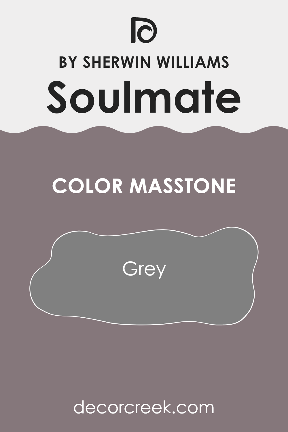
What is the Masstone of the Soulmate SW 6270 by Sherwin Williams?
SoulmateSW 6270 by Sherwin Williams has a masstone of grey, a neutral hue that offers a versatile backdrop for home decoration. This grey color, close to the classic #808080, is simple yet effective in various settings. It serves as a gentle foundation that allows other colors in a room to stand out.
Whether in a living room, bedroom, or kitchen, this grey shade pairs well with both bright colors and softer tones, giving decorators freedom to mix and match.
In homes, this particular shade of grey is particularly useful because it doesn’t dominate the space. Instead, it complements different styles, from modern minimalistic to cozy and traditional. It’s helpful in rooms that get either a lot of sunlight or very little, as it maintains its true color without darkening or fading dramatically.
It also provides a clean, fresh look that can make small spaces appear larger and gives the room a neat and orderly feel. For anyone looking to refresh their home, this grey offers a reliable and straightforward choice.
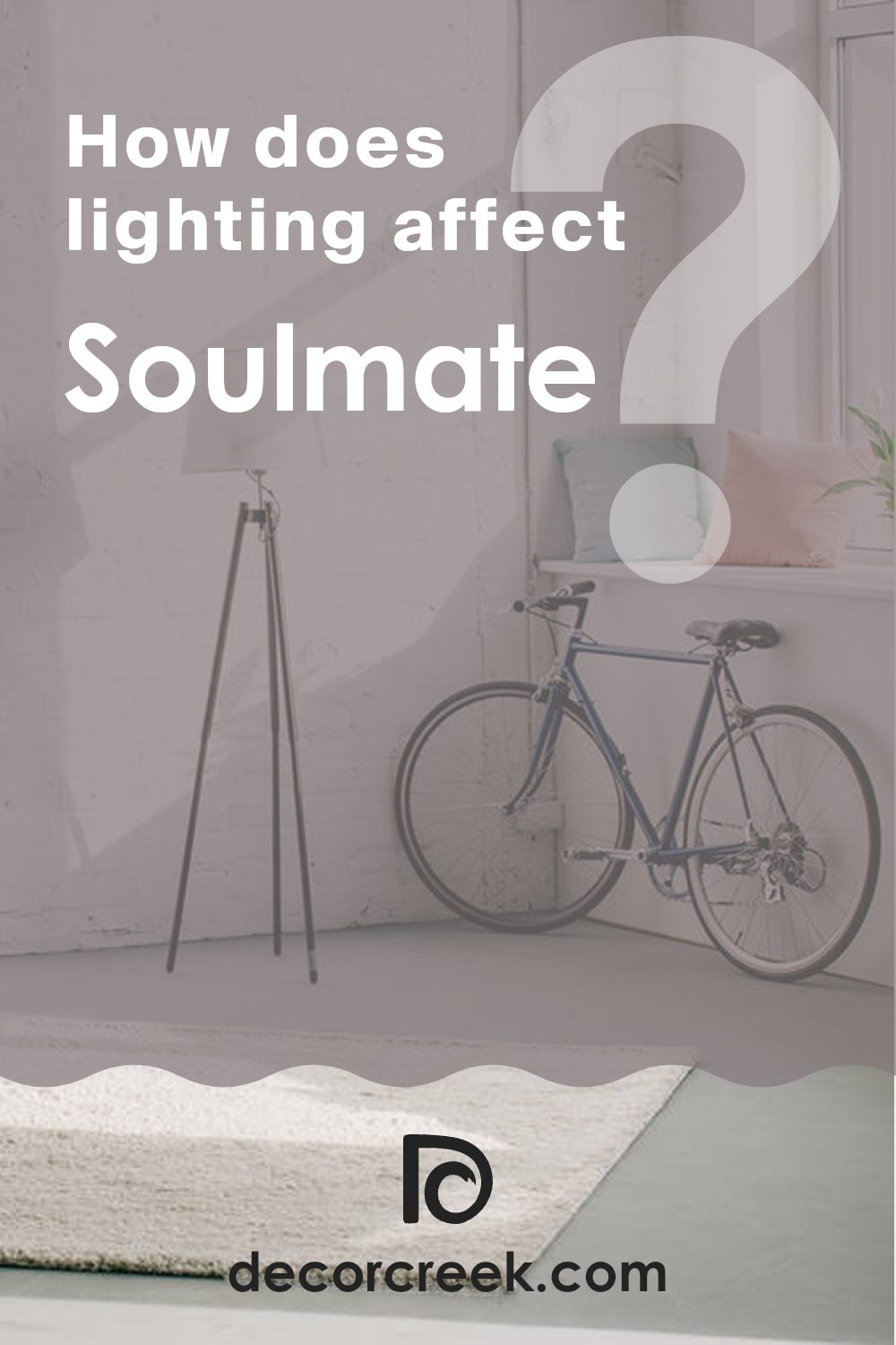
How Does Lighting Affect Soulmate SW 6270 by Sherwin Williams?
Lighting plays a crucial role in how we perceive colors in our environments. The way a color appears can dramatically change under different lighting conditions. This phenomenon occurs due to light’s variable color temperatures and intensities, which can enhance or mute the hues of a paint color.
Considering a specific shade, such as a deep purple from Sherwin Williams, its appearance is affected by both artificial and natural light. Under artificial lighting, depending on whether warm or cool bulbs are used, the purple can appear vividly rich or slightly muted.
Warm lights tend to bring out a cozy, soothing depth in purple, making it look more vibrant and inviting. In contrast, cool lights might give the purple a sharper, more stark appearance, which could make the room feel colder.
Natural light, on the other hand, changes throughout the day and influences how this shade of purple is perceived. In a north-facing room, which receives less direct sunlight, the purple might appear darker and more subdued, possibly even feeling a bit somber.
In south-facing rooms, flooded with ample sunlight for most of the day, the purple will likely appear lighter and more lively. The brightness of the sun can make the purple feel airy and vibrant, which enhances the overall mood of the room.
When it comes to east-facing rooms, they receive a strong morning light that can make the purple look very bright and welcoming in the mornings, fading to a cooler tone as the day progresses.
Conversely, in west-facing rooms, the color might feel softer during the morning and become dynamically bold and dramatic in the evening as it catches the warm sunset light.
Overall, the perception of any color, including this deep purple shade, can significantly vary depending on the room’s orientation and the type of light it receives, showcasing the importance of considering lighting when choosing paint colors for your spaces.
What is the LRV of Soulmate SW 6270 by Sherwin Williams?
LRV, or Light Reflectance Value, is a measurement used to determine how much light a paint color reflects or absorbs. This value ranges from 0, which absorbs all light, to 100, which reflects all light. Essentially, the higher the LRV, the lighter the color appears, and the more it can brighten up a room. Conversely, colors with lower LRV values tend to absorb more light, making them appear darker and can make a space feel smaller or more enclosed.
The LRV of 19.599 for the specific paint color in question means it is on the darker side, reflecting only a small portion of light. This darker shade can add a sense of depth and character to a room, making it feel cozy and intimate.
In spaces with less natural light, using a color with a low LRV can make the room feel even darker, so additional lighting might be necessary to counteract this effect. In well-lit areas, however, this color can create a striking contrast with brighter colors and decor, lending a dramatic flair to the space.

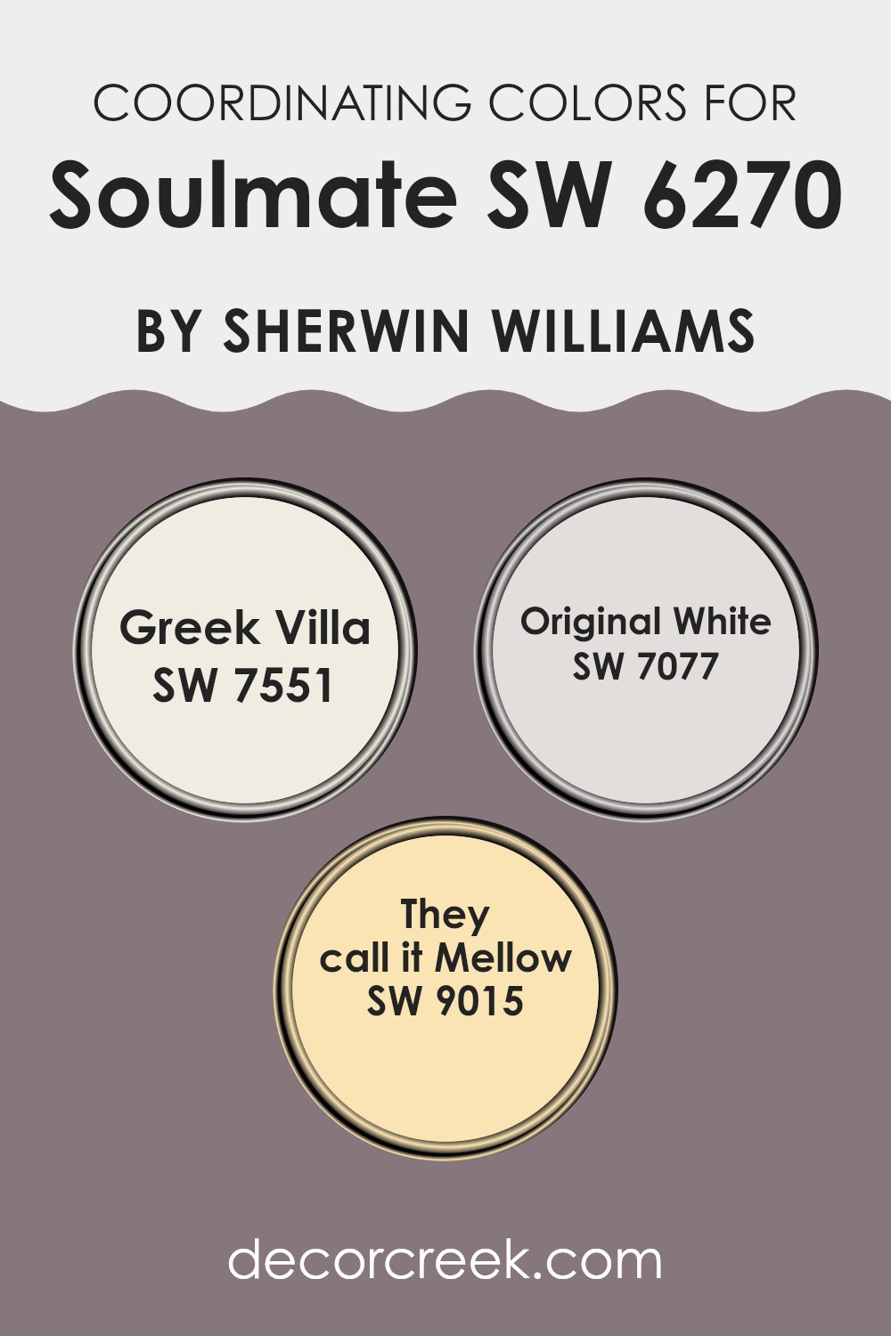
Coordinating Colors of Soulmate SW 6270 by Sherwin Williams
Coordinating colors are selected shades that harmonize well when used with a main color in a design scheme. The chosen colors complement the primary shade, enhance its visual appeal, and create a balanced look throughout the space.
When dealing with paint colors such as those from Sherwin Williams, it’s crucial to find colors that not only work well on their own but also support the primary color to form a cohesive palette. This method ensures that the interior space feels connected, and aesthetically pleasing.
For instance, SW 7551 – Greek Villa is a soft, slightly creamy white that offers a subtle warmth, making it an excellent choice for adding a light and airy feel to a room. It works well in combination with other colors to provide a gentle contrast that’s neither too stark nor overpowering.
Next, SW 7077 – Original White is a true, clean white that acts as a fresh canvas, ideal for creating a crisp look or breaking up more intense colors.
Lastly, SW 9015 – They Call It Mellow is a muted, mellow yellow that adds a soothing hint of color, perfect for spaces intended for relaxation or gentle stimulation. Together, these coordinating colors successfully enhance the richness and depth of the primary color, ensuring that every element in the room feels harmonious.
You can see recommended paint colors below:
- SW 7551 Greek Villa
- SW 7077 Original White
- SW 9015 They call it Mellow
What are the Trim colors of Soulmate SW 6270 by Sherwin Williams?
Trim colors play a crucial role in enhancing the overall appearance of a paint job, acting as a visual frame that defines and complements the main color on the walls. In the case of Soulmate SW 6270 by Sherwin Williams, selecting the right trim color is essential to bring out its unique hue and create a harmonious balance.
For this color, both White Snow SW 9541 and Agreeable Gray SW 7029 serve as excellent choices for trim, providing contrast and subtle definition without overwhelming the main shade.
White Snow SW 9541 is a crisp and clean white shade that offers a fresh and bright contrast, making it a great choice for trims that want to highlight the rich tone of Soulmate. It helps in making the room feel more spacious and open. On the other hand, Agreeable Gray SW 7029 is a soft, light gray color with warm undertones that can add a modern and understated elegance to the space.
When used as a trim color with Soulmate, it ensures the space feels cohesive and adds a touch of contemporary appeal, making it ideal for more muted or modern interior designs.
You can see recommended paint colors below:

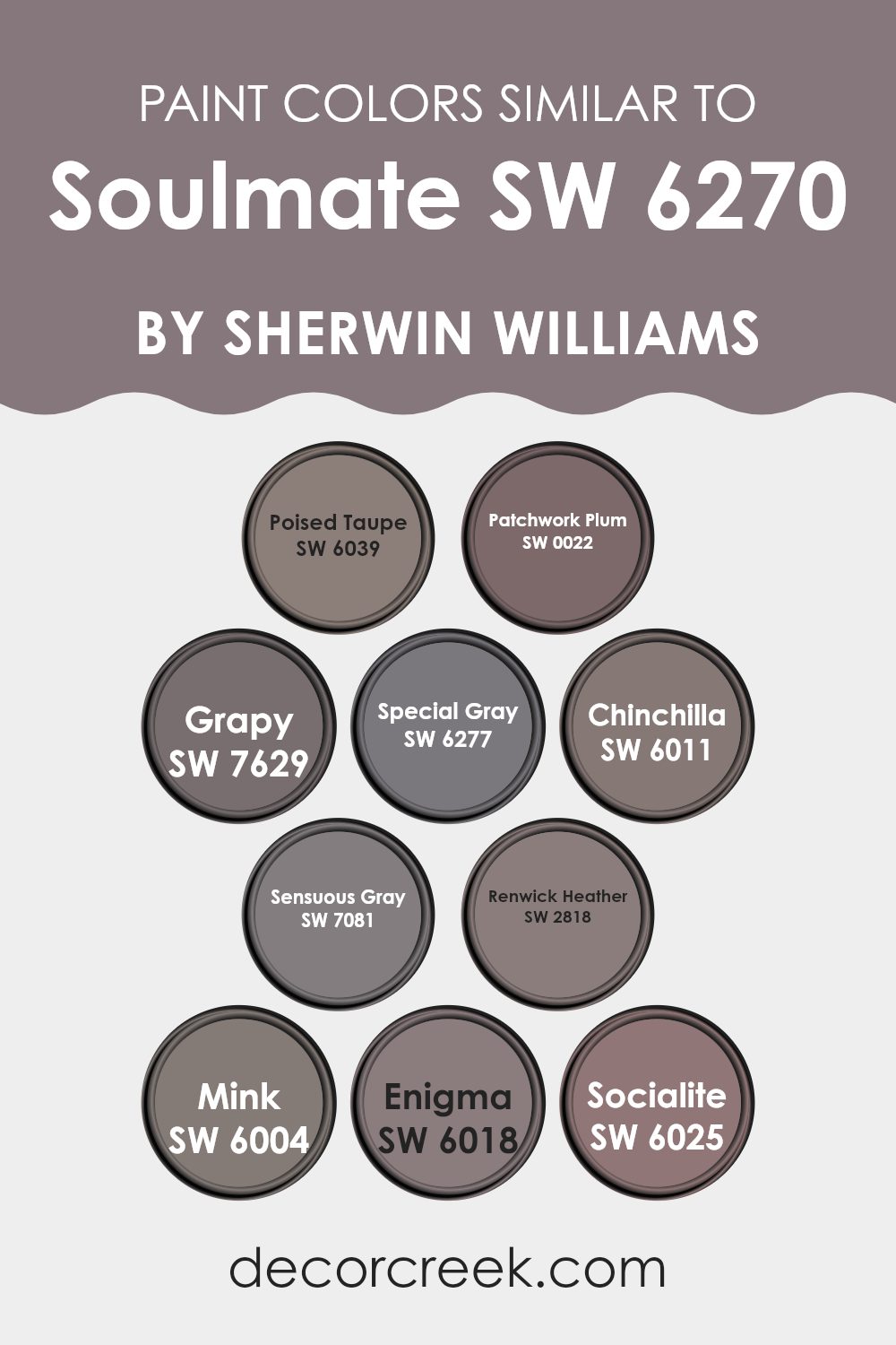
Colors Similar to Soulmate SW 6270 by Sherwin Williams
Similar colors play a significant role in interior design by creating a harmonious and cohesive environment. When colors like SW 6039 Poised Taupe—a warm gray with earthy brown nuances—pair with others such as SW 0022 Patchwork Plum, a deep, muted plum, they create depth and warmth. It’s all about balancing tones to achieve a refined yet welcoming atmosphere.
For instance, SW 7629 Grapy is a dark, subdued purple that complements the lighter hues like SW 6277 Special Gray, adding visual interest. Using shades like SW 6011 Chinchilla, a rich warmer gray, alongside others such as SW 7081 Sensuous Gray, allows for a continuous flow, avoiding stark contrasts that may disrupt the room’s aesthetics.
Matching shades like SW 2818 Renwick Heather, which carries a dusty rose undertone, with deeper tones like SW 6004 Mink, a luxurious deep brown, presents an elegant palette. Similarly, SW 6018 Enigma, which offers a darker slate impression, goes well with the lighter SW 6025 Socialite, a pale gray with purple undertones.
These color combinations ensure that each room maintains a collected feel while achieving an inviting atmosphere.
By selecting colors that naturally fit together, designers can create spaces that are not only stylish but also feel cohesive and thoughtfully curated.
You can see recommended paint colors below:
- SW 6039 Poised Taupe
- SW 0022 Patchwork Plum
- SW 7629 Grapy
- SW 6277 Special Gray
- SW 6011 Chinchilla
- SW 7081 Sensuous Gray
- SW 2818 Renwick Heather
- SW 6004 Mink
- SW 6018 Enigma
- SW 6025 Socialite
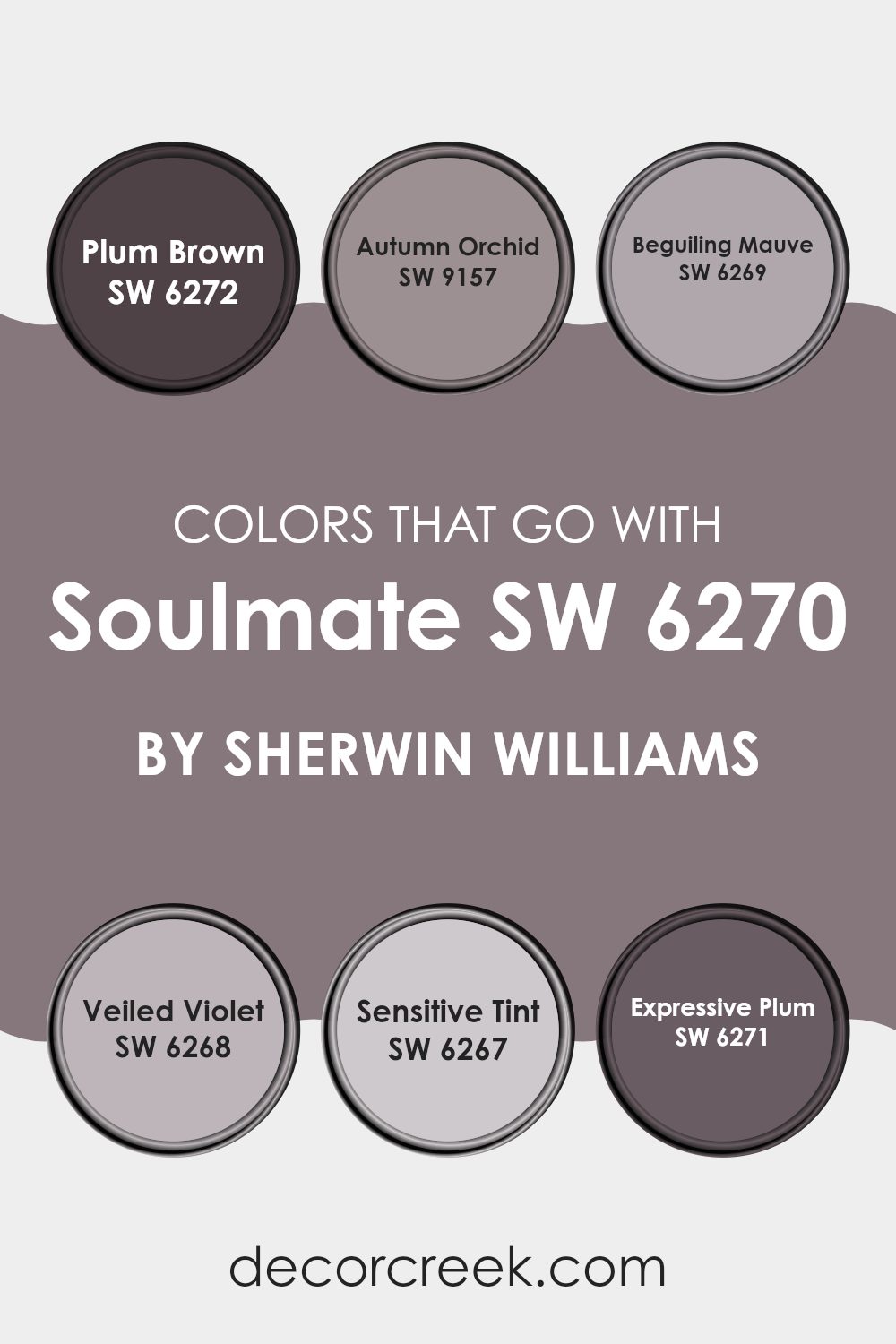
Colors that Go With Soulmate SW 6270 by Sherwin Williams
Choosing the right colors to complement Soulmate SW 6270 by Sherwin Williams is crucial for creating a harmonious and inviting space. Colors like SW 6272 – Plum Brown and others in this palette work well with Soulmate because they share subtle undertones that enhance each other’s beauty.
For instance, SW 6272 – Plum Brown is a deep, rich color that adds warmth and depth, making it ideal for areas meant to feel cozy and intimate. The color SW 9157 – Autumn Orchid, with its gentle blush tint, offers a soft contrast that can lighten up a room while maintaining a warm ambiance.
Similarly, SW 6269 – Beguiling Mauve and SW 6268 – Veiled Violet are excellent choices. Beguiling Mauve has a dusky rose hue that brings a touch of romance and sophistication, blending beautifully with the cool depth of Soulmate. On the other hand, Veiled Violet adds a splash of delicate color, perfect for creating a calm and restful environment.
SW 6267 – Sensitive Tint is another great option, with its pale lavender whisper, it provides a subtle and fresh look.
Lastly, SW 6271 – Expressive Plum has a bolder, more dramatic appeal, adding a rich layer of color that commands attention while still aligning with the calm essence of Soulmate. Together, these colors create a palette that enhances any space, making it feel both cohesive and beautifully varied.
You can see recommended paint colors below:
- SW 6272 Plum Brown
- SW 9157 Autumn Orchid
- SW 6269 Beguiling Mauve
- SW 6268 Veiled Violet
- SW 6267 Sensitive Tint
- SW 6271 Expressive Plum
How to Use Soulmate SW 6270 by Sherwin Williams In Your Home?
Soulmate by Sherwin Williams is a rich, deep purple shade that adds elegance and a touch of drama to any room. It’s perfect for creating a cozy and inviting atmosphere in living spaces. You can use this color to paint an accent wall in your living room or bedroom, instantly drawing attention and giving the space a modern feel.
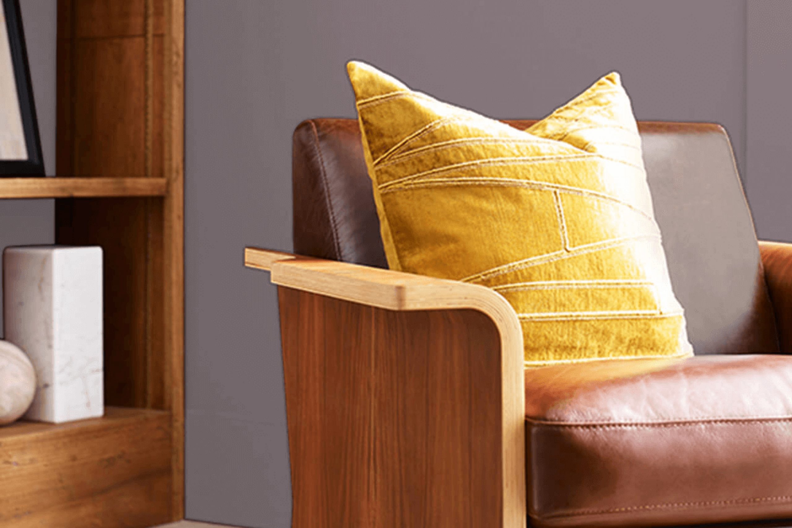
Soulmate also works well in a bathroom or on kitchen cabinets, providing a stylish contrast to lighter walls or fixtures. Pair it with soft whites or grays for a balanced look, or combine it with bold colors like mustard yellow or fiery red to make a statement.
If you’re not ready to commit to painting entire walls, consider using Soulmate for smaller projects like a bookshelf or a piece of furniture to add a subtle yet impactful pop of color to your home.
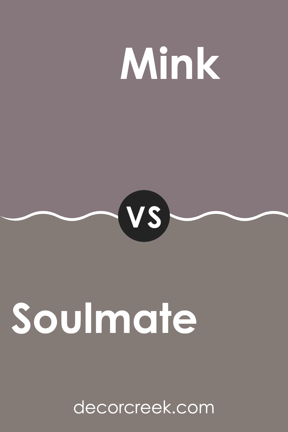
Soulmate SW 6270 by Sherwin Williams vs Mink SW 6004 by Sherwin Williams
Soulmate and Mink, both from Sherwin Williams, present unique tones that can significantly affect the mood of a room. Soulmate is a soft, gentle purple with subtle hints of gray, providing a calming and cozy atmosphere, perfect for creating a peaceful space in homes. It’s a versatile color that works well in bedrooms or living areas where you want a touch of softness without overwhelming the senses.
On the other hand, Mink is a deeper, warmer color, leaning more towards a dark taupe or brown with a rich undertone. It gives off an inviting vibe and is excellent for settings where you want to add a bit of depth and warmth, like dining rooms or studies.
Mink can help make large rooms feel more intimate and is powerful in areas that receive a lot of natural light, balancing the brightness with its deeper hue.
Together, these colors can be used in various home styles, offering distinct yet harmonious options for decorating.
You can see recommended paint color below:
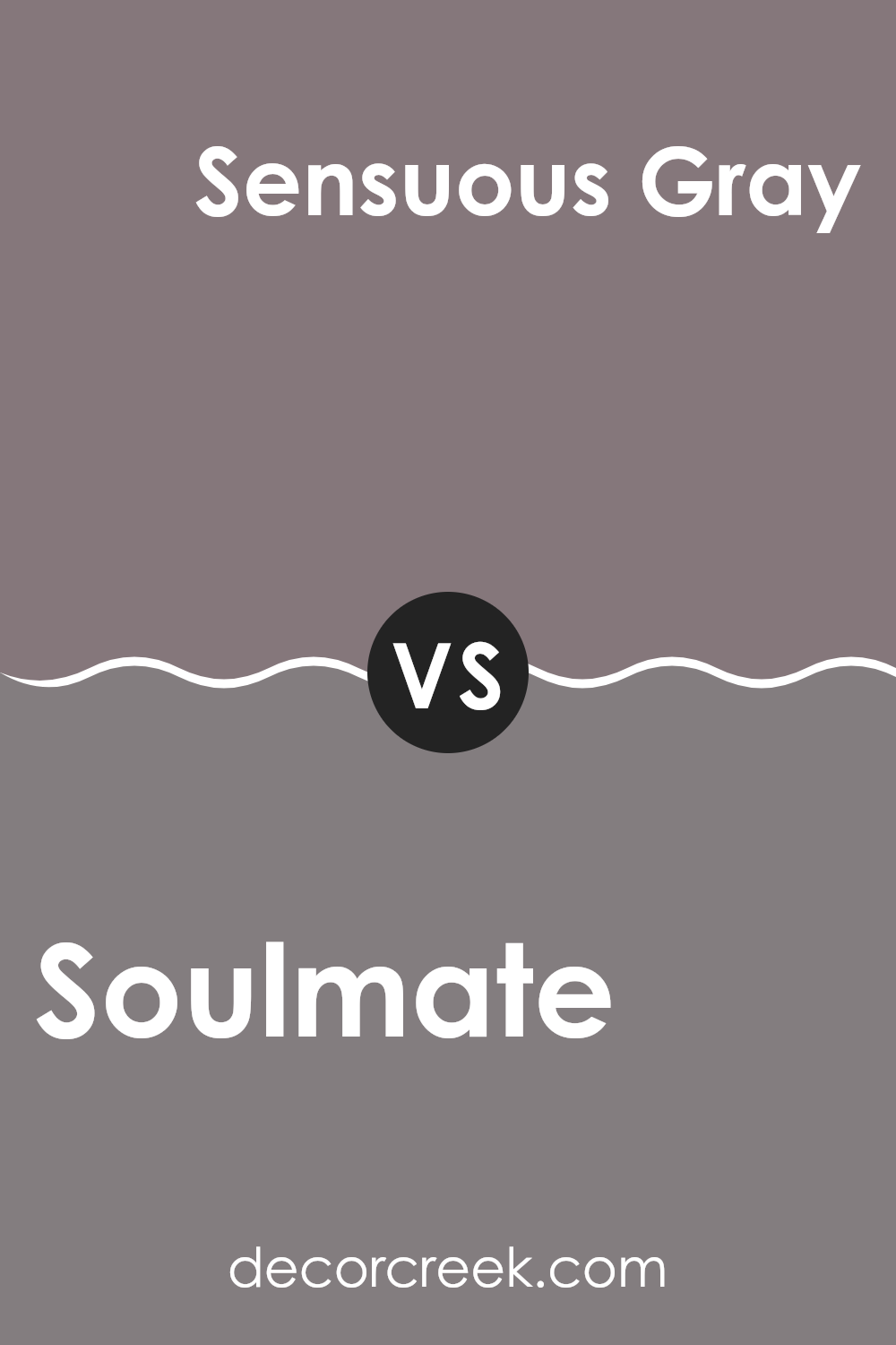
Soulmate SW 6270 by Sherwin Williams vs Sensuous Gray SW 7081 by Sherwin Williams
Soulmate and Sensuous Gray, both from Sherwin Williams, offer distinct shades that can impact the feel of a room differently. Soulmate is a deeper, more saturated color, falling into the navy group. It gives a strong presence and works well as an accent, adding depth and focus to spaces.
In contrast, Sensuous Gray is a soft, muted gray with subtle warmth. This color is more understated and versatile, easy to combine with various decor styles and suitable for larger areas as it won’t overpower the space.
While Soulmate draws attention and sets a mood, Sensuous Gray offers a gentle backdrop, supporting other colors and features in a room. Together, they could complement each other, with Sensuous Gray balancing the intensity of Soulmate, ideal for creating sophisticated spaces with a mix of drama and calm.
You can see recommended paint color below:
- SW 7081 Sensuous Gray
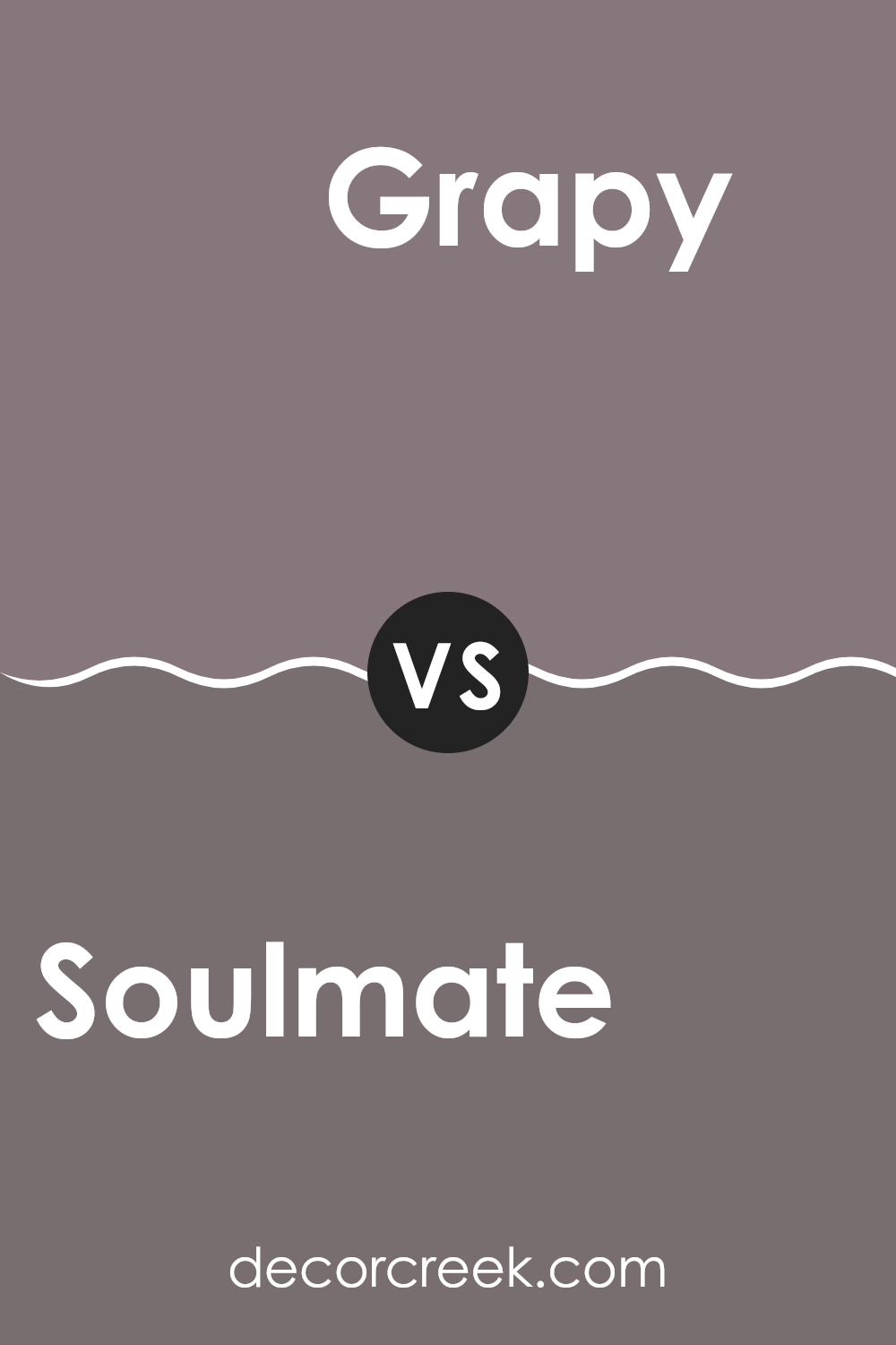
Soulmate SW 6270 by Sherwin Williams vs Grapy SW 7629 by Sherwin Williams
The main color Soulmate is a deep, rich purple with a dusky quality that brings a sense of comfort and warmth to spaces. Perfect for creating a cozy, inviting atmosphere, it works well in bedrooms or living areas where a touch of drama is desired without overwhelming the space.
On the other hand, Grapy is a darker, moodier purple that leans more towards a true subdued hue. It has a more pronounced intensity than Soulmate, making it ideal for spaces where you want to make a bold statement or add depth.
Grapy tends to absorb light, so it’s best used in areas with ample lighting or where a more enclosed, intimate feel is desired. Both colors pair well with neutral shades and can be accented with metallic or reflective surfaces to brighten the visual impact. Choosing between them depends on the desired mood and lighting of the room.
You can see recommended paint color below:
Soulmate SW 6270 by Sherwin Williams vs Chinchilla SW 6011 by Sherwin Williams
Soulmate and Chinchilla, both by Sherwin Williams, offer unique shades for various decorating needs. Soulmate is a muted purple, evoking a soft and calming vibe, perfect for creating a cozy and friendly atmosphere in spaces like living rooms or bedrooms. It has a warmer tone, making it versatile for adding a touch of subtle color without overwhelming the room.
On the other hand, Chinchilla is a darker gray with a slightly purple undertone. This color is ideal for those looking to make a gentle yet distinctive statement. It goes well in areas that benefit from a more grounded, neutral palette, like offices or dens, and pairs well with a wide range of decor styles.
While both colors share a hint of purple, Soulmate leans towards a lighter, warmer lavender shade, whereas Chinchilla serves as a robust, cooler gray. This makes each suitable for different purposes and atmospheres within a home or office.
You can see recommended paint color below:
- SW 6011 Chinchilla

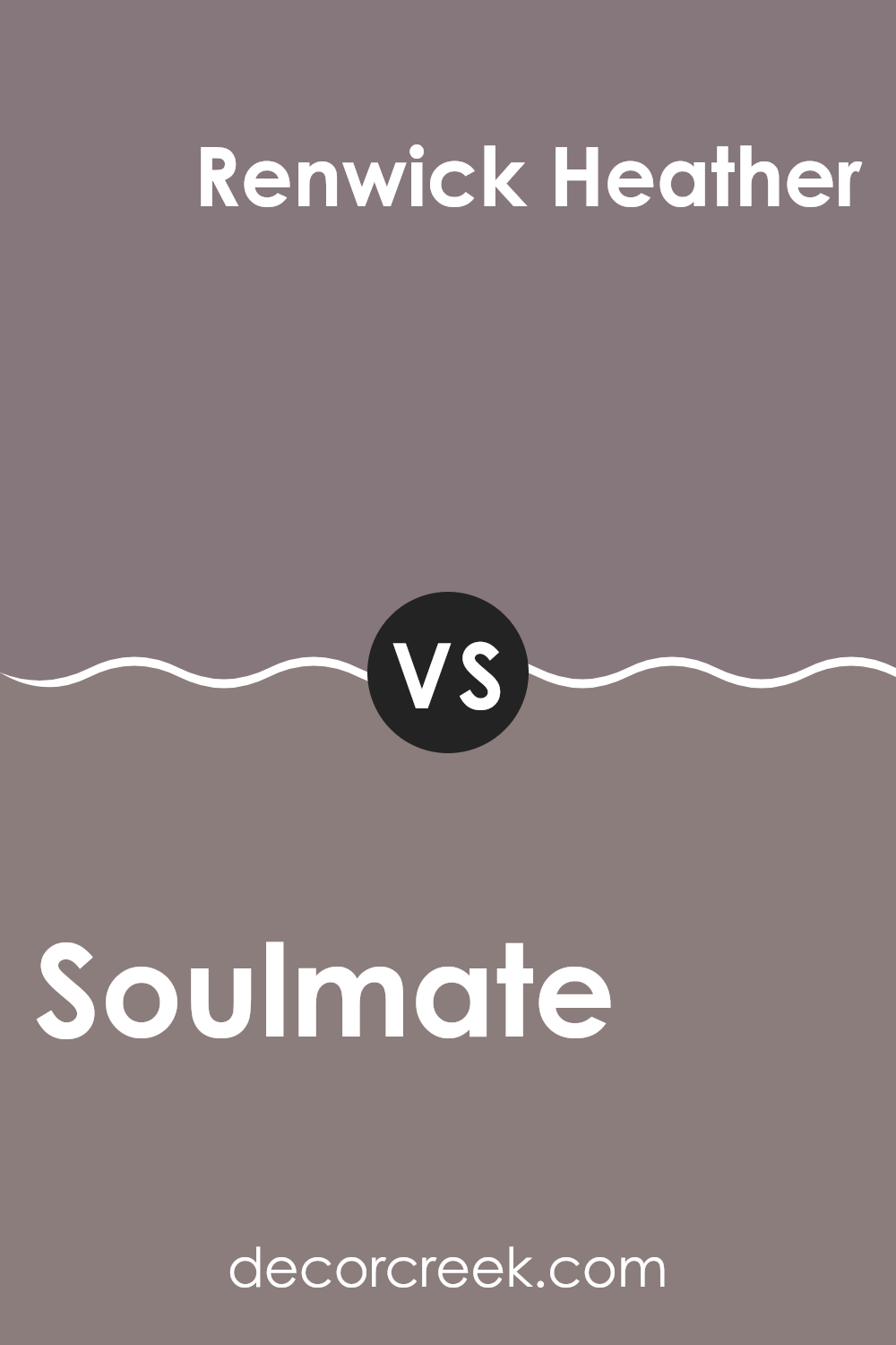
Soulmate SW 6270 by Sherwin Williams vs Renwick Heather SW 2818 by Sherwin Williams
The color Soulmate by Sherwin Williams is a deep, soothing purple that brings a sense of calm and coziness to any space. It’s a rich hue that pairs well with a variety of decor styles, adding a touch of elegance without being overpowering.
On the other hand, Renwick Heather is a robust brown with subtle purple undertones, providing a warm and inviting atmosphere. This color works particularly well in areas where a comfy, welcoming feel is desired, such as living rooms or bedrooms.
While both colors share a depth that can anchor a room, Soulmate leans towards a cooler palette, whereas Renwick Heather offers warmth.
This makes Soulmate a better choice for a modern look that still wants to keep things soft, while Renwick Heather suits spaces aiming for a rustic or traditional vibe.
Combining them could also work well, using Soulmate as an accent wall amidst Renwick Heather for a balanced contrast.
You can see recommended paint color below:
- SW 2818 Renwick Heather
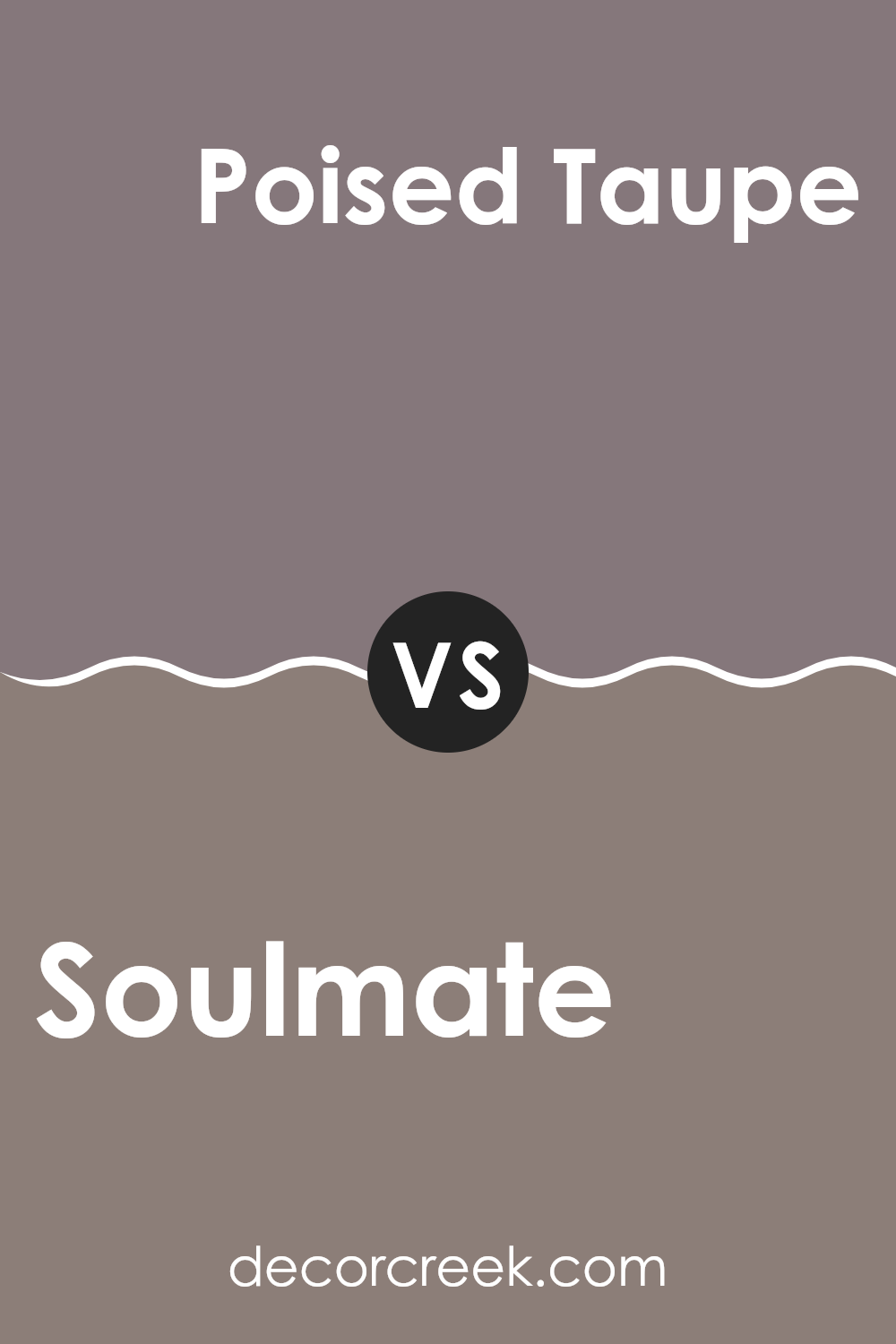
Soulmate SW 6270 by Sherwin Williams vs Poised Taupe SW 6039 by Sherwin Williams
The main color, Soulmate, is a deep, rich purple with a hint of gray that gives it a subtle, muted feel. It’s a color you might choose for adding a touch of drama and elegance to a space, especially when used in a bedroom or lounge area.
In contrast, Poised Taupe is a warm taupe that blends gray with brown, creating a cozy, inviting ambiance. This color is incredibly versatile and works well in a variety of settings, from modern living rooms to classic kitchens.
Both colors offer their unique charm, with Soulmate bringing a more vibrant and deep tone, while Poised Taupe provides a softer, more grounded approach.
Each could potentially complement the other as accents in a single room, with Soulmate drawing the eye and Poised Taupe serving as a calming backdrop.
You can see recommended paint color below:
- SW 6039 Poised Taupe
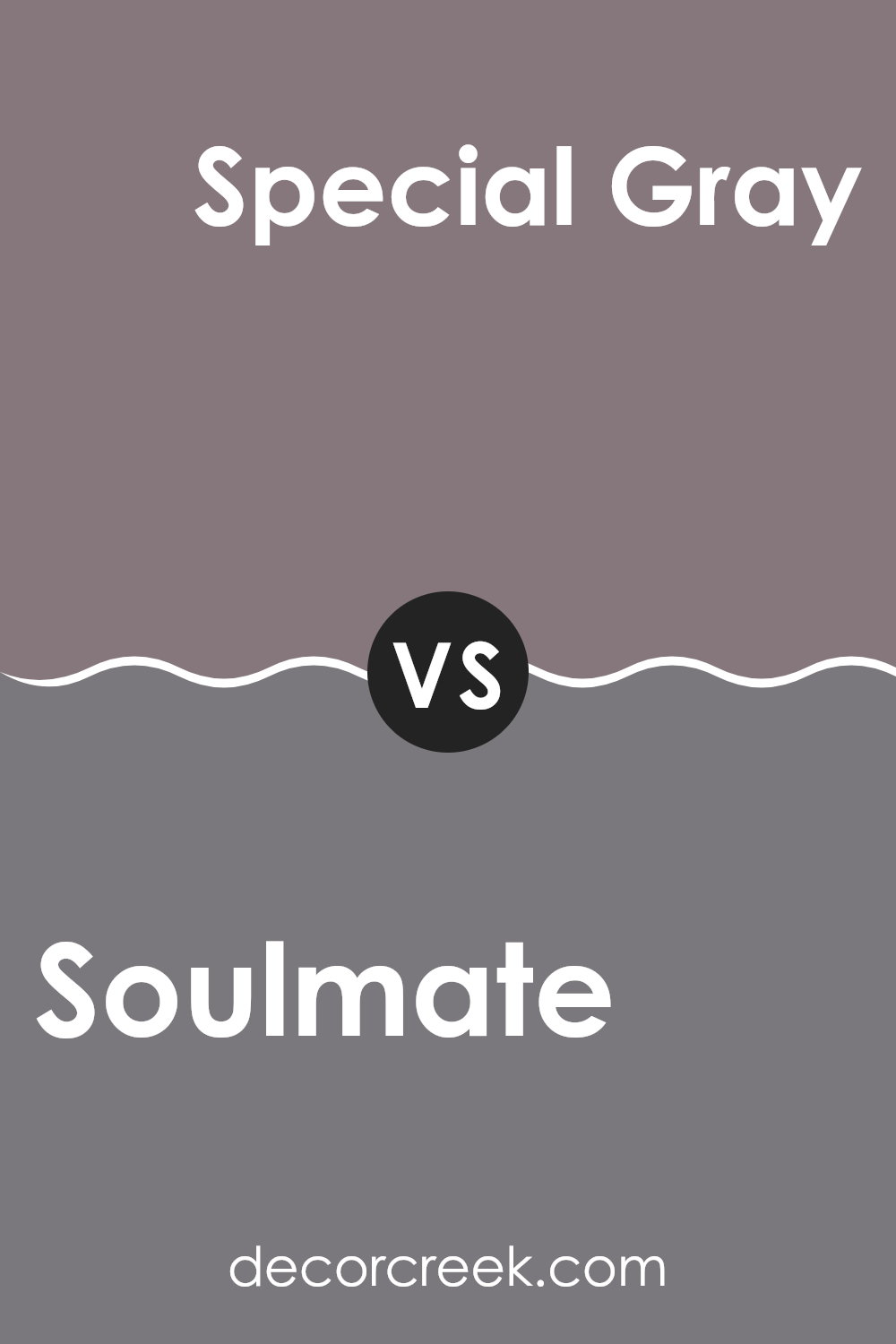
Soulmate SW 6270 by Sherwin Williams vs Special Gray SW 6277 by Sherwin Williams
The two colors, Soulmate and Special Gray, both by Sherwin Williams, offer distinct tones that can set very different moods in a space. Soulmate is a deep, rich purple that provides a strong and calming presence, making it ideal for areas where soothing darkness is welcome, such as bedrooms or cozy reading nooks.
On the other hand, Special Gray is a muted gray with a hint of warmth. This color is softer and lighter, fitting well in spaces that aim for a neutral backdrop with a slightly cozy feel, like living rooms or modern offices.
While Soulmate tends to draw the eye and make a bold statement, Special Gray is more understated, offering flexibility in decor and pairing easily with various color schemes. In summary, Soulmate suits those looking for depth and impact, whereas Special Gray works well for creating a gentle, inviting environment.
You can see recommended paint color below:
- SW 6277 Special Gray
Soulmate SW 6270 by Sherwin Williams vs Enigma SW 6018 by Sherwin Williams
Soulmate and Enigma by Sherwin Williams are two distinct colors that bring unique vibes to a space. Soulmate is a soft, muted purple with a hint of gray that gives a calm and soothing feel, perfect for creating a peaceful environment in bedrooms or living areas. It’s light enough to make small rooms appear more spacious while still adding a touch of color.
On the other hand, Enigma is a darker, more intriguing shade. It’s a deep gray that borders on charcoal, offering a bold and dramatic look. This color works well in modern settings or as an accent wall, providing a strong backdrop that highlights décor pieces or furniture.
Both colors are versatile but serve different purposes based on the mood you want to set. While Soulmate adds a gentle, relaxing touch, Enigma makes a more powerful statement, perfect for design themes that require a bit more intensity.
You can see recommended paint color below:
- SW 6018 Enigma
Soulmate SW 6270 by Sherwin Williams vs Socialite SW 6025 by Sherwin Williams
Sure! The main color, Soulmate, and the second color, Socialite, both by Sherwin Williams, offer unique tones that can create different moods in any space. Soulmate is a deep, muted purple that is reminiscent of dusk. This color is calm and soothing, perfect for rooms where you want a peaceful feel, like bedrooms or a quiet office space.
On the other hand, Socialite is a lighter hue, leaning towards a soft green-gray. It is gentle and subtle, making it versatile for various settings.
Its understated quality allows it to blend well in areas such as living rooms or kitchens where it complements many decor styles without overwhelming the space.
Together, these colors can work well in a home that wants balance between coziness and a hint of freshness. Each brings its own charm, either anchoring a room in calm or softly uplifting the ambiance.
You can see recommended paint color below:
- SW 6025 Socialite
Soulmate SW 6270 by Sherwin Williams vs Patchwork Plum SW 0022 by Sherwin Williams
Soulmate and Patchwork Plum are two distinctive colors from Sherwin Williams, each offering its unique charm. Soulmate is a more subtle hue, leaning towards a cooler, gentle purple with a soothing gray undertone. It’s perfect for creating a calm and mellow feel in a space, bringing a soft and gentle ambiance.
On the other hand, Patchwork Plum boasts a deeper, richer tone, reminiscent of a ripe plum. This color has a vibrant intensity to it, making it ideal for spaces where you want to make a bolder statement or add some drama.
It would stand out beautifully in an area with lots of natural light or be striking as an accent wall.
In comparison, Soulmate is more reserved and suited for broader use on walls in a home to promote a relaxed atmosphere. Both colors can significantly impact the mood and style of a room but through very different approaches.
You can see recommended paint color below:
- SW 0022 Patchwork Plum

Conclusion
One of the best things about Soulmate is that it works well with many other colors. You can pair it with light colors like white or go bold with dark colors like black or gray. It’s like having a best friend who gets along with everyone at the party
! This makes it super easy to use, no matter what your style or what your room looks like.
Besides, Soulmate is not just pretty but also has a calming effect. Imagine coming home after a busy day at school and walking into a room that helps you feel calm and happy. That’s what this color can do!
Overall, SW 6270 Soulmate by Sherwin Williams is more than just a paint color. It’s a magical way to make your house feel just right: calm, inviting, and pretty. If you ever decide to repaint your room or your whole house, remember that Soulmate could be the perfect choice to make any space better.

Ever wished paint sampling was as easy as sticking a sticker? Guess what? Now it is! Discover Samplize's unique Peel & Stick samples.
Get paint samples

