If you’re considering a fresh look for your home or office space, I highly recommend SW 9510 Peace of Mind by Sherwin Williams. I recently had the opportunity to use this color in my home renovation project, and the results were just exceptional. Peace of Mind is a gentle, soothing hue that instantly creates a serene and welcoming atmosphere. It’s a versatile shade that pairs beautifully with various decor styles, from modern minimalism to cozy, rustic themes.
One of the things I really appreciate about this color is how it manages to add brightness to a room without being overpowering. It works perfectly in spaces that boast natural light, as well as those that rely more on artificial lighting, maintaining its charm under different conditions. Furthermore, its subtlety allows you to experiment with bold furniture pieces or vibrant accents without clashing.
Choosing the right paint color can sometimes feel overwhelming with all the options out there, but SW 9510 Peace of Mind truly lives up to its name, offering a peaceful backdrop that enhances every room’s aesthetic and feel.
Whether you’re updating a single room or redoing your entire house, this color provides a calm, collected canvas that will surely delight you and any guests you welcome into your home.
What Color Is Peace of Mind SW 9510 by Sherwin Williams?
The color “Peace of Mind” by Sherwin Williams is a gentle shade of blue with subtle gray undertones. This color brings a calm and cozy feel to any room, making it ideal for creating a relaxing atmosphere. Its soft tone works beautifully in various interior styles, particularly in modern farmhouse, coastal, and Scandinavian designs. The muted blue is versatile and soothing, a perfect backdrop for living rooms, bedrooms, and bathrooms where a soothing ambiance is desired.
“Peace of Mind” pairs exceptionally well with natural materials like light wood, which complements its cool tone, and woven textures that add warmth and depth to the overall design.
Metals, like brushed nickel or matte black, also go well with this color, providing a modern touch that doesn’t overpower the room’s gentle aesthetic. Linen or cotton fabrics in white or soft beige can maintain the room’s airy and light feel, while adding layers with these textures ensures a cozy vibe.
This color welcomes a wide variety of accents — from earthy terracotta to rich navy.
These combinations allow for personalized touches that make a space feel inviting and lived-in, perfectly tailoring to personal tastes while maintaining a cohesive look.
Is Peace of Mind SW 9510 by Sherwin Williams Warm or Cool color?
Peace of Mind by Sherwin Williams is a gentle blue hue that brings a calm and relaxed feeling to any room. It’s soft enough not to overpower the space but vibrant enough to add a touch of personality. This color works well in bedrooms where you want to create a restful atmosphere, or in bathrooms for a refreshing, spa-like vibe. It’s also great in living areas, helping to create a cheerful and welcoming space.
In homes, this color pairs beautifully with whites and grays for a modern, clean look, or can be matched with warmer tones like yellows or light woods for a cozier feel. The versatility of Peace of Mind makes it easy to use in various decor styles, whether you’re decorating a beach house or a contemporary apartment.
This shade is particularly effective in rooms with good natural light, enhancing the space with its airy quality. However, even in darker rooms, it can help brighten up the space and make it feel more open.
Undertones of Peace of Mind SW 9510 by Sherwin Williams
The color “Peace of Mind” is a versatile shade that can significantly influence the feel of a room depending on its undertones. An undertone is a subtle color that lies beneath the surface of the main color, subtly influencing how it appears in different lighting conditions and surroundings.
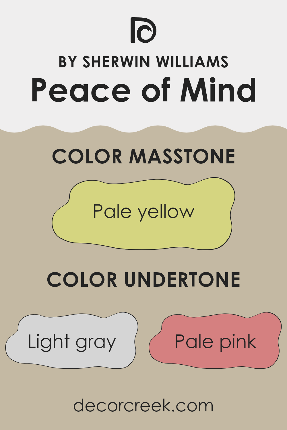
This particular color has a variety of undertones including light gray, pale pink, light purple, mint, light blue, grey, lilac, yellow, orange, light green, and olive. Each of these undertones adds a unique dimension and can affect the overall look and feel of the paint once applied to interior walls.
For example, light gray undertones help create a neutral backdrop that is calm and grounding. Pale pink and light purple undertones add a hint of warmth and softness, making a space feel welcoming and cozy. Mint and light blue provide a fresh, airy quality, ideal for creating a bright and open space. The presence of yellow and orange undertones introduces a subtle energy and vibrancy, which can make a room feel more lively and stimulating.
When “Peace of Mind” is used on interior walls, these undertones interact with each other and with the room’s lighting, furnishings, and natural light sources. In rooms with ample sunlight, the lighter undertones like mint and pale pink might become more pronounced, enhancing the room’s brightness. In artificial light, deeper undertones like grey and olive could become more visible, giving the room a more grounded feel.
Therefore, understanding these undertones can help in choosing the right paint color for the desired emotional and aesthetic impact in a room. Each undertone will behave differently, affecting the atmosphere and how the main color is perceived, ultimately influencing the overall mood and character of the space.
What is the Masstone of the Peace of Mind SW 9510 by Sherwin Williams?
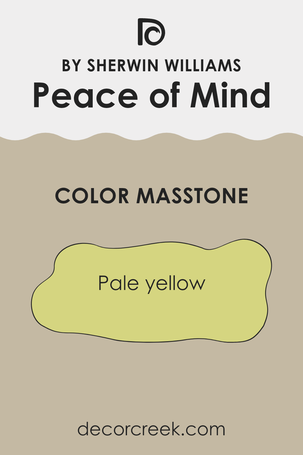
Peace of Mind SW 9510 by Sherwin Williams has a masstone of pale yellow, identified by the color code #D5D580. This soft, gentle yellow brings a light and airy feel to any room, making it seem more spacious and bright.
In a home setting, this shade is especially effective in rooms that don’t get a lot of natural light, as it helps to mimic sunshine and boost the light in the area. The calm, mild color tone can also help in reducing the overwhelmed feeling that often comes from darker, more intense colors.
In bedrooms and living areas, this particular shade provides a backdrop that is easy on the eyes, offering a subtle uplift to mood without being too striking or demanding attention. It pairs well with soft whites or earthy browns, allowing for versatile design options. Overall, Peace of Mind brings a cheerful, yet not too vibrant, energy to a home, making it a popular choice for creating a welcoming environment.
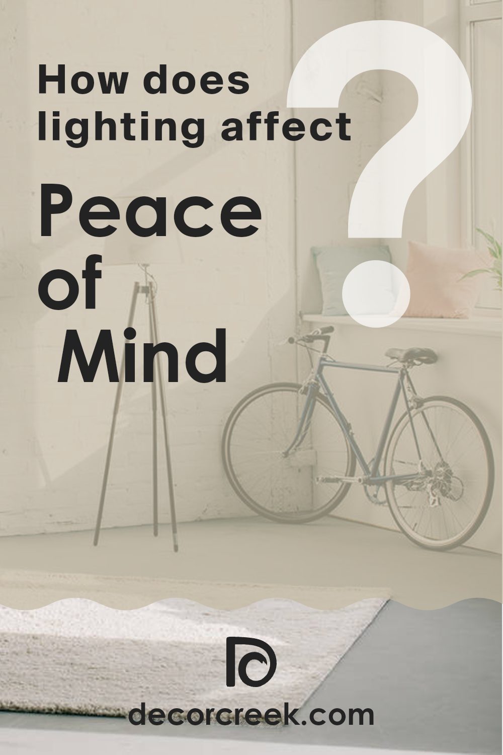
How Does Lighting Affect Peace of Mind SW 9510 by Sherwin Williams?
Lighting has a significant impact on how colors appear within any space. The color “Peace of Mind,” a beautiful teal shade by Sherwin-Williams, can look different based on the type of light it is exposed to, such as natural sunlight or artificial lighting from lamps and overhead lights.
In natural light, “Peace of Mind” tends to reveal its true color. Sunlight brings out the brightness and vibrancy of the teal, making it appear lively and more dynamic. This pure representation shows the color at its most authentic state.
However, under artificial light, “Peace of Mind” can look slightly different. LED or fluorescent lighting can either cool down or warm up the color. Depending on the type of bulbs used (warm white vs. cool white), this shade may either shift towards a greener tone or lean into a richer, bluer hue.
The appearance of this color also changes based on the orientation of the room. In north-facing rooms, which receive less direct sunlight and tend to have cooler, more even light throughout the day, “Peace of Mind” can appear more subdued and slightly darker, emphasizing its blue undertones.
South-facing rooms, in contrast, receive a lot of bright, warm light for most of the day, which can make “Peace of Mind” look brighter and more vibrant. The warm light can make the room feel energetic and lively.
In east-facing rooms, morning light can make “Peace of Mind” look soft and warmly inviting in the morning while turning cooler as the day progresses. This dynamic change can make the room feel different from morning to night.
West-facing rooms enjoy evening light, which tends to be warmer and golden. In these rooms, during the late afternoon and evening, the color can appear richer and warmer, providing a cozy, comforting feel.
Overall, “Peace of Mind” is a versatile color that can adapt well in various lighting conditions, offering a range of moods and appearances depending on the room’s orientation and light source.
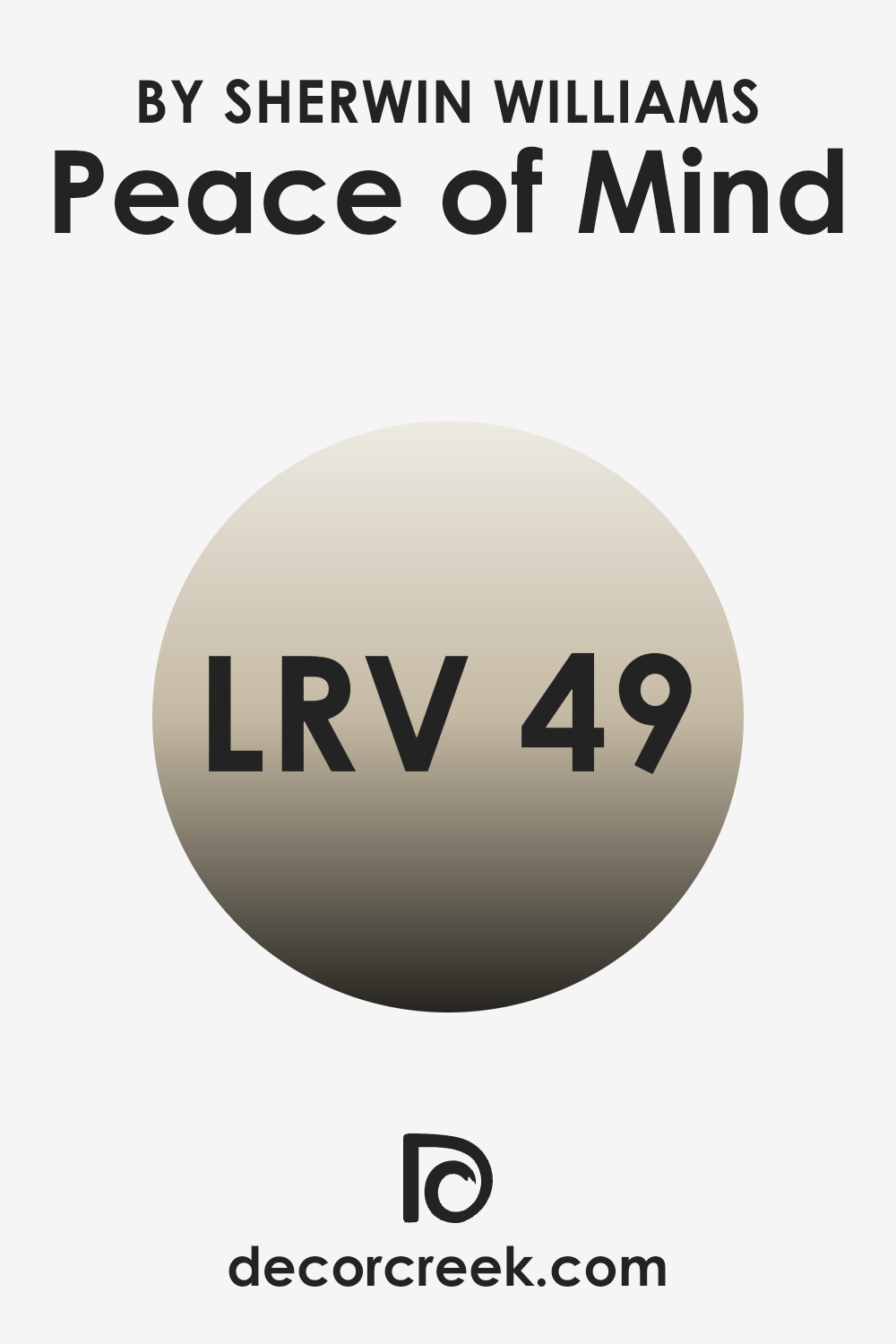
What is the LRV of Peace of Mind SW 9510 by Sherwin Williams?
LRV stands for Light Reflectance Value, which is a measurement used to determine how much light a paint color reflects. An LRV scale goes from 1 to 100, where 1 absorbs the most light and is darker, and 100 reflects the most light and appears very bright. Each color has a specific LRV that can help you understand how light or dark it will look once applied to your walls.
The value is crucial when choosing paint colors because it affects how light or dark a room feels. Higher LRV colors can make a room feel more open and airy, while lower LRV colors can make a space feel cozier and smaller.
The LRV of Peace of Mind, which is 49, is in the middle range. This means it neither reflects nor absorbs light excessively, but sits comfortably in the middle, providing a balanced hue. Therefore, in a room with moderate natural light, Peace of Mind will appear neither too bright nor too dull, making it a versatile color choice. It’s a good option for rooms where you want a neutral ambiance that doesn’t lean too heavily towards feeling open or contracted. Depending on lighting conditions, the appearance of this color may shift slightly, giving the room a dynamic feel as natural light changes throughout the day.
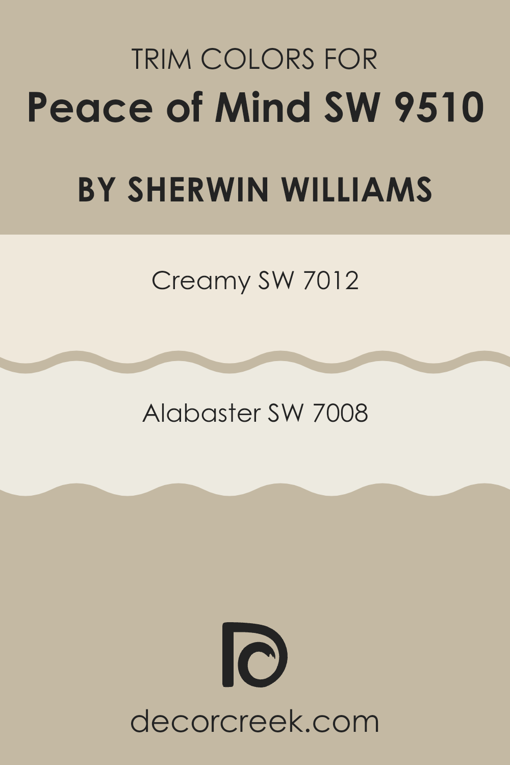
What are the Trim colors of Peace of Mind SW 9510 by Sherwin Williams?
Trim colors play a key role in defining the character and feel of a room by highlighting architectural details and finishing edges where different materials or colors meet. When used with the soft, subtle blue hue of Peace of Mind by Sherwin Williams, trim colors like Creamy and Alabaster can enhance the overall appearance by providing a crisp, clean separation that defines spaces clearly and beautifully.
Creamy (SW 7012) is a soft, warm white with a slight yellow undertone that offers a gentle contrast to the cooler tones of a light blue wall, making it an ideal choice for creating a welcoming and cozy atmosphere.
Alabaster (SW 7008) is a pure, bright white that brings out the freshness of any space and adds visual clarity, making it excellent for spaces that aim to feel more open and airy. Both colors help to add dimension and interest to the walls, making spaces more visually appealing while providing a refreshing contrast that highlights the unique tones of Peace of Mind.
You can see recommended paint colors below:
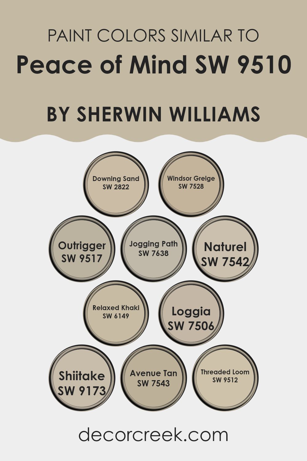
Colors Similar to Peace of Mind SW 9510 by Sherwin Williams
Similar colors are crucial in design because they create a sense of harmony and continuity in a space. These subtle variations in hue help to establish a cohesive atmosphere without becoming monotonous, allowing each room to feel connected while still maintaining its unique character.
For example, using colors like Downing Sand, a gentle beige with a touch of warmth, alongside Windsor Greige, which leans slightly more towards a gray, can create a seamless transition between spaces. This effect is further enhanced by Outrigger, a muted taupe that adds depth when used with lighter shades such as Jogging Path, a balanced grey-beige.
Other similar hues, like Naturel and Relaxed Khaki, offer a soft, neutral backdrop that works beautifully in any lighting condition, making spaces appear larger and more open. Loggia brings in a dustier tone, providing a subtle contrast that highlights architectural details. Shiitake is another useful color, a warm, earthy grey that pairs well with both darker and lighter tones.
Avenue Tan introduces a richer, more golden hue that complements wood furnishings and natural elements. Lastly, Threaded Loom brings all these colors together with its ability to harmonize differing shades, serving as a perfect transitional color that binds the palette harmoniously. By carefully selecting and applying these colors, one can create an inviting, cohesive space that feels intentional and polished.
You can see recommended paint colors below:
- SW 2822 Downing Sand
- SW 7528 Windsor Greige
- SW 9517 Outrigger
- SW 7638 Jogging Path
- SW 7542 Naturel
- SW 6149 Relaxed Khaki
- SW 7506 Loggia
- SW 9173 Shiitake
- SW 7543 Avenue Tan
- SW 9512 Threaded Loom
How to Use Peace of Mind SW 9510 by Sherwin Williams In Your Home?
Peace of Mind, a color produced by Sherwin Williams, has a soothing blue tone that can make any room in your home feel calm and relaxed.
It’s perfect for creating a peaceful atmosphere, whether you use it in your bedroom to help wind down or in your living room for a comforting space where family and friends can gather. This color pairs beautifully with soft whites and natural tones, giving a fresh and airy look to any space.
Many people choose it for bathrooms too, as its gentle hue complements the clean, simple lines of bathroom fixtures.
You can also consider using Peace of Mind to paint a statement wall to add a subtle touch of color without overwhelming the room. It works well with both modern and traditional decor, making it a versatile choice for sprucing up your home.
Peace of Mind SW 9510 by Sherwin Williams vs Loggia SW 7506 by Sherwin Williams
Peace of Mind and Loggia, both by Sherwin Williams, are quite distinct in their appearance and the feeling they create in a space. Peace of Mind is a soft, light blue that brings a fresh and airy feel to any room.
It’s like looking up at a clear sky on a sunny day, making spaces feel more open and relaxed. On the other hand, Loggia is a much warmer, beige color that leans towards earthy tones. This color adds a cozy, comforting vibe, similar to the warmth of a sandy beach. It’s great for those who prefer a neutral palette that’s easy to match with different decor elements.
Essentially, Peace of Mind gives a cooler, breezy feel, while Loggia offers warmth and grounding. Both colors can brighten up a room but in very different ways, depending on what atmosphere you want to create.
You can see recommended paint color below:
Peace of Mind SW 9510 by Sherwin Williams vs Windsor Greige SW 7528 by Sherwin Williams
Peace of Mind and Windsor Greige are two subtle hues offered by Sherwin Williams, each providing a unique feel to any space. Peace of Mind is a soft, pale blue with a hint of gray that brings a light and airy quality to rooms. It’s perfect for creating a calm and refreshing atmosphere, making it ideal for bedrooms or bathrooms where a quiet mood is desired.
On the other hand, Windsor Greige is a warmer tone, blending beige and gray to produce a cozy and inviting neutral color. This shade works well in living areas and kitchens, where a welcoming vibe is often sought. It pairs seamlessly with a wide range of decor, adding a gentle touch of warmth to spaces that might otherwise feel stark.
Both colors are versatile and can enhance the aesthetic of a home, but they serve different purposes based on the feelings they help to foster and the spaces they suit best.
You can see recommended paint color below:
- SW 7528 Windsor Greige
Peace of Mind SW 9510 by Sherwin Williams vs Downing Sand SW 2822 by Sherwin Williams
Peace of Mind and Downing Sand are two distinct shades from Sherwin Williams. Peace of Mind is a soft, light blue with a calming feel, perfect for creating a relaxing atmosphere in spaces like bedrooms or bathrooms. It has a gentle touch that reflects light beautifully, making rooms feel airy and more spacious.
On the other hand, Downing Sand is a warm beige that offers a cozy and welcoming vibe. This color works well in living rooms and other high-traffic areas, providing a neutral background that pairs easily with various decorating styles and colors. Its earthy tones give it a comforting presence, making any room feel more inviting.
While both colors are suitable for adding a peaceful feel to a space, their tones serve different aesthetic and functional purposes. Peace of Mind leans towards a cooler palette, whereas Downing Sand brings warmth to interiors. Both are versatile choices depending on the mood and style you want to achieve in your decorating project.
You can see recommended paint color below:
Peace of Mind SW 9510 by Sherwin Williams vs Relaxed Khaki SW 6149 by Sherwin Williams
Peace of Mind and Relaxed Khaki are two popular paint colors by Sherwin Williams, both known for their calm and soothing effects. Peace of Mind is a soft blue with a hint of gray. This color is cool and subtle, making it perfect for creating a relaxed and peaceful atmosphere in rooms like bedrooms or bathrooms.
On the other hand, Relaxed Khaki is a warm beige color that offers a cozy and inviting feel. It works really well in living spaces and bedrooms, bringing a natural, earthy tone to the environment.
When used in home decor, these colors provide different vibes. Peace of Mind, due to its cooler tone, tends to give spaces a fresh and airy look, while Relaxed Khaki, with its warmer undertones, adds a comforting and grounded feel. Both colors are versatile but cater to different aesthetic preferences and can complement various furniture styles and textures. Overall, whether you choose Peace of Mind or Relaxed Khaki depends on the mood and style you want to achieve in your space.
You can see recommended paint color below:
- SW 6149 Relaxed Khaki
Peace of Mind SW 9510 by Sherwin Williams vs Shiitake SW 9173 by Sherwin Williams
Peace of Mind is a soft blue hue with a calm, refreshing vibe that adds a gentle touch of color to any space. It’s quite light, which makes it perfect for making small rooms appear bigger or for calming busy areas of your home.
In contrast, Shiitake is a warm, neutral mushroom color that leans towards taupe. This earthy shade is versatile and easy to combine with other colors, providing a solid foundation for various decorating styles.
Both colors offer unique atmospheres: Peace of Mind brings a breath of fresh air and a hint of clear skies, while Shiitake grounds a room with its subtle earthiness. Each color has its own charm and can uniquely enhance the aesthetic of a space depending on what feeling you want to achieve.
You can see recommended paint color below:
- SW 9173 Shiitake
Peace of Mind SW 9510 by Sherwin Williams vs Outrigger SW 9517 by Sherwin Williams
Peace of Mind and Outrigger are two contrasting colors by Sherwin Williams. Peace of Mind is a soft, light gray with cool undertones, making it perfect for creating a calm and gentle atmosphere in a room.
It works well in bedrooms or living areas where relaxation is key. On the other hand, Outrigger is a much darker shade. It is a deep navy blue, which adds drama and intensity to spaces.
This color is ideal for striking accent walls or furniture pieces, providing a bold backdrop that really stands out. Both colors are versatile and can be mixed with various decor styles, but Peace of Mind lends a more airy and open feel, while Outrigger offers a strong and dramatic presence.
You can see recommended paint color below:
Peace of Mind SW 9510 by Sherwin Williams vs Avenue Tan SW 7543 by Sherwin Williams
Peace of Mind and Avenue Tan, both from Sherwin Williams, offer distinct vibes for any room. Peace of Mind is a soft, soothing blue that brings a light and airy feel to spaces, making it perfect for creating a calming environment. It’s ideal for bedrooms or bathrooms where you want a hint of freshness without overwhelming brightness.
On the other hand, Avenue Tan is a warm, welcoming neutral that leans towards a beige-brown tone. This color is versatile, fitting well in areas like living rooms or hallways where you might want a cozy, inviting atmosphere. It pairs beautifully with a wide range of decor, adding a touch of warmth to spaces that might otherwise feel cool.
Both colors are quite flexible and can work well in various design styles, from modern to traditional, depending on how they are paired with other decor elements. They differ mainly in the mood they set: Peace of Mind leans towards a cooler, refreshing look, while Avenue Tan opts for a warm, soothing presence.
You can see recommended paint color below:
- SW 7543 Avenue Tan

Peace of Mind SW 9510 by Sherwin Williams vs Jogging Path SW 7638 by Sherwin Williams
The color Peace of Mind SW 9510 by Sherwin Williams is a light and fresh bluish-gray tone that offers a calming vibe to any room. It leans towards a gentle, airy aesthetic, making it perfect for creating a relaxed setting.
In contrast, Jogging Path SW 7638 is a subtle gray with a hint of green, which gives it a warmer, more earthy feel compared to Peace of Mind. Jogging Path fits well in spaces where you want a cozy and welcoming atmosphere, complementing natural materials like wood.
Both colors are versatile and can work well in various décor styles, but Peace of Mind suits a modern, minimalist look while Jogging Path is ideal for more traditional or rustic themes. They offer different mood settings: Peace of Mind is cooler and refreshing, whereas Jogging Path is warmer and grounding.
You can see recommended paint color below:
Peace of Mind SW 9510 by Sherwin Williams vs Naturel SW 7542 by Sherwin Williams
The main color, Peace of Mind, is a soft, pale blue with a calming and gentle vibe. It evokes a feeling of openness and lightness, making it great for creating a relaxed, airy atmosphere in a room. This shade is perfect for spaces where you want to set a peaceful tone, such as bedrooms or bathrooms.
On the other hand, Naturel is a warm, neutral beige. This color is versatile and easy to pair with other hues, creating a cozy and welcoming environment. It’s ideal for living areas and entryways where you want to establish a comforting and inviting setting.
When comparing these two colors, Peace of Mind leans towards a cooler palette, infusing spaces with a breezy and refreshing feel. Naturel, in contrast, brings warmth to any space, working well with various decors to make rooms feel grounded and homey. Both colors can complement each other, appealing to different tastes or stylistic choices in home decor.
You can see recommended paint color below:
- SW 7542 Naturel
Peace of Mind SW 9510 by Sherwin Williams vs Threaded Loom SW 9512 by Sherwin Williams
Peace of Mind and Threaded Loom, both from Sherwin Williams, showcase distinct shades that could suit different areas of a home based on what mood you’re aiming to create. Peace of Mind is a soft, gentle blue with a calming effect, perfect for spaces where you want to relax, like bedrooms or a cozy reading nook. It’s light enough to reflect some natural sunlight, which enhances its airy feel.
On the other hand, Threaded Loom ventures into darker territory, offering a deeper, more grounded gray-blue tone. This color works well in areas that require focus and formality, like an office or a modern living room. Its depth makes it a strong foundation for decorating, allowing for a range of complementing colors in furniture and accents.
Choosing between them depends on the room’s purpose and the atmosphere you want to set. Peace of Mind lifts the space, while Threaded Loom adds a touch of stability and style. Both are beautiful; however, their implementation would naturally differ based on your decor goals.
You can see recommended paint color below:
- SW 9512 Threaded Loom
Conclusion
After reading about SW 9510 Peace of Mind by Sherwin Williams, I can say that this paint color is really special. It has a soft and calm feeling, just like a light blue sky on a sunny day. The color is perfect for making any room in your house feel peaceful and relaxing. It’s especially good for places where you want to chill out, like your bedroom or a reading nook.
I also learned that this paint color goes well with a lot of other colors. Whether you pair it with dark colors, like navy, or with light colors, like white, it looks wonderful. It’s not just a random blue; it has a hint of gray which makes it easy to look at and live with.
One great thing is that even after hours of reading or playing, the color keeps the room feeling cool and calming, which is perfect for a kid’s room or even a family room. It doesn’t make your eyes tired or doesn’t feel too bright—it’s just right.
In conclusion, SW 9510 Peace of Mind seems like an excellent choice if someone wants to paint a room in their house in a new color. It can make any room more pleasant and relaxing to be in, and it works well no matter what other colors are there. It’s a color that makes you feel good, just by being there.

Ever wished paint sampling was as easy as sticking a sticker? Guess what? Now it is! Discover Samplize's unique Peel & Stick samples.
Get paint samples

