Sherwin Williams’ SW 7008 Alabaster is a paint color that has gained much attention for its unique and subtle charm. This color stands out for its ability to bring a warm and welcoming feel to any space.
Alabaster by Sherwin Williams is not just a simple white; it’s a soft, creamy shade that can make rooms look more spacious and brighter.
Many homeowners and interior designers favor it because of its versatility and how it complements various decor styles, from modern to traditional.
Choosing the right paint color can sometimes be challenging, but Alabaster offers a solution that works in almost any situation.
Whether you’re giving a room a fresh look, updating your home’s exterior, or seeking the perfect backdrop for your art and furniture, this color is a reliable choice.
It pairs well with a wide range of other colors, adding to its appeal.
This article aims to provide you with an insightful look into why Sherwin Williams’ SW 7008 Alabaster has become so popular and how it can transform your space into a cozy, inviting home.
What Color Is Alabaster SW 7008 by Sherwin Williams?
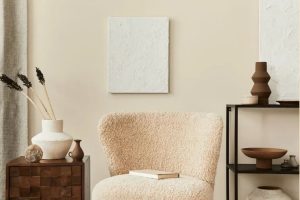
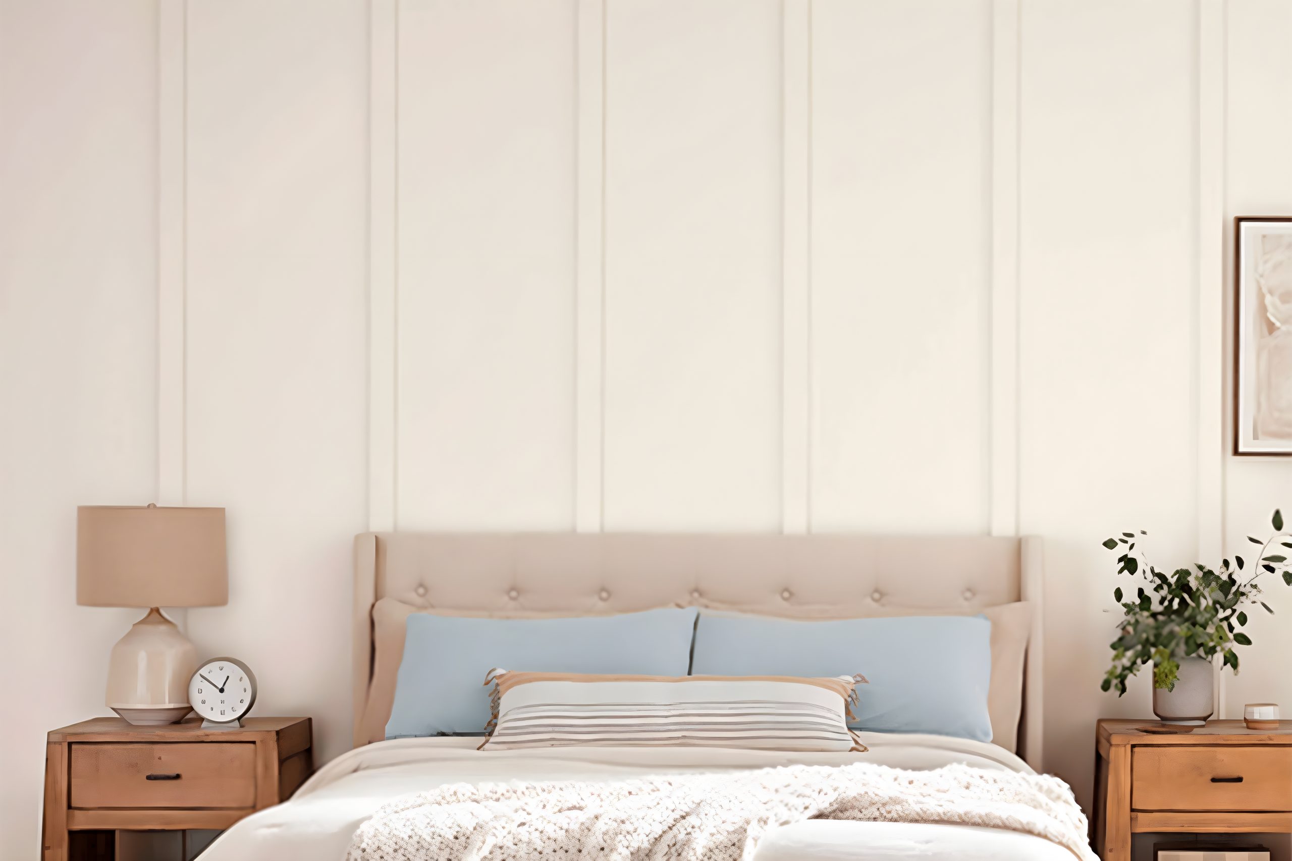
Alabaster by Sherwin Williams is a warm, soft shade of white that brings a gentle luminosity to any space. This color is like a blank canvas, versatile and welcoming, setting a serene backdrop that can either soothe or energize a room depending on how it’s styled.
The beauty of Alabaster lies in its subtle warmth, making it an ideal choice for those seeking a cozy, inviting atmosphere without the starkness often associated with pure white.
Alabaster works marvelously in various interior styles. It is a natural fit for minimalist designs where its simplicity can shine without competition.
In modern farmhouse settings, Alabaster adds a hint of rustic charm, enhancing natural wood elements and textured fabrics. Scandinavian interiors also benefit from its light-enhancing properties, creating bright, airy spaces that feel open and clean.
When it comes to pairing with materials and textures, Alabaster is equally accommodating. It pairs beautifully with natural wood, from light oaks to richer walnuts, highlighting their grain and warmth.
Metals like brass and copper add a touch of elegance against its creamy backdrop, while stone materials such as marble and granite stand out with refined grace.
In terms of texture, Alabaster complements both soft, plush fabrics and rough, rustic ones, allowing for a wide range of decorative flexibility.
Ever wished paint sampling was as easy as sticking a sticker? Guess what? Now it is! Discover Samplize's unique Peel & Stick samples.
Get paint samples

Is Alabaster SW 7008 by Sherwin Williams Warm or Cool color?
AlabasterSW 7008 by Sherwin Williams is a beautiful shade of white that brings a warm and welcoming feel to any room in your home.
Unlike stark whites, Alabaster has a softness to it that helps create a cozy atmosphere, making it perfect for living areas, bedrooms, or even kitchens.
This color has a subtle creamy undertone, which adds a layer of richness and depth that many pure whites lack. One of the great things about Alabaster is its versatility. It can pair well with a wide range of colors, from bold and bright hues to more muted tones, allowing you to create a variety of looks and styles in your home.
Whether you’re going for a modern, minimalist look, a rustic vibe, or something in between, Alabaster can help you achieve your desired aesthetic. Additionally, Alabaster can help make small rooms appear bigger and brighter, as the light reflects off the walls, creating an illusion of more space.
This makes it an excellent choice for smaller homes or rooms that don’t get a lot of natural light. Overall, Alabaster by Sherwin Williams is a fantastic choice for anyone looking to add a touch of warmth and sophistication to their home.
Undertones of Alabaster SW 7008 by Sherwin Williams
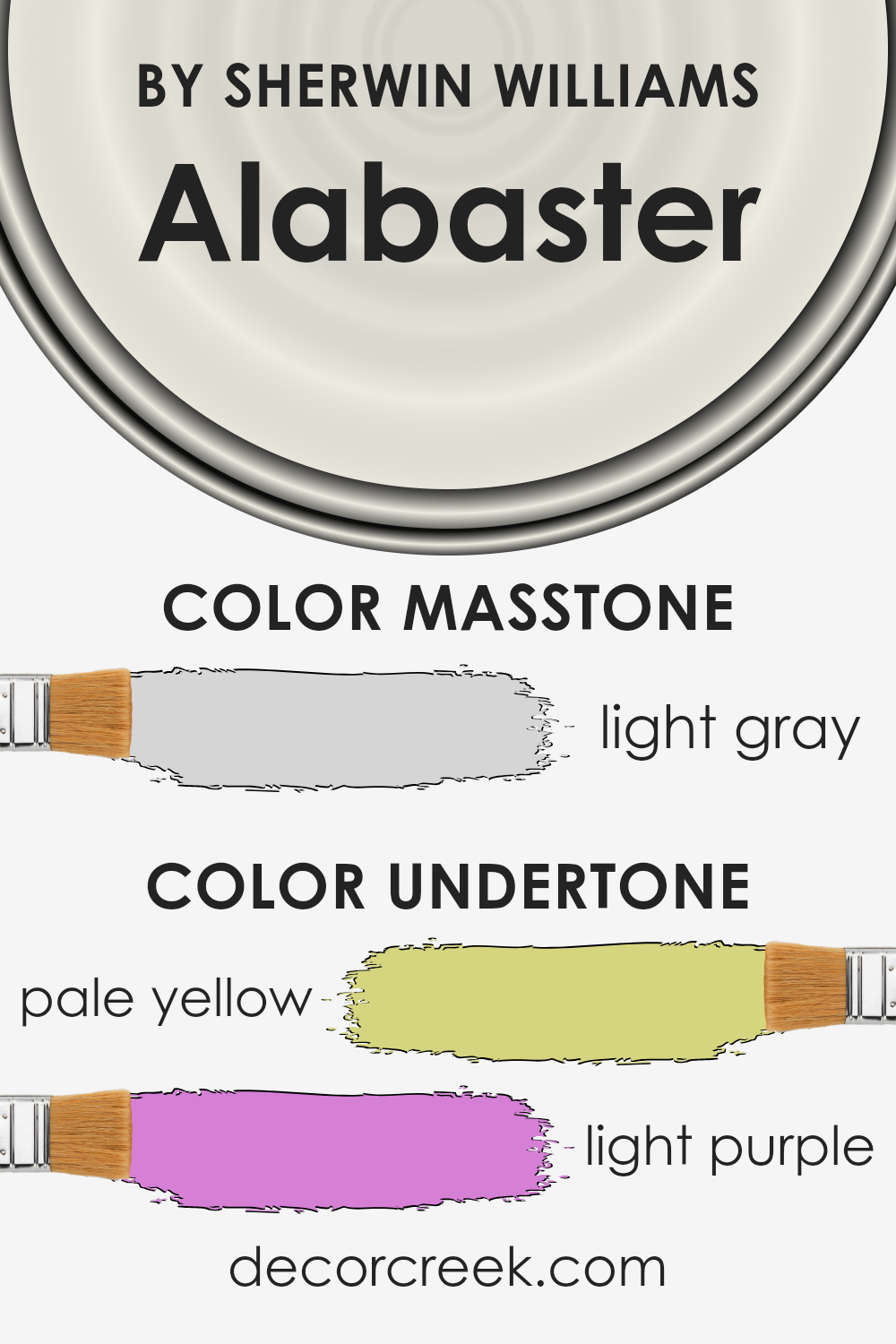
Alabaster, a popular paint color from Sherwin Williams, is known for its creamy, warm hue that brings a soft and comforting feel to any room. This color is not just a simple white; it has subtle undertones that add depth and complexity.
Specifically, Alabaster includes pale yellow and light purple undertones. These undertones play a significant role in how we perceive the color.
Pale yellow undertones give Alabaster a warm and inviting feel. They add a hint of sunshine and brightness to the color, making spaces feel more open and airy.
On the other hand, the light purple undertones bring a touch of sophistication and neutrality. This balance between warmth and coolness makes Alabaster incredibly versatile and appealing.
When Alabaster is applied to interior walls, these undertones influence the ambiance of the room. The pale yellow brings warmth to the space, making it feel cozy and welcoming, perfect for living rooms or bedrooms.
The light purple undertones ensure the color maintains a fresh and tranquil appearance, ideal for creating a serene atmosphere. The way natural and artificial light interacts with Alabaster and its undertones can also impact its appearance, shifting it slightly throughout the day.
This interplay enhances the room’s mood, making Alabaster a favorite for those seeking a subtle yet impactful wall color.
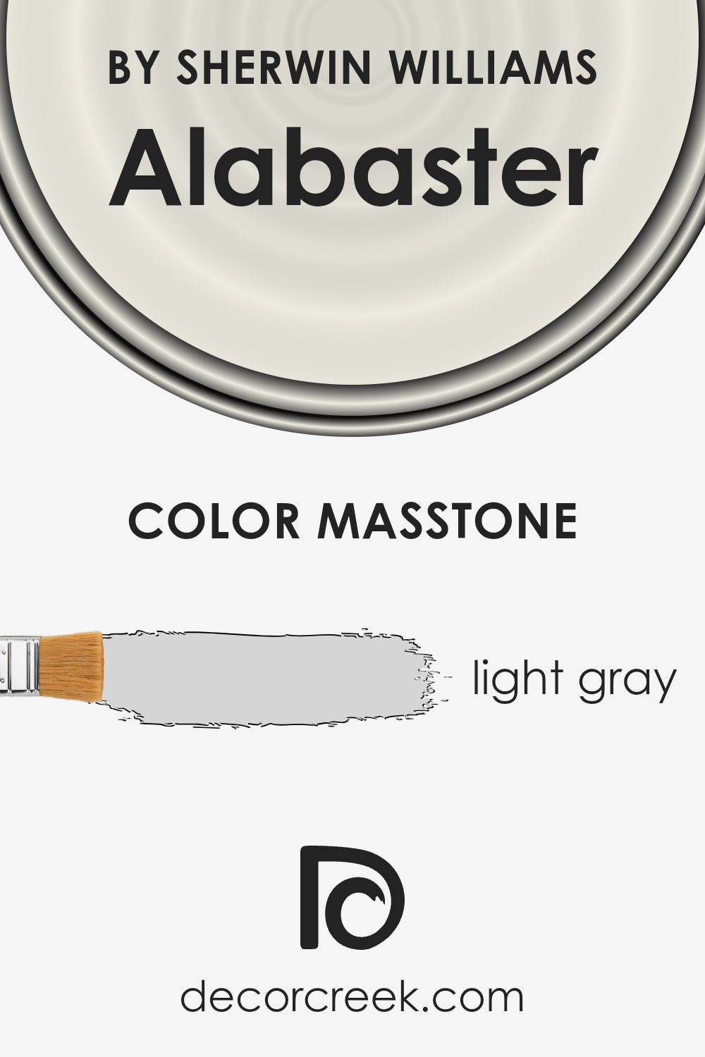
What is the Masstone of the Alabaster SW 7008 by Sherwin Williams?
Alabaster SW 7008 by Sherwin Williams has a masstone of light gray, coded as #D5D5D5. This soft, gentle hue makes it incredibly versatile and appealing for home interiors.
Its light gray aspect means that it brings a fresh, airy feel to spaces, making rooms appear more open and spacious.
This color works exceptionally well in areas that receive lots of natural light, as it helps to enhance the brightness and create a welcoming ambiance.
Since it’s a neutral shade, it pairs easily with a wide variety of colors, from bold and vibrant to soft and subtle, making it a great choice for walls. It serves as a perfect backdrop that allows furniture and decor to stand out.
Furthermore, its simplicity and serenity offer a timeless quality, ensuring that spaces don’t easily go out of style. Whether aiming for a modern, minimalistic look or a cozy, traditional atmosphere, this color’s light gray tone provides a solid foundation that supports various decor choices.
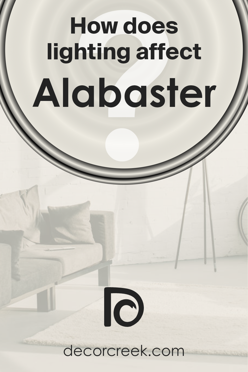
How Does Lighting Affect Alabaster SW 7008 by Sherwin Williams?
Lighting plays a crucial role in how colors appear in any space. Whether it’s the sun’s natural brightness or an artificial light from a bulb, the way colors look can drastically change based on the type and direction of light.
Taking a specific color as an example, let’s consider a popular one like Alabaster from a well-known paint brand. This color is a soft, warm white with a subtle hint of cream and gray, making it versatile and widely appealing.
In natural light, Alabaster tends to show its true color. However, the direction of sunlight can affect its appearance. In rooms facing north, natural light is cooler and more indirect, which can make this color appear slightly more gray.
This can give a serene and calm effect, making it ideal for creating a peaceful space.
South-facing rooms, on the other hand, receive a generous amount of warm, natural light throughout the day.
This can enhance the creamy warmth of the color, making the room feel cozy and inviting. It’s perfect for spaces where you want to add a soft, warm glow. East-facing rooms get bright light in the morning when the sun rises, which can make the color look very vibrant and warm early in the day. As the day progresses, and the natural light dims, the color can take on a softer, neutral appearance.
This makes it a good choice for bedrooms or breakfast nooks, where the morning light can create an energizing start to the day.
West-facing rooms experience the opposite effect. They receive intense light in the late afternoon, which can bring out the warm undertones of the color, making spaces feel welcoming during the evening.
However, in the morning and early part of the day, the color may appear more muted and cooler.
Artificial lighting can also influence how this color looks. Warm-toned bulbs enhance its creamy qualities, making a room feel cozy and inviting, while cooler bulbs might make it lean more towards its subtle gray undertones, giving a crisper look.
Understanding how lighting affects colors, especially a versatile one like Alabaster, can help in making informed decisions when choosing paint colors for any room, ensuring the desired mood and aesthetic are achieved.
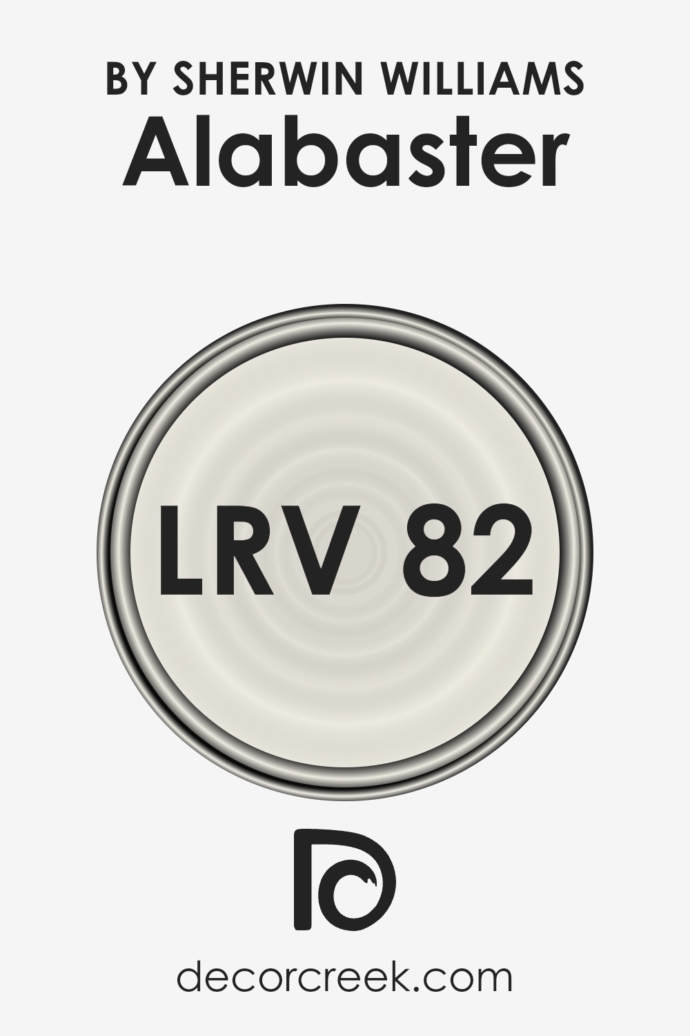
What is the LRV of Alabaster SW 7008 by Sherwin Williams?
LRV stands for Light Reflectance Value, and it plays a crucial role in understanding how colors will look in a space. Essentially, it’s a measurement on a scale from 0 to 100 that indicates how much light a color reflects or absorbs.
A higher LRV means the color reflects more light, making it appear brighter and more open. Conversely, colors with a low LRV absorb more light, which can make a room feel cozier but also darker.
Selecting a paint color with the appropriate LRV can significantly impact the mood and aesthetic of a room, influencing perceptions of size and comfort.
When it comes to the color Alabaster with an LRV of 82.215, it means that it is on the higher end of the scale, reflecting a lot of light. This characteristic makes it a great choice for making spaces appear larger and more inviting, as it brightens up the room.
This lighter shade can also help in spaces that do not receive a lot of natural sunlight, making them feel airy and well-lit.
The high LRV of Alabaster means it is versatile and can be used in various settings, enhancing the sense of space and creating a serene and welcoming atmosphere.
LRV – what does it mean? Read This Before Finding Your Perfect Paint Color
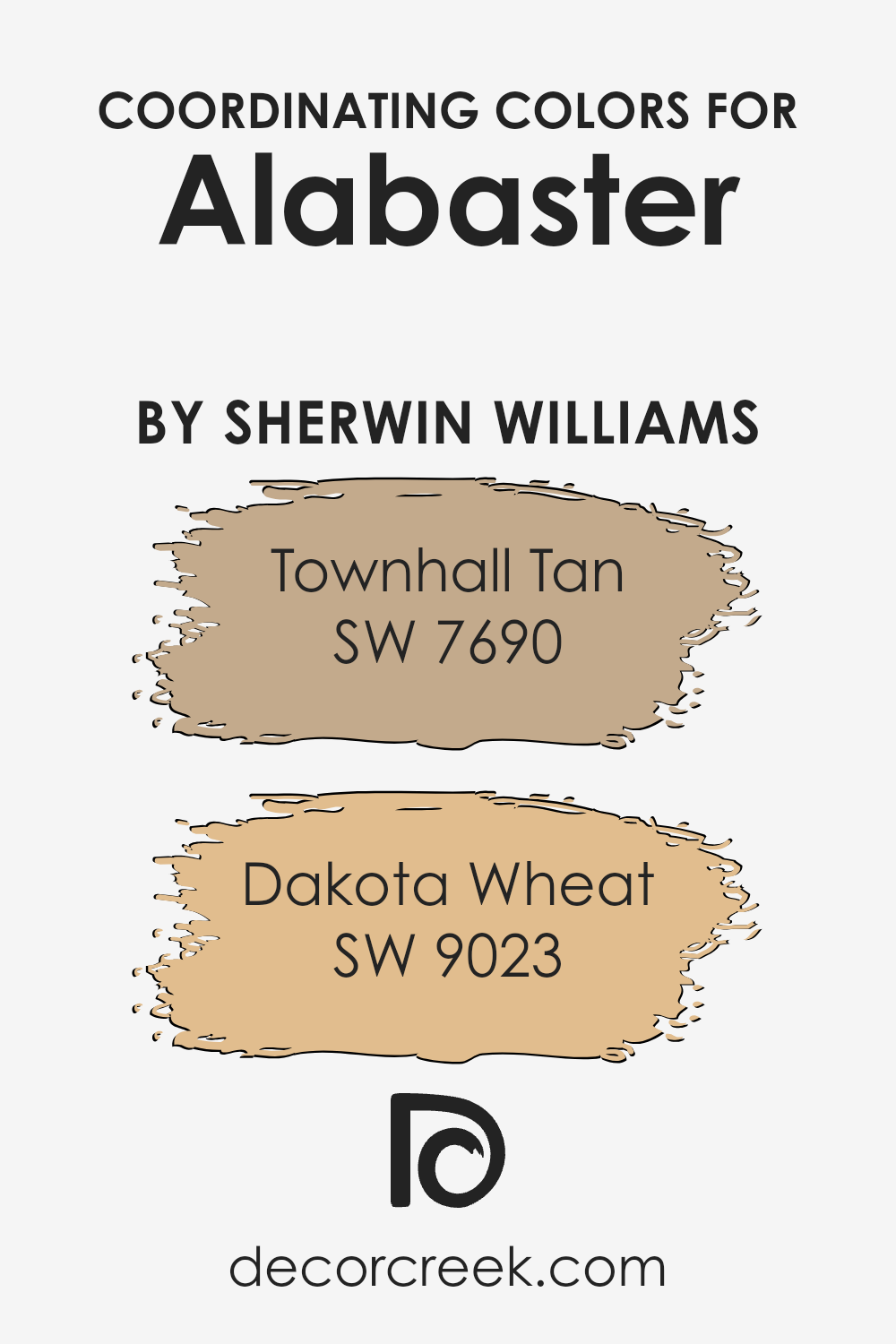
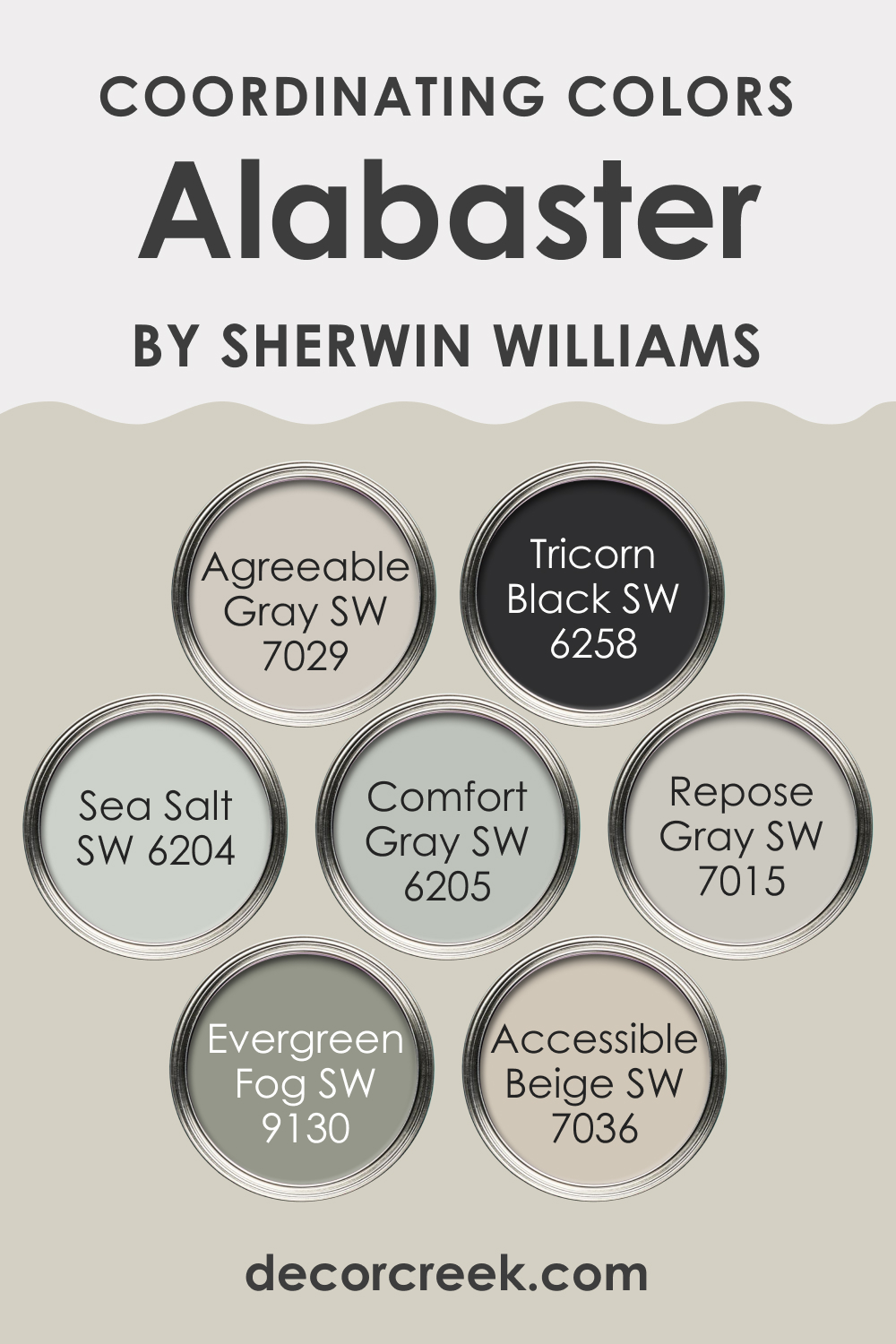
Coordinating Colors of Alabaster SW 7008 by Sherwin Williams
Coordinating colors are essentially colors that work well together. They can either complement or contrast each other to create a visually appealing and cohesive look in any space.
When it comes to colors that coordinate with Alabaster by Sherwin Williams, an off-white with a hint of warmth, two beautiful choices are Townhall Tan and Dakota Wheat.
These colors harmonize well with Alabaster because they share similar undertones, making them a perfect match for anyone looking to create a soothing and cohesive palette.
Townhall Tan is a rich, welcoming hue that brings a sense of calmness and warmth to spaces. It’s like the gentle embrace of a warm, sunny day, offering a perfect balance between coziness and brightness.
This color works well in rooms that seek a touch of earthiness without overwhelming the senses. On the other hand, Dakota Wheat is a lighter, softer tone reminiscent of golden fields under a clear sky.
It injects a fresh and airy feel into spaces, making it an excellent choice for those aiming for a subtle yet impactful look.
Both of these colors, when used alongside Alabaster, provide a seamless transition between spaces, offering a refined and elegant aesthetic that’s both inviting and visually intriguing.
You can see recommended paint colors below:
- SW 7690 Townhall Tan
- SW 9023 Dakota Wheat
Subtle contrast that’s great for open spaces or adjoining rooms. Tricorn Black SW 6258 brings in a bold, dramatic touch, ideal for accents or furniture, adding a striking, modern edge to the softness of Alabaster. Sea Salt SW 6204 and Comfort Gray SW 6205 introduce calming, spa-like blue-green tones that work beautifully with Alabaster for a serene, coastal feel.
Repose Gray SW 7015 provides a cool, neutral backdrop, while Evergreen Fog SW 9130 adds a hint of nature with its muted green tone. Lastly, Accessible Beige SW 7036 offers a warm, grounding element, making it a perfect match for a cozy, inviting space.
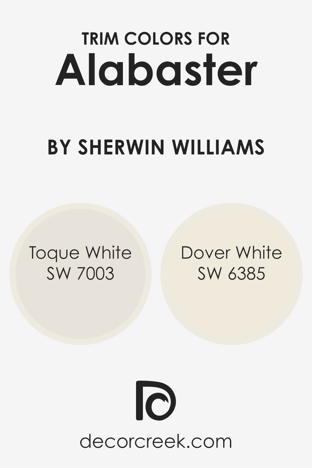
What are the Trim colors of Alabaster SW 7008 by Sherwin Williams?
Trim colors are the hues chosen for the architectural elements and details of a room or exterior, like door frames, window sills, and baseboards. These colors play a vital role in defining and accentuating the overall aesthetic of a space.
When paired with a neutral and soft backdrop like Alabaster by Sherwin Williams, selecting the right trim color becomes crucial.
Alabaster, with its warm, creamy undertones, provides a perfect canvas that allows trim colors to stand out, enhancing the architectural features of a space without overwhelming it.
Opting for a trim color like SW 7003 – Toque White, which is a subtle and slightly warm white, can create a harmonious blend with Alabaster, ensuring the space feels cohesive and inviting.
Toque White offers a gentle contrast, highlighting details without creating a stark divide. On the other hand, SW 6385 – Dover White, with its creamy and almost buttery essence, provides a slightly stronger contrast against Alabaster.
This color enriches the space by adding depth and dimension, making it ideal for someone looking to gently highlight architectural elements while still achieving a unified look.
Both options serve to enhance the beauty of Alabaster in their unique way, making the decision between them a matter of personal preference regarding the degree of contrast and warmth desired in the space.
You can see recommended paint colors below:
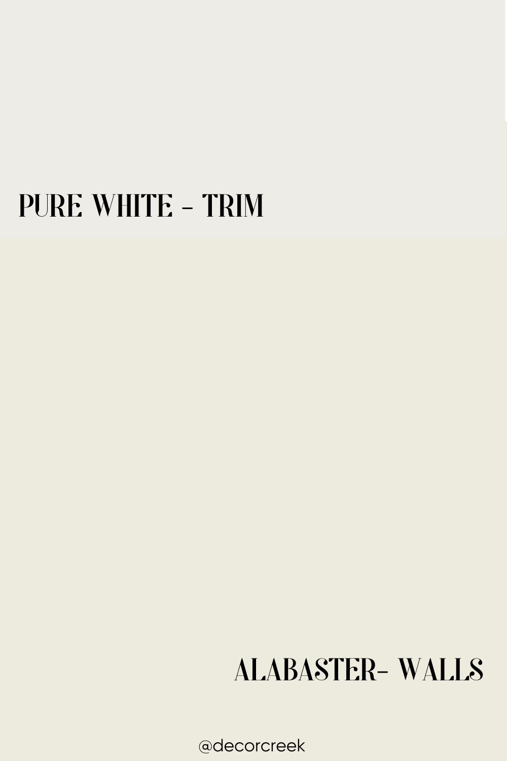
Pairing Alabaster SW 7008 on your walls with Pure White SW 7005 trim creates a timeless, clean, and inviting look.
Alabaster’s soft, warm undertones add a touch of coziness, making the space feel welcoming without being too stark. It’s the perfect backdrop for any room, whether you’re aiming for a modern, farmhouse, or classic style.
Using Pure White for trim, ceilings, or doors adds a crisp, polished finish that enhances the warmth of Alabaster. This combination works wonderfully in living rooms, kitchens, bedrooms, or even bathrooms, delivering a bright and airy feel while maintaining a soft, elegant contrast.
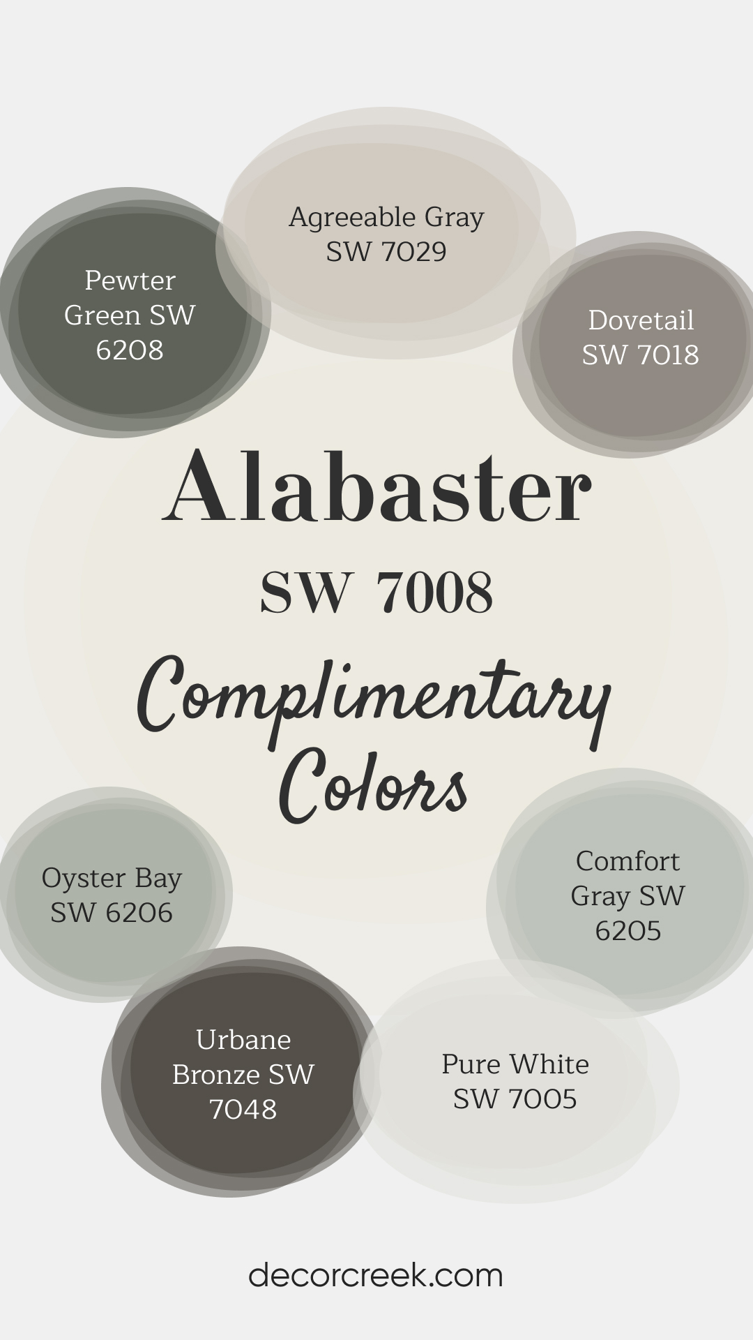
Complimentary Colors for Alabaster SW 7008 by Sherwin Williams
Accessible Beige SW 7036 and Repose Gray SW 7015 are perfect soft neutrals that complement Alabaster SW 7008 beautifully. Accessible Beige brings a warm, inviting touch, while Repose Gray adds a hint of coolness, creating a balanced and serene palette.
For a pop of subtle color, Sea Salt SW 6204 offers a refreshing, light green-blue tone, while Naval SW 6244 introduces a rich, deep navy that pairs elegantly with Alabaster.
Mindful Gray SW 7016 is a versatile gray that works well in any room, adding a modern touch, while Tricorn Black SW 6258 adds drama and sophistication, perfect for accent pieces. Finally, Evergreen Fog SW 9130 infuses a hint of nature, creating a harmonious and timeless look.
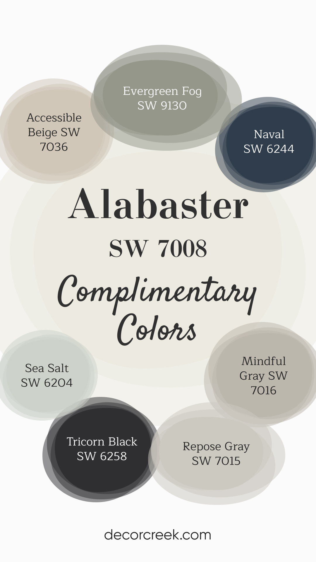
Comfort Gray SW 6205 brings a soft, muted green-blue tone that pairs beautifully with Alabaster SW 7008, creating a calming and serene vibe. Urbane Bronze SW 7048 adds a rich, earthy contrast, making it a great choice for accents or feature walls, adding depth to your space.
For a clean, crisp look, Pure White SW 7005 works wonderfully alongside Alabaster, especially for trim or ceilings. Oyster Bay SW 6206 introduces a soothing, muted green, while Dovetail SW 7018 adds a sophisticated gray-brown touch.
Pewter Green SW 6208 offers a deep, nature-inspired green, and Agreeable Gray SW 7029 rounds out the palette with its soft, warm gray, creating a well-balanced and harmonious color scheme.
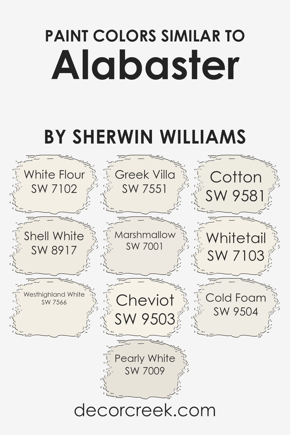
Colors Similar to Alabaster SW 7008 by Sherwin Williams
Choosing similar colors is essential when aiming for a harmonious and cohesive look in any space. Similar shades, like those closely related to Alabaster by Sherwin Williams, work well together because they share a common base but differ slightly in tone, saturation, or brightness.
This slight variation allows for depth and dimension without overwhelming the senses, creating a seamless transition from one area to another.
Colors like White Flour and Shell White, for example, offer subtle differences that can enhance the feeling of space and light in a room. They work by reflecting natural light in slightly varied ways, making the space feel more open and airy.
Further, colors such as Westhighland White and Pearly White add a warm undertone to the mix, providing a cozy and inviting atmosphere.
Meanwhile, Greek Villa and Marshmallow bring in a touch of softness and serenity, perfect for creating a relaxed environment. Cheviot and Cotton lean towards a more neutral palette, offering versatility and simplicity that can easily blend with other decors.
Whitetail and Cold Foam are excellent for those looking to inject a subtle contrast against richer hues or as standalone colors for a minimalist appeal.
By selecting similar colors, you ensure that each room flows beautifully into the next, maintaining a consistent theme and feeling throughout the home.
You can see recommended paint colors below:
- SW 7102 White Flour
- SW 8917 Shell White
- SW 7566 Westhighland White
- SW 7009 Pearly White
- SW 7551 Greek Villa
- SW 7001 Marshmallow
- SW 9503 Cheviot
- SW 9581 Cotton
- SW 7103 Whitetail
- SW 9504 Cold Foam
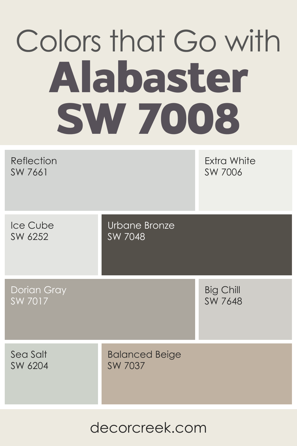
Colors That Go With Alabaster SW 7008 for a Warm and Peaceful Home
Alabaster SW 7008 is one of the softest, warmest whites I use when a room needs comfort without feeling heavy. It brings a gentle glow that works beautifully in living rooms, bedrooms, and kitchens. I love pairing Alabaster with cool, airy shades like Reflection, Extra White, Ice Cube, and Big Chill—these tones help it stay bright and clean. For a deeper, grounding effect, Urbane Bronze or Dorian Gray offer calm contrast that makes Alabaster feel even warmer.
Soft neutrals such as Sea Salt and Balanced Beige add a welcoming touch, giving the room quiet color without taking away from Alabaster’s softness. This shade works beautifully with natural textures, warm wood, and gentle lighting.
When used with thoughtful color partners, Alabaster creates a setting that feels kind, inviting, and easy to enjoy. It is a perfect choice when you want a white that feels warm but still clean enough to carry through an entire home.
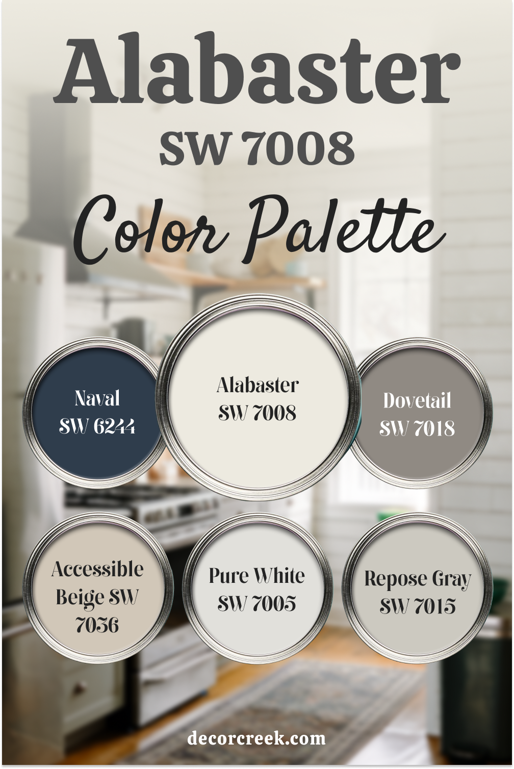
Alabaster SW 7008 Color Palette Forever Neutrals
Alabaster SW 7008 is a beautiful, soft white that pairs wonderfully with various colors to create a balanced and inviting space. When combined with Hale Navy SW 6244, you get a striking contrast that adds depth and sophistication.
Repose Gray SW 7015 and Accessible Beige SW 7036 are great neutrals that work harmoniously with Alabaster, providing a calming and warm backdrop. These shades together make any room feel cozy and stylish. Pure White SW 7005 adds a crisp, clean touch, perfect for trim or ceilings, while Dovetail SW 7018 brings in a deeper, grounded tone.
This combination makes for an elegant and versatile palette that can be used in living rooms, bedrooms, or even kitchens, blending warmth with a touch of classic style.
Alabaster SW 7008 Color Palette Everyday Inspo
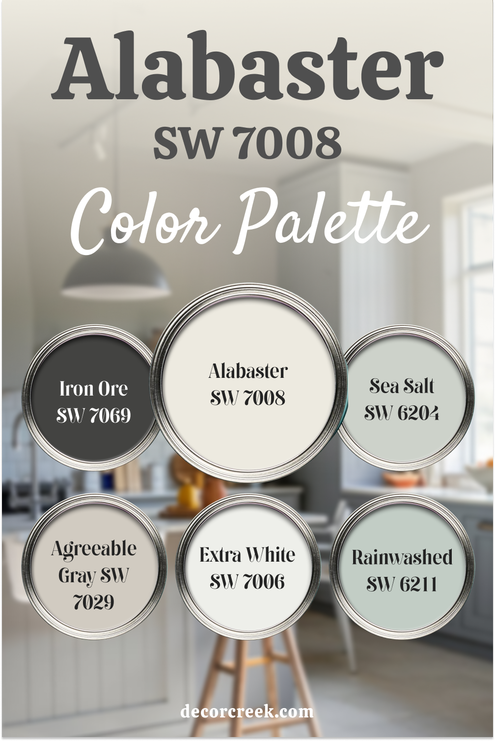
Alabaster SW 7008 shines beautifully when paired with calming, nature-inspired hues. Sea Salt SW 6204 introduces a soft, spa-like green, while Rainwashed SW 6211 adds a hint of refreshing blue, creating a serene and relaxing atmosphere. Iron Ore SW 7069, a deep charcoal, provides the perfect contrast, giving the palette a modern and bold edge.
Agreeable Gray SW 7029 and Extra White SW 7006 add subtle warmth and brightness, making the entire palette versatile and balanced. This combination is perfect for creating a light and airy space with pops of color, ideal for bathrooms, bedrooms, or open living areas, delivering a fresh yet cozy vibe.
Alabaster SW 7008 by Sherwin Williams Color Palette
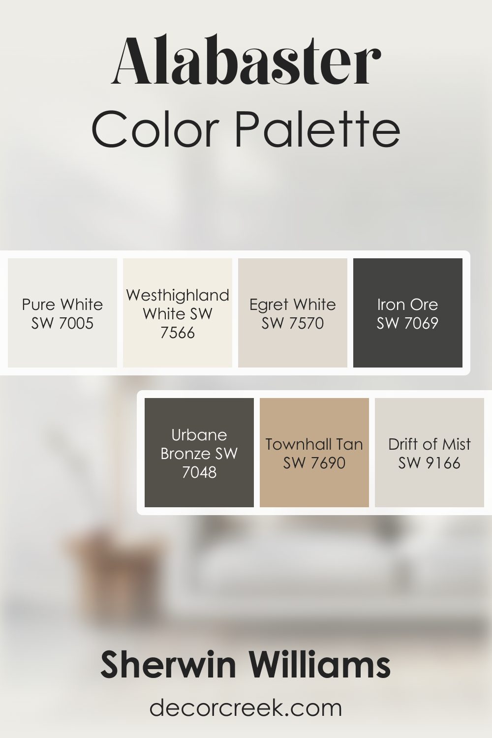
Alabaster always feels comforting to me. It has this creamy glow that makes a room feel cared for and inviting. Pure White adds brightness, giving the palette a clean edge without taking away Alabaster’s warmth. Westhighland White and Egret White create a soft, layered look that feels tender and welcoming. Drift of Mist brings a quiet cool note that balances the warmth beautifully.
For moodier touches, Urbane Bronze and Iron Ore add depth and structure. They bring contrast that feels strong but never harsh.
Townhall Tan adds an earthy grounding tone that pulls everything together with a natural, warm touch.
This palette feels thoughtful and warmhearted. Alabaster leads with its gentle glow, while the supporting colors help build a palette full of comfort, depth, and effortless charm.
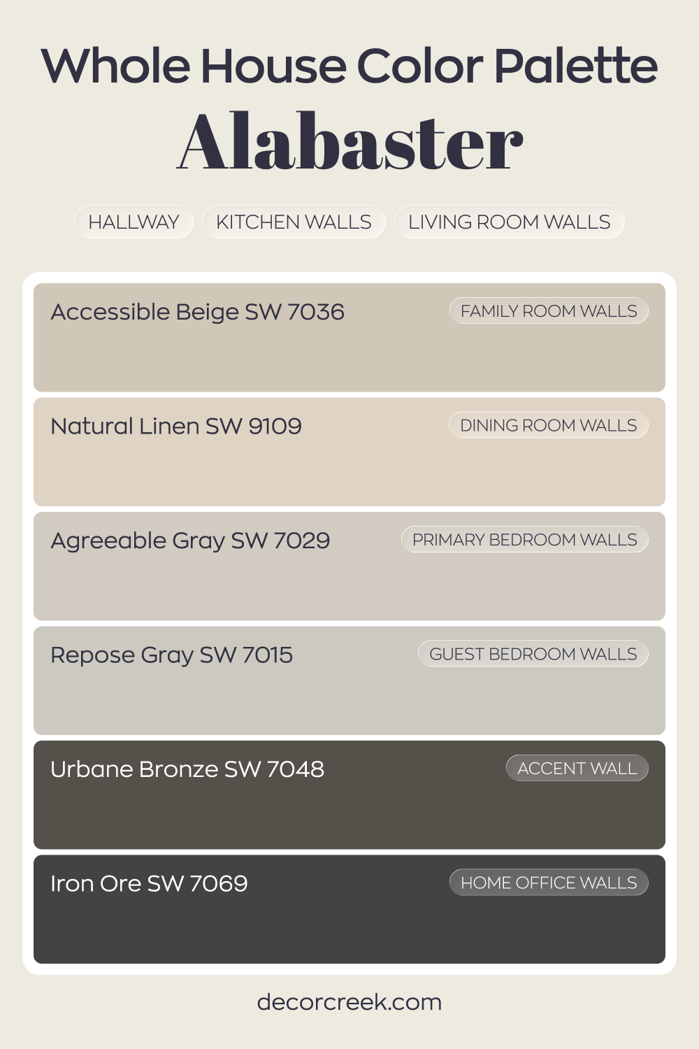
Whole House Paint Color Palette Focused On Alabaster SW 7008
Alabaster SW 7008 sets a soft, welcoming tone through the hallway, kitchen, and living room walls. It pairs beautifully with Accessible Beige in the family room and Natural Linen in the dining room, creating a gentle flow from one area to the next. Together, they keep the main living areas light yet grounded.
Agreeable Gray in the primary bedroom and Repose Gray in the guest bedroom add a balanced, restful feel without feeling cold.
Urbane Bronze on an accent wall brings depth and contrast, giving the house a rich focal point. Iron Ore in the house office adds a bold, confident character that still works with the lighter core palette.
This palette moves from light to dark with intention. Each color supports Alabaster while adding its own personality, so the house feels layered and thoughtfully connected from room to room.
How to Use Alabaster SW 7008 by Sherwin Williams In Your Home?
Alabaster by Sherwin Williams is a popular paint color that brings warmth and a welcoming feel to any home. It’s a soft, creamy white that adds a subtle hint of coziness without overwhelming a space.
This makes it extremely versatile, perfect for almost any room in your house. Whether you’re refreshing your living room, bedroom, or even your kitchen, Alabaster provides a clean, bright base that pairs well with a wide range of other colors and decor styles.
You can use Alabaster on walls for a light and airy feel, or on trim and molding to create a soft contrast with other paint colors.
It’s especially beautiful in spaces with lots of natural light, where it can help enhance the brightness and openness of the room.
Additionally, Alabaster works well as a cabinet color in kitchens or bathrooms, giving a fresh and clean look that’s both modern and timeless.
Incorporating Alabaster into your home is a great way to add a touch of elegance and serenity to your living space. It’s a color that’s easy to live with and complements various design elements, making it a solid choice for anyone looking to refresh their home.
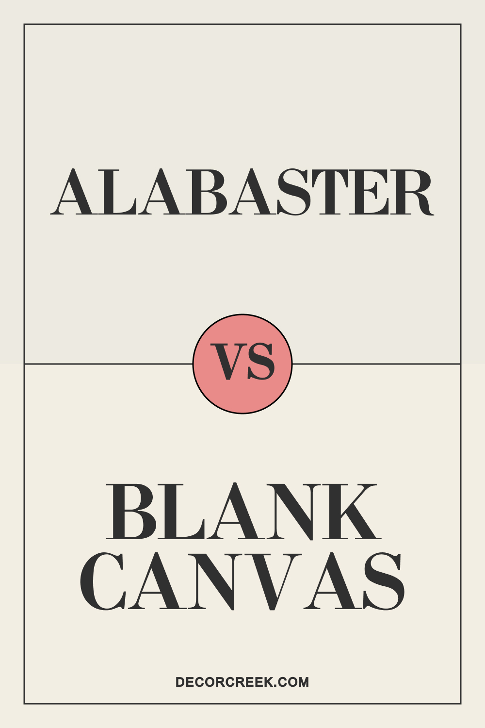
Alabaster SW 7008 by Sherwin Williams vs Blank Canvas DC-003
Alabaster SW 7008 and Blank Canvas DC-003 are two beautiful off-whites that can suit many different styles. Alabaster is a warm white with subtle undertones of cream, giving any space a cozy and welcoming feel. It’s a great option if you want a white that doesn’t feel too cold or clinical.
Blank Canvas DC-003, from Behr, is slightly warmer and has a bit more of a creamy touch, making it feel a bit softer and more traditional. If you’re looking for a color with a bit more warmth, Blank Canvas might be your choice, while Alabaster offers a cleaner, yet still warm, appearance.
You can see recommended paint color below:
-
DC-003 Blank Canvas
Alabaster SW 7008 by Sherwin Williams vs Eider White SW 7014 by Sherwin Williams
Alabaster SW 7008 is known for its warm, creamy undertones that add a touch of softness to any room. It’s a versatile color that works well in spaces where you want a light, cozy, and welcoming feel. This shade pairs nicely with warm wood tones and natural elements.
Eider White SW 7014, however, has cooler undertones with a touch of gray, giving it a more modern, sleek appearance. It’s perfect for spaces where you want a hint of color without it being too overpowering. While Alabaster feels warmer, Eider White offers a cooler, more contemporary vibe.
You can see recommended paint color below:
Alabaster SW 7008 by Sherwin Williams vs Heron Plume SW 6070 by Sherwin Williams
Alabaster SW 7008 brings warmth and comfort with its creamy undertones, making it a versatile choice for rooms where you want a soft, cozy atmosphere. It’s a popular option for creating a bright yet warm environment, especially in living rooms and bedrooms.
Heron Plume SW 6070 is more of a warm gray with subtle taupe undertones, giving it a more sophisticated and muted look. It’s a great choice if you want a bit more depth and character while still maintaining a light and airy feel. Compared to Alabaster, Heron Plume feels slightly cooler and more modern.
You can see recommended paint color below:
Alabaster SW 7008 by Sherwin Williams vs Ivory Lace SW 7013 by Sherwin Williams
Alabaster SW 7008 is a warm, creamy white that adds a touch of softness to any space, making it a popular choice for those seeking a gentle, welcoming white. It pairs beautifully with warm-toned wood, soft fabrics, and other neutral shades.
Ivory Lace SW 7013 is very similar but leans a little more towards the neutral side, with less of the yellow or beige undertones that Alabaster has. This makes Ivory Lace feel a bit cleaner and more classic, while Alabaster tends to be slightly warmer and softer.
You can see recommended paint color below:
Alabaster SW 7008 by Sherwin Williams vs Kestrel White SW 7516 by Sherwin Williams
Alabaster SW 7008 is a light, warm white that feels inviting and pairs well with many other colors. It’s a wonderful option for those who want a white that doesn’t feel too stark or cold, working beautifully in various settings. Kestrel White SW 7516 has more beige undertones and feels warmer and richer compared to Alabaster.
It’s great for spaces where you want a little more warmth and depth. While Alabaster offers a softer, brighter look, Kestrel White adds a bit more warmth and color to the room.
You can see recommended paint color below:
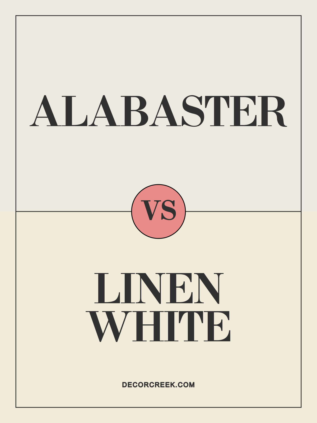
Alabaster SW 7008 by Sherwin Williams vs Linen White 912 by Benjamin Moore
Alabaster SW 7008 is a warm, off-white shade that gives any room a soft, cozy, and welcoming atmosphere. It’s an ideal choice for those who want a light, airy feel without the coolness of pure white. Its creamy undertones make it a popular pick for various styles. Linen White 912, from Benjamin Moore, is warmer with a touch more yellow and beige.
It feels richer and more traditional, adding a sense of warmth to any space. If you’re looking for a more classic, warm look, Linen White is a great option, while Alabaster provides a softer, less yellow appearance.
You can see recommended paint color below:
-
Linen White 912
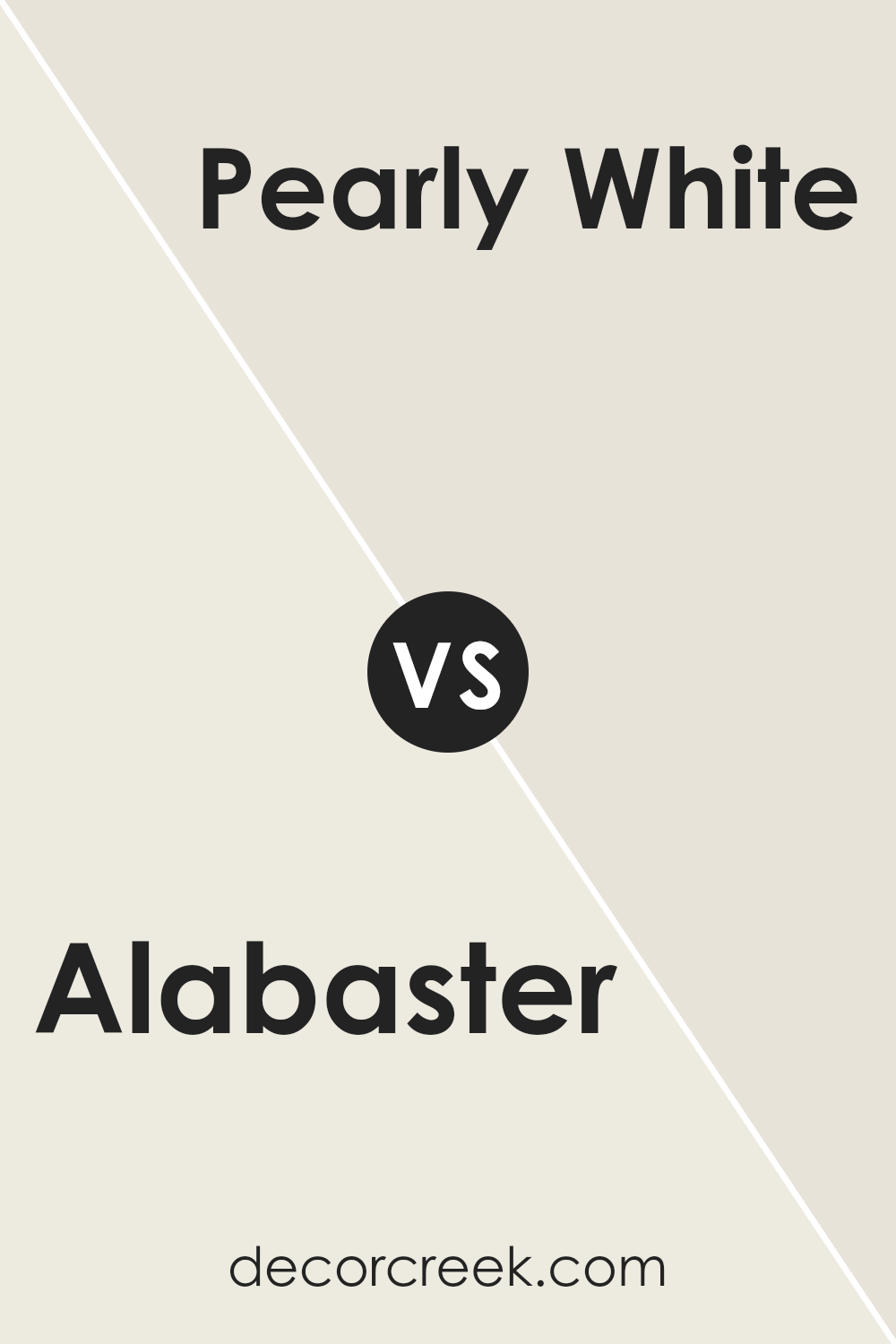
Alabaster SW 7008 by Sherwin Williams vs Pearly White SW 7009 by Sherwin Williams
Alabaster and Pearly White, both from Sherwin Williams, are popular choices for those wanting to brighten their spaces with a soft, inviting vibe. Alabaster stands out with its warm, creamy tone that offers a cozy and timeless look.
It’s perfect for creating a calm and welcoming atmosphere in any room. On the other hand, Pearly White leans towards a cooler palette, giving off a subtle hint of gray.
This coolness brings a fresh, serene quality that can make small spaces appear bigger and brighter.
Both colors work well in various lighting conditions, but Alabaster’s warmth is better suited for spaces where a snug, soothing feel is desired, while Pearly White is ideal for achieving a crisp, clean aesthetic.
Whether you’re decorating a sunny kitchen or a north-facing bedroom, choosing between Alabaster and Pearly White depends on the mood you wish to set and the natural light in your space.
You can see recommended paint color below:
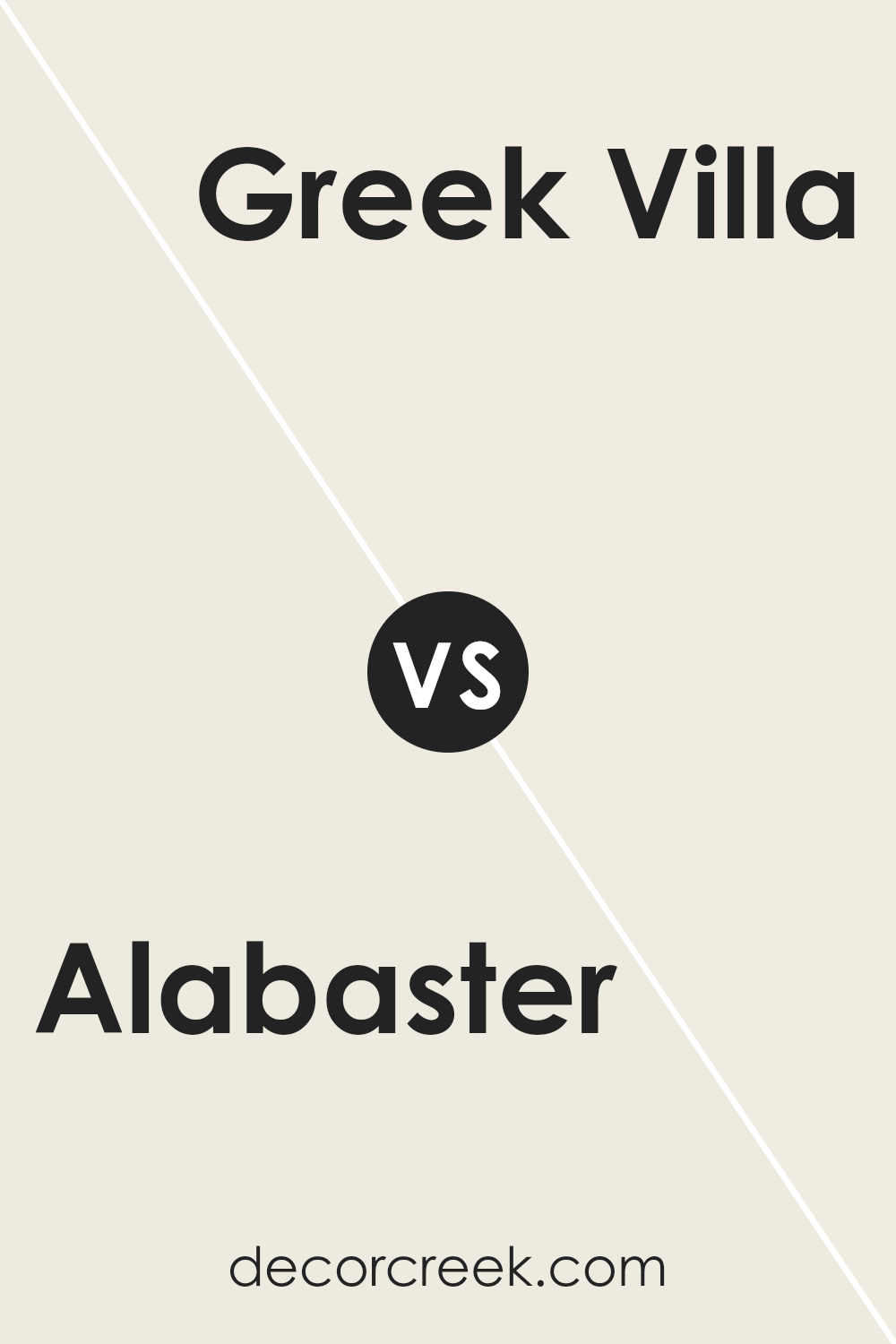
Alabaster SW 7008 by Sherwin Williams vs Greek Villa SW 7551 by Sherwin Williams
Alabaster and Greek Villa, both by Sherwin Williams, are popular choices for those looking to bring a warm and inviting feel to their space.
Alabaster, a soft, almost pure white with subtle hints of cream, offers a gentle warmth that can make any room feel welcoming and cozy without overwhelming it with color.
On the other hand, Greek Villa has a slightly warmer tone, leaning towards a soft, off-white with a whisper of beige. This gives it a bit of a richer feel compared to Alabaster, making spaces feel bright yet very homey.
Both colors are incredibly versatile and can be used in various settings, from modern to traditional designs, contributing to their popularity.
While Alabaster provides a clean, minimalistic look, Greek Villa adds a touch of warmth, making a room feel more lived-in. Choosing between them depends on the desired balance between warmth and brightness in your space.
You can see recommended paint color below:
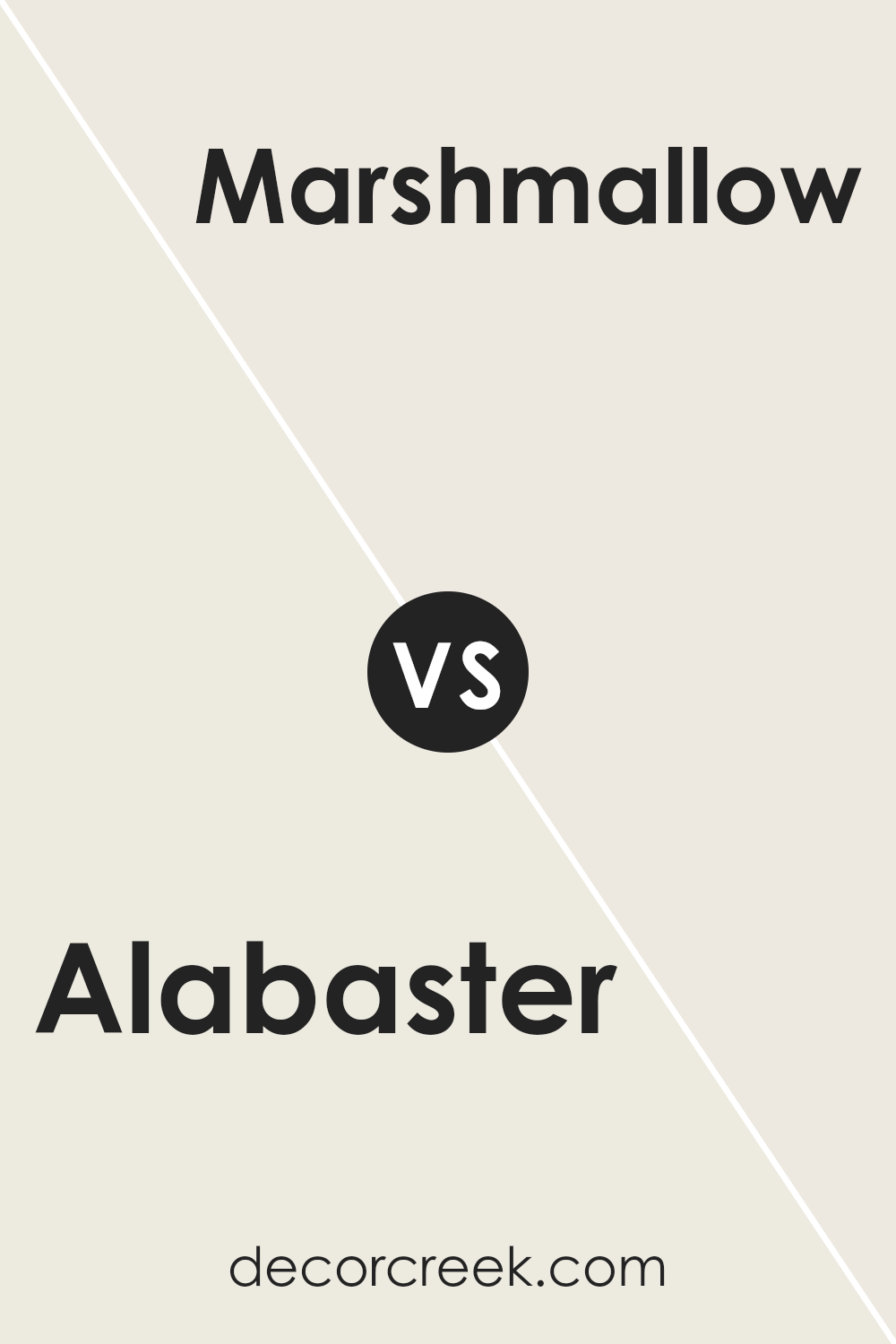
Alabaster SW 7008 by Sherwin Williams vs Marshmallow SW 7001 by Sherwin Williams
Alabaster and Marshmallow are two popular shades by Sherwin Williams, but they have subtle differences. Alabaster is a warm, soft white with a hint of beige, giving it a cozy and welcoming feel.
It’s perfect for creating a serene and inviting atmosphere in any room, reflecting light beautifully without being too stark. On the other hand, Marshmallow leans more towards a pure white, offering a clean and crisp look.
It’s ideal for spaces where you want to add brightness without the warmth that Alabaster brings. Marshmallow can make a room feel more spacious and airy, whereas Alabaster adds a touch of warmth, making a space feel more intimate.
Both colors are incredibly versatile and can work well in a variety of settings, from traditional to modern. Choosing between them depends on the mood you want to create and how much warmth or coolness you prefer in your whites.
You can see recommended paint color below:
Alabaster SW 7008 by Sherwin Williams vs Cotton SW 9581 by Sherwin Williams
Alabaster and Cotton, both colors from Sherwin Williams, offer a subtle yet distinctive vibe to spaces. Alabaster is a soft, warm white with a hint of creaminess that gives it a welcoming and soothing appearance.
t reflects light beautifully, making spaces look airy and open, perfect for someone looking for a classic look that’s not too stark.
On the other hand, Cotton is also a white, but with a crisper, cleaner feel. It leans more towards a pure white without being cold, making it ideal for a modern and minimalistic design.
Cotton works well in spaces that aim for a bright and fresh look, as it adds a lively and vibrant touch.
When comparing the two, Alabaster offers warmth and coziness, making it great for living rooms or bedrooms where comfort is key.
Cotton, conversely, provides a clean slate, offering a more flexible backdrop for bold colors or artwork, making it excellent for kitchens or bathrooms.
Regardless of your choice, both colors bring their unique charm to interiors.
You can see recommended paint color below:
- SW 9581 Cotton
Alabaster SW 7008 by Sherwin Williams vs Cheviot SW 9503 by Sherwin Williams
Alabaster and Cheviot are two colors by Sherwin Williams that have their own unique appeal. Alabaster is a soft, warm white that brings a sense of calmness and simplicity to any room.
It’s a versatile color, perfect for creating a bright and airy space. It acts like a canvas, allowing other colors in the decor to shine. On the other hand, Cheviot brings a different vibe.
It’s a deeper, richer color that combines gray with earthy tones, giving it a more anchored feel. While Alabaster opens up a space with its lightness, Cheviot adds depth and sophistication, making it great for adding character.
Both colors are beautiful in their own right, with Alabaster leaning towards simplicity and brightness, and Cheviot offering a more grounded and complex look.
Choosing between them depends on the atmosphere you want to create; Alabaster for openness and light, Cheviot for depth and richness.
You can see recommended paint color below:
- SW 9503 Cheviot
Alabaster SW 7008 by Sherwin Williams vs Cold Foam SW 9504 by Sherwin Williams
Alabaster and Cold Foam are two colors from Sherwin Williams that share a subtle elegance, but they each bring their own unique vibe to a space. Alabaster is a warm, soft white with a creamy touch that adds a cozy, inviting feel to any room.
It’s like the perfect white that’s not too stark or harsh, making spaces feel more open and airy without losing that sense of warmth.
On the other hand, Cold Foam steps in with a cooler, slightly grayish tone. It’s a fresh, modern white that leans more towards a minimalist and sleek look.
This color is great for those who want to add a crisp, clean atmosphere to their space, making it feel more spacious and organized.
While both colors are versatile and can blend beautifully with different decor styles, Alabaster tends to bring a more comforting and homely feel, ideal for living rooms or bedrooms.
Cold Foam, with its cooler undertone, is perfect for creating a sharp, contemporary feel, especially suitable for kitchens, bathrooms, or modern living spaces.
Each color, in its own right, offers a unique way to brighten and enhance a space, depending on the vibe you’re going for.
You can see recommended paint color below:
- SW 9504 Cold Foam
Alabaster SW 7008 by Sherwin Williams vs Shell White SW 8917 by Sherwin Williams
Alabaster and Shell White, both by Sherwin Williams, present subtle differences that cater to varied design preferences. Alabaster stands out with its slightly gray undertone, offering a warm, yet not overly creamy, appearance.
This color is perfect for spaces where a soft, welcoming feel is desired without the starkness of pure white. In contrast, Shell White leans towards a cleaner, crisper look.
It skews closer to pure white but maintains a hint of warmth, preventing it from becoming too stark or cold. While both colors are excellent choices for creating a light, airy feel in a room, Alabaster provides a touch of coziness and depth, making spaces feel more inviting.
Shell White, on the other hand, is ideal for those seeking a fresher, brighter aesthetic. The choice between them depends on the specific ambience one wishes to achieve in their space.
You can see recommended paint color below:
Alabaster SW 7008 by Sherwin Williams vs Westhighland White SW 7566 by Sherwin Williams
Comparing Alabaster and Westhighland White, both from Sherwin Williams, gives us a fascinating insight into how subtle differences in paint can change the vibe of a room.
Alabaster is a soft, slightly warm white that brings a gentle, inviting atmosphere to spaces. It’s like a cozy blanket in paint form, perfect for creating a calm and serene environment.
It’s not stark or cold; instead, it has just enough warmth to be welcoming.
On the other hand, Westhighland White steps it up a notch in the warmth department. It’s a bit richer and creamier than Alabaster, giving rooms a more pronounced cozy feel.
Imagine Westhighland White as Alabaster’s slightly more outgoing sibling, offering that hint of warmth that can make a space not just look but feel sunlit and cheerful, even on a gloomy day.
While both colors are beautiful and versatile, your choice between them depends on the specific ambiance you’re aiming for.
Alabaster leans towards a neutral, clean backdrop, whereas Westhighland White adds warmth, making spaces feel more enclosed and homey.
You can see recommended paint color below:
Alabaster SW 7008 by Sherwin Williams vs White Flour SW 7102 by Sherwin Williams
Alabaster (SW 7008) and White Flour (SW 7102) by Sherwin Williams are both popular choices for those looking to bring a fresh and light feel to their space.
Alabaster is a soft, creamy white with a hint of warmth, making it a great choice for creating a cozy and welcoming atmosphere without feeling too yellow or beige.
It’s versatile, working well in many areas of the home, from living rooms to bedrooms, providing a gentle backdrop that’s soothing and inviting.
On the other hand, White Flour is a bit brighter and cleaner in appearance. It leans more towards a pure white, offering a more straightforward, crisp vibe.
This makes it excellent for spaces that aim for a sharp, clean look, or where the goal is to make other colors in the décor stand out. White Flour works especially well in modern, minimalist settings or when aiming to maximize natural light.
Both colors offer their unique charm and can significantly impact a space depending on what you want to achieve.
Whether you’re looking for warmth and coziness with Alabaster or a crisp, clean feel with White Flour, either choice brings its own beautiful qualities to a home.
You can see recommended paint color below:
Alabaster SW 7008 by Sherwin Williams vs Whitetail SW 7103 by Sherwin Williams
Alabaster and Whitetail are both popular choices by Sherwin Williams, each bringing its unique vibe to spaces. Alabaster is a soft, creamy white that leans towards a warm tone.
It’s not stark or cold; instead, it brings a cozy, welcoming feel to rooms. Its subtle warmth means it pairs beautifully with a wide range of colors, making it a versatile option for any space, adding a soft, inviting ambiance without overwhelming the senses.
On the other hand, Whitetail is a cleaner, brighter white. It has a more neutral tone, making it perfect for creating a fresh, crisp look.
If you’re after that classic, bright white space that feels open and airy, Whitetail is the way to go. It’s especially great in spaces where you want to maximize natural light or in more modern settings where a sharp, clean look is desired.
Both Alabaster and Whitetail offer unique qualities – Alabaster’s warm, inviting feel versus Whitetail’s crisp, bright ambiance. Your choice depends on the mood you’re aiming to achieve in your space.
You can see recommended paint color below:
Alabaster (SW 7008) vs Jogging Path (SW 7638)
Alabaster is a warm, creamy white that feels light and welcoming. Jogging Path is a medium greige with a quiet green cast and more presence.
Choose Alabaster for airy walls and trim; choose Jogging Path when you want deeper color and clearer outlines.

In conclusion, Alabaster by Sherwin Williams stands out as a versatile and timeless paint color that can refresh and brighten various spaces in the home.
Its warm yet neutral tone provides a perfect backdrop for both modern and traditional interior designs, making it a go-to choice for homeowners and designers alike.
Its ability to pair well with a wide range of colors and textures means it offers endless possibilities for creating inviting and cozy environments.
Moreover, the popularity of Alabaster highlights its ability to adapt to different lighting conditions, enhancing the ambiance of a room without overwhelming it.
This makes it an excellent choice for creating a serene and welcoming atmosphere in living spaces, bedrooms, and beyond.
Whether you’re looking to update a single room or revamp your entire home, Alabaster by Sherwin Williams offers a solid foundation to build upon, promising a chic and harmonious look that stands the test of time.
Ever wished paint sampling was as easy as sticking a sticker? Guess what? Now it is! Discover Samplize's unique Peel & Stick samples.
Get paint samples