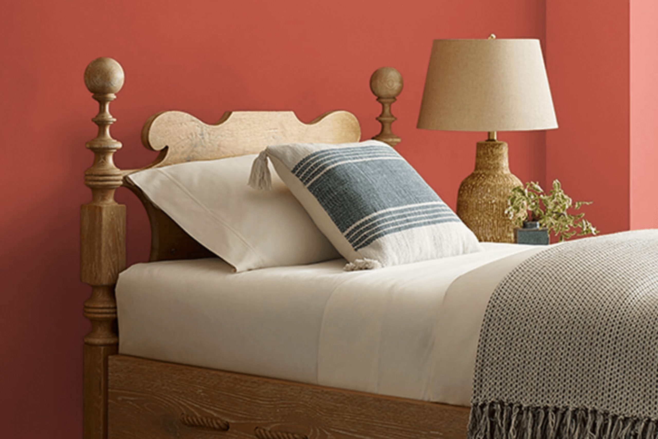
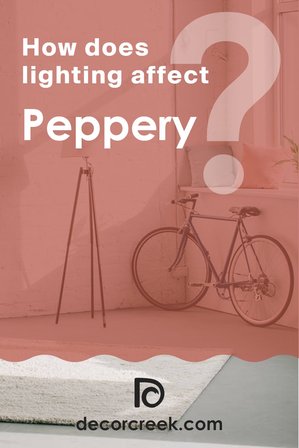
I recently came across SW 6615 Peppery by Sherwin Williams and wanted to share my thoughts on this unique paint color. Peppery is exactly what you might imagine—it’s a bold, vibrant shade that packs a punch and instantly adds personality to any area.
I found that its deep, warm undertones make it incredibly adaptable, suitable for a cozy living room, a dynamic office area, or even an accent wall that really needs to stand out.
Whether you’re looking to refresh a single room or revamp your entire home, consider how Peppery could add a dramatic flair to your decorating scheme. It pairs well with neutral shades, allowing it to shine without feeling too much for the senses.
Let’s talk about how to best use this color to its full potential in your home projects.
What Color Is Peppery SW 6615 by Sherwin Williams?
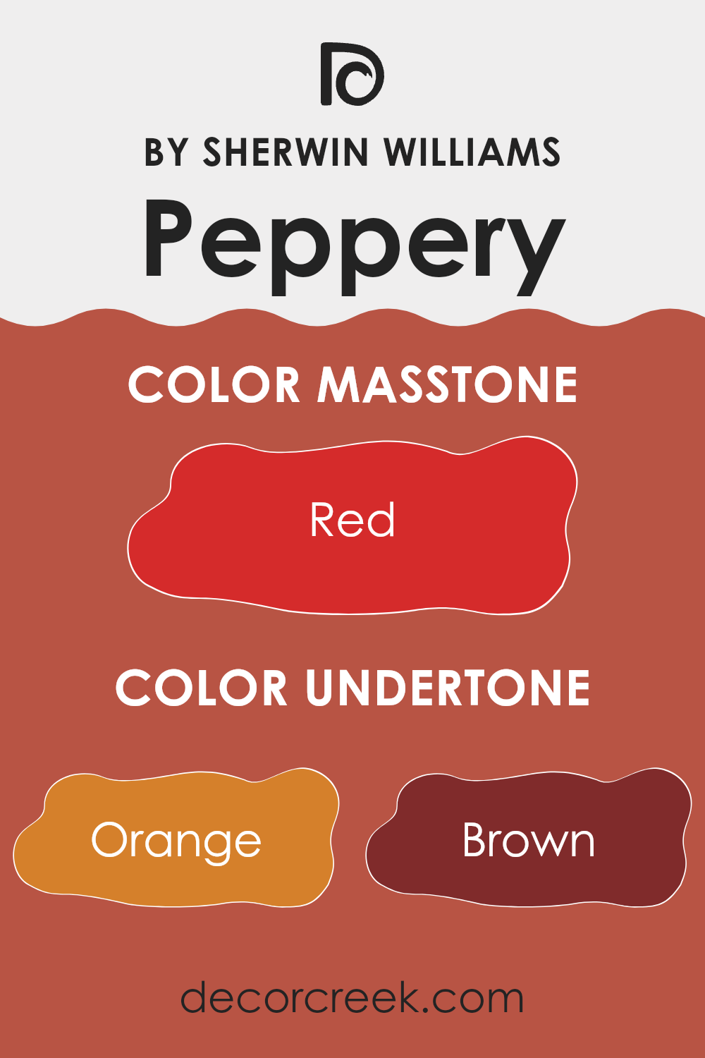
Peppery by Sherwin Williams is a vibrant and bold red hue that adds a punch of energy to any area. This lively color has a slightly orange undertone, making it warm and inviting. It’s a fantastic choice for adding a striking pop of color in areas that require a bit of dynamism and cheer.
Peppery works exceptionally well in modern and eclectic interior styles where bold colors are celebrated. It can brighten up rooms such as kitchens, dining rooms, or living areas where activity and interaction are frequent. This color is also suitable for a cozy reading nook, providing a lively backdrop that stimulates the mind.
As for pairing materials and textures with Peppery, consider natural wood finishes that can soften its intensity while maintaining an earthy touch. Lighter woods like oak and maple are particularly effective. Incorporating textiles like soft linen or velvety cushions can also balance its vivacity, making the environment more comfortable and inviting.
Metals like brushed nickel and matte black work well in fixtures and furniture details, creating a modern look that complements Peppery’s boldness. To enhance its warmth, integrating elements like woven rattan or creamy leather can add depth and stylish charm, making any area feel well-coordinated and stylish.
Is Peppery SW 6615 by Sherwin Williams Warm or Cool color?
PepperySW 6615 by Sherwin Williams is a vibrant and warm shade of red that adds a lively touch to any room. This color is great for making a bold statement in areas like the living room or dining area.
Its rich tone works well on an accent wall, drawing attention and serving as a focal point in the area. When combined with neutral shades like white or gray, PepperySW 6615 really stands out, enhancing the overall appeal of the area.
In well-lit rooms, this color looks bright and welcoming, but in rooms with less natural light, it can create a cozy, intimate feel. This makes it quite adaptable depending on the existing light conditions in your home. Using this color in a home can add warmth and energy, making areas more inviting and lively. Perfect for anyone wanting to add some personality to their home’s design.
Undertones of Peppery SW 6615 by Sherwin Williams
Peppery is a vibrant and dynamic paint color that can shift its appearance depending on the lighting and surrounding colors because of its diverse undertones. With hints of orange, brown, olive, pink, pale pink, purple, and grey, the undertones play a significant role in how the color is perceived.
Undertones are subtle colors that lurk beneath the surface of a more prominent color. They can influence whether a color feels warm or cool and how it pairs with other colors in an area. For instance, if a color has orange or brown undertones, it might appear warmer, making a room feel cozy. Conversely, undertones like grey or olive might make a color look cooler, which can make an area feel more open and airy.
In interior walls, Peppery, with its rich blend of undertones, provides adaptability. In a room with ample natural light, the orange and pink undertones might make the walls appear lively and warm. In dimmer, artificial light, the brown and olive might become more dominant, giving the room a grounded, earthy feel.
This chameleon-like feature of Peppery allows it to adapt to different styles and themes, making it a suitable choice for various rooms, from a vibrant living room to a cozy study. This adaptability means it can also serve as a backdrop for various furniture colors and textures, enhancing the overall aesthetic of an area.
What is the Masstone of the Peppery SW 6615 by Sherwin Williams?
Peppery SW 6615 by Sherwin Williams is a vivid red color with a masstone of #D52B2B. This deep, bold shade brings a strong, energetic vibe to any room. When used in homes, the rich red hue can create a cozy and warm feeling, perfect for social areas like living rooms and dining areas.
It’s a color that draws attention and can serve as a focal point in a design. However, because of its intensity, it’s important to balance it with neutral tones such as whites, grays, or even soft browns to keep the atmosphere from becoming too much.
This color works well in areas that could use a splash of warmth and where you want to add some personality. It’s especially nice during cooler months, making rooms feel more inviting. Red tones like Peppery also stimulate conversation and appetite, making them great choices for kitchens and dining rooms.
How Does Lighting Affect Peppery SW 6615 by Sherwin Williams?
Lighting plays a critical role in how we perceive colors. The type of light and its intensity can change the appearance of a color dramatically. This is especially important to consider when choosing paint colors for a room.
Taking the color Peppery as an example, which is a vivid shade, its appearance can vary under different lighting conditions. In artificial light, such as LED or incandescent bulbs, Peppery might appear warmer and more vibrant, making it lively and striking. This can create a cozy and inviting atmosphere, especially in living areas or areas where energy and warmth are desired.
In natural light, however, Peppery can look quite different. Natural sunlight exposes the true essence of the color, which might be less intense than it appears under artificial lighting. This can be beneficial in areas that receive a lot of daylight, as the color will feel dynamic and change subtly throughout the day depending on the light’s intensity and angle.
The orientation of the room also affects how Peppery is perceived:
- North-faced rooms: These rooms get less direct sunlight, making them cooler in tone. Here, Peppery may seem slightly muted and less intense, giving a softer appearance.
- South-faced rooms: These receive more sunlight, making the color appear brighter and more vibrant. It’s a great place for Peppery if you’re looking to energize the area.
- East-faced rooms: With morning light, Peppery will look bright and cheerful in the morning but might lose some of its vibrancy as the day progresses and lesser light enters the room.
- West-faced rooms: The color can offer a warm and welcoming glow in the afternoon and evening as the sun sets, perfect for living rooms or dining areas.
Overall, when choosing colors like Peppery for your home, consider the type of lighting and the room’s orientation to ensure the color works harmoniously in its intended environment.
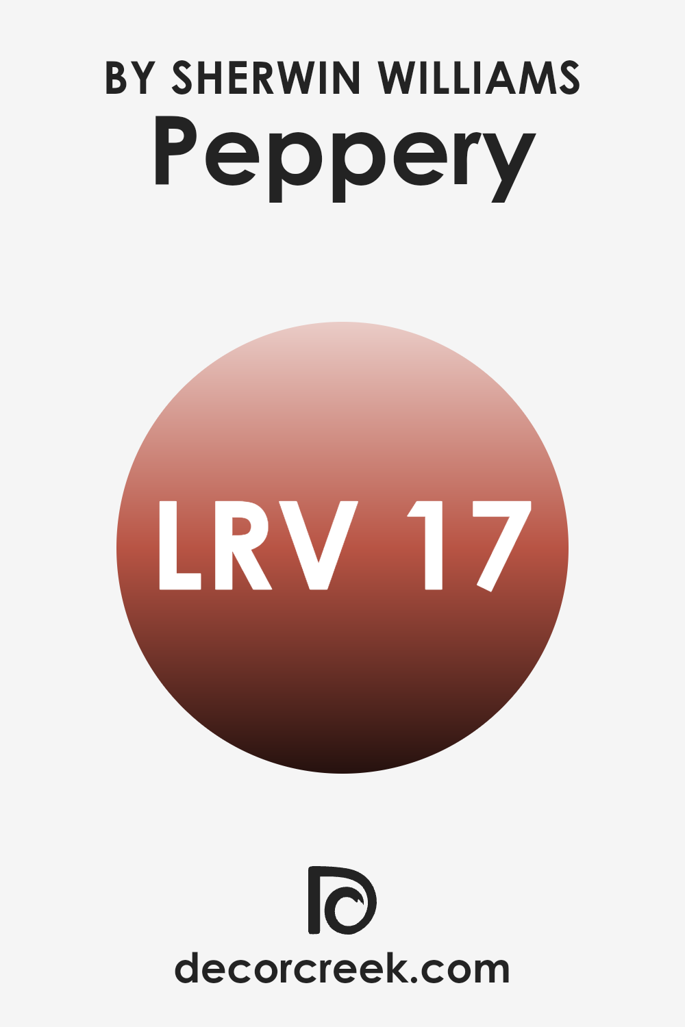
What is the LRV of Peppery SW 6615 by Sherwin Williams?
LRV stands for Light Reflectance Value, which is a measure used in the paint industry to indicate the amount of visible and usable light that a paint color reflects off a surface when it’s hit by natural sunlight or an artificial light source. This value is expressed on a scale from 0 to 100 (black to white), with lower numbers meaning the color reflects less light and absorbs more, making it appear darker.
Understanding LRV can be really helpful when choosing paint colors for your rooms, as it gives you an idea of how light or dark the color will look on your walls. In the case of the color with an LRV of 16.941, such as a deep, rich shade, it’s on the lower end of the scale, indicating that it reflects only a small fraction of light.
This means it will look darker on your walls and can make areas feel more enclosed or cozy. Because of its low LRV, it might be best suited for larger, well-lit areas or as an accent color where you want to create a sense of warmth or depth. In smaller or poorly lit rooms, using a color with such a low LRV might make the room appear smaller and darker.
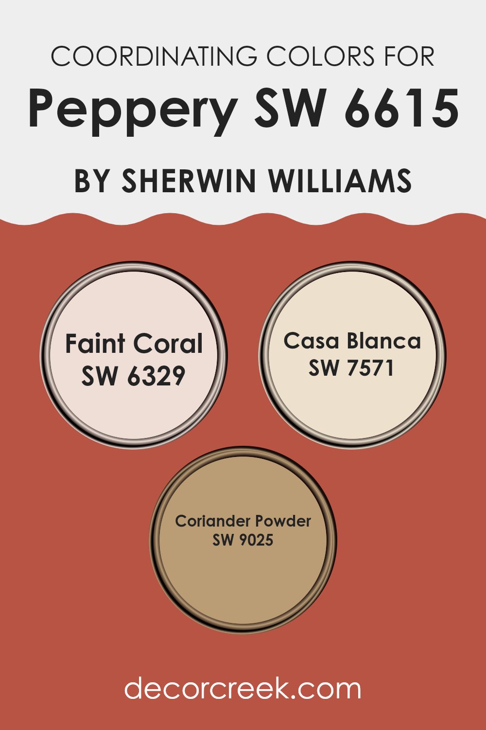
Coordinating Colors of Peppery SW 6615 by Sherwin Williams
Coordinating colors are shades that complement a main color, creating a visually appealing scheme. These colors balance each other either by enhancing the primary hue or by providing a subtle contrast. When working with a distinctive shade like Peppery from Sherwin Williams, it’s important to select coordinating colors that harmonize with its intensity and tone.
This coordination enhances the overall ambiance of an area, making it more cohesive and visually pleasing. For instance, Faint Coral is a soft, warm hue that pairs beautifully with bolder shades. It adds a gentle touch of brightness, making it a great option for creating a welcoming and lively environment.
Casa Blanca, on the other hand, is a neutral off-white that offers a clean and calming backdrop, allowing more vibrant colors to stand out without overpowering the area. Lastly, Coriander Powder is a muted, earthy tone that works well to ground the color scheme, providing a subtle link between the more intense and softer tones in the palette. Together, these colors complement the vibrant Peppery, ensuring a balanced and aesthetically pleasing look.
You can see recommended paint colors below:
- SW 6329 Faint Coral
- SW 7571 Casa Blanca
- SW 9025 Coriander Powder
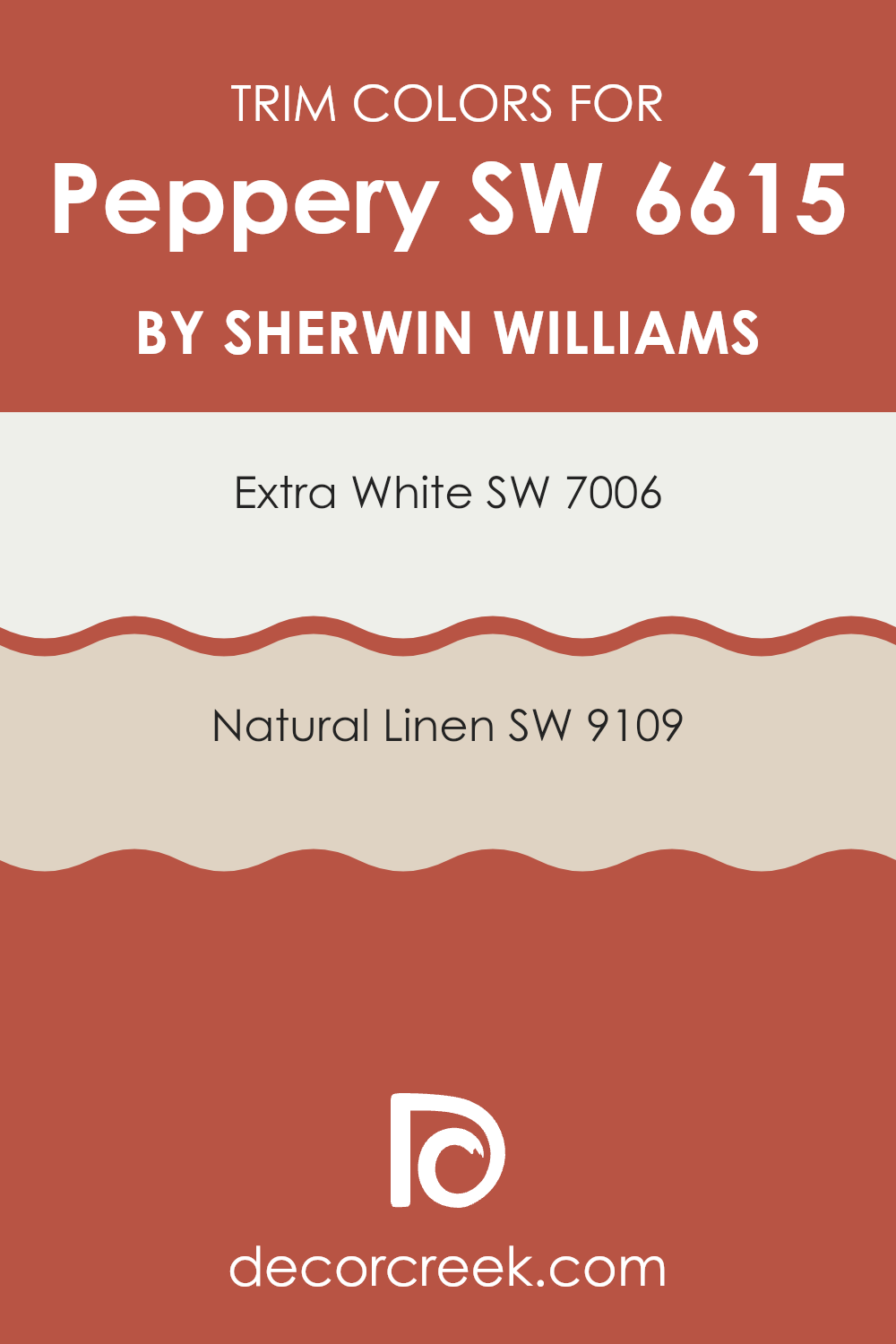
What are the Trim colors of Peppery SW 6615 by Sherwin Williams?
Trim colors are used to accentuate and frame the primary paint colors on walls, emphasizing architectural details such as doors, window frames, and baseboards. Choosing the right trim color can greatly enhance the overall appearance of a room, providing contrast that defines the areas between different sections and highlights the unique elements of a building’s structure.
For a bold color like Peppery by Sherwin Williams, trim colors like Extra White and Natural Linen are excellent choices as they can soften the strong hue of the primary wall color, creating a pleasing balance within the area.
Extra White by Sherwin Williams is a bright and clean shade, ideal for making bolder colors stand out while refreshing the area with a crisp appearance. It works particularly well in rooms with plenty of natural light. On the other hand, Natural Linen offers a warmer option with its subtle, creamy tone that brings warmth to the surroundings without overpowering the main color. This shade pairs nicely with the spiciness of Peppery, ensuring that the ambiance remains balanced and welcoming.
You can see recommended paint colors below:
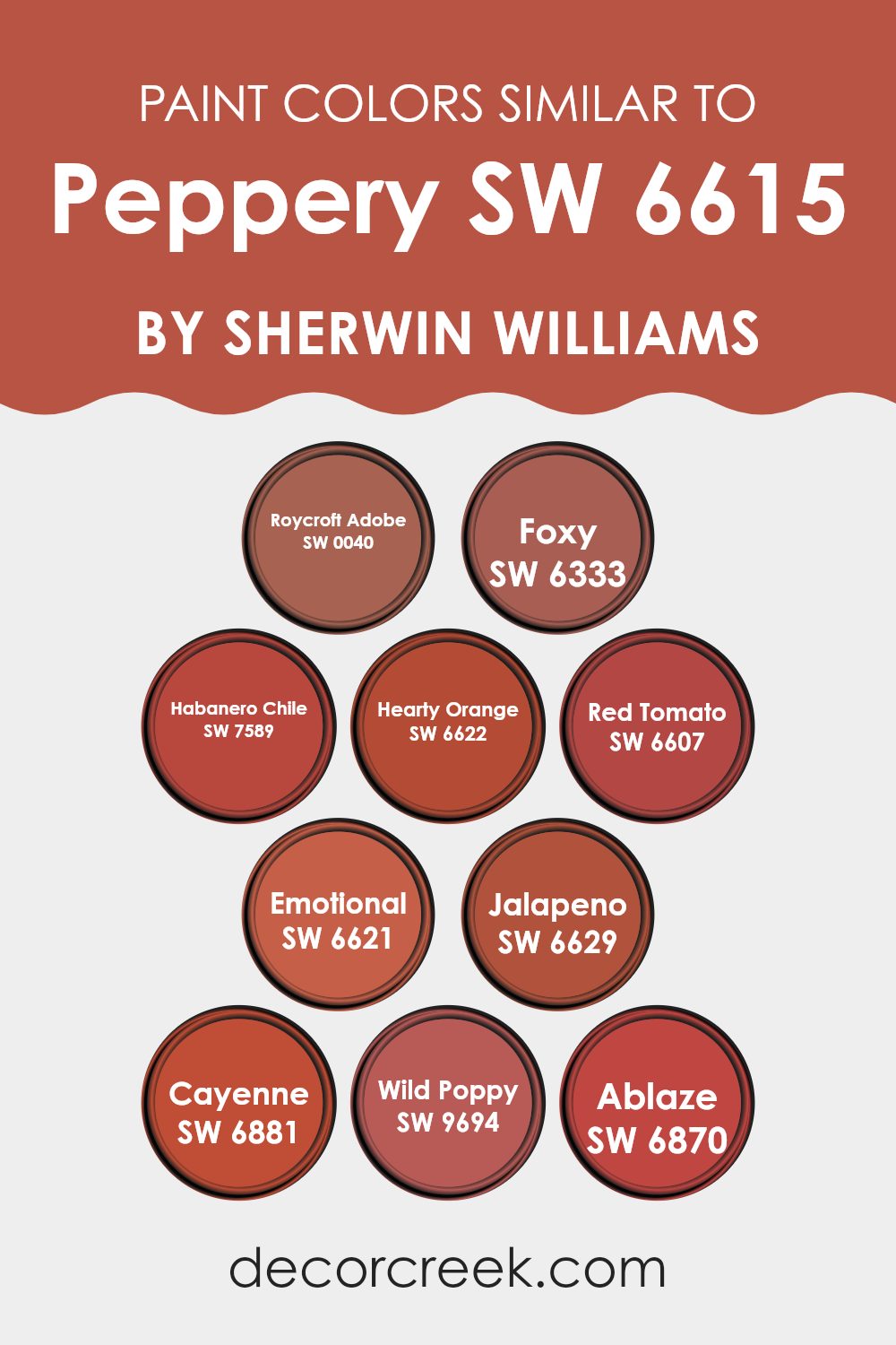
Colors Similar to Peppery SW 6615 by Sherwin Williams
When selecting colors for a room, choosing a palette with similar hues can create a harmonious and visually pleasing environment. Colors like Roycroft Adobe, Foxy, Habanero Chile, Hearty Orange, and Red Tomato share a warm, vibrant energy that can make areas feel welcoming and energetic.
These shades, which range from earthy terracotta to fiery reds, can work beautifully together to offer a cohesive look. They are ideal for creating an area that feels alive yet unified, often used in kitchens, dining rooms, or any area meant for lively gatherings. Continuing with a similar theme, colors like Emotional, Jalapeno, Cayenne, Wild Poppy, and Ablaze present a lovely spectrum from deep, moody oranges to bright and punchy reds.
Emotional offers a subdued, yet rich orange hue that complements the more intense shades like Jalapeno, a slightly spicy green that adds an unexpected pop to the group. Cayenne heats things up with its fiery red-orange, while Wild Poppy brings a jubilant reddish tone to the mix. Ablaze rounds out this selection with its bold, bright red, perfect for accenting an area with dynamic bursts of color. Together, these colors can animate any interior design scheme, providing depth and a sense of continuity.
You can see recommended paint colors below:
- SW 0040 Roycroft Adobe
- SW 6333 Foxy
- SW 7589 Habanero Chile
- SW 6622 Hearty Orange
- SW 6607 Red Tomato
- SW 6621 Emotional
- SW 6629 Jalapeno
- SW 6881 Cayenne
- SW 9694 Wild Poppy
- SW 6870 Ablaze
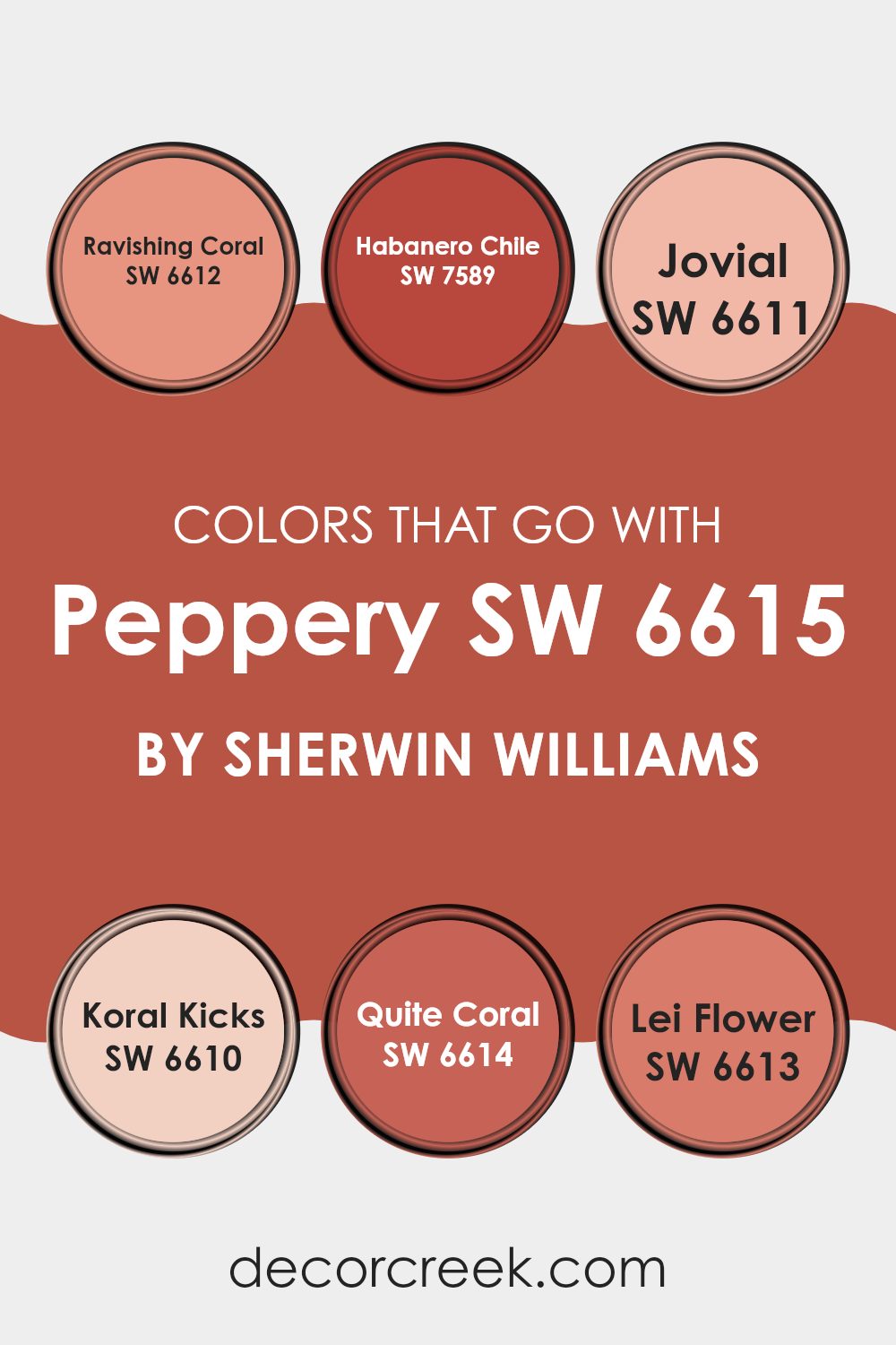
Colors that Go With Peppery SW 6615 by Sherwin Williams
Choosing the right colors to match with Peppery SW 6615 by Sherwin Williams is crucial because it helps create a cohesive look in any area. Peppery itself is a vibrant, deep shade with a fiery personality that needs complementary colors that can either balance or enhance its intensity.
For instance, pairing it with tones like Ravishing Coral or Jovial brings out a lively and cheerful atmosphere, ideal for areas where energy and warmth are desired. On the other hand, using deeper or contrasting colors like Habanero Chile adds a dramatic flair, making it perfect for areas where a striking visual impact is sought.
Ravishing Coral is a bright, spirited coral shade that injects a playful, youthful vibe into interiors, great for a children’s room or a creative area. Next, Habanero Chile, a bold red with orange undertones, offers a robust color that’s perfect for adding a statement to any room. Jovial is a soft peach hue that spreads a light, friendly air, wonderful for living areas or bedrooms where a calm and inviting atmosphere is important.
Koral Kicks is another coral variant that’s slightly more subdued than Ravishing Coral but still brings a fresh, lively feel. Quite Coral and Lei Flower lie at the softer end of the spectrum, with Quite Coral providing a muted, more understated coral and Lei Flower introducing a touch of pink, ideal for a gentle, floral-inspired look. These colors all work together to highlight different moods and settings, making Peppery and its coordinating shades adaptable choices for diverse decorating needs.
You can see recommended paint colors below:
- SW 6612 Ravishing Coral
- SW 7589 Habanero Chile
- SW 6611 Jovial
- SW 6610 Koral Kicks
- SW 6614 Quite Coral
- SW 6613 Lei Flower
How to Use Peppery SW 6615 by Sherwin Williams In Your Home?
Peppery SW 6615 by Sherwin Williams is a vibrant shade of red that adds a lively touch to any room. This color is ideal if you want to create a cozy and welcoming area. It works well in areas like the kitchen or dining room, where it can encourage a warm, social atmosphere.
For a striking contrast, pair it with lighter colors like white or cream, especially for trim or cabinetry. This will balance the intensity of Peppery and keep your area feeling open and bright. If you’re considering using this color in a larger area, you might want to try it on just one accent wall.
This way, you add a pop of color without feeling too much in the entire room. In a bedroom or living room, using Peppery for throw pillows or other decorations against a more neutral background can also introduce color without committing to painting an entire wall. This flexibility makes Peppery a useful choice for adding personality and warmth to your home.
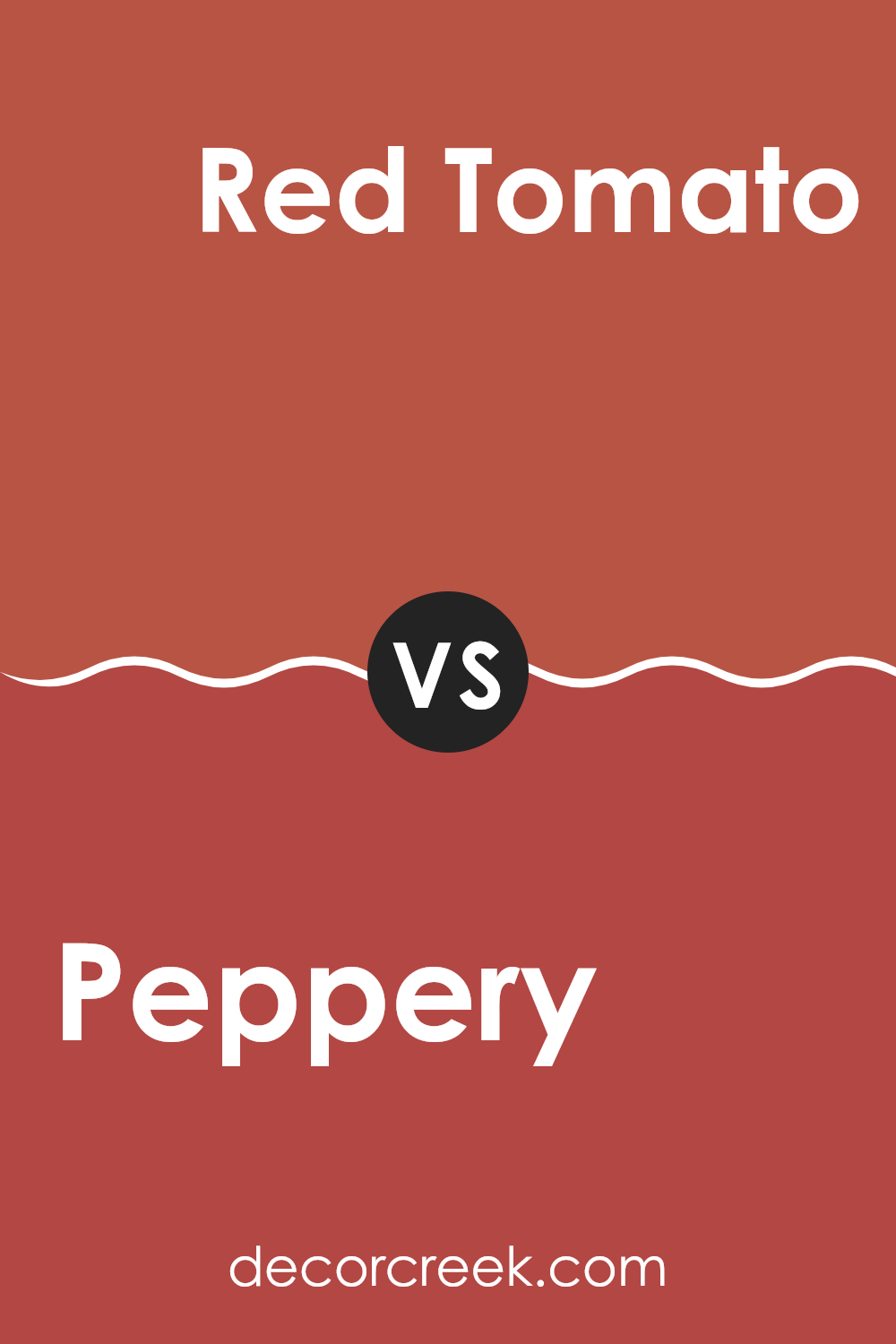
Peppery SW 6615 by Sherwin Williams vs Red Tomato SW 6607 by Sherwin Williams
Peppery and Red Tomato by Sherwin Williams are both vibrant colors, but they have distinct tones that set them apart. Peppery is a deep, bold red with a hint of maroon that gives it a warm, cozy quality.
It’s a color that feels very inviting and works well in areas where you want to create a friendly and welcoming atmosphere. On the other hand, Red Tomato is a brighter, more eye-catching shade of red.
This color has a lively, energetic feel to it, making it perfect for areas where you want to add some excitement and cheerfulness. While Peppery leans towards a more muted, understated vibe, Red Tomato stands out with its vividness. Both colors can add significant charm to a room, but the choice between them depends on whether you prefer a softer approach or a more striking impact.
You can see recommended paint color below:
- SW 6607 Red Tomato
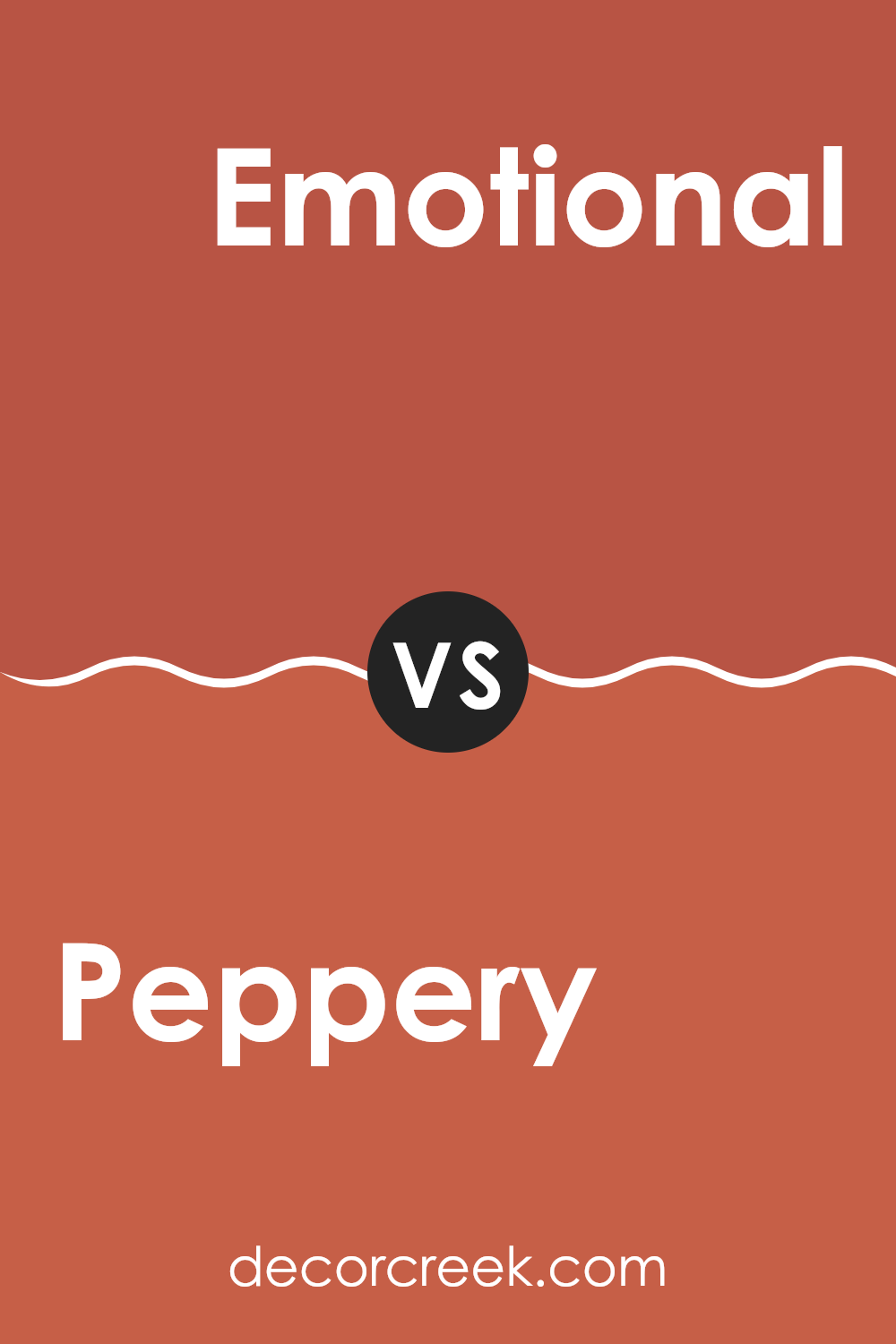
Peppery SW 6615 by Sherwin Williams vs Emotional SW 6621 by Sherwin Williams
Peppery and Emotional, both from Sherwin Williams, offer distinct vibes for any area. Peppery is a strong, vibrant red that adds a bold energy to rooms. It’s the type of color that can create a lively and cozy atmosphere, perfect for social areas like living rooms or dining areas.
In contrast, Emotional is a soft blush pink that brings a gentle, soothing feel. It’s great for environments where you want calm and minimalism, such as bedrooms or reading corners. This hue adds a touch of warmth without being overpowering, and pairs well with neutral tones for a balanced look.
Together, these two colors can complement each other beautifully, with Peppery providing a dynamic punch and Emotional offering a subtle backdrop. Used in a balanced manner, they can enhance the ambiance of any home, making areas more appealing and comfortable.
You can see recommended paint color below:
- SW 6621 Emotional
Peppery SW 6615 by Sherwin Williams vs Wild Poppy SW 9694 by Sherwin Williams
Peppery and Wild Poppy are two distinct shades offered by Sherwin Williams. Peppery is a deep red with a dash of brown, giving it a warm and cozy feel. It resembles the spice it’s named after, making it a great choice for creating a welcoming atmosphere in areas like living rooms or dining areas.
On the other hand, Wild Poppy is a vibrant and cheerful red. This color is much brighter and more energetic, drawing the eye and making a bold statement. It’s perfect for accent walls or areas where you want to inject a sense of excitement and cheerfulness.
Both colors, though red, offer different vibes—Peppery brings warmth and subtlety, while Wild Poppy adds a punch of liveliness and fun. Each color would work well in different home styles and could be used to achieve various looks, from cozy and traditional to bold and modern.
You can see recommended paint color below:
- SW 9694 Wild Poppy
Peppery SW 6615 by Sherwin Williams vs Habanero Chile SW 7589 by Sherwin Williams
Peppery and Habanero Chile are both red tones from Sherwin Williams, but they present unique moods and intensities that set them apart. Peppery is a softer, more muted red with a pinkish undertone, making it adaptable and relatively subdued. This color works well in areas where you want a touch of warmth without feeling too much.
It pairs nicely with neutral shades and can function beautifully in both bedrooms and living areas to add a gentle pop of color. In contrast, Habanero Chile is a bold, vibrant red with deeper, fiery undertones.
This color is much more intense and draws attention, making it ideal for accent walls or areas where you want to make a strong statement. Habanero Chile can inject energy into an area and is typically used in places where lively interaction is encouraged, like dining rooms or kitchens. Depending on how you use it, this vivid color can either energize a room or provide a dramatic flair.
You can see recommended paint color below:
- SW 7589 Habanero Chile
Peppery SW 6615 by Sherwin Williams vs Hearty Orange SW 6622 by Sherwin Williams
Peppery and Hearty Orange, both by Sherwin Williams, offer distinct vibes for any area. Peppery is a deep, rich red with a hint of burgundy, making it perfect for creating a cozy and inviting atmosphere. It tends to pull in warmth, making it ideal for living areas or dining rooms where you want a touch of intimacy.
On the other hand, Hearty Orange is a vibrant, energetic color. It’s a bold orange that can instantly brighten up an area and give it a cheerful, lively feel. This color works well in kitchens, playrooms, or any area that benefits from a splash of cheer.
Both colors have their unique appeals but serve different purposes based on the mood you’re aiming for. Whether you’re looking for warmth and coziness or a burst of energy and fun, choosing between Peppery and Hearty Orange depends on the specific feeling you want to introduce to your room.
You can see recommended paint color below:
- SW 6622 Hearty Orange
Peppery SW 6615 by Sherwin Williams vs Foxy SW 6333 by Sherwin Williams
Peppery and Foxy, both by Sherwin Williams, offer distinct vibes for interior areas. Peppery is a vivid red with a bold and energetic presence, ideal for creating a lively and inviting atmosphere in a room. This shade works well in social areas like living rooms or dining areas where a touch of dynamism is desired.
On the other hand, Foxy is a rich red-orange that leans more towards an earthy tone. This color is warm and cozy, making it perfect for areas where a comfortable and welcoming feel is important, such as family rooms or bedrooms. Foxy can also be a great choice for an accent wall or to warm up a north-facing room.
Both colors are strong and vibrant, but Peppery stands out with its purer red, while Foxy brings in hints of orange, offering a somewhat softer and less intense look. Depending on the mood you want to set, either color can add a significant impact to your decor.
You can see recommended paint color below:
- SW 6333 Foxy
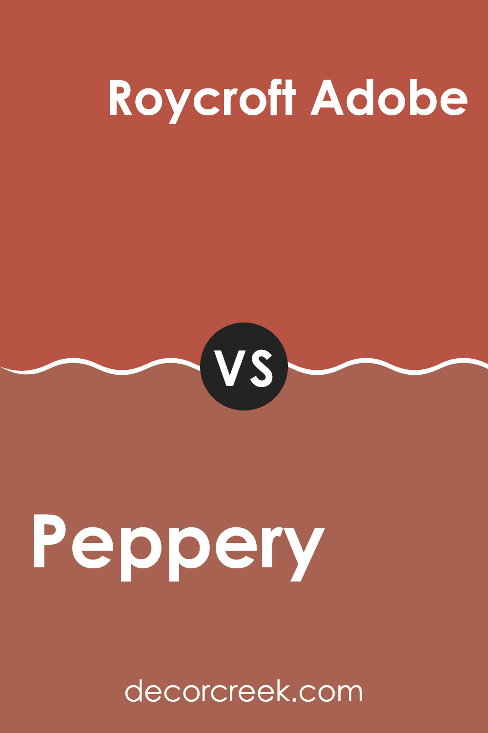
Peppery SW 6615 by Sherwin Williams vs Roycroft Adobe SW 0040 by Sherwin Williams
Peppery by Sherwin Williams is a vibrant red hue that adds a bold punch of color to any area. It’s a warm, inviting shade that can make a strong statement as an accent wall or when used in smaller decor elements. This color works particularly well in lively areas like kitchens or dining rooms, where it can encourage a fun and energetic atmosphere.
On the other hand, Roycroft Adobe from Sherwin Williams is a darker, earthier tone. This shade carries a rustic charm, influenced by its reddish-brown undertones that bring a sense of warmth and comfort. It’s perfect for creating cozy environments, like a welcoming living room or a snug reading nook. It pairs effortlessly with natural materials and textures, enhancing a room’s feel of homeliness.
Both colors, while similar in their warm bases, serve different moods and settings. Peppery is more about vibrancy and energy, while Roycroft Adobe leans towards a cozy, grounded feel, making both unique in their own right.
You can see recommended paint color below:
- SW 0040 Roycroft Adobe
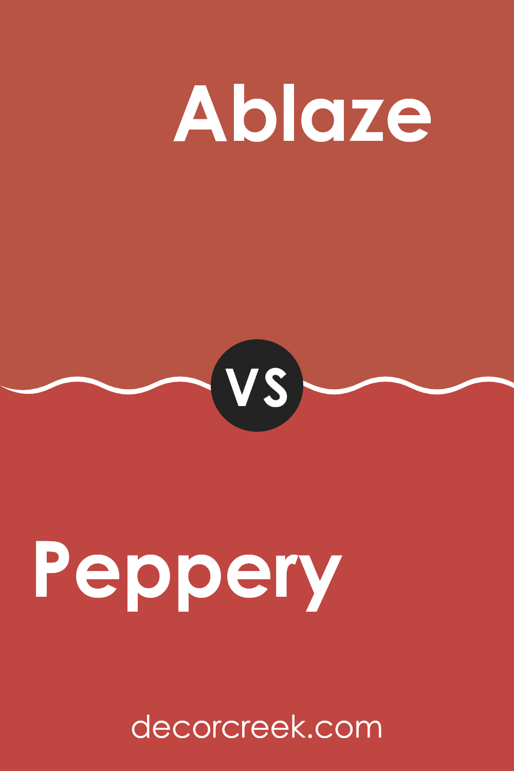
Peppery SW 6615 by Sherwin Williams vs Ablaze SW 6870 by Sherwin Williams
Peppery and Ablaze are two striking colors from Sherwin Williams that stand out in their own unique ways. Peppery is a rich, deep red with a hint of maroon, making it a warm and welcoming color.
It’s perfect for creating a cozy and comfortable atmosphere in areas like living rooms or dining areas. On the contrary, Ablaze is a vivid, bright orange-red that’s much more bold and energetic.
This color can instantly add a pop of vibrancy and is ideal for accent walls or areas where you want to make a strong visual impact. While Peppery offers a more subdued, classic feel, Ablaze is outgoing and dynamic, great for those looking to make a statement. Together, these colors could work well in an area that balances intensity with warmth.
You can see recommended paint color below:
- SW 6870 Ablaze
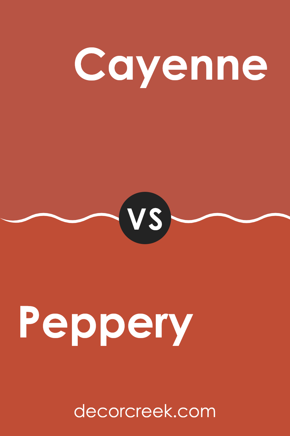
Peppery SW 6615 by Sherwin Williams vs Cayenne SW 6881 by Sherwin Williams
Peppery SW 6615 is a robust and welcoming shade of red with earthy brown undertones, giving it a warm and cozy feel. This color is great for creating a comforting atmosphere in living areas or dining areas. It pairs well with natural materials and soft lighting to enhance its inviting quality.
On the other hand, Cayenne SW 6881 is a vibrant and energetic red. It has a more vivid appearance, making it perfect for adding a pop of color to any area that needs a lively touch. Because of its brightness, Cayenne works well in areas that could use some visual excitement, such as kitchens or accent walls.
While both colors are shades of red, Peppery leans towards a muted, dusty hue that soothes the senses, whereas Cayenne stands out with its fiery and bold tone. Choosing between them depends on whether you want a more subdued backdrop or a striking focal point in your area.
You can see recommended paint color below:
- SW 6881 Cayenne
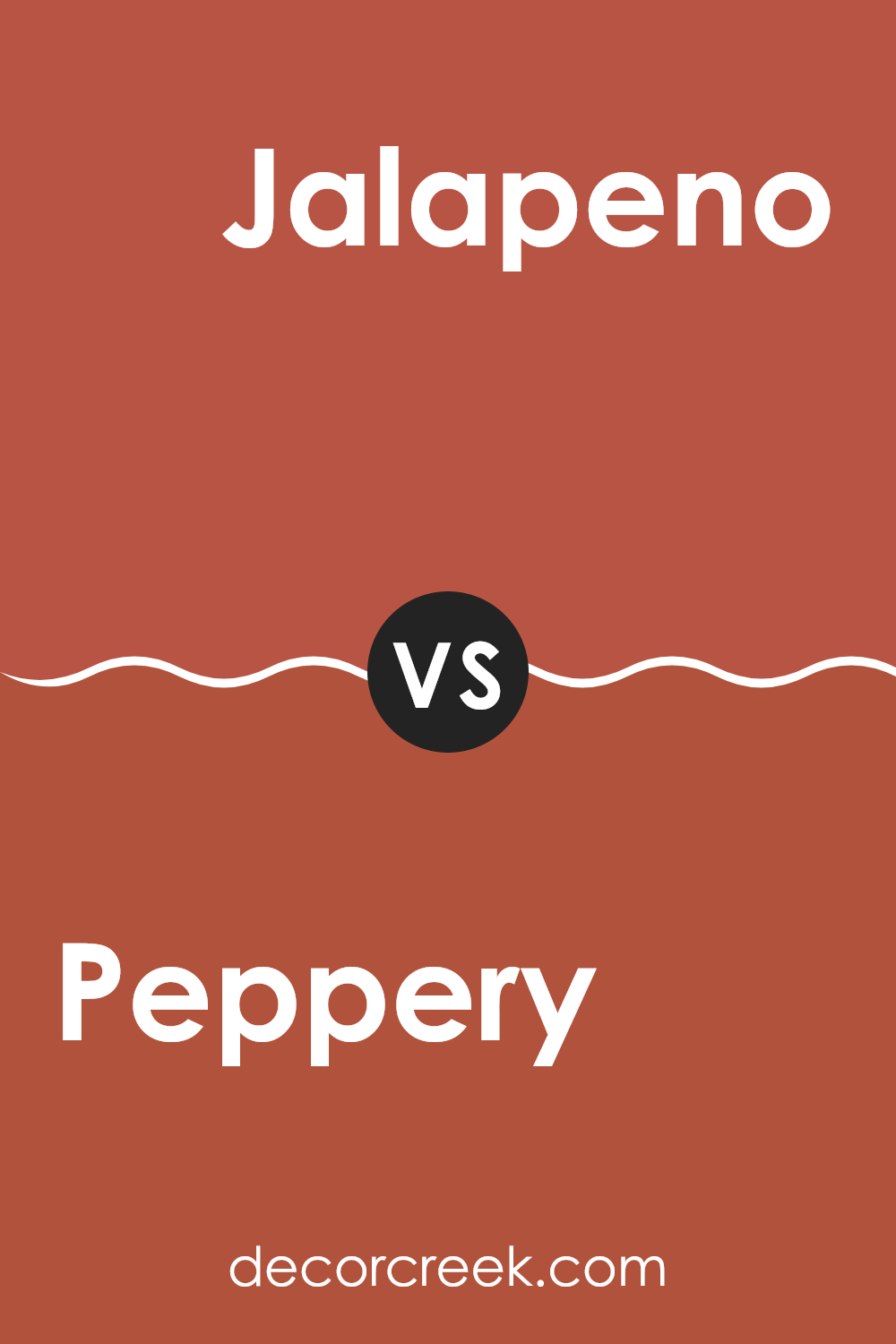
Peppery SW 6615 by Sherwin Williams vs Jalapeno SW 6629 by Sherwin Williams
Peppery SW 6615 and Jalapeno SW 6629, both from Sherwin Williams, offer distinct hues that can significantly affect the mood of a room. Peppery is a deeper, muted red with a hint of brown, making it feel warm and inviting. This color is great for creating a cozy and comfortable setting, ideal for living rooms or dining areas.
On the other hand, Jalapeno is a vibrant, medium green with a lively freshness to it. It’s brighter and brings an energetic touch to any area. This shade is perfect for areas where you want a lively, refreshing feel, such as kitchens or creative areas.
Both colors have their unique charm: Peppery leans towards a classic, understated warmth, while Jalapeno offers a burst of energy with its freshness. Depending on the vibe you want for your area, either color can make a strong statement.
You can see recommended paint color below:
- SW 6629 Jalapeno
In wrapping up my thoughts on SW 6615 Peppery by Sherwin Williams, I have to say that this paint color really brings a fun and lively touch to any room. It’s a unique shade of red that seems to have a little orange mixed in, making it really warm and welcoming. This color can really brighten up a place and make it more cheerful.
I found that Peppery works particularly well in areas like the living room or kitchen where families gather and spend a lot of time. It creates a cozy atmosphere that makes everyone feel right at home. It’s not just for walls either; it can also give a fresh new look to old pieces of furniture or even the front door!
When you use a bold color like Peppery, it’s a good idea to balance it out with some lighter or neutral colors in your furniture and decorations. This way, the room feels balanced and not too flashy. Also, good lighting can make a big difference in showing off this beautiful color at its best.
All in all, SW 6615 Peppery by Sherwin Williams is a great choice if you want to add some warmth and energy to your home. It’s a color that makes a statement without being too loud, and it definitely makes any area more inviting. Whether you’re painting a wall, a piece of furniture, or just adding accents, Peppery is a color that can make your house feel more like a home.

Ever wished paint sampling was as easy as sticking a sticker? Guess what? Now it is! Discover Samplize's unique Peel & Stick samples.
Get paint samples

