If you’re looking for a refreshing change for your walls, you might want to consider SW 6329 Faint Coral by Sherwin Williams. First off, the subtle, soothing qualities of this color can instantly warm up your space without overwhelming it. As a light, gentle hue, Faint Coral has been a go-to for those looking to introduce a touch of warmth to their interiors.
Whether you’re aiming to freshen up a small room or bring some soft cheer to a spacious area, this color offers versatility. What makes Faint Coral stand out is its ability to blend effortlessly with both modern and traditional decor. It works equally well as a focal point or a background shade, allowing you artistic freedom in your decorating schemes.
If you’ve been hesitant about adding color because you fear it might dominate, you’ll find this shade approachable and easy to incorporate into your existing decor. Plus, it pairs beautifully with soft whites and earthy tones, providing plenty of palette options to play with.
Let’s take a closer look at how Faint Coral can transform your space into a cozy, inviting haven.

What Color Is Faint Coral SW 6329 by Sherwin Williams?
Faint Coral is a soft, gentle hue that brings a warm and inviting tone to any room. This color is ideal for creating a cozy and welcoming ambiance, making it perfect for living areas, bedrooms, and even bathrooms. Its subtle pink undertones offer a fresh, lively feel without being too bold or overpowering, ensuring compatibility with various design aesthetics.
This shade pairs beautifully with natural materials and textures. For example, wooden elements, whether light or dark, enhance its warmth, creating a harmonious look. Soft linens and cotton in neutral colors also complement Faint Coral, adding to the cozy feel of the space.
Additionally, leather accents can introduce a touch of luxury and contrast nicely against the softness of the coral, providing a balanced interior design.
Faint Coral works exceptionally well in interior styles such as shabby chic, contemporary, and even minimalistic rooms where a pop of color is needed without making the space feel crowded. Its versatility also extends to beach-inspired themes where its light, airy quality can evoke the sense of calm you find at a seaside retreat.
This color helps in crafting interiors that feel relaxed, light, and homely, becoming a perfect backdrop for stylish yet comfortable living spaces.
Is Faint Coral SW 6329 by Sherwin Williams Warm or Cool color?
Faint Coral by Sherwin Williams is a gentle and warm shade that adds a soft touch of color to any room. Ideal for creating a cozy and welcoming atmosphere, this color strikes a perfect balance between pink and orange hues, making it versatile enough to work well in a variety of decorating schemes.
Whether used in a bedroom to create a restful environment or in a living space to add a bit of cheerfulness, Faint Coral brings a subtle vibrancy without overwhelming the senses.
This color pairs beautifully with neutral tones such as white, gray, or beige, allowing it to stand out as a focal point or blend smoothly as a background shade. Its light and airy feel makes small rooms appear larger and more open, while in well-lit areas, it radiates a warm and inviting glow. Faint Coral is great for those wanting to add a touch of color to their home in a soft and understated way.
Undertones of Faint Coral SW 6329 by Sherwin Williams
Faint Coral is a versatile paint color that can subtly change appearance depending on its surrounding colors and lighting, thanks to its rich undertones. Undertones are like a color’s hidden personality. They can enhance the main shade and influence how we perceive the color in different settings.
Faint Coral has a blend of undertones including pale yellow, light purple, light blue, pale pink, mint, lilac, and grey. These undertones make it a unique and flexible choice for interior walls. For example, the pale yellow undertone can add a soft, warm glow to a room, making it feel cozy and welcoming.
The light blue and mint undertones bring a hint of freshness, which can make a small space seem more airy and open.
Light purple and lilac undertones add a touch of delicacy, subtly enriching the space without overwhelming it with bold color. The pale pink undertone provides a gentle, soothing touch, ideal for creating a relaxed atmosphere.
Finally, the grey undertone in Faint Coral helps to ground the color, ensuring it doesn’t look too pastel and making it easier to match with a wide range of decor.
Overall, the variety of undertones in Faint Coral means it can adapt well to different types of lighting and complement various decor styles, from modern to classic. This adaptability makes it a practical choice for anyone looking to refresh their interior walls with a color that offers both beauty and versatility.
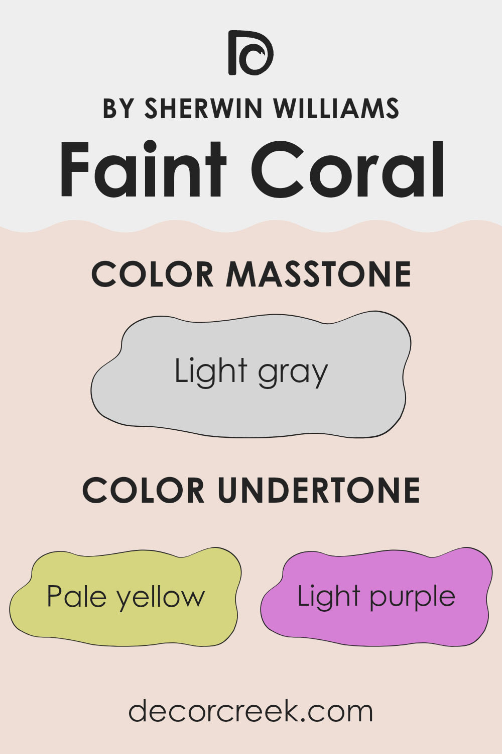
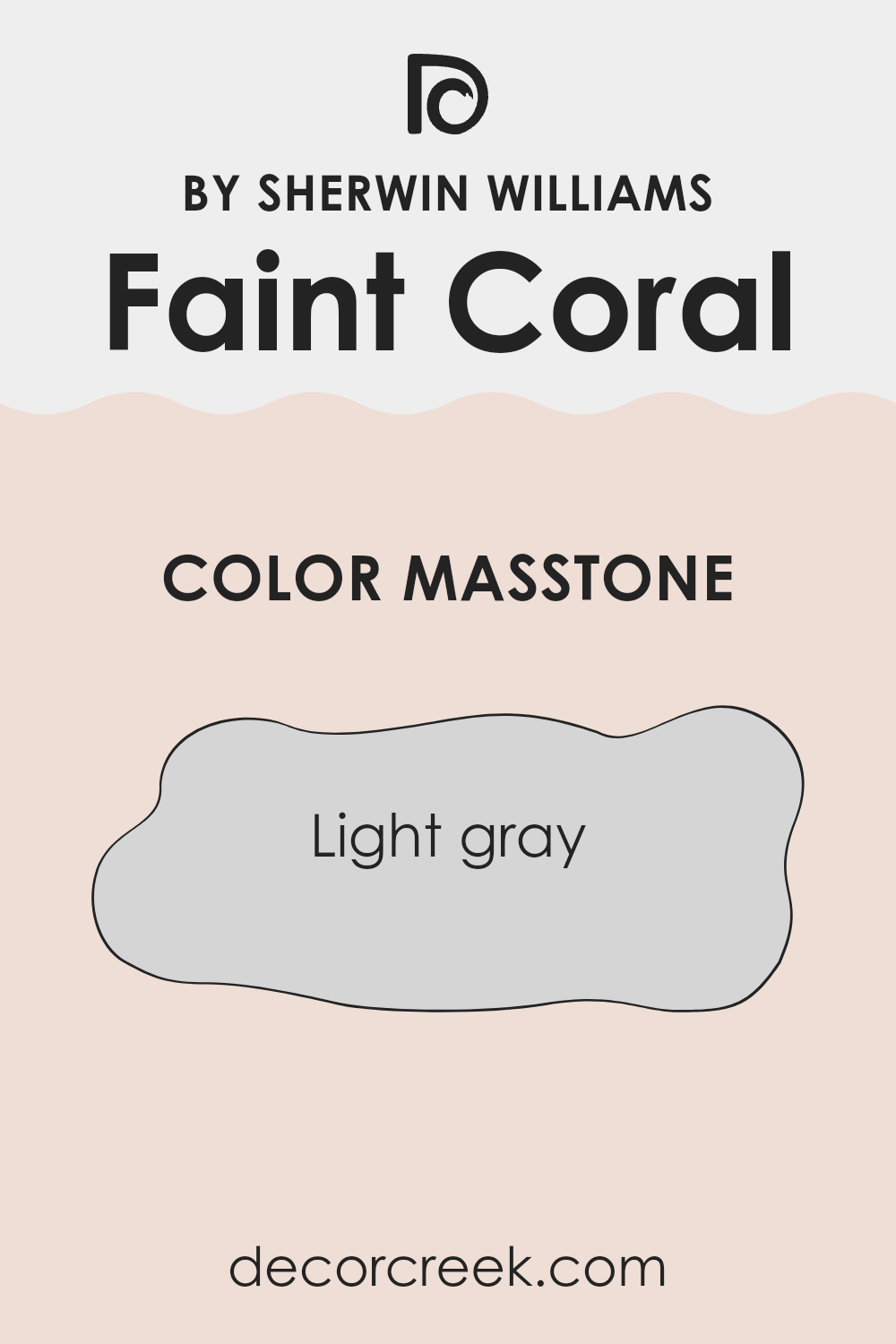
What is the Masstone of the Faint Coral SW 6329 by Sherwin Williams?
Faint Coral SW 6329 by Sherwin Williams has a masstone, or the main color we see when it is on a wall, of light gray (color code #D5D5D5). This neutral shade is very versatile, making it a good fit for almost any room in a house.
Light gray helps other colors in the room stand out and provides a calm background that doesn’t overpower the space. Since it is such a subtle color, it pairs well with both bright and dark furniture and decorations, giving homeowners freedom to style their rooms however they like.
Additionally, light gray is known for its ability to make small spaces appear larger and more open, which is especially useful in apartments or smaller homes. This color also reflects more light than darker shades, helping to make a room feel bright and airy during the day. Overall, this light gray shade from Sherwin Williams is adaptable, light-enhancing, and works well with multiple decor styles.
How Does Lighting Affect Faint Coral SW 6329 by Sherwin Williams?
Lighting plays a crucial role in how we perceive colors. It can significantly impact the appearance of paint colors on your walls, affecting the mood and atmosphere of a room. The color Faint Coral is a perfect example to discuss, as its appearance can shift based on the light it’s exposed to.
In artificial light, Faint Coral tends to look warmer and more vibrant. This is because many types of artificial lighting, like incandescent bulbs, emit a yellowish hue that enhances warm colors. So, in a room with plenty of lamps or warm LED lights, this color will appear more lively and welcoming.
Natural light, on the other hand, reveals the truest form of Faint Coral. How this color looks throughout the day can change depending on the direction the room faces. In north-faced rooms, which receive less direct sunlight and tend to have cooler, more even light, Faint Coral might look slightly muted but maintains a soft warmth. This makes it a good choice for creating a cozy, inviting space without being too bold.
South-faced rooms get abundant light for most of the day, which can make Faint Coral appear brighter and more pronounced. This exposure can bring out the cheerful, energizing qualities of the color, making it ideal for living spaces where you want a fresh and lively atmosphere.
In east-faced rooms, where sunlight is most vivid in the morning, Faint Coral will look especially bright and fresh at the start of the day, gradually becoming softer as the day progresses. It’s perfect for bedrooms, where the calming effect of the color is appreciated as the light fades.
West-faced rooms experience the opposite effect, with muted colors during the morning and a vivid appearance in the afternoon to evening as the sun sets. Faint Coral in these rooms can offer a warm welcome later in the day, perfect for dining rooms or family rooms where evening gatherings are common.
Understanding how light affects your color choices, like Faint Coral, can help you pick the right room and purpose for each color in your home.

What is the LRV of Faint Coral SW 6329 by Sherwin Williams?
LRV stands for Light Reflectance Value, which is a measure of how much light a paint color reflects back into a room compared to how much it absorbs. This number is given on a scale from 1 to 90, where a higher number means the color reflects more light. Different LRV values can significantly affect the appearance and feel of a room.
A color with a higher LRV, for example, tends to make a space feel brighter and more open because it reflects more light around the room. Conversely, colors with lower LRVs might make a room feel smaller or cozier due to them absorbing more light.
The LRV of Faint Coral, which is 75.314, means it’s on the higher end of the scale and is quite reflective. This characteristic makes it a good choice for spaces that might need brightening, such as a small room or a room with limited natural light. Since Faint Coral reflects plenty of light, it helps to create a lively and welcoming space without being overpowering. This makes it versatile and suitable for various spaces seeking a fresh, light-enhanced look.

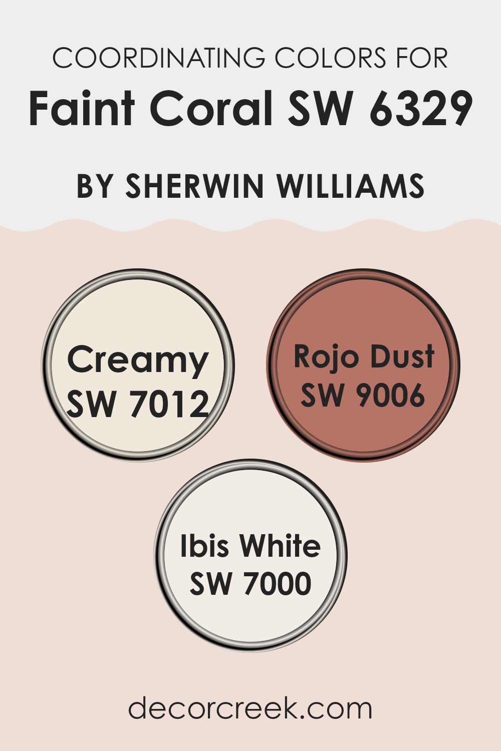
Coordinating Colors of Faint Coral SW 6329 by Sherwin Williams
Coordinating colors are selected shades that complement a primary color, creating a harmonious and visually pleasing palette for any space. When working with a primary color like Faint Coral by Sherwin Williams, choosing the right coordinating colors can enhance the overall aesthetic of a room, allowing for a balanced and cohesive look. Coordinating colors should blend well with the main color but can vary in shades to add depth and interest to the design.
Creamy (SW 7012) is a soft, warm ivory that provides a gentle contrast to the vibrant Faint Coral, creating a soothing backdrop that makes the coral pop without overwhelming the senses. It’s an excellent choice for walls or trim, offering a subtle warmth to spaces that need a touch of brightness.
Rojo Dust (SW 9006) is a muted clay red, which pairs beautifully with Faint Coral, lending an earthy richness to the color scheme. This shade can be great for accent walls or decorative accessories, adding a sense of warmth and coziness to the environment.
Lastly, Ibis White (SW 7000) is a clean, crisp white that works flawlessly with virtually any color but especially complements Faint Coral by providing a sharp, fresh contrast that can help to make the coral stand out. It’s perfect for ceilings or woodwork, helping to tie the room’s colors together in a subtle and effective way.
You can see recommended paint colors below:
- SW 7012 Creamy
- SW 9006 Rojo Dust
- SW 7000 Ibis White
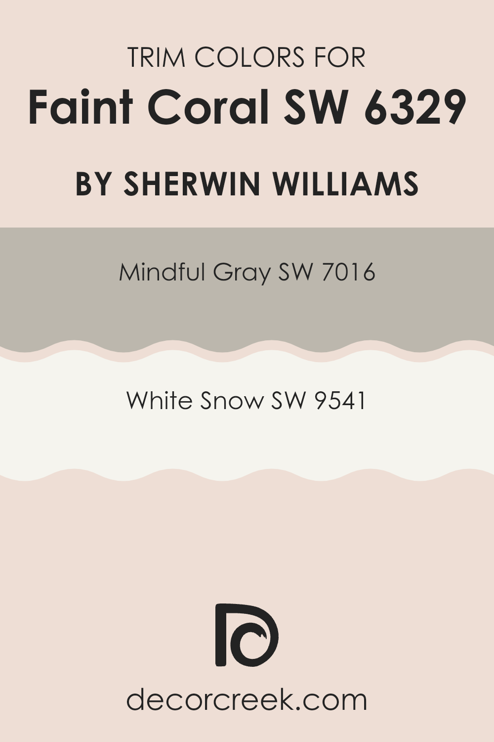
What are the Trim colors of Faint Coral SW 6329 by Sherwin Williams?
Trim colors are essential accents in interior design that outline architectural features like door frames, baseboards, and crown moldings, enhancing the color on the walls, in this case, Faint Coral by Sherwin Williams. By choosing the right trim color, the overall aesthetic appeal of a room can be significantly improved, adding contrast or cohesion to the space, depending on the desired effect. Mindful Gray and White Snow are two trim options that compliment this vibrant hue well, providing balance and making the coral standout beautifully.
Mindful Gray is a neutral shade that mixes gray with subtle hints of taupe. It’s a versatile color that grounds the lively Faint Coral, bringing a muted yet impactful contrast to spaces that feature this pinkish-orange shade.
On the other hand, White Snow is a crisp and clean white that offers a sharp, clear delineation against brighter and bolder colors like Faint Coral. It reflects light and adds a fresh, bright quality to rooms, making them feel more open and airy. Both trim colors provide elegant frames to enhance the beauty of Faint Coral walls.
You can see recommended paint colors below:
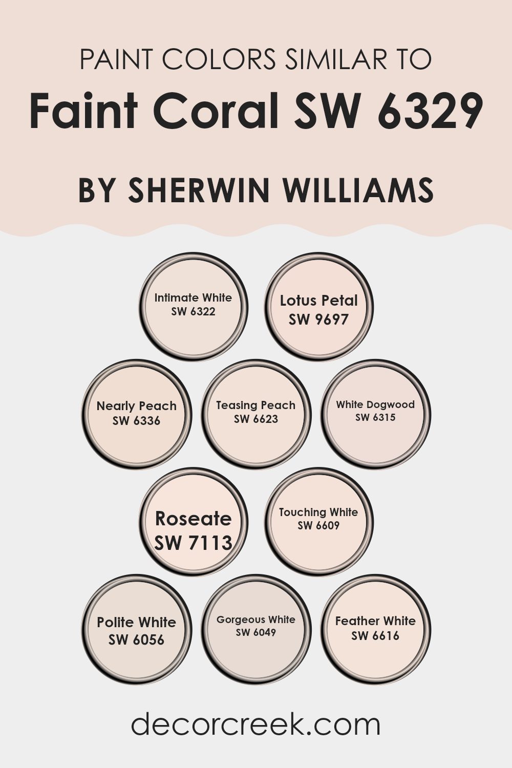
Colors Similar to Faint Coral SW 6329 by Sherwin Williams
Choosing similar colors in design can create a visually cohesive and harmonious environment. Utilizing shades like SW 6322 – Intimate White, which has a soft creamy undertone, and SW 9697 – Lotus Petal, slightly pinker, helps build a subtle yet layered palette. These colors work well because they share a common intensity and softness, allowing them to blend effortlessly while still providing distinct hues.
For instance, SW 6336 – Nearly Peach offers a soft touch of orange, providing a warm, welcoming feel, complementing the soft pink of SW 6623 – Teasing Peach, which adds just a hint of vibrancy to the design.
Continuing with this subtle variation, SW 6315 – White Dogwood has a gentle pink tinge that catches the light beautifully, pairing neatly with the richer tone of SW 7113 – Roseate, which is deeper but still soft. SW 6609 – Touching White and SW 6056 – Polite White both contribute to this theme by being very pale with slight nuances of pink and beige, respectively.
Further accentuating this palette, SW 6049 – Gorgeous White offers a slight grayish tint, adding depth, while SW 6616 – Feather White brightens spaces with its clean, almost ethereal quality. Each color, while similar, has its own unique tone, making the overall aesthetic cohesive yet rich in subtle variety.
You can see recommended paint colors below:
- SW 6322 Intimate White
- SW 9697 Lotus Petal
- SW 6336 Nearly Peach
- SW 6623 Teasing Peach
- SW 6315 White Dogwood
- SW 7113 Roseate
- SW 6609 Touching White
- SW 6056 Polite White
- SW 6049 Gorgeous White
- SW 6616 Feather White
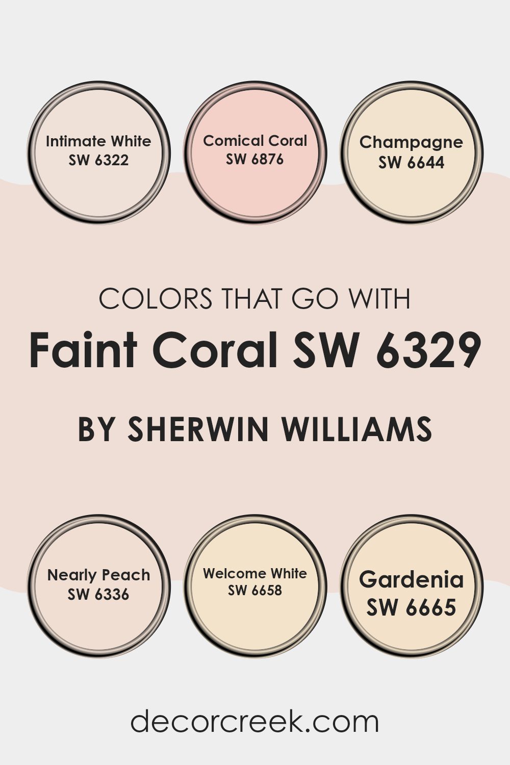
Colors that Go With Faint Coral SW 6329 by Sherwin Williams
Choosing colors that complement Faint Coral SW 6329 by Sherwin Williams plays a crucial role in creating an appealing and cohesive look in a space. Colours like Intimate White and Welcome White are muted whites with subtle undertones that help in softening the boldness of Faint Coral without overshadowing its presence.
These shades establish a light, bright backdrop that allows Faint Coral to pop nicely. Similarly, Nearly Peach echoes the warm tones of Faint Coral but with a slightly peachy spin, adding a gentle, harmonious layer to the color scheme.
This approach provides a seamless color transition when decorating a room, ensuring that each color supports the other without clashing.
On the other hand, colors such as Comical Coral and Gardenia offer a vibrant and slightly more intense hue, compared to Faint Coral. This kind of pairing is perfect for those looking to create a lively, energetic vibe in their space. Comical Coral, in particular, shares a color family with Faint Coral, and using it can produce a dynamic yet cohesive color story.
Meanwhile, Champagne and Gardenia add a touch of natural elegance to the palette, with Champagne bringing in a subtle shimmer and Gardenia providing a refreshing, clean finish. These combinations are especially effective in spaces where you want a mix of warmth and elegance, ensuring the overall aesthetic is lively yet harmonious.
You can see recommended paint colors below:
- SW 6322 Intimate White
- SW 6876 Comical Coral
- SW 6644 Champagne
- SW 6336 Nearly Peach
- SW 6658 Welcome White
- SW 6665 Gardenia
How to Use Faint Coral SW 6329 by Sherwin Williams In Your Home?
Faint Coral SW 6329 by Sherwin Williams is a soft, gentle shade of pink that brings a warm, inviting touch to any space. This color is perfect for creating a cozy, relaxing atmosphere in your home. It works beautifully in living rooms or bedrooms where you want to add a subtle hint of color without it being too overpowering.
Because Faint Coral is such a versatile hue, it pairs well with neutral colors like whites, greys, and beiges. This makes it easy to integrate into your existing decor. If you’re thinking about painting a whole room or just an accent wall, Faint Coral is a great choice.
It also looks charming on furniture or cabinets for a refreshed look. Additionally, combining it with soft textures and other warm tones can really make the color pop and make your space feel more inviting. Whether you aim for a modern or a more classic style, Faint Coral adds a touch of warmth to your home.
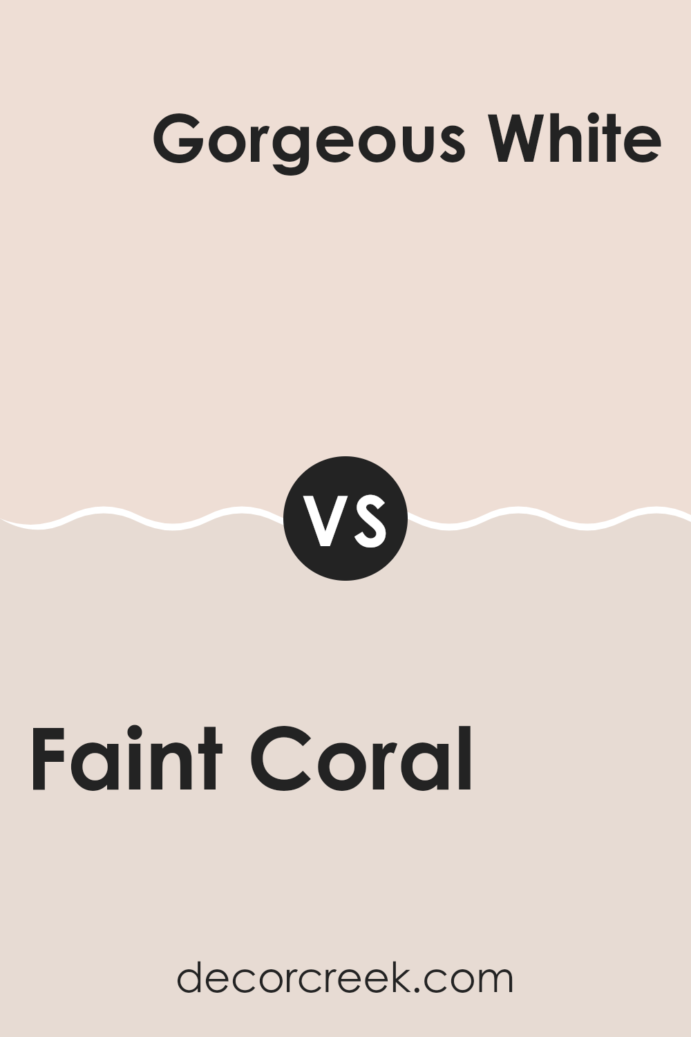
Faint Coral SW 6329 by Sherwin Williams vs Gorgeous White SW 6049 by Sherwin Williams
Faint Coral and Gorgeous White, both by Sherwin Williams, offer distinct vibes for any room. Faint Coral is a gentle, subdued shade of pink with a hint of warmth. It’s a soft color that gives a welcoming and cozy feel to spaces, making it ideal for living rooms or bedrooms where a touch of calmness is appreciated.
On the other hand, Gorgeous White is a clean and bright white that brings a fresh and airy feel. It’s perfect for making smaller spaces appear larger and more open. This color is versatile and works well in any area of the home, from kitchens to bathrooms.
When used together, these two colors complement each other well, with Gorgeous White providing a crisp background that allows the soothing tone of Faint Coral to stand out nicely.
You can see recommended paint color below:
Faint Coral SW 6329 by Sherwin Williams vs White Dogwood SW 6315 by Sherwin Williams
Faint Coral and White Dogwood are two distinct colors from Sherwin Williams that offer subtle yet unique vibes for any space. Faint Coral has a soft pink tone that adds a gentle warmth to the walls, making it inviting.
It’s not overly bright, so it provides a comforting backdrop to a room without overpowering it. On the other hand, White Dogwood is a pale, muted pink with a hint of peach, offering a very light and almost neutral appearance. This color is ideal for those who prefer something close to white but want a touch of additional warmth.
While both colors are light and airy, Faint Coral leans more towards a noticeable pink, making it a bit warmer, whereas White Dogwood is closer to an off-white, giving a cleaner, more subtle finish. Either color would work well in spaces aiming for a fresh, soft look.
You can see recommended paint color below:
- SW 6315 White Dogwood
Faint Coral SW 6329 by Sherwin Williams vs Intimate White SW 6322 by Sherwin Williams
Faint Coral and Intimate White are two warm shades from Sherwin Williams that impart a cozy, inviting feel to any room. Faint Coral has a gentle pink hue with an understated vibrance that can make spaces feel comforting yet cheerful.
It’s a versatile color that works well in living rooms or bedrooms where a touch of warmth is desired. In contrast, Intimate White leans towards a soft, creamy white with just a hint of pink. This color is perfect for making small rooms appear larger and brighter, making it ideal for bathrooms or kitchens.
Both colors complement each other beautifully, with Intimate White potentially serving as a subtle base for walls with Faint Coral used for accent features or vice versa. Whether you lean towards the subtle pink of Faint Coral or prefer the lightness of Intimate White, both colors offer a fresh, inviting atmosphere.
You can see recommended paint color below:
Faint Coral SW 6329 by Sherwin Williams vs Teasing Peach SW 6623 by Sherwin Williams
Faint Coral and Teasing Peach are two paint colors that offer subtle yet distinct vibes for any space. Faint Coral is a light, soft pink with a touch of warmth, making it a cozy and inviting color. It’s perfect for creating a gentle, harmonious atmosphere in rooms like bedrooms or living areas where you want a soothing presence.
On the other hand, Teasing Peach has a bit more zest, leaning towards a peachy-pink tone that adds a cheerful and playful feel to spaces. This color is brighter and can add a splash of energy and friendliness to a room, making it ideal for spaces used for interaction such as kitchens or family rooms.
Although both colors belong to the warm spectrum, Faint Coral offers a more muted approach that blends easily with neutral and soft color schemes, while Teasing Peach stands out more and works well with vibrant or contrasting hues for a more dynamic look.
You can see recommended paint color below:
- SW 6623 Teasing Peach
Faint Coral SW 6329 by Sherwin Williams vs Touching White SW 6609 by Sherwin Williams
Faint Coral and Touching White, both by Sherwin Williams, offer distinct vibes for any space. Faint Coral is a gentle, pinkish-orange hue that gives a warm and inviting feel, perfect for living areas and bedrooms that aim for a cozy atmosphere. It has a soft charm that can make a room feel more intimate and welcoming.
On the other hand, Touching White is a clean and fresh shade of white with a subtle touch of warmth. This color is incredibly versatile and works well in any room, particularly those aiming for a bright and airy feel. It’s great for making small spaces appear larger and can act as a perfect backdrop for vibrant decor pieces.
Together, these colors could complement each other nicely in a space, with Touching White providing a neutral base and Faint Coral adding a pop of gentle color. Whether used in accent features or larger areas, they help create a pleasing and comfortable environment.
You can see recommended paint color below:
- SW 6609 Touching White
Faint Coral SW 6329 by Sherwin Williams vs Lotus Petal SW 9697 by Sherwin Williams
Faint Coral and Lotus Petal are both soft, subtle colors from Sherwin Williams, but they bring their own unique vibes to a space. Faint Coral has a gentle pink tone that feels warm and inviting. It’s a great choice if you want to make a room feel cozy and welcoming without using a color that’s too bold or overpowering.
On the other hand, Lotus Petal leans more towards a neutral side with a beige-pink hue. This color is very flexible and works well in almost any space, giving a clean and calm feeling to the environment. It pairs nicely with a wide range of decor styles and colors, making it a more versatile option compared to Faint Coral.
In summary, Faint Coral offers a warmer, pinker touch, ideal for creating a friendly, cheerful space. Lotus Petal is more understated, providing a background that works with many settings and color schemes. Both colors offer their own charm and can enhance a room in different ways.
You can see recommended paint color below:
Faint Coral SW 6329 by Sherwin Williams vs Feather White SW 6616 by Sherwin Williams
Faint Coral and Feather White by Sherwin Williams are both light, soft colors great for creating a bright and airy feel to a room. Faint Coral has a gentle pinkish-orange hue which adds a touch of warmth and subtle vibrancy, making it a good choice for living spaces or bedrooms that could use a bit of coziness. This coral shade pairs well with neutral and earthy tones, offering a refreshing yet inviting ambiance.
On the other hand, Feather White is closer to a pure white but with a hint of softness that prevents it from being too stark or glaring. It’s an excellent option for areas that you want to appear larger and more open, such as small rooms or spaces with limited natural light.
Because of its very neutral nature, it works beautifully as a base, allowing other colors in the decor to stand out more. Overall, while both colors serve to brighten spaces, Faint Coral adds warmth, whereas Feather White creates a clean, expansive feel.
You can see recommended paint color below:
- SW 6616 Feather White
Faint Coral SW 6329 by Sherwin Williams vs Nearly Peach SW 6336 by Sherwin Williams
Faint Coral and Nearly Peach, both by Sherwin Williams, are subtle, warm shades that bring a gentle and welcoming feel to any space. Faint Coral has a slightly pinkish hue, resembling the soft blush on seashells. It creates a cozy and slightly romantic atmosphere, perfect for living rooms or bedrooms looking for a hint of warmth without overwhelming brightness.
On the other hand, Nearly Peach is a bit more subdued compared to Faint Coral, leaning towards a soft, faded orange. It’s a great option for spaces that need a splash of discreet color, keeping rooms looking fresh and airy. The peachy tone of this color pairs well with light woods and neutral decor, offering a soothing backdrop that’s easy on the eyes.
Both colors are pretty close in their light and airy qualities, but their subtle differences in hue—pinkish versus peachy—can influence the mood and style of a room. Faint Coral offers a hint more romance, while Nearly Peach feels more relaxed and laid-back.
You can see recommended paint color below:
- SW 6336 Nearly Peach
Faint Coral SW 6329 by Sherwin Williams vs Polite White SW 6056 by Sherwin Williams
Faint Coral is a soft and gentle shade with a hint of pink that gives it a warm and inviting feeling. It’s a subtle color that can add a cozy, welcoming touch to any room without being too bold. On the other hand, Polite White is a clean and simple white with a slightly warm undertone. It’s a versatile color that works well in any space, providing a fresh and neat background that can make other colors stand out more.
When comparing the two, Faint Coral offers a more colorful and cheerful vibe that can make a space feel more lively, while Polite White serves as a neutral backdrop that can help highlight other decor elements.
Depending on the mood you want to create in a room, Faint Coral would be great for adding a touch of warmth, whereas Polite White is ideal for creating a calm, uncluttered environment. Both colors work well for creating a friendly atmosphere, but they serve different purposes in decor.
You can see recommended paint color below:
- SW 6056 Polite White
Faint Coral SW 6329 by Sherwin Williams vs Roseate SW 7113 by Sherwin Williams
Faint Coral and Roseate, both by Sherwin Williams, are delightful shades with subtle differences in their vibe and appearance. Faint Coral is a soft, muted pink with a hint of peach that adds a gentle, calming warmth to any space. It’s perfect for creating a cozy and welcoming atmosphere, especially suitable in living rooms or bedrooms where comfort is key.
On the other hand, Roseate is a richer, slightly more intense color. This shade leans more towards a true pink. It has a vibrant, yet not overwhelming charm, making it excellent for adding a fresh burst of color. This makes it fitting for spaces that benefit from a lively yet still gentle splash of color, like bathrooms or casual dining areas.
Though both colors share a pink base, Faint Coral offers a more subdued, peachy tone, while Roseate steps up with a punchier pink presence. Each brings its unique mood to interiors, with Faint Coral being more laid-back and Roseate standing out more boldly.
You can see recommended paint color below:
- SW 7113 Roseate
I think that it is a great choice for someone wanting to add a splash of color to their walls without making it too bright or showy. It works nicely in bedrooms and living rooms, adding a cheerful touch to the walls. Additionally, this color goes well with different kinds of furniture and decorations, like white or beige items, which can help in making a room look even nicer.
To wrap things up, SW 6329 Faint Coral is certainly a beautiful choice for anyone looking to brighten up their home in a subtle and pretty way. It’s perfect for those who want their rooms to feel warm and inviting. Sherwin Williams has created a color that offers a fresh yet cozy atmosphere, proving once again why they are a trusted name in paint.
Ever wished paint sampling was as easy as sticking a sticker? Guess what? Now it is! Discover Samplize's unique Peel & Stick samples.
Get paint samples

