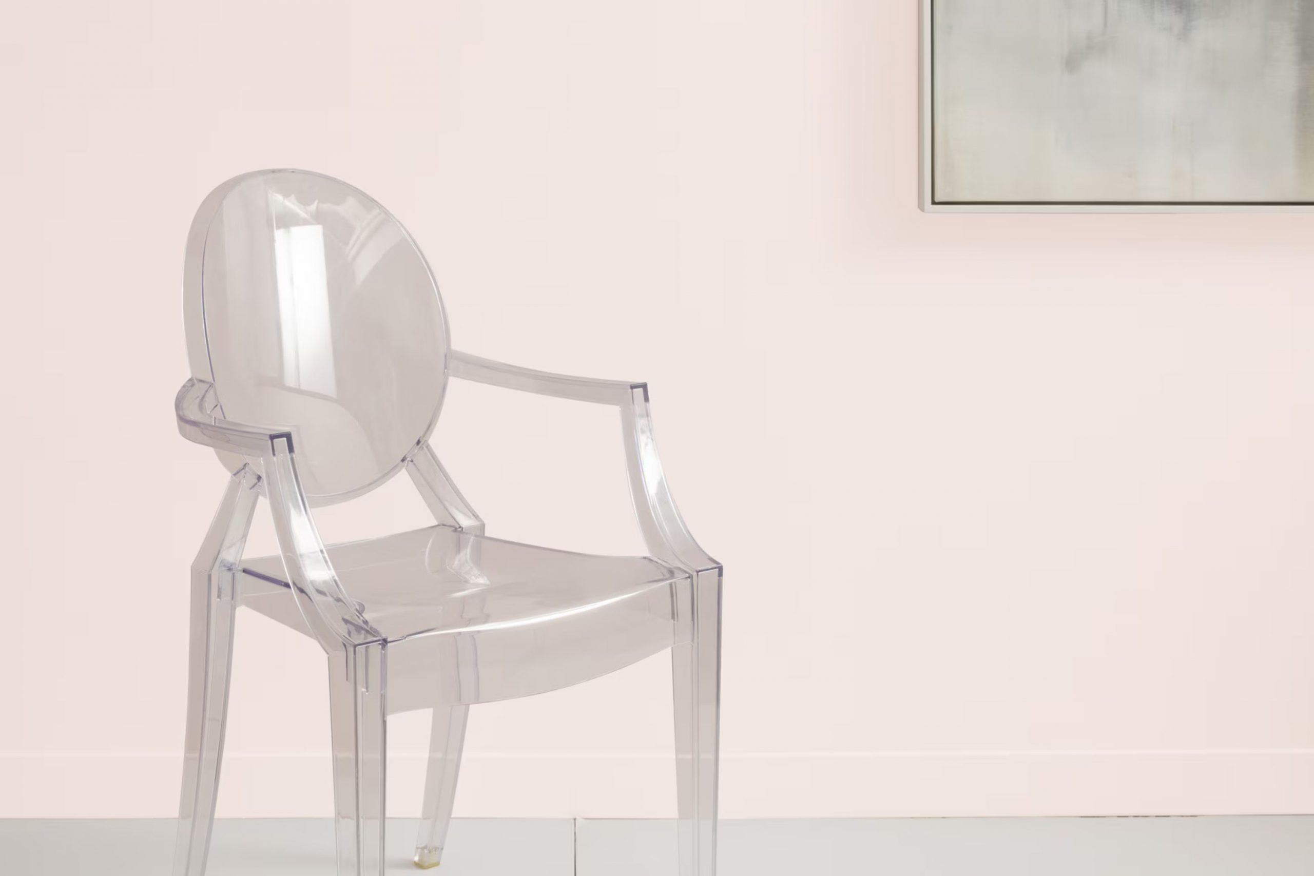
Imagine walking into a room bathed in the soft glow of the early morning sun. That’s the feeling you get with Benjamin Moore’s 2093-70 Pink Bliss. This delicate pink shade, light and airy, offers a subtle touch of color that refreshes your area without being too daunting.
As you consider updating a room in your home, you might be considering what mood or atmosphere you want to evoke. Pink Bliss might be the perfect choice if you’re aiming for a gentle and uplifting feel.
Using Pink Bliss in your decor can breathe new life into a room, making it feel more open and welcoming. Whether you’re painting a whole room, an accent wall, or just looking for a color to uplift furniture pieces, Pink Bliss adapts beautifully to diverse styling and lighting conditions, maintaining its calm essence consistently.
So, if you’re interested in creating a calm and cheerful area, Pink Bliss could be the way to go, reflecting positivity and warmth that enhances your home’s overall ambiance.
What Color Is Pink Bliss 2093-70 by Benjamin Moore?
Pink Bliss by Benjamin Moore is a gentle hue reminiscent of soft cherry blossoms in spring. It exudes a light, airy quality which works wonderfully in environments where a calming, cheerful presence is desired. This color is particularly effective for creating a cozy, welcoming ambiance in living areas, nurseries, or reading nooks. Its subtlety makes it adaptable, allowing it to act either as a soothing background or as a delicate highlight against more neutral shades like whites or soft grays.
In terms of interior styles, Pink Bliss shines in settings that favor a romantic or country cottage aesthetic. It beautifully complements shabby chic decor, adding a touch of youthful freshness without overpowering the senses. This color can also fit well in contemporary rooms that use pops of color to break up monochromatic themes.
When thinking about materials and textures that pair well with Pink Bliss, consider natural elements such as light wooden accents, wicker, or linen fabrics. These materials connect the color to earthy, rustic vibes. For a more modern twist, integrate brushed silver or glass finishes to provide a sleek contrast to its warmth. Soft textiles like cotton throws or velvet cushions in this color can add a lush, inviting feel to any room.
Is Pink Bliss 2093-70 by Benjamin Moore Warm or Cool color?
Pink Bliss by Benjamin Moore is a soft, gentle pink that brings a warm and welcoming feel to any room. This color is great for areas where you want to create a cozy and comforting atmosphere, like bedrooms or nurseries.
Because of its light and subtle nature, Pink Bliss works well as a background color. It pairs beautifully with white trim or can be used to complement darker furniture pieces, adding a touch of softness without overpowering the area.
Homeowners often choose this color when they want to add a little brightness to a room without going too bold. It’s perfect for creating a peaceful, inviting area. Pink Bliss is also adaptable enough to be used in small areas like bathrooms or as an accent wall, where it can make the room feel more open and airy. Whether you’re looking to create a chic, modern look or a classic, enduring style, Pink Bliss provides a perfect backdrop.
Undertones of Pink Bliss 2093-70 by Benjamin Moore
Pink Bliss by Benjamin Moore is a subtle and adaptable paint color with a complex composition of undertones that can significantly influence the look and feel of an area. These undertones include pale yellow, light purple, light blue, pale pink, mint, lilac, and grey. Each undertone plays a unique role in modifying the appearance of the color under different lighting conditions and when paired with various decor elements.
Undertones affect how we perceive color because they can subtly shift a color’s visual temperature and depth. For instance, pale yellow and mint bring a warm and slightly vibrant touch that can make a room feel more welcoming and lively. Conversely, light purple, lilac, and grey add a cooler, more neutral quality to the color, possibly making the area feel more calm and balanced.
When Pink Bliss is used on interior walls, the ambient lighting and surrounding colors will bring out these undertones in various ways. In bright, natural light, the pale yellow or light blue might become more pronounced, creating a fresh and airy feel. In artificial or dimmer lighting, the lilac or grey undertones might dominate, bringing a more subdued and cozy atmosphere.
Understanding these undertones is crucial when choosing this paint color to ensure it pairs harmoniously with the room’s lighting, furnishings, and overall mood. By considering these subtle nuances, homeowners can create the desired effect in their living areas.
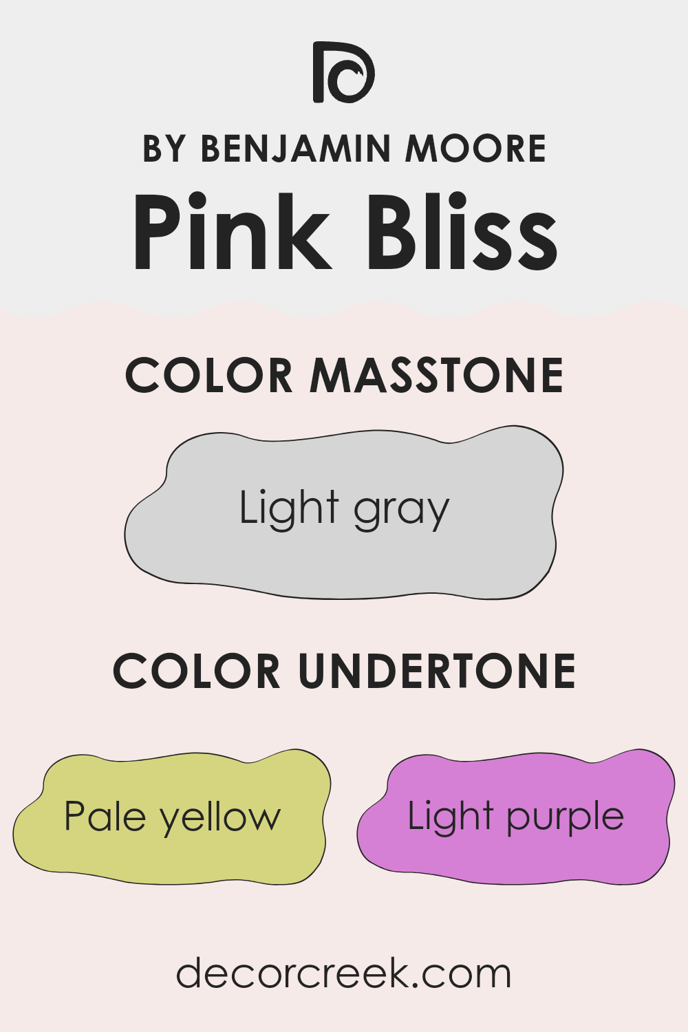
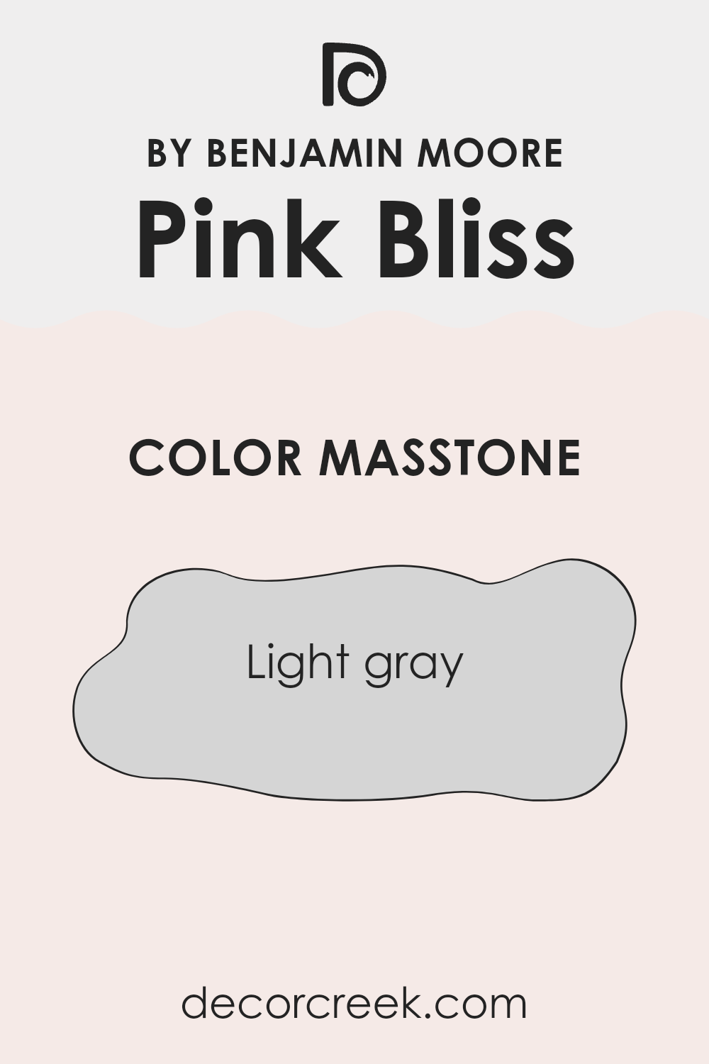
What is the Masstone of the Pink Bliss 2093-70 by Benjamin Moore?
The masstone of Pink Bliss 2093-70 by Benjamin Moore is light gray, which makes it an adaptable choice for home interiors. This subtle gray base ensures that the color maintains a soft, neutral appearance, making it easy to pair with a wide range of decor styles and colors.
In bright, well-lit areas, the gray undertone helps to keep the pink hue from overpowering the room, contributing to a balanced and welcoming atmosphere. In rooms with less natural light, the gray aspect can help the color remain steady and neutral, preventing it from appearing too bold or out of place.
This makes Pink Bliss 2093-70 an excellent choice for commonly used areas of the home like living rooms and kitchens, where it can complement both modern and traditional furnishings without creating too strong of a statement. Additionally, its warmth adds a subtle, cozy feel to the area, appealing to those who want their home to have a soft and inviting aesthetic.
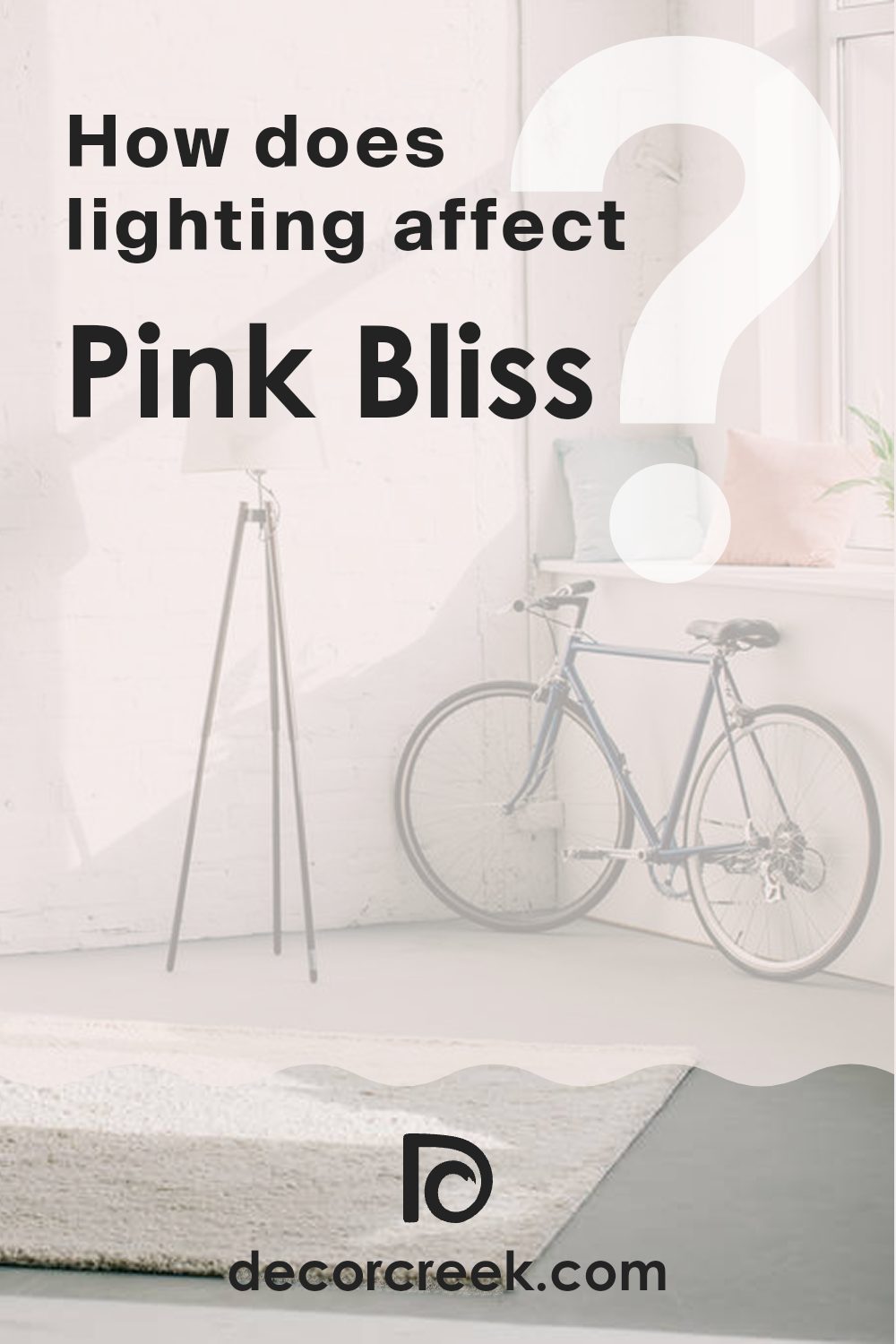
How Does Lighting Affect Pink Bliss 2093-70 by Benjamin Moore?
Lighting plays a crucial role in how colors appear in various environments. The color Pink Bliss by Benjamin Moore, a soft and gentle shade of pink, can look quite different under various lighting conditions.
When illuminated by natural light, Pink Bliss reveals its true soft and airy quality. In rooms with lots of sunlight, such as those facing south, Pink Bliss looks particularly vibrant and warm, making the area feel welcoming and cozy. This is because the south-facing light tends to be stronger and more direct, enhancing the brightness and warmth of the pink.
In contrast, north-facing rooms receive less direct sunlight, which can make Pink Bliss appear slightly more muted and cooler. This doesn’t diminish its beauty; instead, it gives the room a calm and gentle look, with the color showing a more subtle and delicate pink.
Rooms that face east benefit from the morning light, which can make Pink Bliss look very soft and fresh early in the day. This makes east-facing rooms a great choice for bedrooms or bathrooms where a gentle color can provide a calm start to the day. As the day progresses and the natural light decreases, the color may lose some of its vibrancy but still retains its gentle appeal.
West-facing rooms, on the other hand, receive intense evening light. This can make Pink Bliss look brighter and more intense during sunset when the light casts a golden glow. This can add a dramatic effect to the area in the late afternoon and early evening.
Artificial lights also affect how Pink Bliss is perceived. Warm artificial lighting, like that from incandescent bulbs, enhances the warmth of Pink Bliss, making it feel cozier. Cooler artificial lights, such as LED lights, might make the color appear crispier and slightly bluer.
Overall, Pink Bliss by Benjamin Moore is an adaptable color that adjusts its personality based on the lighting environment, providing various atmospheres from calm and subtle to warm and vivacious.
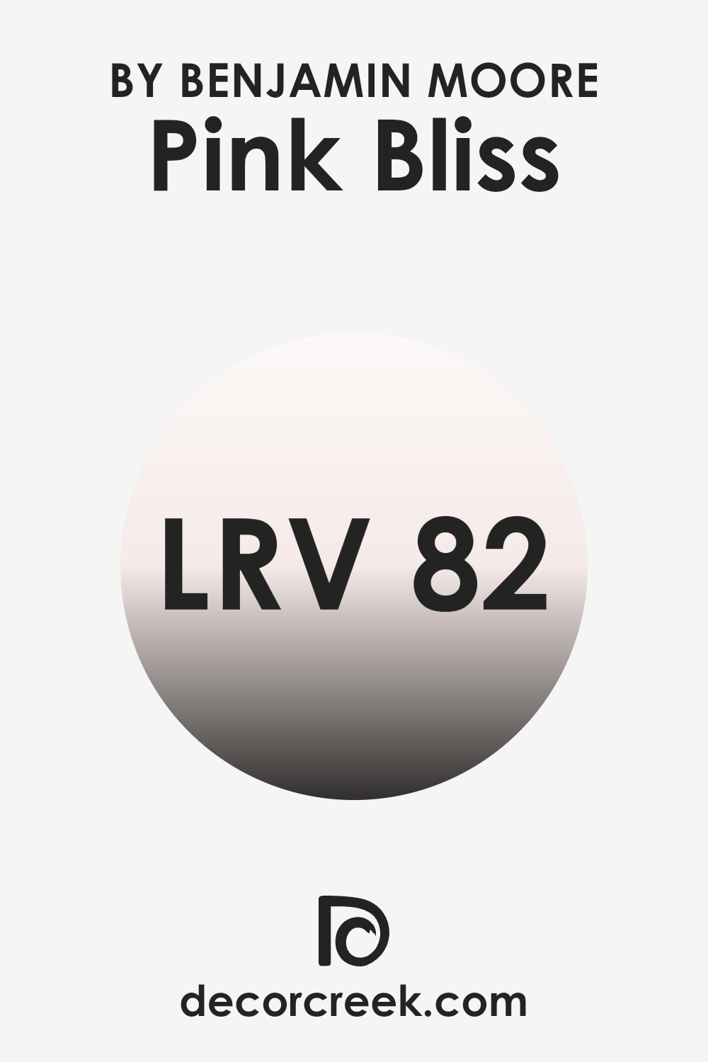
What is the LRV of Pink Bliss 2093-70 by Benjamin Moore?
LRV, or Light Reflectance Value, is a measure used to indicate how much light a paint color reflects back into a room as opposed to absorbing it. This value is expressed on a scale where lower numbers mean the color absorbs more light, making a room appear darker, and higher numbers mean the color reflects more light, brightening up an area.
When choosing paint, understanding the LRV can help you determine how a color will look once it’s up on your walls, especially under different lighting conditions.
In the case of Pink Bliss with an LRV of 81.58, it is a color that falls into the higher range of the LRV scale, indicating that it is a light color that will reflect a lot of light back into the room. This means it has the capability to make an area feel more airy and open. If you’re painting a smaller or darker room, this high LRV can help make the area appear larger and more illuminated. On the other hand, if used in a very brightly lit room, it could appear much lighter and potentially washed out under intense light.
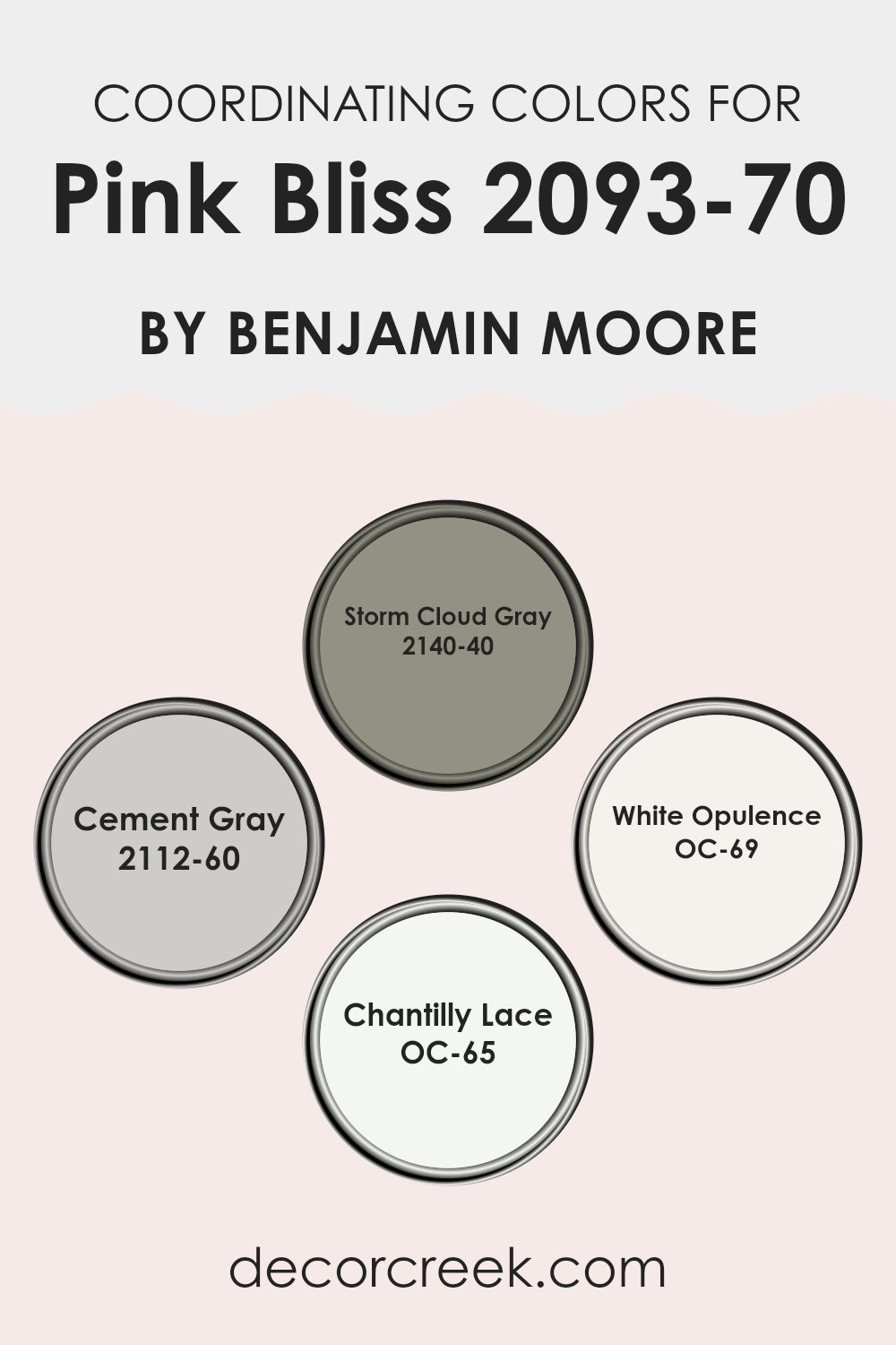
Coordinating Colors of Pink Bliss 2093-70 by Benjamin Moore
Coordinating colors are shades that complement each other when used together in decor, helping to create a harmonious and balanced look. When considering Pink Bliss by Benjamin Moore, a soft, gentle pink, the chosen coordinating colors enhance the hue and bring refinement to the overall palette without overpowering it. These coordinating colors range from neutrals to deeper tones, offering flexible options for different design needs.
Storm Cloud Gray gives a moodier contrast to the lightness of Pink Bliss, acting as a strong, anchoring shade in an area. It’s a deep gray that can add depth to a room when used on accent walls or furniture. Cement Gray, meanwhile, is a lighter, mid-tone gray that bridges the gap between Pink Bliss and darker shades like Storm Cloud Gray.
It works well to soften transitions between colors in an area. White Opulence is a crisp, clean white that refreshes the palette and can make Pink Bliss appear even more delicate. It’s ideal for trim or ceilings to give a lift to the entire area. Lastly, Chantilly Lace offers a slightly warmer white option, still clean but with a touch of warmth to prevent the room from feeling too stark, making it an excellent choice for larger wall areas or cabinetry. These colors, when used together, support and enhance the beauty of Pink Bliss, allowing for beautiful and cohesive interiors.
You can see recommended paint colors below:
- 2140-40 Storm Cloud Gray
- 2112-60 Cement Gray
- OC-69 White Opulence
- OC-65 Chantilly Lace
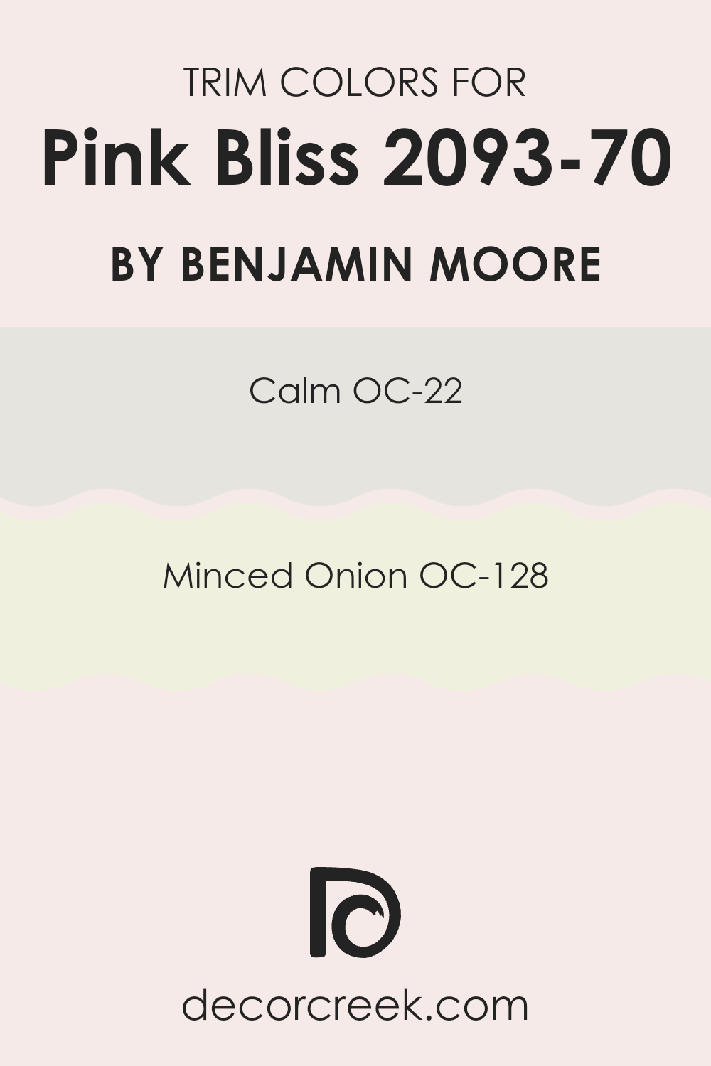
What are the Trim colors of Pink Bliss 2093-70 by Benjamin Moore?
Trim colors are specifically used for painting the architectural details of a room, such as door frames, window frames, moldings, and skirting boards. They play a key role in defining the area and can complement or contrast the main wall color to create a cohesive or striking visual impact.
For a delicate hue like Pink Bliss by Benjamin Moore, choosing the right trim colors can add a subtle definition without overpowering the gentle tone of the room. The colors OC-22 Calm and OC-128 Minced Onion, both by Benjamin Moore, serve this purpose beautifully, providing a soft backdrop that enhances the overall aesthetic of the area.
OC-22 Calm is a light and airy off-white shade with a hint of gray that gives a fresh and clean look to any room. It pairs well with Pink Bliss as it maintains the light, refreshing feel of the area while providing just enough contrast to make the trim noticeable. OC-128 Minced Onion offers a slightly different approach; it is a warmer, beige color that brings a cozy and inviting atmosphere to the room. This color works well in rooms using Pink Bliss, where a touch of warmth is desired to balance the cooler tones of the main color. Both trim colors help in achieving a well-rounded look that complements the gentle charm of Pink Bliss.
You can see recommended paint colors below:
- OC-22 Calm
- OC-128 Minced Onion
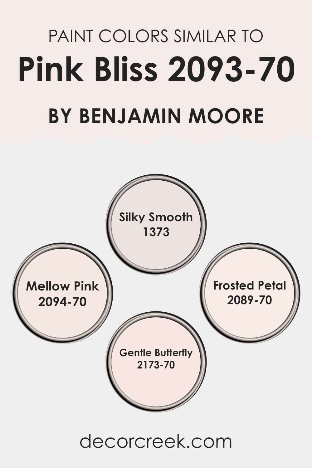
Colors Similar to Pink Bliss 2093-70 by Benjamin Moore
Similar colors play a significant role in interior design by creating a harmonious and soothing atmosphere in any area. When hues close to Pink Bliss by Benjamin Moore are used together, such as Silky Smooth, Mellow Pink, Frosted Petal, and Gentle Butterfly, they produce a subtle yet impactful visual experience.
This cohesion is crucial because it doesn’t become too daunting for the eye, allowing the colors to flow seamlessly throughout the room. These soothing shades help in achieving a cohesive look that is visually pleasing and calming.
Silky Smooth is a delicate color, like the inside of a seashell, soft and inviting, perfect for areas intended to be relaxing. Mellow Pink, as the name suggests, adds a whisper of color, gentle and undemanding, ideal for creating an area that feels light and airy. Frosted Petal offers a touch of freshness, mimicking the tender hue of a rose at dawn, while Gentle Butterfly has the faintest glow of sunrise, warm and welcoming. Together, these colors create an environment that is both inviting and comforting, perfect for areas where calm and visual unity are desired.
You can see recommended paint colors below:
- 1373 Silky Smooth
- 2094-70 Mellow Pink
- 2089-70 Frosted Petal
- 2173-70 Gentle Butterfly
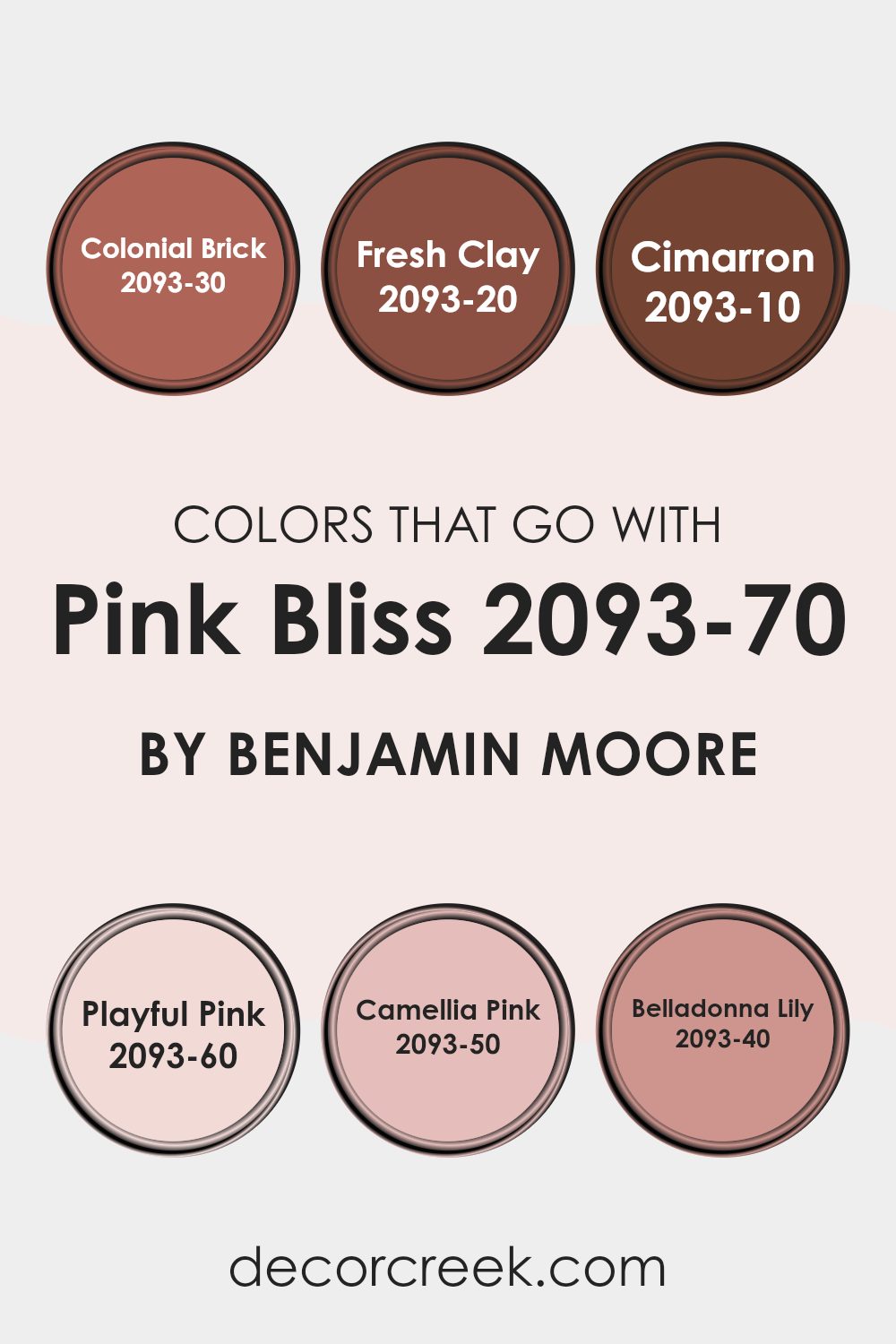
Colors that Go With Pink Bliss 2093-70 by Benjamin Moore
Choosing the right colors to complement Pink Bliss 2093-70 by Benjamin Moore is key to creating a harmonious and inviting area. The colors that pair well with Pink Bliss, such as Colonial Brick, Fresh Clay, Cimarron, Playful Pink, Camellia Pink, and Belladonna Lily, enhance the soft, gentle nature of Pink Bliss by offering both contrast and cohesion in a color scheme.
Colonial Brick is a warm, deep red that brings a cozy feel to the environment, making it a great companion to the lighter Pink Bliss for a balanced look. Fresh Clay, with its earthy, muted orange tone, offers a subtle warmth that pairs nicely with Pink Bliss, adding a bit of rustic charm without being too daunting for the area.
Cimarron stands out as a rich, terra cotta hue that provides a bold contrast, making the soft pink pop and adding interest to the room. Playful Pink, as its name suggests, is a cheerful, light-hearted pink that is slightly more vibrant than Pink Bliss, injecting fun into the area while maintaining a soft palette.
Camellia Pink is similar to Pink Bliss but with a slightly more pronounced pink tone that can create a monochromatic look with a bit of variation. Lastly, Belladonna Lily is a striking magenta that offers a vivid contrast, perfect for accenting features and drawing the eye, while still complementing the overall softness of Pink Bliss. Each of these colors supports Pink Bliss in creating environments that are warm and inviting, with just the right amount of visual interest and excitement.
You can see recommended paint colors below:
- 2093-30 Colonial Brick
- 2093-20 Fresh Clay
- 2093-10 Cimarron
- 2093-60 Playful Pink
- 2093-50 Camellia Pink
- 2093-40 Belladonna Lily
How to Use Pink Bliss 2093-70 by Benjamin Moore In Your Home?
Pink Bliss 2093-70 by Benjamin Moore is a soft and gentle pink shade that brings a warm and inviting feel to any room. This color is perfect for creating a cozy and relaxing atmosphere in your home.
It works well in bedrooms, where it adds a touch of quiet, cheerful energy without being too overpowering. For those who fancy a bit of subtlety in their living areas, applying Pink Bliss on a feature wall can give the room a fresh, modern look while keeping the overall vibe calm.
In addition to walls, you can use Pink Bliss on furniture or cabinets for a playful yet stylish pop of color. It pairs beautifully with white or light gray, which helps keep the area feeling light and airy. This color is also a wonderful choice for a nursery or children’s room, providing a soothing backdrop that’s perfect for both boys and girls. Overall, Pink Bliss offers a flexible way to add a personal touch to your home with its warm and inviting hue.
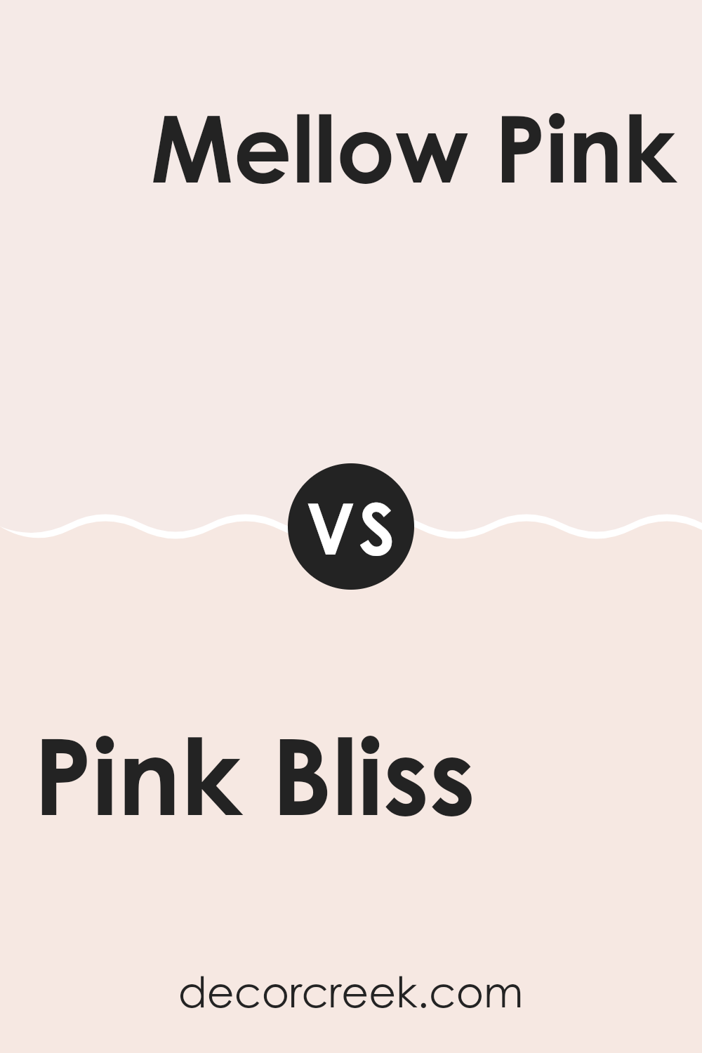
Pink Bliss 2093-70 by Benjamin Moore vs Mellow Pink 2094-70 by Benjamin Moore
Pink Bliss and Mellow Pink, both by Benjamin Moore, are subtle shades that offer a delicate touch to any area. Pink Bliss has a light and airy feel, almost like a soft, warm blush on a cheek. It’s perfect for creating a gentle and inviting atmosphere.
In contrast, Mellow Pink leans slightly towards a peachier tone, giving it a warmer presence compared to Pink Bliss. This warmth makes Mellow Pink a cozy choice for rooms where you want a hint of color without overpowering the area.
Both colors are quite muted, making them excellent for pairing with bolder hues or soft neutrals. Whether you’re looking to add a splash of softness to a nursery or a calming influence to a personal workspace, Pink Bliss and Mellow Pink have subtle differences that can suit various moods and preferences.
You can see recommended paint color below:
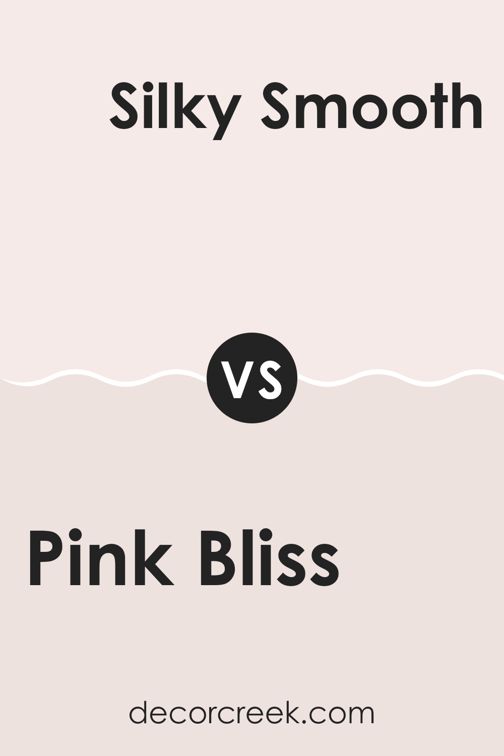
Pink Bliss 2093-70 by Benjamin Moore vs Silky Smooth 1373 by Benjamin Moore
Pink Bliss and Silky Smooth are two colors by Benjamin Moore that each provide a unique atmosphere to an area. Pink Bliss is a soft, light pink that has a gentle and airy feel, making it perfect for creating a calming and cheerful environment.
It’s subtle enough to be used widely in anything from bedrooms to living areas without overpowering the area. On the other hand, Silky Smooth has a deeper, creamier pink tone that offers a slightly richer look.
This color brings a warm and welcoming vibe, perfect for areas where you want to add a touch of coziness without going too dark. While both colors share a pink base, Pink Bliss leans towards a lighter, more delicate pink, while Silky Smooth presents a more muted, creamy aspect, making each ideal for different tastes and styles.
You can see recommended paint color below:
- 1373 Silky Smooth
Pink Bliss 2093-70 by Benjamin Moore vs Frosted Petal 2089-70 by Benjamin Moore
Pink Bliss and Frosted Petal, both by Benjamin Moore, are subtle and gentle colors, perfect for creating a soft and inviting atmosphere in any area. Pink Bliss leans into a very light, whispery pink that offers a hint of warmth, making it a great choice if you want to add a touch of softness to your room without being too daunting with color. It’s like a soft blush on a cheek, subtle yet present.
On the other hand, Frosted Petal is another light option but with a cooler undertone. It’s almost like the first touch of frost on a flower petal, hence the name. This color reflects light beautifully and can help make a small area appear bigger and more open.
Both colors are quite light and can work well to brighten up a room while maintaining a gentle, non-intrusive presence. You might choose Pink Bliss if you’re inclined towards a slightly warmer feel, and Frosted Petal if you prefer cooler tones. They work well in sunny rooms to enhance natural light without creating glare.
You can see recommended paint color below:
- 2089-70 Frosted Petal
Pink Bliss 2093-70 by Benjamin Moore vs Gentle Butterfly 2173-70 by Benjamin Moore
Pink Bliss and Gentle Butterfly, both by Benjamin Moore, are shades that might seem similar but have distinct undertones and vibes. Pink Bliss is a very light pink that almost leans toward a soft white with just a hint of blush. It’s perfect for creating a subtle, gentle feel in an area, making it ideal for bedrooms or other areas where a calm atmosphere is desired.
Gentle Butterfly, on the other hand, is also a pale pink but with a warmer undertone. This color offers a slightly more cheerful and inviting look compared to Pink Bliss. It could be a great choice for areas like a nursery or a cozy reading nook, giving a more lively yet still soft touch to the walls.
When choosing between the two, consider the mood you want to set in your room. Pink Bliss is better for those looking for a minimalistic or neutral backdrop, while Gentle Butterfly suits an area where a warm, welcoming feel is preferred.
You can see recommended paint color below:
- 2173-70 Gentle Butterfly
In writing about the 2093-70 Pink Bliss paint by Benjamin Moore, I’ve shared quite a bit about how this color makes rooms feel warm and welcoming. Interestingly, this particular shade of pink isn’t too bright or too soft; it’s just right for making a room feel cozy yet cheerful. It’s a great choice if you want to make an area in your home feel happy and calm without using a super bold color.
I also mentioned how Pink Bliss can be used in different rooms like bedrooms, living rooms, or even bathrooms and it still looks great. It’s like this color has a special power to fit in anywhere and make it look better. It’s especially good for places where you relax or play, because it has a way of lifting your mood.
Lastly, I learned that using Pink Bliss paint can be a smart move since it not only makes the walls look nice, but it also goes well with other colors. Whether you mix it with dark colors like gray or lighter tones like white, it manages to stand out in a good way. This makes decorating a lot easier and more fun.
So, whether you’re giving a new look to your room or just adding a splash of color, Pink Bliss is a choice that you’ll probably be really happy with. It invites happiness into the area without trying too hard, and that’s what makes it so special.
Ever wished paint sampling was as easy as sticking a sticker? Guess what? Now it is! Discover Samplize's unique Peel & Stick samples.
Get paint samples

