I recently painted cliens’t kitchen with HC-35 Powell Buff by Benjamin Moore, and I want to share my experience with you. If you’re looking for a warm, inviting neutral color, you might find Powell Buff to be a perfect choice. This shade has a way of making the space feel cozy and welcoming without overwhelming with color. It’s versatile too, blending seamlessly with various decor styles, from traditional to contemporary.
In different lighting, Powell Buff reveals subtle undertones that keep the walls from looking flat. For those who are trying to avoid a stark white or a too-bold beige, it offers an excellent middle ground. Whether you’re aiming to freshen up your living room, bedroom, or even your kitchen, Powell Buff adapts beautifully.
If you’ve experienced your own share of mishaps with picking the wrong paint colors before, you’ll appreciate how forgiving Powell Buff can be. It doesn’t demand extensive redecorations around it, making it a practical choice for anyone looking to update their living space without committing to a complete design overhaul.
I used it and appreciated how it enhanced the room’s overall ambiance with its warm and subtle presence.
What Color Is Powell Buff HC-35 by Benjamin Moore?
Powell Buff HC-35 by Benjamin Moore is a warm and inviting beige that adds a gentle touch of coziness to any room. This versatile color has a creamy undertone that makes it perfect for creating a comforting and welcoming atmosphere in your home. Its subtle richness enhances the space without overwhelming it, making it an excellent choice for those looking to refresh their interiors with a neutral, yet impactful, shade.
The beauty of Powell Buff HC-35 lies in its adaptability. It fits seamlessly into a variety of interior styles, from traditional to modern and even rustic. This hue works particularly well in living rooms, bedrooms, and kitchens where its warm tones complement natural light.
For materials and textures, Powell Buff pairs beautifully with natural wood, enhancing its rich grains and adding depth to the room. It also goes well with soft textiles like cotton and linen in lighter shades to maintain a light and airy feel. For a more dynamic look, you can match it with metals like bronze or copper to bring out its warm undertones. In summary, Powell Buff HC-35 is a go-to color for creating a cozy, stylish, and cohesive space.
Is Powell Buff HC-35 by Benjamin Moore Warm or Cool color?
Powell Buff HC-35 by Benjamin Moore is a warm, inviting paint color that brings a cozy atmosphere to any room in the home. It has a soft, creamy tone that pairs beautifully with a wide range of other colors, making it quite versatile. Whether you’re painting a living room, bedroom, or even a kitchen, Powell Buff creates a welcoming environment.
This color is especially useful in spaces that don’t get a lot of natural sunlight. Its warm hue helps to brighten rooms that might otherwise feel dull or cold. When used in a well-lit area, it adds a cheerful glow, enhancing the natural light.
Powell Buff also works well with wood finishes, from light pines to dark walnuts, complementing natural materials without overpowering them. It’s a great choice if you want to create a cozy, comfortable vibe without using a color that feels too intense or overwhelming. Overall, Powell Buff is a practical and attractive option for almost any space in your home.
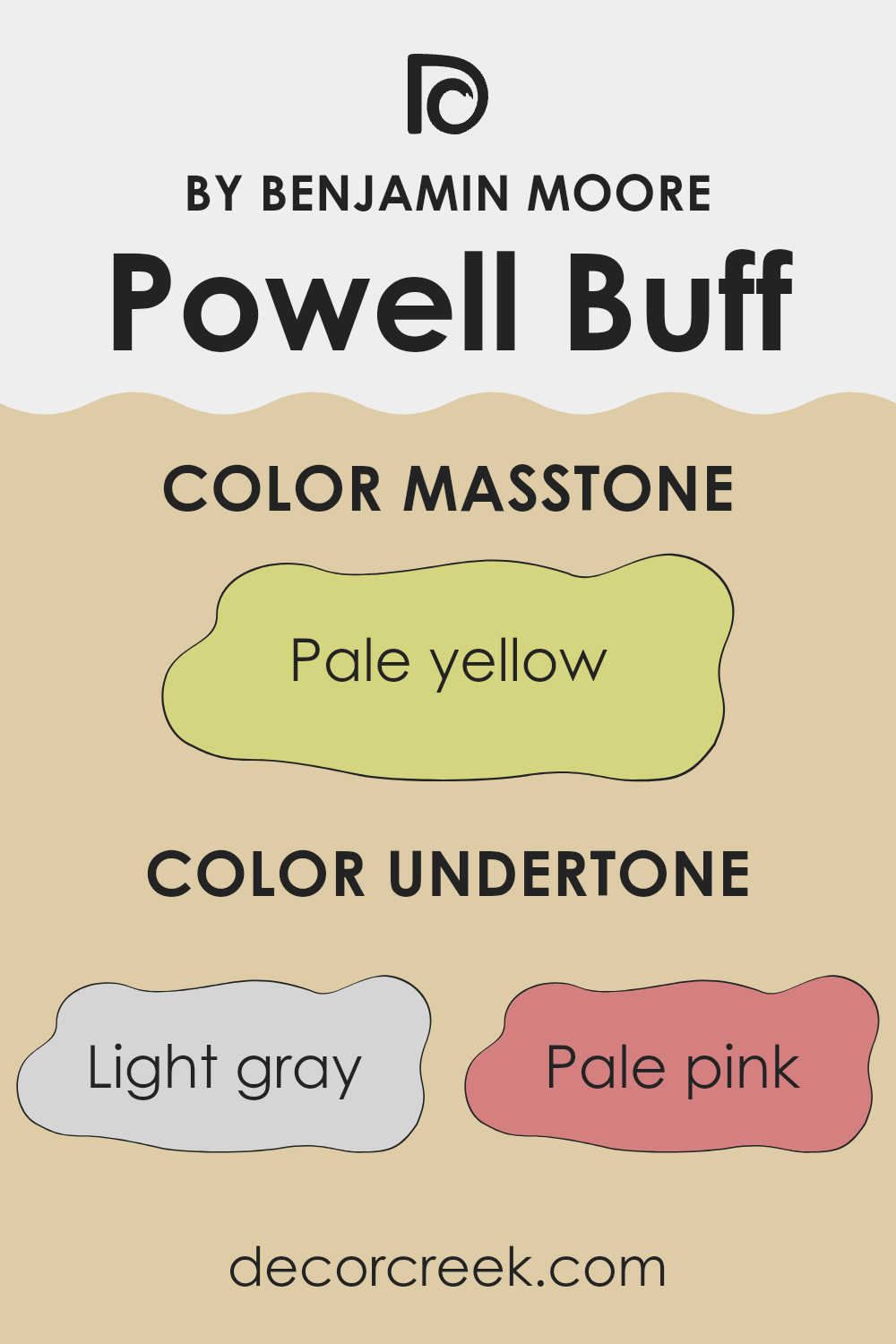
Undertones of Powell Buff HC-35 by Benjamin Moore
Powell Buff is a paint color that exhibits a warm, inviting base with a diverse palette of undertones. These undertones include light gray, pale pink, light purple, mint, light blue, yellow, grey, lilac, orange, light green, and olive. Each of these undertones plays a role in how the color is perceived in different lighting conditions and settings.
Undertones affect our perception of color by subtly altering its appearance under various light sources. For instance, a color with a yellow undertone might look warmer and more welcoming under natural light, but appear different under artificial lighting.
In the case of Powell Buff, the range of undertones makes it a versatile choice for interior walls. The light gray and grey undertones provide a neutral base, which can help in tying the room together. Pale pink and light purple add a touch of warmth, making the space feel cozy. The mint, light blue, and light green undertones impart a slight freshness, ideal for rooms that aim for a lively yet soft ambiance.
Yellow, orange, and olive bring in a natural earthiness that can make larger spaces feel more intimate. These undertones ensure that the wall color maintains a connection with natural elements, which is soothing for residential spaces.
Overall, the complexity of Powell Buff’s undertones means it can adapt to various décor styles and preferences, influencing the atmosphere of the room and how it’s enjoyed.
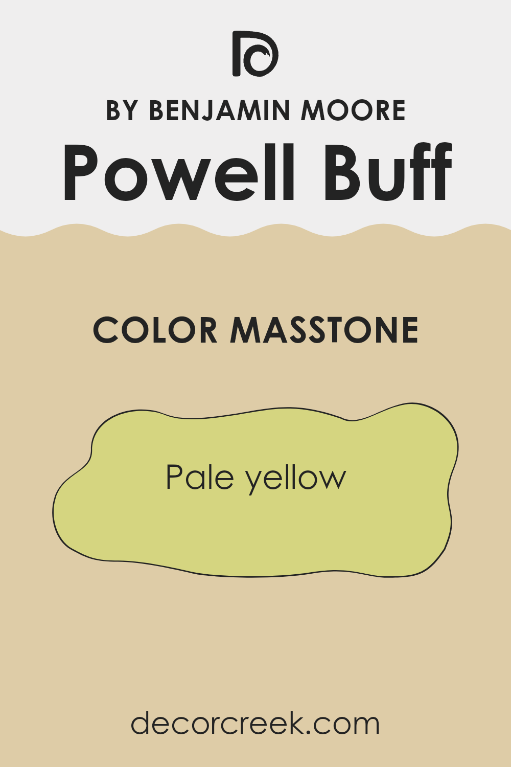
What is the Masstone of the Powell Buff HC-35 by Benjamin Moore?
Powell Buff HC-35 by Benjamin Moore presents a masstone of pale yellow, characterized by its understated yet warm appearance, which can significantly influence a home’s atmosphere. This particular hue is gentle and inviting, making it an excellent choice for almost any room.
Its lightness reflects natural light beautifully, helping to make small spaces appear larger and more open. Furthermore, the soft yellow tone creates a cozy feel, suitable for living areas and bedrooms where a comforting ambiance is desired.
When used on walls, this color pairs well with both bright and dark colors, allowing for versatile design options. It provides a subtle background that can enhance bolder furniture pieces or art without overpowering them. Its neutrality helps in maintaining a balanced look, making it easy to decorate around without the fear of color clashes. Powell Buff is thus a practical choice, offering both aesthetic appeal and flexibility in interior design.
How Does Lighting Affect Powell Buff HC-35 by Benjamin Moore?
Lighting plays a crucial role in how we perceive colors. The same shade can look different depending on the type of light it’s under – whether natural sunlight or artificial lighting. This change occurs due to the light’s intensity and the color temperature, which affects how we see colors. Let’s use the paint color Powell Buff by Benjamin Moore as an example to see how lighting impacts its appearance in various settings.
This particular color is a warm, neutral tone that can shift in appearance from one environment to another. Under artificial light, such as LED or fluorescent bulbs, Powell Buff can look slightly more yellow or beige depending on the bulb’s warmth or coolness. This warmer tone can make a room feel cozy and welcoming.
In natural light, the color tends to show its true character. In rooms that face north, which receive less direct sunlight, Powell Buff may appear slightly duller and cooler, giving the room a more muted feel. South-facing rooms, on the other hand, get ample sunlight and this can make the color look brighter and even warmer, enhancing its inviting quality.
East-facing rooms see the most change with this color, as they are filled with warm morning light. Here, Powell Buff radiates warmth, looking vibrant and fresh. As the day progresses, however, the color loses some of this warmth and can appear more subdued. West-facing rooms receive intense evening light, which can make the color appear richer and warmer towards the end of the day.
Each of these different qualities shows just how dynamic and flexible Powell Buff can be under various lighting conditions, highlighting why lighting should always be considered when choosing colors for a space.

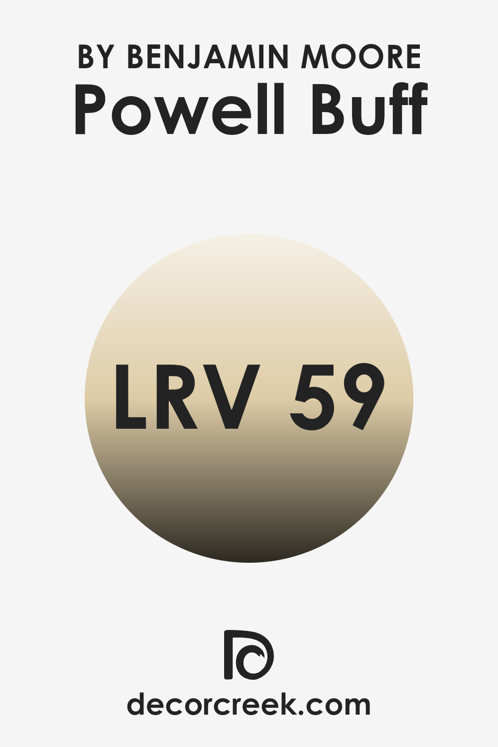
What is the LRV of Powell Buff HC-35 by Benjamin Moore?
LRV stands for Light Reflectance Value, which is a measure of how much light a paint color can reflect. It is expressed as a percentage from 0 to 100, where a higher number indicates that the color reflects more light. This is important because a color with a higher LRV can make a space feel brighter and more open, as it reflects more natural and artificial light back into the room. On the other hand, colors with lower LRVs absorb more light, making a room feel smaller and darker.
The LRV of Powell Buff, which is 59.43, means that it is a fairly light color that will reflect a good amount of light without appearing stark or overly bright. This makes it a great choice for rooms that could use a bit of brightness but where a very high reflectance might be overwhelming.
In a room with moderate to high levels of natural light, this color will help maintain a light and airy feel while still adding visual warmth and coziness. It’s a versatile color that can easily adapt to various lighting changes throughout the day, keeping the room lively and inviting.
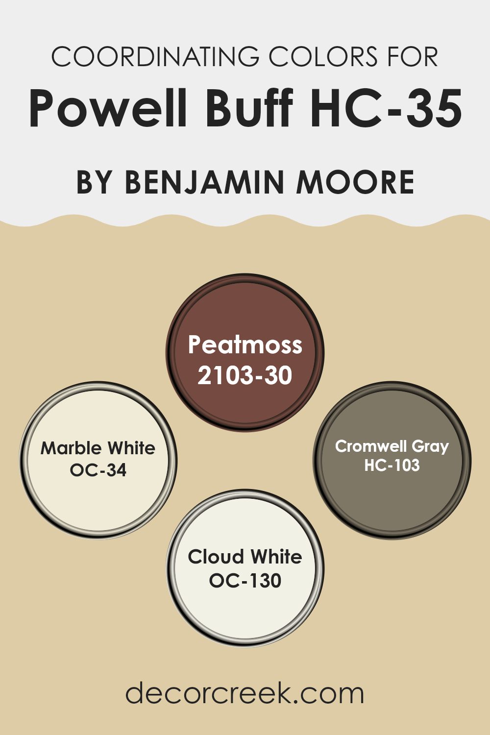
Coordinating Colors of Powell Buff HC-35 by Benjamin Moore
Coordinating colors are complementary shades that pair well with a primary color to create a harmonious color scheme in a room. These colors can enhance the main hue by adding contrast, depth, or softness, depending on their tones. Coordinating colors are often selected to create a balanced visual impact, making a space feel more cohesive. Powell Buff is a versatile neutral shade that works beautifully as a base, allowing coordinating colors to stand out or blend in subtly, depending on their intensity and undertone.
Peatmoss is a deep, earthy green that adds a robust contrast to the subtlety of Powell Buff, perfect for accent walls or decorative elements that need to pop. Marble White offers a soft, almost creamy hue that complements Powell Buff in a way that creates a gentle, light-enhancing effect, excellent for a feeling of openness and light in smaller or dimly lit rooms.
Cromwell Gray brings a steady, cool balance, ideal for areas where a neutral yet pronounced backdrop is needed, helping to ground the space without overpowering it. Lastly, Cloud White provides a crisp, clean look that pairs with Powell Buff to keep spaces feeling airy and fresh, ideal for trim or ceilings to give a lift to the overall aesthetics of a room. Together, these coordinating colors work in harmony to enhance the beauty and functionality of a space decorated with Powell Buff.
You can see recommended paint colors below:
- 2103-30 Peatmoss
- OC-34 Marble White
- HC-103 Cromwell Gray
- OC-130 Cloud White
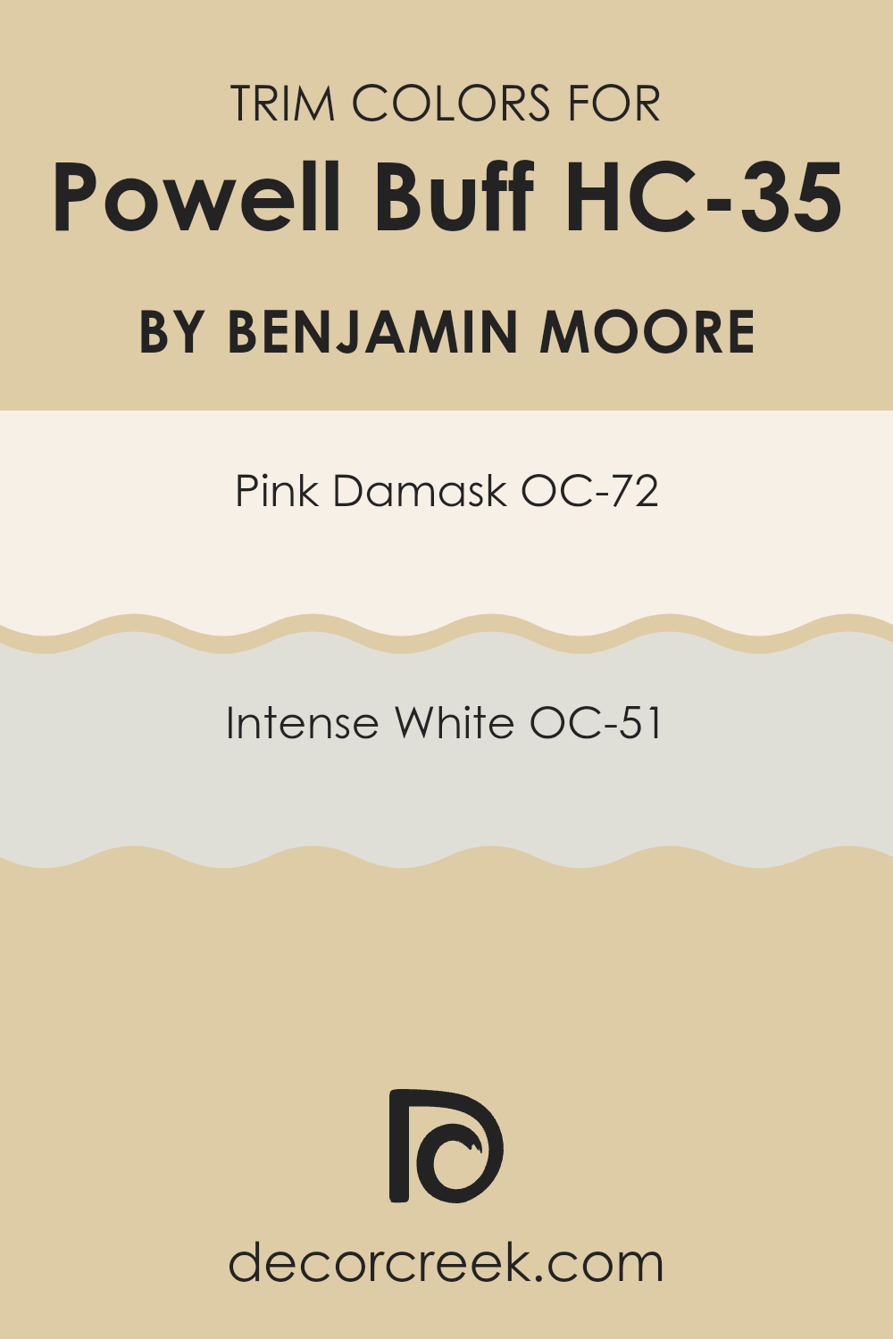
What are the Trim colors of Powell Buff HC-35 by Benjamin Moore?
Trim colors are used on the edges of walls, doors, windows, and other architectural features to enhance the appearance of a room by contrasting or complementing the main wall color. For a color like Powell Buff HC-35 by Benjamin Moore, which is a warm and inviting neutral hue, choosing the right trim colors can really highlight the spaces and add depth to the overall decor. Trim colors help define clear boundaries and visually separate different materials, making architectural details stand out.
OC-72 – Pink Damask and OC-51 – Intense White from Benjamin Moore are great choices as trim colors for Powell Buff HC-35. Pink Damask is a gentle pink that adds a subtle touch of warmth to the trim, giving it a soft and welcoming look that pairs well with the earthy tone of Powell Buff.
Intense White, on the other hand, is a bright and clean white that offers a sharp contrast to the muted tones of Powell Buff, making it ideal for a crisp, refreshing look around doors and windows. These colors work together to enhance the overall aesthetic and ensure the main color looks more defined and striking in any room.
You can see recommended paint colors below:
- OC-72 Pink Damask
- OC-51 Intense White
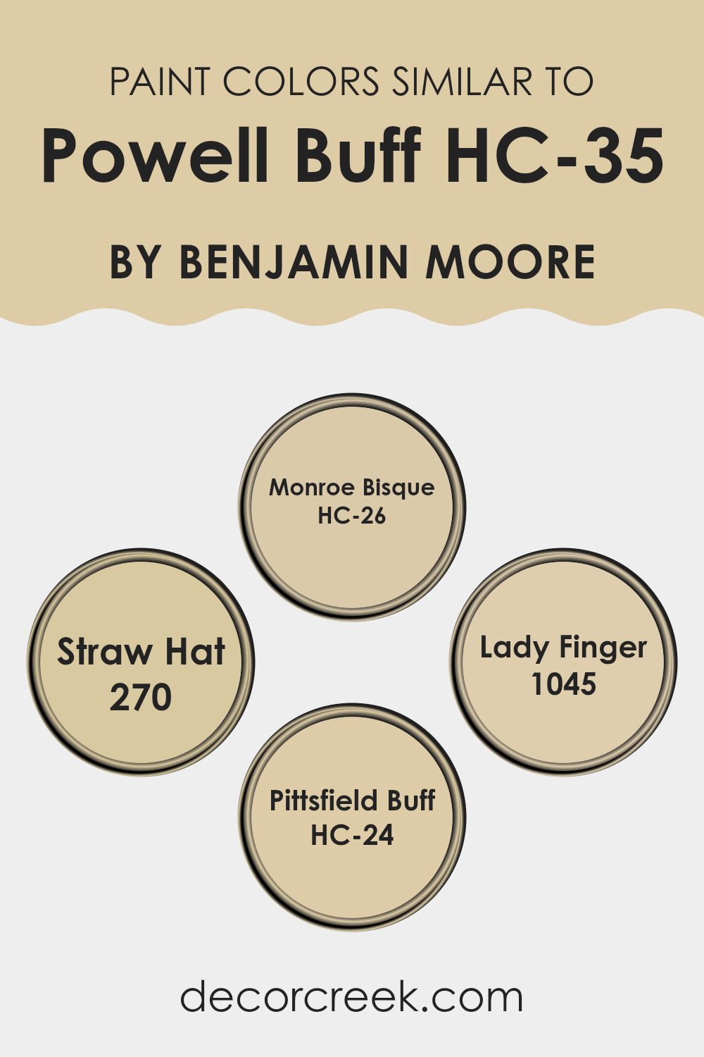
Colors Similar to Powell Buff HC-35 by Benjamin Moore
Choosing similar colors in a color scheme is crucial for creating a harmonious and aesthetically pleasing environment. Colors like Monroe Bisque HC-26, Straw Hat 270, Lady Finger 1045, and Pittsfield Buff HC-24 share a close relationship with Powell Buff HC-35 by Benjamin Moore, offering a palette that seamlessly blends together.
These subtle variations in hue help in creating depth and continuity, allowing for a gentle transition between different surfaces and elements within a space. Such a setup is especially beneficial in areas where a soothing and cohesive appearance is desired, as it prevents the jarring contrasts that can occur with widely differing colors.
Monroe Bisque HC-26 is a warm, inviting beige that offers a soft backdrop, ideal for living spaces where comfort is key. Straw Hat 270 brings a slightly deeper, golden tone that recalls the gentle warmth of sunlight, perfect for creating a cozy and inviting atmosphere. Lady Finger 1045 has an understated elegance with its muted, earthy beige tone, making it suitable for a refined yet relaxed look.
Lastly, Pittsfield Buff HC-24 provides a light, sandy color that works beautifully in brightening rooms while maintaining an organic, subdued feel. Together, these colors work in tandem to provide a versatile and welcoming environment, enhancing the beauty of the home without overwhelming the senses with too much variation.
You can see recommended paint colors below:
- HC-26 Monroe Bisque
- 270 Straw Hat
- 1045 Lady Finger
- HC-24 Pittsfield Buff
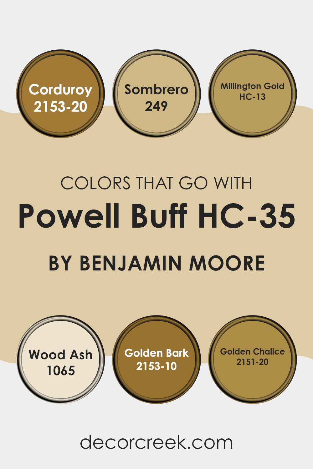
Colors that Go With Powell Buff HC-35 by Benjamin Moore
Choosing the right colors to complement Powell Buff HC-35 by Benjamin Moore is essential for creating a harmonious and visually appealing space. Powell Buff itself is a versatile and warm beige that serves as a fantastic backdrop for a range of complementary colors. For example, pairing it with colors like Corduroy (2153-20) or Golden Bark (2153-10) adds a depth and richness to the room, making it feel cozy and welcoming. Corduroy is a deep, earthy brown that provides a strong contrast, ideal for making features stand out, while Golden Bark is a darker, golden-brown shade that enriches the warm tones of Powell Buff.
On the lighter side, using Wood Ash (1065) with Powell Buff introduces a subtle contrast with its lighter, almost grayish-tan hue, which can help to brighten a space and give it a more open feel. Similarly, Millington Gold (HC-13) offers a soft golden hue that can add a gentle touch of sunshine to a room, enhancing the natural light.
For those looking to add a bit more drama, Sombrero (249) is a darker, more saturated brown with a hint of rust, perfect for creating a focal point or accent wall. Additionally, Golden Chalice (2151-20) is a majestic, deep mustard that can add a striking yet warm feature to interiors, complementing the earthy qualities of Powell Buff. Together, these colors create a palette that can accommodate a variety of design aesthetics, making any room feel put-together and cozy.
You can see recommended paint colors below:
- 2153-20 Corduroy
- 249 Sombrero
- HC-13 Millington Gold
- 1065 Wood Ash
- 2153-10 Golden Bark
- 2151-20 Golden Chalice
How to Use Powell Buff HC-35 by Benjamin Moore In Your Home?
Powell Buff HC-35 by Benjamin Moore is a warm, inviting paint color that beautifully complements various spaces in your home. Its earthy tone works well in living rooms and dining areas, creating a cozy atmosphere that makes guests feel welcome.
In bedrooms, it adds a soft, soothing touch, ideal for a relaxing environment. You can also use this versatile shade in hallways and entryways to give a feeling of warmth as you enter your home. Powell Buff HC-35 pairs nicely with natural materials like wood and leather, enhancing the richness of their textures.
It also looks fantastic with both bright and muted accent colors, allowing for flexible decorating choices. Whether you’re aiming for a causal or a more formal look, this color forms a perfect backdrop. Additionally, if you’re interested in selling your home, Powell Buff HC-35 can help make rooms look appealing and well-maintained, potentially increasing your home’s marketability.
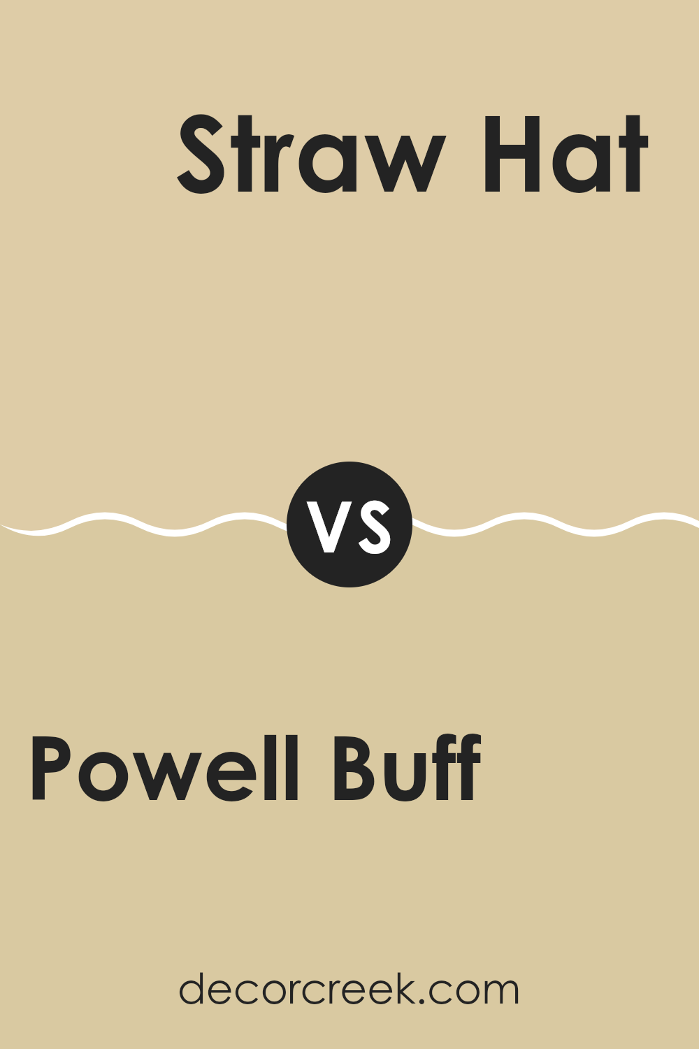
Powell Buff HC-35 by Benjamin Moore vs Straw Hat 270 by Benjamin Moore
Powell Buff and Straw Hat by Benjamin Moore are two warm shades, but they have distinct tones that set them apart. Powell Buff is a soft, creamy beige that provides a cozy and welcoming feel to any room.
It’s gentle and subtle, making it very versatile for various spaces such as living rooms or bedrooms. On the other hand, Straw Hat is a slightly deeper and richer color, resembling the natural tone of dried straw. This color offers a rustic charm that can make a room feel more grounded and homey.
While Powell Buff is more neutral and can easily blend with other colors, Straw Hat stands out a bit more, offering a stronger presence due to its deeper and earthier undertones. Both colors work well in spaces that aim for a warm and inviting atmosphere, but the choice between them depends on how bold or subtle you want the room to feel.
You can see recommended paint color below:
- 270 Straw Hat
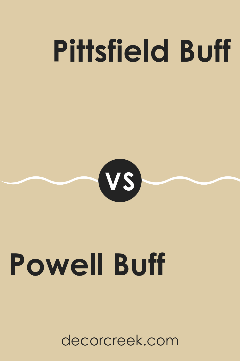
Powell Buff HC-35 by Benjamin Moore vs Pittsfield Buff HC-24 by Benjamin Moore
Powell Buff and Pittsfield Buff are two warm, neutral colors from Benjamin Moore. While both are in the same family of buffs, there are subtle differences. Powell Buff has a slightly deeper and richer hue, giving it a cozy and inviting feel. It’s a great color for living spaces where you want a comforting and soft atmosphere without being too bold.
On the other hand, Pittsfield Buff is lighter and has a bit more yellow in it, making it feel fresher and brighter. It works well in areas like kitchens and bathrooms, where a light and airy vibe is often desired. This shade can help to make small spaces appear larger and more open.
Both colors are versatile and pair well with various decor styles and other colors. Choosing between them would depend on the specific mood and size of the room you’re painting.
You can see recommended paint color below:
- HC-24 Pittsfield Buff
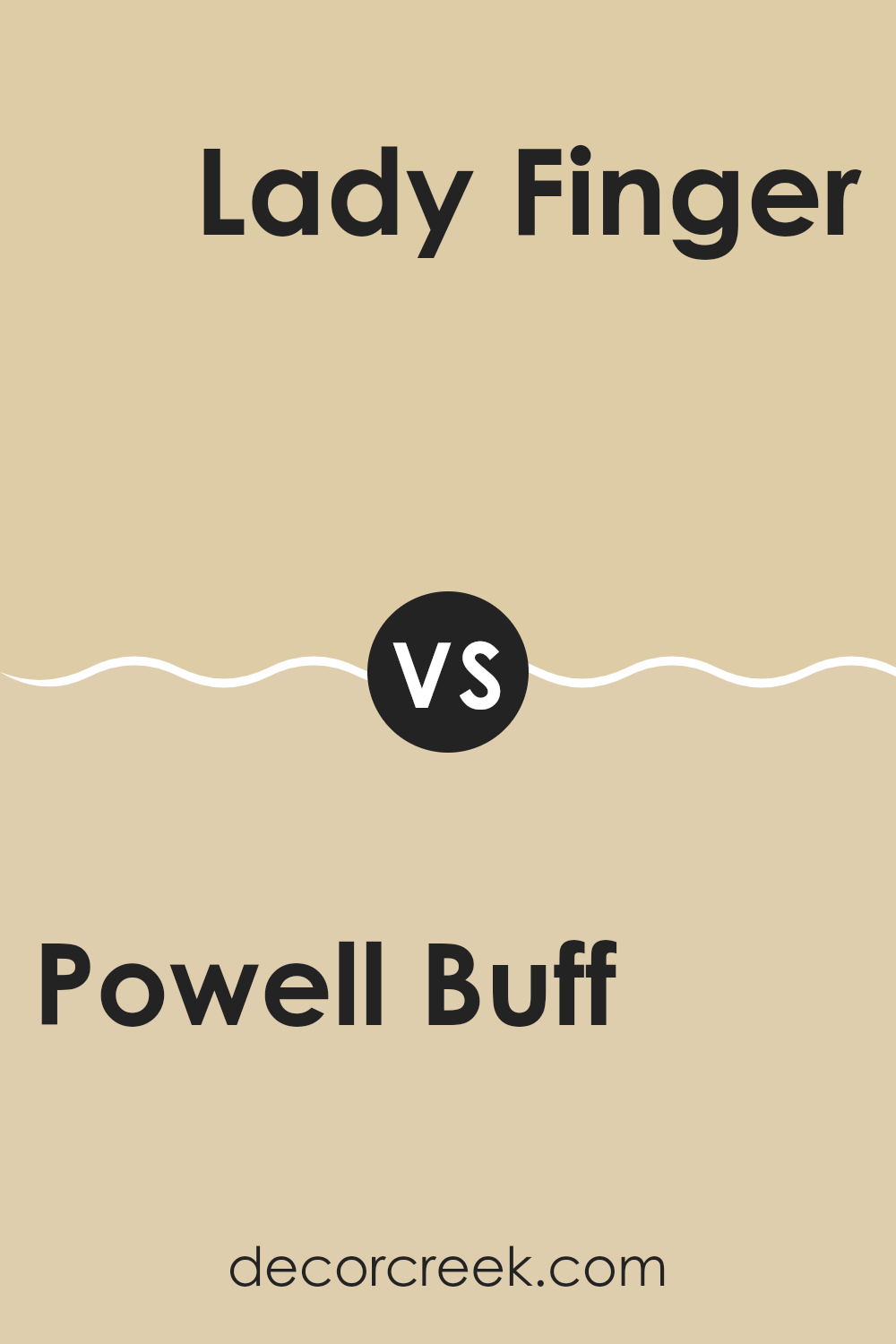
Powell Buff HC-35 by Benjamin Moore vs Lady Finger 1045 by Benjamin Moore
The main color, Powell Buff, is a warm beige hue with a subtle yellow undertone, making it cozy and inviting, perfect for spaces where you want a comforting atmosphere. It reflects light well, brightening rooms and making them appear larger.
On the other hand, Lady Finger is a darker shade that leans more toward a golden beige. This color provides a richer, deeper look, which can create a cozy feeling in spaces without feeling too enclosed. While both colors are in the beige family, Powell Buff is lighter and more neutral, making it versatile for any space and easy to pair with various decor styles.
Lady Finger, with its golden tones, offers a warmer feel and works best in spaces that benefit from a more pronounced color presence, like living rooms or dining areas. Both colors are effective for creating a welcoming environment but offer different tones and depths, impacting the room’s overall mood.
You can see recommended paint color below:
- 1045 Lady Finger
Powell Buff HC-35 by Benjamin Moore vs Monroe Bisque HC-26 by Benjamin Moore
Powell Buff and Monroe Bisque, both by Benjamin Moore, offer subtle and warm undertones perfect for creating cozy spaces. Powell Buff, a gentle mix of beige with soft yellow undertones, brings a light and airy feel to rooms, making them appear more open and welcoming. It works well in spaces that get a lot of sunlight, enhancing the brightness.
On the other hand, Monroe Bisque has a deeper, creamier tone that emanates warmth. Its richer beige color provides a comforting effect, ideal for areas where you want a more enclosed, snug vibe. It is especially good for adding depth to larger rooms or for accent walls to draw attention.
Both colors are versatile and pair well with various decor styles, from modern minimalism to classic country. They complement wood furniture and flooring beautifully and can blend smoothly with a wide range of other colors. Whether you’re painting a living room, bedroom, or hallway, both Powell Buff and Monroe Bisque are excellent choices, each setting a different mood based on their unique shades.
You can see recommended paint color below:
- HC-26 Monroe Bisque
What’s great about Powell Buff is that it goes well with lots of other colors. You can pair it with dark blues, greens, or even grays and it will still look good! This means it’s really easy to use in almost any room, like your living room, bedroom, or even the kitchen.
People who have used this color before say it makes their home feel warm and welcoming, which is exactly what you want when you’re trying to make a nice, friendly atmosphere for family and friends.
So, in conclusion, HC-35 Powell Buff by Benjamin Moore is a really good choice if you’re thinking of giving your room a new look. It’s like picking the perfect cozy sweater that’s not only comfy but also makes you look good. Whether you’re just refreshing an old space or starting fresh, this color could be the perfect choice for making a room feel just right.
Ever wished paint sampling was as easy as sticking a sticker? Guess what? Now it is! Discover Samplize's unique Peel & Stick samples.
Get paint samples

