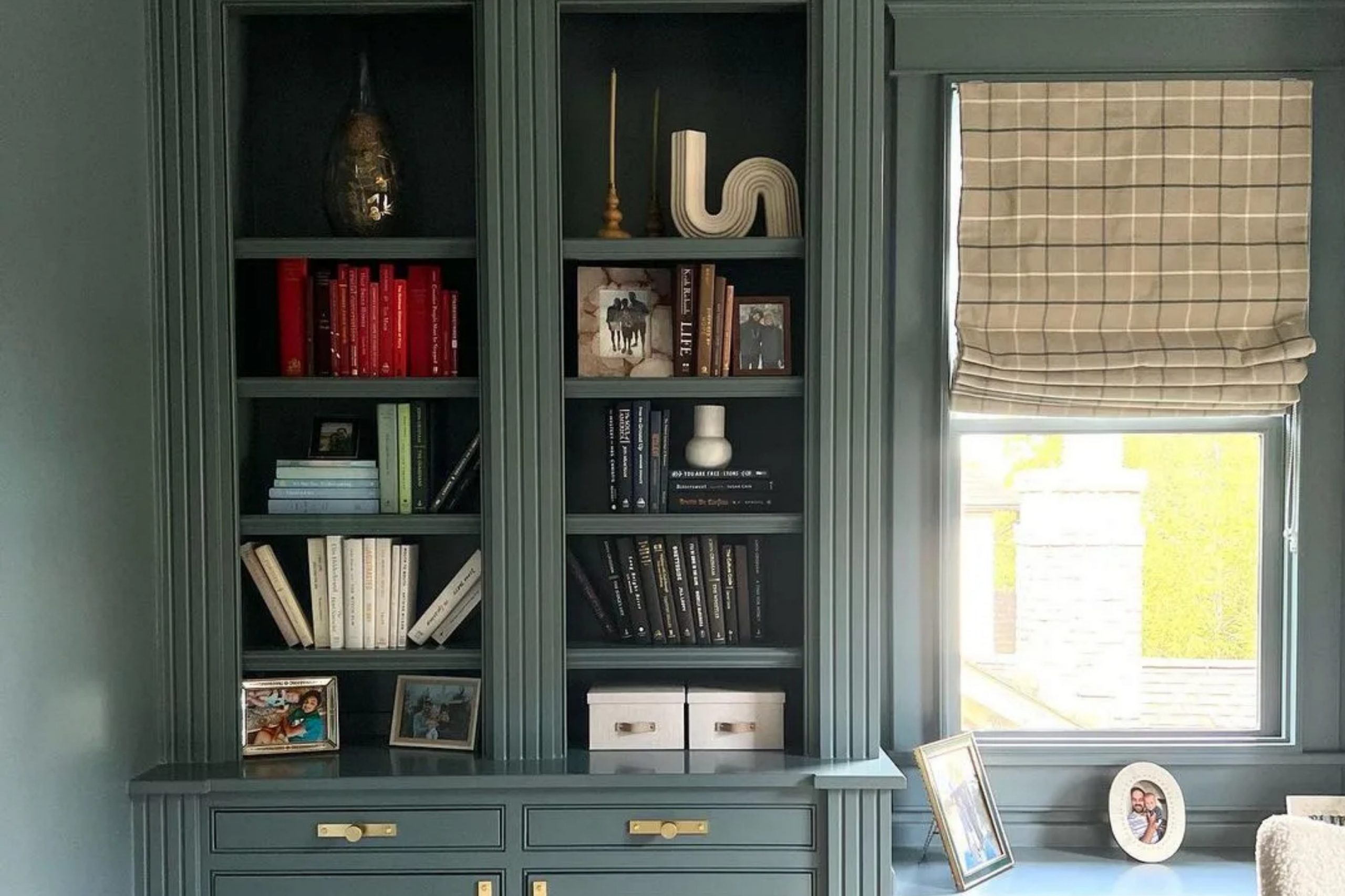
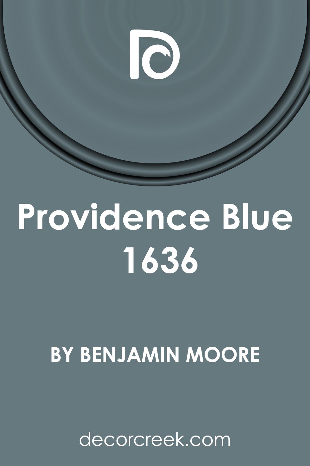
When I first came across the color 1636 Providence Blue by Benjamin Moore, I found myself drawn to its unique charm. To me, it seemed to capture a sense of calm and elegance in a way that other shades had not. This color holds a perfect balance of soothing coolness and subtle warmth, making it incredibly versatile for any space.
In my room, Providence Blue brought a refreshing change, transforming it into a serene retreat. The shade works wonderfully with both natural and artificial light, making the space feel inviting at any time of day.
When I paired it with white trims and neutral accessories, the contrast highlighted its depth, creating an atmosphere that was both peaceful and sophisticated.
Whether you’re thinking about repainting a bedroom, a living room, or an office, Providence Blue is an excellent choice. It adapts well to various styles, from traditional to modern, allowing you to create a harmonious environment.
This color’s timeless quality provides a great backdrop for artwork, furniture, and decorative pieces. I found that it serves as a perfect foundation for any personal design preferences, offering a sense of balance and continuity throughout the space.
What Color Is Providence Blue 1636 by Benjamin Moore?
Providence Blue by Benjamin Moore is a refined, soft blue with a touch of gray, giving it a muted, calming quality. This color is a versatile choice that adds a hint of color without being overpowering. It’s an excellent option for creating a peaceful atmosphere in any room. The subtle blue undertones make it a timeless choice, suitable for both modern and traditional styles.
In terms of interior styles, Providence Blue works beautifully in coastal themes, where it mirrors the hues of the sea and sky, bringing a touch of the outdoors inside. It also complements farmhouse decor, offering a subtle contrast to rustic wood elements and vintage accents.
The understated tones make it suitable for contemporary spaces, providing a gentle backdrop that enhances other design elements.
Pairing well with natural materials, Providence Blue looks stunning next to light and medium-toned woods, which bring out its warmth.
Textures like linen, cotton, and woven fabrics complement its softness, adding to the inviting feeling. Metals such as brushed nickel or matte black add a modern touch, while creamy whites and soft grays enhance its natural elegance.
This color creates a harmonious setting, making it a delightful choice for bedrooms, living rooms, or any space seeking a calming influence.
Is Providence Blue 1636 by Benjamin Moore Warm or Cool color?
Providence Blue by Benjamin Moore is a rich, versatile color that can bring a pleasant and stylish touch to various spaces in the home. With a balance of blue and green, this shade can make rooms feel comforting and refreshing. In living rooms, it can introduce a welcoming and cozy atmosphere that makes gatherings feel more inviting.
When used in bedrooms, the color creates a peaceful setting, perfect for relaxation and rest after a long day.
In kitchens and dining areas, Providence Blue adds a subtle pop of color without overwhelming the space. It pairs well with both light and dark furnishings, offering a striking contrast that enhances the room’s overall look.
The color’s depth allows it to work beautifully with natural wood tones, adding warmth and character to the home. Additionally, it complements a variety of design styles, from modern to traditional, ensuring that it can seamlessly fit into any home’s existing décor.
Undertones of Providence Blue 1636 by Benjamin Moore
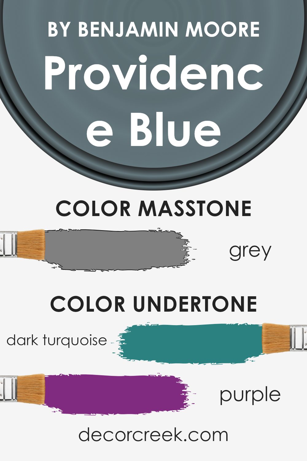
Providence Blue by Benjamin Moore is a paint color that carries a range of interesting undertones, affecting how we perceive it on walls. Undertones are subtle hues mixed into the main color, influencing its overall appearance. In this case, the undertones include shades of dark turquoise, purple, olive, mint, navy, dark green, and others like lilac, pale pink, and light blue.
These undertones make Providence Blue a versatile and dynamic color. For instance, the presence of dark turquoise and navy gives it a cooler, more refreshed tone, while hints of purple and violet add a touch of depth and richness.
Olive and dark green undertones contribute a grounding, earthy quality, providing balance. When viewed under different lighting conditions, such as sunlight or artificial light, these undertones can change the perception of the color.
On interior walls, Providence Blue creates an engaging atmosphere.
In a room with natural daylight, the blues and greens stand out, giving a vibrant look. In warmer or dimmer lighting, the purples and browns become more prominent, creating a cozy and calm environment. Undertones like mint and light turquoise add brightness, while dark grey and olive maintain sophistication, making the color suitable for various styles.
What is the Masstone of the Providence Blue 1636 by Benjamin Moore?
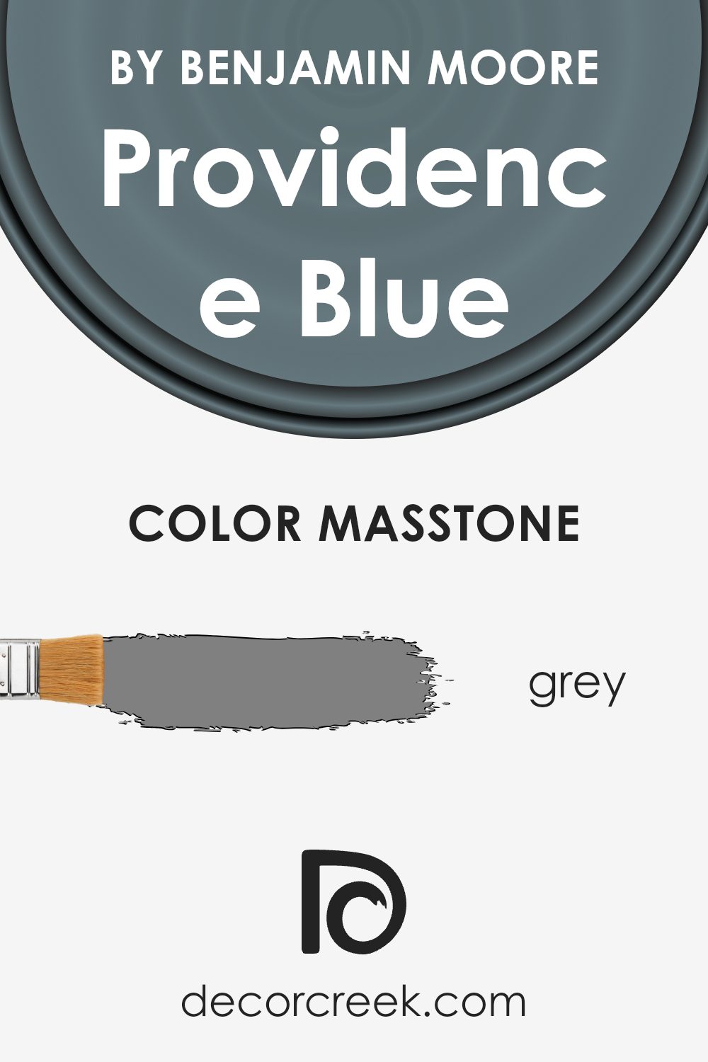
Providence Blue by Benjamin Moore, identified by the masstone Grey (#808080), is a versatile color that can enhance any living space. This shade blends the calmness of blue with the neutral properties of gray, making it suitable for various design styles.
Its balanced tones allow it to complement both warm and cool color palettes, providing flexibility in decorating choices.
In the home, Providence Blue works well in bedrooms and living spaces where a calming atmosphere is desired. The gray undertone ensures that the color does not dominate the room, instead offering a subtle backdrop that lets other elements stand out.
It pairs well with white trim for a clean, classic look or can be combined with natural wood and metallic accents for a modern feel.
Whether used on an accent wall or throughout an entire room, Providence Blue provides a soft, soothing environment without overwhelming the senses.
How Does Lighting Affect Providence Blue 1636 by Benjamin Moore?
Lighting plays a crucial role in how we perceive colors. Different types of light can change the appearance of a color, making it look warmer, cooler, duller, or more vibrant. Providence Blue by Benjamin Moore, a classic shade, is no exception to these effects.
In natural light, colors are typically seen in their truest form. The appearance of Providence Blue will vary throughout the day as the sun moves. In a north-facing room, natural light tends to be consistent but cool, which might make Providence Blue appear more muted and subdued, with hints of gray becoming more apparent.
This could result in a calming, subdued blue that lacks the brightness it might have elsewhere.
In a south-facing room, the light is brighter and warmer. This abundance of natural light can make Providence Blue appear warmer and more vibrant, bringing out its rich, deeper tones. The result is a color that feels both inviting and bold, as the warm sunlight enhances its blue hues.
East-facing rooms receive bright, crisp morning sunlight. Earlier in the day, Providence Blue can appear lively and fresh, as the cool morning light interacts with its tones. However, as the light fades towards the afternoon, it can take on a softer, more relaxed tone.
West-facing rooms get warm afternoon and evening light, making Providence Blue look cozier and perhaps richer as the day progresses. The warm light can bring out a slightly different aspect to the hue, giving it a pleasant and warm touch.
Under artificial lighting, such as LED or incandescent bulbs, the color can vary significantly. Incandescent lights tend to bring out warmer tones, giving Providence Blue a more soothing and intimate look. LEDs can vary based on their temperature settings, with cooler settings making the color appear crisper and warmer settings drawing out cozier undertones.
Understanding these effects can help homeowners choose the right lighting to highlight Providence Blue’s beauty in different spaces.
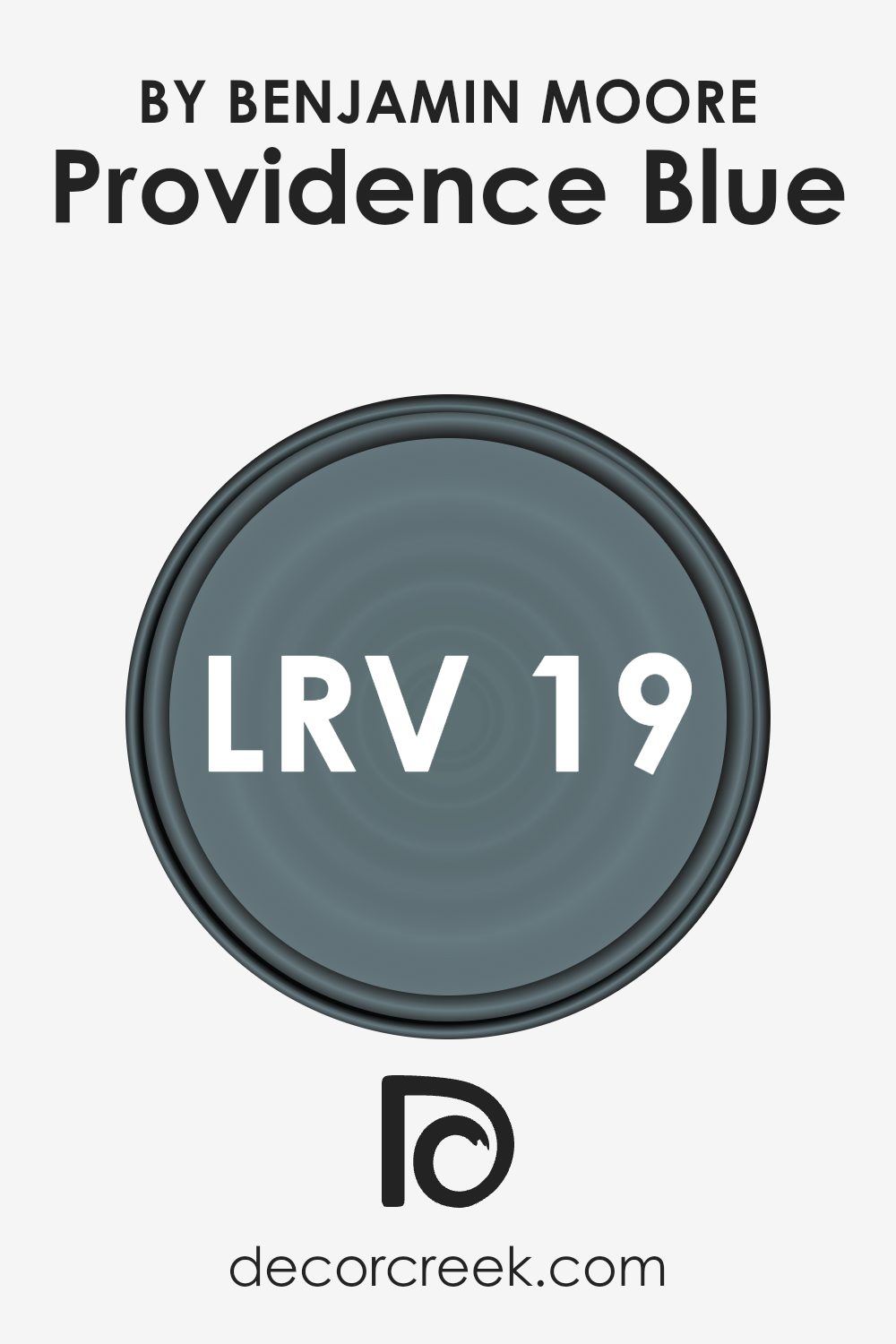
What is the LRV of Providence Blue 1636 by Benjamin Moore?
Light Reflectance Value (LRV) is a measurement used to indicate the percentage of light a paint color reflects. It is measured on a scale from 0 to 100, where 0 represents absolute black, absorbing all light, and 100 represents pure white, reflecting all light. LRV helps determine how light or dark a color will appear and how brightly it can make a room feel.
This measure is crucial for understanding how a particular color will behave under different lighting conditions or in various settings. Colors with higher LRV values tend to make a room feel larger and brighter, while those with lower values often give a room a cozy, intimate feel by absorbing more light.
With an LRV of 19.23, Providence Blue is on the darker side of the scale, which means it will absorb more light than it reflects.
This can lead to a rich, moody ambiance in the room, giving spaces a more intimate feeling. When used on walls, this color can create a comforting environment, especially in spaces with ample natural or artificial light to balance its dark nature.
However, in rooms with limited light, it may cause the space to feel smaller or more enclosed. Therefore, understanding the LRV helps in predicting how Providence Blue will interact with available lighting and influence the room’s overall atmosphere.
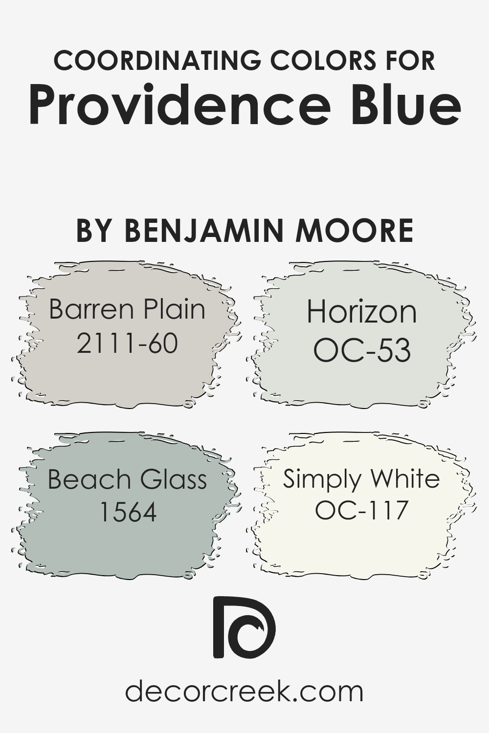
Coordinating Colors of Providence Blue 1636 by Benjamin Moore
Coordinating colors are hues that complement each other and are used together to create a harmonious look in a space. When selecting coordinating colors, it’s essential to choose shades that work well with the main color to enhance the overall aesthetic.
For Providence Blue by Benjamin Moore, which is a calm and soothing blue, coordinating colors can enhance its beauty and create a balanced ambiance.
Barren Plain, with its soft gray tone, serves as a neutral backdrop that allows the subtle hues of Providence Blue to stand out without overpowering them. Beach Glass, a gentle blue-green, mirrors the refreshing feel of Providence Blue, adding a touch of nature-inspired softness.
Horizon, being a light gray with a hint of blue, ties beautifully with Providence Blue to maintain a cool, airy atmosphere, ideal for making a room feel more open and inviting.
Simply White, a clean and crisp white, provides the perfect light contrast and can be used to highlight architectural details or brighten the space when paired with Providence Blue and its coordinating shades.
Together, these colors work to craft a cohesive and inviting color scheme that feels both calming and inviting, perfect for any room aiming for a balance of color and light.
You can see recommended paint colors below:
- 2111-60 Barren Plain
- 1564 Beach Glass
- OC-53 Horizon
- OC-117 Simply White
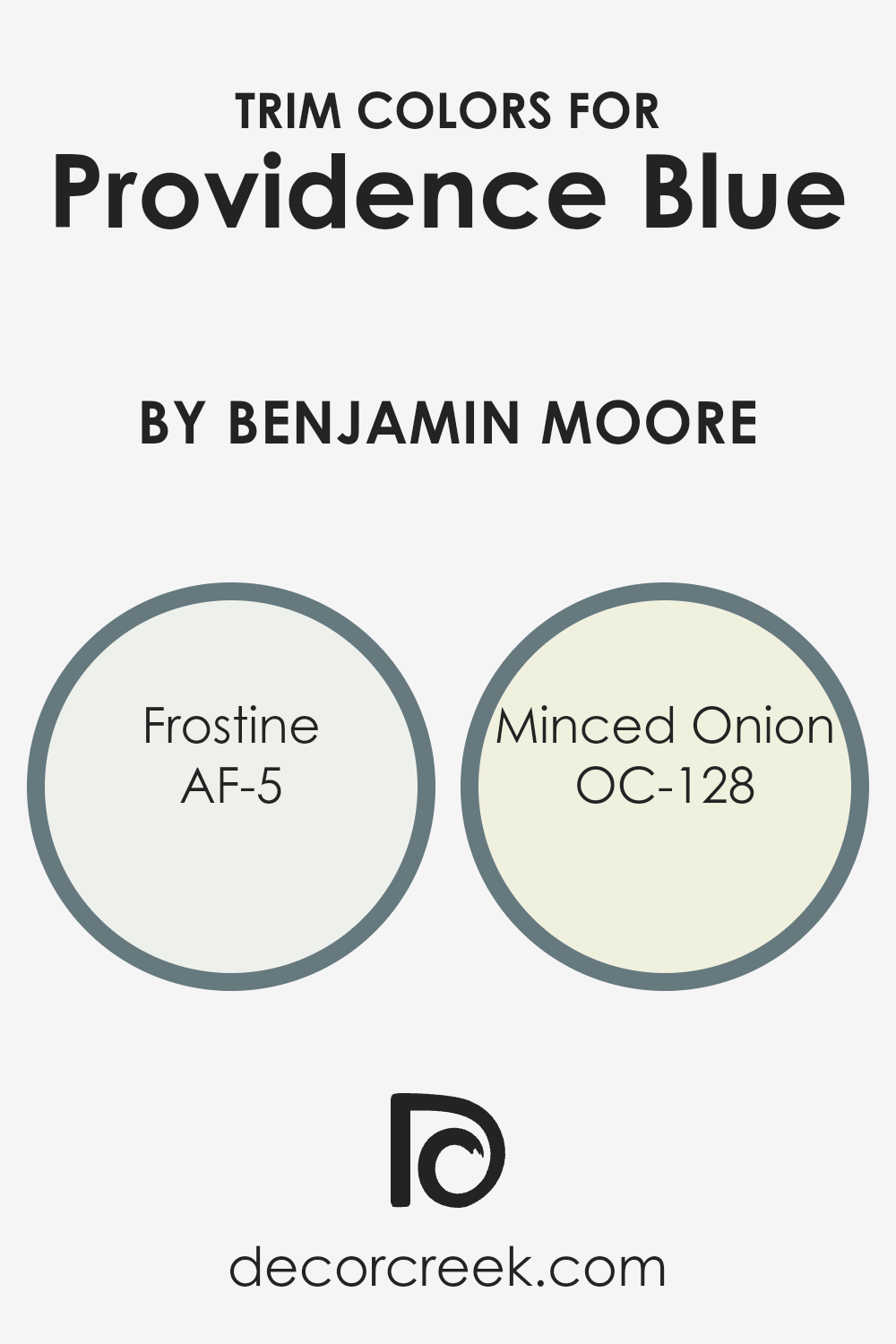
What are the Trim colors of Providence Blue 1636 by Benjamin Moore?
Trim colors are the additional colors you use to paint the edges and moldings of walls, windows, and doors. They frame the main wall color, creating contrast and highlighting architectural details. Using the right trim colors with a specific paint color like Providence Blue can greatly affect a room’s overall aesthetics.
For a shade like Providence Blue, trim colors such as AF-5 Frostine and OC-128 Minced Onion can provide a wonderful balance. Frostine, a soft and gentle white, can offer a clean, fresh look that will make Providence Blue stand out.
Meanwhile, Minced Onion, a warmer off-white, brings a touch of cozy warmth, giving the room a more inviting feeling.
Frostine is a delicate shade of white with a slight coolness to it, creating a crisp, airy feel. It pairs beautifully with cooler tones and can help make the room feel brighter and more spacious. Minced Onion is a light, warm white with just a hint of beige.
It complements both cool and warm colors, bringing warmth to a space without overwhelming it. When paired with a color like Providence Blue, it highlights the blue’s depth, offering a subtle yet distinct contrast that works well in any room. Choosing the right trim colors is crucial because they accentuate the blue, adding dimension and sophistication to the space.
You can see recommended paint colors below:
- AF-5 Frostine
- OC-128 Minced Onion
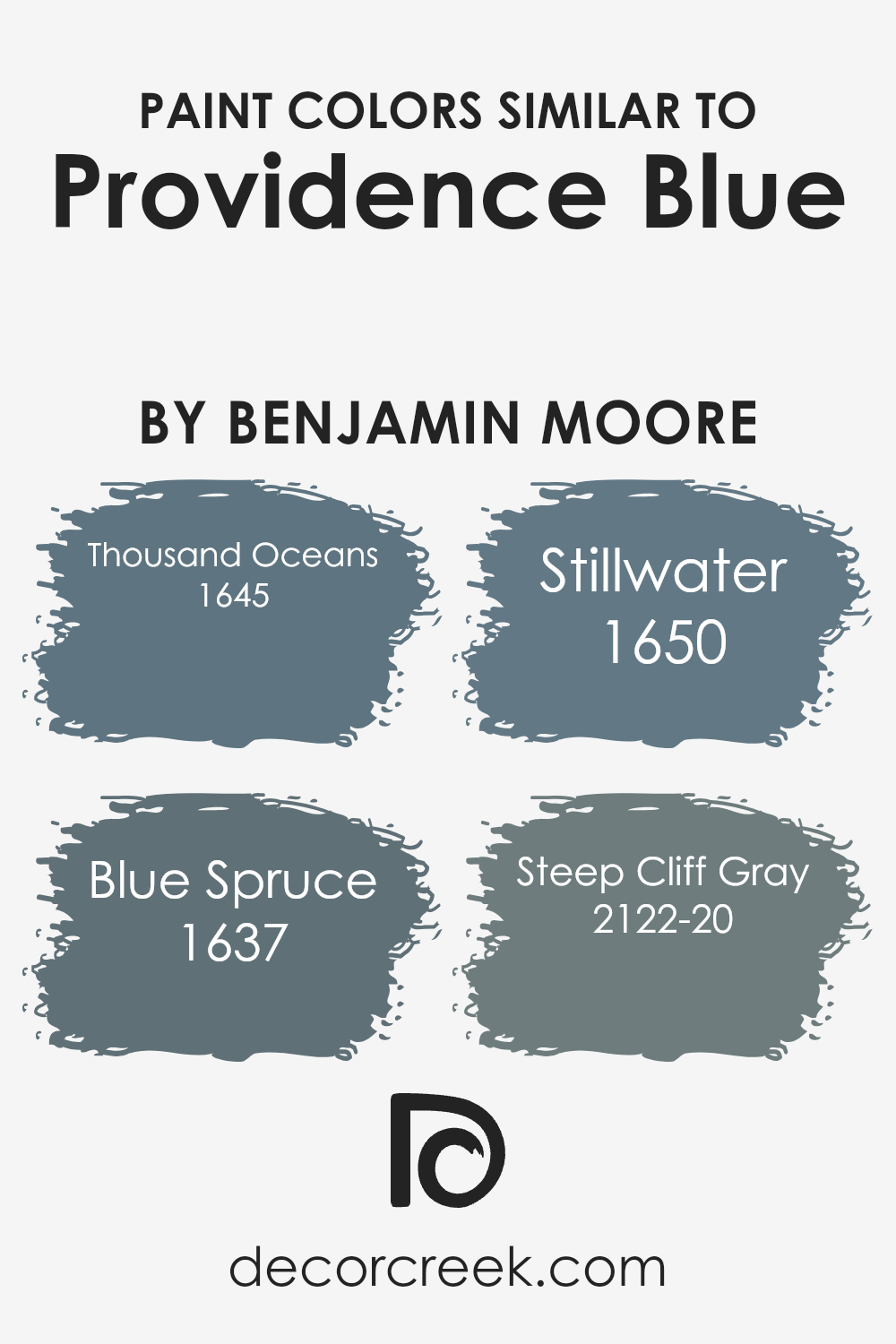
Colors Similar to Providence Blue 1636 by Benjamin Moore
Similar colors play an important role in design and decoration, creating harmony and unity in a space. When colors closely resemble one another, they can tie elements together smoothly, making a room feel more cohesive and balanced.
Providence Blue by Benjamin Moore offers a calming and elegant base that can be beautifully complemented by similar hues, creating a coordinated look without overwhelming the senses.
These colors can accentuate one another, emphasizing the subtle differences in tone and depth, which adds interest without drastic contrast.
Thousand Oceans is a rich, deep blue that carries a touch of the ocean’s mystery. It’s a shade that can add depth and drama when used alongside Providence Blue.
Blue Spruce offers a cooler, greenish undertone, reminiscent of a quiet forest, providing a natural and calming presence. Stillwater offers a soft, muted blue that feels calming and serene, perfect for creating a peaceful environment.
Lastly, Steep Cliff Gray, while predominantly gray, has a bluish tint that echoes the elegance of Providence Blue.
Each of these colors holds its own distinct character while seamlessly blending with Providence Blue to achieve a sophisticated and pleasing palette.
You can see recommended paint colors below:
- 1645 Thousand Oceans
- 1637 Blue Spruce
- 1650 Stillwater
- 2122-20 Steep Cliff Gray
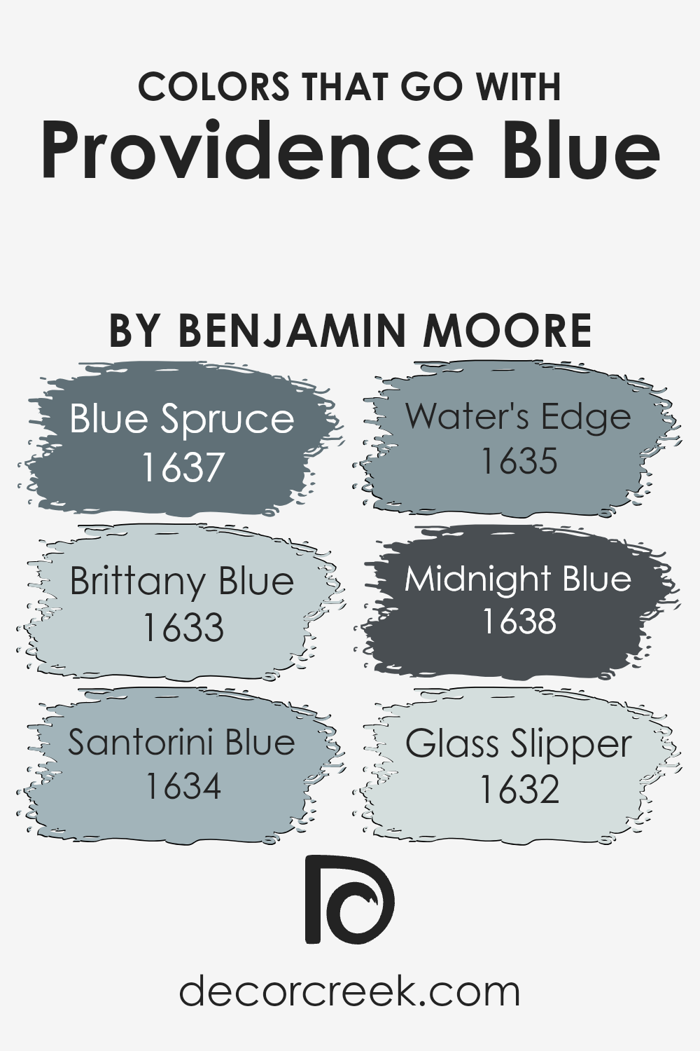
Colors that Go With Providence Blue 1636 by Benjamin Moore
Decorating with Providence Blue 1636 by Benjamin Moore creates a cozy and inviting atmosphere, but it’s the colors you combine it with that truly bring out its personality. Blue Spruce 1637, a dark green-blue shade, adds richness and depth, reminding one of the deep and cool forest, complementing the more cheerful Providence Blue.
Brittany Blue 1633 is soft and somewhat muted, offering a gentle contrast while maintaining harmony, reminiscent of a clear, endless sky on a warm day. These combinations result in a balanced environment that feels both calm and full of character.
Santorini Blue 1634 is bright and lively, reminiscent of bright summer days by the sea, which adds vibrancy and helps Providence Blue feel more energetic. On the other hand, Water’s Edge 1635 is calm and slightly greyish, giving off a soothing coastal feel, where water touches the sky.
Midnight Blue 1638 is deep and intense, akin to a night sky full of twinkling stars, and it pairs nicely for a dramatic effect.
Glass Slipper 1632 is very soft, like a light breeze of cool air, gently offsetting the bolder hues. By using these colors together, each choice complements Providence Blue, creating a look that feels complete and well-thought-out.
You can see recommended paint colors below:
- 1637 Blue Spruce
- 1633 Brittany Blue
- 1634 Santorini Blue
- 1635 Water’s Edge
- 1638 Midnight Blue
- 1632 Glass Slipper
How to Use Providence Blue 1636 by Benjamin Moore In Your Home?
Providence Blue by Benjamin Moore is a versatile paint color that can add charm and character to any room in your home. This soothing shade of blue has hints of gray, making it both soft and welcoming. It’s perfect for creating a cozy atmosphere in a living room or bedroom. You might also consider using it as an accent color on a feature wall to add depth and interest to the space.
In smaller spaces like a hallway or bathroom, Providence Blue can make the area feel more open and airy. Pairing it with white trim and light-colored furniture can create a clean, modern look. It works well with both contemporary and traditional styles, so it’s an excellent choice for various design themes.
Additionally, using Providence Blue on kitchen cabinets can give your kitchen a fresh, updated look. This color can complement natural wood tones, stainless steel appliances, and stone countertops, offering a balanced and stylish feel for your home.
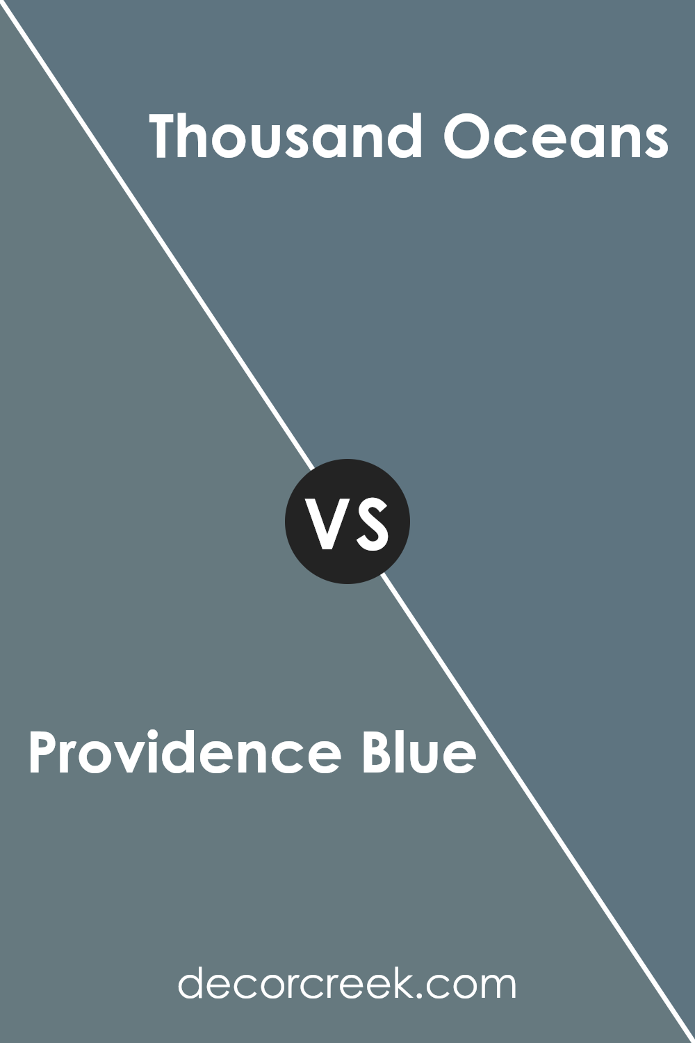
Providence Blue 1636 by Benjamin Moore vs Thousand Oceans 1645 by Benjamin Moore
Providence Blue and Thousand Oceans are two distinct colors by Benjamin Moore that offer different vibes for your space. Providence Blue is a deep, muted blue with a hint of gray, creating a calm and grounded feel. It works well in creating a cozy, intimate atmosphere in a room.
On the other hand, Thousand Oceans is a lighter, softer blue that carries a breezy, fresh vibe. It’s reminiscent of a clear sky or a gentle sea, bringing a feeling of openness and lightness to any area.
These colors, while both in the blue family, serve different purposes. Providence Blue might be ideal for a study or bedroom where a serene setting is desired. Thousand Oceans, with its airy quality, could be perfect for a living room or bathroom, adding a refreshing touch.
Both colors can pair beautifully with neutral tones, but their unique shades allow for varied creative expressions in any home.
You can see recommended paint color below:
- 1645 Thousand Oceans
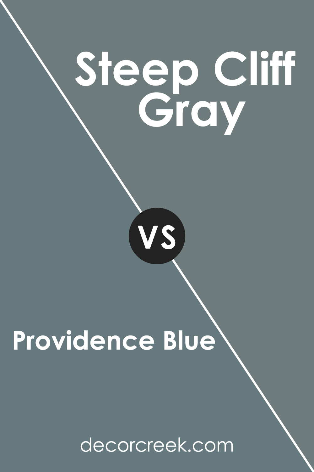
Providence Blue 1636 by Benjamin Moore vs Steep Cliff Gray 2122-20 by Benjamin Moore
Providence Blue is a rich and inviting shade that brings warmth to a room. It combines blue with hints of gray and green, making it versatile for various settings. This color can add depth and a cozy feel to living spaces.
Steep Cliff Gray, on the other hand, is a darker and more grounded hue. It is primarily a gray with subtle undertones that can shift in different lighting, offering a more industrial or modern vibe. This color works well in contemporary settings or as an accent wall for added drama.
While Providence Blue leans warmer and more vibrant, Steep Cliff Gray is cooler and more subdued. Both colors have their own charm and can be used to create different moods in a room. Whether you want a lively atmosphere or a calm, modern feel, choosing between these two can help set the right tone for your space.
You can see recommended paint color below:
- 2122-20 Steep Cliff Gray
Providence Blue 1636 by Benjamin Moore vs Blue Spruce 1637 by Benjamin Moore
Providence Blue and Blue Spruce are two colors by Benjamin Moore that sit next to each other in their palette. Providence Blue is a rich, deeper shade of blue with subtle green undertones. It has a classic, timeless feel, making it an excellent choice for spaces that want to convey a sense of calm and elegance.
Blue Spruce, on the other hand, has a slightly more muted tone with an apparent green influence, giving it a more earthy and natural vibe.
While both colors share a similar base, their differences lie in the mood they evoke. Providence Blue is perfect for creating a cozy, yet sophisticated atmosphere, while Blue Spruce works well in spaces aiming for a more outdoorsy or rustic charm. Both colors can complement each other beautifully in a single space, with Providence Blue creating a focal accent and Blue Spruce offering a harmonious backdrop.
You can see recommended paint color below:
- 1637 Blue Spruce

Providence Blue 1636 by Benjamin Moore vs Stillwater 1650 by Benjamin Moore
Providence Blue and Stillwater are two distinct shades offered by Benjamin Moore, each bringing its own personality to a space. Providence Blue is a muted blue with gray undertones, giving it a soft, calming feel. It’s versatile, making it suitable for various settings, from living rooms to bedrooms, as it adds a touch of warmth without being overpowering.
Stillwater, on the other hand, is a deeper, richer blue. It has a stronger presence and can add a sense of drama to a room. The depth of Stillwater makes it a good choice for accent walls or spaces where you want a more intense look.
While both colors share a blue base, Providence Blue is lighter and more subdued, whereas Stillwater offers a bolder, more dramatic impact. When choosing between them, consider the mood you want to create and how much light the room receives, as this can affect how each color appears.
You can see recommended paint color below:
- 1650 Stillwater
When I first learned about 1636 Providence Blue by Benjamin Moore, I was amazed by how this paint color can change the feel of a room. It’s like a magical paint that brings both a sense of calm and a hint of mystery. Imagine a blue that isn’t too bright but feels cozy, like being wrapped in a hug.
This paint feels like the sky at dusk, right before the stars come out.
What makes Providence Blue special is how it works well with many other colors. You could have furniture in different shades and this color would get along with all of them. Your room could be filled with greens, whites, or even yellows, and Providence Blue would still look nice.
When you use this paint, it’s like giving your room a gentle makeover. It’s like dressing up your room for a special occasion, making it feel a little more special and unique without being too flashy.
I think if you want to change how a room feels, this color is a great choice. It helps make any place feel more inviting and special for everyone who comes in.
Ever wished paint sampling was as easy as sticking a sticker? Guess what? Now it is! Discover Samplize's unique Peel & Stick samples.
Get paint samples

