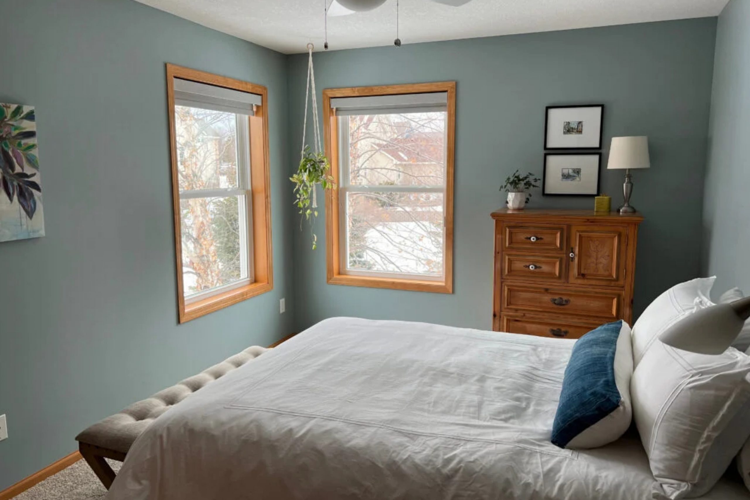
Stepping into a room painted with Benjamin Moore’s 1564 Beach Glass is like finding a quiet escape by the sea. It’s not just a color; it’s a feeling. When I decided to refresh my space, I wanted something that brought a sense of calm and subtle sophistication. Beach Glass struck the perfect balance. It’s a soft blue-green that feels as gentle as a sea breeze on a summer day, with hints of gray that give it a modern touch.
In the morning light, it feels airy and bright. As the day goes on, it takes on a cozy, welcoming warmth. I’ve always felt that colors can set the mood of a room, and Beach Glass does that beautifully without overwhelming the senses.
It pairs well with both modern and traditional decor, blending seamlessly with neutrals yet offering enough character to stand alone.
Whether I’m enjoying a quiet cup of coffee or hosting friends, this color seems to fit perfectly. It’s my little piece of the coast at home, evoking the peaceful, relaxed feeling I was looking for.
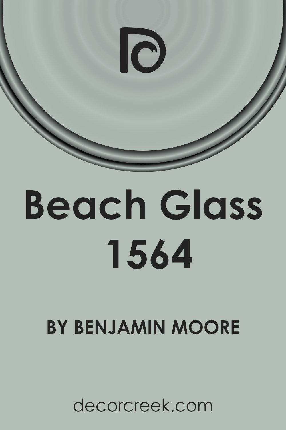
What Color Is Beach Glass 1564 by Benjamin Moore?
Beach Glass by Benjamin Moore is a muted, soft blue-gray color that brings a sense of calm and relaxation to any space. It has a balanced mix of blue and gray, making it versatile and soothing to the eyes. This color works well in a variety of interior styles, including coastal, modern, and farmhouse.
In a coastal style, it mirrors the gentle hues of sea glass and ocean waves, while in modern interiors, it adds a subtle touch of color without overwhelming clean lines and minimalist decor. In farmhouse settings, its softness complements rustic and vintage elements.
Beach Glass pairs beautifully with natural materials and textures. Consider using it alongside light wood tones, which enhance its gentle hue, adding warmth and contrast. Linen fabrics also complement this color well, providing a cozy and inviting feel. For added elegance, incorporate metallic accents like brushed nickel or soft gold, which harmonize with the cool undertones of the color.
In a bedroom, use Beach Glass on the walls for a peaceful retreat. In a living room, pair it with cream upholstery and wooden coffee tables.
Overall, its muted tone creates a timeless and versatile backdrop that adapts to various spaces effortlessly.
Is Beach Glass 1564 by Benjamin Moore Warm or Cool color?
Beach Glass by Benjamin Moore is a versatile paint color. It has a soft grayish-green tone that can change depending on the lighting in a room. In spaces with lots of natural light, Beach Glass appears more green, adding a refreshing touch. In dimmer settings, it leans more to the gray side, which gives rooms a calm atmosphere.
This color works well in many areas of a home. In living rooms, it offers a neutral but interesting backdrop that pairs nicely with wooden furniture and natural materials. In bedrooms, Beach Glass creates a peaceful environment, perfect for relaxation.
It also works beautifully in bathrooms, bringing a spa-like feel.
Beach Glass complements other colors well, such as whites, beiges, and even darker blues. This flexibility makes it easy for homeowners to incorporate into existing designs.
Overall, Beach Glass by Benjamin Moore adds a subtle but stylish touch to various rooms, making it a popular choice for many.
Undertones of Beach Glass 1564 by Benjamin Moore
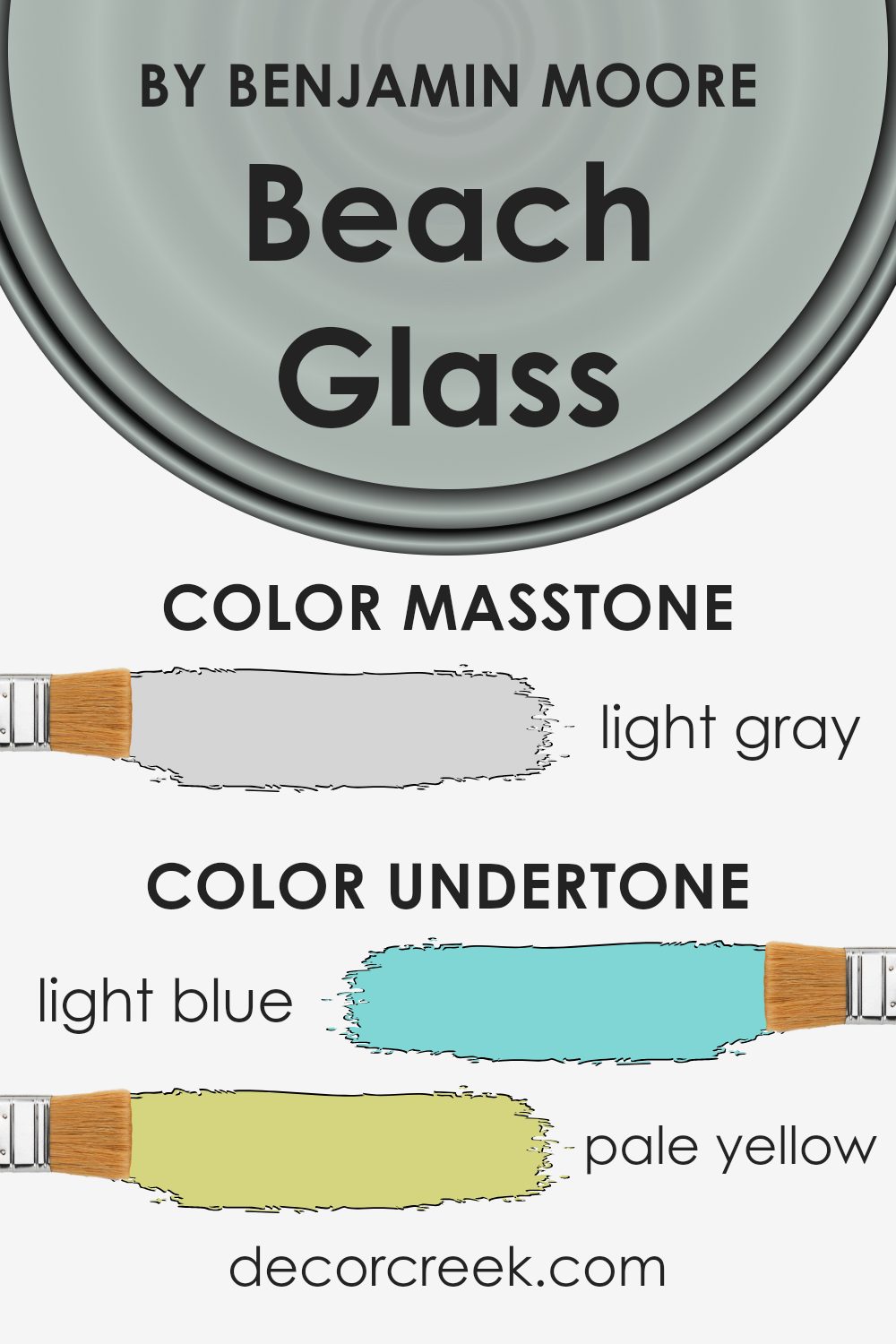
Beach Glass by Benjamin Moore is a complex color with multiple undertones. This shade primarily presents as a muted, soft blue-green, reminiscent of sea glass found on the shore. However, its subtle undertones give it depth and versatility.
The light blue adds a serene freshness, while the pale yellow infuses a hint of warmth. A light purple undertone introduces a gentle sophistication, and the presence of mint brings a sense of calm and relaxation.
Lilac undertones give it a soft, romantic quality, whereas pale pink adds a touch of warmth and comfort. Lastly, the grey undertone keeps the color grounded, balancing all the other shades.
Undertones play a crucial role in how we perceive color. They can make a color feel warmer or cooler, brighter or more subdued, depending on the lighting and surrounding elements. The undertones in Beach Glass allow it to adapt to various settings.
In bright, natural light, the light blue and mint are more pronounced, offering a fresh, coastal feel. In dimmer indoor lighting, the grey and pale purple might stand out, creating a more intimate and cozy environment.
This flexibility makes Beach Glass a popular choice for interior walls, as it complements a wide range of decor styles and brings different moods to a space.
What is the Masstone of the Beach Glass 1564 by Benjamin Moore?
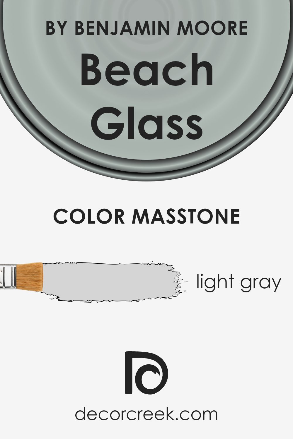
Beach Glass 1564 by Benjamin Moore is a light gray color that offers a soft, airy feel to any room. This shade is versatile and can complement various design styles, from modern to traditional. Its lightness makes spaces feel open and inviting, creating a calming atmosphere perfect for living rooms, bedrooms, or bathrooms.
The color pairs well with both cool and warm tones, making it easy to coordinate with existing furniture and decor. In rooms with ample natural light, Beach Glass 1564 helps enhance the brightness, adding a gentle gleam to the walls.
Its neutral quality allows homeowners to change accent colors easily without the need to repaint, providing long-term flexibility in design.
Furthermore, this shade of gray fits well in both small and large spaces, making it a practical choice for any room size.
Overall, Beach Glass 1564 by Benjamin Moore is an excellent selection for anyone seeking a refined, soothing palette in their home.
How Does Lighting Affect Beach Glass 1564 by Benjamin Moore?
Lighting plays a crucial role in how we perceive colors. The type, angle, and intensity of light can change the appearance of a paint color significantly. For example, Beach Glass by Benjamin Moore, a soft greenish-blue hue, will look different depending on whether it’s illuminated by natural or artificial light.
In natural light, Beach Glass can appear more true to its subtle green-blue nature. The time of day also affects how this color will look. Morning light, which is cooler, might make the color seem more blue, while afternoon light, which is warmer, might bring out greener tones.
In artificial light, Beach Glass can take on a different character. Under incandescent bulbs, which emit a warm yellow light, this color might appear warmer and more muted. Conversely, under fluorescent lighting, Beach Glass might lean towards a cooler, bluer tone.
The direction a room faces greatly influences how colors are seen. In north-facing rooms, which typically receive cooler, more consistent light throughout the day, Beach Glass may appear more subdued and slightly grayish. This lighting can enhance the cooler blue undertones of the color.
South-facing rooms get more warm sunlight, especially in the afternoon, highlighting the warmer tones of Beach Glass. As a result, the color may appear more vibrant and slightly greener.
In east-facing rooms, Beach Glass can shift significantly throughout the day. The morning brings warm, direct light, casting a vibrant yet soft glow on the color. By afternoon, as the light becomes indirect, the color may appear cooler and more subtle.
West-facing rooms are the opposite of east-facing. They receive warm, orangish light in the late afternoon and evening, which can make Beach Glass appear richer and sometimes darker, accentuating the dusky blue aspects of the color.
Overall, the play of light and angle changes how Beach Glass presents itself in any room.
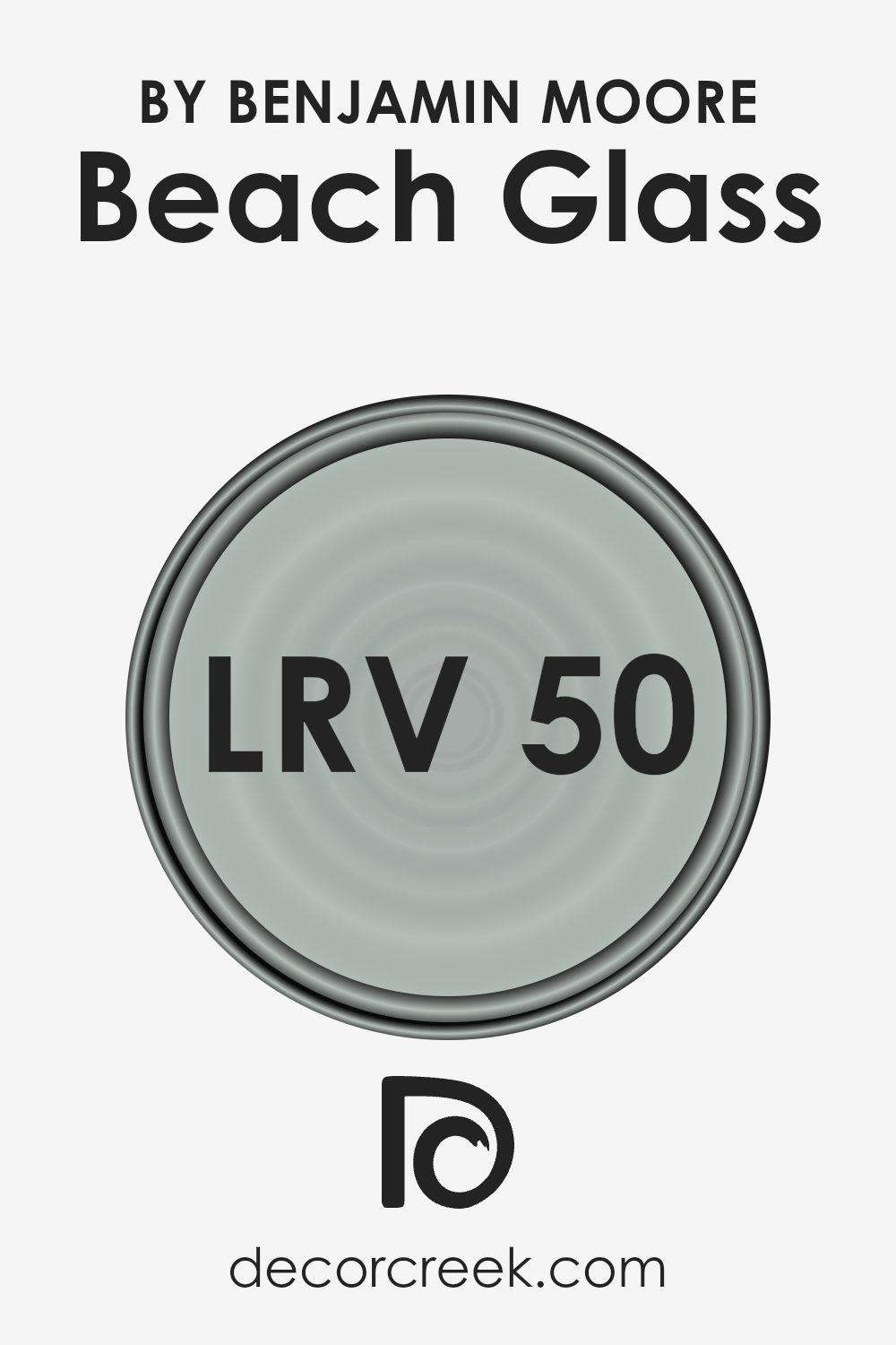
What is the LRV of Beach Glass 1564 by Benjamin Moore?
Light Reflectance Value (LRV) is a measurement that shows how much light a color reflects. It’s on a scale from 0 to 100, where 0 is black (absorbing all light) and 100 is pure white (reflecting all light). When choosing paint colors, LRV can help you understand how light or dark a color will appear in a room.
Colors with high LRV values will reflect more light, making spaces feel brighter and more open. On the other hand, colors with low LRV values will absorb more light, contributing to a cozier and often warmer atmosphere in a space.
The color Beach Glass has an LRV of 49.7, which places it right in the middle of the scale. This means it reflects a moderate amount of light and can look different depending on the lighting in your room. In bright spaces, Beach Glass might look lighter and more airy, while in rooms with less light, it could appear darker and slightly more muted.
The balance in its LRV makes it a flexible choice for many spaces, allowing it to adapt to different lighting conditions without overwhelming the room with brightness or becoming too subdued.
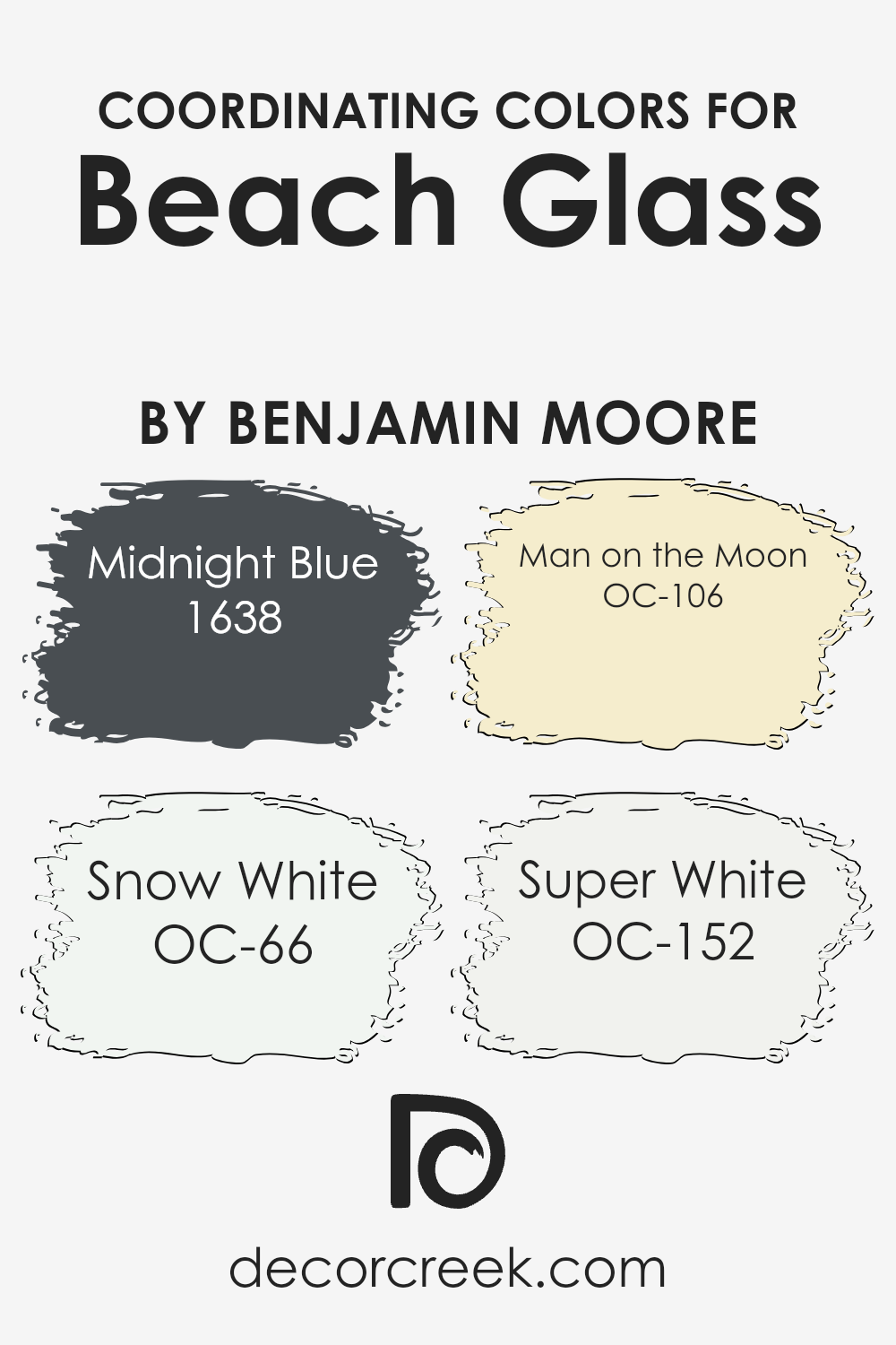
Coordinating Colors of Beach Glass 1564 by Benjamin Moore
Coordinating colors are hues that are carefully chosen to complement and enhance a primary color. When it comes to the soft, muted tones of Beach Glass by Benjamin Moore, selecting the right coordinating colors can bring out its subtle beauty.
Midnight Blue, for instance, is a rich and deep shade that provides a striking contrast, adding depth and elegance to any space when paired with Beach Glass. The dark blue hue is perfect for those who prefer a classic touch that still feels modern and inviting.
On the lighter side, Snow White offers a clean and crisp complement to Beach Glass. It reflects light brilliantly, creating an airy and open feel, making spaces appear brighter and more expansive. Man on the Moon introduces a soft, creamy tone that brings warmth and coziness, ideal for creating a welcoming atmosphere while gently enhancing the cooler tones of Beach Glass.
Super White is another versatile option, offering a bright and neutral backdrop.
It pairs seamlessly with Beach Glass, providing a fresh and timeless look that keeps the focus on the primary color while maintaining a clean and modern aesthetic. Each of these coordinating colors has its unique role, working together to highlight and balance the tranquil charm of Beach Glass.
You can see recommended paint colors below:
- 1638 Midnight Blue
- OC-66 Snow White
- OC-106 Man on the Moon
- OC-152 Super White
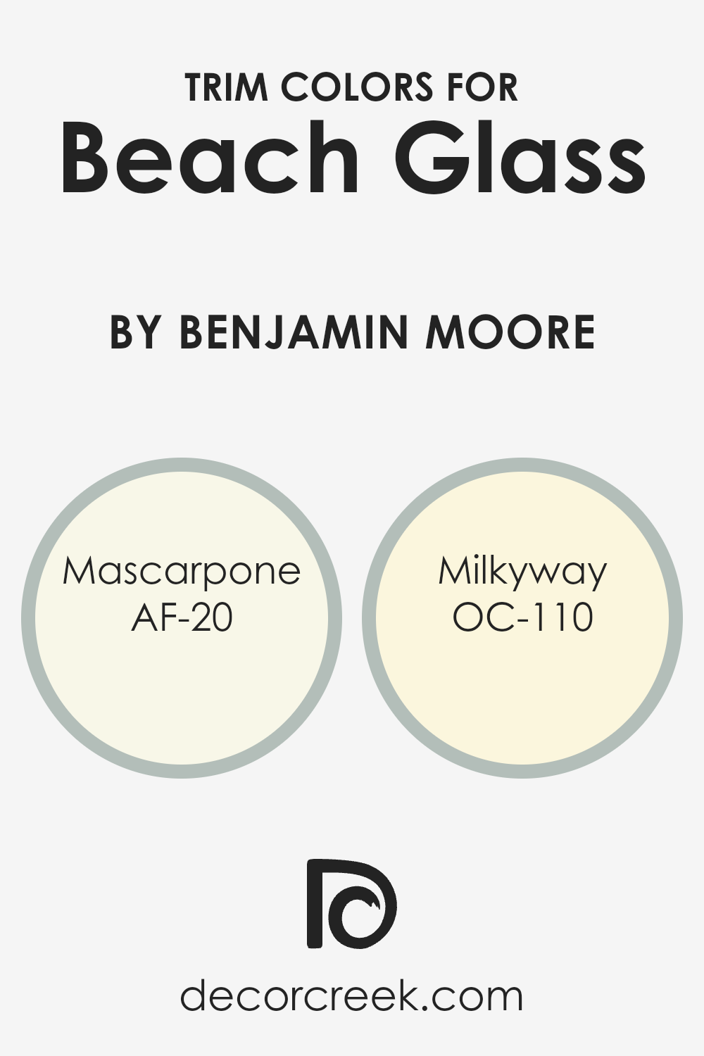
What are the Trim colors of Beach Glass 1564 by Benjamin Moore?
Trim colors are shades used for areas like window frames, doors, and baseboards that frame and highlight the main color in a room. They play an important role in defining the space and can enhance the overall look by adding contrast or harmony, depending on the desired visual effect.
In the case of Beach Glass, a soft and calming shade of greenish-blue by Benjamin Moore, selecting the right trim colors can significantly enhance its aesthetic appeal.
The combination of trim colors with Beach Glass can create a fresh and inviting atmosphere, making the space feel more cohesive and thoughtfully planned.
Trim colors like AF-20 Mascarpone and OC-110 Milkyway can enrich the gentle nature of Beach Glass by either complementing it with warm tones or providing a subtle contrast.
AF-20 Mascarpone is a warm, creamy white that brings a touch of brightness without being too stark. It’s soft and inviting, making it a wonderful complement to the Beach Glass, adding warmth and blending naturally without overpowering it. OC-110 Milky Way, on the other hand, is a soft, milky white with a hint of warm beige undertones.
This color can provide a more understated and gentle contrast against the cooler hue of Beach Glass, and its warmth can make spaces feel cozy and welcoming.
Both colors serve to carefully highlight the primary shade, enhancing Beach Glass’s calming effect while maintaining a subtle yet reassuring presence in any space.
You can see recommended paint colors below:
- AF-20 Mascarpone
- OC-110 Milkyway
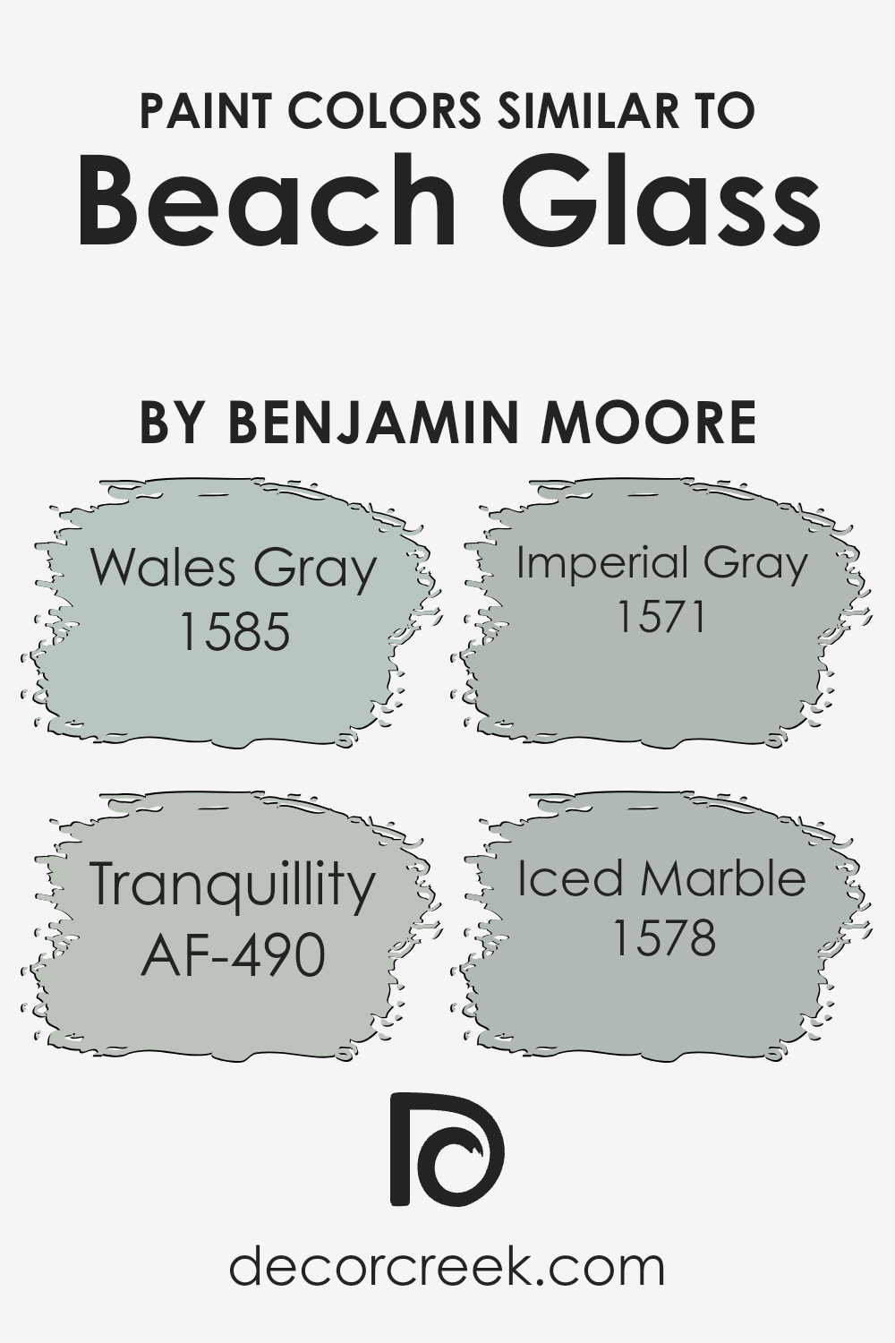
Colors Similar to Beach Glass 1564 by Benjamin Moore
Similar colors are important in design and painting because they create a harmonious and balanced look. When you use colors that are close to each other, like those similar to the Beach Glass from Benjamin Moore, they tend to naturally blend well, offering a soothing visual experience.
These similar colors, such as Wales Gray, Tranquillity, Imperial Gray, and Iced Marble, capture the calming and understated essence of Beach Glass. They are especially useful in creating an atmosphere that feels unified, making a space more inviting and comfortable without stark contrasts.
Wales Gray is a soft and gentle hue with a touch of blue, giving a refreshing feel reminiscent of cool ocean breezes. Tranquillity is a peaceful blue-green, offering a sense of calmness, much like a quiet morning by the water. Imperial Gray is a deeper, more refined shade, providing a solid presence that is both comforting and elegant.
Meanwhile, Iced Marble is a light and airy tone, echoing the smoothness of a polished stone surface, which can provide a brightening effect in any space.
Together, these colors work well to create a space that feels harmonious, soothing, and perfectly balanced, making them a great choice with Beach Glass as a base.
You can see recommended paint colors below:
- 1585 Wales Gray
- AF-490 Tranquillity
- 1571 Imperial Gray
- 1578 Iced Marble
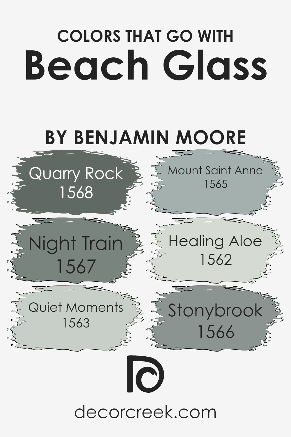
Colors that Go With Beach Glass 1564 by Benjamin Moore
Beach Glass 1564 by Benjamin Moore is a subtle, muted green-blue color that reflects the calmness and beauty of seaside settings. When paired with complementary colors, it helps create a balanced and harmonious space. Quarry Rock 1568 is a strong, deep gray that adds a solid, grounding effect.
It works well with Beach Glass to add depth and contrast. Night Train 1567, a dark and moody gray, enriches the Beach Glass by adding intensity and richness to the palette. Quiet Moments 1563 is a gentle, relaxing blue-green that echoes Beach Glass’s soothing vibes, offering a soft transition.
Mount Saint Anne 1565 is a clean, smoky blue, creating a gentle freshness that pairs nicely with Beach Glass’s organic feel. Healing Aloe 1562, a light, airy green, adds a refreshing touch, enhancing the light and natural qualities of Beach Glass.
Stonybrook 1566, a medium gray with subtle green undertones, harmonizes beautifully with Beach Glass, providing a calm backdrop without overpowering the overall look.
Together, these colors create a well-rounded palette that feels naturally connected to the essence of Beach Glass, making any space feel warm and inviting.
They all work together to maintain balance while offering a variety of tones and depths.
You can see recommended paint colors below:
- 1568 Quarry Rock
- 1567 Night Train
- 1563 Quiet Moments
- 1565 Mount Saint Anne
- 1562 Healing Aloe
- 1566 Stonybrook
How to Use Beach Glass 1564 by Benjamin Moore In Your Home?
Beach Glass 1564 by Benjamin Moore is a versatile paint color that can bring a soft, calming feel to any home. It is a gentle mix of gray and green with a hint of blue, making it an ideal choice for many different spaces. In a living room, this color can create a cozy, welcoming atmosphere that encourages relaxation and conversation.
When used in a bedroom, Beach Glass can promote a peaceful environment, perfect for unwinding at the end of the day. This color also works well in bathrooms, adding a spa-like quality that enhances a sense of cleanliness and calm.
Pairing Beach Glass with white trim can give a room a crisp, clean look. For an earthy vibe, consider combining it with natural wood tones and plants. Beach Glass 1564 fits nicely in a variety of styles, from modern to coastal, making it a popular choice for many homeowners.
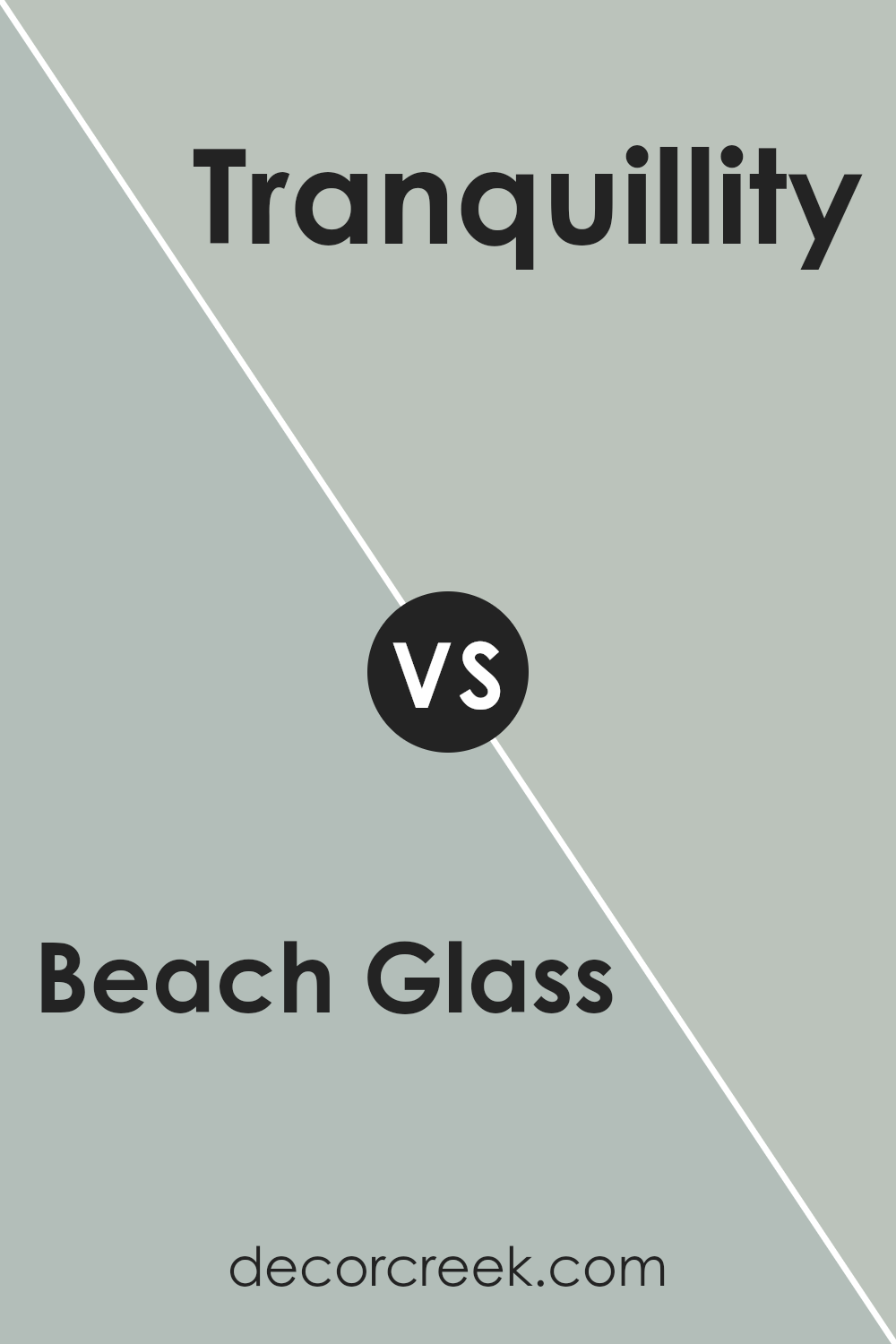
Beach Glass 1564 by Benjamin Moore vs Tranquillity AF-490 by Benjamin Moore
Beach Glass by Benjamin Moore is a soothing greenish-blue that resembles sea glass found on a beach. It has a soft, airy feel, making it a popular choice for spaces that aim to be calm and refreshing. This color can remind you of coastal areas and works well in rooms with natural light, creating a breezy atmosphere.
Tranquillity, on the other hand, is a muted teal with slightly more depth and a hint of gray, creating a cool and relaxing vibe. It shares the calming qualities but feels a bit more sophisticated and grounding due to its gray undertones.
This makes it suitable for creating cozy, relaxed spaces without overwhelming the room.
Both colors are ideal for creating a peaceful environment, but while Beach Glass feels light and coastal, Tranquillity has a modern and grounding touch. They are versatile and can complement various decor styles, bringing a sense of calm to any space.
You can see recommended paint color below:
- AF-490 Tranquillity
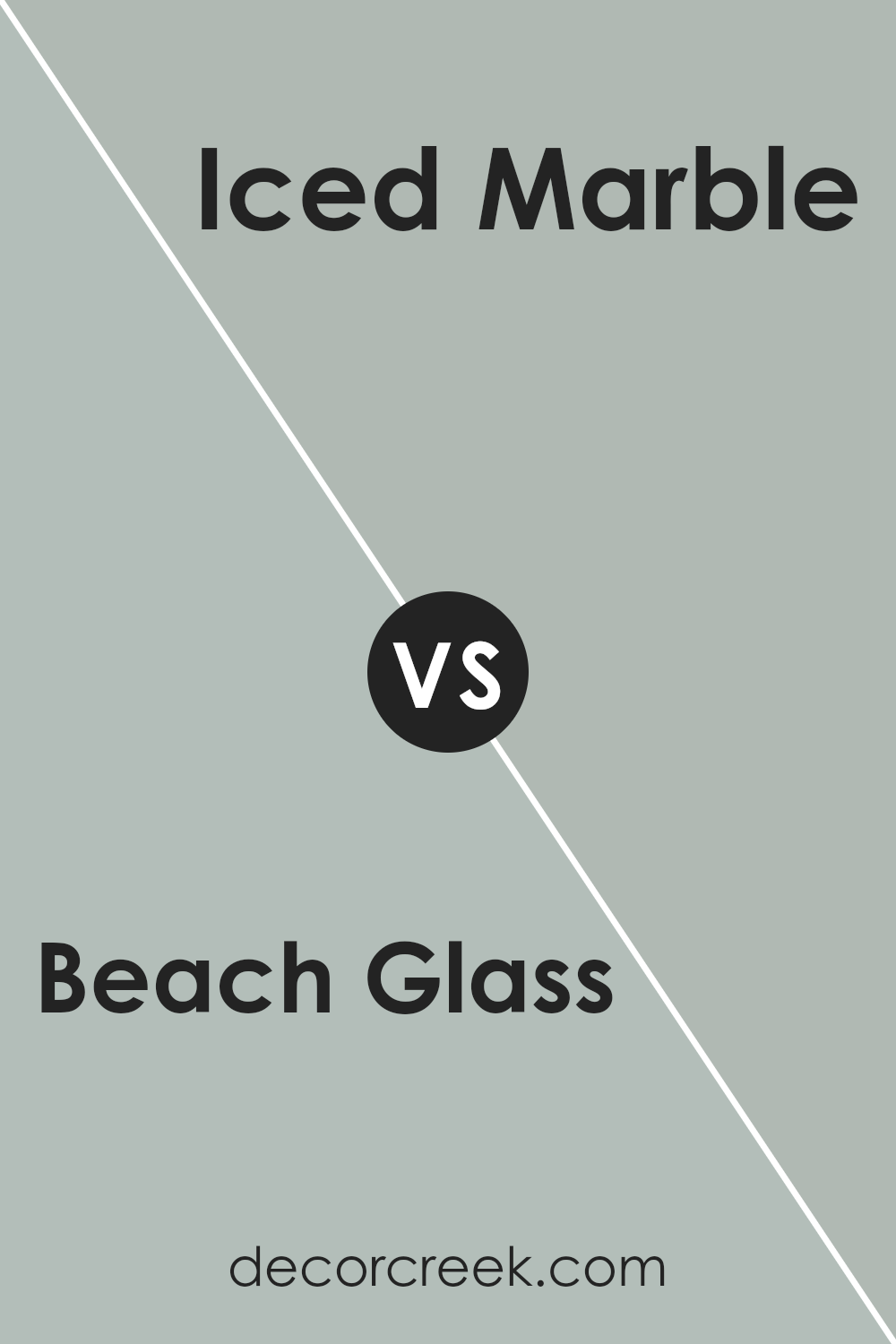
Beach Glass 1564 by Benjamin Moore vs Iced Marble 1578 by Benjamin Moore
Beach Glass and Iced Marble by Benjamin Moore are both soft, calming colors, but they offer different feels. Beach Glass is a gentle mix of blue-green with a hint of gray. It gives a room a relaxed, coastal vibe, reminiscent of sea glass found on a sandy beach. This color can feel soothing and is perfect for creating a calming space.
On the other hand, Iced Marble leans more towards a light gray with subtle undertones of green. It’s a bit cooler and more understated compared to Beach Glass. Iced Marble works well in spaces where you want a clean and refreshing look.
It can make a room feel elegant and modern without being too cold.
Both colors can blend well with other neutrals, but Beach Glass adds a touch more color to your space, while Iced Marble maintains a more muted and minimalistic feel.
You can see recommended paint color below:
- 1578 Iced Marble
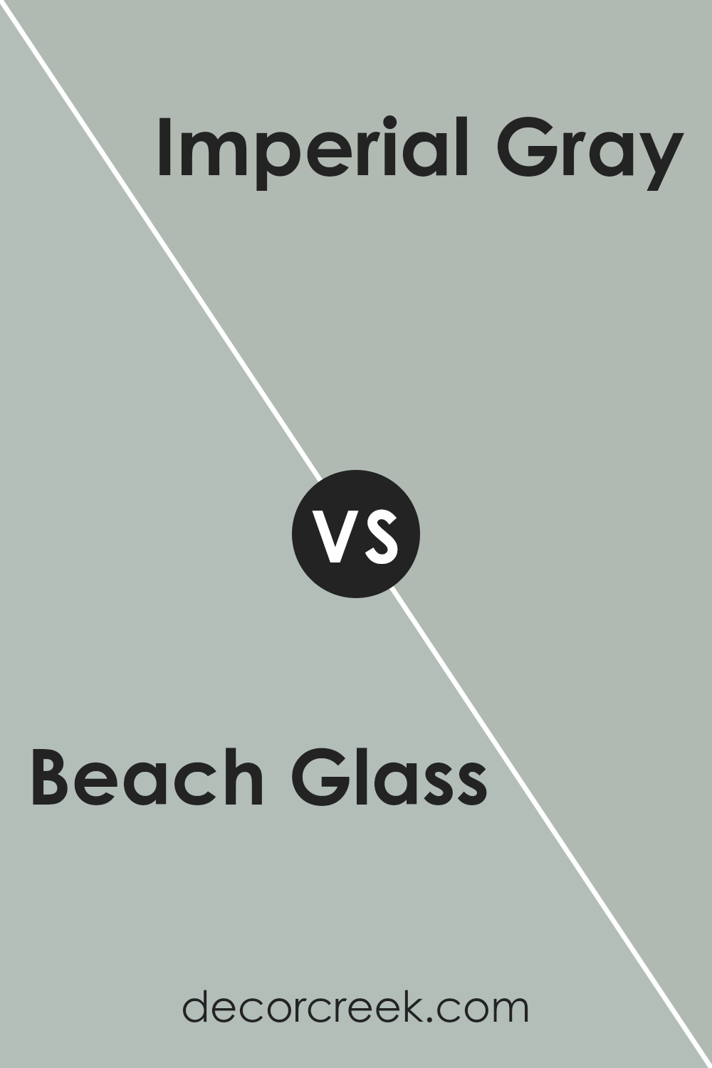
Beach Glass 1564 by Benjamin Moore vs Imperial Gray 1571 by Benjamin Moore
Beach Glass 1564 by Benjamin Moore is a soft, muted green with blue undertones, reminiscent of sea glass found along the shore. It has a calming and refreshing feel, making it perfect for spaces where you want a touch of nature and relaxation. This color pairs well with natural elements like wood and stone, and works beautifully in living rooms or bedrooms.
On the other hand, Imperial Gray 1571 by Benjamin Moore is a subtle, cool gray with a gentle hint of blue. It’s a versatile, neutral shade that adds a sense of quiet sophistication without being overpowering. This color is easy to match with other hues and can serve as a backdrop for bolder accents in furniture or artwork.
Both colors bring a sense of peace and are excellent choices for creating spaces that feel inviting and comfortable. While Beach Glass leans more towards green and nature, Imperial Gray offers a more classic and understated look.
You can see recommended paint color below:
- 1571 Imperial Gray
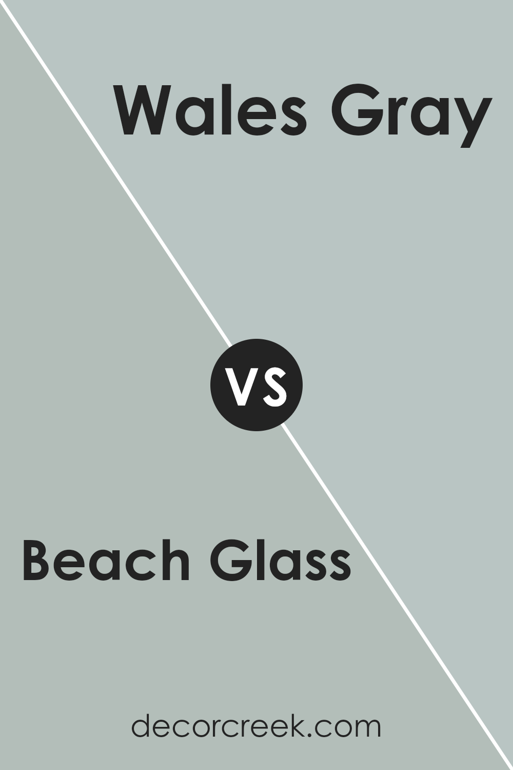
Beach Glass 1564 by Benjamin Moore vs Wales Gray 1585 by Benjamin Moore
Beach Glass and Wales Gray are two different yet appealing colors by Benjamin Moore.Beach Glass is a soft, muted blue-green that brings a relaxed and airy feel to a space. It resembles the color of smooth sea glass found on the beach, blending blue, green, and gray to create a calming effect. This color works well in spaces where you want a soothing and refreshing touch.
On the other hand, Wales Gray is a more subdued blue-gray. It has a slightly deeper tone than Beach Glass, giving it a quieter and more classic feel. The gray undertones make it versatile, fitting nicely into both modern and traditional settings.
Both colors incorporate elements of blue and gray, but Beach Glass leans slightly towards green, offering a lighter and more playful vibe. Wales Gray, with its stronger gray influence, offers a more reserved and understated appeal. Both are great choices depending on the mood you want to create.
You can see recommended paint color below:
- 1585 Wales Gray
Conclusion
In my view, 1564 Beach Glass by Benjamin Moore is a truly special color. It’s like a gentle wave coming to shore, bringing with it a soothing feeling that reminds me of a calm day by the sea. When I look at it, I imagine tiny pieces of glass that the ocean has turned smooth over time.
This color makes any room feel fresh and peaceful, almost as if the room is taking a quiet, deep breath.
What I find amazing is how this color brings a touch of nature indoors. It seems to add a little bit of the outside world to any part of the house. Whether it’s in a bedroom, living room, or kitchen, Beach Glass color always feels just right.
I believe this color is not only pretty but also makes people feel relaxed and happy. It’s like having a piece of the ocean right there on the walls of your home.
This color, with its soft and gentle hues, can change how you feel in a room, making it feel closer to nature.
I love how 1564 Beach Glass by Benjamin Moore does this so well, and it’s truly a color that can make any place feel cozy and inviting.

Ever wished paint sampling was as easy as sticking a sticker? Guess what? Now it is! Discover Samplize's unique Peel & Stick samples.
Get paint samples

