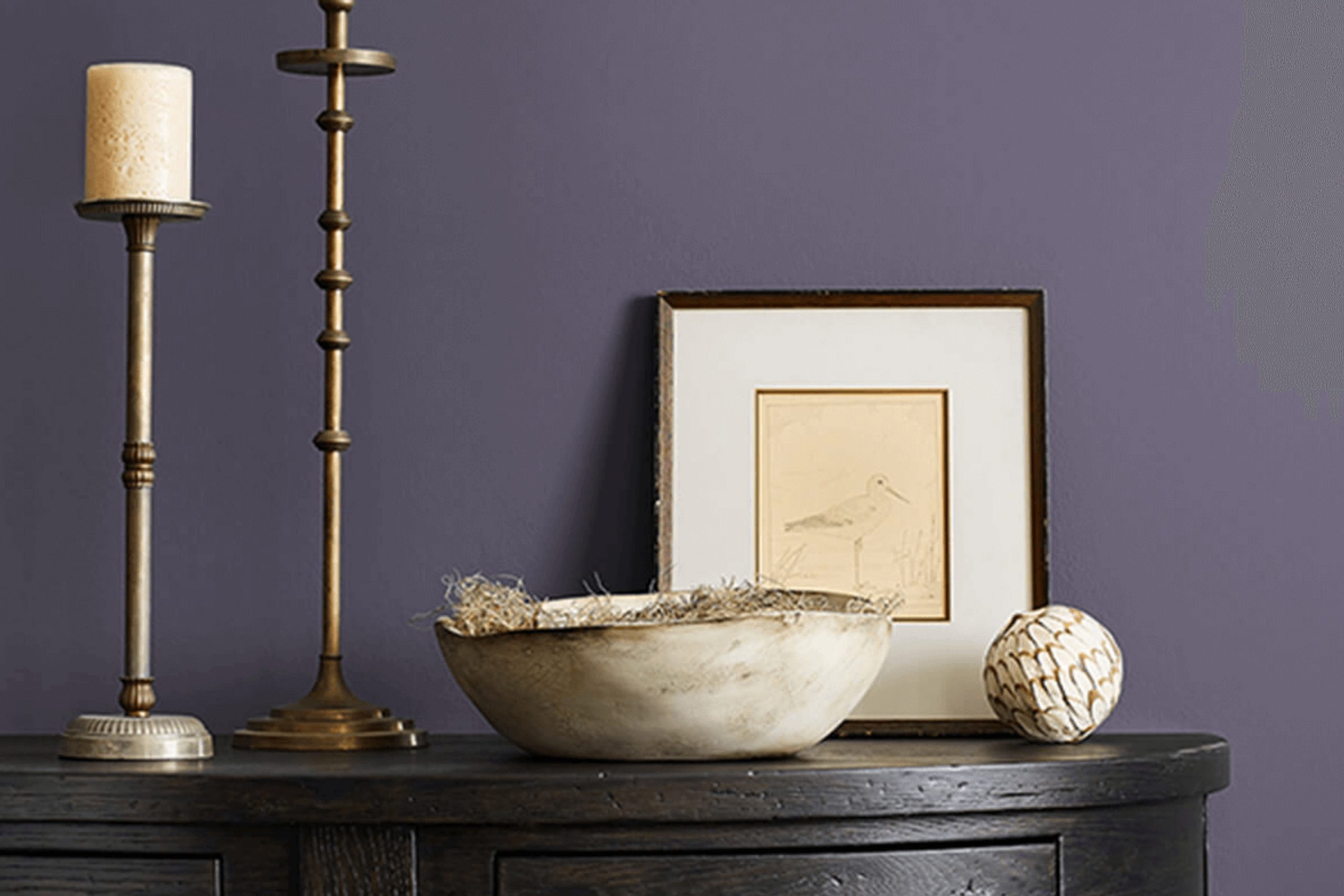
When thinking about adding a touch of warmth and richness to my space, I was drawn to SW 9689 Ripe Berry by Sherwin Williams. It’s a color that seems to combine the depth of a ripe fruit with a welcoming, earthy tone. As soon as I saw it, I imagined it creating an inviting atmosphere in any room.
I could picture it on an accent wall or as a bold choice for a cozy reading nook. The shade is bold yet soothing, with a hint of sophistication that I found perfect for creating a unique space. Whenever I see it, it brings a sense of comfort, almost like wrapping myself in a warm blanket. I was amazed at how it managed to bring both energy and calm, striking a balance that is not easy to achieve.
Its versatility means it fits with many styles—be it modern, classic, or rustic.
I began to envision how it would pair well with neutral tones, perhaps alongside soft creams or muted grays, making any room feel both lively and composed.
SW 9689 Ripe Berry quickly became a favorite for its ability to turn an ordinary space into something special.
What Color Is Ripe Berry SW 9689 by Sherwin Williams?
Ripe Berry by Sherwin Williams is a rich, deep-red color that evokes a sense of warmth and coziness. This shade has a touch of purple, giving it a luxurious feel perfect for creating a bold statement in any room. Its depth and richness make it an excellent choice for accent walls or even an entire room if you’re aiming for a cozy, inviting atmosphere.
This color works particularly well in traditional and eclectic interior styles, where bold colors play a significant role in the overall design. It can also fit into bohemian spaces, adding a vibrant yet warm touch that complements earthy tones and varied patterns associated with the style.
When it comes to materials and textures, Ripe Berry pairs beautifully with natural woods and dark metals. Wooden furniture with a rich brown finish can enhance the room’s warmth when paired with this color. Metallic accents in bronze or brass provide a contrast that highlights the richness of the red tone.
Additionally, incorporating soft textures like velvet or thick knits in cushions or throws can enhance the cozy aesthetic of the room. Overall, Ripe Berry is a versatile color that brings warmth to interiors, making spaces feel inviting and well-curated.

Is Ripe Berry SW 9689 by Sherwin Williams Warm or Cool color?
Ripe Berry SW 9689 by Sherwin Williams is a rich and warm color that brings a cozy feeling to any space. It’s a deep, purplish-red hue that can add a touch of elegance and comfort to your home. This color works well in living rooms and dining areas, creating a welcoming and inviting atmosphere.
When used on an accent wall, it can become the focal point of the room, offering a dramatic yet soothing effect without becoming overwhelming. It pairs beautifully with neutral tones like creams, grays, or soft beiges, allowing it to stand out while maintaining balance within the space.
Ripe Berry can also complement wooden furniture and flooring, highlighting their natural warmth. This color is ideal for those looking to add a bit of personality and depth to their interiors, providing a sense of warmth and coziness that guests and homeowners alike will appreciate.
Undertones of Ripe Berry SW 9689 by Sherwin Williams
Ripe Berry by Sherwin Williams is a complex color with a range of undertones that influence how it appears in different settings. This deep, rich shade primarily exhibits undertones of purple, violet, and pink, which give it a vibrant, warm feeling. When exposed to certain lighting or paired with other hues, the various undertones can subtly shift its appearance.
For instance, in a room with lots of natural light, Ripe Berry might show more of its purple and pink hues, creating a cozy and welcoming atmosphere. However, in dim lighting, the darker navy and olive undertones can become more prominent, making the color appear more subdued and richer.
This versatility makes Ripe Berry a great choice for spaces where lighting conditions change throughout the day.
On interior walls, the undertones of Ripe Berry can influence the mood and feel of a room significantly. Purple and pink feel inviting and warm, while the deeper tones like dark turquoise and navy offer a sense of grounding and depth.
When paired with complementary colors, such as light grey or pale yellow, these undertones can make the space feel balanced and harmonious. Whether in a bedroom, living room, or dining area, Ripe Berry adds character and depth to walls with its unique blend of undertones.

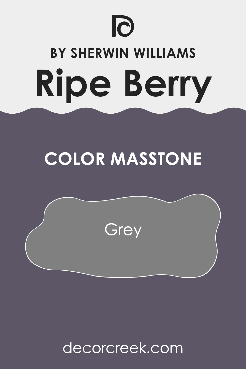
What is the Masstone of the Ripe Berry SW 9689 by Sherwin Williams?
Ripe Berry SW 9689 by Sherwin Williams is a rich and warm hue with purple undertones. Its masstone is grey (#808080), which can affect how it interacts in various home settings. The grey undertone gives it an elegant softness, making it versatile for different styles and moods.
In rooms with lots of natural light, Ripe Berry tends to have a softer appearance, highlighting its grey component, which can help balance out the intensity of the color. This color works well in living spaces, adding warmth and creating a cozy atmosphere. It can be painted on accent walls to bring a touch of sophistication without overwhelming the space.
In darker, smaller rooms, the grey masstone becomes more prominent, adding depth and a soothing backdrop. Complementing Ripe Berry with neutral furniture and accessories can help tie the room together, providing a harmonious look that feels both modern and comfortable.
How Does Lighting Affect Ripe Berry SW 9689 by Sherwin Williams?
Lighting has a significant impact on how colors appear. The color of a wall or any other item can look quite different under various lighting conditions. This is because light has its own color temperature and intensity, affecting how our eyes perceive colors.
Ripe Berry is a rich, deep berry shade by Sherwin Williams. In natural light, this color can show more of its true depth and vibrancy.
However, the appearance can change throughout the day as the natural light shifts. In a north-facing room, which tends to receive cooler light, Ripe Berry might appear slightly muted, making it a bit darker or cooler than expected. The soft, cool light can make the color feel more restrained.
- In a south-facing room, which gets plenty of warm sunlight, the color can appear more vibrant and warm. The abundant natural light enhances the rich undertones, making Ripe Berry feel more inviting and lively.
- East-facing rooms receive bright but cooler light in the mornings and lose light in the afternoon. Ripe Berry in these rooms might seem brighter and more vibrant in the morning but gradually tone down as the day progresses.
West-facing rooms benefit from warm, golden light in the afternoon. In these settings, Ripe Berry will likely look warmer and more saturated later in the day, adding a cozy feel as the sunlight becomes richer.
Artificial lighting also plays a significant role. Warm artificial light can highlight the richer tones of Ripe Berry, enhancing its warmth.
Meanwhile, cooler artificial light, such as fluorescent lighting, might make the color appear cooler and less intense.
It’s always a good idea to test a sample of the color in your specific space and lighting before committing fully to see how it shifts in different lighting conditions throughout the day.
What is the LRV of Ripe Berry SW 9689 by Sherwin Williams?
LRV, or Light Reflectance Value, measures how much light a color reflects and absorbs. It ranges from 0, which means no light is reflected (pure black), to 100, meaning all light is reflected (pure white). A color’s LRV determines how bright or dark a color appears in a room.
If a color has a low LRV, it absorbs more light, making the room feel cozy and intimate, but it may also make the space seem smaller and darker. Conversely, a color with a high LRV reflects more light, making a room feel larger and more open.
Ripe Berry has an LRV of 9.9, which is quite low. This means it is a dark and saturated color that absorbs much of the light in a room. When used on walls, Ripe Berry can create a warm and inviting atmosphere, though it might make a smaller room feel even smaller due to its low light reflection. It’s a bold choice for a space that you want to feel snug and rich. In rooms that get a lot of natural light, it can look vibrant and full of depth, yet in dimly lit rooms, it might appear even darker.

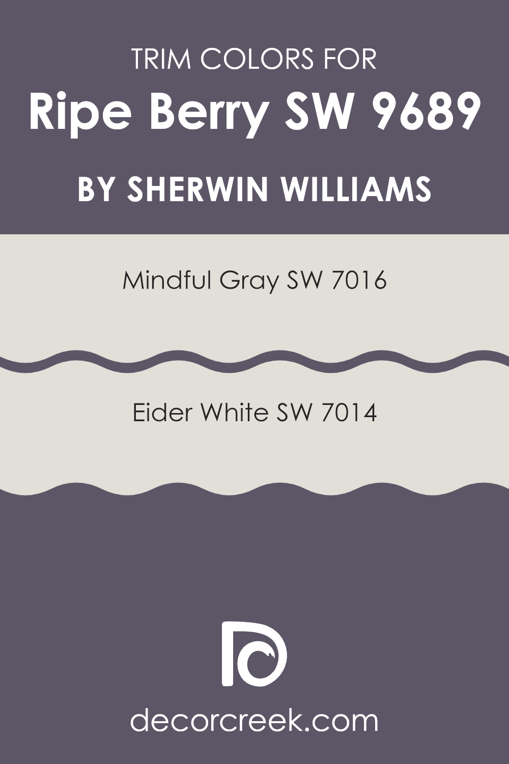
What are the Trim colors of Ripe Berry SW 9689 by Sherwin Williams?
Trim colors play an essential role in a room’s design because they help frame and emphasize the main wall color, creating a balanced and cohesive look. For Ripe Berry by Sherwin-Williams, using the right trim colors can enhance its rich, deep tones. Mindful Gray, a warm gray with hints of beige, offers an understated contrast, adding dimension without overshadowing the vibrant hue of Ripe Berry.
Choosing Mindful Gray as a trim color can result in a sophisticated yet welcoming space, as it complements the depth and warmth of Ripe Berry, allowing the strong raspberry-like color to shine without becoming overwhelming.
Eider White, on the other hand, is a soft and subtle off-white shade with a touch of gray, providing a clean and fresh contrast to the bold and saturated Ripe Berry. When used as a trim, Eider White highlights the architectural details in a room, making the overall design appear crisp and bright while allowing Ripe Berry to remain the focal point.
The neutrality of Eider White tempers the vividness of Ripe Berry, creating a balanced color scheme that maintains visual interest and draws attention to the beauty of the red tones. Both Mindful Gray and Eider White are excellent choices for trim colors, enhancing the impact of Ripe Berry in their own charming ways.
You can see recommended paint colors below:
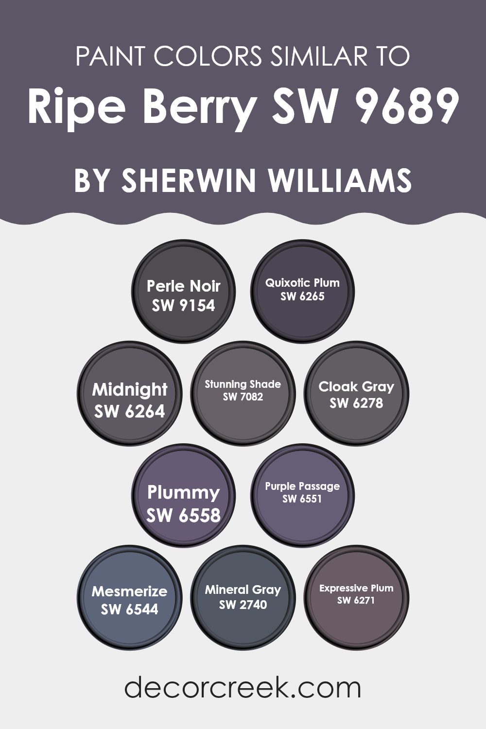
Colors Similar to Ripe Berry SW 9689 by Sherwin Williams
Using similar colors to Ripe Berry by Sherwin Williams can create a harmonious and cohesive look in any space. These colors blend well together, offering subtle differences and variations that can add depth to a room without feeling too bold or overwhelming.
For instance, Perle Noir introduces a dark, rich shade that can ground a space, while Quixotic Plum plays with more romantic purple undertones that can add warmth and intrigue. Midnight pairs this richness with a touch of mystery, making it an excellent choice for creating cozy corners.
Stunning Shade adds a pop of brightness without losing warmth, which can be great for striking contrast. Cloak Gray and Mineral Gray offer sophisticated gray shades that blend seamlessly with purples, bringing balance and neutrality. Plummy and Expressive Plum bring forward playful yet elegant options that maintain the depth of Ripe Berry, perfect for adding a stylish flair.
Purple Passage and Mesmerize come forward as rich, deeper tones that can add an element of drama. These similar colors work together by maintaining an overall warmth and earthiness, ensuring that spaces feel inviting and well-thought-out while adding subtle character through varied undertones and shades.
You can see recommended paint colors below:
- SW 9154 Perle Noir
- SW 6265 Quixotic Plum
- SW 6264 Midnight
- SW 7082 Stunning Shade
- SW 6278 Cloak Gray
- SW 6558 Plummy
- SW 6551 Purple Passage
- SW 6544 Mesmerize
- SW 2740 Mineral Gray
- SW 6271 Expressive Plum
How to Use Ripe Berry SW 9689 by Sherwin Williams In Your Home?
Ripe Berry SW 9689 by Sherwin Williams is a rich and warm shade of red with subtle hints of purple. It can make any room in your home feel cozy and inviting. In the living room, this color can create a warm atmosphere perfect for gatherings with family and friends.
Pair it with neutral furniture and accents to balance its boldness. In the bedroom, it adds a romantic and comfortable vibe, ideal for rest and relaxation. Use Ripe Berry as an accent wall to bring depth without overpowering the space. In a dining room, it can enhance the sense of sophistication, encouraging long dinners and conversations.
Combine it with light-colored decor to keep the room fresh and open. This color works well with metallics or warm wood tones, which complement its rich berry undertones. Overall, Ripe Berry offers a unique way to add warmth and character to various spaces in your home.
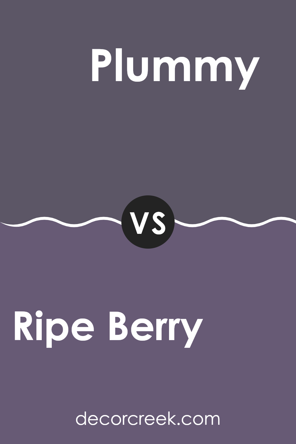
Ripe Berry SW 9689 by Sherwin Williams vs Plummy SW 6558 by Sherwin Williams
Ripe Berry and Plummy are two rich and warm colors offered by Sherwin Williams. Ripe Berry is a deep, vibrant berry tone that feels energetic and bold. It can bring a lively atmosphere to a space, making it suitable for accent walls or areas where you want to make a statement.
On the other hand, Plummy is a darker, more muted shade. It has a subtle elegance and a calming effect, which makes it great for cozy, intimate settings like bedrooms or reading nooks. When comparing the two, Ripe Berry stands out more with its brightness and vibrancy, while Plummy offers a more relaxed and comforting feel.
Both colors are versatile and can add a touch of luxury to a room, but the choice between them depends on whether you want a pop of color or a more subdued, sophisticated background.
You can see recommended paint color below:
- SW 6558 Plummy
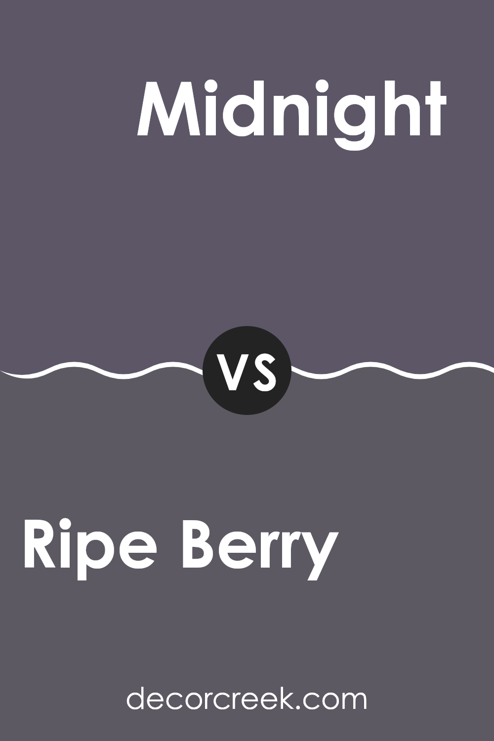
Ripe Berry SW 9689 by Sherwin Williams vs Midnight SW 6264 by Sherwin Williams
Ripe Berry and Midnight by Sherwin Williams are both rich, bold colors but offer different moods and uses in a space. Ripe Berry is a deep, warm hue that blends red and purple to create a cozy and inviting atmosphere. It’s an excellent choice for adding warmth to living rooms or dining areas where you want a welcoming feel.
On the other hand, Midnight is a dark, cool blue that leans towards navy. It brings depth and a sense of calmness to a space, making it ideal for bedrooms or offices where a peaceful vibe is desired. While both colors are strong and make a statement, Ripe Berry has more warmth and energy, whereas Midnight offers a cooler, more relaxed energy.
When choosing between the two, consider the mood you want to create. Ripe Berry works well for vibrant, intimate settings, while Midnight is perfect for spaces needing calmness and depth.
You can see recommended paint color below:
- SW 6264 Midnight
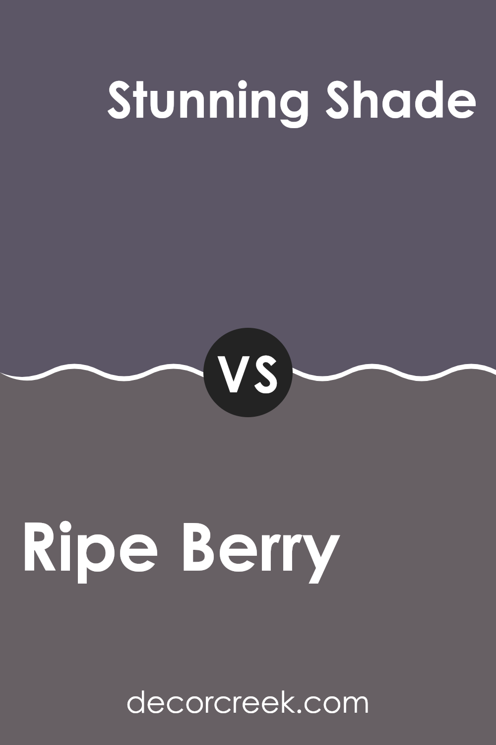
Ripe Berry SW 9689 by Sherwin Williams vs Stunning Shade SW 7082 by Sherwin Williams
Ripe Berry by Sherwin Williams is a rich, deep hue with hints of berry tones that bring warmth and coziness to a space. Its intensity makes it perfect for creating an intimate atmosphere in living areas or dining rooms.
On the other hand, Stunning Shade from Sherwin Williams is a more vibrant and lively color. It’s brighter compared to Ripe Berry, with a boldness that can energize a room. While Ripe Berry feels warm and comforting, Stunning Shade is more about making a bold statement. These two colors can complement each other well, with Ripe Berry serving as a strong anchor and Stunning Shade adding a pop of excitement.
Whether you prefer the depth of Ripe Berry or the vividness of Stunning Shade, both colors can add distinct character to any space. Both colors work differently depending on lighting and room size, making them versatile for various settings.
You can see recommended paint color below:
- SW 7082 Stunning Shade
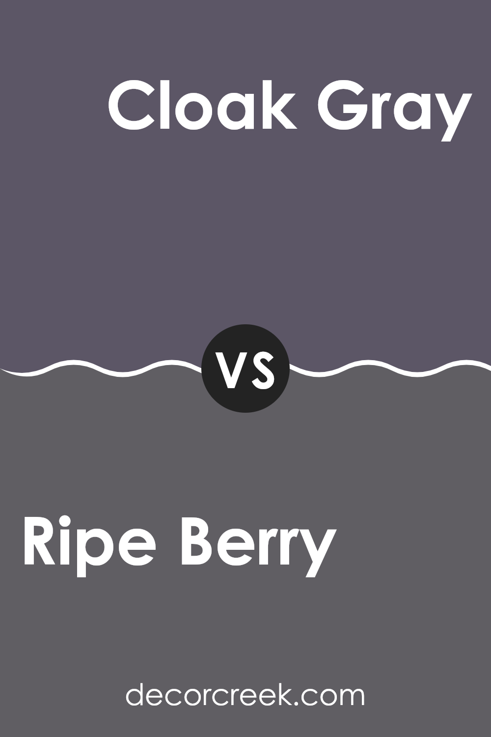
Ripe Berry SW 9689 by Sherwin Williams vs Cloak Gray SW 6278 by Sherwin Williams
Ripe Berry and Cloak Gray by Sherwin Williams offer two distinct color experiences. Ripe Berry is a rich, deep hue that combines elements of red and purple, creating a cozy, warm feel. It’s perfect for adding energy and vibrancy to a room. The intensity of this color can make a bold statement, making it ideal for accent walls or spaces where you want to draw attention.
In contrast, Cloak Gray is a soft, muted shade that leans towards a cool, calming effect. Its gray tone is versatile, providing a neutral backdrop that works well in various settings. Cloak Gray offers a sense of calm and balance, making it suitable for bedrooms or living areas where relaxation is key.
Together, Ripe Berry and Cloak Gray can complement each other, with the warmth of Ripe Berry contrasting nicely against the cool, understated presence of Cloak Gray. This pairing can create a sophisticated and balanced look in any space.
You can see recommended paint color below:
- SW 6278 Cloak Gray
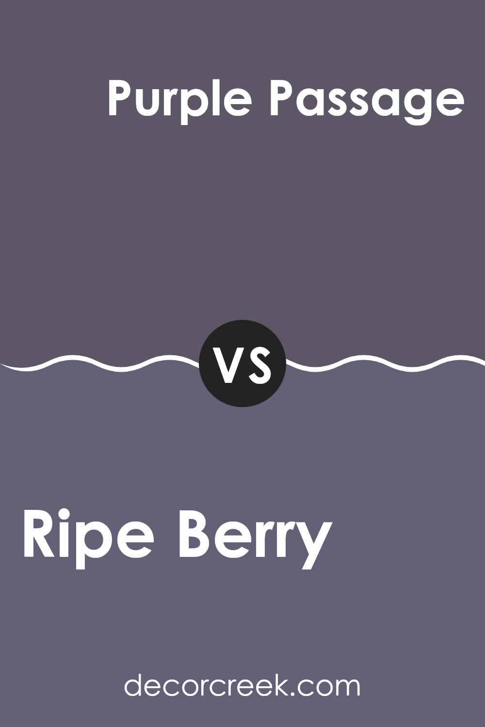
Ripe Berry SW 9689 by Sherwin Williams vs Purple Passage SW 6551 by Sherwin Williams
Ripe Berry and Purple Passage, both from Sherwin Williams, offer distinct moods and styles. Ripe Berry is a deep, rich shade of red with purple undertones, creating a bold and dramatic look. It is warm and inviting, which makes it great for spaces meant to feel cozy and intimate.
On the other hand, Purple Passage is a softer, more muted lavender. This lighter color feels airy and calming, suiting areas where a peaceful atmosphere is desired. When comparing them, Ripe Berry stands out for its intense and energetic presence, making a statement in any room.
Purple Passage, however, offers a subtle, elegant vibe that adds a gentle touch of color. Both colors bring their unique charm, but choosing between them depends on whether you want to create a vibrant, lively space or a soft, relaxing environment. Regardless, both colors add a unique flair to any decor.
You can see recommended paint color below:
- SW 6551 Purple Passage
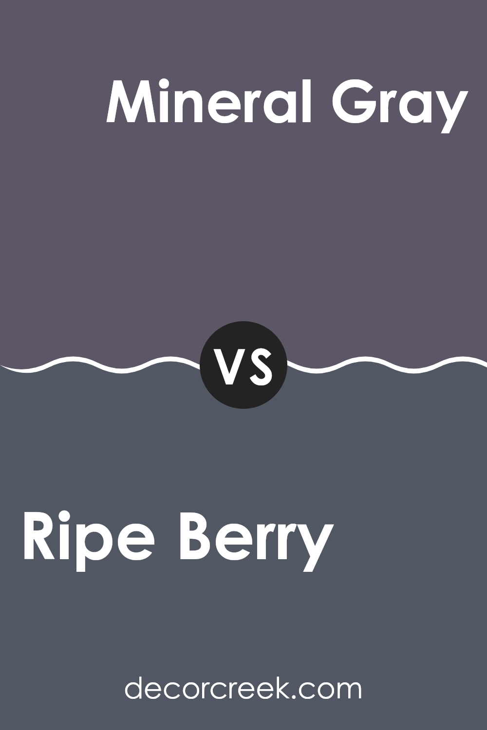
Ripe Berry SW 9689 by Sherwin Williams vs Mineral Gray SW 2740 by Sherwin Williams
Ripe Berry (SW 9689) and Mineral Gray (SW 2740) by Sherwin Williams offer two distinct color experiences. Ripe Berry is a rich, bold color with a deep, reddish-purple hue. It feels warm and inviting, bringing a sense of coziness to any room. It’s perfect for adding a touch of luxury or creating a statement wall.
In contrast, Mineral Gray is a cooler, more subdued shade. It’s a soft, neutral gray with hints of blue. This color is versatile and calming, ideal for creating a peaceful atmosphere in spaces like bedrooms or living areas. It pairs well with a variety of other colors, making it a flexible choice for different design themes.
While Ripe Berry is about making a striking impact, Mineral Gray focuses on understated elegance. Together or separately, they offer unique ways to add personality to your space.
You can see recommended paint color below:
- SW 2740 Mineral Gray
Ripe Berry SW 9689 by Sherwin Williams vs Perle Noir SW 9154 by Sherwin Williams
Ripe Berry (SW 9689) by Sherwin Williams is a warm and rich color, reminiscent of ripe fruits with a deep, inviting tone that adds coziness to any room. It’s a bit red and purple, making it vibrant and lively.
On the other hand, Perle Noir (SW 9154) is a deep, almost black color, but with subtle hints of warmth. It leans more towards a dark charcoal gray, offering a touch of softness compared to pure black. When used in a space, Ripe Berry can create a bold and energetic atmosphere, perfect for areas where you want to invite conversation and activity.
Perle Noir, with its near-black shade, can bring a sense of drama and elegance, making it suitable for accent walls or creating contrast. Pairing these two can result in a striking combination, with Ripe Berry adding the color pop and Perle Noir providing depth and sophistication.
You can see recommended paint color below:
- SW 9154 Perle Noir

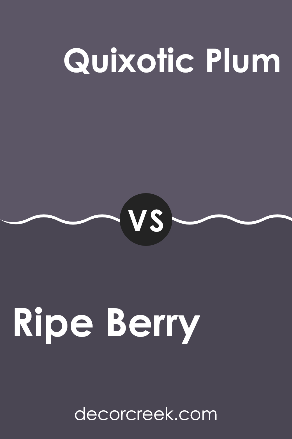
Ripe Berry SW 9689 by Sherwin Williams vs Quixotic Plum SW 6265 by Sherwin Williams
Ripe Berry SW 9689 is a rich, deep red with a hint of purple, reminiscent of mature berries. It offers a warm, inviting feel and can create a cozy atmosphere in any room. Its boldness makes it a great choice for accent walls or spaces where you want a striking effect.
Quixotic Plum SW 6265, on the other hand, leans more toward a deep purple with cooler undertones. It has a slightly more muted and mysterious vibe compared to Ripe Berry. This color can bring a touch of luxury and sophistication, making it ideal for bedrooms or living areas where relaxation is key.
Both colors are bold and add dramatic impact, yet Ripe Berry feels warmer and more vibrant, while Quixotic Plum feels cooler and more subdued. When choosing between them, consider the mood you want to set—cozy and inviting with Ripe Berry, or plush and calming with Quixotic Plum.
You can see recommended paint color below:
- SW 6265 Quixotic Plum
Ripe Berry SW 9689 by Sherwin Williams vs Mesmerize SW 6544 by Sherwin Williams
Ripe Berry SW 9689 by Sherwin Williams is a rich, deep red color with a touch of purple, giving it a cozy, warm feel. It’s perfect for creating an inviting atmosphere in living rooms or dining areas. This color has a bold presence and works well with both neutral tones and other warm colors.
On the other hand, Mesmerize SW 6544 by Sherwin Williams is a cool, calming shade of blue with hints of green. This color evokes a sense of calmness and is ideal for spaces where you want to relax, like bedrooms or bathrooms. It pairs beautifully with whites and other cool tones, enhancing its soothing effect.
While Ripe Berry adds warmth and richness, Mesmerize provides a refreshing contrast with its cool, serene vibe. These colors can be used individually for distinct moods or together, where Ripe Berry’s warmth balances Mesmerize’s coolness, creating a dynamic yet cohesive look.
You can see recommended paint color below:
- SW 6544 Mesmerize
Ripe Berry SW 9689 by Sherwin Williams vs Expressive Plum SW 6271 by Sherwin Williams
Ripe Berry (SW 9689) and Expressive Plum (SW 6271) by Sherwin Williams are two beautiful shades of purple, each with its unique vibe. Ripe Berry is a warm, deep magenta tone that feels lively and bold. It adds a sense of richness and warmth to any room, making it perfect for spaces that want a bit of drama or energy.
On the other hand, Expressive Plum is a deeper, cooler purple with more of a muted undertone. It’s a bit more reserved, providing a touch of elegance and calmness to a setting. This color works well in creating a cozy atmosphere and pairs nicely with lighter, neutral colors.
While Ripe Berry brings in warmth and vibrancy, Expressive Plum introduces a softer, more subtle mood. Both colors have their own place in home decor, depending on whether you want an energetic or a more soothing environment.
You can see recommended paint color below:
- SW 6271 Expressive Plum
Conclusion
After looking at the color SW 9689 Ripe Berry by Sherwin Williams, I can say it’s a really pretty color. It’s like a mix of red and purple, kind of like a ripe fruit or a yummy berry. If you paint your walls with this color, it can make a room feel warm and cozy, like a big hug.
This color can be used in many rooms because it’s bold and exciting. It can make a living room feel lively or make a bedroom feel like a comfy place to relax. Ripe Berry can be fun to match with other colors too. You might mix it with light colors like cream or gray to make it stand out even more. It’s also good with shiny things like gold or silver for an extra special look.
Some people might worry this color is too strong, but I think it’s just right for making a statement. It’s like telling people, “Look at me!” without being too loud. Whether you want a whole room painted in Ripe Berry or just one wall, it can show a bit of your style. Overall, Ripe Berry is a fun and bright color choice that can make your home feel really special.

Ever wished paint sampling was as easy as sticking a sticker? Guess what? Now it is! Discover Samplize's unique Peel & Stick samples.
Get paint samples

