Choosing a paint color for your home isn’t always straightforward. With an overwhelming array of choices available, finding the perfect hue that will enhance your space can be a daunting task. This guide will take a deep dive into one specific paint color that has made waves in the interior design world: Sherwin-Williams SW 7016 Mindful Gray.
From its hue and undertones to its adaptability in different spaces, we will explore all there is to know about this versatile shade.

What Color Is SW 7016 Mindful Gray?
SW 7016 Mindful Gray is a soft, sophisticated, neutral gray with just a hint of warmth to it. It’s a mid-tone color, not too light and not too dark. Its rich, inviting hue exudes understated elegance, making it a timeless and stylish choice for any home.
Despite its name, Mindful Gray does more than just deliver a simplistic gray hue. It’s a complex and layered color that projects depth and sophistication. This versatile shade perfectly captures the tranquil and serene nature of its namesake, making it an ideal choice for a soothing, calm ambiance in your home.

Ever wished paint sampling was as easy as sticking a sticker? Guess what? Now it is! Discover Samplize's unique Peel & Stick samples.
Get paint samples

Is It a Warm Or Cool Color?
While many people perceive gray as a cool color, SW 7016 Mindful Gray is what could be described as a ‘warm gray.’ This is because of its subtle undertones, which lend it a certain warmth not often found in stark, true grays. However, it still maintains a neutral balance, making it an incredibly flexible color that can pair beautifully with both warm and cool colors alike.
Undertones of SW 7016 Mindful Gray
Undertones are subtle colors that lie beneath the primary color. They may not be overtly visible but play a significant role in determining how a color is perceived, especially under different lighting conditions. SW 7016 Mindful Gray is unique in that it has a complex array of undertones.
The primary undertones in Mindful Gray are gray and greige, a perfect blend of gray and beige. This gives the color its warm, inviting feel. Furthermore, the color also hosts some very subtle bluish/green undertones. While these are less apparent, they add a layer of complexity to the color, helping it adapt beautifully to a wide range of color palettes.
Understanding these undertones is key to unlocking the color’s full potential and determining how it will interact with other colors in a given space.

Coordinating Colors of SW 7016 Mindful Gray
Coordinating colors are those that work harmoniously with a specific hue, amplifying its charm and creating a cohesive, balanced look. For SW 7016 Mindful Gray, a wide array of colors can play this role effectively. Here are five strong contenders:
- SW 6222 Riverway : This deep, teal blue color adds a beautiful contrast to Mindful Gray, providing depth and dynamism to a space.
- SW 6244 Naval : A strong, confident shade of navy blue that harmonizes perfectly with Mindful Gray, adding an air of sophistication.
- SW 7006 Extra White : This pure white shade offers a crisp, clean contrast to the warmth of Mindful Gray.
- SW 7029 Agreeable Gray : A lighter, warmer gray that complements Mindful Gray and can help create a layered, monochromatic look.
- SW 6238 Icicle : A soft, cool blue that brings out the subtle blue undertones of Mindful Gray, adding a serene, calming touch.

How Does Lighting Affect SW 7016 Mindful Gray?
Lighting plays a crucial role in how we perceive color, and SW 7016 Mindful Gray is no exception. Under natural daylight, the color appears as a balanced, mid-toned gray with noticeable warmth. As the day progresses and the light changes, the color may appear lighter or darker, and the subtle bluish/green undertones may become more or less prominent.
Artificial lighting can also significantly impact the appearance of Mindful Gray. Warm, yellow lighting tends to accentuate the greige undertones, making the color appear warmer. On the other hand, cool, white light may bring out the subtle bluish undertones, giving the color a cooler appearance.
When planning your room’s color scheme, it’s important to consider the type of lighting your space will most often be under.

LRV of SW 7016 Mindful Gray
LRV, or Light Reflectance Value, is a measure of how much light a color reflects. On a scale of 0 to 100, with 0 being absolute black and 100 being pure white, SW 7016 Mindful Gray has an LRV of 48. This means that it reflects about 48% of light, classifying it as a medium-light color.
An LRV of 48 allows Mindful Gray to maintain a solid presence without overwhelming a space. This balanced LRV also means that the color works beautifully in both small and large rooms, as well as in spaces with varying levels of natural light. It’s light enough to open up smaller, dimly lit rooms yet dark enough to add depth and interest to larger, well-lit spaces.
While it’s not as reflective as lighter colors, Mindful Gray still bounces back a good amount of light, keeping spaces bright and airy. This, combined with its versatile undertones, makes it a highly adaptable color that can work well under a variety of lighting conditions and in different types of spaces.

LRV – what does it mean? Read This Before Finding Your Perfect Paint Color
Trim Colors of SW 7016 Mindful Gray
Choosing the right trim color can greatly enhance the overall look of your paint job, creating contrast and highlighting architectural details. When it comes to pairing SW 7016 Mindful Gray with trim colors, shades of white from the Sherwin-Williams palette are the top contenders:
- SW 7005 Pure White : A clean, bright white that provides a crisp contrast against Mindful Gray, perfect for a modern, minimalist aesthetic.
- SW 7008 Alabaster : A slightly warmer white that harmonizes beautifully with the warm undertones of Mindful Gray.
- SW 7551 Greek Villa : A rich, creamy white that pairs well with Mindful Gray for a cozy, traditional look.

Colors Similar to SW 7016 Mindful Gray
Knowing similar colors can help you identify subtle differences and preferences, aiding you in the ultimate color selection process. Here are five colors from Sherwin-Williams that share close similarities with SW 7016 Mindful Gray:
- SW 9567 Viaduct : It’s a light-medium gray with a perfect balance of warm and cool undertones. While similar to Mindful Gray, it leans more toward the cool spectrum due to its subtle blue undertones.
- SW 7023 Requisite Gray : This color is a notch darker than Mindful Gray with a tad more beige undertones, making it slightly warmer.
- SW 2844 Roycroft Mist Gray : Roycroft Mist Gray is slightly cooler than Mindful Gray. It carries a delicate air of sophistication and tranquility.
- SW 7030 Anew Gray : A warmer, beige-gray color that’s slightly darker than Mindful Gray, bringing a touch more coziness and warmth.
- SW 1015 Skyline Steel : This is a lighter shade compared to Mindful Gray. It offers a fresh and airy feel, with similar subtle bluish/green undertones.
Identifying these similar colors not only provides alternatives if Mindful Gray isn’t the perfect fit but also helps to refine your color preferences and understanding of how subtle changes in tone, undertone, and LRV can impact a color’s appearance.

Colors That Go With SW 7016 Mindful Gray
Coordinating a color palette involves selecting colors that harmonize well together and create a pleasing aesthetic. When it comes to SW 7016 Mindful Gray, here are six complementary Sherwin-Williams colors:
- SW Dovetail : A darker shade of gray that can provide a beautiful contrast, enhancing the warm undertones of Mindful Gray.
- SW Black Fox : A deep, dark brownish-gray, this color pairs well with Mindful Gray to create a rich, earthy palette.
- SW Gauntlet Gray : Another darker gray, it can bring depth and dimension to a room painted in Mindful Gray.
- SW Rain : A soft, muted blue-green, this color complements the subtle bluish undertones of Mindful Gray.
- SW Tradewind : A gentle, breezy blue that pairs beautifully with Mindful Gray for a tranquil, serene color palette
- SW Hazel : A cool green with gray undertones that can complement and bring out the subtle green undertones of Mindful Gray.
Choosing colors that go well with Mindful Gray can help create a cohesive design scheme that enhances the overall ambiance of the room.

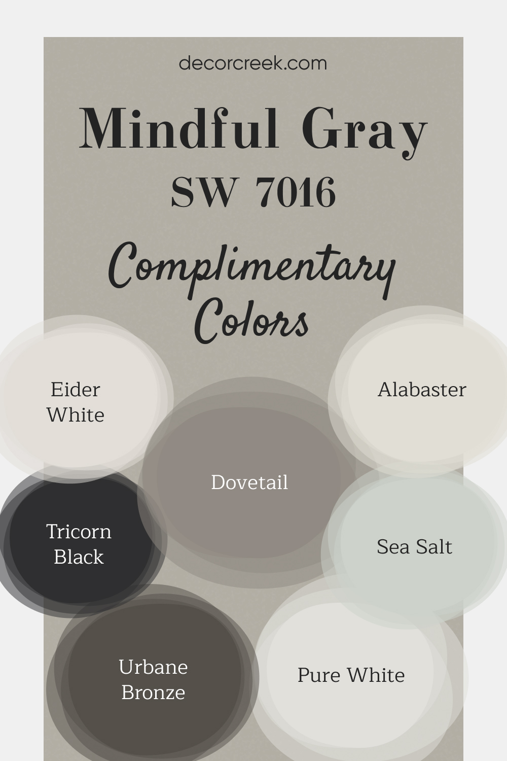
Complimentary Colors for Mindful Gray SW 7016 Paint Color by Sherwin Williams
Mindful Gray serves as a neutral foundation that works well in any room, bringing a sense of calm and balance. Alabaster and Pure White add brightness, making spaces feel open and fresh. Eider White is a great choice for trim or ceilings, giving an airy touch.
Sea Salt adds a gentle pop of color, creating a serene atmosphere that’s perfect for bedrooms or bathrooms. Urbane Bronze and Tricorn Black introduce deeper tones, adding contrast and character to accent walls, cabinetry, or doors.
Dovetail complements the mix with its soft gray hue, helping tie everything together. This palette brings a modern yet cozy feel to your home, making each space both stylish and welcoming.
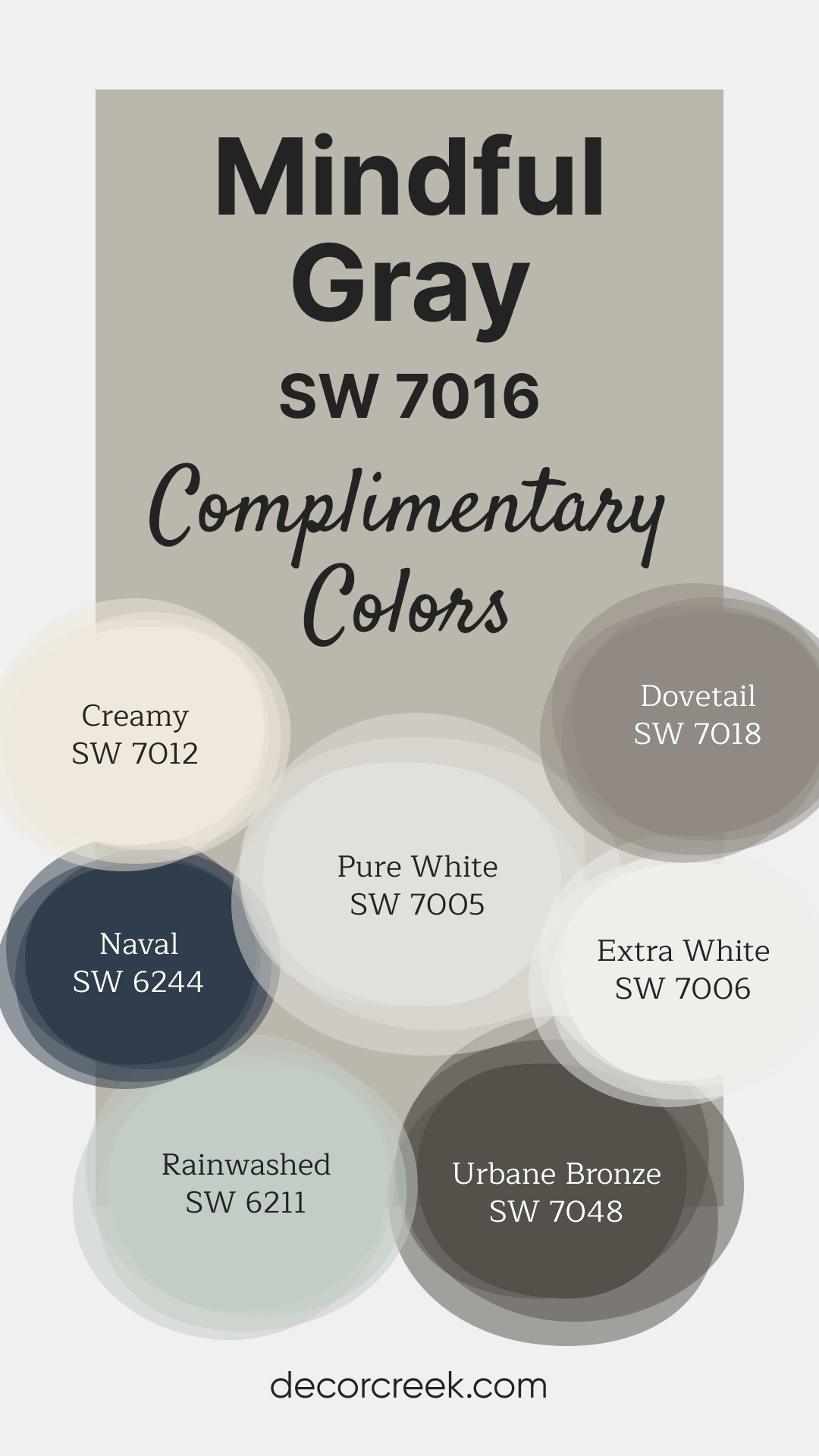
This Sherwin Williams palette blends elegance and versatility for any space. Mindful Gray and Dovetail create a neutral foundation, while Naval adds a bold and rich statement. Creamy and Pure White brighten the mix, offering a welcoming and clean feel. Rainwashed adds a refreshing touch with its gentle green-blue undertone.
Extra White provides a crisp, modern finish, perfect for trims or ceilings, and Urbane Bronze brings depth and contrast. Together, these shades offer a harmonious balance of warmth and sophistication, making them an ideal choice for a cohesive look.
How to Use SW 7016 Mindful Gray In Your Home?
SW 7016 Mindful Gray is a versatile color that can be used in various rooms, including the bedroom, bathroom, living room, exterior, and kitchen. Additionally, it fits well with many interior design styles, from modern and minimalist to rustic and traditional.
How to Use SW 7016 Mindful Gray in the Bedroom?
When used in a bedroom, SW 7016 Mindful Gray can create a restful and serene environment. Its medium-light LRV helps to reflect a good amount of light, making the room feel brighter and more spacious. Pair Mindful Gray with crisp, white linens and incorporate soft lighting to create a soothing ambiance. Adding a few elements of natural wood or metallic accents can add warmth and texture, enhancing the tranquility of the space.
To amplify the sophisticated appeal, consider combining Mindful Gray with darker accent colors, such as navy blue or rich teal, in your throw pillows, rugs, or artwork. This can create a dynamic contrast while still maintaining the overall calm atmosphere. Remember, a bedroom is a personal sanctuary, so feel free to express your individual style through carefully selected accessories and furniture pieces.

How to Use SW 7016 Mindful Gray in the Bathroom?
In a bathroom, Mindful Gray can create a spa-like feel. Its balanced LRV makes it an excellent color for smaller spaces like bathrooms, reflecting just enough light to make the room feel larger and more open. This color goes especially well with modern bathroom fixtures in stainless steel or nickel finishes, as these will accentuate the warmth of Mindful Gray while adding a touch of sleek, contemporary style.
For a unique, cohesive look, consider painting bathroom cabinets or vanities in Mindful Gray as well. A white countertop would provide a striking contrast, and touches of natural elements such as stone or wood can add a layer of richness to the room. Accent the space with towels or accessories in a cooler color, like a muted blue or green, to bring out the subtle cool undertones of Mindful Gray.

How to Use SW 7016 Mindful Gray in the Living Room?
SW Mindful Gray can serve as an ideal backdrop in a living room. Its warm undertones make the space feel inviting, while its balanced LRV ensures the room feels airy and open. You can pair this versatile shade with various color palettes. Complement it with cool blues and greens for a fresh, modern feel or with warm browns and creams for a more traditional look. For a more dynamic aesthetic, incorporate a mix of textures and patterns in your upholstery, rugs, and decorative items.
If your living room has a fireplace, painting the surrounding wall in Mindful Gray can create a beautiful focal point. Complement it with white trim to add crispness to the room. For a contemporary look, consider mixing in metallic accents in silver or gold, which will pop against the warm gray backdrop and add an element of sophistication to the room.

How to Use SW 7016 Mindful Gray for an Exterior?
For an exterior, Mindful Gray provides an elegant and timeless appeal. The color’s warm undertones lend a welcoming feel, and its versatility allows it to pair well with a variety of accent colors. Try using it on the siding or the main body of the house, and offset it with crisp, white trim for a classic look that stands out. Darker accents on doors or shutters can add depth and interest to the overall exterior color scheme.
If your home has stone or brick elements, Mindful Gray can harmonize beautifully with these natural materials, emphasizing their texture and color variations. For a modern twist, consider pairing Mindful Gray with darker grays or even black for the front door or shutters. This can create a bold contrast, making your home stand out.

How to Use SW 7016 Mindful Gray in the Kitchen?
In the kitchen, Mindful Gray can lend a warm and inviting atmosphere. Applying it to walls can provide a neutral backdrop that allows other design elements, like countertops, backsplashes, or appliances, to shine. To create a cohesive look, consider choosing hardware in stainless steel or brushed nickel, which will complement the warm undertones of Mindful Gray.
Alternatively, you can use this versatile hue on your kitchen island for a subtle contrast against white or cream-colored cabinetry. This can add visual interest and depth to the space. Pair it with a white quartz or marble countertop and white subway tile backsplash for a classic yet contemporary aesthetic.

How to Use SW 7016 Mindful Gray for Kitchen Cabinets?
Painting kitchen cabinets in Mindful Gray can create a modern yet timeless look. As a mid-toned color, it adds depth and interest while still remaining neutral and versatile. Pair these cabinets with a light-colored countertop, like white or cream quartz or granite, to create a balanced look. You can also use a subway tile backsplash in a similar light color to tie the space together.
Don’t be afraid to mix in some bold accent colors. A pop of vibrant color from accessories or appliances can provide a lively contrast against the neutral cabinets. Furthermore, choose hardware that complements the warm undertones of Mindful Gray, such as brushed nickel or antique bronze. This will enhance the cabinets’ elegance and add to the overall harmony of your kitchen design.

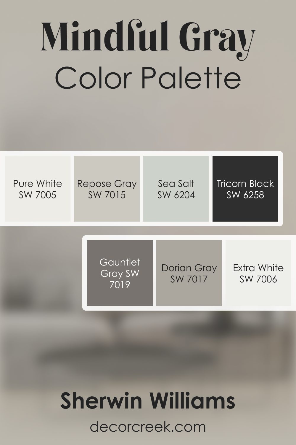
Mindful Gray SW 7016 by Sherwin Williams Color Palette
When I work with Mindful Gray, I always feel a calm, steady softness settle into the room. There’s a gentle depth to this color that makes everything feel balanced and quietly grounded. I love pairing it with Pure White or Extra White when I want the room to feel open and bright without losing warmth.
Repose Gray and Dorian Gray sit beautifully beside it, adding smooth transitions that create a layered, thoughtful look.
When I want to bring in something bold, Tricorn Black gives Mindful Gray just the right amount of contrast, keeping the palette crisp and clear. Gauntlet Gray adds a deeper tone that feels steady, while Sea Salt introduces a refreshing, airy touch that softens the entire palette.
This combination works so well because every shade brings something helpful—light, depth, or gentle color. Mindful Gray sits right at the center, creating a look that feels calm, modern, and wonderfully balanced.
Comparing SW 7016 Mindful Gray With Other Colors
Comparing a color with other similar or contrasting hues can provide a deeper understanding of its characteristics. By examining how it stands against other colors, you can better understand its undertones, depth, and how it might feel in your space.
SW 7016 Mindful Gray vs. SW Tricorn Black
SW Tricorn Black is a deep, true black with a strong presence. When compared to Mindful Gray, it provides a striking contrast. While Tricorn Black can give a room a dramatic, contemporary feel, Mindful Gray offers a softer, more tranquil atmosphere. Together, they can create a dynamic and visually appealing balance.

SW 7016 Mindful Gray vs. SW Sea Salt
SW Sea Salt is a light, muted shade of green with gray undertones. Next to Mindful Gray, Sea Salt appears lighter and slightly cooler. Sea Salt brings a breath of fresh air into any room, while Mindful Gray grounds the space with its subdued, warm gray tones.

SW 7016 Mindful Gray vs. SW Creamy
SW Creamy is a light, warm off-white color. When compared to Mindful Gray, it appears much lighter and warmer. Creamy lives up to its name by providing a creamy, delicate backdrop, while Mindful Gray adds a bit more depth and sophistication.

SW 7016 Mindful Gray vs. SW Ellie Gray
SW Ellie Gray is a medium to dark gray with cool blue undertones. It is noticeably cooler and darker than Mindful Gray. Ellie Gray offers a more dramatic and contemporary feel, while Mindful Gray remains a warm, neutral, and versatile choice.

SW 7016 Mindful Gray vs. SW Aesthetic White
SW Aesthetic White is light to medium beige with warm undertones. Compared to Mindful Gray, it’s lighter and warmer, almost a pale beige. While Aesthetic White brings a warm, airy feel to a room, Mindful Gray adds a touch more gravity and sophistication.

SW 7016 Mindful Gray vs. SW Colonnade Gray
SW Colonnade Gray is a medium-light gray with warm beige undertones. It’s very similar to Mindful Gray but leans a bit more toward beige. Colonnade Gray offers a slightly warmer and cozier atmosphere, while Mindful Gray balances between being warm and cool.

Choosing the right paint color can dramatically transform your space. SW 7016 Mindful Gray, with its warm gray hue, greige, and subtle bluish/green undertones, makes it a versatile choice for any room. Its balanced LRV and ability to harmonize with a range of coordinating colors, from striking blues to soothing whites, make it an excellent choice for various design styles.
By understanding its comparison with other colors and its application in different rooms, we hope this guide has provided you with a comprehensive insight into this unique shade.
Remember, the right paint color is the one that feels right to you and aligns with your aesthetic preferences, enhancing the beauty and comfort of your space. Happy painting!

Ever wished paint sampling was as easy as sticking a sticker? Guess what? Now it is! Discover Samplize's unique Peel & Stick samples.
Get paint samples
Frequently Asked Questions
⭐Is SW 7016 Mindful Gray a warm or cool color?
SW 7016 Mindful Gray is considered a warm gray due to its gray and greige undertones. However, it also has subtle bluish/green undertones that can become more apparent depending on lighting and surrounding colors.
⭐What coordinating colors work well with Mindful Gray?
Mindful Gray pairs beautifully with a range of colors. It works especially well with Sherwin-Williams Riverway and Naval. Other colors like Sea Salt, Rain, Tradewind, and Hazel also complement Mindful Gray very nicely.
⭐What is the Light Reflectance Value (LRV) of Mindful Gray?
The Light Reflectance Value (LRV) of Mindful Gray is 48. This value indicates that it is a medium-light color that reflects a good amount of light. This makes it versatile and suitable for both small and large spaces.
⭐What trim colors can be paired with Mindful Gray?
Mindful Gray looks best when paired with shades of white for the trim. Colors like Sherwin-Williams Pure White, Extra White, or Alabaster are all excellent choices for this.
⭐Can I use Mindful Gray for my kitchen cabinets?
Absolutely! Mindful Gray is a very versatile color, and it works wonderfully on kitchen cabinets. It pairs nicely with light-colored countertops and backsplashes, providing a modern yet timeless look to your kitchen.


