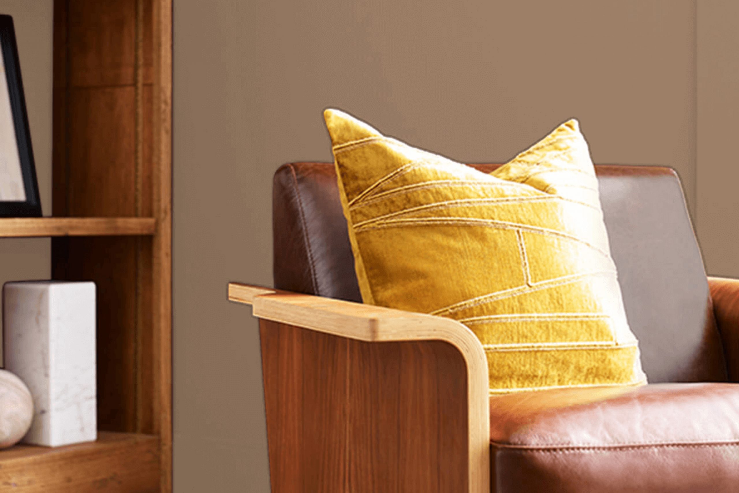
SW 2823 Rookwood Clay by Sherwin Williams instantly caught my attention with its warm, earthy tones. It’s a shade that feels grounded and classic, drawing you in with its rich, natural hue. As I examined it more closely, I noticed how this color seamlessly blends traditional charm with a modern twist. It has a way of creating an inviting and cozy atmosphere, whether used in a spacious living room or a more intimate setting.
Rookwood Clay offers a perfect balance between boldness and subtlety, making it incredibly adaptable. You can pair it with lighter neutrals for a soft, harmonious look, or contrast it with deeper shades for a more dramatic effect. Its adaptability makes it suitable for various styles, from classic to contemporary.
Whether you’re looking to refresh a single wall or update an entire room, Rookwood Clay provides a foundation that feels both comfortable and stylish. It’s a choice that encourages creativity and personal expression, allowing you to craft a room that truly reflects your unique taste.
As you work with this color, you’ll find it resonates well with both natural and artificial lighting, adapting beautifully to different environments throughout the day.
What Color Is Rookwood Clay SW 2823 by Sherwin Williams?
Rookwood Clay (SW 2823) by Sherwin Williams is a warm, earthy shade that sits comfortably between tan and brown. It offers a cozy and grounded feel, reminiscent of natural clay or soft terracotta. This color works particularly well in interiors that aim for a rustic or traditional look, but it can also enhance modern areas that use earth tones.
In rustic interiors, Rookwood Clay complements wooden elements, such as oak or walnut furniture, emphasizing the natural beauty of wood grains. It pairs well with materials like stone or brick, enhancing the textures and colors. For a more traditional style, combine this color with deep greens or muted reds to create a classic, inviting atmosphere.
In modern settings, Rookwood Clay can be used alongside metals like brass or copper, where the warmth of the paint beautifully contrasts with cooler metallic tones. Textured fabrics like linen or wool in neutral or warm hues can enhance the room’s coziness.
Rookwood Clay also harmonizes with natural textiles, such as woven baskets or jute rugs, adding to its organic appeal. Use it as a backdrop in rooms with plenty of natural light to bring out its full richness, creating a welcoming room that’s both comfortable and stylish.
Is Rookwood Clay SW 2823 by Sherwin Williams Warm or Cool color?
Rookwood Clay SW 2823 by Sherwin Williams is a rich, earthy brown with warm undertones, making it an adaptable choice for home interiors. This color creates a cozy and welcoming atmosphere in any room. In living areas, it can make large rooms feel more intimate and comfortable.
When used in a bedroom, it adds warmth and creates a soothing environment, making it a great backdrop for relaxation and rest. In kitchens or dining areas, pairing it with warm wood tones or cream accents can enhance the inviting feel.
Rookwood Clay works well with both modern and traditional styles, adding a touch of warmth to minimalist areas or complementing classic decor. It pairs beautifully with off-whites, golds, and olive greens, allowing for various decorating options. With adequate lighting, it brings depth and richness to walls, turning a simple room into a cozy retreat.
Undertones of Rookwood Clay SW 2823 by Sherwin Williams
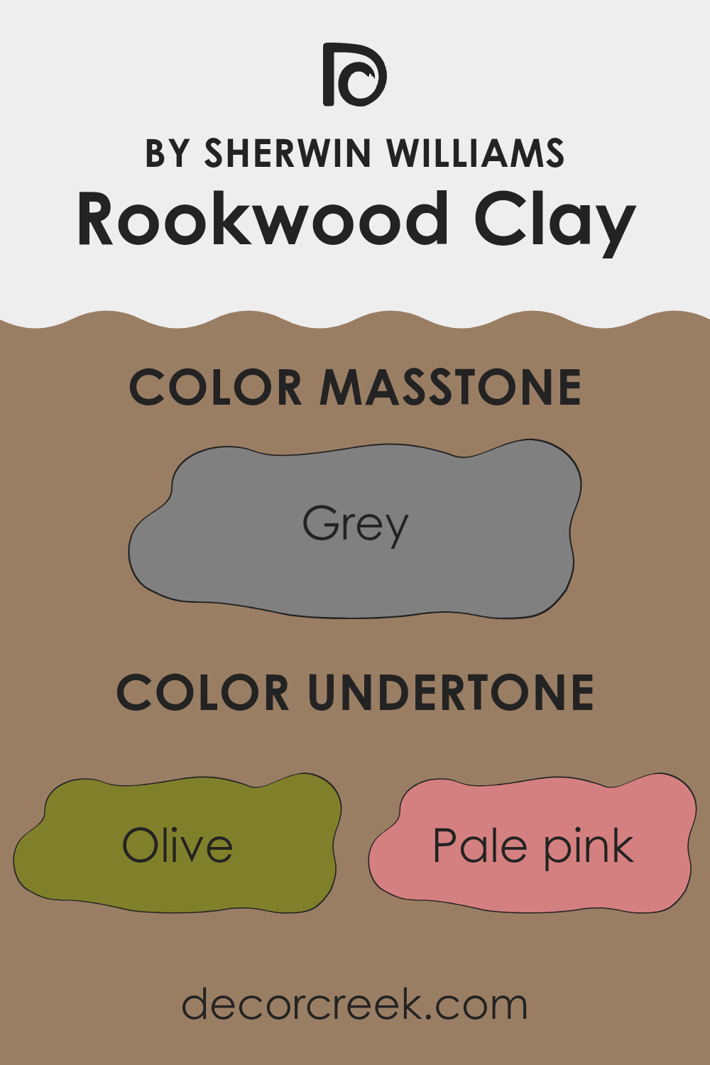
Rookwood Clay by Sherwin Williams is a complex and subtle color with a variety of undertones that affect how we see it on walls. This color might look like a blend of brown and clay, but its undertones add depth and variability. Olive and dark green undertones can give it a natural heaviness, making it feel grounded, while light green and pale yellow can make it seem warmer and more inviting.
The presence of pale pink and pink undertones can add a soft, gentle warmth, while the orange undertones provide an earthy, rich vibe. Purple, lilac, and violet undertones could introduce a surprising touch of elegance and depth. These purples might also make the paint more mysterious, shifting its vibe under different lighting.
The mixtures of mint, light turquoise, blue, and navy undertones add a coolness that balances out the warmer tones. This can create a fresh feeling in a room, making it more dynamic. Dark turquoise and dark grey provide a richer, more refined background that can help highlight different design elements in a room.
All these undertones combined contribute toward changing the overall feel of a room, playing with natural and artificial lighting throughout the day, making rooms feel different depending on the time of day. The warm tones invite coziness, while the cool ones introduce freshness.
What is the Masstone of the Rookwood Clay SW 2823 by Sherwin Williams?
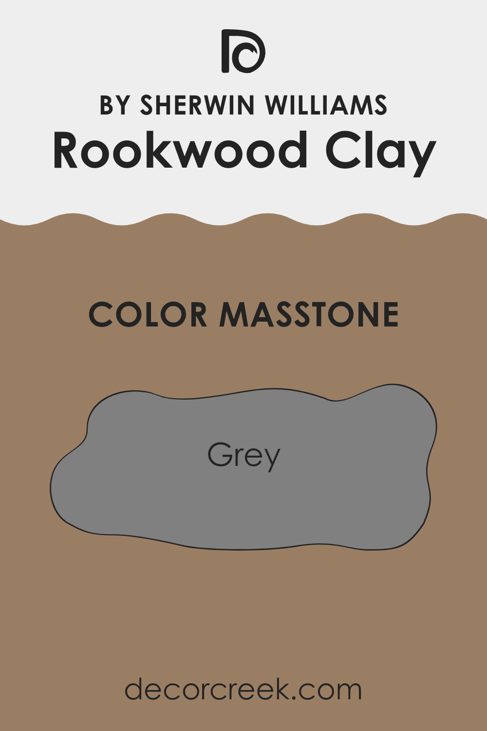
Rookwood Clay (SW 2823) by Sherwin Williams is a warm, earthy color that combines grey and brown tones. Its masstone, or main visible color, is a soft grey (#808080), which makes it very adaptable for home interiors.
This muted grey acts as a neutral backdrop, allowing it to blend well with various design elements and styles. It can add a cozy, grounded feel to a room, making areas feel more intimate and inviting without overpowering them. The color’s subdued nature means it works well in both modern and traditional settings.
It can be used in living rooms, bedrooms, or even kitchens, complementing wood accents, metal fixtures, and a variety of textiles. By using Rookwood Clay, homeowners can create a harmonious atmosphere that feels cohesive and balanced. Its grey undertone pairs easily with other colors, providing flexibility in decorating and allowing personal touches to stand out against its calming background.
How Does Lighting Affect Rookwood Clay SW 2823 by Sherwin Williams?
Lighting plays a big role in how we see colors. Different types of light can change the appearance of a color, making it look lighter, darker, or even like a different hue. Rookwood Clay by Sherwin Williams is a warm, earthy color. Depending on the type of light, its look can change quite a bit.
In natural light, Rookwood Clay tends to show its true color best. In a north-facing room, the natural light can be cooler and dimmer. This might make Rookwood Clay look slightly more muted or gray. North-facing rooms have less direct sunlight, which can make warm colors appear cooler.
In contrast, south-facing rooms receive abundant sunlight, which is often warm and bright. Rookwood Clay in a south-facing room will look warmer and richer, as the ample sunlight helps enhance its natural warmth.
East-facing rooms get morning light, which is usually soft and warm. In the morning, Rookwood Clay can look quite warm and cozy. However, as the sun moves away and the light becomes indirect, it might seem a bit more neutral.
West-facing rooms experience the opposite. They don’t get direct morning light, so Rookwood Clay might look more muted earlier in the day. But in the afternoon and evening, when the sun is setting, the warm light can make the color appear deeper and more intense.
Under artificial light, the type of bulb used can affect the color too. Incandescent bulbs emit a warm light, which can make Rookwood Clay feel even warmer and more inviting. On the other hand, fluorescent lighting is cooler and might bring out cooler tones in the color, making it a touch more subdued. LED lights vary, so depending on the warmth or coolness of the bulb, the color will shift accordingly.
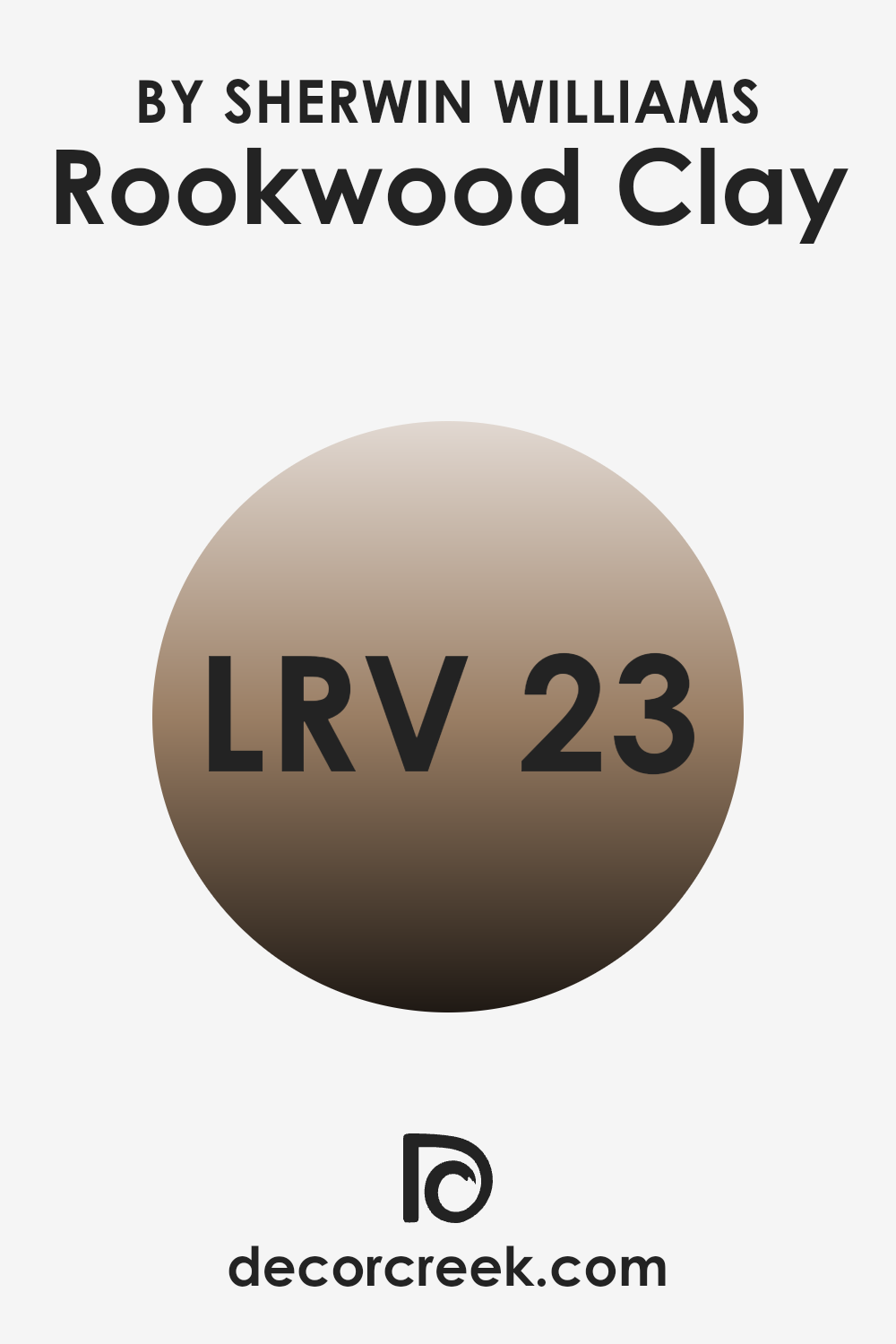
What is the LRV of Rookwood Clay SW 2823 by Sherwin Williams?
LRV stands for Light Reflectance Value, and it measures the amount of light a color reflects. It’s a way to tell how light or dark a color will appear on a wall. The scale ranges from 0 to 100, where 0 is pure black, meaning it absorbs all light, and 100 is pure white, meaning it reflects all light. A color with an LRV of 22.748, like Rookwood Clay, is on the darker side of the spectrum.
This means it will absorb a lot of light and reflect less, making a room feel cozier and more intimate, as opposed to bright and airy. When considering Rookwood Clay with its LRV of 22.748, it’s important to think about the size of the room and the lighting.
Because it reflects less light, this color can make a large room feel more inviting and warm. However, in a small or poorly-lit room, it might seem even darker and more constrained. This hue can add depth and richness to a room, but it’s essential to balance it with lighter elements or adequate lighting to prevent the room from feeling too heavy or enclosed.
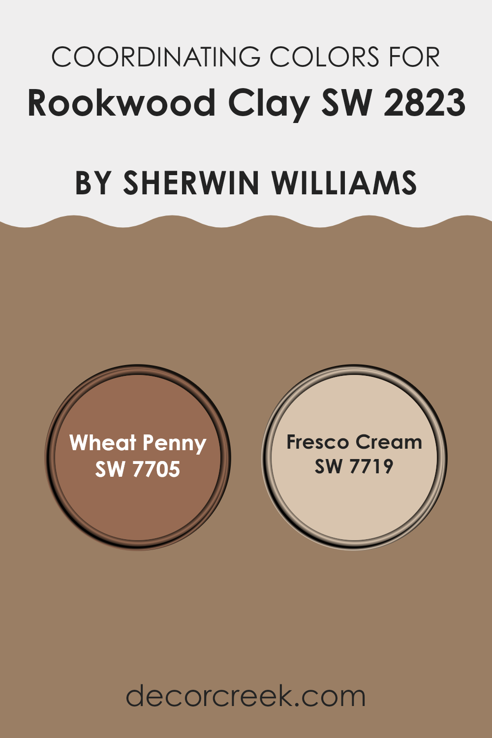
Coordinating Colors of Rookwood Clay SW 2823 by Sherwin Williams
Coordinating colors are hues that complement each other and are often used together in interior design to create a harmonious and visually appealing room. When selecting coordinating colors for a particular base color like Rookwood Clay by Sherwin Williams, it’s important to choose shades that enhance and balance it.
For example, Wheat Penny and Fresco Cream can be excellent choices. Wheat Penny is a warm, earthy tone with rich copper undertones that brings an inviting and cozy feel to a room. Its warmth can balance the deep, natural clay hue of Rookwood Clay, adding depth and comfort.
On the other hand, Fresco Cream is a soft, pale yellow with a hint of warmth that can brighten any room. This color pairs well with Rookwood Clay by providing a light contrast, bringing out the nuanced tones of the clay without overpowering it. When used together, these colors create a comforting and balanced atmosphere, perfect for any room looking to achieve a welcoming and cohesive look. The key is to choose shades that not only stand well on their own but also enhance the primary color’s attributes, creating a seamless blend throughout the room.
You can see recommended paint colors below:
- SW 7705 Wheat Penny
- SW 7719 Fresco Cream
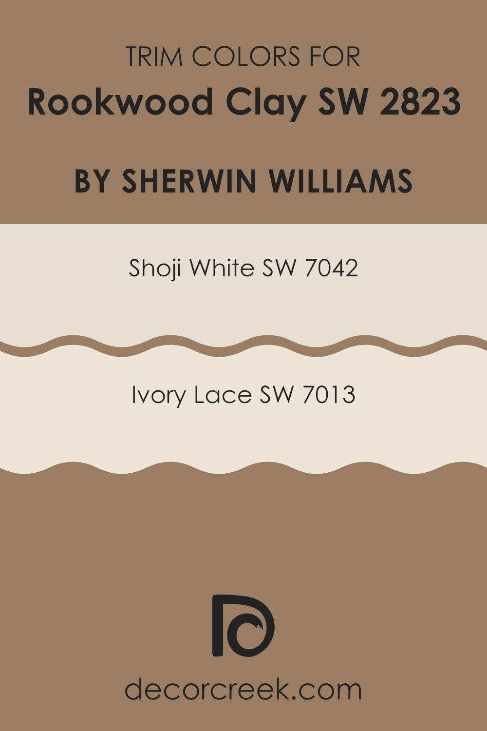
What are the Trim colors of Rookwood Clay SW 2823 by Sherwin Williams?
Trim colors are accent colors used around windows, doors, baseboards, and other architectural features inside or outside a house. They help define and highlight areas, adding contrast and depth to the primary wall colors. The trim color needs to complement the wall color to create a balanced and cohesive appearance.
For a color like Rookwood Clay by Sherwin Williams, which is an earthy and muted tone, using trim colors such as Shoji White or Ivory Lace can enhance its warm undertones and create a harmonious and inviting room. These trim colors play a crucial role in enhancing the overall aesthetic and ensuring the lushness of Rookwood Clay is appreciated without overpowering the room.
Shoji White is a soft, warm white with slight gray and beige undertones, offering a cozy and clean edge without being stark. It provides a gentle contrast to Rookwood Clay, balancing its earthiness while keeping the room light and open. Ivory Lace, on the other hand, is a creamy off-white that exudes a sense of comfort and warmth. It complements the natural warmth of Rookwood Clay beautifully, allowing both colors to shine.
The combination of these trim colors with Rookwood Clay ensures a well-coordinated area that feels cohesive and inviting.
You can see recommended paint colors below:
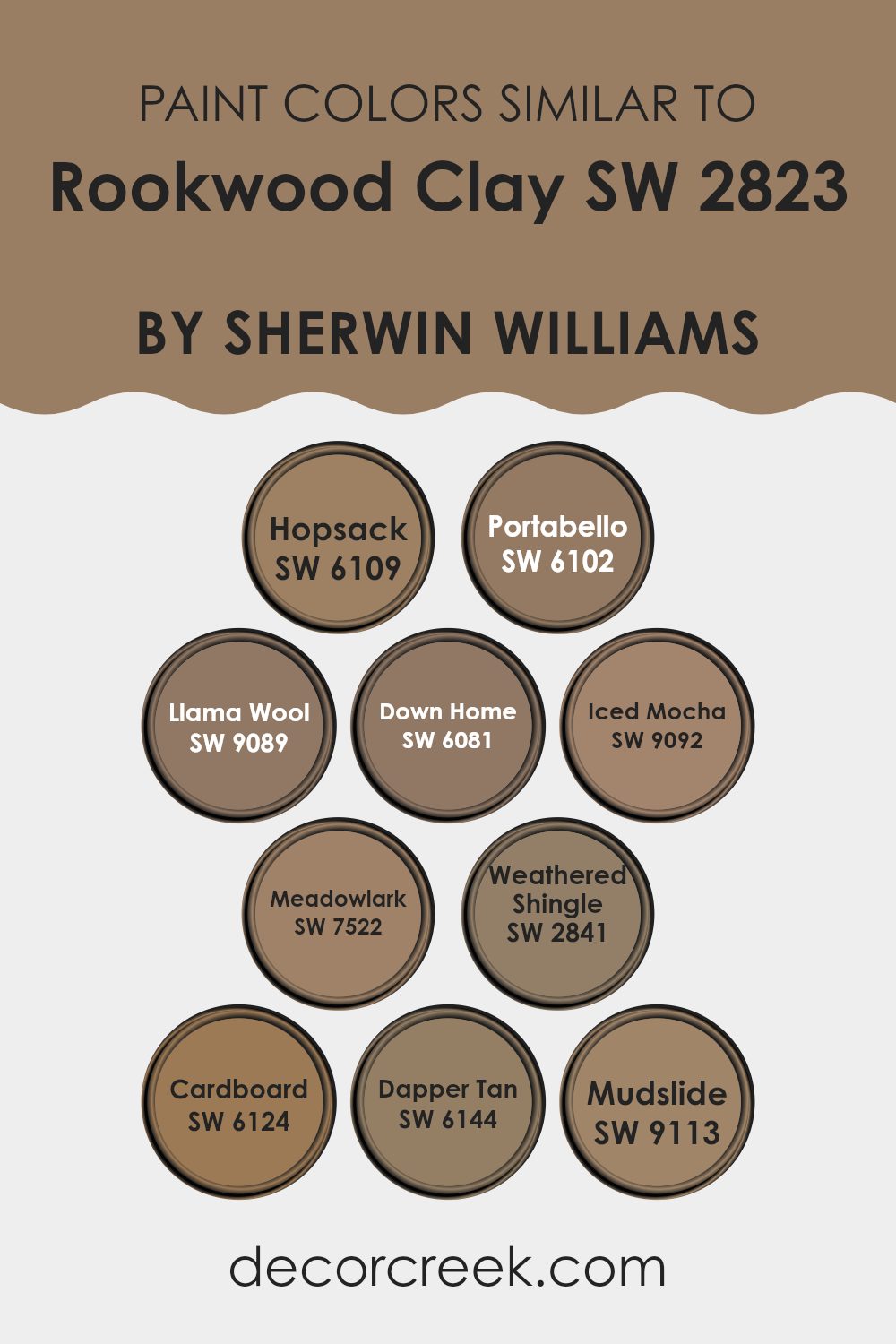
Colors Similar to Rookwood Clay SW 2823 by Sherwin Williams
Similar colors are important in design for creating harmonious and cohesive areas. These colors often share undertones, making them adaptable options that work well together. For instance, Hopsack is a warm, earthy tone that can complement a wider palette. Portabello is a rich, muted brown with a cozy feel, perfect for balancing brighter hues. Llama Wool offers a light, soft beige that brightens up rooms without being overpowering. Down Home stands out with a warm, rusty undertone, adding warmth to any room.
Iced Mocha is a smooth, soft brown, bringing a sense of comfort. Meadowlark has a sunny, mellow yellow undertone that fits well with other natural colors. Weathered Shingle provides a deeper, aged wood tone, adding depth to a palette. Cardboard, with its medium brown base, mimics natural materials seamlessly.
Dapper Tan offers a reliable, neutral tan that matches almost everything, while Mudslide’s rich, deep brown adds a grounded feel. Together, these colors around Rookwood Clay create settings that feel inviting and balanced, with each shade having its unique role. Whether you want something light and airy or dark and rich, these colors work well together for any style or design need.
You can see recommended paint colors below:
- SW 6109 Hopsack
- SW 6102 Portabello
- SW 9089 Llama Wool
- SW 6081 Down Home
- SW 9092 Iced Mocha
- SW 7522 Meadowlark
- SW 2841 Weathered Shingle
- SW 6124 Cardboard
- SW 6144 Dapper Tan
- SW 9113 Mudslide
How to Use Rookwood Clay SW 2823 by Sherwin Williams In Your Home?
Rookwood Clay SW 2823 by Sherwin Williams is a warm, earthy color that can add a cozy touch to any home. This shade of brown has subtle red undertones, which can create a welcoming and comfortable atmosphere. It works well in living rooms, dining areas, and bedrooms, where it can make areas feel inviting and grounded.
In a living room, Rookwood Clay can pair beautifully with neutral furniture and natural materials like wood and leather. It also works well as an accent wall or can be used throughout the room for a more dramatic effect. In the kitchen, this color can complement wooden cabinets and stainless-steel appliances, adding a touch of warmth.
For those looking to create a restful bedroom, Rookwood Clay can be balanced with soft textiles in lighter colors like cream or beige. Use it on walls and incorporate lighter bedding and curtains to maintain a balanced look. This color can also bring a sense of coziness to reading nooks or home offices.
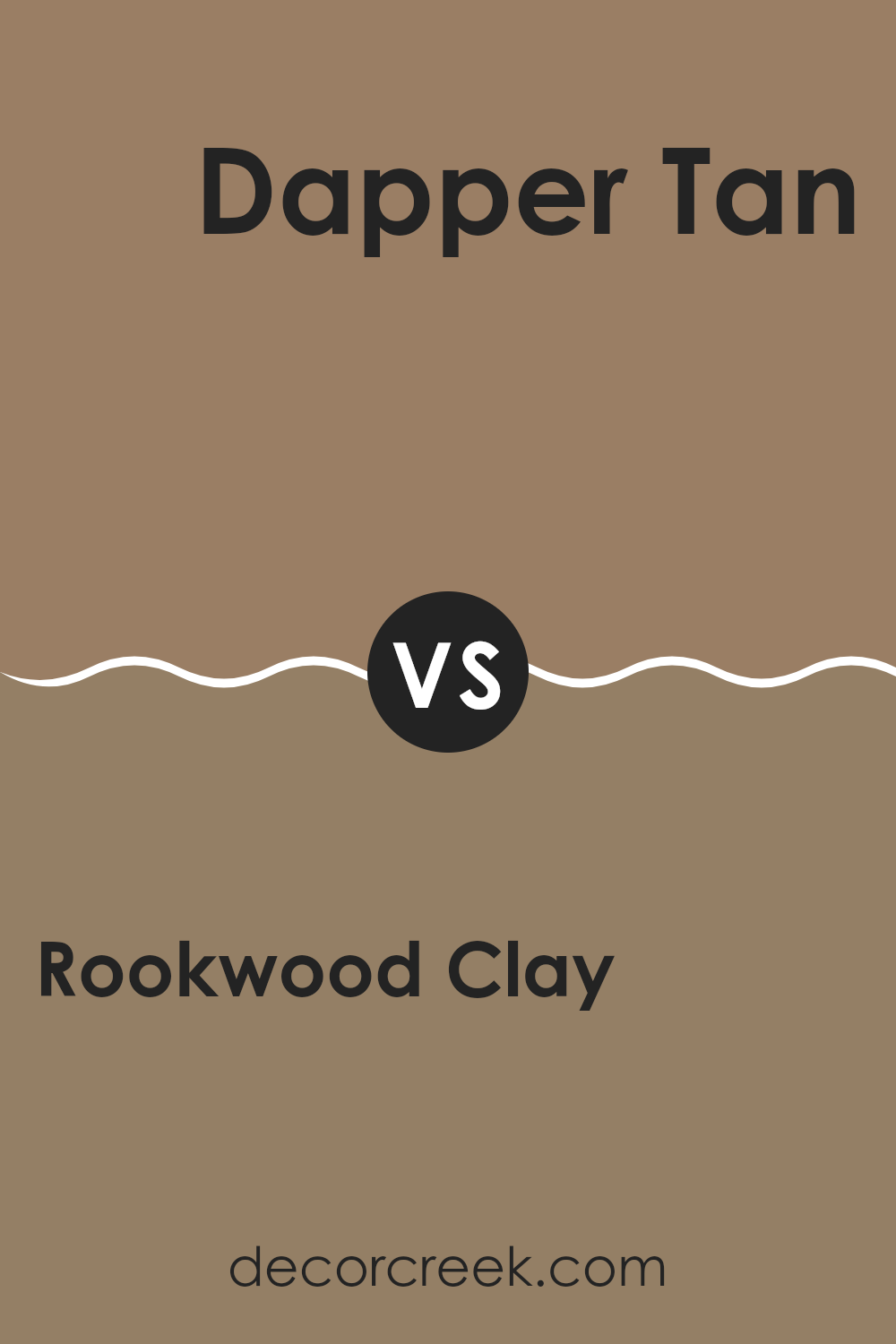
Rookwood Clay SW 2823 by Sherwin Williams vs Dapper Tan SW 6144 by Sherwin Williams
Rookwood Clay SW 2823 and Dapper Tan SW 6144 are two distinct colors from Sherwin Williams, each bringing its own feel to a room. Rookwood Clay is a warm, rich terracotta shade with a deep, earthy undertone.
It evokes a cozy, inviting atmosphere and works well in areas where you want to create a grounded, intimate setting. This color can dominate a room, so it’s often used for accent walls or smaller areas where warmth is desired. On the other hand, Dapper Tan is a soft, neutral beige. It is lighter and softer, making it adaptable for many settings.
This color might be perfect for those who want a subtle backdrop that doesn’t overpower a room. It can make a room feel larger and more open. While Rookwood Clay has a bold, cozy presence, Dapper Tan acts as a gentle, understated canvas that complements a variety of design styles.
You can see recommended paint color below:
- SW 6144 Dapper Tan
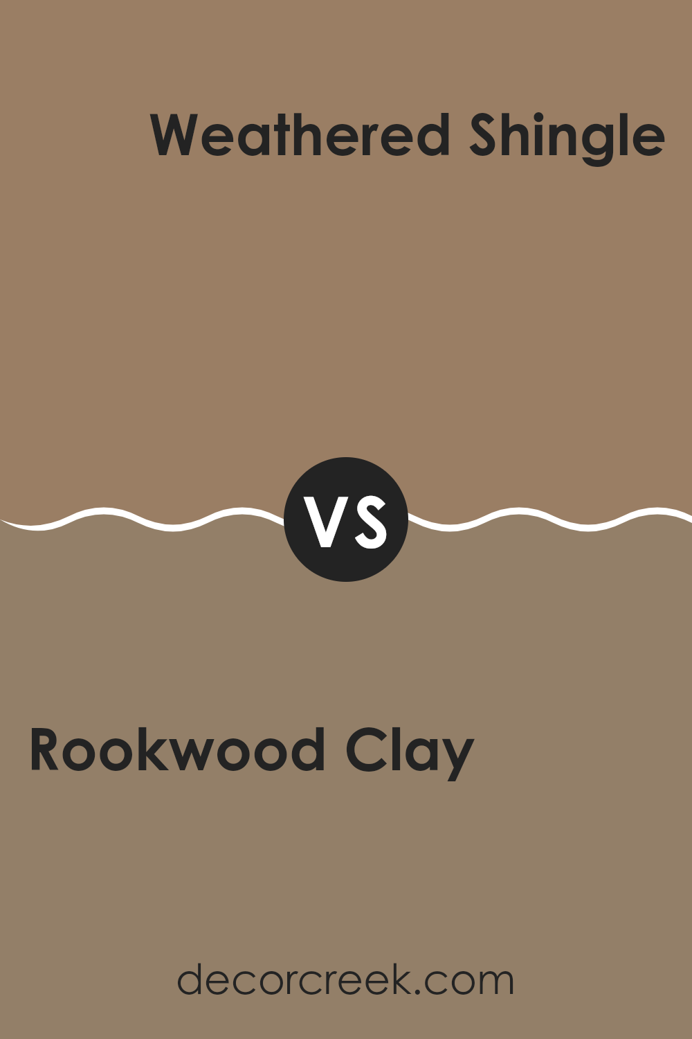
Rookwood Clay SW 2823 by Sherwin Williams vs Weathered Shingle SW 2841 by Sherwin Williams
Rookwood Clay SW 2823 and Weathered Shingle SW 2841 are two distinct paint colors by Sherwin Williams with their own unique qualities.
Rookwood Clay is a rich, earthy brown with warm undertones. It brings a sense of warmth and coziness to a room, making it perfect for creating a welcoming and inviting atmosphere. This color feels grounded and natural, making it ideal for living rooms, dining areas, or any room where you want to bring in a touch of nature-inspired comfort.
On the other hand, Weathered Shingle is a darker, more muted grayish-brown. It has a cooler and more subdued tone, giving it a refined and classic appeal. This color works well in areas where you want a neutral backdrop that still provides depth and character, such as bedrooms or offices. While both colors can be used to create a comfortable atmosphere, Rookwood Clay is warmer and more vibrant, whereas Weathered Shingle offers a cooler, more understated look.
You can see recommended paint color below:
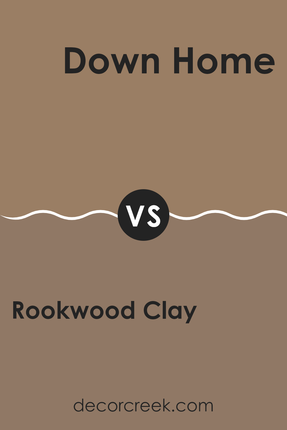
Rookwood Clay SW 2823 by Sherwin Williams vs Down Home SW 6081 by Sherwin Williams
Rookwood Clay SW 2823 and Down Home SW 6081 by Sherwin Williams are both earthy tones, but they bring different vibes to a room. Rookwood Clay is a warm, rich terracotta color. It has a clay-like appearance, with reddish-brown undertones that create a cozy and inviting atmosphere, often used in rooms where you want a rustic or classic feel.
On the other hand, Down Home is a softer, muted beige with a touch of warmth. It’s more neutral compared to Rookwood Clay, making it adaptable for various settings. Down Home works well if you want a calming and comfortable environment that doesn’t overpower other design elements.
When choosing between the two, consider the mood and style you’re aiming for. Rookwood Clay adds a touch of boldness and traditional charm, while Down Home offers a gentle, easygoing background that pairs easily with many other colors.
You can see recommended paint color below:
- SW 6081 Down Home
Rookwood Clay SW 2823 by Sherwin Williams vs Llama Wool SW 9089 by Sherwin Williams
Rookwood Clay (SW 2823) by Sherwin Williams is a warm, earthy shade that brings to mind rich terracotta and deep, sun-baked clay. It has a grounded and cozy feel, making it perfect for creating an inviting atmosphere in a room. Its deep, clay-like tone can add depth to a room and works well as an accent or primary wall color.
On the other hand, Llama Wool (SW 9089) offers a soft, neutral touch. It’s a light beige with subtle warmth, resembling the natural, gentle hue of wool. This color is adaptable and works well in areas requiring a calm and light atmosphere. It pairs beautifully with both vibrant and muted colors, providing a gentle backdrop without overpowering the room.
When comparing the two, Rookwood Clay brings a sense of earthiness and bold warmth, while Llama Wool provides a lighter, more understated option that complements a wider range of colors and styles.
You can see recommended paint color below:
- SW 9089 Llama Wool
Rookwood Clay SW 2823 by Sherwin Williams vs Cardboard SW 6124 by Sherwin Williams
Rookwood Clay and Cardboard are two earthy colors by Sherwin Williams that offer different looks. Rookwood Clay is a deep, warm brownish-red, giving off a cozy and inviting feeling. It’s rich and can add a strong presence to a room, making areas feel warm and grounded.
On the other hand, Cardboard is lighter and more muted, with a beige or tan appearance. This color is more neutral, offering a softer and more subtle warmth. While Rookwood Clay can serve as a bold and striking choice for accents or feature walls, Cardboard works well in larger rooms or for entire rooms, providing a gentle, earthy background.
When used together, Rookwood Clay can add a vibrant contrast to the calm and neutral Cardboard, creating a balanced and natural palette. Both colors bring elements of earthiness and warmth but differ in intensity and impact.
You can see recommended paint color below:
- SW 6124 Cardboard
Rookwood Clay SW 2823 by Sherwin Williams vs Meadowlark SW 7522 by Sherwin Williams
Rookwood Clay SW 2823 is a warm, earthy tone that brings to mind a rich clay or terracotta. It feels grounded and solid, making it a great choice for creating a cozy and inviting room. It works well in rooms where you want a sense of warmth and comfort, like a living room or a dining area.
Meadowlark SW 7522, on the other hand, is a softer, more muted shade with undertones of gold and beige. It carries a light, airy feel, adding brightness and a touch of sophistication to a room without being overpowering. It’s adaptable and complements areas where you want a more subtle yet refreshing look.
When compared, Rookwood Clay projects a bold, earthy impact, while Meadowlark offers a lighter, gentle contrast. These two colors can work beautifully together, with Rookwood Clay adding depth and Meadowlark balancing it with warmth and lightness.
You can see recommended paint color below:
- SW 7522 Meadowlark
Rookwood Clay SW 2823 by Sherwin Williams vs Iced Mocha SW 9092 by Sherwin Williams
Rookwood Clay SW 2823 and Iced Mocha SW 9092 are two unique paint colors by Sherwin Williams. Rookwood Clay is a rich and warm earthy tone with a reddish-brown base. It’s perfect for creating a cozy and inviting atmosphere, as its deep hue provides a sense of warmth and comfort.
In contrast, Iced Mocha is a much lighter neutral color. With its soft beige undertone, it brings light and airiness to a room. This makes it ideal for rooms where you want to maintain a sense of spaciousness and openness without overpowering the senses.
When placed together, Rookwood Clay can add depth and warmth, while Iced Mocha offers balance with its light and neutral presence. They complement each other well, providing a harmonious blend of warmth and light. Choosing between them depends on the mood and feeling you want to create in your room.
You can see recommended paint color below:
Rookwood Clay SW 2823 by Sherwin Williams vs Mudslide SW 9113 by Sherwin Williams
Rookwood Clay and Mudslide are two earthy paint colors from Sherwin Williams. Rookwood Clay SW 2823 is a warm, rich terracotta color. It has hints of red and brown, making it feel cozy and inviting. It’s great for adding warmth to a room and pairs well with natural materials like wood and stone.
Mudslide SW 9113 is a deeper, darker shade of brown. It’s more muted than Rookwood Clay, bringing a grounded, stable feel to a room. This color is adaptable and can work well in both modern and traditional settings.
When comparing the two, Rookwood Clay brings more warmth and brightness due to its reddish tone, while Mudslide offers a more subdued, neutral effect. Depending on the mood you want to create, Rookwood Clay can make a room feel lively, whereas Mudslide can create a cozy, intimate atmosphere. Both can be used to create comfortable and welcoming rooms, but their effects are quite distinct.
You can see recommended paint color below:
- SW 9113 Mudslide
Rookwood Clay SW 2823 by Sherwin Williams vs Hopsack SW 6109 by Sherwin Williams
Rookwood Clay SW 2823 and Hopsack SW 6109 by Sherwin Williams are both warm and earthy colors, but they offer different vibes and uses.
Rookwood Clay is a rich, deep hue with an undertone of reddish-brown. This bold color can make a statement in any room, adding warmth and a cozy feel. It’s perfect for accent walls or areas where you want to create a sense of depth and intimacy.
On the other hand, Hopsack is a more muted, adaptable color. It is a soft, natural beige with a hint of warmth, making it a great backdrop for a wide range of decor styles. It can make a room feel light and open while still offering a comforting atmosphere. In summary, Rookwood Clay is bold and dramatic, ideal for creating focal points, whereas Hopsack is subtle and neutral, suitable for larger surfaces or where neutrality is desired.
You can see recommended paint color below:
- SW 6109 Hopsack
Rookwood Clay SW 2823 by Sherwin Williams vs Portabello SW 6102 by Sherwin Williams
Rookwood Clay SW 2823 by Sherwin Williams is a rich, earthy brown with strong red undertones. It gives a warm, cozy feel to any room and works well in traditional and rustic settings. This color can create an inviting atmosphere in living rooms or dining areas.
On the other hand, Portabello SW 6102, also by Sherwin Williams, is a light, neutral taupe with subtle gray undertones. This color is more adaptable and can blend well in most modern or contemporary homes. It’s a good choice for areas where you want a more subtle background that still adds warmth.
While Rookwood Clay is bold and creates a statement, Portabello is understated, providing a calming background. Rookwood Clay can dominate a room, making it feel intimate, whereas Portabello opens up rooms, giving them a quiet, airy vibe. Both colors add warmth but in different intensities and styles.
You can see recommended paint color below:
After learning about SW 2823 Rookwood Clay by Sherwin Williams, I really appreciate what this color can do in a home. It’s like having a warm friend in the room. The color is cozy and reminds me of the earthy feel of clay. It’s neither too dark nor too light, just in-between, making any room feel comfortable and inviting.
I realized how well Rookwood Clay works in different parts of a house. Whether it’s in the kitchen, living room, or even a bedroom, it brings a nice warmth that makes you want to stay there longer. This color looks really good with both old and new furniture. It doesn’t clash but instead complements other colors around it like greens, whites, or even blues.
Using Rookwood Clay is a fun way of adding something special to walls without making them too flashy. It’s like giving a room a big hug. I think this color is a great choice for anyone who wants their home to feel warm and friendly.
It’s amazing how a simple change in wall color can have such a nice effect on how a room feels.
Ever wished paint sampling was as easy as sticking a sticker? Guess what? Now it is! Discover Samplize's unique Peel & Stick samples.
Get paint samples

