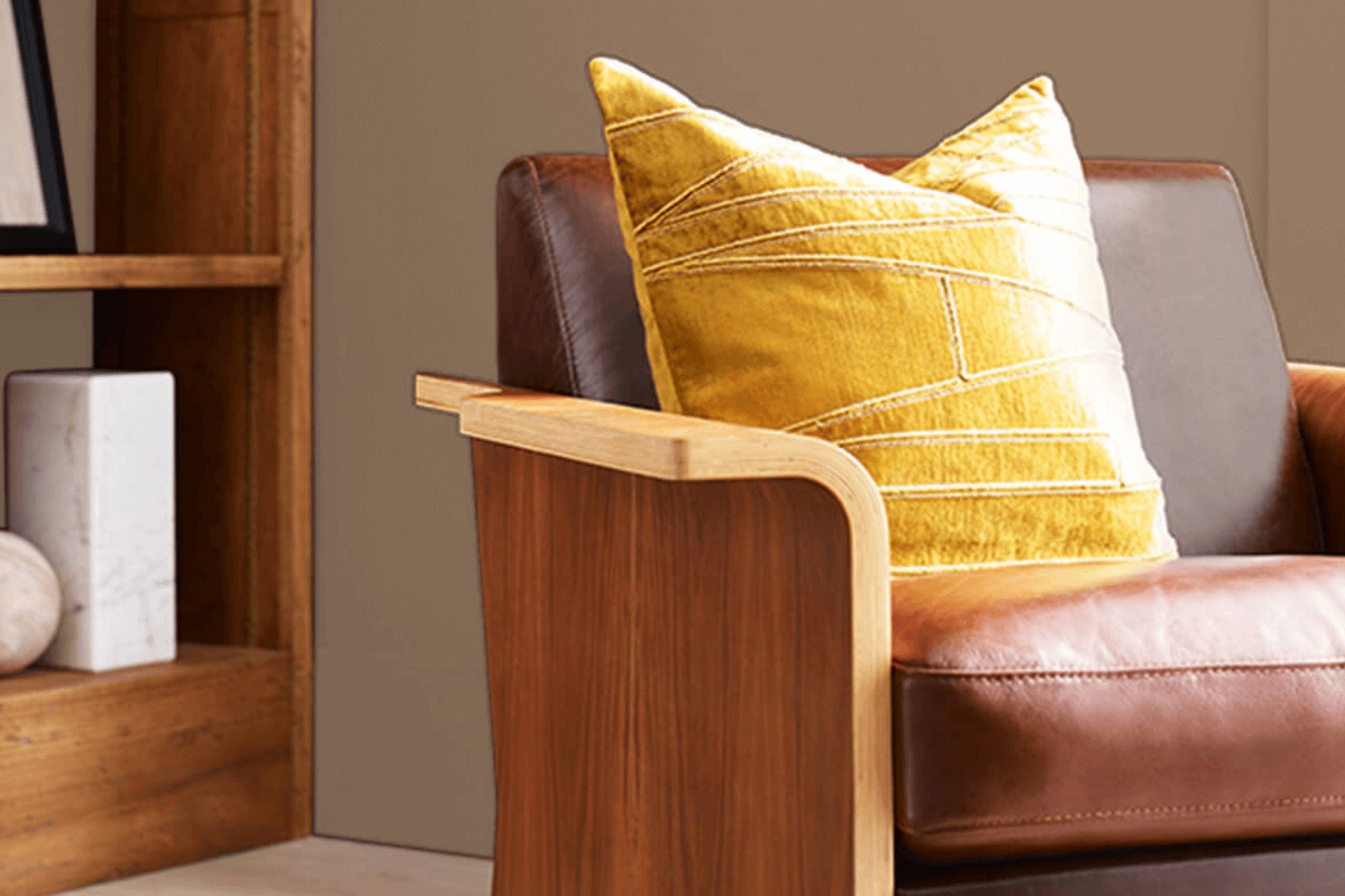
When you look for a paint color that adds warmth and comfort to a room, SW 6102 Portabello by Sherwin Williams might be just what you need. Its earthy and neutral tones create a cozy atmosphere in any area. Think of it as a warm cup of coffee on a chilly morning. The soft, muted brown feels like a hug, wrapping your room in a comforting touch.
You might find that it works beautifully with both modern and traditional decor. Portabello is adaptable; it complements other colors easily, whether it’s pairing with bright accents or blending seamlessly with other neutrals. Natural light does wonders for this shade, enhancing its rich warmth during the day, while at night, it creates an inviting, snug room perfect for winding down.
The color evokes a sense of simplicity and peace, making it ideal for areas where relaxation is key. Whether it’s a bedroom retreat, a welcoming living room, or a peaceful hallway, SW 6102 Portabello brings an understated elegance without being too intense.
This color is all about creating a sense of balance and harmony in your home.
What Color Is Portabello SW 6102 by Sherwin Williams?
Portabello (SW 6102) by Sherwin Williams is a warm, earthy taupe that adds a touch of comfort and coziness to any room. It’s an adaptable neutral that manages to be both inviting and grounded, thanks to its subtle undertones of gray and brown. This color is particularly suited to interior styles like rustic, farmhouse, and traditional, where warmth and a sense of homey charm are emphasized.
In rustic and farmhouse styles, Portabello works well when paired with natural materials like wood and stone. Think of wooden beams, oak furniture, or stone fireplaces. The taupe tones in Portabello complement these textures, creating harmony and balance in the room.
For a more traditional look, this color fits beautifully with rich fabrics like velvet or linen in darker hues, adding depth and a classic feel to the room.
Portabello also pairs nicely with other muted or warm colors, as well as with metallic accents in brass or bronze. These combinations can create a layered, elegant look without feeling overdone.
Whether it’s used in living rooms, bedrooms, or dining areas, Portabello brings a touch of warmth and a sense of classic style, making it a go-to choice for a variety of home environments.
Is Portabello SW 6102 by Sherwin Williams Warm or Cool color?
Portabello (SW 6102) by Sherwin Williams is a paint color that brings warmth and coziness to a home. This earthy, soft brown shade has the ability to make rooms feel inviting and comforting.
Its neutral tone makes it a great option for different rooms, whether it’s a living room, bedroom, or even a kitchen. The beauty of Portabello is its ability to complement a wide range of other colors. It pairs well with both light and dark shades, allowing flexibility in decor choices.
In larger areas, Portabello can provide a grounded feel, adding depth without being too intense. In smaller rooms, it adds a sense of coziness, making them feel more intimate. This color works well in homes with natural light, as the sunlight enhances its warm, welcoming attributes. For those looking to create a homely and comforting environment, Portabello is an excellent choice. Its adaptability and warmth make it a popular option for many homeowners.
Undertones of Portabello SW 6102 by Sherwin Williams
Portabello by Sherwin Williams is a warm and inviting color, often described as a neutral with character. Its undertones play a crucial role in determining how we perceive it on interior walls. Undertones are subtle hues that mix into the primary color and can dramatically shift its appearance based on lighting and surrounding colors.
Portabello carries a mix of earthy and muted undertones. The presence of olive and brown gives it a grounded, natural feel. These elements make Portabello perfect for rooms where you want a cozy and welcoming atmosphere. Meanwhile, hints of pale pink and orange add warmth, making it feel more like a sunny day.
Mint and light green undertones provide a fresh contrast, adding vitality and preventing the color from feeling dull. Meanwhile, darker shades like dark green and navy can pop up under certain lighting conditions, adding depth and richness to the walls. With a slight touch of pale yellow, Portabello can look bright in natural light without being overpowering. Subtle purples and lilacs, on the other hand, can make the color appear refined without being heavy.
Generally, the variety of undertones means Portabello can adapt to many environments, making it an adaptable choice for different rooms and styles. The way these undertones mix can make a room feel warmer or more lively, depending on the lighting and décor.
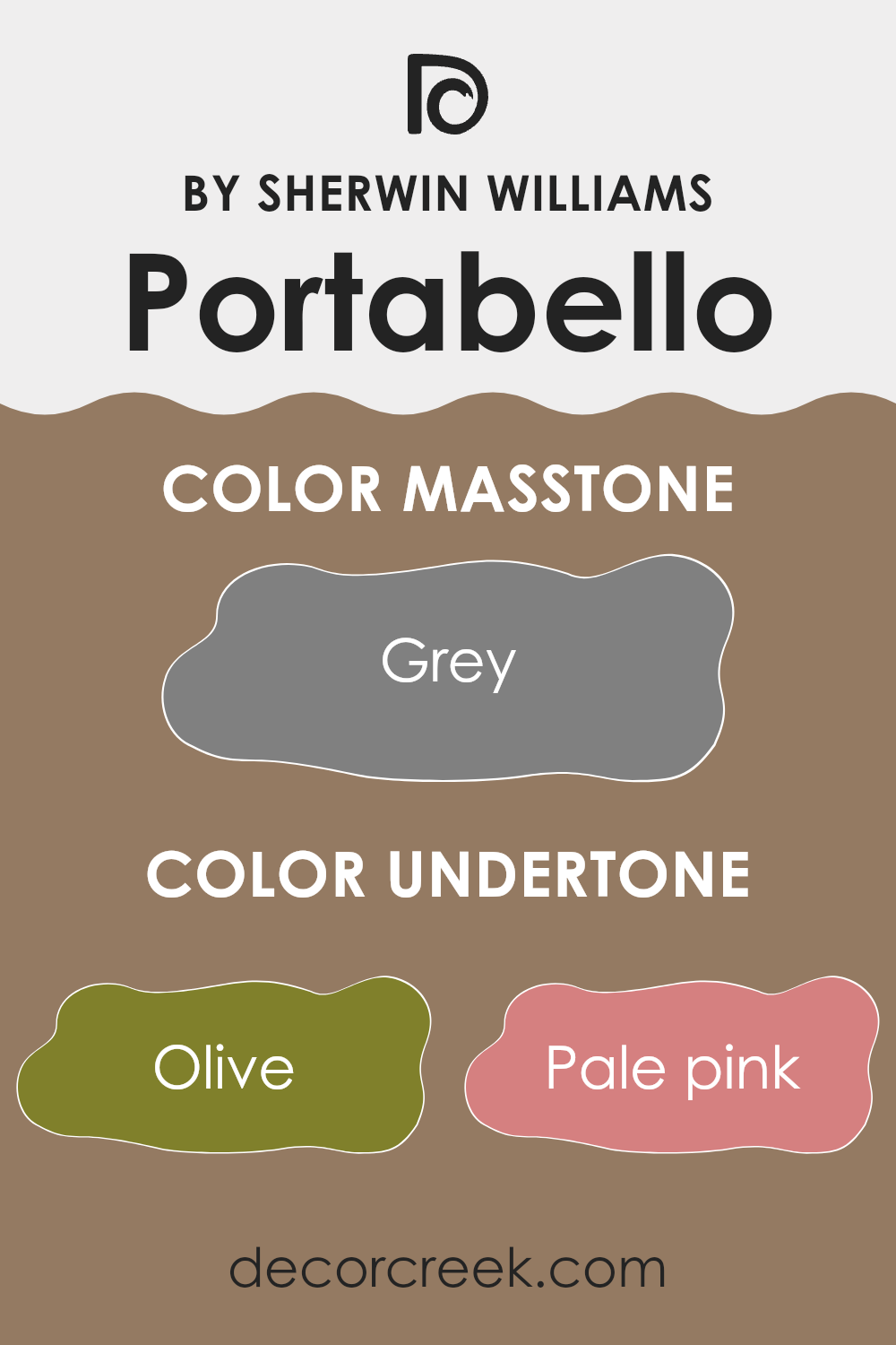
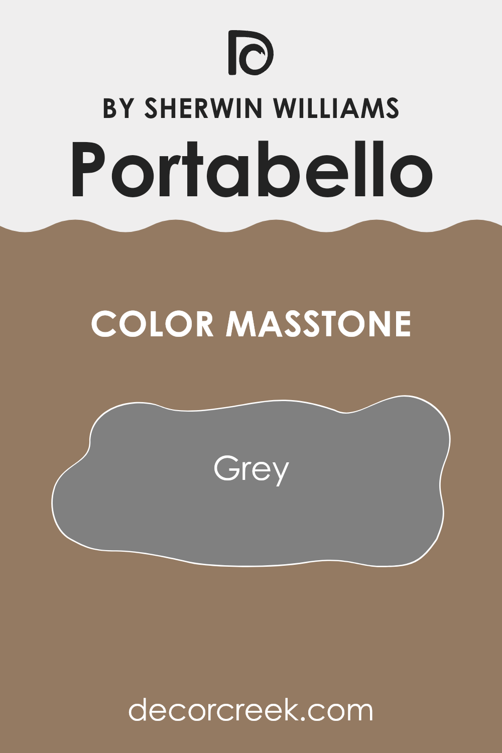
What is the Masstone of the Portabello SW 6102 by Sherwin Williams?
Portabello (SW 6102) by Sherwin Williams is a neutral paint color with a subtle hint of warmth. Its masstone of grey (#808080) allows it to harmonize seamlessly with a variety of design styles.
When used in a home, the grey undertone keeps the color grounded and stable, providing a soothing backdrop that is neither too cool nor too warm. This makes Portabello an excellent choice for rooms where you want to create a calm and balanced environment.
The grey masstone makes the color adaptable; it can complement both modern and traditional décor. In living rooms, it can create a cozy feel without being too intense in the area. In bedrooms, it helps set a relaxed tone that promotes rest and relaxation. Due to its neutrality, Portabello pairs well with natural materials like wood and stone, and can support a range of accent colors, from soft pastels to bolder hues.
How Does Lighting Affect Portabello SW 6102 by Sherwin Williams?
Lighting plays a crucial role in how we perceive colors. Different types of light can cause a color to look different from one setting to another. Portabello SW 6102 by Sherwin Williams is a warm, medium-toned greige (a mix of gray and beige). Understanding how it reacts under various lighting conditions is important for its application in different rooms.
In artificial light, the color can shift slightly depending on the type of lightbulb used. Under incandescent bulbs, Portabello may appear warmer and more beige. Fluorescent lighting tends to make colors look cooler, which might bring out more of the gray tones in Portabello. LED lights, which are available in a range of warmth and brightness, can bring out either the warmer or cooler sides of the color.
Natural light also changes throughout the day and affects how colors are perceived:
- 1. North-Facing Rooms: These rooms receive cooler, indirect natural light, which can make Portabello appear more muted and gray. The color might look a bit darker and less warm in this setting.
- 2. South-Facing Rooms: These rooms get the most consistent and warm sunlight throughout the day. In such lighting, Portabello will likely show its warmer, richer beige tones, making the room feel more inviting and cozy.
- 3. East-Facing Rooms: Morning light in these rooms is bright and warm, enhancing Portabello’s beige tones early in the day. As the sun moves, the light turns cooler and softer, emphasizing the color’s gray tones.
- 4. West-Facing Rooms: These rooms enjoy a range of lighting conditions. Morning light is cooler, making the color seem more subdued, while afternoon and evening light is warmer and richer, bringing out warmer tones.
Understanding these lighting shifts can help you decide how and where to use Portabello effectively in a room.
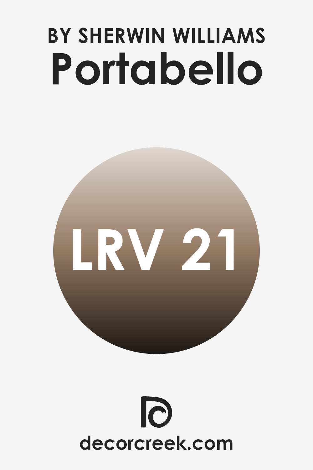
What is the LRV of Portabello SW 6102 by Sherwin Williams?
Light Reflectance Value (LRV) measures how much light a color reflects or absorbs. On a scale of 0 to 100, with 0 being completely black and 100 being pure white, LRV helps determine how light or dark a paint color will appear in a room.
A lower LRV means the color absorbs more light and appears darker. It can make a room feel cozy and intimate, but might not be suitable for areas that require lots of light. A higher LRV color reflects more light, which can make a room feel brighter and more spacious.
For the color Portabello, which has an LRV of 21.114, this means it falls on the darker side of the spectrum. This color absorbs more light, creating a warm and cozy atmosphere, perfect for making large rooms feel more inviting. However, because it reflects less light, it might not be ideal in rooms with little natural light, as it could make them feel darker than intended. If you like the earthy and grounding feel of Portabello, consider adding extra lighting in the room or using it in rooms where natural light is plentiful to balance the deeper tone.
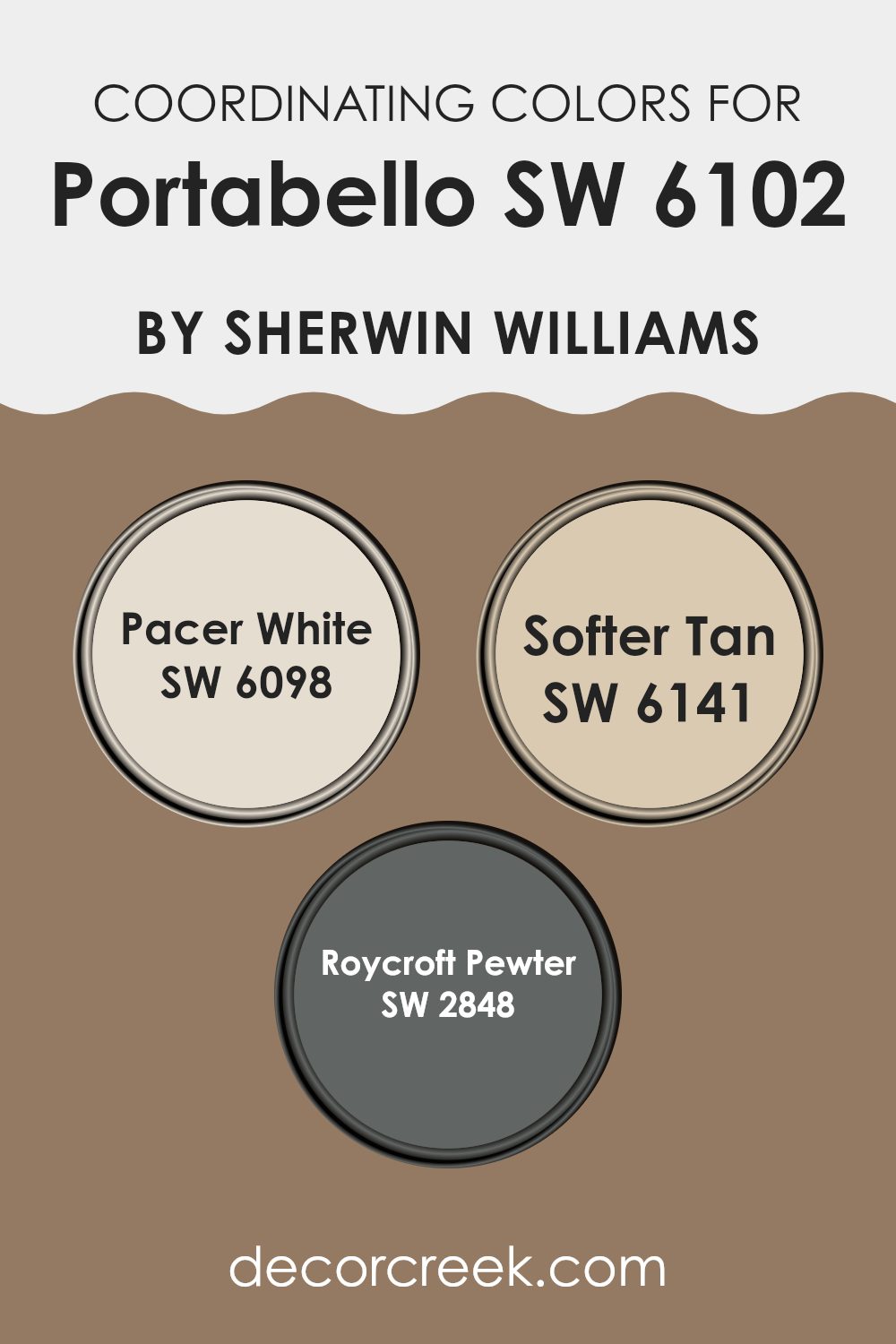
Coordinating Colors of Portabello SW 6102 by Sherwin Williams
Coordinating colors work together to create a harmonious look in a room by complementing the main shade. For Portabello by Sherwin Williams, three colors coordinate beautifully: Pacer White, Softer Tan, and Roycroft Pewter. These colors blend well with Portabello due to their warm undertones and balanced presence, creating an inviting and cohesive atmosphere.
Pacer White is a soft, creamy white that pairs nicely with Portabello. Its warm undertones make it an adaptable choice for ceilings and trim, helping to create a fresh and open feeling. Softer Tan adds a gentle warmth to the palette, bringing a cozy and welcoming touch.
This neutral hue works well on walls, offering a seamless transition when set against the darker Portabello. Roycroft Pewter introduces depth and refinement to the mix. It’s a rich, dark gray that provides an anchor for the design, perfect for accent walls or cabinetry, where a touch of drama is desired. Together, these colors create a balanced, inviting room that feels both classic and appealing.
You can see recommended paint colors below:
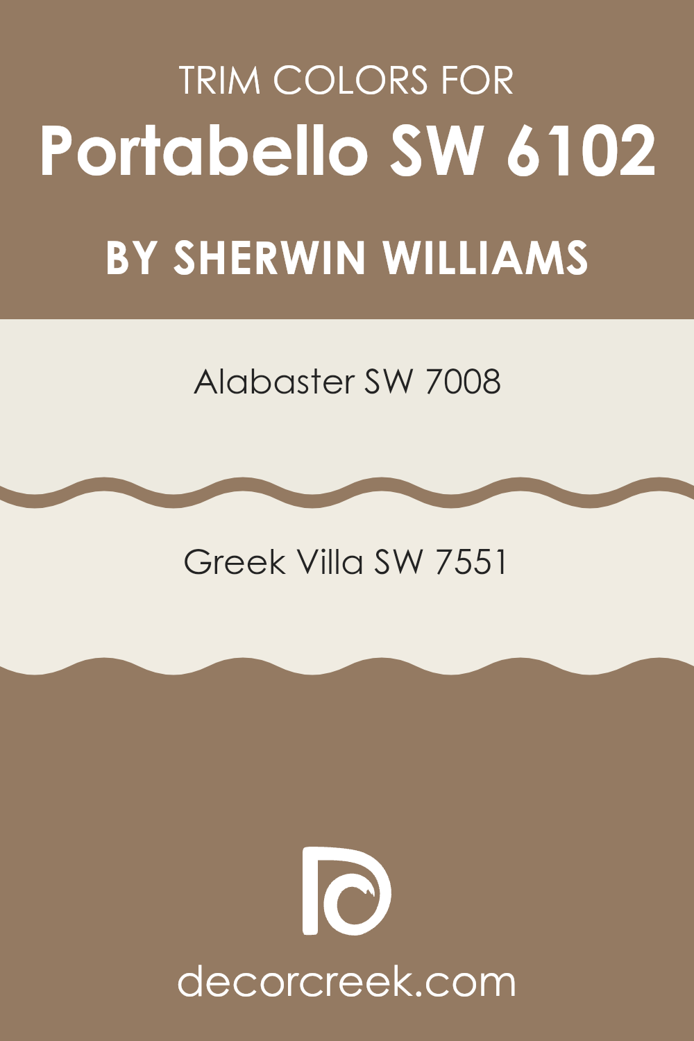
What are the Trim colors of Portabello SW 6102 by Sherwin Williams?
Trim colors are accents used to highlight and frame the main wall color in a room, often applied to baseboards, door frames, and windowsills. In the case of Portabello by Sherwin Williams, selecting the right trim color is vital because it enhances the overall aesthetic and complements the rich, warm tone of the walls, creating a balanced and polished look.
Choosing the right trim can bring out the best in your wall color, adding dimension and interest to the interior design. The right trim not only frames the wall but also adds a touch of contrast or harmony, depending on the desired effect. Adding trim colors can provide a cohesive appearance or make specific architectural details stand out, thereby enhancing the room’s character.
Using SW 7008 Alabaster as a trim color provides a creamy white shade that is both soft and warm without being too stark. It’s an adaptable option that can subtly highlight the depth of Portabello without being too intense. Likewise, Greek Villa SW 7551 is another excellent choice for trim, offering a refined, soft white tone that feels classic and inviting.
This color can lighten the room and accent the Portabello walls, providing a gentle contrast that pulls the entire look together.
When applying these trim colors, they help create a seamless flow within the room, ensuring everything feels intentional and well-designed.
You can see recommended paint colors below:
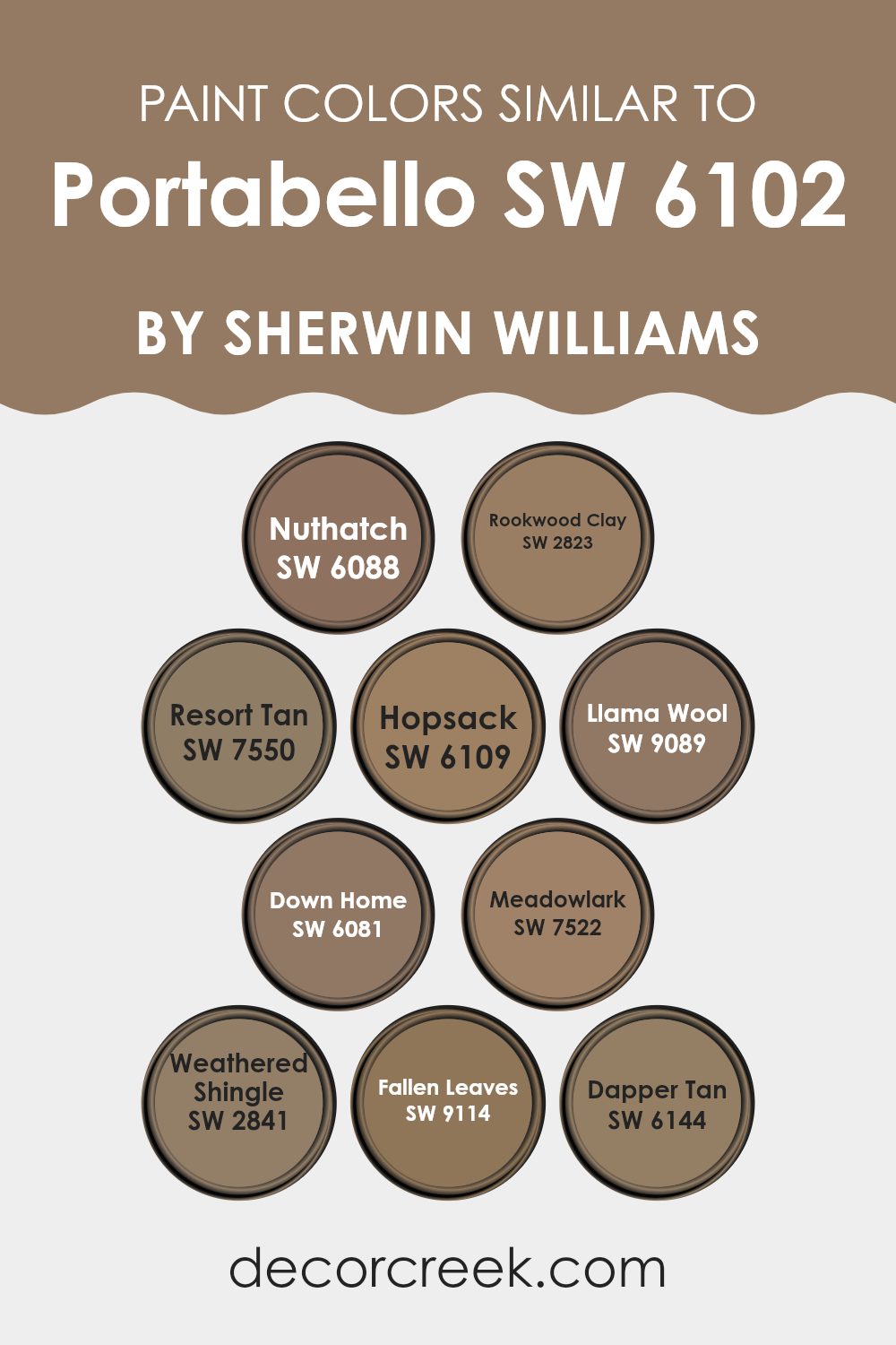
Colors Similar to Portabello SW 6102 by Sherwin Williams
Similar colors are crucial in design as they create harmony and a cohesive look in a room. Portabello SW 6102 from Sherwin Williams is a warm, earthy shade, and its similar colors work together to enhance its natural vibe. Each of these colors brings something unique yet complementary to the palette.
For instance, Nuthatch offers a soft touch with its muted brown tone, while Rookwood Clay adds depth with its warm clay-like appearance. Resort Tan provides a cozy, inviting warmth ideal for relaxing rooms, and Hopsack, with its rich tan color, brings a sense of comfort and natural elegance.
Llama Wool introduces a gentle, refined feel with its subtle shade, and Down Home brings a touch of rustic charm with its deeper reddish hue. Meadowlark adds a hint of brightness with its golden undertones, making rooms feel welcoming. Weathered Shingle has a grayish tint that balances the earthier tones, and Fallen Leaves offers a rich, deep color reminiscent of autumn.
Finally, Dapper Tan provides a clean, simple backdrop with its understated beige hue.
Together, these colors work in harmony to create a balanced, warm atmosphere, enhancing the overall look of a room without making it feel too busy.
You can see recommended paint colors below:
- SW 6088 Nuthatch
- SW 2823 Rookwood Clay
- SW 7550 Resort Tan
- SW 6109 Hopsack
- SW 9089 Llama Wool
- SW 6081 Down Home
- SW 7522 Meadowlark
- SW 2841 Weathered Shingle
- SW 9114 Fallen Leaves
- SW 6144 Dapper Tan
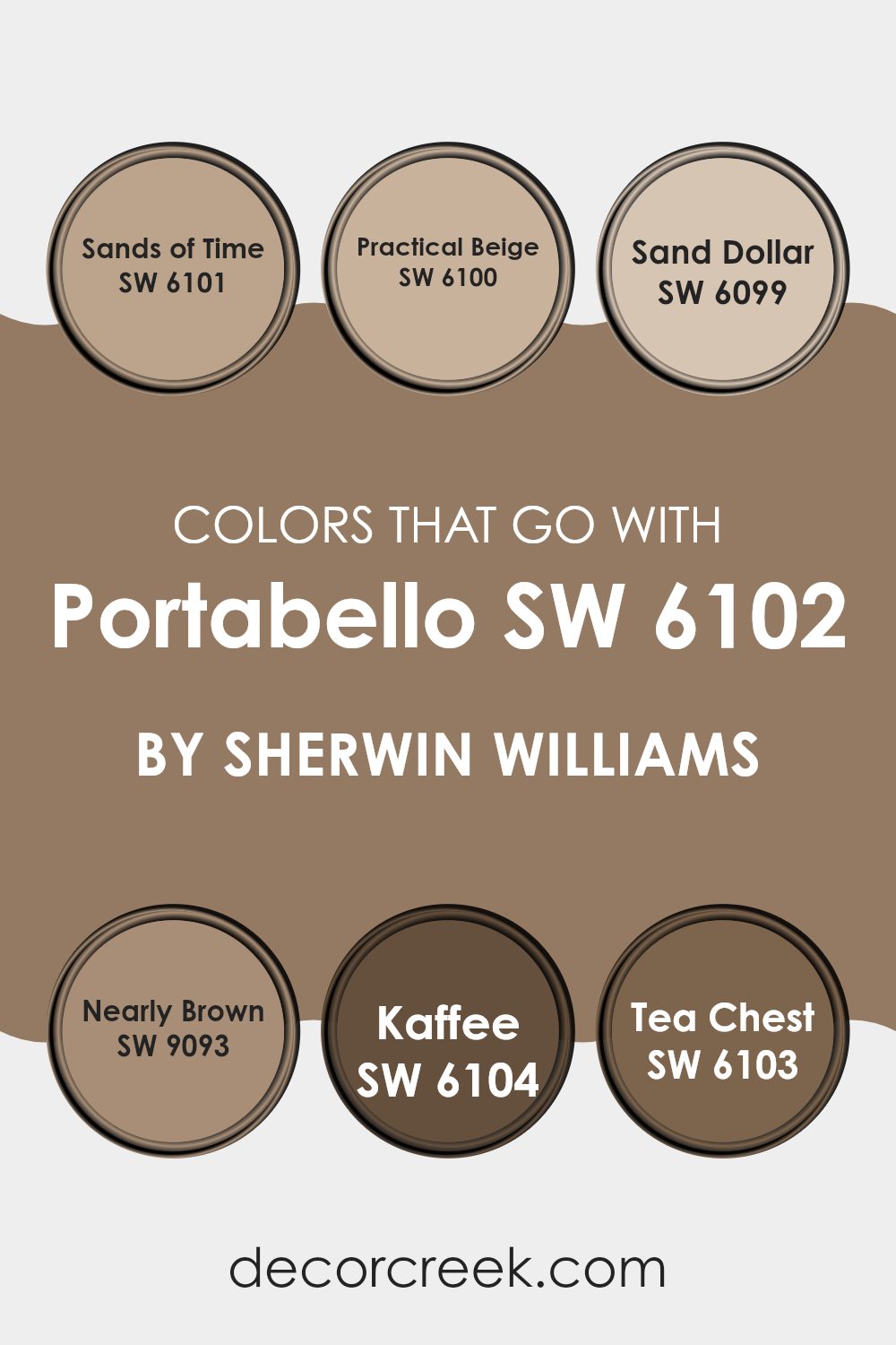
Colors that Go With Portabello SW 6102 by Sherwin Williams
Choosing the right colors to pair with Portabello SW 6102 by Sherwin Williams can greatly enhance the overall look of your room. Each color brings its own unique character, complementing Portabello’s warm, earthy tones. SW 6101 Sands of Time is a soft, muted beige that adds a gentle warmth without making the room feel too heavy.
SW 6100 Practical Beige provides a neutral baseline, offering subtle balance and an understated backdrop for other design elements. These colors work well together to create a cohesive and inviting atmosphere.
SW 6099 Sand Dollar introduces a hint of lightness, bridging the gap between deeper tones and providing a sense of openness. SW 9093 Nearly Brown offers a rich, grounding quality that brings depth to the overall color scheme, while SW 6104 Kaffee adds a cozy, comforting feel with its deeper brown notes. SW 6103 Tea Chest boasts a slightly darker richness, enhancing the warm, homey vibe. Together, these colors harmonize to create a warm and inviting environment, perfect for any room that needs a touch of comfort and style. By using these colors alongside Portabello, you can easily craft a room that’s pleasant and balanced.
You can see recommended paint colors below:
- SW 6101 Sands of Time
- SW 6100 Practical Beige
- SW 6099 Sand Dollar
- SW 9093 Nearly Brown
- SW 6104 Kaffee
- SW 6103 Tea Chest
How to Use Portabello SW 6102 by Sherwin Williams In Your Home?
Portabello SW 6102 by Sherwin Williams is a warm, neutral paint color that can easily fit into any home decor. Its earthy tone makes it an adaptable choice for various rooms, from the living room to the bedroom.
In a living room, Portabello creates a cozy and inviting atmosphere, especially when paired with soft textures like plush rugs or comfy sofas. For those wanting a calming bedroom environment, using Portabello on the walls can provide a soothing backdrop for restful sleep.
In kitchens, it pairs well with both modern and traditional cabinetry, adding a touch of warmth and balance. Portabello can also be used in hallways to seamlessly connect different rooms throughout the home. When combined with white trim, it offers a clean yet warm look. Accentuating the color with greens or blues in decor items can highlight its subtle beauty and complement the overall aesthetic of the room.
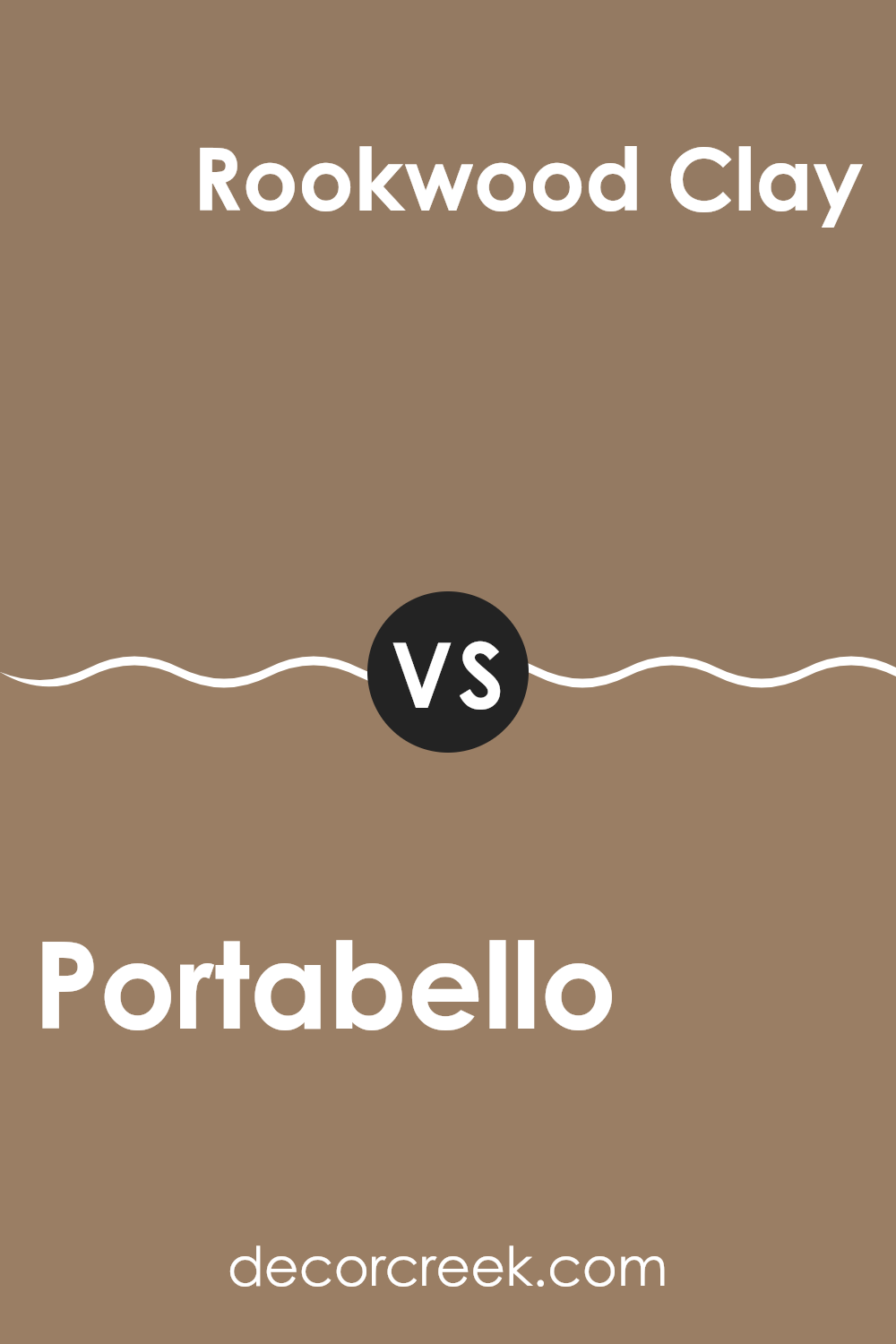
Portabello SW 6102 by Sherwin Williams vs Rookwood Clay SW 2823 by Sherwin Williams
Portabello SW 6102 by Sherwin Williams is a warm, neutral shade, often described as a soft taupe with subtle beige undertones. It’s an adaptable color that can create a cozy and inviting atmosphere in many rooms. Rookwood Clay SW 2823, on the other hand, is richer and earthier.
It has a deeper red-brown hue, reminiscent of natural clay or terracotta. This color can add a sense of warmth and depth to a room, making it feel more grounded and earthy.
Portabello is often used for creating a calm backdrop, while Rookwood Clay stands out as a more bold choice, adding character and a touch of history to the room. Together, these colors can complement each other well, with Portabello providing a neutral base and Rookwood Clay adding a pop of warm, rustic color.
You can see recommended paint color below:
- SW 2823 Rookwood Clay
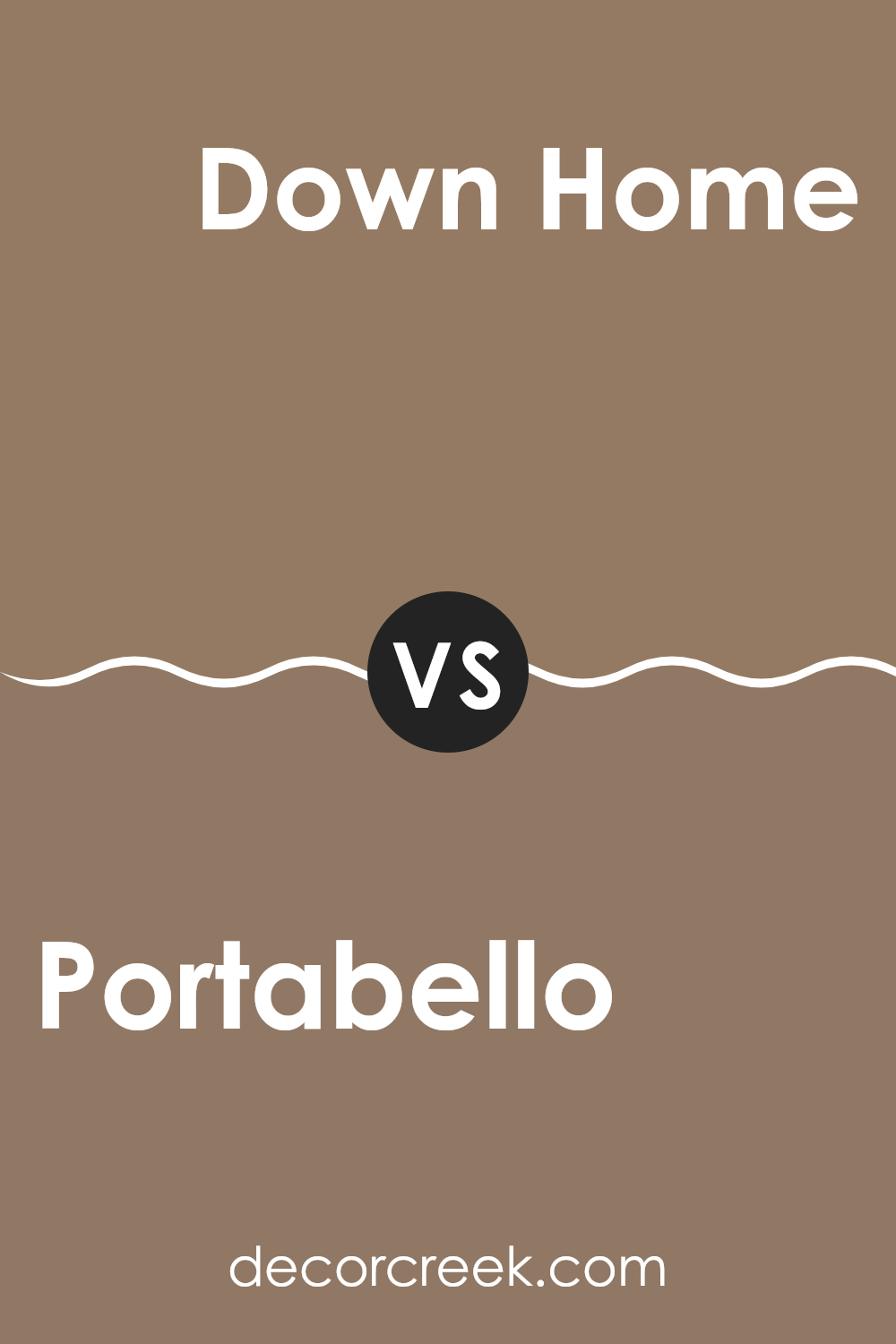
Portabello SW 6102 by Sherwin Williams vs Down Home SW 6081 by Sherwin Williams
Portabello (SW 6102) and Down Home (SW 6081) are two warm, earthy colors from Sherwin Williams, but they have their own unique traits. Portabello is a soft, neutral taupe that leans towards gray, making it adaptable for many rooms.
It has a calming quality, working well as a subtle backdrop in living rooms or bedrooms. In contrast, Down Home is darker and has more of a brown undertone. It creates a cozy, inviting feeling and is ideal for rooms where a stronger color presence is desired, like accent walls or study rooms.
While both colors exude warmth, Portabello offers a lighter, more airy feel, whereas Down Home feels grounded and snug. Choosing between them depends on whether you want a light, subtle touch or a richer, more enveloping atmosphere. Both can be paired with whites, creams, or wood tones for a harmonious look.
You can see recommended paint color below:
- SW 6081 Down Home
Portabello SW 6102 by Sherwin Williams vs Dapper Tan SW 6144 by Sherwin Williams
Portabello (SW 6102) and Dapper Tan (SW 6144) by Sherwin Williams are two warm, earthy tones that can add a cozy feel to any room. Portabello is a deeper, richer brown with hints of gray, giving it a more grounded and organic appearance. It’s an adaptable color that can work well as a backdrop or main wall color in various settings, adding a touch of warmth.
In contrast, Dapper Tan is a lighter shade that leans more toward a beige or tan hue. It has a sunnier vibe due to its lighter tint, making rooms feel open and airy. This color can be ideal for smaller rooms needing a brightening effect without losing warmth.
Together, Portabello and Dapper Tan can balance a room, with Portabello adding depth and Dapper Tan bringing lightness. Both shades pair excellently with natural materials and earthy decor, making them suitable for cozy, inviting rooms.
You can see recommended paint color below:
- SW 6144 Dapper Tan
Portabello SW 6102 by Sherwin Williams vs Nuthatch SW 6088 by Sherwin Williams
Portabello SW 6102 and Nuthatch SW 6088 are both warm, earthy colors by Sherwin Williams that work well in cozy, inviting areas. Portabello is a soft, muted brown with a subtle gray undertone, which gives it a neutral and calming appearance. It’s adaptable and pairs nicely with a variety of colors and materials, making it suitable for living rooms or bedrooms where a soothing atmosphere is desired.
Nuthatch, on the other hand, is a richer, deeper brown with a hint of warmth that adds a comforting feel. This color can create a bold statement when used as an accent wall or in a room with lots of natural light.
While both colors are grounded and nature-inspired, Portabello leans more towards neutrality and works well across many styles, whereas Nuthatch brings more depth and can highlight particular features in a room. Each color has its unique charm and can be chosen based on the mood you want to set.
You can see recommended paint color below:
- SW 6088 Nuthatch
Portabello SW 6102 by Sherwin Williams vs Llama Wool SW 9089 by Sherwin Williams
Portabello SW 6102 by Sherwin Williams is a warm, earthy brown that brings a grounded and cozy feel to any room. It’s similar to the color of a mushroom, which gives it a natural and organic vibe. This shade works well in living rooms or kitchens where you want to create a welcoming atmosphere.
On the other hand, Llama Wool SW 9089 by Sherwin Williams is a soft, light beige that feels airy and fresh. It’s an adaptable neutral that can make a room feel larger and brighter. Llama Wool works great in bedrooms and hallways where you want to keep things light and neutral.
When comparing these two colors, Portabello provides a more intimate and snug feeling, while Llama Wool offers a brighter and more open look. Both are adaptable and can be paired with various accents and furnishings, but which to choose depends on whether you prefer a cozier or airier environment.
You can see recommended paint color below:
- SW 9089 Llama Wool
Portabello SW 6102 by Sherwin Williams vs Resort Tan SW 7550 by Sherwin Williams
Portabello SW 6102 and Resort Tan SW 7550 by Sherwin Williams are both warm, neutral paint colors, but they have distinct differences. Portabello is a rich, earthy brown with a medium intensity. It can give rooms a cozy and grounded feel, making it a good choice for living rooms or study areas.
In contrast, Resort Tan is a lighter, softer shade with a slight hint of yellow. This color tends to brighten rooms and gives them an open, inviting feel. It is well-suited for bedrooms or kitchens where a bit of warmth and lightness is desired.
While Portabello has more of a subdued, moody vibe, Resort Tan adds a touch of sunniness and warmth to a room. Both colors work well in classic and contemporary settings, but your choice will depend on whether you prefer a deeper, grounding color or a lighter, airier one.
You can see recommended paint color below:
- SW 7550 Resort Tan
Portabello SW 6102 by Sherwin Williams vs Meadowlark SW 7522 by Sherwin Williams
Portabello SW 6102 and Meadowlark SW 7522 by Sherwin Williams offer distinct vibes for any area. Portabello is an adaptable brown with warm undertones, making it a cozy choice that adds depth. It’s well-suited for creating a neutral backdrop, adding warmth without being too intense.
In contrast, Meadowlark is a soft, light tan with hints of yellow, providing a brighter, more airy feel. It works well in rooms where a lighter touch is desired, giving rooms an open and welcoming vibe.
Combining these two paints can create a balanced look where Portabello adds depth and richness, while Meadowlark keeps things light and cheerful. Whether you’re aiming for warmth or brightness, these colors can suit various styles and settings, offering flexibility for different design preferences.
You can see recommended paint color below:
- SW 7522 Meadowlark
Portabello SW 6102 by Sherwin Williams vs Hopsack SW 6109 by Sherwin Williams
Portabello and Hopsack are both warm, earthy colors from Sherwin Williams, making them ideal for creating cozy areas. Portabello is a soft, muted brown with a hint of gray. It provides a neutral backdrop that is adaptable and pairs well with many other shades. It’s great for walls if you’re looking for a subtle, calming effect that doesn’t become too intense in the room.
Hopsack, on the other hand, is a slightly darker, richer brown with more pronounced warmth. It leans more towards a classic beige, giving it a bit more depth and vibrancy compared to Portabello. Hopsack can create a more inviting and cozy atmosphere, ideal for living rooms or bedrooms where warmth is desired.
Both colors offer a classic look, with Portabello offering subtlety and Hopsack providing a touch of added warmth. They can both work well in similar areas, but your choice may depend on whether you prefer a softer or richer hue.
You can see recommended paint color below:
- SW 6109 Hopsack
Portabello SW 6102 by Sherwin Williams vs Fallen Leaves SW 9114 by Sherwin Williams
Portabello SW 6102 and Fallen Leaves SW 9114 are two earthy colors by Sherwin Williams. Portabello is a warm, neutral color that resembles the shade of a mushroom or taupe. It gives off a cozy and inviting vibe, making it great for living rooms or bedrooms.
Fallen Leaves, on the other hand, is a bit darker with undertones of muted brown and green. It’s reminiscent of the rich hues of fall foliage. While both colors have a natural feel, Portabello is lighter and more adaptable, easily pairing with other neutrals or brighter accents.
Fallen Leaves brings a darker, more grounded feeling to a room, making it ideal for an accent wall or creating a cozy nook. Together, they can create a harmonious and warm environment, with Portabello providing a light and airy touch and Fallen Leaves adding depth and richness.
You can see recommended paint color below:
- SW 9114 Fallen Leaves
Portabello SW 6102 by Sherwin Williams vs Weathered Shingle SW 2841 by Sherwin Williams
Portabello SW 6102 and Weathered Shingle SW 2841 are two distinct shades by Sherwin Williams. Portabello is a warm, earthy taupe that brings a cozy and inviting feel to any room. It’s adaptable and complements a variety of decor styles, working well with both warm and cool tones. Its welcoming nature makes it a great choice for living rooms or bedrooms where comfort is key.
In contrast, Weathered Shingle is a darker, muted brown with hints of gray. It has a more dramatic and refined appearance, often adding depth to rooms. This color is ideal for accent walls or to create a more intimate atmosphere in dining rooms or offices.
While both colors are earthy and natural, Portabello feels lighter and more adaptable, whereas Weathered Shingle brings a deeper, more enveloping feel. The choice depends on whether you’re aiming for a soft, flexible look or a bold, cozy atmosphere.
You can see recommended paint color below:
After spending time learning about SW 6102 Portabello from Sherwin Williams, I really think it’s a special paint color. It’s a warm, earthy shade that reminds me a bit of mushrooms or cozy fall days. What’s nice about this color is that it can make a room feel really inviting and comfortable. Imagine stepping into a room that feels like a warm hug—that’s what Portabello can do.
If you have a bedroom or a living room that needs a little warmth, this color could be a great choice. It’s not too dark, and it’s not too light. It’s right in the middle, which means it can help make a room feel just right—not too big, not too small.
I can also see it working well with different things in a room, like wooden furniture or maybe some green plants. It has a natural vibe, which makes it easy to mix with things you might already have.
Overall, learning about Portabello has shown me that picking the right paint color can make a big difference in how a room feels. It can make a room feel comfy and welcoming, which is exactly what you’d want, especially if you like spending time there with family or friends. So, if you’re thinking about changing a room’s color, maybe give Portabello a try!
Ever wished paint sampling was as easy as sticking a sticker? Guess what? Now it is! Discover Samplize's unique Peel & Stick samples.
Get paint samples

