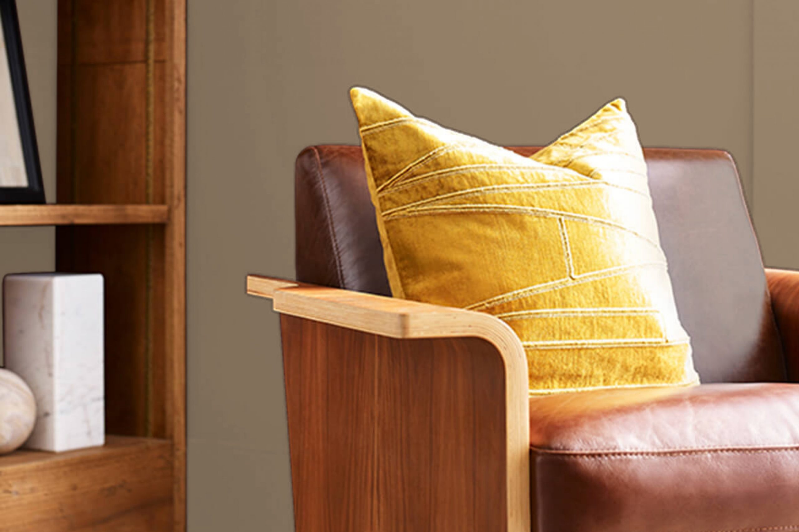
I recently sampled SW 2841 Weathered Shingle by Sherwin Williams for a small renovation project at home and I’d love to share my thoughts on it. When selecting a paint color for a cozy reading nook, I wanted something subtle yet strong enough to define the space.
Weathered Shingle stood out as a versatile choice, offering a serene backdrop with its rich, warm grey tone that suggests stability and timelessness—a nod, perhaps, to the weathered shingles on a beachside cottage, enduring and beautifully muted by nature’s elements.
During the application process, I noticed how this shade interacted with different lights. In daylight, it has a soft, welcoming vibe, while under night lighting, it shifts slightly to bring a more enclosed, intimate feel to the room. This adaptability makes it suitable for spaces used both during the day and in the evening.
I think its understated elegance really helps in creating a space that feels both personal and inviting.
Whether you’re thinking about updating a room or just looking for a new color to refresh your walls, SW 2841 Weathered Shingle might just meet your needs.
What Color Is Weathered Shingle SW 2841 by Sherwin Williams?
The color Weathered Shingle by Sherwin Williams is a deep, rich gray with a hint of brown. This warming shade has a versatile and earthy tone, perfect for creating a cozy and inviting atmosphere in any room. It resembles the color of aged wood shingles that have gracefully weathered over time, giving your space a sense of timelessness and warmth.
Weathered Shingle works exceptionally well in rustic and modern farmhouse interior styles. Its comforting hue serves as an excellent backdrop for natural materials such as wood, leather, and linen. These textures complement its earthy nature and enhance the overall warmth of the decor. Additionally, it pairs beautifully with metals like bronze or copper, bringing out their luster against its muted backdrop.
When it comes to accessories and accents, this color supports the inclusion of woven fabrics and chunky knits, which add layers of texture and comfort to the room. This hue can also be contrasted with softer tones like creamy whites or light grays, which highlight its depth and richness while keeping the palette light and airy.
Overall, Weathered Shingle is an ideal choice for those looking to create a cozy, grounded environment in their homes, blending well with a variety of materials and supporting a range of comfortable, lived-in interior aesthetics.
Is Weathered Shingle SW 2841 by Sherwin Williams Warm or Cool color?
Weathered Shingle by Sherwin Williams is a versatile paint color that brings a cozy and homey feel to any room. Its deep, warm gray shade has hints of earthy brown, making it a great choice for creating a welcoming atmosphere.
This color works well in both modern and traditional home styles. In living rooms or bedrooms, it adds a soothing touch, especially when paired with lighter colors like creams or soft blues, which help to open up the space. Kitchens or bathrooms can also benefit from Weathered Shingle, as it complements wood finishes and stone tiles beautifully.
Its neutrality means it can blend with various decor elements without clashing. Even in small spaces, this color doesn’t overpower; instead, it makes rooms feel more grounded. Weathered Shingle is ideal for those looking to give their home a subtle yet impactful update.
Undertones of Weathered Shingle SW 2841 by Sherwin Williams
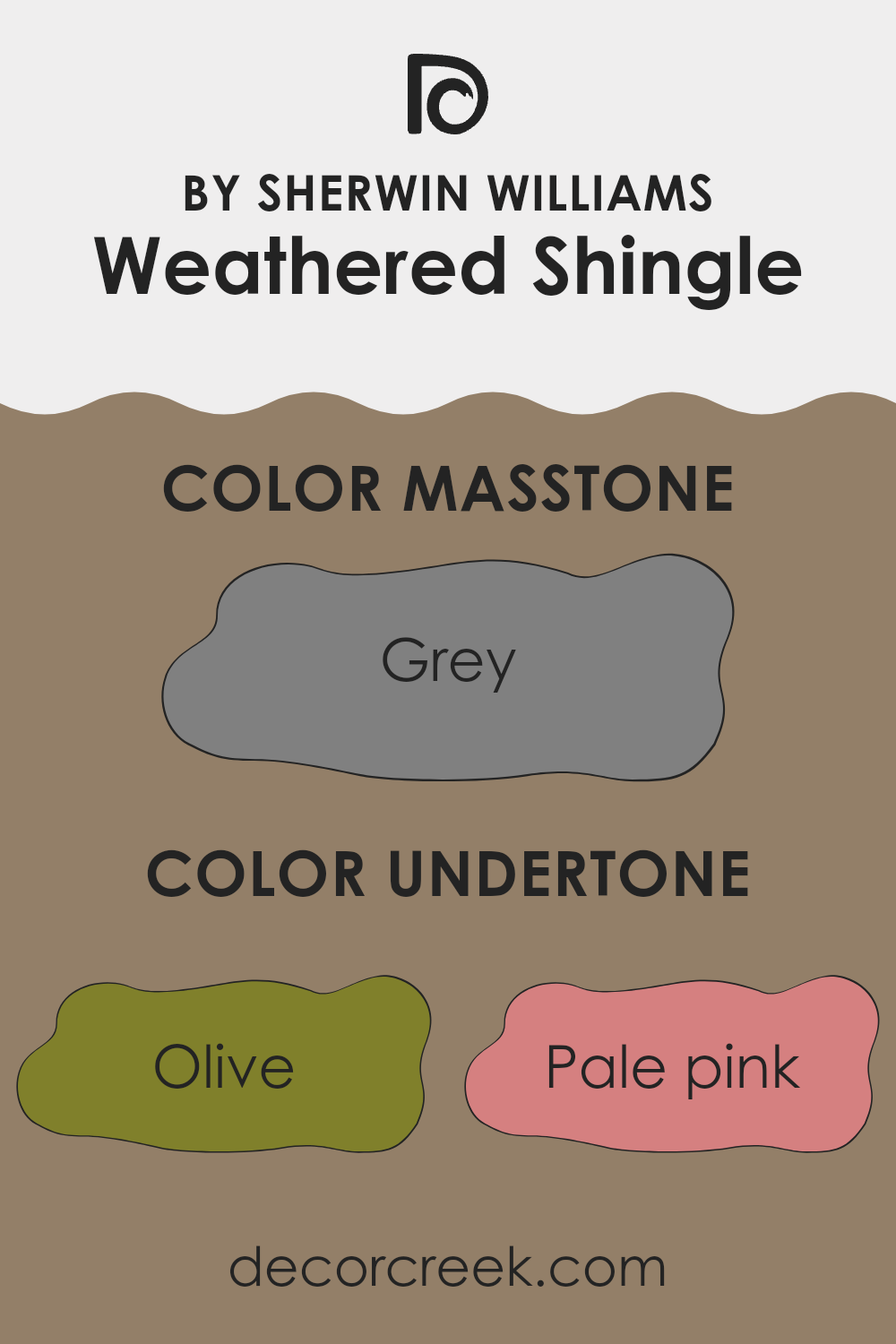
Weathered Shingle is a unique paint color with a complex mix of undertones that can dramatically influence its appearance in different settings. Undertones are subtle colors that lurk beneath the primary color of the paint, affecting how it looks depending on the lighting and surrounding colors.
This color has a wide variety of undertones including shades of green, pink, purple, orange, and even grey. Each undertone brings its own effect to the overall feel of the paint. For example, olive and dark green undertones add a natural, earthy vibe, making it a suitable choice for spaces intended to have a connection with nature or an outdoorsy feel.
On the other hand, lighter undertones like pale pink, lilac, and light blue can soften the appearance of the color, making it more versatile and less dominating in a room. These lighter tones can help create a more airy and fresh feeling in a space, ideal for bedrooms or living rooms that aim for a gentle and welcoming atmosphere.
In interior walls, these varied undertones can cause the main color to appear differently based on the room’s lighting and color scheme. For instance, in a brightly lit room with lots of natural light, the lighter undertones might become more pronounced, giving the walls a more vibrant look.
Conversely, in a room with less light, the darker undertones like dark grey or navy may stand out, giving the walls a more grounded and dense appearance.
This complexity in undertones also means that pairing this color with décor and furniture requires some consideration to ensure that all elements of the room harmonize well.
Soft furnishings in neutral colors or materials like wood can complement the natural undertones, while metals and modern materials might enhance the cooler undertones like light turquoise and violet.
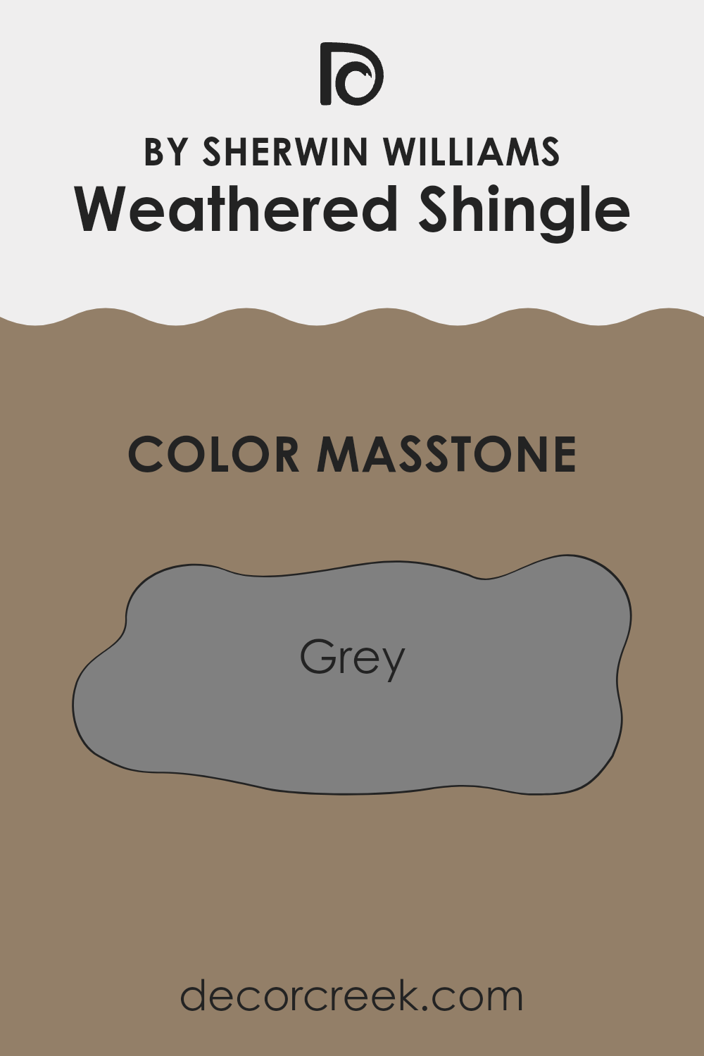
What is the Masstone of the Weathered Shingle SW 2841 by Sherwin Williams?
Weathered Shingle SW 2841 by Sherwin Williams masstone is grey, which means it fundamentally appears as a medium grey shade. This grey color is extremely versatile and works well in a variety of home settings.
It offers a balanced look that can either blend in with surroundings or stand out, depending on the colors it is paired with. In homes, this grey is particularly effective because it provides a neutral backdrop that can support both vibrant and subdued color schemes.
For instance, in a living room, it can make bright furnishings pop or create a calm, muted feel when combined with other neutrals. Additionally, grey tones like Weathered Shingle are known for their ability to hide imperfections on walls, making this color not only aesthetically pleasing but also practical. In different lighting conditions, it can appear lighter or darker, adding to its functional flexibility in home design.
How Does Lighting Affect Weathered Shingle SW 2841 by Sherwin Williams?
Lighting plays a crucial role in how we perceive colors. The same paint color can appear different under various lighting conditions due to the light’s intensity, color, and direction. Understanding this can help you make better choices about paint colors for your home, ensuring they look good at all times of day and under different lighting.
Weathered Shingle, a paint color, is a warm, muted greige (gray + beige) that varies under different lighting conditions.
In artificial light, the color tends to appear warmer, pulling out more beige tones, which can make a room feel cozy and welcoming.
It’s ideal for living spaces or areas where you want a comforting atmosphere, particularly in the evenings.
In natural light, Weathered Shingle can look quite different. North-facing rooms receive less direct sunlight, making colors appear cooler.
Here, Weathered Shingle might lean more towards its gray components, giving a sleeker, more understated look. In contrast, in south-facing rooms which get ample sunlight, the color can warm up significantly, brightening up spaces by reflecting natural light in a way that emphasizes its beige tones.
East-facing rooms see the most change in this color throughout the day; it appears lighter and warmer in the morning light, but can become cooler as the day progresses. In west-facing rooms, the color will start cooler in the morning and become richer and warmer towards the evening as the setting sun casts a golden light inside.
These variations can be used to your advantage based on the function of the room and the mood you want to set. By testing the color in different rooms and observing how it changes in varying light conditions, you can ensure the shades you choose always align with your decorating goals.
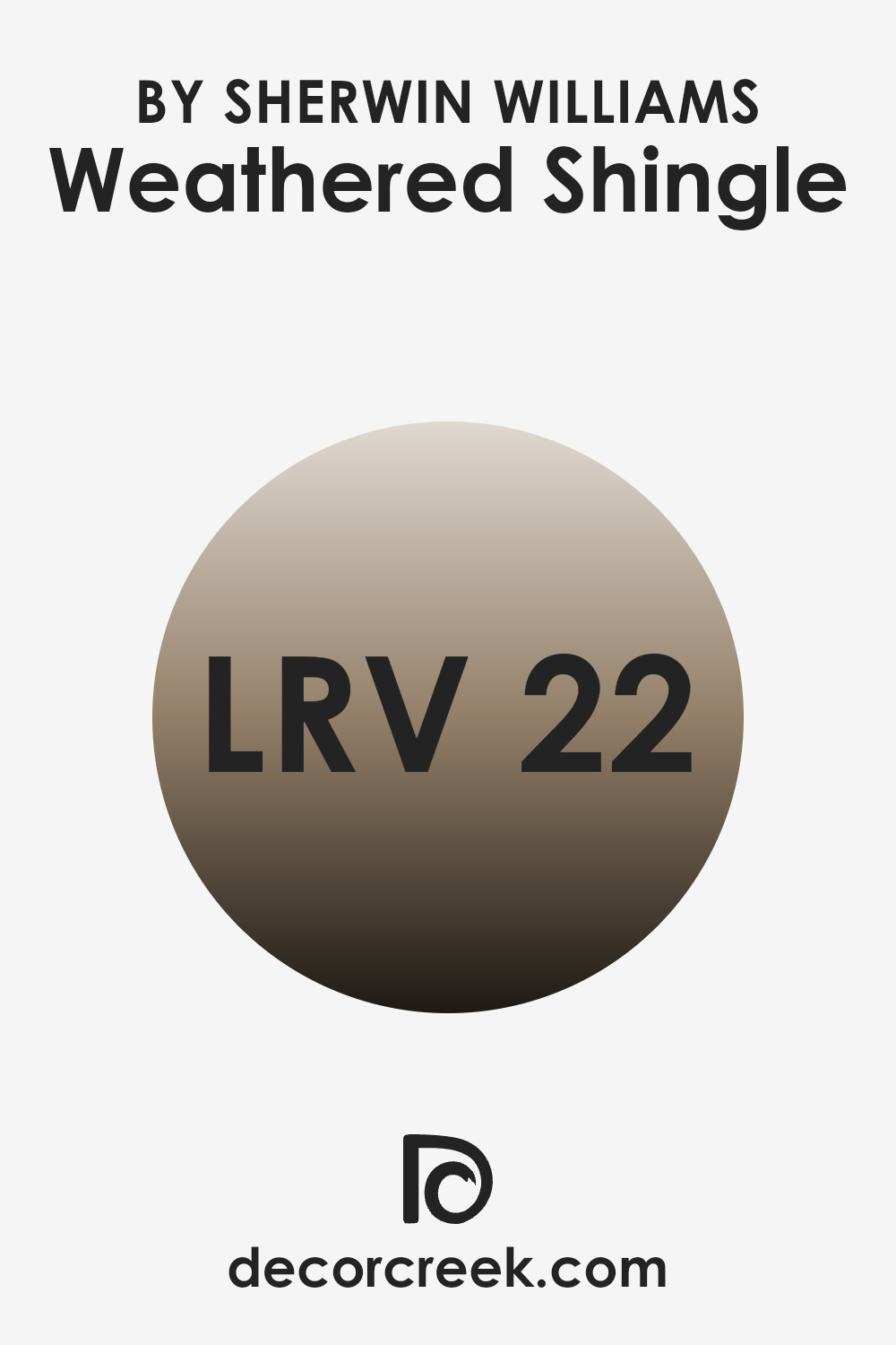
What is the LRV of Weathered Shingle SW 2841 by Sherwin Williams?
LRV stands for Light Reflectance Value, which measures the percentage of light a paint color reflects from or absorbs into a painted surface. In simpler terms, LRV helps you understand how light or dark a color will look once it’s on your walls.
Higher LRV numbers indicate that the color reflects more light, making rooms appear brighter and bigger, while a lower LRV means the color absorbs more light, often creating a cozier and more enclosed feeling in the space.
The color Weathered Shingle has an LRV of 22.368, which means it’s on the darker side, absorbing more light than it reflects. This can make a room feel smaller or more intimate, which might be perfect for creating a cozy, relaxed atmosphere in spaces like bedrooms or living rooms. However, if used in a smaller or poorly lit space, it might make the room feel a bit cramped or darker.
Using adequate lighting and combining it with lighter colors in decor can balance its deep tone and enhance the overall ambiance of the room.
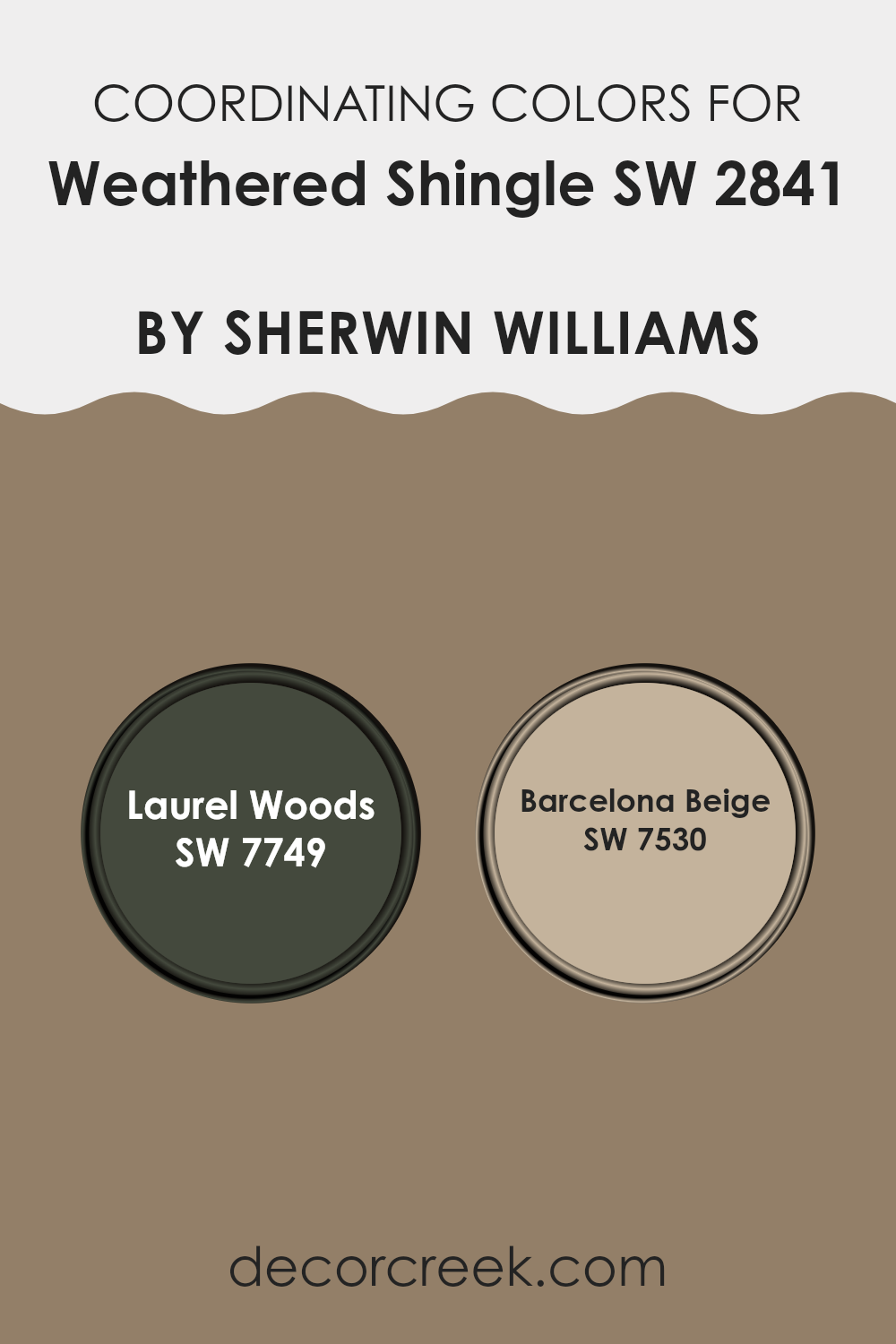
Coordinating Colors of Weathered Shingle SW 2841 by Sherwin Williams
Coordinating colors are selected to create harmony and enhance the aesthetic appeal when used alongside a primary paint color. For instance, Weathered Shingle by Sherwin Williams, a versatile gray hue, pairs exceptionally well with colors like Laurel Woods and Barcelona Beige. These coordinated colors can balance or accentuate the primary color, depending on their hue and intensity, providing an appealing visual experience.
Laurel Woods is a deep, woodsy green that exudes warmth, making it an excellent choice for creating a cozy and inviting atmosphere. Its rich nature allows it to blend perfectly with neutral tones like Weathered Shingle, grounding lighter spaces or complementing darker ones.
On the other hand, Barcelona Beige is a soft, warm beige that offers a subtle contrast. This color is perfect for softening the overall look of a space, providing a light, airy feel when paired with the more solid presence of Weathered Shingle. Using these coordinating colors together can help achieve a balanced and harmonious environment in any home or space.
You can see recommended paint colors below:
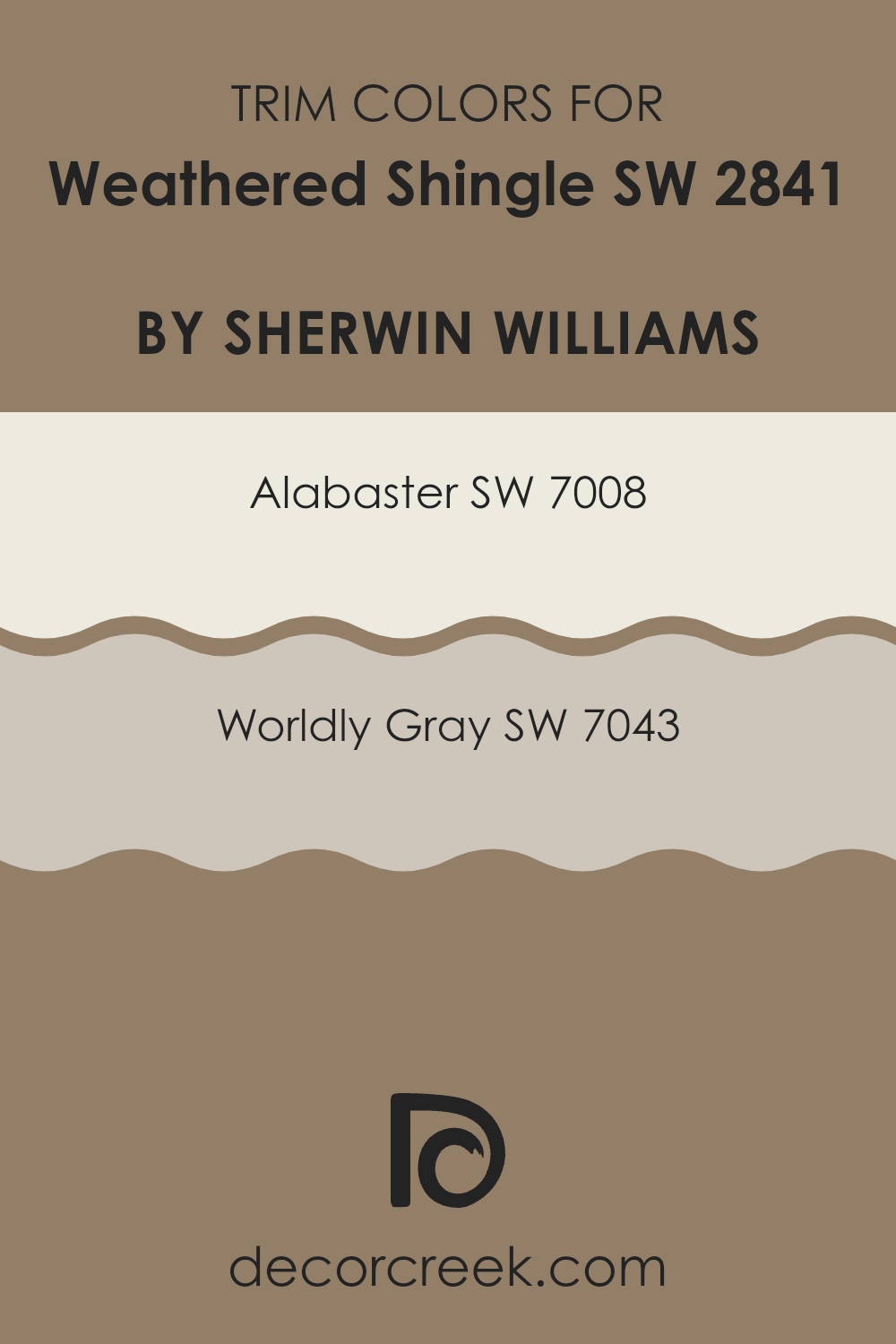
What are the Trim colors of Weathered Shingle SW 2841 by Sherwin Williams?
Trim colors are essentially used to highlight or accentuate the architectural details and edges of a home. When paired effectively with a primary house color like Weathered Shingle by Sherwin Williams, trim colors can enhance the overall appearance by framing the house, giving it a clean and finished look.
Selecting the right trim color is crucial because it outlines window sashes, doors, and other structural facets, potentially improving curb appeal and sometimes even impacting the perceived size and shape of the home. For a color like Weathered Shingle, utilizing trim colors such as Alabaster and Worldly Gray can be quite appealing.
Alabaster, a soft and creamy white, offers a bright contrast that can make the deeper tones of Weathered Shingle pop, providing a clear, distinct look that is visually appealing without being overly bold. On the other hand, Worldly Gray is a warm, gentle gray that harmonizes beautifully with Weathered Shingle, creating a more seamless transition between the main color and the trim, which can enhance the understated elegance of the home’s exterior.
You can see recommended paint colors below:
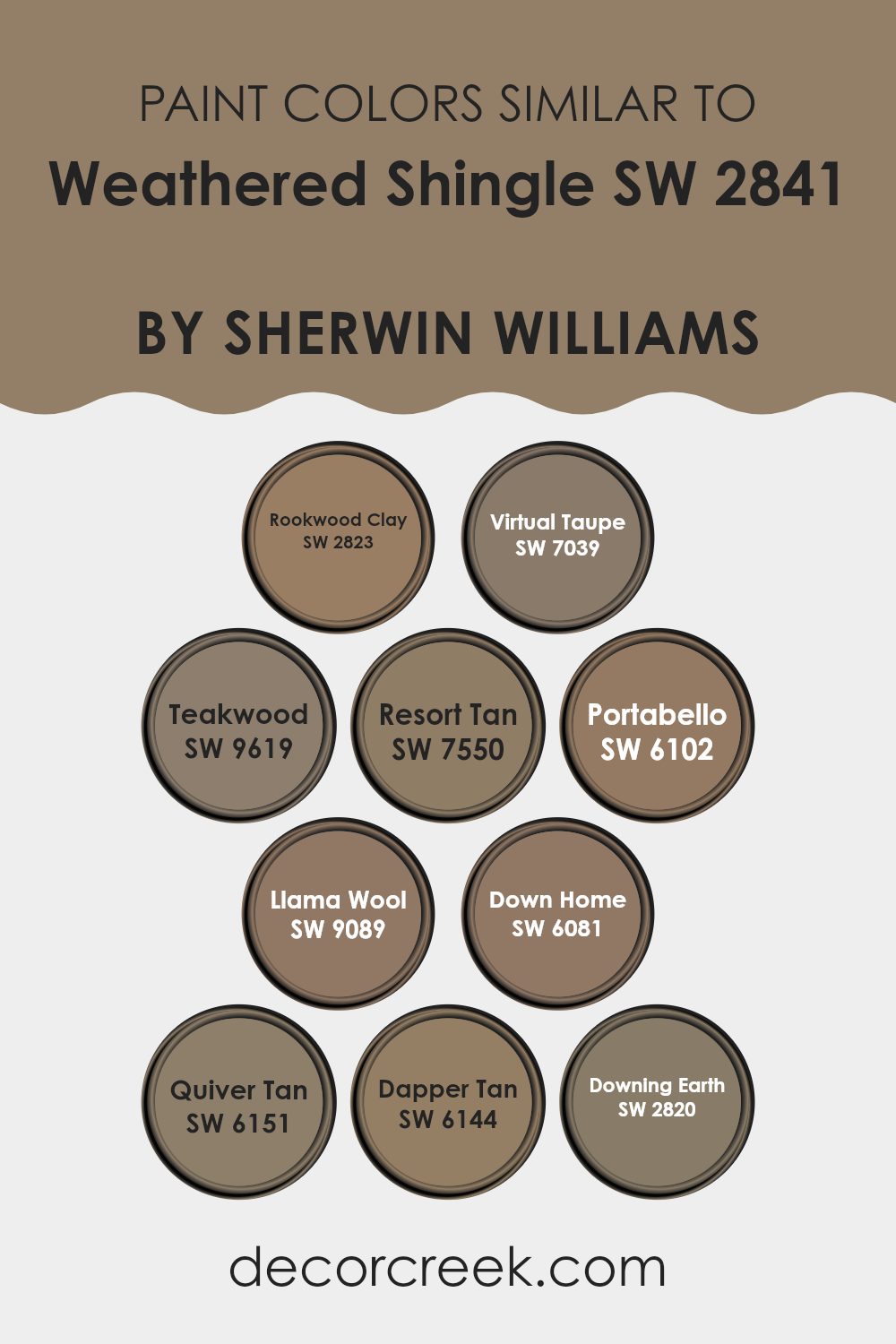
Colors Similar to Weathered Shingle SW 2841 by Sherwin Williams
Similar colors help create a seamless visual flow in spaces, enhancing cohesion and a subtle sense of unity. When using hues like those related to Weathered Shingle by Sherwin Williams, such as Rookwood Clay or Virtual Taupe, the resulting atmosphere is harmonious without stark contrasts that might disrupt the eye.
These shades, ranging from the rich earthiness of Teakwood to the softer beige of Resort Tan, offer diversity while maintaining a connection that makes them easy to combine in various design settings, ideal for anyone aiming for a coordinated look without being too matchy-matchy.
Colors like Portabello and Llama Wool strike a balance, adding warmth with their deeper tones that complement a variety of decors, while Down Home and Quiver Tan provide lighter alternatives that still stay within the same color spectrum, ensuring everything blends smoothly.
Dapper Tan and Downing Earth, being part of this collection, serve well in settings where a touch of groundedness is necessary, supporting other decor elements without overpowering them. Using similar colors in your space can subtly enhance the aesthetic appeal, subtly pulling together various aspects of a room to create a cohesive environment.
You can see recommended paint colors below:
- SW 2823 Rookwood Clay
- SW 7039 Virtual Taupe
- SW 9619 Teakwood
- SW 7550 Resort Tan
- SW 6102 Portabello
- SW 9089 Llama Wool
- SW 6081 Down Home
- SW 6151 Quiver Tan
- SW 6144 Dapper Tan
- SW 2820 Downing Earth
How to Use Weathered Shingle SW 2841 by Sherwin Williams In Your Home?
Weathered Shingle SW 2841 by Sherwin Williams is a rich, warm gray paint that can add a cozy and inviting look to any room in your home.
If you’re thinking about refreshing your living room or bedroom, this color can be a great choice because it provides a neutral backdrop that pairs well with various furnishings and decorations. For those who want to update their kitchen, Weathered Shingle can also create a welcoming space when used on cabinets or walls.
It complements wood tones and works beautifully with both modern and traditional styles. Additionally, this color is suitable for exterior projects, such as painting your home’s siding or trim, to give it a classy, timeless appearance. Whether inside or out, Weathered Shingle can help make your space feel more like home.
Weathered Shingle SW 2841 by Sherwin Williams vs Teakwood SW 9619 by Sherwin Williams
Weathered Shingle is a rich, deep gray that’s reminiscent of old, worn roof shingles exposed to the elements over time. It has a strong presence due to its depth, making it ideal for adding character and a sense of grounding in spaces that could use a moody touch.
Teakwood, on the other hand, appears as a deep brown with red undertones, like the polished, reddish hues of teak wood. This color is warm, inviting, and works well to create a cozy, comfortable atmosphere in a room.
Between the two, Weathered Shingle presents as the cooler and more neutral option, thus providing a versatile background that can fit various decor styles. Teakwood’s redder and warmer tones offer a more traditional warmth, suitable for areas where you want to enhance a feel of warmth and welcome.
You can see recommended paint color below:

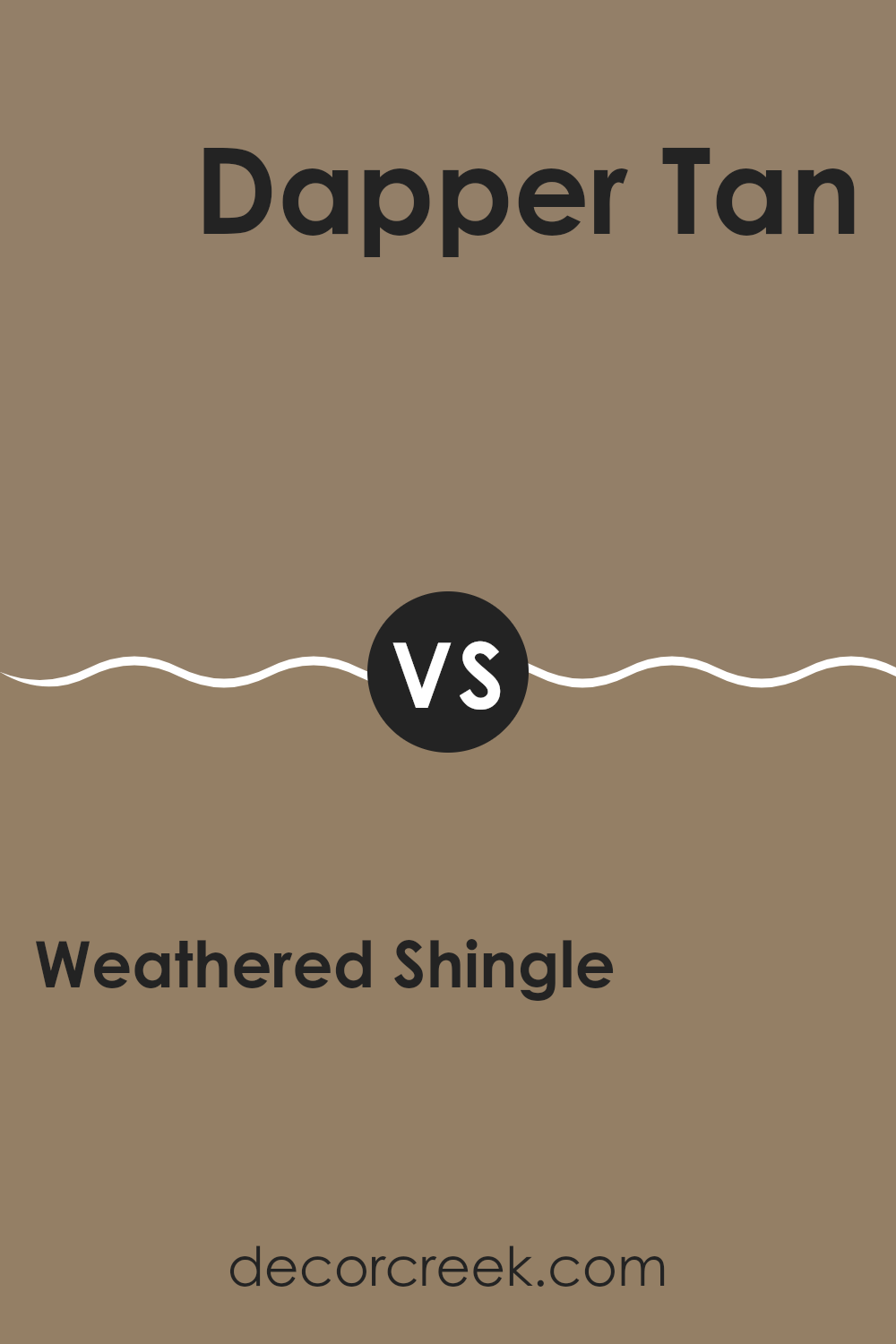
Weathered Shingle SW 2841 by Sherwin Williams vs Dapper Tan SW 6144 by Sherwin Williams
Weathered Shingle by Sherwin Williams is a deep, warm gray that hints at underlying earth tones. This versatile color works well in spaces where you want a cozy yet substantial feel. It has the ability to make a room feel grounded due to its rich, but muted hue.
On the other hand, Dapper Tan by Sherwin Williams is lighter and leans more towards a beige-brown. This color is warm and welcoming, making it an excellent choice for living areas or bedrooms where a soft, inviting atmosphere is desired.
Both colors are unique in their way and can effectively enhance different aspects of a room. Weathered Shingle tends to draw in depth and complexity, setting a strong base for a space, while Dapper Tan brings a lighter, cheerier touch that can brighten a room effortlessly. Depending on the mood you want to create, either color could be the perfect fit.
You can see recommended paint color below:
- SW 6144 Dapper Tan
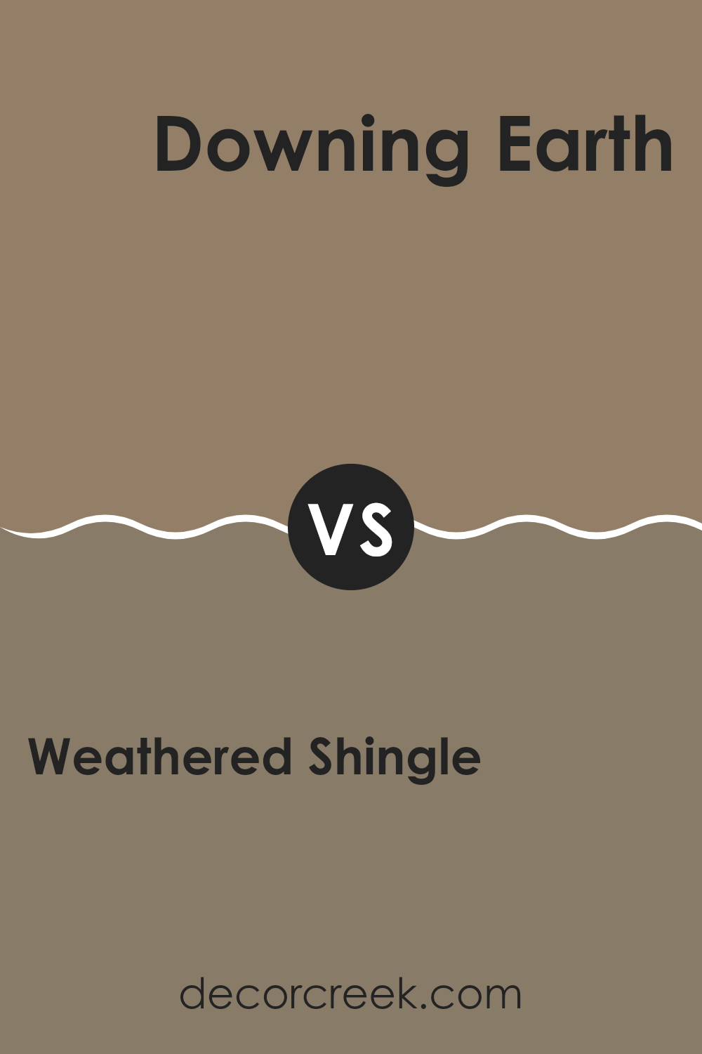
Weathered Shingle SW 2841 by Sherwin Williams vs Downing Earth SW 2820 by Sherwin Williams
Weathered Shingle and Downing Earth, both by Sherwin Williams, offer unique shades appealing to different tastes and design needs. Weathered Shingle is a darker hue that resembles the aged grayish-brown color of wooden shingles exposed to the elements.
This color is ideal for creating a cozy, grounded atmosphere in spaces. On the other hand, Downing Earth is a much darker, earthy brown tone. It’s perfect for those who prefer a richer, more grounded feel in their room, complementing natural elements like wood or stone.
While Weathered Shingle provides a subtle backdrop, Downing Earth makes a bolder statement, potentially serving as an accent wall or in rustic settings. Each color offers a distinct mood and can be used effectively in various design schemes, whether you’re looking to add a touch of muted elegance or a sweep of dramatic flair.
You can see recommended paint color below:
- SW 2820 Downing Earth
Weathered Shingle SW 2841 by Sherwin Williams vs Rookwood Clay SW 2823 by Sherwin Williams
Weathered Shingle and Rookwood Clay are two distinct colors from Sherwin Williams. Weathered Shingle is a gray shade with a subtle warmth that hints at an undertone of brown, giving it a natural, soft appearance.
It’s flexible and calm, ideal for creating a cozy and welcoming space. On the other hand, Rookwood Clay boasts a deeper, earthier tone. This color is reminiscent of terracotta, rich and grounded with an organic feel. It is stronger and more pronounced than Weathered Shingle, making it great for adding character and warmth to an area.
While Weathered Shingle works well in spaces aiming for a subtle, neutral backdrop, Rookwood Clay stands out and can be used to make a bolder statement. Both are versatile in their own right, but serve different visual impacts and moods in interior design.
You can see recommended paint color below:
- SW 2823 Rookwood Clay

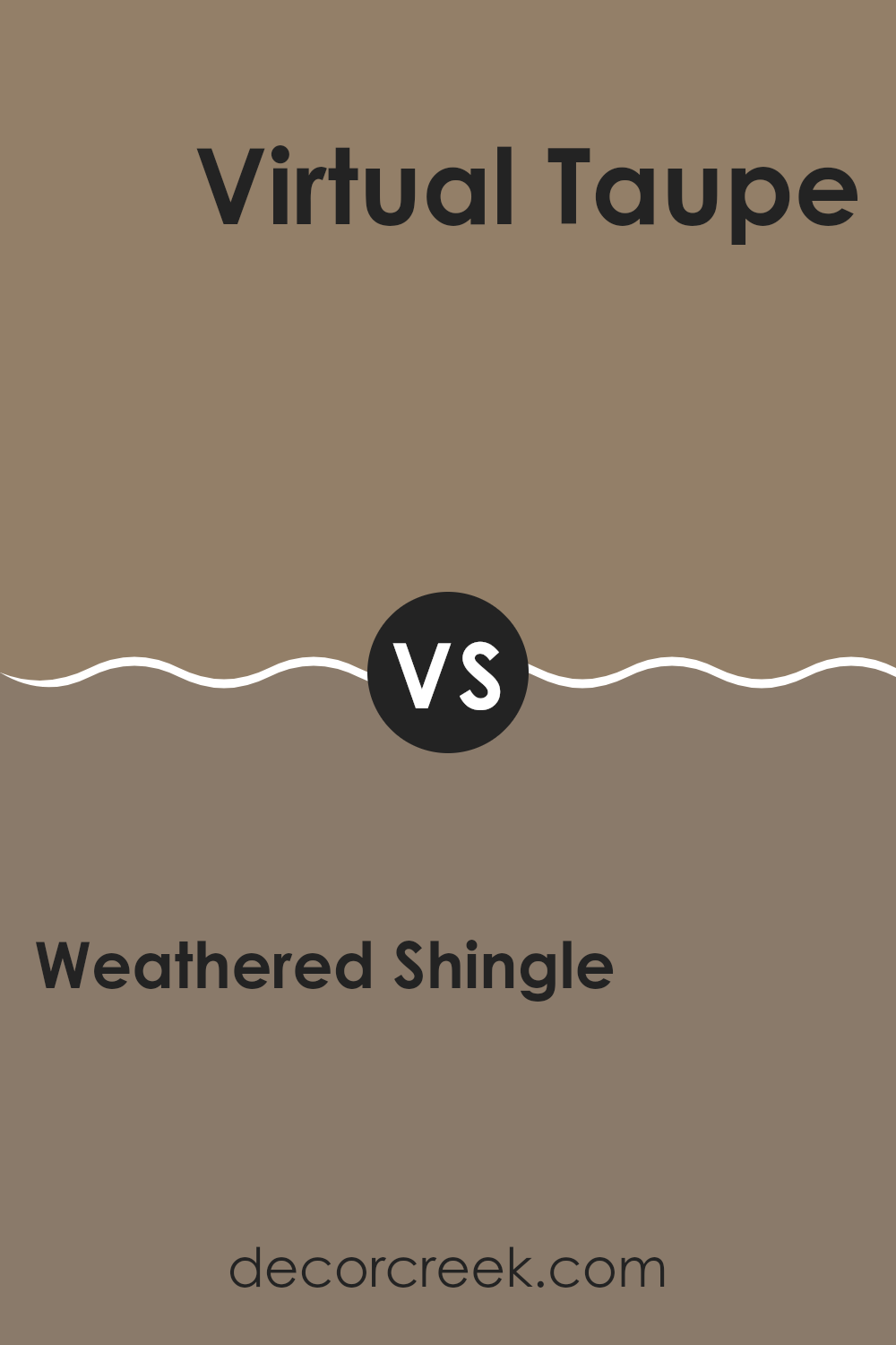
Weathered Shingle SW 2841 by Sherwin Williams vs Virtual Taupe SW 7039 by Sherwin Williams
Weathered Shingle and Virtual Taupe, both by Sherwin Williams, are distinct yet somewhat similar tones suitable for various settings. Weathered Shingle is a deep, warm gray with a touch of brown, which gives it a cozy and inviting feel. It’s perfect for areas where you want to add a bit of subdued elegance without going too dark. This color works well in spaces that need a comforting and grounding atmosphere.
On the other hand, Virtual Taupe is a lighter, more neutral shade compared to Weathered Shingle. It leans more towards a classic taupe that balances gray and brown evenly. This makes it highly versatile for use in numerous spaces, enhancing lightness and acting as a great backdrop for both bold and subtle decor.
While both colors share some warmth, Weathered Shingle veers towards a deeper, more enveloping feel, and Virtual Taupe offers a lighter, cleaner look. Either option allows for easy coordination with other colors and design elements in a home or office.
You can see recommended paint color below:
Weathered Shingle SW 2841 by Sherwin Williams vs Portabello SW 6102 by Sherwin Williams
The main color, Weathered Shingle, is a soft yet rich gray shade with a hint of warmth, reminiscent of aged shingles on a sunlit roof. It has an understated elegance that works well in a variety of settings, providing a calm, cozy backdrop that pairs well with brighter colors and natural materials.
On the other hand, Portabello is a much deeper, earthier tone resembling the dark, rich hues of a portabello mushroom. This color is deeper and more intense but still maintains a natural feel that makes it ideal for creating inviting, warm environments. It’s perfect for accent walls or rooms where a more grounded, comforting atmosphere is desired.
Both colors offer unique qualities for interior spaces, with Weathered Shingle being the lighter of the two, giving rooms an airy, open feel. In contrast, Portabello, being darker, adds depth and warmth, setting a more defined, cozy ambiance. These choices allow for flexibility depending on the mood or style you want to achieve in your home.
You can see recommended paint color below:
- SW 6102 Portabello
Weathered Shingle SW 2841 by Sherwin Williams vs Resort Tan SW 7550 by Sherwin Williams
Weathered Shingle by Sherwin Williams is a rich, deep gray color that has a subtle brown undertone. This makes it a warm and inviting shade, ideal for creating a cozy atmosphere in any room. It works especially well in spaces that aim for a natural and earthy feel, as it mimics the color of aged wood.
On the other hand, Resort Tan by Sherwin Williams is a lighter, softer brown that gives off a more relaxed and casual vibe. This color is excellent for spaces where you want to keep things light and airy, yet still warm and welcoming. Resort Tan pairs well with a variety of other colors, making it versatile for decorating.
Both colors are excellent choices but serve different purposes based on their tones and the feelings they evoke. Weathered Shingle is perfect for a robust, grounding presence, while Resort Tan offers a gentle, soothing backdrop.
You can see recommended paint color below:
- SW 7550 Resort Tan

Weathered Shingle SW 2841 by Sherwin Williams vs Llama Wool SW 9089 by Sherwin Williams
Weathered Shingle by Sherwin Williams is a deeper, grayish tone that brings a sense of solidity and calm. It’s bold enough to make a statement but soft enough to maintain a cozy and welcoming vibe. This color works wonderfully in living spaces or bedrooms where comfort and relaxation are key.
On the other hand, Llama Wool is a lighter, almost beige-like gray that offers a gentle and soothing touch. It’s perfect for creating a warm and inviting atmosphere in any room. Being lighter, Llama Wool can make a space feel more open and airy compared to Weathered Shingle.
Together, these two colors can complement each other beautifully. Weathered Shingle can serve as a striking accent or focus wall, while Llama Wool can be used for the remaining walls to provide balance and keep the room from feeling too dark.
You can see recommended paint color below:
- SW 9089 Llama Wool
Weathered Shingle SW 2841 by Sherwin Williams vs Down Home SW 6081 by Sherwin Williams
Weathered Shingle by Sherwin Williams is a rich, brown-gray shade that gives a natural and earthy feel to spaces. It can remind you of the colors you might see on old, sun-faded wood shingles on the outside of a cozy cottage or historic home. This color works well in spaces that aim for a timeless and warm feel, as it pairs nicely with both bold and soft color schemes.
Down Home by Sherwin Williams is a deeper, more pronounced dark brown with a hint of reddish undertone. This shade adds a strong, welcoming warmth to rooms and is excellent for creating a cozy and inviting atmosphere. It goes well with cream or beige which can lighten its impact and bring out more of its warm tones.
In comparing these two, Weathered Shingle is more subdued and versatile, suitable for a broader scope of designs. Down Home, on the other hand, offers a bolder statement and can establish a more defined and warm presence in a space. Both colors can coexist in the same palette but serve different purposes in design aesthetics.
You can see recommended paint color below:
- SW 6081 Down Home
Weathered Shingle SW 2841 by Sherwin Williams vs Quiver Tan SW 6151 by Sherwin Williams
Weathered Shingle and Quiver Tan, both by Sherwin Williams, are distinct in their color tones and mood setting. Weathered Shingle presents a deep, greyish-brown shade that conveys a sturdy and classic appearance. It’s ideal for creating a sense of grounding in a space, particularly useful in areas where a calming, solid feel is desired. This color mimics the look of aged wood, adding a rustic charm to exteriors or interiors.
On the other hand, Quiver Tan is a lighter, softer beige that has a warm undertone. It provides a light, airy feel, making it perfect for brightening up a room. This color works well in small spaces or rooms that lack natural light, as it helps make the area appear larger and more welcoming.
Together, these colors could complement each other in a home design where contrast between warmth and depth is desired. Quiver Tan could lighten up spaces, while Weathered Shingle could add anchoring elements.
You can see recommended paint color below:
- SW 6151 Quiver Tan
Conclusion
After looking at SW 2841 Weathered Shingle by Sherwin Williams, I’ve learned so much! First, this paint color is like a calm gray that reminds me of stones or a cloudy day. It’s soft and gentle, making any room feel cozy and relaxing. Next, it works really well in lots of different rooms. Whether you’re painting your bedroom, living room, or even your kitchen, this color makes the room look nice without trying too hard.
Also, it matches well with many other colors. You can pair it with brighter colors like blue or yellow to make things more fun, or stick with dark colors like brown for a more earthy feel. This gives you lots of choices when decorating your room.
People often worry about choosing the right paint color, but SW 2841 Weathered Shingle is a good pick because it’s both beautiful and easy to like. It makes the place where you live look great and feel comfy, which is super important. This color has a lot to offer without being too fancy or complicated, which is perfect if you just want something simple and nice.
So, in the end, I think SW 2841 Weathered Shingle is a great choice for anyone looking to refresh their home with a new splash of color. It gives a calm and lovely touch to any room, making it easy to enjoy.
Ever wished paint sampling was as easy as sticking a sticker? Guess what? Now it is! Discover Samplize's unique Peel & Stick samples.
Get paint samples

