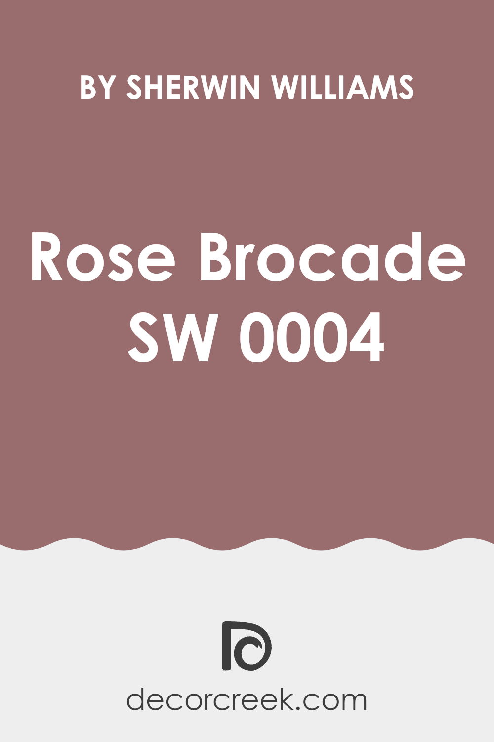
If you’re looking for a paint color that adds a sophisticated yet subtle grandeur to your space, the SW 0004 Rose Brocade by Sherwin Williams might just be your perfect choice. I recently decided to refresh my living room walls and stumbled upon this elegant shade. Rose Brocade is a rich, muted pink with an old-world charm that feels both cozy and refined.
When I began searching for a color that could complement various types of décor, from modern to vintage, I realized how versatile Rose Brocade can be. It has a unique ability to blend seamlessly with different textures and fabrics, making it a great backdrop for any room. Whether you want to create a focal wall or wrap the entire room in subtlety, this color provides a gentle warmth that enhances natural light and makes other colors in the room pop.
In my experience with Rose Brocade, I noticed it particularly shines during the daytime when sunlight brings out its soothing pink hues. Yet, it doesn’t lose its charm at night, maintaining a cozy and inviting atmosphere.
If you’re aiming to refresh a room in your home, consider what feeling you want to achieve. This shade could be just what you need to rejuvenate your space softly and beautifully.
What Color Is Rose Brocade SW 0004 by Sherwin Williams?
Rose Brocade is a rich, deep pink hue that exudes warmth and charm. At its core, this color finds a perfect balance between vibrancy and softness, making it an excellent choice for creating a welcoming space. This particular shade of pink carries slight undertones of red, which enhances its coziness and makes it an ideal match for spaces designed for relaxation and comfort.
When it comes to interior design, Rose Brocade fits beautifully within traditional, shabby chic, and even modern settings that call for a pop of color. It pairs exceptionally well with creamy whites and soft beiges, creating a subtle yet striking contrast. In terms of materials, this color goes hand in hand with luxurious textures like velvet or silk, contributing to a plush, inviting environment.
The warmth of Rose Brocade also harmonizes seamlessly with natural wood finishes, from lighter tones like pine or birch to darker shades like walnut or mahogany.
Using Rose Brocade in a room can add a touch of femininity and warmth, perfect for areas like bedrooms, living rooms, or even bathrooms where comfort is key. It’s especially effective on accent walls, within nooks, or as a backdrop for bookshelves, encouraging a sense of coziness and inclusion.
Overall, Rose Brocade is a versatile and hearty color that can help create inviting and pleasant spaces in your home.
Is Rose Brocade SW 0004 by Sherwin Williams Warm or Cool color?
Rose Brocade SW 0004 by Sherwin Williams is a rich, deep pink hue with warm undertones. This color brings a cozy and inviting atmosphere to any room in a house. Its warm and comforting shade can make large spaces feel more intimate and small rooms appear welcoming. Rose Brocade is versatile and pairs well with both light and dark colors, allowing for various styling options.
In living rooms or bedrooms, this color can create a focal point when used on a feature wall, adding a touch of warmth without overpowering the space. For those who prefer subtle elegance, painting a single wall with Rose Brocade can add a splash of color while maintaining a homely feel.
Additionally, in spaces like the kitchen or dining area, accessories or accent pieces in this color can add a lively yet comforting vibe, making the area more enjoyable for gatherings. Overall, Rose Brocade SW 0004 has the ability to make a home feel both cozy and fresh.
Undertones of Rose Brocade SW 0004 by Sherwin Williams
Rose Brocade is a unique paint color that might look simple at first glance but contains a complex blend of undertones that can subtly influence the atmosphere of a room. Undertones are additional colors that make up the base of the main color, affecting how it is perceived under different lighting conditions and in different surroundings.
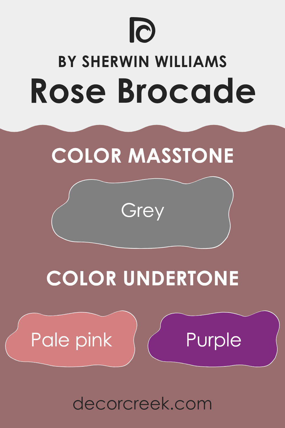
This color has a rich assortment of undertones, ranging from pale pink and lilac to deeper shades like navy and dark grey. These undertones can make the color appear warmer or cooler depending on the light and what other colors are present in the room. For instance, under bright daylight, the pale pink or light purple undertones might become more pronounced, giving the walls a gently cheerful look.
In artificial light, however, the darker undertones like navy or dark green might stand out, providing a more grounded feel.
When used on interior walls, Rose Brocade’s diverse undertones offer a versatility that can compliment a variety of decor styles and personal tastes. It’s particularly effective in spaces where you want a dynamic color that adjusts with the day and shifts mood from morning to evening. The way these undertones interact can also make the space feel more cozy and welcoming, as they add depth and interest to what might otherwise be just a flat, single-color wall.
Overall, the interaction of these undertones in Rose Brocade provides a subtle, yet effective way to enhance the visual appeal of interior spaces. It’s a color that keeps on giving, revealing new aspects of itself in differing conditions and uses.
What is the Masstone of the Rose Brocade SW 0004 by Sherwin Williams?
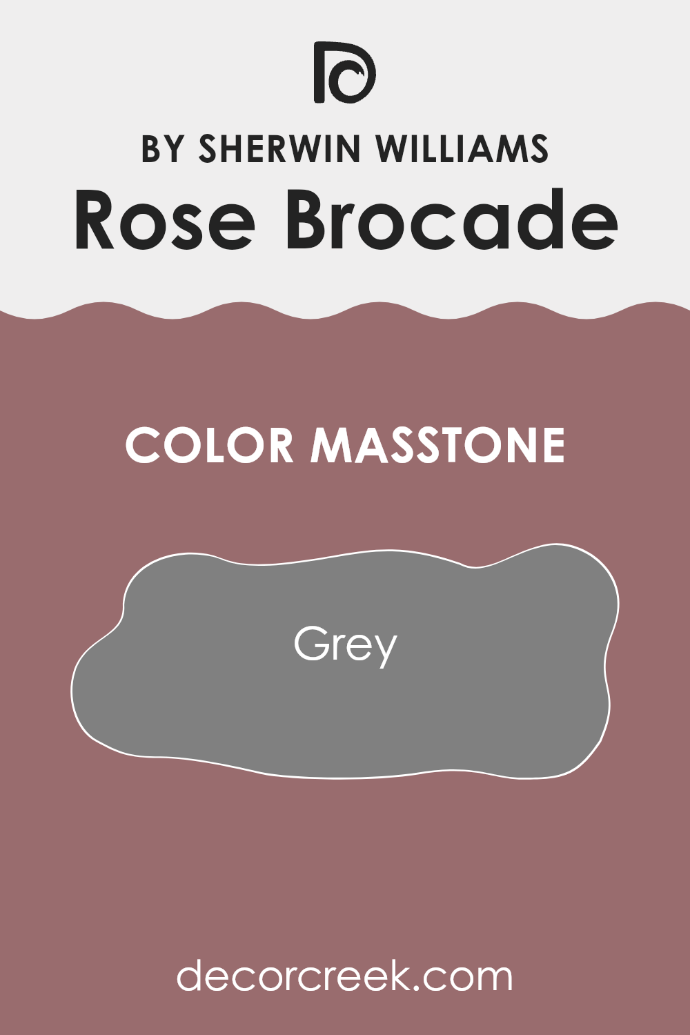
Rose BrocadeSW 0004 by Sherwin Williams, with a masstone color of grey (#808080), brings a subtle and flexible base into any home setting. Being a neutral grey, it pairs seamlessly with a wide range of other colors, making it incredibly versatile for decorating. Whether it’s in a modern living room or a cozy bedroom, this grey hue helps maintain a balanced look by bridging bolder colors or softening darker shades.
In well-lit spaces, it reflects sufficient light, which can make rooms appear more spacious and open. In dimmer areas, it adds depth without overwhelming the senses, which is perfect for creating a comfortable, calming environment.
For homeowners looking to sell, such a universally appealing color can also make a property more attractive to potential buyers, as it allows them to imagine their personal touch. Overall, Rose BrocadeSW 0004 is a reliable choice for anyone wanting a classic, unobtrusive backdrop in their living space.
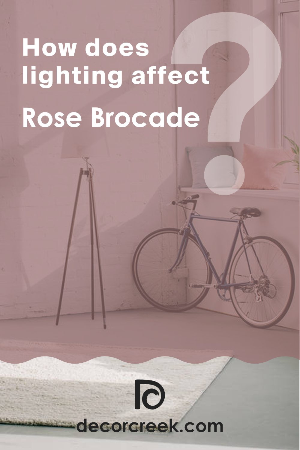
How Does Lighting Affect Rose Brocade SW 0004 by Sherwin Williams?
Lighting plays a critical role in how we perceive colors. The color of light, whether it’s natural daylight or artificial lighting, can significantly influence how a paint color looks on your walls. Each type of light casts its unique hues, affecting the appearance of painted surfaces.
Taking the color Rose Brocade by Sherwin Williams as an example, let’s discuss how this shade can appear under different lighting conditions. Rose Brocade is a rich, warm-toned hue that can show a variety of undertones depending on the lighting.
In natural light, the true color of Rose Brocade shines the brightest. In a room with south-facing windows, where there is an abundance of natural light throughout the day, this color will look vibrant and fairly true to its swatch, bringing a cozy and warm atmosphere to the space.
In contrast, in north-facing rooms, which are generally cooler and receive less direct sunlight, Rose Brocade may appear slightly darker and less saturated. The cooler, blue-toned light can make the color look more subdued, adding a hint of sophistication without being overly bold.
Rooms that face east or west also present unique lighting throughout the day. In east-facing rooms, the morning light can make Rose Brocade look very warm and inviting in the morning, but it might lose some of its brightness by the afternoon. Conversely, in west-facing rooms, the color will experience the opposite effect. It may start off more muted in the morning and then warm up and become richer toward the evening as the sunset approaches.
Artificial lighting can also impact the appearance of Rose Brocade. Warmer artificial lights, such as incandescent bulbs, will enhance the warm tones of the paint, making it more intense and richer. On the other hand, cooler lights, like some LEDs, may bring out any cooler undertones, making the color look slightly muted compared to its appearance under warm lighting.
Understanding these effects can help you choose the right paint color for your space based on the room’s orientation and your lighting choices, ensuring that you achieve the desired effect in your decorating project.
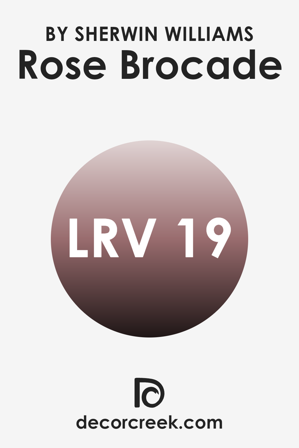
What is the LRV of Rose Brocade SW 0004 by Sherwin Williams?
LRV stands for Light Reflectance Value, which is a measurement used to determine how much light a paint color reflects compared to how much it absorbs. A higher LRV means the color reflects more light and generally appears brighter, while a lower LRV means the color absorbs more light and appears darker.
Understanding LRV can help someone pick the right paint shade for a room based on how much natural or artificial light the room gets. For instance, a room with lots of windows might do well with a lower LRV color to balance the abundance of brightness.
The LRV of Rose Brocade, which is 18.566, indicates that it is a darker color that absorbs more light than it reflects. This can affect the appearance and mood of a space dramatically. In a room with limited light, using this color might make the space appear more enclosed and cozy, potentially making it a great choice for creating a more intimate atmosphere like in a dining room or bedroom. However, in a dimly-lit space, this shade might make the room feel even smaller or darker, so additional lighting might be necessary to counteract this effect.
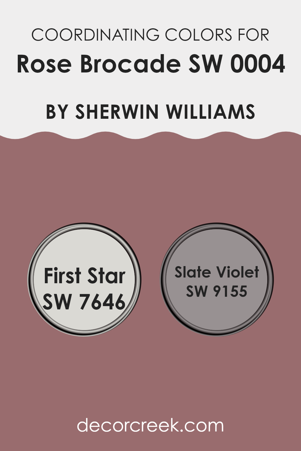
Coordinating Colors of Rose Brocade SW 0004 by Sherwin Williams
Coordinating colors are selected shades that harmonize with a primary color to enhance the overall aesthetic of a room. For example, when decorating with a primary color like Rose Brocade from Sherwin Williams, which is a rich, deep floral pink, it’s natural to pair it with colors that complement or nicely contrast it to create a visually pleasing space. These coordinating colors can come in various tones, from neutral to bold, allowing you to add layers of interest to your decor.
One great coordinating color is First Star (SW 7646), a soft, light gray that can act as a subtle background. This color is gentle and calm, providing a neutral base that doesn’t compete with Rose Brocade but instead supports and balances its vibrancy.
Another coordinating shade is Slate Violet (SW 9155), which offers a muted purple hue. This shade brings an understated touch of depth and mystery to a room, pairing well with Rose Brocade to add a nuanced and delightful contrast without overwhelming the space. Together, these colors create a cohesive palette that enhances the beauty of the main color while ensuring the environment remains inviting and pleasing to the eye.
You can see recommended paint colors below:
- SW 7646 First Star
- SW 9155 Slate Violet
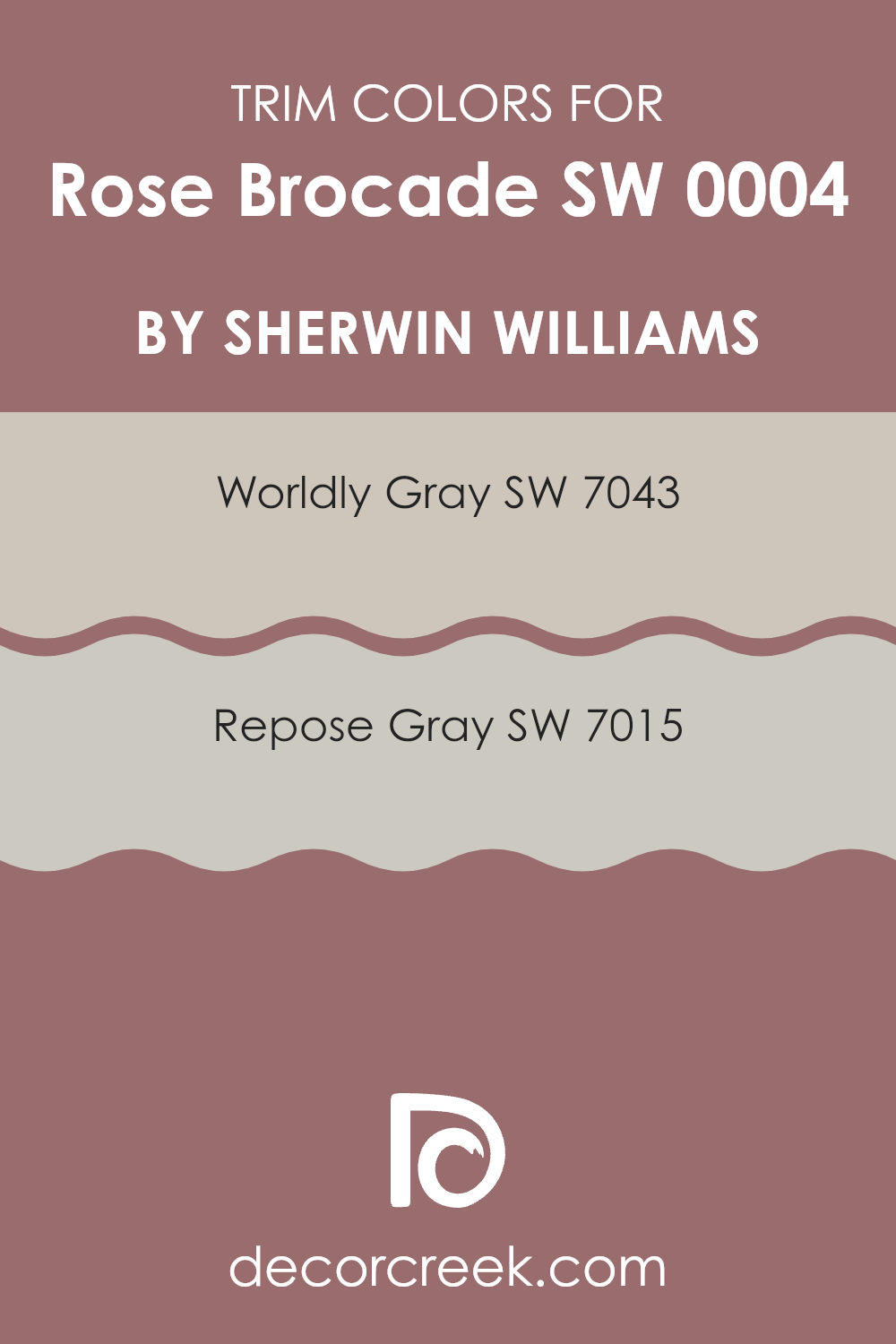
What are the Trim colors of Rose Brocade SW 0004 by Sherwin Williams?
Trim colors play a significant role in accentuating the main color of a room, and choosing the right trim color can help in defining and highlighting architectural details, such as doorways, moldings, and window frames. When it comes to a rich color like Rose Brocade by Sherwin Williams, selecting a neutral trim color can balance the intensity and bring a clean, finished look to the space. Colors like Worldly Gray and Repose Gray are excellent choices because they are subtle yet effective in complementing the deep tones of Rose Brocade without overpowering it.
Worldly Gray SW 7043 is a soft, warm gray that brings a gentle contrast to the vividness of Rose Brocade, offering a harmonious transition between the wall and trim. It merges well with other hues, proving to be versatile in various decor settings.
On the other hand, Repose Gray SW 7015 is a lighter gray that provides a slightly sharper contrast, potentially making the rich hues of the walls stand out more, thus accentuating the room’s features with a crisp delineation. Both these colors are wonderful considerations for anyone looking to achieve a balanced and visually appealing space.
You can see recommended paint colors below:
Colors Similar to Rose Brocade SW 0004 by Sherwin Williams
Understanding the importance of similar colors can greatly enhance any interior design scheme. Opting for complementary hues not only creates visual harmony but also allows for a gradual and pleasing transition throughout a space. A great example of utilizing similar colors can be seen with those related to the Rose Brocade hue.
Salon Rose is a gentle pink that evokes a sense of warm, welcoming energy, making it ideal for spaces used for relaxation and conversation. Redbud has a slightly more vibrant pink tone that adds a cheerful pop of color conducive to lively areas within a home. Rambling Rose is more subdued, lending an earthy, mature feel perfect for creating a cozy nook.
Concerto, a deeper variation, mirrors a greyish tint, good for complementing brighter colors or standing strong on its own. Moss Rose offers a dusty rose shade perfect for a soft, romantic touch in any room.
Reddened Earth is a rich, terra cotta color that grounds a room with its robust depth, while Dutch Cocoa introduces a deep brown, which pairs well with both warm and cool tones, adding richness. Carley’s Rose is a unique mixture of pink and lavender, giving a fresh yet traditional vibe, suited for spaces meant to comfort and intrigue.
Plum Dandy infuses a room with its deep purple, reminiscent of regal elegance, but with a modern twist. Lastly, Socialite presents a striking yet refined greyish-purple, perfect for adding a dash of sophistication without overwhelming a space. Each color, while varying slightly from Rose Brocade, complements the palette harmoniously, reinforcing the aesthetic cohesion throughout a home.
You can see recommended paint colors below:
- SW 0061 Salon Rose
- SW 6312 Redbud
- SW 6305 Rambling Rose
- SW 6298 Concerto
- SW 6291 Moss Rose
- SW 6053 Reddened Earth
- SW 6032 Dutch Cocoa
- SW 9002 Carley’s Rose
- SW 6284 Plum Dandy
- SW 6025 Socialite

How to Use Rose Brocade SW 0004 by Sherwin Williams In Your Home?
Rose Brocade by Sherwin Williams is a beautiful, warm pink paint color that can bring a cozy and inviting feel to any room in your home. This color is perfect for adding a gentle and pleasant touch to spaces like living rooms or bedrooms. Because it’s a soft shade, it doesn’t overpower the space but instead adds just the right amount of warmth and character.
You can use Rose Brocade on a feature wall to create a focal point in the room or paint all the walls in a smaller room, like a bathroom, for a consistent and harmonious look. Pairing this color with white trim or molding can make the walls really stand out, giving the space a fresh and clean appearance.
Additionally, Rose Brocade works well with other colors. It can be paired with grays, whites, or even darker shades like navy or forest green in furniture and decorations to create a balanced and pleasant atmosphere. Whether you’re aiming for a cozy bedroom nook or a welcoming living area, this color is versatile for many home styles.
Rose Brocade SW 0004 by Sherwin Williams vs Rambling Rose SW 6305 by Sherwin Williams
Rose Brocade and Rambling Rose, both by Sherwin Williams, are unique shades of red that cater to different aesthetic tastes. Rose Brocade is a soft and subtle pink with a slight hint of coral, giving it a gentle and airy feel.
This color is perfect for creating a cozy and inviting atmosphere in spaces like living rooms and bedrooms. On the other hand, Rambling Rose is a deeper, more vibrant pink with a noticeable touch of red. It’s bolder and can add a dash of energy to a room.
This color works well in areas where you want to make a statement, such as an accent wall or a decorative space. Despite their differences, both colors offer warmth and can contribute to a comfortable home vibe.
You can see recommended paint color below:
- SW 6305 Rambling Rose
Rose Brocade SW 0004 by Sherwin Williams vs Socialite SW 6025 by Sherwin Williams
The main color, Rose Brocade, is a soft, warm pink with a subtle coziness that makes it perfect for creating a welcoming atmosphere in areas like living rooms or bedrooms. It’s not too bright, which makes it easier to blend with various decor styles and preferences.
On the other hand, Socialite is a deeper, more intense blue that carries a sense of richness and depth. This color can add a dramatic flair to a space, making it ideal for accent walls or areas where a bold statement is desired.
Both colors offer distinct vibes: Rose Brocade leans towards a gentle, soothing presence while Socialite offers a striking, bold look. These characteristics make them suitable for different purposes or rooms depending on the mood you want to set. Rose Brocade might be better in a soft, light-filled room, while Socialite could work well in a space with ample lighting or modern decor to highlight its richness.
You can see recommended paint color below:
- SW 6025 Socialite
Rose Brocade SW 0004 by Sherwin Williams vs Concerto SW 6298 by Sherwin Williams
Rose Brocade is a soft, dusty pink with a hint of warmth, perfect for creating a cozy and inviting ambiance in spaces like living rooms or bedrooms. It pairs beautifully with neutral tones and wooden furniture, enhancing the space with a subtle, yet charming character.
On the other hand, Concerto is a deeper, more muted gray with a hint of purple. This color is versatile, making it suitable for both modern and traditional decors. It works great in spaces that aim for a more grounded, composed feel, such as studies or dens. Concerto can complement metallic accents and dark woods, offering a stylish backdrop that quietly stands out.
While Rose Brocade adds a gentle, warm touch to a room, Concerto offers a solid, calming base, making them both excellent choices, each setting a distinct mood and style.
You can see recommended paint color below:
- SW 6298 Concerto
Rose Brocade SW 0004 by Sherwin Williams vs Dutch Cocoa SW 6032 by Sherwin Williams
Rose Brocade is a soft, muted pink shade that carries a gentle warmth, making it perfect for creating a cozy and inviting space. It has a subtle elegance that works well in areas like living rooms or bedrooms where a touch of softness can enhance the overall feel of the room. This color pairs beautifully with soft whites or cream colors to maintain a light, airy feel.
On the other hand, Dutch Cocoa is a deep, rich brown tone that offers a strong sense of grounding and stability. It’s an excellent choice for adding depth and warmth to a space. This color works particularly well in larger areas or as an accent wall, where it can make a bold statement without overpowering. It’s also very versatile, pairing well with both bright colors for contrast or softer tones for a more harmonious look.
Both colors bring their own unique vibes to a space, with Rose Brocade leaning towards light and airy, and Dutch Cocoa providing depth and warmth.
You can see recommended paint color below:
- SW 6032 Dutch Cocoa
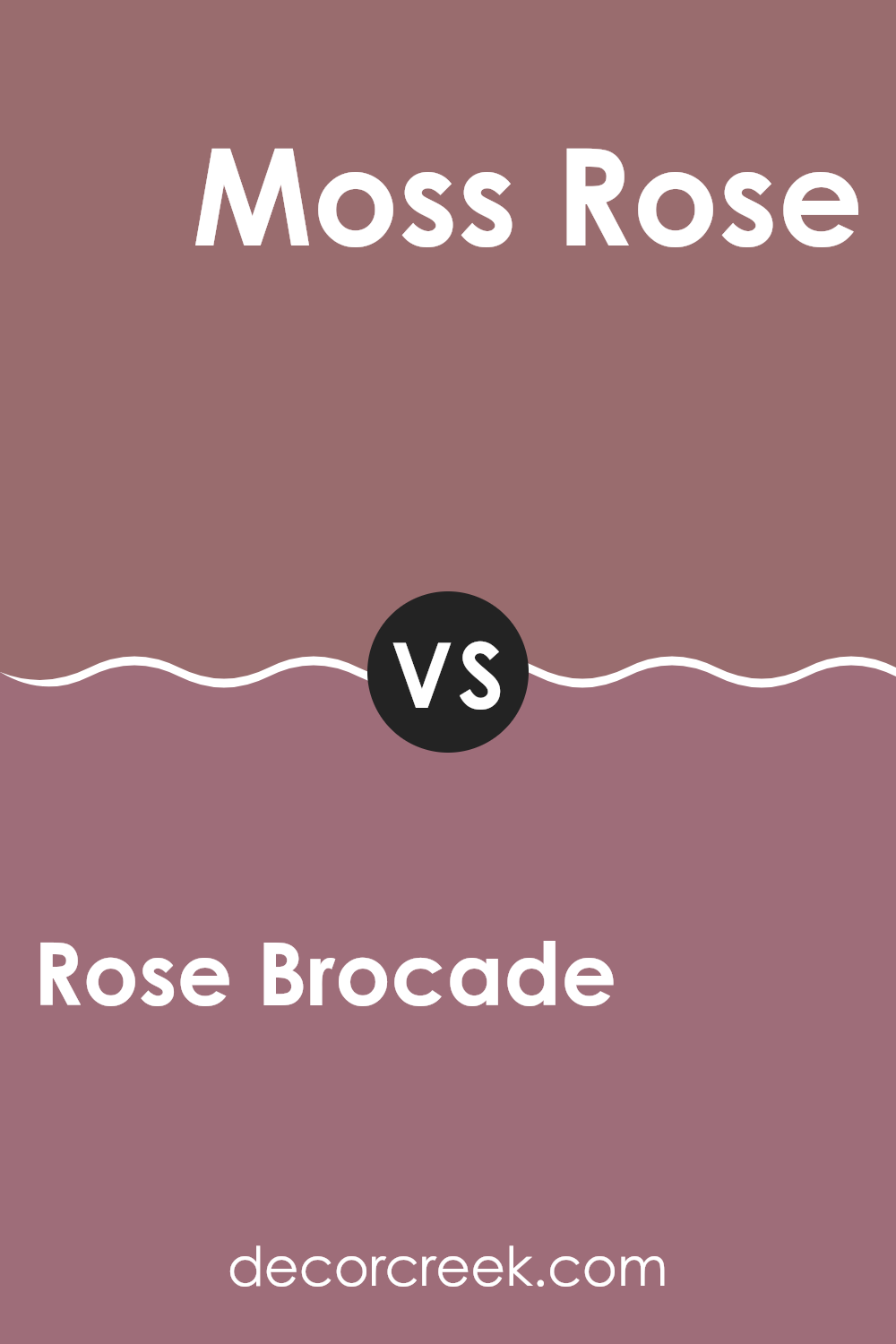
Rose Brocade SW 0004 by Sherwin Williams vs Moss Rose SW 6291 by Sherwin Williams
Rose Brocade and Moss Rose, both from Sherwin Williams, are distinct yet harmonious colors. Rose Brocade is a deep, rich pink with a slight hint of peach, giving it a warm and welcoming vibe. It’s perfect for creating a cozy and inviting atmosphere in a room.
On the other hand, Moss Rose has a softer, more muted pink tone, blended beautifully with subtle green undertones. This color is ideal for spaces where you want a gentle, soothing feel.
When used together, these colors complement each other well. Rose Brocade’s depth can serve as a striking feature or accent wall, while Moss Rose works wonderfully for the surrounding walls to create a balanced, soft, and airy space. Both colors lend themselves well to various decor styles, particularly those seeking a touch of femininity without being overly bold.
You can see recommended paint color below:
- SW 6291 Moss Rose
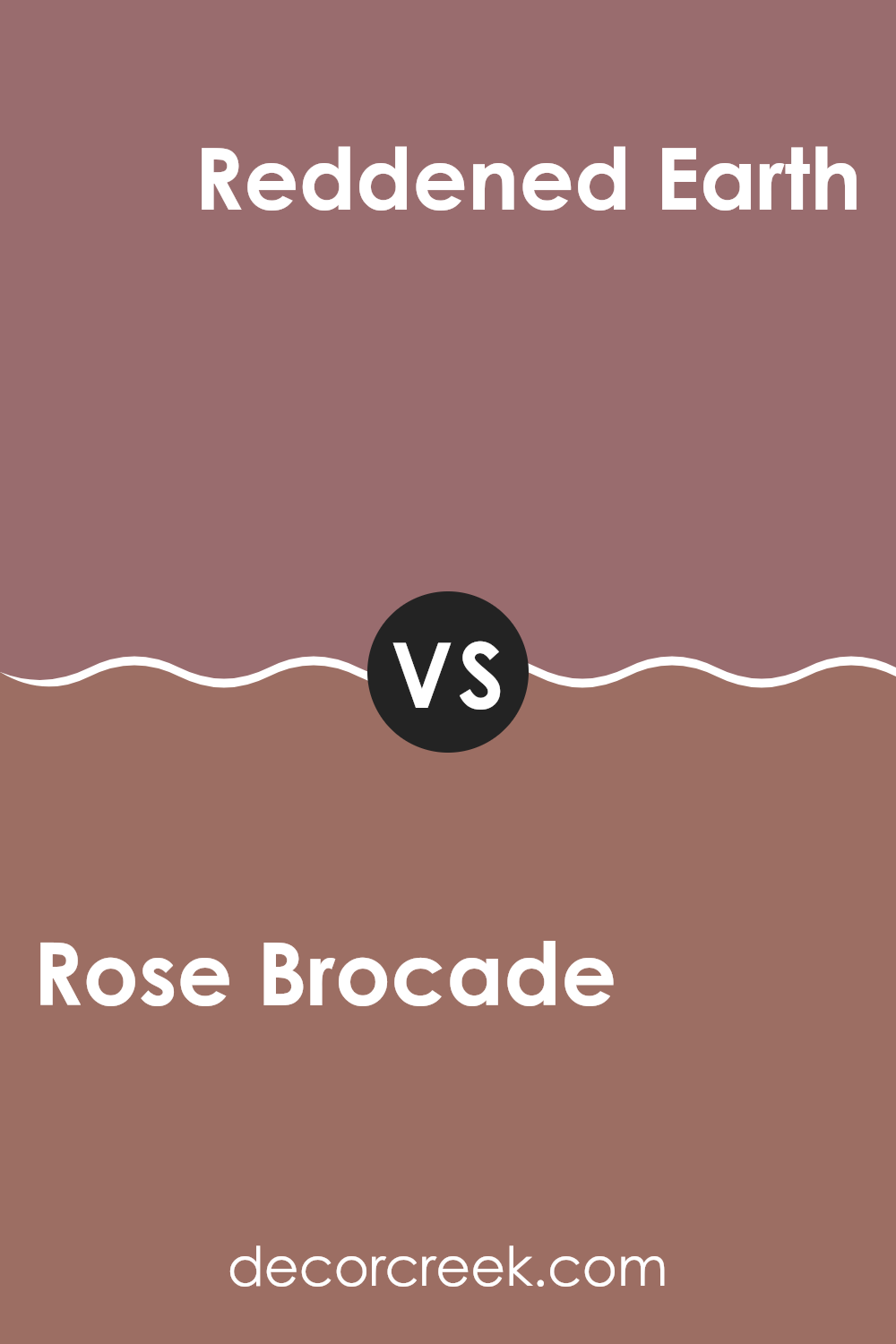
Rose Brocade SW 0004 by Sherwin Williams vs Reddened Earth SW 6053 by Sherwin Williams
The main color, Rose Brocade, and the second color, Reddened Earth, both offer warm and inviting tones from the Sherwin Williams collection. Rose Brocade is a softer, more subtle shade, tending towards a light and gentle pink with hints of warmth that makes it perfect for creating a cozy, welcoming atmosphere in spaces like living rooms or bedrooms.
On the other hand, Reddened Earth leans towards a richer, deeper terracotta color, evoking the feel of natural clay or a dusty sunset. This color is great for adding a bit of warmth and depth to a space, suitable for accents or even whole walls if you’re looking to make a stronger statement.
While both colors share a certain warmth, Rose Brocade provides a lighter, airier feel, making it ideal for those who prefer a more understated elegance. Reddened Earth offers a bold, earthy vibe that’s perfect for making a room feel more grounded and inviting.
You can see recommended paint color below:
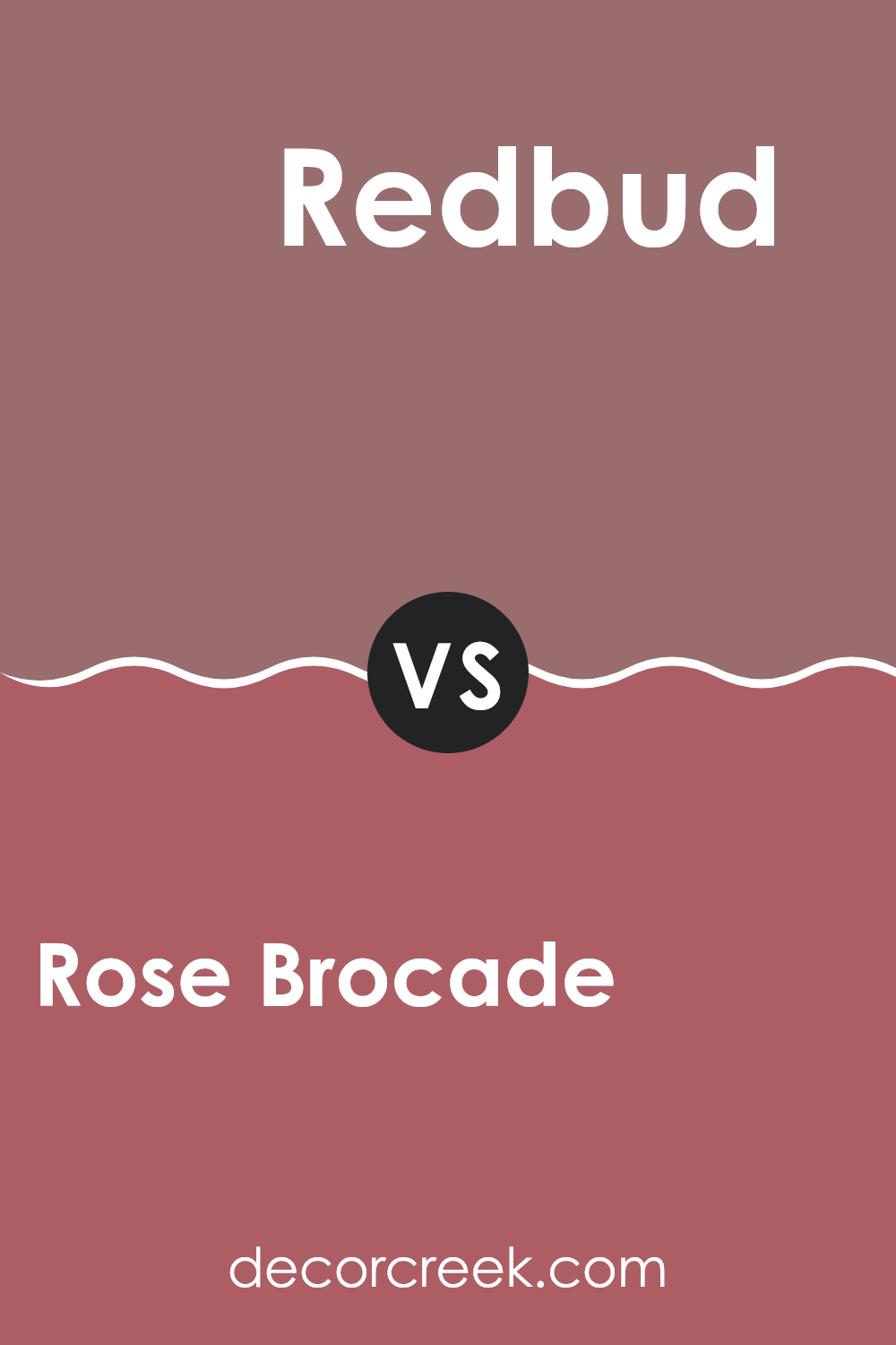
Rose Brocade SW 0004 by Sherwin Williams vs Redbud SW 6312 by Sherwin Williams
Rose Brocade and Redbud, both by Sherwin Williams, present distinct vibes for any room. Rose Brocade is a muted, dusty pink with a subtle hint of peach, giving it a soft, welcoming feel without being too bold. This color is great for creating a gentle and cozy atmosphere, making it perfect for living rooms or bedrooms where comfort is key.
On the other hand, Redbud is a vibrant, deeper shade of pink with a noticeable touch of purple. This color stands out more and brings a lively and energetic feel to a space. It’s an excellent choice for spaces that could use a pop of color, like a bathroom or an accent wall in a creative space.
Both colors offer unique aesthetics but serve different purposes based on the mood and energy you want to bring into your space. While Rose Brocade leans towards a subdued, calm feel, Redbud is bolder and more striking, ideal for more dynamic or youthful environments.
You can see recommended paint color below:
- SW 6312 Redbud
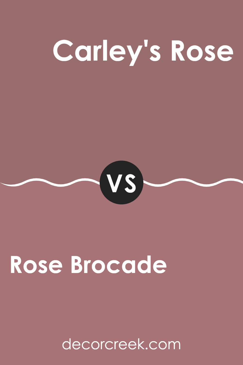
Rose Brocade SW 0004 by Sherwin Williams vs Carley’s Rose SW 9002 by Sherwin Williams
Rose Brocade and Carley’s Rose are two distinct shades from Sherwin Williams, each offering a unique ambiance. Rose Brocade leans more towards a deep, muted pink with a hint of a vintage feel, making it ideal for spaces aiming for a refined yet inviting atmosphere.
In contrast, Carley’s Rose presents a lighter, more subdued tone of pink, evoking a fresh and soft look perfect for creating a calming space. This difference in depth and mood allows each color to serve well in different settings: Rose Brocade suits areas like dining rooms or entryways where a touch of elegance is desired, while Carley’s Rose is well-suited for bedrooms or living rooms where a gentle and peaceful feel is preferable.
Both colors interact with light uniquely, with Rose Brocade absorbing more light, giving a cozier feel, whereas Carley’s Rose reflects light, enhancing the sense of space. So, choosing between them depends largely on the atmosphere one wishes to achieve in their space.
You can see recommended paint color below:
- SW 9002 Carley’s Rose
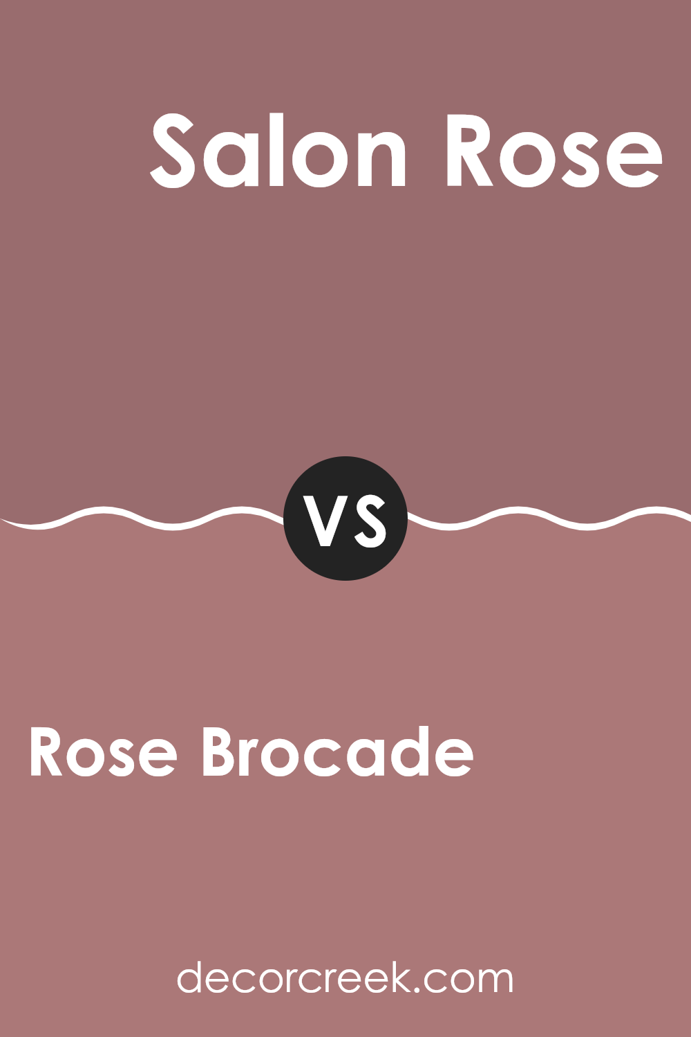
Rose Brocade SW 0004 by Sherwin Williams vs Salon Rose SW 0061 by Sherwin Williams
Rose Brocade and Salon Rose, both by Sherwin Williams, present distinct shades of pink with their own unique appeal. Rose Brocade is a deeper, almost vintage pink with a dusky touch, making it perfect for creating a cozy and welcoming atmosphere in spaces like living rooms or bedrooms. Its richer hue carries a classic vibe, suitable for those looking to add a bit of warmth to their décor.
On the other hand, Salon Rose is lighter and brighter, offering a more vibrant look. This color is ideal for spaces where you want to inject energy and cheer, such as a kitchen or a child’s room. The freshness of Salon Rose can help to make a small room feel more open and airy, and pairs well with other bright or neutral colors for a balanced look.
Overall, while both colors share a pink base, Rose Brocade leans towards a muted, refined warmth, whereas Salon Rose offers a lively and cheerful tone, making each suitable for different decorating goals and tastes.
You can see recommended paint color below:
- SW 0061 Salon Rose
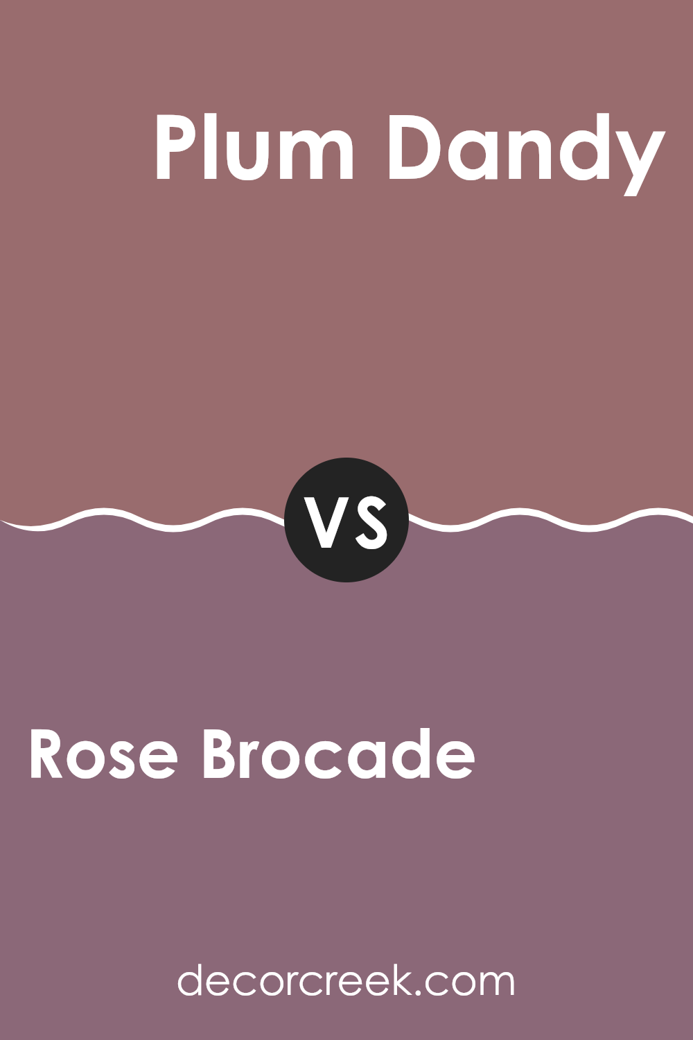
Rose Brocade SW 0004 by Sherwin Williams vs Plum Dandy SW 6284 by Sherwin Williams
Rose Brocade and Plum Dandy, both from Sherwin Williams, offer distinct hues for those looking to add a touch of color to their spaces. Rose Brocade is a soft, muted pink with a subtle warmth that makes it ideal for creating a cozy and inviting atmosphere. It’s light enough to be used extensively without overwhelming a room, lending itself well to living areas or bedrooms where a gentle, soothing presence is desired.
On the other hand, Plum Dandy brings a richer, deeper purple tone that carries a bit more boldness and drama. This color is perfect for accent walls or decorative touches where you want to make a stronger statement. Plum Dandy’s deeper hue can add depth and interest to a space, making it especially suitable for places where you want to draw the eye, like dining rooms or entryways.
Both colors offer unique vibes—Rose Brocade is gentle and calming, while Plum Dandy is more dynamic and striking. Depending on your room’s purpose and the mood you want to set, either could be a great choice.
You can see recommended paint color below:
- SW 6284 Plum Dandy
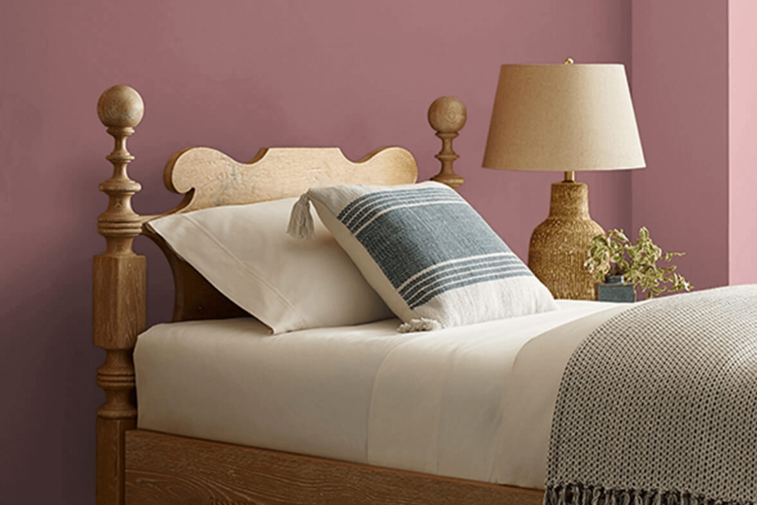
This pink shade isn’t too bright, but has just enough color to make walls look pretty and inviting.
The way it looks in different lights, from morning light to lamp light at night, shows that Rose Brocade has a lovely charm that adjusts well to every setting. It seems particularly good for places like bedrooms or living rooms where you want to feel cozy and relaxed.
I also learned that this color goes well with lots of other colors. Whether you pair it with dark greens or light beiges, it seems to work pretty well. This makes it easy to use when decorating because it’s simple to match with furniture and other room decorations.
Overall, if someone is thinking about painting a room and wants a color that is gentle and warm, SW 0004 Rose Brocade seems like a great pick. It’s easy to work with and keeps rooms looking nice and welcoming. I’m even thinking it could be perfect for a room refresh that doesn’t need too much effort but makes a big difference.
Ever wished paint sampling was as easy as sticking a sticker? Guess what? Now it is! Discover Samplize's unique Peel & Stick samples.
Get paint samples

