When it comes to selecting the perfect neutral paint color for your home, SW 7043 Worldly Gray by Sherwin Williams often comes highly recommended.
This particular shade is part of the vast selection available from Sherwin Williams, a brand known for its quality and ability to provide just the right hue for any decorating vision.
Worldly Gray stands out as a versatile option that can effortlessly fit into various spaces and design schemes.At first glance, Worldly Gray presents itself as a subtle, warm gray that strikes a fine balance between inviting and stylish.
What makes it unique is its ability to adapt to different lighting conditions, sometimes appearing more as a beige or taupe, and other times showcasing its gray tones more prominently.
This chameleon-like quality makes it an ideal choice for those looking to create a cozy yet sophisticated atmosphere in their home.
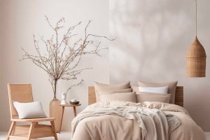
Whether you’re planning to give your living room a fresh coat of paint, revamp your kitchen, or update your bedroom’s look, Worldly Gray offers a timeless appeal that works well with different themes and accessories.
It pairs beautifully with both modern and traditional decor, making it a go-to color for interior designers and homeowners alike.
In this article, we’ll explore the characteristics of SW 7043 Worldly Gray and why it might just be the perfect paint color for your next home project.
What Color Is Worldly Gray SW 7043 by Sherwin Williams?
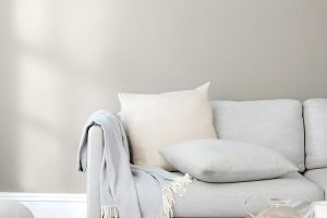
Worldly Gray is a warm, cozy shade that dances right on the edge between gray and beige. Its versatility makes it a favorite for those looking to create spaces that feel both modern and welcoming.
This neutral color has a gentle warmth to it, making rooms feel inviting and comfortable. Picture it as the backdrop of a room filled with soft, natural light, highlighting its subtle, earthy tones.
This color thrives in a variety of interior styles. Whether you’re decking out a rustic farmhouse kitchen or bringing a serene vibe to a minimalist living room, Worldly Gray has got you covered.
It’s especially effective in spaces that aim for a chic, yet understated elegance, like contemporary or Scandinavian designs.
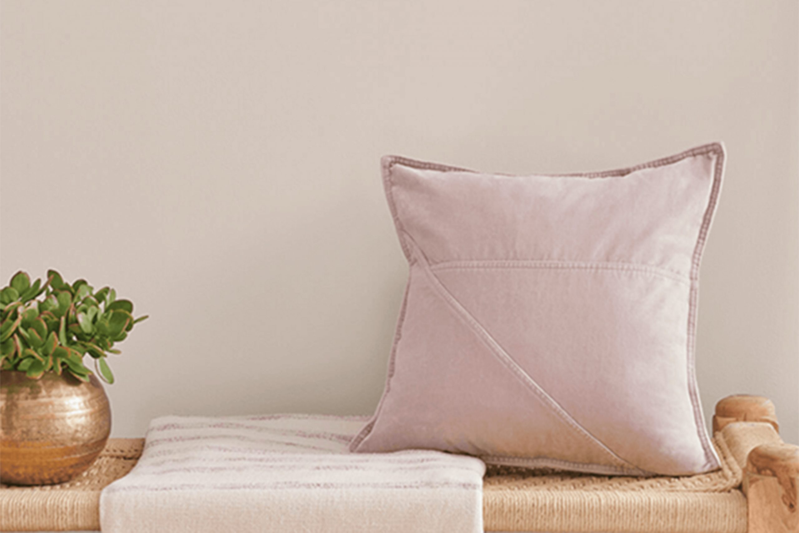
When it comes to pairing with materials and textures, Worldly Gray is a real team player. It looks stunning against the rugged beauty of natural wood, from pale oak to rich walnut, adding to the room’s warmth and texture.
Metals, like brushed nickel or aged brass, also match beautifully, offering a touch of sophistication.
For those seeking a softer approach, fabrics in white, ivory, or even soft pastels can complement this shade to create a layered, inviting space with depth and interest.

Ever wished paint sampling was as easy as sticking a sticker? Guess what? Now it is! Discover Samplize's unique Peel & Stick samples.
Get paint samples

Is Worldly Gray SW 7043 by Sherwin Williams Warm or Cool color?
Worldly Gray by Sherwin Williams is a unique and sophisticated shade of gray that has become increasingly popular in home interiors. This color has a warm undertone, making it incredibly versatile and welcoming.
It is perfect for those looking to create a cozy yet modern ambiance in their home.
One of the key benefits of Worldly Gray is its ability to work well in a variety of lighting conditions.
Whether a room gets a lot of natural sunlight or relies more on artificial lighting, this shade maintains its beauty without turning too dull or too bright.
This characteristic makes it an excellent choice for almost any room, from living areas and kitchens to bedrooms and bathrooms.
Moreover, Worldly Gray pairs beautifully with a wide range of other colors. It can act as a neutral backdrop for bold and vibrant hues or create a subtle contrast with other neutrals for a more layered and textured look.
Furniture and decor in wood, metal, or natural fibers also look fantastic against this shade, allowing homeowners to experiment with different styles and finishes.
In sum, Worldly Gray offers a perfect balance of warmth and elegance, making spaces feel inviting and stylish.
Its adaptability in different settings and ease in complementing various decor elements make it a go-to choice for those seeking a fresh yet timeless look in their homes.
Undertones of Worldly Gray SW 7043 by Sherwin Williams
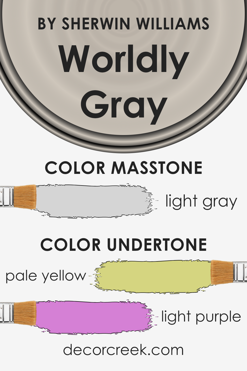
The color Worldly Gray by Sherwin Williams is a unique gray that has some interesting undertones, which are pale yellow and light purple. These undertones play a big role in how we perceive the color.
In general, undertones can subtly influence the overall appearance of a color, depending on the lighting and surrounding colors. They can make a hue feel warmer, cooler, or give it a certain depth and complexity that adds to its appeal.
In the case of Worldly Gray, the pale yellow undertone adds a hint of warmth to the color, making it feel more inviting and less stark than a pure gray.
This is especially helpful in creating a cozy atmosphere in a room, making it an excellent choice for living spaces where you spend a lot of time.
On the other hand, the light purple undertone introduces a touch of sophistication and can enhance the space with a subtle, unexpected depth.
This quality makes Worldly Gray versatile, allowing it to adapt to different styles and preferences.
When applied to interior walls, the impact of these undertones becomes even more significant. Natural and artificial light will interact with Worldly Gray in various ways throughout the day, highlighting its complex nature.
In bright sunlight, the pale yellow might become more pronounced, infusing the room with a soft glow. In artificial or dimmer light, the light purple might come forward, adding elegance and a sense of tranquility.
This interaction means that Worldly Gray can create dynamic spaces that feel alive and constantly evolving, providing a backdrop that complements a wide range of decors and furnishings.
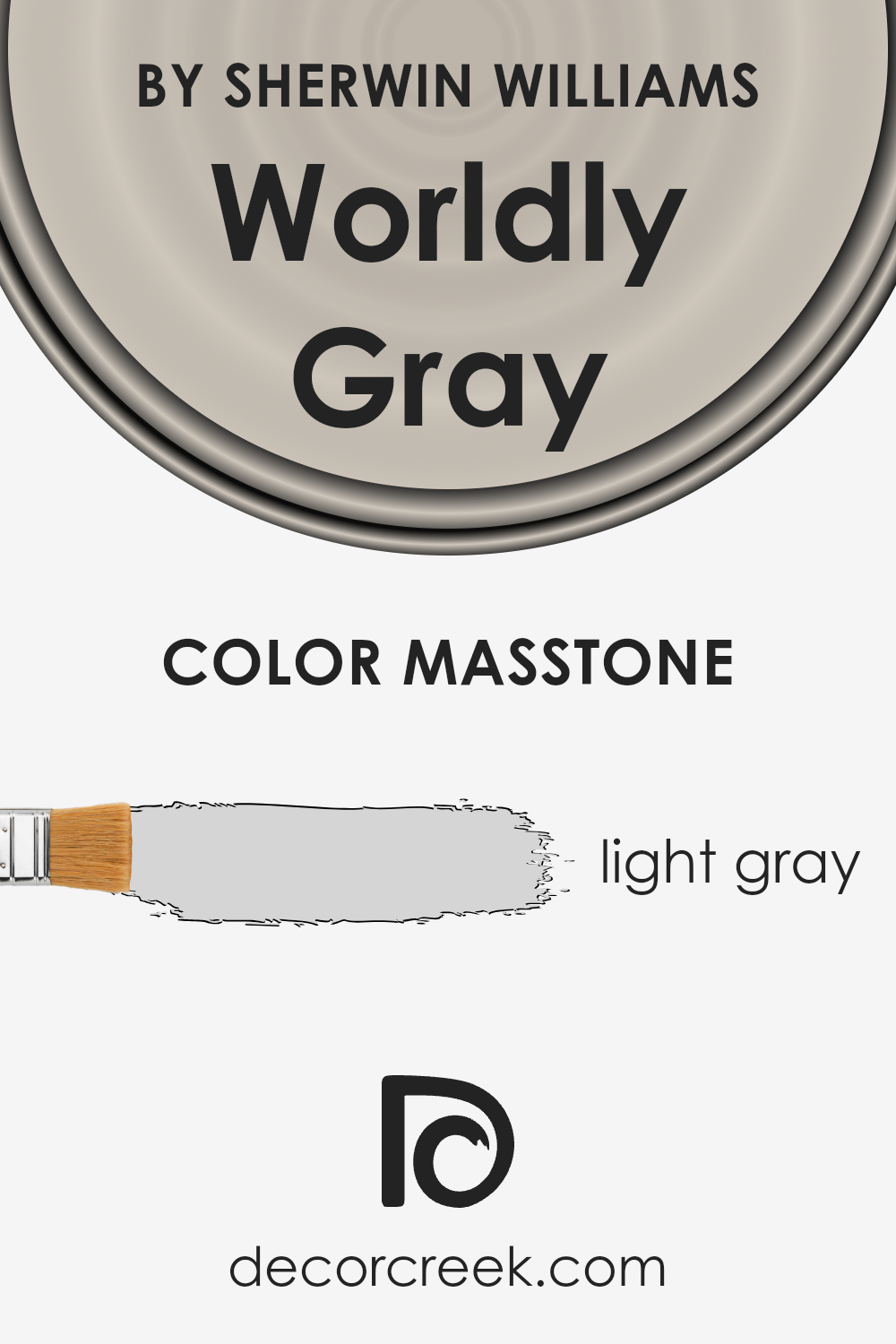
What is the Masstone of the Worldly Gray SW 7043 by Sherwin Williams?
Worldly Gray, identified by its light gray shade close to the color code #D5D5D5, is a versatile paint option by Sherwin Williams. This shade of gray acts as a neutral base, making it perfect for any room in the house.
Its lightness adds a bright and airy quality, opening up spaces to appear more welcoming and larger.
Because of its neutrality, it seamlessly pairs with a wide range of other colors, from soft pastels to bold hues, allowing for flexibility in decorating styles.
Whether used as a main wall color or accent, it provides a subtle backdrop that enhances the room’s features without overwhelming them.
This color is especially effective in areas with natural light, where it can change subtly, capturing the nuances of the changing daylight, thereby adding depth to the space without the need for darker or more saturated colors.
Its understated elegance makes it a smart choice for homeowners looking to create a timeless interior.
How Does Lighting Affect Worldly Gray SW 7043 by Sherwin Williams?
Lighting plays a pivotal role in how we perceive colors, significantly influencing their appearance and the ambiance of a room.
Different light sources can make colors look different, from daylight to artificial lighting. Let’s explore how lighting affects a particular color and how it behaves in various room orientations.
Consider the color Worldly Gray by a well-known paint brand. This versatile shade is a balanced neutral, with the ability to appear both warm and cool depending on the lighting conditions.
It’s precisely this chameleon-like quality that makes it interesting to analyze in different light settings.
In artificial light, such as that from LED bulbs or incandescent lamps, this gray can lean towards its warmer side, offering a cozy and inviting atmosphere to spaces.
The warmth or coolness of the artificial light used can accentuate different undertones in the paint, making it more complex and dynamic.
Natural light brings another layer of variation to this color. Its true character shines in the sunlight, but the direction of the light source – north, south, east, or west – vastly influences its perception.
North-faced rooms receive less direct sunlight, bathing spaces in cool, indirect light for most of the day.
Here, Worldly Gray might appear slightly cooler and more muted, maintaining a serene and steady backdrop that’s ideal for creating a peaceful retreat.
South-faced rooms are drenched in warm, direct sunlight for the majority of the day, making colors look brighter and more vivid.
In these rooms, Worldly Gray can reveal a warmer, more inviting hue, enhancing the room’s natural brightness and welcoming nature.
East-faced rooms enjoy the morning sun, which casts a bright, warm light. This means the color can appear softer and warmer in the morning, transitioning to a cooler tone as the day progresses and the sunlight moves away.
West-faced rooms catch the evening light, which can be intensely warm and dramatic.
This changing light can make the color transition from a neutral tone during the day to a warmer, cozy hue by dusk, perfectly adapting to the shifting ambiance.
In essence, the mutable nature of Worldly Gray under different lighting conditions makes it a versatile choice for any space, capable of transforming and adapting to its environment, showcasing the profound impact of lighting on color perception.

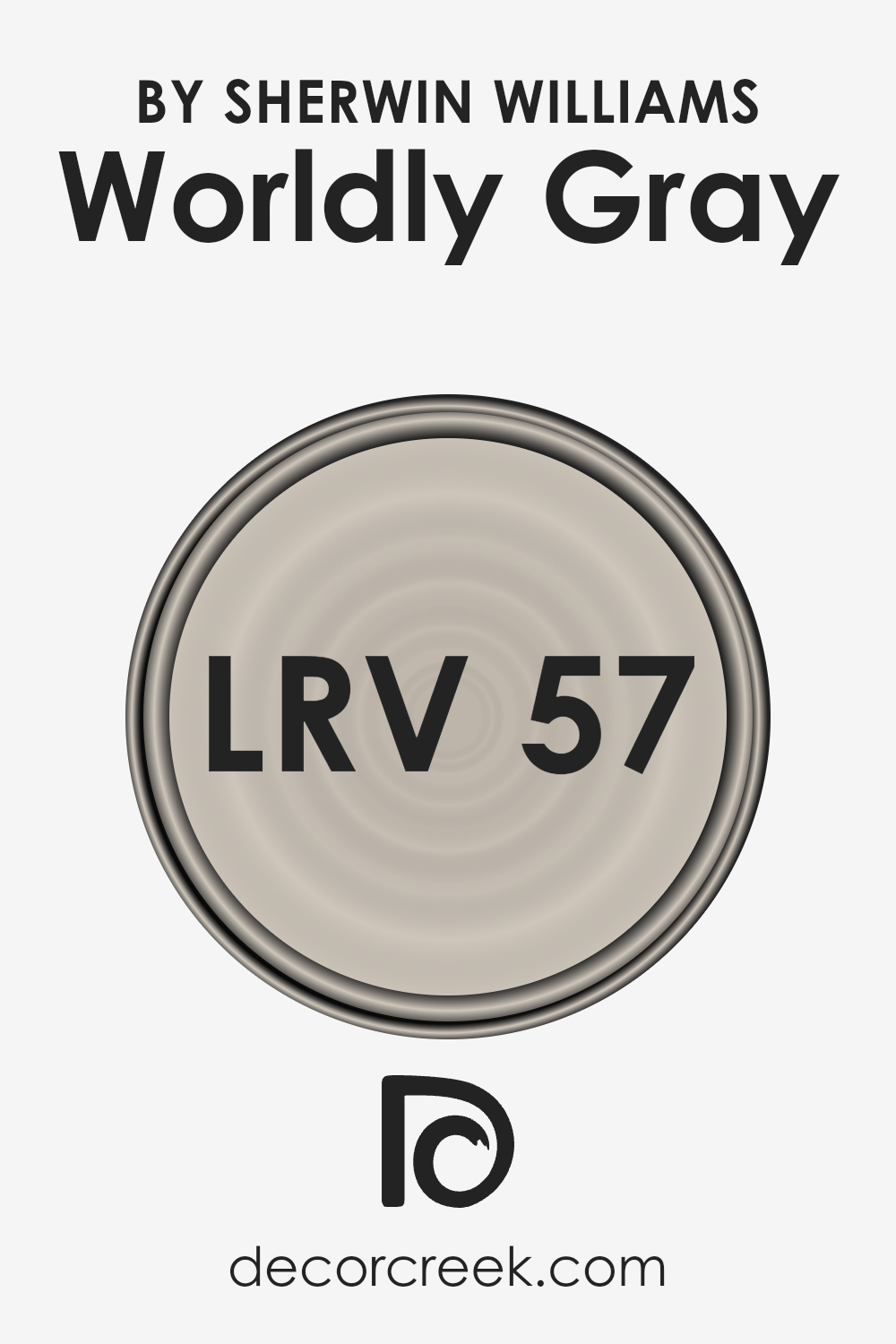
What is the LRV of Worldly Gray SW 7043 by Sherwin Williams?
LRV stands for Light Reflectance Value, which is a measure of the percentage of light a paint color reflects from or absorbs into a painted surface.
This value ranges from 0 to 100, with 0 being pure black (absorbing all light) and 100 being pure white (reflecting all light). The LRV helps you understand how light or dark a color will look in a space once it’s applied to the walls.
It’s especially useful when determining how a paint color can affect the overall feel of a room, whether making it brighter and more open or cozier and more intimate.
Lighter colors with higher LRVs reflect more light, enhancing natural light in a room, while darker colors with lower LRVs absorb light, which can make a room feel smaller or dimmer.
The LRV of Worldly Gray, set at 57.238, positions it in the lighter half of the scale but not at the very lightest end.
This means it can reflect a decent amount of light, contributing to a feeling of openness and space within a room, without being overwhelmingly bright.
In various lighting conditions, Worldly Gray will likely maintain its true color without skewing too dark or too light, making it a versatile choice for many spaces.
Its LRV allows it to adapt well to different settings and decorations, reflecting enough light to make a room feel welcoming while offering enough substance to anchor a space with a sense of warmth and sophistication.
LRV – what does it mean? Read This Before Finding Your Perfect Paint Color
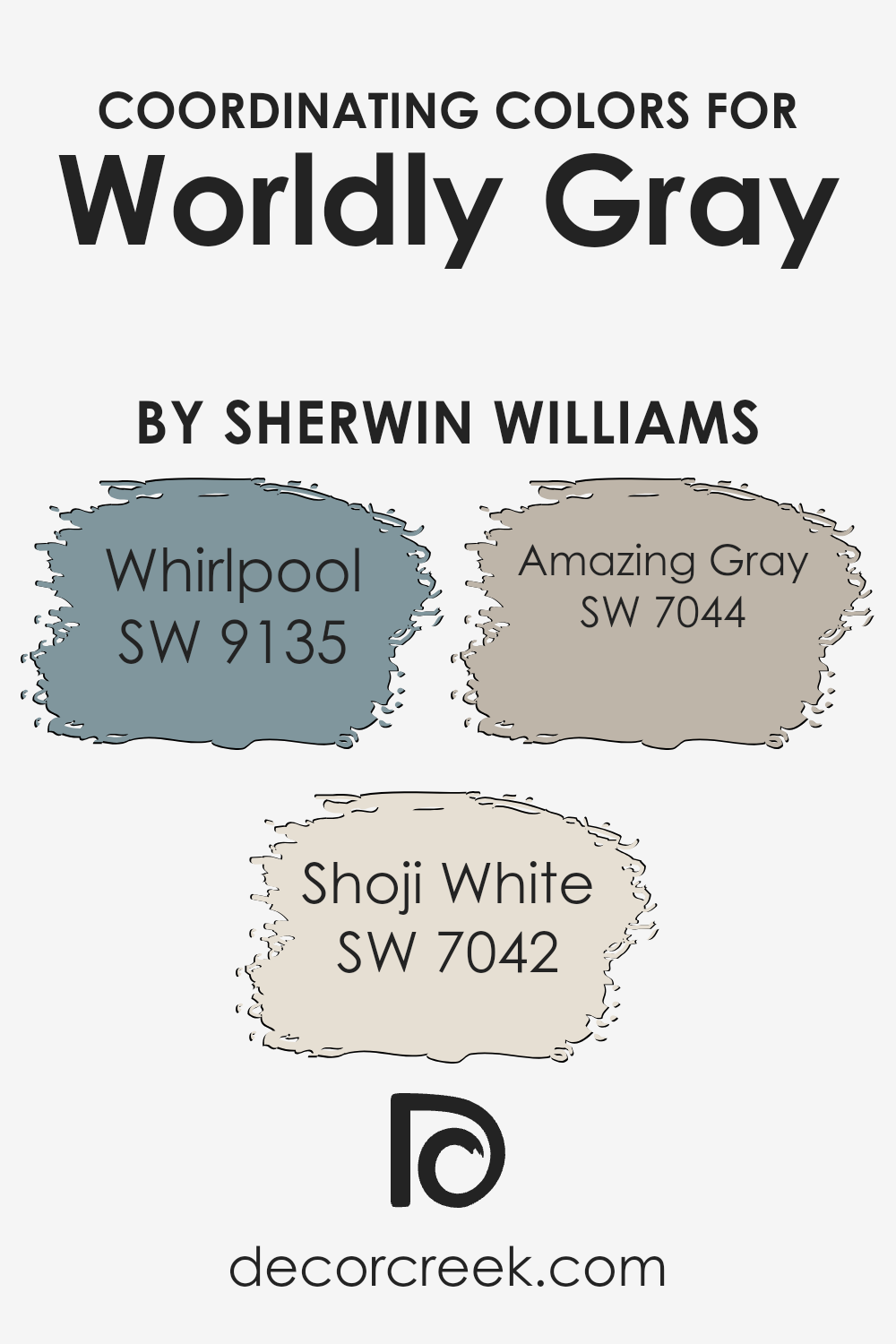
Coordinating Colors of Worldly Gray SW 7043 by Sherwin Williams
Coordinating colors are essentially hues that complement each other and are used together to enhance the overall aesthetic appeal of a space.
When it comes to the color Worldly Gray by Sherwin Williams, it has a unique set of coordinating colors that work seamlessly with it to create a balanced and harmonious look.
These colors complement Worldly Gray by either contrasting with it or by being in the same color family but a different shade, providing versatility in design options. They ensure that the space feels cohesive and well-thought-out.
The first coordinating color, Whirlpool, is a serene and slightly moody blue that adds a touch of sophistication and depth when paired with Worldly Gray.
It’s perfect for creating a focus wall or for using in accessories to add a subtle pop of color.
Shoji White, on the other hand, is a soft and warm white that brings a sense of calm and brightness to the space, making it feel more open and airy.
This color works wonderfully for trim or ceilings, offering a crisp contrast to Worldly Gray. Lastly, Amazing Gray is a deeper gray that shares a similar undertone with Worldly Gray but is bold enough to stand on its own.
It’s ideal for adding dimension and interest to a room, without overwhelming the space. Together, these coordinating colors offer endless possibilities to create a space that feels cohesive and beautifully layered.
You can see recommended paint colors below:
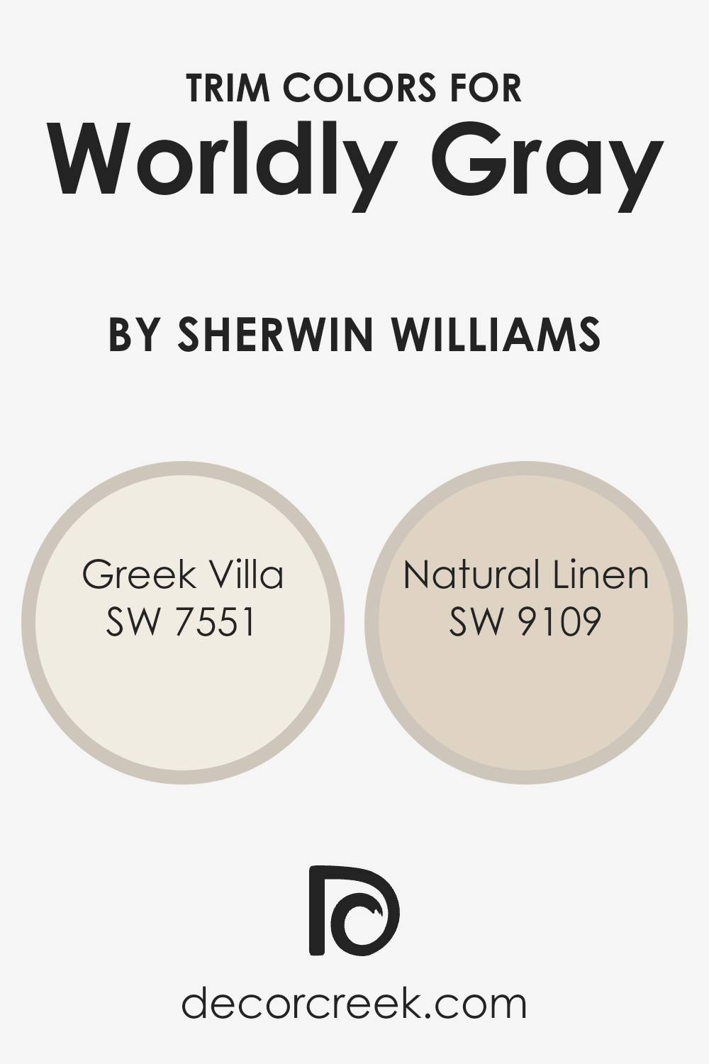
What are the Trim colors of Worldly Gray SW 7043 by Sherwin Williams?
Trim colors play a crucial role in complementing the main hue of a room, enhancing both the architectural features and the overall aesthetic.
When considering Worldly Gray by Sherwin Williams, a balanced, warm gray with earthy undertones, selecting the right trim color can highlight its versatility and elevate the space.
Trim colors frame the edges, corners, and transitions of walls, doors, and windows, acting like the outline in a picture that defines shapes and brings focus.
In this context, the choice of trim color can either subtly blend with the main wall color or strikingly contrast it to create a more defined and visually appealing space.
Greek Villa (SW 7551) and Natural Linen (SW 9109) are two shades that harmonize well with Worldly Gray.
Greek Villa is a soft, warm white with a creamy undertone that provides a gentle, soothing contrast to Worldly Gray, giving a refreshed and airy feel to the environment.
It’s perfect for a trim color as it brings lightness to the room without overpowering the main color, offering a seamless transition between wall and trim. On the other hand, Natural Linen offers a more pronounced, yet harmonious contrast.
This shade is a light, taupey beige, imparting an earthy, natural warmth that complements the grounded essence of Worldly Gray.
By applying Natural Linen as a trim color, you can add depth and dimension, enriching the overall color scheme with its subtle complexity.
You can see recommended paint colors below:
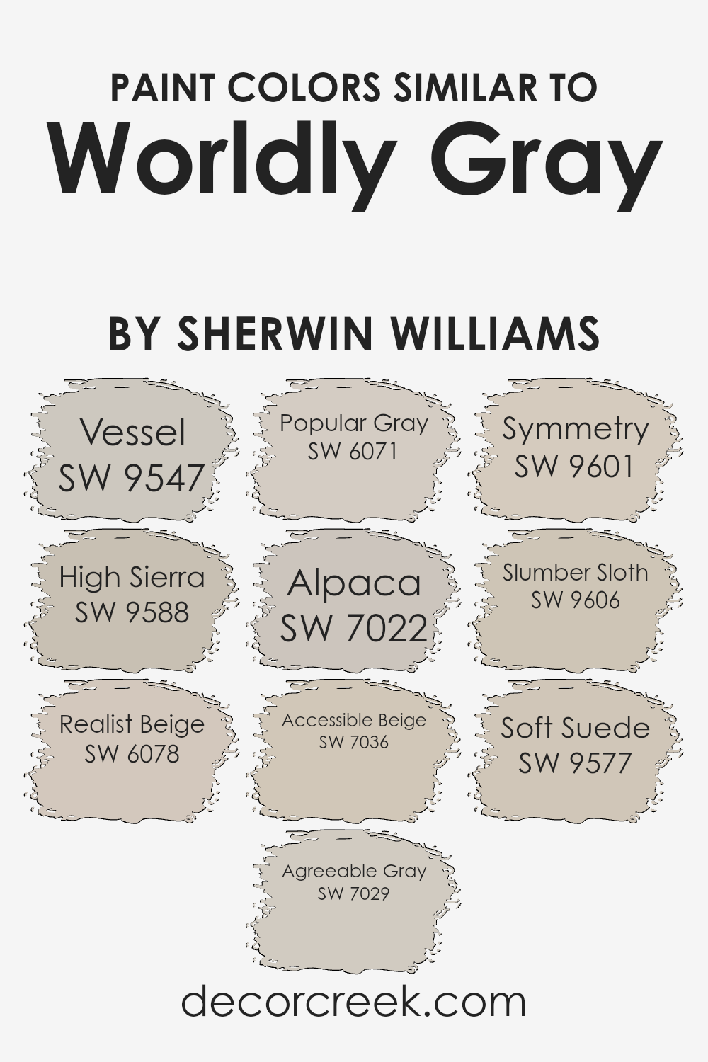
Colors Similar to Worldly Gray SW 7043 by Sherwin Williams
Selecting similar colors for your design project or home decoration is essential for creating a cohesive and aesthetically pleasing environment.
Colors that complement each other, such as those similar to Sherwin Williams’ Worldly Gray, can seamlessly tie a space together, making it feel balanced and harmonious.
Using shades like Vessel and High Sierra adds a touch of earthiness and depth, perfect for spaces aiming for a grounded atmosphere.
Realist Beige and Agreeable Gray are fantastic for those seeking a neutral palette that still offers warmth, making rooms feel welcoming yet sophisticated.
Popular Gray and Alpaca lend a soft, elegant vibe to any area, effortlessly sophisticated but without overwhelming the senses. Meanwhile, Accessible Beige brings a touch of calm and relaxation, suitable for spaces meant for unwinding.
If you’re aiming for a balanced symmetry, Symmetry itself is an ideal choice, offering a sense of order and peace.
Slumber Sloth and Soft Suede, on the other hand, provide a cozy and comfortable feeling, reminding one of quiet, serene moments.
These colors work together by offering a range of options that share a common hue base, allowing for fluid transitions between spaces and elements within a design, ensuring everything works together harmoniously.
You can see recommended paint colors below:
- SW 9547 Vessel
- SW 9588 High Sierra
- SW 6078 Realist Beige
- SW 7029 Agreeable Gray
- SW 6071 Popular Gray
- SW 7022 Alpaca
- SW 7036 Accessible Beige
- SW 9601 Symmetry
- SW 9606 Slumber Sloth
- SW 9577 Soft Suede
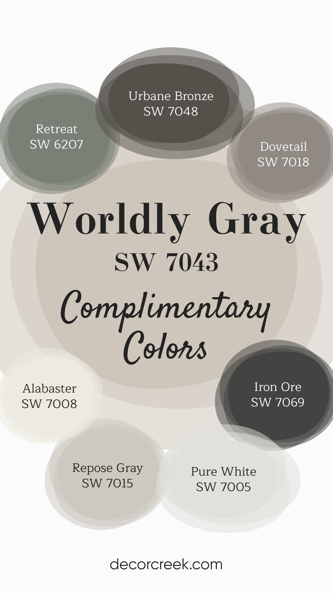
Complimentary Colors for Worldly Gray SW 7043 Paint Color by Sherwin Williams
Worldly Gray serves as a perfect neutral base, offering a soft and versatile tone that complements both light and dark accents. Pair it with and Pure White for a bright, fresh look that works well in living rooms, bedrooms, or kitchens.
Repose Gray and Dovetail add subtle warmth and depth, making these grays perfect for creating a calming, sophisticated space. To add richness and contrast, Urbane Bronze and Iron Ore provide bold, grounding tones that can be used on doors, cabinets, or accent walls.
Retreat offers a soft green hue that brings a touch of nature indoors, rounding out the palette with a calming, earthy feel. This combination creates a balanced, cohesive design for any home.
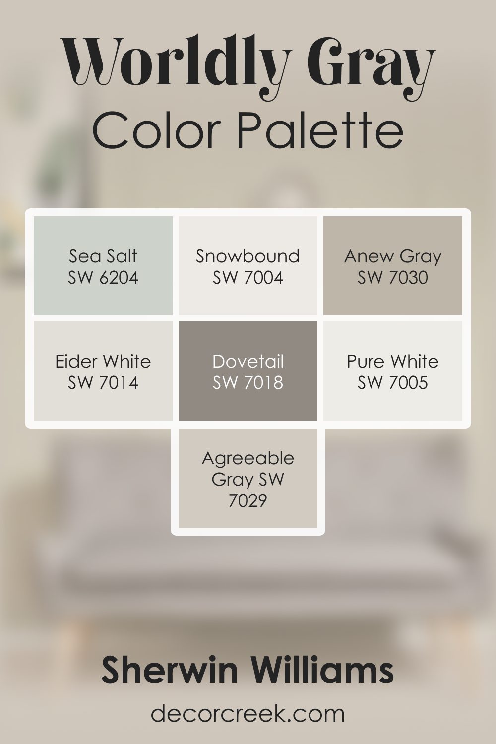
Worldly Gray SW 7043 by Sherwin Williams Color Palette
Worldly Gray always feels steady and peaceful when I use it. There’s a quiet softness in this color that makes a room feel relaxed and welcoming. I love pairing it with Pure White and Snowbound to bring in clean brightness without taking away its warmth. Agreeable Gray and Anew Gray blend into it beautifully, adding layers that feel smooth and natural.
Dovetail gives the palette a grounded touch that I use when I want a little more depth. Eider White adds a gentle lift, and Sea Salt brings a subtle fresh note that softens everything around it.
This palette feels harmonious and calm, with Worldly Gray sitting at the center as a warm, balanced foundation. It creates a look that feels thoughtful, soothing, and easy to enjoy every day.
How to Use Worldly Gray SW 7043 by Sherwin Williams In Your Home?
Worldly Gray by Sherwin Williams is a versatile and beautiful shade of gray that can make any room in your home look amazing. It’s a soft, warm gray with hints of beige, making it perfect for creating a cozy and inviting space.
Since it’s so neutral, it matches well with almost any color, allowing you to add your personal touch with decorations and furniture.
You can use Worldly Gray in your living room to create a calm and relaxing vibe. It’s also great for bedrooms, giving a serene backdrop that can help you unwind and sleep better.
In the kitchen or dining area, it can add a touch of elegance without overpowering the space.
If you have a small room, painting it Worldly Gray can help make it appear larger and brighter. And, for a modern look, you can pair it with bright whites or dark blacks in trim or accent pieces.
Whether you want a sleek and modern feel or a cozy, rustic look, Worldly Gray can help you achieve it.
Worldly Gray SW 7043 by Sherwin Williams vs Slumber Sloth SW 9606 by Sherwin Williams
Worldly Gray and Slumber Sloth, both by Sherwin Williams, are unique shades that bring their own vibe to a space. Worldly Gray is a warm, soft gray that comfortably fits in almost any room, making spaces feel cozy yet spacious.
It’s like the perfect middle ground – not too dark, not too light, just right for anyone looking to add a touch of sophistication without overwhelming the room.
On the other hand, Slumber Sloth introduces a richer, deeper tone. It’s closer to a dark gray or soft black, adding a more pronounced but still soothing warmth to areas.
This color is fantastic for creating a focal point or adding depth in a way that’s subtle but noticeable.
When comparing them, Worldly Gray brings a light, airy feeling, making it ideal for smaller rooms or spaces with limited natural light.
Slumber Sloth is your go-to for making bold statements, perfect for accent walls or rooms where you want to create a cozy, enveloping atmosphere.
Both colors offer a beautiful backdrop, but the choice between them depends on the mood you’re aiming to achieve in your space.
You can see recommended paint color below:
- SW 9606 Slumber Sloth

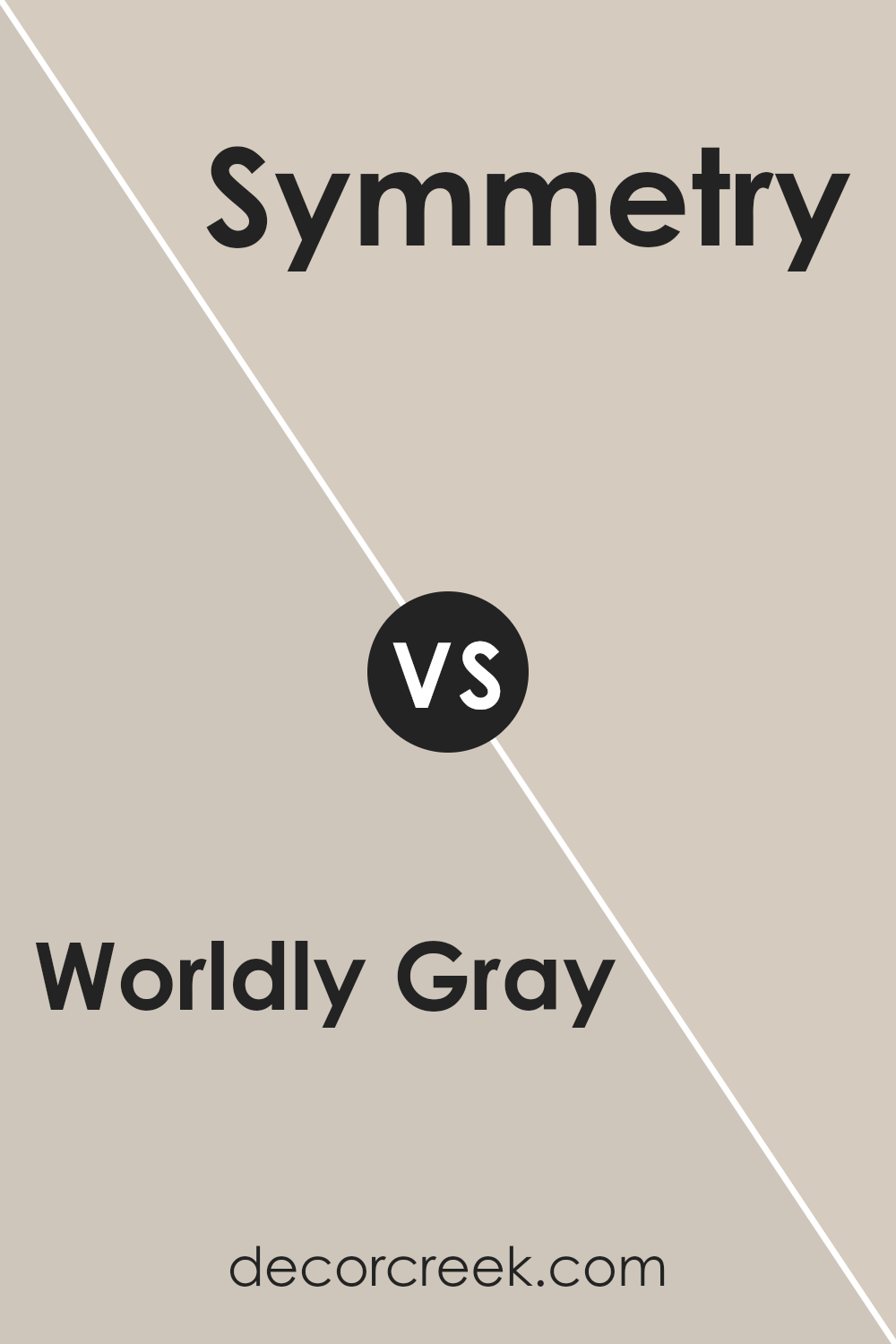
Worldly Gray SW 7043 by Sherwin Williams vs Symmetry SW 9601 by Sherwin Williams
Worldly Gray and Symmetry, both by Sherwin Williams, offer unique takes on neutral tones for walls. Worldly Gray is a warm, cozy gray with slight earthy undertones.
It’s a versatile color that can make any space feel welcoming and grounded, perfect for creating a soft, tranquil backdrop in a room. On the other hand, Symmetry offers a cleaner, more balanced feel, leaning towards a pure, subtle gray with a hint of warmth.
This makes it an excellent choice for spaces seeking a modern, minimalistic look but still want to avoid feeling too cold or stark. While both colors share a gray base, Worldly Gray adds a touch of warmth and depth, creating a more inviting atmosphere.
In contrast, Symmetry keeps things light and airy, offering a crisp, clean canvas for any room.
You can see recommended paint color below:
- SW 9601 Symmetry
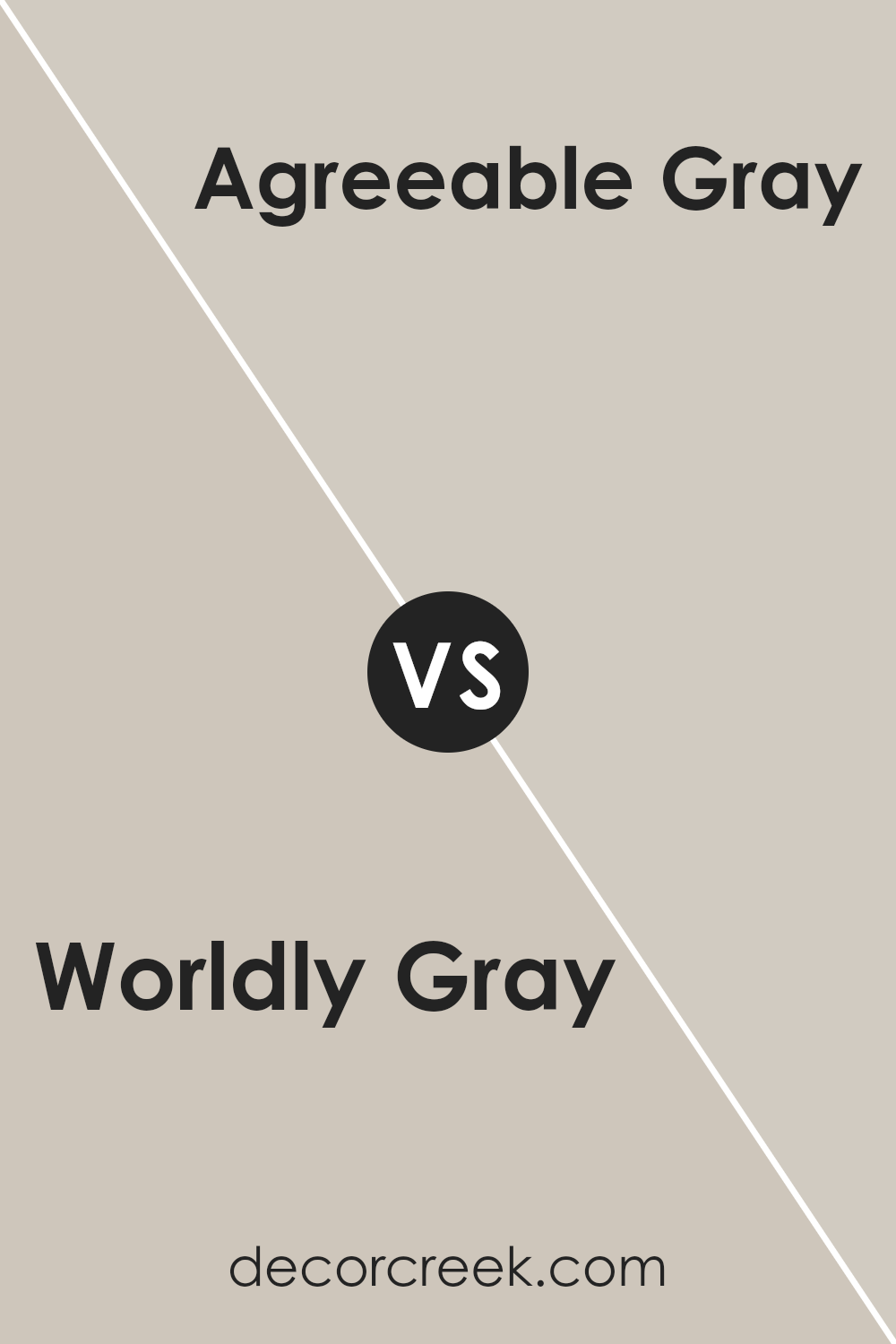
Worldly Gray SW 7043 by Sherwin Williams vs Agreeable Gray SW 7029 by Sherwin Williams
Worldly Gray and Agreeable Gray, both by Sherwin Williams, are popular choices for those seeking neutral paint colors. Worldly Gray is a bit deeper and has a taupe-like undertone, giving it a warmer, cozier feel.
This makes it an excellent choice for spaces where you want to add a bit of sophistication without making the room feel too dark.
On the other hand, Agreeable Gray is lighter and has a more balanced, almost chameleon-like quality, allowing it to adapt well in various lighting conditions.
It strikes a nice balance between warm and cool tones, making it incredibly versatile for any room.
While both colors provide a solid foundation for a wide range of decor styles, Worldly Gray leans more towards a grounded, earthy vibe, whereas Agreeable Gray offers a lighter, airier ambiance.
Ultimately, your choice between them might boil down to the specific mood you’re aiming to create in your space.
You can see recommended paint color below:
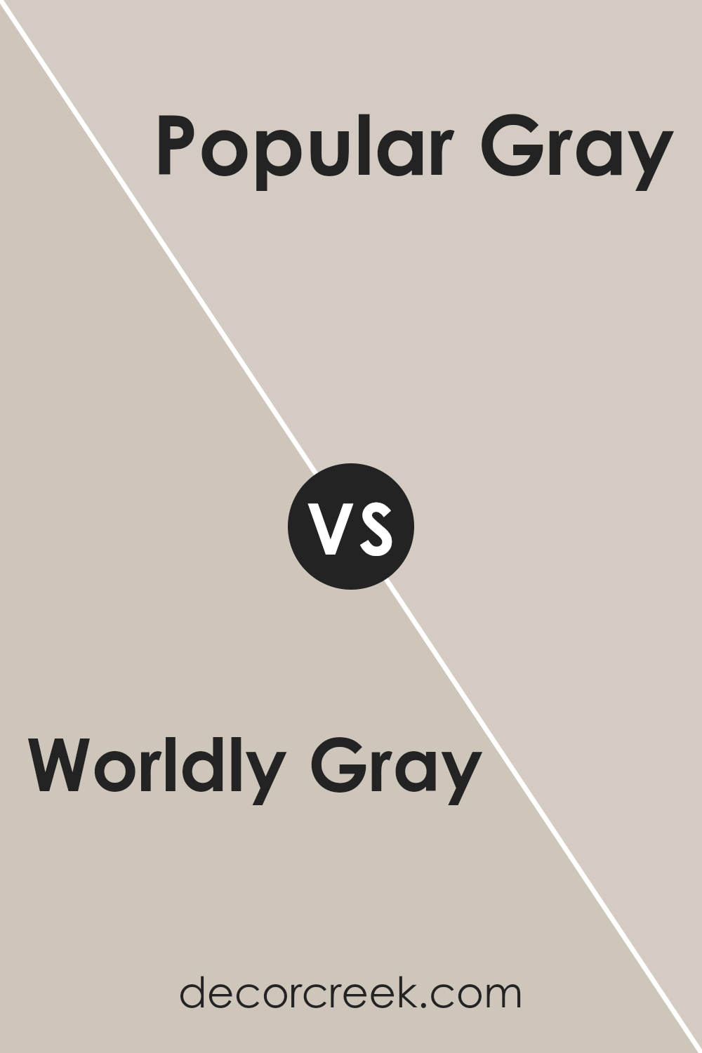
Worldly Gray SW 7043 by Sherwin Williams vs Popular Gray SW 6071 by Sherwin Williams
Worldly Gray SW 7043 and Popular Gray SW 6071, both from Sherwin Williams, are pretty close neighbors on the color spectrum, yet they have their unique appeal.
Worldly Gray is like a soft, gentle hug in a color form. It’s a warm, welcoming shade that leans towards the greige side – a perfect blend of gray with a touch of beige.
This mix makes it highly versatile, fitting easily into most decors without overpowering the space. On the other hand, Popular Gray has a slightly lighter and warmer tone.
It offers a more straightforward approach to gray, injecting a cozy, inviting vibe into rooms. It’s the kind of color that can brighten up spaces while still keeping things grounded and elegant.
While both shades share a gray base, Worldly Gray’s hint of beige gives it a richer, more layered look, whereas Popular Gray offers a cleaner, more straightforward gray experience, making both ideal for creating serene and sophisticated spaces.
You can see recommended paint color below:
- SW 6071 Popular Gray
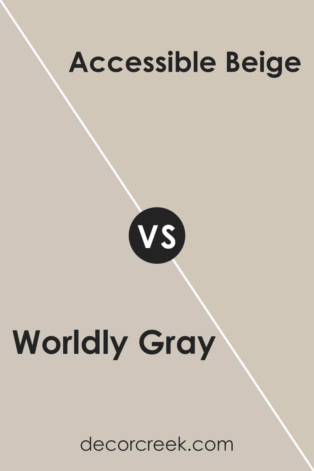
Worldly Gray SW 7043 by Sherwin Williams vs Accessible Beige SW 7036 by Sherwin Williams
Worldly Gray and Accessible Beige, both by Sherwin Williams, have their unique appeal. Worldly Gray lives in the gray family, offering a soft, warm, and cozy vibe.
It leans towards a true gray but carries a touch of warmth to avoid feeling too cold, making it versatile for various spaces and lighting conditions.
On the other hand, Accessible Beige is a welcoming neutral with a beige base. It’s a bit warmer than Worldly Gray, pulling more towards a creamy, inviting tone.
This color works wonderfully in rooms that need a touch of warmth without overpowering with bold colors. While Worldly Gray gives off a more modern and minimalistic feel, Accessible Beige brings in a classic and homey atmosphere.
Choosing between the two depends on the mood you’re aiming for; Worldly Gray for a sleek, contemporary look and Accessible Beige for a comfortable, traditional feel. Both colors play well with natural light, shifting subtly throughout the day.
You can see recommended paint color below:
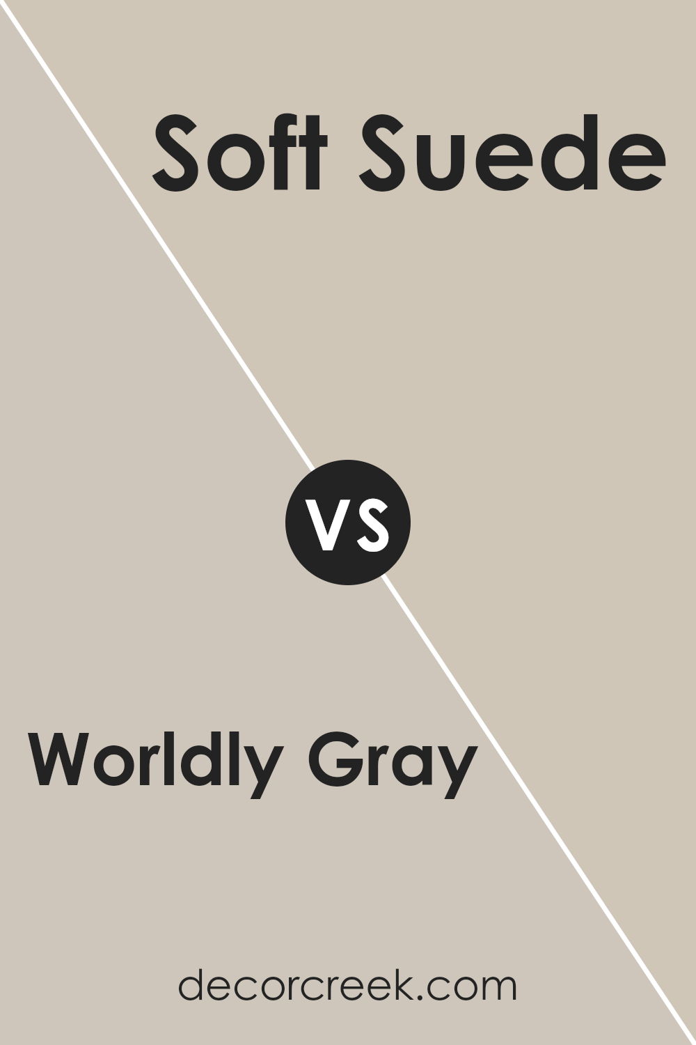
Worldly Gray SW 7043 by Sherwin Williams vs Soft Suede SW 9577 by Sherwin Williams
Worldly Gray and Soft Suede, both from Sherwin Williams, offer distinct tones that cater to various tastes and design needs. Worldly Gray is like a gentle hug from a cloudy sky, offering a neutral, warm gray with a comforting presence.
It’s versatile, fitting effortlessly into any space wanting a touch of softness without overwhelming the senses.
On the other hand, Soft Suede is richer and warmer, reminiscent of the cozy feeling you get from touching soft leather. This color brings a certain depth and warmth to rooms, making spaces feel more inviting and snug.
It’s perfect for areas where you want to add a bit of coziness and sophistication.
Both colors work well in a range of lighting conditions, showcasing their adaptability. While Worldly Gray maintains a calm and subtle atmosphere, Soft Suede adds energy and warmth, making each room feel like a welcoming retreat.
Choosing between them depends on the ambiance you’re aiming for: serene and subtle with Worldly Gray or warm and inviting with Soft Suede.
You can see recommended paint color below:
- SW 9577 Soft Suede
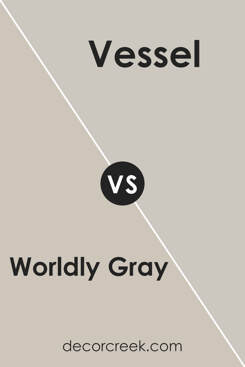
Worldly Gray SW 7043 by Sherwin Williams vs Vessel SW 9547 by Sherwin Williams
Worldly Gray and Vessel by Sherwin Williams are two distinct colors that offer unique vibes to any space. Worldly Gray is a soft, warm gray with a comforting feel.
It’s like the color of a cloudy day but with a hint of warmth, making it versatile for various rooms. On the other hand, Vessel is a deeper, more earthy gray-brown.
It brings to mind the color of wet clay, adding a robust and grounding effect wherever it’s used.
The main difference between these two colors comes down to their warmth and depth. Worldly Gray is lighter and cozier, making spaces feel open and soothing.
Vessel is darker and has a strong presence, creating a sense of stability and depth.
While Worldly Gray works well in spaces where you want a neutral backdrop with a warm touch, Vessel is ideal for areas where a bolder, more dramatic statement is desired.
Both colors offer a beautiful canvas for decorating, but the choice between them depends on the atmosphere you’re aiming to create.
You can see recommended paint color below:
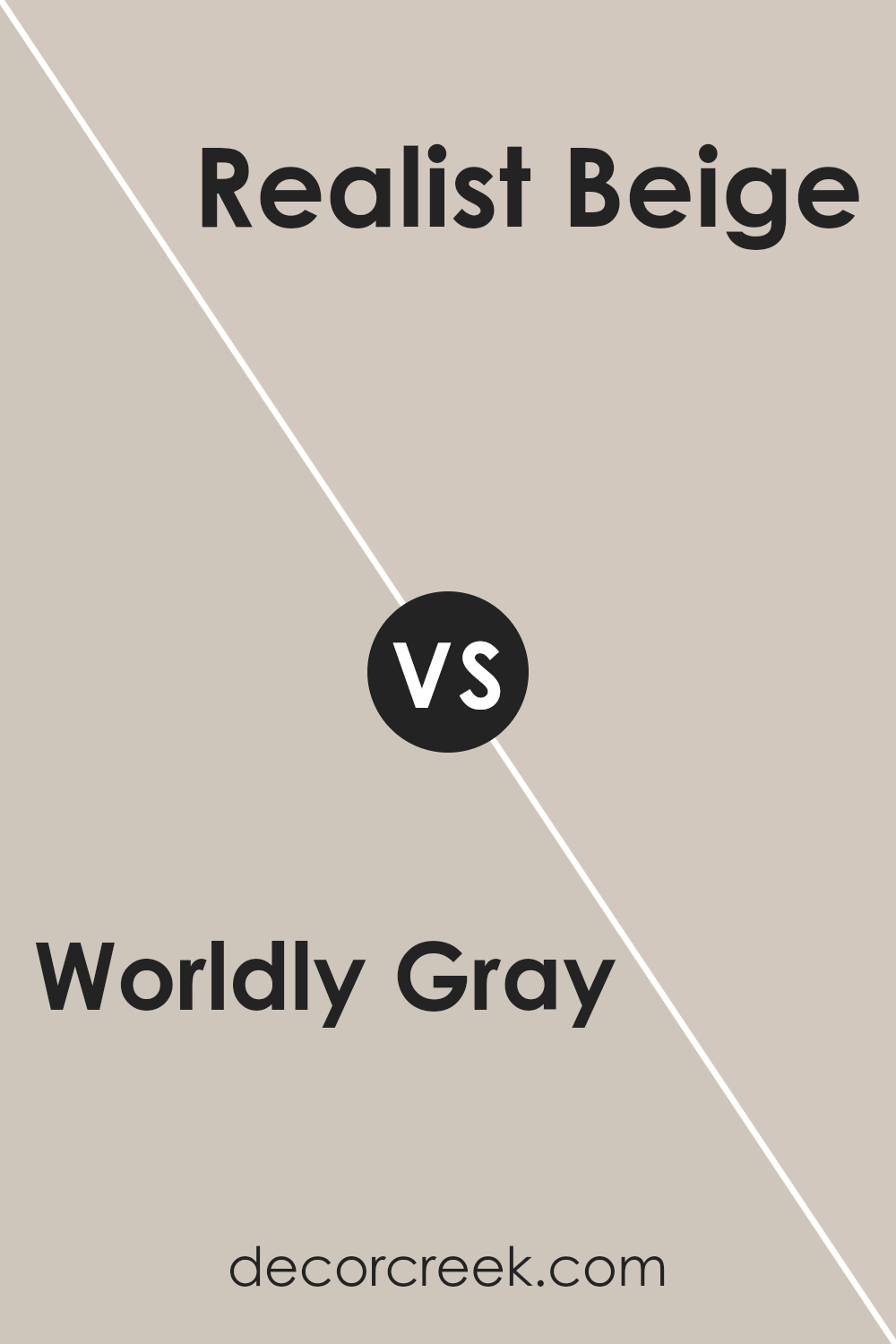
Worldly Gray SW 7043 by Sherwin Williams vs Realist Beige SW 6078 by Sherwin Williams
Worldly Gray and Realist Beige are both popular colors from Sherwin Williams, but they have their unique characteristics. Worldly Gray is a soft, warm gray with just a hint of beige, making it versatile for various spaces.
It’s a neutral color that adds a subtle depth to rooms, blending well with both cool and warm undertones. This means it can work nicely in a variety of lighting conditions, from natural daylight to artificial light sources.
On the other hand, Realist Beige is a true beige, leaning more towards a classic, warm palette. It is cozy and inviting, perfect for creating a comfortable and soothing environment.
Unlike Worldly Gray’s subtle gray undertones, Realist Beige offers a more traditional beige look, making it ideal for those who prefer a timeless and warm neutral.
Both colors are great for creating a neutral backdrop, but your choice between them might come down to the specific mood or atmosphere you’re aiming to create.
Worldly Gray is more modern with its grayish vibe, while Realist Beige brings a classic warmth to any space.
You can see recommended paint color below:
- SW 6078 Realist Beige
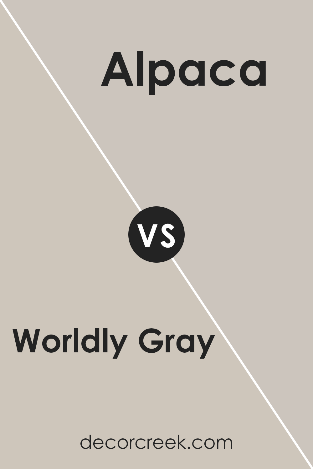
Worldly Gray SW 7043 by Sherwin Williams vs Alpaca SW 7022 by Sherwin Williams
Worldly Gray and Alpaca by Sherwin Williams are two popular neutral shades, but they have their unique vibes.
Worldly Gray stands out as a warm gray with a slight green undertone, making it versatile for spaces where you want a cozy yet sophisticated feel. It’s a color that feels grounded and can blend well in various settings, from modern to traditional.
On the other hand, Alpaca is a bit softer and leans towards a taupe, mixing gray with warmer brown undertones.
This color brings a gentle warmth to rooms, creating a soothing and inviting atmosphere. It’s great for spaces where you want comfort and calm.
While both colors share a neutral palette, making them easy to incorporate into your decor, Worldly Gray offers a slightly more refined, cooler presence.
Alpaca, with its touch of warmth, is perfect for creating a snug, welcoming environment. Choosing between them depends on whether you prefer the subtle coolness of Worldly Gray or the warmer, cozier feel of Alpaca.
You can see recommended paint color below:
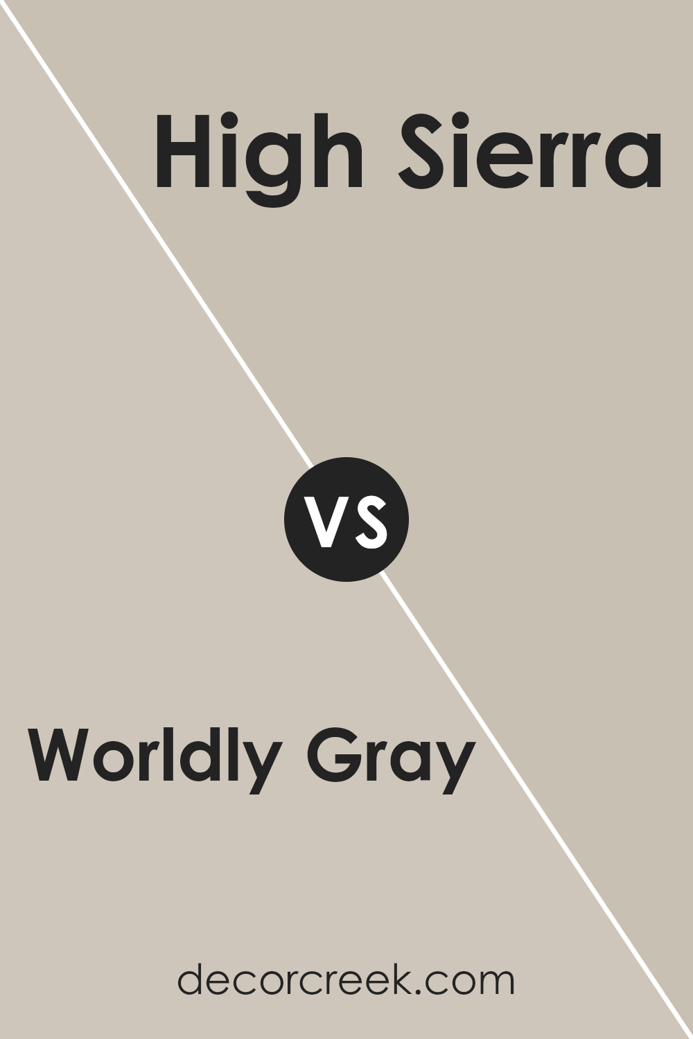
Worldly Gray SW 7043 by Sherwin Williams vs High Sierra SW 9588 by Sherwin Williams
Worldly Gray and High Sierra are two unique shades from Sherwin Williams, each with its own character. Worldly Gray is a soothing, neutral color that brings a calm and refined atmosphere to any space.
It’s like a soft blanket, offering comfort and a sense of stability in a room. This color pairs well with a wide range of décor, making it a versatile choice for any home.
On the other hand, High Sierra stands out with a stronger personality. It’s a deeper, more pronounced color that adds a bold statement to walls.
High Sierra can make a space feel more anchored and defined, delivering a sense of grandeur and richness that Worldly Gray tends to approach in a more subtle way.
When comparing the two, Worldly Gray offers a lighter, more understated elegance, while High Sierra brings a dramatic flair.
Whether you’re looking for the gentle embrace of a serene, neutral background or aiming to make a striking impact with a more vivid shade, both colors present appealing choices but cater to different aesthetic preferences and room functionalities.
You can see recommended paint color below:
- SW 9588 High Sierra
Conclusion
Worldly Gray by Sherwin Williams stands out as a versatile color option, perfect for creating a cozy and inviting atmosphere in any room.
This particular shade of gray balances warmth and neutrality, making it easy to pair with various decor styles and color schemes. Its subtle elegance allows it to serve as either a main color for walls or as an accent, fitting seamlessly into modern and traditional spaces alike.
Homeowners and designers alike appreciate Worldly Gray for its adaptability and the sophisticated backdrop it provides.
Whether used in living areas, bedrooms, or even in office spaces, this color helps to create a calm and serene environment.
Its popularity is a testament to its ability to enhance the aesthetic appeal of a space without overwhelming it, proving it to be a smart choice for those looking to refresh their interiors with a touch of understated elegance.
Ever wished paint sampling was as easy as sticking a sticker? Guess what? Now it is! Discover Samplize's unique Peel & Stick samples.
Get paint samples