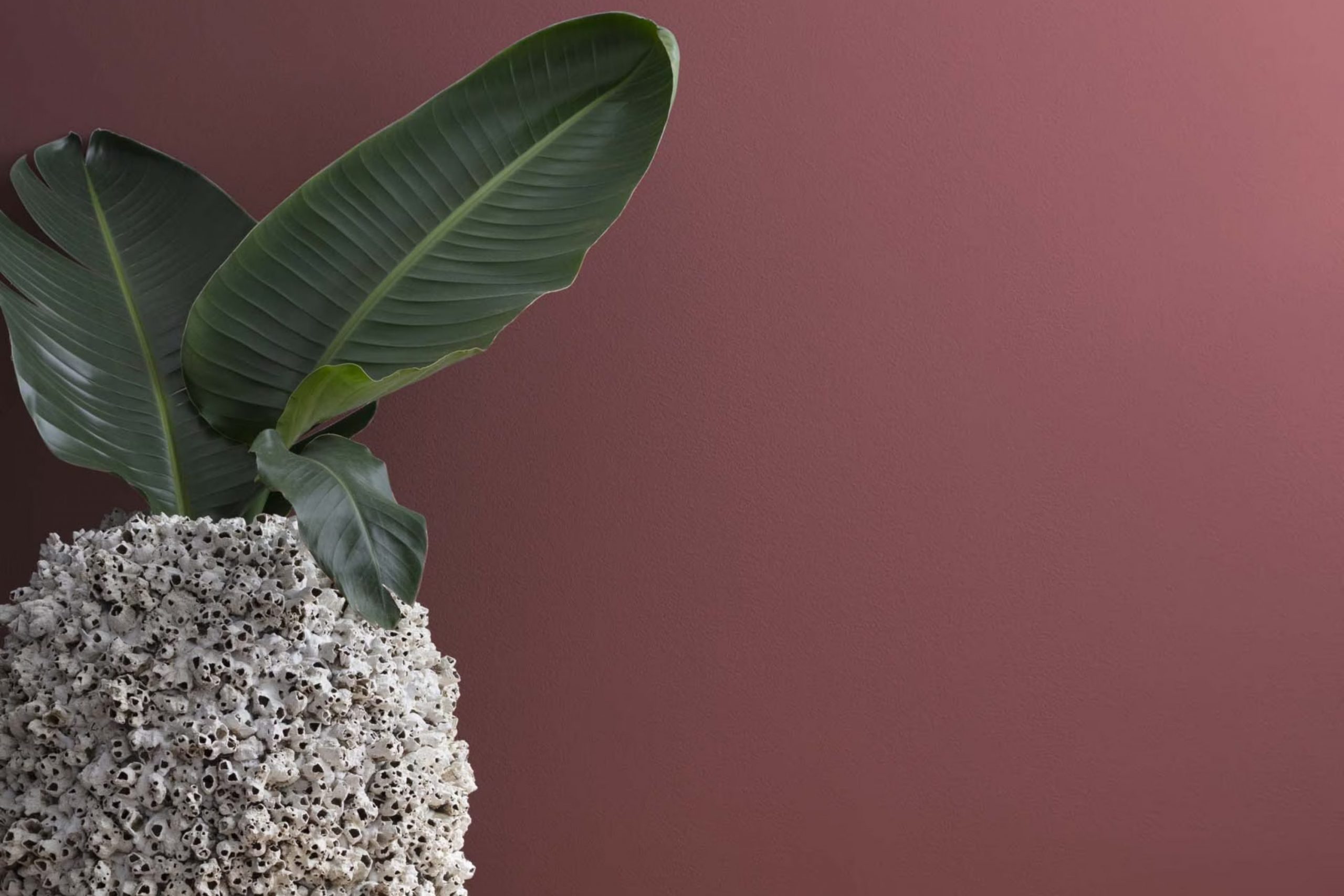
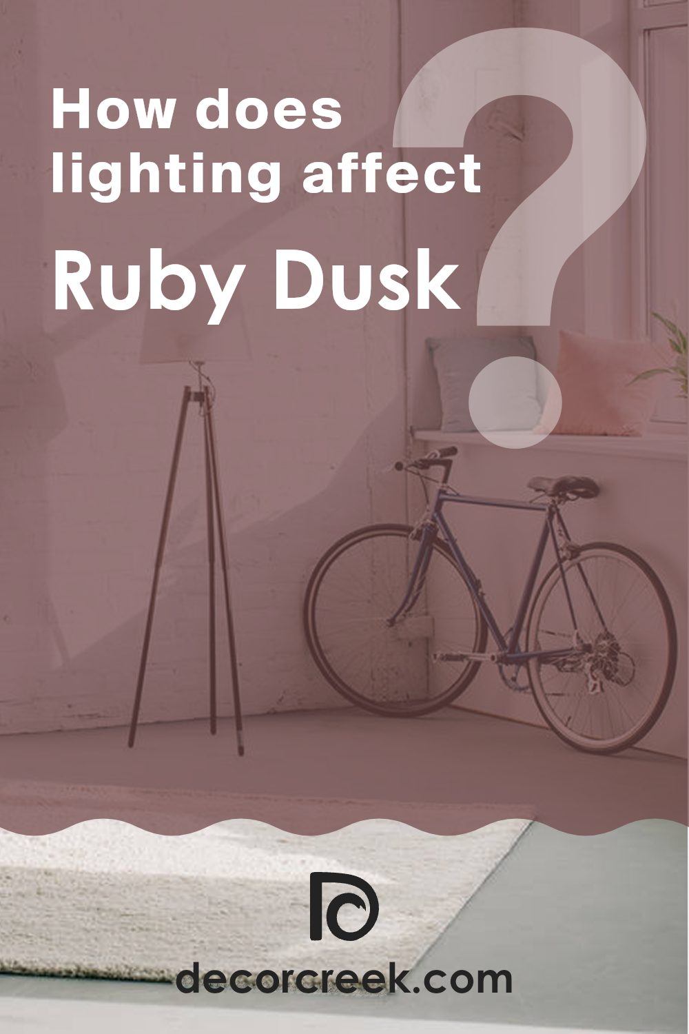
When you first come across 1267 Ruby Dusk by Benjamin Moore, you might be struck by its unique warmth and depth. This color, grounded in a deep, rich red with hints of maroon, seems perfect for adding a cozy yet refined touch to any room.
As you look at it, you might imagine it creating a welcoming atmosphere in a living room or adding a touch of drama to a dining area. It can also serve as an excellent accent color, perhaps on a single wall or in decorative details, bringing life and character to neutral surroundings.
What makes Ruby Dusk particularly interesting is how it shifts under different lighting conditions, offering varying shades throughout the day.
Whether you are looking to refresh a single room or thinking about a full makeover, Ruby Dusk has the potential to enrich your home with its warm and inviting hue.
What Color Is Ruby Dusk 1267 by Benjamin Moore?
Ruby Dusk 1267 by Benjamin Moore is a warm, deep red with a subtle brown undertone that adds a cozy and inviting feel to any room. This color exudes a natural elegance and can create a striking impact when used on walls or as an accent in a room. It pairs exceptionally well with materials that have a rustic or earthy texture, such as wooden furniture, woven baskets, and linen fabrics. This rich hue also complements leather well, enhancing its natural patina and adding depth to the overall décor.
This color is ideal for various interior styles, especially those that lean toward a warm, cozy aesthetic like traditional, rustic, or farmhouse designs. It can also add a dramatic flair to more contemporary or minimalistic rooms, serving as a bold backdrop for neutral or metal elements.
In terms of lighting, Ruby Dusk works best in rooms that receive ample natural light or are well-lit with warm artificial lighting, which draws out its rich tones. This color is adaptable in its compatibility with both light and dark color schemes, allowing for flexible design options. Pair it with soft creams for a calming contrast or bold blacks to make a dramatic statement.
Is Ruby Dusk 1267 by Benjamin Moore Warm or Cool color?
Ruby Dusk 1267 by Benjamin Moore is a deep, rich red that brings a cozy and warm feeling to any room. It’s the kind of color that makes a strong statement and can really anchor a room. In a living room, Ruby Dusk can be used on a feature wall to create a focal point, adding depth and interest to the area. It pairs well with neutral colors like white or beige, which help to balance its intensity, making the room not feel too intense.
In smaller areas, like a powder room or a reading nook, this color can make the area feel more inviting and snug. Although it’s dark, when paired with good lighting, Ruby Dusk adds a stylish, warm touch without making the room feel smaller.
This color works particularly well with natural materials such as wood or leather, enhancing their rich textures and creating a welcoming atmosphere. Ruby Dusk is perfect for anyone looking to add a touch of warmth and drama to their home.
Undertones of Ruby Dusk 1267 by Benjamin Moore
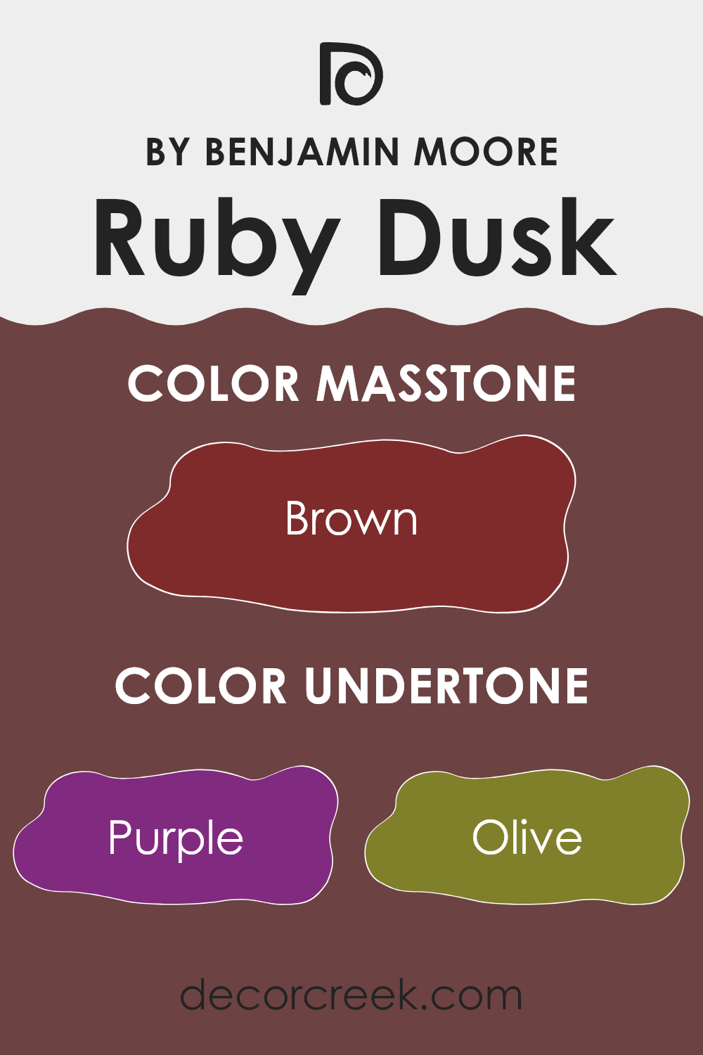
Ruby Dusk by Benjamin Moore is an intriguing hue that can subtly change its appearance under different lighting conditions due to its diverse undertones. When selecting paint, it’s important to consider the undertones, which are subtle colors that influence the main shade. These underlying hues can make a color look cooler or warmer and even alter our perception of the room it fills.
The undertones in Ruby Dusk include a wide range of colors like purple, olive, dark grey, grey, navy, dark green, dark turquoise, red, pink, orange, and pale pink.
This variety means that Ruby Dusk isn’t just a simple shade; it’s a complex color that can sometimes appear warmer or cooler depending on the surrounding light and decor. For instance, the purple and pink undertones can give a soft, warm feel, ideal for a cozy bedroom, while the dark grey and navy can offer a stronger, more stable look for an office.
On interior walls, Ruby Dusk can act as a flexible background, reacting dynamically with both natural and artificial light. In a room with plenty of sunlight, the warmer undertones like orange and pale pink might stand out, making the room feel welcoming and lively. In dimmer, artificial light, the cooler tones like navy and dark grey could become more pronounced, providing a grounding effect.
This complexity means that Ruby Dusk can fit into many different styles and settings, making it a practical choice for those looking to refresh their home with a rich and dynamic new color.
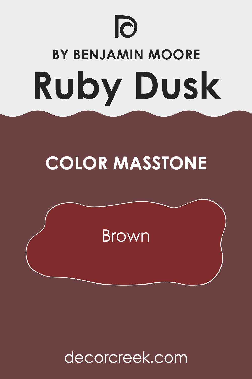
What is the Masstone of the Ruby Dusk 1267 by Benjamin Moore?
Ruby Dusk 1267 by Benjamin Moore is a unique brown color with a masstone of Brown (#802B2B), making it warm and inviting. This shade is perfect for creating a cozy and friendly atmosphere in any home. When used on walls, it can make a room feel more enclosed and snug, ideal for areas like living rooms or bedrooms where you want to bring a sense of comfort and relaxation.
The richness of Ruby Dusk also works well as an accent color, perhaps on a single wall or through decorative elements like cushions or curtains, adding a subtle touch of warmth without making the room feel too intense. In well-lit areas, the color can appear slightly brighter, offering a soft, warm glow that enhances natural light.
Moreover, this particular brown tone pairs beautifully with lighter colors like creams or soft whites, which can help to balance its depth and prevent a room from feeling too dark. It’s also adaptable enough to complement wooden furniture or flooring, enhancing the natural qualities of these materials. Ruby Dusk 1267 is a great choice for anyone looking to add a touch of warmth and coziness to their home without going too bold or dramatic.
How Does Lighting Affect Ruby Dusk 1267 by Benjamin Moore?
Lighting plays a crucial role in how colors appear in different environments. The way colors are perceived can change dramatically depending on the type of light—whether it’s natural sunlight or artificial light from bulbs. Each lighting condition brings out different hues and tones in a color.
Let’s look at how the color Ruby Dusk 1267 by Benjamin Moore behaves under various lighting conditions. This color is a deep and warm tone that can add a cozy feel to any room.
In artificial light, Ruby Dusk 1267 might look richer and more intense. The warm undertones of this color are enhanced under incandescent lighting, giving it a vibrant and inviting appearance. However, in fluorescent light, the color might appear slightly muted, with less of its natural warmth showing.
Natural light has a different effect on Ruby Dusk 1267. In rooms facing south, where sunlight is abundant throughout the day, the color looks bright and lively. The natural light highlights the depth of the color, making the room feel warm and energetic. Conversely, in north-facing rooms where natural light is cooler and less direct, Ruby Dusk 1267 might appear more subdued and slightly darker, adding a more formal tone to the room.
In east-facing rooms, Ruby Dusk 1267 benefits from the warm and soft light of the morning sun, which enhances its warm undertones, making the room feel welcoming and cozy during the morning hours. As the day progresses and natural light decreases, the color could seem more muted.
West-facing rooms, on the other hand, receive the evening sun’s golden tones, which make Ruby Dusk 1267 appear warmer and more dynamic toward the afternoon and evening. This brings a cozy, comforting atmosphere at the end of the day, ideal for relaxation.
Overall, Ruby Dusk 1267 is adaptable enough to adjust to different lighting conditions, offering varying vibes from warm and vibrant to more subdued and refined, depending on the light. This flexibility makes it a great choice for many rooms and accents.
decorcreek.com
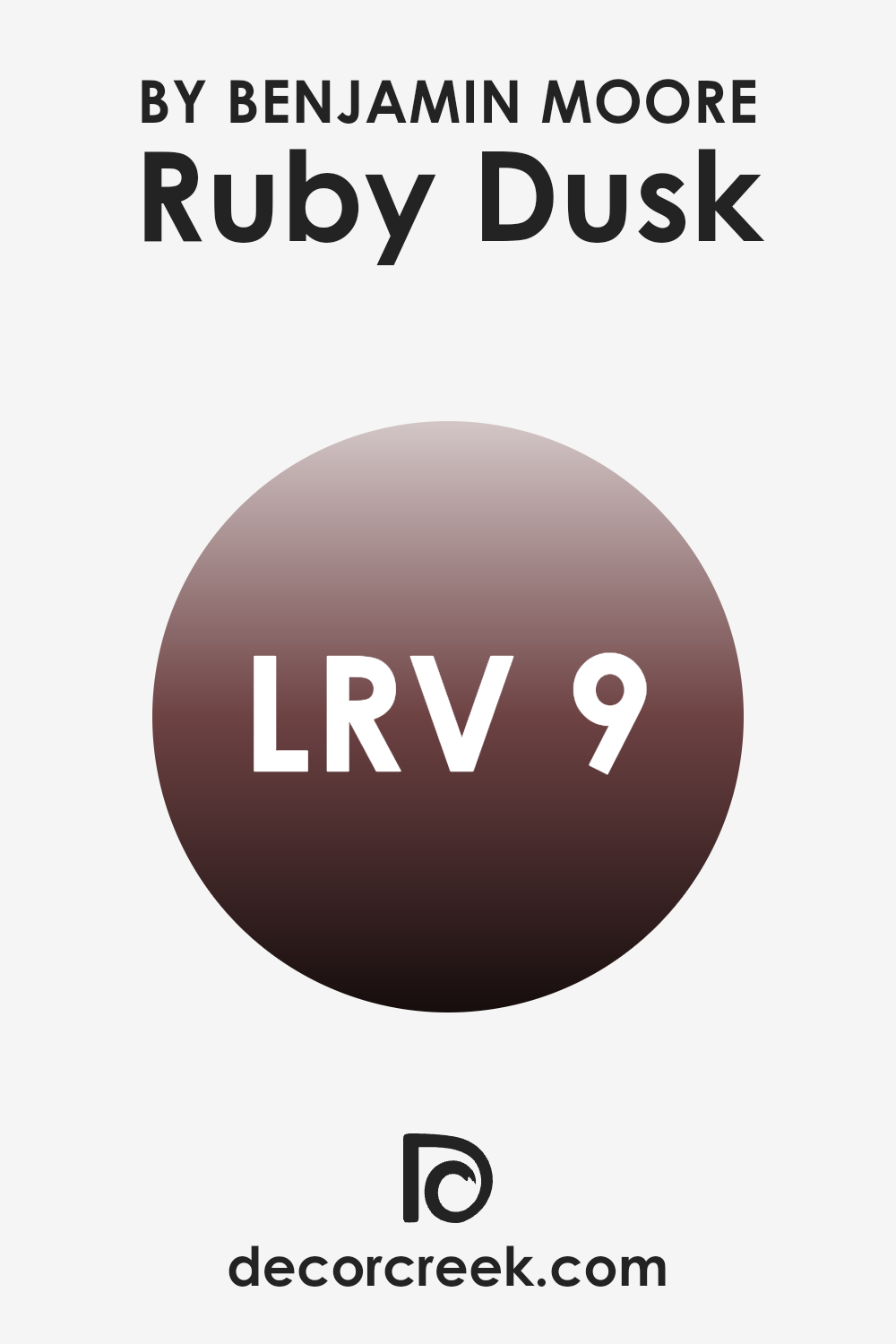
What is the LRV of Ruby Dusk 1267 by Benjamin Moore?
LRV stands for Light Reflectance Value, which is a measure of how much light a paint color reflects back into a room. This scale usually goes up to a high number like 100, where higher numbers mean more light reflection.
Low LRV means that the color absorbs more light and usually looks darker. When you pick a color based on its LRV, you’re essentially determining how light or dark your room will feel once it’s painted. High LRV colors can make small rooms feel larger and brighter, while low LRV colors might make rooms feel cozier but smaller.
For the color with an LRV of 8.61, like Ruby Dusk, it’s a very dark shade. This means it will absorb a lot of light instead of reflecting it. When used on walls, it will make the room appear smaller and more enclosed. This isn’t necessarily a bad thing – some areas benefit from a darker color, providing a feeling of warmth and intimacy. However, it’s important to have adequate lighting in rooms with such dark colors to balance the ambiance and avoid making the room feel too dark.
Painting a large room with Ruby Dusk might feel too intense, so it is typically better suited for smaller accent walls or areas where you want to create a dramatic impact.
Coordinating Colors of Ruby Dusk 1267 by Benjamin Moore
Coordinating colors are those that complement each other and are often used together to create harmonious and aesthetically pleasing rooms. They are selected to enhance the qualities of the main color and might contrast it to create some visual interest or blend subtly for a more soothing effect. In the case of Ruby Dusk by Benjamin Moore, a deep, warm hue, its coordinating colors help in achieving a balanced look across different applications, whether in a residential or a commercial setting.
AF-15 – Steam is a gentle off-white that has the discreetness to soften the intensity of stronger hues like Ruby Dusk while maintaining a clean, fresh appearance. 973 – Ice Formations offers a pale gray touch and adds a slight coolness that counteracts the warmth of Ruby Dusk, providing a modern and airy feel.
AF-490 – Calmness is a soft, calm blue-green that introduces a feeling of lightness, making it an excellent partner to the denser Ruby Dusk for those looking to add a sense of calm to their environment. Lastly, OC-130 – Cloud White is a bright, clear white that acts as a perfect backdrop; it amplifies light and gives any pairings with Ruby Dusk a striking contrast that’s both inviting and dynamic. Together, these colors work in tandem to offer flexible combinations for enriching and complementing the dominant Ruby Dusk shade.
You can see recommended paint colors below:
- AF-15 Steam
- 973 Ice Formations
- AF-490 Tranquillity
- OC-130 Cloud White

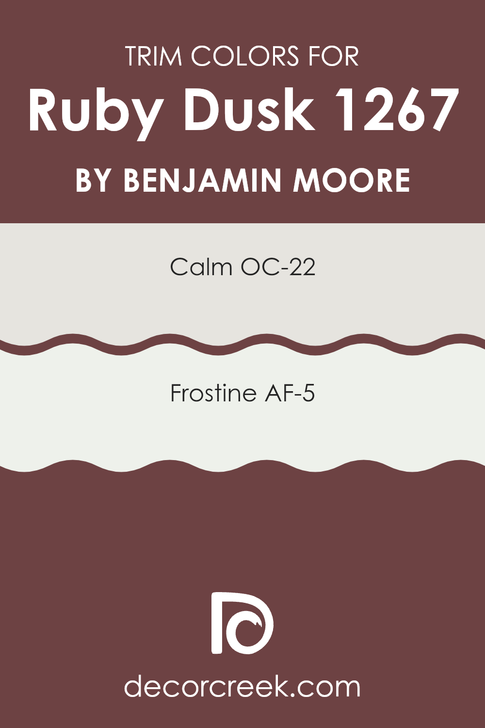
What are the Trim colors of Ruby Dusk 1267 by Benjamin Moore?
Trim colors are specific shades used to highlight or define the edges and accents of a room’s architectural features such as doorframes, window frames, and baseboards.
These colors play a crucial role in enhancing the overall look of a room by creating a visual frame that complements or contrasts with the wall colors. For instance, when using a distinctive shade like Ruby Dusk by Benjamin Moore, choosing the right trim colors can significantly impact the visual appeal and cohesion of the room’s design.
OC-22 Calm and AF-5 Frostine by Benjamin Moore are excellent choices for trim colors when paired with a rich color like Ruby Dusk. OC-22 Calm is a soft, muted white with a hint of gray, providing a subtle contrast that helps in making the vibrant tones of Ruby Dusk stand out without making things feel too intense. On the other hand, AF-5 Frostine is a pure, bright white that offers a sharp, clean look, which can make the deeper shades stand out more and give the room a fresh and airy feel. Both colors help in defining the room while maintaining a harmonious look throughout the area.
You can see recommended paint colors below:
- OC-22 Calm
- AF-5 Frostine
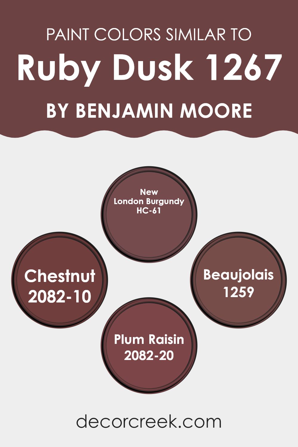
Colors Similar to Ruby Dusk 1267 by Benjamin Moore
Using similar colors is central in creating a cohesive and harmonious room. Colors like Ruby Dusk by Benjamin Moore find strong companions in shades such as HC-61 – New London Burgundy, 2082-10 – Chestnut, 1259 – Beaujolais, and 2082-20 – Plum Raisin, since they share common undertones and intensities but vary slightly, adding visual interest without making things feel too intense.
The subtle variations among these colors provide a rich layering effect, allowing for a dynamic yet unified atmosphere. This blend of similar colors can enrich the depth and warmth of a room, making it feel more welcoming and connected.
New London Burgundy carries a deep, warm burgundy tone that appears almost earthy and grounding, great for accent walls or rich textile choices. Moving to a slightly lighter hue, Chestnut offers a strong, reddish-brown that gently brings in warmth, ideal for cozy, inviting rooms.
On the other hand, Beaujolais introduces a more vivid and slightly redder cast, adding a burst of color that keeps a refined feel. Lastly, Plum Raisin provides a deeper, more intense variation with hints of purple, making it excellent for areas that benefit from a dark, rich backdrop. Each of these hues helps create a cohesive yet distinctive look, working well with Ruby Dusk to shape rooms that feel balanced and thoughtfully designed.
You can see recommended paint colors below:
- HC-61 New London Burgundy
- 2082-10 Chestnut
- 1259 Beaujolais
- 2082-20 Plum Raisin
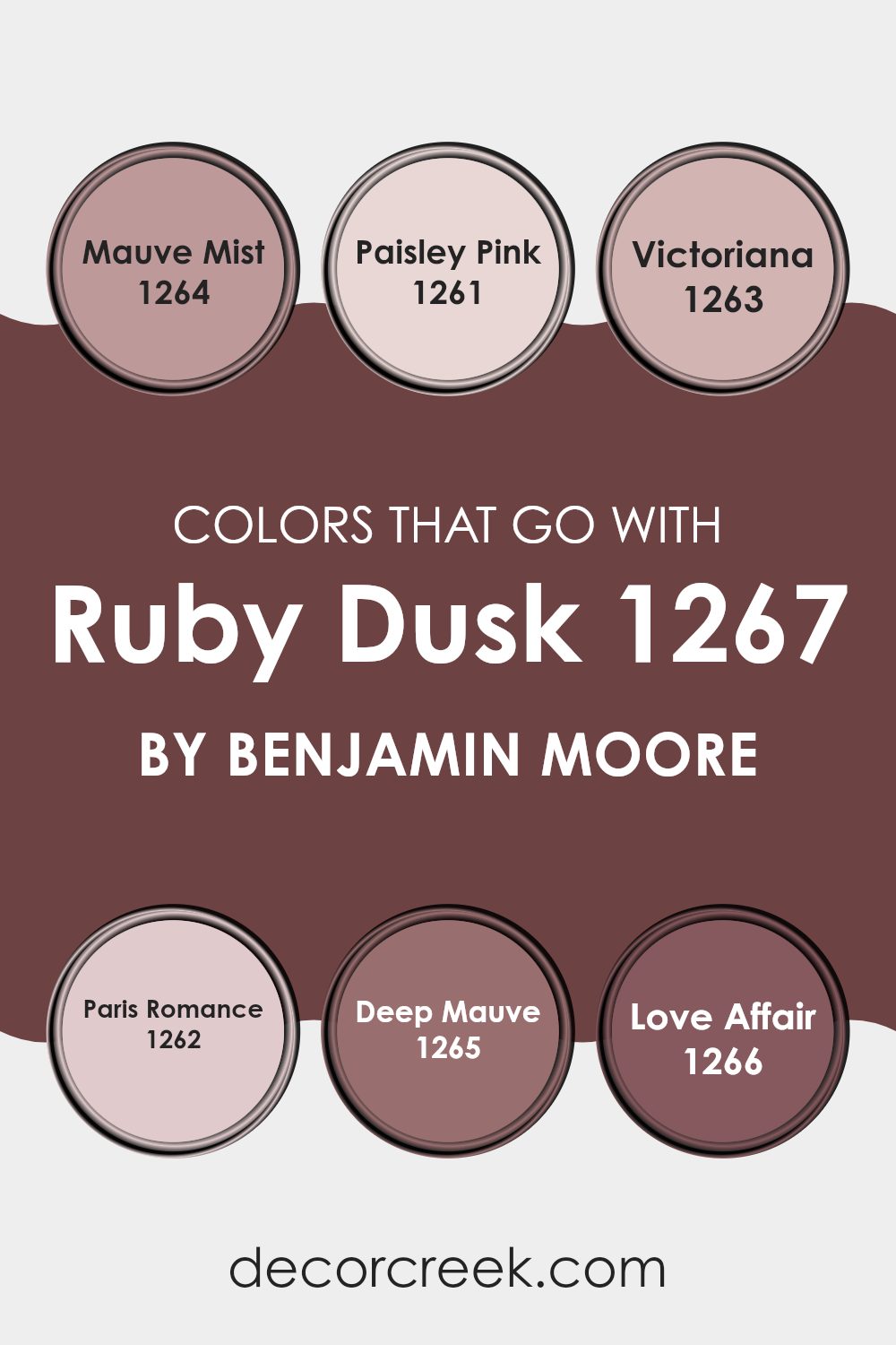
Colors that Go With Ruby Dusk 1267 by Benjamin Moore
Choosing the right colors to complement Ruby Dusk 1267 by Benjamin Moore is important as it ensures a harmonious and appealing environment. Ruby Dusk 1267 is a vibrant and rich shade, and to ensure it shines without making a room feel too intense, pairing it with compatible colors like Mauve Mist, Paisley Pink, Victoriana, Paris Romance, Deep Mauve, and Love Affair is essential. These complementary colors create a balanced visual flow, making any room feel well put together and stylish, while still maintaining a warm and inviting atmosphere.
Mauve Mist is a light, soft purple that offers a subtle contrast, keeping the room light and airy when paired with the deeper tones of Ruby Dusk. Paisley Pink is a gentle and light pink, adding a touch of freshness and softness to complement the intensity of Ruby Dusk. Victoriana is a vintage-inspired bluish-grey tone that adds a unique and calming neutral balance to the boldness of Ruby Dusk.
Paris Romance leans towards a pastel pink with a creamy feel, perfect for softening the overall look and adding a romantic feel. Deep Mauve, as the name suggests, is a bolder and darker purple that echoes the depth of Ruby Dusk, enriching the palette with its intensity. Lastly, Love Affair is a passionate and deeper pink, which mirrors the warmth and energy of Ruby Dusk, making for a dynamic and cohesive color scheme. Together, these colors ensure that any décor focusing on Ruby Dusk remains vibrant, comfortable, and visually appealing.
You can see recommended paint colors below:
- 1264 Mauve Mist
- 1261 Paisley Pink
- 1263 Victoriana
- 1262 Paris Romance
- 1265 Deep Mauve
- 1266 Love Affair
How to Use Ruby Dusk 1267 by Benjamin Moore In Your Home?
Ruby Dusk 1267 by Benjamin Moore is a rich, deep red paint that can add a warm and inviting feel to any room in your home. This color is perfect if you want to create a cozy vibe in your living room.
It’s great for a feature wall in the living room or dining area, as it can make these rooms feel more welcoming and cozy, especially when paired with soft lighting. In a bedroom, using Ruby Dusk on one wall can create a dramatic backdrop and make the room look stylish and homely without being too intense.
Because this shade has such a deep red tone, it pairs well with neutral furniture and decor, allowing it to stand out as a beautiful focal point. Additionally, you can use Ruby Dusk in smaller areas, like a hallway or bathroom, to add a burst of warmth and personality into the room.
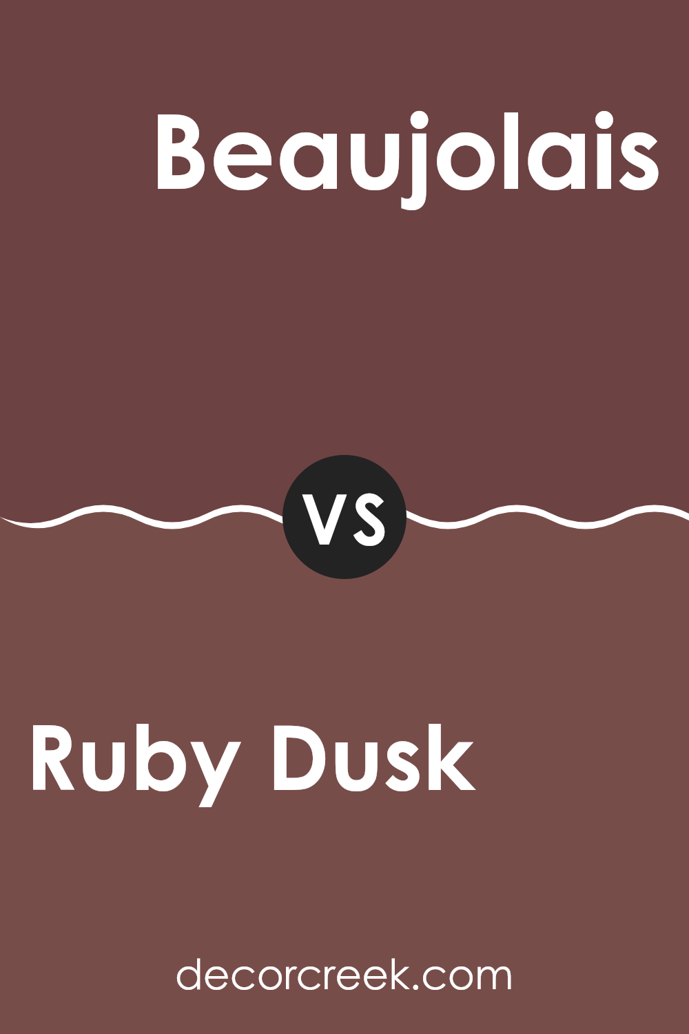
Ruby Dusk 1267 by Benjamin Moore vs Beaujolais 1259 by Benjamin Moore
Ruby Dusk and Beaujolais, both by Benjamin Moore, offer distinct yet complementary color tones, ideal for those looking to add warmth to their room. Ruby Dusk is a deep, rich red with a subtle brown undertone that gives it an inviting, cozy feel. It works well in areas where you want to create a sense of comfort and warmth, such as living rooms or dining areas.
On the other hand, Beaujolais is slightly lighter, leaning more towards a pure red, and has an energetic, vibrant vibe. This color is great for areas where you want to add a pop of brightness, like kitchens or creative rooms. The livelier nature of Beaujolais makes it a perfect accent color against the more muted and dusky Ruby Dusk.
While both colors share a red base, Ruby Dusk’s earthy tones contrast with the brighter, more stimulating hues of Beaujolais. Using them together can create a dynamic balance, adding depth and interest to your color scheme.
You can see recommended paint color below:
- 1259 Beaujolais
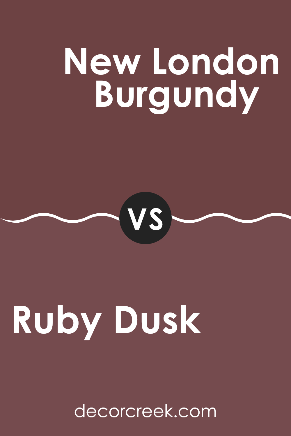
Ruby Dusk 1267 by Benjamin Moore vs New London Burgundy HC-61 by Benjamin Moore
Ruby Dusk and New London Burgundy, both by Benjamin Moore, offer unique takes on deep, warm hues. Ruby Dusk tends to have a vibrant, rich quality that leans slightly towards a dark pink or red spectrum. It’s lively and can add a fresh burst of color to a room without being overly bold or dominating. This makes it a great choice for a room looking to strike a balance between classic warmth and a touch of modern flair.
In contrast, New London Burgundy carries a more traditional burgundy color that pulls in deeper, darker tones resembling a fine wine. This color is ideal for those who want to create a cozy and inviting ambiance. It works well in areas that aim for a more classic or refined look, making rooms feel grounded and rich.
Both colors provide warmth, but Ruby Dusk does so with a bit more brightness, while New London Burgundy offers depth and a sense of classic elegance. Depending on the mood and style you want to achieve, either could beautifully enhance your room.
You can see recommended paint color below:
- HC-61 New London Burgundy
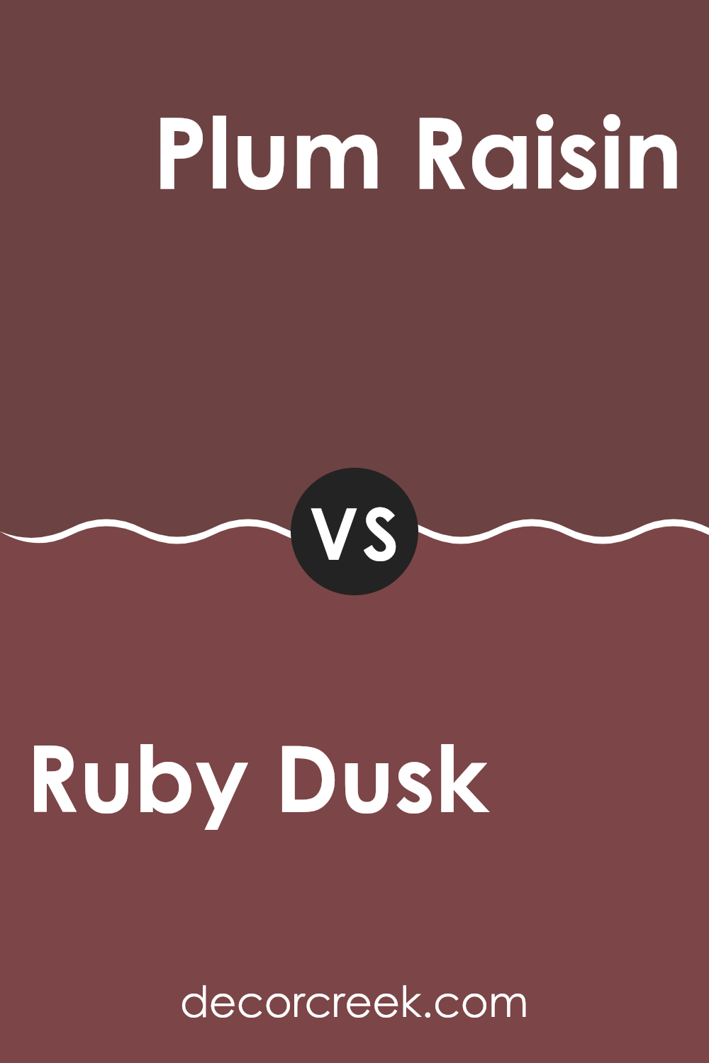
Ruby Dusk 1267 by Benjamin Moore vs Plum Raisin 2082-20 by Benjamin Moore
Ruby Dusk by Benjamin Moore is a muted, reddish-brown hue, giving off warmth and calmness. It reminds one of a cozy, soft blanket or the last light of a setting sun. Its subtle earthiness makes it adaptable enough to fit in living rooms or bedrooms while giving a welcoming charm.
On the other hand, Plum Raisin by Benjamin Moore leans towards a deeper, richer purple with a touch of burgundy. This color feels more bold and dramatic, likely to draw attention in a room. It’s perfect for someone looking to create a focal point in a room—perhaps an accent wall or for decor items that really stand out.
While Ruby Dusk brings a gentle, soothing vibe, Plum Raisin adds an air of mystery and depth. Depending on your mood and the atmosphere you want to set in a room, either of these colors can enhance your home’s character. Ruby Dusk is soft and earthy, Plum Raisin is deep and striking—each offering its distinct flair.
You can see recommended paint color below:
- 2082-20 Plum Raisin
Ruby Dusk 1267 by Benjamin Moore vs Chestnut 2082-10 by Benjamin Moore
Ruby Dusk is a deep, warm red with hints of maroon, offering a cozy and inviting feel to any room. It’s a rich color that reminds one of autumn leaves or a fine wine, adding a touch of elegance without being too strong. This shade is excellent for areas where you want to create a cozy, welcoming atmosphere like living rooms or dining areas.
On the other hand, Chestnut is a much darker hue, closely resembling the rich, dark brown of chestnut trees. This color is bold and deep, providing a strong presence in any area it’s used in. It works well in places where you want to make a statement, such as on accent walls or for cabinetry.
Both colors are quite warm and can create a sense of comfort, but they serve different moods and looks depending on what you want for your room. Ruby Dusk brings more brightness and warmth, whereas Chestnut offers depth and weight.
You can see recommended paint color below:
- 2082-10 Chestnut
As I wrap up my thoughts on the color 1267 Ruby Dusk by Benjamin Moore, I can genuinely say it’s a beautiful, warm red that feels cozy and inviting. This color is like a hug; it makes any room feel friendly and welcoming. If you’re considering giving your room a new look, Ruby Dusk could be the perfect choice, especially if you love colors that add a sense of warmth.
What’s great about Ruby Dusk is how well it goes with many other colors. It pairs wonderfully with soft whites or creams, making it ideal for living rooms, dining areas, or even bedrooms. And when it comes to holidays or festive times, this color really shines because it has that rich, joyful vibe.
If you have a room that feels a bit too cool or impersonal, painting it Ruby Dusk can make a big difference. This color brings a lively energy, making your room look and feel cozier. Whether you want a splash of color by painting one wall or decide to color the whole room, Ruby Dusk is an easy choice for making your home more beautiful and warm.
In conclusion, trying out 1267 Ruby Dusk by Benjamin Moore is a good move if you want a room that feels both cozy and cheerful. It’s perfect for anyone looking to change their room’s look to something warm and inviting. Happy painting!
Ever wished paint sampling was as easy as sticking a sticker? Guess what? Now it is! Discover Samplize's unique Peel & Stick samples.
Get paint samples

