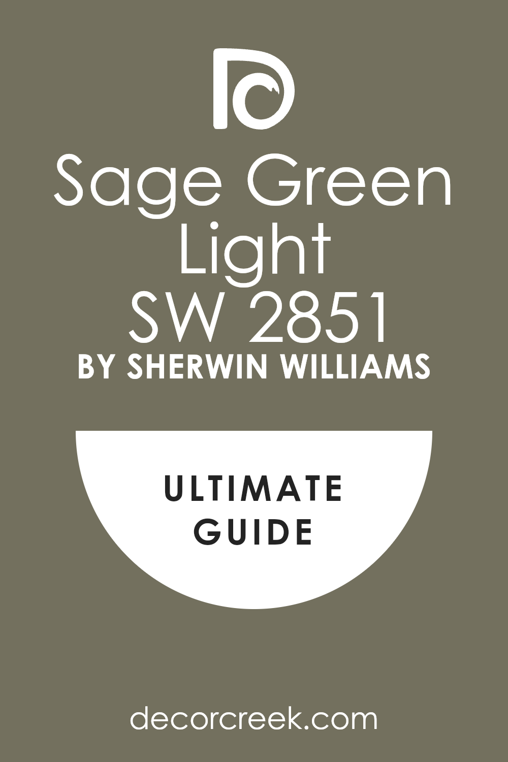
If you’re looking for a color that’s both refreshing and soothing for your space, you might want to consider SW 2851 Sage Green Light by Sherwin Williams. It’s a gentle green shade that brings a sense of calm and serenity to any room. I find it particularly appealing because it has a soft, almost muted quality that makes it versatile for both traditional and contemporary spaces.
This color can help brighten a dark room or give a more open feel to a small space. It pairs beautifully with natural elements like wood and stone, enhancing the overall aesthetic without overwhelming it.
Whether you’re planning to repaint your living room, bedroom, or just a piece of furniture, Sage Green Light offers a subtle, refreshing touch.
What I appreciate most about this color is how it acts as a neutral backdrop, allowing other design elements to stand out. Furnishings in bold colors or rich textures look fantastic against it. You’ll find that it works well with a wide range of decor styles, whether you’re into minimalist designs or something more eclectic.
If you’re thinking about repainting, Sage Green Light could be the perfect choice for bringing a new lease on life to your interior spaces.
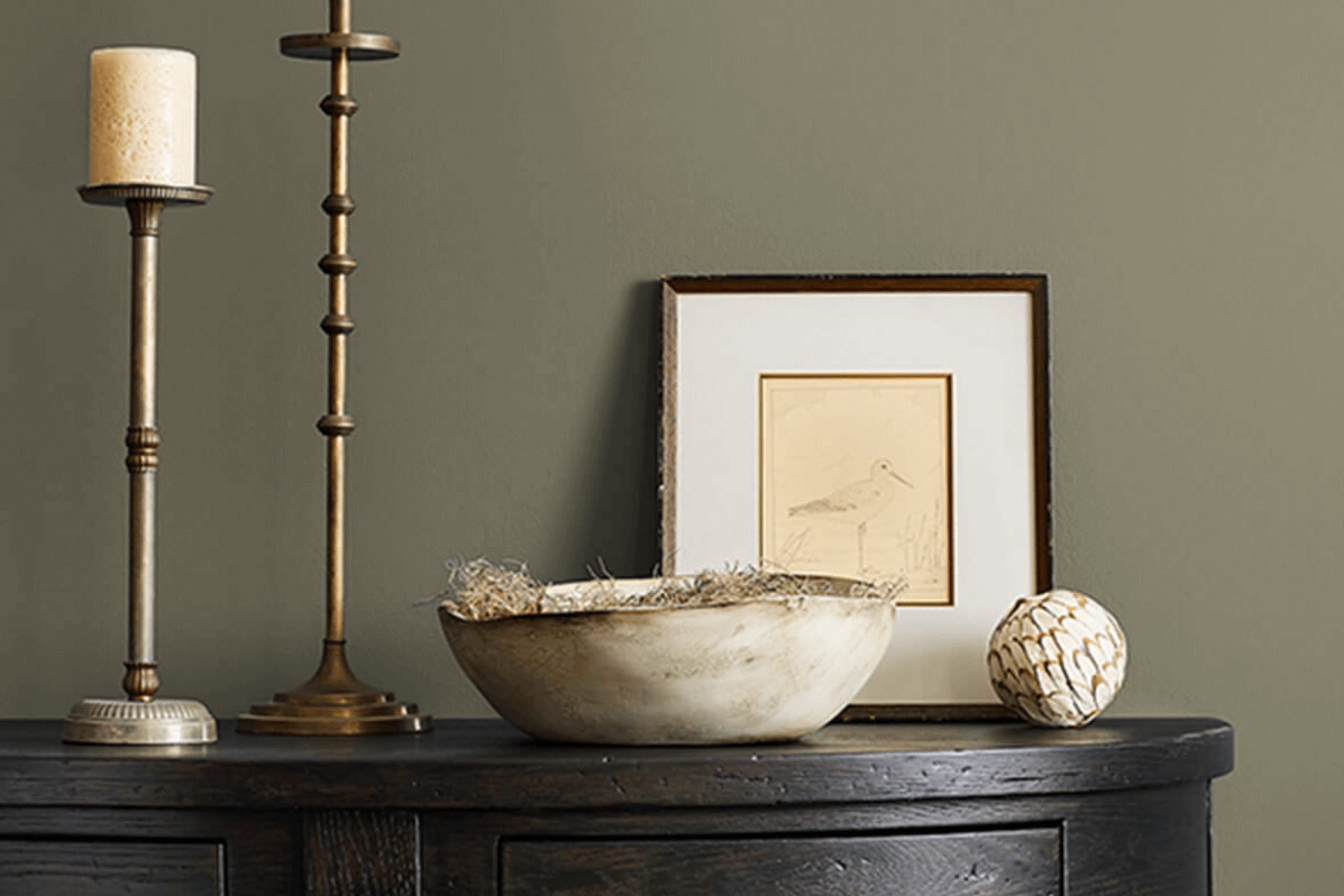
What Color Is Sage Green Light SW 2851 by Sherwin Williams?
Sage Green Light by Sherwin Williams is a soft and subtle green hue that adds a gentle touch of nature to any space. This color is a blend of gray undertones with a whisper of green, making it versatile and easy to incorporate into various interior designs. It works exceptionally well in styles like rustic, Scandinavian, and modern minimalist, where its understated elegance can complement natural wood textures, sleek furniture, and clean lines.
In terms of materials, Sage Green Light pairs beautifully with light woods such as oak and birch, which help to enhance its organic feel. Metals like brushed nickel and copper also go well with this shade, providing a delightful contrast to its softness.
For textiles, consider linens and cotton in white or light neutral colors to maintain a light and airy environment, or introduce velvet in darker hues for a plush look.
This color is ideal for creating a calm and inviting atmosphere in living rooms, bedrooms, and bathrooms. It works as a beautiful base that allows for various layers of design through decor items like cushions, throws, and artwork. Overall, Sage Green Light is a timeless choice that provides a fresh and stylish backdrop to any interior.
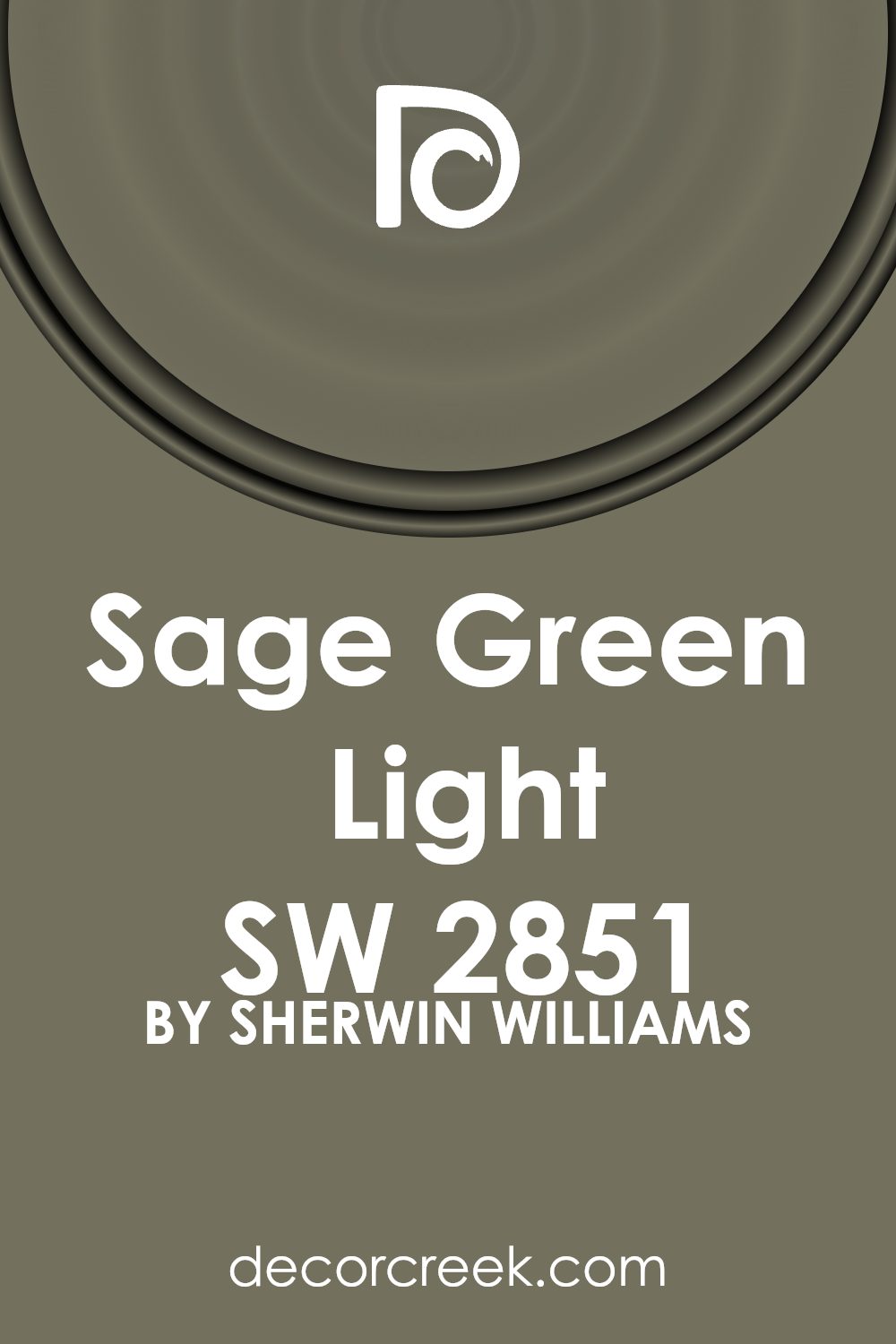
Is Sage Green Light SW 2851 by Sherwin Williams Warm or Cool color?
Sage Green Light by Sherwin Williams is a soft and subtle green that brings a fresh, nature-inspired vibe to any room. This color has a muted tone that is easy on the eyes and versatile, making it ideal for both modern and traditional homes. When used on walls, it creates a calm and inviting atmosphere that makes spaces feel more open and airy.
Sage Green Light works well in various rooms, including bedrooms, living rooms, and kitchens. It pairs beautifully with white trim, adding a clean and crisp border that enhances its gentle green shade. Additionally, this color coordinates nicely with a range of other colors, from soft beiges and warm woods to more vibrant blues and yellows, offering numerous decorating possibilities.
When choosing furnishings and decor, Sage Green Light serves as a neutral backdrop, allowing bolder colors or patterns to stand out. It’s great for those who like to switch up their decor often, as it complements many different styles and tastes.
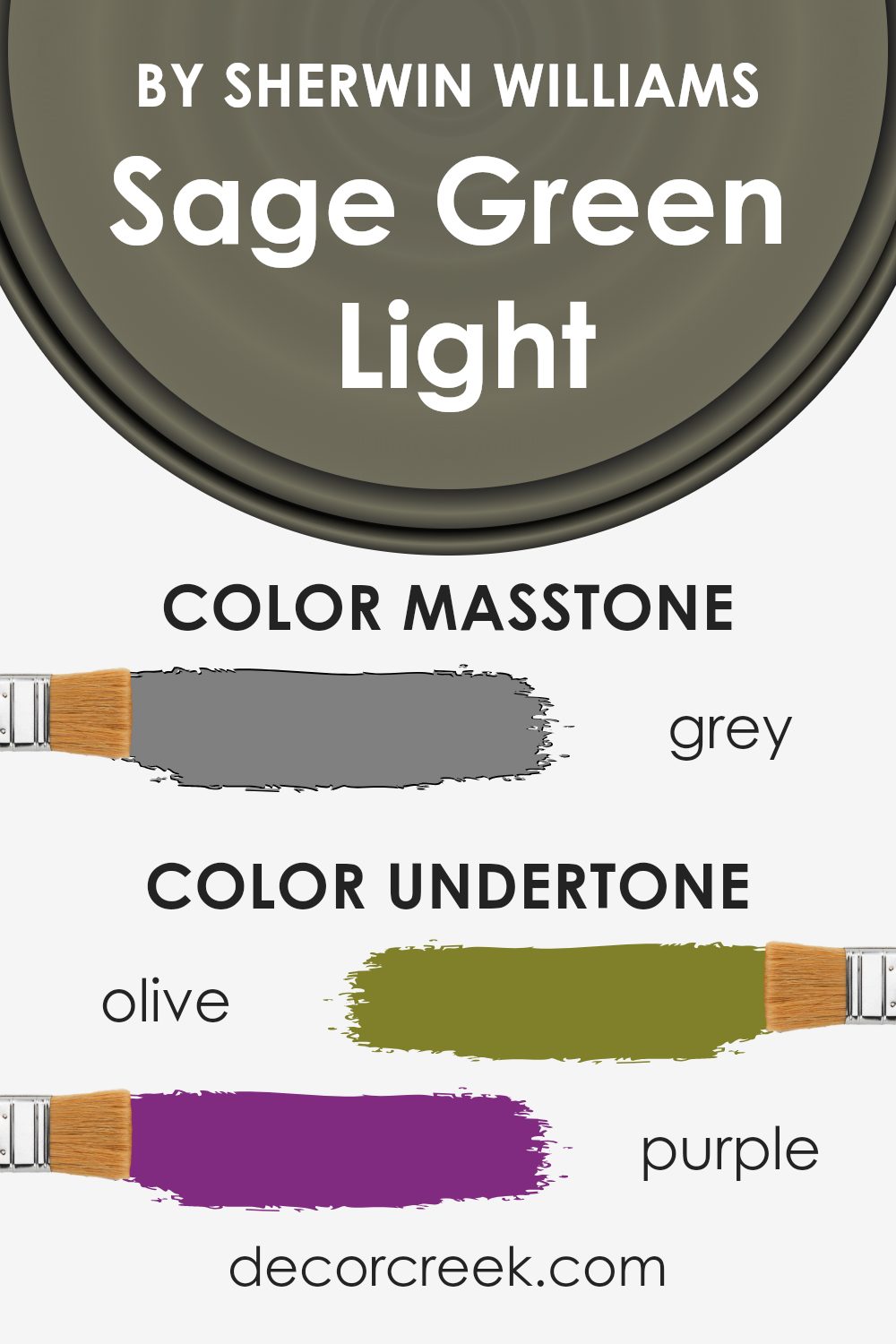
Undertones of Sage Green Light SW 2851 by Sherwin Williams
Sage Green Light is a versatile color that subtly incorporates various undertones, creating a complex and appealing hue. The presence of these undertones can significantly influence how the color interacts with different lighting conditions and surrounding elements in a room.
Primarily, the olive, dark green, and light green undertones reinforce its natural feel, making it a perfect choice for spaces intended to have a touch of the outdoors. This is ideal for creating a calming, welcoming environment in living rooms or studies where you want a hint of nature.
Purple, lilac, and blue undertones add a slight coolness to the color, which can be quite refreshing. This aspect of the color makes it suitable for bedrooms or bathrooms, providing a subtle splash of cool hues which infuse a calm and restful energy.
On the other hand, undertones like brown and dark grey give the Sage Green Light a grounded, earthy base, which can help in making large spaces feel more intimate and cozy. This makes the color excellent for dining rooms or entryways, where a sense of warmth is often desired.
Furthermore, adding accents like pale pink, mint, or light turquoise can bring out a playful, yet subtle vibrancy in the color when used on interior walls. This dynamic quality can enhance creativity and liveliness in a home office or children’s play area.
When painted on walls, Sage Green Light’s range of undertones allows it to adapt uniquely to different room aspects and decorations, reflecting varying shades at different times of the day. This adaptability can make a room feel lively and reactive, continuously changing and keeping the environment interesting.
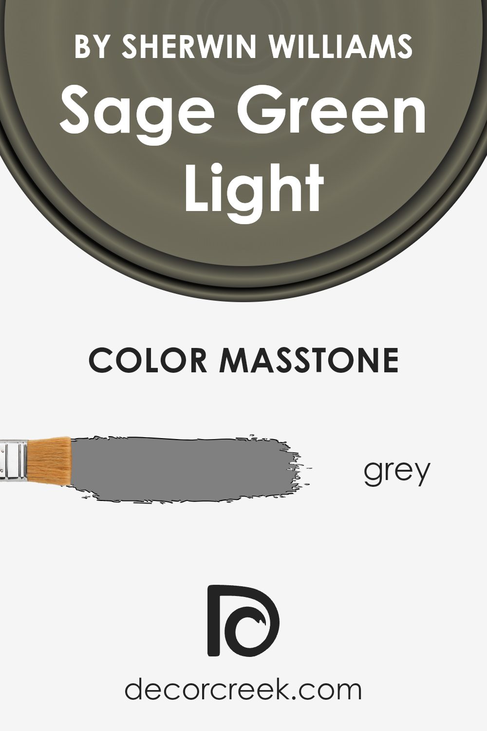
What is the Masstone of the Sage Green Light SW 2851 by Sherwin Williams?
Sage Green Light, identified as SW 2851 by Sherwin Williams, has a masstone which visually resembles grey. This neutral grey base makes it an adaptable choice for home interiors. It can effectively pair with various color schemes without overwhelming the space.
In well-lit areas, this grey undertone supports the sage in revealing a subtle hint of natural green, providing a refreshing touch to the room. Conversely, in dimmier spaces, it recedes gracefully, maintaining a more muted, understated aesthetic.
This adaptability is particularly beneficial in rooms that serve multiple purposes or in homes where decor is likely to change over time. The color’s ability to anchor bolder accents while maintaining its understated charm makes it a practical choice for those looking to keep a balanced and inviting atmosphere in their living spaces.
How Does Lighting Affect Sage Green Light SW 2851 by Sherwin Williams?
Lighting plays a critical role in how we perceive colors, greatly influencing the appearance and mood of a space. Different light sources can change how a color looks; for example, the color sage green light, a muted greenish shade, can vary in appearance depending on the type of light in the room.
In artificial light, the color sage green light might appear slightly different based on the color temperature of the light bulb used. Warmer lights, such as soft white bulbs, can make the sage green light seem more muted and warmer, enhancing its cozy and calming qualities.
In cooler, brighter lights like daylight bulbs, this shade may lean towards a fresher, crisper version of green, highlighting its natural elements more prominently.
Natural light also has a significant impact on how this shade of green is perceived. In north-facing rooms, which receive less direct sunlight and generally have a cooler, bluer light, the sage green light might appear softer and more shadowed, giving the room a calm and gentle feel. South-facing rooms, on the other hand, get plenty of bright, warm sunlight, which can make the sage green light look more vibrant and lively, potentially bringing out more of its yellow undertones.
In east-facing rooms, where sunlight is bright in the morning and softer towards the evening, sage green light will change appearance throughout the day. It may look fresh and cheerful in the morning light, and gradually become softer and more subdued by the afternoon.
Conversely, in west-facing rooms, where the light is dimmer in the morning but intensive in the evening, this color can feel cooler in the morning, then warm up and become more dynamic towards sunset.
Overall, the way sage green light interacts with different lighting conditions illustrates how lighting can significantly affect the perception of color in a space. Understanding these nuances can help in making informed decisions about paint colors based on the orientation and lighting of your rooms.
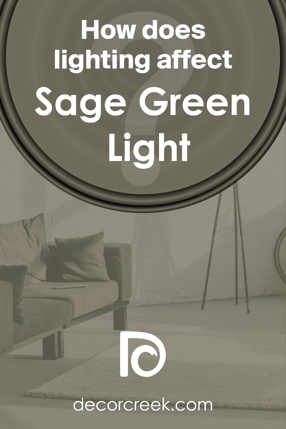
What is the LRV of Sage Green Light SW 2851 by Sherwin Williams?
Light Reflectance Value (LRV) is a measure used to indicate how much light a paint color reflects or absorbs. It’s rated on a scale where lower numbers mean the color absorbs more light, making it appear darker, and higher numbers indicate that the color reflects more light, giving it a lighter appearance.
LRV is useful when choosing paint colors for a space because it helps predict how bright or dark a room will feel once painted. For instance, colors with higher LRV make a room feel airier and more open, while those with lower values can make spaces feel cozier but smaller.
The LRV for the particular shade of green mentioned is 16.082, which is relatively low. This means it absorbs a lot of light, causing it to look rich and deep in tone. In a practical sense, using this color on walls can make a room feel more enclosed and intimate.
It’s ideal for larger spaces or areas with plenty of natural light to prevent the space from feeling too dark. However, in smaller or less well-lit rooms, this shade might make the space feel even smaller and darker. Thus, thoughtful lighting and decor choices are crucial when working with colors with lower LRV values like this green.
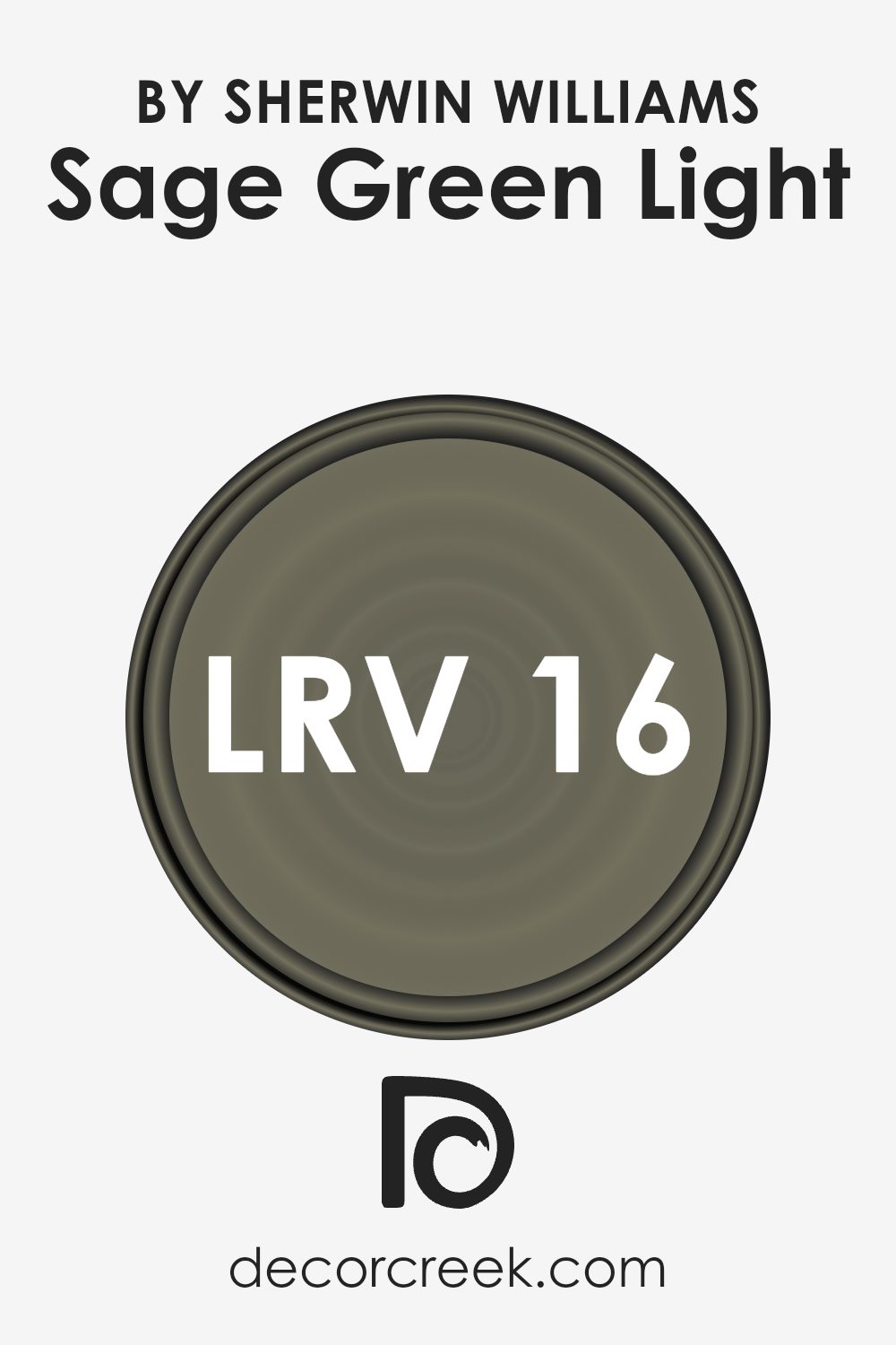
Coordinating Colors of Sage Green Light SW 2851 by Sherwin Williams
Coordinating colors are selected to complement a main color, enhancing the overall aesthetic of a space. When working with a base color like Sage Green Light by Sherwin Williams, choosing coordinating colors involves picking shades that harmonize and balance the look without competing for attention.
Colors like SW 2824 – Renwick Golden Oak and SW 2833 – Roycroft Vellum are excellent examples of shades that coordinate well with a soft, muted green like Sage Green Light, as they add warmth and variety to the color scheme.
Renwick Golden Oak is a warm, inviting shade that resembles the rich tones of polished oak wood. This color provides a nice contrast to the cooler tones of Sage Green Light, adding a touch of warmth and natural elegance to any room.
On the other hand, Roycroft Vellum is a softer, lighter color that leans towards a creamy beige. It offers a subtle contrast, creating a gentle and soothing backdrop that allows Sage Green Light to stand out without overwhelming the senses.
Together, these colors create a balanced and harmonious palette that enhances the beauty of each individual shade.
You can see recommended paint colors below:
- SW 2824 Renwick Golden Oak
- SW 2833 Roycroft Vellum
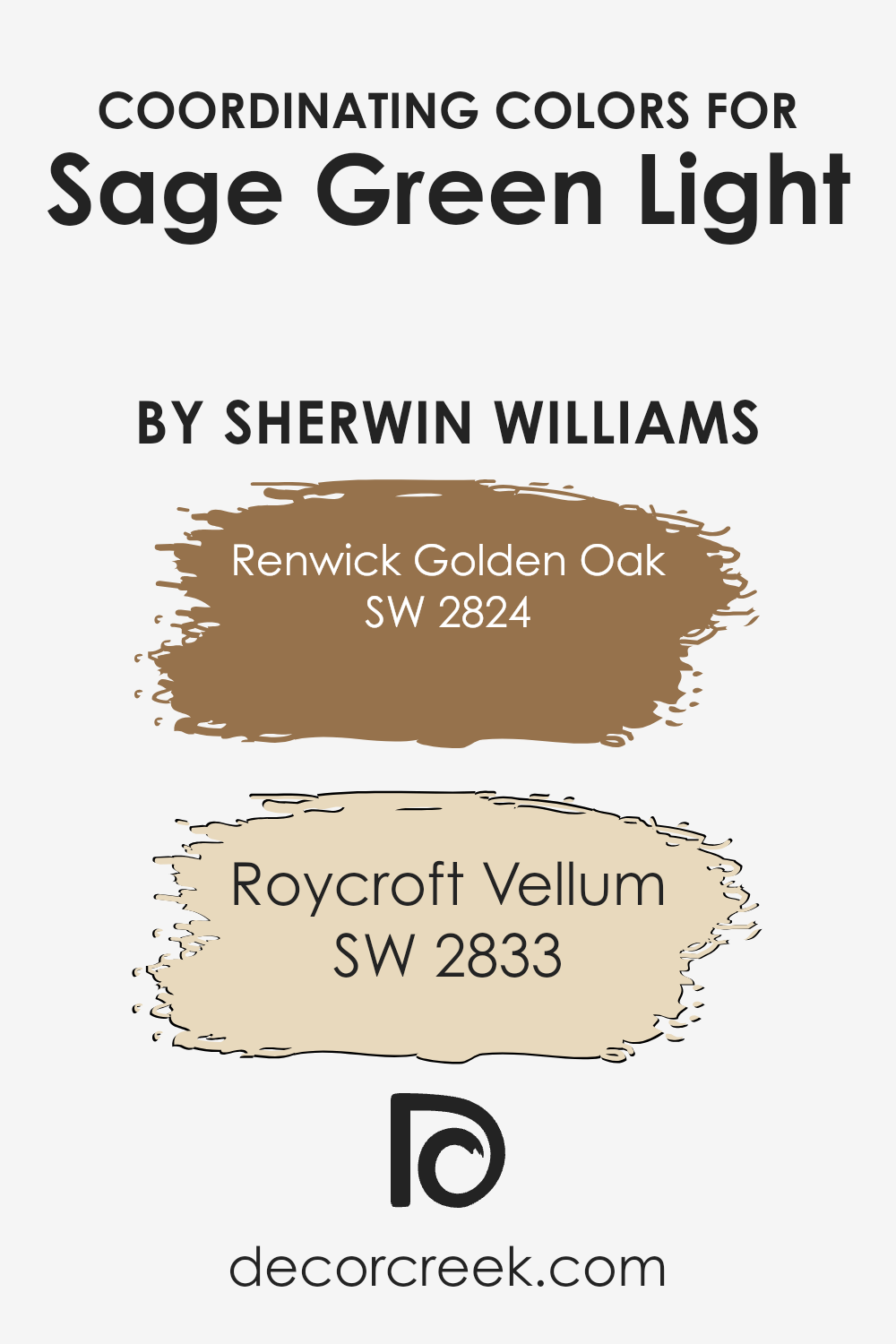
What are the Trim colors of Sage Green Light SW 2851 by Sherwin Williams?
Trim colors play a crucial role in defining the aesthetic appeal and overall feel of a room painted with Sherwin Williams’s Sage Green Light. By selecting complementing trim colors, you can accentuate the nuances of the main color and tie together different aspects of the decor.
For example, using SW 6385 – Dover White as a trim color creates a clean and seamless look because its bright and neutral tone contrasts subtly with the calm Sage Green Light, highlighting architectural features without overpowering the room’s gentle ambiance.
On the other hand, choosing SW 6148 – Wool Skein, a warmer and softer shade, can produce a cozier effect. This color offers a subtle contrast that gently softens the transitions between the walls and trim, enhancing the overall warmth of the space. Wool Skein works particularly well in spaces with abundant natural light, where it can amplify the welcoming feel set by the sage walls. Both Dover White and Wool Skein, therefore, serve as excellent choices for trims, reflecting light to keep spaces feeling airy and fresh while perfectly complementing the understated beauty of Sage Green Light.
You can see recommended paint colors below:
- SW 6385 Dover White (CHECK A SAMPLE)
- SW 6148 Wool Skein (CHECK A SAMPLE)
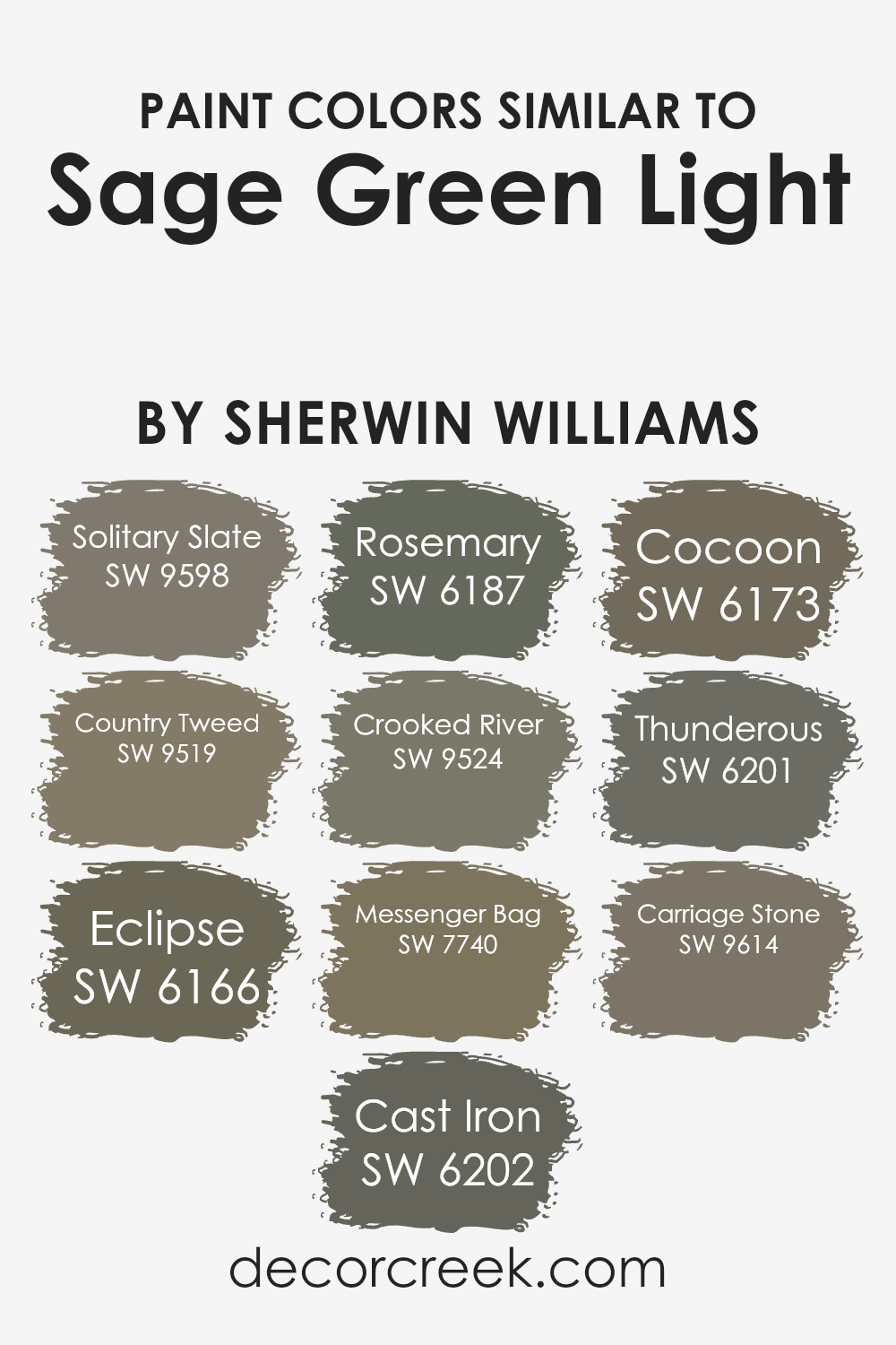
Colors Similar to Sage Green Light SW 2851 by Sherwin Williams
Selecting similar colors to Sage Green Light by Sherwin Williams can significantly enhance the aesthetic continuity and visual appeal of your space. For instance, colors like Solitary Slate and Country Tweed offer subtle variations that maintain harmony while adding depth.
Solitary Slate brings a muted bluish-gray tone that pairs beautifully with softer greens for a refined yet understated look. Country Tweed, on the other hand, lends a more earthy touch with its deeper, herbaceous green, complementing natural wood tones and rustic decors excellently.
Additionally, shades such as Eclipse and Cast Iron provide darker alternatives that can help in creating a striking contrast without overwhelming the gentle nature of sage green. Eclipse offers a deep, almost charcoal gray that works well as an accent, grounding lighter shades.
Cast Iron is a robust, steely gray that can act as a solid foundation for both contemporary and traditional spaces. Furthermore, colors like Rosemary and Crooked River echo the organic essence of Sage Green Light with their hints of green.
Rosemary is a darker, leafy green which is perfect for adding a touch of nature to any room, while Crooked River has a unique, muddy green shade that recalls the earthy banks of a river, ideal for settings that aim for a connection with the outdoors.
You can see recommended paint colors below:
- SW 9598 Solitary Slate (CHECK A SAMPLE)
- SW 9519 Country Tweed (CHECK A SAMPLE)
- SW 6166 Eclipse (CHECK A SAMPLE)
- SW 6202 Cast Iron
- SW 6187 Rosemary (CHECK A SAMPLE)
- SW 9524 Crooked River (CHECK A SAMPLE)
- SW 7740 Messenger Bag (CHECK A SAMPLE)
- SW 6173 Cocoon (CHECK A SAMPLE)
- SW 6201 Thunderous (CHECK A SAMPLE)
- SW 9614 Carriage Stone (CHECK A SAMPLE)
How to Use Sage Green Light SW 2851 by Sherwin Williams In Your Home?
Sage Green Light SW 2851 by Sherwin Williams is a soft and versatile green paint that can add a fresh and calming touch to any room in your home. This particular shade is great for creating a cozy and welcoming atmosphere. Imagine painting your living room or bedroom walls with Sage Green Light; it sets a relaxed mood and pairs well with natural materials like wood or stone.
For a more modern look, you can use this color in your kitchen or bathroom. It pairs beautifully with white cabinets and metallic fixtures, giving the space a clean and airy feel. If you’re not ready to commit to painting entire walls, consider using Sage Green Light for smaller projects like a feature wall or on furniture items like a bookshelf or a desk.
Adding this color to your home can also brighten up dim areas without being too bold, making it a good choice for hallways and entryways. Whether you choose to paint an entire room or add small touches, Sage Green Light can give your home a fresh look.
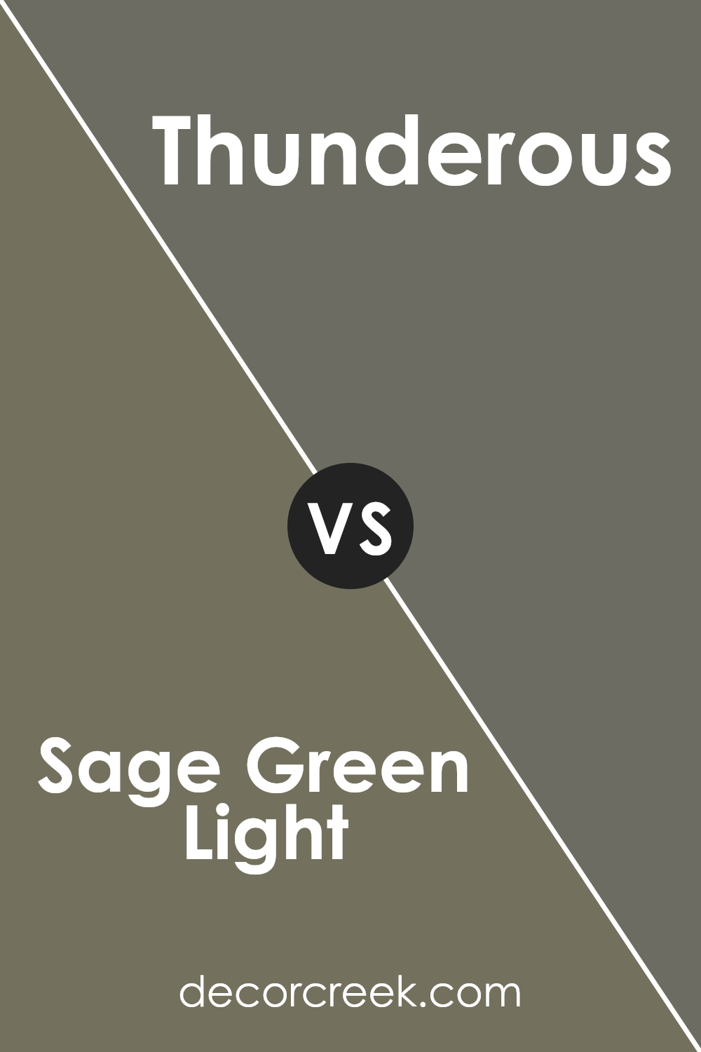
Sage Green Light SW 2851 by Sherwin Williams vs Thunderous SW 6201 by Sherwin Williams
Sage Green Light is a soft and gentle shade of green with a hint of gray, giving it a muted yet fresh appearance that is easy on the eyes. This color brings a natural, calming feel to any space, making it a great choice for rooms where you want to relax, like bedrooms or living areas.
Thunderous, on the other hand, is a much darker gray that leans towards a stormy blue. It’s a strong and bold color that can give a room a dramatic touch. This shade is ideal for creating a striking contrast, especially when used in areas that feature accents or as a statement wall.
When comparing the two, Sage Green Light is lighter and more subdued, providing a soothing backdrop. Thunderous, being darker and more intense, offers depth and a more pronounced presence. Together, they can work well by balancing light and shadow in a room, with Sage Green Light brightening spaces and Thunderous adding a powerful depth.
You can see recommended paint color below:
- SW 6201 Thunderous (CHECK A SAMPLE)
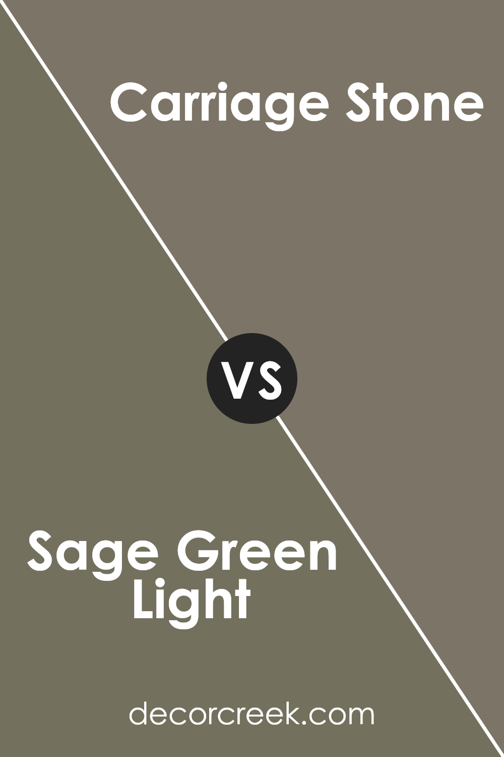
Sage Green Light SW 2851 by Sherwin Williams vs Carriage Stone SW 9614 by Sherwin Williams
Sage Green Light by Sherwin Williams is a soft, muted green with a touch of gray. This color gives off a calm and soothing vibe, making it perfect for creating a relaxed atmosphere in spaces like living rooms or bedrooms. It reflects natural elements, bringing a sense of the outdoors inside.
On the other hand, Carriage Stone by Sherwin Williams is a deeper, warmer gray with earthy undertones. This color is more grounded and provides a strong, stable look. It works well in areas where you want to give a sense of solidity and support, like in dining rooms or home offices.
Both colors are versatile and pair well with various decor styles. Sage Green Light offers a lighter, fresher feel, ideal for brightening up a space, while Carriage Stone provides a more anchored and cozy ambiance, perfect for areas where you want to feel more secure and enveloped. They can also complement each other nicely in a color scheme, balancing light and depth in your home’s palette.
You can see recommended paint color below:
- SW 9614 Carriage Stone (CHECK A SAMPLE)
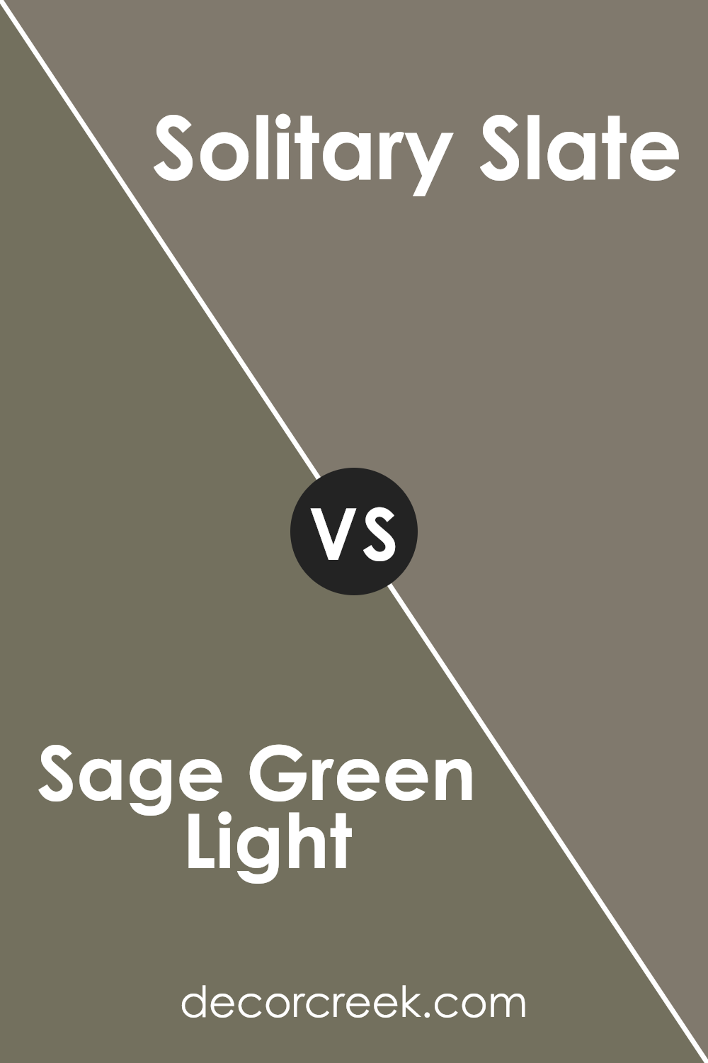
Sage Green Light SW 2851 by Sherwin Williams vs Solitary Slate SW 9598 by Sherwin Williams
Sage Green Light by Sherwin Williams is a soft, muted green that carries the freshness of a calm spring day. It brings a natural feel to any space, making it ideal for creating a cozy, welcoming atmosphere. This light green shade works well in both bright and dimly lit rooms, as it can make a small room feel more open and a large room feel more intimate.
On the other hand, Solitary Slate by Sherwin Williams is a deeper, gray-infused slate color. This shade is more grounded and gives a room a more solid, secure feeling. It’s perfect for adding depth to a space and works exceptionally well in areas that aim for a more reserved and understated look.
Both colors are versatile, but while Sage Green Light adds a touch of lightness and airiness, Solitary Slate offers a stronger sense of stability and definition. They can be used separately or together, depending on the mood and style you want to achieve in your decorating scheme.
You can see recommended paint color below:
Sage Green Light SW 2851 by Sherwin Williams vs Cocoon SW 6173 by Sherwin Williams
The two colors from Sherwin Williams, Sage Green Light and Cocoon, offer distinct atmospheres. Sage Green Light is a lighter, softer green that brings a fresh and airy feel to a space. It’s bright enough to make small rooms appear larger and has a gentle, calming effect. This color is well-suited for bedrooms or living areas where a touch of natural elements is desired.
On the other hand, Cocoon is a deeper, muted beige with a green undertone. It provides a cozy and warm feeling, making it perfect for spaces where you want to relax and feel sheltered. Cocoon works well in dens or reading nooks where a sense of warmth and seclusion is favorable.
Both colors reflect natural elements, but while Sage Green Light leans towards a vibrant, open vibe, Cocoon draws on deeper, sheltering tones to create intimacy. These colors can complement each other in a home where balance between brightness and warmth is needed.
You can see recommended paint color below:
- SW 6173 Cocoon (CHECK A SAMPLE)
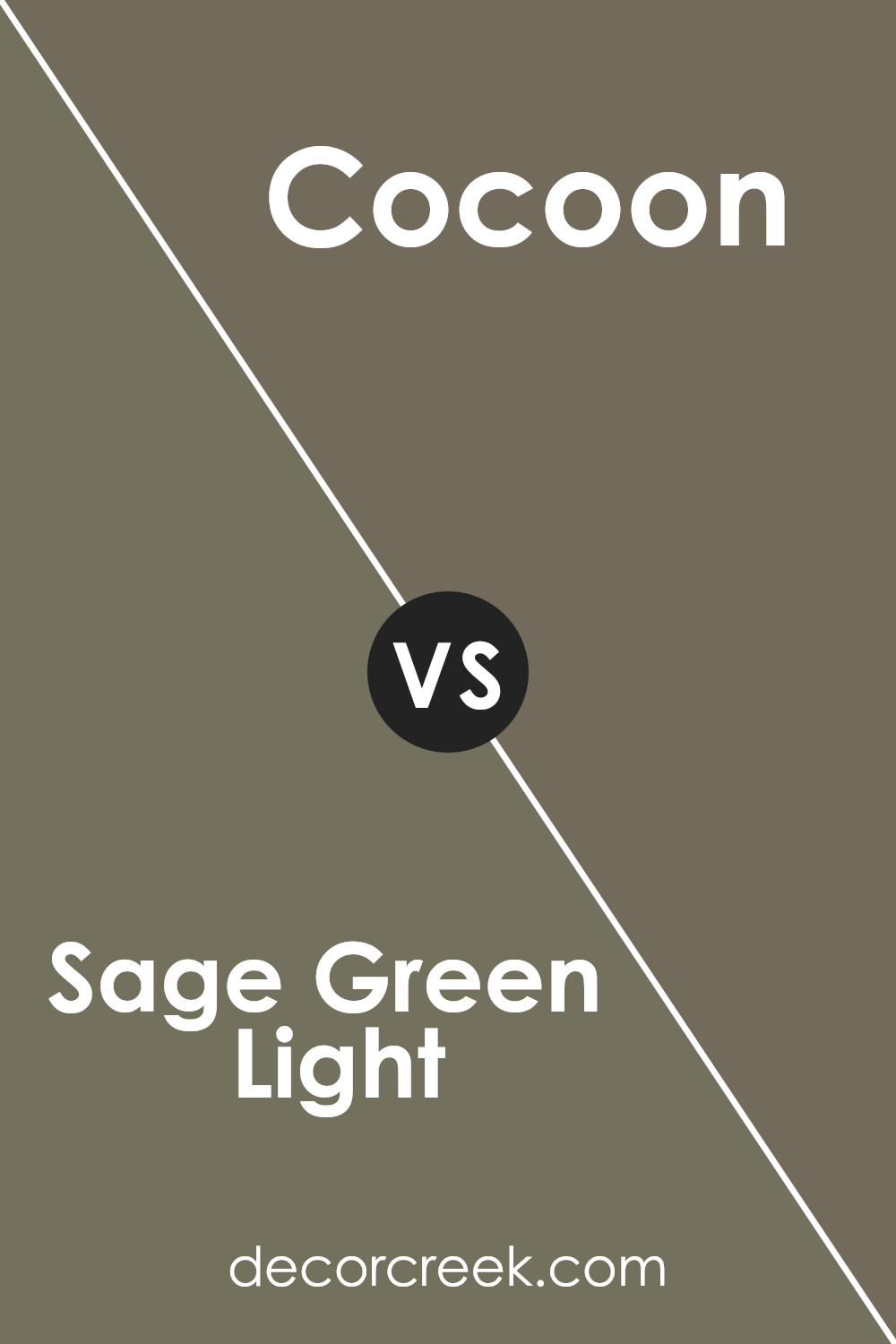
Sage Green Light SW 2851 by Sherwin Williams vs Cast Iron SW 6202 by Sherwin Williams
Sage Green Light by Sherwin Williams is a soft and gentle color that brings a sense of calm and freshness to any space. It’s light and airy, making a room feel more open and inviting. This color works well in places where you want to relax, like bedrooms or living rooms.
On the other hand, Cast Iron by Sherwin Williams is a much darker and bolder shade. It has a strong presence and can add a lot of depth and dramatic flair to a space. This color is great for feature walls or accent pieces to make a statement in an area. It contrasts sharply with lighter colors, making them stand out more.
Both colors offer unique vibes: Sage Green Light adds a breath of fresh air, while Cast Iron gives a solid, anchor-like feel. Depending on what you want to achieve in a room, either color could be a perfect fit.
You can see recommended paint color below:
- SW 6202 Cast Iron
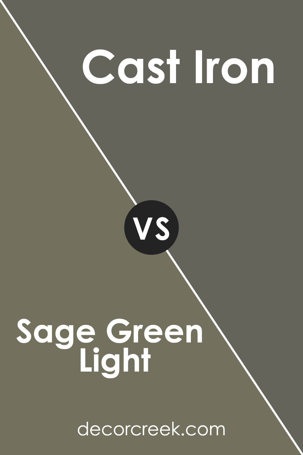
Sage Green Light SW 2851 by Sherwin Williams vs Country Tweed SW 9519 by Sherwin Williams
Sage Green Light and Country Tweed, both by Sherwin Williams, offer unique hues that can enhance any space differently. Sage Green Light is a light, soft green that carries a fresh and airy feel, making it ideal for creating a calm and welcoming atmosphere in places like living rooms or bedrooms. Its subtle tone pairs well with light woods and natural accents, resulting in a friendly and clean look.
On the other hand, Country Tweed is a deeper, muted green with gray undertones. This color lends a more grounded and cozy vibe, making it perfect for spaces that aim for a more tucked-away, comforting feel, such as dens or study rooms. Its richer depth works well with darker furniture and can add a sense of warmth to a room.
In summary, while both shades are green, Sage Green Light provides a lighter, more refreshing touch, suitable for creating a delicate and open space, whereas Country Tweed offers a sense of solidity and warmth suitable for more intimate settings.
You can see recommended paint color below:
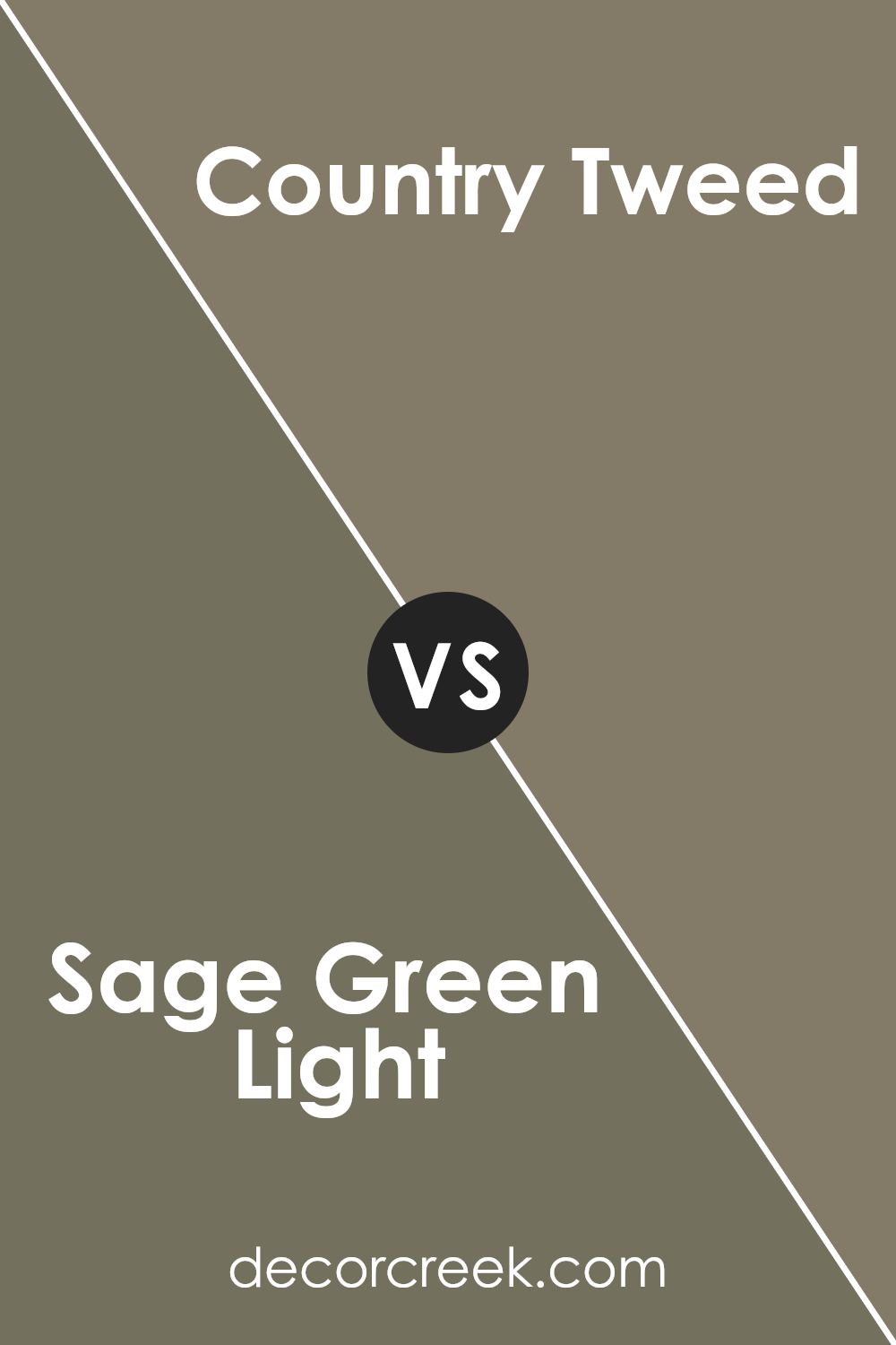
Sage Green Light SW 2851 by Sherwin Williams vs Messenger Bag SW 7740 by Sherwin Williams
Sage Green Light and Messenger Bag by Sherwin Williams are two distinct shades that provide unique atmospheres to any space. Sage Green Light is a soft, muted green with a touch that leans slightly towards gray, making it ideal for creating a calm and inviting environment. It’s a color that pairs well with natural materials like wood and stone, enhancing spaces with a fresh, airy feel.
On the other hand, Messenger Bag is a deeper, olive green shade that offers a more grounded and earthy vibe. This color is bolder compared to Sage Green Light, providing a strong backdrop that can make furniture and decor really stand out. It works well in areas where a more cozy, comforting feel is desired, such as living rooms or studies.
Both colors reflect elements of nature, but while Sage Green Light adds a brighter, lighter touch, Messenger Bag offers depth and intensity. Depending on the mood and style you want to achieve, each color has its unique charm and utility in home design.
You can see recommended paint color below:
- SW 7740 Messenger Bag (CHECK A SAMPLE)
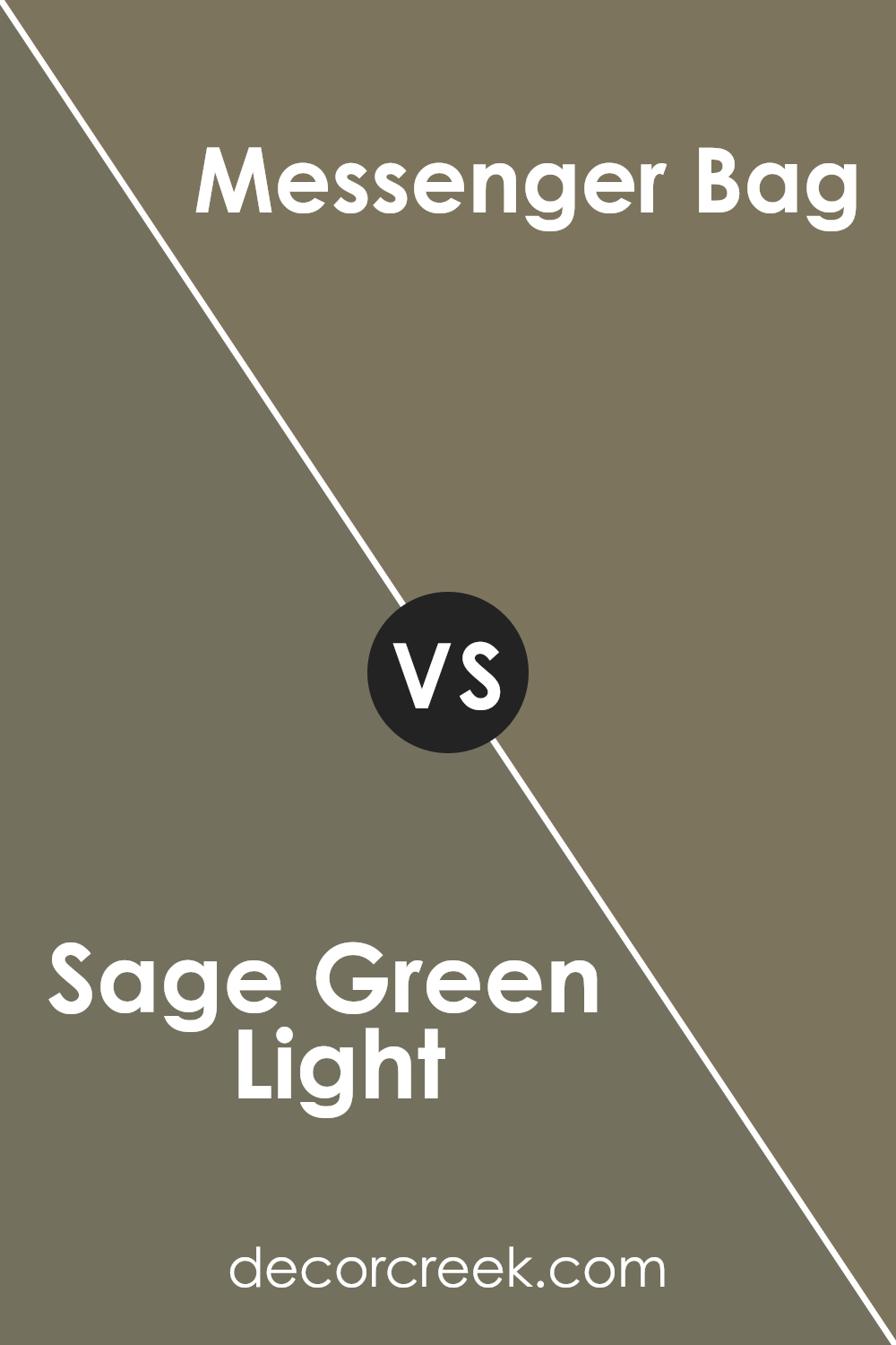
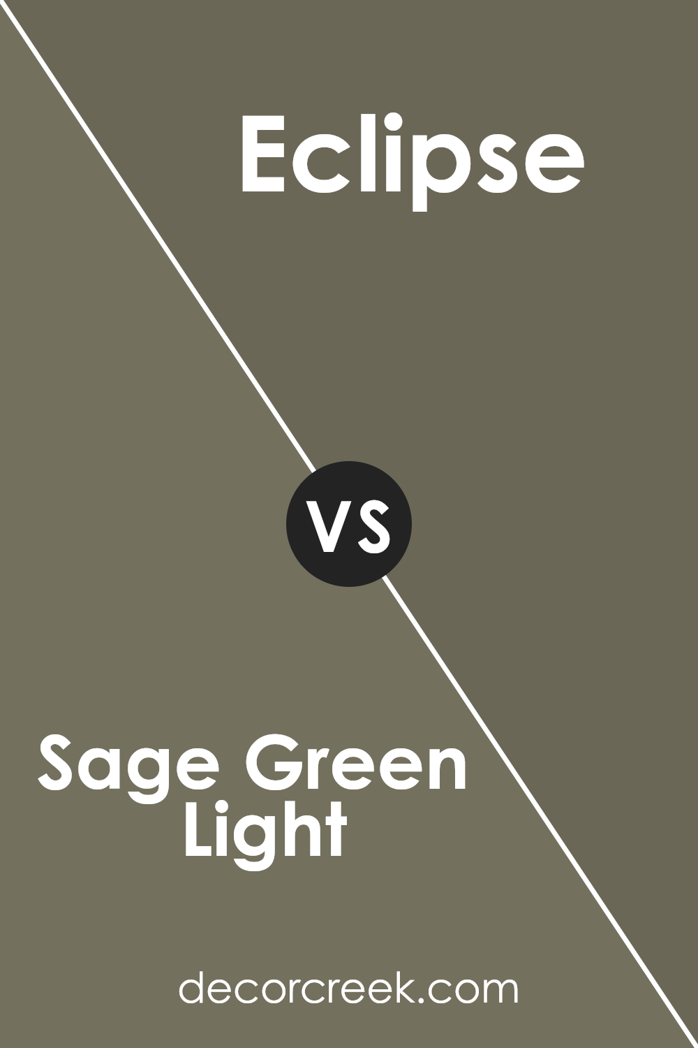
Sage Green Light SW 2851 by Sherwin Williams vs Eclipse SW 6166 by Sherwin Williams
Comparing Sage Green Light and Eclipse by Sherwin Williams shows a nice contrast between the two. Sage Green Light is a soft, muted green with a hint of gray, giving a calm and gentle feel to any space. It’s a light color that makes rooms look more open and airy.
On the other hand, Eclipse is a much darker shade, leaning towards a deep gray with subtle blue undertones. It offers a strong, bold look and can make a dramatic statement when used in interior design.
While Sage Green Light brings a fresh and light ambiance, Eclipse provides a grounding, more dominant presence. The lighter green is great for a comforting, peaceful setting, while the darker gray-blue can create a striking, forceful backdrop. Together, they can complement each other well in a space, with Eclipse anchoring the room and Sage Green Light adding a touch of lightness.
You can see recommended paint color below:
- SW 6166 Eclipse (CHECK A SAMPLE)
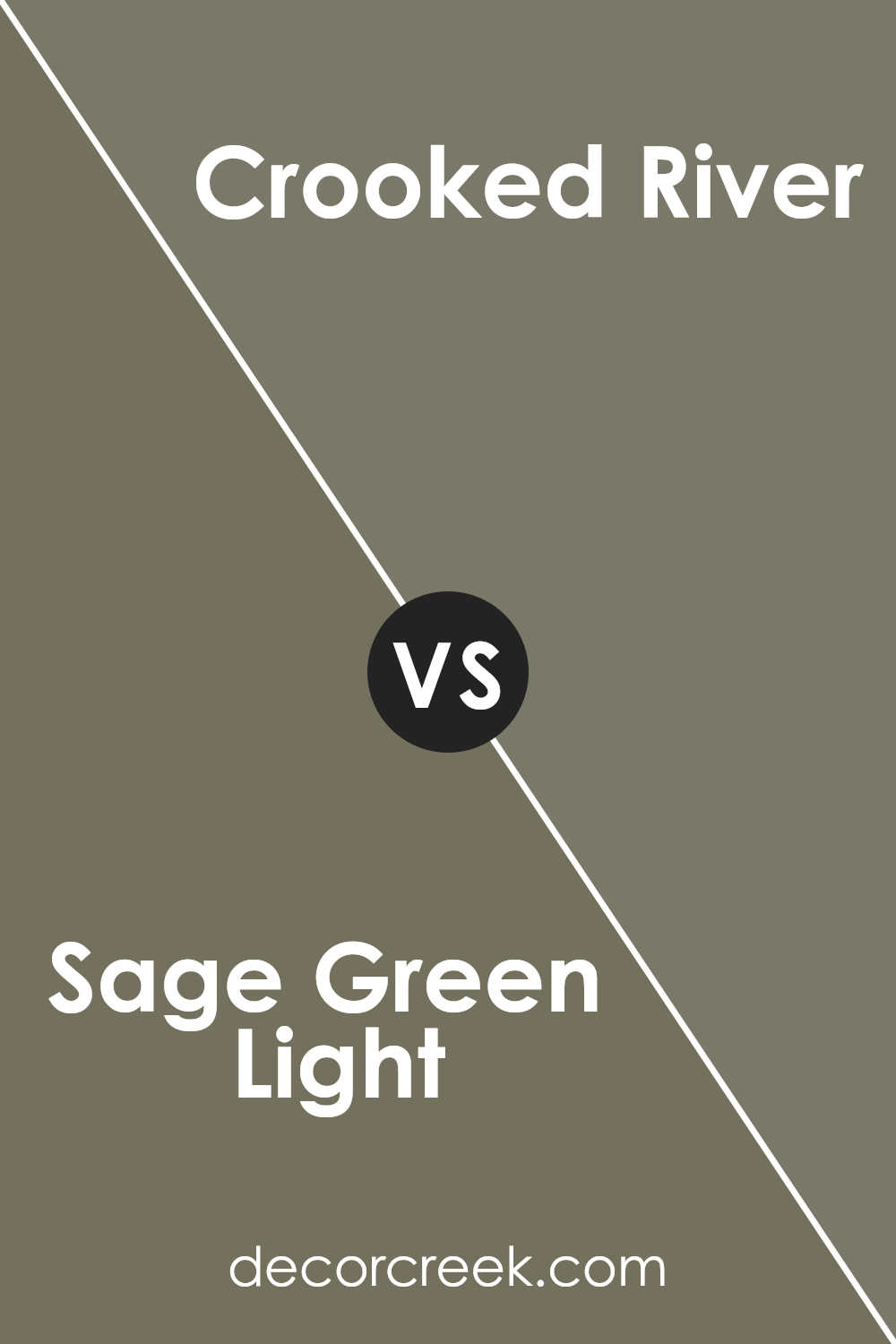
Sage Green Light SW 2851 by Sherwin Williams vs Crooked River SW 9524 by Sherwin Williams
Sage Green Light and Crooked River are two distinctive paint colors from Sherwin Williams. Sage Green Light is a soft, subtle green with a touch of gray, giving it a calming and refreshing feel. This color is perfect for creating a light and airy atmosphere in a room. It’s particularly suited for spaces like bedrooms or living rooms where a gentle and relaxing ambiance is desired.
On the other hand, Crooked River is a deeper, earthier color with strong brown tones. It brings a warm and cozy feel to any space, making it ideal for areas where you want to feel snug and comfortable, like dens or dining rooms.
This color works well in settings that benefit from a more grounded and comforting palette, adding a sense of stability and warmth.
Both colors offer unique vibes and can dramatically alter the mood of a room. While Sage Green Light lifts a space with its breezy freshness, Crooked River anchors a room with its rich, warm hues.
You can see recommended paint color below:
- SW 9524 Crooked River (CHECK A SAMPLE)
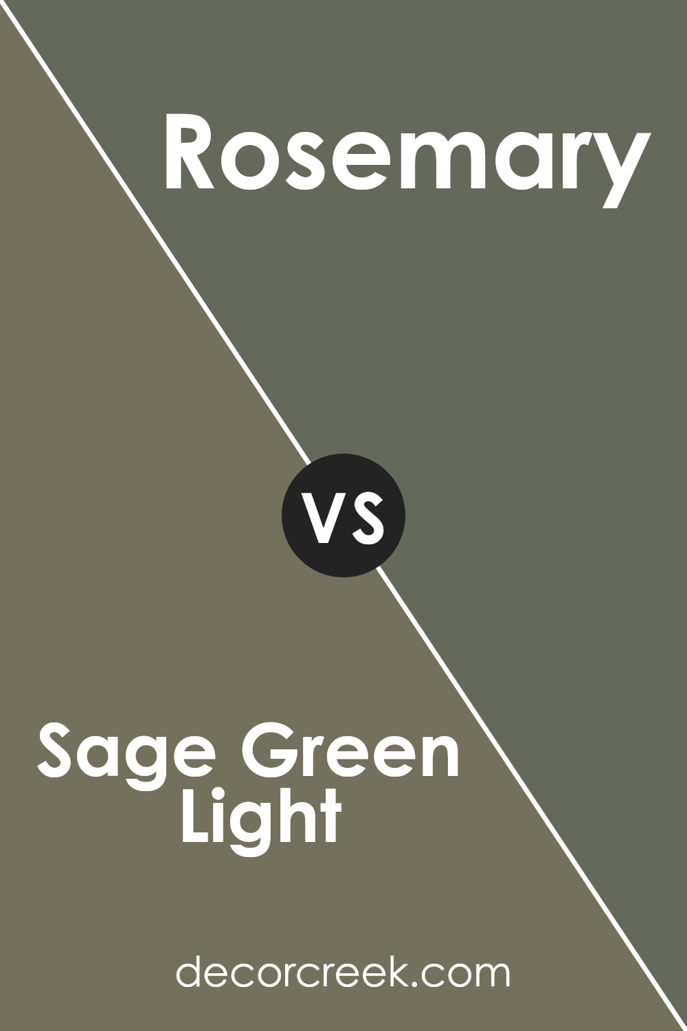
Sage Green Light SW 2851 by Sherwin Williams vs Rosemary SW 6187 by Sherwin Williams
Sage Green Light by Sherwin Williams is a soft and subtle hue, embodying a light, almost pastel green that adds a fresh look to any space. Its gentle tone makes it perfect for creating a calm and welcoming atmosphere in rooms like the kitchen or living room.
On the other hand, Rosemary by Sherwin Williams is a deeper, more herbal green. This color has a richness that can give spaces a more grounded and cozy feel. It works well in areas where a touch of nature is desired without overwhelming the senses.
While both colors draw inspiration from nature, Sage Green Light is lighter and more airy, ideal for smaller spaces or rooms with limited natural light. Rosemary, with its deeper tones, is better suited for larger areas or as an accent wall, providing depth and contrast.
In summary, Sage Green Light is great for a light, refreshing vibe, while Rosemary offers a more substantial presence, making each suitable for different applications based on the desired impact and space characteristics.
You can see recommended paint color below:
Conclusion
Sure, after taking a good look at SW 2851 Sage Green Light by Sherwin Williams, I’d like to share some final thoughts with you. This color is a soft, peaceful green that really makes any space feel calm and cozy. It’s perfect for places where you want to relax, like bedrooms or living rooms. This shade of green reminds me of a quiet garden—it’s gentle and brings a touch of nature indoors.
What’s great about Sage Green Light is that it goes well with lots of different colors. Whether you pair it with light colors like whites and creams, or even darker shades like browns and blacks, it works beautifully without overpowering the room. It also looks good with wooden furniture and can make metal accents pop.
Using this color in your home can make the space feel more connected to the outdoors. It’s also a timeless color, meaning it won’t go out of style quickly. This is perfect for anyone who wants their home to have a classic look that will last for years.
All in all, SW 2851 Sage Green Light by Sherwin Williams is a versatile and inviting color that can help make any space in your home more welcoming and serene.
Ever wished paint sampling was as easy as sticking a sticker? Guess what? Now it is! Discover Samplize's unique Peel & Stick samples.
Get paint samples


