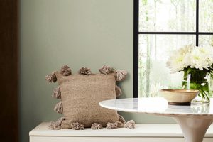
This unique shade embodies the tranquility and depth of a misty morning sky, blending seamlessly with a variety of design aesthetics, from the sleek and modern to the cozy and traditional. Solitary Slate’s versatile nature allows it to be a harmonious choice for living spaces, bedrooms, and even home offices, providing a calm and collected ambiance that encourages both relaxation and productivity.
As homeowners and interior designers alike search for hues that offer both beauty and flexibility, Solitary Slate emerges as a top contender. Its ability to act as a neutral, yet with more personality than the typical beige or gray, makes it a perfect foundation or accent within a room.
Whether it’s the main color in a minimalist living room, a serene background in a spa-like bathroom, or a chic statement in a contemporary kitchen, SW 9598 Solitary Slate adapts to its surroundings while maintaining its unique allure.
Beyond its aesthetic appeal, Solitary Slate is also praised for its ease of application and compatibility with a wide range of furniture and decor items, making it an excellent choice for anyone looking to refresh their space with a touch of elegance and sophistication.

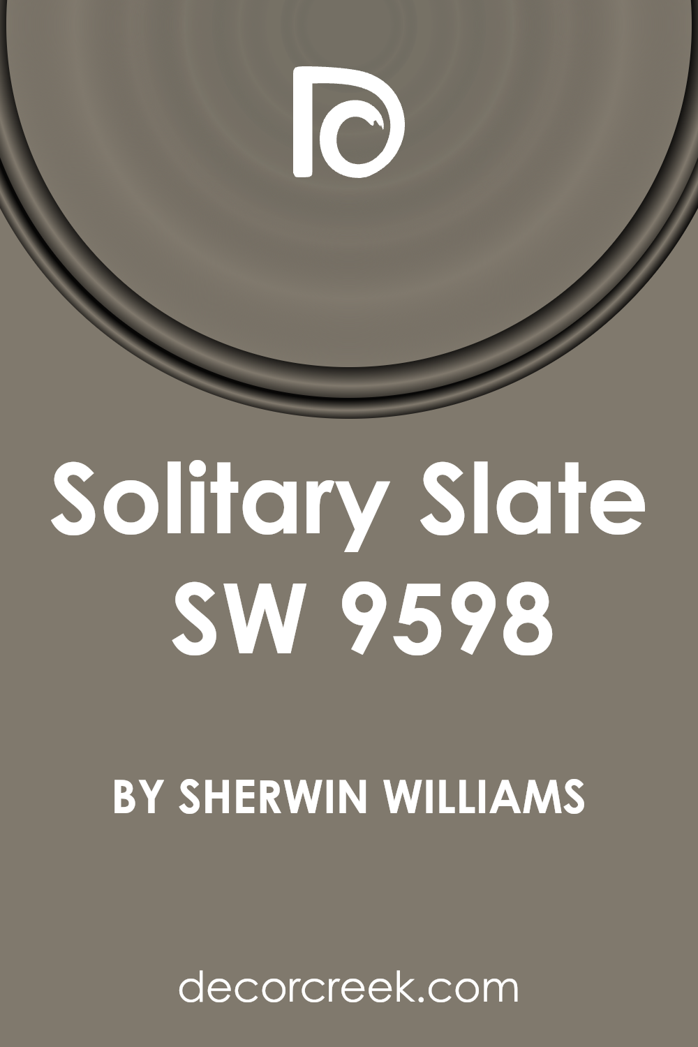
What Color Is Solitary Slate SW 9598 by Sherwin Williams?
Solitary Slate is a captivating color that exudes a blend of strength and serenity, embodying an elegance that can transform any room into a peaceful sanctuary. This hue, a refined gray with subtle blue undertones, presents a timeless aesthetic that balances perfectly between warm and cool.
Its versatility allows it to adapt beautifully across various interior styles, elevating spaces with its sophisticated charm.
In contemporary and minimalist interiors, Solitary Slate serves as a grounding force, providing a sleek backdrop that highlights modern furnishings and bold art pieces. Its subdued nature allows for a seamless integration with natural materials, such as light woods, stone, and metals, further accentuating its understated elegance.
In spaces aiming for a more traditional or transitional look, this color brings depth and dimension, pairing wonderfully with rich textures like velvet, silk, and wool, creating an inviting and cozy atmosphere.
Solitary Slate works exceptionally well with soft, muted tones, adding a layer of depth when contrasted against crisp whites or lighter grays. For a dynamic and visually appealing palette, incorporate accents in mustard, burnt orange, or deep teal, which beautifully complement its cool base.
This color’s adaptability and timeless nature make it an excellent choice for those looking to imbue their space with tranquility and class.
Ever wished paint sampling was as easy as sticking a sticker? Guess what? Now it is! Discover Samplize's unique Peel & Stick samples.
Get paint samples

Is Solitary Slate SW 9598 by Sherwin Williams Warm or Cool color?
Solitary Slate is a distinctive color offering by Sherwin Williams, characterized by its deep, introspective gray with hints of blue undertones, providing a sense of calm and sophistication to any space. This nuanced hue brings versatility to the palette of homeowners, acting as a serene backdrop that complements a wide array of decor styles, from modern minimalism to cozy traditional.
Its unique blend captures the tranquility of a solitary seascape under a slate sky, making it an ideal choice for creating a contemplative and peaceful atmosphere in homes.
The impact of this color in interior spaces is profound. It has the capability to open up smaller rooms, giving an illusion of a more expansive space, while in larger areas, it can add depth and focus. The subtle undertones of Solitary Slate allow for seamless integration with both warm and cool accent colors, offering endless possibilities for personalization.
Whether applied in living rooms, bedrooms, or bathrooms, it brings a harmonious and balanced aesthetic, making spaces more inviting and restful. This makes Solitary Slate not just a color but a transformative design element that enhances the way homes feel and function.
Undertones of Solitary Slate SW 9598 by Sherwin Williams
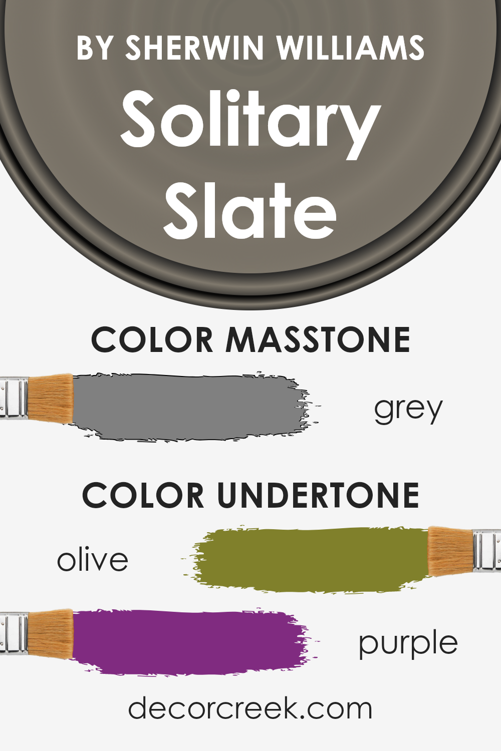
Solitary Slate is a captivating color that embodies a unique depth and complexity, thanks in part to its subtle undertones. The nuanced presence of olive and purple undertones significantly impacts how this color is perceived and experienced in a space. Olive undertones introduce a hint of earthiness, bringing warmth and a grounding effect to the cooler, more neutral base.
This touch of natural green can make spaces feel more inviting and connected to the outdoors, even in the absence of direct natural elements. On the other hand, the purple undertones add a layer of richness and sophistication, injecting a subtle intrigue into the color. This blend of warmth and depth can transform an ordinary room into a serene and thought-provoking space.
The way these undertones influence the perception of Solitary Slate varies dramatically with lighting conditions and juxtaposition with other colors. In natural light, the olive undertones might become more pronounced, enhancing the connection with nature and making the room feel more alive.
Conversely, in artificial lighting, the purple undertones could emerge stronger, adding a luxurious and cozy feel to the space. These undertones affect how Solitary Slate interacts with other colors and materials in interior walls, enabling it to adapt and complement a wide range of designs, from minimalist to more elaborate decor.
Thus, the olive and purple undertones in Solitary Slate contribute to its versatility and charm, making it an appealing choice for those looking to bring a sophisticated and balanced palette into their interiors.
What is the Masstone of the Solitary Slate SW 9598 by Sherwin Williams?
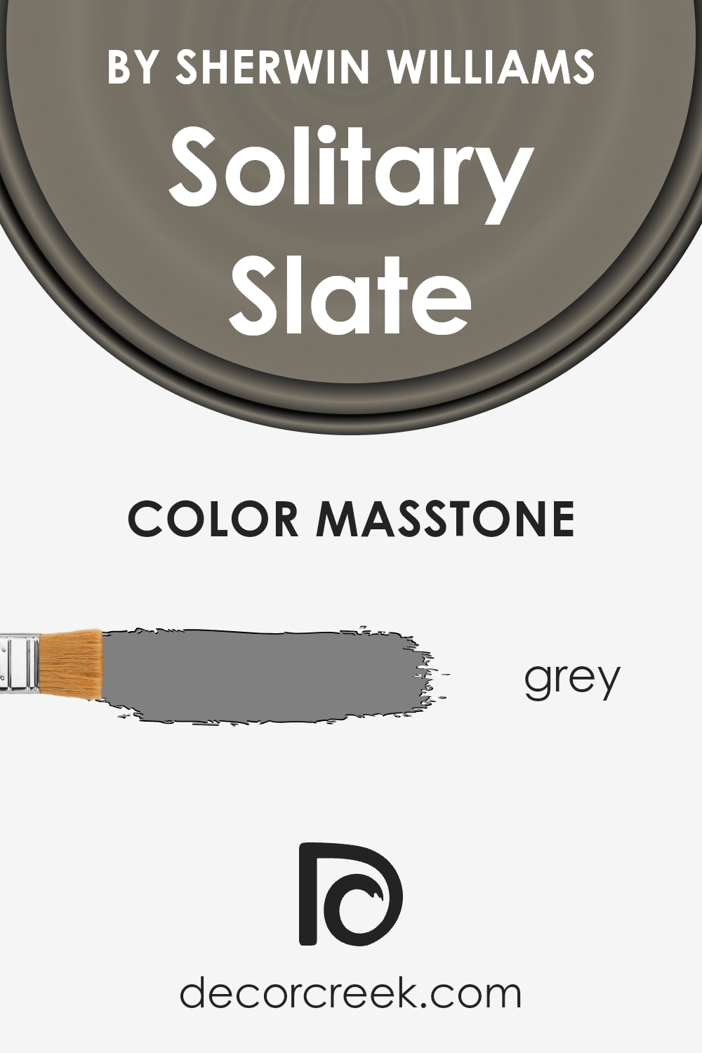
Solitary Slate presents a harmonious grey masstone that beautifully captures the essence of calm and understated elegance. This particular shade of grey offers a versatile palette that can seamlessly integrate into various home styles, from contemporary to classic.
Its grey base, precisely balanced at the midpoint of the grey scale, stands as a testament to its adaptability, making it an exemplary choice for those seeking a color that can complement a wide range of furnishings, artworks, and accent colors.
The neutrality of this grey encourages a sense of tranquility and space in environments where it is applied, making it ideal for rooms intended as serene retreats from the bustling world outside. Its inherent ability to reflect both warm and cool tones allows it to adapt to different lighting conditions, subtly changing its character from the soft glow of morning light to the dusky ambience of the evening.
With this versatility, it supports a dynamic interaction with the surrounding space, enhancing the perception of depth and openness in smaller rooms, while adding a layer of sophistication and grounding in larger spaces.
By choosing this particular shade of grey, homeowners can create a timeless backdrop that invites creative expression through decor and furnishing choices, enabling personal style to shine without overwhelming the senses.
How Does Lighting Affect Solitary Slate SW 9598 by Sherwin Williams?
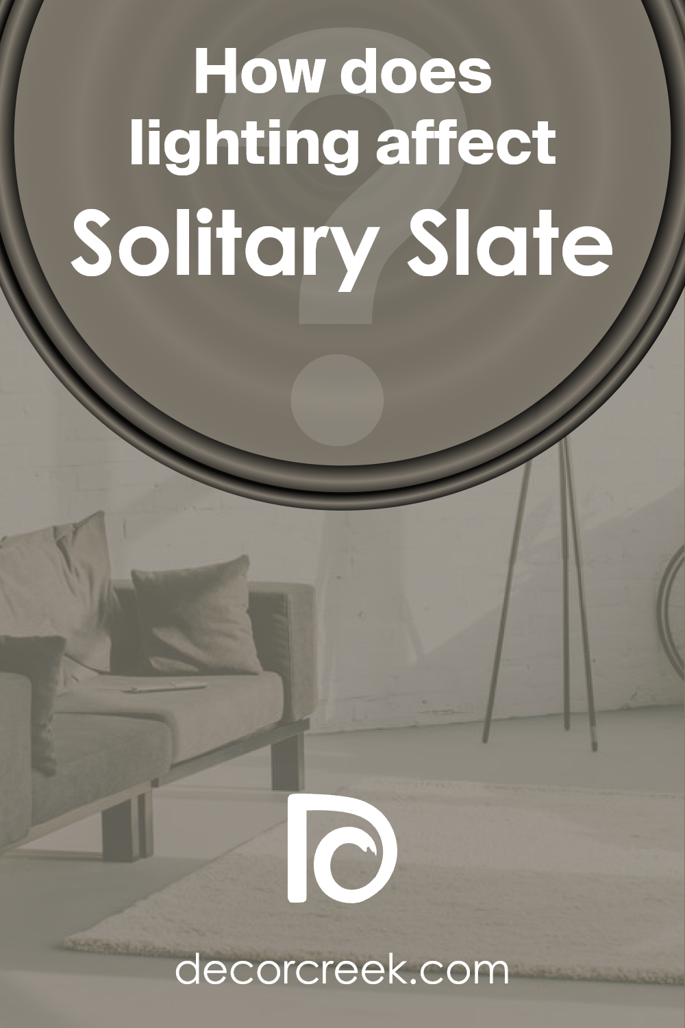
Lighting plays a crucial role in how we perceive colors, affecting both their intensity and hue. The interplay between light and color can dramatically alter the appearance of a room, influencing its ambiance and the comfort level of its occupants.
When considering a specific paint color, such as a gray with subtle undertones like the one offered by Sherwin Williams, understanding how lighting affects its appearance is key to achieving desired results in interior spaces.
In artificial light, colors can appear differently depending on the type of bulbs used. Incandescent lighting tends to warm colors, making them appear more vibrant and rich. In the context of a gray hue with complex undertones, artificial light can highlight its warmth, making the space feel cozier.
LED or fluorescent bulbs, on the other hand, have a cooler light, which can enhance the gray’s cooler undertones, giving the room a more modern and crisp feel.
Natural light brings another dimension to color perception. North-facing rooms receive less direct sunlight, meaning colors can appear cooler and more muted. In such rooms, a sophisticated gray can seem more subdued, emphasizing its cooler aspects, which can make the space feel serene and calm.
South-facing rooms bask in abundant sunlight, which can amplify the warmth in the color, making the room feel brighter and more welcoming.
East-facing rooms enjoy the warm glow of morning light, which can make the color appear softer and slightly warmer in the mornings, transitioning to cooler tones as the day progresses. This dynamic change can add a beautiful complexity to the room, making the color appear versatile throughout the day.
West-facing rooms, bathed in the intense afternoon and evening light, can reveal the deepest tones in the color, highlighting any underlying warmth and making the space feel vibrant in the afternoons and cozy as the sun sets.
Understanding how light direction and type affect color perception is vital when choosing paint colors for interior spaces. A nuanced color like the sophisticated gray from Sherwin Williams can offer versatility and elegance, adapting its personality from serene to vibrant, depending on the room’s orientation and the light it receives.
This insight allows designers and homeowners to make informed choices, creating atmospheres that align with their aesthetic preferences and functional needs.
What is the LRV of Solitary Slate SW 9598 by Sherwin Williams?
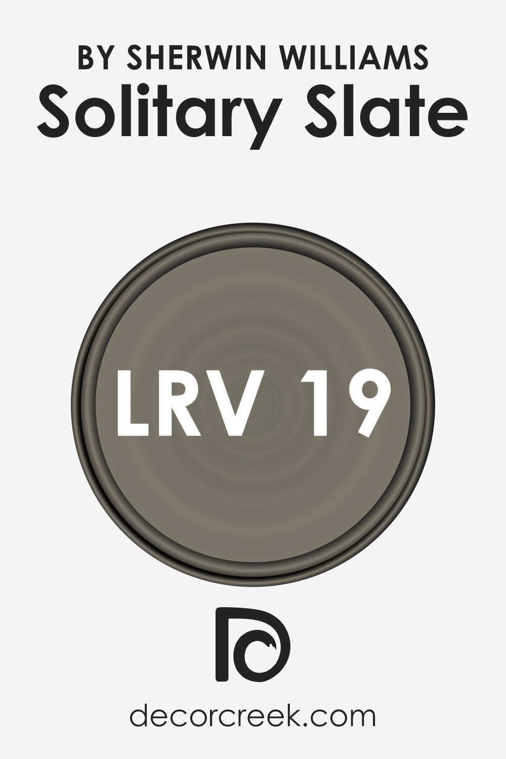
LRV, or Light Reflectance Value, plays a crucial role in the visual and functional aspects of interior and exterior design. It is a measure of the percentage of light a paint color reflects from or absorbs into a surface, calculated on a scale from 0 to 100, where 0 absorbs all light (pure black) and 100 reflects all light (pure white).
This value is important for determining how bright or dark a color will appear in a specific setting and can significantly impact the ambiance of a room. Higher LRV colors can make spaces appear larger and more illuminated, while lower LRV colors contribute to a cozier, more intimate feel.
This metric is especially useful in choosing paint colors that will enhance natural light in a room or compensate for the lack of it.
The LRV of 19.474 for the color in question indicates that it is on the darker end of the spectrum, absorbing more light than it reflects. This means that when applied to walls, this color will lend a rich, deep tone to the space, potentially making it feel more enclosed or intimate.
It’s an important consideration in rooms where the goal is to create a sense of warmth and coziness or to make a bold statement. However, the use of lighter-colored furnishings and adequate artificial or natural lighting can balance out its depth, preventing the room from feeling too dark.
This LRV suggests that the color is versatile but best used in spaces where its deep, introspective quality can be used to its full advantage, particularly in well-lit areas or as an accent to provide visual depth and interest.
LRV – what does it mean? Read This Before Finding Your Perfect Paint Color
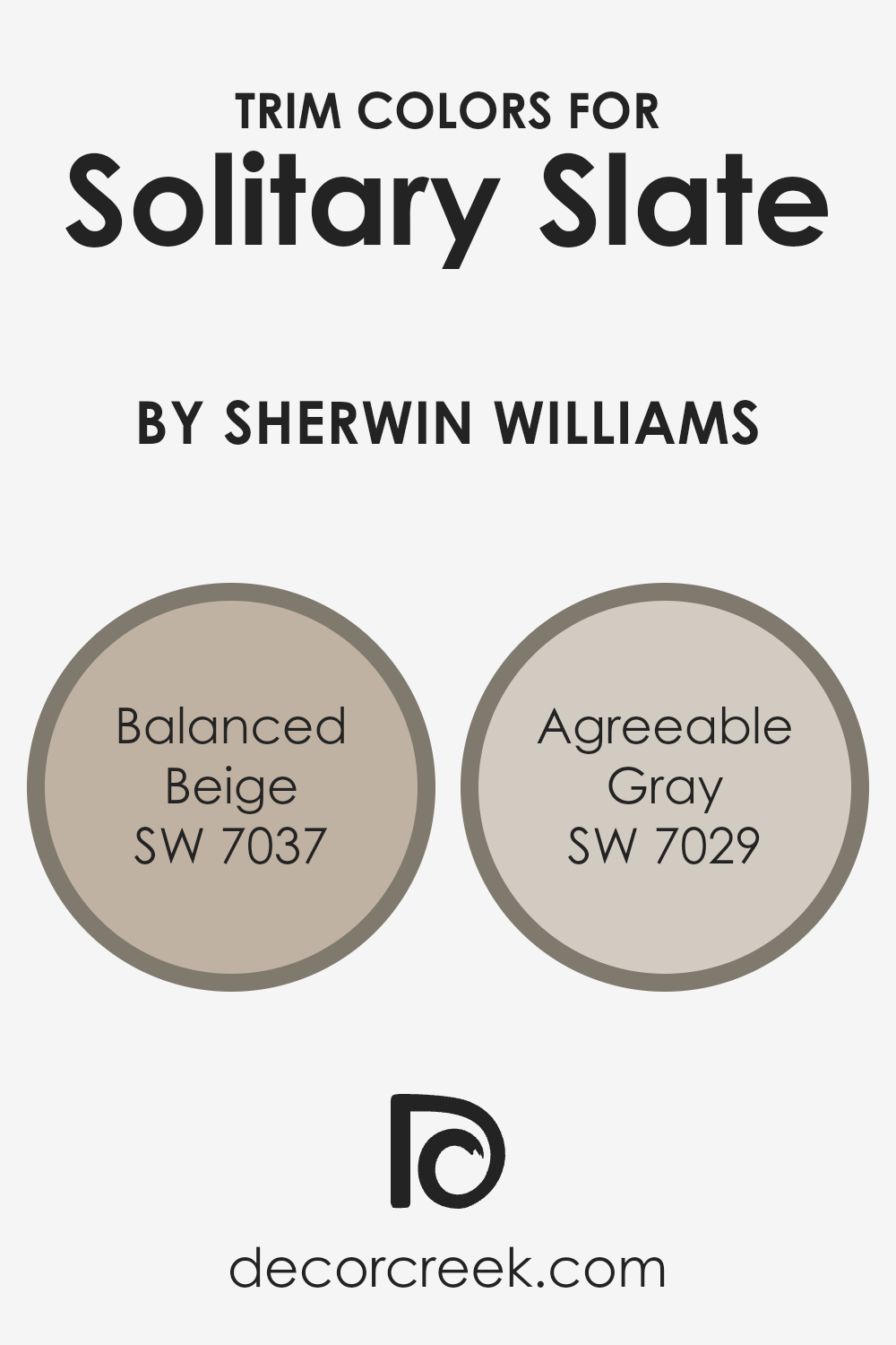
What are the Trim colors of Solitary Slate SW 9598 by Sherwin Williams?
Trim colors are essential elements in home decor that frame and accentuate the walls, providing a polished finish to the room. When paired with a distinctive shade like the calming and sophisticated tone of Solitary Slate by Sherwin Williams, selecting the right trim colors becomes crucial in enhancing the visual appeal and overall ambiance.
Balance and harmony are key; thus, choices like Balanced Beige and Agreeable Gray serve as perfect complements. These trim colors not only frame the space beautifully, drawing attention to the architectural features, but also subtly tie the room’s aesthetics together, creating a cohesive look that resonates with warmth and sophistication.
Balanced Beige is a warm, inviting hue that brings a sense of tranquility and earthiness to the trim, offering a soft contrast that highlights the serene quality of Solitary Slate without overpowering it. Its undertones harmonize with the cooler notes of Solitary Slate, providing a pleasant visual flow that’s both inviting and comforting.
Agreeable Gray, on the other hand, lends a more neutral backdrop, a light, airy gray that balances the cooler tones of Solitary Slate, ensuring the space feels open and bright. This color supports a modern and minimalist aesthetic, subtly enhancing the room’s features without detracting from the wall color’s depth and sophistication.
Together, these trim colors contribute significantly to creating a space that’s both cohesive and beautifully presented, encapsulating the room’s desired ambiance.
You can see recommended paint colors below:
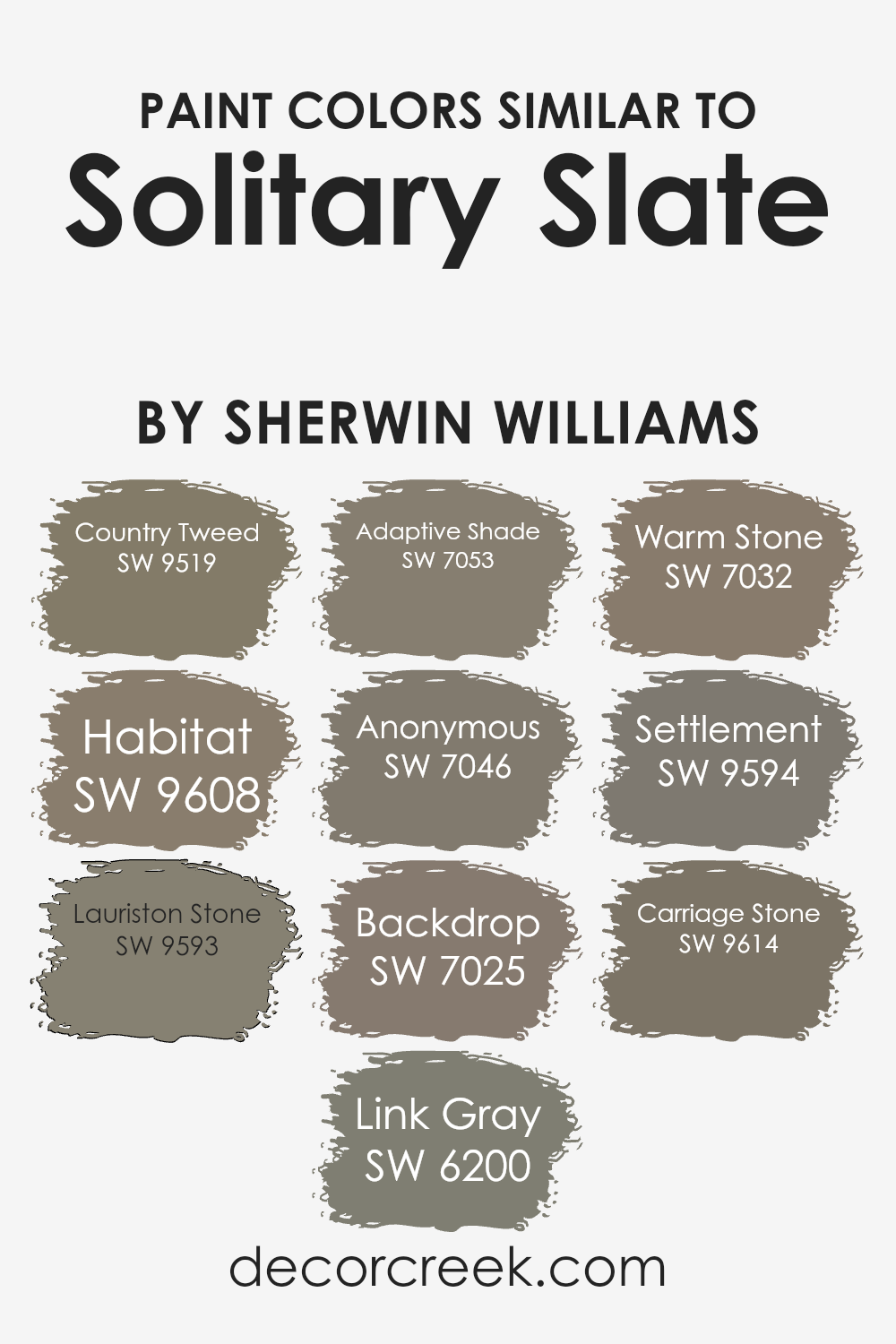
Colors Similar to Solitary Slate SW 9598 by Sherwin Williams
The subtle art of coordinating similar colors plays a pivotal role in creating an aesthetically pleasing and harmonious space. The nuanced variations among colors similar to Solitary Slate by Sherwin Williams, such as Country Tweed, Habitat, Lauriston Stone, Link Gray, Adaptive Shade, Anonymous, Backdrop, Warm Stone, Settlement, and Carriage Stone, demonstrate the power of slight differences in hue and tone to infuse depth and complexity into interior design.
These colors, while individually distinct, share a common foundation that allows them to work cohesively within a space, promoting a sense of unity without monotony. The diversity within this palette enables designers to craft environments that can variably evoke calmness, warmth, or sophistication depending on the combination and application of these shades.
Country Tweed offers a touch of earthiness that grounds the environment, whereas Habitat introduces a richer, deeper layer, reminiscent of natural elements. Lauriston Stone brings a soft, neutral warmth that brightens spaces subtly, and Link Gray steps in with its slightly cooler, more detached presence.
Adaptive Shade whispers versatility, fitting seamlessly into various decor styles, while Anonymous adds a muted, enigmatic depth. Backdrop provides a robust, dramatic anchor that invites boldness into spaces. In contrast, Warm Stone exudes a welcoming warmth, perfect for creating cozy corners.
Settlement whispers historical charm without overwhelming, and finally, Carriage Stone concludes with a touch of refined, old-world elegance, making each of these colors a unique contributor to the symphony of design.
You can see recommended paint colors below:
- SW 9519 Country Tweed
- SW 9608 Habitat
- SW 9593 Lauriston Stone
- SW 6200 Link Gray
- SW 7053 Adaptive Shade
- SW 7046 Anonymous
- SW 7025 Backdrop
- SW 7032 Warm Stone
- SW 9594 Settlement
- SW 9614 Carriage Stone
How to Use Solitary Slate SW 9598 by Sherwin Williams In Your Home?
Solitary Slate is a sophisticated and versatile paint color that exudes tranquility and elegance. As a unique shade that straddles the line between gray and blue, it has the remarkable ability to adapt to various styles and lighting conditions, making it a fantastic choice for any room in the home.
Its calm, muted tones provide a serene backdrop for both modern and traditional décor, ensuring it complements a wide range of furniture and accessories.
For living rooms or bedrooms, Solitary Slate creates a peaceful sanctuary, inviting relaxation and reflection. It pairs beautifully with soft whites and natural materials like wood and stone, enhancing the sense of harmony and balance in the space.
In bathrooms and kitchens, this color can refresh the area, bringing a clean and airy feel that maximizes natural light.
Moreover, utilizing Solitary Slate on cabinetry or as an accent wall can add a subtle hint of color and sophistication to the room without overwhelming it. Its understated elegance allows for creative flexibility in decorating, from bold color contrasts to a more muted palette, making it a perfect canvas for personal expression in your home.
Solitary Slate SW 9598 by Sherwin Williams vs Carriage Stone SW 9614 by Sherwin Williams
Solitary Slate and Carriage Stone, both from Sherwin Williams, offer distinctly different ambiance and mood to spaces, highlighting the versatility in their collection. Solitary Slate, as the name suggests, delves into the cooler spectrum with its deep, muted gray tones, reflecting an almost stony, serene, and sophisticated feel.
This color is ideal for creating a calming, grounded environment, enhancing spaces with a touch of modernity and elegance. On the other hand, Carriage Stone steps away from the coldness of grays, embracing a warmer, earthier palette. It straddles the line between beige and light brown, conjuring images of natural clay or sunbaked stone.
This warm hue brings a cozy, welcoming atmosphere to rooms, perfect for settings where comfort and warmth are paramount. When comparing the two, the choice between Solitary Slate and Carriage Stone comes down to the desired aesthetic; cool and contemporary versus warm and inviting.
You can see recommended paint color below:
- SW 9614 Carriage Stone
Solitary Slate SW 9598 by Sherwin Williams vs Anonymous SW 7046 by Sherwin Williams
Solitary Slate and Anonymous are two nuanced colors from Sherwin Williams, each presenting a unique ambiance for spaces they adorn. Solitary Slate is a deep, brooding gray with cool undertones, suggesting a sense of sophistication and modern elegance.
It’s a color that stands out for its ability to add depth and character to a room, making it feel more grounded and serene. On the other hand, Anonymous drifts into the realm of softer, warmer grays. It carries a lighter, more versatile tone that bridges the gap between neutrality and warmth.
This color can effortlessly complement a wide range of decor styles, from contemporary to traditional, adding a subtle layer of complexity without overwhelming the senses. While both colors share the tranquility and neutrality of gray, Solitary Slate leans towards a cooler, more intense presence, whereas Anonymous offers a gentler, inviting feel, making them suitable for different moods and settings.
You can see recommended paint color below:
- SW 7046 Anonymous
Solitary Slate SW 9598 by Sherwin Williams vs Warm Stone SW 7032 by Sherwin Williams
Solitary Slate and Warm Stone, both from Sherwin Williams, offer unique aesthetic vibes for interiors and exteriors. Solitary Slate presents as a deep, rich gray with subtle blue undertones, evoking a sense of quiet sophistication and modern elegance.
Its depth makes it particularly striking as an accent wall or when used to add drama in a space that receives a good amount of natural light.
On the other hand, Warm Stone carries a cozy, inviting warmth, with its blend of soft beige and gentle gray creating an effortlessly neutral background. This color is versatile, blending seamlessly with a wide range of decor styles and color palettes. It works well in spaces where a sense of calm and comfort is desired, such as living rooms or bedrooms.
While Solitary Slate leans into a cooler, more dramatic mood, Warm Stone tilts towards warmth and neutrality. Each brings its own unique character to a space, with Solitary Slate offering bold sophistication and Warm Stone exuding a welcoming, serene vibe.
You can see recommended paint color below:
- SW 7032 Warm Stone
Solitary Slate SW 9598 by Sherwin Williams vs Settlement SW 9594 by Sherwin Williams
Solitary Slate and Settlement, both from Sherwin Williams, present intriguingly subtle yet distinct tones that can dramatically influence the ambiance of a space. Solitary Slate is a deeper, more pronounced hue, veering towards a richer, cooler gray.
This color embodies sophistication and flexibility, making it a perfect choice for creating a strong, serene, and grounded environment. It pairs beautifully with a wide range of decor styles, adding depth and focus.
On the other hand, Settlement offers a lighter, warmer gray tone, imbued with an inviting softness. Its earthy undercurrents suggest comfort and tranquility, suitable for spaces intended to be soothing and welcoming. Settlement acts as a gentle backdrop, enhancing other colors and design elements without overwhelming them.
Comparatively, Solitary Slate brings a bold yet calming anchor to a room, while Settlement introduces a subtle, nurturing warmth. Both colors provide unique atmospheres: one is ideal for crafting a statement space with a contemporary edge, and the other for creating a cozy retreat.
You can see recommended paint color below:
- SW 9594 Settlement
Solitary Slate SW 9598 by Sherwin Williams vs Lauriston Stone SW 9593 by Sherwin Williams
Solitary Slate and Lauriston Stone, both from Sherwin Williams, embody a serene, sophisticated palette, yet each offers a unique ambiance to interior spaces. Solitary Slate stands out as a deeper, more pronounced hue, reminiscent of the shadowy hues found in a dense forest at twilight.
It brings a richness and depth, making it ideal for creating a focal point or accentuating architectural details.
On the other hand, Lauriston Stone has a lighter, warmer tone that exudes a natural, earthy feel. It offers a versatile backdrop that complements a wide range of decors, enhancing the space with a subtle, welcoming glow. Its understated elegance can brighten rooms, giving them an airy, open feel.
While both colors share a sophisticated undertone, Solitary Slate offers a bold statement, inviting mystery and depth into the space. Lauriston Stone, in contrast, provides a gentle warmth, creating a tranquil and inviting atmosphere.
Together, these hues can harmonize within a color scheme, offering balance between light and dark, warmth and depth, making them suitable for a multitude of design aesthetics.
You can see recommended paint color below:
- SW 9593 Lauriston Stone
Solitary Slate SW 9598 by Sherwin Williams vs Adaptive Shade SW 7053 by Sherwin Williams
Solitary Slate and Adaptive Shade, both by Sherwin Williams, offer distinct hues that cater to varying aesthetic preferences. Solitary Slate is a deep, contemplative gray that evokes a sense of calmness and solidity.
Its rich undertone provides a strong base, making it ideal for creating a serene environment with a touch of sophistication. This color works wonders in spaces designed for focus and tranquility, such as home offices or bedrooms.
On the other hand, Adaptive Shade is a lighter, more versatile gray that seamlessly blends with various decor styles. It carries a subtle warmth, making it exceptionally adaptable to different lighting conditions and color palettes.
This quality allows it to serve as a neutral backdrop that can enhance contemporary, minimalist, or classic interiors without overpowering other design elements.
While Solitary Slate offers depth and intensity, Adaptive Shade provides flexibility and lightness. Their unique characteristics enable them to cater to specific design needs, whether one seeks to create a bold statement or a harmonious space that adapts to changing styles and preferences.
You can see recommended paint color below:
- SW 7053 Adaptive Shade
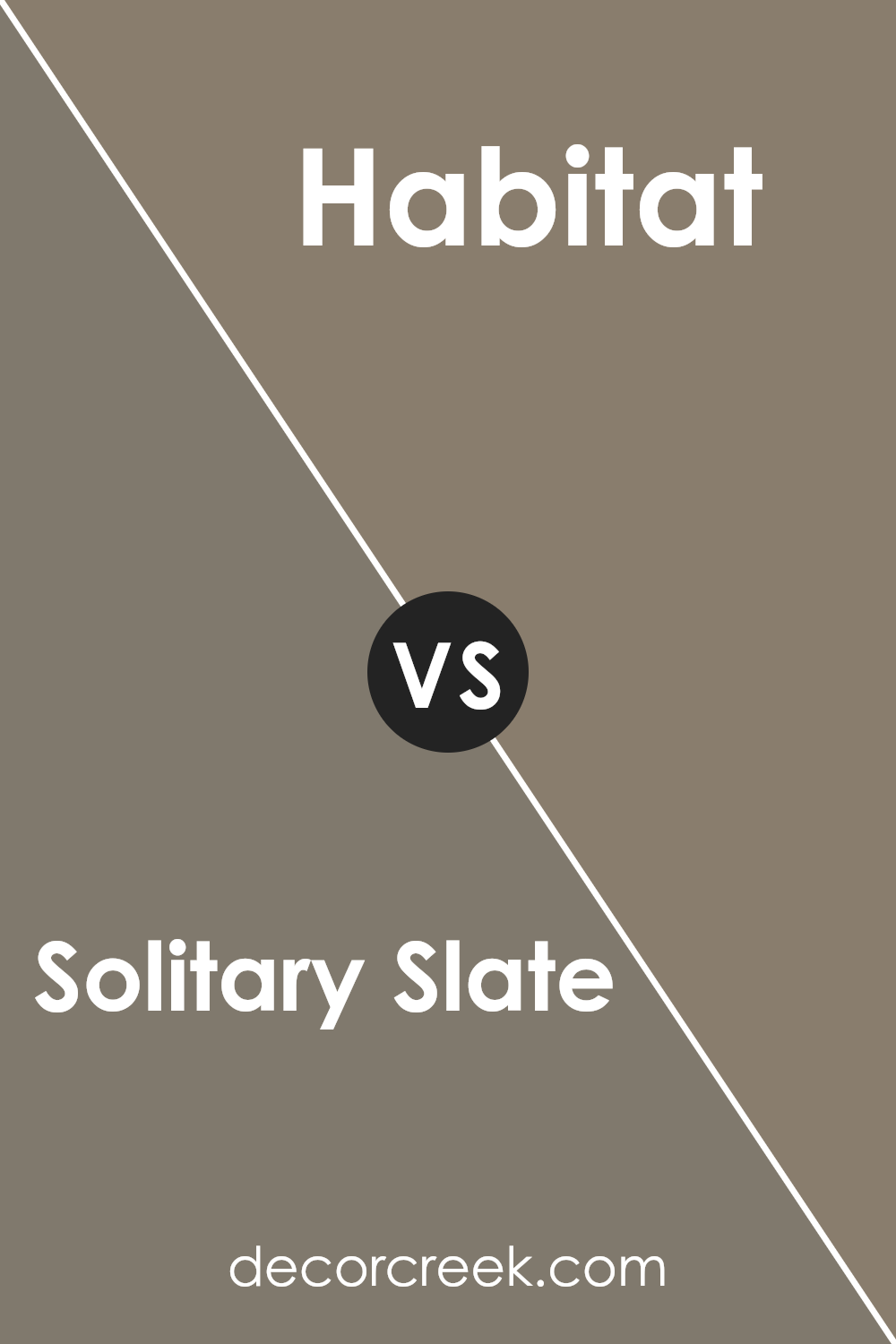
Solitary Slate SW 9598 by Sherwin Williams vs Habitat SW 9608 by Sherwin Williams
Solitary Slate and Habitat, both from Sherwin Williams, present a nuanced dialogue in the realm of interior and exterior paints. Solitary Slate embodies a deep, muted blue with tones that evoke the tranquility and depth of dusk skies or the serene depths of a still lake.
It’s a color that communicates stability, sophistication, and a touch of mystique. On the other hand, Habitat introduces a warmer, nature-inspired hue, leaning towards a soft, earthy green that mimics the serenity of a lush forest or a quiet meadow at dawn. This color fosters a sense of renewal, grounding, and connection to the natural world.
When comparing these two, it’s evident that while both carry a sense of calm and comfort, they do so from distinctly different perspectives. Solitary Slate veers towards the introspective and contemplative side of color psychology, making spaces feel more enclosed and focused.
Habitat, conversely, opens up spaces with its lightness and warmth, promoting a sense of openness and organic harmony. Together, they could create a compelling balance within a space, catering to different emotional and aesthetic needs depending on their application.
You can see recommended paint color below:
- SW 9608 Habitat
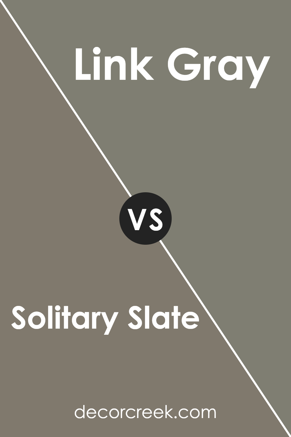
Solitary Slate SW 9598 by Sherwin Williams vs Link Gray SW 6200 by Sherwin Williams
Solitary Slate and Link Gray, both from Sherwin Williams, provide unique yet harmoniously blending options for those seeking sophisticated and versatile paint colors. Solitary Slate is a deeper, more intense hue, offering an almost enigmatic charm that leans towards a cooler, shadowed sophistication.
It embodies an air of mystery and depth, making it perfect for creating focal points or accentuating architectural features within a space.
On the other hand, Link Gray presents a softer, more neutral gray that carries a delicate balance between warmth and coolness, making it incredibly adaptable and a favoured choice for those desiring a serene and inviting atmosphere.
Its versatility allows for seamless integration into various decor styles and palettes, promoting a sense of calm and collectedness.
While both colors share a foundational gray base, Solitary Slate brings a bolder, more pronounced character to spaces, promoting a feeling of solace and introspection. Link Gray, conversely, offers a lighter, airier feel, capable of expanding spaces visually while maintaining a cozy, understated elegance.
Together, they can be used to achieve a dynamic contrast or to complement each other, depending on the desired aesthetic and mood of the room.
You can see recommended paint color below:
- SW 6200 Link Gray
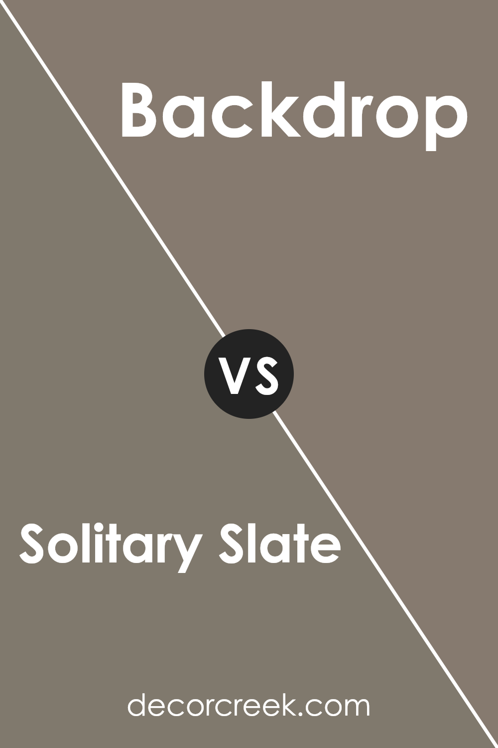
Solitary Slate SW 9598 by Sherwin Williams vs Backdrop SW 7025 by Sherwin Williams
Solitary Slate and Backdrop, both from Sherwin Williams, present a nuanced palette of greys, embodying distinctive moods and styles. Solitary Slate offers a deeper, more contemplative grey, hinting at a sophisticated and slightly bolder aesthetic.
Its richness provides a strong foundation, making it an excellent choice for creating a statement space or an elegant backdrop that commands attention.
On the other hand, Backdrop embodies a lighter, more neutral grey. It carries an inherent versatility, seamlessly blending with various decor styles, from the modern to the traditional. This color offers a softer approach, promoting a sense of calm and understated elegance.
It’s perfect for spaces that crave a gentle touch of neutrality, offering a clean canvas without overwhelming the senses.
In essence, while both colors provide a modern and tasteful grey palette, Solitary Slate leans towards a deeper, more pronounced expression, ideal for striking spaces. Backdrop, conversely, offers a lighter, serene vibe, perfect for creating a subtle yet sophisticated atmosphere.
You can see recommended paint color below:
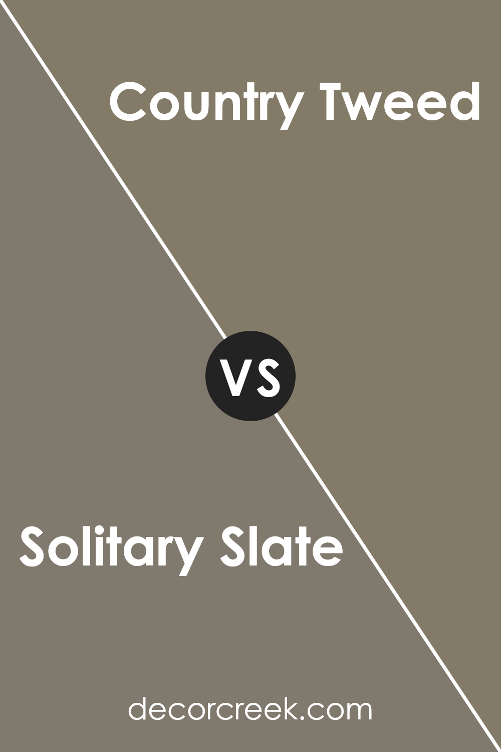
Solitary Slate SW 9598 by Sherwin Williams vs Country Tweed SW 9519 by Sherwin Williams
Solitary Slate is a deeply introspective shade that leans towards the cooler end of the spectrum, offering a serene and sophisticated backdrop. It’s the kind of color that embodies tranquility, making spaces feel more open and airy yet grounded.
Its subtle blue undertones provide a calming effect, ideally suited for creating a peaceful retreat in any room. The color resonates particularly well in areas designed for relaxation and focus, such as bedrooms and home offices.
In contrast, Country Tweed occupies a warmer, earthier niche. Its rich, taupe-like quality exudes comfort and organic warmth, bringing a cozy, inviting atmosphere to spaces. This color thrives in areas where a touch of warmth is desired, seamlessly blending with natural elements and materials to create a welcoming environment.
Its versatility allows it to adapt from traditional to more contemporary settings, making it a universal choice for adding depth and warmth.
Both colors offer distinct emotional tones: Solitary Slate brings a cool, contemplative ambiance, while Country Tweed offers warmth and comforting embrace, demonstrating their unique abilities to influence the feeling and style of a space.
You can see recommended paint color below:
Conclusion
Solitary Slate by Sherwin Williams emerges as a nuanced and sophisticated choice for those seeking to imbue their spaces with a serene yet undeniably modern aesthetic. This particular shade offers a perfect balance between strength and subtlety, making it an ideal backdrop for a wide range of interior design schemes.
It provides a versatile canvas that enhances both contemporary and traditional decors, proving itself as a go-to color for designers and homeowners alike who are looking to create spaces that feel both grounded and expansively inviting.
Incorporating Solitary Slate into interiors or exteriors allows for a remarkable transformation, offering a sense of calm and refinement without overwhelming the senses. Its ability to pair well with natural elements, as well as various textures and colors, makes it incredibly adaptable to different styles and preferences.
Whether used as a dominant theme or an accent feature, Solitary Slate stands out for its ability to elevate the aesthetic value of any space, asserting itself as a timeless and elegant choice within Sherwin Williams’ repertoire of colors.
Ever wished paint sampling was as easy as sticking a sticker? Guess what? Now it is! Discover Samplize's unique Peel & Stick samples.
Get paint samples