It’s one of those shades that effortlessly merges sophistication with warmth, making it an ideal choice for various spaces in a home. As I considered using this color in my own living area, I found that it perfectly complemented both modern and traditional design elements.
Salisbury Green has a unique tone that’s not too bold, yet not too subdued—it strikes a harmonious balance. Its versatility allows it to pair beautifully with a variety of other colors and materials, whether you prefer wood, metal, or a mix of textures.
What truly drew me to this color was its ability to create a sense of coziness and comfort. It seems to wrap around you in a gentle embrace, turning any room into a welcoming retreat.
I noticed that the way it interacts with light can bring different nuances to a space, sometimes appearing as a muted backdrop and other times as a subtle highlight.
Choosing paint can often be overwhelming, but Salisbury Green made that decision easy for me.
It’s a choice that can effortlessly reflect personal style while bringing an enduring sense of peace and balance.
What Color Is Salisbury Green HC-139 by Benjamin Moore?
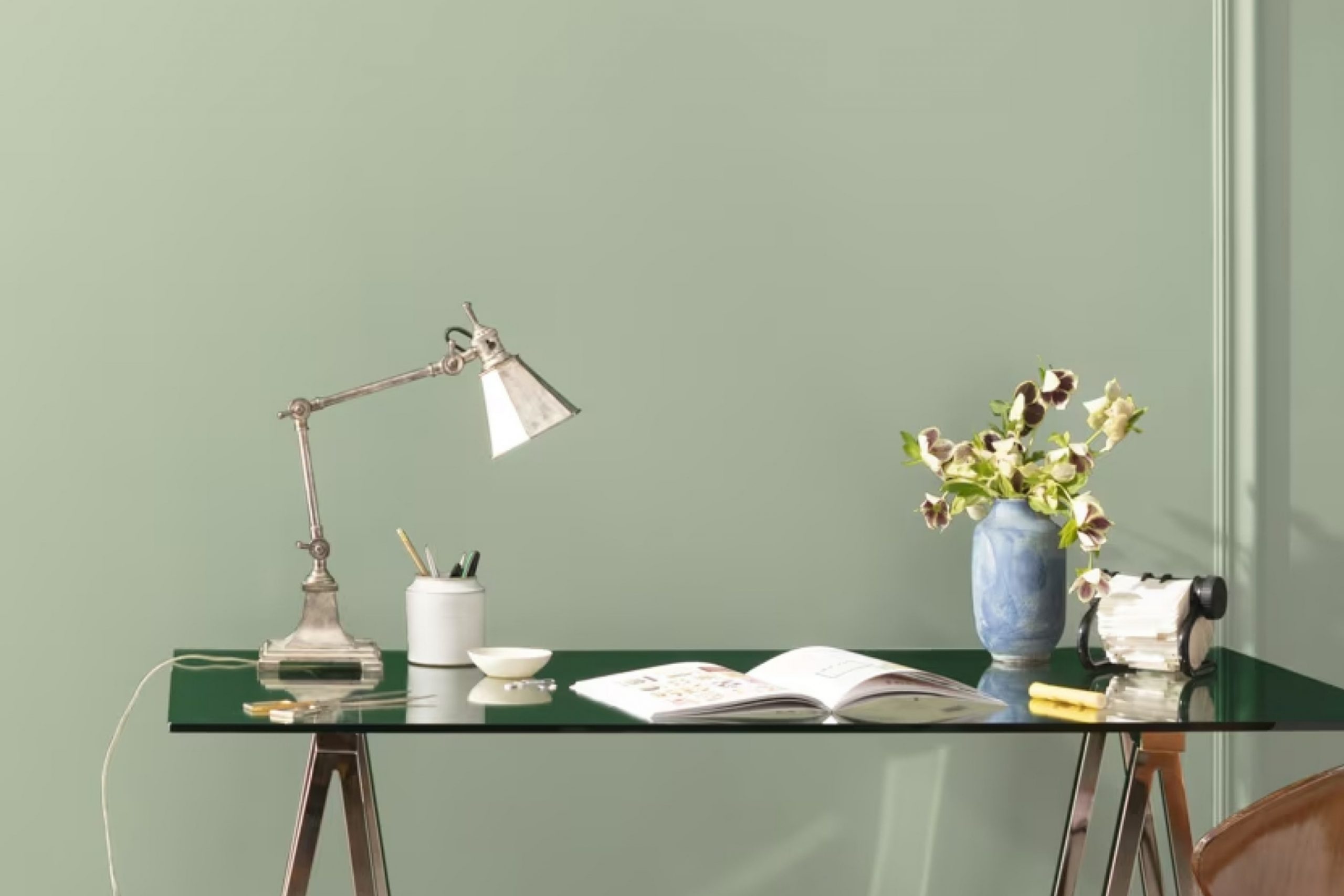
Salisbury Green HC-139 by Benjamin Moore is a subtle, muted green that brings a gentle, natural touch to any space. Its soft, earthy tone feels both fresh and timeless, creating a calming atmosphere. This green is versatile and works well in various interior styles, especially those emphasizing natural elements and simplicity.
In a farmhouse or cottage-style home, Salisbury Green can enhance the cozy, welcoming feel, pairing beautifully with rustic woods and whitewashed finishes.
In a modern or minimalist space, its understated hue can provide a gentle contrast to sleek lines and monochromatic schemes without overpowering the simplicity. It’s also a great choice for traditional interiors, bringing a hint of nature indoors while complementing classic furniture pieces and vintage decor.
To pair Salisbury Green effectively, consider using it alongside materials like light or medium-toned wood, which highlight the color’s natural quality.
Textures such as linen or cotton add to the softness it brings, giving the room a comfortable and inviting look.
Metals like brushed brass or matte black can offer a modern edge, serving as accents that add interest without clashing. With its harmonious and effortless charm, Salisbury Green is a timeless choice for any room needing a touch of nature.
Is Salisbury Green HC-139 by Benjamin Moore Warm or Cool color?
Salisbury Green HC-139 by Benjamin Moore is a versatile paint color that brings a sense of calm and warmth to homes. This color is a muted, earthy green with subtle gray undertones, making it suitable for various spaces. In living rooms or bedrooms, Salisbury Green can create a cozy and inviting environment. It pairs well with natural materials like wood and stone, enhancing the warmth and comfort of the space.
In kitchens or dining areas, this shade provides a soft backdrop that complements white or cream cabinetry and accents. It’s also an excellent choice for home offices or study areas, as the muted tone helps maintain focus without being distracting.
Salisbury Green works well with both modern and traditional decor. It can be paired with neutral colors like beige and taupe, or used with contrasting bold colors for a more dynamic look. Overall, this color adds a subtle touch of nature, promoting a balanced and peaceful ambiance in the home.
Undertones of Salisbury Green HC-139 by Benjamin Moore
Salisbury Green by Benjamin Moore has various undertones that subtly change how we perceive the paint color on walls. The main color, a muted green, is influenced by undertones of mint, light gray, light blue, pale pink, gray, light purple, lilac, yellow, light green, orange, and olive.
These undertones mix to create a versatile and complex color. For instance, mint and light green can make Salisbury Green feel fresher and more vibrant.
Light gray and gray tones soften the color, giving it a more reserved and calming appearance. Light blue and lilac introduce a coolness, adding depth.
On the other hand, pale pink and light purple add a hint of warmth and sophistication, while yellow and orange provide subtle brightness that can make spaces appear more inviting.
Olive undertones contribute to an earthy, grounded feel, enhancing the green’s natural qualities.
Overall, these undertones affect how Salisbury Green looks on walls by shifting its warmth and coolness depending on the lighting and surrounding colors.
In bright, natural light, cooler undertones might stand out, whereas, in a dimly lit room, warmer tones can appear more prominent, changing the room’s mood significantly.

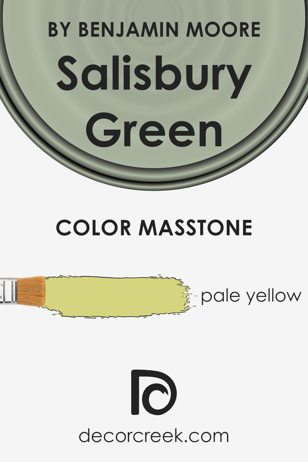
What is the Masstone of the Salisbury Green HC-139 by Benjamin Moore?
Salisbury Green HC-139 by Benjamin Moore is a soft pale yellow color. Because of its light and airy tone, it works well in homes to create a welcoming and pleasant atmosphere. In rooms with lots of natural light, this pale yellow can feel bright and cheerful without being overwhelming.
It adds warmth to spaces that might otherwise feel cold or sterile. In darker rooms, it can help lift and lighten the space, bringing a sense of freshness and openness.
This color can be a versatile choice for kitchen walls, paired with white cabinets or light wood finishes, to create a cozy and bright cooking space. It can also add a gentle glow to a bedroom, making it feel comfortable and inviting. In living rooms, it pairs well with soft greens, blues, or neutral tones, creating a harmonious balance.
Overall, its subtlety and warmth make it an excellent choice for creating a comfortable and inviting home atmosphere.
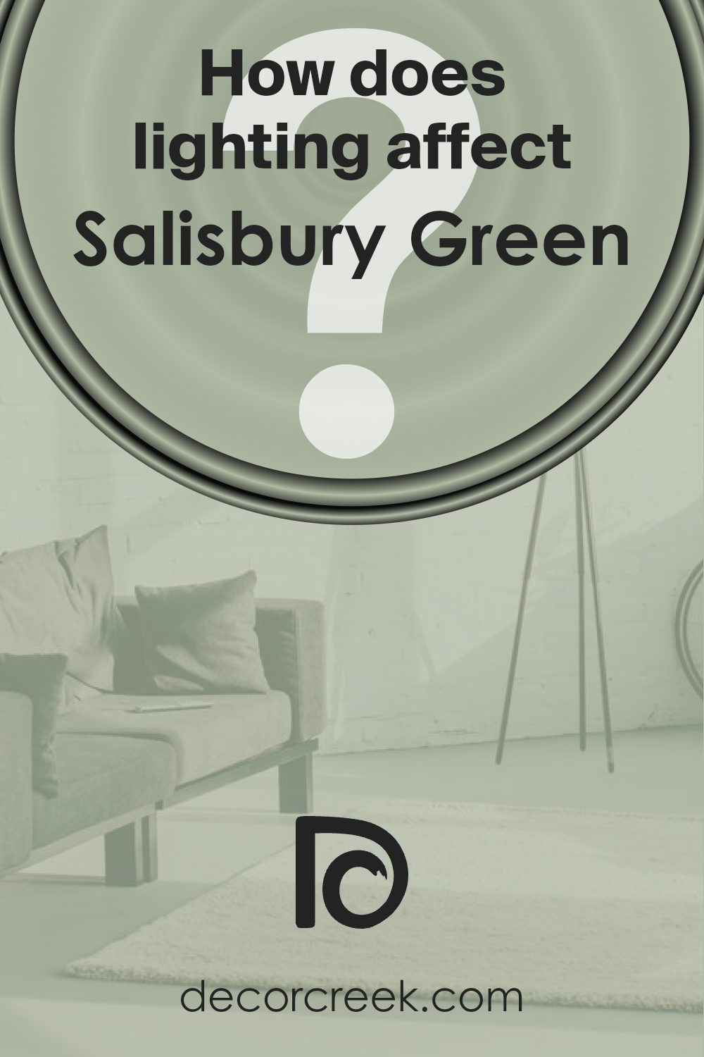
How Does Lighting Affect Salisbury Green HC-139 by Benjamin Moore?
Lighting plays a crucial role in how we perceive colors in a space. The same color can look quite different depending on the type of light and its intensity. Salisbury Green (HC-139) by Benjamin Moore is a soft, muted green that can change with the lighting.
Under artificial light, Salisbury Green can appear warmer and more muted. Incandescent bulbs, which emit a warm yellow light, can make the green appear cozier and softer.
LED lights, which can range from warm to cool, can also influence the color’s appearance; a cooler LED can make it appear slightly more bluish, while a warmer LED brings out the green’s warmth.
In natural light, Salisbury Green can really show its true nature. The color will vary throughout the day as the intensity and angle of the sunlight change.
In north-facing rooms, where the light is cooler and more consistent, Salisbury Green may appear more subdued and cooler, with a hint of gray. The limited sunlight in these rooms means the green can look more muted.
South-facing rooms benefit from abundant warm natural light throughout the day. In these rooms, Salisbury Green can appear vibrant and warm, as the light enhances its natural warmth and richness.
East-facing rooms receive bright, direct morning light. In the morning, Salisbury Green will look brighter and livelier as it catches the warm golden sunlight. However, as the sun moves westward, the color may appear softer and cooler.
West-facing rooms, with their warm afternoon and evening light, will see Salisbury Green take on a rich and embracing tone as the day progresses. The color can look more intense and warmer, reflecting the golden hues of the setting sun.
Overall, Salisbury Green is versatile and adapts well to different lighting conditions, making it a great choice for various rooms and orientations.
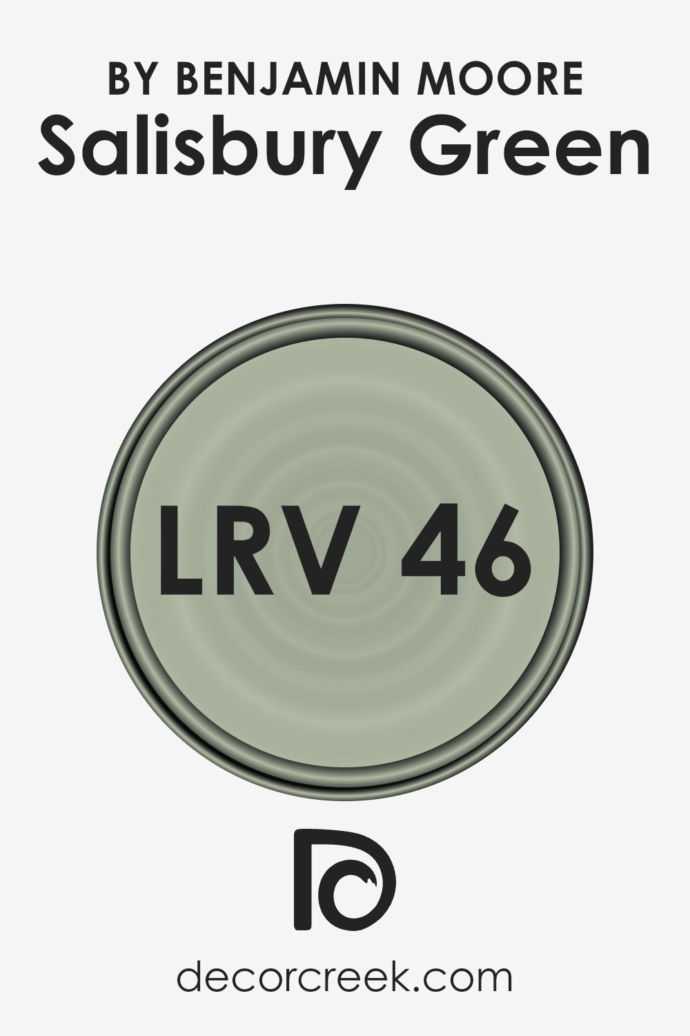
What is the LRV of Salisbury Green HC-139 by Benjamin Moore?
LRV, or Light Reflectance Value, is a measure of how much light a color reflects compared to how much it absorbs. It’s measured on a scale from 0 to 100, with 0 being absolute black, which absorbs all light, and 100 being pure white, which reflects all light.
Understanding the LRV of a color can help you predict how bright or dark a paint color will appear once it’s on your walls.
Colors with high LRV values reflect more light and will generally make a room feel more spacious and brighter, while colors with lower LRV values reflect less light and can create a cozier, more intimate feel.
Knowing the LRV is particularly useful when considering how much natural or artificial light is present in a space, as it helps ensure the paint choice will create the desired ambiance.
Salisbury Green, with an LRV of 46.39, is on the middle to lower end of the LRV scale. This means it has a medium level of light reflectance, making it neither too dark nor too light. It reflects a moderate amount of light, which can help balance out the lighting in a room that has average natural light.
In a well-lit space, this color can appear warm and inviting without overwhelming the senses. In a dimly lit room, it can give a comfortable, cozy feel without making the room feel too closed in.
Overall, Salisbury Green is versatile for various settings, providing enough depth to add character while maintaining a sense of openness.
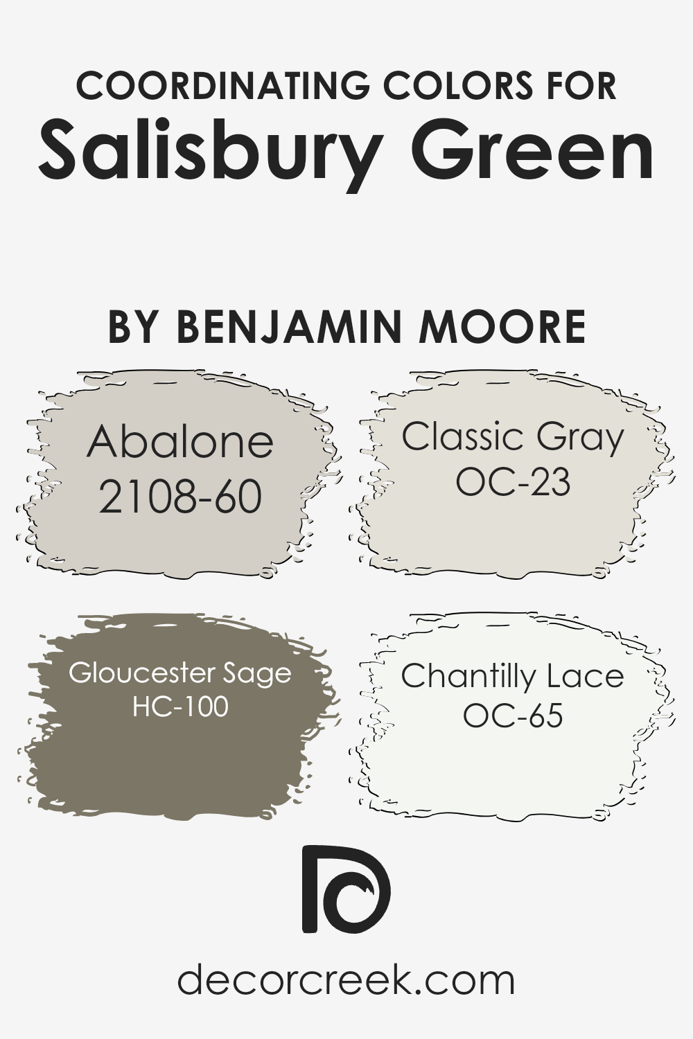
Coordinating Colors of Salisbury Green HC-139 by Benjamin Moore
Coordinating colors are hues that complement each other when used together. They enhance the overall look of a space by creating a cohesive and visually pleasing environment. When choosing colors to coordinate with Salisbury Green HC-139 by Benjamin Moore, you’ll want to consider tones and shades that work harmoniously.
For example, Abalone 2108-60 is a soft, warm gray that creates a calm backdrop, perfect for spaces where you want a touch of warmth without overpowering other elements.
Then there’s Gloucester Sage HC-100, a rich, earthy green that pairs beautifully with Salisbury Green, adding depth and a natural feel to the room.
On the lighter side, Classic Gray OC-23 offers a neutral, timeless option. It provides a gentle contrast that balances out stronger colors without drawing too much attention to itself.
If you’re looking for a bright and crisp complement, Chantilly Lace OC-65 might be the perfect choice.
This clean, pure white reflects plenty of light and provides a fresh, airy touch.
These coordinating colors work well with Salisbury Green to create a pleasing aesthetic in any room, offering various ways to achieve balance and harmony in your décor.
You can see recommended paint colors below:
- 2108-60 Abalone
- HC-100 Gloucester Sage
- OC-23 Classic Gray
- OC-65 Chantilly Lace
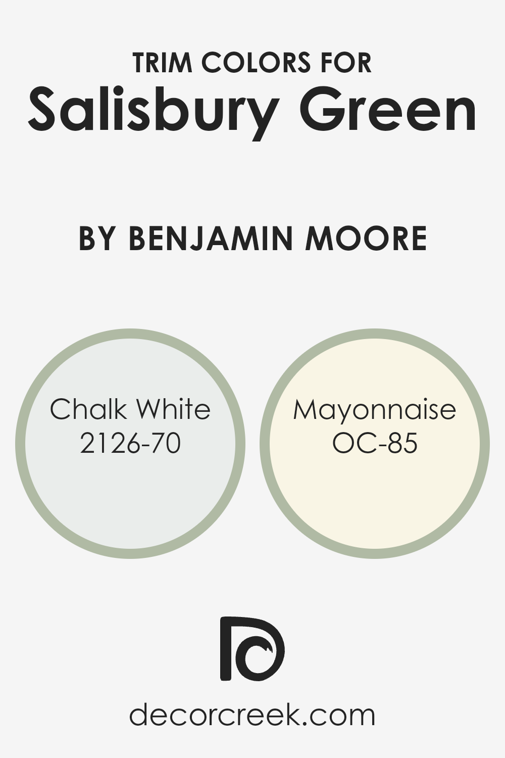
What are the Trim colors of Salisbury Green HC-139 by Benjamin Moore?
Trim colors serve as the finishing touch for any room, providing definition and contrast to walls and creating a polished look. When paired with Salisbury Green, a calming shade with subtle hints of nature, the right trim colors can enhance its soothing qualities.
Chalk White, a crisp and clean hue that emits a sense of freshness and brightness, works beautifully as a trim color alongside Salisbury Green.
It offers a clear, defined edge that can make the walls appear taller and the room generally more open, complimenting the green while ensuring it doesn’t overpower the space.
Mayonnaise, another excellent trim choice, brings a warmer touch with its creamy undertones. It can add a soft, welcoming feel when used as a trim with Salisbury Green, ensuring the room feels inviting and balanced.
The slight warmth of Mayonnaise can enrich the walls, drawing out the softer notes in the green and adding depth to the overall color scheme.
Both Chalk White and Mayonnaise as trim colors highlight the gentle elegance of Salisbury Green, allowing it to be the main star of the space, while still keeping everything cozy and inviting.
You can see recommended paint colors below:
- 2126-70 Chalk White
- OC-85 Mayonnaise
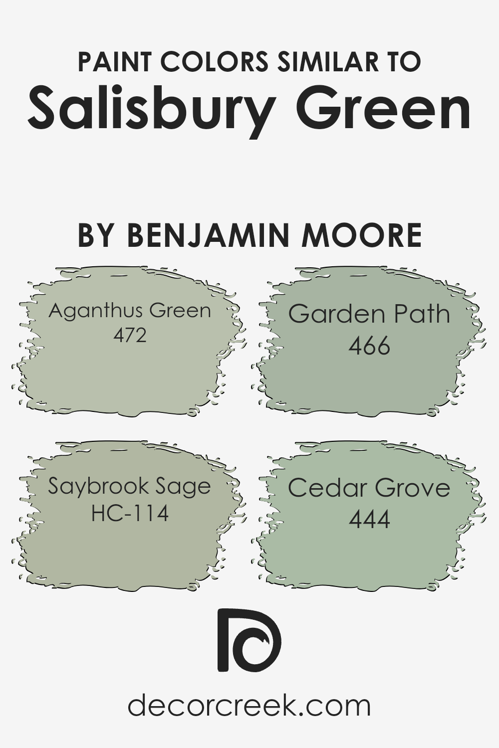
Colors Similar to Salisbury Green HC-139 by Benjamin Moore
Similar colors are essential because they create harmony and a sense of balance in a room or space. With Salisbury Green as your base, choosing colors like Aganthus Green, Saybrook Sage, Garden Path, and Cedar Grove can help achieve a cohesive and pleasing aesthetic.
These colors work together to create a natural, calming environment that promotes relaxation. When placed in proximity, they enhance each other’s qualities, making the green tones appear richer and more inviting.
This creates an understated elegance that feels warm and welcoming, perfect for both communal and personal spaces.
Each color, while similar, brings its unique charm. Aganthus Green offers a warm, leafy hue that adds a touch of freshness and vitality, reminiscent of lush gardens. Saybrook Sage provides a softer and more muted tone, lending a gentle, earthy feel to any area.
Garden Path balances brightness with a subtle depth, bringing to mind the tranquility of a shaded walking path. Cedar Grove rounds out the palette with its subdued and earthy undertones, grounded and calming.
When these colors are used together, they form a cohesive palette that enhances the beauty and function of your space. They bring out the best in each other, making them ideal companions for interior design.
You can see recommended paint colors below:
- 472 Aganthus Green
- HC-114 Saybrook Sage
- 466 Garden Path
- 444 Cedar Grove
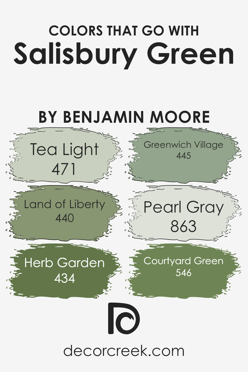
Colors that Go With Salisbury Green HC-139 by Benjamin Moore
Colors that go well with Salisbury Green HC-139 by Benjamin Moore create a harmonious and pleasing environment. It’s important to choose complementary colors because they enhance the overall look and feel of a space, making it inviting and balanced.
Salisbury Green is a soft, muted shade that naturally pairs well with other earthy tones. For instance, Tea Light 471 is a gentle, warm white which brings a sense of airiness and space when combined with Salisbury Green, keeping the room light and open.
Meanwhile, Land of Liberty 440 offers a deep, rich brown that adds warmth and depth, grounding the lighter colors and making them pop.
Herb Garden 434 is a fresh, olive-like green that brings out the natural qualities in Salisbury Green, adding a touch of nature that works well in both modern and traditional settings.
Greenwich Village 445 is a dusty, soft blue that complements the green, bringing a calm and balanced atmosphere.
Pearl Gray 863 introduces a subtle, cool, neutral tone that highlights the warmth of Salisbury Green, offering contrast without overpowering it.
Lastly, Courtyard Green 546 is a slightly darker shade of green that provides depth and a sense of richness, enhancing the subtle tones in Salisbury Green while adding sophistication and depth to any room.
You can see recommended paint colors below:
- 471 Tea Light
- 440 Land of Liberty
- 434 Herb Garden
- 445 Greenwich Village
- 863 Pearl Gray
- 546 Courtyard Green
How to Use Salisbury Green HC-139 by Benjamin Moore In Your Home?
Salisbury Green HC-139 by Benjamin Moore is a lovely, calming shade of green that fits well in many parts of the home. This color has a timeless quality, making it versatile for various design styles, whether traditional or modern. In a living room, Salisbury Green can create a peaceful environment that encourages relaxation.
Pair it with neutral furniture and natural wood tones to enhance this effect. For a kitchen, this shade can add a fresh, inviting look, especially when combined with white cabinets and stainless-steel appliances.
In bedrooms, Salisbury Green promotes relaxation, offering a gentle backdrop that works well with soft, cozy textiles in neutral or muted tones.
As an exterior paint choice, it can beautifully complement brick or stonework, offering understated charm.
Overall, Salisbury Green HC-139 brings a touch of nature indoors, making spaces feel warm and welcoming without overwhelming them.
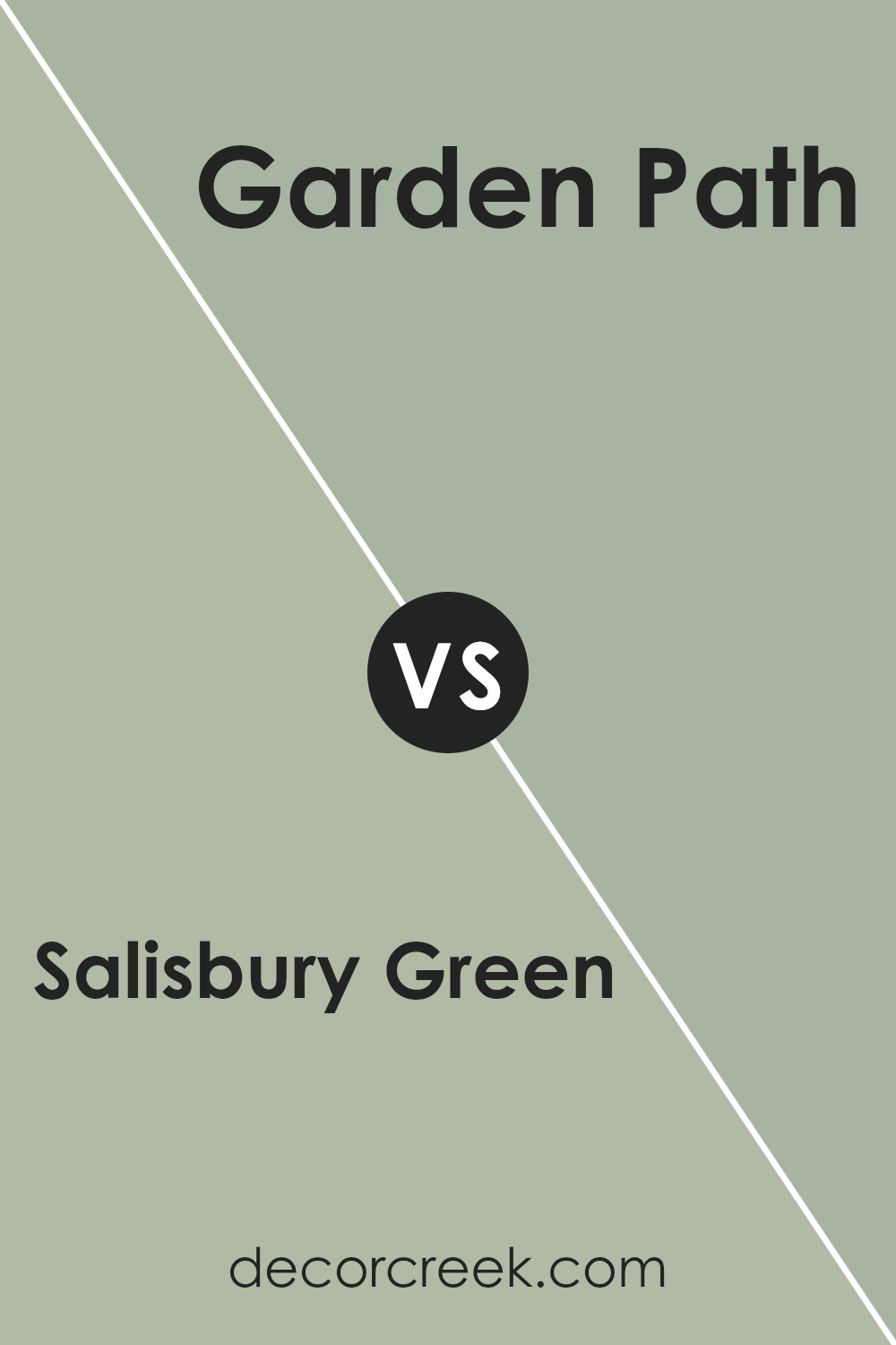
Salisbury Green HC-139 by Benjamin Moore vs Garden Path 466 by Benjamin Moore
Salisbury Green HC-139 and Garden Path 466 by Benjamin Moore are both soft, nature-inspired colors, but they have distinct vibes. Salisbury Green is a warm, muted green with an earthy undertone. It offers a calming, grounded feel, reminiscent of a peaceful forest. It’s a versatile color that can work well in both traditional and modern spaces.
On the other hand, Garden Path is a slightly cooler and more muted green. It has a hint of gray, giving it a more subtle and understated appearance. This makes it a great choice if you’re looking for a color that’s soothing and doesn’t overpower a room.
While Salisbury Green feels more vibrant and lively, Garden Path leans towards a more relaxed feel. Both colors bring a touch of nature indoors, but Salisbury Green stands out more, while Garden Path offers a gentler presence. Each can create a cozy, inviting atmosphere in your home.
You can see recommended paint color below:
- 466 Garden Path
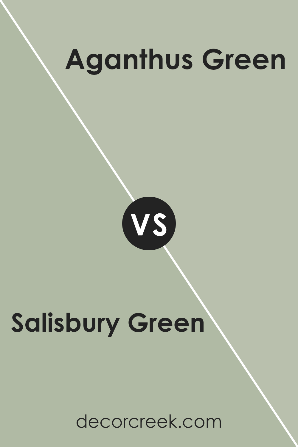
Salisbury Green HC-139 by Benjamin Moore vs Aganthus Green 472 by Benjamin Moore
Salisbury Green HC-139 and Aganthus Green 472 by Benjamin Moore are two distinct yet subtle shades of green. Salisbury Green is a muted, olive-toned green, carrying a sense of warmth and earthy charm. It can fit well in traditional settings or spaces looking for a cozy and calm vibe.
Aganthus Green, on the other hand, is lighter and fresher. It’s a soft green with hints of gray, offering an airy and light feel. This makes it suitable for modern spaces or rooms where you want to bring in a sense of openness and freshness.
While both are green, the choice between them depends on the mood you’re aiming to create. Salisbury Green is deeper and more grounded, whereas Aganthus Green feels light and breezy. Both are versatile and can complement various decor styles but offer different atmospheres.
You can see recommended paint color below:
- 472 Aganthus Green
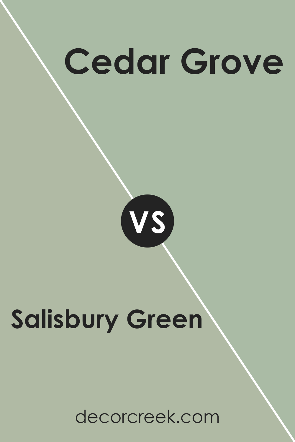
Salisbury Green HC-139 by Benjamin Moore vs Cedar Grove 444 by Benjamin Moore
Salisbury Green HC-139 by Benjamin Moore is a soft, muted green with a slightly gray undertone. It feels calm and soothing, making it a great choice for creating a relaxed atmosphere in any room. The color works well in spaces that get a lot of natural light, as it can gently reflect the outdoors.
Cedar Grove 444 by Benjamin Moore is a richer, more saturated green that brings a sense of warmth and vibrancy. This color has a stronger presence and can make a bolder statement in a room.
It can work beautifully in settings where you want to add a touch of nature or a feeling of coziness.
While Salisbury Green has a more understated look, Cedar Grove adds energy and depth.
Depending on the mood you want to create, Salisbury Green will provide calmness, while Cedar Grove offers a lively, warm environment. Both colors celebrate different aspects of the green spectrum.
You can see recommended paint color below:
- 444 Cedar Grove
Salisbury Green HC-139 by Benjamin Moore vs Saybrook Sage HC-114 by Benjamin Moore
Salisbury Green HC-139 and Saybrook Sage HC-114 by Benjamin Moore are beautiful shades of green that offer a natural, calming feel. Salisbury Green HC-139 is a soft, muted green with an earthy tone that brings a touch of nature indoors. It’s a versatile color, great for living spaces or kitchens, providing a relaxing backdrop.
On the other hand, Saybrook Sage HC-114 is slightly lighter and has a hint of gray, giving it a more subtle and gentle look. This sage tone is ideal for creating a cozy atmosphere in bedrooms or studies.
Both colors work well with white trims and wood finishes, but Salisbury Green might suit bolder accents, while Saybrook Sage pairs nicely with pastel or neutral tones.
Whether you prefer the warm vibe of Salisbury Green or the understated look of Saybrook Sage, both colors offer a sense of peace and calm.
You can see recommended paint color below:
After thinking a lot about HC-139 Salisbury Green by Benjamin Moore, here’s what I think. This paint color is really special. It’s like a nice mix of green and grey, which makes it feel warm and friendly but also calm.
When you use Salisbury Green in a room, it makes the room feel cozy and pleasant. It’s not too bright, so it won’t hurt your eyes or feel too strong. It’s also not too dull, so it keeps things interesting. It’s like having a little bit of nature inside your house.
People say this color works well in lots of places, like living rooms, kitchens, or even outside the house. It seems to match well with other colors. So, if you have different colored furniture or decorations, Salisbury Green might still look nice with them.
I think if you want your place to feel cozy and welcoming, Salisbury Green is a good choice. It’s gentle and nice to look at.
So, if you like the idea of having something that feels natural and warm in your room, this might be a color you’d enjoy.
Ever wished paint sampling was as easy as sticking a sticker? Guess what? Now it is! Discover Samplize's unique Peel & Stick samples.
Get paint samples

