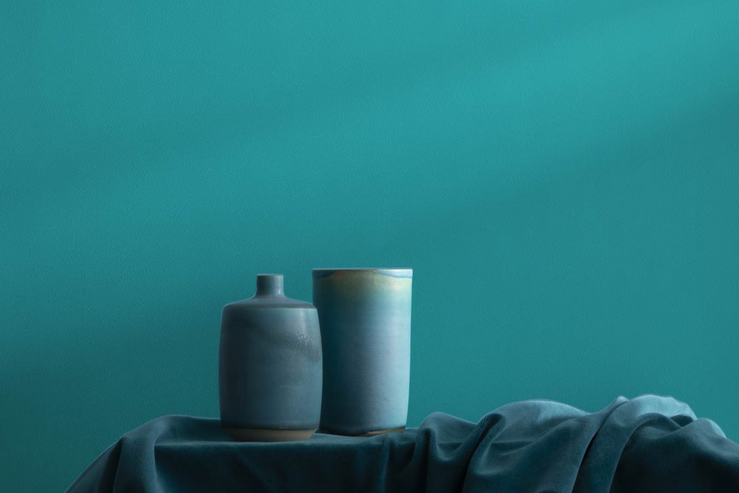
Choosing the perfect paint color for your home can feel challenging with so many options out there. I recently stumbled upon Benjamin Moore’s 741 San Jose Blue and, let me tell you, it’s a game changer! This shade strikes a beautiful balance—it’s neither too bold nor too subdued, making it just right for anyone looking to refresh their room without committing to a radical change.
San Jose Blue possesses a calmness that brings a gentle vibe to any room, yet it holds enough depth to make a statement. It’s perfect for living rooms or bedrooms where you want a touch of color without overpowering the room’s other elements. The color works wonders in areas that get plenty of natural light, bringing out its vibrant yet soothing blue tones.
What’s great about San Jose Blue is its adaptability. It pairs beautifully with whites and grays for a crisp look, or you can match it with warmer tones for a cozier feel. Whether you’re aiming to create a peaceful retreat or a stylish, welcoming room, San Jose Blue fits your vision.
Let me show you why this color could be just what you’re looking for in your next update.
What Color Is San Jose Blue 741 by Benjamin Moore?
San Jose Blue 741 by Benjamin Moore is a rich, deep blue with a subtle vibrancy that gives it both warmth and depth. This color is adaptable enough to work in a variety of settings, adding a bold yet cozy atmosphere to any room. It shines particularly well in modern and coastal interior styles, providing a striking contrast against light neutrals or serving as a calming backdrop to vibrant hues.
When incorporating San Jose Blue into your home, consider pairing it with natural materials to enhance its inherent coziness. Light wood tones, such as oak or birch, bring out its warm undertones, while darker woods like walnut add a luxurious feel.
Textures also play a vital role in complementing this color; plush fabrics like velvet or wool in off-white or soft gray can create a soft, inviting room. For a more dynamic look, incorporate metallic finishes like brushed gold or silver, which reflect light and add a touch of elegance.
The key to working with San Jose Blue is balancing its depth with lighter or textured elements to prevent it from becoming daunting. Whether you use it on an accent wall, in soft furnishings, or as part of a color scheme, it provides a beautiful backdrop that is both stylish and easy to live with.
Is San Jose Blue 741 by Benjamin Moore Warm or Cool color?
San Jose Blue 741 by Benjamin Moore is a unique shade that brings a calm and gentle vibe to any home. This color resembles the sky on a clear day, which can make smaller rooms feel more open and airy. Because of its soothing nature, it’s ideal for areas where relaxation is key, such as bedrooms and bathrooms. When used in a living room or dining area, it adds a fresh, clean look that is very welcoming.
San Jose Blue is adaptable, so it matches well with many different decor styles and colors. Pairing it with whites or grays can create a modern, minimalist feel, while combining it with warmer tones like yellows or oranges can add a lively contrast and warmth to an area.
It’s also a great choice for painting cabinets or doors as a way to introduce a subtle pop of color without overpowering a room. Overall, San Jose Blue is a great choice for anyone looking to refresh their area with a calming yet cheerful hue.
Undertones of San Jose Blue 741 by Benjamin Moore
San Jose Blue 741 by Benjamin Moore is a rich and adaptable paint color that brings a vibrant yet soothing feel to any room. Understanding the undertones of a paint color is crucial because they influence how the color looks under different lighting conditions and when paired with other colors.
San Jose Blue 741 isn’t simply blue; it’s a spectrum that includes undertones like light blue, navy, and dark blue, which bring depth and variety to the blue base. These dark and light blue shades help the color adjust to varying amounts of light, making it appear more dynamic and interesting. Additionally, green and turquoise undertones add a hint of freshness, enhancing the natural feel of the area.
Neutral undertones such as grey and dark grey give San Jose Blue 741 a balanced look, preventing it from becoming daunting in a room. These grey tones help in integrating the paint with modern and minimalist décor by adding a subtle refinement without overpowering the senses.
When this color is used on interior walls, its complex undertones come into play beautifully. In natural daylight, the lighter undertones like light turquoise and mint might become more pronounced, giving a lively vibe. Under artificial lighting, darker undertones like navy and dark green may emerge, creating a cozier and more enveloping atmosphere.
Overall, the undertones in San Jose Blue 741 make it a flexible choice for interior areas, allowing it to adapt and morph, reflecting various moods and styles according to different settings and accompanying décor elements.
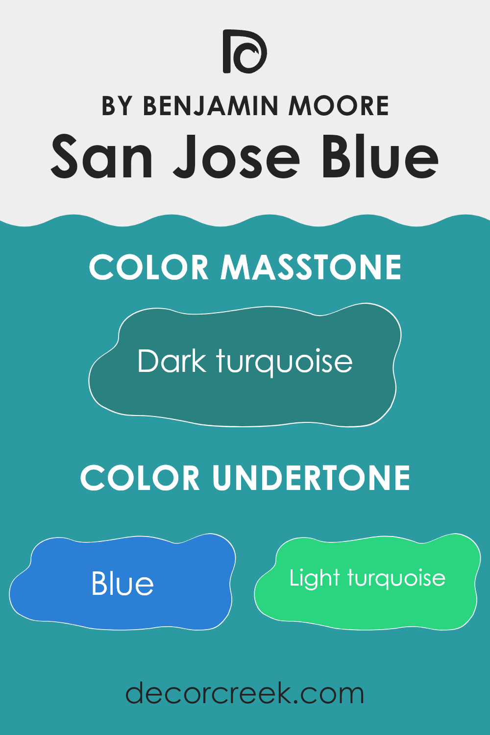
What is the Masstone of the San Jose Blue 741 by Benjamin Moore?
San Jose Blue 741 by Benjamin Moore, with its masstone of Dark Turquoise (#2B8080), brings a dash of vibrant personality to any room without becoming daunting. This shade of greenish-blue is deep enough to create a focal point in an area, yet balanced enough to work beautifully with natural light or softer, artificial lighting.
In homes, this color can create a cozy yet lively atmosphere in living areas or add a stylish touch to a bedroom. It works well with both modern and rustic themes, complementing wooden furniture and brightening up white trim or decor elements.
Its adaptable nature allows it to be used on walls, as an accent in alcoves, or on furniture, enabling a variety of decorating styles. This color maintains its richness across different surfaces and textures, making it a reliable choice for those looking to refresh their area with a unique but tasteful hue.

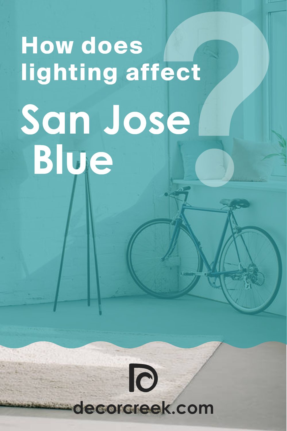
How Does Lighting Affect San Jose Blue 741 by Benjamin Moore?
Lighting plays a crucial role in how colors are perceived in an environment. Colors can appear different depending on the type of light under which they are viewed. For example, a specific shade of blue can look vibrant and clear under some lighting conditions but might seem dull or muted under others.
San Jose Blue 741 by Benjamin Moore in Various Light Conditions
Artificial Light: Under artificial lighting, San Jose Blue 741 tends to appear slightly darker than it does in natural light. The type of bulb (LED, incandescent, halogen) can also impact its appearance. LED lights, especially those with a cool tone, can enhance the blue, making it look more vivid and sharp. Incandescent bulbs, which usually cast a warmer glow, might soften the blue, giving it a more muted feel.
Natural Light: Natural light is generally the best to accurately display San Jose Blue 741. During daylight, the full spectrum of sunlight can reveal the true depth and richness of this shade. The color can look bright and lively, particularly under clear, sunny skies.
North-facing rooms: These rooms get less direct sunlight, which can make colors appear slightly cooler and more shadowy. In north-facing rooms, San Jose Blue 741 might look more reserved and subtle, lacking some of the brightness seen in areas with more direct light.
South-facing rooms: Here, the abundance of sunlight can bring out the best in San Jose Blue 741, making the color look vibrant and lively throughout the day. The warm light enhances the depth of the color, showing off its dynamic range.
East-faced rooms: Morning light in east-facing rooms can make San Jose Blue 741 look bright and cheerful. As the day progresses and the light dims, the color could lose some of its liveliness but still retain a calm, pleasant quality.
West-faced rooms: In west-facing rooms, the color will experience the opposite effect compared to east-facing rooms. It starts off more subdued in the morning and gains intensity as the afternoon progresses, culminating in a bold expression of blue in the late afternoon and evening when the sun sets.
In summary, the appearance of San Jose Blue 741 can vary significantly depending on the lighting conditions and the room’s orientation relative to the sun. This variability can be used to your advantage to achieve different moods and effects in various parts of a home or area.
What is the LRV of San Jose Blue 741 by Benjamin Moore?
LRV stands for Light Reflectance Value, which measures the percentage of light a paint color reflects back into a room compared to how much it absorbs. LRV ranges across a scale where higher values indicate that the color reflects more light, making rooms appear brighter, while lower values mean the color absorbs more light, which can make areas look darker.
This is an important factor to consider when choosing paint colors because it can significantly affect the ambience and visual size of a room. Light colors with high LRV make a room feel more open and airy, whereas dark colors with low LRV can give a room a cozier and more enclosed feel.
With an LRV of 28.06, San Jose Blue by Benjamin Moore is on the darker side of the scale, meaning it tends to absorb more light than it reflects. This characteristic makes it more suited for areas where a sense of depth or intimacy is desired. In well-lit areas or rooms with ample natural light, this color can add a strong visual impact without making the room feel too confined.
However, in smaller, less-lit rooms, using a color with such a lower LRV can make the area appear even smaller and darker, so additional lighting might be necessary to balance the effect and ensure the room doesn’t feel too cramped.

Coordinating Colors of San Jose Blue 741 by Benjamin Moore
Coordinating colors are chosen to complement each other while creating a balanced and harmonious look in any area. These colors, when combined correctly, can enhance the overall aesthetic of a room, highlighting each element without overpowering the senses. For instance, when you have a bold color like a deep blue, you can coordinate it with softer, lighter colors to create a sense of balance and visual interest.
Icy Morn is a subtle, pale blue that provides a light, airy feel. It works well to soften a room that features darker, more intense colors, giving the area a fresh and inviting atmosphere. Cloud Cover, on the other hand, is an off-white with a neutral base that adds a sense of warmth without overshadowing other colors. It’s ideal for creating a gentle contrast with deeper shades.
Cloud White is a true soft white that offers a crisp and clean look, making any room feel more spacious and bright. It’s especially effective at enhancing the vibrancy of richer colors. Lastly, Wind’s Breath is a delicate beige with a hint of grey, perfect for adding a subtle layer of complexity to a coordinated color scheme, grounding brighter or darker shades beautifully. Together, these colors work seamlessly to create a cohesive and visually appealing area.
You can see recommended paint colors below:

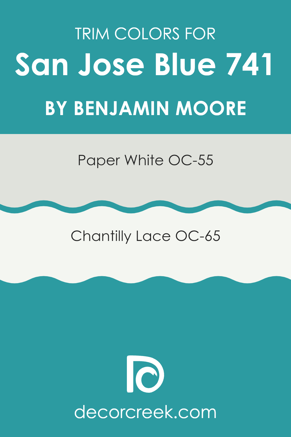
What are the Trim colors of San Jose Blue 741 by Benjamin Moore?
Trim colors are specific shades used for painting elements like moldings, door frames, windowsills, and baseboards. These accents in contrasting or complementary colors to your main wall color, such as San Jose Blue by Benjamin Moore, add definition and character to the area. By using trim colors, you enhance architectural details and create a polished, well-rounded appearance for the room. It helps in framing the wall color, making it pop and look more intentional and finished.
Paper White OC-55 is a crisp, clean white that brings a fresh clarity to any area, making it an excellent choice for trim when combined with a deeper hue like San Jose Blue. Its bright tone helps in creating a sharp contrast, making the wall color more pronounced and neat.
On the other hand, Chantilly Lace OC-65 is a very pure, almost stark white, which offers a striking delineation against richer colors. This trim color option will provide a clean line that visually separates different surface areas, enhancing the overall aesthetic by giving the room a more structured and orderly vibe.
You can see recommended paint colors below:
- OC-55 Paper White
- OC-65 Chantilly Lace
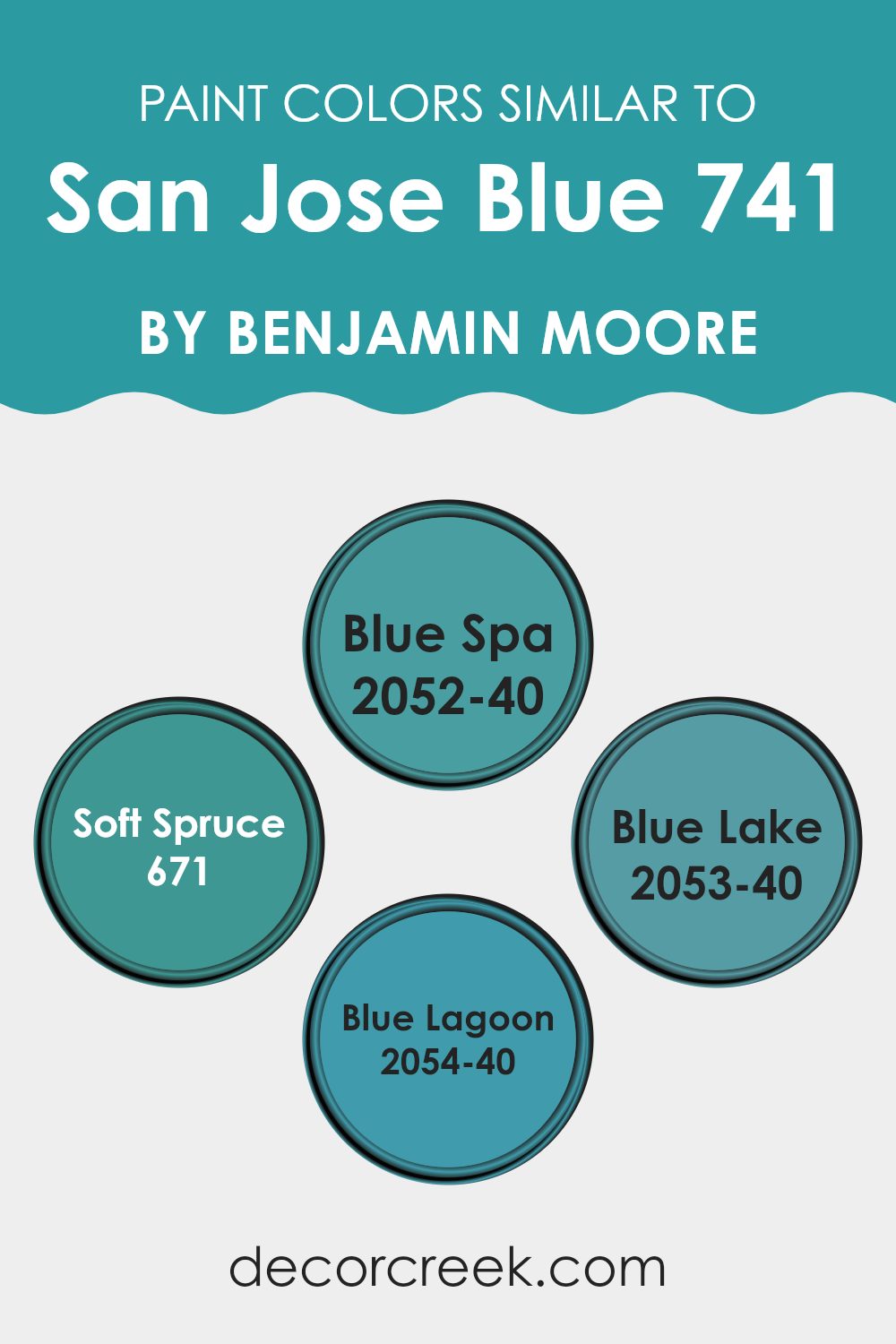
Colors Similar to San Jose Blue 741 by Benjamin Moore
When decorating, selecting a harmonious color scheme is essential for creating a visually appealing environment. Similar colors, such as variations of blue from Benjamin Moore, work well together because they share a common hue, ensuring that they complement each other without clashing.
For example, when using shades like Blue Spa, Soft Spruce, Blue Lake, and Blue Lagoon alongside each other, the continuity in color hue provides a cohesive and coordinated look. This approach is particularly useful in achieving a unified aesthetic, making the area feel consistent and thoughtfully planned.
Blue Spa is a refreshing and light blue that gives a fresh and airy feel to any room, making it a great choice for bathrooms and bedrooms. Soft Spruce is slightly deeper, hinting at green undertones, which offers a subtle contrast while still retaining harmony with other blues. Blue Lake, on the other hand, is a more vibrant and vivid blue that adds a dynamic touch to the palette, ideal for accent walls or furniture pieces.
Meanwhile, Blue Lagoon presents a tropical and vibrant tone, which can inject a playful yet relaxed mood into areas. Together, these shades provide an adaptable range of options that can enhance an interior with both lively and calm elements, depending on how they’re used.
You can see recommended paint colors below:
- 2052-40 Blue Spa
- 671 Soft Spruce
- 2053-40 Blue Lake
- 2054-40 Blue Lagoon
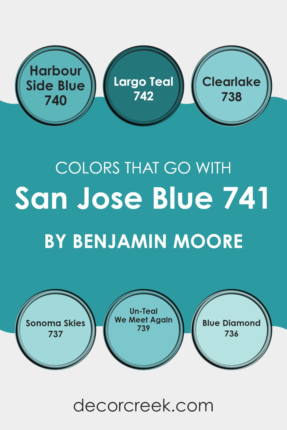
Colors that Go With San Jose Blue 741 by Benjamin Moore
Choosing the right colors to complement San Jose Blue 741 by Benjamin Moore can significantly enhance the overall aesthetic of an area. San Jose Blue is a deep, striking shade that serves as a perfect backdrop, allowing complementary colors to add vibrancy and warmth to the room. Color coordination is crucial because it creates balance and a sense of harmony, preventing the area from feeling daunting or disjointed.
Harbour Side Blue 740 is a shade lighter than San Jose Blue, offering a subtle contrast that’s ideal for creating a gentle, layered look in a room. This can be particularly effective in areas where you want continuity without monotony. Largo Teal 742 adds a slightly greenish tint to the mix, introducing a refreshing vibrancy that breathes life into interiors.
Clearlake 738, being a pale, airy blue, works wonders in brightening areas and introducing a light, fresh feel. For a touch of softness, Sonoma Skies 737 integrates a calming blue that can help soften the intense depth of San Jose Blue. On the other hand, Un-Teal We Meet Again 739 has a unique quality of bridging the gap between blue and green, providing a dynamic yet harmonious look. Lastly, Blue Diamond 736 shines as a vibrant, crisp blue that can inject energy and a pop of brightness in areas that pair with the darker tones of San Jose Blue. Together, these colors create a cohesive palette that ensures a warm and inviting atmosphere.
You can see recommended paint colors below:
- 740 Harbour Side Blue
- 742 Largo Teal
- 738 Clearlake
- 737 Sonoma Skies
- 739 Un-Teal We Meet Again
- 736 Blue Diamond
How to Use San Jose Blue 741 by Benjamin Moore In Your Home?
San Jose Blue 741 by Benjamin Moore is a vibrant and cheerful shade of blue that can brighten up any area in your home. It’s perfect for adding a splash of color without making a room feel daunting. Consider painting an accent wall in your living room or bedroom to create a lively focal point. This color also works great in bathrooms and kitchens, bringing a fresh and clean feel to these areas.
If you’re not ready to commit to painting entire walls, think about using San Jose Blue on furniture or cabinets for a modern, refreshing look. It pairs well with neutral tones like whites and grays, which helps balance out its brightness.
This shade is also ideal for crafting a fun and inviting atmosphere in children’s rooms or play areas. Accessories like curtains or pillows in San Jose Blue can tie the room together beautifully, making the area cheerful and stylish.
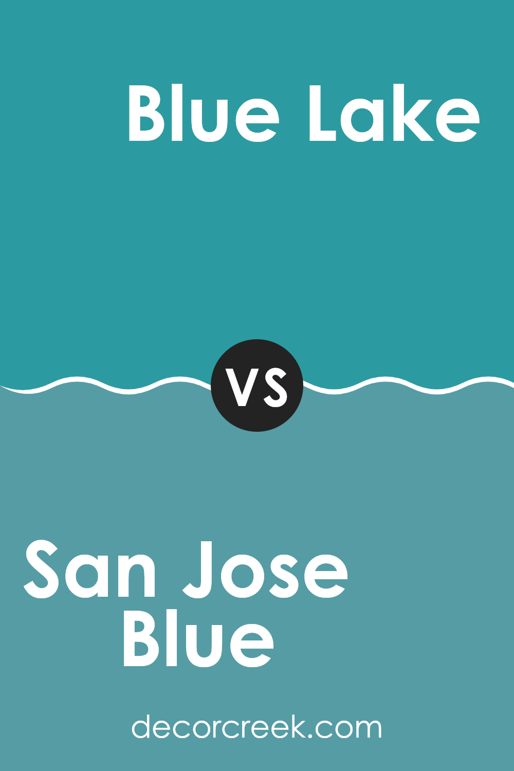
San Jose Blue 741 by Benjamin Moore vs Blue Lake 2053-40 by Benjamin Moore
San Jose Blue 741 by Benjamin Moore is a deep, vivid blue that brightens up areas with its bold character. It captures a vibrant energy that can add a sense of excitement to any area, be it a living room or an accent wall. Meanwhile, Blue Lake 2053-40 by Benjamin Moore is also a striking hue but with a lighter, more playful tone.
Blue Lake tends to have a more airy feel, which can make a room look more open and welcoming. When comparing the two, San Jose Blue comes off as more of a statement color due to its intensity, while Blue Lake provides a cheerful pop of color without becoming daunting to the senses.
This makes San Jose Blue a great choice for someone looking to create a strong presence in their area, whereas Blue Lake works well for those who want a lighter touch of blue that still maintains plenty of personality.
You can see recommended paint color below:
- 2053-40 Blue Lake
San Jose Blue 741 by Benjamin Moore vs Blue Spa 2052-40 by Benjamin Moore
San Jose Blue and Blue Spa are both colors from Benjamin Moore. San Jose Blue is a deeper, more muted blue, giving off a classic and calm vibe that works well in an area where you want a subtle touch of color without overpowering the room.
On the other hand, Blue Spa is a lighter and brighter shade of blue. It’s fresh and lively, making it a great choice for bathrooms or other areas where you want to add a clean, invigorating feel. Both colors are quite adaptable, yet they cater to different aesthetics.
San Jose Blue might be better for creating a cozy, intimate atmosphere, while Blue Spa could be the go-to for a more upbeat and airy room.
You can see recommended paint color below:
- 2052-40 Blue Spa
San Jose Blue 741 by Benjamin Moore vs Blue Lagoon 2054-40 by Benjamin Moore
San Jose Blue and Blue Lagoon are two unique shades by Benjamin Moore. San Jose Blue is a soft, muted blue with a touch of gray, making it a subtle choice for areas where relaxation is key. It’s not too bright, so it creates a gentle, calming effect in a room.
On the other hand, Blue Lagoon is a vibrant and lively shade of blue. It has more intensity compared to San Jose Blue, making it stand out more. This makes it perfect for areas where you want to add a pop of color or make a strong visual impact.
Both colors are adaptable, but Blue Lagoon will definitely catch the eye more due to its brighter and more energetic nature. San Jose Blue works well for a softer look or where you want to keep things low-key but still stylish.
You can see recommended paint color below:
- 2054-40 Blue Lagoon
San Jose Blue 741 by Benjamin Moore vs Soft Spruce 671 by Benjamin Moore
San Jose Blue and Soft Spruce are both paint colors from Benjamin Moore, each offering a unique vibe to any area. San Jose Blue is a deep, vivid blue that has a strong presence.
It’s bold and assertive, making it a great choice for a feature wall or accents that you really want to stand out. On the other hand, Soft Spruce is a more subtle, muted green. It’s gentle and soothing, perfect for creating a calm and welcoming atmosphere in areas like bedrooms or living rooms.
While San Jose Blue adds a splash of drama, Soft Spruce brings a sense of softness and relaxation. Both colors are adaptable but serve very different purposes depending on the mood you’re aiming to achieve in your area.
You can see recommended paint color below:
- 671 Soft Spruce
In wrapping up my thoughts on 741 San Jose Blue by Benjamin Moore, I have to say I’m quite impressed with how it performs. This color has a magical way of making any room look really pretty and friendly. It’s like painting your walls with a piece of the clear sky, which is always soothing. When it came to trying it out, applying it was easy, and the finish was smooth, leaving a beautiful look that seems fresh all the time.
What’s great about San Jose Blue is that it does a fantastic job of fitting in with different styles and furniture. Whether your room has a simple, modern look or more colorful and fun pieces, this shade of blue just works well. It’s not just about the look; this paint also feels calm and nice, which makes you want to spend more time in the room.
So, if you’re thinking about giving your room a new coat of paint, I’d definitely recommend 741 San Jose Blue. It’s a choice that you, your family, and your friends will probably like a lot because it makes everything look neat and welcoming. Benjamin Moore did a great job with this color, and it’s worth giving it a try!
Ever wished paint sampling was as easy as sticking a sticker? Guess what? Now it is! Discover Samplize's unique Peel & Stick samples.
Get paint samples

