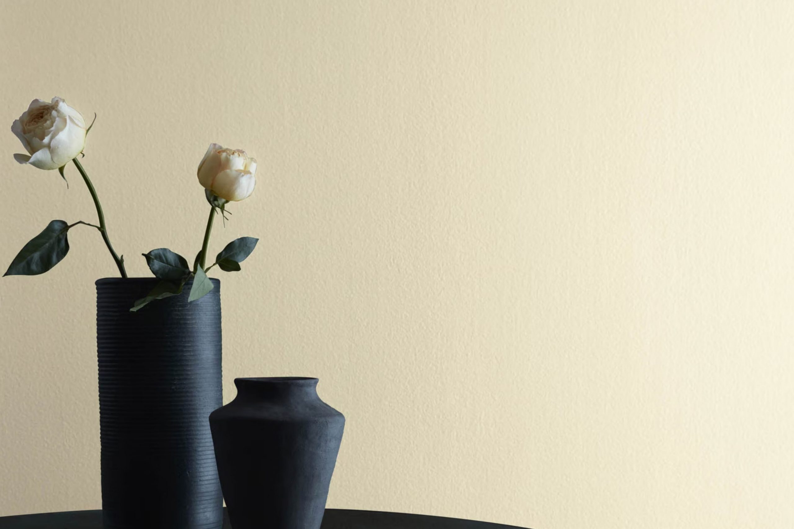
Finding the right shade for your room can be a journey filled with many choices, but 2148-50 Sandy White by Benjamin Moore makes it easier. Right away, this color offers a warm, inviting feeling that can turn any room into a cozy retreat. Its soft, gentle hue resembles the calming nature of a beach, with sandy shores that stretch out beneath the sun. This particular shade manages to be both comforting and flexible, making it a dependable choice for many settings.
Whether you want to paint a living room, bedroom, or hallway, Sandy White complements various styles and decor. It’s the kind of shade that doesn’t demand attention but quietly enhances the room around it, allowing furniture and decor to shine. Pairing it with soft greys, blues, or earthy tones can create balance, while brighter accents pop against its subtle background.
In both new and old homes, Sandy White feels like it belongs, bringing a sense of history or fresh beginnings. It’s a shade perfect for those who appreciate simplicity and elegance. Making a choice like Sandy White means valuing subtle beauty that withstands trends, letting your personal style lead the way.
This color has a knack for making areas feel more like you envisioned them: peaceful, inviting, and just right.
What Color Is Sandy White 2148-50 by Benjamin Moore?
Sandy White by Benjamin Moore is a soft, neutral shade that brings a warm and calming presence to any room. This color offers a subtle creamy undertone, making areas feel inviting and cozy. It works beautifully in a variety of interior styles, from traditional to modern, due to its flexible nature.
In a traditional setting, Sandy White can complement dark wood furniture and classical elements like crown moldings, enhancing their elegance with its understated warmth. In modern or minimalist interiors, it provides a perfect backdrop that allows bold accents and clean lines to stand out without being too intense.
This color pairs wonderfully with natural materials and textures. Wooden floors, especially in lighter oak or birch tones, harmonize well with Sandy White, bringing an organic touch to the room. Linen and cotton fabrics in muted tones, such as beige or soft gray, create a layered look that is both inviting and stylish. Additionally, incorporating elements like rattan or wicker can enhance the warmth of Sandy White, adding texture and interest.
Overall, Sandy White is a flexible choice, offering a warm and neutral base that complements various styles and materials, making it a favorite for those seeking a comfortable and lasting look in their areas.
Is Sandy White 2148-50 by Benjamin Moore Warm or Cool color?
Sandy White by Benjamin Moore is a warm, inviting paint color that works well in many home settings. It’s a soft, creamy white with subtle undertones that hint at beige, giving it an earthy vibe. This color creates an atmosphere of coziness, making rooms feel welcoming and comfortable.
Because it reflects natural light beautifully, Sandy White can make areas appear larger and more open. It’s flexible enough to be used in both modern and traditional homes, working well in living rooms, bedrooms, and hallways.
Sandy White pairs nicely with various accent colors, from bold blues and greens to neutral grays and browns, allowing for easy decoration changes over time. It also complements wood tones and natural materials, enhancing their warmth and texture. Whether used on walls, trims, or ceilings, Sandy White provides a lasting look that doesn’t feel stark or too intense, making it a popular choice for homeowners.
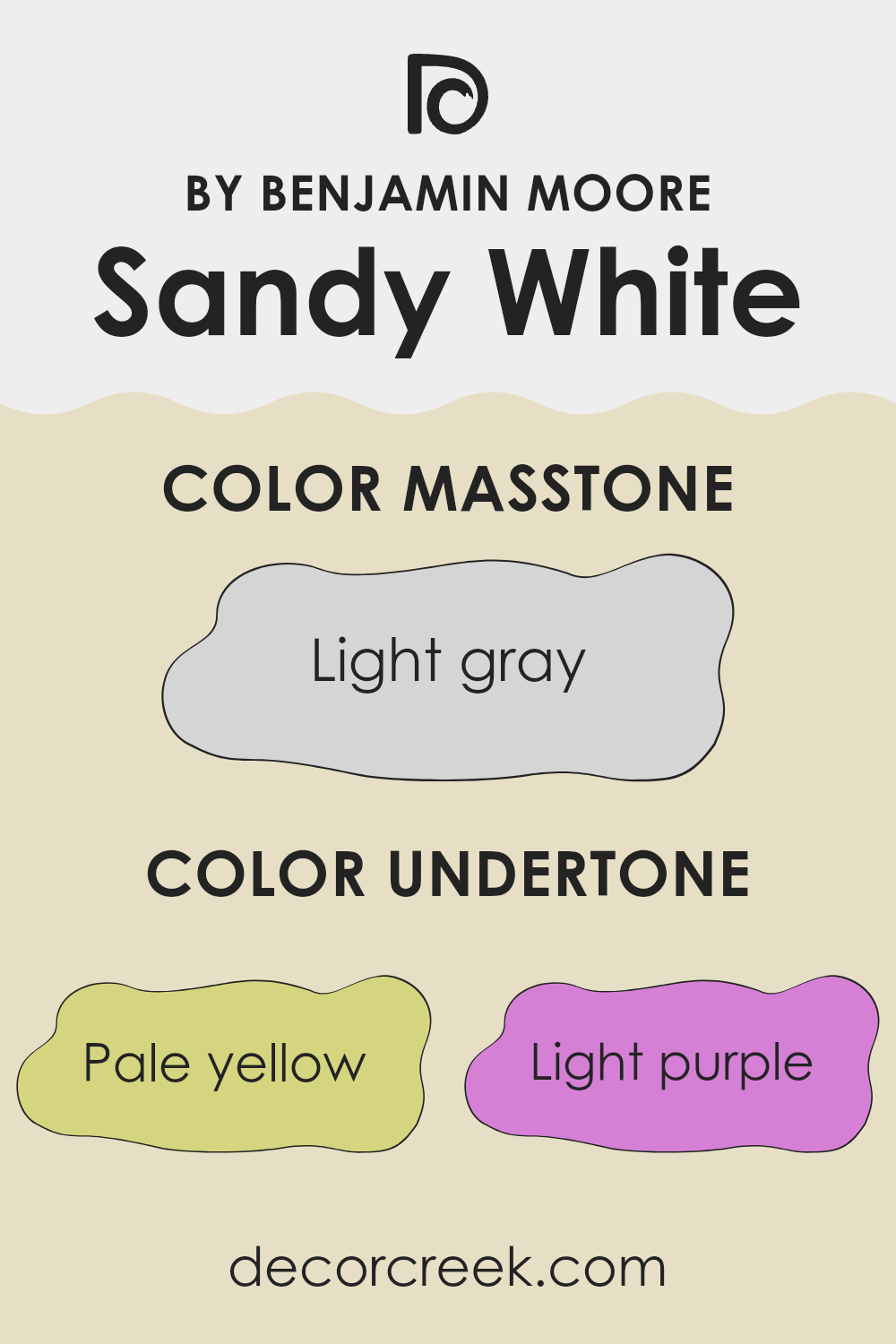
Undertones of Sandy White 2148-50 by Benjamin Moore
Sandy White by Benjamin Moore is an intriguing paint color with a mix of several undertones that can influence how we perceive it. Undertones are subtle hints of color that appear underneath the main hue, affecting its appearance under different lighting conditions. In Sandy White, the presence of pale yellow, light purple, light blue, pale pink, mint, lilac, and grey undertones gives it a complex character.
When applied to interior walls, these undertones can change the mood of a room. For instance, the pale yellow undertone might add warmth, making the room feel cozy and inviting. The light purple and lilac undertones introduce a soft, calming effect, which can make areas feel more relaxed.
The hint of light blue adds a touch of coolness, while mint can lend a fresh and revitalizing feel. Pale pink undertones add a hint of warmth and softness, balancing out the cooler elements. Grey undertones can give the color a neutral, balanced feel, making it a flexible choice.
All these undertones make Sandy White adaptable to various lighting conditions. In natural light, it may lean more towards its warmer, yellow or pink notes. In darker or artificial lighting, cooler tones like blue or grey might become more noticeable. This makes it a flexible color option for different styles and preferences.
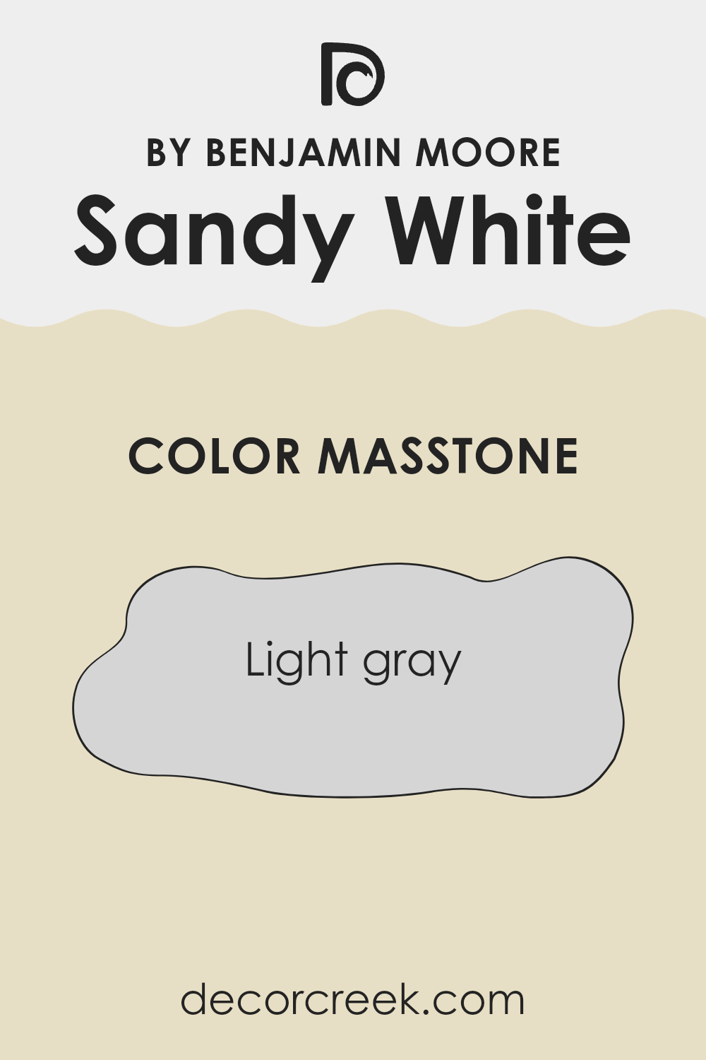
What is the Masstone of the Sandy White 2148-50 by Benjamin Moore?
Sandy White by Benjamin Moore is a gentle and neutral light gray, coded as #D5D5D5. This color offers a soft and flexible look, making it a popular choice for homes. Its light gray hue is calm and inviting, providing a subtle backdrop that complements many interior styles.
This shade works well in various rooms, from living rooms to bedrooms, creating a cozy and welcoming atmosphere. Sandy White’s lightness can make small anreas appear larger and more open, reflecting natural light to brighten up a room. It pairs nicely with both warm and cool color schemes, allowing for flexibility in decorating choices.
Additionally, Sandy White’s neutral tone helps other colors and elements in the room stand out, serving as an excellent canvas for artwork, furniture, and decor. It’s an approachable color that ensures a harmonious and fresh feel throughout the home, easily matching different moods and aesthetics.
How Does Lighting Affect Sandy White 2148-50 by Benjamin Moore?
Lighting plays a crucial role in how colors appear in a room. The type and direction of light can change the perception of a color’s warmth, brightness, and even its hue.
Consider the color Sandy White by Benjamin Moore. This color is known for its soft, warm appearance. In natural lighting, it can look different depending on which direction the room faces.
In a north-facing room, you usually get cooler and more consistent light throughout the day. This can make Sandy White appear a bit cooler or grayer, losing some of its inherent warmth. This is because the light in north-facing rooms often has a blue tint.
In a south-facing room, there is usually abundant warm and strong light, especially during midday. Here, Sandy White can look brighter and warmer, showing off its cozy beige tones more effectively. The color can be at its most lively and warm in these conditions.
East-facing rooms get bright light in the morning but this fades to cooler, shadowy light later in the day. In the morning, Sandy White will appear fresh and warm, but as the day progresses, the lack of direct sun might make it look a little subdued or even cool.
In west-facing rooms, the light comes in warmer and brighter in the late afternoon and early evening. This means in the mornings, Sandy White might look dim or gray, but by late afternoon, it will appear much warmer and more inviting as it catches the reddish hues of the setting sun.
With artificial lighting, the type of bulb used will greatly affect the color. Warm LED or incandescent bulbs tend to highlight the warmth in Sandy White, making it appear more cozy and slightly creamy. However, cooler fluorescent lights might make it appear less warm and slightly more neutral. It’s important to test the color under the specific lighting conditions of your room to be sure of how it looks.
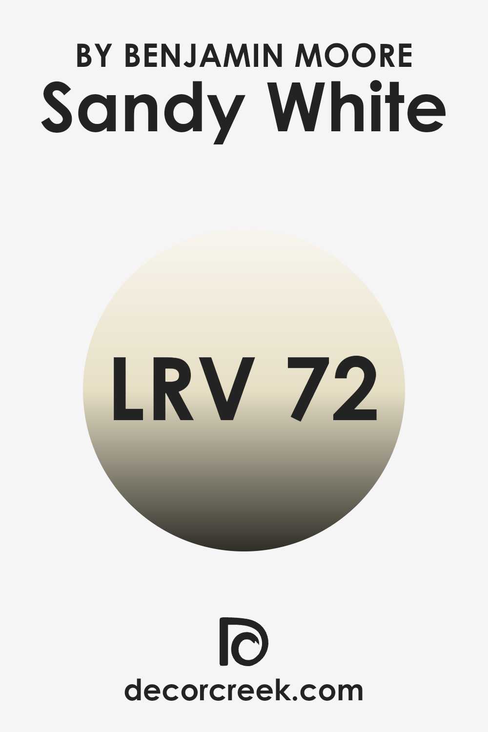
What is the LRV of Sandy White 2148-50 by Benjamin Moore?
Light Reflectance Value, or LRV, is a measure that indicates how much light a paint color reflects. The scale runs from 0, which means no light is reflected (pure black), to 100, which means all light is reflected (pure white). In simple terms, LRV helps you understand how light or dark a color will appear when applied to walls.
In areas with lots of natural light, colors with higher LRV values can make rooms feel brighter and more open. Conversely, colors with lower LRV values will absorb more light, making a room feel cozier and more intimate.
Sandy White by Benjamin Moore, with an LRV of 72, is a relatively light color, meaning it reflects a good amount of light. This makes it a great choice for rooms where you want to keep things light and airy. It won’t feel as stark or intense as pure white, providing a soft, warm glow. Rooms painted with higher LRV colors like Sandy White will generally feel larger and more spacious, especially in areas with lots of natural light.
Using this paint shade in a dim room can help it feel brighter without having to increase artificial lighting.
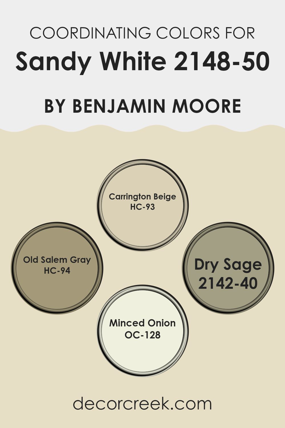
Coordinating Colors of Sandy White 2148-50 by Benjamin Moore
Coordinating colors are hues that complement each other well, creating a harmonious and balanced look when used together in a room. When selecting coordinating colors for a base shade like Sandy White by Benjamin Moore, it’s important to think about how these colors will work alongside the main color to enhance the overall aesthetic.
For Sandy White, some excellent coordinating options include HC-93 Carrington Beige, HC-94 Old Salem Gray, 2142-40 Dry Sage, and OC-128 Minced Onion. Each of these colors adds its unique touch, allowing for flexible design choices.
Carrington Beige, a warm beige with a hint of earthiness, brings a welcoming feel to any room. It’s perfect for creating a cozy atmosphere. Old Salem Gray is a soft, muted gray with a subtle blue undertone that lends a refined and calming effect. Dry Sage, a gentle green with hints of gray, evokes a natural and restful vibe, which can make areas feel fresh and inviting. Minced Onion is a light and creamy shade that epitomizes comfort and pairs beautifully with Sandy White, adding brightness without being too intense. Together, these colors work in harmony to create a cohesive and pleasant environment.
You can see recommended paint colors below:
- HC-93 Carrington Beige
- HC-94 Old Salem Gray
- 2142-40 Dry Sage
- OC-128 Minced Onion
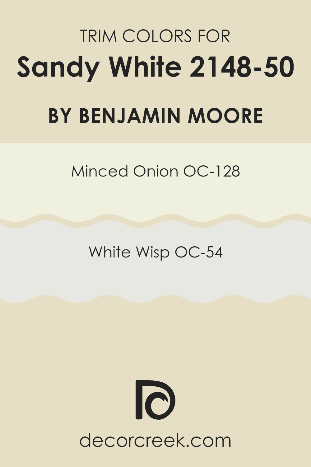
What are the Trim colors of Sandy White 2148-50 by Benjamin Moore?
Trim colors are the shades used to frame walls, ceilings, or architectural details, providing a clear and attractive outline that enhances the overall look of a room. Using trim colors is important because they can accentuate key design elements and provide contrast, creating a balanced and cohesive visual effect. For Sandy White by Benjamin Moore, selecting the right trim colors can amplify its warmth and natural appeal.
The combination with complementary trim shades helps to highlight Sandy White’s soft and inviting nature, making it stand out more effectively in any room setting. The key is to find trim colors that complement rather than compete with the primary wall color, ensuring a harmonious look.
Among the ideal trim choices for Sandy White are OC-128 Minced Onion and OC-54 White Wisp. Minced Onion is a warm and subtle color that gently enhances Sandy White’s natural tone without overpowering it. It’s soft and understated, perfect for creating a cozy and welcoming area. On the other hand, White Wisp offers a cooler tint that can provide a crisp and clean contrast, enriching the overall appearance of the room. Its gentle whisper of color adds a touch of freshness that can brighten up the surrounding room, highlighting Sandy White’s warmth with its refreshing undertone. Together, these trim choices can add a refined yet inviting finish to Sandy White.
You can see recommended paint colors below:
- OC-128 Minced Onion
- OC-54 White Wisp
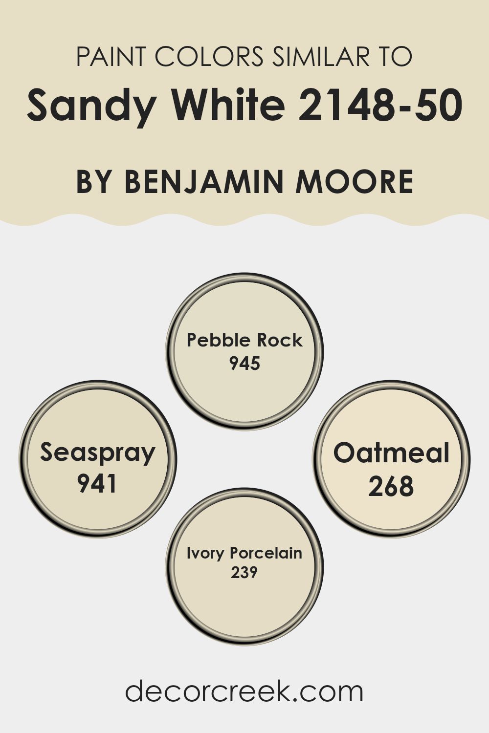
Colors Similar to Sandy White 2148-50 by Benjamin Moore
Similar colors play a crucial role in creating a cohesive and harmonious room, offering a sense of continuity and balance. When working with colors like Sandy White by Benjamin Moore, choosing similar hues like Pebble Rock, Seaspray, Oatmeal, and Ivory Porcelain can help maintain a unified look.
These colors blend well with Sandy White, enhancing its warm undertones while adding depth and interest to a room. By selecting colors that are similar, you can create a soothing atmosphere, as each shade complements the others without creating stark contrasts.
Pebble Rock is a gentle, earthy tone that provides a natural feel. It has a soft, muted quality that makes it flexible and easy on the eyes. Seaspray brings a hint of coolness, reminiscent of a subtle, breezy day, adding a touch of freshness to the room. Oatmeal, with its light, creamy texture, provides warmth and a welcoming feel that is easy to match with various other shades. Ivory Porcelain stands out with its classic elegance, bringing a touch of lasting beauty. Together, these colors work in harmony, creating a room that feels inviting and pleasantly unified.
You can see recommended paint colors below:
- 945 Pebble Rock
- 941 Seaspray
- 268 Oatmeal
- 239 Ivory Porcelain
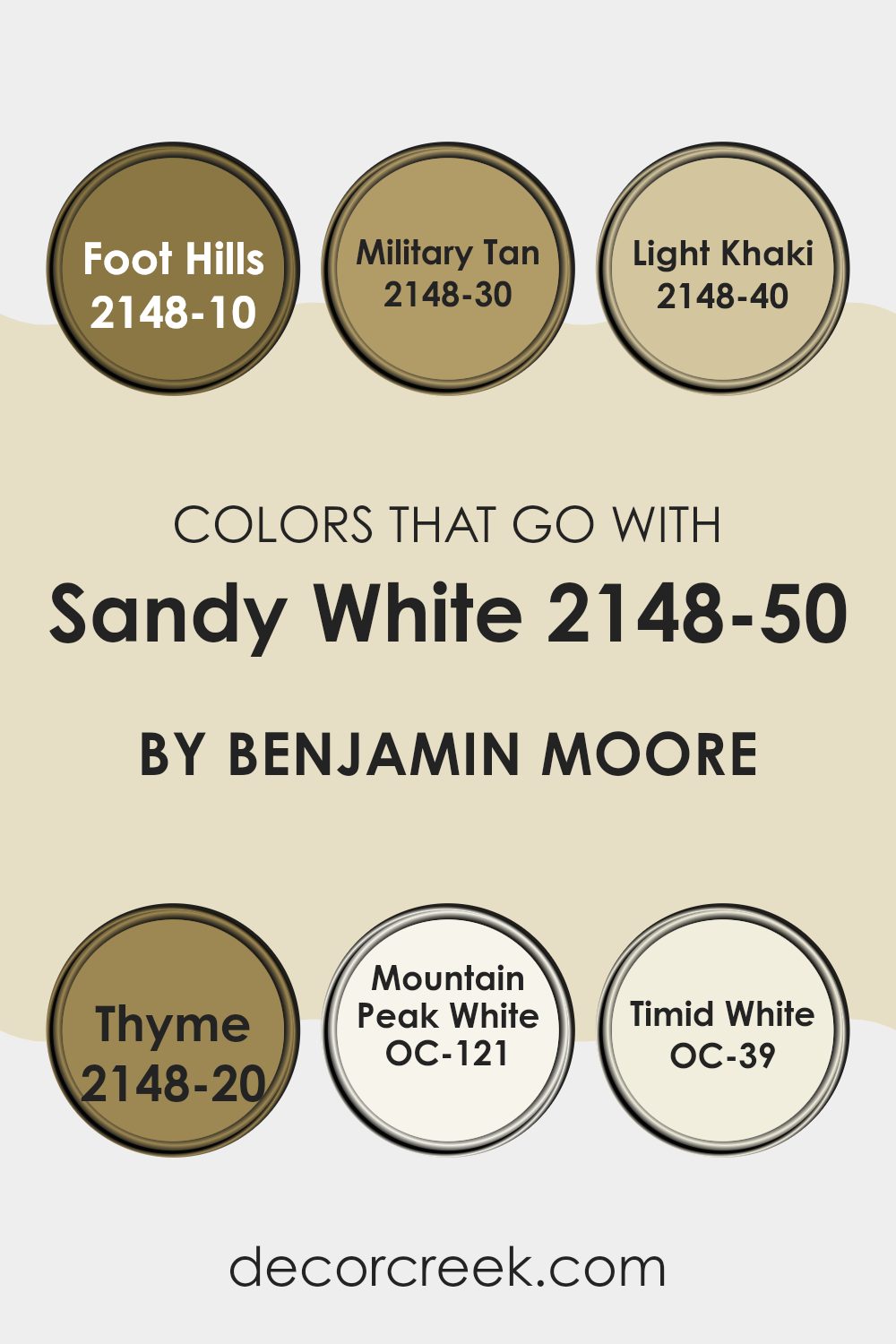
Colors that Go With Sandy White 2148-50 by Benjamin Moore
When choosing colors to pair with Sandy White 2148-50 by Benjamin Moore, it’s crucial to create a harmonious and pleasing palette. Sandy White is a warm, flexible color that offers a cozy and inviting feel.
Complementing it with colors such as 2148-10 Foot Hills, which is a deep, earthy green, can bring a touch of nature indoors, grounding the room with its rich tone. Similarly, 2148-30 Military Tan, a brown shade with hints of green, works well with Sandy White by adding depth without overpowering the room.
For a softer touch, 2148-40 Light Khaki provides a subtle contrast with its gentle, warm beige tone, while 2148-20 Thyme, a muted green, adds freshness and a subtle pop of color. If you’re looking for a crisp yet gentle pairing, OC-121 Mountain Peak White offers a soft white that complements Sandy White’s warmth without clashing. Finally, OC-39 Timid White provides a light, airy touch, designed to reflect more light and make areas feel open.
Each of these colors can be used in various combinations to create a balanced, comfortable environment that highlights the inviting nature of Sandy White while adding character and interest to the room.
You can see recommended paint colors below:
- 2148-10 Foot Hills
- 2148-30 Military Tan
- 2148-40 Light Khaki
- 2148-20 Thyme
- OC-121 Mountain Peak White
- OC-39 Timid White
How to Use Sandy White 2148-50 by Benjamin Moore In Your Home?
Sandy White by Benjamin Moore is a warm, inviting paint color that adds coziness to any room in your home. This soft, creamy shade can be a great choice for living rooms, bedrooms, or even kitchens, providing a neutral backdrop that allows other design elements to stand out. It pairs well with both traditional and modern decor, offering flexibility in design choices.
When used in a living room, Sandy White creates a welcoming atmosphere, making it a perfect room for family gatherings or relaxing after a long day. In a bedroom, it can make the room feel cozy and peaceful, contributing to a restful environment. This color can also work well in a kitchen, complementing wooden cabinets and stainless steel appliances alike.
Overall, the subtle warmth of Sandy White makes it a flexible paint color that can suit various styles and enhance the comfort of your home.
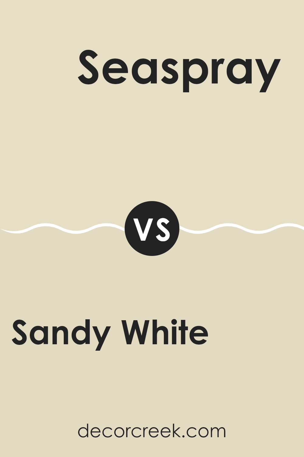
Sandy White 2148-50 by Benjamin Moore vs Seaspray 941 by Benjamin Moore
Sandy White by Benjamin Moore is a warm, soft off-white with a hint of beige. It’s a flexible color that works well as a neutral backdrop, creating a cozy and inviting atmosphere. This color can beautifully complement a variety of design styles, from traditional to modern, making rooms feel warm and welcoming.
Seaspray, on the other hand, is a calming, muted blue-green that brings a sense of freshness and calmness to a room. It’s reminiscent of the sea, making areas feel relaxed and airy. Seaspray can add a subtle touch of color without overpowering, ideal for creating a peaceful environment.
While Sandy White offers warmth and a neutral palette, Seaspray introduces a gentle, cool tone. Together, they can create a balanced look, with Sandy White providing warmth and Seaspray adding a splash of soothing color. Both colors can enhance the aesthetic of any room, offering different atmospheres depending on your needs.
You can see recommended paint color below:
- 941 Seaspray
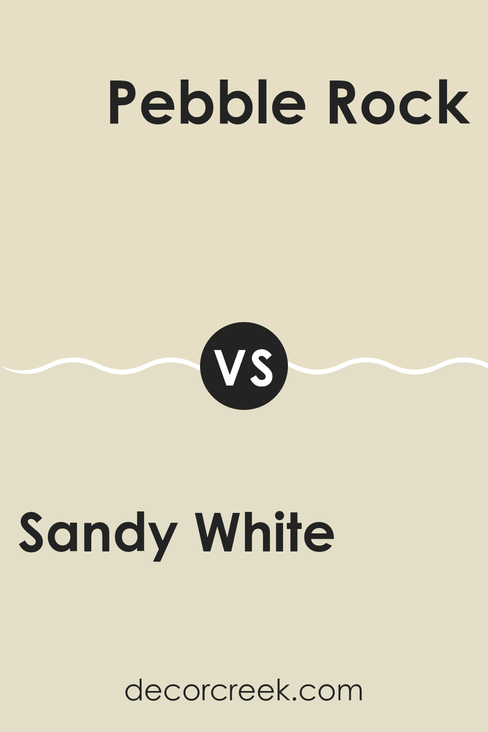
Sandy White 2148-50 by Benjamin Moore vs Pebble Rock 945 by Benjamin Moore
Sandy White (2148-50) by Benjamin Moore is a warm, soft off-white with a hint of beige, giving it a cozy, inviting feel. It’s flexible, working well in various settings and lighting conditions. This color is often chosen for its ability to create a welcoming and relaxed atmosphere without dominating the room.
On the other hand, Pebble Rock (945) by Benjamin Moore is a slightly darker, more muted tone with earthy gray undertones. It has a grounded, natural look that adds a touch of sophistication to any room. While it’s still subtle, Pebble Rock has more depth compared to Sandy White, making it a great choice for those who want a bit more contrast without going too dark.
Both colors are neutral, but Sandy White leans warmer and brighter, whereas Pebble Rock is cooler and a bit more subdued. Depending on your preferred mood, either can beautifully complement your room.
You can see recommended paint color below:
Sandy White 2148-50 by Benjamin Moore vs Oatmeal 268 by Benjamin Moore
Sandy White 2148-50 and Oatmeal 268 by Benjamin Moore are subtle, neutral colors that differ in their undertones and mood. Sandy White is a soft, warm off-white with a hint of cream, making it flexible and easy to match with other colors. It creates a cozy and inviting atmosphere, ideal for areas where warmth and comfort are desired.
On the other hand, Oatmeal is a bit darker than Sandy White and has a more pronounced beige undertone. It can bring a more grounded feel to a room, adding depth and richness without being overpowering. Oatmeal tends to complement earthy or natural color palettes beautifully.
While both colors are neutral, Sandy White might be more suited for areas that need a light and airy feel, whereas Oatmeal offers a warmer, more comforting vibe. Choosing between them depends on whether you want a lighter or slightly heavier look for your room.
You can see recommended paint color below:
- 268 Oatmeal

Sandy White 2148-50 by Benjamin Moore vs Ivory Porcelain 239 by Benjamin Moore
Sandy White 2148-50 and Ivory Porcelain 239, both by Benjamin Moore, are light neutral colors that can make a room feel bright and welcoming. Sandy White has a warm undertone, bringing a touch of coziness and softness to areas. It sits between cream and light beige, offering a slightly sun-kissed appearance.
Ivory Porcelain, on the other hand, is a lighter shade with a subtle coolness compared to Sandy White. It has hints of off-white, making it more crisp and fresh. This color can reflect light well, adding to the sense of openness in a room.
While both colors are flexible and suitable for various settings, Sandy White feels warmer and Ivory Porcelain leans towards a clean, classic aesthetic. Sandy White might suit rooms looking for comfort and warmth, whereas Ivory Porcelain could be ideal for those aiming for a clean, airy feel. Both colors complement light and dark furnishings, enhancing different design styles.
You can see recommended paint color below:
- 239 Ivory Porcelain
Alright, let’s wrap this up about 2148-50 Sandy White by Benjamin Moore. I think this paint color is like a superhero in the world of paints. You know how superheroes are great at fixing problems and making things look amazing? Sandy White does that for walls!
First, Sandy White is a gentle and friendly color. It feels like a warm hug from your favorite blanket. It’s not too bright, like the sun, which can hurt your eyes if you stare at it. It’s also not too dark, like the sky at night, which can make you feel a little scared because you can’t see everything.
When you put Sandy White on your walls, it makes the room feel cozy and welcoming. It’s a great choice if you want your room to feel calm and happy. It’s like when you add a scoop of vanilla ice cream to your pie—everything just comes together nicely.
Also, Sandy White is super easy to get along with. It matches with almost any color you can think of, like your best friend who gets along with everyone. This means you can add colorful things like pillows, toys, or posters to your room, and Sandy White will still look great.
In short, picking Sandy White is like picking a trusty sidekick—it helps make everything around it just a little bit better.

Ever wished paint sampling was as easy as sticking a sticker? Guess what? Now it is! Discover Samplize's unique Peel & Stick samples.
Get paint samples

