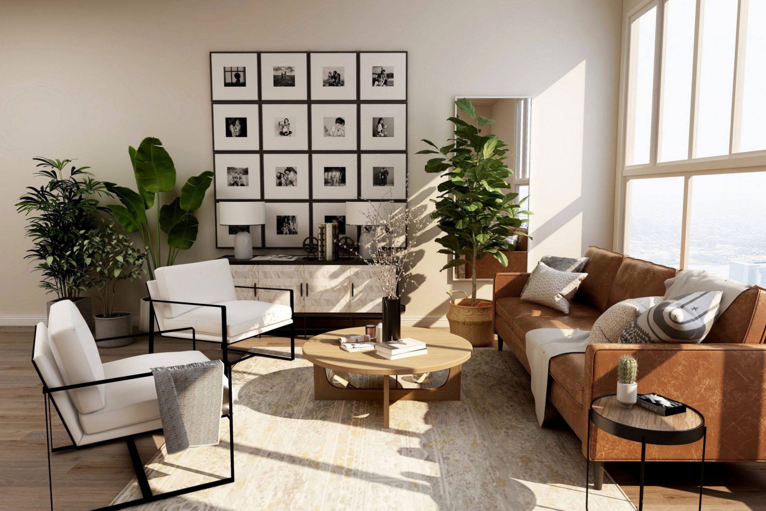
CSP-95 Sea Salt by Benjamin Moore has such a soothing, effortless beauty. It captures the gentle tones of the sea with a soft, muted blend that works in so many spaces. Its neutral quality makes it a perfect fit for both modern and traditional styles, bringing a calm, relaxed feel wherever it’s used.
I found that it creates a soothing backdrop, perfect for any room where relaxation is a priority. Whether in a living area or a tranquil bedroom retreat, this color provides a peaceful ambiance.
The subtlety of Sea Salt gives it a unique ability to unify different elements in a room, bringing them together into a harmonious ensemble.
When used thoughtfully, it can add a gentle layer of sophistication without overpowering other design elements.
This color works well with a variety of furnishings and decor styles, making it a great choice for those who appreciate understated elegance.
What Color Is Sea Salt CSP-95 by Benjamin Moore?
Sea Salt CSP-95 by Benjamin Moore is a gentle, muted green color with a hint of gray, making it feel fresh and calming. It works well in both residential and commercial spaces due to its versatility. This color can integrate beautifully into various interior styles, from coastal and modern farmhouse to minimalist and Scandinavian designs. Its soft undertone can effectively lighten a room, contributing to an airy and open atmosphere.
In coastal interiors, Sea Salt pairs effortlessly with light woods, woven baskets, and linen fabrics to create a beachy vibe. For a more modern farmhouse look, consider combining it with distressed wood or shiplap and adding touches of iron or black accents for contrast.
In minimalist settings, this color serves as a subtle backdrop that complements clean lines and simple forms. Incorporating white or gray decor elements can help emphasize its nice, subdued nature, creating a peaceful environment.
For textures, Sea Salt works well with both smooth and textured surfaces. It pairs beautifully with natural materials like jute rugs, cotton throws, and lightly patterned ceramics. Additionally, incorporating metallic finishes like brushed nickel or aged brass can add a touch of warmth and interest.
Overall, Sea Salt CSP-95 is a versatile choice suitable for various interior styles and materials.
Is Sea Salt CSP-95 by Benjamin Moore Warm or Cool color?
Sea Salt CSP-95 by Benjamin Moore is a soothing, light blue-green color that can bring a calm and fresh feel to homes. This soft hue is versatile and works well in many spaces, from living rooms to bedrooms and bathrooms. Its subtlety makes it a great choice for creating a relaxing atmosphere without overwhelming the senses.
It complements natural light beautifully, enhancing small spaces by making them feel more open and airy. Sea Salt CSP-95 pairs well with neutral tones like beige and white, as well as natural wood and stone accents, enhancing the natural elements in a room.
Homeowners often choose this color to create a peaceful environment, where they can unwind and feel comfortable. Its gentle presence can make any room feel welcoming and balanced, lending a touch of nature’s simplicity to interior spaces. Sea Salt CSP-95 is perfect for those who want a fresh and calming backdrop in their homes.
Undertones of Sea Salt CSP-95 by Benjamin Moore
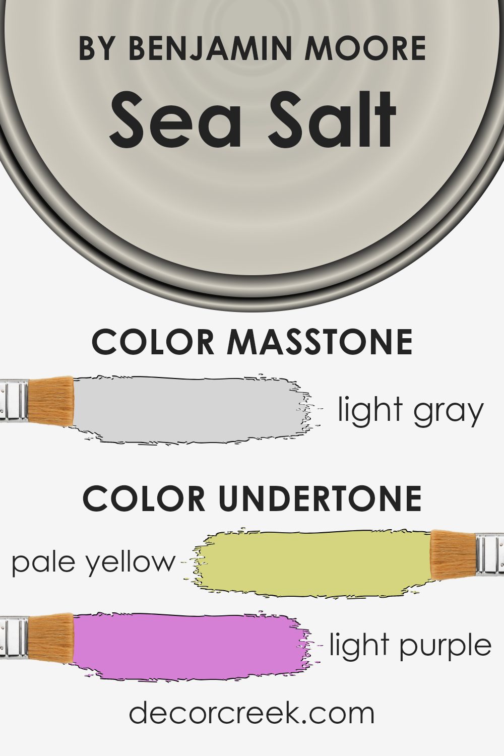
Sea Salt (CSP-95) by Benjamin Moore is a complex color with a range of subtle undertones that affect how we perceive it in different settings. At first glance, it might appear as a soft, muted hue, but its depth comes from an intriguing mix of pale yellow, light purple, light blue, pale pink, mint, lilac, and grey undertones. These undertones can influence the mood and appearance of the color when applied to interior walls.
The pale yellow undertone adds a slight warmth, making spaces feel inviting and cozy. The light purple and lilac bring a touch of elegance, adding sophistication without being overpowering. A hint of light blue provides a calming effect, reminiscent of open skies or gentle waters.
The pale pink offers subtle softness, creating a welcoming ambiance. Meanwhile, mint gives a fresh, invigorating feel, and grey adds a neutral, balanced aspect that helps the color blend seamlessly with other elements in a room.
How we perceive Sea Salt can change depending on lighting conditions and surrounding colors. In natural light, the airy blue and mint may pop, while warm artificial light might enhance the yellow and pink undertones.
It’s a versatile color that adapts well to different atmospheres, making it suitable for various interior styles.
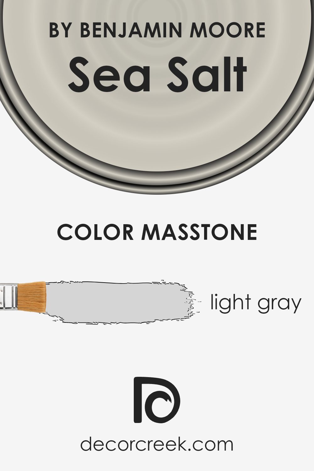
What is the Masstone of the Sea Salt CSP-95 by Benjamin Moore?
Sea Salt CSP-95 by Benjamin Moore is a light gray color that works well in many homes. This gentle shade of gray offers a neutral backdrop that can easily complement both modern and traditional styles. The lightness of the color (#D5D5D5) allows it to brighten up spaces, making rooms feel more open and airy.
This makes it a great choice for smaller rooms or areas that do not receive a lot of natural light, as it can help to reflect light around the room, enhancing its brightness.
In living rooms and bedrooms, this color pairs well with soft whites, pastels, and even darker shades for contrast. It creates a calm and relaxed atmosphere without overpowering the decor. Additionally, it provides a subtle elegance that helps other colors and textures stand out. Sea Salt CSP-95 is versatile enough to be used throughout the home, making it a popular choice for homeowners seeking a balanced and harmonious look.
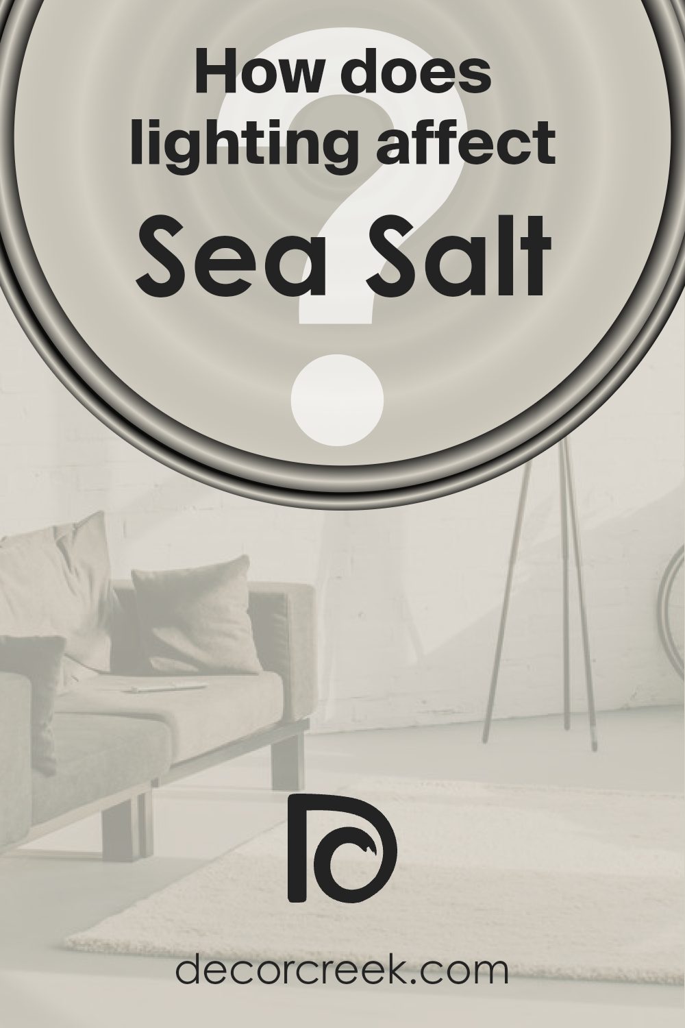
How Does Lighting Affect Sea Salt CSP-95 by Benjamin Moore?
Lighting has a significant impact on how we perceive colors, and the paint color Sea Salt (CSP-95) by Benjamin Moore is no exception. This color can look quite different depending on the type of lighting in a room and the room’s orientation.
In natural light, Sea Salt appears as a soft, muted green with a touch of gray. It’s a calming color that can change slightly with the movement of the sun throughout the day.
– In a north-facing room, light tends to be cooler and more consistent, which can make Sea Salt appear more muted and slightly cooler. The green and gray tones may become more pronounced, giving the room a more subdued feel.
– In a south-facing room, sunlight is much warmer and more abundant, especially during the afternoon. Sea Salt will look warmer and lighter in these conditions, with its soft green hue becoming more visible. This can make the room feel bright and cozy.
– An east-facing room gets the most direct sunlight in the morning. In the early hours, Sea Salt might appear brighter and more vibrant. As the day progresses and the natural light fades, the color will settle into its more muted tone.
– In a west-facing room, the color will react differently due to the warm light from the setting sun. In the late afternoon and evening, Sea Salt can look warmer and more intense, with the green undertones becoming more noticeable.
Under artificial lighting, the appearance of Sea Salt will depend on the type of bulbs used. Warm white bulbs can bring out the warmer tones in the color, whereas cool white bulbs might emphasize the gray undertones. LED lights offer a more balanced lighting option, which can maintain Sea Salt’s soft and soothing look.
Overall, the environment and lighting greatly influence how Sea Salt is perceived in any space.
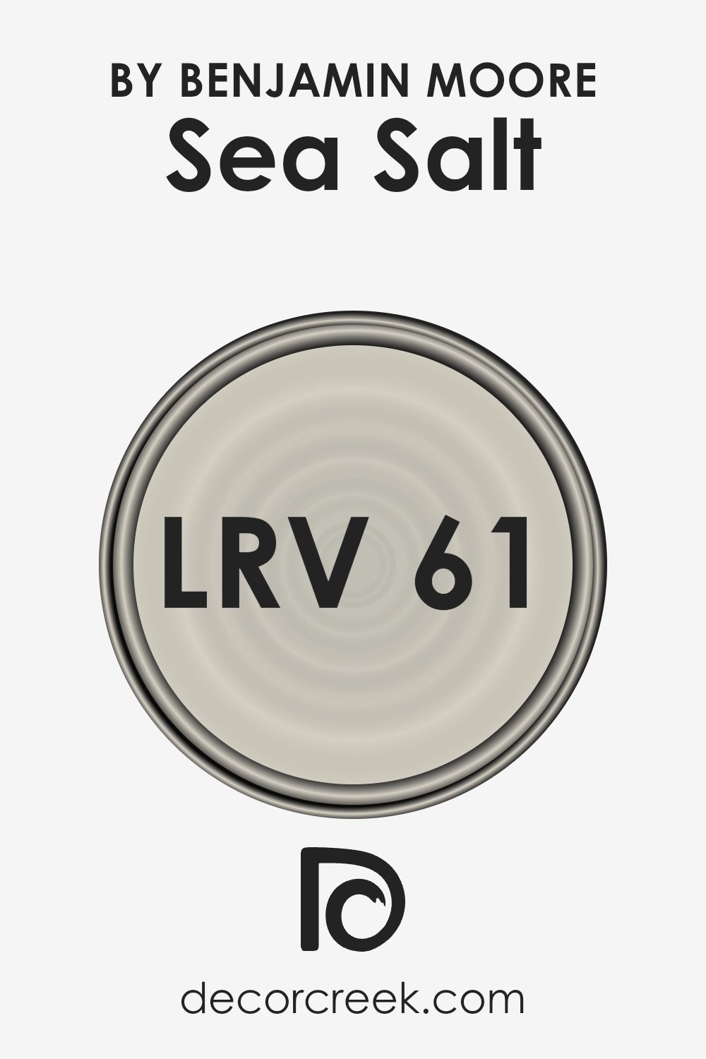
What is the LRV of Sea Salt CSP-95 by Benjamin Moore?
Light Reflectance Value, or LRV, is a measurement that tells us how much light a color reflects. It ranges from 0, which is absolute black, to 100, which is pure white. Colors with higher LRV values reflect more light, making them appear brighter and lighter, while those with lower values absorb more light, giving them a darker appearance.
Knowing the LRV of a paint color can help you predict how it will look in different lighting conditions and how it can affect the overall brightness of a room. This is particularly helpful when selecting paint for spaces with little natural light or for areas where you want to avoid a color feeling too dark or heavy.
Sea Salt, with an LRV of 61.09, is somewhat in the middle of the LRV scale, but leaning towards the lighter side. This means it reflects a decent amount of light, helping rooms to feel more open and airy. If you use this color on your walls, it can make your space feel brighter, especially in rooms with plenty of natural light.
However, its moderate LRV also ensures it won’t feel washed out or overly stark, providing a nice balance. This makes it versatile for different spaces, as it can enhance coziness while still maintaining some brightness.
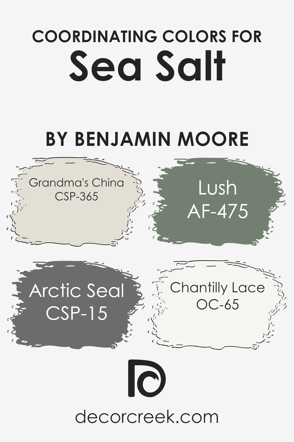
Coordinating Colors of Sea Salt CSP-95 by Benjamin Moore
Coordinating colors are chosen to work harmoniously with a primary color, enhancing and complementing its effect in a room. They bring balance and interest by varying tones, hues, and intensities. For example, Sea Salt (CSP-95) by Benjamin Moore is a gentle and calming green.
Coordinating colors for Sea Salt include Grandma’s China (CSP-365), Arctic Seal (CSP-15), Lush (AF-475), and Chantilly Lace (OC-65). These colors can create a cohesive and pleasing aesthetic when used together.
Grandma’s China is a soft, muted blue, reminiscent of vintage porcelain, adding a touch of nostalgia and warmth to any space. Arctic Seal is a deep, cool gray that provides a strong, grounding contrast, giving depth and richness to rooms. Lush is a warm, earthy green, instilling a natural, inviting feel that pairs beautifully with the subtle tones of Sea Salt.
Chantilly Lace, on the other hand, is a crisp, clean white, reflecting light and providing a perfect backdrop that enhances the other colors. Together, these shades create a palette that is both balanced and vibrant, ensuring that each color supports and amplifies the overall look and feel of a room.
You can see recommended paint colors below:
- CSP-365 Grandma’s China
- CSP-15 Arctic Seal
- AF-475 Lush
- OC-65 Chantilly Lace
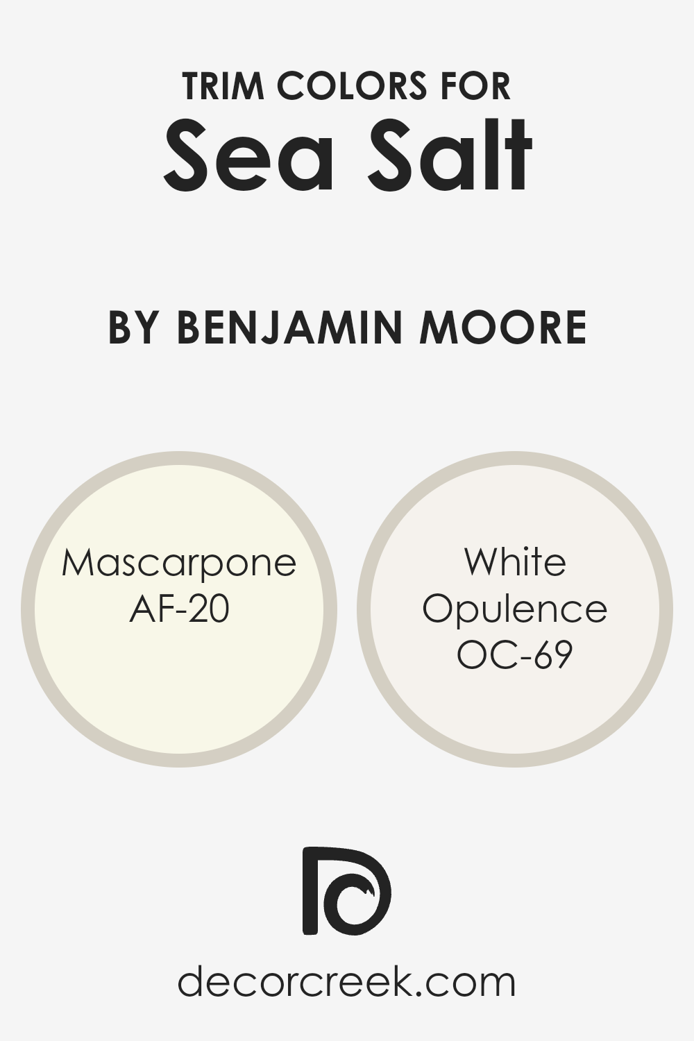
What are the Trim colors of Sea Salt CSP-95 by Benjamin Moore?
Trim colors are shades used on door frames, moldings, and baseboards to complement or contrast the main wall color. They help define architectural details and create a finished look by highlighting edges and corners. When paired with Benjamin Moore’s Sea Salt CSP-95, trim colors can make a space feel complete and balanced.
Sea Salt is a soft, natural shade that brings a touch of calm and freshness to a room, reminiscent of gentle sea breezes and muted coastal elements. Having the right trim color can emphasize this effect, making the walls stand out while adding depth and dimension.
Mascarpone AF-20 is a warm, creamy white that pairs beautifully with Sea Salt, providing a subtle contrast that feels inviting and cozy, like the richness of fresh cream. On the other hand, White Opulence OC-69 is a lighter, more airy white that adds a touch of elegance and brightness, like a gentle wisp of cloud softly framing the walls.
Both of these colors work well with Sea Salt, depending on whether you want a warmer or crisper feel for your space.
The right trim choice will not only complement Sea Salt but also enhance the overall aesthetic of the room, ensuring a harmonious and pleasing environment.
You can see recommended paint colors below:
- AF-20 Mascarpone
- OC-69 White Opulence
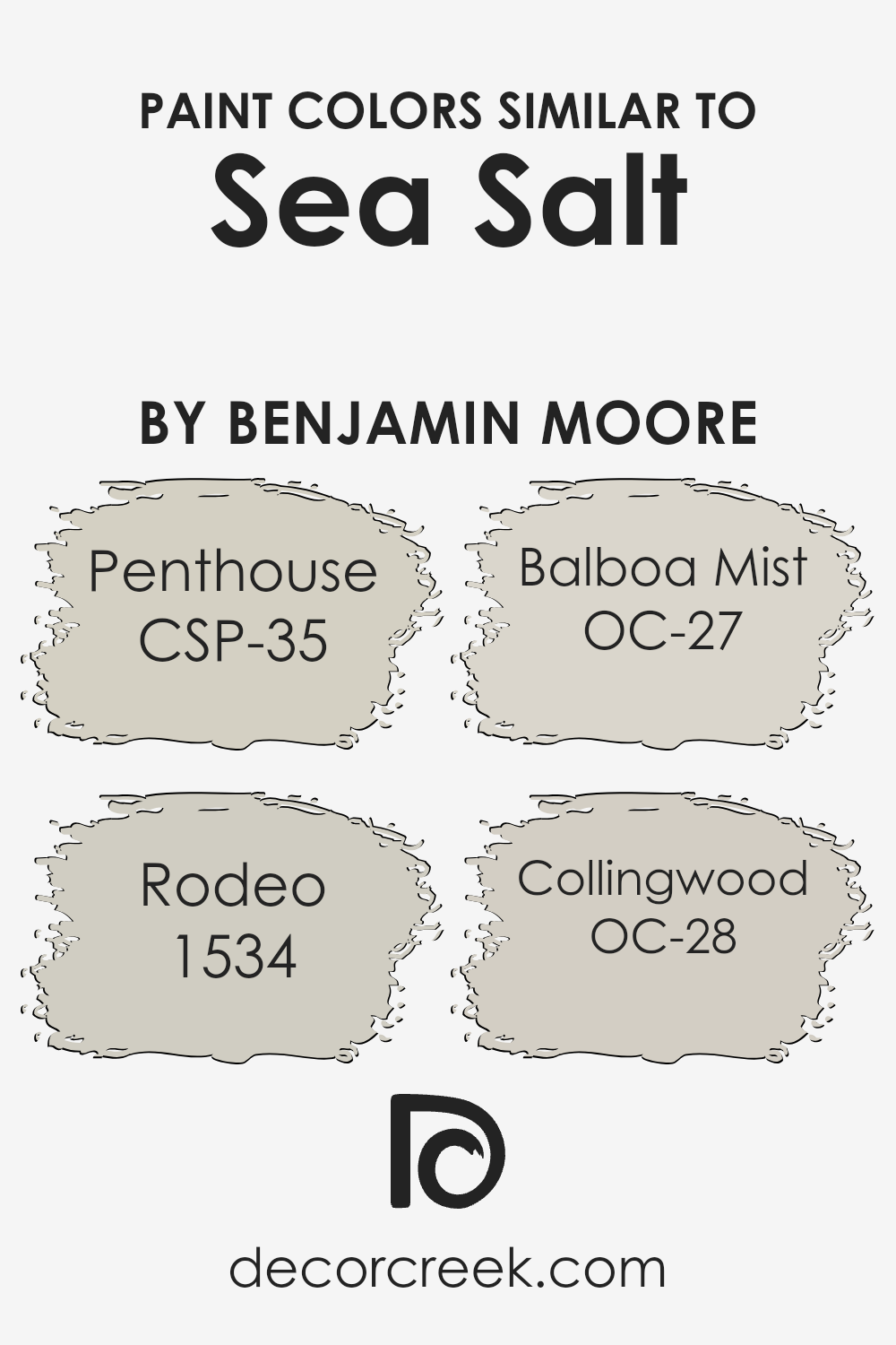
Colors Similar to Sea Salt CSP-95 by Benjamin Moore
Similar colors play a crucial role in interior design, as they help create a harmonious and cohesive look. The similarity in colors ensures that rooms have a seamless flow, which is visually pleasing and calming. When selecting colors that complement Sea Salt by Benjamin Moore, shades like CSP-35 Penthouse, 1534 Rodeo, OC-27 Balboa Mist, and OC-28 Collingwood work well together.
These colors all share a soft, neutral base that allows them to blend beautifully without clashing, offering a sense of continuity and balance throughout a space.
CSP-35 Penthouse is a gentle gray with a subtle hint of warmth, offering a quiet elegance to any room. Its calming presence makes it easy to match with other soft tones. Meanwhile, 1534 Rodeo showcases a slightly darker gray with a touch of beige that adds depth. OC-27 Balboa Mist is a versatile light gray with a soft hint of warmth, making it perfect for spaces that need an airy feel.
Lastly, OC-28 Collingwood is a medium-toned gray that balances both warm and cool undertones, making it a flexible choice for various design styles.
Together, these colors create a soft, neutral palette that enhances the look and feel of a home.
You can see recommended paint colors below:
- CSP-35 Penthouse
- 1534 Rodeo
- OC-27 Balboa Mist
- OC-28 Collingwood
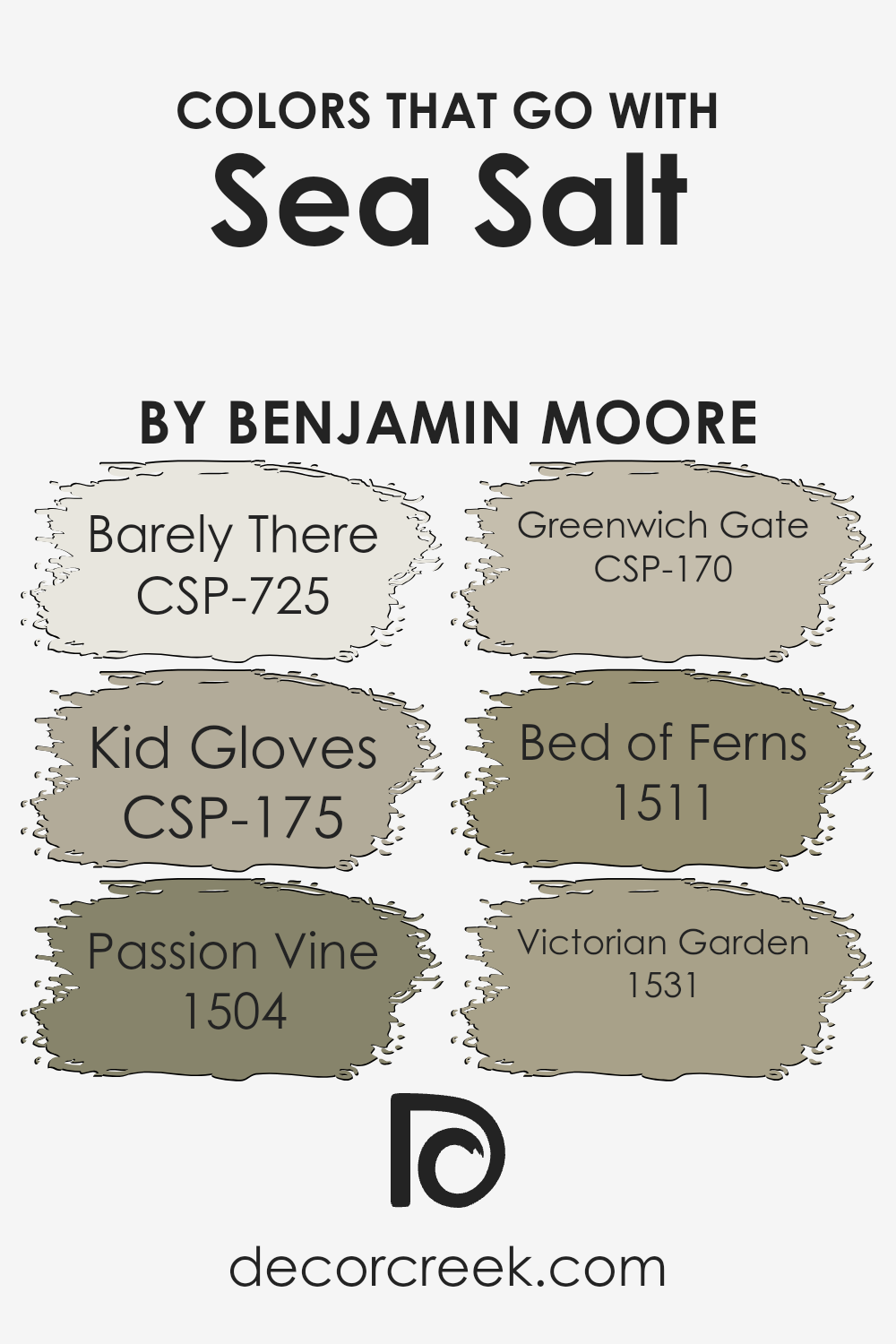
Colors that Go With Sea Salt CSP-95 by Benjamin Moore
Sea Salt CSP-95 by Benjamin Moore is a soft, versatile color that can harmonize beautifully with various hues. When paired with CSP-725 Barely There, a delicate, whisper-light shade, it creates an airy and spacious feel. This subtle tint adds a gentle touch that enhances the calm essence of Sea Salt. CSP-175 Kid Gloves, a warm and tender pink, complements the cool undertones by adding a welcoming, cozy feeling to the space.
This pairing brings lightness and warmth, balancing Sea Salt’s calmness with a hint of playful elegance.
1504 Passion Vine offers a rich, deep green that contrasts beautifully with Sea Salt, creating a dynamic yet natural vibe. This vibrant green brings a touch of the outdoors inside, enhancing Sea Salt’s gentle freshness. CSP-170 Greenwich Gate adds a classic, muted green tone that works to ground the lightness of Sea Salt while echoing a serene garden atmosphere. 1511 Bed of Ferns, a mid-tone green, connects the light and dark elements, fostering a harmonious transition between shades.
Finally, 1531 Victorian Garden combines floral inspiration with earthy notes, crafting a striking balance when matched with Sea Salt. This partnership enriches the visual texture, weaving together nature’s elegance with subtle color.
You can see recommended paint colors below:
- CSP-725 Barely There
- CSP-175 Kid Gloves
- 1504 Passion Vine
- CSP-170 Greenwich Gate
- 1511 Bed of Ferns
- 1531 Victorian Garden
How to Use Sea Salt CSP-95 by Benjamin Moore In Your Home?
Sea Salt CSP-95 by Benjamin Moore is a soft and inviting color that brings a sense of calm and peace to any space. This gentle shade of blue-gray is perfect for creating a soothing atmosphere in your home. It’s an excellent choice for bedrooms, as it promotes restful sleep, making you feel relaxed and at ease.
In living rooms, Sea Salt CSP-95 offers a light and airy ambiance, helping the space feel open and welcoming. For bathrooms, this color can evoke a spa-like feel, ideal for unwinding after a long day. Pair it with white trim and natural wood accents to enhance its calming effect.
Sea Salt works well with various decor styles, from coastal to modern, complementing both neutral and bold color palettes.
Whether used on all the walls or as an accent, Sea Salt CSP-95 brings a touch of comfort and simplicity to any room.
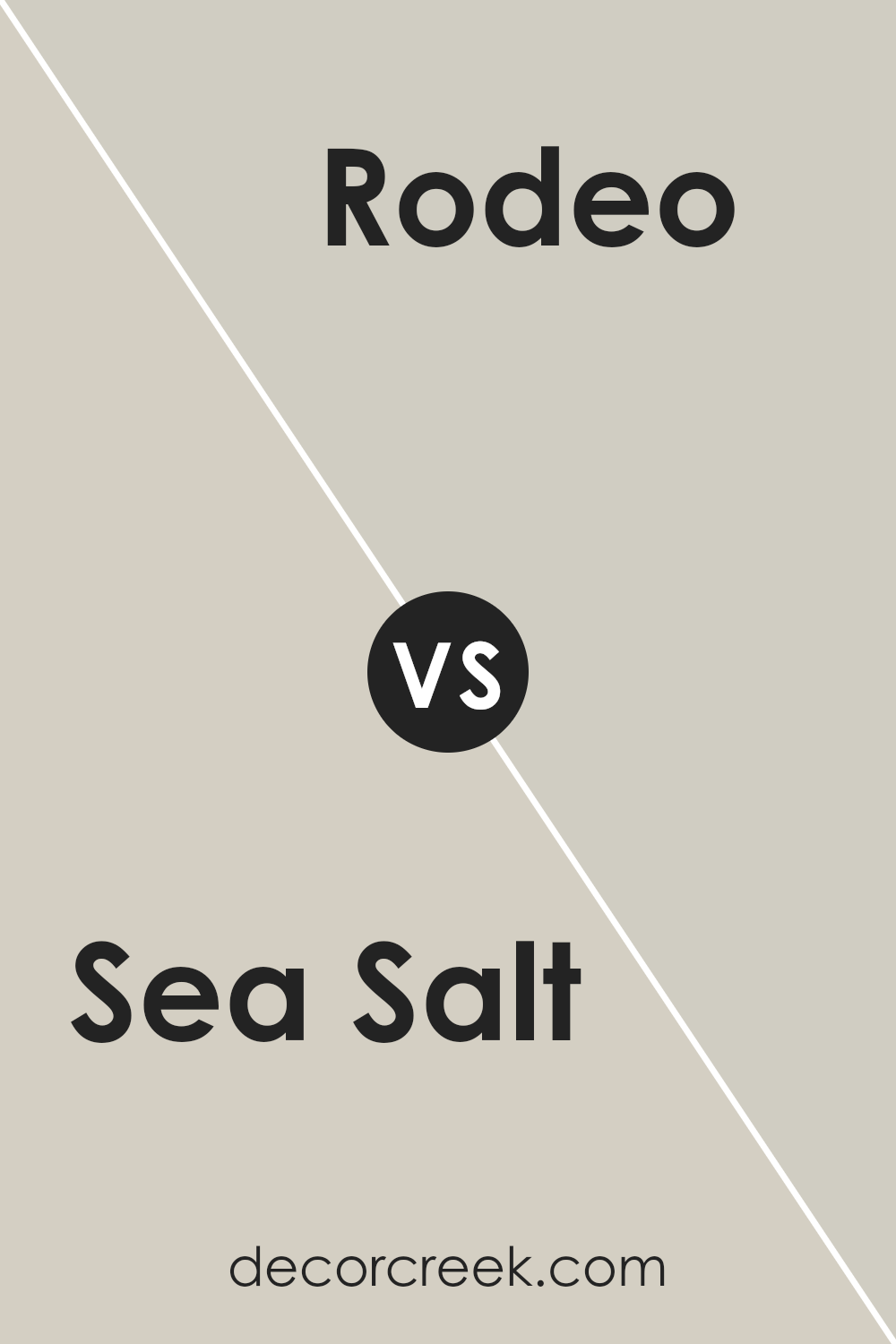
Sea Salt CSP-95 by Benjamin Moore vs Rodeo 1534 by Benjamin Moore
Sea Salt CSP-95 by Benjamin Moore is a soft, muted green with gray undertones, creating a soothing and fresh feel. It’s versatile enough to be used in various rooms, bringing a subtle nod to nature indoors. This color can pair well with whites and light woods, offering a calm and airy atmosphere.
On the other hand, Rodeo 1534 is a warm gray with beige hints, providing a cozy and welcoming vibe. It’s more neutral compared to Sea Salt, making it a good backdrop for different types of decor. Rodeo can easily complement bolder colors and works well in both modern and traditional settings.
While both colors offer a relaxing ambiance, Sea Salt leans towards a cooler and more refreshing palette, whereas Rodeo adds warmth and richness to a space. The choice between them can be influenced by the overall mood you want and the existing elements in the room.
You can see recommended paint color below:
- 1534 Rodeo
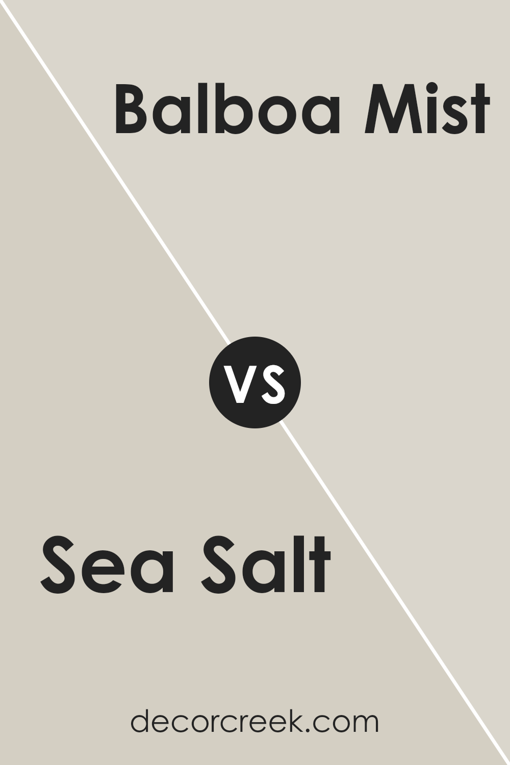
Sea Salt CSP-95 by Benjamin Moore vs Balboa Mist OC-27 by Benjamin Moore
Sea Salt CSP-95 and Balboa Mist OC-27 by Benjamin Moore are both popular neutral paint colors, but they have distinct differences. Sea Salt is a soft, calming hue with greenish undertones that can remind you of a gentle sea, giving a fresh and airy feel. It’s a versatile color that works well in spaces where you want a peaceful ambiance, like bedrooms or bathrooms.
On the other hand, Balboa Mist is a warm, light gray with beige undertones. It’s often described as a “greige,” a mix of gray and beige, which makes it very adaptable to different settings. It can look lighter or darker depending on the lighting and pairs beautifully with both warm and cool colors.
While Sea Salt brings in a cool, refreshing vibe, Balboa Mist offers a cozy and inviting atmosphere. Both are great choices for creating a neutral backdrop, but their undertones will suit different styles and preferences.
You can see recommended paint color below:
Sea Salt CSP-95 by Benjamin Moore vs Collingwood OC-28 by Benjamin Moore
Sea Salt (CSP-95) and Collingwood (OC-28) are both calm and versatile colors from Benjamin Moore, but they have their differences in tone and mood. Sea Salt is a light greenish-gray that often gives a subtle, fresh feeling, reminiscent of mint or mist. It works well in spaces where you want a soft and airy atmosphere.
On the other hand, Collingwood is a light gray with warm undertones, which might appear more neutral and grounded. This makes it a great choice for spaces where you want a cozy yet clean look. While Sea Salt can add a hint of color, Collingwood keeps things neutral and warm.
Both can be used to create a relaxing environment, but Sea Salt brings a bit more color, whereas Collingwood focuses on warmth and neutrality. Depending on the lighting, Sea Salt may look slightly more vibrant, while Collingwood maintains its subtle warmth.
You can see recommended paint color below:
Sea Salt CSP-95 by Benjamin Moore vs Penthouse CSP-35 by Benjamin Moore
Sea Salt CSP-95 and Penthouse CSP-35 by Benjamin Moore are two distinct colors that offer different vibes to a space. Sea Salt is a soft, muted gray with a hint of warmth, making it versatile and easy to pair with other colors. This shade creates a light and airy feel, perfect for spaces where you want a calm and relaxed atmosphere.
On the other hand, Penthouse is a deeper, richer gray. It exudes a sense of coziness and depth, making it suitable for creating a more intimate setting. Its dark tone can add contrast and drama to a room, complementing lighter accents beautifully.
While Sea Salt works well in small spaces, reflecting more light and making areas feel larger, Penthouse’s bolder shade can add an element of sophistication and warmth. Both colors can suit different styles, but your choice depends on whether you prefer a gentle, breezy aura or a more grounded, cozy feel.
You can see recommended paint color below:
- CSP-35 Penthouse
Conclusion
CSP-95 Sea Salt is like a breath of fresh air, bringing to mind a quiet, peaceful day by the ocean. With its blend of soft gray and light blue, it creates a calm and inviting feel. It’s the kind of color that makes any space feel bright, cheerful, and welcoming.
When I think about using CSP-95 Sea Salt in a home, I see how it fits in almost any room. Whether it’s a bedroom, living room, or kitchen, it can bring a light and airy feeling. It works well with other colors, too. You can pair it with brighter colors for a fun look or with neutrals for something more relaxed.
One of my favorite aspects of this color is how it changes throughout the day. In the morning light, it can look bright and cheerful. As the day goes on and the light changes, it might take on more of its gray tones. This shifting appearance keeps things interesting and adds depth to your surroundings.
Overall, CSP-95 Sea Salt is a wonderful choice for anyone looking to refresh their home. It combines a peaceful vibe with enough flexibility to fit in different styles. I hope my take on it has inspired you to try something new with your colors.
Ever wished paint sampling was as easy as sticking a sticker? Guess what? Now it is! Discover Samplize's unique Peel & Stick samples.
Get paint samples

