The OC-28 Collingwood by Benjamin Moore isn’t just any paint; it stands out as a classic choice for anyone looking to bring a fresh, yet timeless look into their space. Known for its versatility, Collingwood isn’t too warm nor too cold, making it the perfect neutral backdrop for any room in your house. Whether you’re aiming to brighten up a living room or create a soothing atmosphere in a bedroom, this shade has the ability to transform a space with its subtle elegance.
What sets Collingwood apart isn’t just its balanced undertone but also how it reacts to natural light, offering a variety of shades throughout the day.
This means, depending on the lighting in your space, it can appear as a soft gray during daylight and transition into a warmer tone in the evening. This adaptability makes it a top choice for decorators who aim for a harmonious look that flows throughout their home.
Selecting OC-28 Collingwood is more than just picking a paint color; it’s about creating a backdrop that enhances your decor and reflects your personality. Whether you’re refreshing a single room or planning a full home makeover, Collingwood offers a solid foundation to build upon.
Its unmatched versatility and timeless appeal have made it a go-to for homeowners and professionals alike, proving that sometimes, the best choice is the one that feels just right.

What Color Is Collingwood OC-28 by Benjamin Moore?
Collingwood by Benjamin Moore is a versatile and sophisticated gray with a warm undertone. This particular shade balances between gray and beige, offering a neutral palette that brings a cozy and inviting feel to any room. Its unique blend makes it perfect for those looking to achieve a soft, yet rich atmosphere without overpowering the space.
This color works exceptionally well in a variety of interior styles, including modern minimalist, traditional, and even rustic. Its subtle warmth complements the clean lines and simplicity of modern design, while its depth adds character to traditional settings. In rustic interiors, Collingwood serves as an ideal backdrop, enhancing natural wood textures and earthy elements.
When it comes to pairing with materials and textures, Collingwood shows its true versatility. It pairs beautifully with light woods, adding warmth and depth, and contrasts elegantly with dark woods for a striking effect. Metals like brass and copper can introduce a touch of sophistication, while marble adds a luxurious feel. Soft textiles in rich textures, like velvet or wool, in both light and dark tones, work harmoniously with this color, creating a layered and well-rounded look.
Overall, its adaptability makes it a popular choice for those looking to achieve a balanced and harmonious interior.
Is Collingwood OC-28 by Benjamin Moore Warm or Cool color?
Collingwood, a subtle gray shade, is part of the Benjamin Moore Off-White Collection. This particular color is beloved for its versatility, working beautifully in various spaces within a home. It has a warm undertone, making rooms feel cozy and inviting, a must-have quality for spaces where comfort is key. This warmth allows it to blend seamlessly with different decor styles and colors, acting as a neutral backdrop that can highlight furniture, art, or accent pieces.
What sets Collingwood apart is its ability to adapt to changing natural light throughout the day, offering a dynamic quality that keeps rooms feeling fresh and lively. In bright sunlight, it can look almost ethereal, adding a light, airy feel to the space. On cloudier days or in spaces with less natural light, it provides depth and coziness without overpowering the room’s other design elements.
Homeowners who choose Collingwood appreciate its sophisticated yet understated charm, making it a solid choice for walls, ceilings, and even trim. It’s a paint color that truly works everywhere, bringing rooms together in a cohesive, stylish manner.
Undertones of Collingwood OC-28 by Benjamin Moore
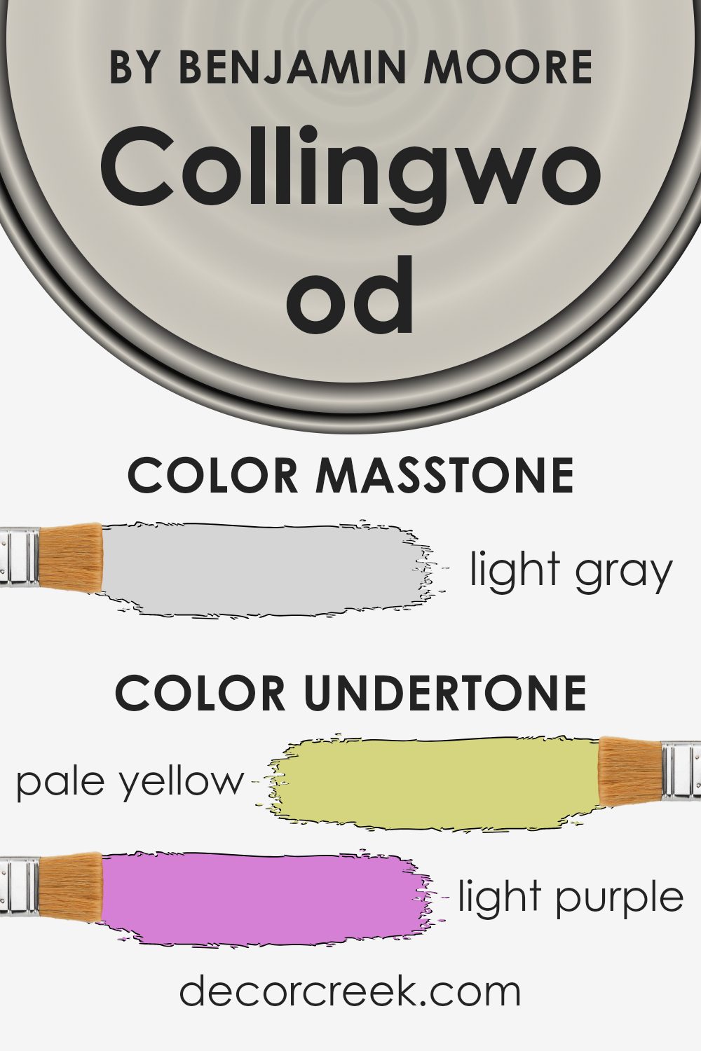
Collingwood is a popular paint color known for its ability to adapt to different settings and lighting conditions, thanks to its complex undertones. Understanding undertones, which are the subtle colors lying beneath the surface of the main color, is key to seeing why Collingwood behaves the way it does on walls. This color has a mix of undertones like pale yellow, light purple, light blue, pale pink, mint, lilac, and grey. These undertones play a significant role in how we perceive the main hue.
When you put Collingwood on interior walls, the lighting and surrounding colors can pull out these undertones, subtly shifting how the color appears. For example, in a room with lots of natural light, you might notice the pale yellow or light blue undertones, giving the room a cooler or warmer feel depending on the time of day. In artificial light, the grey or light purple might become more pronounced, adding a sophisticated touch.
This variability makes Collingwood a versatile choice for interiors. It can harmonize with a wide range of decor styles and color schemes because its undertones can complement various furnishings and accessories. The presence of mint and lilac adds a hint of freshness or calm to a room, respectively, while the grey undertone keeps the color grounded, ensuring it doesn’t become too overwhelming or vibrant. In general, the mix of undertones in Collingwood can enhance the mood and character of a space, making the walls a dynamic backdrop to daily life.
What is the Masstone of the Collingwood OC-28 by Benjamin Moore?
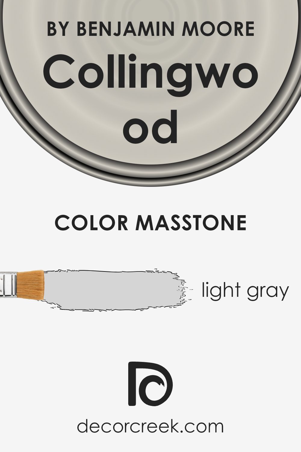
Collingwood OC-28 by Benjamin Moore has a light gray masstone that looks very appealing in homes. This specific shade is special because it’s not too dark or too bright. The color is like a soft blanket of fog on a peaceful morning, creating a calm and relaxing atmosphere in any room.
This light gray, with its subtle warmth, blends beautifully with various decor styles, from modern to traditional. It’s versatile, making small spaces appear bigger and giving large rooms a cozier feel without overwhelming with color. Since it’s not a strong, bold gray, it acts as a perfect background, allowing furniture and art to stand out.
The neutrality of Collingwood OC-28 makes it easy to mix with other colors, whether you’re adding soft pastels for a gentle look or bright accents for a pop of energy. It’s especially great for living rooms, bedrooms, and even kitchens, making these spaces feel welcoming and stylish.
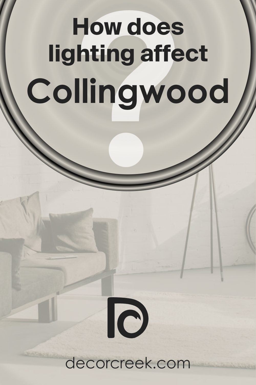
How Does Lighting Affect Collingwood OC-28 by Benjamin Moore?
Lighting can significantly influence the way colors appear in a room, altering their brightness, hue, and overall vibe. The variation in light, whether it’s basking in natural sunlight or illuminated by artificial lights, can make colors look vastly different at various times of the day.
Taking the color Collingwood (OC-28) by Benjamin Moore as an example, let’s explore how different lighting conditions affect its appearance. This color, a soft, light gray with warm undertones, is versatile and elegant, making it a popular choice for many spaces.
In artificial light, the kind of bulb used can impact how Collingwood looks. LED or fluorescent lighting can bring out its cooler tones, making the color appear more crisp and vibrant. With incandescent lighting, on the other hand, the warm undertones of Collingwood are enhanced, giving the room a cozier feel.
In natural light, the direction of the light source plays a crucial role. North-facing rooms get less direct sunlight, which means Collingwood might look softer and more muted in these spaces. The cooler, indirect light accentuates the gray aspects, providing a tranquil and serene ambiance.
South-facing rooms are flooded with warm light for most of the day, which can make Collingwood appear warmer and more luminous. This can add a welcoming and inviting touch to the room, making it feel more open and airy.
East-facing rooms enjoy bright morning light, which can make Collingwood look exceptionally lively and vibrant in the mornings, gradually moving towards a softer feel as the day progresses. The color adapts to the changing light, showing off its versatility.
West-facing rooms experience the warm, golden tones of the setting sun, which can make Collingwood glow with warmth in the late afternoon and evening. This adds a cozy, comforting atmosphere to the space, ideal for relaxing.
In summary, Collingwood’s appearance can change dramatically under different lighting conditions, making it a flexible color choice that can adapt to various environments and create a range of atmospheres, from serene and calming to warm and welcoming.
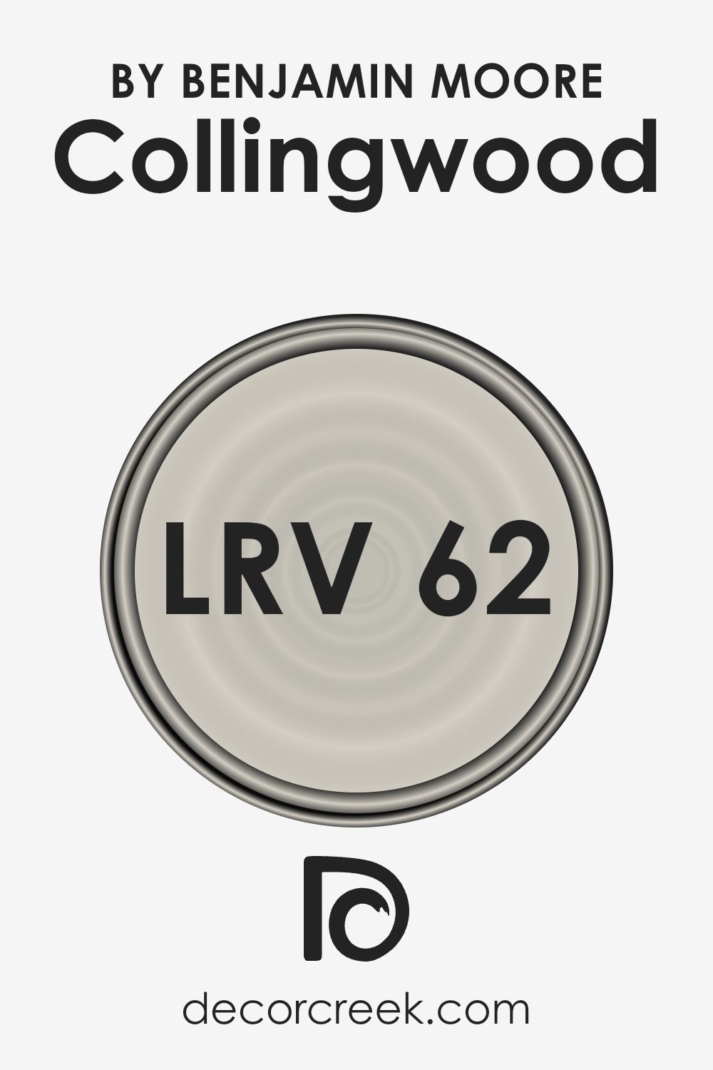
What is the LRV of Collingwood OC-28 by Benjamin Moore?
Understanding LRV is crucial when choosing paint colors because it can significantly impact the feel and ambiance of a space. High LRV colors make rooms feel brighter and more spacious as they reflect more light. Conversely, low LRV colors create a cozier or more subdued environment by absorbing light.
With an LRV of 61.52, the color in question reflects a good deal of light back into the room without being too bright. This means it has the potential to make spaces feel airy and open, yet with more warmth and character than a pure white or very light color might offer. This specific LRV strikes a balance that can be particularly appealing for those who wish to enhance natural light in a room without the starkness that higher LRV colors can sometimes bring.
It’s versatile, providing a sophisticated backdrop that can complement a wide range of decor styles and preferences, making your space feel welcoming and well-lit.
Coordinating Colors of Collingwood OC-28 by Benjamin Moore
Coordinating colors work together to create a harmonious palette for any space, enhancing the main color’s attributes without overpowering it. For a color like Collingwood OC-28 by Benjamin Moore, which is a warm, versatile grey, the perfect coordinating colors can bring out its best qualities while adding depth and character to the room. These complementary colors can range from lighter hues to dark, contrasting shades, each playing a role in achieving a balanced and aesthetically pleasing look.
Starting with AF-15, known as Steam, it’s a soft, almost ethereal white that can lighten a room beautifully, creating a subtle contrast with Collingwood’s warmth without clashing.
It’s ideal for trim or ceilings to give a lifted, airy feel to the space. AF-655, or Silhouette, presents a deep, charcoal grey that can add a striking boldness when used alongside Collingwood, perfect for creating a focal point or adding dramatic flair.
For a touch of earthiness, 2115-30, dubbed Amazon Soil, is a rich, deep brown that brings a grounding element to the palette, making spaces feel more inviting and cozy. Lastly, OC-57, White Heron, is a crisp, clean white with just a hint of warmth, making it a great choice for broader areas, offering a fresh backdrop that allows Collingwood to shine as an accent or main wall color. Together, these coordinating colors provide a range of options to create a cohesive look that feels both designed and welcoming.
You can see recommended paint colors below:
- AF-15 Steam
- AF-655 Silhouette
- 2115-30 Amazon Soil
- OC-57 White Heron
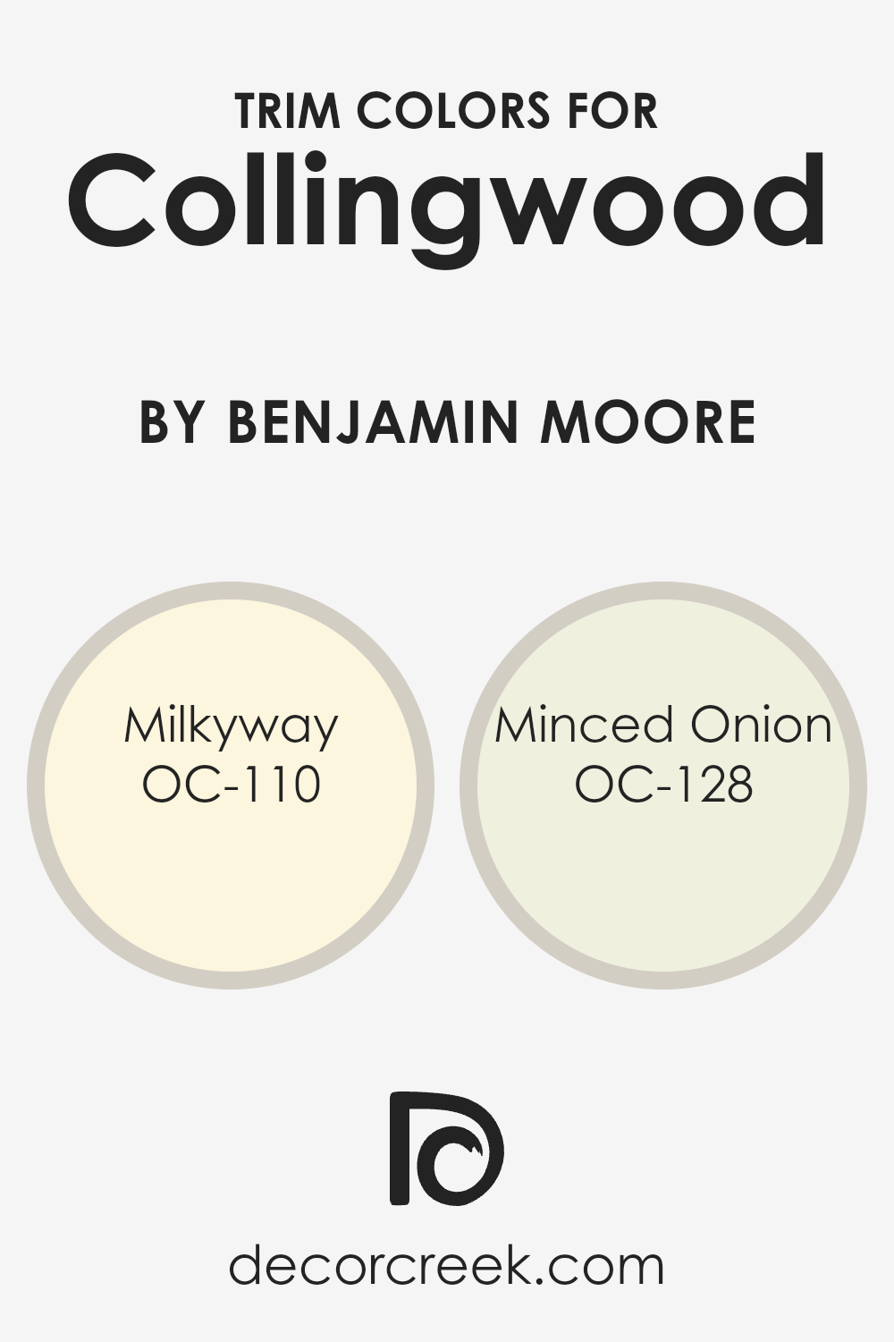
What are the Trim colors of Collingwood OC-28 by Benjamin Moore?
Trim colors are the contrasting or complementary hues used for painting the architectural elements like doorframes, window frames, baseboards, and crown molding, different from the wall color. For a neutral and widely popular shade like Collingwood OC-28 by Benjamin Moore, selecting the right trim colors is crucial. It helps in defining the space, accentuating the architectural details, and enhancing the overall aesthetic appeal of the room. The subtle contrast or complement with trim colors can bring out the best in Collingwood OC-28, making the walls look more refined and giving the space a cohesive look.
OC-110 Milkyway is a soft, creamy white that offers a gentle contrast to Collingwood OC-28, providing a fresh and clean look to the trim work without overwhelming the main color. It’s light enough to maintain a bright and airy feel but carries just enough depth to highlight the trims against the backdrop of Collingwood OC-28.
On the other hand, OC-128 Minced Onion is a slightly warmer and more nuanced white, offering a subtle and sophisticated edge. This color adds a layer of warmth to the space, ensuring the trims blend harmoniously with Collingwood OC-28, creating an inviting and cohesive atmosphere. Both colors offer unique ways to accentuate and complement the beauty of Collingwood OC-28, enhancing the room’s overall character and charm.
You can see recommended paint colors below:
- OC-110 Milkyway
- OC-128 Minced Onion
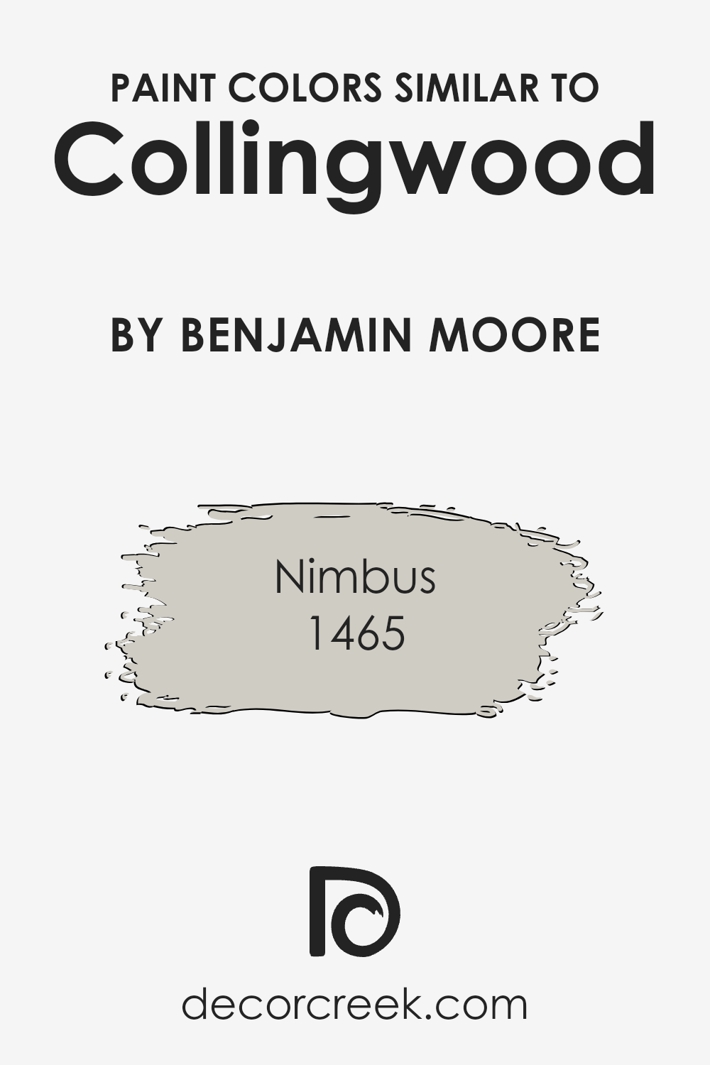
Colors Similar to Collingwood OC-28 by Benjamin Moore
Choosing similar colors, like the tones found around Collingwood OC-28 by Benjamin Moore, serves an essential purpose in design and aesthetics. A palette of related shades, such as Nimbus 1465, harmonizes the visual experience, creating a cohesive and soothing atmosphere. By utilizing shades that share a common hue, designers achieve a subtle transition between spaces, making rooms feel interconnected.
This method also allows for depth and dimension without the stark contrasts that come from using highly diverse colors. It’s like layering different notes of a song, where each color adds to the melody without overpowering it.
Nimbus 1465 is a perfect example of how a similar color can complement Collingwood OC-28. While Collingwood leans towards a warm, inviting gray with soft undertones that can illuminate a room with natural light, Nimbus steps in as a slightly cooler, more neutral gray. This presents a subtle shift, perfect for adjoining spaces or accent walls, where you aim for continuity without monotony.
The beauty of using such closely aligned colors lies in their ability to create a fluid visual experience, making each room flow into the next smoothly, while maintaining their unique character. This method of color selection enriches the environment, lending an air of sophistication and unity to the home.
You can see recommended paint color below:
- 1465 Nimbus
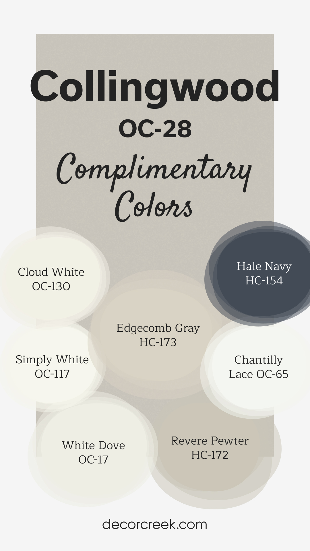
Complimentary Colors for Collingwood OC-28 Paint Color by Benjamin Moore
Collingwood by Benjamin Moore is a warm, neutral greige that adds a touch of softness and elegance to any room. Its subtle warmth makes it a perfect choice for creating inviting spaces, whether used in living areas, bedrooms, or kitchens. Collingwood serves as a versatile backdrop that works well with both bold accents and softer tones.
To complement Collingwood, pair it with Hale Navy for a striking contrast or with Chantilly Lace and Simply White for a crisp, clean palette.
Edgecomb Gray and Revere Pewter bring a seamless, layered effect, while White Dove and Cloud White are ideal for trim, ceilings, or cabinetry, ensuring a fresh and balanced look throughout the room.
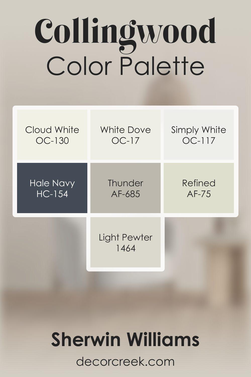
Collingwood OC-28 by Benjamin Moore Color Palette
Collingwood offers a gentle warm gray tone that feels soft, balanced, and easy to enjoy in any setting. This palette enhances that welcoming character through a blend of warm whites, grounding neutrals, and rich accents. White Dove, Cloud White, and Simply White brighten the palette with clean softness, lifting Collingwood’s gentle warmth and keeping the look fresh and open.
Refined adds a subtle supporting warmth that blends smoothly with Collingwood, helping the palette feel cohesive and calm.
Thunder deepens the palette with warm gray depth, adding texture and natural weight that enrich the neutral tones.
Light Pewter introduces a soft, grounding note that completes the warm-gray transitions beautifully. Hale Navy adds a strong anchor, giving the palette structure, clarity, and a sense of confidence.
Together, these shades create a warm, refined palette that feels inviting and quietly expressive.
It’s perfect for bedrooms, living spaces, and entryways where comfort and gentle warmth make the home feel calm and welcoming.
How to Use Collingwood OC-28 by Benjamin Moore In Your Home?
Collingwood OC-28 by Benjamin Moore is a popular paint choice for home interiors. Its unique color strikes a balance between gray and beige, making it a versatile option for any room. This shade, often referred to as “greige,” can brighten up spaces while still adding warmth, making it suitable for living rooms, bedrooms, or kitchens.
Its neutral tone serves as a perfect backdrop, allowing furniture and decor to stand out. Additionally, Collingwood OC-28 adapts well to different lighting conditions, subtly shifting its appearance to match the room’s natural or artificial light. This quality makes it an excellent choice for spaces that experience changes in light throughout the day.
Homeowners can use this color to create a cozy, welcoming atmosphere or achieve a more modern and minimalist aesthetic. Whether you’re redecorating a single room or looking for a cohesive color scheme for your entire home, Collingwood OC-28 offers a beautiful and adaptable option.
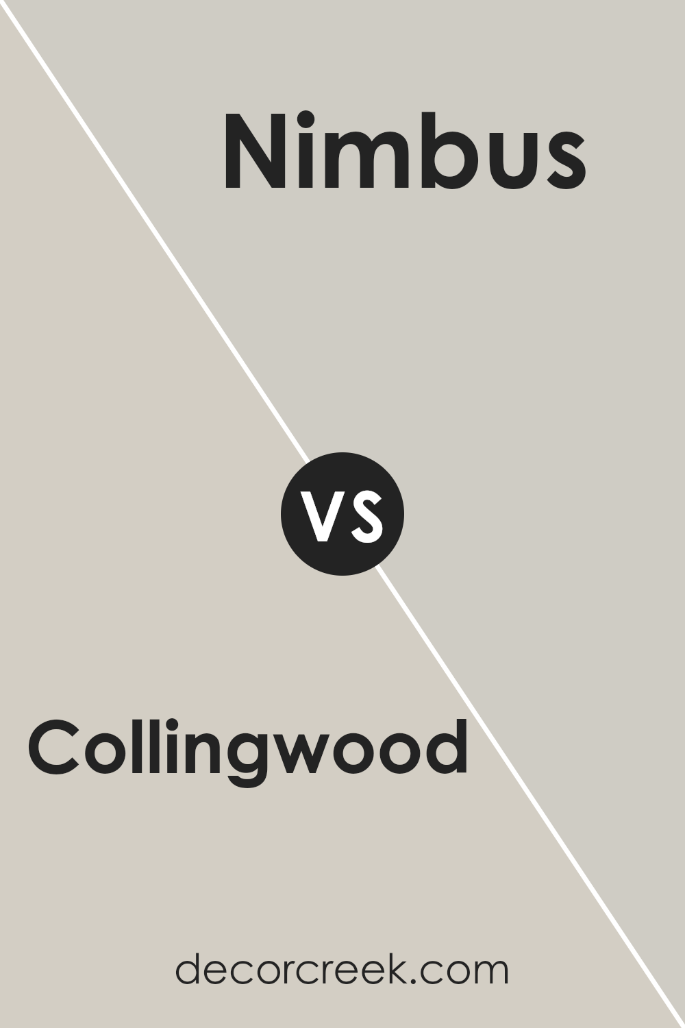
Collingwood OC-28 by Benjamin Moore vs Nimbus 1465 by Benjamin Moore
Collingwood and Nimbus, both by Benjamin Moore, are two popular paint colors that share some similarities but also have distinct differences. Collingwood is a warm, light gray with a touch of beige, making it a perfect neutral that adds a cozy feel to any room. Its versatility means it can complement a wide range of decor styles and colors.
On the other hand, Nimbus is also a gray but leans slightly cooler compared to Collingwood. It has a hint of blue, giving it a serene, calm vibe that is great for creating a peaceful and relaxing space. While both colors are excellent choices for those seeking a modern and stylish look, Collingwood’s warmer undertones make it more inviting, whereas Nimbus offers a fresher, more tranquil atmosphere.
Whether you choose Collingwood or Nimbus will depend on the mood you want to set in your space and your personal preference for warm or cool tones.
You can see recommended paint color below:
- 1465 Nimbus
Conclusion
Collingwood OC-28 by Benjamin Moore is a versatile paint color known for its warm undertones, offering a cozy ambiance to any room it adorns. Its unique blend makes it a go-to choice for those looking to add a touch of sophistication and warmth to their living spaces without overwhelming the senses.
The color’s adaptability means it works well in various settings, from modern to traditional, ensuring it complements a wide range of decor styles. Its ability to change subtly with the lighting conditions adds to its appeal, making it a favorite among homeowners and interior designers alike.
The popularity of Collingwood OC-28 stems from its perfect balance of warmth and neutrality, making it an ideal backdrop for both vibrant and muted color schemes. This paint color has the capacity to make spaces feel more inviting and spacious, an often sought-after effect in interior design.
Its ease of application and harmonious blend with other colors ensure it remains a top choice for those looking to refresh their homes. As a testament to its timelessness, Collingwood OC-28 continues to be celebrated for its elegant and understated beauty, securing its place in the Benjamin Moore collection as a classic hue that homeowners return to time and again.

Ever wished paint sampling was as easy as sticking a sticker? Guess what? Now it is! Discover Samplize's unique Peel & Stick samples.
Get paint samples

