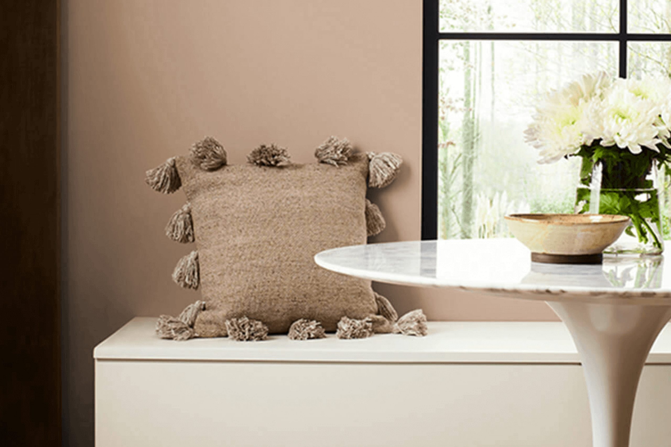
When I painted my living room with Sherwin Williams SW 6094 Sensational Sand, the change was immediate and remarkable. This color brought a soft, welcoming warmth to the room. It’s a subtle blend of beige and grey that feels both modern and lasting. The beautiful thing about Sensational Sand is its flexibility; it complements different types of decor and furniture, adapting to any style you choose.
When the afternoon sun pours in, the walls glow gently, creating a cozy atmosphere that wraps you up and makes you want to sit back and relax. In the evening, the shade shifts slightly, adding depth and richness that feels intimate and comforting.
For anyone who wants a calm and neutral backdrop, while still adding a touch of elegance, Sensational Sand is a perfect choice. It’s amazing how a color can so subtly change a room, turning it into a haven without being too intense.
You’ll find that it sets a perfect canvas, whether you’re enjoying a quiet evening or hosting friends and family.
What Color Is Sensational Sand SW 6094 by Sherwin Williams?
Sensational Sand by Sherwin Williams is a warm, neutral shade that offers a soft, inviting feel. This color is a light beige with subtle undertones that can vary with lighting, providing either a cozy warmth or a calming effect. It’s a flexible color that fits well in different interior styles, particularly those that emphasize comfort and simplicity, such as modern, coastal, or rustic designs.
In a modern setting, Sensational Sand serves as an excellent backdrop, allowing sleek furniture and bold decor pieces to stand out. For a coastal style, it complements oceanic blues, sandy whites, and natural elements, creating a relaxed and breezy atmosphere. In rustic interiors, this hue pairs well with wooden elements, highlighting the natural textures and earthy tones inherent in rustic design.
For materials, Sensational Sand works beautifully with natural fibers such as cotton, linen, and wool. These textures enhance the warmth of the color and provide a cozy ambiance. Wooden furniture, especially in lighter or medium tones, complements this shade nicely, as do accents in soft metals like brushed nickel or warm brass.
Additionally, stone or ceramic tiles in neutral shades can enhance the color’s natural look, making it a great choice for both walls and trim work.

Is Sensational Sand SW 6094 by Sherwin Williams Warm or Cool color?
Sensational Sand (SW 6094) by Sherwin Williams is a flexible neutral paint color that brings warmth and comfort to a home. Its soft beige tone can create a cozy and inviting atmosphere, making it a popular choice for living rooms, bedrooms, and common areas. The color’s subtle warmth works well with various styles and decor, blending seamlessly with both modern and traditional designs.
In rooms with ample natural light, Sensational Sand can make a room feel bright and airy without being too stark. In darker or smaller rooms, it adds coziness without making the room feel cramped. This color pairs nicely with other neutral tones like whites and grays, but it also complements bolder colors, allowing for flexibility in decorating.
Overall, Sensational Sand adds a gentle warmth to interiors, serving as a perfect backdrop for a variety of home furnishings and accents. Its understated elegance makes it suitable for any room in the house.
Undertones of Sensational Sand SW 6094 by Sherwin Williams
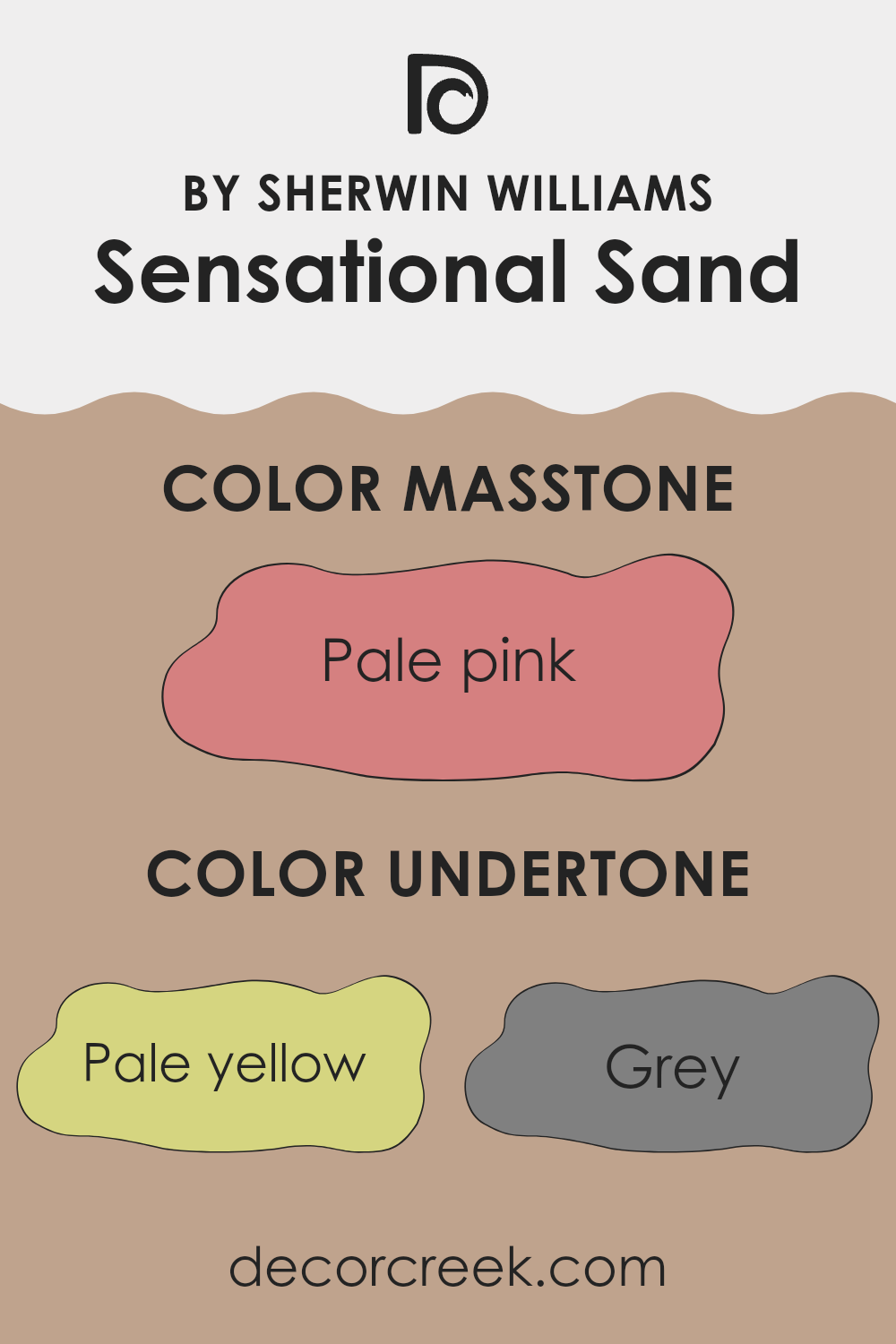
Sensational Sand by Sherwin Williams is a complex and adaptable color. It carries several subtle undertones like pale yellow, grey, and mint, which can influence how the color appears in different lighting and settings. These undertones create a warm, inviting hue that can shift gently throughout the day.
For example, the pale yellow undertone adds a touch of warmth, making it feel cozy and inviting. This is great for living rooms where you want a welcoming atmosphere. The grey undertone gives it a neutral base, providing balance and making it an excellent choice for pairing with bolder colors or for creating a calm backdrop without being too cold.
Mint and light purple undertones can add a slight freshness or softness to the walls, contributing to a relaxing feel in bedrooms or bathrooms. The light gray and lilac can enhance the subtlety of Sensational Sand, making it adaptable enough for various decor styles.
The presence of orange and brown hints adds an earthy depth, perfect for creating an inviting dining room or family room. These undertones work quietly in the background, adjusting the color’s appearance subtly but significantly, making it a flexible choice for different interior settings. It can adapt to its surroundings, appearing more vibrant or subdued based on complementary colors and the room’s lighting.
What is the Masstone of the Sensational Sand SW 6094 by Sherwin Williams?
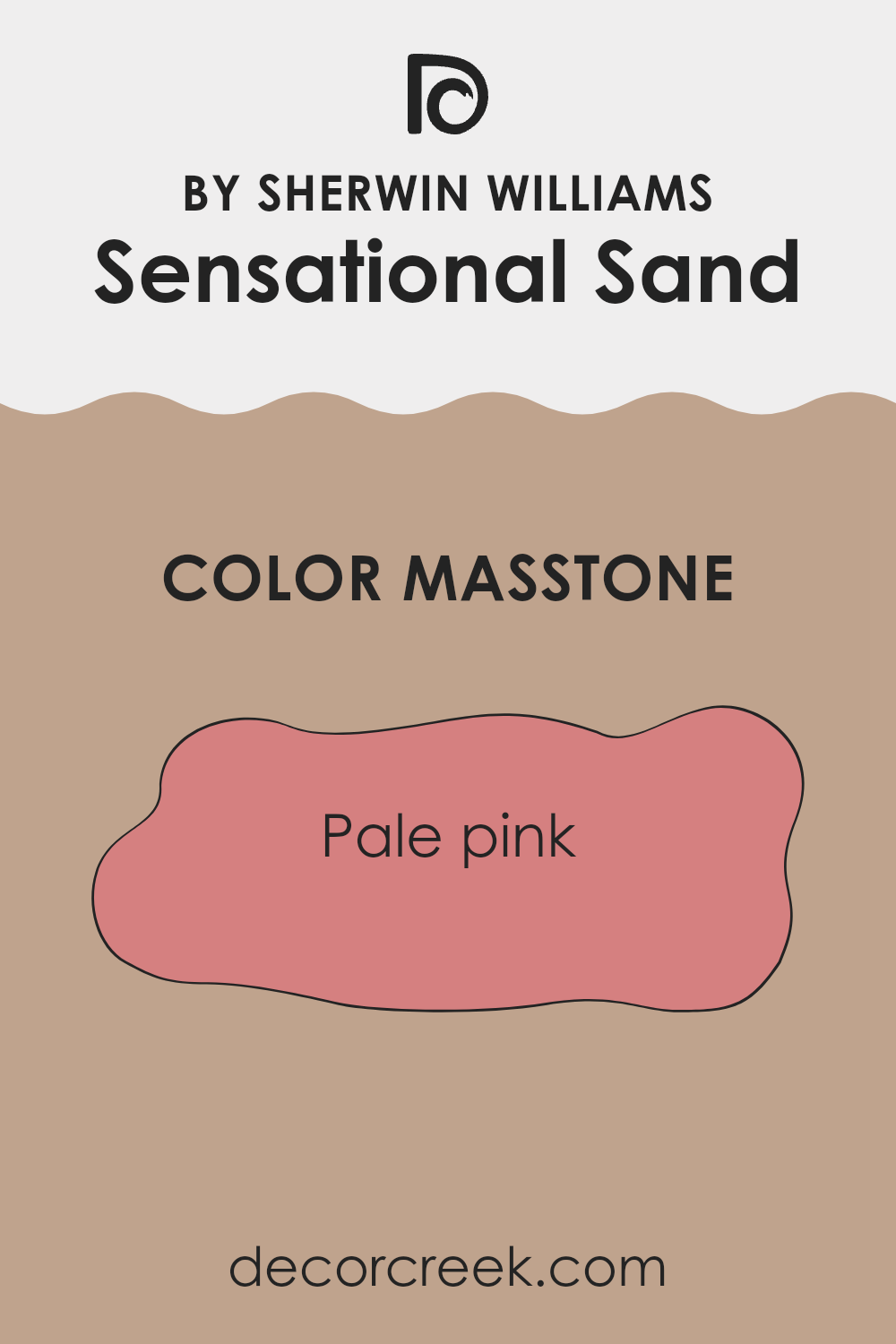
Sensational Sand (SW 6094) by Sherwin Williams is a soft, pale pink hue (#D58080) that adds warmth and a subtle touch of elegance to home interiors. Its masstone creates a gentle and welcoming atmosphere, making areas feel cozy and inviting. Pale pink is known for its ability to brighten up a room without being too intense, providing a balanced backdrop for various decor styles.
When used in living rooms or bedrooms, this color can make the area feel comfortable and restful. It pairs well with neutral tones like beige and white, allowing for flexible design options. In kitchens or dining areas, Sensational Sand can enhance light and airiness, contributing to a pleasant environment for meals and gathering.
Its soft pink undertone reflects natural light beautifully, bringing a gentle glow to a room. This quality makes it a great choice for rooms where a calm and pleasant mood is desired.
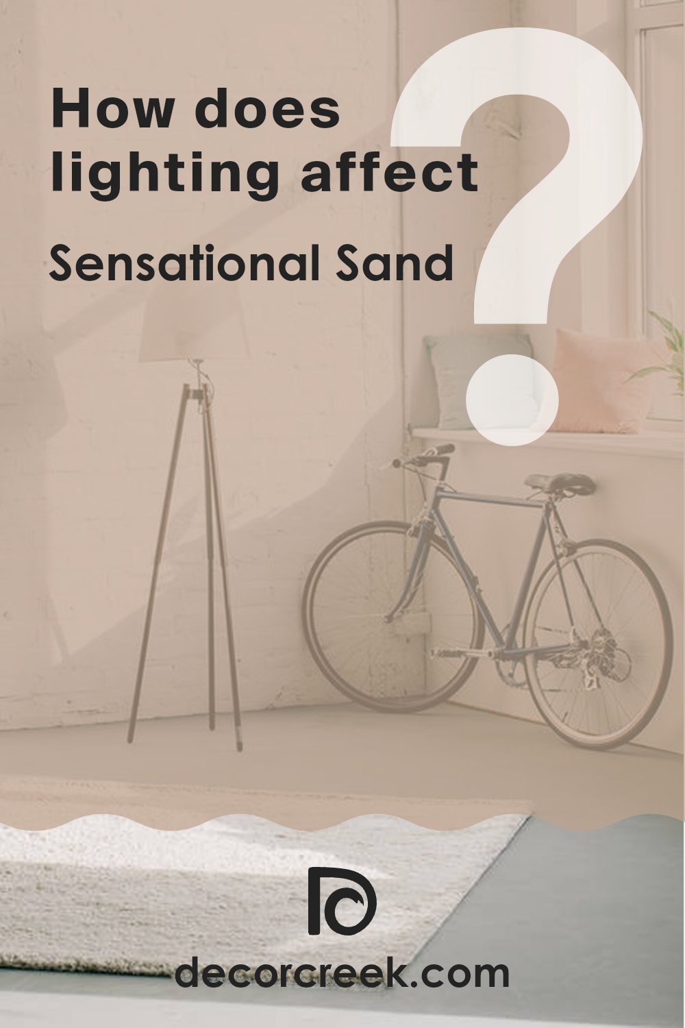
How Does Lighting Affect Sensational Sand SW 6094 by Sherwin Williams?
Lighting plays a significant role in how we perceive color, as light can alter the appearance of paint shades. Sensational Sand SW 6094 by Sherwin Williams is a flexible color that reacts differently under various lighting conditions.
In natural light, Sensational Sand appears as a warm, muted beige. The tone of the color can change depending on the orientation of the room and the quality of light it receives throughout the day. For example, in a north-facing room, the light is typically cooler and harsher. This can make Sensational Sand look slightly grayish or less warm than it might be in other rooms. The cooler light of north-facing rooms may highlight any cooler undertones in the paint.
In south-facing rooms, the light is usually warm and abundant for most of the day. This enhances the warm qualities of Sensational Sand, giving it a cozy glow. It appears richer and more vibrant under this warm, natural light.
East-facing rooms receive bright light in the morning, which is cooler and crisper. During this time, Sensational Sand may seem lighter and slightly more muted. As the day progresses and the direct light moves away from the windows, the color will change, appearing closer to its true hue but softer.
West-facing rooms experience warm and golden light in the late afternoon and evening. This can make Sensational Sand look very warm and even slightly orange as the sun sets. During midday, without direct sunlight, the color may seem balanced and neutral.
In artificial light, the color of Sensational Sand can also change. Cooler light bulbs can bring out the cooler undertones of the paint, while warmer bulbs will enhance the warmth. The type of bulb can make a significant difference: LED bulbs can differ slightly from incandescent bulbs, which generally emit a warmer glow. Choosing bulbs that align with the desired feel of a room is essential to ensuring Sensational Sand appears as intended.
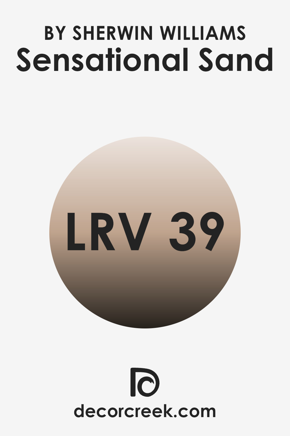
What is the LRV of Sensational Sand SW 6094 by Sherwin Williams?
Light Reflectance Value (LRV) is a measurement that indicates how much light a color reflects. It’s a scale from 0 to 100, where 0 means the color absorbs all light (like black) and 100 means it reflects all light (like white). In simple terms, the higher the LRV, the lighter and more reflective the color appears.
It affects how colors look on your walls because a high LRV can make a room feel more open and bright, while a low LRV can make a room feel cozier and more intimate. When you’re choosing a paint color, considering its LRV helps you predict how it will interact with the light in a particular room.
Sherwin Williams’ Sensational Sand has an LRV of 39.113, which places it in the middle range of the spectrum. This means it’s neither too light nor too dark, providing a nice balance. With this LRV, Sensational Sand will reflect a moderate amount of light, helping a room feel warm without being too bright. This makes it a flexible color choice for rooms where you want a touch of lightness but still keep a cozy, grounded feel.
Whether you have plenty of natural light or rely on artificial lighting, this shade will offer a subtle, welcoming atmosphere without feeling too stark or heavy.
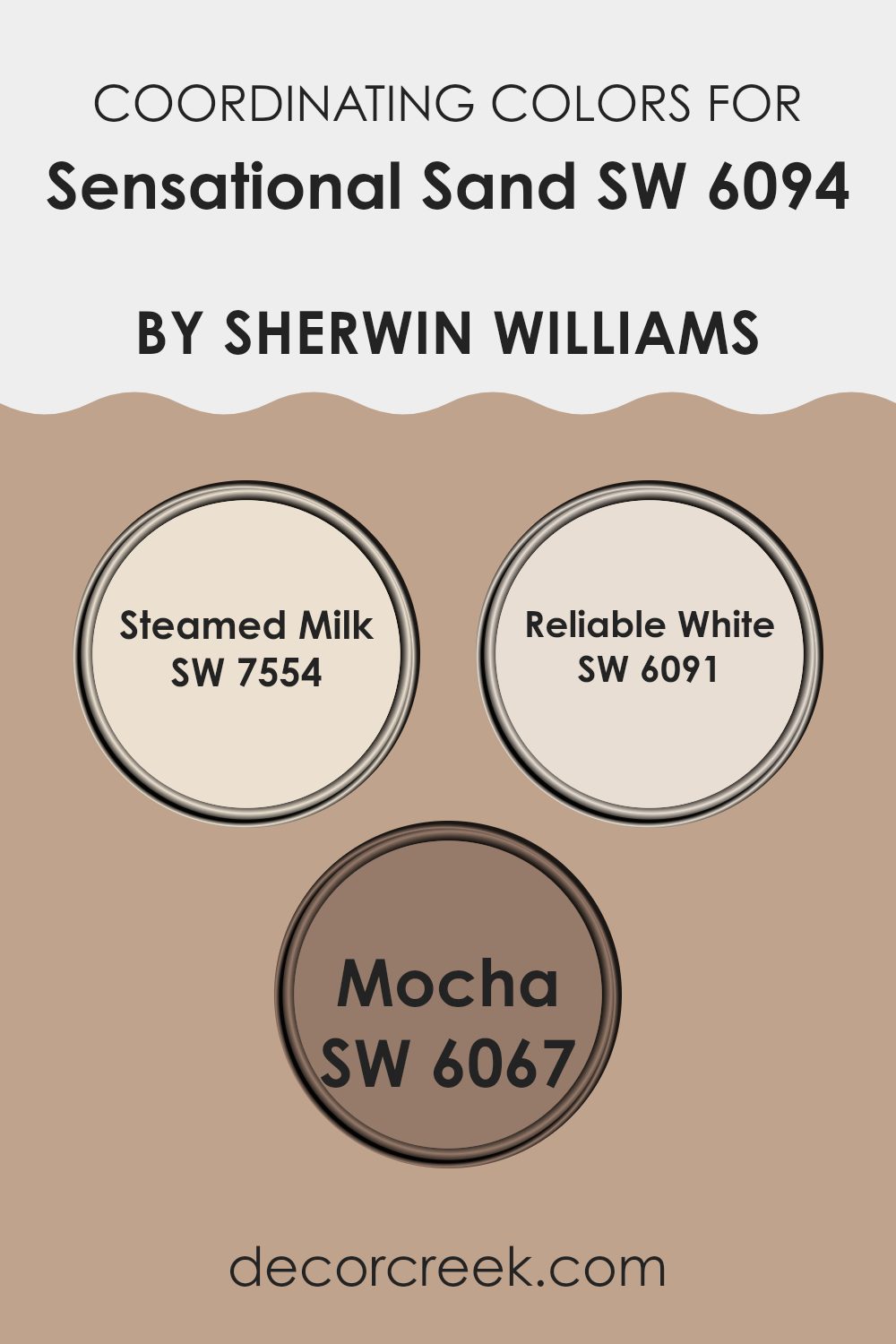
Coordinating Colors of Sensational Sand SW 6094 by Sherwin Williams
Coordinating colors are hues that work well together to create a harmonious look in a room. They complement each other by having similar undertones or by contrasting in a pleasing way. When using the color Sensational Sand by Sherwin Williams as the main hue, it’s important to choose coordinating colors that enhance its warm, earthy tone. Steamed Milk, Reliable White, and Mocha are excellent choices for this purpose.
Steamed Milk is a soft, creamy off-white that adds a subtle warmth to any room, making it a flexible backdrop that pairs beautifully with Sensational Sand. Reliable White offers a clean, smooth look but has just enough warmth to avoid feeling stark, making it perfect for trims or ceilings.
Mocha, on the other hand, is a rich, warm brown that brings depth and coziness, acting as an accent color that grounds the room. Together, these colors create a balanced and inviting atmosphere, enhancing the overall look and feel when combined with Sensational Sand.
You can see recommended paint colors below:
- SW 7554 Steamed Milk
- SW 6091 Reliable White
- SW 6067 Mocha
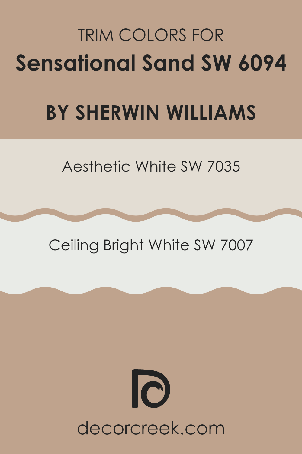
What are the Trim colors of Sensational Sand SW 6094 by Sherwin Williams?
Trim colors are the shades used on the edges and features in a room, such as window frames, baseboards, and door frames. They help highlight these elements and provide contrast against the main wall color. Using trim colors is important for Sensational Sand by Sherwin Williams because it is a warm, neutral shade that benefits from clear, defined edges to keep the room from looking too flat or faded.
Trim colors like Aesthetic White and Ceiling Bright White can complement Sensational Sand beautifully by adding brightness and subtle definition to the room. Proper trim colors not only give a polished look but also enhance the architectural details of the room, making each element stand out in its own way.
Aesthetic White offers a soft, warm white with beige undertones, which works well to gently accent Sensational Sand without creating a stark contrast. It provides a seamless, cozy transition between the wall and trim, enhancing the warmth of the overall palette.
Ceiling Bright White, on the other hand, is a crisp, clean white that can create more defined boundaries and add a touch of brightness, ideal for keeping a room with Sensational Sand feeling open and airy. Together, these trim colors can enhance a room by providing balance and cohesion with Sensational Sand, creating a well-rounded and attractive environment.
You can see recommended paint colors below:
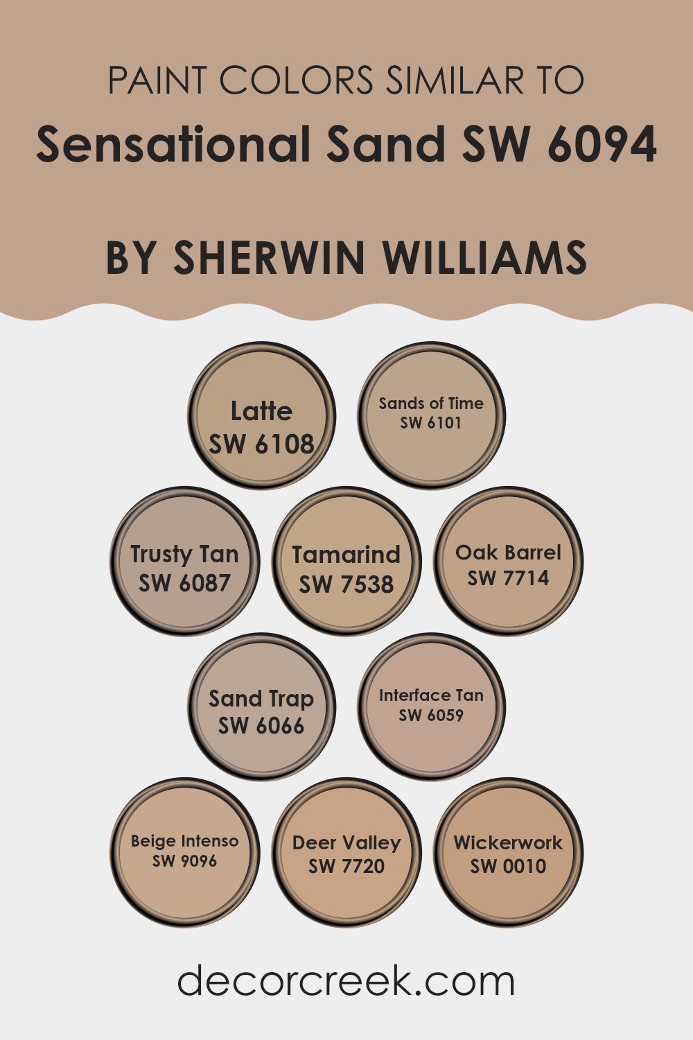
Colors Similar to Sensational Sand SW 6094 by Sherwin Williams
Similar colors work together because they share common hues and tonal qualities, making them blend seamlessly. This harmony is important in design as it creates a cohesive and inviting atmosphere. Taking inspiration from Sensational Sand by Sherwin Williams, colors like SW 6108 – Latte and SW 6101 – Sands of Time offer warm, earthy tones that can add comfort and friendliness to a room.
SW 6087 – Trusty Tan brings in a touch of classic neutrality, creating a balanced backdrop that pairs well with both modern and traditional settings. Meanwhile, SW 7538 – Tamarind offers a deeper, richer hue that can add depth and contrast without overpowering a room.
In settings where a bit more contrast is desired, SW 7714 – Oak Barrel can introduce natural, rustic charm, while SW 6066 – Sand Trap offers a softer, muted alternative that maintains a light and airy feel. SW 6059 – Interface Tan provides a neutral foundation, perfect for pairing with accent colors.
The rich beige tones of SW 9096 – Beige Intenso bring warmth and a welcoming feel. For a slightly bolder choice, SW 7720 – Deer Valley adds warmth with its cozy, brown undertones, and SW 0010 – Wickerwork serves as a flexible hue that complements various styles, ensuring a lasting look. By choosing similar colors, you can create areas that are harmonious yet varied, avoiding the chaos of clashing shades.
You can see recommended paint colors below:
- SW 6108 Latte
- SW 6101 Sands of Time
- SW 6087 Trusty Tan
- SW 7538 Tamarind
- SW 7714 Oak Barrel
- SW 6066 Sand Trap
- SW 6059 Interface Tan
- SW 9096 Beige Intenso
- SW 7720 Deer Valley
- SW 0010 Wickerwork
Colors that Go With Sensational Sand SW 6094 by Sherwin Williams
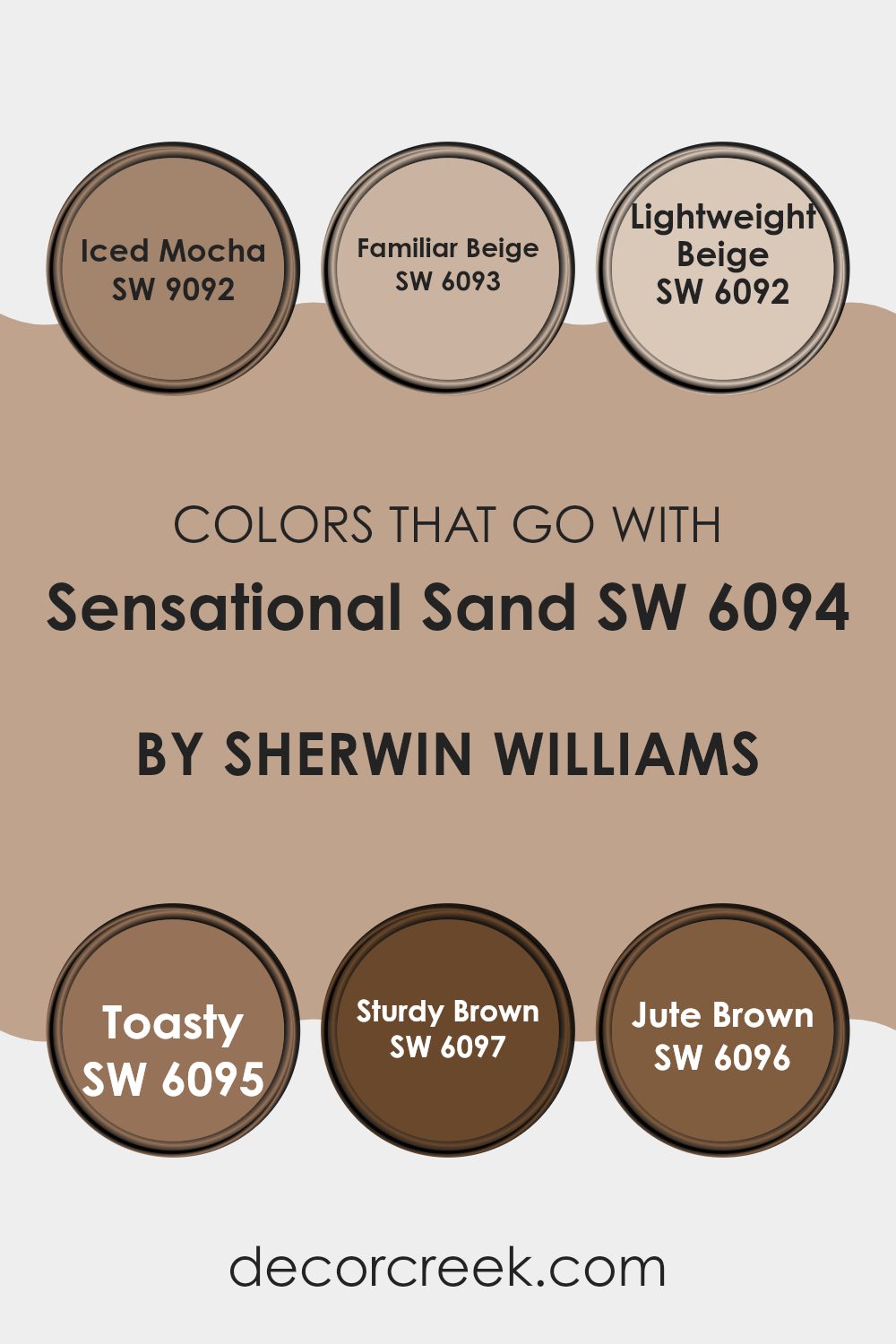
Choosing colors that harmonize with Sherwin Williams’ Sensational Sand SW 6094 can make a room feel balanced and inviting. These complementary shades help create a unified look that ties a room together. Iced Mocha SW 9092 is a soft, creamy color with hints of pale pink and beige, which pairs beautifully with the warm undertones of Sensational Sand.
It adds a gentle, cozy feel to your area. Familiar Beige SW 6093 is a classic neutral shade that brings a touch of warmth, making it perfect for living areas where you want a sense of comfort. It adds a grounded vibe without being too intense.
Lightweight Beige SW 6092 offers a subtle freshness with its light and airy qualities. This hue works well in a variety of settings, helping rooms feel open and inviting. Toasty SW 6095 is a warm, medium-brown tone that adds richness and depth, enhancing the natural warmth of Sensational Sand. Sturdy Brown SW 6097 brings in a deeper element, with its strong, earthy presence.
It lends an anchoring force to any room, making it feel well-defined. Finally, Jute Brown SW 6096 offers an earthy connection that ties everything together, blending seamlessly with the sensibilities of Sensational Sand and providing a unified, cohesive look.
You can see recommended paint colors below:
- SW 9092 Iced Mocha
- SW 6093 Familiar Beige
- SW 6092 Lightweight Beige
- SW 6095 Toasty
- SW 6097 Sturdy Brown
- SW 6096 Jute Brown
How to Use Sensational Sand SW 6094 by Sherwin Williams In Your Home?
Sensational Sand SW 6094 by Sherwin Williams is a warm, neutral color that can add a cozy feel to any home. Its earthy tone makes it a flexible choice for various rooms. You might consider using it in the living room to create a welcoming atmosphere for family and guests. This color works well with both modern and traditional decor, easily complementing different styles of furniture and accessories.
In the bedroom, Sensational Sand can help create a calm and restful area. Pair it with soft white linens and a few colorful accents for a balanced look. If you’re thinking about refreshing your kitchen, this shade can add warmth and pairs nicely with natural wood cabinets or sleek metal finishes.
For those who enjoy decorating with plants, the subtle background of Sensational Sand lets greenery pop beautifully. Overall, it’s an adaptable choice for anyone looking to add warmth and comfort to their home without overpowering the room.
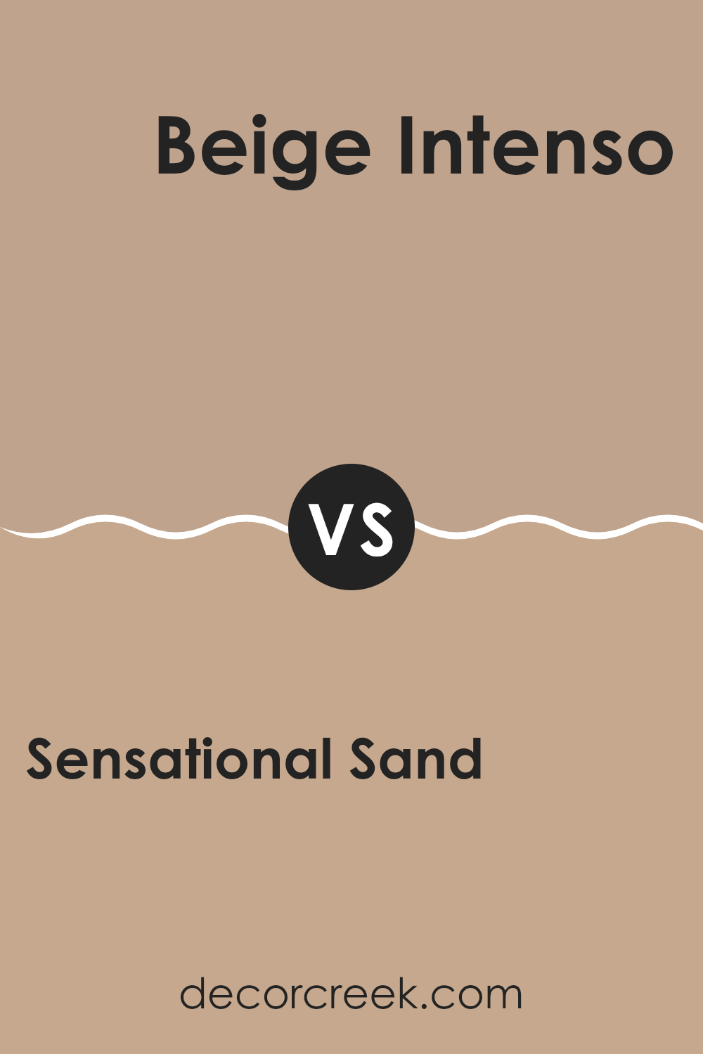
Sensational Sand SW 6094 by Sherwin Williams vs Beige Intenso SW 9096 by Sherwin Williams
Sensational Sand SW 6094 and Beige Intenso SW 9096 from Sherwin Williams are both neutral colors, but they offer different qualities. Sensational Sand is a warm, light brown with a subtle pink undertone. It creates a cozy, inviting atmosphere ideal for rooms where comfort is key, such as living rooms or bedrooms. This color pairs well with whites or deeper browns for a balanced look.
On the other hand, Beige Intenso is slightly darker and grayer. This gives it a more modern, muted feel compared to the warmth of Sensational Sand. Beige Intenso is adaptable and works well in contemporary settings, offering a bit more depth without overpowering the area. It matches nicely with cool-toned accents or darker grays.
Both colors serve as excellent backdrops, but while Sensational Sand leans towards warmth and coziness, Beige Intenso offers a cool, refined vibe.
You can see recommended paint color below:
- SW 9096 Beige Intenso
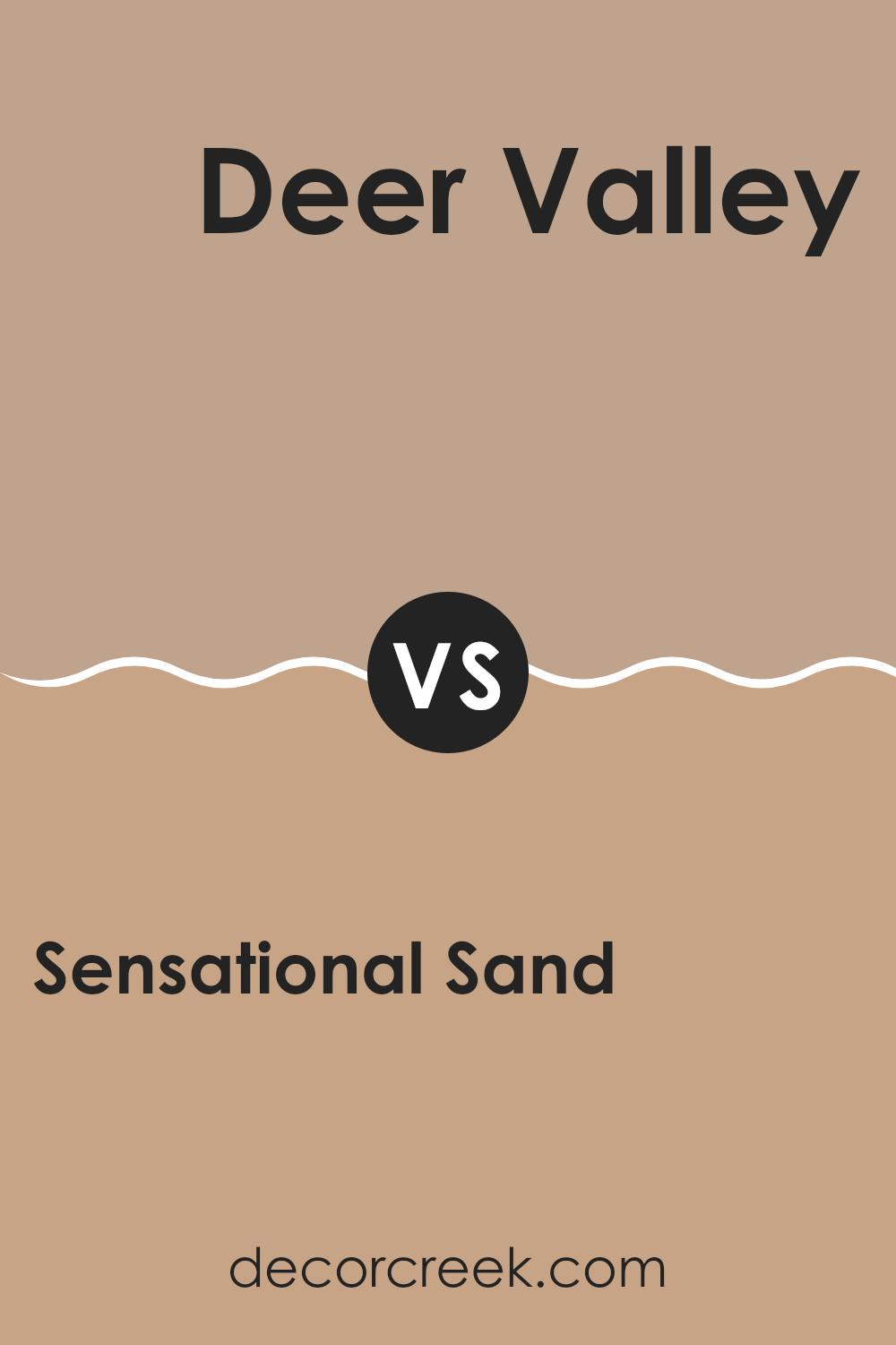
Sensational Sand SW 6094 by Sherwin Williams vs Deer Valley SW 7720 by Sherwin Williams
Sensational Sand (SW 6094) by Sherwin Williams is a warm, neutral color that feels soft and inviting. It has beige undertones that make rooms feel cozy and comfortable. This color works well in living rooms or bedrooms, where you want a relaxed and welcoming atmosphere.
On the other hand, Deer Valley (SW 7720) by Sherwin Williams is a richer, earthier tone. It’s a deep brown with hints of green, resembling the color of tree trunks or forest floors. This color adds depth and a touch of nature to a room, making it perfect for study areas or accent walls.
When comparing the two, Sensational Sand is lighter and more adaptable, while Deer Valley offers a bolder, more grounded feel. Sensational Sand brightens a room, whereas Deer Valley brings a sense of warmth and richness. Together, they can create a balanced and harmonious room, blending lightness with depth.
You can see recommended paint color below:
- SW 7720 Deer Valley
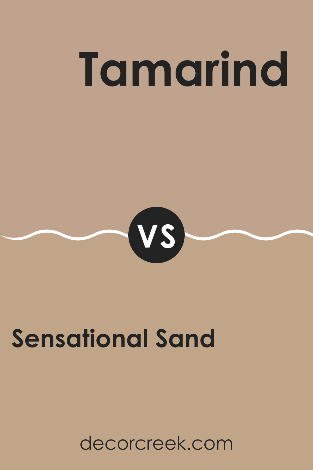
Sensational Sand SW 6094 by Sherwin Williams vs Tamarind SW 7538 by Sherwin Williams
Sensational Sand SW 6094 and Tamarind SW 7538 by Sherwin Williams are two colors that offer distinct moods for your room. Sensational Sand is a warm, soft shade that feels like a gentle touch. It’s light and easy on the eyes, creating a welcoming atmosphere. This color fits well in living rooms or bedrooms, where you want a calm and inviting environment.
On the other hand, Tamarind SW 7538 is a darker, richer color. It has a strong, earthy feel that brings depth to any room. This shade works well in areas where you want a more intimate and cozy feeling, such as dining rooms or study areas. Because of its deeper tone, Tamarind can add a touch of drama to your decor.
Both colors can work well together if you want to create a balanced look, using Sensational Sand as a main color and Tamarind as an accent.
You can see recommended paint color below:
- SW 7538 Tamarind
Sensational Sand SW 6094 by Sherwin Williams vs Wickerwork SW 0010 by Sherwin Williams
Sensational Sand SW 6094 and Wickerwork SW 0010 are both warm, inviting colors by Sherwin Williams, but they offer different vibes. Sensational Sand is a soft, muted beige with subtle pink undertones. It’s cozy and creates a relaxed atmosphere, making it a good choice for living rooms or bedrooms where a calming feel is desired.
In contrast, Wickerwork SW 0010 has more yellow undertones, giving it a sunnier, brighter appearance. This makes Wickerwork feel lively and cheerful, perfect for rooms like kitchens or family rooms where energy and light are beneficial.
While Sensational Sand provides a quiet, neutral backdrop suitable for many decor styles, Wickerwork adds a hint of cheerful warmth that can make a room feel inviting and energetic. Choosing between these colors depends on the mood and energy you want to create in your room. Both colors offer different ways to bring warmth into your home.
You can see recommended paint color below:
- SW 0010 Wickerwork
Sensational Sand SW 6094 by Sherwin Williams vs Trusty Tan SW 6087 by Sherwin Williams
Sensational Sand SW 6094 and Trusty Tan SW 6087, both by Sherwin Williams, are two warm and inviting neutral colors. Sensational Sand has a soft beige tone with a hint of warmth, making it adaptable for many areas.
It’s light enough to brighten a room without being too intense, providing a comforting and cozy backdrop. On the other hand, Trusty Tan is slightly deeper in color, with a richer, earthier feel. This makes it a solid choice for creating a more grounded and intimate atmosphere.
While both colors are in the same family, Sensational Sand tends to reflect more light, giving rooms an airy feel, whereas Trusty Tan adds depth and a touch of refinement. Sensational Sand is great for open and bright areas, keeping them light and welcoming. Trusty Tan works well in rooms where you want to create a warm and snug environment, like a study or a reading nook.
You can see recommended paint color below:
- SW 6087 Trusty Tan
Sensational Sand SW 6094 by Sherwin Williams vs Oak Barrel SW 7714 by Sherwin Williams
Sensational Sand SW 6094 by Sherwin Williams is a warm, neutral beige that brings a soft, comforting feel to any room. It’s adaptable and works well as a backdrop, letting other colors in the room stand out. This shade is great for creating a relaxed and inviting atmosphere in living rooms or bedrooms.
On the other hand, Oak Barrel SW 7714 by Sherwin Williams has a richer, more earthy tone. It’s a medium brown with some yellow undertones, reminiscent of the color of oak wood. This makes it perfect for giving rooms a cozy and grounded feel. Oak Barrel adds depth and can be used in areas where you want a touch of rustic charm.
When comparing the two, Sensational Sand is lighter and airier, making it better for rooms where you want an open and light feeling. Oak Barrel, being darker and warmer, suits areas where you desire more warmth and coziness.
You can see recommended paint color below:
- SW 7714 Oak Barrel
Sensational Sand SW 6094 by Sherwin Williams vs Interface Tan SW 6059 by Sherwin Williams
Sensational Sand SW 6094 and Interface Tan SW 6059 are both warm, earthy colors from Sherwin Williams, but they have distinct differences. Sensational Sand is a soft beige with a pinkish undertone, creating a cozy and comforting vibe.
It has a light and airy feel, making rooms look more open and inviting. It’s a flexible color that works well in living rooms, bedrooms, and even kitchens, blending easily with other neutral tones or bolder accents. On the other hand, Interface Tan is a deeper, richer tan with stronger yellow undertones.
This color adds warmth and depth to a room, suitable for creating a more intimate and grounded atmosphere. It is ideal for areas that aim to be warm and welcoming, such as dining rooms or studies. While both colors are warm and inviting, Sensational Sand is brighter and lighter, whereas Interface Tan offers a more robust and substantial look.
You can see recommended paint color below:
- SW 6059 Interface Tan
Sensational Sand SW 6094 by Sherwin Williams vs Sand Trap SW 6066 by Sherwin Williams
Sensational Sand SW 6094 and Sand Trap SW 6066 are two warm, earthy colors from Sherwin Williams, each offering a distinct feel. Sensational Sand is a light, muted beige with a hint of pink that can make a room feel warm and welcoming. It’s an easy color to use as a backdrop, allowing other colors to stand out.
In contrast, Sand Trap is slightly deeper and more beige-brown. It can create a natural, grounded atmosphere. While Sensational Sand works well in rooms where you want to keep things light and airy, Sand Trap might be better suited for areas where you want a cozier, more grounded vibe.
Both colors are adaptable and can be paired with various other shades. Sensational Sand pairs nicely with whites and soft blues, while Sand Trap can be matched with richer browns and greens. These colors work well in both traditional and modern rooms.
You can see recommended paint color below:
Sensational Sand SW 6094 by Sherwin Williams vs Sands of Time SW 6101 by Sherwin Williams
Sensational Sand SW 6094 by Sherwin Williams is a warm, neutral beige with a hint of pink. It creates a cozy and inviting atmosphere, making it a great choice for living rooms and bedrooms. The color feels welcoming and comfortable, offering a subtle backdrop that can pair well with various accent colors.
On the other hand, Sands of Time SW 6101 by Sherwin Williams is slightly darker and carries a more pronounced yellow undertone. This gives it a sunnier, earthier feel. Sands of Time can add warmth to a room while still maintaining a neutral base. It works well in areas where you want to bring in a bit more brightness.
Both colors offer a neutral palette, but Sensational Sand leans more towards a pinkish hue, while Sands of Time feels more golden. They can be used to create different moods depending on the amount of light and surrounding decor elements in the area.
You can see recommended paint color below:
- SW 6101 Sands of Time
Sensational Sand SW 6094 by Sherwin Williams vs Latte SW 6108 by Sherwin Williams
Sensational Sand SW 6094 and Latte SW 6108 by Sherwin Williams are both warm, neutral colors, but they offer different vibes. Sensational Sand is a soft, light beige with a subtle warmth, making rooms feel open and inviting. It’s adaptable, perfect for creating a cozy ambiance without being too intense. This color works well in living rooms, bedrooms, or any area needing a gentle touch.
Latte, on the other hand, is a deeper, richer beige with slightly stronger brown undertones. It adds warmth and comfort to a room, creating a cozy, intimate feel. Latte is ideal for rooms where a bit more warmth is desired, such as dining areas or home offices.
Both colors complement various styles, but Latte provides more contrast, making it suitable for accents or feature walls. Together, they can create a balanced, harmonious room by using Sensational Sand for main walls and Latte for accents.
You can see recommended paint color below:
After reading about the amazing paint color called SW 6094 Sensational Sand by Sherwin Williams, I’ve learned so much about its special qualities. This warm, sandy color can make any room feel cozy and welcoming, almost like a gentle hug from nature. It’s like bringing a little bit of the beach or desert into your home, without having to worry about sand getting everywhere!
I really appreciate how Sensational Sand can work well with lots of other colors. Whether you have bold reds, deep blues, or soft greens, this paint seems to get along with all of them. It’s like that friendly kid on the playground who gets along with everyone.
What I find coolest about Sensational Sand is how it changes with the light. In the mornings, when the sunlight is bright, it feels lively and fresh. But in the evenings, under soft lamp light, it feels warm and snug, almost like your favorite blanket on a chilly night.
If you’re thinking about painting a room, Sensational Sand sounds like a wonderful choice. It makes rooms feel happy and comfortable, and it’s easy to match with furniture and decorations. So if you want to add a warm and friendly feeling to where you live, Sensational Sand by Sherwin Williams is a color you might really like!

Ever wished paint sampling was as easy as sticking a sticker? Guess what? Now it is! Discover Samplize's unique Peel & Stick samples.
Get paint samples

