Have you ever walked into a room and felt instantly warm and welcome? That’s the kind of mood this paint color can create in your space. Named after the soothing coffee drink, Latte brings a cozy, creamy vibe that’s just right for making any room feel more like home.
This rich beige color has a bit of a golden undertone that works beautifully in spaces with natural light, or those in need of a touch of warmth without overpowering the senses.
Whether you’re considering a new look for your living room, bedroom, or even your kitchen, Latte can really help to soften the area and add a layer of comfort.
It’s perfect for pairing with darker furniture or floors, providing a nice contrast that isn’t too stark. Plus, it’s super adaptable and looks great with various decors, from modern minimalist to country chic.
If you’re thinking about revamping your space or trying to decide on the best shade for a new home, you might want to consider SW 6108 Latte. It just might be the touch of coziness you’re looking for.

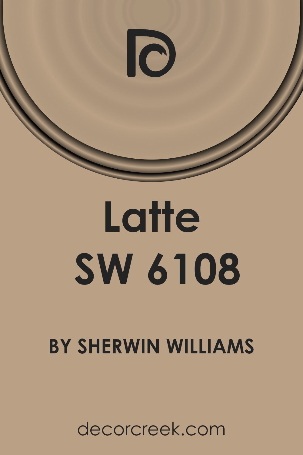
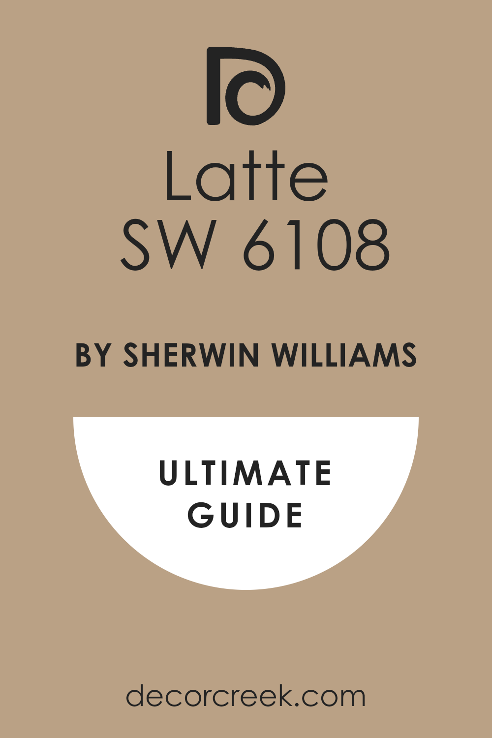
What Color Is Latte SW 6108 by Sherwin Williams?
Latte by Sherwin Williams is a warm, inviting beige that mimics the creamy richness of a freshly brewed latte. Its softness makes rooms feel cozy and welcoming, creating a comfortable atmosphere. The color has a perfect balance of warmth, making it highly adaptable and easy to pair with different styles and materials.
This versatile shade works wonders in a variety of interior styles. It is particularly effective in rustic settings where its earthy tones complement natural materials like wood and stone. It also shines in modern and traditional decor, providing a neutral backdrop that allows furniture and art to stand out.
Latte pairs exceptionally well with a wide range of materials and textures. In spaces with wooden floors or furniture, it enhances the natural grain, adding depth and warmth to the area. When used with textiles like linen or cotton, it promotes a soft, cozy ambiance ideal for bedrooms and living spaces.
For a more refined look, combining it with metallic accents in gold or brass can add a touch of glamour to the simplicity of the color, while pairing it with glass or mirrored surfaces can introduce a subtle contemporary edge.
Overall, Latte is a flexible color choice that complements a diverse array of design elements, making it a go-to color for anyone looking to create a warm, inviting space.
Is Latte SW 6108 by Sherwin Williams Warm or Cool color?
Latte by Sherwin Williams is a warm, inviting paint color that brings a cozy atmosphere to any room. It has a soft, creamy hue which gives it a very natural and earthy vibe. This makes it a great choice for living rooms and bedrooms where a calming presence is desired. Since it’s a neutral color, Latte pairs well with a wide variety of decor styles and colors, from bright and bold to soft and subtle.
This shade’s adaptability makes it easy to work with when redecorating; you don’t have to worry about it clashing with your existing furnishings. It’s especially good at hiding imperfections on walls, thanks to its mid-tone depth. In spaces with lower light, this color helps warm up the surroundings without darkening the room too much.
Overall, Latte creates a welcoming environment, making it a popular choice for homeowners looking to add a touch of warmth to their interiors.
Undertones of Latte SW 6108 by Sherwin Williams
LatteSW 6108 is a unique paint color characterized by a mix of intriguing undertones that affect its appearance under different lighting conditions and surroundings. Undertones are subtle colors that influence the primary hue of the paint. In LatteSW 6108, these undertones range across a spectrum from pale yellow to violet, including shades like grey, mint, and light purple.
The way undertones affect our perception of color is significant. For instance, grey and light gray in LatteSW 6108 can give it a cooler feel, making the wall look more neutral. However, the presence of warmer undertones like pale yellow or orange adds a touch of warmth, making the space feel more welcoming.
In diverse lighting, these undertones can become more apparent, shifting the wall color’s appearance throughout the day.
When applied to interior walls, LatteSW 6108 provides a versatile backdrop that pairs well with various decor styles and colors. Its range of undertones allows it to adapt subtly to different settings. For example, in a room with ample natural light, the yellow or mint undertones might come forward, enhancing brightness and freshness.
In artificial lighting, the grey or lilac might become more dominant, lending a calm and cozy feel to the room.
Understanding these undertones helps in choosing complementary furniture and decorations that either highlight or balance these subtle hues, depending on the desired effect for the room.
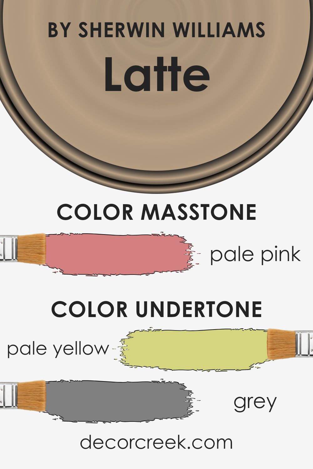
What is the Masstone of the Latte SW 6108 by Sherwin Williams?
LatteSW 6108 by Sherwin Williams has a masstone of Pale pink, giving it a soft and welcoming appearance. This subdued shade is highly versatile and works well in various settings within a home. Because it’s not overly bold, it blends seamlessly with other colors and materials, making it easy to use in living rooms, bedrooms, and even kitchens.
It provides a calm background that complements wood furniture, metallic accents, and natural textures like linen and cotton, adding a gentle warmth to the overall decor. The lightness of Pale pink makes spaces feel larger and airier, which is particularly beneficial in smaller or dimly lit rooms.
Additionally, its soothing quality can have a relaxing effect, making it an excellent choice for areas where comfort is key, such as bedrooms and bathrooms. Overall, this color offers a fresh, clean look while maintaining a cozy atmosphere in the home.
How Does Lighting Affect Latte SW 6108 by Sherwin Williams?
Lighting plays a critical role in how we perceive colors. The type and quality of light can significantly influence the appearance of a color in an environment. Colors might look different under natural sunlight compared to artificial lighting due to the temperature and intensity of the light.
Consider the color Latte by Sherwin Williams, a warm and creamy shade. Under artificial light, such as LED or fluorescent, the color may appear slightly different depending on the type of bulb used. LED lights typically emit a cooler tone and can make this warm color look more muted, whereas incandescent bulbs, which emit a warmer light, can enrich its creamy tones, making the room feel cozy.
In natural light, the appearance of this color can change throughout the day. Natural sunlight provides a wide spectrum of light that can make this paint color look vibrant and rich. During the morning, the cooler, bluer light of dawn can give it a soft, calm appearance.
As the sun rises and the light becomes brighter and more golden, the color warms up, enhancing its creamy warm tones.
In north-facing rooms, which receive less sunlight and generally cooler, bluer light, the color can appear slightly darker and less vibrant. The cooler light enhances the subtler, muted aspects of the color.
South-facing rooms enjoy ample sunlight most of the day, which can make the color appear brighter and more vibrant, bringing out its warm and inviting nature.
East-facing rooms get strong sunlight in the morning but less in the afternoon. Here, the paint might look very lively and warm in the morning light, then cooler and more subdued in the afternoon.
West-facing rooms experience the opposite effect, with muted tones during the morning becoming warm and bright by evening as the sun sets.
Understanding these effects can help in choosing the right paint color for a room based on its orientation and the quality of light it receives.
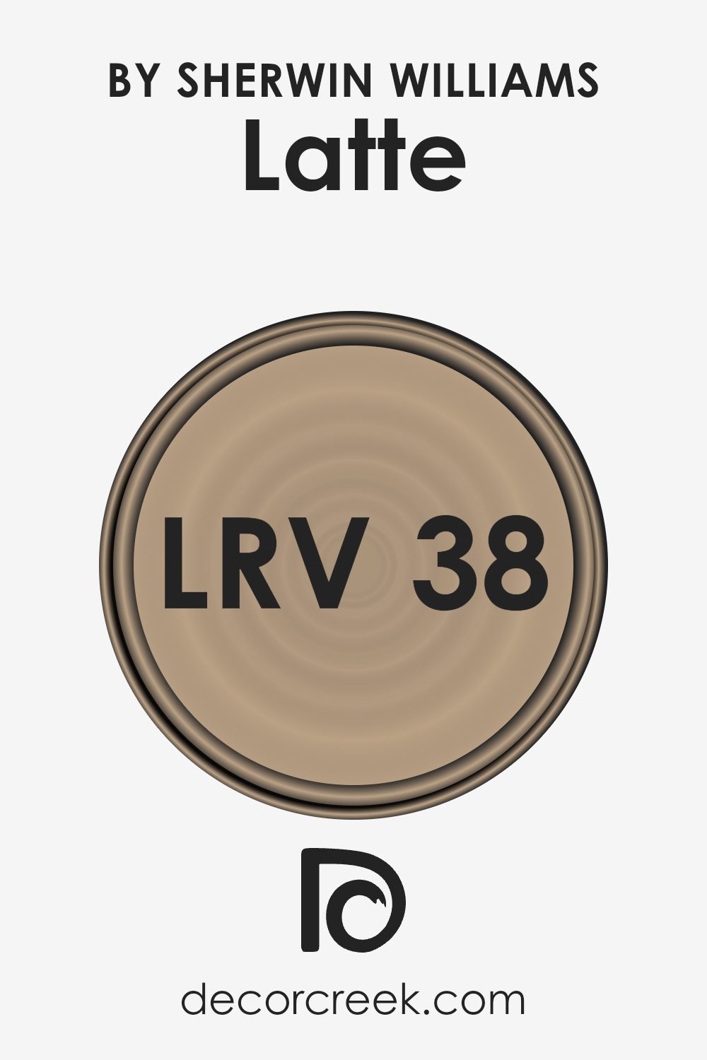
What is the LRV of Latte SW 6108 by Sherwin Williams?
LRV stands for Light Reflectance Value, which measures the percentage of light a paint color reflects back into a room once it’s on the walls. This value helps predict how light or dark a color will look in a space and can range from very low (dark, absorbing more light) to very high (light, reflecting more light).
Understanding LRV is important when selecting paint colors, as it helps you anticipate how different colors will affect the mood and feel of a room based on how much natural and artificial light it receives.
For instance, the LRV of SW 6108 Latte is 37.573, which places it in the middle range. This means it neither reflects nor absorbs light excessively, offering a balanced option for rooms that need a moderate level of brightness. In spaces with less natural light, this color might appear slightly darker, providing a cozy and welcoming atmosphere.
Conversely, in well-lit areas, it will look lighter and can help make the space feel more open and airy. This makes it a versatile choice that can adapt to various lighting conditions without overwhelming a space.
Coordinating Colors of Latte SW 6108 by Sherwin Williams
Coordinating colors are essentially hues that complement each other and work well together when used in the same space, creating a cohesive and aesthetically pleasing environment. They are often selected to enhance the main color used in a decor scheme, helping to bring a room to life with balance and harmony.
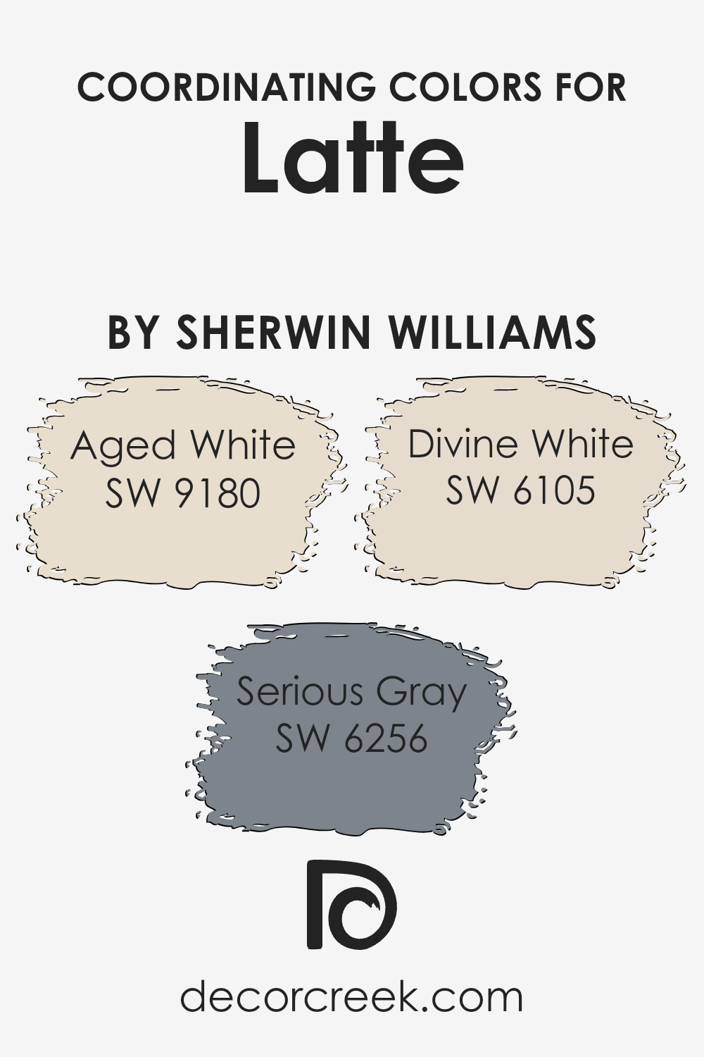
For instance, when working with a warm, welcoming base color like Latte, one could consider incorporating shades such as Aged White, Serious Gray, and Divine White to accentuate and round out the color palette.
Aged White is a soft, muted cream that provides a gentle contrast to richer, darker colors, adding a light and airiness to the room without overwhelming the senses. It’s ideal for trim, highlighting architectural features, or even as an option for furniture or cabinetry, offering a subtle nuance to the space.
Serious Gray, on the other hand, is a bold, deep gray that brings a strong, grounding element to surroundings. It’s perfect for a dramatic accent wall or for textiles like throw pillows and curtains, lending a sense of depth and sophistication.
Divine White is another complementary color, slightly warmer than Aged White, providing a cozy and inviting feel. Ideal for creating a soft backdrop or for larger areas, it works seamlessly with Latte to produce a harmonious and inviting atmosphere.
You can see recommended paint colors below:
- SW 9180 Aged White (CHECK A SAMPLE)
- SW 6256 Serious Gray (CHECK A SAMPLE)
- SW 6105 Divine White (CHECK A SAMPLE)
What are the Trim colors of Latte SW 6108 by Sherwin Williams?
Trim colors play a crucial role in defining the architectural details and enhancing the overall appeal of a room. When paired with a base color like Latte SW 6108 by Sherwin Williams, selecting the right trim color can highlight the walls, create depth, and form a cohesive look.
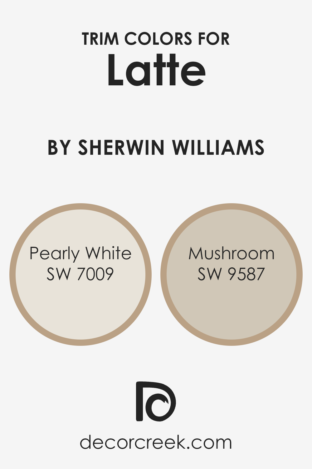
Trim colors such as SW 7009 Pearly White or SW 9587 Mushroom are versatile choices that complement Latte SW 6108, allowing its rich, warm tones to stand out. These colors can be used on elements such as door frames, window trims, and crown moldings, providing a polished finish to any space.
Pearly White SW 7009 is a soft, gentle white with a subtle warmth that can brighten and open up a room, bringing a fresh and clean look to the trim. Its light-reflective qualities can make smaller spaces appear larger. On the other hand, Mushroom SW 9587 offers a deeper, neutral tone with an earthy base, adding a sense of grounding and richness when used as a trim color.
Together, these colors complement the creamy neutrality of Latte SW 6108, ensuring that the walls are the focal point while the trims neatly define the spatial structure.
You can see recommended paint colors below:
- SW 7009 Pearly White (CHECK A SAMPLE)
- SW 9587 Mushroom (CHECK A SAMPLE)
Colors Similar to Latte SW 6108 by Sherwin Williams
Similar colors are crucial in design because they help create a harmonious and cohesive look. By using shades that closely relate to each other, like those similar to Latte by Sherwin Williams, decorators and homeowners can achieve a smooth and balanced aesthetic.
These subtle variations allow for depth and complexity without the stark contrasts that come with using highly different colors. This approach is particularly useful in spaces where a calm and unified atmosphere is desired, as it subtly ties the elements of the room together through a common hue.
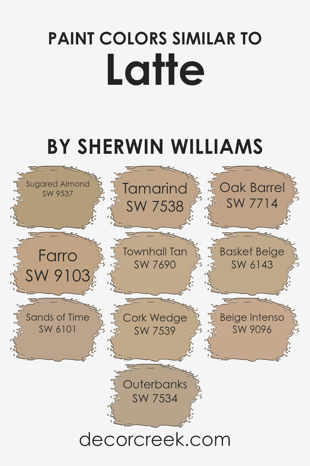
For instance, Sugared Almond is a gentle pale beige that offers a light and airy feel, perfect for creating a soft background. Farro brings a slightly deeper tone of beige, adding a warm and inviting touch to any space. Sands of Time has an earthy, sandy quality that works well to establish a solid, grounded ambience. Outerbanks is a deeper, muted brown that lends a cozy, secure feeling to interiors.
Tamarind, a rich, dark brown, provides an elegant shadow and depth, ideal for accentuating key areas. Townhall Tan is a classic beige that sets a traditional and timeless tone. Cork Wedge, slightly darker, offers versatility in pairing with both light and dark furnishings. Oak Barrel is a robust brown that can anchor a space with its sturdiness.
Basket Beige brings a soft, neutral canvas that’s easy on the eyes, while Beige Intenso, the most intense of the batch, gives a strong dose of warmth to a room. All these colors work together to create a nuanced palette that complements the central theme set by Latte, enabling a design that is both beautiful and functional.
You can see recommended paint colors below:
- SW 9537 Sugared Almond (CHECK A SAMPLE)
- SW 9103 Farro (CHECK A SAMPLE)
- SW 6101 Sands of Time (CHECK A SAMPLE)
- SW 7534 Outerbanks (CHECK A SAMPLE)
- SW 7538 Tamarind (CHECK A SAMPLE)
- SW 7690 Townhall Tan (CHECK A SAMPLE)
- SW 7539 Cork Wedge (CHECK A SAMPLE)
- SW 7714 Oak Barrel (CHECK A SAMPLE)
- SW 6143 Basket Beige (CHECK A SAMPLE)
- SW 9096 Beige Intenso (CHECK A SAMPLE)
Colors that Go With Latte SW 6108 by Sherwin Williams
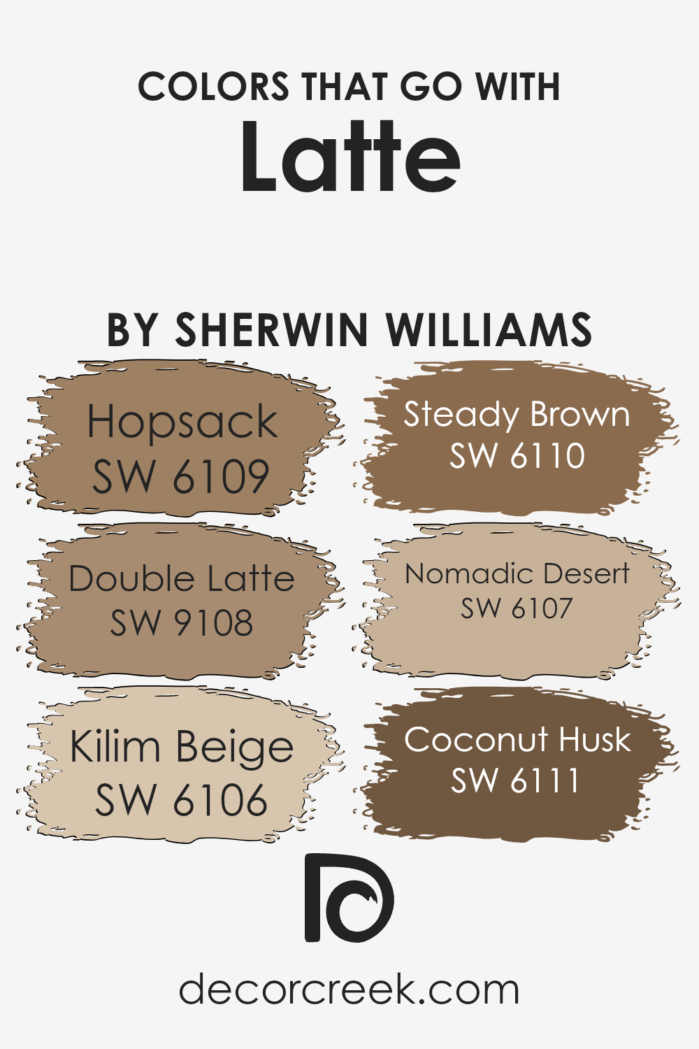
Choosing the right complementary colors for Latte SW 6108 by Sherwin Williams is crucial because it helps create a cohesive and visually appealing space. Coordinating colors, like Hopsack, Double Latte, Kilim Beige, Steady Brown, Nomadic Desert, and Coconut Husk, work together to enhance the warm and inviting nature of Latte SW 6108.
Each of these colors has its own unique hue that contributes to a harmonious look when used alongside Latte.
Hopsack SW 6109 is a deeper, earthy shade that adds a strong foundation to any room, functioning well as either a primary color or an accent. Double Latte SW 9108, true to its name, doubles down on the intensity of Latte, giving a richer, more profound backdrop or feature wall. Kilim Beige SW 6106 offers a lighter, softer contrast, perfect for creating a gentle transition between the bolder shades.
Steady Brown SW 6110 provides a robust and grounding effect, making the space feel secure and comforting. Nomadic Desert SW 6107 is a subtle blend between beige and brown, offering versatility in decorating without overwhelming other elements.
Finally, Coconut Husk SW 6111, with its deep, woodsy feel, brings a sense of nature and depth, perfect for accents and focal points.
Together, these colors work in harmony to provide a welcoming and warm atmosphere in any home.
You can see recommended paint colors below:
- SW 6109 Hopsack (CHECK A SAMPLE)
- SW 9108 Double Latte (CHECK A SAMPLE)
- SW 6106 Kilim Beige (CHECK A SAMPLE)
- SW 6110 Steady Brown (CHECK A SAMPLE)
- SW 6107 Nomadic Desert (CHECK A SAMPLE)
- SW 6111 Coconut Husk (CHECK A SAMPLE)
Complimentary Colors for Latte SW 6108 Paint Color by Sherwin Williams
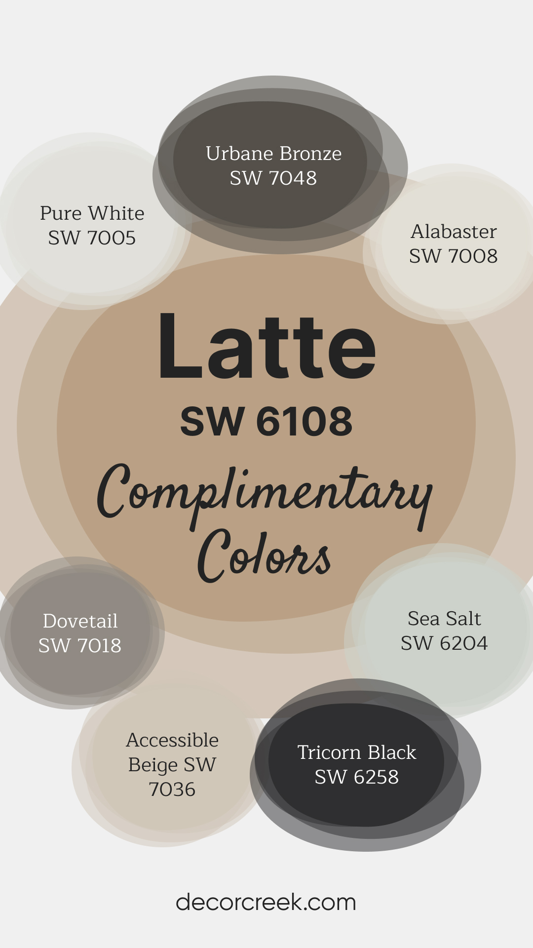
Sherwin Williams paints bring together a collection of rich and complementary colors that suit a variety of spaces. Latte introduces a cozy and welcoming feel, while Tricorn Black adds a bold and modern accent. Pure White and Alabaster are ideal for brightening walls or trim, creating a fresh and clean foundation.
Sea Salt and Accessible Beige bring softer touches, adding subtle depth to your palette.
For a touch of drama, Dovetail and Urbane Bronze provide deeper tones that work beautifully for accent walls or cabinetry. These colors combine effortlessly to create balance and flow throughout your home.
Whether you’re refreshing a single space or coordinating throughout, this palette brings depth and light together in harmony.
How to Use Latte SW 6108 by Sherwin Williams In Your Home?
Latte SW 6108 by Sherwin Williams is a warm and inviting shade of brown that can add a cozy touch to any room in your home. This color works extremely well in living areas or bedrooms where a calm and welcoming atmosphere is desired. Pairing Latte with soft lighting and comfortable furniture can make your space feel more like a relaxing retreat.
It’s also versatile enough to be applied in a kitchen or dining room, offering a rich backdrop that enhances cabinets and wood features.
For those wanting a bit of contrast, Latte pairs beautifully with lighter colors such as creams or soft yellows, bringing a balanced look to any space. You can use it as a main wall color or as an accent to highlight specific areas or architectural features of your room. Additionally, it complements natural materials like wood, leather, and stone, enhancing the texture and depth of your decor.
Whether you’re painting an entire room or just adding a few touches, Latte can create a warm and inviting environment in your home.
Latte SW 6108 by Sherwin Williams vs Tamarind SW 7538 by Sherwin Williams
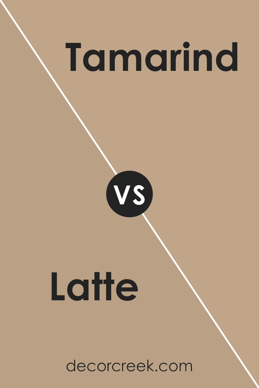
Latte and Tamarind by Sherwin Williams are both warm, welcoming colors but they offer distinctly different tones. Latte is a lighter, creamy beige that gives off a soft and cozy feel. It’s perfect for creating a bright and airy space. On the other hand, Tamarind is a much darker, richer brown. It provides a strong sense of warmth and can make large spaces feel more intimate and grounded.
When used together, these colors can complement each other nicely. Latte can be used to lighten up a room, while Tamarind can act as an accent, adding depth and contrast to the overall look.
Whether you’re painting a living room or just adding some color to your furniture, these two can work together to create a harmonious and inviting atmosphere.
You can see recommended paint color below:
- SW 7538 Tamarind (CHECK A SAMPLE)
Latte SW 6108 by Sherwin Williams vs Cork Wedge SW 7539 by Sherwin Williams
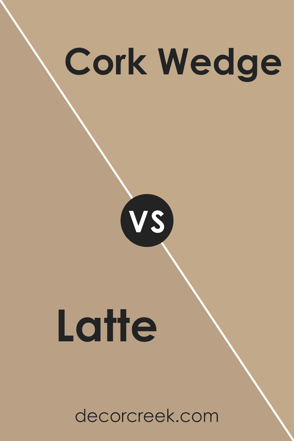
Latte SW 6108 and Cork Wedge SW 7539, both by Sherwin Williams, are warm, inviting hues perfect for creating a cozy atmosphere in any room. Latte is a softer, lighter beige with a creamy touch, making spaces feel airy and bright. It’s great for smaller rooms or areas with limited natural light as it helps open up the space.
Cork Wedge, on the other hand, is a deeper, richer brown that adds warmth and depth to larger spaces. This color can make a big room feel more intimate and cozy.
When used together, these colors complement each other beautifully, with Latte bringing lightness to balance the boldness of Cork Wedge, ideal for a harmonious color scheme in your home.
Both are versatile shades that work well with various decor styles, from modern to rustic.
You can see recommended paint color below:
- SW 7539 Cork Wedge (CHECK A SAMPLE)
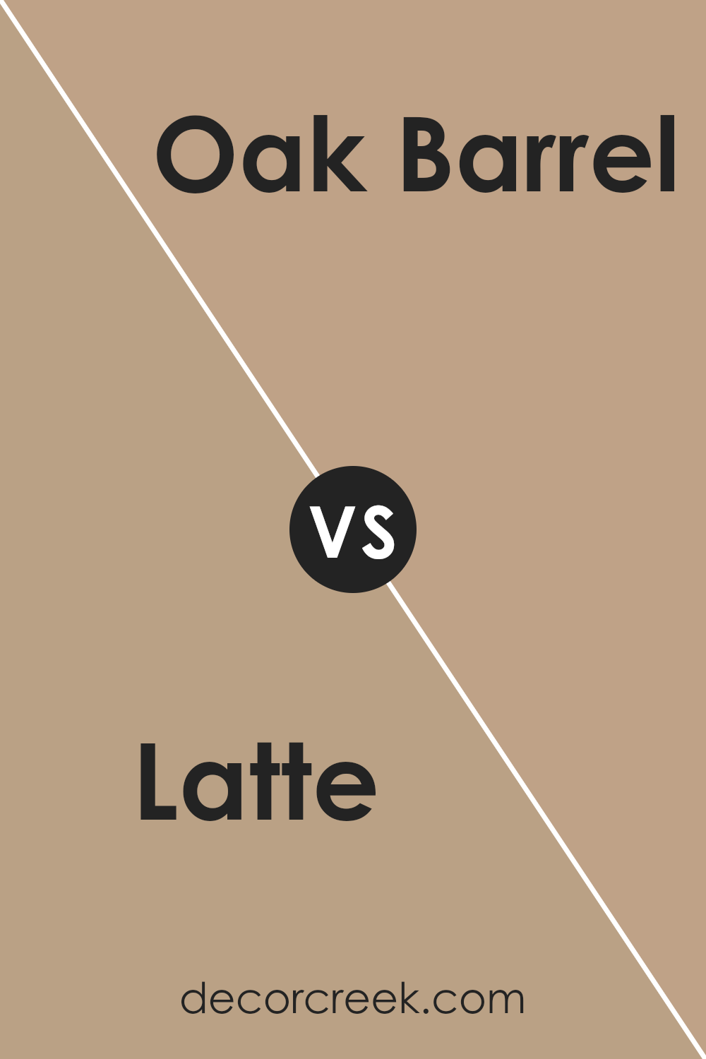
Latte SW 6108 by Sherwin Williams vs Oak Barrel SW 7714 by Sherwin Williams
Latte and Oak Barrel, both by Sherwin Williams, offer distinct tones that can beautifully define spaces. Latte is a warm, inviting beige with subtle undertones that suggest a creamy, soft texture reminiscent of a well-blended coffee drink. It’s versatile and comforting, making it perfect for creating a cozy and welcoming atmosphere in areas like living rooms or bedrooms.
On the other hand, Oak Barrel is a deeper, richer color resembling the weathered wood of an old oak barrel. This color has a more pronounced and earthy vibe, providing a strong and grounded feeling to any space. It works well in settings where a bolder, more defined presence is desired, such as dining areas or studies.
These two colors, while both warm and natural, cater to different aesthetic needs and preferences. Latte serves well as a gentle backdrop, while Oak Barrel stands out with a bit more intensity.
You can see recommended paint color below:
- SW 7714 Oak Barrel (CHECK A SAMPLE)
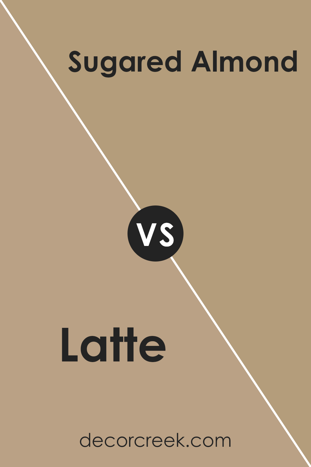
Latte SW 6108 by Sherwin Williams vs Sugared Almond SW 9537 by Sherwin Williams
Latte SW 6108 and Sugared Almond SW 9537 are both paint colors provided by Sherwin Williams, each with a distinct vibe. Latte resembles a classic, creamy coffee blend, offering a warm and comforting hue that makes rooms feel welcoming. It’s a versatile brown that pairs well with various decor styles, creating a cozy atmosphere in spaces like living rooms or bedrooms.
On the other hand, Sugared Almond is lighter, leaning towards a soft beige with hints of pink. This color is subtle yet cheery, brightening up spaces without overwhelming them. It’s perfect for creating a gentle, soothing environment and works especially well in smaller spaces that need to feel more open and airy.
Together, these colors could complement each other well in a home, with Latte providing a grounded, earthy base and Sugared Almond adding light and a touch of sweetness to the overall palette. They suit different needs and tastes, with Latte being a solid choice for a traditional cozy feel and Sugared Almond ideal for a lighter, fresher look.
You can see recommended paint color below:
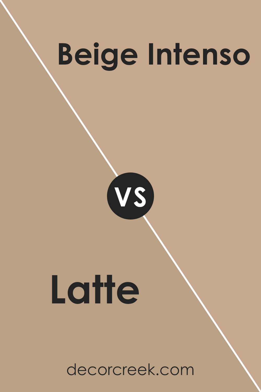
Latte SW 6108 by Sherwin Williams vs Beige Intenso SW 9096 by Sherwin Williams
Latte SW 6108 and Beige Intenso SW 9096 are both neutral colors by Sherwin Williams, but they have different tones and moods. Latte is a warm, creamy beige that brings a cozy and comforting feel to a space. It has a softness that makes it ideal for living rooms and bedrooms where a relaxing atmosphere is desired.
On the other hand, Beige Intenso is a deeper, more intense color. It has a richer, earthier base that provides a stronger presence in a room. This color works well in areas that require a bit more drama or where you want to add depth, such as dining rooms or entryways.
When compared, Latte is lighter and tends to blend into the background, offering a subtle warmth, whereas Beige Intenso stands out more and can serve as a focal point or complement darker furniture and decor. Choosing between them depends on the vibe you want for your room and how much you want the walls to play a role in your overall decor scheme.
You can see recommended paint color below:
- SW 9096 Beige Intenso (CHECK A SAMPLE)
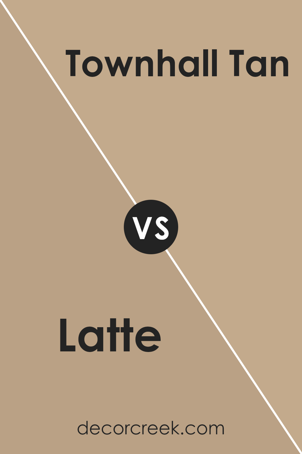
Latte SW 6108 by Sherwin Williams vs Townhall Tan SW 7690 by Sherwin Williams
Latte SW 6108 and Townhall Tan SW 7690, both by Sherwin Williams, offer unique yet complementing shades for any space. Latte, a lighter and creamier color, exudes a warm and inviting feel. It’s perfect for creating a cozy and comfortable atmosphere in rooms like living areas or bedrooms where you want to relax.
On the other hand, Townhall Tan has a bolder and deeper hue. This color brings a sense of groundedness and can be a great choice for spaces that require a bit more depth and definition, such as dining rooms or home offices. While Latte reflects more light, making a room feel more open and airy, Townhall Tan provides a sense of enclosure and coziness.
Deciding between the two depends on the mood you want to set and the specific characteristics of the room you’re decorating. Both colors are versatile and can be paired with a wide range of decor styles and palettes, ensuring they fit seamlessly into any home.
You can see recommended paint color below:
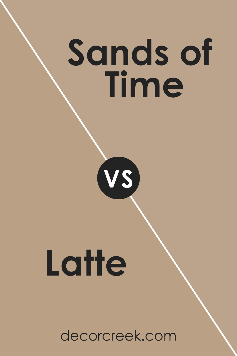
Latte SW 6108 by Sherwin Williams vs Sands of Time SW 6101 by Sherwin Williams
Latte SW 6108 and Sands of Time SW 6101 by Sherwin Williams are both warm, neutral shades, but they have some noticeable differences in tone and depth. Latte is a richer, deeper beige, giving a cozy and inviting feel to any space. It carries a more pronounced brown undertone, making it a strong choice for areas where you want a comforting and stable atmosphere.
In contrast, Sands of Time is lighter and has a softer appearance. This color leans more towards a sandy hue, offering a gentle and calm vibe, which is great for creating a relaxed and light environment.
Both colors pair well with a variety of decor styles and other shades, but the choice between them depends on the desired impact and the specific mood you want to set in a room. While Latte can anchor a space with its warmth, Sands of Time can open a room up, making it seem brighter and more airy.
You can see recommended paint color below:
- SW 6101 Sands of Time (CHECK A SAMPLE)
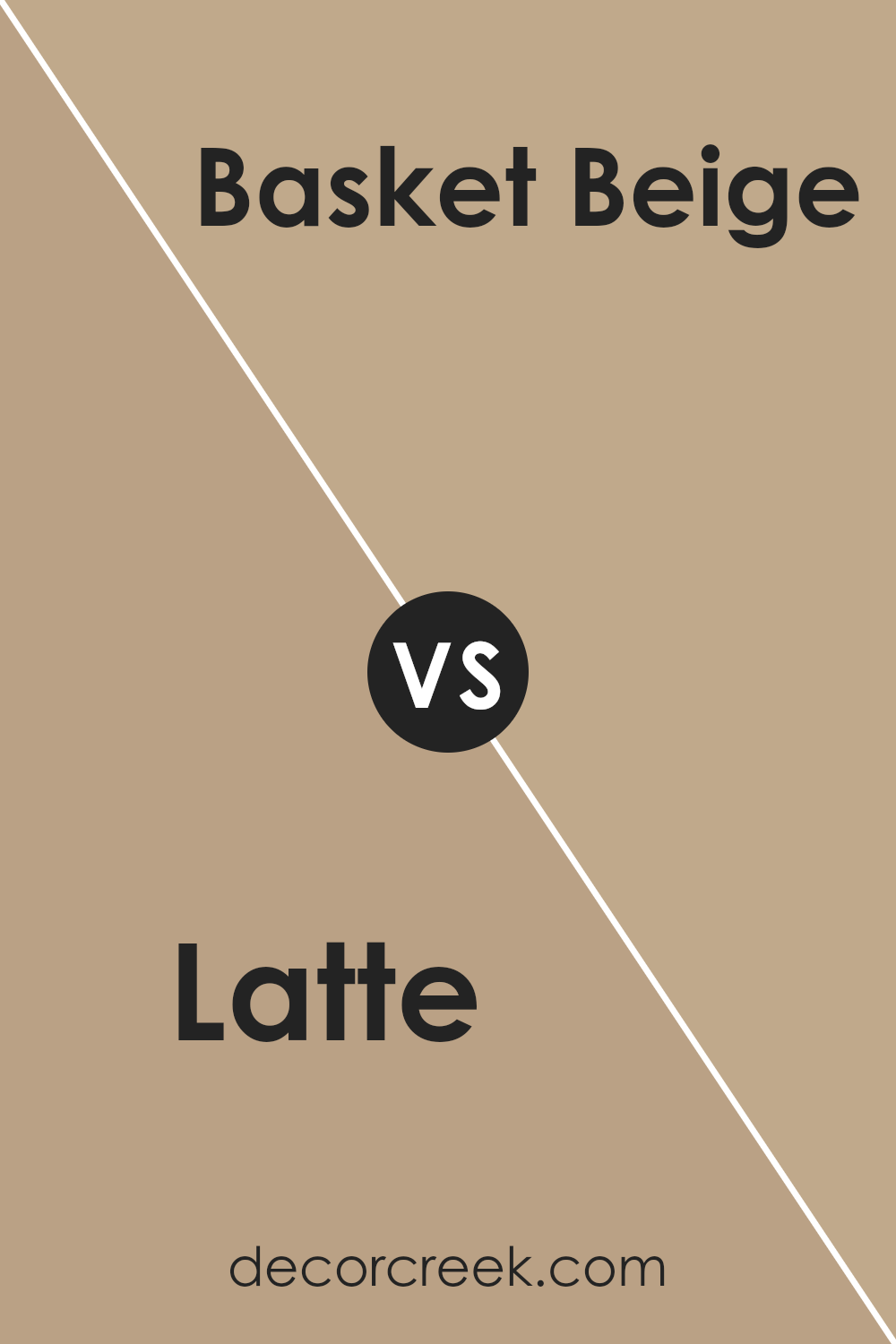
Latte SW 6108 by Sherwin Williams vs Basket Beige SW 6143 by Sherwin Williams
Latte SW 6108 and Basket Beige SW 6143, both by Sherwin Williams, are similar yet distinct neutral paint colors. Latte is a warm, cozy shade with hints of creamy coffee, making it look comforting and inviting in a room. This color tends to create a welcoming space, especially in living areas where you want to feel relaxed.
On the other hand, Basket Beige is slightly darker and has a more subdued tone. It leans more towards a sandy beige, giving spaces a grounded, earthy feel. This color works well in areas where you prefer a subtle touch of warmth without overwhelming the senses.
Both colors are versatile for a variety of decorating styles and can easily pair with different fabrics and accessories. However, Latte adds more warmth due to its creamier undertones, while Basket Beige offers a more neutral backdrop, potentially making a space feel more open and less cozy compared to Latte.
Choosing between them depends on the mood and atmosphere you’re aiming to achieve in your space.
You can see recommended paint color below:
- SW 6143 Basket Beige (CHECK A SAMPLE)
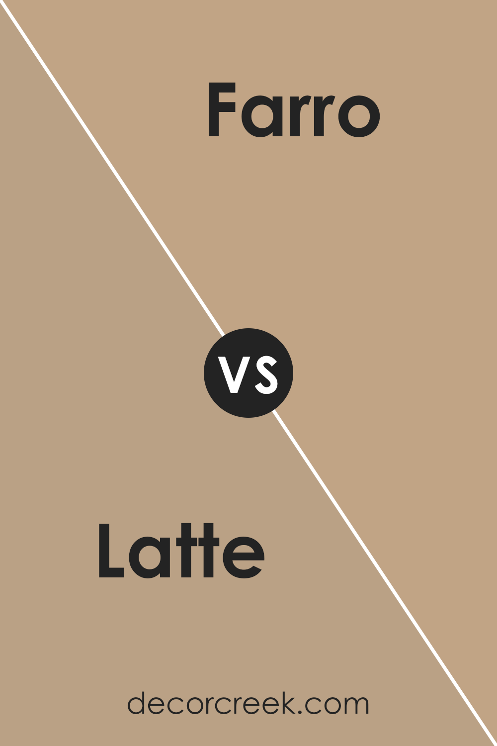
Latte SW 6108 by Sherwin Williams vs Farro SW 9103 by Sherwin Williams
Latte and Farro by Sherwin Williams are both warm, welcoming colors but they have distinct differences. Latte has a richer, deeper brown tone that feels cozy and comforting. It’s similar to the color of a well-creamed coffee, making it ideal for creating a snug, inviting space in areas like living rooms or bedrooms.
On the other hand, Farro has a lighter, more muted beige tone. It’s subtle and gentle, providing a soft backdrop that works well in almost any room. This color can make small spaces appear larger and brighter, giving it a versatile edge.
While both colors share a warm base, Latte creates a stronger presence with its deeper shade, whereas Farro offers a more understated elegance.
This makes Latte a great choice for statement walls or cozy nooks, while Farro is perfect for more extensive use throughout a home for a clean, airy feel.
You can see recommended paint color below:
- SW 9103 Farro (CHECK A SAMPLE)
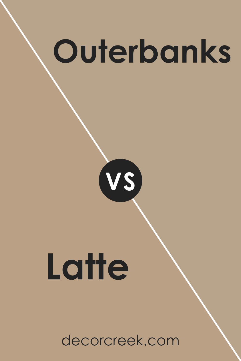
Latte SW 6108 by Sherwin Williams vs Outerbanks SW 7534 by Sherwin Williams
The two colors, Latte and Outerbanks by Sherwin Williams, both bring unique tones to any space, but they have different vibes. Latte is a warm beige that adds a cozy and inviting feel, perfect for living rooms or bedrooms wanting a soft, homey touch. It’s light enough to make small rooms appear larger and versatile for pairing with various decor styles.
On the other hand, Outerbanks is a darker shade that can be described as a deep, warm gray. This color is great for creating a grounded, calming atmosphere in a space. It’s ideal for accent walls or rooms where you want a more defined, cozy appearance without going too bold.
Both colors offer a neutral palette, but Latte leans towards a creamier, lighter feel, while Outerbanks offers more depth and a stronger presence. Their uses can overlap, but choosing between them depends on the mood and size of the room you’re decorating.
You can see recommended paint color below:
- SW 7534 Outerbanks (CHECK A SAMPLE)
Conclusion
In wrapping up my thoughts on SW 6108 Latte by Sherwin Williams, I’ve got to say, it’s a color that really makes a room feel warm and welcoming. This shade of brown reminds me of a yummy cup of latte, which is probably why they picked the name! It’s soft enough to make you feel cozy, yet bright enough to make a room not feel too dark.
I love how this color goes so well with different styles of furniture and decor. Whether your room has a modern look or more of a classic style, Latte seems to fit right in. It’s like the friendly color that gets along with everyone and everything!
After trying it out in various rooms, Latte proves to be a great choice if you’re looking to give your walls a fresh, new look without going too bold. It works beautifully in living rooms, bedrooms, and even kitchens, making the whole house feel unified and complete.
So, if you’re thinking of giving your room a fresh coat of paint and want something that adds warmth without overpowering, SW 6108 Latte by Sherwin Williams might just be the perfect pick. It’s definitely made me happy with how my rooms turned out.
Ever wished paint sampling was as easy as sticking a sticker? Guess what? Now it is! Discover Samplize's unique Peel & Stick samples.
Get paint samples


