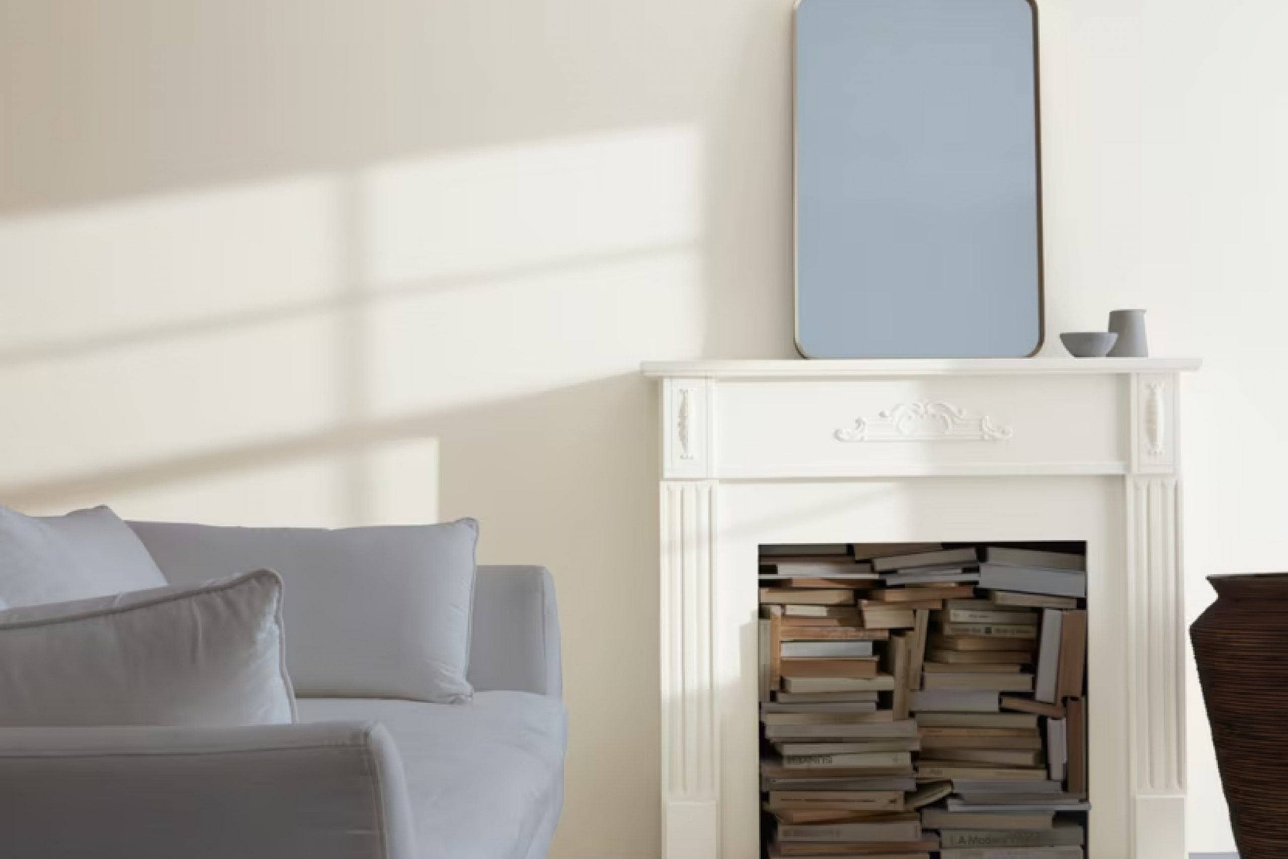
When I first saw OC-26 Silver Satin by Benjamin Moore, I knew it was something special. This color is the perfect mix of neutral and welcoming, making it easy to use in any room. Its soft, light gray tone adds a touch of elegance and calm without feeling too strong.
Whether you’re trying to brighten up a small room or need a neutral backdrop for your favorite artwork and furniture, this color can work wonders. I found that it creates a serene atmosphere, effortlessly complementing different styles, from modern to traditional.
It’s a color that seems to adapt well with any lighting, enhancing the natural beauty of a room during the day and providing a cozy feel in the evening. Silver Satin’s versatility has made it a favorite of mine; it’s like having a quiet, trusty friend who knows how to make everything look better.
This color truly enhances the beauty of your surroundings, creating a welcoming atmosphere without trying too hard.
What Color Is Silver Satin OC-26 by Benjamin Moore?
Silver Satin OC-26 by Benjamin Moore is a subtle, soft off-white color with a hint of gray. It has a gentle warmth, making it versatile for many spaces. This color creates a calm and relaxed atmosphere, suitable for a variety of interior styles such as modern, minimalist, and Scandinavian. It also works well in traditional settings, offering a fresh, clean backdrop.
Silver Satin complements other colors beautifully without overpowering, making it an excellent choice for open-plan living spaces or anywhere you want a neutral palette. This hue pairs nicely with natural materials like light wood, linen, and cotton, emphasizing the warmth of the color while maintaining a crisp look.
The understated elegance of Silver Satin works splendidly with brushed metal accents, particularly in stainless steel or chrome, highlighting the soft gray undertones.
Textures that can enhance Silver Satin include woven jute area rugs, smooth leather furnishings, and textured ceramic decor. These elements can add depth while keeping the overall look understated and harmonious.
Whether used on walls, trim, or cabinetry, Silver Satin provides a versatile and classic backdrop that adapts well to various design needs, creating a welcoming and cohesive interior environment.
Is Silver Satin OC-26 by Benjamin Moore Warm or Cool color?
Silver Satin (OC-26) by Benjamin Moore is a versatile and popular paint color for home interiors. This soft, light gray has subtle undertones that can complement various design styles, making it a go-to choice for many homeowners and designers. Its neutral shade works well in different spaces, such as living rooms, bedrooms, and kitchens, providing a calm and airy feel.
One of the things that make Silver Satin effective is its ability to reflect natural light. This quality can make rooms appear larger and more open, which is particularly beneficial in smaller or darker spaces.
The color’s gentle hue allows it to pair easily with both bold and muted tones, offering flexibility in choosing furniture and accents.
Silver Satin also works well with different types of lighting. Whether it’s natural sunlight or artificial light, this color maintains its subtle elegance throughout the day.
Its understated charm makes it a reliable choice for a fresh and modern look.
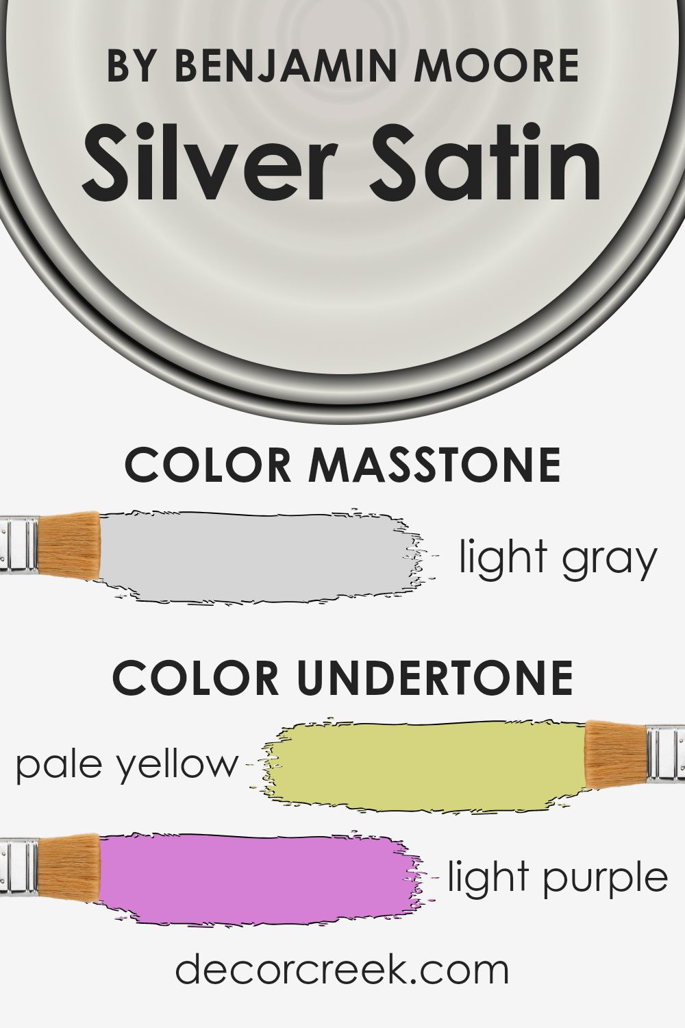
Undertones of Silver Satin OC-26 by Benjamin Moore
Silver Satin OC-26 by Benjamin Moore is a versatile, gentle off-white color with a subtle mix of undertones. This paint color combines delicate hints of pale yellow, light purple, light blue, pale pink, mint, lilac, and grey. These undertones influence how this color appears in different lighting conditions and settings.
In spaces with lots of natural light, the pale yellow and light blue undertones can make rooms appear sunnier and more open, lending a warm, airy feeling.
Under artificial lighting, the lilac and pale pink hints might become more noticeable, adding a touch of soft coziness, making the environment feel inviting and peaceful.
The grey undertone provides a neutral base, balancing the other undertones to prevent any one color from overpowering the overall shade.
When applied to interior walls, Silver Satin can be very adaptable. The varying undertones allow it to blend well with a wide range of other colors in furnishings and decor. Depending on the colors and lighting around it, Silver Satin can shift subtly, either enhancing a room’s light and spacious feel or adding warmth and comfort. Hence, it serves as an excellent backdrop in a range of spaces, easily adapting to the mood of its surroundings.
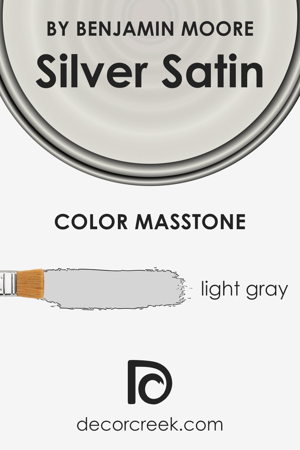
What is the Masstone of the Silver Satin OC-26 by Benjamin Moore?
Silver Satin OC-26 by Benjamin Moore is a light gray color that offers a soft and gentle appearance. With its masstone of light gray (#D5D5D5), it creates a calm and welcoming atmosphere in homes, making rooms feel airy and spacious.
This hue is versatile, allowing it to work well in various spaces such as living rooms, bedrooms, or hallways. Its subtle shade doesn’t dominate, letting furniture and other decor elements shine.
It reflects natural light, brightening rooms and making them feel larger and more open.
The light gray also provides a neutral backdrop that pairs nicely with both bold and muted colors, giving homeowners flexibility in choosing complementary accents. In addition, this shade works with different design styles, from modern to traditional, offering a timeless appeal.
It suits people looking for a clean and simple look without overwhelming the senses, promoting a sense of comfort and continuity throughout the home.
How Does Lighting Affect Silver Satin OC-26 by Benjamin Moore?
Lighting plays a significant role in how we perceive colors. Different types of lighting can change the way a color appears in a room, making it look warmer, cooler, darker, or lighter. One example is the color Silver Satin (OC-26) by Benjamin Moore, a soft, warm, light gray with subtle undertones.
In natural light, Silver Satin shows its true colors. In rooms with plenty of natural light, like south-facing rooms, this color can look bright and creamy.
South-facing rooms get a lot of sunlight throughout the day, which enhances the warm tones in Silver Satin, making it appear slightly more yellow or beige. This can create a cozy atmosphere.
For north-facing rooms, they generally receive cooler, indirect light. Here, Silver Satin may appear more muted and cooler because the gray tones are more pronounced. The color can sometimes look a bit more flat compared to south-facing rooms, but it can still offer a nice, calm backdrop.
East-facing rooms get bright light in the morning and softer, cooler light later in the day. Silver Satin might appear brighter and warmer in the morning sun, capturing a creamy and subtle hue. In the afternoon, the color can shift to a softer, more subdued tone.
West-facing rooms are the opposite; they receive cooler light in the morning and warmer light in the afternoon and evening. In the morning, the color might look a bit more neutral or gray. However, in the late afternoon, as the sun sets, Silver Satin picks up the warmer tones again, creating a cozy feel.
In artificial lighting, the type of bulb used can affect how Silver Satin looks.
Incandescent bulbs tend to bring out the warmer tones, while fluorescent lighting can make it appear cooler. LED lighting can vary, but typically offers a more even and realistic hue close to natural daylight.
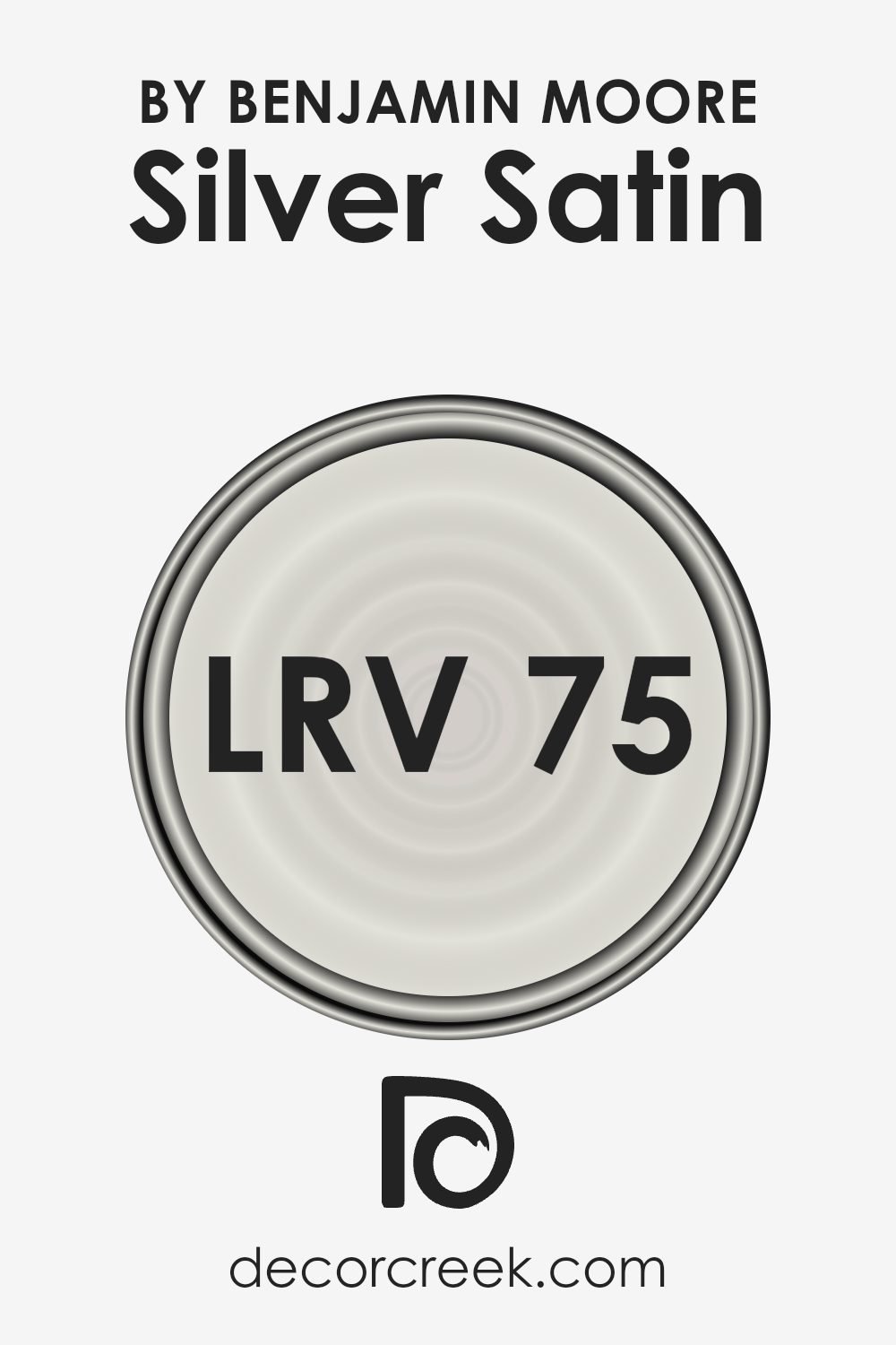
What is the LRV of Silver Satin OC-26 by Benjamin Moore?
Light Reflectance Value, or LRV, is a measure of how much light a color reflects when it’s applied to a surface. It operates on a scale from 0 to 100, where 0 means no light is reflected (pure black), and 100 means all light is reflected (pure white).
The LRV is important because it affects how colors look in different lighting conditions. A higher LRV means a color will reflect more light, making a space feel brighter and more open. Lower LRVs reflect less light, causing colors to appear darker and rooms to feel more intimate or cozy.
The LRV of Silver Satin by Benjamin Moore is 74.9, meaning it reflects a good amount of light. This relatively high LRV makes Silver Satin a light, airy color that can help brighten up a room. It’s a versatile choice for walls because it bounces light around the space, making it feel larger and more inviting. The color is not stark like some whites, as it has a subtle warmth to it, which can create a pleasant backdrop for other design elements in a room.
This makes Silver Satin suitable for a variety of settings, especially in spaces where you want to enhance natural light or create a more open feel.
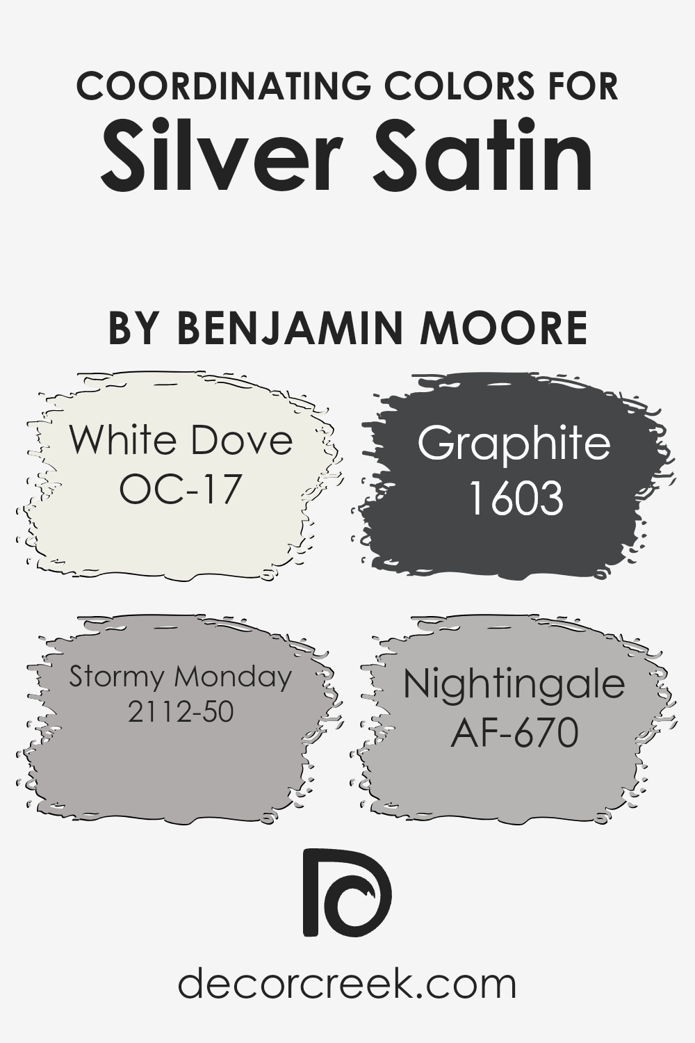
Coordinating Colors of Silver Satin OC-26 by Benjamin Moore
Coordinating colors are shades that complement a particular primary color, creating a harmonious space when used together. When choosing colors to coordinate with Silver Satin by Benjamin Moore, it’s important to select tones that enhance its soft, subtle beauty.
One of the coordinating colors is White Dove (OC-17), a warm, creamy white that offers a light, airy touch when used alongside Silver Satin, making spaces feel open and bright.
Another is Stormy Monday (2112-50), a gentle, muted gray that adds depth and contrast, perfectly balancing the lighter shade of Silver Satin with its more grounded tone.
Graphite (1603) is a rich, dark gray that provides a striking backdrop or accent to the gentle softness of Silver Satin, introducing a bold element that’s still cohesive. Finally, Nightingale (AF-670) brings a muted taupe-brown into the mix, offering a neutral warmth that can tie different elements of a room together seamlessly.
These colors work in harmony with Silver Satin, offering a versatile palette that can suit various styles and moods, whether you’re aiming for a modern minimalist look or a cozy, inviting atmosphere. Using these coordinating colors ensures that spaces feel unified and thoughtfully designed without being overwhelming.
You can see recommended paint colors below:
- OC-17 White Dove
- 2112-50 Stormy Monday
- 1603 Graphite
- AF-670 Nightingale
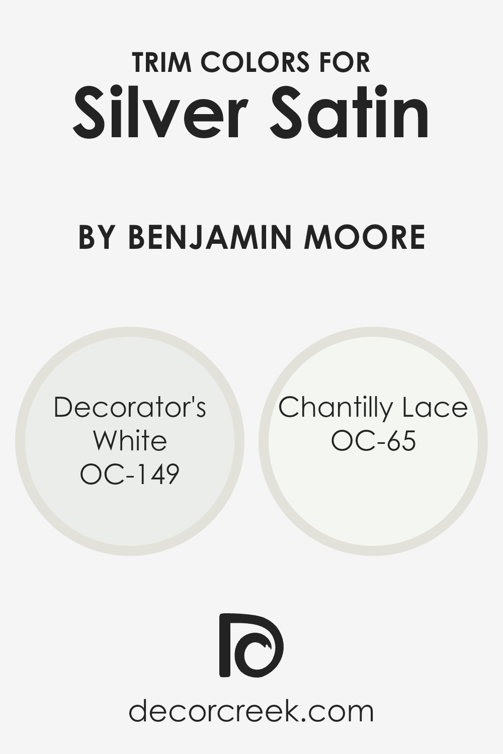
What are the Trim colors of Silver Satin OC-26 by Benjamin Moore?
Trim colors are lighter shades of paint used to highlight the edges and corners of walls, windows, and door frames. They are crucial for defining spaces and enhancing the overall look of a room. When pairing trim colors with Silver Satin by Benjamin Moore, they provide contrast and make the main wall color stand out.
Using Decorator’s White or Chantilly Lace as trim colors can complement Silver Satin beautifully, giving a crisp and clean finish. These colors emphasize the subtle elegance of Silver Satin, making it look fresh without overwhelming the room.
Decorator’s White is a soft white with a hint of warmth, providing a subtle contrast that pairs well with Silver Satin’s soft gray undertones. This combination gives a balanced and harmonious look. On the other hand, Chantilly Lace is a pure, bright white that offers a stark contrast, creating a sharp and clean boundary against the softer Silver Satin.
Both options enhance Silver Satin’s appeal, allowing it to maintain its lightness while giving the space a polished and refined appearance.
You can see recommended paint colors below:
Colors Similar to Silver Satin OC-26 by Benjamin Moore
Similar colors play an essential role in creating a cohesive and harmonious space, particularly when you’re working with subtle, nuanced shades like Silver Satin. These colors allow for a seamless transition from room to room, maintaining a unified feel without overwhelming the senses.
When you use similar colors, they complement each other beautifully, enhancing the overall aesthetic of your home. This is why selecting shades that closely resemble each other can effectively provide balance and warmth, making any space feel inviting and comfortable.
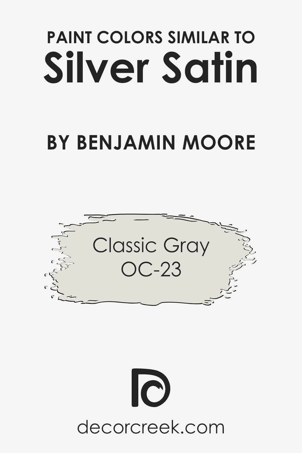
For example, Classic Gray (OC-23) is a perfect companion to Silver Satin. This shade offers a gentle warmth with its soft gray tone and minimal undertones, making it versatile enough to fit into various design styles. It brings in a touch of elegance without being too stark or overpowering, creating a soothing backdrop that enriches the Silver Satin nearby.
When used together, these hues offer a smooth and subtle contrast, giving your home a refined and cohesive appearance. By thoughtfully choosing similar colors, you can effortlessly create an inviting atmosphere that feels both welcoming and timeless, perfectly crafted for any room in your home.
You can see recommended paint color below:
How to Use Silver Satin OC-26 by Benjamin Moore In Your Home?
Silver Satin by Benjamin Moore is a subtle and versatile paint color. This shade is a soft, light gray with warm undertones, making it a popular choice for many areas in the home. It provides a clean and fresh backdrop in living rooms, allowing furniture and decor to stand out while keeping the space feeling open and airy.
In a bedroom, it creates a calm and inviting atmosphere, perfect for relaxation. Silver Satin is also a great option for hallways or entryways, creating a smooth, welcoming look that transitions well between rooms.
For kitchens and bathrooms, Silver Satin adds a touch of elegance without overpowering the space. It pairs nicely with both traditional and modern fixtures, offering flexibility in design choices. Its neutral tone allows for easy coordination with various colors and materials, making it a practical option for anyone looking to refresh their home without committing to bold color choices.
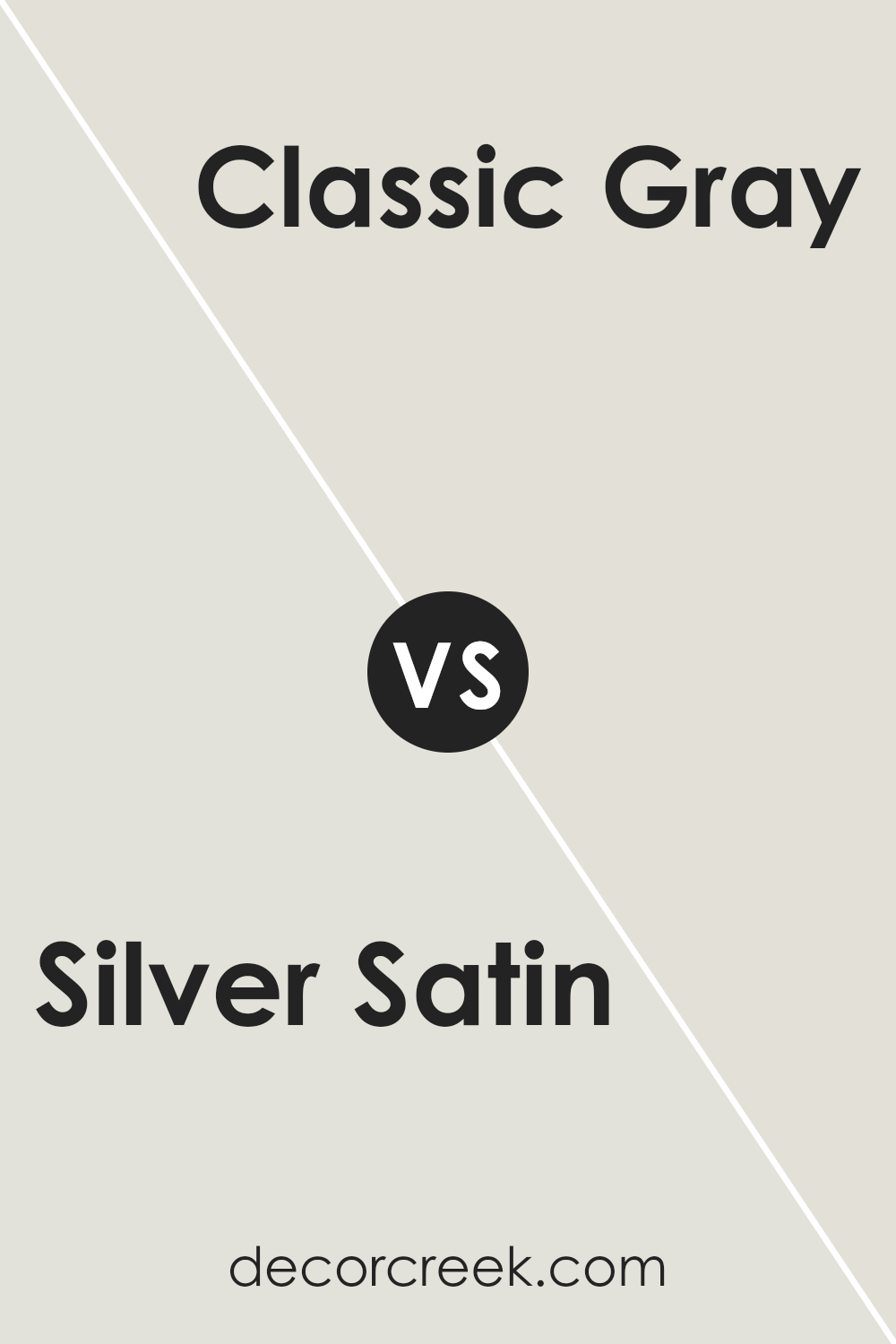
Silver Satin OC-26 by Benjamin Moore vs Classic Gray OC-23 by Benjamin Moore
Silver Satin OC-26 by Benjamin Moore is a soft and light gray with warm undertones. It gives a space a fresh and airy feel, making it ideal for rooms where you want to create an open, welcoming vibe. On the other hand, Classic Gray OC-23 is also a light gray but has slightly cooler undertones, lending it a subtle, timeless appearance.
It is versatile and works well in different lighting conditions, offering a calm and neutral backdrop.
While both colors are light grays, Silver Satin leans warmer, which can add a hint of coziness to a room, whereas Classic Gray’s cooler tones make it feel a bit more neutral. They both pair nicely with a variety of other colors, but Silver Satin might complement warmer accents better, while Classic Gray could be a suitable match for cooler accent colors. Both options are excellent for creating a neutral and balanced space.
You can see recommended paint color below:
Conclusion
After getting to know OC-26 Silver Satin by Benjamin Moore, I can see why so many people love it. It’s a soft, light gray with a touch of warmth that makes a space feel cozy. I picture a room in Silver Satin as calm and relaxing, just the kind of place you want to unwind in.
This color doesn’t shout for attention, but it helps things look nice together without being too bright or too dull. It’s a color that can make a room feel open and airy.
One of the best things about Silver Satin is how well it works with other colors. Whether you pair it with darker shades or keep it with other light colors, it always looks good. It’s kind of like having a good friend who gets along with everyone. You can use it in kitchens, living rooms, bedrooms, or anywhere else in a house, and it will feel just right.
OC-26 Silver Satin is comforting, like a soft blanket or a gentle breeze.
It helps create an environment where you can relax or play. It’s a nice choice if you want a color that’s easy to like and helps make any room feel nice.
Overall, I believe Silver Satin is a great choice for many rooms and brings a sense of calm without needing to be flashy.
Ever wished paint sampling was as easy as sticking a sticker? Guess what? Now it is! Discover Samplize's unique Peel & Stick samples.
Get paint samples

