If you’re considering refreshing your room with a new paint color, you might want to look at SW 7621 Silvermist by Sherwin Williams. I recently had the pleasure of using this adaptable shade in my own home, and I must say, it offers a unique blend of blue and gray that can create a peaceful and inviting atmosphere in any room. Before you decide on Silvermist, here are a few key things you should know.
Firstly, it’s important to understand how lighting affects Silvermist. In rooms with plenty of natural light, the blue tones in the paint become more pronounced, giving the room a cool and soothing vibe. Conversely, in rooms with less natural light, the gray tones dominate, providing a more subtle and neutral backdrop.
Also, consider the existing elements in your room, such as flooring and furniture. Silvermist pairs beautifully with a wide array of colors and materials, making it a flexible choice for many styles and settings. Whether your decor is modern, traditional, or something in between, this color can complement your aesthetic effectively.
Lastly, think about the mood you want to create. Silvermist has a calming effect, making it perfect for bedrooms or bathrooms where relaxation is key. However, its adaptability also makes it suitable for lively areas like living rooms or kitchens, as it can harmoniously blend with vibrant colors and accessories.
Choosing the right paint color can be a game-changer for your home, and Silvermist might just be the shade you need to enhance your environment.
Is Silvermist SW 7621 Right for My Home?
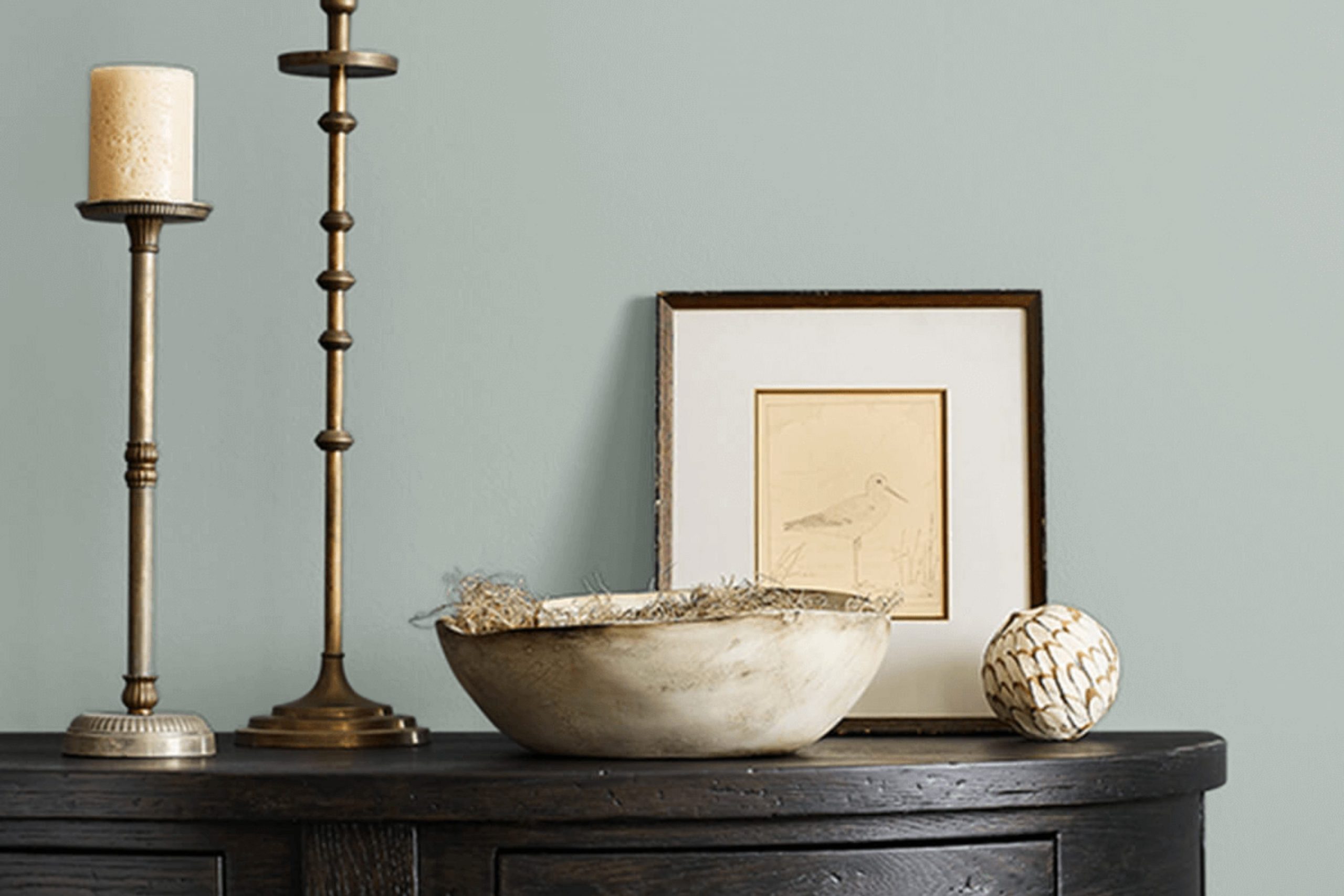
I recently found a color called Silvermist by Sherwin Williams, and it’s quickly become one of my favorites for home decor. This shade is a lovely soft gray with a hint of blue. It’s muted enough to be neutral, but the touch of blue adds a unique character that really stands out in a room.
I’ve found Silvermist to be incredibly adaptable. It works beautifully in various interior styles. If you love modern or minimalist designs, this color creates a clean, crisp backdrop. It also looks stunning in coastal-inspired rooms, where its subtle blue tones complement themes of relaxation and nature.
In terms of pairing it with materials and textures, Silvermist is quite flexible. It goes really well with natural wood, whether it’s a light oak or a darker walnut, adding a warm contrast to its cool tones. Metals like brushed nickel or stainless steel also match perfectly, maintaining the modern vibe. For textures, consider soft, plush fabrics to create a cozy, inviting room, or sleek leather for a more contemporary look.
I’ve used it primarily in living rooms and bedrooms, but I think it would also make a lovely choice for bathrooms or kitchens, providing a soothing atmosphere without being too stark or cold.

decorcreek.com
What are the right undertones of Silvermist SW 7621 ?
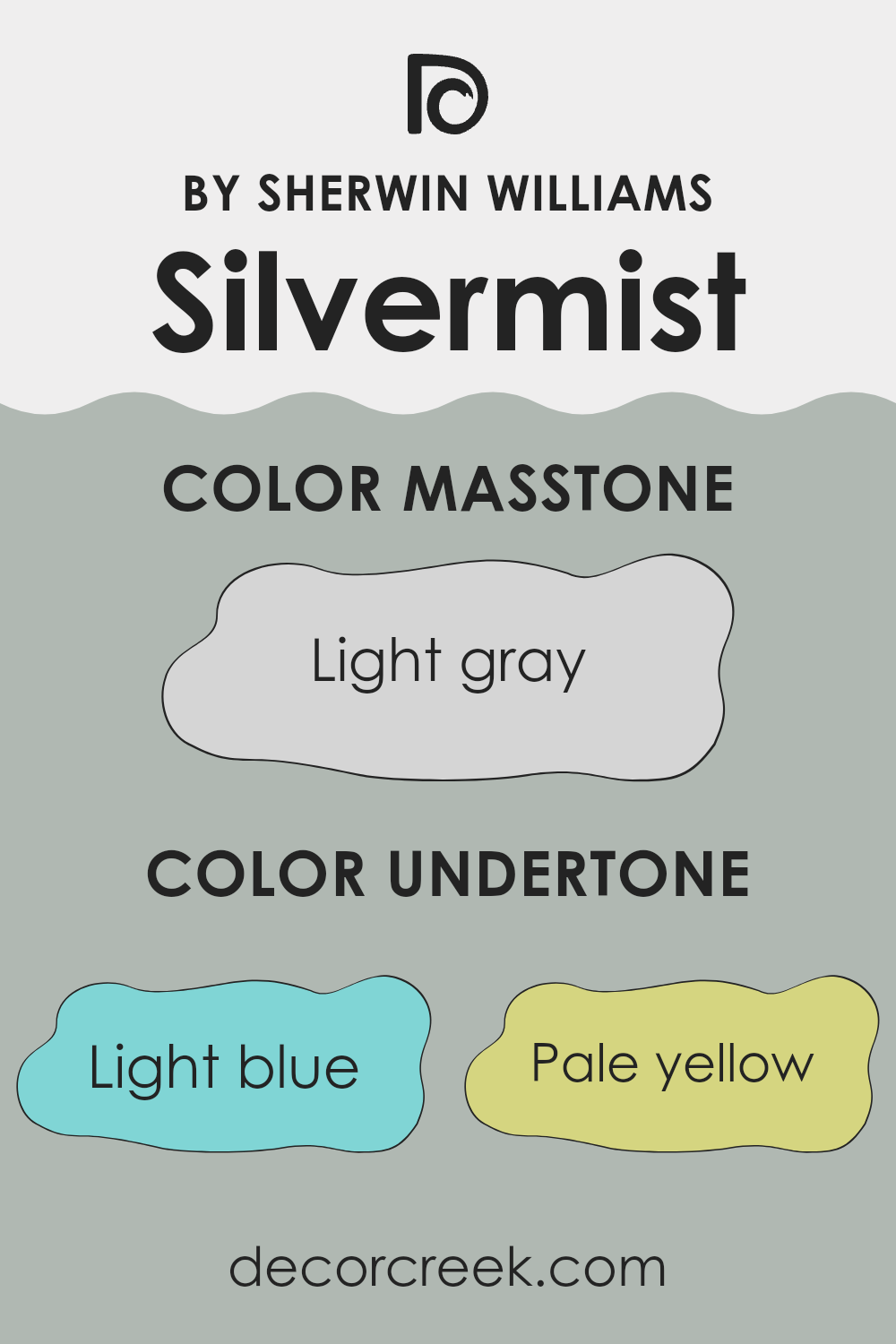
Silvermist, a color by Sherwin Williams, has a unique appeal due to its subtle undertones. This color displays a gentle mix of light blue, pale yellow, light purple, mint, lilac, pale pink, and grey. Each of these undertones plays a role in how Silvermist appears in different settings and lighting conditions.
For instance, the light blue and mint undertones can give a sense of freshness and brightness to a room, making it feel more open and airy. On the other hand, the pale pink and lilac undertones can add a soft, welcoming touch, which makes a room feel cozy and comfortable. The influence of pale yellow can subtly warm up the ambiance, countering cooler tones.
Grey undertones in Silvermist bring a neutral balance to the color, ensuring it doesn’t lean too heavily towards any one hue, thus maintaining a harmonious look. This balance makes Silvermist incredibly adaptable and easy to pair with a wide range of decor styles and colors.
When applied to interior walls, the varying undertones of Silvermist influence the mood and perception of the room. The mix of undertones allows the paint to interact dynamically with both natural and artificial light, showing slight changes as the day progresses.
This means that the room will not only look inviting but will also have an evolving appeal throughout the day, never appearing flat or dull. This capacity to subtly alter its appearance makes Silvermist a popular choice for those wanting to refresh their living rooms without committing to a bold color change.
decorcreek.com
Best Coordinating Colors to use with Silvermist SW 7621 by Sherwin Williams this year.
Coordinating colors are shades that complement each other well when used together in a design scheme. They create harmony and balance in a room without creating an intense feeling. The idea is to select hues that enhance the main color, giving the room a polished and cohesive look. In the case of a subtle color like Silvermist, choosing the right coordinating colors can accentuate its unique tone and bring out the best in the décor.
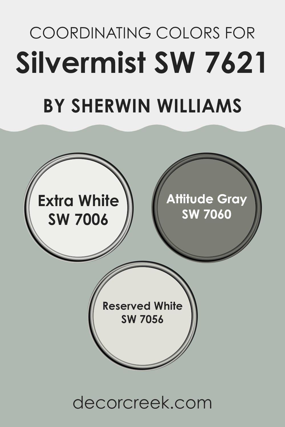
Extra White (SW 7006) is a fresh and crisp white that can brighten rooms and make other colors stand out, making it an excellent choice for trim, ceilings, and even as a primary wall color in a more minimalist design. Attitude Gray (SW 7060) is a deeper shade that offers a strong contrast to lighter tones, making it great for creating depth or accent walls that draw the eye.
Reserved White (SW 7056) is a soft and gentle white, with a slight warmth that makes it ideal for creating a cozy and inviting atmosphere. All these colors support the cool, gentle hue of Silvermist, ensuring that the overall design remains balanced and pleasing to the eye.
You can see recommended paint colors below:
Trendy Trim Colors of Silvermist SW 7621 by Sherwin Williams to use this year.
Trim colors are essential in interior design as they help define and accentuate the architectural details of a room, such as door frames, window sills, and baseboards. When paired with a gentle gray like Silvermist by Sherwin Williams, trim colors can either create a subtle contrast or complement the main hue to enhance the overall aesthetic. Choosing the right trim color can enhance the visual appeal and create a cohesive look that ties a room together.
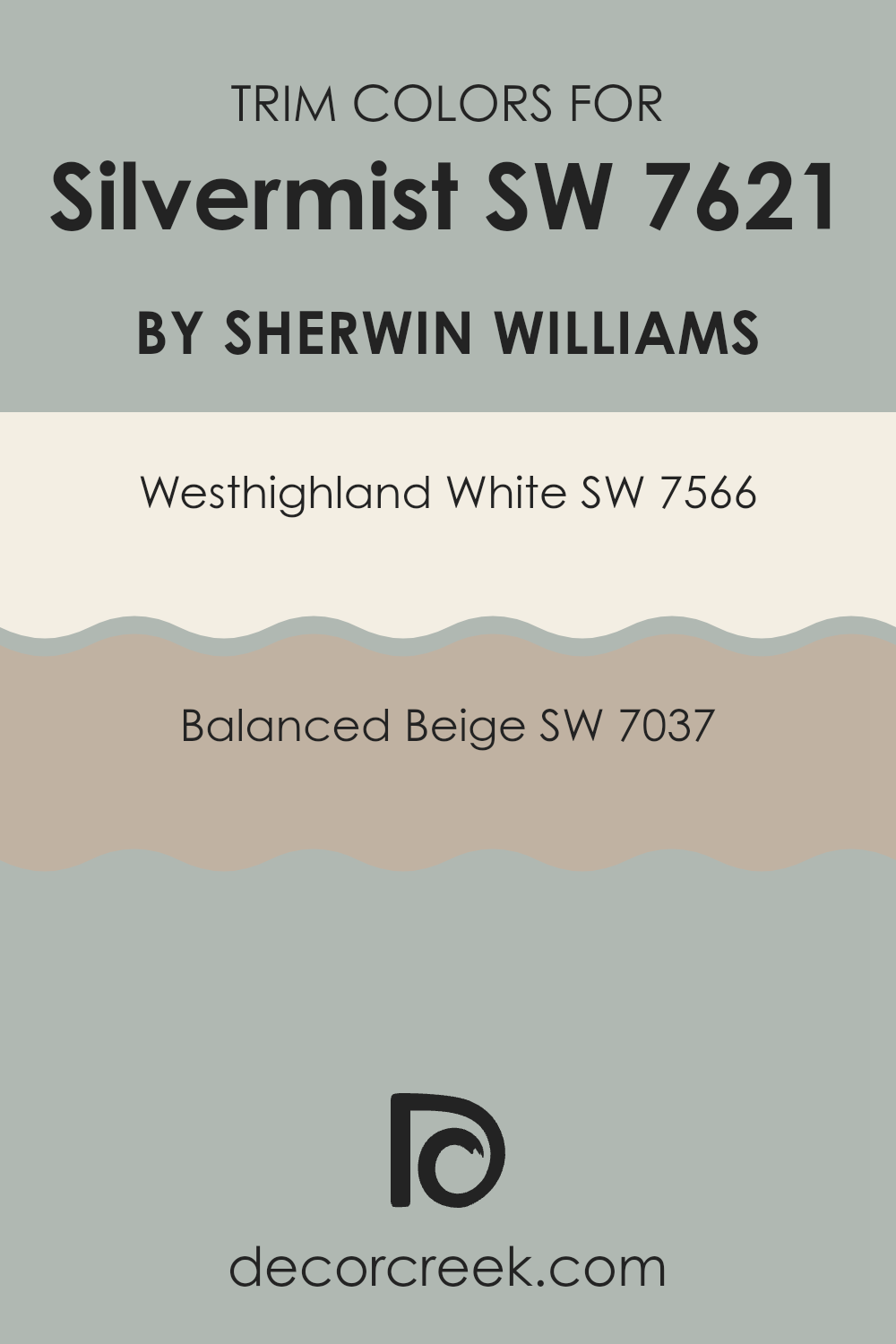
Westhighland White SW 7566 is a clean, bright white that offers a crisp contrast to the softer tones of Silvermist, making it ideal for creating a fresh and inviting look. It is particularly effective in rooms that benefit from a sharper definition around edges and corners, helping to make them stand out.
On the other hand, Balanced Beige SW 7037 is a warm, welcoming beige that blends more smoothly with Silvermist. This color combination is excellent for achieving a harmonious and cozy atmosphere, allowing the room to feel connected and balanced.
You can see recommended paint colors below:
- SW 7566 Westhighland White
- SW 7037 Balanced Beige
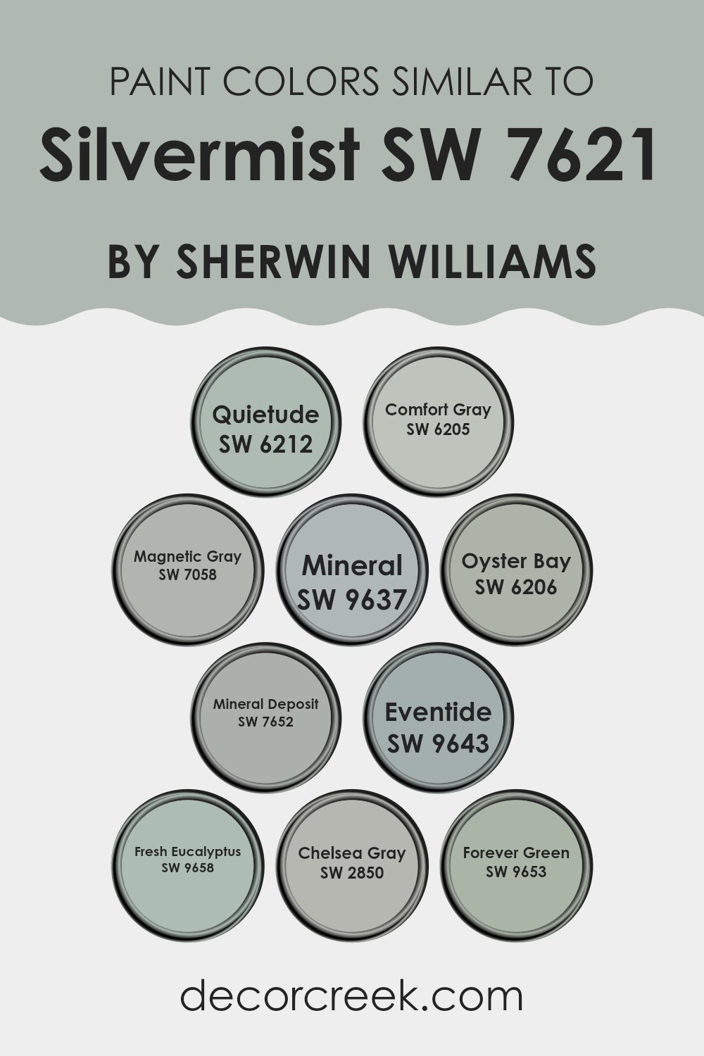
Evergreen Colors Similar to Silvermist SW 7621 by Sherwin Williams
When designing an interior room, selecting a harmonious palette of similar colors can be crucial in achieving a cohesive look. Colors like SW 6212 – Quietude, a gentle aqua hue, and SW 6205 – Comfort Gray, a subdued mix of blue and green, are perfect for creating a seamless transition between rooms. These colors, along with hues such as SW 7058 – Magnetic Gray, a soft, gray shade, and SW 9637 – Mineral, a muted green, work well together by providing a balanced backdrop that complements furnishings without creating an intense feeling.
SW 6206 – Oyster Bay offers a deeper, more intense version of blue-green, which can add depth to rooms, while SW 7652 – Mineral Deposit introduces a dusty blue that acts as a neutral. SW 9643 – Eventide continues this theme, adding a hint of twilight blue, perfect for a calming environment.
Colors like SW 9658 – Fresh Eucalyptus provide a refreshing green that is subtle yet effective when combined with neutral furnishings. SW 2850 – Chelsea Gray is more pronounced, delivering a bolder statement yet still soft enough to blend well with similar hues. Lastly, SW 9653 – Forever Green provides a lush, leafy presence, allowing for a natural feel in the decor. All these colors work in tandem to create a fluid aesthetic, each complementing the next in both tone and saturation, allowing for design flexibility and aesthetic harmony.
You can see recommended paint colors below:
- SW 6212 Quietude
- SW 6205 Comfort Gray
- SW 7058 Magnetic Gray
- SW 9637 Mineral
- SW 6206 Oyster Bay
- SW 7652 Mineral Deposit
- SW 9643 Eventide
- SW 9658 Fresh Eucalyptus
- SW 2850 Chelsea Gray
- SW 9653 Forever Green
Colors that Go With Silvermist SW 7621 by Sherwin Williams
Choosing the right colors to pair with Silvermist SW 7621 by Sherwin Williams is essential for creating a harmonious and appealing aesthetic in any room. Silvermist, a soft, silvery green, provides an adaptable backdrop that pairs beautifully with a variety of hues. When coordinating colors, considering how they interact with Silvermist is key to achieving a balanced and visually pleasing look.
SW 7612 – Mountain Stream is a gentle, muted blue that echoes the calmness of a quiet brook, offering a refreshing complement to Silvermist. SW 7611 – Tranquil Aqua presents a lighter, more airy blue that lends a refreshing breath to any room. SW 7613 – Aqua-Sphere, with its deeper and richer teal tone, adds a nice depth when used alongside the lighter Silvermist.
SW 7619 – Labradorite introduces a dark, almost charcoal gray that contrasts strikingly with Silvermist’s lighter tones, providing a robust anchor in a color scheme. SW 7616 – Breezy is another light, airy color, but with a hint more green, which seamlessly blends with Silvermist for a gentle gradient effect.
Lastly, SW 7617 – Mediterranean brings a vibrant, sea-inspired blue that injects vitality and a splash of brightness, perfect for adding a dash of energy to a Silvermist-themed palette. Together, these colors support and enhance the beauty of Silvermist, allowing for a variety of decorating styles and preferences.
You can see recommended paint colors below:
- SW 7612 Mountain Stream
- SW 7611 Tranquil Aqua
- SW 7613 Aqua-Sphere
- SW 7619 Labradorite
- SW 7616 Breezy
- SW 7617 Mediterranean

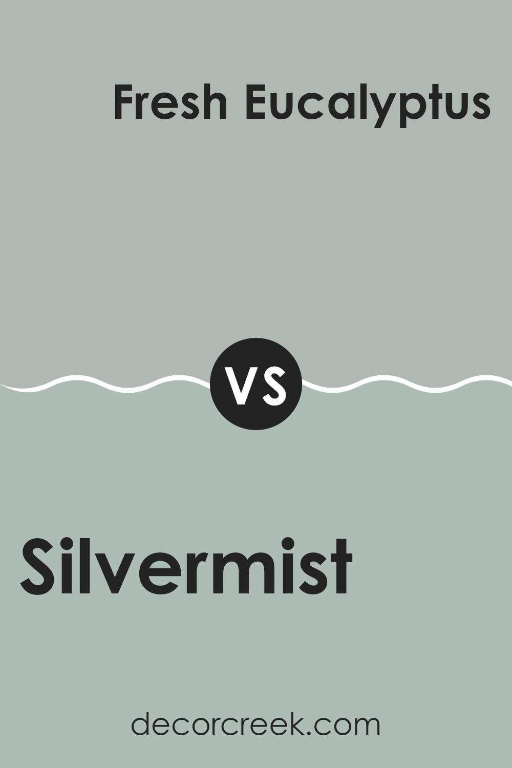
Silvermist SW 7621 by Sherwin Williams vs Fresh Eucalyptus SW 9658 by Sherwin Williams
Silvermist and Fresh Eucalyptus, both by Sherwin Williams, are two distinct shades with unique vibes. Silvermist is a soft, muted gray with a hint of blue. It’s an adaptable color that works well in many rooms, offering a calm and subdued backdrop.
On the other hand, Fresh Eucalyptus is a vibrant, light green that brings a refreshing and lively feel to any room. Its brightness can energize a room, making it feel fresher and more open. While Silvermist pairs well with both modern and traditional decor styles, Fresh Eucalyptus is perfect for rooms where you want to introduce a natural, airy atmosphere.
If you’re considering these colors, think about the mood you want to create: relaxing and understated with Silvermist, or cheerful and inviting with Fresh Eucalyptus. Both colors offer a unique environment, but their impact is quite different depending on what you are looking for in your room.
You can see recommended paint color below:
- SW 9658 Fresh Eucalyptus
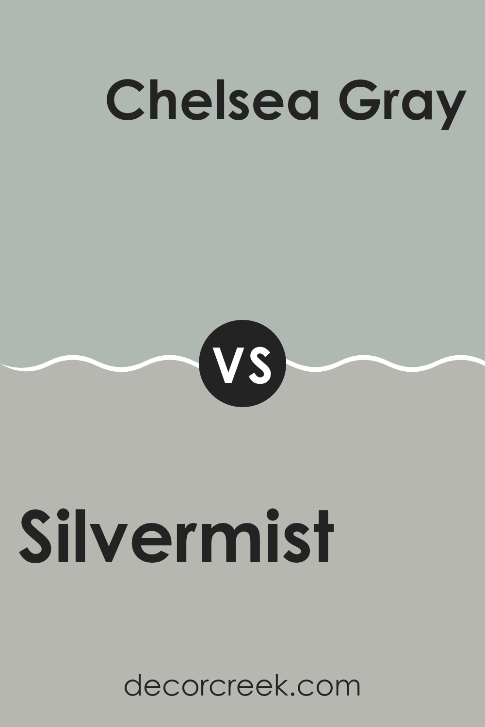
Silvermist SW 7621 by Sherwin Williams vs Chelsea Gray SW 2850 by Sherwin Williams
Silvermist and Chelsea Gray, both from Sherwin Williams, offer distinct vibes for interior rooms. Silvermist is a soft, subtle gray with a hint of green, creating a gentle and refreshing look.
It’s perfect for adding a light, airy feel to any room, making rooms appear larger and more open. On the other hand, Chelsea Gray stands out with its deeper, richer tone. This color is more pronounced, delivering a strong presence which makes it ideal for accent walls or areas where a bolder statement is desired.
While Silvermist works well in rooms that get a lot of natural light, enhancing a fresh, clean aesthetic, Chelsea Gray excels in adding depth and warmth, making it suitable for larger areas or furniture pieces that you want to stand out. Both colors are adaptable but serve different purposes depending on the mood or style you’re aiming for in a room.
You can see recommended paint color below:
- SW 2850 Chelsea Gray
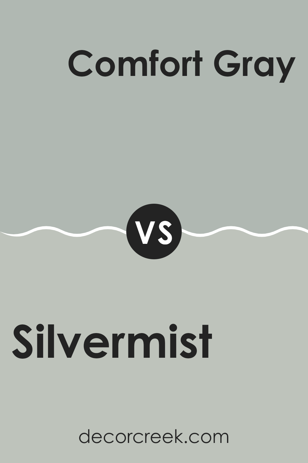
Silvermist SW 7621 by Sherwin Williams vs Comfort Gray SW 6205 by Sherwin Williams
Silvermist and Comfort Gray, both by Sherwin Williams, offer unique shades for any room makeover. Silvermist sits on the cooler end of the spectrum, providing a subtle blend of gray with soft blue undertones, giving it a calm, refreshing feel. It’s light enough to make small rooms appear larger while maintaining a cozy vibe.
Comfort Gray, on the other hand, is a warmer gray that leans towards green, offering a soothing yet cozy atmosphere. This color is adaptable, fitting well in both bright, sunlit rooms and darker, more intimate rooms. It brings a natural, earthy touch to interiors, making it great for those who like a more grounded ambiance.
Though both colors share a gray base, Silvermist offers a cooler, airier feel, whereas Comfort Gray brings warmth and a touch of nature indoors. They could even complement each other in different rooms of a house or in a single room for those who enjoy a mix of cool and warm tones.
You can see recommended paint color below:
Silvermist SW 7621 by Sherwin Williams vs Mineral Deposit SW 7652 by Sherwin Williams
The two colors, Silvermist and Mineral Deposit, both by Sherwin Williams, offer subtle differences within the cool spectrum. Silvermist has a lighter, airier feel, leaning slightly towards a soft green, which makes it a great choice for creating a fresh and gentle atmosphere in a room.
On the other hand, Mineral Deposit presents a stronger gray tone, giving it a more grounded and cooler appearance compared to Silvermist. This characteristic makes Mineral Deposit ideal for rooms where a firmer, more neutral background is desired.
Both colors work well in a variety of settings, offering a cool and calm ambiance, but Silvermist adds a touch of warmth with its green undertones, while Mineral Deposit sticks to a purer gray, possibly providing a more modern look.
You can see recommended paint color below:
- SW 7652 Mineral Deposit
Silvermist SW 7621 by Sherwin Williams vs Magnetic Gray SW 7058 by Sherwin Williams
Silvermist and Magnetic Gray are both popular shades by Sherwin Williams but offer different vibes. Silvermist has a gentle blue-gray tone, giving it a light and airy feel. It’s a cool color that is soft enough to be soothing, making it great for rooms where you want to relax.
On the other hand, Magnetic Gray is a darker gray that leans slightly towards taupe, giving it a warmer appearance. While still neutral, it offers a bit more presence on the walls, creating a cozy and inviting atmosphere.
Both colors work well in a variety of rooms but depending on your decor and the mood you want to create, you might prefer the lighter, fresher touch of Silvermist or the more grounded, comforting feel of Magnetic Gray.
You can see recommended paint color below:
- SW 7058 Magnetic Gray
Silvermist SW 7621 by Sherwin Williams vs Forever Green SW 9653 by Sherwin Williams
Silvermist and Forever Green by Sherwin Williams are quite distinct from each other. Silvermist is a subtle gray with hints of blue, creating a light and airy feel in rooms. This adaptability makes it suitable for modern living rooms or cozy home offices.
In contrast, Forever Green is a deep, vibrant green, offering a bold statement. This color works well in areas where a touch of nature and energy is desirable, like in kitchens or dining rooms.
While Silvermist reflects a gentle, neutral backdrop, Forever Green stands out more and can inject life into a room. Together, these colors could complement each other, with Silvermist providing a soothing balance to the dynamic presence of Forever Green.
You can see recommended paint color below:
- SW 9653 Forever Green
Silvermist SW 7621 by Sherwin Williams vs Eventide SW 9643 by Sherwin Williams
Silvermist by Sherwin Williams is a soft, soothing gray that acts as an adaptable backdrop in any room, providing a calm and inviting atmosphere. It has a subtle hint of green, which gives it a unique touch compared to more traditional grays.
On the other hand, Eventide by Sherwin Williams is a deeper, more intense color. It leans towards a navy tone but maintains enough gray to keep it from feeling too intense. This color is great for creating a cozy, focused feeling in rooms like home offices or reading nooks.
Both colors offer a fresh, clean vibe but address different moods and settings. Silvermist works well in a more open, airy room, while Eventide is ideal for adding a bit of drama and depth to a smaller or more intimate area.
You can see recommended paint color below:
- SW 9643 Eventide
Silvermist SW 7621 by Sherwin Williams vs Mineral SW 9637 by Sherwin Williams
Silvermist and Mineral, both colors from Sherwin Williams, offer unique tones that can influence the mood and style of any room. Silvermist sits on the cooler side of the spectrum with its subtle green undertones, providing a fresh and calming effect.
This color fits well in rooms aimed to have a peaceful, soothing ambiance. On the other hand, Mineral is warmer and leans towards a taupe-like shade, mingling beige and gray in a very gentle blend.
This color works wonderfully in areas where a cozy, welcoming feel is desired, as it pairs nicely with a variety of decor styles and adds a soft, neutral warmth to the walls. While both colors are muted and understated, Silvermist offers a hint of cool freshness, whereas Mineral brings a warm touch.
You can see recommended paint color below:
- SW 9637 Mineral
Silvermist SW 7621 by Sherwin Williams vs Quietude SW 6212 by Sherwin Williams
Silvermist and Quietude are two colors by Sherwin Williams that both bring a calm and soothing feel to any room. Silvermist is a soft gray with a hint of blue, giving it a cool and fresh look.
It’s an adaptable color that works well in many areas of the home, creating a peaceful and relaxing atmosphere. On the other hand, Quietude is more of a muted green with blue undertones. This color is also calming, but it leans towards a natural, earthy vibe, which can make a room feel grounded and cozy.
Both colors are great choices for creating a calm environment, but they offer distinct vibes due to their different undertones. While Silvermist might remind you of a misty morning, Quietude could make you think of a quiet forest. Your choice between them could depend on whether you prefer a more airy or earthy feel in your decor.
You can see recommended paint color below:
- SW 6212 Quietude
Silvermist SW 7621 by Sherwin Williams vs Oyster Bay SW 6206 by Sherwin Williams
Silvermist and Oyster Bay, both by Sherwin Williams, offer distinct shades for different moods and rooms. Silvermist has a soft gray tone with a hint of blue, giving it a cool, calming feel that’s perfect for creating a peaceful environment in places like bedrooms or bathrooms. It’s an adaptable color that works well with modern and traditional decor alike.
Oyster Bay, on the other hand, leans more towards a greenish-blue shade, providing a slightly richer and deeper color that brings a fresh and lively feel to any room. It’s ideal for rooms where you want a bit more energy and vibrancy, like kitchens or living rooms.
Both colors are great for those looking to refresh their home with a subtle yet noticeable change. Silvermist works best for those who prefer a more understated look, while Oyster Bay suits those wanting to add a splash of color without creating an intense feeling. Each color provides a unique atmosphere, allowing you to personalize your home according to your taste and the function of each room.
You can see recommended paint color below:
- SW 6206 Oyster Bay
In wrapping up my thoughts on SW 7621 Silvermist by Sherwin Williams, I have to say I am quite impressed. This paint color is like the perfect background for your room—chill, soft, and super friendly. It has a blend of blue, green, and gray that makes everything in the room look calm, kind of like how you feel when you sit under a big shady tree on a sunny day.
What’s cool is how Silvermist can fit with so many different things in your house. Whether you have plants, bookshelves, or colorful cushions, this color supports them all without stealing the show. It’s like the best sidekick your furniture could ask for—always making the main stuff look better.
I painted my own room with Silvermist, and it feels like I have a new favorite place in the house. It doesn’t shout for attention but softly pulls everything together, making the room feel just right. It’s like magic for your walls, making the vibe of the room calm and cool without any effort.
So, if you’re thinking about giving your room a new look or just want a change, I’d say go for Silvermist by Sherwin Williams. It’s simple, looks amazing, and creates the nicest backdrop for living, playing, and just hanging out.

decorcreek.com
Ever wished paint sampling was as easy as sticking a sticker? Guess what? Now it is! Discover Samplize's unique Peel & Stick samples.
Get paint samples

