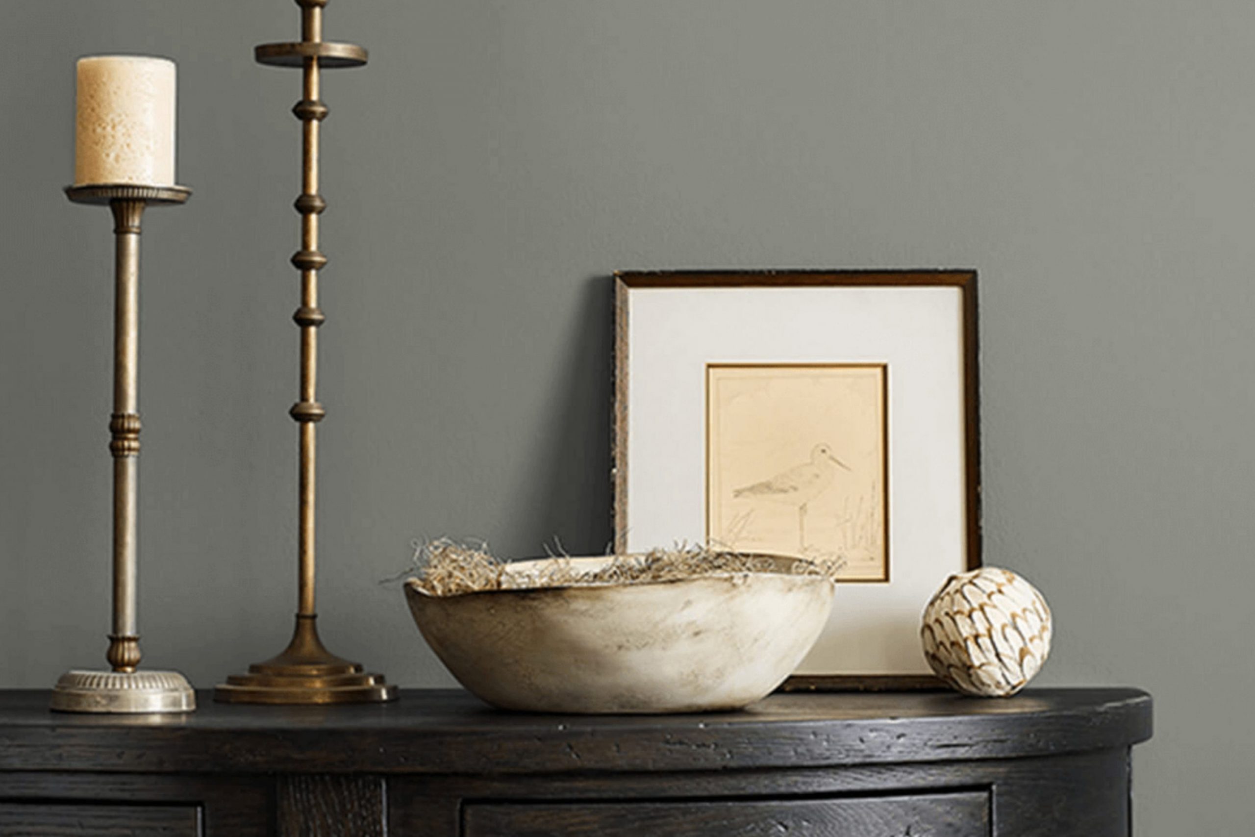
When I think about creating a calming and stylish living space, SW 7060 Attitude Gray by Sherwin Williams often comes to mind. It’s a sophisticated gray with subtle hints of warmth, making it incredibly versatile. Whether you’re planning to update your living room, bedroom, or even home office, Attitude Gray provides a perfect backdrop that complements a range of styles and colors.
The beauty of Attitude Gray lies in its ability to adapt. It works well with both modern and traditional decor, bringing out the best in each piece of furniture or artwork.
Pair it with crisp whites for a clean and contemporary look, or combine it with deeper shades to introduce a more intimate and cozy atmosphere.
What I appreciate most about Attitude Gray is its balance. It’s not too dark or too light, placing it in that sweet spot where it can either be a subtle base or a statement on its own.
It also responds wonderfully to different lighting conditions, offering a soft glow in natural daylight and a warm hug under artificial lighting.
Choosing Attitude Gray is about adding a touch of elegance that’s both timeless and current. It’s about creating a space that feels effortlessly polished yet incredibly welcoming.
What Color Is Attitude Gray SW 7060 by Sherwin Williams?
Attitude Gray by Sherwin Williams is a versatile medium gray color with subtle blue undertones, creating a balanced and modern feel. It is sophisticated without being cold, making it suitable for various interior styles. Its neutral base allows it to work well in contemporary, industrial, and even traditional settings.
In contemporary spaces, Attitude Gray serves as an excellent backdrop for bold artwork and modern furniture. It complements clean lines and minimalist designs. In industrial interiors, it pairs well with raw materials like exposed brick, concrete, and steel, enhancing the urban vibe.
Traditional settings benefit from its calming presence, bringing a touch of modernity while harmonizing with classic furniture and decor.
Materials and textures that pair well with Attitude Gray include natural wood, which adds warmth and contrast. Dark woods like walnut or cherry highlight its cool tones, while lighter woods like oak create an airy, casual atmosphere.
Textured fabrics, such as linen or wool, play nicely with this color, adding depth and interest.
Pairing it with metallic accents, like brushed nickel or matte black, can lend a sleek, polished edge. Whether in walls, cabinetry, or accents, Attitude Gray is a color that beautifully adapts to its surroundings, offering both versatility and style.
Is Attitude Gray SW 7060 by Sherwin Williams Warm or Cool color?
Attitude Gray SW 7060 by Sherwin Williams is a versatile paint color that blends seamlessly in various home settings. This muted gray has a subtle warmth, making it welcoming and approachable. In living rooms, it creates a cozy atmosphere, pairing well with both modern and traditional furniture styles. Its neutral hue allows homeowners to experiment with colorful decor or keep things simple with a monochromatic palette.
In bedrooms, Attitude Gray provides a restful backdrop, promoting relaxation. It matches well with soft whites and pastels, contributing to a calm environment. This color also works in kitchens and bathrooms, where it gives a clean, calm feel without being too stark or cold.
Overall, Attitude Gray is easy to coordinate with other colors and materials, making it a popular choice for those who want a timeless look. Its neutral undertone complements wood, metal, and fabric elements, ensuring it harmonizes within any space.
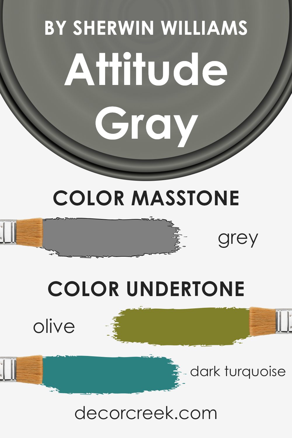
Undertones of Attitude Gray SW 7060 by Sherwin Williams
Attitude Gray by Sherwin Williams is an interesting color with a mix of undertones that can change its appearance based on lighting and surroundings. The undertones include shades like olive, dark turquoise, purple, mint, pale pink, lilac, and several others.
These undertones are subtle colors present in the main color. They influence how the paint looks on walls. For example, in natural sunlight, the olive and mint undertones might make Attitude Gray seem warmer.
In contrast, under artificial lighting, the cool blues, dark turquoise, and lilac undertones might become more noticeable, giving a cooler appearance.
On interior walls, these undertones can make the room feel different at various times of the day. The light green and pale yellow might bring a refreshing feel in the morning, while the deeper colors like dark grey and navy may provide a calming effect in the evening.
The undertones can also affect the color’s compatibility with furniture. A room with dark furniture might emphasize the pale pink and light purple tones, adding a touch of warmth.
Meanwhile, rooms with light-colored decor could highlight the dark blue and dark green undertones, providing a more grounded feel. Understanding these undertones helps in deciding where and how to use Attitude Gray effectively in home interiors.
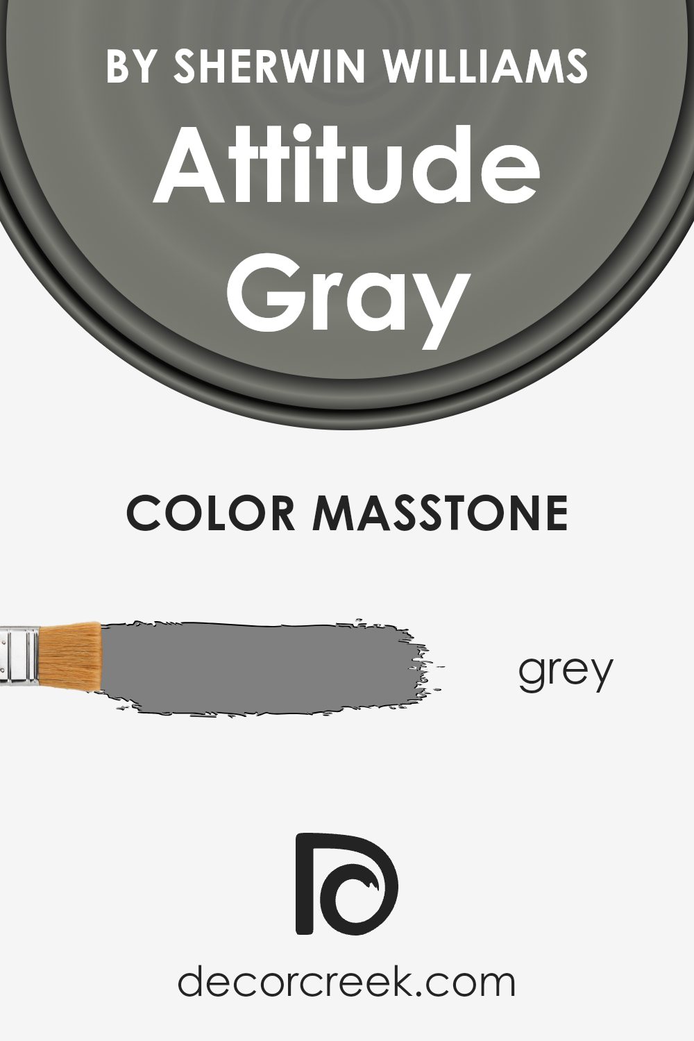
What is the Masstone of the Attitude Gray SW 7060 by Sherwin Williams?
Attitude Gray (SW 7060) by Sherwin Williams is a versatile gray shade with a masstone close to #808080, a true gray. This color plays a unique role in home decor due to its neutral characteristics. Because it doesn’t have strong undertones, it adapts well to different lighting conditions, providing a consistent and calming appearance in various rooms. In homes, Attitude Gray can create a balanced and inviting atmosphere.
This hue is particularly effective in spaces where a modern and clean look is desired, such as living rooms, bedrooms, or offices. It serves as a perfect backdrop for both bold and subtle accent colors, making it a flexible choice for various interior styles.
The straightforward nature of this gray helps other design elements stand out, whether it’s colorful artwork, vibrant furnishings, or textured fabrics. Its simplicity and neutrality provide a timeless framework, allowing homeowners to personalize and update their spaces with ease.
How Does Lighting Affect Attitude Gray SW 7060 by Sherwin Williams?
Lighting plays a crucial role in how we perceive colors. Different light sources can change the appearance of a color, making it look lighter, darker, warmer, or cooler. Natural light varies throughout the day, while artificial lighting can have different color temperatures, influencing the look of a paint color like Attitude Gray (SW 7060) by Sherwin Williams.
In natural light, colors tend to look different depending on the time of day and the direction a room faces. For a north-facing room, which gets cooler and less direct sunlight, Attitude Gray might appear more bluish or cooler in tone.
This is because northern light is soft and indirect, often enhancing cooler hues in gray shades.
South-facing rooms receive more direct and bright sunlight, particularly in the afternoon. Here, Attitude Gray might seem warmer and potentially a bit lighter, as the warm sunlight makes the gray take on a more greige tone. The abundance of sunlight brings out the warmer undertones in the paint.
East-facing rooms get bright morning light, which is cool and refreshing, but the light becomes more muted as the day progresses. Attitude Gray in an east-facing room will look cooler in the morning, and then slightly warmer later in the day as the sun moves away.
West-facing rooms, on the other hand, have a warm, golden light during the late afternoon and evening. This can make Attitude Gray appear warm and rich later in the day. In the morning, when there is less direct sunlight, the color may look cooler and more muted.
Artificial lighting, such as LED or incandescent bulbs, also impacts how the color is perceived. Warmer bulbs (like incandescent) can make Attitude Gray look cozier and more inviting, while cooler LEDs might keep the color looking more neutral or emphasize its cooler undertones. Always sample paint colors in the specific lighting of your space to see how they truly appear.
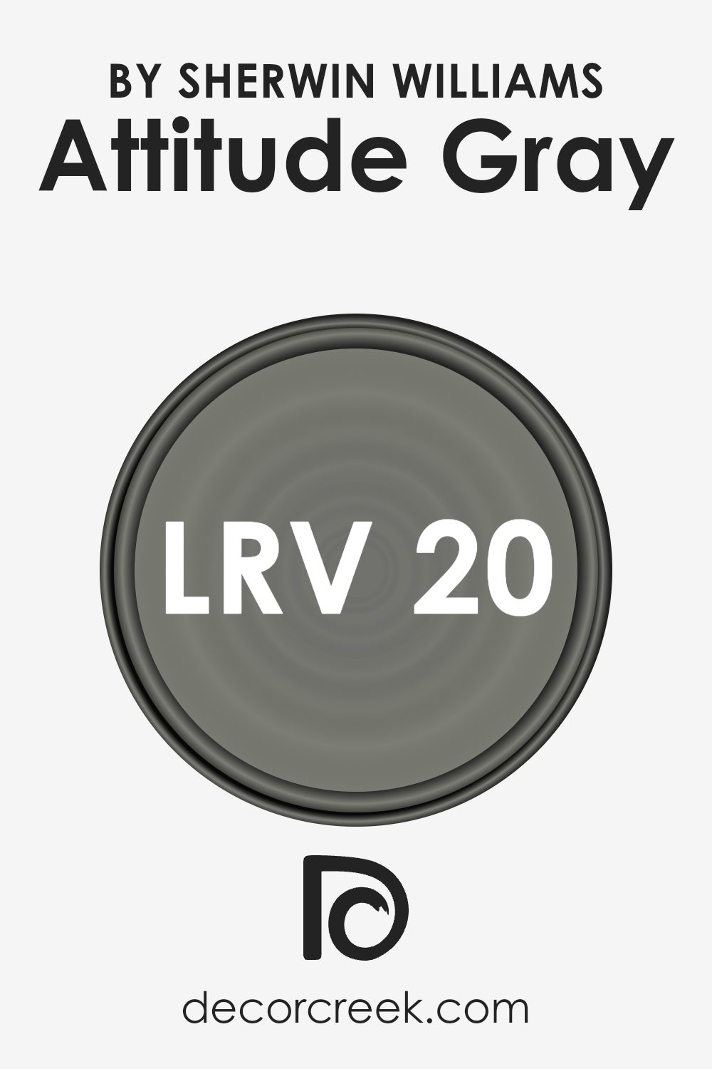
What is the LRV of Attitude Gray SW 7060 by Sherwin Williams?
Light Reflectance Value (LRV) is a measurement used to determine how much light a color reflects. Essentially, it indicates the perceived lightness or darkness of a color when it’s applied to a surface, such as a wall. The LRV scale ranges from 0, which signifies absolute black and absorbs all light, to 100, which represents pure white and reflects all light.
Generally, colors with higher LRV values will make a room feel brighter and more spacious because they reflect more light, while colors with lower LRV values absorb light, making a space feel cozier and more intimate.
For Attitude Gray by Sherwin Williams, which has an LRV of 20.195, this means it is a relatively dark color. This lower LRV value suggests that Attitude Gray will absorb a significant amount of light, making it a suitable choice for creating a cozy or moody atmosphere in a room. In a brightly lit space, the color will appear darker and more subdued, while in a dimly lit area, it may come across as deeper and more enveloping.
It’s important to consider how much natural and artificial light a room gets when choosing this color, as its lower reflectance level will play a significant role in how the space feels overall.
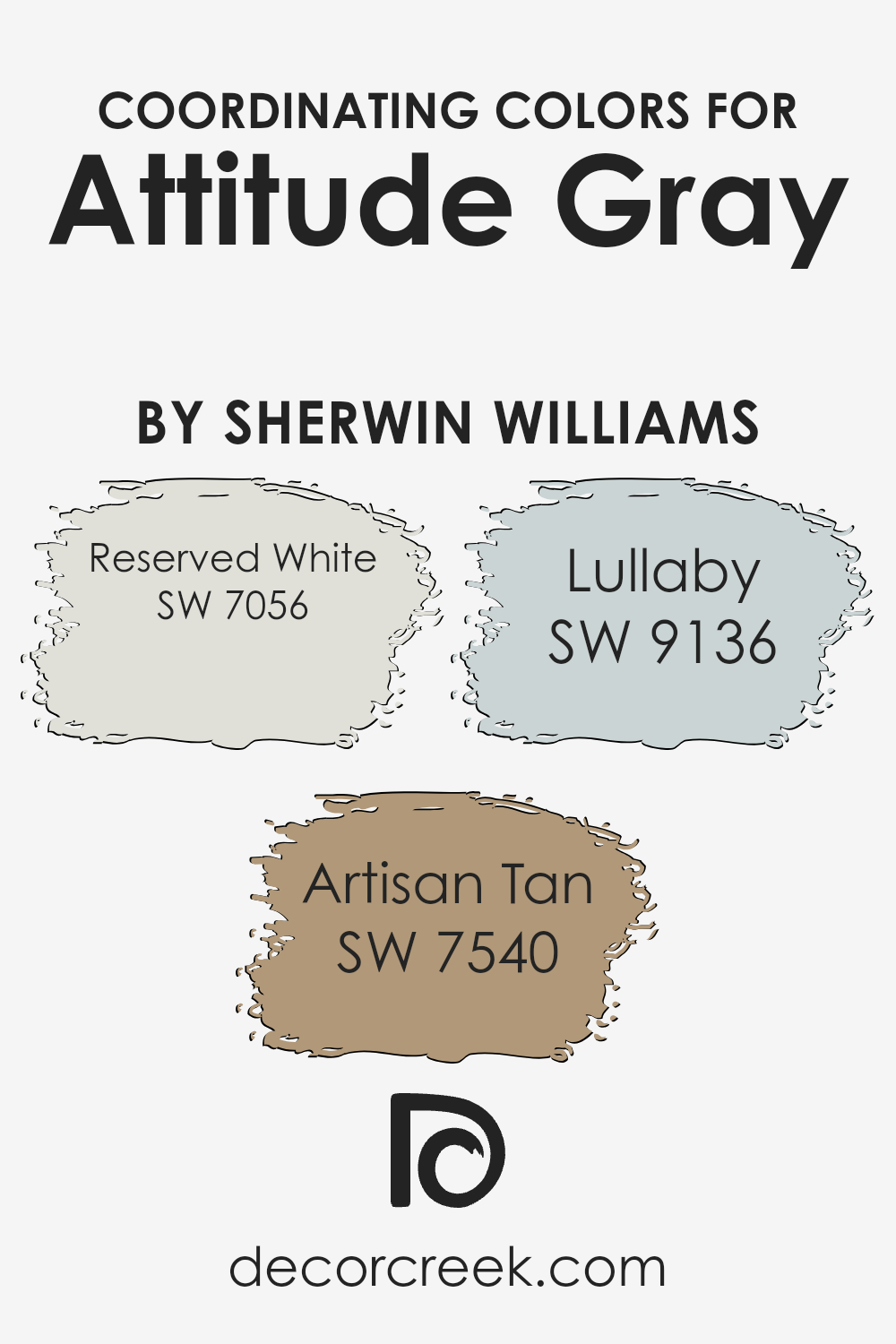
Coordinating Colors of Attitude Gray SW 7060 by Sherwin Williams
Coordinating colors are hues that complement or enhance each other when used together in a space. They work by creating a harmonious look, where each color brings out the best in the others. For example, Attitude Gray by Sherwin Williams is a versatile neutral that can be paired with other colors to create a cohesive design scheme.
Reserved White, Artian Tan, and Lullaby are coordinating colors that work well with Attitude Gray.
Reserved White is a soft, creamy white that brings a sense of purity and brightness to any space, providing a clean backdrop that can make surrounding colors stand out. Artisan Tan, on the other hand, offers a warm and earthy tone, infusing the room with a welcoming and cozy feel that pairs beautifully with the cooler tones of gray.
Lullaby adds a hint of gentle, muted blue-green, introducing a touch of calmness and balance into the space. Together, these colors create an inviting and pleasant environment that feels both cohesive and dynamic without overwhelming the senses.
You can see recommended paint colors below:
- SW 7056 Reserved White
- SW 7540 Artisan Tan
- SW 9136 Lullaby
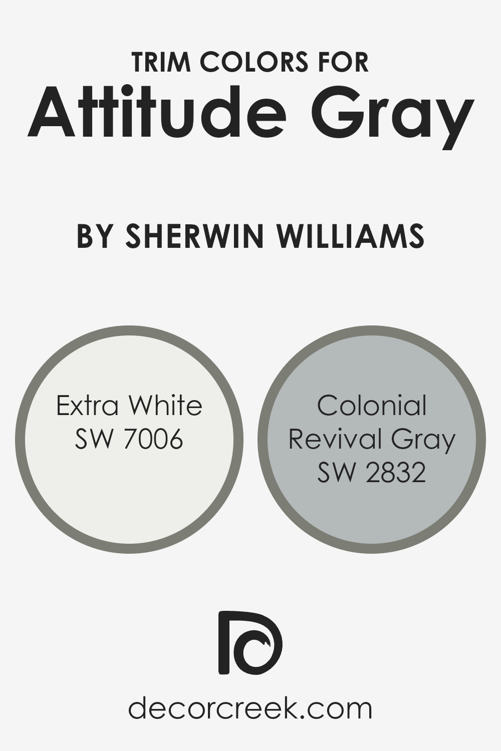
What are the Trim colors of Attitude Gray SW 7060 by Sherwin Williams?
Trim colors are the secondary paint colors used to highlight and define the architectural details of a space, such as moldings, doors, and window frames. They play a crucial role in enhancing the main wall color by providing contrast or complementing the overall aesthetic.
For the wall color Attitude Gray by Sherwin Williams, choosing the right trim color can enhance its elegance and versatility. SW 7006 – Extra White, for instance, is a bright, crisp shade that brings a clean and fresh look to the space.
When used alongside Attitude Gray, Extra White creates a modern vibe, with the lightness of the white highlighting the depth of the gray, making the room feel airy and open.
SW 2832 – Colonial Revival Gray offers a subtler approach when used as a trim color.
With its soft gray tone that carries a hint of warmth, it perfectly complements the mid-tone hue of Attitude Gray. Using Colonial Revival Gray as a trim color adds a sophisticated yet understated look, offering just the right amount of contrast without overshadowing the primary wall color.
This combination can enhance the transition between walls and trim, creating a harmonious and balanced environment that makes the room inviting and cohesive.
Both trim colors highlight the complex beauty of Attitude Gray, offering different stylistic options depending on whether you prefer a classic or contemporary feel.
You can see recommended paint colors below:
- SW 7006 Extra White
- SW 2832 Colonial Revival Gray
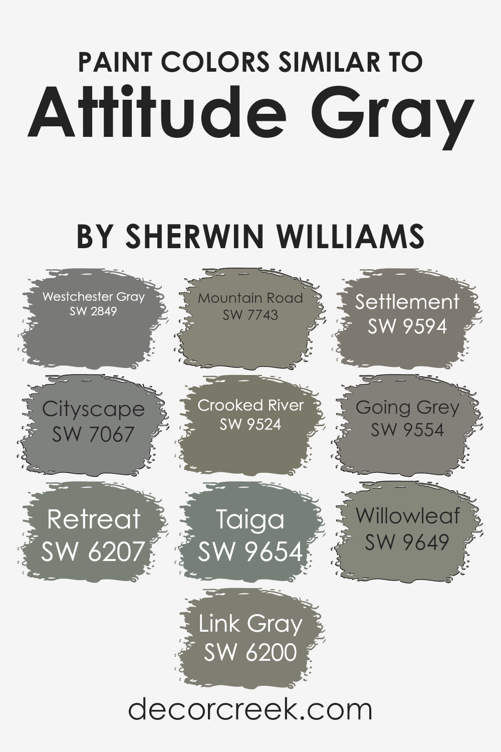
Colors Similar to Attitude Gray SW 7060 by Sherwin Williams
Choosing colors that are similar to one another is important because they create a harmonious and cohesive look. This allows different elements of a space to come together seamlessly, giving the room a pleasant and balanced feel.
Colors like SW 2849 – Westchester Gray and SW 7067 – Cityscape, for example, are subtle and warm, giving any room a sense of calmness while remaining visually interesting. SW 6207 – Retreat brings in a nature-inspired, soft green, adding freshness and depth without drawing too much attention.
Meanwhile, SW 6200 – Link Gray offers a slightly warmer tone, perfect for adding a cozy and comforting atmosphere.
For a touch of earthiness, colors such as SW 7743 – Mountain Road and SW 9524 – Crooked River are wonderful choices.
They ground the palette and make the room feel secure. SW 9654 – Taiga introduces a muted blue-gray, imbuing spaces with a hint of coolness. SW 9594 – Settlement is a versatile neutral hue, working well as a quiet backdrop or in tandem with accent colors.
SW 9554 – Going Grey provides a soft, natural look, great for adding a layer of softness.
Rounding out the collection, SW 9649 – Willowleaf, with its gentle olive undertones, offers a touch of the outdoors while maintaining the overall neutral theme.
You can see recommended paint colors below:
- SW 2849 Westchester Gray
- SW 7067 Cityscape
- SW 6207 Retreat
- SW 6200 Link Gray
- SW 7743 Mountain Road
- SW 9524 Crooked River
- SW 9654 Taiga
- SW 9594 Settlement
- SW 9554 Going Grey
- SW 9649 Willowleaf
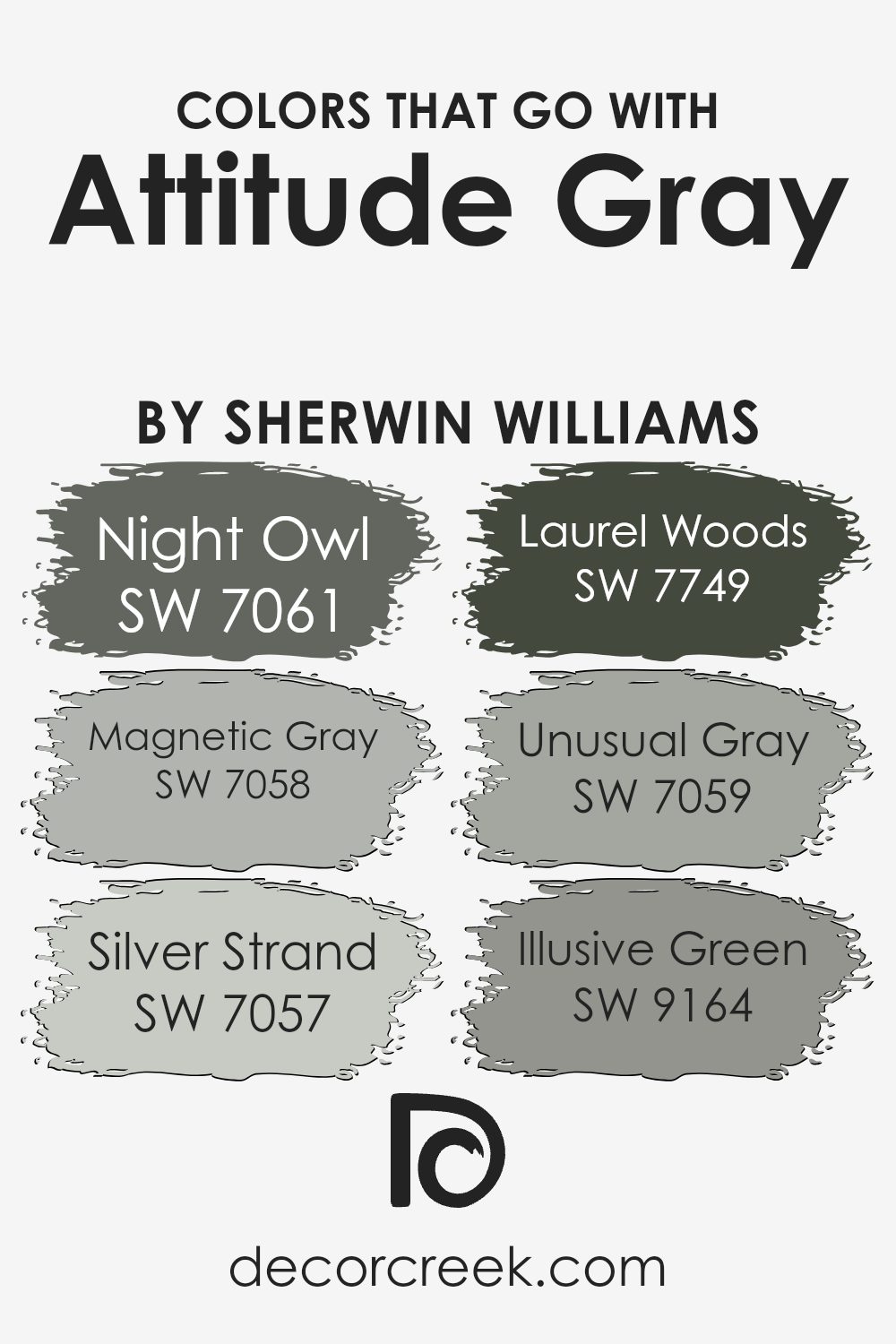
Colors that Go With Attitude Gray SW 7060 by Sherwin Williams
Attitude Gray SW 7060 by Sherwin Williams is a versatile and calming gray that serves as a strong base for a variety of color combinations. This color pairs beautifully with several complementary shades, each bringing its own unique touch to the palette.
Night Owl SW 7061 offers a deeper, richer tone that adds depth and richness, grounding a room with its dark, moody vibe. Magnetic Gray SW 7058 brings a hint of blue, lending a refreshing undertone that keeps the space lively yet balanced.
Silver Strand SW 7057 stands out with its blend of gray and barely-there green, which can brighten a room while maintaining the overall calm feel.
Laurel Woods SW 7749 is a bold, earthy green that infuses warmth and a natural essence, perfect for adding some contrast and visual interest.
Unusual Gray SW 7059 introduces subtle green undertones that can complement the primary gray, bridging the gap between neutral and color. Illusive Green SW 9164, with its soft, muted green presence, wraps up the palette by introducing an understated freshness that pairs seamlessly with Attitude Gray. By combining these colors, one can create spaces that feel balanced, grounded, and inviting, achieving an aesthetic that is both cohesive and dynamic.
You can see recommended paint colors below:
- SW 7061 Night Owl
- SW 7058 Magnetic Gray
- SW 7057 Silver Strand
- SW 7749 Laurel Woods
- SW 7059 Unusual Gray
- SW 9164 Illusive Green
How to Use Attitude Gray SW 7060 by Sherwin Williams In Your Home?
Attitude Gray SW 7060 by Sherwin Williams is a versatile paint color that blends gray and beige tones. It works well in modern and classic homes, making it a popular choice for living rooms, bedrooms, and kitchens. This color brings a sense of calm and comfort without feeling cold or stark. It’s a perfect backdrop for both colorful and neutral decor, allowing your furniture and accessories to stand out.
One way to use this color is by painting the walls of an open-plan living space. It can unify the area while providing a warm, cozy feeling that encourages relaxation and conversation. Pair it with white trim for a crisp, clean look that doesn’t overpower the room.
In a bedroom, Attitude Gray can create a peaceful atmosphere when combined with soft linens and understated lighting. It’s a versatile option that suits a variety of styles and preferences, allowing it to easily fit into any home.
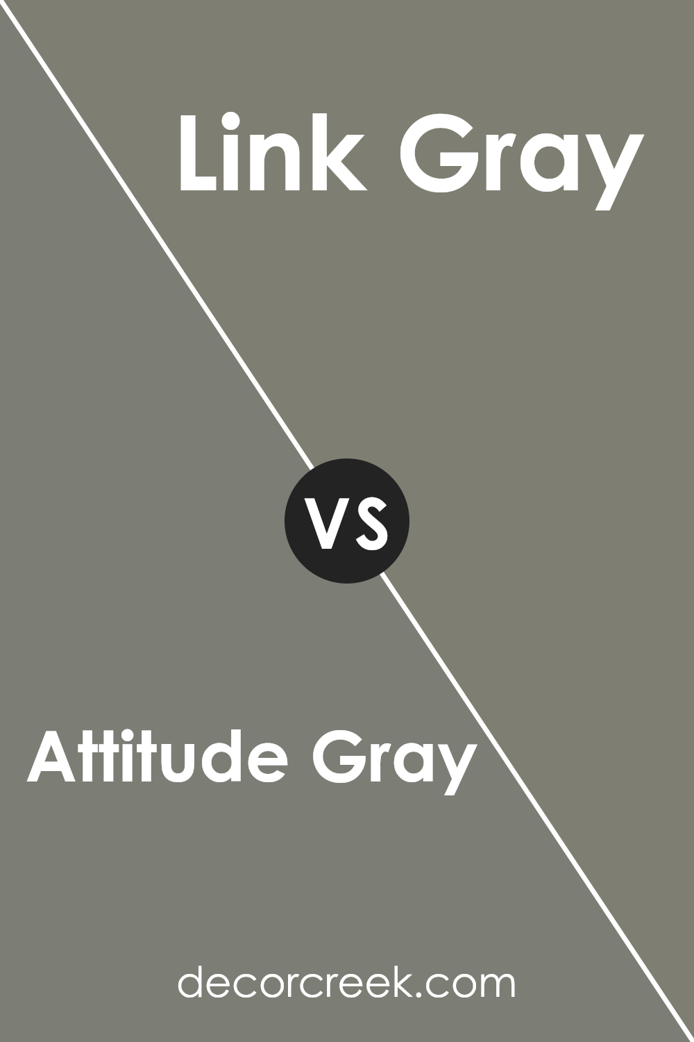
Attitude Gray SW 7060 by Sherwin Williams vs Link Gray SW 6200 by Sherwin Williams
Attitude Gray (SW 7060) and Link Gray (SW 6200) by Sherwin Williams are both versatile shades of gray but have distinct differences. Attitude Gray is a medium-toned gray with subtle green undertones. It creates a balanced and modern feel, making it suitable for living rooms or bedrooms where you want a calming atmosphere.
On the other hand, Link Gray is slightly warmer, leaning more towards a beige-gray. Its earthy, muted tone adds a touch of coziness and comfort, ideal for spaces like dining rooms or kitchens.
While both colors are laid-back, they serve different purposes. Attitude Gray suits contemporary settings with its cool, neutral vibe. Link Gray is perfect for those seeking a warmer, homier feel. Your choice between these two will depend on the mood and look you aim to achieve in your space.
You can see recommended paint color below:
- SW 6200 Link Gray
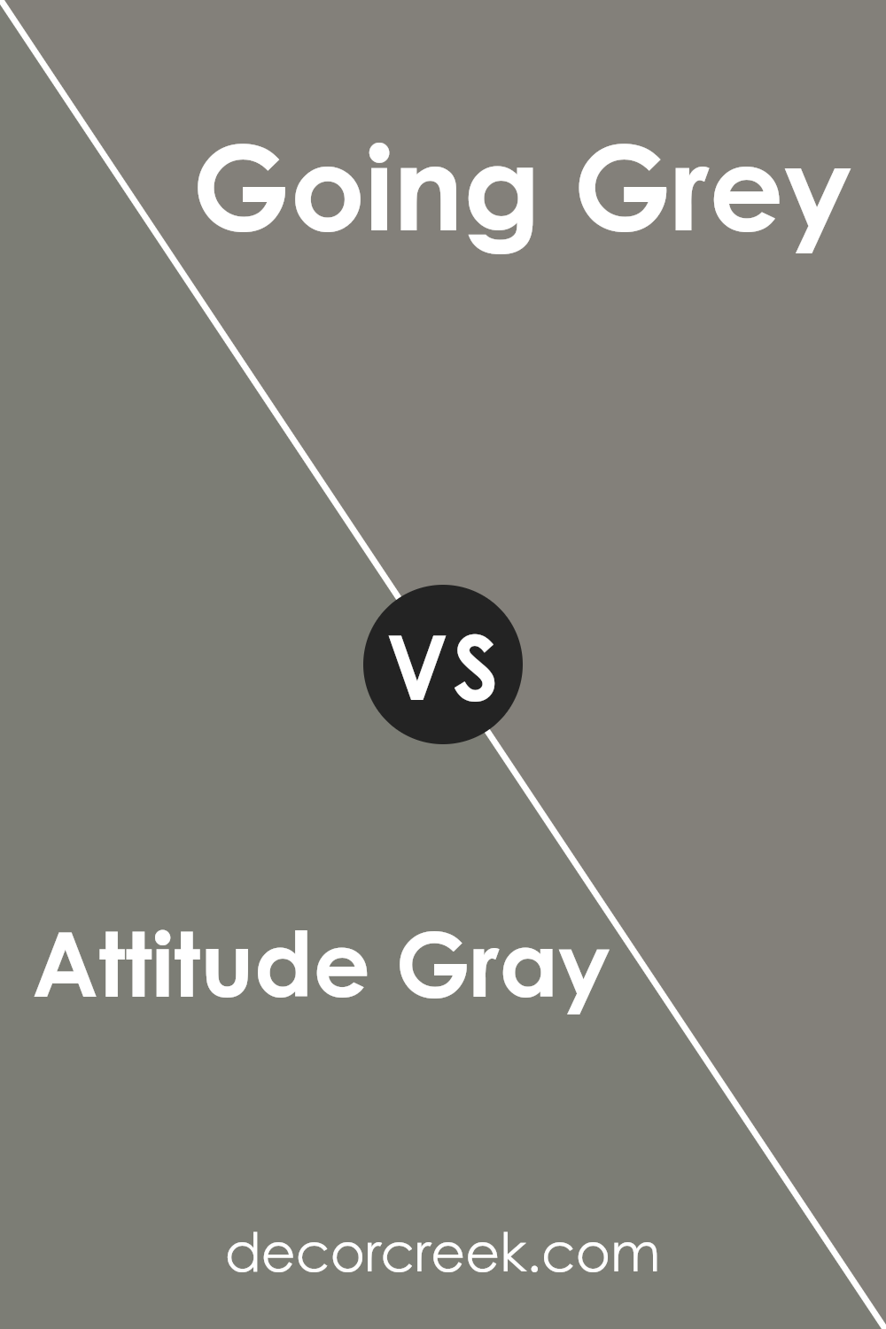
Attitude Gray SW 7060 by Sherwin Williams vs Going Grey SW 9554 by Sherwin Williams
Attitude Gray (SW 7060) and Going Grey (SW 9554) are both colors from Sherwin Williams that offer a sense of calm and neutrality, but they have distinct differences.
Attitude Gray is a medium-toned gray with subtle hints of blue, which gives it a cooler appearance. It’s versatile and works well in modern spaces, balancing well with both bold and muted colors.
On the other hand, Going Grey is a lighter, softer gray that leans more towards a true neutral. It lacks any strong undertone, making it a great choice for spaces where you want a clean and fresh look without influence from other colors.
While Attitude Gray can add more depth due to its blue undertones, Going Grey provides a more straightforward, uncomplicated gray.
Both are excellent choices depending on whether you desire a slight hint of color or a classic, neutral shade.
You can see recommended paint color below:
- SW 9554 Going Grey
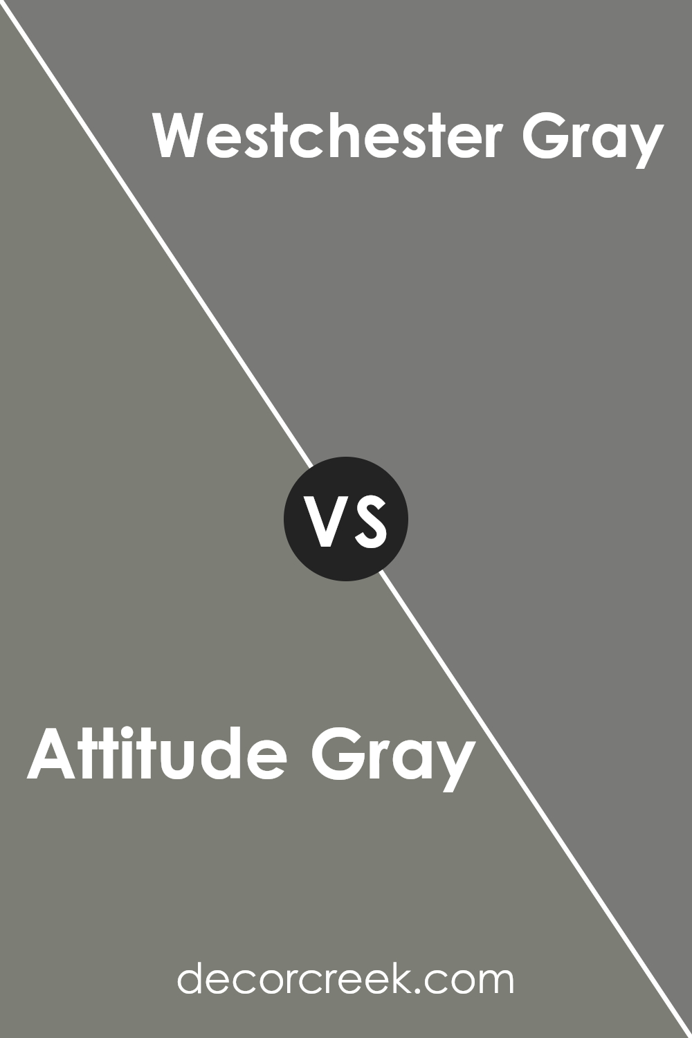
Attitude Gray SW 7060 by Sherwin Williams vs Westchester Gray SW 2849 by Sherwin Williams
Attitude Gray (SW 7060) and Westchester Gray (SW 2849) are two popular paint colors by Sherwin Williams. Both are versatile, but they have distinct characteristics. Attitude Gray is a soft, neutral gray with slight beige undertones, making it a warm hue. It works well in spaces where a gentle backdrop is desired, easily complementing various styles and furnishings.
On the other hand, Westchester Gray is a darker, more classic gray with cooler undertones. It’s a bolder choice that can add depth and richness to a room. This color often suits more formal or traditional spaces, providing a strong contrast to lighter elements in the decor.
While Attitude Gray creates a cozy, subtle environment, Westchester Gray makes a statement with its deeper tone. Both colors are elegant, but your choice will depend on whether you prefer a warm ambiance or a more dramatic, cool atmosphere.
You can see recommended paint color below:
- SW 2849 Westchester Gray
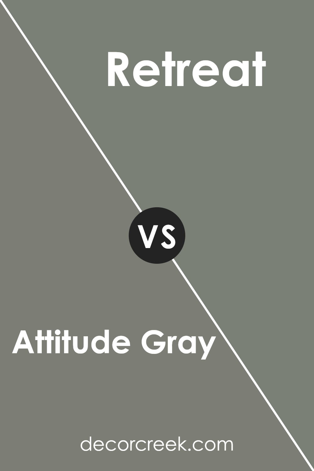
Attitude Gray SW 7060 by Sherwin Williams vs Retreat SW 6207 by Sherwin Williams
Attitude Gray SW 7060 by Sherwin Williams is a versatile gray with a modern touch. It’s a neutral shade that works well in many spaces, giving rooms a calm and balanced atmosphere. It has a subtle warmth, making it feel cozy rather than stark.
On the other hand, Retreat SW 6207 is a muted green that brings a sense of nature indoors. It’s a calming color that provides a soft, relaxing vibe. This shade can be a great choice for creating a peaceful space, like a bedroom or a reading nook.
When comparing the two, Attitude Gray is more neutral and versatile, whereas Retreat adds a touch of color with its gentle green tones. Both colors are soothing, but Retreat leans towards an earthy, natural feel, while Attitude Gray offers a more subdued, classic look. Choosing between them depends on whether you want a neutral backdrop or a hint of nature-inspired color.
You can see recommended paint color below:
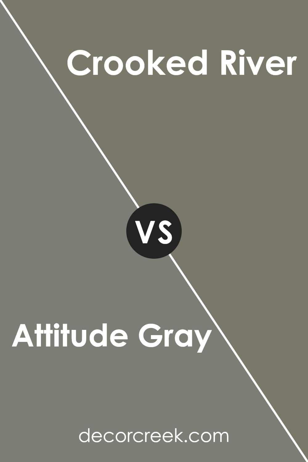
Attitude Gray SW 7060 by Sherwin Williams vs Crooked River SW 9524 by Sherwin Williams
Attitude Gray SW 7060 by Sherwin Williams is a versatile and neutral shade, often described as a cool, muted gray. It tends to complement a wide range of design styles and can create a calm atmosphere in any room. The color’s subtle undertone makes it suitable for both modern and traditional interiors, and it pairs well with both bright and muted accents.
On the other hand, Crooked River SW 9524 is a deeper, more dramatic color. This shade has darker blue-gray tones, which can make a bold statement in a space while still maintaining a sense of sophistication. It works well in areas where you want to create a cozy or intimate setting.
When comparing the two, Attitude Gray offers a more neutral and subdued backdrop, while Crooked River adds depth and richness. Both colors can work beautifully in a home, but the choice depends on whether you prefer a lighter, airy feel or a darker, more intense vibe.
You can see recommended paint color below:
- SW 9524 Crooked River
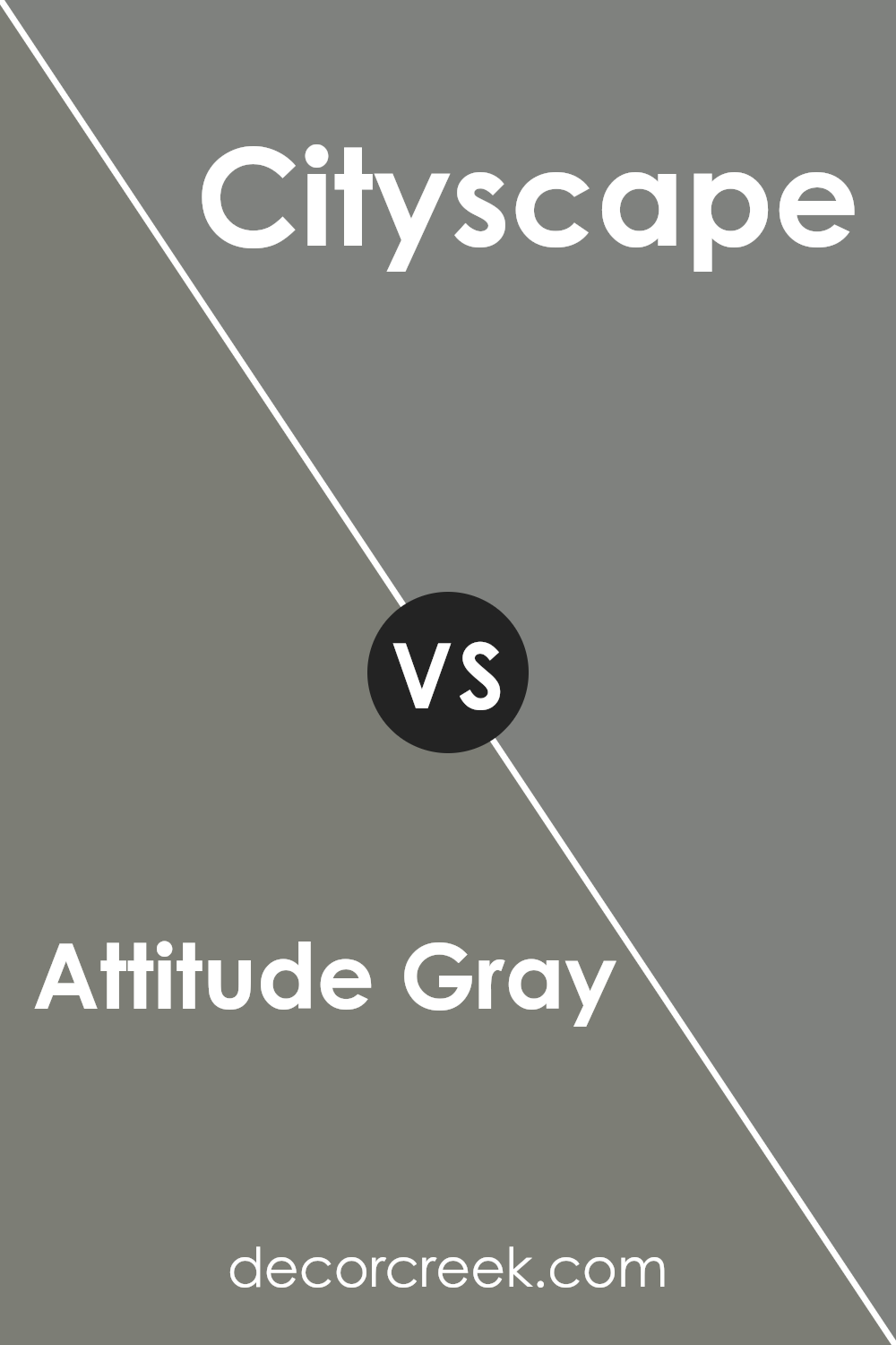
Attitude Gray SW 7060 by Sherwin Williams vs Cityscape SW 7067 by Sherwin Williams
Attitude Gray SW 7060 and Cityscape SW 7067 by Sherwin Williams are both popular neutral colors, but they each bring a different feel to a space. Attitude Gray is a soft, mid-tone gray with subtle green undertones. It adds a calm and gentle backdrop, making it versatile for many settings. This color works well in living areas, bedrooms, or offices where a peaceful environment is desired.
In contrast, Cityscape is a darker, deeper gray with hints of warmth. It creates a more dramatic and bold effect compared to Attitude Gray. Cityscape is often used for accent walls or exterior paint to add depth and character. It pairs well with lighter colors to create a striking contrast.
While both colors are part of the same family, Attitude Gray is lighter and softer, making it suitable for spaces where lightness is preferred. Cityscape, being darker, can add intensity and make a statement.
You can see recommended paint color below:
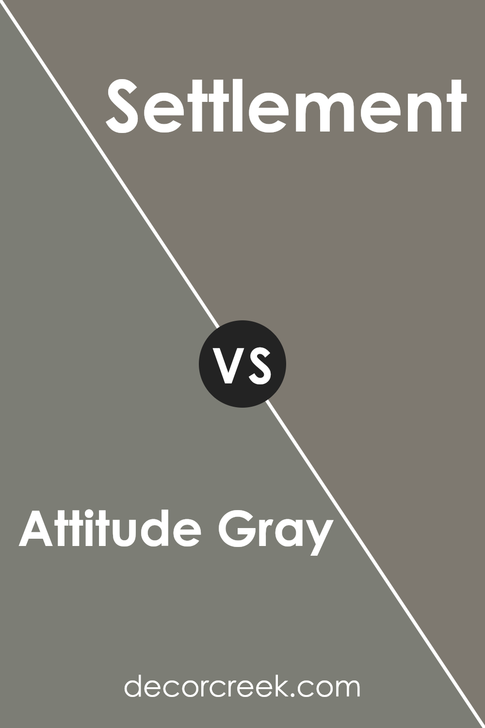
Attitude Gray SW 7060 by Sherwin Williams vs Settlement SW 9594 by Sherwin Williams
Attitude Gray SW 7060 and Settlement SW 9594 are both colors by Sherwin Williams, but they offer different vibes. Attitude Gray is a soft, neutral gray with a subtle hint of warmth, making it versatile for many spaces. It works well when you want a calming and balanced backdrop that isn’t too cold or stark. This gray is suitable for living rooms, bedrooms, or even offices, providing a modern yet comfortable feel.
In contrast, Settlement is a warmer, earthy color with taupe undertones. It brings a cozy and inviting atmosphere, making it ideal for spaces like bedrooms or reading nooks. This color gives a more grounded and organic impression compared to the more refined nature of Attitude Gray.
While Attitude Gray offers a contemporary and neutral look, Settlement provides a warm and earthy feel. Choosing between the two depends on whether you prefer a calming gray or a cozy taupe setting.
You can see recommended paint color below:
- SW 9594 Settlement
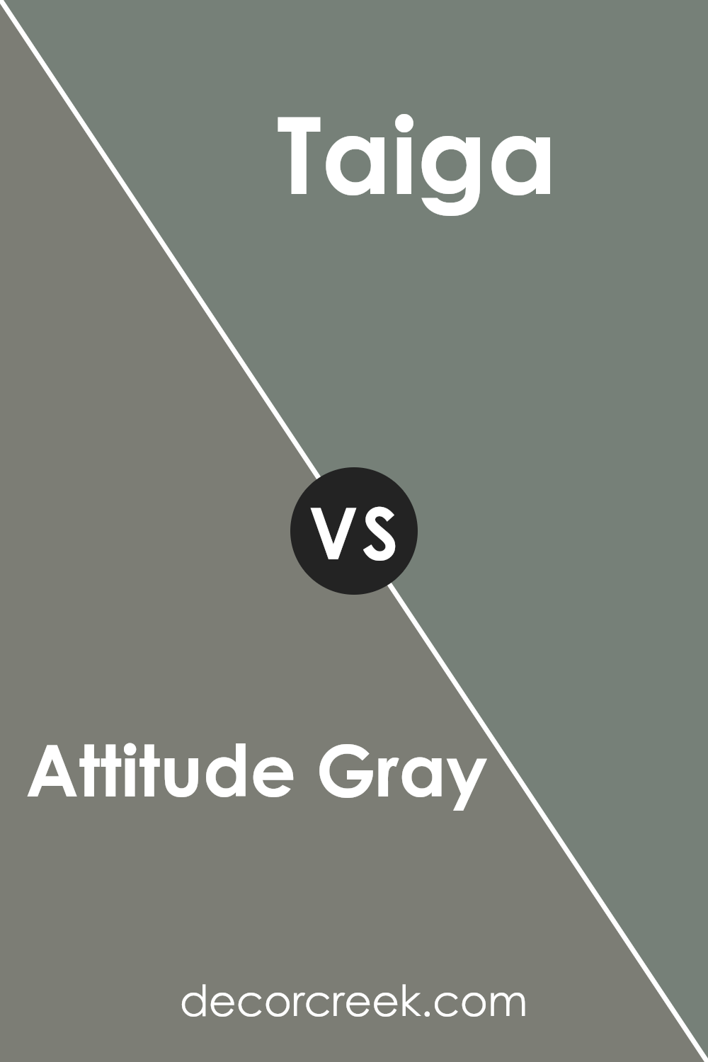
Attitude Gray SW 7060 by Sherwin Williams vs Taiga SW 9654 by Sherwin Williams
Attitude Gray SW 7060 by Sherwin Williams is a versatile gray with subtle undertones that can shift between warm and cool depending on the lighting. This makes it a great neutral choice that pairs well with many colors and styles. It provides a balanced, calm backdrop that’s neither too stark nor too warm.
On the other hand, Taiga SW 9654 offers a subtle greenish tint, reminiscent of a misty forest. This color has an earthy, natural feel that brings a bit of nature indoors. While Attitude Gray works seamlessly with modern and minimal spaces, Taiga can add a touch of vitality and freshness to a room.
When paired together, Attitude Gray can serve as the main canvas, allowing the unique green nuances of Taiga to pop as accents, whether in trim work, furniture, or decorative pieces. Both colors offer a soothing environment, with Attitude Gray providing neutrality and Taiga infusing a gentle hint of nature.
You can see recommended paint color below:
- SW 9654 Taiga
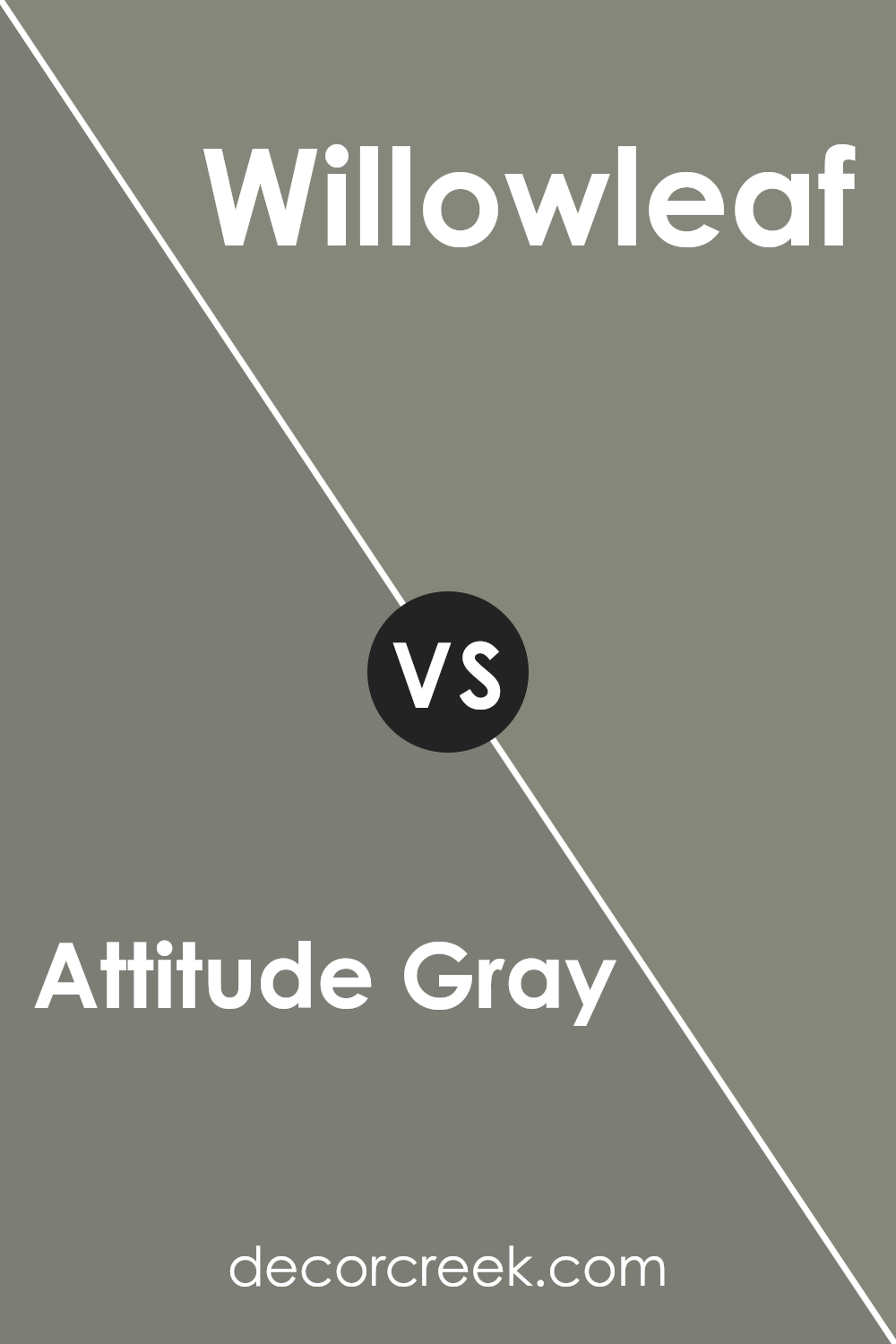
Attitude Gray SW 7060 by Sherwin Williams vs Willowleaf SW 9649 by Sherwin Williams
Attitude Gray SW 7060 by Sherwin Williams is a neutral gray color that offers a balanced blend of warmth and coolness. It’s a versatile shade that works well in many settings, providing a calm backdrop without overpowering other design elements. The color is understated, making it a solid choice for those who enjoy a subtle and classic look.
In contrast, Willowleaf SW 9649 from Sherwin Williams is a soft green with earthy undertones. This color brings a touch of nature indoors, offering a fresh and subtle brightness to a room. It conjures images of leaves and outdoor scenery.
While calming, Willowleaf adds a gentle pop of color that can create a more lively atmosphere than a typical neutral shade.
When comparing the two, Attitude Gray is more subdued and versatile, whereas Willowleaf introduces a hint of color with its natural green tones, making it ideal for those looking to bring a bit of nature into their space.
You can see recommended paint color below:
- SW 9649 Willowleaf
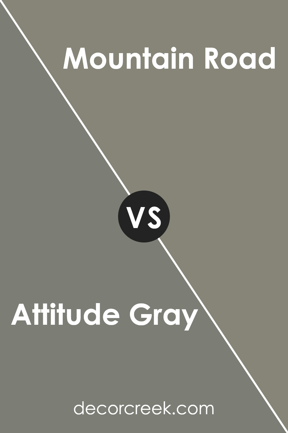
Attitude Gray SW 7060 by Sherwin Williams vs Mountain Road SW 7743 by Sherwin Williams
Attitude Gray (SW 7060) by Sherwin Williams and Mountain Road (SW 7743) by Sherwin Williams are both popular paint colors, but they offer different vibes for spaces. Attitude Gray is a soft, cool-toned gray with subtle blue undertones. It feels modern and clean, making it a versatile choice for any room. It works well with both bold and muted colors, adding a calm background without being dull.
On the other hand, Mountain Road is a warm, earthy brown with green undertones. It brings a natural, cozy feel to a space, often used in living rooms or any area where a comforting atmosphere is desired. It pairs well with other earth tones and warm, natural materials like wood.
While Attitude Gray is cool and contemporary, Mountain Road offers a warm, grounded feel. Choosing between them depends on the effect you want in your space: sleek and modern, or cozy and inviting.
You can see recommended paint color below:
Conclusion
After reading all about SW 7060 Attitude Gray by Sherwin Williams, I think this color is pretty cool. It reminds me of a soft, calm day when everything feels just right. This shade of gray can fit almost anywhere you put it, like bedrooms, living rooms, or even kitchens.
It’s like having a fresh slate that makes other colors pop. If you have bright pillows or colorful art, this gray helps them stand out more.
What’s neat about Attitude Gray is how it works with light. If there’s lots of sunshine, it looks a bit different than if it’s in a dim room, but it always looks nice. It’s a great color for people who like things that don’t change too much and want something that’ll look good for a long time.
I think if you’re looking for a color that stays cool and calm, but not too plain, Attitude Gray is a good choice. It’s like wearing your favorite comfortable clothes that look good on any day. So, whether you’re picking colors for one room or more, this gray is definitely worth thinking about.
Ever wished paint sampling was as easy as sticking a sticker? Guess what? Now it is! Discover Samplize's unique Peel & Stick samples.
Get paint samples

