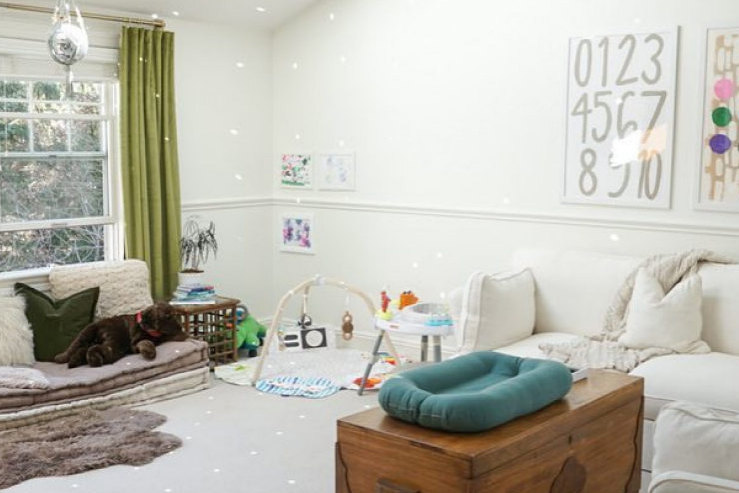
If you’re thinking about giving your space a fresh, clean look, you might want to consider using SW 7056 Reserved White by Sherwin Williams. I find this paint color to be a versatile choice that can lighten up any room without overwhelming it. It has a subtle warm tone that makes it ideal not just as a backdrop but also as a main color scheme for those who appreciate minimalistic and airy interiors.
I’ve noticed that Reserved White works beautifully in spaces that get a lot of natural light, enhancing the room’s brightness. On cloudy days, this shade keeps the space feeling warm and inviting.
It’s also fantastic for creating a seamless look throughout your home, whether for walls, trim, or even cabinetry.
Moreover, pairing it with bold colors or soft neutrals can dramatically change the mood and style of a room.
Whether you’re into modern, traditional, or eclectic styles, Reserved White can adapt and support various décor choices. It’s a great foundation for letting your personality shine through in the home.
So, you might want to consider this shade if you’re planning a redecoration or just a simple refresh. It could be just what your home needs to feel new again.
What Color Is Reserved White SW 7056 by Sherwin Williams?
Reserved White by Sherwin Williams is a versatile and soothing paint color that can brighten up any space while maintaining a subtle, refined appeal. This shade is a soft, neutral white with just a hint of warmth, making it an excellent choice for creating a cozy yet light atmosphere in a variety of interior styles.
It’s particularly effective in modern and minimalist decor but also fits well in traditional and rustic settings due to its clean and welcoming demeanor.
In terms of pairing, Reserved White works exceptionally well with natural materials such as wood and stone, which help bring out its warm undertones. Whether it’s a dark walnut hardwood floor or a cool marble countertop, this color provides a beautiful backdrop that enhances these textures without overpowering them.
It also pairs nicely with soft textiles like linen or cotton, adding a layer of comfort to spaces like living rooms and bedrooms.
The beauty of Reserved White lies in its ability to act as a blank canvas. This color is subtle enough to allow other elements in a room to stand out, yet it possesses its unique charm that contributes to a largely cozy and inviting atmosphere. It’s ideal for walls, trim, and even ceilings, providing a seamless look throughout the home.
Is Reserved White SW 7056 by Sherwin Williams Warm or Cool color?
Reserved White SW 7056 from Sherwin Williams is a popular paint choice for those looking to create a clean and inviting atmosphere in their homes. This particular shade of white is warm and soft, making it ideal for just about any room. Unlike stark whites, Reserved White adds a subtle hint of coziness, which can make spaces feel more comfortable and welcoming.
This is great for living rooms or bedrooms where a gentle and calming vibe is desired.
Since it is not overly bright, this color can also help make small rooms appear slightly larger and more open without feeling too cold or clinical. It pairs well with various decor styles and colors, offering flexibility in interior design options. Whether combined with bold colors or used as a backdrop for a more muted palette, Reserved White can fit effortlessly into numerous home aesthetics.
This adaptability and the warmth it brings make it a trusted choice for many homeowners.
Undertones of Reserved White SW 7056 by Sherwin Williams
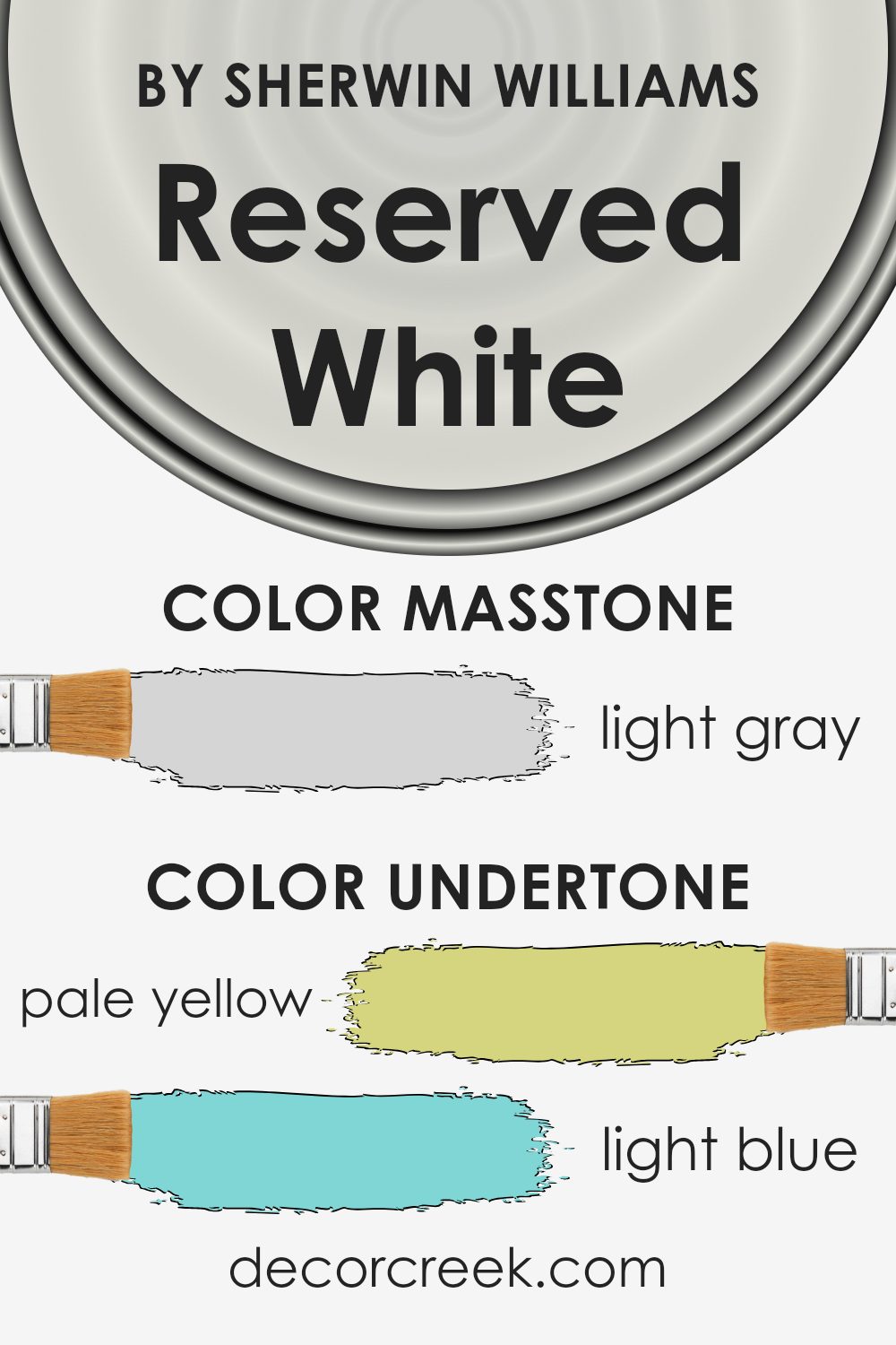
Reserved White by Sherwin Williams is a versatile paint color that subtly incorporates a range of undertones. Understanding the undertones in a color can greatly affect how we perceive it because they subtly influence the main hue. In the case of Reserved White, the undertones are pale yellow, light blue, light purple, mint, pale pink, lilac, and grey.
Each of these undertones can bring a different feel and look when the paint is applied to interior walls.
When light hits Reserved White, these undertones can become more apparent and change the overall appearance of the color. For example, in a room with ample natural light, the pale yellow undertone might give a slightly warmer feel, making the room feel cozy and inviting.
In contrast, in a space with less natural light or during different times of day, the grey undertone might become more dominant, giving the walls a more neutral and subdued look.
Furthermore, adjacent colors in a room, like furnishings and decor, can also interact with these undertones, enhancing or muting them. For instance, blue or purple decorations might highlight the light blue or lilac undertones, respectively, creating a gentle and harmonious aesthetic.
Overall, the variety of undertones in Reserved White makes it a flexible choice that adapts well to different settings and styles.
This adaptability can either make the walls a subtle backdrop or subtly influence the mood and character of a space depending on the lighting and surrounding elements.
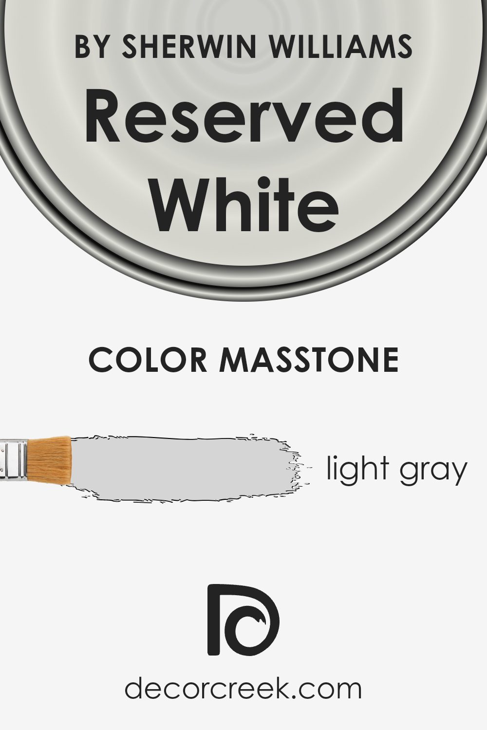
What is the Masstone of the Reserved White SW 7056 by Sherwin Williams?
Reserved White (SW 7056) by Sherwin Williams has a masstone of light gray, a neutral color that offers a clean and simple backdrop for any room in a home. This gray’s subtle tone makes it extremely versatile and easy to pair with a variety of accent colors, furniture, and flooring.
Because of its softness, it can make small spaces seem larger and brighter, while in well-lit rooms, it adds a crisp freshness. This particular shade of gray does not dominate but rather supports other colors, allowing your chosen decor accents to stand out.
In addition, its neutrality creates a calming atmosphere, making it an excellent choice for bedrooms and living areas where relaxation is key. Its ability to blend seamlessly into various styles and settings also makes it a practical choice for both modern and traditional homes.
How Does Lighting Affect Reserved White SW 7056 by Sherwin Williams?
Lighting plays a crucial role in how colors appear in any space. Whether in artificial or natural light, the color can change in intensity and hue. Let’s consider the color Reserved White SW 7056 by Sherwin Williams and how it behaves under different lighting conditions.
Reserved White is a calm and neutral white, which makes it versatile for various settings. Under artificial light, such as incandescent or warm LED lights, this color tends to appear warmer, bringing a cozy and inviting feel to the room.
In the glow of cooler LED lighting, however, Reserved White looks more crisp and clean, which is great for spaces that aim for a fresh, modern look.
Natural light exposes Reserved White to more dynamic changes throughout the day, influenced by the direction of the room’s windows. In north-facing rooms, light is cooler and more consistent throughout the day. Here, Reserved White may seem slightly more shadowy and muted, making the room feel cool and calm.
In contrast, south-facing rooms receive the most intense, warm light, especially in the middle of the day, making Reserved White appear brighter and more vibrant.
For rooms with east-facing windows, the morning light is warm and bright, making Reserved White look very lively and refreshing in the morning, gradually transitioning to a softer tone by the afternoon. Conversely, in west-facing rooms, the color will have a softer tone during the morning, and as the sun sets, it catches those intense, warm rays, which can make the walls glow warmly in the late afternoon.
Overall, Reserved White is a flexible color that adapts subtly to different lighting conditions, maintaining its neutral charm but shifting in warmth and coolness depending on the lighting source and room orientation.
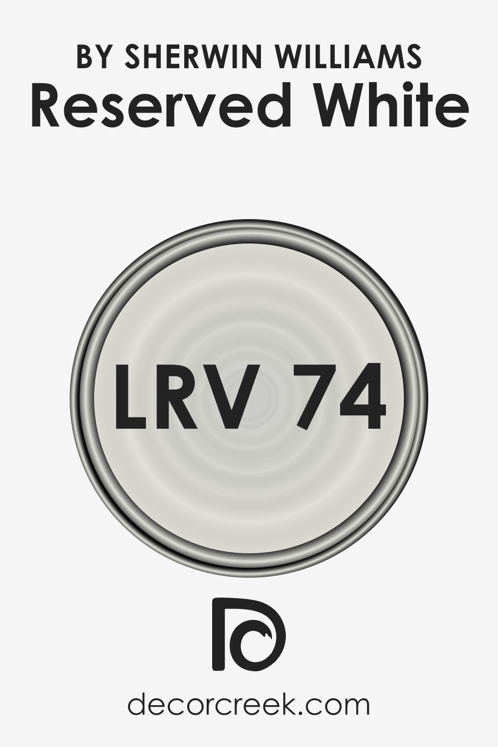
What is the LRV of Reserved White SW 7056 by Sherwin Williams?
LRV, or Light Reflectance Value, is a measure used to indicate how much light a paint color reflects or absorbs when it’s applied to a wall. It’s calculated on a scale where black is at one extreme, absorbing most light, and white at the other, reflecting most light.
This value helps determine how light or dark a color will appear once it’s on your walls. Brighter colors with higher LRVs make rooms feel more open and airy because they reflect more light, while darker colors create a cozier feel by absorbing more light.
Reserved White by Sherwin Williams, which has an LRV of 74.078, is quite a bright color, leaning more towards the reflective end of the scale. This means it’s capable of making a space feel more luminous and expansive by bouncing back a large percentage of the light that hits it.
This particular shade of white is a great choice for spaces that need a boost in brightness or for smaller rooms that you want to appear larger. The high LRV also means that it can help in reducing the amount of artificial lighting needed, making it a practical choice for energy efficiency.
Coordinating Colors of Reserved White SW 7056 by Sherwin Williams
Coordinating colors are shades that complement a primary color, enhancing the overall aesthetic of a space. When you select a primary color, like a soft neutral such as Reserved White from Sherwin Williams, you can pair it with coordinating colors to create a harmonious look.
These coordinating colors work because they share similar undertones or because they provide a pleasing contrast without clashing.
For example, Pure White (SW 7005) is one of the coordinating colors that works well with Reserved White. It’s a clean and crisp white that can help bring a fresh brightness to a room, making it feel more open and airy. Another coordinating color, Wall Street (SW 7665), is a deep, bold gray that adds a striking contrast, perfect for accent walls or furniture to add depth and interest to an interior.
Lastly, Gray Clouds (SW 7658) offers a softer approach with its mid-tone gray, providing a subtle contrast that’s perfect for creating a gentle and relaxed atmosphere in areas like bedrooms or living rooms.
Together, these colors create a palette that allows for versatility and a range of visual dynamics within your space.
You can see recommended paint colors below:
- SW 7005 Pure White
- SW 7665 Wall Street
- SW 7658 Gray Clouds

What are the Trim colors of Reserved White SW 7056 by Sherwin Williams?
Trim colors are essentially the accent colors used for elements such as doors, window frames, and moldings in a home. Choosing the right trim color can really highlight and complement the primary wall color, enhancing the overall aesthetic appeal of a space.
For a neutral shade like Reserved White from Sherwin Williams, using contrasting or complementing trim colors can add subtle visual interest without overwhelming the senses. Trim colors can help define the architectural details of a room and create a finished, polished look.
Alabaster (SW 7008) by Sherwin Williams is a warm, soft white that brings a gentle contrast to the cooler tones of Reserved White, providing a harmonious look that keeps spaces bright and airy. White Snow (SW 9541), on the other hand, is a brighter, crisper white that creates a sharper contrast, which can make the architectural features in a room stand out more distinctly. Both options can enhance the overall impression of a space, offering flexibility according to different tastes and styles.
You can see recommended paint colors below:
- SW 7008 Alabaster
- SW 9541 White Snow

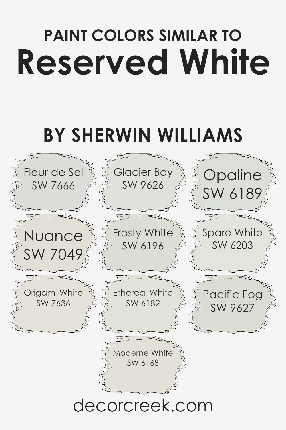
Colors Similar to Reserved White SW 7056 by Sherwin Williams
Similar colors, like those akin to Reserved White by Sherwin Williams, play a crucial role in creating harmonious and visually appealing spaces. When colors are closely related on the color spectrum, they blend smoothly with each other, providing a soothing and cohesive look.
This subtlety in variation can add depth and complexity to a design without overwhelming the senses, making it ideal for those seeking a refined yet understated aesthetic.
For instance, Fleur de Sel is a gentle hue that whispers a hint of gray, making it versatile for tranquil settings. Nuance, as the name suggests, provides a soft touch of greige that works beautifully in spaces that demand a neutral backdrop with a hint of warmth.
Origami White brings a crisp clarity, offering a slightly more defined shade of white that stands out in well-lit areas. Moderne White leans towards a warm spectrum, adding coziness to its surrounding space.
Glacier Bay has an airy feel with its almost ethereal glow, ideal for creating a refreshing vibe. Frosty White is cool and clean, lending itself well to a modern look that seeks simplicity. Ethereal White, true to its name, floats between the line of white and a very light gray, perfect for an understated elegance.
Opaline has a faint touch of green, gently enriching spaces with its unique character. Spare White is minimalistic and subdued, great for those who appreciate a muted palette. Lastly, Pacific Fog offers a deeper gray undertone, providing a stronger statement while still maintaining close relationship with its family of whites.
These subtle variations allow for flexibility and continuity in home design, promoting a seamless aesthetic flow throughout different rooms.
You can see recommended paint colors below:
- SW 7666 Fleur de Sel
- SW 7049 Nuance
- SW 7636 Origami White
- SW 6168 Moderne White
- SW 9626 Glacier Bay
- SW 6196 Frosty White
- SW 6182 Ethereal White
- SW 6189 Opaline
- SW 6203 Spare White
- SW 9627 Pacific Fog
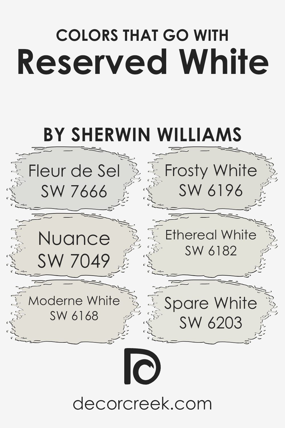
Colors that Go With Reserved White SW 7056 by Sherwin Williams
Choosing the right colors to complement Reserved White SW 7056 by Sherwin Williams is crucial for achieving a harmonious and appealing aesthetic in any space. Reserved White itself is a clean and versatile color that provides a subtle backdrop, making it important to pair it with shades that enhance its quiet elegance.
Colors like Fleur de Sel, Nuance, Moderne White, Frosty White, Ethereal White, and Spare White work perfectly in this regard as they share a soothing neutral palette that smoothly integrates with Reserved White, ensuring a cohesive look.
Fleur de Sel SW 7666 is a soft, delicate gray with a hint of warmth that brings a gentle depth to rooms without overwhelming the senses, making it an excellent choice for a relaxed environment. Nuance SW 7049 is a bit deeper, offering a slight taupe undertone that enriches spaces with a touch of warmth, ideal for creating a cozy feeling in living areas and bedrooms.
Moderne White SW 6168 leans towards a muted beige, providing a neutral ground that works well in various lighting conditions. Frosty White SW 6196 offers a brighter, crisper feel which can help in making smaller spaces appear bigger and more open.
Ethereal White SW 6182 includes a hint of soft gray, perfect for those looking to add a sleek, modern twist to their interiors. Lastly, Spare White SW 6203 is the coolest of the bunch, offering a clean, almost icy feel, perfect for complementing contemporary styles or enhancing the light in darker rooms. By choosing these colors to pair with Reserved White, you can ensure a smooth and appealing color flow throughout your decorating project.
You can see recommended paint colors below:
- SW 7666 Fleur de Sel
- SW 7049 Nuance
- SW 6168 Moderne White
- SW 6196 Frosty White
- SW 6182 Ethereal White
- SW 6203 Spare White
How to Use Reserved White SW 7056 by Sherwin Williams In Your Home?
Reserved White SW 7056 by Sherwin Williams is a versatile paint color that can add a fresh and clean look to your home. It is a bright, slightly warm shade of white that works well in many different spaces. Whether you want to paint your living room, bedroom, or kitchen, Reserved White can help brighten up the area and make it feel more open.
This color is great for small rooms or spaces with limited natural light, as it can help make the room appear larger and more inviting. You can use it on walls, trim, or even ceilings to create a uniform look throughout your home. Additionally, Reserved White pairs well with other colors, so you can use it as a backdrop for more vibrant artwork or furniture.
Using this color in your home can help refresh old spaces and give them a more modern feel. It is easy to apply, and since it’s a neutral shade, it’s a safe choice that tends to appeal to many people, making it also ideal if you’re considering selling your home.
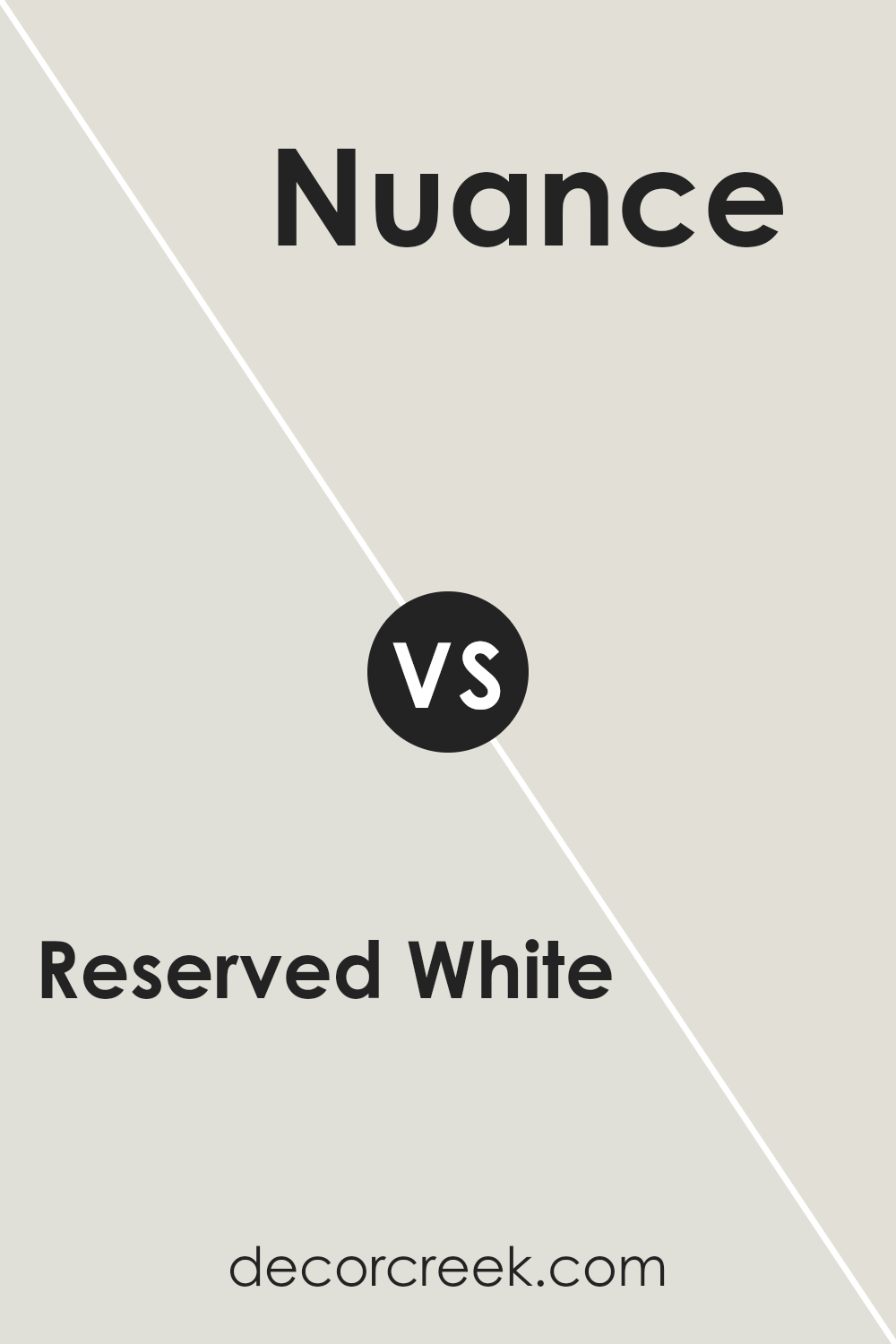
Reserved White SW 7056 by Sherwin Williams vs Nuance SW 7049 by Sherwin Williams
Reserved White and Nuance, both by Sherwin Williams, are distinct yet subtly nuanced shades. Reserved White is a cleaner, brighter shade, lending a more open and airy feel to spaces. It’s perfect if you’re looking for a classic, fresh look.
On the other hand, Nuance is a bit deeper, bordering more on a light gray than a pure white. This color provides a calm, subtle backdrop that is extremely versatile; it’s also great for adding a touch of warmth to rooms without overwhelming them with color.
When comparing the two, Reserved White is likely to make a room feel more spacious and brighter, whereas Nuance could give a cozier and more grounded feeling. Both colors work well in a variety of lighting conditions, making them practical choices for just about any part of your home.
You can see recommended paint color below:
- SW 7049 Nuance
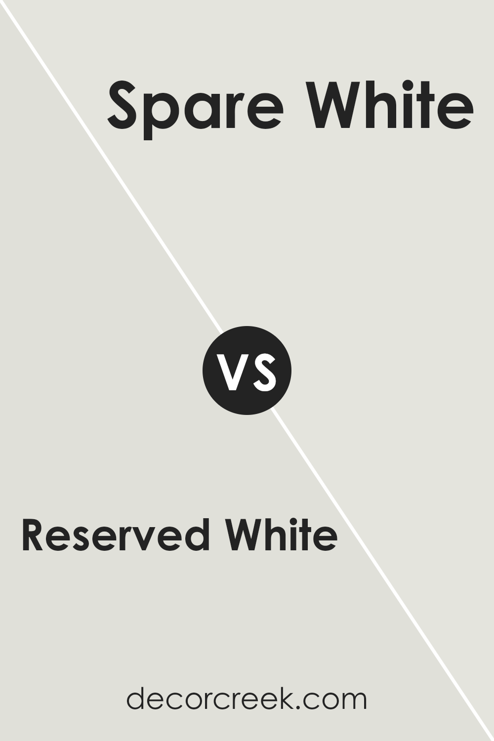
Reserved White SW 7056 by Sherwin Williams vs Spare White SW 6203 by Sherwin Williams
Reserved White and Spare White, both by Sherwin Williams, are subtle and elegant shades of white with distinct undertones that set them apart. Reserved White has a warm undertone that gives it a cozy and inviting feel, making it perfect for living rooms or bedrooms where you want a touch of warmth.
On the other hand, Spare White leans towards a cooler tone, with hints of gray that deliver a clean and fresh look, ideal for modern spaces or areas where you desire a minimalist aesthetic. Despite both being whites, their contrasting undertones mean they each create very different moods and fit better in different kinds of spaces depending on the effect you’re aiming for.
Choosing between them depends on the vibe you want to achieve and the natural light in your space, as this will influence how the colors appear once applied.
You can see recommended paint color below:
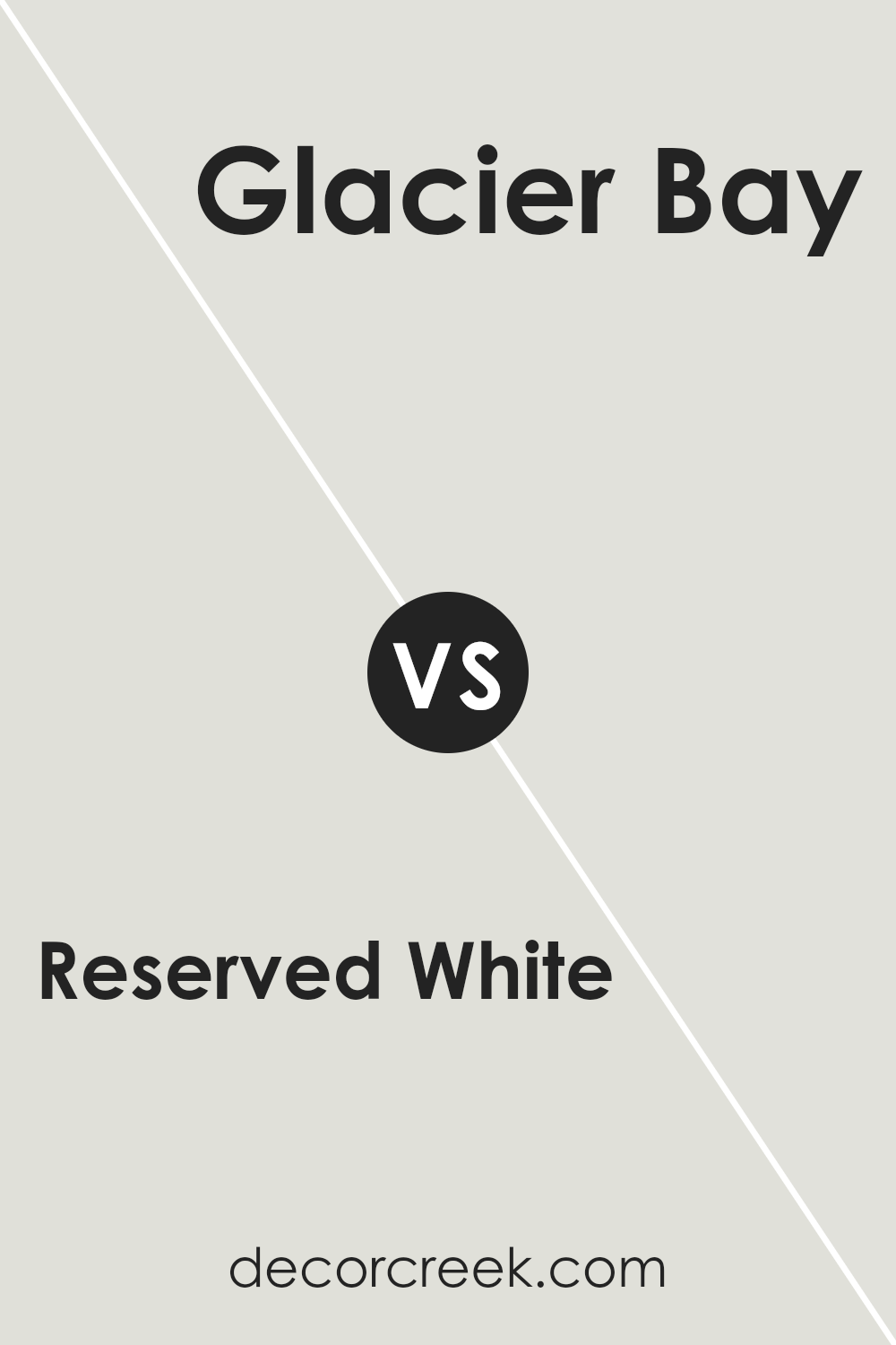
Reserved White SW 7056 by Sherwin Williams vs Glacier Bay SW 9626 by Sherwin Williams
Reserved White and Glacier Bay by Sherwin Williams are two distinctive colors, each creating a unique feel in a space. Reserved White is a soft, neutral white. It’s a versatile shade that easily complements various decor styles and colors, making a room feel open and bright without being too stark.
On the other hand, Glacier Bay is a light, airy blue with a calming presence. This color is perfect for areas where you want to add a splash of subtle color without overwhelming the space. It can help in making a room feel more relaxed and peaceful.
Both colors are excellent choices for those looking to refresh their space with a light and airy feel, but they serve different aesthetic purposes. Reserved White works well as a base or background color, while Glacier Bay can act as an accent wall or for adding a gentle color lift to a room. Choosing between them depends on the desired mood and style of the room.
You can see recommended paint color below:
- SW 9626 Glacier Bay
Reserved White SW 7056 by Sherwin Williams vs Frosty White SW 6196 by Sherwin Williams
Reserved White and Frosty White are both colors from Sherwin Williams, but they each have their unique tones. Reserved White is a more neutral white. It doesn’t lean too much toward any other color, making it a solid choice for those who want a straightforward, clean look. It’s great for spaces where you want to keep the background simple and allow other elements in the room to stand out.
On the other hand, Frosty White has a slightly cooler tone, which can give a crisper feel to a space. It might remind you of snow or frost, especially in well-lit areas. This shade can help in making a small room appear a bit larger and more open.
Both Reserved White and Frosty White work well in various spaces, but your choice may depend on the mood you want to set and the other colors you plan to use in your decor.
You can see recommended paint color below:
- SW 6196 Frosty White
Reserved White SW 7056 by Sherwin Williams vs Pacific Fog SW 9627 by Sherwin Williams
Reserved White and Pacific Fog are two paint colors by Sherwin Williams, each offering a distinct vibe. Reserved White is a soft, clean white that creates a fresh and airy feeling in any space. It’s quite neutral, making it versatile for various rooms and styles, from modern kitchens to cozy living rooms.
On the other hand, Pacific Fog is a gentle gray with a slightly blue tone, providing a cooler appearance. This color can add a subtle hint of color while still maintaining a calm and muted atmosphere. It works well in spaces where you want a bit of color without overwhelming the senses, like bedrooms or bathrooms.
When comparing these two, Reserved White is brighter and more straightforward, ideal for enhancing natural light. Pacific Fog, while also light, offers more depth and can help define a space subtly due to its hint of blue. Both can be combined in different parts of a home to create a cohesive yet varied color scheme.
You can see recommended paint color below:
- SW 9627 Pacific Fog
Reserved White SW 7056 by Sherwin Williams vs Moderne White SW 6168 by Sherwin Williams
The colors Reserved White and Moderne White by Sherwin Williams are both neutral whites, but each has subtle differences that can impact the feel of a space. Reserved White is a clean, crisp white without strong undertones, making it a versatile choice for any room.
It reflects light well and can help make a small space appear larger. On the other hand, Moderne White has a slight warmth to it due to its beige undertones. This makes it a great option for creating a cozy and inviting atmosphere.
It’s less stark than Reserved White and works well in rooms with natural materials like wood or stone. If you’re looking for a pure, bright effect, Reserved White might be the better option, while if you prefer a softer, warmer feel, Moderne White could be more suitable. Both colors offer a fresh, clean background for any decor style.
You can see recommended paint color below:
- SW 6168 Moderne White
Reserved White SW 7056 by Sherwin Williams vs Origami White SW 7636 by Sherwin Williams
Reserved White and Origami White are two subtle shades from Sherwin Williams. They offer a clean and minimalistic feel, but they do have distinct undertones that set them apart. Reserved White leans slightly towards a cool gray, giving it a crisp, fresh look. This makes it great for spaces that benefit from a sharp, clear vibe.
On the other hand, Origami White has a touch of beige, which warms it up a bit compared to Reserved White. This warmth makes Origami White ideal for creating a cozy, welcoming atmosphere in any room.
When deciding between these two, consider the mood and functionality of your space. Reserved White might be better in a modern kitchen or a bathroom where you want a clean, invigorating environment, while Origami White could be perfect for living areas or bedrooms where a softer, more comforting tone is desirable. Both colors reflect light well, making them excellent choices for making a small space appear larger.
You can see recommended paint color below:
Reserved White SW 7056 by Sherwin Williams vs Opaline SW 6189 by Sherwin Williams
Reserved White and Opaline, both by Sherwin Williams, showcase distinct tones that suit different decorating needs. Reserved White is precisely what its name suggests: a clean, pure white that offers a neutral backdrop perfect for any space. It doesn’t lean towards any specific undertone, making it incredibly versatile for combining with any color scheme.
Opaline, on the other hand, presents a soft, subtle green that hints at a light pastel hue. It’s almost like a whisper of color, providing a gentle touch of personality without overwhelming a space. This color is ideal for those looking to add a slight nuance of color while maintaining a light and airy feel in their rooms.
Both colors work well in spaces aiming for a fresh and open feel, but the choice between them depends on whether you prefer a strict neutral or a touch of color. Reserved White is perfect for those who want a classic, timeless look, while Opaline suits those looking to inject a hint of earthiness and nature into their interiors.
You can see recommended paint color below:
- SW 6189 Opaline
Reserved White SW 7056 by Sherwin Williams vs Fleur de Sel SW 7666 by Sherwin Williams
Reserved White and Fleur de Sel are both soft, neutral colors by Sherwin Williams, but they have different undertones and vibes. Reserved White is a warm white that gives a cozy and inviting feel to spaces. It’s a great base color for walls in almost any room, adding a subtle warmth without overwhelming the senses. It pairs nicely with earth tones and soft textures, making spaces feel homey.
On the other hand, Fleur de Sel is cooler, with hints of gray that bring a fresh and airy quality. It’s perfect for achieving a clean and open look, especially in modern settings. This color works well in spaces with lots of natural light, or in bathrooms and kitchens for a crisp finish.
Both colors are versatile and can be used in various decor styles, but Reserved White leans towards a warmer, cozier atmosphere while Fleur de Sel offers a crisper, more refreshing feel. Whether you choose one over the other depends on the mood you want to create in your space.
You can see recommended paint color below:
Reserved White SW 7056 by Sherwin Williams vs Ethereal White SW 6182 by Sherwin Williams
“Reserved White” and “Ethereal White” by Sherwin Williams are two subtle shades that might seem similar but have distinct undertones that set them apart. “Reserved White” is a soft, muted gray with a warm undertone that makes it very versatile and easy to match with a variety of decor styles. It provides a gentle backdrop that complements bold and neutral tones alike, making it ideal for living spaces and bedrooms where a calm, cohesive look is desired.
On the other hand, “Ethereal White” is lighter and has a cooler undertone, reminiscent of a crisp, clear day. This shade is perfect for creating a bright, airy feeling in a room. It works well in smaller spaces or areas with less natural light, as it reflects light beautifully, making the space appear larger.
Both colors are excellent choices for those looking to refresh their walls with a neutral palette. Your choice between the two would depend on the feel you want for your room—cozy and warm with “Reserved White” or light and open with “Ethereal White.”
You can see recommended paint color below:
In closing, SW 7056 Reserved White by Sherwin Williams is truly a wonderful choice if you’re looking for a paint color that’s simple yet can make any room look bright and clean. It doesn’t shout for attention, but it makes every space feel fresh and peaceful.
Whether you’re thinking about giving your living room a new look, making your bedroom a bit cozier, or just adding a touch of clear, crisp white to your kitchen, this color is an excellent pick.
It works really well in homes because it’s like a blank canvas, letting your furniture and decorations stand out.
It’s sort of like creating your own artwork where the walls are your canvas and your furniture and decor are the paint.
Plus, it’s great because it fits in any room, no matter what kind of light it has – sunny or not so much.
So, if you’re thinking about picking a new color for any room in your house, SW 7056 Reserved White is definitely worth thinking about. It’s like the perfect background that lets all the other colors and fun stuff you have shine.

Ever wished paint sampling was as easy as sticking a sticker? Guess what? Now it is! Discover Samplize's unique Peel & Stick samples.
Get paint samples

