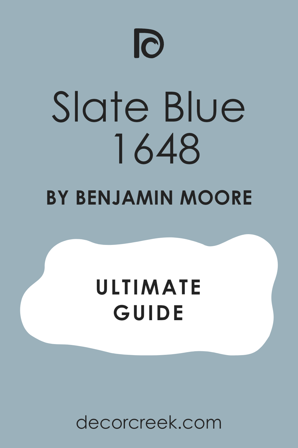
Choosing the right paint color for your room can be a daunting task with so many options available. Recently, I stumbled upon 1648 Slate Blue by Benjamin Moore, and it has quickly become a favorite.
This shade of blue strikes a delicate balance, being both soothing and rich, which makes it adaptable enough for any room in your house.
Whether you’re looking to refresh your living room or give your bedroom a cozy update, Slate Blue provides a calm backdrop. Its ability to pair well with both warm and cool tones adds to its appeal.
Let me share why this color might be the perfect choice for your next decorating project.
What Color Is Slate Blue 1648 by Benjamin Moore?
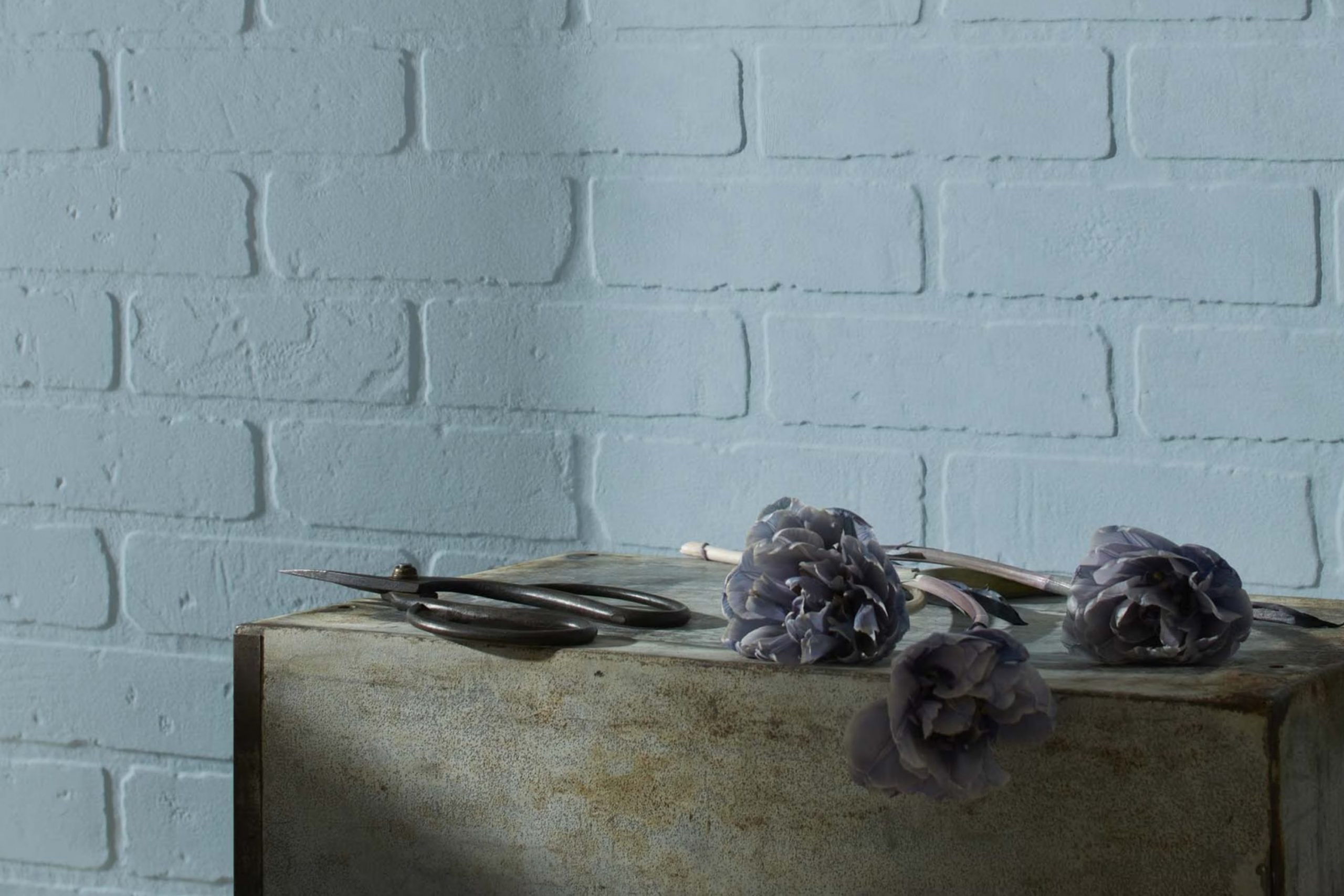
Slate Blue 1648 by Benjamin Moore is a rich, medium blue with subtle undertones of gray that give it a grounded, inviting feel. This color strikes a balance between being vivid enough to make a statement and subdued enough to be soothing. It’s perfect for creating a welcoming atmosphere in any room.
This shade of blue works well in a variety of interior styles such as modern, coastal, and traditional. In modern settings, it adds a splash of color without overpowering the sleek furnishings and clean lines. For coastal themes, it pairs beautifully with sandy beiges and soft whites, evoking the calmness of the seaside. In traditional rooms, it complements rich woods and detailed trim, adding a touch of enduring elegance.
Slate Blue 1648 works best when paired with natural materials and soft textures. It goes beautifully with light woods like oak and birch, which contrast its depth while maintaining a warm environment. Soft fabrics such as cotton, linen, and wool in neutral shades bring out its cozy qualities, making any room feel more inviting.
When it comes to metals, brushed nickel or soft matte brass fixtures offer a subtle shimmer that complements this adaptable blue hue wonderfully, rounding out a harmonious and attractive aesthetic.
Is Slate Blue 1648 by Benjamin Moore Warm or Cool color?
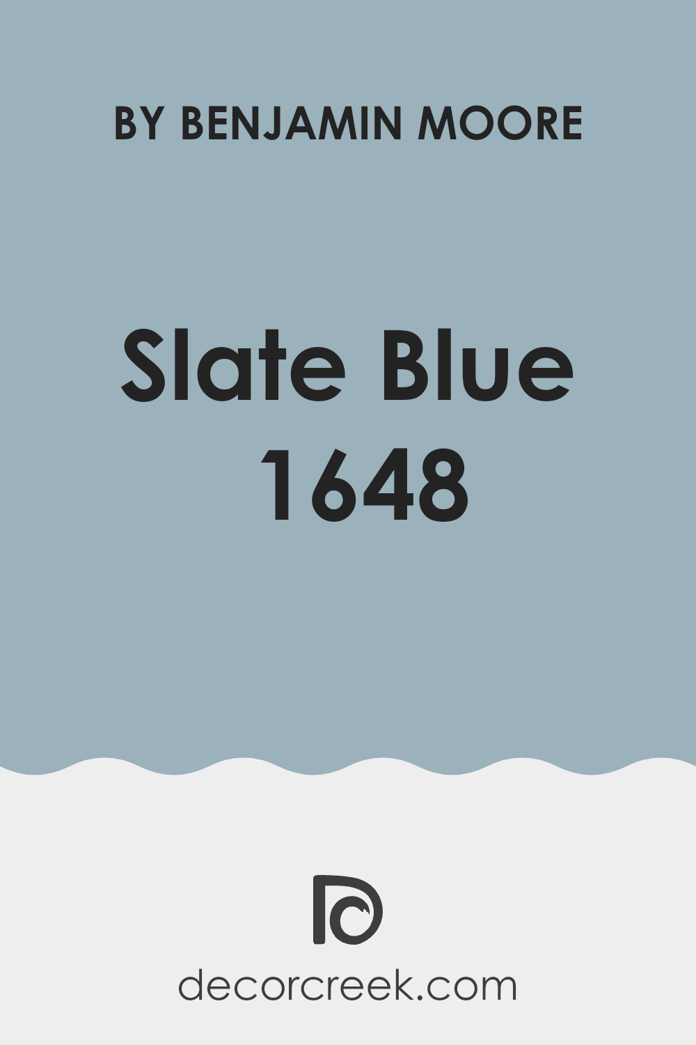
Slate Blue 1648 by Benjamin Moore is a gentle and appealing color that adds a fresh look to any home. This shade of blue has a warm, soft vibe that makes it perfect for creating a cozy atmosphere in living areas like the living room or bedroom. Since it is not too bright or overpowering, it blends well with a variety of decor styles and other colors, making it incredibly adaptable.
Homeowners often choose this color for its calming effect, which is great for areas where relaxation is key. Slate Blue 1648 works wonderfully as a main wall color or as an accent to complement neutral tones. It can also bring a touch of color to a kitchen or bathroom without making the room feel too busy.
Applying this color in homes with natural light highlights its unique tone, enhancing the overall ambience of the room. Its ability to pair well with both light and dark furniture adds to its flexibility, making redecorating less stressful. Slate Blue 1648 is an effective choice for those looking to freshen up their room with a gentle pop of color.
Undertones of Slate Blue 1648 by Benjamin Moore
Slate Blue 1648 has a complex and adaptable character that is shaped significantly by its undertones. Undertones are subtle colors that lie beneath the surface of the main color, influencing how it appears under different lighting conditions and when placed alongside other shades.
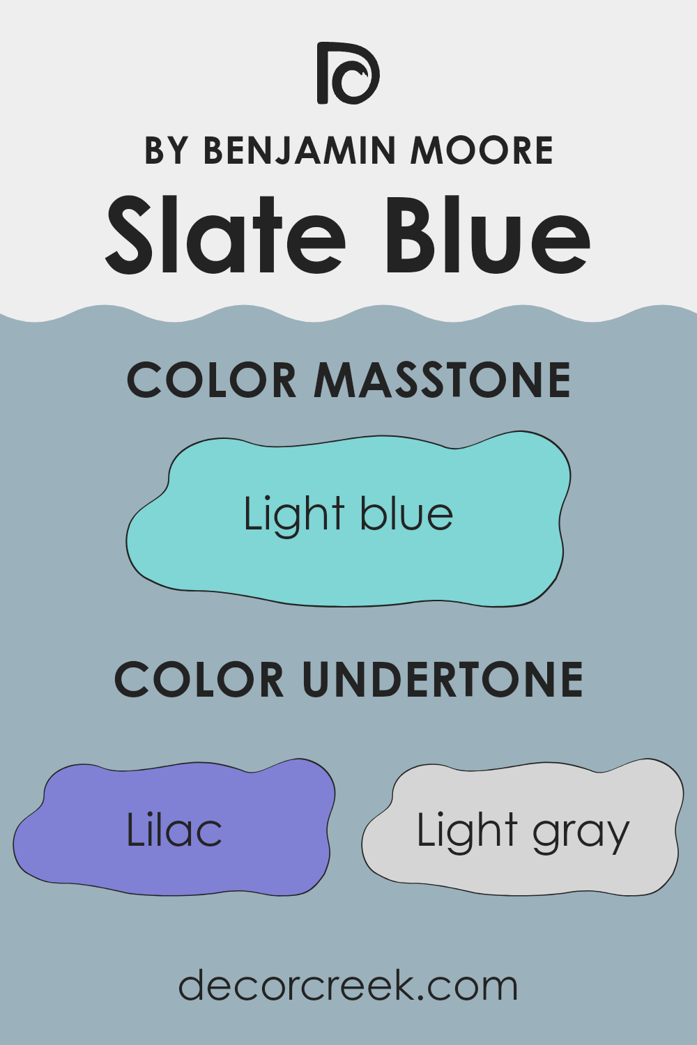
This particular blue features hints of lilac, light gray, mint, light purple, grey, pale yellow, pale pink, turquoise, blue, light turquoise, and dark turquoise. Each undertone adds a unique dimension to the overall look. For instance, lilac and light purple lend a gentle, almost soft floral feel, which can make a room feel more inviting.
Light gray and grey provide Slate Blue with a cool, neutral base, making it highly adaptable and easy to pair with a variety of decor styles. On interior walls, these undertones can shape how the room feels and functions.
Lighter notes like pale yellow and mint brighten a room, creating an airy impression, while deeper undertones like turquoise and dark turquoise add depth, offering a more grounded and defined effect. Because of this, Slate Blue may appear slightly different in each room depending on natural or artificial light and the surrounding furniture or colors.
In essence, the undertones in Slate Blue make it a flexible choice for interiors, able to complement a wide range of decorating styles and personal preferences. They keep the color dynamic and engaging, subtly adapting as the light and room design change.
What is the Masstone of the Slate Blue 1648 by Benjamin Moore?
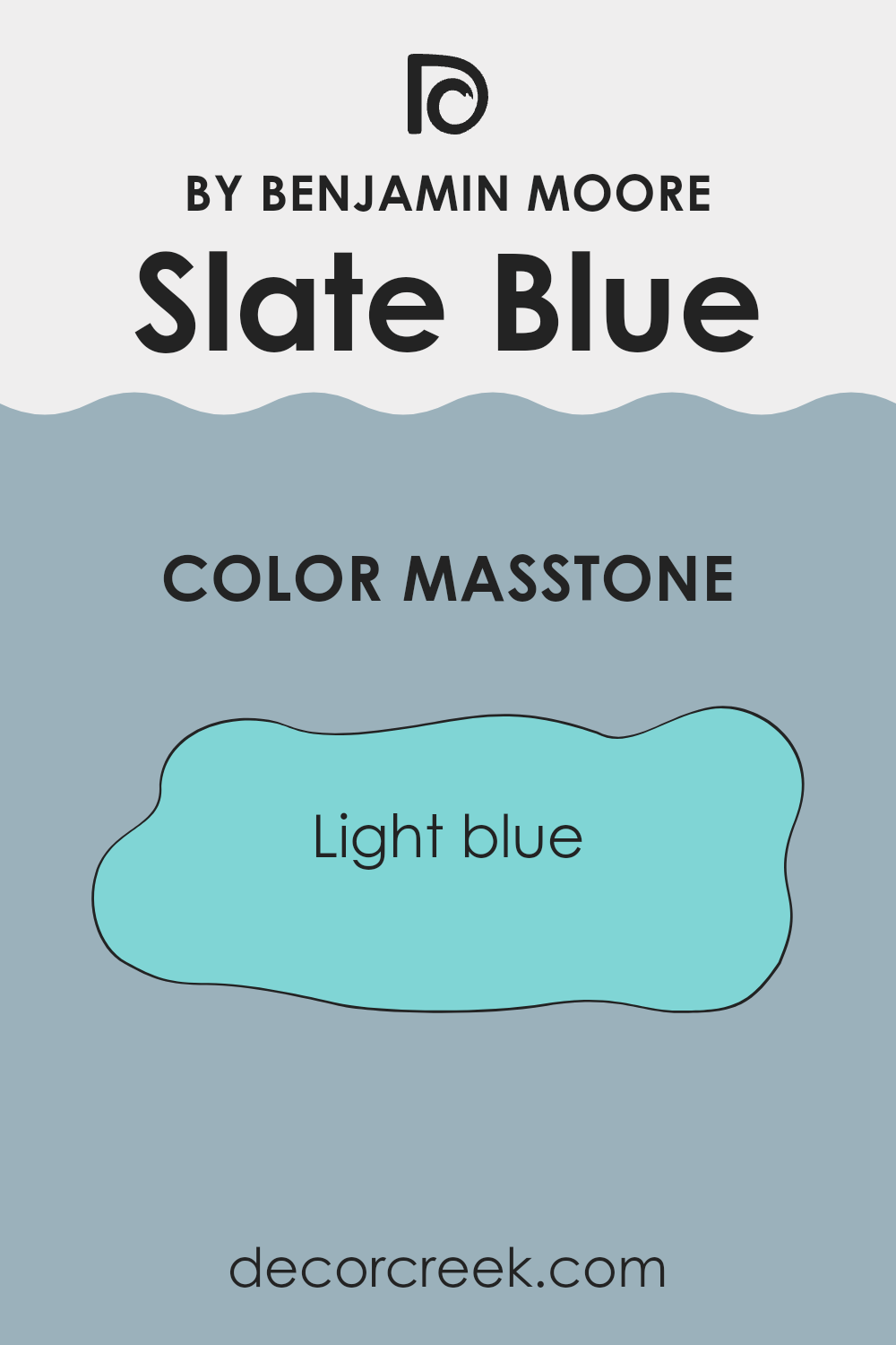
Slate Blue 1648 by Benjamin Moore has a masstone of Light Blue (#80D5D5), a fresh and welcoming shade that beautifully accents home interiors. This particular tone of blue conveys a sense of freshness and cleanliness, making it an excellent choice for bathrooms and kitchens where these qualities are appreciated.
Its lightness has a subtle, calming effect without making rooms feel too cold or stark, creating a comfortable setting for daily activities. Additionally, Light Blue is adaptable in style and complements various decor themes, from modern to rustic.
It pairs seamlessly with whites and grays to create a soft, airy palette or can be matched with bolder shades like mustard or coral for a more dynamic appearance. Particularly effective in smaller rooms or areas with limited natural light, this shade can make interiors appear more open and brighter. Overall, its soft, friendly tone works well in many parts of a home, enhancing the look without becoming too dominant.
How Does Lighting Affect Slate Blue 1648 by Benjamin Moore?
Lighting plays a crucial role in how we perceive colors. The type of light and its intensity can greatly affect how a color looks in a room. Natural light typically shows the truest version of a shade, while artificial light can shift its appearance in noticeable ways.
Slate Blue 1648 by Benjamin Moore is a clear example of how lighting influences perception. In natural daylight, this color reveals a calm, gentle blue that helps a room feel fresh and airy. Its subtle undertones are more visible, allowing the area to feel open and welcoming.
Under artificial lighting, however, the look of Slate Blue can shift. Warm light from incandescent bulbs may bring out a slightly greener, softer quality, creating a cozier vibe. In contrast, cooler fluorescent lighting can emphasize its blue tones, making it appear more vivid and bold. These variations show just how important lighting is when choosing and applying this shade in different rooms.
The orientation of a room also affects how Slate Blue looks at different times of the day:
1. North-facing rooms: These rooms get less direct sunlight, which can make Slate Blue appear more subdued and shadowy. The cooler, indirect light can enhance the blue tones, making the wall color look more profound and rich.
2. South-facing rooms: These rooms benefit from abundant direct sunlight, which can make Slate Blue look brighter and more vivid. The natural light can help illuminate the room, showcasing the true beauty of the color.
3. East-facing rooms: In these rooms, the morning light can make Slate Blue look very vibrant and fresh. As the day progresses and the natural light decreases, the color may take on a more subdued tone.
4. West-facing rooms: In the evening, as the sun sets, west-facing rooms can cast a golden hue that warms up Slate Blue, making it feel softer and more welcoming.
Overall, the visual impact of Slate Blue by Benjamin Moore shifts with the light source and room orientation, shaping the mood and atmosphere of the room.
What is the LRV of Slate Blue 1648 by Benjamin Moore?
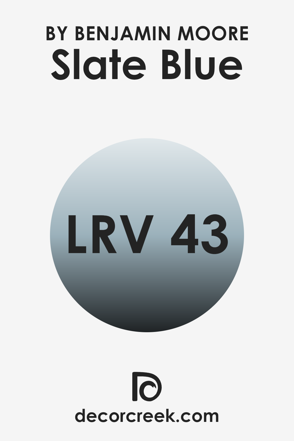
LRV stands for Light Reflectance Value, which is a measure used to indicate how much light a paint color reflects or absorbs when applied to a surface. It’s like a scale for seeing how bright or dark a color will look once it’s on your walls.
Paint colors with higher LRVs are lighter and reflect more light, making a room feel more open and airy. On the other hand, colors with lower LRVs are darker and absorb more light, which can make an area feel cozier but smaller. Having an LRV of 30.62 for Slate Blue means that it’s moderately reflective.
This middle-ground reflectance means that in bright rooms, this color will look somewhat light and lively, but in areas with less natural light, it might appear a bit darker and more subdued. So, when choosing this particular shade of blue, it’s good to consider the lighting.
In a well-lit room, Slate Blue will help maintain a cheerful atmosphere, while in a dimmer setting, it could add a sense of depth and richness.
Coordinating Colors of Slate Blue 1648 by Benjamin Moore
Coordinating colors are those that complement each other while sharing a harmony that enhances the overall aesthetic of a room. When choosing coordinating colors, like those that pair well with Slate Blue by Benjamin Moore, it’s essential to consider how these hues will interact with each other to create a balanced and pleasing environment. The right combination can enhance the mood and character of any room.
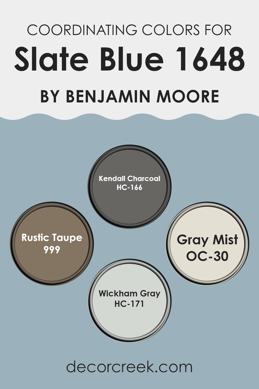
Kendall Charcoal is a deep, moody gray that provides a striking contrast to Slate Blue, making it an ideal choice for accent walls or furniture to give a room a grounded feeling. Its rich depth adds a layer of interest in any setting.
Rustic Taupe, on the other hand, offers a warm neutral option that pairs beautifully with Slate Blue, ensuring the room remains welcoming and calm, without overpowering with color. Gray Mist is a lighter, airy gray that brings a sense of freshness and brightness, working wonderfully with Slate Blue to maintain a light, open feel.
Lastly, Wickham Gray offers a soft, clean look that complements the subtle tones in Slate Blue, ideal for creating a subdued yet inviting atmosphere. Together, these colors work harmoniously to enhance the beauty and character of your living environment.
You can see recommended paint colors below:
- HC-166 Kendall Charcoal (CHECK A SAMPLE)
- 999 Rustic Taupe (CHECK A SAMPLE)
- OC-30 Gray Mist
- HC-171 Wickham Gray
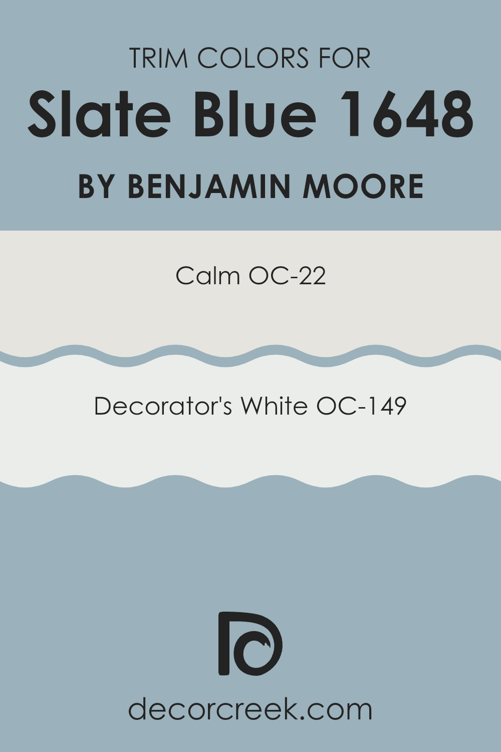
What are the Trim colors of Slate Blue 1648 by Benjamin Moore?
Trim colors are specifically chosen paints used for the accents and details on walls, doors, ceilings, and other architectural elements of a room. These colors can greatly enhance the overall aesthetic and complement the main color of an area, providing contrast or cohesion that highlights unique features. In the case of using a rich hue like Slate Blue by Benjamin Moore as the primary wall color, selecting suitable trim colors can help in defining and accenting the architectural details of a room.
The trim colors such as OC-22 – Calm and OC-149 – Decorator’s White by Benjamin Moore are excellent choices to pair with Slate Blue as they can offset its depth with their lighter shades, adding a crisp, clean finish to the edges and corners where different surfaces meet.
OC-22 – Calm is a soft, muted shade that carries a hint of warmth without overpowering. It works wonderfully as a trim color because it provides a subtle contrast, particularly against deeper tones, yet maintains a harmonious atmosphere in the room.
On the other hand, OC-149 – Decorator’s White is a bright, clear white that offers a stark contrast, making it ideal for more dramatically outlined areas. It makes the colors pop and details stand out, giving the room a very fresh and orderly appearance. Both these trim colors help in maintaining a balanced visual experience when used with richer, darker shades like Slate Blue.
You can see recommended paint colors below:
Colors Similar to Slate Blue 1648 by Benjamin Moore
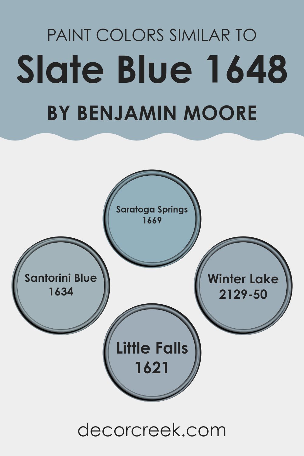
Choosing similar colors that harmonize with a central hue like Slate Blue by Benjamin Moore is important as it creates a sense of cohesion and fluidity within an area. Colors like Saratoga Springs, Santorini Blue, Winter Lake, and Little Falls all share a common blue foundation with Slate Blue but differ slightly, making them ideal for creating subtle contrasts and depth in home décor.
This approach allows for a coordinated aesthetic without monotony, offering flexibility and a refined visual appeal. The similar tones enable smooth transitions from room to room, providing a consistent theme throughout the home.
Saratoga Springs is a slightly muted blue that evokes a gentle freshness reminiscent of a quiet, early morning sky, giving rooms a calm and inviting atmosphere. Santorini Blue draws its inspiration from the vibrant tones spotted in its namesake island, offering a brighter, yet still soothing, blue that pairs well with soft whites and sandy tones.
Winter Lake is darker and more intense, akin to the deep hues seen in a frozen lake under a winter sky, which makes it excellent for creating more dramatic and focal areas. On the other hand, Little Falls is a lighter, airier blue with a touch of grey, perfect for rooms seeking a softer, more understated elegance. These shades all work together seamlessly, affording a range of options that connect through their shared blue roots while delivering distinct individual qualities.
You can see recommended paint colors below:
- 1669 Saratoga Springs (CHECK A SAMPLE)
- 1634 Santorini Blue (CHECK A SAMPLE)
- 2129-50 Winter Lake (CHECK A SAMPLE)
- 1621 Little Falls (CHECK A SAMPLE)
Colors that Go With Slate Blue 1648 by Benjamin Moore
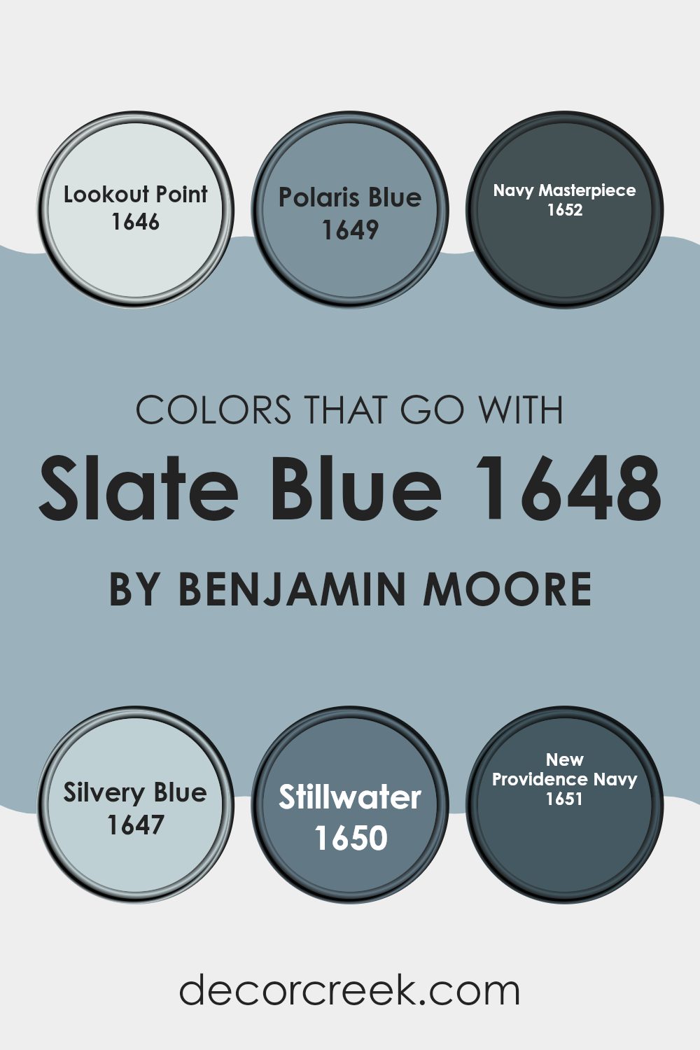
Choosing the right colors to complement Slate Blue 1648 by Benjamin Moore is crucial because they create a balanced and harmonious visual experience in any area. When paired correctly, these colors enhance the rich tone of Slate Blue without overpowering it, allowing for a cohesive and appealing aesthetic.
For example, Lookout Point 1646 is a soft, airy gray that lightens the mood of a room while providing a subtle contrast to Slate Blue. Polaris Blue 1649, on the other hand, is slightly lighter than Slate Blue and adds a gentle, refreshing touch to the palette.
Navy Masterpiece 1652 offers a deeper, more dramatic option that works well in creating a strong, grounding effect when paired with the more subdued Slate Blue. Silvery Blue 1647 introduces a hint of metallic sheen that can brighten areas and add a touch of elegance. Stillwater 1650 is a muted green-blue that complements Slate Blue in a way that’s natural and soothing, perfect for areas meant to be restful.
Lastly, New Providence Navy 1651 is a classic navy that provides a traditional anchor to the more vibrant Slate Blue, ensuring the combination feels well-rounded and thoughtful. Together, these colors offer a flexible range of options that work harmoniously with Slate Blue to fit any decorating style or room.
You can see recommended paint colors below:
- 1646 Lookout Point (CHECK A SAMPLE)
- 1649 Polaris Blue (CHECK A SAMPLE)
- 1652 Navy Masterpiece (CHECK A SAMPLE)
- 1647 Silvery Blue (CHECK A SAMPLE)
- 1650 Stillwater (CHECK A SAMPLE)
- 1651 New Providence Navy (CHECK A SAMPLE)
How to Use Slate Blue 1648 by Benjamin Moore In Your Home?
Slate Blue 1648 by Benjamin Moore is a beautifully subtle and adaptable shade of blue that can add a fresh look to any area in your home. It works really well in living rooms or bedrooms, creating a calming atmosphere that’s perfect for relaxing.
This color isn’t too bright or intense, so it pairs nicely with a wide range of decor styles and other colors. You might consider using Slate Blue on all walls for a consistent and cohesive feel, or just on one wall for a striking accent.
Additionally, Slate Blue is an excellent choice for bathrooms or kitchens, where it can bring a clean, fresh vibe. If painting all the walls feels like too much, think about using it on cabinets or a single focal area. This shade combines well with natural elements like wood and stone, enhancing the overall aesthetic of the room without dominating it. Whether you’re updating a single room or redoing the entire house, Slate Blue offers an enduring appeal that can make your area feel new and inviting.
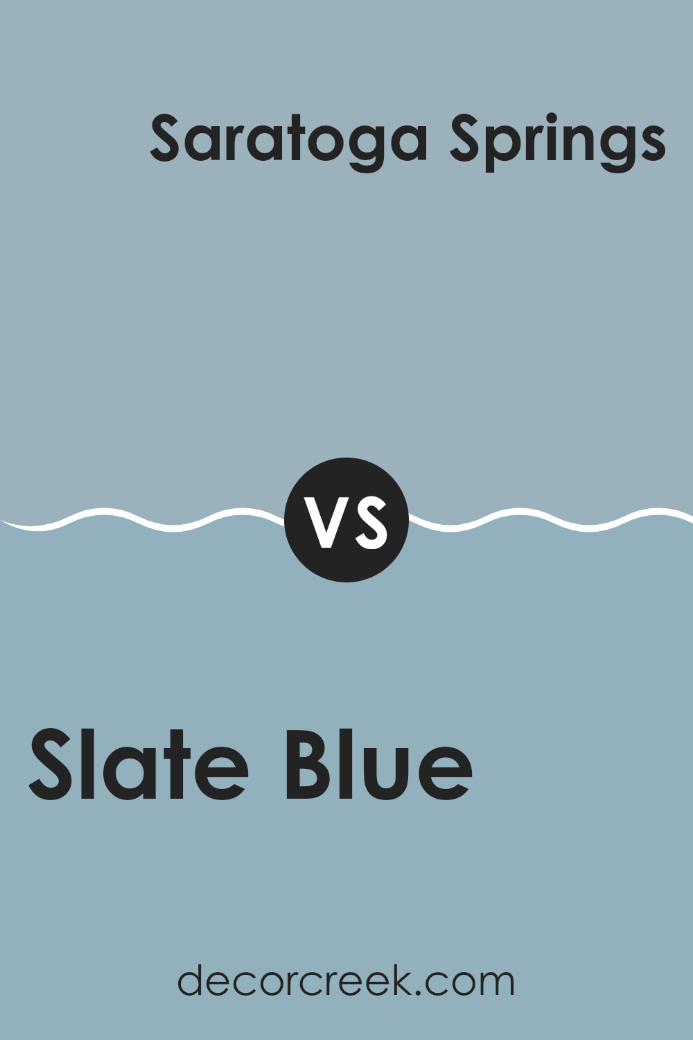
Slate Blue 1648 by Benjamin Moore vs Saratoga Springs 1669 by Benjamin Moore
The main color, Slate Blue by Benjamin Moore, is a gentle, muted blue with hints of gray, giving it a calm and understated feel. This color is adaptable, fitting well in areas that aim for a subtle, cozy atmosphere. It reflects a soft, soothing vibe, making it suitable for bedrooms or living areas where a peaceful ambiance is desired.
On the other hand, Saratoga Springs by Benjamin Moore is a bit deeper and has a trace of green, creating a slightly more vibrant look compared to Slate Blue. This color brings a fresh and lively feel to any area, ideal for spots that need a touch of brightness without being too bold.
Saratoga Springs works well in bathrooms or kitchens where the hint of green can complement natural elements like plants or wooden accents. Both colors offer unique qualities but serve different moods and settings, providing options for personalizing your home’s color scheme.
You can see recommended paint color below:
- 1669 Saratoga Springs (CHECK A SAMPLE)
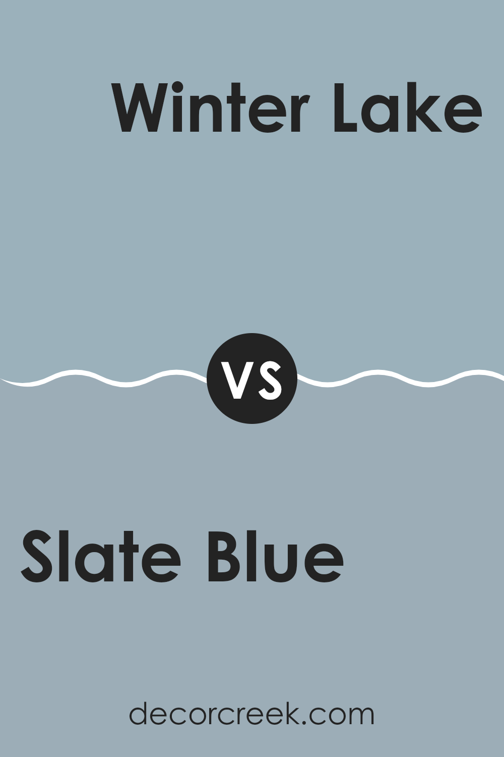
Slate Blue 1648 by Benjamin Moore vs Winter Lake 2129-50 by Benjamin Moore
The main color, Slate Blue by Benjamin Moore, is a cozy, deep hue that has a subtle blend of blue and gray tones. This color gives off a warm vibe and works well in areas where you want a touch of richness without dominating the room. It pairs nicely with both dark and light accents, making it adaptable for various decorating styles.
On the other hand, Winter Lake by Benjamin Moore is a lighter shade compared to Slate Blue. It leans more towards a soft, muted blue with a hint of gray, giving it a calm feel. This color is excellent for creating a light and airy area, and it’s particularly effective in smaller rooms or areas with less natural light, as it can help make an area feel larger and more open.
Overall, while both colors share a base of blue and gray, Slate Blue is deeper and warmer, making it suitable for a cozy, inviting atmosphere. In contrast, Winter Lake is softer and cooler, ideal for a refreshing and open look.
You can see recommended paint color below:
- 2129-50 Winter Lake (CHECK A SAMPLE)
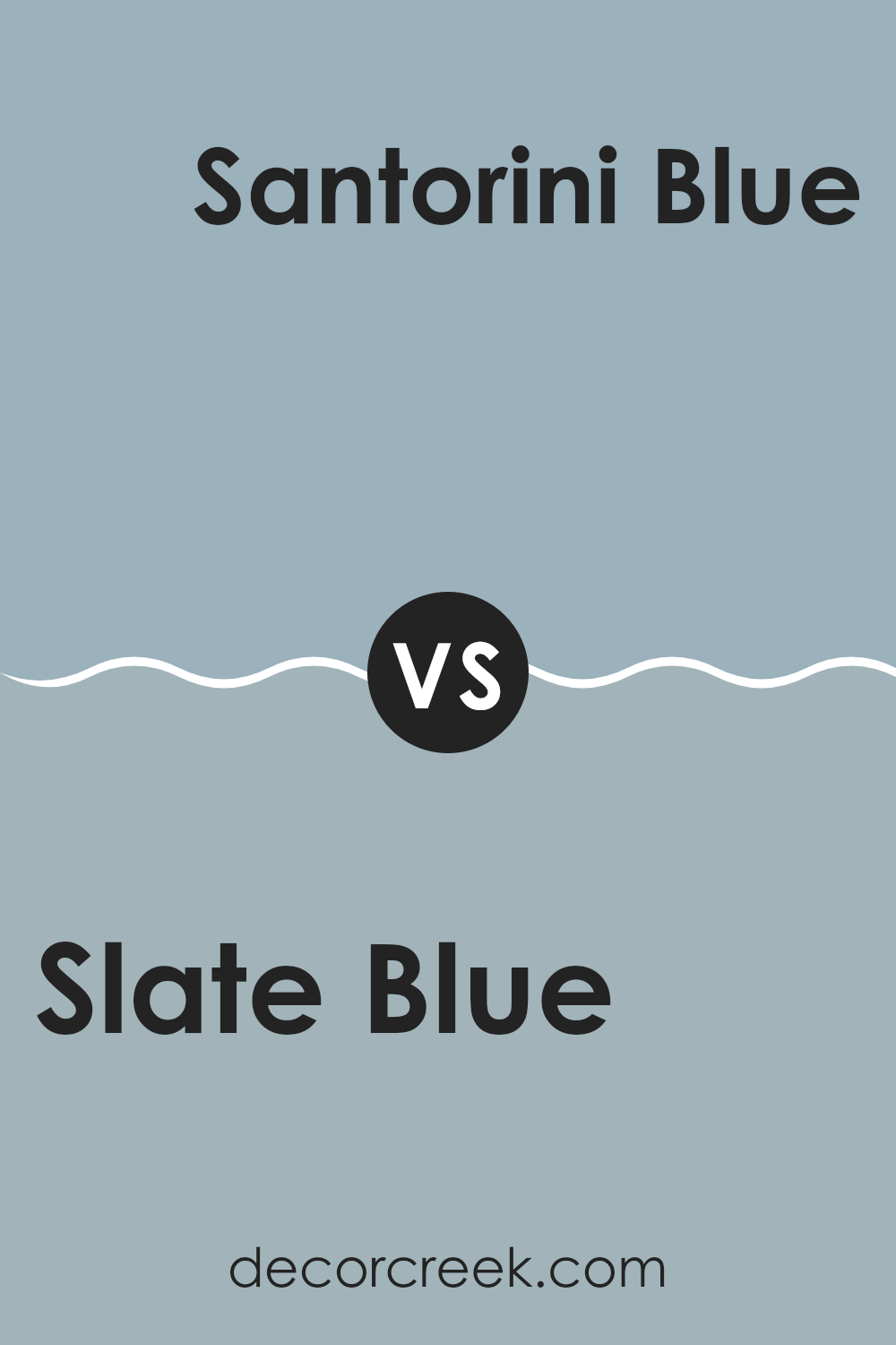
Slate Blue 1648 by Benjamin Moore vs Santorini Blue 1634 by Benjamin Moore
When comparing Slate Blue and Santorini Blue by Benjamin Moore, both shades offer a calm and pleasant feel, suitable for creating relaxing environments. Slate Blue is a deeper hue, reminiscent of a stormy, late-evening sky, offering a subtle, muted touch that pairs well with a variety of decor styles. It can make smaller areas feel more intimate or give a cozy corner a more dramatic flair.
On the other hand, Santorini Blue has a lighter, fresher vibe that echoes the airy feel of a sunny day by the sea. It’s brighter and can make an area feel more open and lively. This color is great for revitalizing a room that needs a splash of cheer.
Both colors bear a cool undertone but differ in intensity and brightness. While Slate Blue leans toward a more reserved, grounded feeling, Santorini Blue is more uplifting and welcoming. Each offers unique possibilities depending on the area and the mood you want to create.
You can see recommended paint color below:
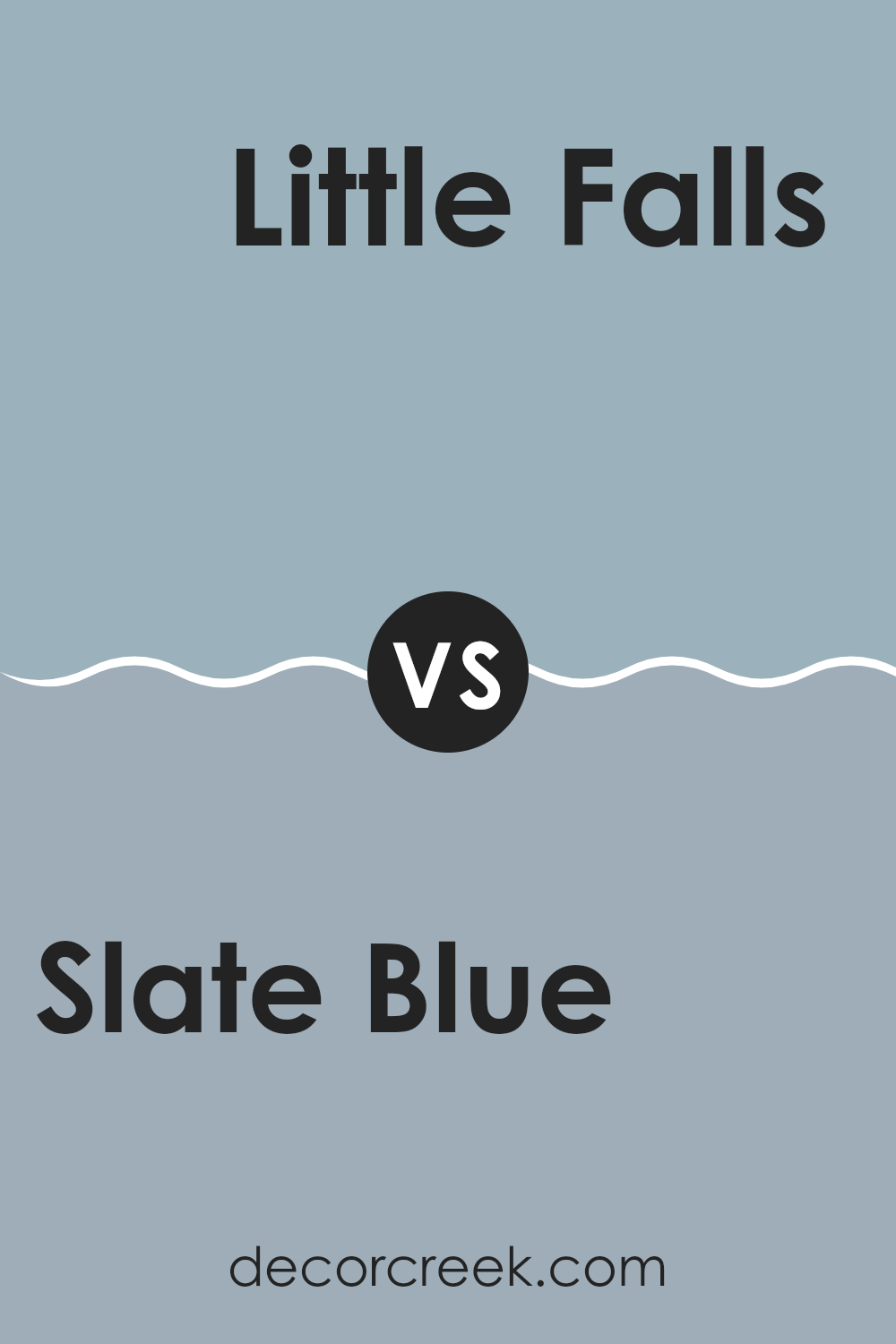
Slate Blue 1648 by Benjamin Moore vs Little Falls 1621 by Benjamin Moore
Slate Blue and Little Falls by Benjamin Moore are two distinct shades that offer unique vibes for any area. Slate Blue is a deeper, richer color with a strong blue base that might remind you of a calm evening sky.
It often adds a cozy and somewhat more majestic feel to a room, possibly making it feel warmer and more inviting. In contrast, Little Falls is lighter and leans towards a soft gray with a hint of blue. This color tends to give rooms a fresher, more airy feel, making small areas appear larger and more open.
Both colors work well in various settings, but your choice might hinge on the mood you’re aiming to set. Slate Blue could be a better pick for a relaxed, intimate environment, while Little Falls suits areas aiming for a breezier, more gentle atmosphere. Whether used separately or together, both colors offer their unique charms to beautify your home.
You can see recommended paint color below:
- 1621 Little Falls (CHECK A SAMPLE)
Conclusion
As I wrap up my thoughts on Benjamin Moore’s 1648 Slate Blue, I can’t help but appreciate how special this color truly is. Paint is a simple way to change how a room feels, and Slate Blue does this beautifully. It reminds me of a slightly cloudy sky, right before the rain starts – not too dark, not too light, just perfectly in between.
Slate Blue is a great choice if you’re looking to make a room feel cozy and welcoming without using a color that’s too bold or bright. It works really well in a bedroom where you want to feel calm and relaxed, or in a living room where everyone gathers and spends time together.
The best part is, it pairs nicely with a lot of different colors. Whether you have furniture in natural wood tones or more modern pieces, Slate Blue adds a lovely background without taking over the show.
After spending time really looking at this color and seeing how it acts in different lights and with different decorations, I feel confident saying that anyone who chooses 1648 Slate Blue is making a great choice. It’s not just a trend; it’s a shade that will make your rooms feel just right for a long time. Whether you’re repainting a single room or redoing your whole house, considering this color is definitely a smart move.
decorcreek.com
Ever wished paint sampling was as easy as sticking a sticker? Guess what? Now it is! Discover Samplize's unique Peel & Stick samples.
Get paint samples


