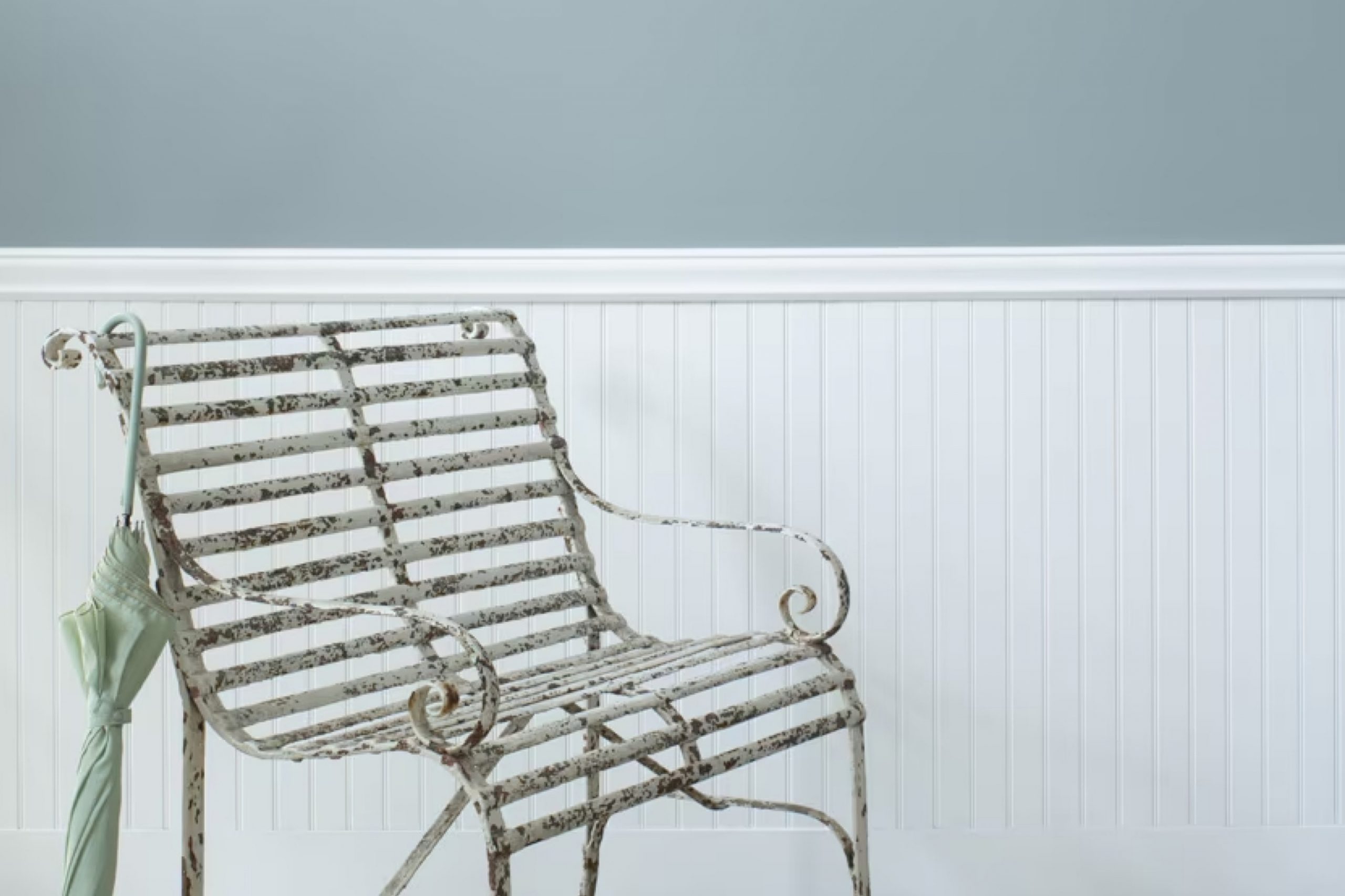
When I first laid eyes on 1634 Santorini Blue by Benjamin Moore, I was captivated by its remarkable charm and subtle elegance. This shade of blue evokes a sense of calmness and serenity, reminiscent of clear seas and peaceful skies. It’s like being whisked away to a quiet coastal town where time seems to stand still, and the pace of life slows.
As I looked closer at Santorini Blue, I noticed how it effortlessly balances warmth and coolness. This unique blend makes it versatile for various spaces, whether you are aiming for a coastal theme in a living room or a soothing atmosphere in a bedroom.
The color seems to change with the light, making it all the more charming and dynamic.
What I appreciate most about Santorini Blue is its ability to create a peaceful environment. Its understated elegance means it can stand alone or complement other hues beautifully.
Whether it’s paired with whites and grays for a clean, modern look or with earthy tones for a more natural vibe, it maintains a sense of harmony.
Incorporating this color into a space brings an airy and refreshing ambiance. It’s a choice that has transformed my environment into a haven of peace and style.
If you’re searching for a color that offers serenity and style in equal measure, Santorini Blue could be the perfect option.
What Color Is Santorini Blue 1634 by Benjamin Moore?
Santorini Blue by Benjamin Moore is a soft, inviting shade of blue that brings a sense of calm and coolness to any space. This color reminds you of the sky or the sea, making it perfect for creating a relaxed atmosphere. It’s versatile and works particularly well in coastal or beach-style interiors, where its soothing hue complements natural light and the breezy feel of the ocean.
This shade of blue pairs beautifully with crisp whites, creating a fresh and clean look. For those who prefer more color, accents of soft grays or even sandy beiges can add depth and interest without overpowering the serene blue tones.
Santorini Blue can also work well in modern or minimalist interiors, where its soft color can be a subtle backdrop that highlights more striking accents and furnishings.
In terms of materials and textures, this color pairs wonderfully with natural elements. Think wooden floors, wicker furniture, and cotton or linen fabrics.
The simplicity of these materials allows the blue to stand out, creating a harmonious balance. Additionally, metallic accents in silver or brushed nickel can add a contemporary touch, while soft textiles like throws and cushions in complementary colors can enhance its calming effect.
Is Santorini Blue 1634 by Benjamin Moore Warm or Cool color?
Santorini Blue by Benjamin Moore is a popular paint color for homes. This shade brings a fresh and airy feeling to spaces. It is reminiscent of the beautiful blue seas and skies of the Greek islands. When used on walls, it can make a room feel larger and more open, thanks to its light and bright qualities.
It works well in living rooms, bedrooms, and bathrooms, adding a touch of calmness without being too bold or overwhelming.
This color pairs nicely with neutral tones such as whites, grays, and beige. It also complements natural materials like wood and stone, bringing out their warmth. Santorini Blue can be used in various decorating styles, from coastal to contemporary. It’s a versatile choice that brings a bit of the outside in, creating a pleasant and inviting atmosphere.
Whether on an accent wall or throughout an entire room, it adds a touch of peacefulness to any space.
Undertones of Santorini Blue 1634 by Benjamin Moore
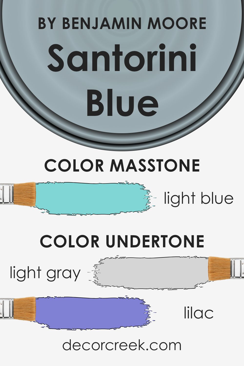
Santorini Blue by Benjamin Moore is a versatile color with several undertones that subtly alter how it appears in different settings. The color falls primarily within the blue spectrum but is nuanced by a variety of undertones, including light gray, lilac, mint, light purple, pale yellow, gray, pale pink, turquoise, blue, light turquoise, and dark turquoise.
These undertones interplay to create a color that can appear differently depending on the surrounding elements and lighting conditions.
The undertones contribute to how Santorini Blue looks on interior walls. Light gray and mint give it a calming effect, making it suitable for bedrooms or bathrooms where a soothing environment is preferred.
Lilac and light purple undertones add a hint of warmth and can make the color appear more vibrant in natural light, enhancing living spaces.
Pale yellow and pale pink subtly warm the color, preventing it from feeling too cold or stark, which is important for areas like kitchens or dining rooms where warmth is desirable.
The various shades of turquoise and blue add depth, making the color dynamic and visually interesting. Gray undertones ensure that it maintains a timeless and adaptable quality, fitting into both modern and traditional interior designs.
What is the Masstone of the Santorini Blue 1634 by Benjamin Moore?
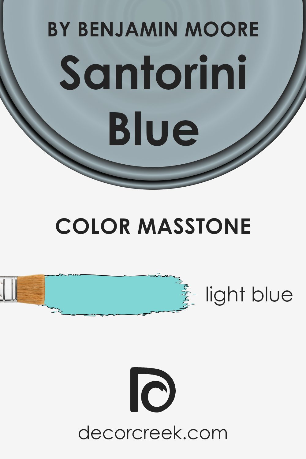
Santorini Blue by Benjamin Moore, identified as a soft light blue (#80D5D5), is a versatile color choice for homes. This gentle hue creates a calming atmosphere, making it ideal for spaces where you want to relax and unwind. Its masstone effects allow it to blend seamlessly with both modern and traditional decor.
In homes, this light blue can brighten spaces without overwhelming them. It works well in living rooms, bedrooms, and bathrooms, where a soothing vibe is desired. Pairing it with whites or soft grays can enhance its light, airy feel, making rooms appear larger and more open.
Natural lighting will highlight its freshness, adding a gentle touch of color without competing with other elements. Santorini Blue is a great choice if you’re looking to add a bit of color while maintaining a peaceful, inviting look. Its versatility ensures it fits well with various interior styles and designs.
How Does Lighting Affect Santorini Blue 1634 by Benjamin Moore?
Lighting significantly influences how we perceive colors in a room. It can change the appearance of a color, making it look lighter, darker, warmer, or cooler. Santorini Blue by Benjamin Moore is a soft, calming shade of blue that can look different depending on the type of light it’s exposed to.
Under artificial light, the shade of Santorini Blue can vary depending on the bulb used. Incandescent bulbs, which emit a warm light, tend to enhance the blue’s warmth, making it appear more muted and gentle.
In contrast, fluorescent lighting, which can be cooler and sometimes has a greenish tint, might make the blue appear sharper or slightly duller.
In natural light, this blue shows its true color more evidently. However, the direction from which the light comes can make a difference. In north-facing rooms, which receive cooler, indirect light throughout the day, Santorini Blue might appear a bit grayer. This is because the cool light can pull out the cooler undertones of the color.
In south-facing rooms, which benefit from warm natural light, Santorini Blue can look brighter and more vibrant, as the warm light adds a slight glow to the color. This orientation can often enhance the cheerful aspect of the color.
East-facing rooms receive bright, direct sunlight in the morning, leading to a fresh, crisp look for Santorini Blue early in the day. However, as the day progresses, the color may take on deeper tones as the room gets less direct sun.
In west-facing rooms, Santorini Blue might appear more intense in the late afternoon and early evening when the room is flooded with warm, golden light. This can make the color feel richer and more saturated, offering a cozy atmosphere.
Understanding these differences can help people choose the right color for their space, ensuring the color appears as desired in their home.
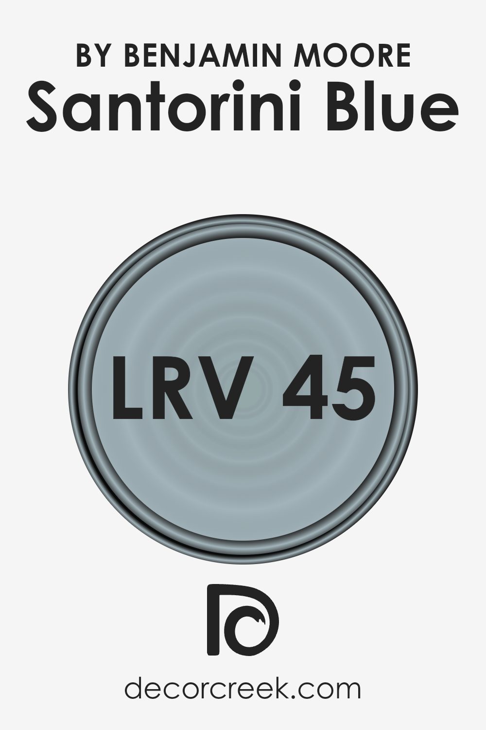
What is the LRV of Santorini Blue 1634 by Benjamin Moore?
LRV, or Light Reflectance Value, is a measurement that indicates how much light a color reflects. The scale ranges from 0, which means the color absorbs all light (like black), to 100, which reflects all light (like white). LRV helps us understand how light or dark a color will appear in a space.
Colors with higher LRV will reflect more light and can make a room feel brighter and more open, whereas colors with lower LRV absorb more light, making spaces feel cozier or more intimate. When choosing paint colors, considering the LRV can be helpful to achieve the desired atmosphere and lighting effect in a room.
Santorini Blue by Benjamin Moore has an LRV of 44.67, placing it in the mid-range of light reflectance. This means it reflects a moderate amount of light, not too much, and not too little.
In a room with plenty of natural light, Santorini Blue will appear brighter and more vibrant, while in a space with less light, it might take on a richer, deeper hue.
This specific LRV value makes Santorini Blue versatile: it’s light enough to add brightness without overwhelming, and has enough depth to add interest and character to a space.
When applying this color to your walls, it’s important to consider the amount of natural and artificial light in the room to see how the color may subtly change throughout the day.
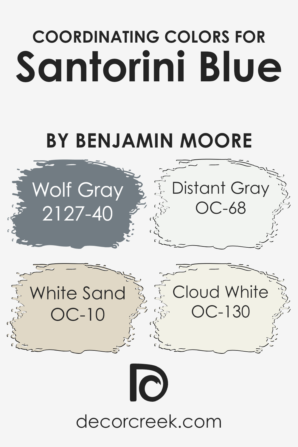
Coordinating Colors of Santorini Blue 1634 by Benjamin Moore
Coordinating colors are hues that complement one another and together create a harmonious look. They help tie a space together, making it visually appealing and cohesive. Santorini Blue by Benjamin Moore is a versatile shade that pairs well with certain coordinating colors, enhancing its charm and making any room feel welcoming.
When you pair it with Wolf Gray, it adds a touch of modern sophistication to a space, as this gray has a cool undertone that balances the brightness of Santorini Blue.
White Sand introduces a warm, creamy hue that softens the boldness of the blue, creating a lovely natural feel in any room. Distant Gray offers a crisp, clean backdrop, perfect for accentuating the depth of Santorini Blue without competing for attention.
Meanwhile, Cloud White brings in an airy lightness, adding a gentle brightness to a room that balances with these shades beautifully.
By using these coordinating colors, you can craft a seamless and pleasing environment around the central, vibrant hue of Santorini Blue. Each color brings its unique feature, allowing the space to come together in a harmonious blend.
You can see recommended paint colors below:
- 2127-40 Wolf Gray
- OC-10 White Sand
- OC-68 Distant Gray
- OC-130 Cloud White
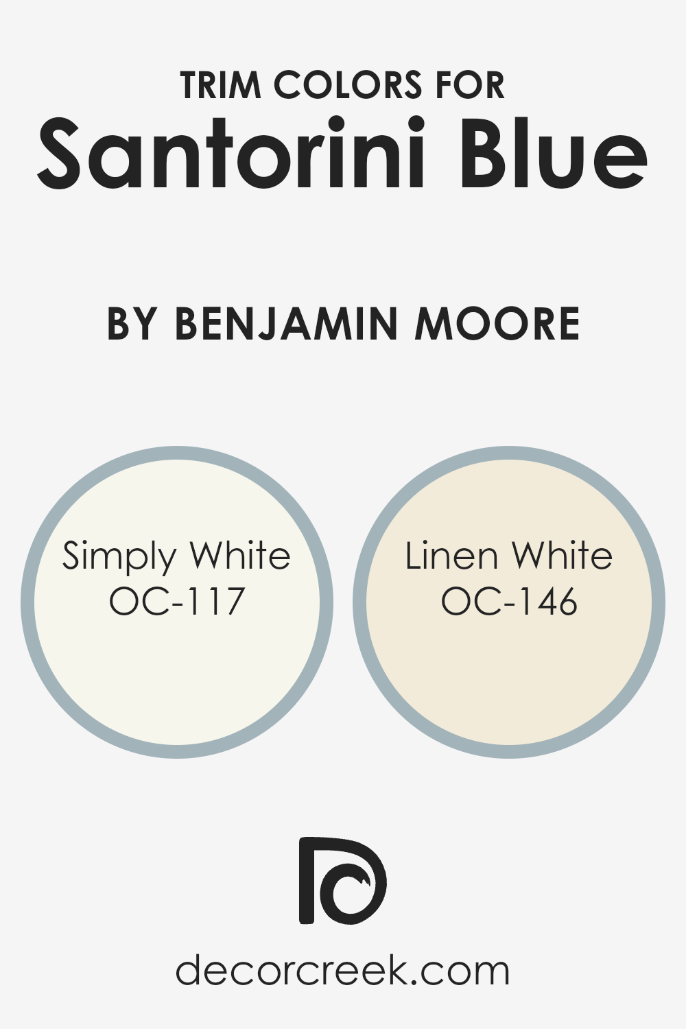
What are the Trim colors of Santorini Blue 1634 by Benjamin Moore?
Trim colors are used to highlight or accentuate the architectural features of a space, such as door frames, windows, and baseboards. They provide a visual boundary that can make the main wall color stand out more vividly. For a striking yet harmonious look, pairing a bold color like Santorini Blue with the right trim is crucial.
Santorini Blue is a vibrant and rich shade of blue, reminiscent of the deep Aegean Sea, perfect for injecting a sense of energy and charm into any space. By choosing an appropriate trim color, you can enhance the depth and nuances of the blue, creating a balanced and cohesive aesthetic.
OC-117 Simply White is a versatile white with a touch of warmth. It provides a clean, crisp contrast to the vibrant Santorini Blue, making the blue pop without overwhelming the space. It also offers a neutral base that adds a sense of brightness and openness.
Meanwhile, OC-146 Linen White brings an inviting, creamy tone that softens the overall look. It offers a subtle touch of warmth, blending smoothly with Santorini Blue for a more intimate and cozy feel.
Using these trim colors can transform a room’s ambiance, drawing out different dimensions of the main color and allowing you to tailor the mood of your space to your preference.
You can see recommended paint colors below:
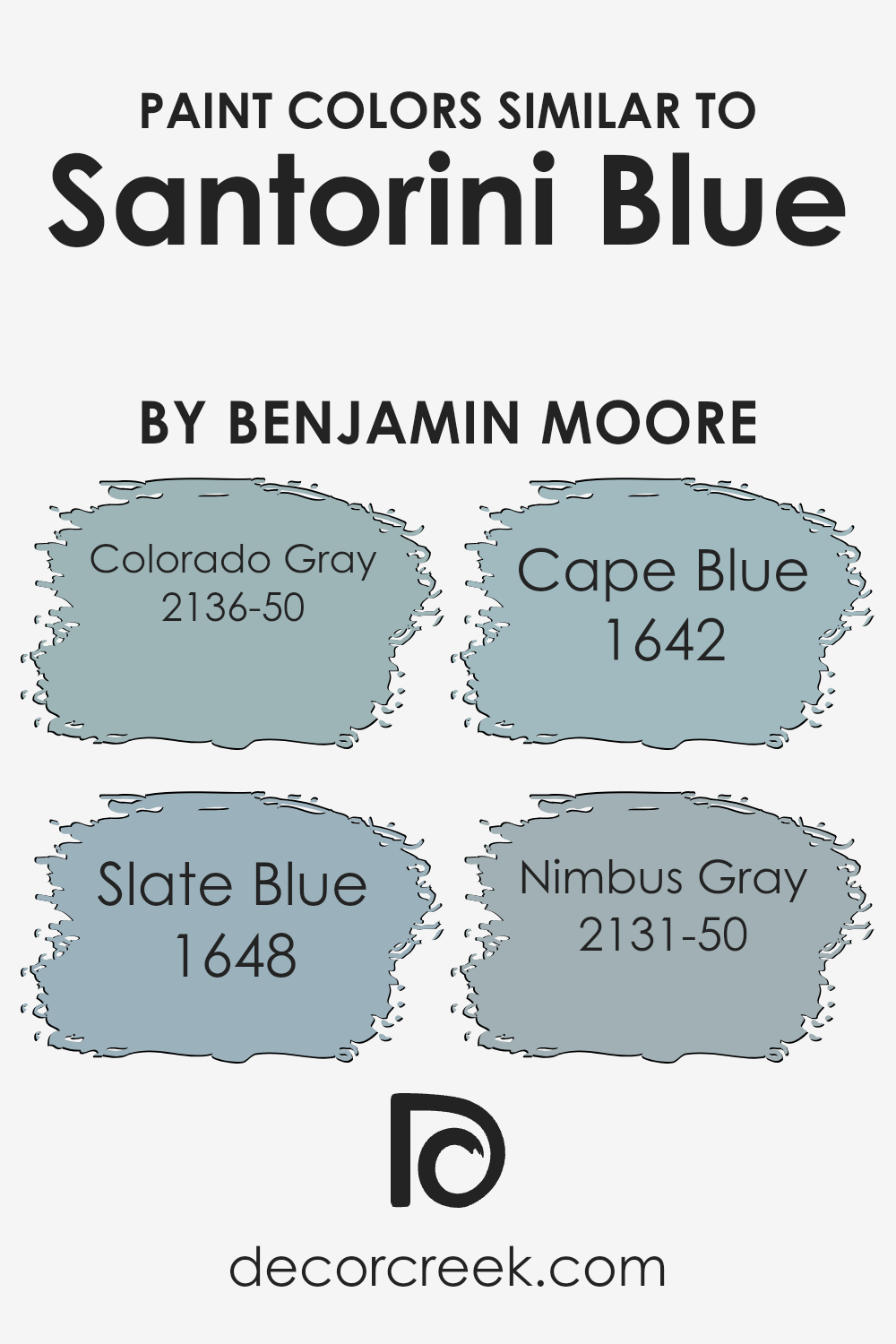
Colors Similar to Santorini Blue 1634 by Benjamin Moore
Similar colors are essential in design because they help create a harmonious and balanced look. Santorini Blue by Benjamin Moore is a soft, inviting shade that brings a touch of calmness to any space. When you use similar colors like Colorado Gray, Slate Blue, Cape Blue, and Nimbus Gray, you craft a cohesive ambiance that flows naturally from one hue to the next.
This approach makes the transition between colors appear seamless, soothing to the eyes and enhancing the overall atmosphere. Using such color palettes can make a room feel more connected and unified, leading to a calming and pleasing environment.
Each color within this palette has its own charm. Colorado Gray has a subtle warmth with a hint of blue, making it versatile and easy to match with both cool and warm tones. Slate Blue brings a more muted blue with a gentle depth that often adds a reflective quality.
Cape Blue envelops spaces with a light, airy feeling reminiscent of clear skies. Finally, Nimbus Gray offers a cool, understated elegance with its soft gray tones, giving any room a gentle lift without overpowering it.
Together, these colors complement each other beautifully, allowing for a unified look and feel throughout any space.
You can see recommended paint colors below:
- 2136-50 Colorado Gray
- 1648 Slate Blue
- 1642 Cape Blue
- 2131-50 Nimbus Gray
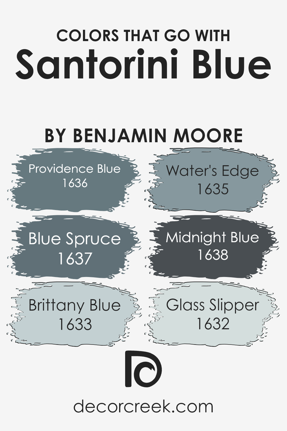
Colors that Go With Santorini Blue 1634 by Benjamin Moore
Santorini Blue 1634 by Benjamin Moore is a versatile, soft blue shade that evokes a sense of calmness and balance, making it a great choice for any space. To enhance its effect, it can be paired with colors like Providence Blue 1636, Blue Spruce 1637, Brittany Blue 1633, Water’s Edge 1635, Midnight Blue 1638, and Glass Slipper 1632.
Each of these shades complements Santorini Blue in unique ways, providing either contrast or harmony that can change the mood of a room. Providence Blue is a muted, laid-back blue, adding depth and a soothing touch. Blue Spruce is a darker, more intense blue-green, bringing richness and an earthy feel.
Brittany Blue is a lighter, airy blue, freshening up a space while maintaining a gentle touch. Water’s Edge introduces a soft green-blue hue that inspires a sense of refreshment, perfect for introducing a touch of nature.
Midnight Blue is a deep, bold blue that grounds and anchors a room, offering a lovely contrast while still fitting well with the softer Santorini Blue.
Glass Slipper is a pale, bluish-gray that adds a hint of sophistication without overpowering the calming nature of Santorini Blue. Together, these colors work in harmony to craft an environment that feels both warm and inviting.
You can see recommended paint colors below:
- 1636 Providence Blue
- 1637 Blue Spruce
- 1633 Brittany Blue
- 1635 Water’s Edge
- 1638 Midnight Blue
- 1632 Glass Slipper
How to Use Santorini Blue 1634 by Benjamin Moore In Your Home?
Santorini Blue by Benjamin Moore is a soft, calming color that brings a touch of the Mediterranean to your home. Its gentle blue tone makes it versatile, suitable for various rooms and styles. In a living room, Santorini Blue can create a relaxing atmosphere, making it a great backdrop for both modern and traditional decor.
Pair it with white or cream-colored furniture to keep the space light and airy.
In the bedroom, this shade can induce a peaceful vibe, perfect for rest and relaxation. Adding accents like navy pillows or a patterned throw can enhance the look. Santorini Blue also works well in a bathroom, giving the space a fresh and clean feel.
You can balance it with darker blue tiles or stainless steel fixtures for contrast. This color is not overpowering, so it won’t dominate a room but will provide a subtle, inviting ambiance.
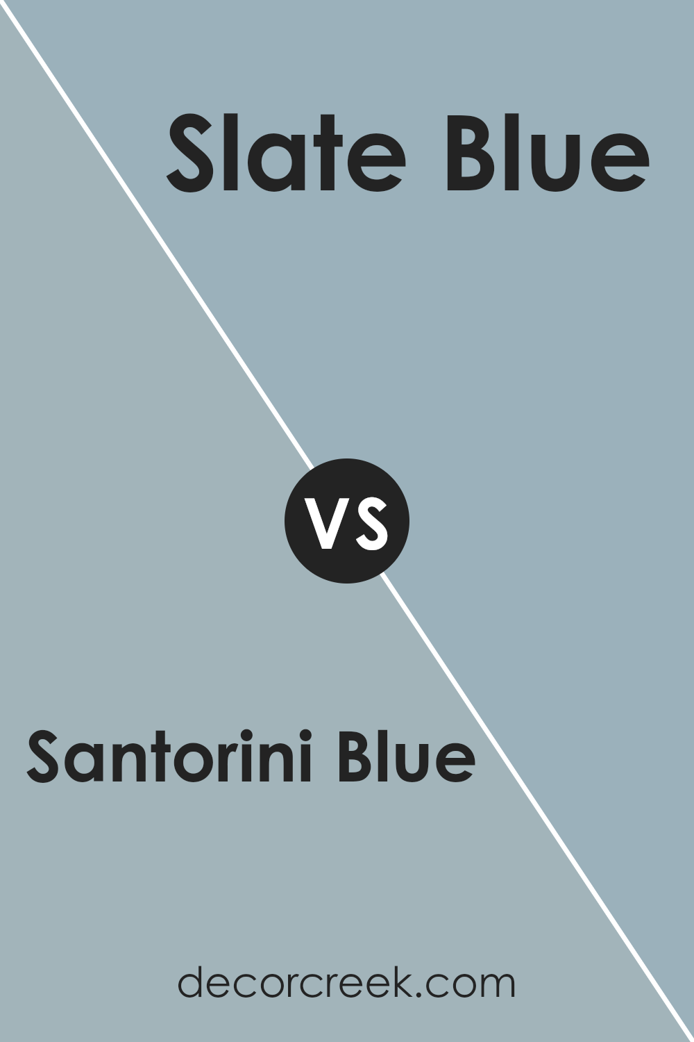
Santorini Blue 1634 by Benjamin Moore vs Slate Blue 1648 by Benjamin Moore
Santorini Blue 1634 and Slate Blue 1648 by Benjamin Moore are both beautiful shades of blue, but they offer different vibes. Santorini Blue is a soft, warm blue that leans towards a light sky blue. It’s cheerful and fresh, making it perfect for spaces that benefit from a light and airy feel. Think of it as the blue you might see on a bright, sunny day.
On the other hand, Slate Blue is deeper and has more gray undertones. This makes it feel cooler and slightly more muted. Slate Blue lends a sense of calm and can be a cozy choice for rooms where you want a touch of sophistication without being too dark.
In summary, if you’re looking for a more uplifting and bright atmosphere, Santorini Blue is a great choice. For a calm, more reserved look, Slate Blue is the way to go.
You can see recommended paint color below:
- 1648 Slate Blue
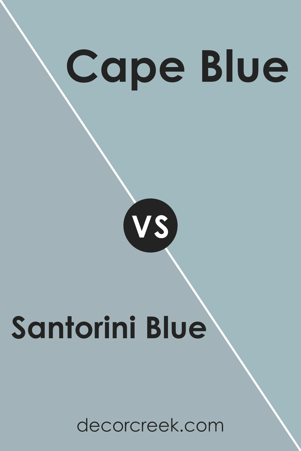
Santorini Blue 1634 by Benjamin Moore vs Cape Blue 1642 by Benjamin Moore
Santorini Blue 1634 and Cape Blue 1642 by Benjamin Moore are both beautiful shades of blue, but they have different characteristics that set them apart. Santorini Blue 1634 is a softer, more muted blue with a hint of gray, which makes it feel calm and versatile.
It can bring a touch of elegance to any space, working well in both traditional and modern settings. On the other hand, Cape Blue 1642 is a brighter, more vibrant blue. It has a touch of green in its undertone, giving it a lively and energetic feel.
This color can add a refreshing pop, especially in spaces where a more dynamic look is desired. While Santorini Blue is subtle and soothing, perfect for creating a restful ambiance, Cape Blue can brighten up a room and add a cheerful note to the decor.
Both colors offer unique charm depending on the atmosphere you want to achieve.
You can see recommended paint color below:
- 1642 Cape Blue
Santorini Blue 1634 by Benjamin Moore vs Nimbus Gray 2131-50 by Benjamin Moore
Santorini Blue 1634 by Benjamin Moore is a soft, soothing blue with a touch of gray, reminiscent of the calming seas around the Greek islands. It feels fresh and airy, making spaces feel open and relaxed. On the other hand, Nimbus Gray 2131-50 is a bit darker and has a more pronounced gray undertone, giving it a slightly moodier and more grounded appearance.
It works well in creating a cozy atmosphere without feeling too heavy. While both colors offer a sense of calm, Santorini Blue leans more towards a light and breezy vibe, perfect for enhancing natural light.
Nimbus Gray, however, brings a more subdued and sophisticated touch. Choosing between them depends on whether you prefer the bright, refreshing quality of Santorini Blue or the deeper, more intimate feel of Nimbus Gray, each creating a unique ambiance in any room.
You can see recommended paint color below:
- 2131-50 Nimbus Gray
Santorini Blue 1634 by Benjamin Moore vs Colorado Gray 2136-50 by Benjamin Moore
Santorini Blue and Colorado Gray are two distinct colors from Benjamin Moore, each bringing a different feel to a space. Santorini Blue is a vibrant, refreshing blue that evokes the essence of a seaside escape. It’s a bright and cheerful color that can energize a room, making it perfect for spaces where you want a lively atmosphere.
On the other hand, Colorado Gray is more subdued, with a peaceful and calming effect. Despite its name, it leans towards a soft, muted blue with gray undertones, creating a more understated and relaxed setting.
This makes it great for bedrooms or any area where you want a more soothing environment.
While both colors have blue tones, the main difference lies in their intensity and mood.
Santorini Blue injects energy and brightness, while Colorado Gray offers a quieter, more gentle ambiance. Choosing between them depends on whether you prefer a bold, active vibe or a calm, restful atmosphere.
You can see recommended paint color below:
- 2136-50 Colorado Gray
Conclusion
After learning about Benjamin Moore’s 1634 Santorini Blue, I really feel like I understand why this color is so special. Santorini Blue reminds me of calm seas and clear skies. It’s a color that brings a bit of the outside world into our homes. Whenever I look at it, I feel relaxed and peaceful, like I’m on a beach or an island far away.
This shade of blue can be used in many different rooms. Whether it’s in a bedroom to help you sleep better or in a living room where you spend time with family, it works well. It’s not too bright, so it doesn’t hurt your eyes, but it’s bright enough to make a room feel happy and light.
Painting a room with Santorini Blue is like adding a touch of nature to your walls. It goes well with other colors too, like whites, greys, and even some yellows, which makes it easy to match with your furniture and decorations.
In the end, I think Santorini Blue is a great color because it makes rooms feel nice and cozy. It’s a color that I think everyone can enjoy, and it brings a little joy to everyday life.
So, if you want your home to feel like a friendly place, Santorini Blue might just be the perfect choice.
Ever wished paint sampling was as easy as sticking a sticker? Guess what? Now it is! Discover Samplize's unique Peel & Stick samples.
Get paint samples

