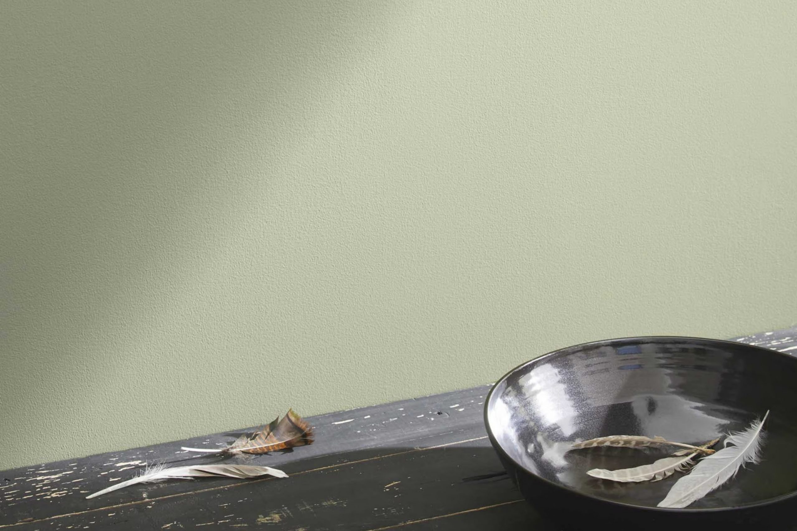
I recently had the pleasure of freshening up a room with a paint called 2144-40 Soft Fern by Benjamin Moore. As someone constantly looking for the perfect shade that feels fresh yet calming, Soft Fern turned out to be an excellent choice.
It’s a unique color that straddles the line between green and gray, providing a subtle, soothing backdrop that’s flexible enough for any room. When painted, it brings a sense of quiet harmony to the room, promoting a relaxed environment.
It works well with natural light, giving the room an airy feel during the day, while at night, it changes into a cozy, intimate room. Using Soft Fern has allowed me to refresh my living area without overpowering it with color, keeping things light and open.
Whether you’re looking to repaint a single room or redo your entire home, Soft Fern provides a fresh palette that might just be what you’re looking for.
What Color Is Soft Fern 2144-40 by Benjamin Moore?
Soft Fern is a gentle and refreshing green shade that carries hints of neutrality, making it incredibly adaptable for various interior styles. This color is airy enough to enhance the openness of a room while providing a touch of earthiness that makes a room feel grounded and inviting. It’s a great choice for those wanting to add a natural element to their environment without overpowering it with bold color.
When it comes to interior styles, Soft Fern works beautifully in modern farmhouse, rustic, and Scandinavian designs due to its organic vibe. It also fits well in casual coastal styles where light, breezy colors are favored. The subtlety of Soft Fern allows it to act as a soothing backdrop or a complementary accent without clashing with other elements.
Soft Fern pairs exceptionally well with natural materials like wood, which can enhance its earthy qualities. Light oak or pine can keep the room feeling light and airy, while darker woods like walnut can create a rich, cozy feel. Textiles like linen or cotton in white, beige, or soft pastels can keep rooms feeling light and fresh. Soft Fern also matches well with stone textures, such as marble or slate, bringing an organic and grounded feel to any room. Combining it with brushed metals like brass or copper can add a touch of understated elegance.
Is Soft Fern 2144-40 by Benjamin Moore Warm or Cool color?
Soft Fern 2144-40 by Benjamin Moore is a fresh, light green hue that brings a natural, peaceful feeling to any room. This color is very adaptable and works well in various rooms, from kitchens to bedrooms. Because it mirrors the calm tones of nature, it helps create a relaxed and inviting atmosphere.
Soft Fern is especially good in rooms with a lot of natural light, as the sunlight enhances its warm undertones, making the room feel airy and bright. When paired with neutral colors like whites or light browns, Soft Fern stands out and gives a gentle pop of color without overpowering the room.
It’s also an excellent choice for furniture and accent walls as it’s not too bold but still adds character. If you’re looking for a color that adds a hint of freshness without being too loud, Soft Fern is a valuable choice to consider. It’s subtle enough to be used extensively throughout a home while still adding a unique touch to the environment.
Undertones of Soft Fern 2144-40 by Benjamin Moore
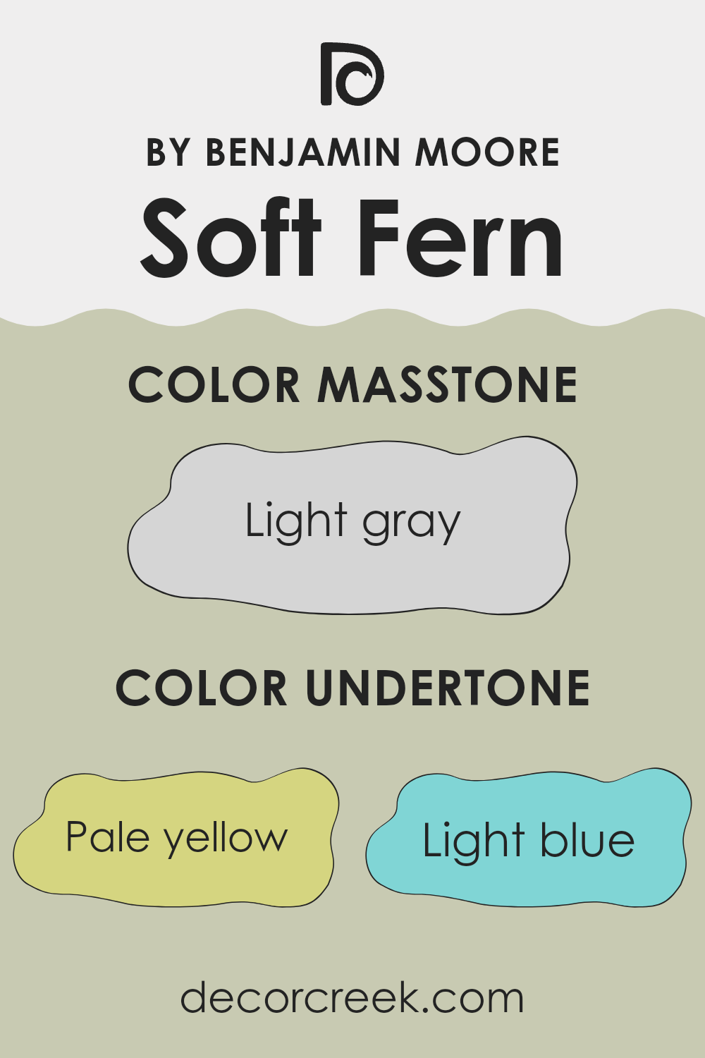
Soft Fern by Benjamin Moore is a flexible paint color that features a complex blend of undertones. Though primarily a muted green, the color contains hints of pale yellow, light blue, light purple, mint, pale pink, lilac, and grey. Each of these undertones can play a significant role in how the color is perceived and how it interacts with light and surrounding colors in a room.
Undertones can greatly influence our perception of color. They can make a paint color appear cooler or warmer depending on the lighting and other colors in the environment. For example, under natural daylight, the blue or lilac undertones in Soft Fern might become more noticeable, giving the walls a cooler feel. In contrast, in a room with warm lighting, the pale yellow or pale pink undertones may stand out, warming up the room.
When used on interior walls, the undertones of Soft Fern can create a calm and inviting atmosphere. The green mixed with these subtle hints of other colors ensures that the paint doesn’t overpower the room but rather complements it. Depending on the room’s decor and lighting, Soft Fern can shift from looking more nature-inspired and fresh to being subtly refined with a more polished palette. This adaptability makes Soft Fern a suitable choice for many different interior styles and settings.
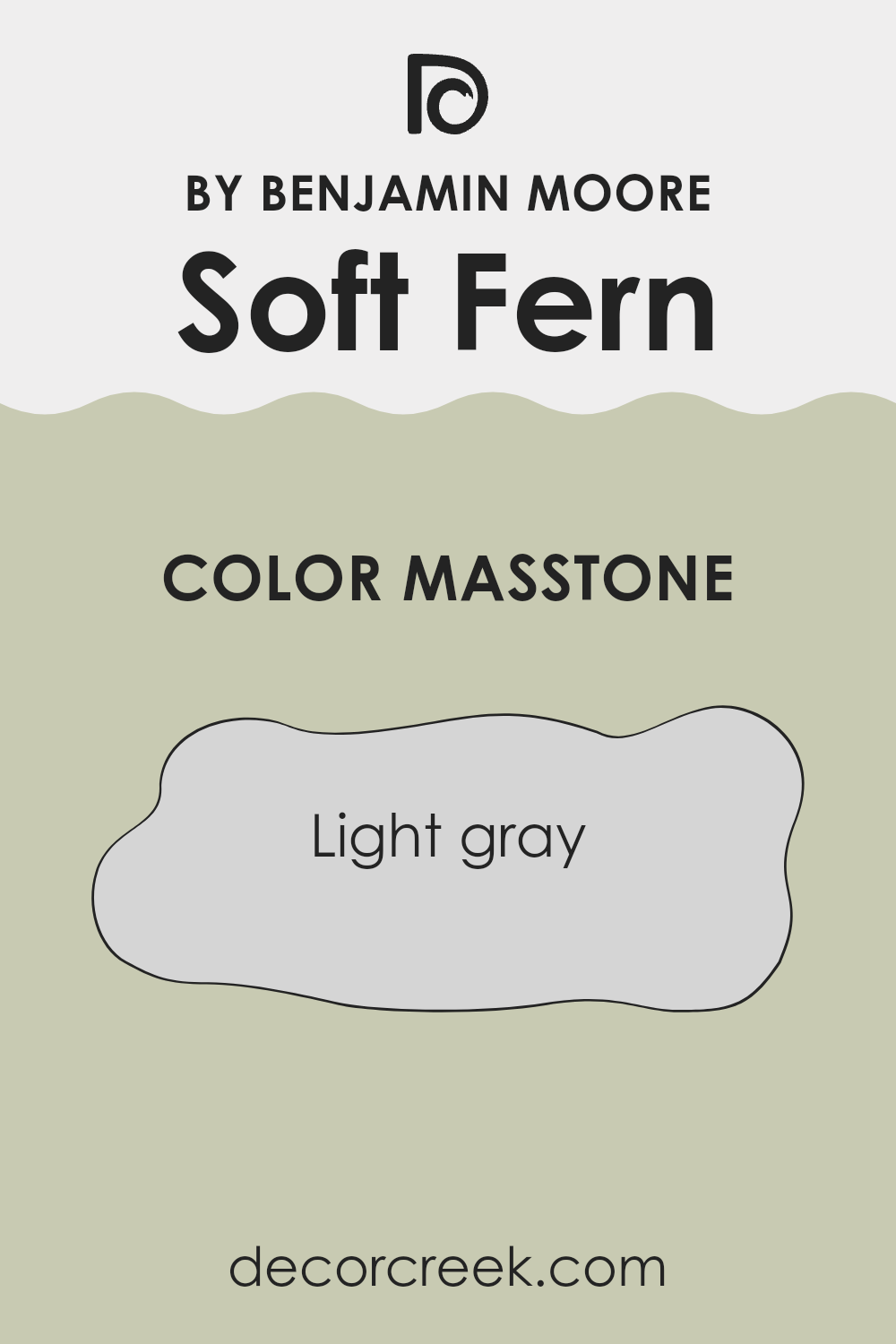
What is the Masstone of the Soft Fern 2144-40 by Benjamin Moore?
Soft Fern 2144-40 by Benjamin Moore has a core shade of light gray (#D5D5D5), creating a neutral backdrop in any room. This masstone is adaptable, making it a practical choice for homes as it pairs well with various decor styles and colors.
Since it’s a light gray, it brings a clean and fresh look to rooms, making them appear more open and airy. This characteristic is particularly beneficial in smaller rooms or areas with limited natural light, as it helps to reflect light around the room, enhancing the overall brightness.
The understated quality of this color means it doesn’t overpower, making it ideal for walls in living areas, bedrooms, or even kitchens, where it can complement both bold and subtle hues in furnishings and accessories. Moreover, its neutrality allows homeowners to easily change their decor without needing to repaint, offering both flexibility and longevity in design choices.
How Does Lighting Affect Soft Fern 2144-40 by Benjamin Moore?
Lighting plays a crucial role in how we perceive colors in different environments. When it comes to interior paint, such as Soft Fern by Benjamin Moore, its appearance can significantly change depending on the type of light it’s exposed to.
In artificial lighting, Soft Fern tends to appear slightly warmer due to the yellow or warm white bulbs commonly used in home lighting. This can make the color feel cozier and more inviting, especially in the evenings or rooms without much natural light.
In contrast, natural light brings out the truest form of Soft Fern. In a room with ample sunlight, the color can look fresh and vibrant. However, the direction the room faces also impacts how Soft Fern appears throughout the day:
- North-Facing Rooms: These rooms often get less direct sunlight, which can make light colors like Soft Fern appear more muted and slightly cooler. In north-facing rooms, Soft Fern might look more like a soft grayish-green.
- South-Facing Rooms: Here, you can expect Soft Fern to shine brightly. South-facing rooms receive a lot of light throughout the day, which can make this color look lively and vibrant. The natural warmth of the sunlight will enhance the green tones, making the room feel welcoming and bright.
- East-Facing Rooms: Rooms that face east get bright light in the morning, which can make Soft Fern look very cheerful and fresh during the early hours. As the day progresses and the natural light fades, the color may shift to a softer and more subdued tone.
- West-Facing Rooms: On the opposite side, west-facing rooms get the most light in the late afternoon to evening. During this time, Soft Fern might glow vibrantly due to the intensity of the setting sun. However, it could appear darker in the morning when the sunlight is less intense.
Understanding how lighting affects colors like Soft Fern can help in choosing where to apply this shade in your home to make the most of its changing appearance under different lighting conditions.
decorcreek.com
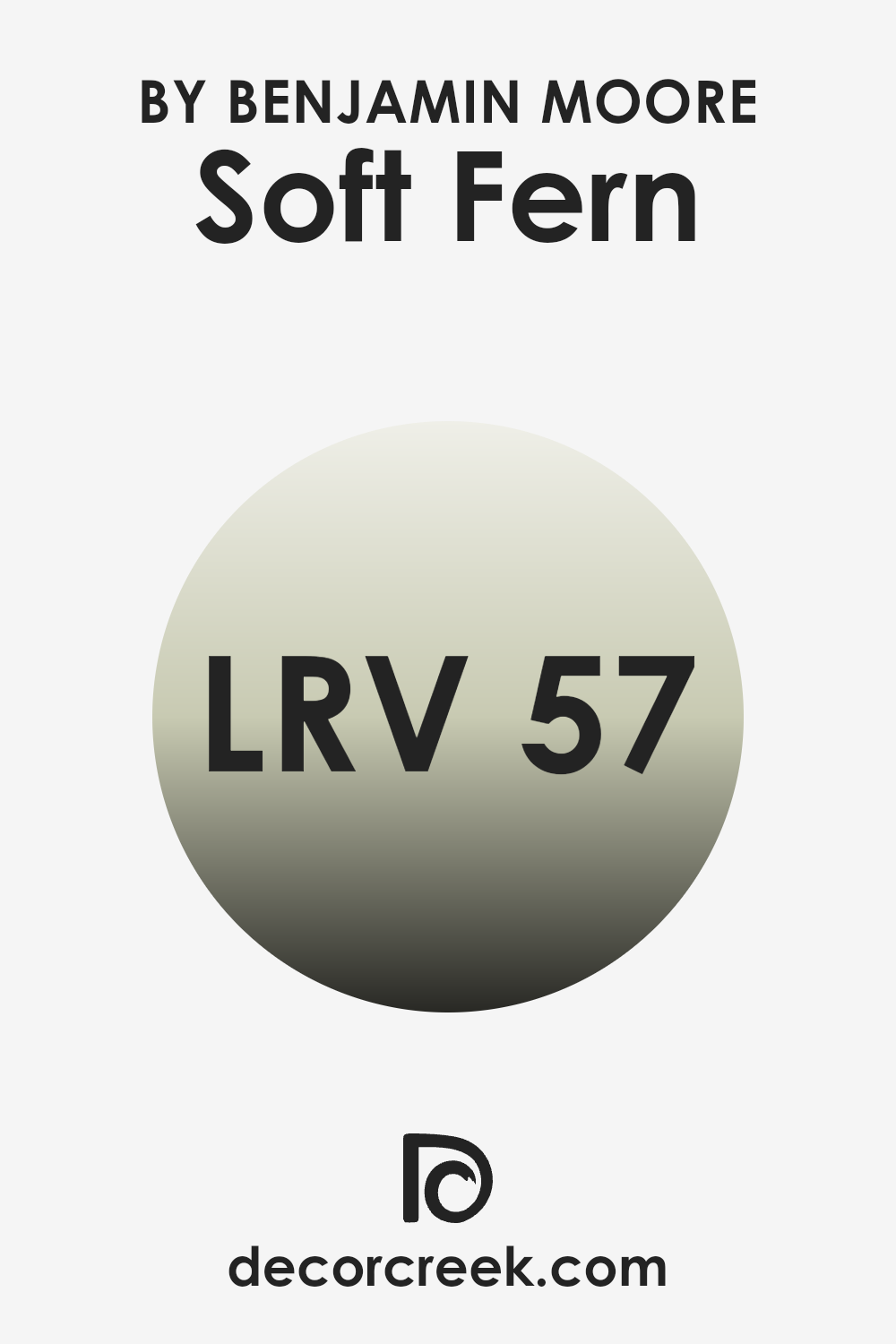
What is the LRV of Soft Fern 2144-40 by Benjamin Moore?
Light Reflectance Value (LRV) is a measure used to describe the amount of visible and usable light that a color reflects when light shines on it. This value is calculated on a scale from zero, where no light is reflected and the color appears very dark or black, to a high value where a lot of light is reflected, making the color look lighter or even white.
LRV is important because it helps determine how a color might look once applied to walls in different environments. For example, a color with a higher LRV will make a room feel brighter and more open, while a color with a low LRV might make a room feel cozier and somewhat smaller.
The LRV of Soft Fern is 56.67, which means it falls in the medium to higher range of light reflectance. This implies that it is a relatively light color capable of making rooms feel airy and fresh. For rooms that get a lot of natural sunlight, this color can enhance the brightness because it will reflect a fair amount of light back into the room.
Conversely, in a less well-lit area, using Soft Fern can help bounce around whatever light is available, making the room seem brighter than it would if a darker shade were used. This level of LRV is quite adaptable and can work well in many different areas of a home or office, lending a fresh feel without being overpowering.
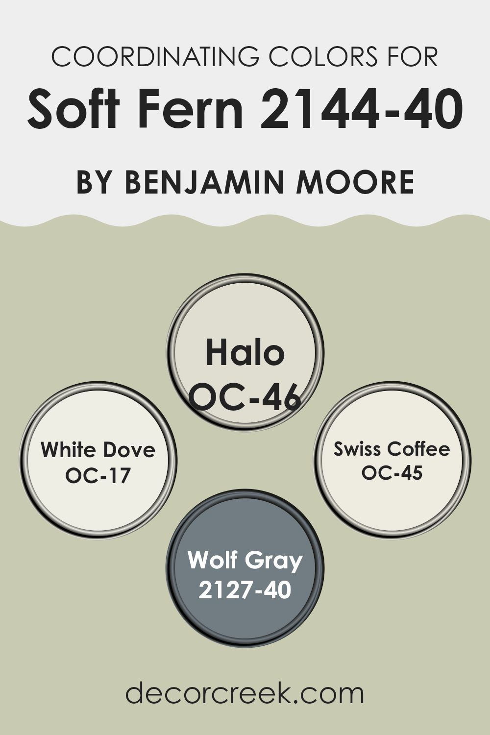
Coordinating Colors of Soft Fern 2144-40 by Benjamin Moore
Coordinating colors are chosen to complement each other, creating a balanced palette that enhances the visual appeal of a room. When colors are coordinated thoughtfully, they can add harmony and highlight the best qualities of each shade.
For instance, the color Soft Fern by Benjamin Moore pairs beautifully with other coordinating hues that enhance its natural and calm green tone. Using coordinating colors like OC-46 – Halo, OC-17 – White Dove, OC-45 – Swiss Coffee, and 2127-40 – Wolf Gray ensures that Soft Fern stands out without overpowering the room.
OC-46 – Halo is a gentle off-white with a touch of gray that provides a soft backdrop, making it ideal for a peaceful environment. OC-17 – White Dove is a popular creamy white that offers a crisp contrast, perfect for trim or cabinets to create clean lines against deeper colors.
OC-45 – Swiss Coffee is another off-white but with a warmer undertone, pairing nicely with Soft Fern to create a cozy feel. Lastly, 2127-40 – Wolf Gray adds a bolder note with its deep, bluish-gray tone, offering a refined balance that enhances more vivid colors. These shades work together to create a cohesive look that complements the relaxing character of Soft Fern.
You can see recommended paint colors below:
- OC-46 Halo
- OC-17 White Dove
- OC-45 Swiss Coffee
- 2127-40 Wolf Gray
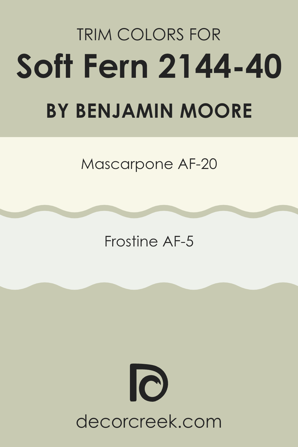
What are the Trim colors of Soft Fern 2144-40 by Benjamin Moore?
Trim colors are essential accents in interior design, particularly when used to complement main wall colors. For a paint color like Soft Fern by Benjamin Moore, selecting the right trim colors can enhance the overall aesthetic and create a cohesive look throughout the room.
Trim colors like Mascarpone and Frostine, which are also made by Benjamin Moore, are perfect options since both can effortlessly highlight Soft Fern’s gentle green without overpowering it. These shades provide a subtle contrast that frames and defines the room, adding depth and a polished appearance to the interiors.
Mascarpone is a warm, inviting cream color that offers a cozy and uplifting atmosphere when paired as a trim with the cooler, calm green of Soft Fern. Frostine is a softer, nearly white shade that gives a fresh, clean feel, making it an excellent choice for a crisp and light companion to the more subdued Soft Fern. Both trim options support a smooth transition between wall colors and decor, creating a harmonious and refreshing environment.
You can see recommended paint colors below:
- AF-20 Mascarpone
- AF-5 Frostine
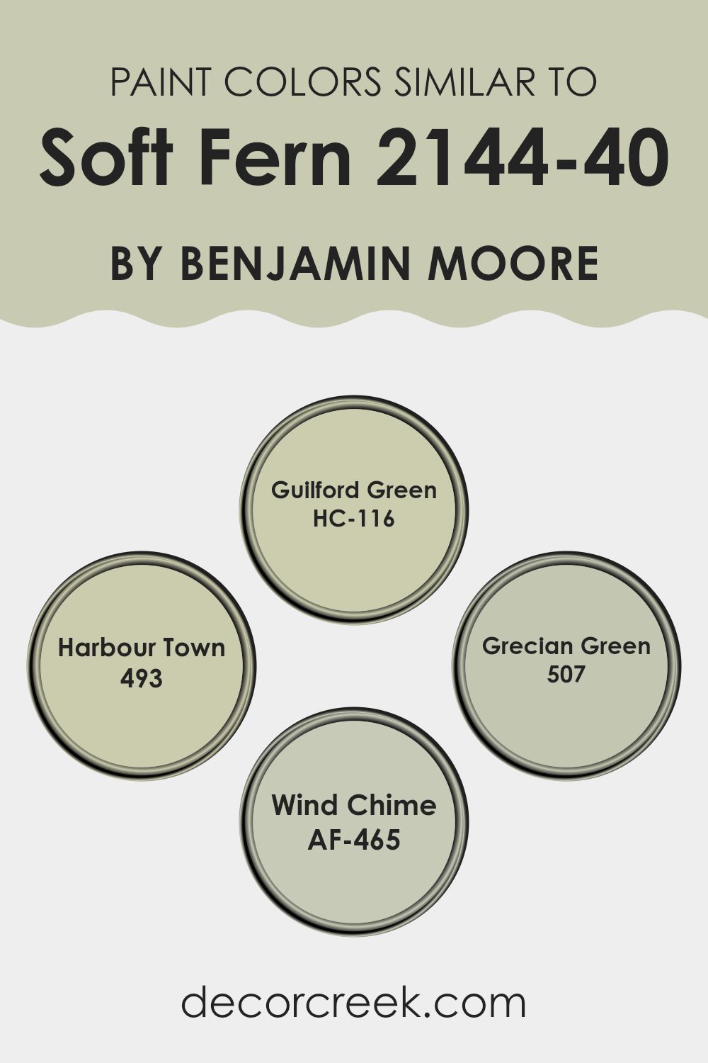
Colors Similar to Soft Fern 2144-40 by Benjamin Moore
Similar colors play a crucial role in interior design as they create harmony and a subtle visual flow within a room. By using shades like Soft Fern alongside its similar colors, such as Guilford Green, Harbour Town, Grecian Green, and Wind Chime, one can achieve a cohesive yet varied ambiance that feels connected and balanced without becoming overly repetitive. These similar hues work together by providing slight variations in depth and tone, allowing for a room that feels layered and visually engaging while still maintaining unity.
Guilford Green is a gentle color that leans slightly toward a refreshing hint of spring green, making it a wonderful complement to the more subdued Soft Fern. Conversely, Harbour Town offers a deeper, more mature green, adding a touch of contrast within the same color family.
Grecian Green captures the feel of Mediterranean olives, providing a muted yet rich background that enhances the palette. Wind Chime, on the other hand, brings a lighter, almost airy quality to the mix, ideal for lifting the overall look and introducing a breath of freshness to the combination. These colors together deliver balance and depth, making any room feel complete and effortlessly stylish.
You can see recommended paint colors below:
- HC-116 Guilford Green
- 493 Harbour Town
- 507 Grecian Green
- AF-465 Wind Chime
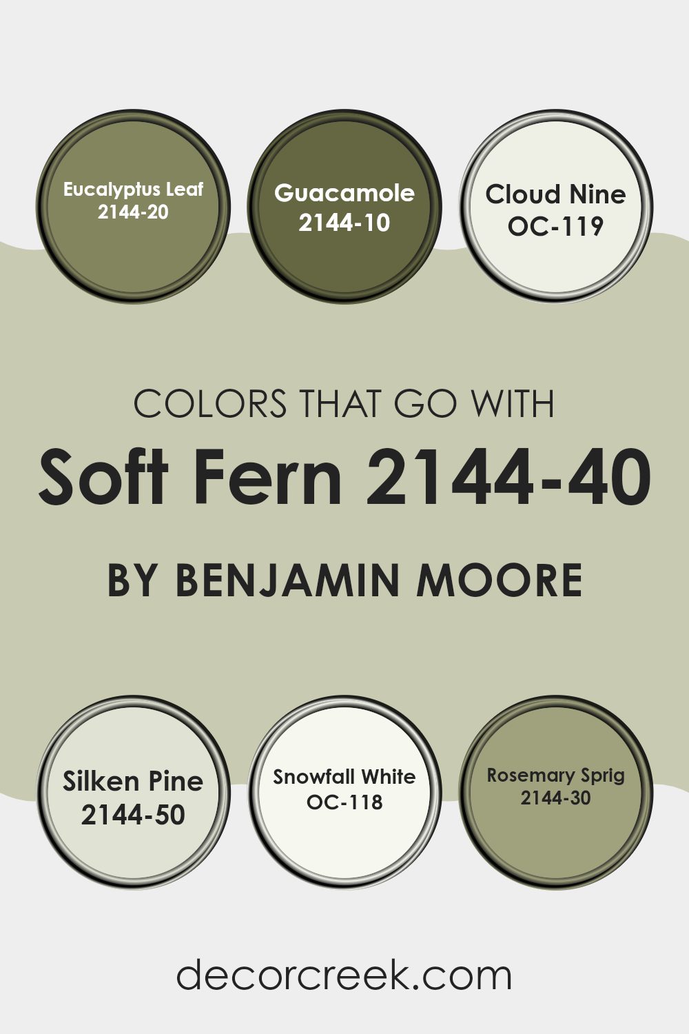
Colors that Go With Soft Fern 2144-40 by Benjamin Moore
Choosing complementary colors that go with Soft Fern 2144-40 by Benjamin Moore is crucial in designing a cohesive and appealing room. The right color combination enriches the environment, making it pleasing to the eye and ensuring that each color enhances the others. Soft Fern is a gentle, subtle green that serves as a flexible backdrop in many settings.
When paired with colors like Eucalyptus Leaf and Guacamole, the palette brings out an earthy and natural vibe. Eucalyptus Leaf is a deeper green that adds depth and contrast to Soft Fern, while Guacamole is a vibrant, energetic green that injects life into the room. These greens work together to create a feeling of freshness and vitality.
Lighter shades such as Cloud Nine and Snowfall White offer a clean and refreshing counterbalance to the richness of the greens. Cloud Nine is a soft off-white with a hint of warmth, perfect for making a room feel larger and more open. Snowfall White is a pure, crisp white that provides a sharp contrast, enhancing the liveliness of the green shades. For a balanced look, Silken Pine and Rosemary Sprig can also be used.
Silken Pine is a muted green with gray undertones, perfect for adding polish without overpowering the senses; Rosemary Sprig is a dark, leafy green that complements Soft Fern by grounding the room with its earthy tones. Together, these colors create a harmonious and inviting palette that works beautifully in any setting.
You can see recommended paint colors below:
- 2144-20 Eucalyptus Leaf
- 2144-10 Guacamole
- OC-119 Cloud Nine
- 2144-50 Silken Pine
- OC-118 Snowfall White
- 2144-30 Rosemary Sprig
How to Use Soft Fern 2144-40 by Benjamin Moore In Your Home?
Soft Fern 2144-40 by Benjamin Moore is a gentle green paint that brings a fresh feel to any room. It’s a flexible color, so you can use it in many ways around your home. If you’re thinking about giving your living room or bedroom a makeover, Soft Fern can add a light, airy vibe. It works especially well in rooms that get a lot of natural sunlight, enhancing the openness of the room.
In the kitchen, this color can create a clean, welcoming atmosphere. Pair it with white cabinets or furniture for a crisp look. Soft Fern is also ideal for bathrooms, as its light tone helps make small rooms appear larger while offering a calm, refreshing backdrop.
For those who enjoy DIY projects, consider using Soft Fern for smaller pieces like picture frames or chairs for a subtle pop of color. It’s a great way to brighten up your home environment without overpowering your existing decor.
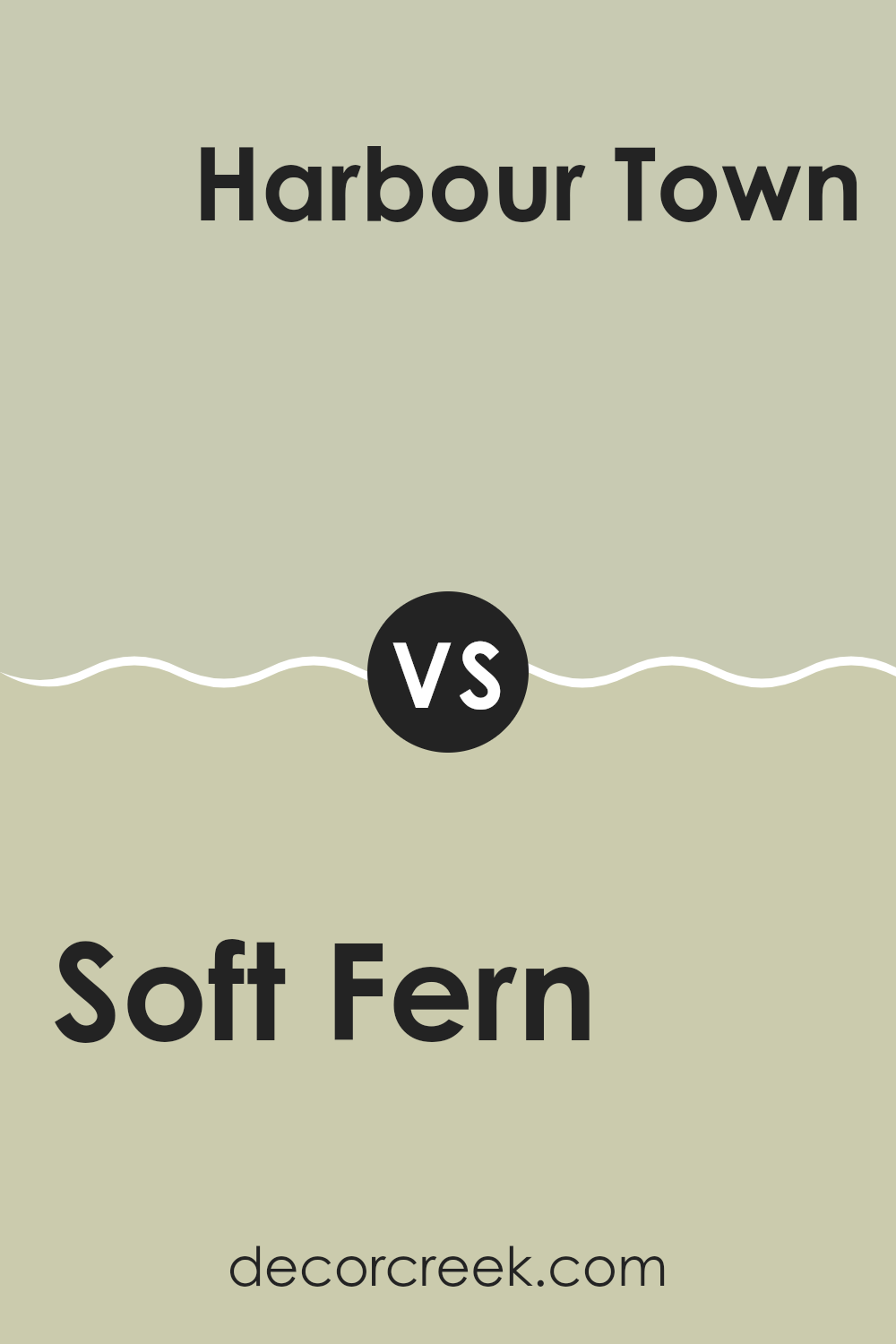
Soft Fern 2144-40 by Benjamin Moore vs Harbour Town 493 by Benjamin Moore
Soft Fern by Benjamin Moore is a gentle green that brings a quiet, natural vibe to any room. It has a light, airy feel, making it perfect for rooms where you want a touch of calm without overpowering the senses.
In contrast, Harbour Town by Benjamin Moore offers a deeper, more pronounced green that tends to make a bolder statement. This color is great for areas where you want to add a bit of drama or anchor the room with something stronger.
Both colors are adaptable and can work well in various settings, but Soft Fern leans toward a softer, more subtle look, while Harbour Town is more noticeable and rich. Depending on what atmosphere you’re aiming for in a room, both colors offer unique benefits and can be used to create beautiful, inviting interiors.
You can see recommended paint color below:
- 493 Harbour Town
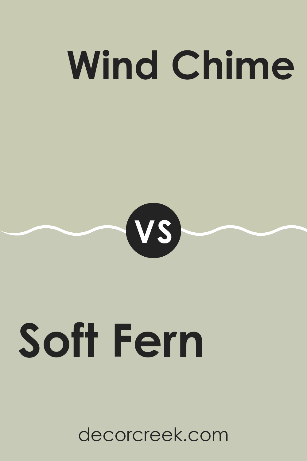
Soft Fern 2144-40 by Benjamin Moore vs Wind Chime AF-465 by Benjamin Moore
Soft Fern by Benjamin Moore is a gentle green shade with a soft, welcoming vibe perfect for creating a cozy atmosphere in any room. It has a fresh feel reminiscent of spring, which can lighten up dark rooms or give a room an air of calmness.
On the other hand, Wind Chime by Benjamin Moore is a neutral gray with a slightly cool undertone. This color is extremely adaptable, ideal for those looking to create a modern, clean look in their room. It pairs well with a variety of decor styles and adds a touch of elegance without overpowering the room.
Both colors offer unique advantages: Soft Fern brings a hint of nature indoors, promoting a comforting environment, while Wind Chime provides a more understated, contemporary backdrop suitable for various design settings. Choosing between them depends on the desired mood and color scheme of your room.
You can see recommended paint color below:
- AF-465 Wind Chime
Soft Fern 2144-40 by Benjamin Moore vs Guilford Green HC-116 by Benjamin Moore
Soft Fern by Benjamin Moore is a gentle, soothing green with a hint of gray, making it adaptable for any room. It evokes a natural feel, blending well with both modern and traditional decor. Its light gray undertone softens the green, giving it a subdued and calming appearance that works well in rooms meant for relaxation, like bedrooms and living areas.
On the other hand, Guilford Green has a brighter, more vivid presence. It’s a true green that brings a fresh and lively feel to rooms. This color is excellent for areas where you want to add a touch of cheerfulness without overpowering the senses. It’s particularly good in kitchens or any room where natural light can enhance its vibrant qualities.
In summary, Soft Fern is more muted and neutral, making it a great choice for a calming effect. Guilford Green, with its richer and pure green tone, is ideal for creating a refreshing and inviting atmosphere.
You can see recommended paint color below:
Soft Fern 2144-40 by Benjamin Moore vs Grecian Green 507 by Benjamin Moore
Soft Fern and Grecian Green, both by Benjamin Moore, are distinct yet subtly harmonious green hues. Soft Fern has a gentle, muted quality, making it ideal for creating a calm and cozy atmosphere in rooms like living areas or bedrooms.
It leans slightly toward a soft, sage green, providing a light and airy feel without overpowering a room. On the other hand, Grecian Green is deeper and more vibrant, with stronger hints of green that can add a lively touch to any room. This color works well in areas that benefit from a bit more energy and vitality, like kitchens or dining areas.
While both colors bring the freshness of nature indoors, Soft Fern offers a whisper of color, and Grecian Green makes more of a statement. Their varying intensities make them suitable for different purposes yet equally appealing for those who love green tones.
You can see recommended paint color below:
- 507 Grecian Green
As I wrap up my thoughts on Benjamin Moore’s 2144-40 Soft Fern paint, I feel really excited about how much I’ve learned and shared about this unique color. Soft Fern isn’t just any green; it brings a sense of calm and freshness wherever you use it, like bringing a little piece of the outdoors inside your home.
From testing it in different rooms to seeing how it pairs with various furniture and decor, it’s clear that Soft Fern is an adaptable color. It blends well with many other shades, making it easy to use when you want to give your room a new look without too much fuss.
Whether you’re painting a whole room or just adding a touch of color here and there, Soft Fern can definitely make your home feel more lively and comfortable. It’s like the gentle color of spring leaves, which feels soothing and balanced.
Overall, trying out 2144-40 Soft Fern by Benjamin Moore has been a fun and inspiring experience. It’s a wonderful choice if you’re looking to freshen up your home with a natural and cozy vibe. So if you’re thinking about a new paint color, you might want to consider Soft Fern — it could be just the right touch to make your home feel perfectly inviting.
Ever wished paint sampling was as easy as sticking a sticker? Guess what? Now it is! Discover Samplize's unique Peel & Stick samples.
Get paint samples

