As I researched new colors for a bedroom makeover, I stumbled across HC-116 Guilford Green from Benjamin Moore. Initially, I was looking for something soft yet vibrant enough to give the room a fresh look without being too bold. This shade caught my attention because of its subtle yet lively character, which seemed just right for creating a calm atmosphere.
Guilford Green is a part of Benjamin Moore’s Historic Color collection. It is a soothing, muted green that carries a whisper of grey undertones, making it an excellent choice for a calm and grounding environment. This color fits beautifully with natural materials and light woods, enhancing the area without overpowering it.
I found that pairing it with whites or soft creams opened up the room, giving it a more airy and inviting feel. What I appreciate most about Guilford Green is its adaptability—it works equally well in a sunlit living room as it does in a shadowy reading nook.
If you’re thinking about refreshing a room in your home, Guilford Green might just be the perfect hue to consider for a balanced and refreshing ambiance.

What Color Is Guilford Green HC-116 by Benjamin Moore?
Guilford Green is a fresh and adaptable shade that brings a touch of nature indoors. As a light green with subtle gray undertones, it provides a calming backdrop that’s easy on the eyes and complements a variety of decor styles. This color is particularly effective in creating a relaxed atmosphere, making it ideal for rooms like living areas, bedrooms, and bathrooms where comfort is key.
The color works well with natural materials such as wood, linen, and cotton, enhancing their textures and adding depth to the overall aesthetic of the room. When paired with wood, whether it’s light oak or dark walnut, Guilford Green highlights the warm tones of the timber. With fabrics like linen and cotton, it promotes a soft, airy feel, perfect for creating a cozy, inviting area.
Guilford Green is best suited for interior styles that lean towards the casual, such as modern farmhouse, Scandinavian, and coastal. These styles benefit from its natural, understated quality, allowing the color to blend seamlessly with elements like rustic wood furnishings, woven baskets, and soft, plush textiles.
In a modern farmhouse setup, it complements shiplap walls and rustic wooden beams, while in a Scandinavian context, it enhances the clean, minimalistic lines and neutral color palettes typical of this style. In coastal interiors, it echoes the colors of the seaside, pairing beautifully with sandy shades, blues, and crisp whites.
Is Guilford Green HC-116 by Benjamin Moore Warm or Cool color?
Guilford Green HC-116 is a fresh and lively color offered by Benjamin Moore. This shade of green brings a natural vibe into any room, making areas feel welcoming and relaxed. It has a softness that works well in light-filled rooms but also adds brightness to areas that may not get a lot of sunlight.
The color pairs beautifully with both light and dark woods, which makes it adaptable for furniture and flooring. It’s an excellent choice for living rooms, bedrooms, and kitchens where a touch of nature’s calmness is desired without overpowering the senses.
Guilford Green HC-116 also complements a wide range of decor styles, from modern to traditional, adjusting easily to various settings. This color can make small rooms appear bigger and more open, offering a simple and effective way to refresh your home. Whether used as a main wall color or as an accent, Guilford Green adds a gentle yet dynamic energy to interiors, ensuring a stylish and enjoyable environment.
Undertones of Guilford Green HC-116 by Benjamin Moore
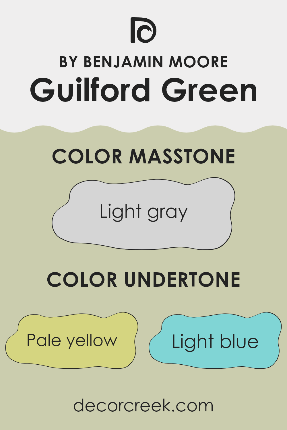
Guilford Green is a unique paint color that stands out for its adaptability, largely due to its range of subtle undertones. These undertones aren’t just a single hue but a spectrum of pale yellow, light blue, light purple, mint, pale pink, lilac, and grey. Each of these undertones can make a significant difference in how the color appears under different lighting conditions and against different decor elements.
In general, undertones can affect the perception of color by adding depth and complexity. For instance, a color with a yellow undertone might seem warmer, while a blue undertone can impart a cooler feel. Understanding these subtleties can impact both the mood of a room and how other colors in the area interact.
When used on interior walls, the plethora of undertones in Guilford Green can influence the ambiance of any room. The light blue and mint undertones might give a fresh and airy feel, ideal for a calm and relaxing environment like a bedroom or bathroom. The inclusion of pale pink or lilac could provide a softer, more soothing backdrop that enhances natural light in living rooms.
The grey and pale yellow undertones help balance these effects, ensuring the color remains neutral and flexible, fitting into various decorating styles. Therefore, when choosing this color for home walls, the lighting, room size, and accompanying decor should be considered to bring out the desired effect of these undertones optimally.
decorcreek.com
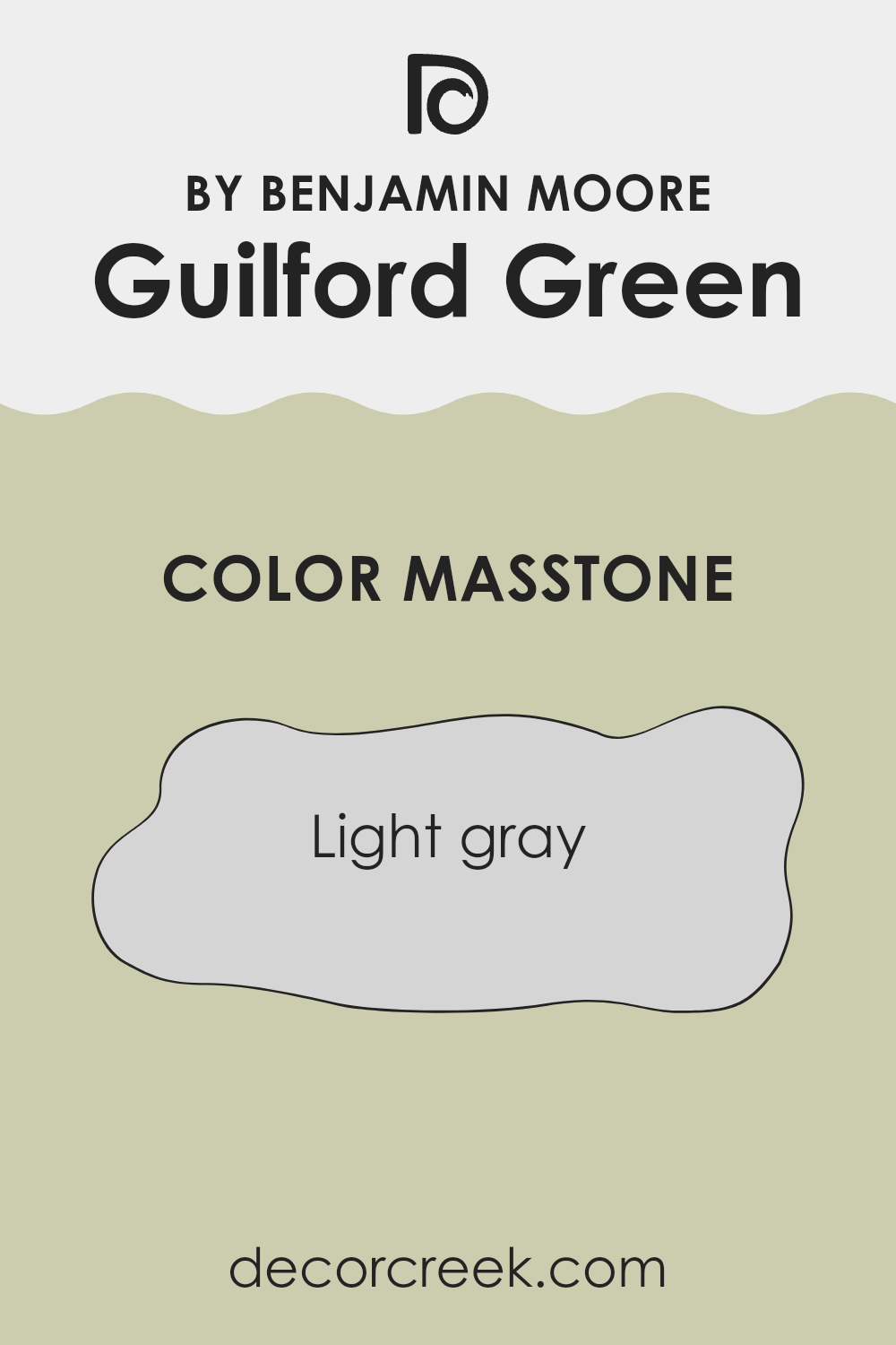
What is the Masstone of the Guilford Green HC-116 by Benjamin Moore?
Guilford Green HC-116 is a unique shade of light gray that offers a fresh and inviting atmosphere when used in home interiors. This particular tone, reflecting a light gray color, merges well with various decor styles, whether modern or traditional.
It’s an adaptable color that can help brighten up rooms that receive less natural light, making areas feel larger and more open. In larger rooms, such as living areas, using Guilford Green on the walls can create a calm, cohesive backdrop that allows furniture and art to stand out.
In smaller rooms like bathrooms, it can give a clean and continuous look. Furthermore, it’s easy to pair with both bold and soft hues, allowing for personalization in your decorating choices. For example, pairing it with deep blues or vibrant yellows can add a dynamic contrast, while soft whites and creams can create a more relaxed and gentle atmosphere.
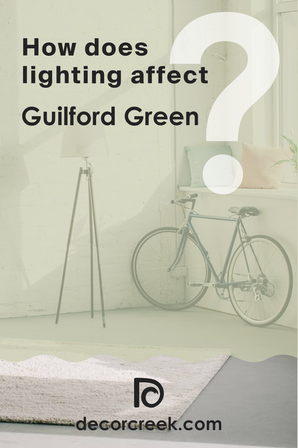
How Does Lighting Affect Guilford Green HC-116 by Benjamin Moore?
Lighting plays a crucial role in how colors appear in different settings. The way light interacts with painted surfaces can dramatically change the perception of a color. For instance, the color Guilford Green by Benjamin Moore might look different under various lighting conditions.
In artificial light, like the glow from bulbs and lamps, Guilford Green tends to appear slightly warmer and richer. This is because most artificial lighting, except cool LED light, has yellow or warm undertones, which can add a cozy feel to the green, making it seem more vibrant and welcoming.
In natural light, the appearance of Guilford Green can vary significantly depending on the time of day and the direction of the sunlight. Natural light typically shows the truest color, but the amount and intensity of the light can alter this perception.
In north-facing rooms, Guilford Green will likely look more subdued and slightly cooler, as the light from the north is often softer and bluer. This can make the room feel calm and refined without being too bold.
South-facing rooms enjoy abundant light for most of the day, which can make Guilford Green look brighter and more lively. The ample sunlight brings out the vibrancy of the green, making the room feel fresh and lively.
East-facing rooms receive light in the morning when the sun is rising. This means that Guilford Green will appear brighter and warmer in the morning, taking on a cheerful tone, and then transition to a softer and cooler shade as the day progresses and the light diminishes.
West-facing rooms get the evening sun, which can be quite warm and golden. Here, Guilford Green might appear warmer towards the evening, feeling cozy and inviting as the sunlight enhances its yellow undertones.
Overall, when choosing colors like Guilford Green for your room, consider the room’s orientation and the type of light it receives to ensure you get the desired effect at different times of the day.
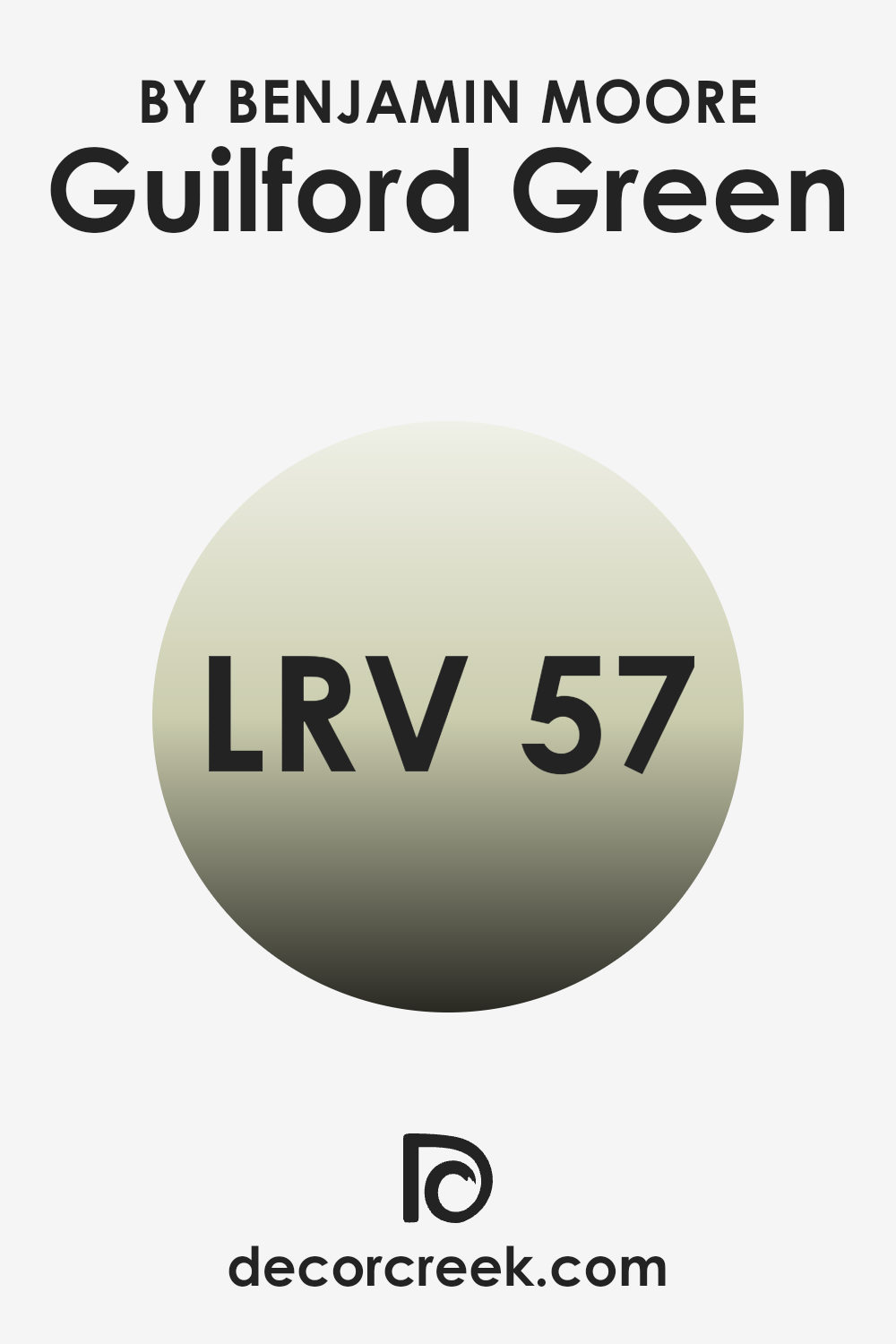
What is the LRV of Guilford Green HC-116 by Benjamin Moore?
LRV stands for Light Reflectance Value, which is a measure of how much light a color reflects back into a room versus how much it absorbs. When a paint has a high LRV, it means that the color is lighter and reflects more light around the room, while a low LRV means the color is darker and absorbs more light, making the room feel potentially dimmer or cozier.
This scale helps people decide how a paint color might affect the atmosphere and brightness of a room. The LRV of Guilford Green is 57.22, placing it in the mid-range of the scale. This means it is a moderately light color that will reflect a decent amount of light but won’t make a room feel overly bright.
In practical terms, Guilford Green can add a fresh and airy feel without being too intense. It’s likely to brighten up moderately lit rooms while still maintaining a sense of warmth and depth. This can make it an adaptable choice for many rooms, helping to enhance natural light where it’s available, but not making dim areas feel cold or stark.
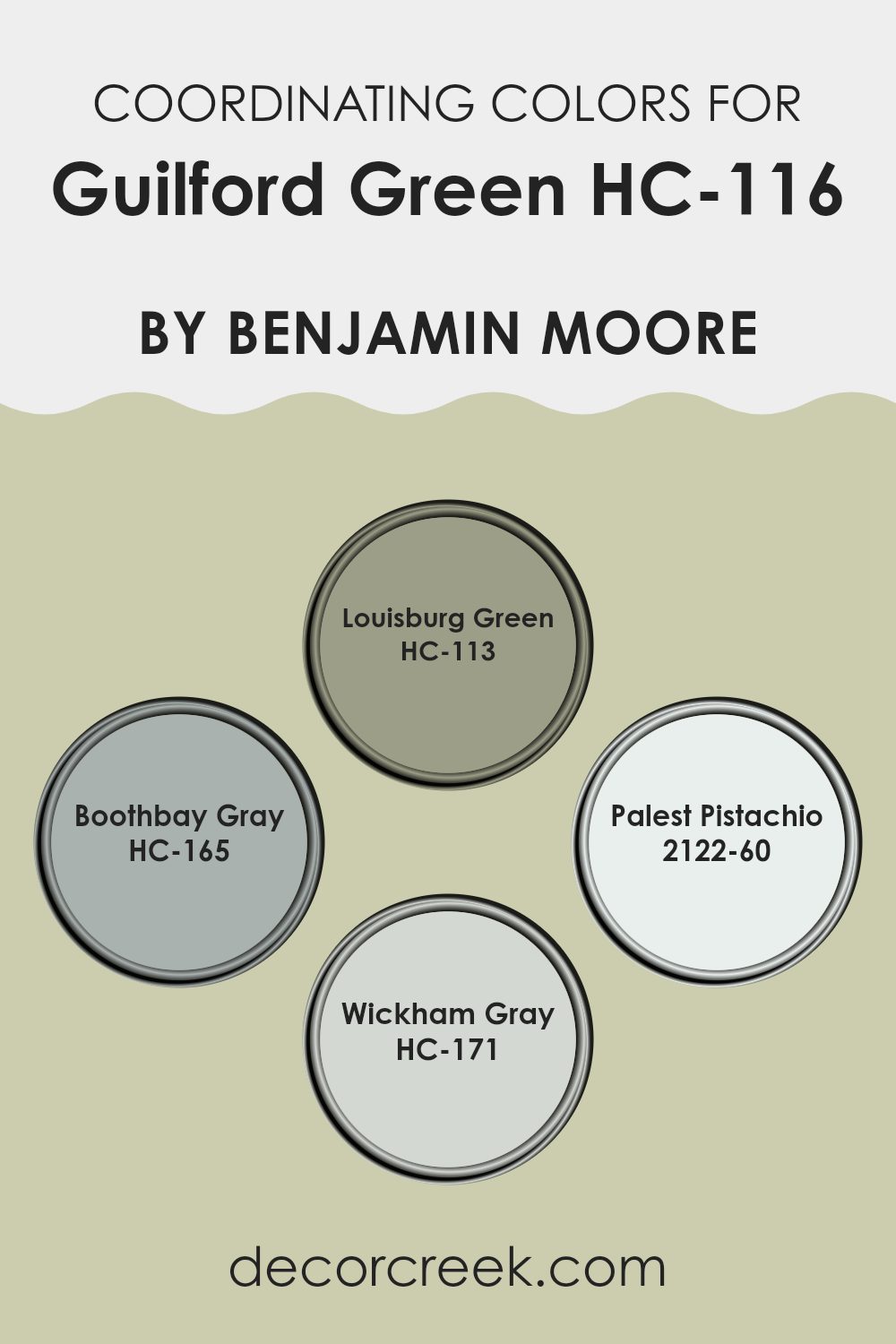
Coordinating Colors of Guilford Green HC-116 by Benjamin Moore
Coordinating colors are shades that complement and enhance each other when used together in a design. They are usually selected from the same color palette or share similar undertones, creating a harmonious look. Coordinating colors can make decorating simpler because they ensure all elements of the room work together, creating a cohesive appearance. For instance, colors like Louisburg Green, Boothbay Gray, Palest Pistachio, and Wickham Gray are great companions for Guilford Green due to their harmonizing tones.
Louisburg Green is a deep, earthy green that adds a rich backdrop to the lighter Guilford Green, offering a touch of drama and depth to rooms. Boothbay Gray has a cool, subtle blue undertone making it perfect for a calming effect when paired with the lively Guilford Green.
Palest Pistachio is a soft, whisper-light green that introduces a gentle, airy feel, ideal for creating a soothing ambience. Lastly, Wickham Gray offers a balanced, medium gray shade that complements green hues well, grounding rooms without overpowering them, which works particularly well in modern and minimalistic designs. Each of these colors, when used alongside Guilford Green, maintains a balanced, fresh aesthetic that feels coordinated and pleasant.
You can see recommended paint colors below:
- HC-113 Louisburg Green
- HC-165 Boothbay Gray
- 2122-60 Palest Pistachio
- HC-171 Wickham Gray
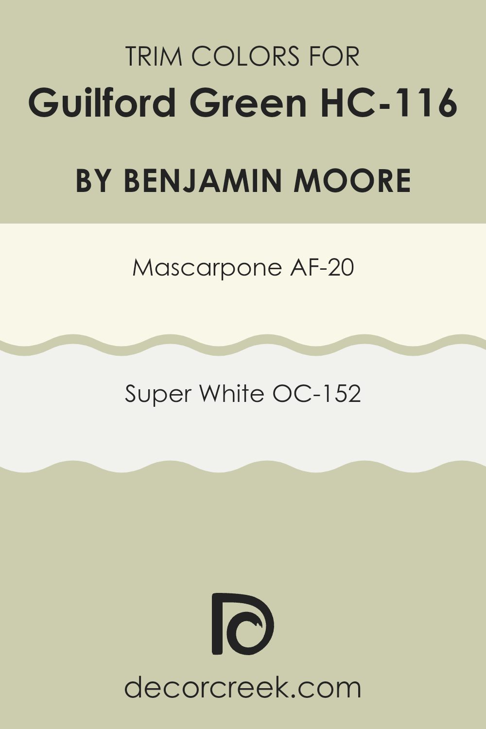
What are the Trim colors of Guilford Green HC-116 by Benjamin Moore?
Trim colors are specifically chosen shades that are used to highlight or complement the main colors on a wall, typically applied to door frames, window trim, baseboards, and crown molding. For a color like Guilford Green by Benjamin Moore, selecting the right trim color is essential for creating a well-balanced and pleasing aesthetic.
Trim colors like AF-20 – Mascarpone and OC-152 – Super White are often used because they contrast nicely with Guilford Green, bringing a clear, clean look to the edges and features of a room. These trim colors help define the rooms, making architectural details pop and giving a finished look to the interior design.
AF-20 – Mascarpone, one option as a trim color for Guilford Green, offers a creamy, soft white that has a warm undertone, making it less stark than a pure white. This shade works wonderfully in softening the transition between the wall color and the trim, providing a subtle yet inviting contrast.
On the other hand, OC-152 – Super White is a brighter, crisper white that provides a more striking contrast with Guilford Green. This shade is excellent for making the green stand out and giving a fresh, clean look to the room’s edges, which can make a room appear more lively and defined.
You can see recommended paint colors below:
- AF-20 Mascarpone
- OC-152 Super White
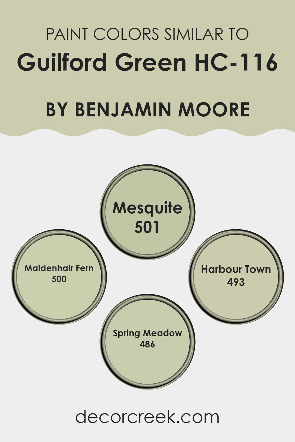
Colors Similar to Guilford Green HC-116 by Benjamin Moore
In interior design, using similar colors can create a harmonious and coherent look, making rooms feel more connected and flowing. For instance, selecting shades close to Guilford Green, like Mesquite, Maidenhair Fern, Harbour Town, and Spring Meadow, ensures that each room maintains a cohesive color story while allowing for subtle nuances that add interest and individuality. These colors work well together because they share similar undertones but vary just enough in depth and intensity to define different rooms or features within a home.
For instance, Mesquite is a slightly deeper, more muted green that can provide a grounding effect in a room, making it ideal for creating a cozy corner or accenting woodwork. Maidenhair Fern, on the other hand, has a fresher, lighter green hue that brightens rooms and brings in a touch of nature’s freshness, perfect for kitchens and bathrooms.
Harbour Town offers a grayish-green tone that works well in more modern or industrial settings, giving a slightly edgier feel to the room without deviating from the green theme. Lastly, Spring Meadow offers a vibrant, lively green that can inject energy into a room, excellent for a children’s play area or a creative area. Together, these hues can beautifully enhance the primary color scheme inspired by Guilford Green, allowing for both unity and individual expression in home decor.
You can see recommended paint colors below:
- 501 Mesquite
- 500 Maidenhair Fern
- 493 Harbour Town
- 486 Spring Meadow
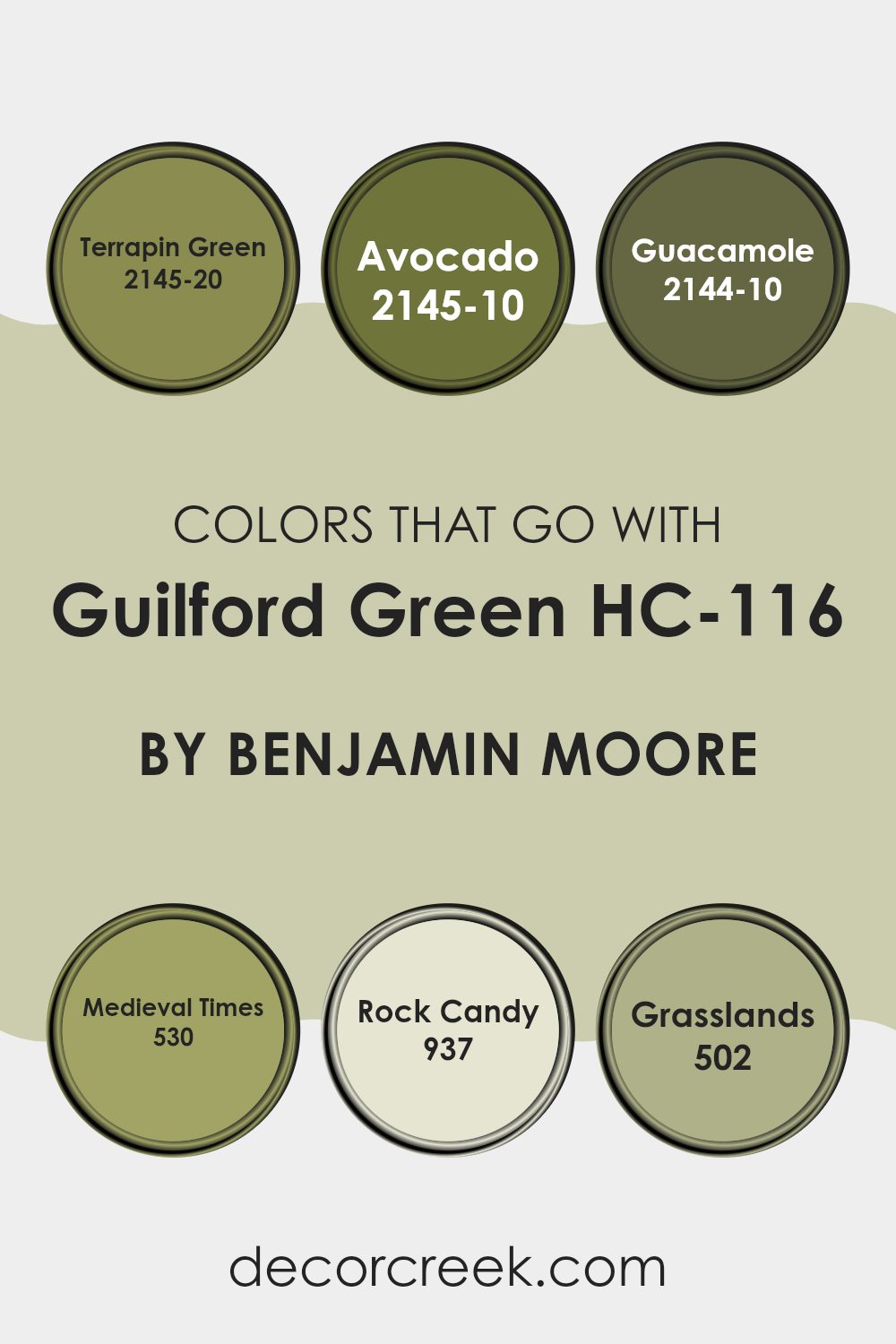
Colors that Go With Guilford Green HC-116 by Benjamin Moore
When choosing a complementary color palette for Guilford Green HC-116 by Benjamin Moore, the importance of picking the right hues cannot be understated. Colors like Terrapin Green, Avocado, Guacamole, Medieval Times, Rock Candy, and Grasslands are selected specifically to create a harmonious look that enhances the calming essence of Guilford Green.
This coordination of colors ensures that the room maintains a cohesive aesthetic, allowing each hue to support and accentuate the others without overpowering. When these colors are used together, they bring balance and continuity to interiors, making the environment more appealing and visually coherent.
For instance, Terrapin Green offers a deep, dusky green that acts as a bold contrast, giving depth to the softness of Guilford Green. Avocado, with its richer, slightly darker tone, provides a solid grounding effect, ideal for adding a touch of nature-inspired robustness to a room.
On the other hand, Guacamole is lighter and brings a playful vibrancy that can brighten rooms. Medieval Times introduces a gray undertone, which pairs excellently with Guilford Green for those looking for a muted yet impactful color scheme.
Rock Candy is a subtle off-white, perfect for softening transitions between the more intense shades of green. Finally, Grasslands, with its medium tone, blends beautifully, ensuring that the entire palette flows smoothly from one color to the next, enhancing the overall aesthetic appeal of a room.
You can see recommended paint colors below:
- 2145-20 Terrapin Green
- 2145-10 Avocado
- 2144-10 Guacamole
- 530 Medieval Times
- 937 Rock Candy
- 502 Grasslands
How to Use Guilford Green HC-116 by Benjamin Moore In Your Home?
Guilford Green HC-116 by Benjamin Moore is a gentle and inviting shade of green that can make any room feel welcoming and fresh. It’s perfect for creating a relaxing atmosphere in your home, whether you’re painting a living room, bedroom, or even a kitchen. With its soft and subtle tone, Guilford Green works well with both light and dark furniture, making it quite adaptable.
You could use this color to paint all the walls in a room for a calming, cohesive look. If you prefer a more balanced approach, consider using it on just one feature wall. This can add a nice touch of color without overpowering the room. Guilford Green also looks great when paired with white trim or cabinets, which can help to brighten the room and make it feel larger.
For those who like a bit of creativity, this color can be used in stenciling or other decorative painting techniques. This way, you can add unique touches to your room that reflect your personal style while still keeping the overall feel light and easy.
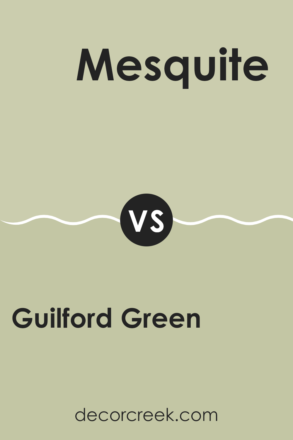
Guilford Green HC-116 by Benjamin Moore vs Mesquite 501 by Benjamin Moore
Guilford Green and Mesquite are two colors by Benjamin Moore with distinct vibes. Guilford Green is a soft, light green with a hint of gray, making it very calm and soothing. It’s perfect for creating a relaxed atmosphere in a room, like a bedroom or living room.
On the other hand, Mesquite is a deeper, earthy tone that resembles a mix of brown and gray. It’s great for rooms where you want a more grounded and cozy feel, such as a study or den.
The subtleness of Guilford Green pairs nicely with brighter accents, while Mesquite works well with lighter colors to balance its depth. Together, they could complement each other nicely in a room that aims for a natural and comforting aesthetic. Each holds its unique appeal, depending on what mood you’re trying to set.
You can see recommended paint color below:
- 501 Mesquite
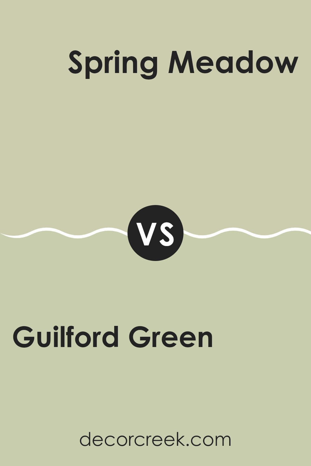
Guilford Green HC-116 by Benjamin Moore vs Spring Meadow 486 by Benjamin Moore
Guilford Green and Spring Meadow by Benjamin Moore are two distinct shades that each bring a unique vibe to any room. Guilford Green is a soft, subtle green that has a hint of gray. It’s an adaptable color that works well in most rooms, providing a calm, peaceful feel without being too bright. This makes it a great backdrop for various decor styles and colors.
On the other hand, Spring Meadow is a more vibrant green. It’s fresh and lively, reminiscent of grass in spring. This color will add a cheerful and energetic touch to a room, perfect for areas that could use a visual lift. It’s brighter and can energize a room’s atmosphere, making it ideal for rooms where you want to create a more playful or invigorating setting.
When you compare them, Guilford Green offers a more muted, understated look, while Spring Meadow packs a punch with its brightness and vibrancy. Depending on what mood or theme you’re aiming for, each color has its advantages.
You can see recommended paint color below:
- 486 Spring Meadow
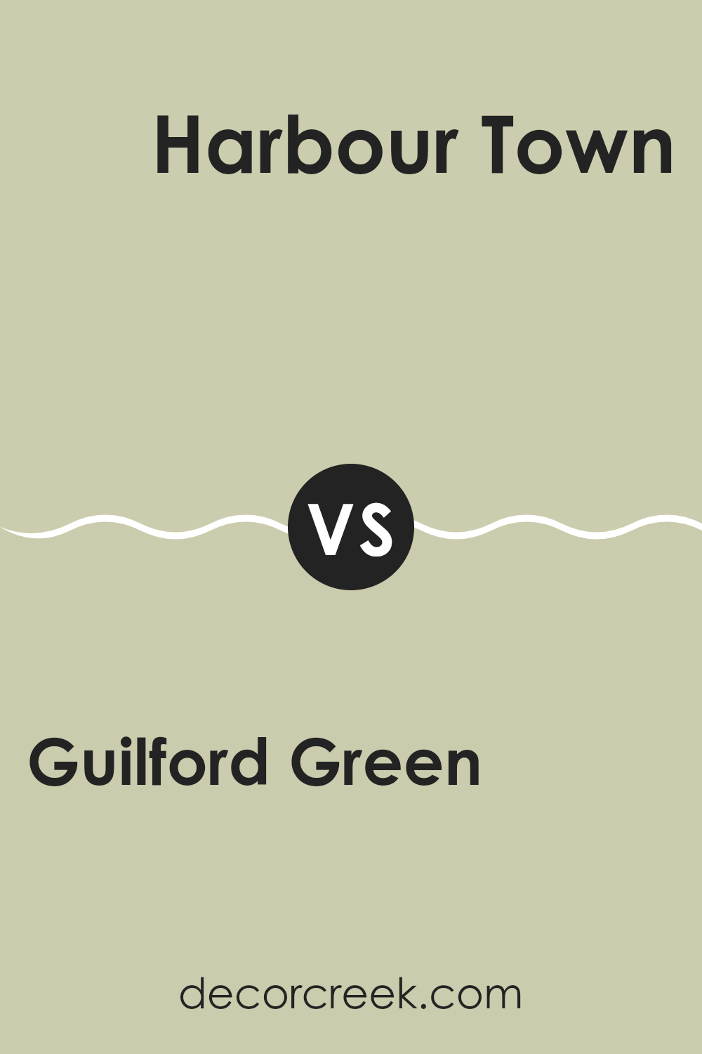
Guilford Green HC-116 by Benjamin Moore vs Harbour Town 493 by Benjamin Moore
Guilford Green by Benjamin Moore is a soft, muted green with a subtle hint of gray, giving it a calming and gentle feel. This color is adaptable and works well in rooms where you want a touch of nature without overpowering the area with a strong green. It pairs nicely with a wide range of colors, making it a good choice for many decorating styles.
On the other hand, Harbour Town by Benjamin Moore is a deeper, richer green. It has more intensity than Guilford Green, offering a stronger presence and a touch of drama. Harbour Town might be better suited for rooms where you want the color to make a bolder statement, like in an accent wall or a room with ample lighting.
Overall, while both are greens, Guilford Green is lighter and more neutral, making it easier to fit into various decors. Harbour Town is deeper and can act as a focal point in the design.
You can see recommended paint color below:
- 493 Harbour Town
Guilford Green HC-116 by Benjamin Moore vs Maidenhair Fern 500 by Benjamin Moore
Guilford Green and Maidenhair Fern by Benjamin Moore are both inspired by nature, but they bring different vibes to the table. Guilford Green is a soft, muted green that gives a subtle and calming effect to any room. It’s light enough to act as a neutral backdrop, allowing other colors and decor elements to stand out.
In contrast, Maidenhair Fern is a deeper, richer green that can make a bigger statement. It’s perfect for creating a cozy feel or drawing attention to a specific area like an accent wall. While Guilford Green blends effortlessly into the surroundings, Maidenhair Fern demands a bit more consideration in terms of matching with other colors and furnishings.
Both colors work beautifully in rooms that aim to echo the outdoors but in distinctly different ways. Guilford Green is ideal for creating a light, airy feel, while Maidenhair Fern works well in rooms that benefit from a touch of depth and boldness.
You can see recommended paint color below:
- 500 Maidenhair Fern
Concluding my thoughts on HC-116 Guilford Green by Benjamin Moore, I have to say it’s a paint color that really makes a room feel cheerful and calming. After trying it out, I found that Guilford Green has a soft, light green shade that adds a fresh and cozy feel to any room. It’s not too bright but has enough color to make a wall stand out nicely. This makes it excellent for rooms like the living room or bedroom where you spend a lot of time and want to feel relaxed.
I also noticed that Guilford Green works really well with different kinds of furniture and decorations. Whether you have dark wood tables or lighter-colored sofas, this shade of green adds a lovely background without clashing with other colors. It’s easy to use and can fit into many home styles, whether you like things modern or more traditional.
Overall, for anyone looking to refresh their home with a new paint color, I would recommend Guilford Green. It’s simple, looks clean, and creates a friendly atmosphere. It’s definitely a color that makes you happy to be in the room every time you walk in.
Whether you’re giving your room a new look or just trying out something different, Guilford Green by Benjamin Moore is worth considering.
Ever wished paint sampling was as easy as sticking a sticker? Guess what? Now it is! Discover Samplize's unique Peel & Stick samples.
Get paint samples

