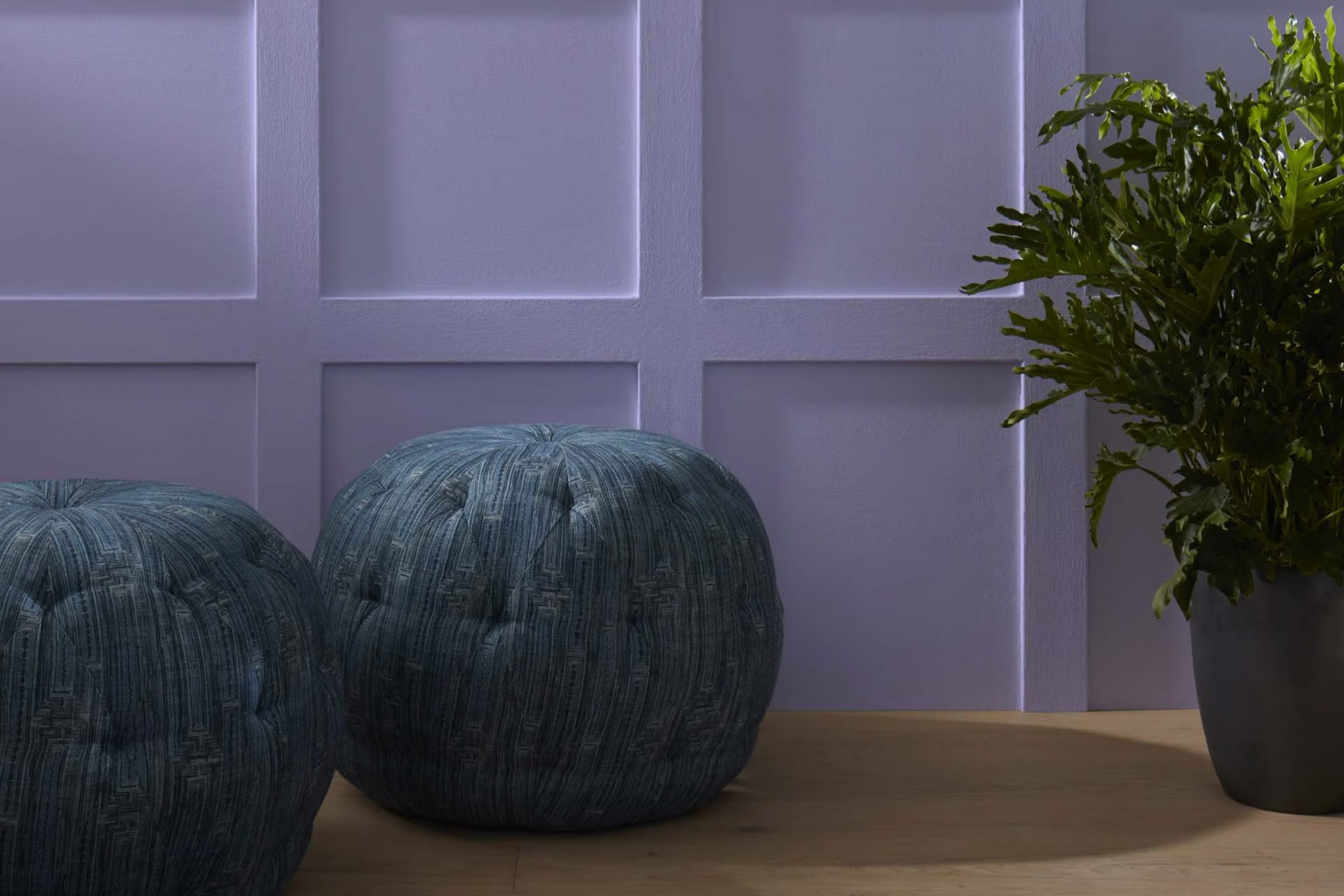
Choosing the right color for a room in your home can sometimes feel overpowering, but when I came across Benjamin Moore’s 2070-40 Spring Purple, it felt like a breath of fresh air. This shade offers a gentle nudge toward brightness and playfulness, setting a lively yet soothing ambiance in any room. Whether you’re looking to liven up a living room or bring a splash of cheer to a bedroom, Spring Purple strikes a beautiful balance between vibrancy and calmness.
Spring Purple has enriching blue undertones that lend it a unique vibrancy, making it particularly appealing for rooms that benefit from a drop of calm and a splash of energy. It’s amazing how this color adapts to different lighting conditions, showing off various hues throughout the day, from a bright lavender in the morning light to a deeper, dusky purple as the evening sets in.
If your goal is to create a room that feels both cozy and spirited, Benjamin Moore’s Spring Purple might be the perfect choice. It has certainly changed the way I look at potential color schemes, and could possibly change your perspective too!
Whether you pair it with soft neutrals or bold shades, it consistently proves to be wonderfully adaptable.
What Color Is Spring Purple 2070-40 by Benjamin Moore?
Spring Purple (2070-40) by Benjamin Moore is a vibrant and playful shade that fills rooms with a lively atmosphere. This hue has a bubbly personality, combining deep violet tones with a touch of playful brightness, which makes it perfect for creating a focal point in any room. The color is adaptable enough to fit various interior design styles, particularly modern, eclectic, and contemporary rooms where a splash of color can add a fresh dimension.
When it comes to pairing materials and textures with Spring Purple, it works exceptionally well with natural elements. For instance, light woods like beech or maple help in softening its intensity, creating a warm and welcoming vibe. Incorporating metallic accents in silver or brushed nickel can also add a modern twist, balancing the room’s look.
Textured fabrics like velvet or silk in complementary or contrasting colors can enrich the overall look of a room decorated with Spring Purple. For a more layered design, incorporating accessories in mustard yellow or teal can highlight its playful nature, making an interior look more dynamic and inviting.
Overall, Spring Purple is a superb choice for those looking to add a distinct touch of vivacity to their living room, promising a fresh and stylish atmosphere.

Is Spring Purple 2070-40 by Benjamin Moore Warm or Cool color?
Spring Purple 2070-40 by Benjamin Moore is a vivid and lively shade of purple that can add a playful touch to any room in your home. Its bright tones are perfect for creating a cheerful and inviting atmosphere. This color works brilliantly in rooms that benefit from a touch of personality, such as a child’s bedroom, a craft room, or even a dining area.
What’s unique about Spring Purple is how it combines the warmth of red with the calmness of blue, resulting in a purple that’s both energetic and soothing. This makes it a adaptable choice that can pair well with neutral shades like whites and grays, as well as with other vibrant colors for a more dynamic scheme.
Using this color in small doses, like on an accent wall or in decorative accessories, can liven up a room without overpowering it. It’s also great for stimulating creativity, making it an excellent choice for rooms where you think, create, or just enjoy hobbies.
Undertones of Spring Purple 2070-40 by Benjamin Moore
Spring Purple by Benjamin Moore is a complex color that reveals different characteristics depending on the light and surrounding elements. This particular shade has a variety of undertones which can subtly influence the overall perception of the color once applied to interior walls.
Undertones are essentially hints of other colors that are present within a main color but are not always immediately obvious to the eye. For example, if a paint like Spring Purple has a lilac undertone, in certain lighting conditions the color may lean slightly more toward a soft, gentle purple.
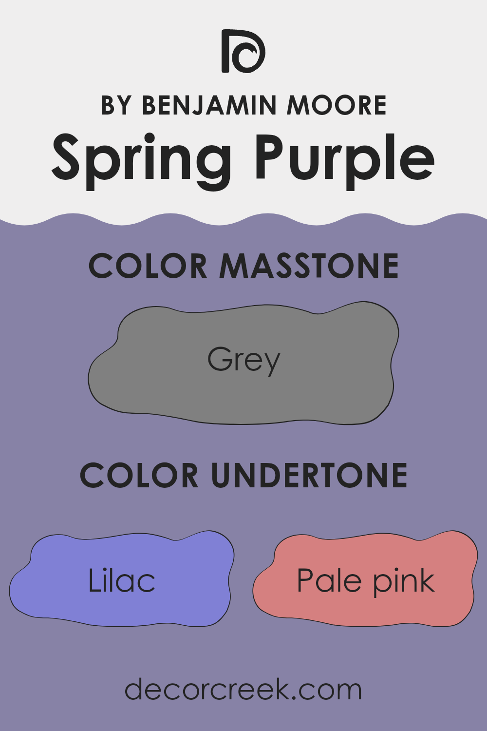
Spring Purple carries undertones ranging from lilac to various other hues like pale pink, light purple, and violet. These purple-family undertones improve the richness of the color, making it appear fuller and more vibrant. When used on walls, these undertones can make a room feel cozy and warm, especially in natural light.
Additionally, Spring Purple also contains undertones like mint and light turquoise, which can bring a fresh and somewhat airy feel to the room. These cooler undertones can help balance the warmth of the purple shades, providing a more balanced look.
Colors like light gray and pale yellow within the undertone spectrum add a subtle brightness and can prevent the purple from being too overpowering, creating a pleasant ambience in the room. This blend of undertones means that Spring Purple can adjust well to various lighting conditions and complement different decor styles. Whether the room gets a lot of sunlight or is mostly artificially lit, Spring Purple will offer varying experiences making it a flexible choice for many homes.
What is the Masstone of the Spring Purple 2070-40 by Benjamin Moore?
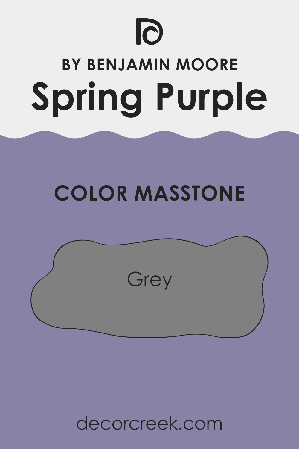
Spring Purple 2070-40 by Benjamin Moore, with its masstone being Grey (#808080), offers a unique and adaptable option for home interiors. This grey tone serves as a subtle background that easily blends with various decors and style preferences.
Since grey is a neutral color, it doesn’t overpower other shades in a room, making it perfect for rooms where balance and subtlety are desired. This quality allows homeowners to pair it with bolder, vibrant colors for contrast or keep a monochromatic scheme for a more unified look.
The neutrality of grey also works wonders in improving natural light, giving rooms a brighter appearance without the use of harsh whites. Moreover, Grey can help hide imperfections on walls better than lighter shades, making it practical for busy areas in a home. Overall, Spring Purple 2070-40 offers a calm, grounding base that can suit various decorating styles, adding depth and elegance without overpowering a room. This flexibility is a significant reason why it’s a popular choice for home interiors.
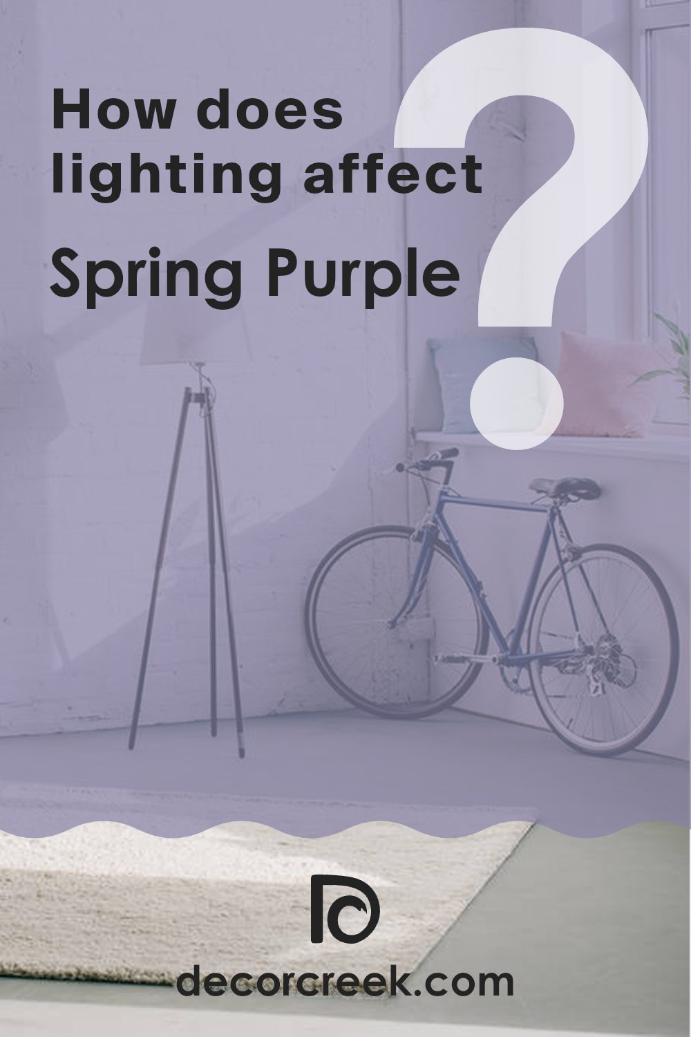
How Does Lighting Affect Spring Purple 2070-40 by Benjamin Moore?
Lighting plays a crucial role in how we perceive colors in our environments. The effect of light on color is particularly evident with vivid shades, such as Spring Purple by Benjamin Moore. The look of this color can change dramatically depending on whether it is illuminated by natural or artificial light and the direction of the room it is used in.
In natural light, colors tend to show their truest form. For Spring Purple, this means the color will appear vibrant and lively under sunlight. However, the quality and angle of natural light can alter this effect. For instance, in a north-facing room, which receives less direct sunlight and typically has cooler, softer light, Spring Purple might appear slightly more muted and subdued. The color can seem cooler and less intense, which might make the room feel calm and pleasant.
Conversely, in a south-facing room, where light is abundant and warmer for most of the day, Spring Purple will likely feel brighter and more dynamic. The warmth of the sunlight can improve the color, making it appear more vivid and rich, which adds a cheerful and energetic vibe to the room.
East-facing rooms receive intense light in the morning, which can make Spring Purple look very bright and welcoming at sunrise, gradually softening as the day progresses. This dynamic change can make an east-facing room a fascinating room to observe as the color shifts throughout the day.
West-facing rooms experience the reverse, with the more subdued morning light giving Spring Purple a softer tone that grows increasingly vibrant toward the evening. This change can create a stimulating environment in the afternoon and evening as the color becomes more noticeable.
Artificial lighting can also influence how Spring Purple is perceived. Under warm artificial lighting, the purple may appear richer and deeper, improving its presence in a room. Cooler light, like some LED lights, might render the color more toward a bluer, less warm purple, which could shift the mood of the room.
Understanding these nuances can help when deciding where to paint Spring Purple in your home to best use its vibrant qualities under different lighting conditions.
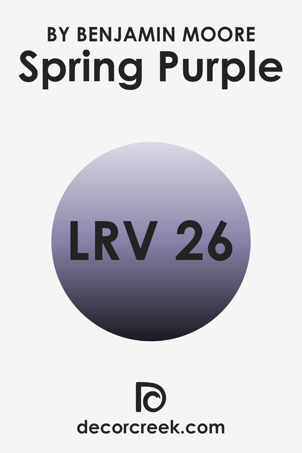
What is the LRV of Spring Purple 2070-40 by Benjamin Moore?
LRV stands for Light Reflectance Value, which is a measure indicating the amount of light a paint color reflects or absorbs. Think of it like this: the higher the LRV, the lighter the color appears because it reflects more light back into the room.
On the other hand, a lower LRV means the color is darker and absorbs more light, making rooms feel smaller or cozier. This value helps in choosing paint colors based on how bright or dim you want a room to feel. Especially when using color in poorly lit areas, a higher LRV can make a room feel brighter without adding more light sources.
For a color like Spring Purple which has an LRV of 25.65, it’s on the darker side of the scale. This means it absorbs more light than it reflects, which can have a dramatic effect on your walls. In a room with ample natural light, this color might look vibrant and rich.
However, in a dimly lit room, it could make the room feel smaller and more enclosed. When considering this color, lighting should be a major factor. Additionally, furniture and decor should either complement or contrast adequately to create a balanced look, ensuring the color adds character without overpowering the room.
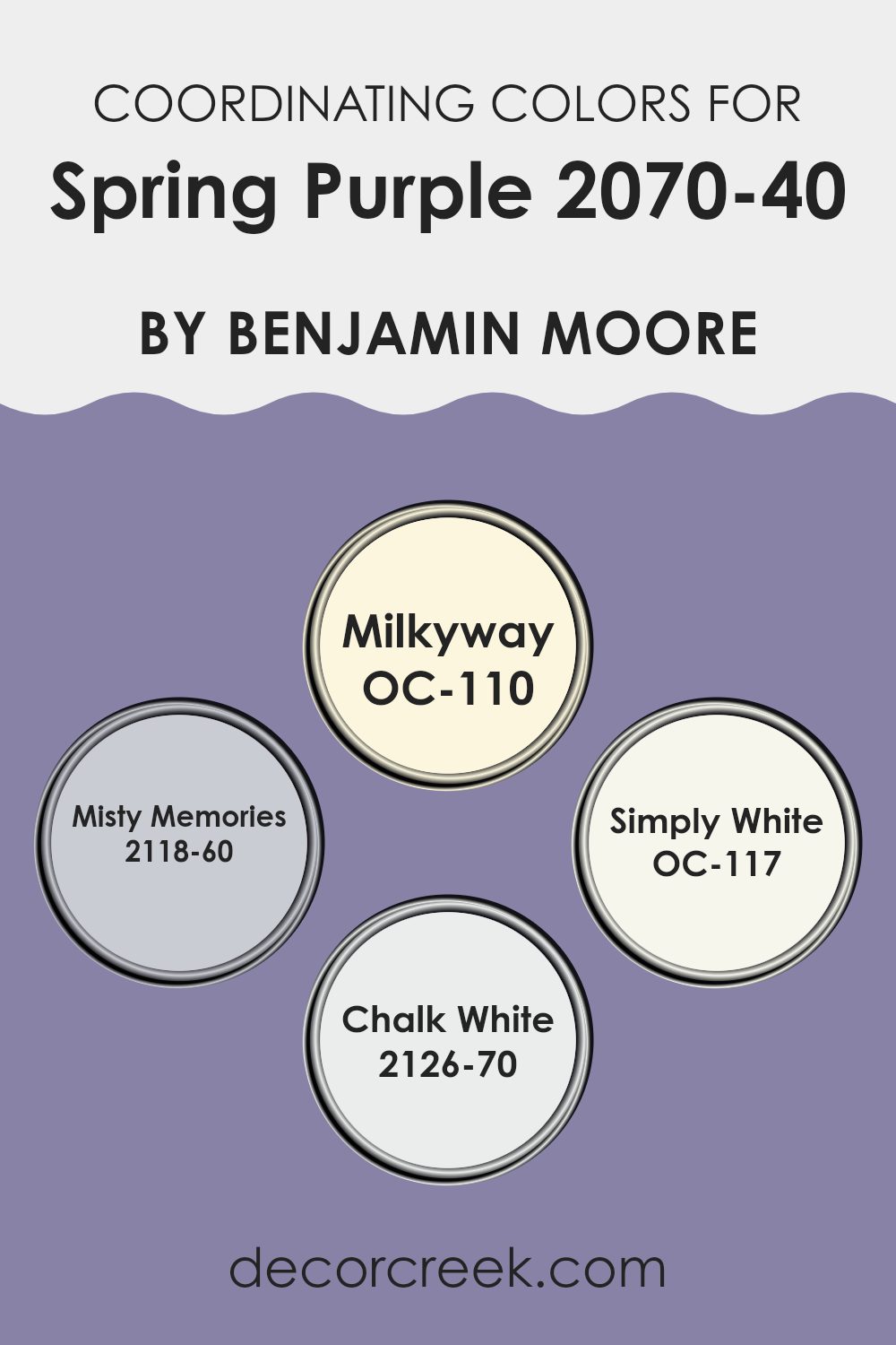
Coordinating Colors of Spring Purple 2070-40 by Benjamin Moore
Coordinating colors are those that harmonize well with a main hue, helping to create a visually appealing and cohesive color scheme. For example, when working with a vibrant hue like Spring Purple by Benjamin Moore, achieving a balanced and appealing palette involves selecting other shades that complement it nicely. These coordinating colors are often used to accent walls, furniture, or decorative elements, ensuring that everything in the room looks intentional and well-coordinated.
One coordinating color option is Milkyway (OC-110), a gentle off-white with a creamy base that can help to soften the intensity of a bolder shade like Spring Purple. It’s a great choice for trim or cabinetry to provide a subtle contrast. Another mild selection is Misty Memories (2118-60), a pale grey with blue undertones, offering a cooler complement that maintains a calm atmosphere.
Simply White (OC-117) is a clean and crisp white that provides a fresh backdrop, making other colors stand out while keeping the room light and airy. Lastly, Chalk White (2126-70) is a soft white with a slight grey undertone, perfect for creating a muted yet inviting environment when paired with more saturated colors. These hues work together to improve the primary color while adding depth and dimension to the room’s overall look.
You can see recommended paint colors below:
- OC-110 Milkyway
- 2118-60 Misty Memories
- OC-117 Simply White
- 2126-70 Chalk White
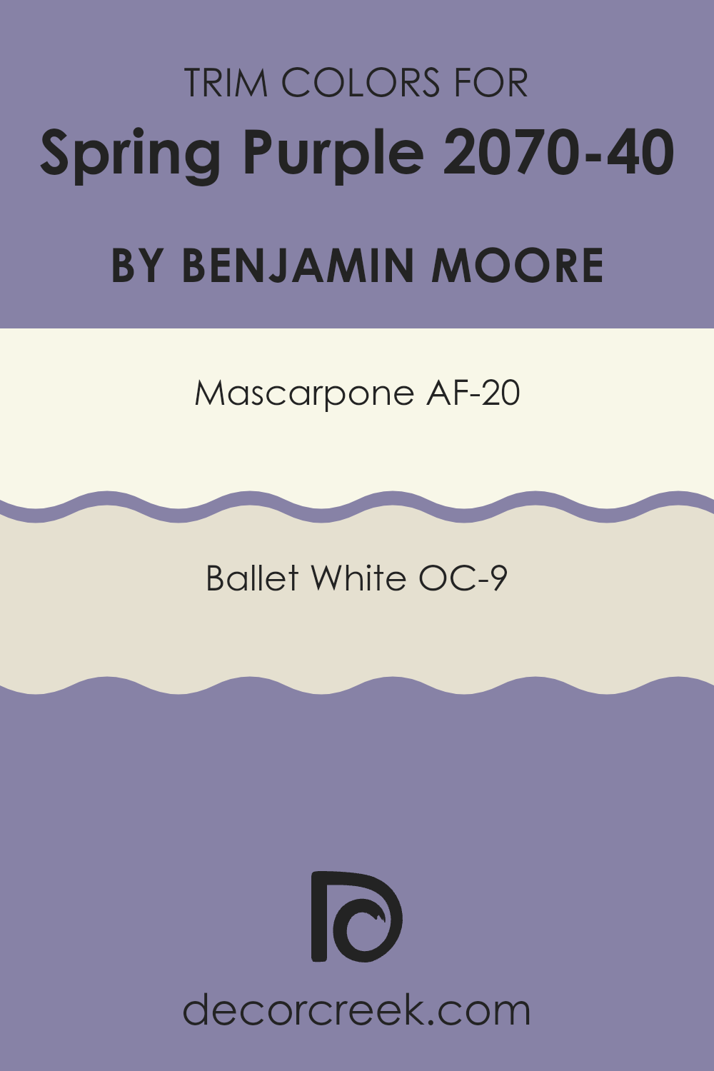
What are the Trim colors of Spring Purple 2070-40 by Benjamin Moore?
Trim colors are used in interior design to define and highlight the architectural features of a room, such as door frames, moldings, and window casings. These colors can either complement or contrast with the wall colors to add depth and dimension to a room.
When using a vibrant hue like Spring Purple (2070-40) by Benjamin Moore, selecting the right trim colors becomes crucial to balancing the overall look. Lighter trim colors, such as AF-20 – Mascarpone and OC-9 – Ballet White, are particularly effective in providing a visual break and softening the impact of a bold wall color, thereby ensuring that the room still feels inviting and harmonious.
Mascarpone AF-20 is a warm, creamy white that adds a touch of warmth to any room, making it feel cozy and welcoming, an excellent contrast to the cooler tones of a color like Spring Purple. Ballet White OC-9, on the other hand, is a subtle, off-white shade with a hint of beige that lends a soft, calm feel to rooms, effectively offsetting more saturated colors. Both these hues work beautifully as trim colors because they offer a gentle contrast that allows the main color to stand out without overpowering the room, thus achieving a balanced and pleasant look.
You can see recommended paint colors below:
- AF-20 Mascarpone
- OC-9 Ballet White
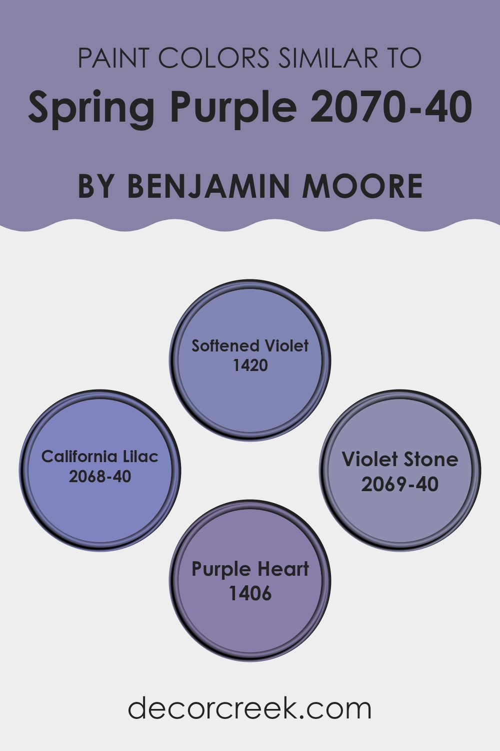
Colors Similar to Spring Purple 2070-40 by Benjamin Moore
Similar colors are essential in design because they provide a sense of harmony and balance. When colors like those similar to Spring Purple by Benjamin Moore are used together, they can create a subtle and aesthetically pleasing palette that improves the flow of a room.
These colors share the same hue but differ in saturation and brightness, allowing them to blend seamlessly without causing visual discord. The use of these similar shades can establish a coherent look that improves the overall appeal of a room by generating a gentle progression of related tones.
1420 – Softened Violet gives a gentle touch, hosting a muted lavender tint that can lighten a room gracefully. 2068-40 – California Lilac is vivid yet soft, resembling the fresh bloom of spring lilacs and brings a cheerful vibrancy to any room.
On the other hand, 2069-40 – Violet Stone offers a deeper hue reminiscent of a twilight sky, adding both depth and intrigue to the palette. Finally, 1406 – Purple Heart is rich and deep, providing a regal quality that anchors the surrounding lighter tones in an elegant but approachable manner. Together, these colors complement each other and allow for flexible and engaging design schemes.
You can see recommended paint colors below:
- 1420 Softened Violet
- 2068-40 California Lilac
- 2069-40 Violet Stone
- 1406 Purple Heart
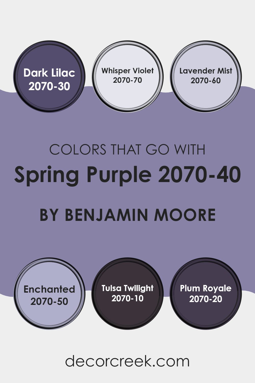
Colors that Go With Spring Purple 2070-40 by Benjamin Moore
Choosing the right complementary colors for Spring Purple 2070-40 by Benjamin Moore is crucial because it helps create a balanced and harmonious look in any room. When decorating, combining main colors with the right accents can bring out the best in the room, making the atmosphere welcoming and enjoyable.
Colors like Dark Lilac (2070-30), Whisper Violet (2070-70), and Lavender Mist (2070-60) offer subtle variations that can enrich the visual experience. Dark Lilac is a deeper purple that adds depth and interest, making it great for a feature wall or furniture. On the lighter side, Whisper Violet is soft and muted, perfect for creating a light, airy feel in rooms like bedrooms or bathrooms.
In addition, Enchanted (2070-50), Tulsa Twilight (2070-10), and Plum Royale (2070-20) provide more options to fine-tune your color scheme. Enchanted is a lighter, dreamy purple that pairs beautifully with Spring Purple for a gentle contrast. Tulsa Twilight is much darker, almost leaning toward a midnight blue, which makes it ideal for adding dramatic touches or anchoring lighter shades. Lastly, Plum Royale stands out with its rich, jewel-tone quality that can give a luxurious feel to accessories or accent walls. Pairing these colors thoughtfully with Spring Purple can truly improve the room, making it more appealing and cozy.
You can see recommended paint colors below:
- 2070-30 Dark Lilac
- 2070-70 Whisper Violet
- 2070-60 Lavender Mist
- 2070-50 Enchanted
- 2070-10 Tulsa Twilight
- 2070-20 Plum Royale
How to Use Spring Purple 2070-40 by Benjamin Moore In Your Home?
Spring Purple 2070-40 by Benjamin Moore is a vibrant and cheerful color. This bright purple shade brings a fun and lively atmosphere to any room. If you’re looking to add a splash of personality to your home, consider using Spring Purple in a child’s bedroom or play area. Its playful tone can stimulate creativity and make the room more inviting for kids.
This color also works well in small rooms like bathrooms or hallways. Here, it can make the area feel fresh and lively without overpowering the senses. For those wanting just a touch of playfulness, consider using Spring Purple for an accent wall. This is a great way to introduce a pop of color without committing to painting the entire room.
Accessories like cushions, vases, or artwork in Spring Purple can also add a subtle yet effective splash of color to more neutral rooms. It’s perfect for anyone looking to create a fun and cheerful home environment.
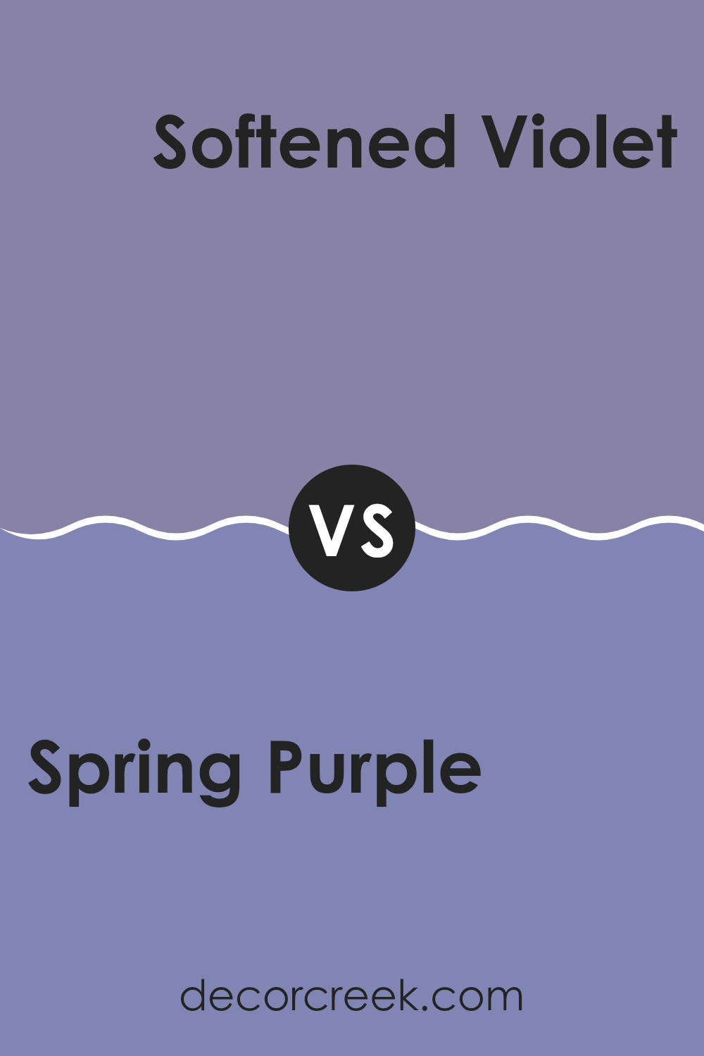
Spring Purple 2070-40 by Benjamin Moore vs Softened Violet 1420 by Benjamin Moore
Spring Purple by Benjamin Moore is a vibrant, lively shade that has an energetic vibe to it. Its richness can make any room feel more exciting and full of life. This color could be perfect for areas where you want to add a sense of fun and creativity, like a playroom or creative workspace.
On the other hand, Softened Violet by Benjamin Moore is a milder hue, which offers a gentle and soothing feel. It’s less intense than Spring Purple, making it a good choice for places where you want a relaxed atmosphere, such as bedrooms or bathrooms.
While both colors share a purple base, Spring Purple is deeper and more vivid, whereas Softened Violet leans toward a softer, more subdued experience. Depending on the mood and function of the room, you could choose either to create the desired impact.
You can see recommended paint color below:
- 1420 Softened Violet
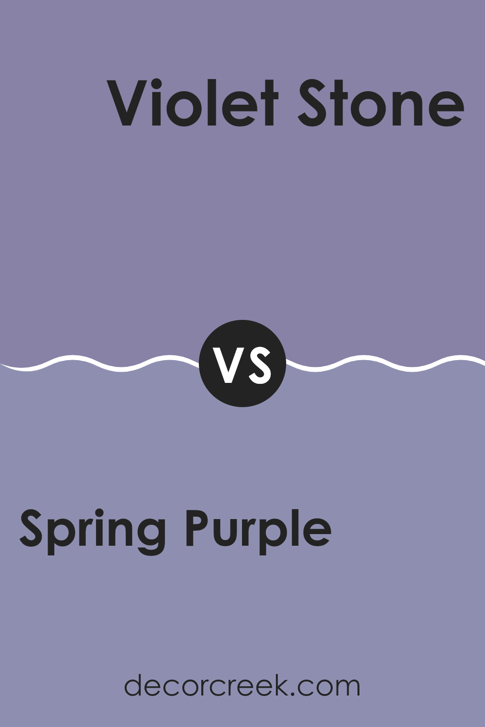
Spring Purple 2070-40 by Benjamin Moore vs Violet Stone 2069-40 by Benjamin Moore
Spring Purple and Violet Stone are two distinct shades by Benjamin Moore. Spring Purple is a cheerful, bright shade that has a vividness that feels fresh and lively. It leans slightly toward a true purple, making it quite eye-catching and ideal for rooms used for creativity or activity.
On the other hand, Violet Stone is a slightly darker purple. This shade feels deeper and more grounded, offering a sense of calmness without being too dull. It’s more subdued compared to Spring Purple, which makes it suitable for areas where a relaxing, yet enriching atmosphere is desired.
Both colors, while different, can bring a unique personality to a room, depending on what mood you’re aiming to create. Spring Purple fits well in energetic rooms, whereas Violet Stone is better for creating a cozy, inviting area.
You can see recommended paint color below:
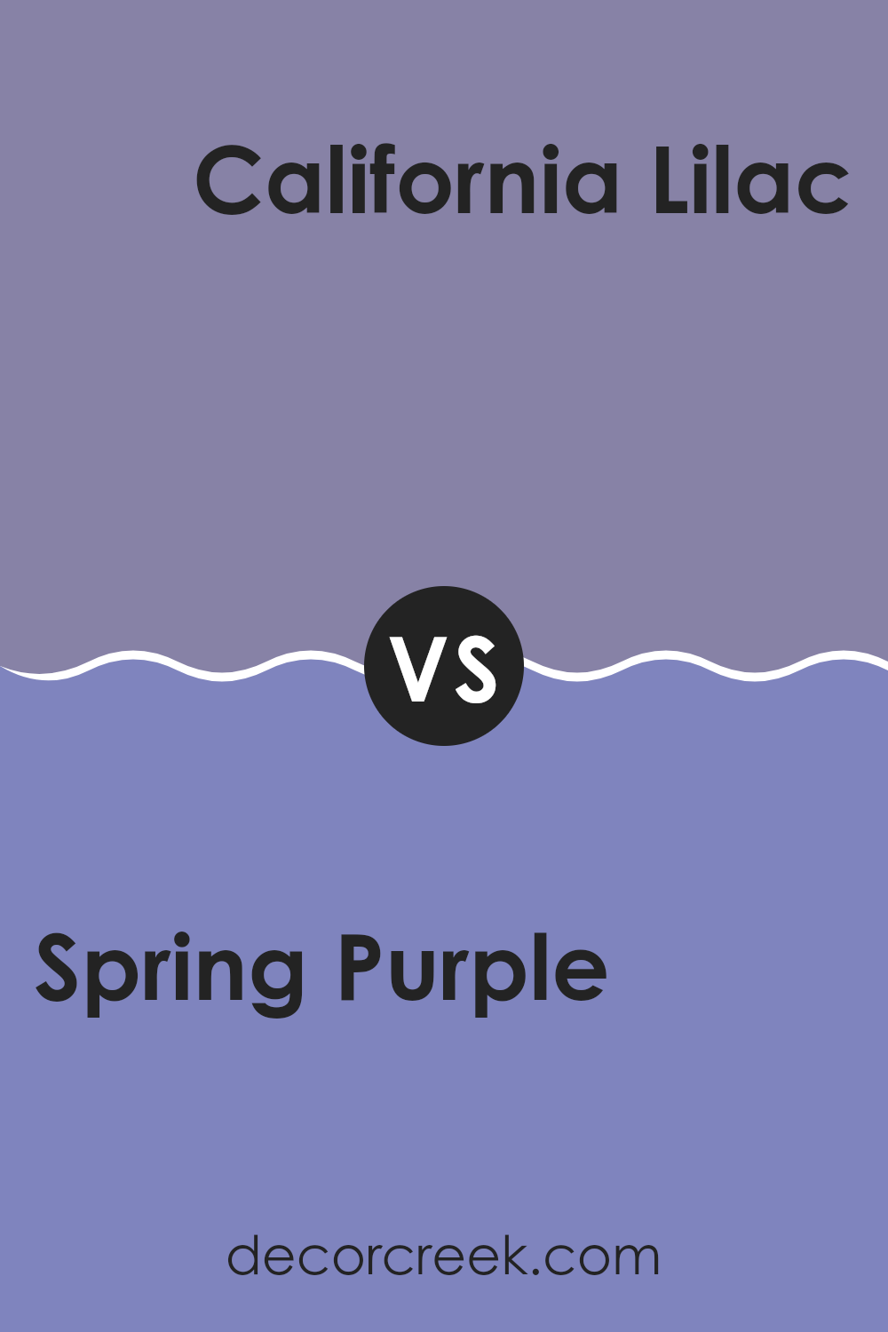
Spring Purple 2070-40 by Benjamin Moore vs California Lilac 2068-40 by Benjamin Moore
Spring Purple and California Lilac by Benjamin Moore both offer vibrant takes on purple hues. Spring Purple is a lively color with a rich depth that reminds one of a flower in full bloom. It is bold and stands out, making it a great choice for a statement wall or to add a splash of energy to a room.
On the other hand, California Lilac possesses a slightly lighter appearance, giving off a more subdued and softer vibe. This makes it perfect for creating a gentle and soothing atmosphere in rooms aiming for a relaxed feel.
Both colors bring their unique charm and can greatly improve the look of a room depending on the mood you want to set. Spring Purple can be ideal for more dynamic and energetic decor, while California Lilac suits places where you’d favor a quieter, lighter touch.
You can see recommended paint color below:
Spring Purple 2070-40 by Benjamin Moore vs Purple Heart 1406 by Benjamin Moore
Spring Purple 2070-40 and Purple Heart 1406, both from Benjamin Moore, offer distinct shades of purple that can create different moods and styles in a room. Spring Purple is a vivid, bright purple that brings a lively and energetic feel to a room. It’s a great choice if you want to add a splash of cheer and brightness, perfect for rooms like playrooms or creative studios.
On the other hand, Purple Heart 1406 is a deeper, more muted purple. This color provides a more reserved and subtle look, making it suitable for areas where you want a touch of color without overpowering the room. It works well in bedrooms or living rooms, where a calm and understated atmosphere is often desired.
Both colors offer their unique vibe, with Spring Purple being more bold and vibrant, and Purple Heart leaning toward a softer, more gentle appearance. Each can be the right choice depending on the mood you want to set in your room.
You can see recommended paint color below:
- 1406 Purple Heart
In wrapping up my thoughts on Benjamin Moore’s 2070-40 Spring Purple, I want to share just how much I love this color. It’s like a friendly smile on a sunny day. This shade of purple isn’t too bright or too soft; it’s just right for making any room feel happy and cozy. Whether you’re painting a bedroom wall or just using a little bit for decorations, it’s a color that makes any place feel more like home.
What stands out most about Spring Purple is how it brings a gentle touch of nature indoors. It reminds me of a field of flowers, and that makes any room feel inviting and warm, almost like a big, comfy hug. Plus, it’s not just for one kind of room. From kitchens to playrooms, it works wonderfully everywhere, proving how easy it is to use.
Overall, Benjamin Moore’s Spring Purple is a delightful choice if you’re looking to freshen up a room without making things too flashy. It keeps things simple yet impactful, helping you make any area nicer with a splash of playful color. So, if you’re wondering whether to try out this purple, my advice is definitely to go for it.
You might find that it brings that perfect touch of joy to your home.

Ever wished paint sampling was as easy as sticking a sticker? Guess what? Now it is! Discover Samplize's unique Peel & Stick samples.
Get paint samples

