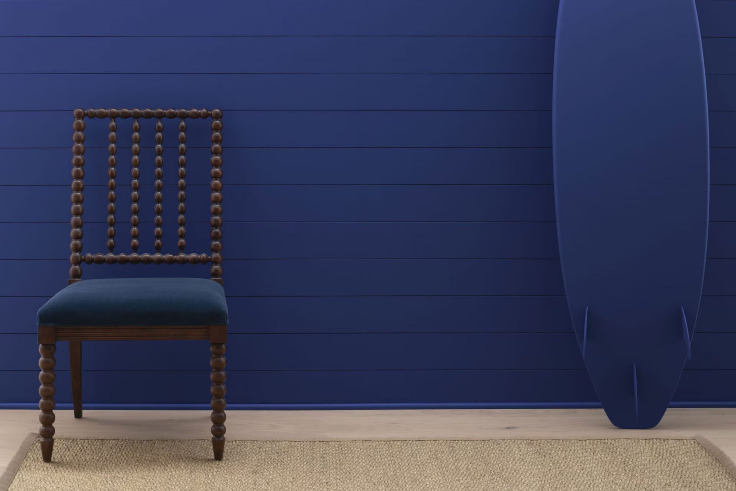
Have you ever seen a color that truly reflects the calmness of a starry night sky? That’s the magic of 2067-20 Starry Night Blue by Benjamin Moore. When I first painted a wall in my study with this shade, it wasn’t just a change in room color, but a shift in the room’s energy.
Starry Night Blue carries the essence of a peaceful evening under a clear sky, making it perfect not just for my study, but for any area that could use a touch of calm beauty. The depth of this blue reminds me of gazing upward into the cosmos, feeling both grounded and inspired by the vastness above.
Whether used in a cozy corner for reading or to add a splash of refinement to an elegantly appointed room, Starry Night Blue holds the power to change mundane into mesmerizing with a simple stroke of a brush. For anyone looking to refresh an area in their home, this color offers a unique blend of peace and beauty.
Join me in finding how this beautiful hue can make your favorite areas feel more inviting and reflective of the vast night sky.
What Color Is Starry Night Blue 2067-20 by Benjamin Moore?
Starry Night Blue by Benjamin Moore is a deep, vibrant shade of blue with a touch of navy. This color brings a bold, rich presence to any area, making it a great choice for those looking to add a strong visual element to their interiors. Ideal for creating a striking accent wall, this shade can also be used on cabinetry or furniture for a dramatic effect.
Starry Night Blue works exceptionally well in a variety of interior styles. It’s perfect for modern and contemporary areas due to its bold and clean appearance, but it also suits nautical and coastal themes wonderfully, providing a deep oceanic vibe. This color pairs harmoniously with natural materials like wood and leather, which help to soften its intensity. Combining it with metals such as brass or copper can add a touch of luxury and warmth.
In terms of textures, Starry Night Blue goes well with smooth, matte finishes to keep the look sleek and grounded. It also pairs beautifully with textured fabrics like velvet or wool, which can help to create a cozy, inviting atmosphere. Whether used in a living room, bedroom, or study, this color is flexible enough to bring depth and interest to your decor.
decorcreek.com
Is Starry Night Blue 2067-20 by Benjamin Moore Warm or Cool color?
Starry Night Blue by Benjamin Moore is a deep, vibrant blue that can make a big impact in any home. This shade is bold and can create a strong presence in a room, making it ideal for an accent wall. When used in smaller areas, such as a powder room or on kitchen cabinets, it adds a punch of personality and character. The rich tones of Starry Night Blue can also help to make large rooms feel more cozy and inviting.
This color pairs well with bright whites or light grays, which help to balance its intensity and keep the area from feeling too dark. Adding this color to your home can bring in a sense of energy and freshness, while still keeping a classy look.
Starry Night Blue works best in areas that get plenty of natural light, as this helps to highlight the depth and texture of the color. Whether you’re looking to add some drama to your living area or give a unique touch to a bedroom, this color won’t disappoint.
Undertones of Starry Night Blue 2067-20 by Benjamin Moore
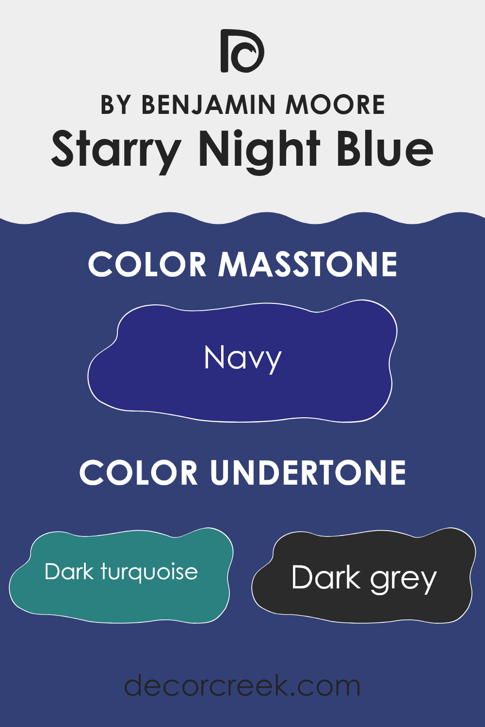
Starry Night Blue is a vibrant paint color that includes a variety of undertones, which are subtle hues mixed into the main color, affecting how it appears under different lighting conditions. The undertones in this particular shade include dark turquoise, dark grey, purple, dark blue, dark green, grey, brown, blue, violet, olive, and lilac. These undertones add depth and complexity, making the color appear different when viewed in various environments or lighting.
Understanding undertones is crucial in choosing the right paint color for your area, as they can significantly influence the mood and style of a room. For example, the dark turquoise and dark blue undertones in Starry Night Blue could bring a sense of calmness and depth, making it a good choice for a bedroom or study. On the other hand, its brown and grey undertones can help ground the area, making it feel more welcoming and cozy, ideal for living rooms.
When applied on interior walls, Starry Night Blue’s range of undertones allows it to interact captivatingly with both natural and artificial light. During the day, the brighter undertones like blue and lilac might become more prominent, giving the room a lively feel. In contrast, in the evening, the darker undertones such as dark grey and brown could make the area feel more enclosed and intimate.
Choosing furnishings and decor that complement or contrast these undertones can enhance the overall aesthetics of the room.
Thus, considering these undertones can help in achieving the desired ambiance for a room.
What is the Masstone of the Starry Night Blue 2067-20 by Benjamin Moore?
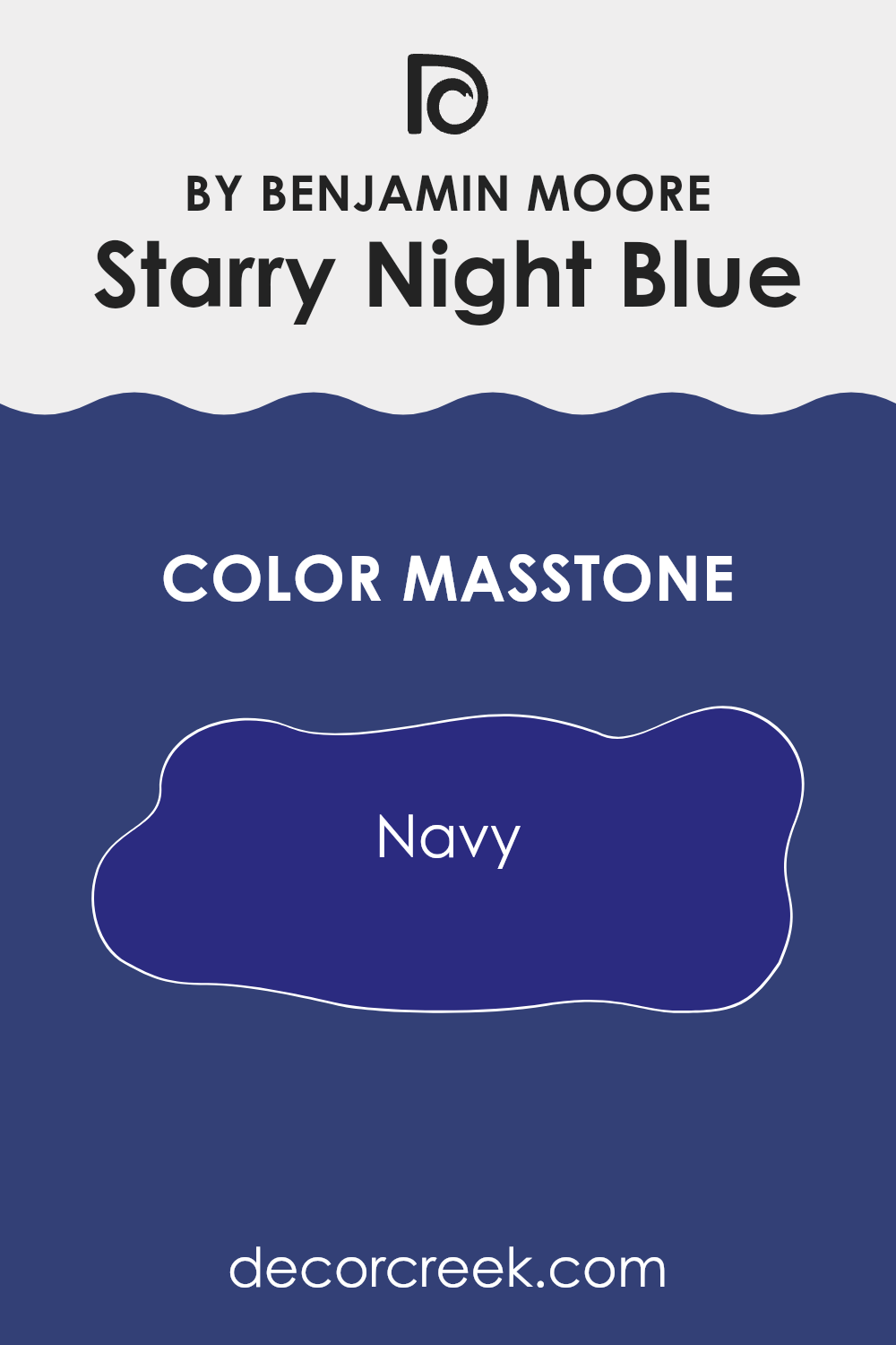
Starry Night Blue 2067-20 by Benjamin Moore, characterized by its Navy masstone (#2B2B80), brings a deep, rich ambiance to any room. This color, resembling a dark night sky, has an inviting intensity that adds depth when used on walls, creating a cozy and secure feeling in home areas. Its dark hue provides an excellent background for contrasting lighter tones in furniture or decor, enhancing the overall appeal of the room.
When applying Starry Night Blue in smaller areas, it can make the area feel more enclosed and snug, which is wonderful for creating a snug reading nook or a relaxed atmosphere in a study.
In larger areas, it helps in defining areas, anchoring the room with a strong color foundation. This color works well with a variety of lighting scenarios, looking exceptionally striking under warm lights that highlight its rich undertones. Also, this deep navy works effectively in various home styles, from modern to traditional, given its flexible nature.
How Does Lighting Affect Starry Night Blue 2067-20 by Benjamin Moore?
Lighting plays a crucial role in how colors appear in an area. Different light sources can significantly alter the perception of colors on your walls. For example, the paint color Starry Night Blue by Benjamin Moore can look quite different under various lighting conditions due to its rich, deep blue tone.
In artificial light, such as LED or incandescent bulbs, this blue shade might appear more vibrant and pronounced. Artificial light tends to bring out the depth in darker colors, making Starry Night Blue pop more vividly against interior furnishings. It’s critical to consider the type of bulbs used: warmer bulbs can add a slightly cozier feel to the color, while cooler bulbs maintain its bold, blue integrity.
In natural light, this color’s appearance can change throughout the day. Natural light is generally more evenly distributed and can expose subtle undertones within the paint. During the daylight, when sunlight is abundant, Starry Night Blue might look brighter and less intense. As evening approaches and natural light fades, the color will appear deeper and more dominant.
The orientation of the room also affects how Starry Night Blue behaves. In north-facing rooms, which get less direct sunlight, this color can look more somber and subdued, making the room feel cooler. South-facing rooms, however, receive a lot of sunlight throughout the day, which can make the blue look brighter and more radiant.
East-facing rooms see the most sun in the morning, so the color will start vibrant in the morning then gradually become gentler and softer as the day progresses. Conversely, in west-facing rooms, the color will stay relatively tame during the morning and become brighter and more dynamic in the afternoon to evening hours as the sunlight intensifies.
Thus, when planning your area with Starry Night Blue, consider both the lighting and the room’s orientation to achieve the desired visual effect with this color.
What is the LRV of Starry Night Blue 2067-20 by Benjamin Moore?
LRV stands for Light Reflectance Value, which measures the percentage of light a paint color reflects back into a room. It ranges from a low value, meaning the color absorbs more light, to a high value, where the color reflects more light. Basically, colors with a higher LRV make a room feel brighter because they reflect more light.
On the other hand, colors with a low LRV, such as darker shades, absorb more light, making a room appear cozier but possibly darker if not complemented with adequate artificial or natural lighting.
For the specific color with an LRV of 7.51, like a deep blue shade, this means it is on the lower end of the LRV scale. Such a color will absorb a lot of light rather than reflecting it. This characteristic makes it a poor choice for a smaller or poorly lit room as it might make the area feel even smaller and darker. However, in a well-lit area or a larger area, using this color can add depth and a sense of comfort, making it ideal for creating a focused or intimate atmosphere.

Coordinating Colors of Starry Night Blue 2067-20 by Benjamin Moore
Coordinating colors are shades that complement and enhance the main color they are paired with, creating a balanced and harmonious look. In the context of decorating, when you choose a vivid and deep hue like Starry Night Blue, it’s key to select coordinating colors that can either contrast it subtly or blend smoothly for aesthetic fluidity.
These matching colors can either help tone down the richness of the primary shade or add dimensions to the ambiance without overpowering the area. For instance, AF-15 – Steam is a gentle, clean white that works well by providing a neutral backdrop or crisp contrasts against deeper tones, making it ideal for trims or ceilings.
AF-575 – Instinct offers an earthy, muted grey-blue that echoes the intensity of Starry Night Blue without competing for attention, perfect for adjacent rooms or furnishings. Similarly, 2119-60 – Silver Lining is a soft grey with a hint of blue, offering a subtle transition that bridges the gap between stark neutrals and vibrant blues, well-suited for creating a soothing gradient effect.
Lastly, OC-61 – White Diamond provides a slightly warmer tone of white with a hint of gray, lending an understated elegance to any area that needs softening or a gentle brightening effect.
Each of these colors adds its charm to the décor, ensuring that the overall aesthetic remains cohesive and visually appealing.
You can see recommended paint colors below:
- AF-15 Steam
- AF-575 Instinct
- 2119-60 Silver Lining
- OC-61 White Diamond

What are the Trim colors of Starry Night Blue 2067-20 by Benjamin Moore?
Trim colors are used to accentuate and highlight the architectural features and edges of a room, providing a neat finish and a contrasting outline around doors, windows, and skirting boards. By choosing the right trim color, you can enhance the overall appearance of your walls and ensure that various elements like door frames and moldings stand out.
For a deep and vibrant hue like Starry Night Blue by Benjamin Moore, using lighter trim colors such as AF-5 – Frostine or OC-152 – Super White can effectively frame the area, making the wall color pop while giving the room a clean and finished look.
AF-5 – Frostine is a delicate and airy white that brings a breath of fresh air to any area. Its light and almost ethereal quality can create a subtle yet striking contrast against deeper tones, such as Starry Night Blue. On the other hand, OC-152 – Super White offers a crisp and pure white tone that provides a stark contrast and bright effect, effectively outlining the architectural details with a sharp clarity. Both colors work wonderfully to draw attention to the vibrant depth of Starry Night Blue, adding a refreshing balance to the strong wall color.
You can see recommended paint colors below:
- AF-5 Frostine
- OC-152 Super White

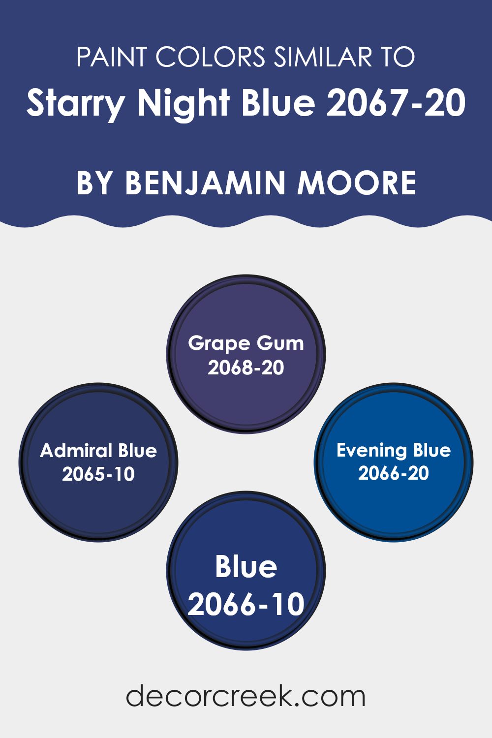
Colors Similar to Starry Night Blue 2067-20 by Benjamin Moore
Understanding why similar colors are important can enhance the way we use them in our areas. When colors like Starry Night Blue by Benjamin Moore and its similar shades are used together, they create a cohesive and balanced look. Having similar colors around a primary color gives the designer the ability to maintain a consistent theme while adding depth and variety to the design. This approach can make areas feel more put together and harmonious without stark contrasts that could disrupt the overall flow of the design.
For instance, Grape Gum is a deeper, more intense shade, adding a strong presence that works well in areas needing a touch of drama. Admiral Blue, on the other hand, has a strong, vibrant tone that pairs beautifully with more subdued blues, creating a lively yet balanced atmosphere.
Evening Blue is closer to a twilight shade, perfect for adding a subtle variance to a blue-themed room without straying too far from the central color theme. Meanwhile, the shade simply named Blue offers a classic look, providing a slightly lighter and more flexible hue, which can easily fit into a variety of decorative styles. Using these colors together with Starry Night Blue allows for a smoother visual transition across an area, making it feel more integrated and pleasing to the eye.
You can see recommended paint colors below:
- 2068-20 Grape Gum
- 2065-10 Admiral Blue
- 2066-20 Evening Blue
- 2066-10 Blue
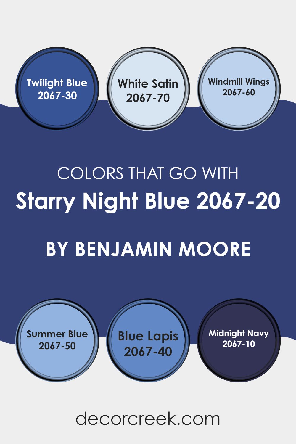
Colors that Go With Starry Night Blue 2067-20 by Benjamin Moore
Choosing complementary colors for Starry Night Blue 2067-20 by Benjamin Moore is important because they help create a balanced and appealing color scheme in any area. When used alongside Starry Night Blue, these colors enhance the depth and richness of the primary shade, providing a harmonious visual experience.
For instance, Twilight Blue 2067-30 is a deeper, more subdued shade that pairs well with Starry Night Blue to offer a cohesive look. It gives a calm, consistent feel. White Satin 2067-70, on the other hand, is a crisp, clean color that contrasts nicely, adding brightness and highlighting the vibrant tones of Starry Night Blue.
Similarly, Windmill Wings 2067-60 offers a lighter, airy feel that can open up an area and make it appear more inviting when used with Starry Night Blue. It’s perfect for adding a touch of lightness. Summer Blue 2067-50 brings a playful, cheerful vibe to the mix, injecting life and energy into any room.
Blue Lapis 2067-40 has a unique charm, with a touch of vibrancy that complements the main hue without overpowering it. Lastly, Midnight Navy 2067-10 is almost like an anchor, providing a grounding effect with its very deep blue tone, making it a great choice for adding depth and intensity. Collectively, these colors work together to create a visually appealing palette that enhances the beauty of Starry Night Blue.
You can see recommended paint colors below:
- 2067-30 Twilight Blue
- 2067-70 White Satin
- 2067-60 Windmill Wings
- 2067-50 Summer Blue
- 2067-40 Blue Lapis
- 2067-10 Midnight Navy
How to Use Starry Night Blue 2067-20 by Benjamin Moore In Your Home?
Starry Night Blue 2067-20 by Benjamin Moore is a deep, rich blue paint color that can add a lot of character to a room. It’s perfect for creating a cozy and inviting area in your home. One great way to use Starry Night Blue is in your bedroom. Painting one wall or all walls with this color can make the area feel more secure and comfortable, helping you relax and get a better night’s sleep.
In the living room, you could paint an accent wall with Starry Night Blue to create a focal point. Pair it with lighter colors like soft whites or greys for the other walls and decor to keep the room balanced and not too dark.
If you’re interested in adding a pop of color to your kitchen, consider painting the cabinets or an island in Starry Night Blue. It works well with natural wood or metallic finishes, such as brass or stainless steel, giving your kitchen a fresh and modern look. Just make sure to have good lighting to enhance the beauty of this bold color.
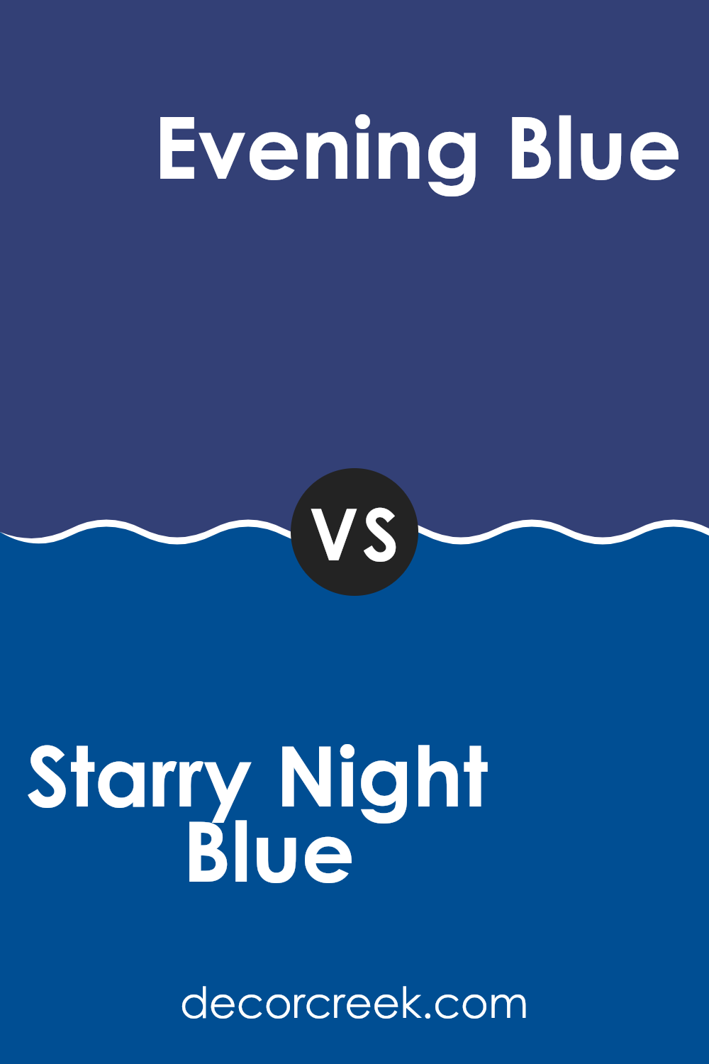
Starry Night Blue 2067-20 by Benjamin Moore vs Evening Blue 2066-20 by Benjamin Moore
Starry Night Blue and Evening Blue by Benjamin Moore are two close colors that bring distinct vibes to areas. Starry Night Blue is a deep, rich blue that almost seems to have a touch of purple under certain lighting. It’s bold and makes a strong statement, perfect for creating a cozy, enveloping atmosphere in a room.
On the other hand, Evening Blue leans slightly more towards a true navy blue. It’s also deep and rich but lacks the purplish undertone of Starry Night Blue. This color is ideal for those looking to add a classic and lasting feel to their area, offering a slightly more straightforward blue tone that pairs well with a variety of decor styles.
Both colors are quite dark, which means they can make small rooms feel smaller but incredibly stylish when used correctly, especially with good lighting and balanced with lighter or contrasting colors.
You can see recommended paint color below:
- 2066-20 Evening Blue
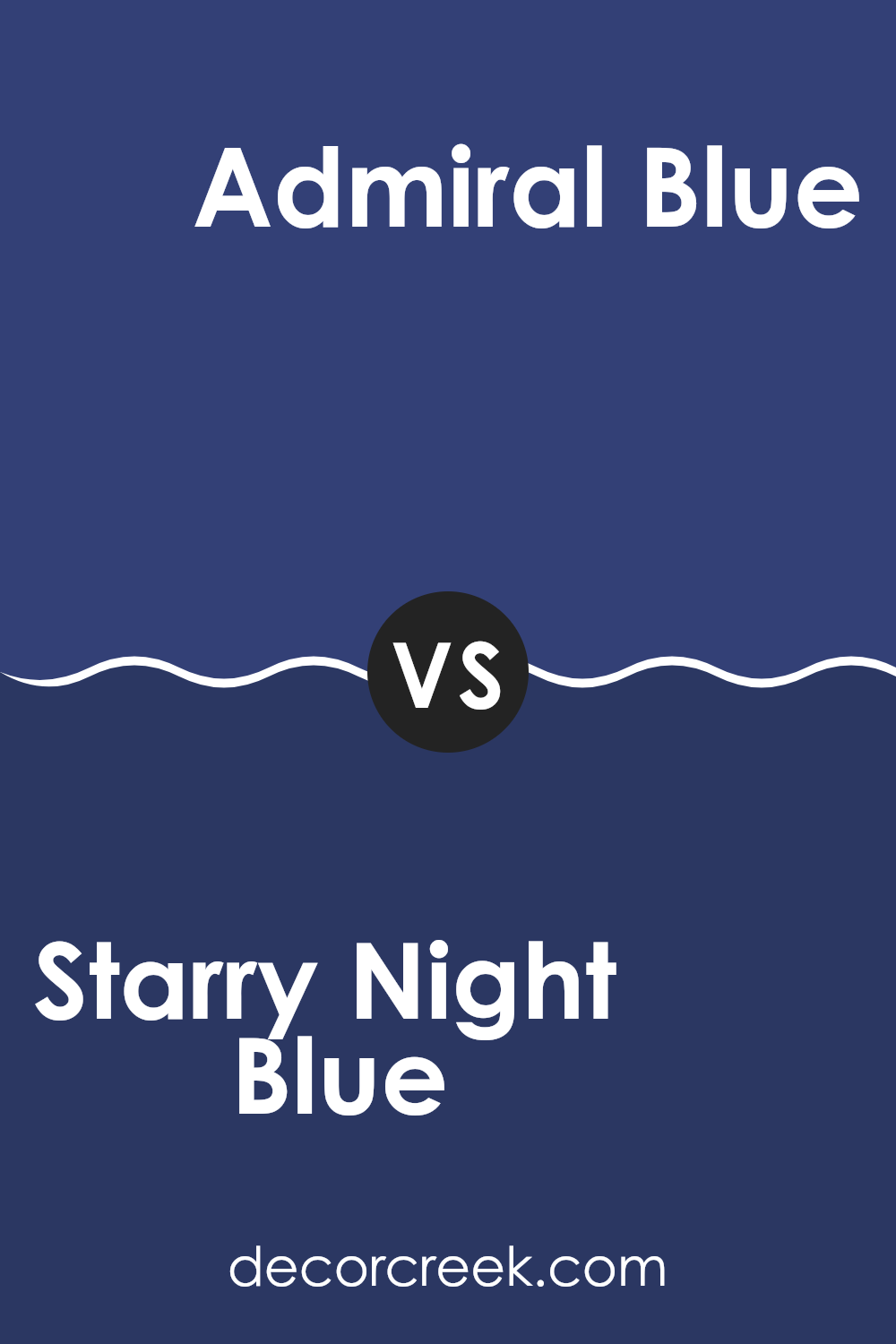
Starry Night Blue 2067-20 by Benjamin Moore vs Admiral Blue 2065-10 by Benjamin Moore
Starry Night Blue and Admiral Blue are both rich, deep shades by Benjamin Moore, but they have distinct tones that set them apart. Starry Night Blue has a deep, slightly purplish undertone, giving it a warm and cozy feel.
It suits areas where a touch of drama and comfort is desired, making rooms feel more inviting. On the other hand, Admiral Blue is a true dark blue. This color is clearer and more straightforward than Starry Night Blue, with a nautical vibe that reminds you of the deep ocean.
It fits well in areas that aim for a bold, classic look. Overall, while both colors are deep and intense, Starry Night Blue leans towards a warmer, slightly softer look, whereas Admiral Blue offers a crisp, more defined appearance that might be perfect for creating striking contrasts in a decor scheme.
You can see recommended paint color below:
- 2065-10 Admiral Blue
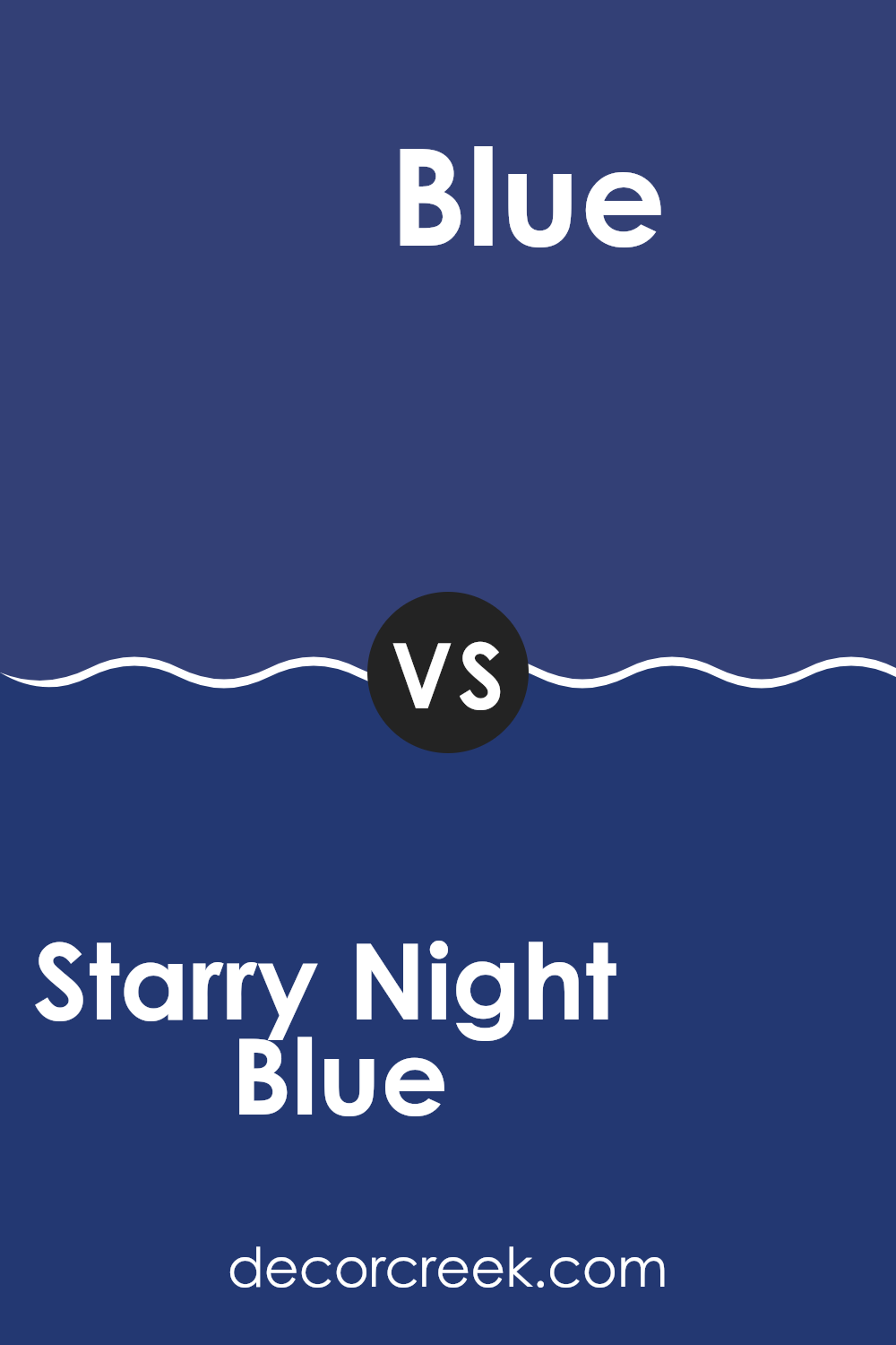
Starry Night Blue 2067-20 by Benjamin Moore vs Blue 2066-10 by Benjamin Moore
Starry Night Blue and Blue 2066-10, both from Benjamin Moore, are distinctly different shades of blue. Starry Night Blue is a deep, dark blue that can make any room feel cozy and somewhat dramatic. It’s a strong color that works well in areas where a bold, impactful tone is desired.
On the other hand, Blue 2066-10 is even darker, leaning towards a true navy blue. This color is so rich that it could almost be mistaken for black in dim lighting. This makes it great for creating a focus wall or for use in areas where you want to draw attention, like behind a bed in a bedroom or on cabinetry in a kitchen.
Both colors pair well with bright whites or lighter colors for contrast, but Blue 2066-10 is the better choice if you’re aiming for an almost-black without going completely black. In summary, while both are dark blues, Starry Night Blue offers a bit more brightness, whereas Blue 2066-10 steps closer to a shadowy navy.
You can see recommended paint color below:
- 2066-10 Blue
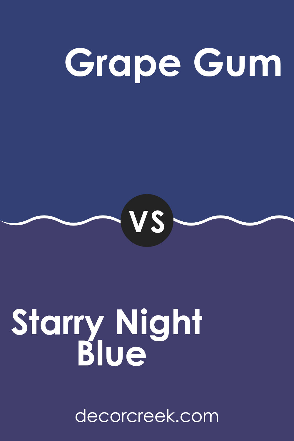
Starry Night Blue 2067-20 by Benjamin Moore vs Grape Gum 2068-20 by Benjamin Moore
Starry Night Blue is a deep, rich blue that is both bold and soothing. It evokes the feeling of a clear night sky, adding a peaceful and calming effect to any area. This color can make a room feel more intimate and cozy, ideal for creating a relaxing environment.
On the other hand, Grape Gum is a vivid, deeper shade of purple that offers a dramatic flair. It’s a color that can add personality and energy to an area, making it stand out. Because of its intensity, it works well as an accent color, perhaps on a feature wall or in decorative details, to enliven a room without making it too much.
Both colors are strong and vibrant, but where Starry Night Blue brings a calm depth, Grape Gum adds a punch of vibrant energy. The choice between the two would depend on the mood and atmosphere one wishes to achieve in their area.
You can see recommended paint color below:
- 2068-20 Grape Gum
After reading all about the paint 2067-20 Starry Night Blue by Benjamin Moore, I think it’s a great choice for someone who wants to make their room look really special.
This shade of blue is pretty and deep, like the night sky filled with stars, which can make any area feel interesting and cozy. The paint also has a good quality that means it will stay looking nice for a long time, and it doesn’t get dirty easily.
Even though choosing the right paint can sometimes be hard, Starry Night Blue is a good pick if you like blue or want an area that feels calm and happy. It would work well in a bedroom, a play area, or even a study corner. Plus, this kind of blue makes it easy to match with other colors for your furniture and decorations.
So, if you’re thinking about giving a fresh new look to your place, Starry Night Blue could be just the right paint to start with!
Ever wished paint sampling was as easy as sticking a sticker? Guess what? Now it is! Discover Samplize's unique Peel & Stick samples.
Get paint samples

