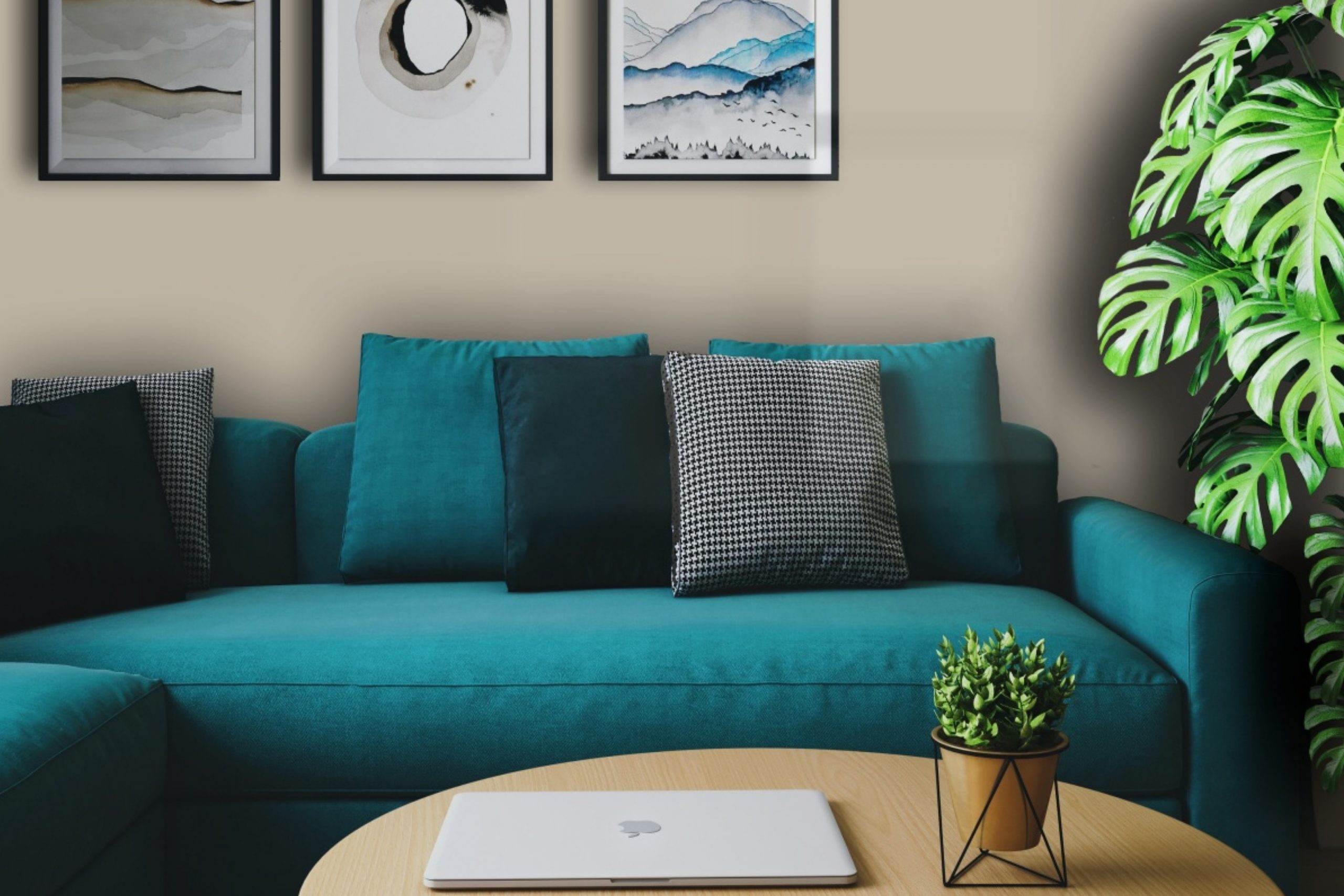
If you’re on the hunt for the perfect paint color to refresh your space, look no further than AF-100 Pashmina by Benjamin Moore. This beautiful shade is part of their Affinity Collection, designed to make color selection a breeze by ensuring all colors in the lineup work well together. Pashmina is a warm, versatile color that adds a touch of elegance to any room without overwhelming it.
It has the unique ability to adapt to different lighting and styles, making it an ideal choice for living areas, bedrooms, or even kitchens.
This shade strikes a perfect balance between a cozy neutral and a statement color. Whether you’re aiming for a subtle background hue or looking to create a cozy, inviting atmosphere, Pashmina can meet your needs. Its understated elegance makes it a great choice for those looking to update their home without going for a radical change.
Plus, Benjamin Moore’s reputation for high-quality paint means you can count on Pashmina to not only look great but also stand up well to daily life. So, if you’re considering giving your home a fresh coat of paint, AF-100 Pashmina offers a chic and timeless option that’s likely to transform your space beautifully.
What Color Is Pashmina AF-100 by Benjamin Moore?
Pashmina by Benjamin Moore is a warm, mid-tone beige that brings a cozy and inviting atmosphere to any room. This versatile color exudes a sense of comfort and soft elegance, making it an ideal backdrop for various interior design styles. It shines in settings where a calming yet sophisticated palette is desired, seamlessly blending with both modern and classic decor.
This hue works wonders in interior styles that prioritize warmth and understated luxury, like modern farmhouse, Scandinavian, and transitional designs. Its subtle richness adds depth without overwhelming, creating a serene and welcoming environment. Pashmina is exceptional at bridging the gap between different materials and textures, enhancing the interplay of light and space in a room.
When it comes to pairing with materials, this color complements natural wood, adding warmth and organic texture to the space. It also looks stunning alongside metallic accents, such as brass or copper, which introduce a touch of refinement and glamour. For textures, Pashmina pairs well with soft, plush fabrics like velvet or wool, enhancing the cozy feel of a room, while with linen, it maintains a light and airy vibe.
Its adaptability makes it a favorite for creating harmonious and beautifully blended spaces.
Is Pashmina AF-100 by Benjamin Moore Warm or Cool color?
Pashmina by Benjamin Moore is a color that brings warmth and sophistication to any room. It has a rich, versatile shade that falls between gray and beige. This unique balance makes it incredibly adaptable to various home styles and decorations. Whether you’re looking to create a cozy, inviting space in your living room or a serene, calming atmosphere in your bedroom, this color can achieve both effortlessly.
Its neutral tone serves as an excellent backdrop for both bold and muted furnishings, allowing your personal style to stand out without overwhelming the space. Additionally, it can make rooms feel more spacious and light-filled, enhancing natural light during the day and creating a soft glow in the evening with artificial lighting. It’s a timeless color that suits walls, trim, and cabinetry, providing a seamless look throughout the home.
Pashmina offers a perfect balance, ensuring your home feels both modern and welcoming.
Undertones of Pashmina AF-100 by Benjamin Moore
Pashmina by Benjamin Moore is a rich and complex color with a variety of undertones that can subtly influence the overall look and feel of a room. These undertones include pale pink, light gray, mint, light purple, grey, light blue, lilac, yellow, orange, light green, and olive. Each of these colors adds a different dimension to Pashmina, making it a versatile choice for interior walls.
The presence of pale pink and light purple undertones can give Pashmina a soft warmth, making spaces feel cozy and inviting. Light gray and grey undertones help to ground the color, ensuring it doesn’t feel too overwhelming or bright. This makes it an excellent choice for creating a sophisticated, yet accessible look.
Mint, light blue, and lilac undertones can introduce a subtle freshness to the color, suggesting airiness and light. These undertones are particularly effective in spaces with good natural light, enhancing the sense of space. Yellow and orange undertones add a hint of vibrancy, injecting energy without dominating the room.
The inclusion of light green and olive allows Pashmina to connect with natural elements, enabling it to tie in well with wood finishes and organic materials, enhancing a room’s natural beauty.
In practical terms, the mix of warm and cool undertones in Pashmina means it can adapt to different lighting conditions and furnishings, reflecting various hues at different times of the day. This adaptability makes it a popular choice for interior walls, as it can complement a wide range of decor styles and preferences. The diverse undertones work together to create a rich, nuanced color that adds depth and character to interiors, making spaces more engaging and visually interesting.

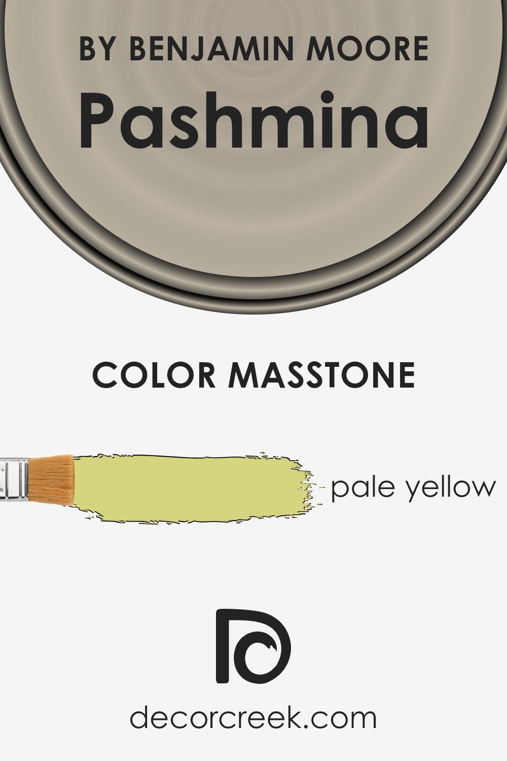
What is the Masstone of the Pashmina AF-100 by Benjamin Moore?
Pashmina AF-100 by Benjamin Moore has a masstone of pale yellow, marked as #D5D580. This gentle hue brings a sense of warmth and light into any home. Its light yellow tone is subtle yet effective in making spaces feel welcoming and cozy without overwhelming them with brightness. This color works wonders in rooms that could use a touch of cheer without the intensity of a vibrant yellow.
It’s great for areas where you spend a lot of time, like living rooms or bedrooms, because it creates a peaceful and relaxed environment.
The pale yellow of Pashmina AF-100 is also versatile, blending well with various decor styles and other colors, from soft neutrals to bolder shades. By adding this color to your walls, you can easily refresh your space, making it feel more open and airy. Plus, it has a way of reflecting light, which can make smaller rooms appear larger and more inviting.
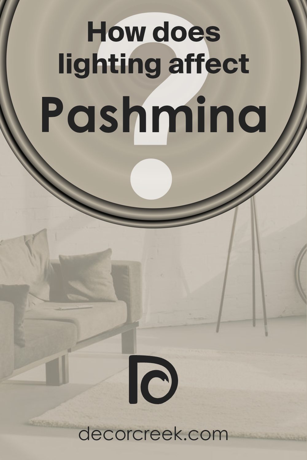
How Does Lighting Affect Pashmina AF-100 by Benjamin Moore?
Lighting plays a significant role in how we perceive colors. It can transform a color’s appearance, making it look different under various light sources. When choosing a paint color like the one by Benjamin Moore, it’s crucial to consider how lighting will affect its appearance in your space.
In artificial light, the way a color looks can vary dramatically depending on the type of bulbs used. Soft white or warm bulbs can enhance warm tones, making the color appear cozier and richer. On the other hand, cool light bulbs might bring out cooler undertones, giving the color a crisper look.
When exposed to natural light, the appearance of the color can also change throughout the day, shifting from soft and warm in the morning to bright and vivid in the midday sun, and back to warm in the late afternoon. The quality and direction of the natural light your room receives are crucial in predicting how a color will look.
In north-faced rooms, which get less direct sunlight, the color might appear slightly cooler and more muted. This cooler light can sometimes make colors appear a bit duller than they would in a well-lit room. Therefore, in north-facing rooms, the color could look more subdued and might need artificial lighting to warm it up.
South-faced rooms bathe in plenty of warm sunlight throughout the day, making colors look brighter and more vibrant. In these rooms, the color will likely appear warmer and more welcoming, enhancing its undertones beautifully.
East-faced rooms receive the most light in the morning, followed by cooler, less intense light in the afternoon. Morning light tends to be gentle and warm, making the color look soft and warm early in the day, transitioning to a cooler tone in the afternoon.
West-faced rooms see the opposite effect, with minimal morning light but intense, warm light in the late afternoon and evening. Here, the color can transform from appearing somewhat neutral or muted in the morning to rich and warm in the evening.
Understanding the interaction between light and color can help you anticipate how different lighting conditions will affect your chosen paint color, ensuring you’re satisfied with your decision at any time of the day.
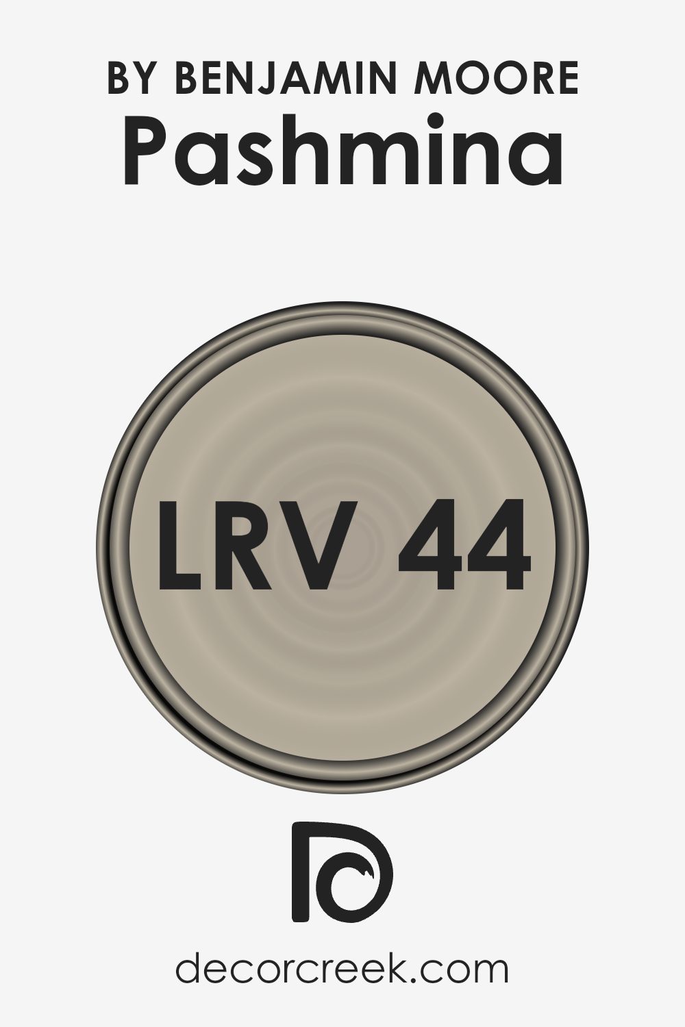
What is the LRV of Pashmina AF-100 by Benjamin Moore?
LRV, or Light Reflectance Value, is a measure used to express the percentage of light a paint color reflects back into the room, compared to pure white, which reflects 100% of the light. In simpler terms, LRV helps you understand how light or dark a color will look once it’s on your walls. High LRV numbers, closer to 100, indicate lighter colors that reflect more light, making spaces feel more open and airy. On the other hand, lower LRV values mean the color absorbs more light, creating a cozier or more subdued atmosphere.
For the color with an LRV of 44.2, it sits in the mid-range of the LRV scale. This means it neither reflects light brightly like lighter hues nor absorbs it heavily like darker shades. In practical terms, it strikes a balance, making it a versatile choice for various lighting conditions.
In rooms with plenty of natural light, it can appear lighter and more welcoming, while in less lit areas, it might present a richer, deeper appearance. This moderate LRV allows it to adapt seamlessly to different environments, making it an adaptable choice for adding warmth and sophistication to a space without overwhelming it with brightness or shadow.
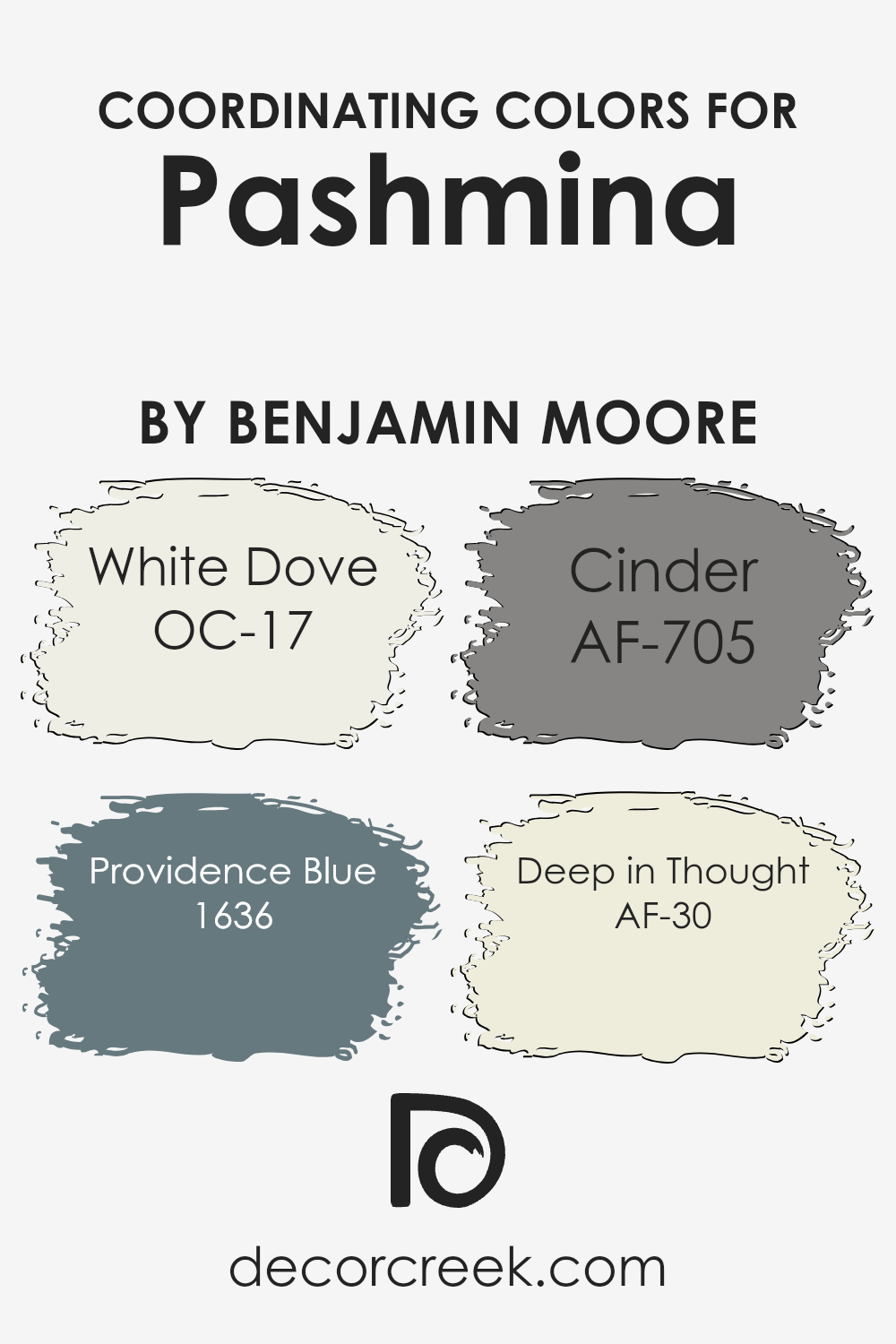
Coordinating Colors of Pashmina AF-100 by Benjamin Moore
Coordinating colors are hues that harmonize with a main color, enhancing the overall aesthetic of a space. Their purpose is to create a balanced and visually appealing look by complementing the primary color. In the case of Benjamin Moore’s Pashmina, a rich and versatile neutral shade, selecting the right coordinating colors can elevate the elegance of any room. These colors, carefully chosen for their compatibility with Pashmina, range from crisp whites to deep blues and greys, each adding its own unique character to the mix.
OC-17 White Dove is a soft and warm white, acting as a perfect counterbalance to the deeper tones of Pashmina, bringing light and openness to spaces. It’s great for trim and ceilings, giving a fresh, clean look. On the other hand, 1636 Providence Blue offers a serene and sophisticated touch, adding depth and interest with its calming presence.
This blue is ideal for accent walls or furniture, creating a soothing contrast. AF-705 Cinder is a deep, charcoalesque grey that grounds the palette, offering a strong and stable foundation that works well in modern and traditional settings alike. Lastly, AF-30 Deep in Thought is a thoughtful grey with hints of brown, providing a complex backdrop that enriches and complements the warmth of Pashmina.
Together, these colors create a cohesive and inviting environment, each contributing its individual strength to enhance the overall ambiance.
You can see recommended paint colors below:
- OC-17 White Dove
- 1636 Providence Blue
- AF-705 Cinder
- AF-30 Deep in Thought
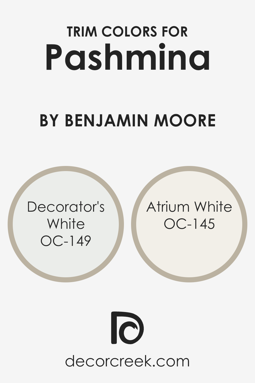
What are the Trim colors of Pashmina AF-100 by Benjamin Moore?
Trim colors are the shades used on the architectural elements like doors, window frames, and skirting boards that contrast or complement the wall color. For a sophisticated wall color like Pashmina AF-100 by Benjamin Moore, selecting the right trim colors is crucial because it can enhance the room’s elegance and create a polished look. Properly chosen trim colors can accentuate the architectural features of a room, creating depth and highlighting the room’s best attributes. They act as a frame for the wall, making the color pop and giving the space a finished appearance.
When considering Pashmina AF-100, a rich hue with depth and warmth, two trim colors that work wonderfully are OC-149 Decorator’s White and OC-145 Atrium White by Benjamin Moore.
Decorator’s White is a crisp, clean white with a slight hint of grey. This color is perfect for creating a sharp contrast that defines and enhances the sophisticated nuances of Pashmina AF-100, giving the space a fresh and contemporary feel. Atrium White, on the other hand, offers a softer approach with its subtle warmth, making it ideal for adding a gentle, soothing touch to the room.
This color pairs beautifully with Pashmina AF-100, creating a harmonious balance that is both inviting and stylish.
You can see recommended paint colors below:
- OC-149 Decorator’s White
- OC-145 Atrium White
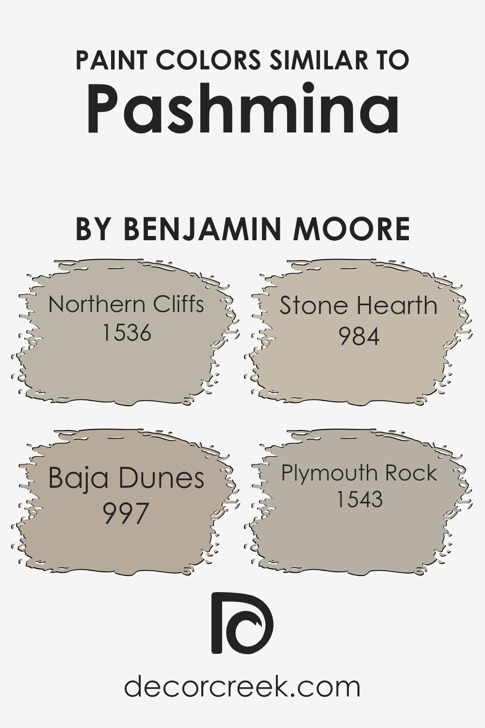
Colors Similar to Pashmina AF-100 by Benjamin Moore
Similar colors are crucial in design because they create harmony and a sense of balance. When colors closely resemble each other, they can effortlessly blend together, creating a soothing and cohesive look. This principle is especially important in interior design, where the goal is often to create a peaceful, unified space.
For instance, when colors similar to Pashmina AF-100 by Benjamin Moore are used together, they can complement each other wonderfully. These similar shades, ranging from gentle grays to warm beiges, work together to produce an environment that feels both inviting and stylistically consistent. This color harmony is crucial for achieving a polished look without the stark contrasts that can sometimes disrupt the flow of a space.
Among these similar hues, Northern Cliffs has a slightly bold, yet inviting gray tone that brings a sense of sophistication. Baja Dunes, on the other hand, offers a softer touch, with its warm beige reflecting a serene, comforting light. Stone Hearth strikes a balance between the two, presenting a versatile option that bridges warm and cool tones for a middle-ground solution.
Lastly, Plymouth Rock serves up a classic, understated gray that can easily anchor a room without overwhelming it. These colors, all while sitting close on the spectrum, bring their unique attributes to the table, making them perfect for creating layered, yet harmonious interior designs. They prove that similar colors can work together to enhance the beauty and cohesion of a space.
You can see recommended paint colors below:
- 1536 Northern Cliffs
- 997 Baja Dunes
- 984 Stone Hearth
- 1543 Plymouth Rock
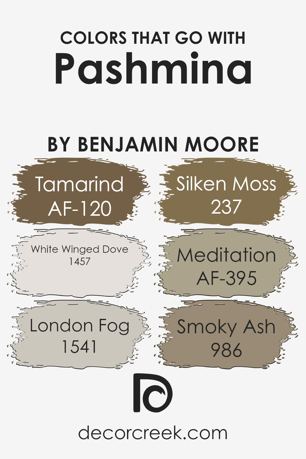
Colors that Go With Pashmina AF-100 by Benjamin Moore
Selecting colors that complement Pashmina AF-100 by Benjamin Moore is crucial because it ensures a harmonious and visually appealing palette in any room. Pashmina, a rich, cozy hue, lays a versatile foundation that can be paired with a variety of colors to either calm or invigorate a space. By choosing the right accompanying colors, you can create a balanced atmosphere that enhances the room’s aesthetics and mood. These accent colors play a significant role in pulling a design together, offering contrast or coherence, and highlighting the room’s architectural features or furnishings.
Starting with AF-120 – Tamarind, this deep, warm brown adds a sense of groundedness and sophistication to spaces, making it a perfect complement to the mid-tone of Pashmina. On the other hand, 1457 – White Winged Dove offers a soft, airy brightness, providing a gentle lift to the warmth of Pashmina and making spaces feel more open and light. 1541 – London Fog introduces a cool, neutral gray that balances the warmth of Pashmina with its understated elegance, perfect for creating a serene and sophisticated vibe.
The green undertones of 237 – Silken Moss bring in a natural, refreshing element when paired with Pashmina, infusing spaces with vibrancy and life. AF-395 – Meditation is a calm, muted blue that echoes the tranquility of a serene sky, offering a peaceful counterpoint to Pashmina’s earthiness.
Finally, 986 – Smoky Ash serves as a dark, contrasting hue that adds depth and intensity, ensuring that Pashmina stands out as the focal point of the room. Together, these colors work in harmony to enhance the beauty and warmth of Pashmina, creating inviting and stylistically complete interiors.
You can see recommended paint colors below:
- AF-120 Tamarind
- 1457 White Winged Dove
- 1541 London Fog
- 237 Silken Moss
- AF-395 Meditation
- 986 Smoky Ash
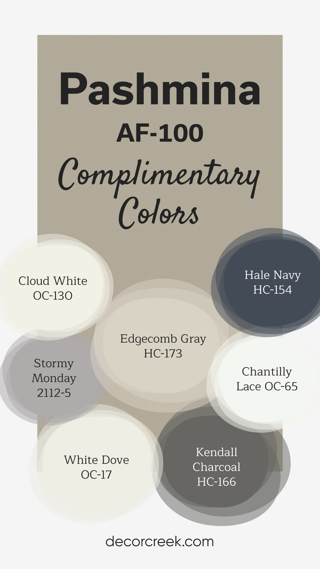
Complimentary Colors for Pashmina AF-100 Paint Color by Benjamin Moore
Pashmina by Benjamin Moore is a cozy, earthy neutral that adds warmth and sophistication to any space. Pair it with Chantilly Lace or White Dove for bright, clean accents that keep the room feeling fresh and light. Edgecomb Gray and Cloud White offer softer, more subtle tones, creating a balanced and harmonious palette.
For deeper contrast, consider adding Hale Navy or Kendall Charcoal to introduce bold, rich hues. Stormy Monday brings a moody, elegant touch, perfect for a more dramatic look.
This versatile combination of colors can complement both modern and traditional styles, giving your home a timeless and inviting feel.
How to Use Pashmina AF-100 by Benjamin Moore In Your Home?
Pashmina AF-100 by Benjamin Moore is a versatile paint color that can add warmth and sophistication to any room in your home. Think of this shade as a cozy blanket for your walls. It’s a rich, medium tone that straddles the line between gray and beige, making it a perfect neutral. This means it can easily fit into a variety of color schemes and design styles, from modern to classic.
You can use it in your living room to create a soothing atmosphere where your family and friends feel right at home. In the bedroom, Pashmina provides a tranquil backdrop, ideal for relaxation and rest. If you want to add some elegance to your dining area, this color can do that too, making every meal feel a bit more special.
The beauty of Pashmina AF-100 lies in its flexibility. It pairs beautifully with bold colors for a striking contrast or with soft tones for a more harmonious look. Whether you decide to paint all the walls or just create an accent wall, this color is sure to enrich your space and make it more inviting.
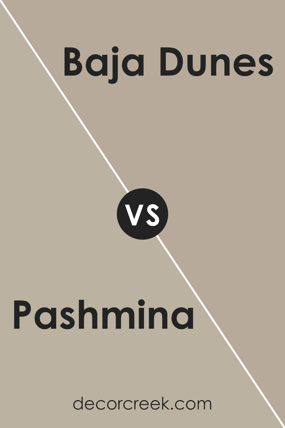
Pashmina AF-100 by Benjamin Moore vs Baja Dunes 997 by Benjamin Moore
The main color, Pashmina by Benjamin Moore, and Baja Dunes by Benjamin Moore are both neutral shades, but they offer distinct vibes. Pashmina is a cozy and warm color, kind of like a soft, snug blanket. It’s a go-to for creating a welcoming space, feeling both sophisticated and grounded. On the other hand, Baja Dunes tends to be lighter and more subtle.
It leans towards a sandy tone, offering a calm and serene atmosphere, similar to a peaceful beachy landscape. While Pashmina adds depth and warmth to a room, making it feel more enclosed and intimate, Baja Dunes gives off a more open and airy feeling, making spaces seem larger and more relaxed.
Both colors are versatile and work well in various settings, but the choice between them boils down to the mood you want to create, whether it’s the cozy embrace of Pashmina or the light and fresh vibe of Baja Dunes.
You can see recommended paint color below:
- 997 Baja Dunes
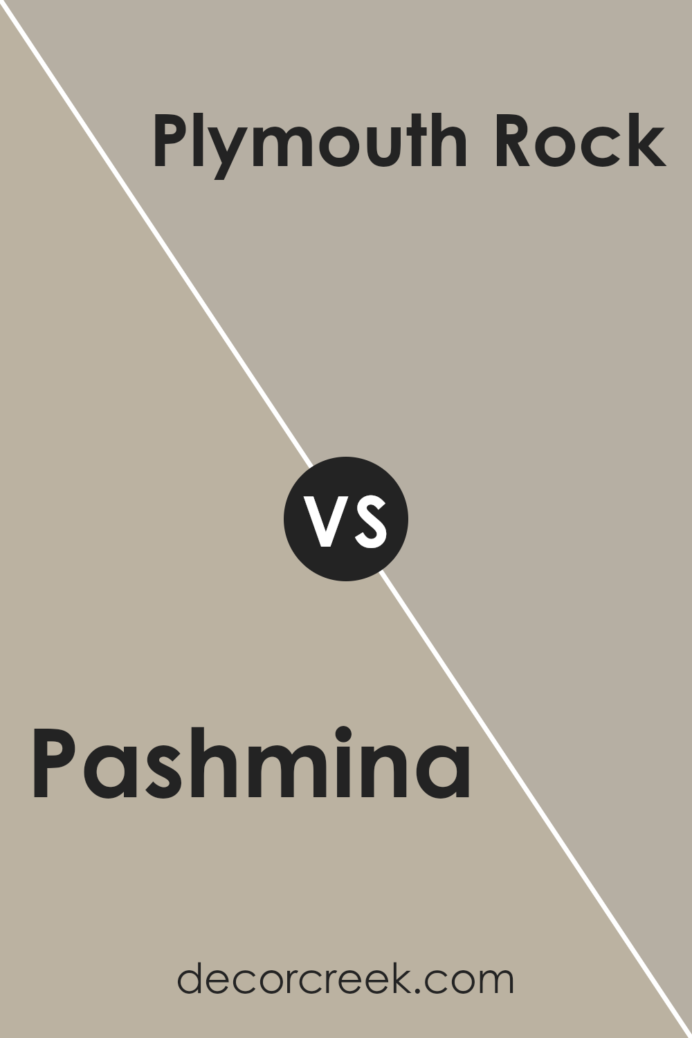
Pashmina AF-100 by Benjamin Moore vs Plymouth Rock 1543 by Benjamin Moore
Pashmina AF-100 and Plymouth Rock 1543, both from Benjamin Moore, share a sophisticated vibe, yet they bring very different energies to a space. Pashmina is like a cozy, warm blanket; it has a rich, taupe-like hue that adds a soft, welcoming feel to any room. It’s versatile and can make a space feel snug without overpowering it with darkness.
On the other hand, Plymouth Rock 1543 leans more towards a gentle, lighter gray. This shade brings a sense of calm and serenity, offering a more understated elegance. It’s perfect for creating a peaceful and airy atmosphere, where light plays a vital role in enhancing the room’s overall character.
While both colors are fantastic options for those looking to add a touch of sophistication and comfort to their homes, Pashmina offers warmth and richness, whereas Plymouth Rock presents a cooler, serene backdrop. Choosing between them depends on the mood and ambiance you want to achieve in your space.
You can see recommended paint color below:
- 1543 Plymouth Rock
Pashmina AF-100 by Benjamin Moore vs Northern Cliffs 1536 by Benjamin Moore
Pashmina and Northern Cliffs, both by Benjamin Moore, are two sophisticated colors that nicely add warmth and depth to spaces. Pashmina is a rich, cozy beige with an inviting undertone. It’s like a warm blanket on a chilly day, offering comfort with its soft, welcoming vibe. It pairs beautifully with various decor styles, adding a touch of elegance to any room.
On the other hand, Northern Cliffs is a darker, more profound gray shade that hints at a more decided, mature character. It gives off a strong, grounded feeling, making a statement without being too bold. While Pashmina brightens rooms with its lighter touch, Northern Cliffs brings a sense of seriousness and solidity, perfect for creating dramatic, intimate spaces.
Both colors are versatile, but their different tones set distinctive moods, from Pashmina’s gentle embrace to Northern Cliffs’ robust presence.
You can see recommended paint color below:
- 1536 Northern Cliffs
Pashmina AF-100 by Benjamin Moore vs Stone Hearth 984 by Benjamin Moore
Pashmina and Stone Hearth, both by Benjamin Moore, offer unique yet subtly distinct tones for your home. Pashmina is like a warm, cozy blanket in color form. It’s a rich, medium-toned hue that blends beige and gray, delivering a versatile backdrop suitable for various rooms and lighting situations. It feels welcoming and can easily pair with both bold and muted accents, making it a favorite for those looking to add a touch of sophistication without overwhelming a space.
On the other hand, Stone Hearth carries a softer, more muted presence. It leans more towards the gray side, with understated brown undertones, providing a calming and neutral base. This color is excellent for creating serene spaces, ideal for bedrooms or living areas where relaxation is key. It works well in spaces that receive a lot of natural light, highlighting its subtle warmth and making the room feel grounded.
Both colors share a natural elegance, but while Pashmina offers depth and warmth, Stone Hearth brings a lighter, soothing touch. Choosing between them depends on the mood you’re aiming to create – cozy and enveloping with Pashmina or calm and understated with Stone Hearth.
You can see recommended paint color below:
- 984 Stone Hearth
Conclusion
Pashmina AF-100 by Benjamin Moore is a paint color that stands out for its versatility and warmth. It offers a perfect balance for spaces that need a cozy yet sophisticated touch. The hue is subtle, making it an excellent choice for those looking to create a serene and welcoming atmosphere in their homes or offices. Its ability to pair well with various decor styles, from modern to traditional, adds to its appeal, allowing for seamless integration into any interior design.
Choosing Pashmina AF-100 means opting for a timeless shade that can transform spaces without overwhelming them. It’s particularly effective in rooms that crave a hint of elegance without sacrificing comfort. Whether applied to a bedroom wall, a living room, or an office, this color promises to enhance the aesthetic appeal while providing a backdrop that encourages relaxation and creativity.
This makes it a popular choice among interior designers and homeowners alike, who appreciate its unique blend of beauty and functionality.

Ever wished paint sampling was as easy as sticking a sticker? Guess what? Now it is! Discover Samplize's unique Peel & Stick samples.
Get paint samples

