When you first come across SW 9699 Stone Fruit by Sherwin-Williams, you’re met with a remarkable color that’s both warm and refined. It’s a shade that seems to balance between earthy, muted tones and a hint of something lively and refreshing. As you apply it to your walls, you notice how it changes with the light throughout the day—sometimes appearing cozy and comforting, while at other times it reveals a more vibrant personality.
This beautiful hue has a way of complementing a wide range of decor styles, from modern minimalism to rustic charm. The versatility is impressive, making it easy to pair with other colors in your room.
Picture a bright living room where Stone Fruit serves as a subtle yet elegant backdrop or a cozy bedroom where it wraps you in a gentle, inviting atmosphere. The color brings warmth without being overpowering, offering a perfect canvas to bring out your personal style.
As you live with this color, you may find it surprising how it influences the mood of your home. It has a unique way of making rooms feel both cozy and expansive. SW 9699 Stone Fruit isn’t just a paint color—it’s a simple way to bring harmony and warmth to your surroundings.
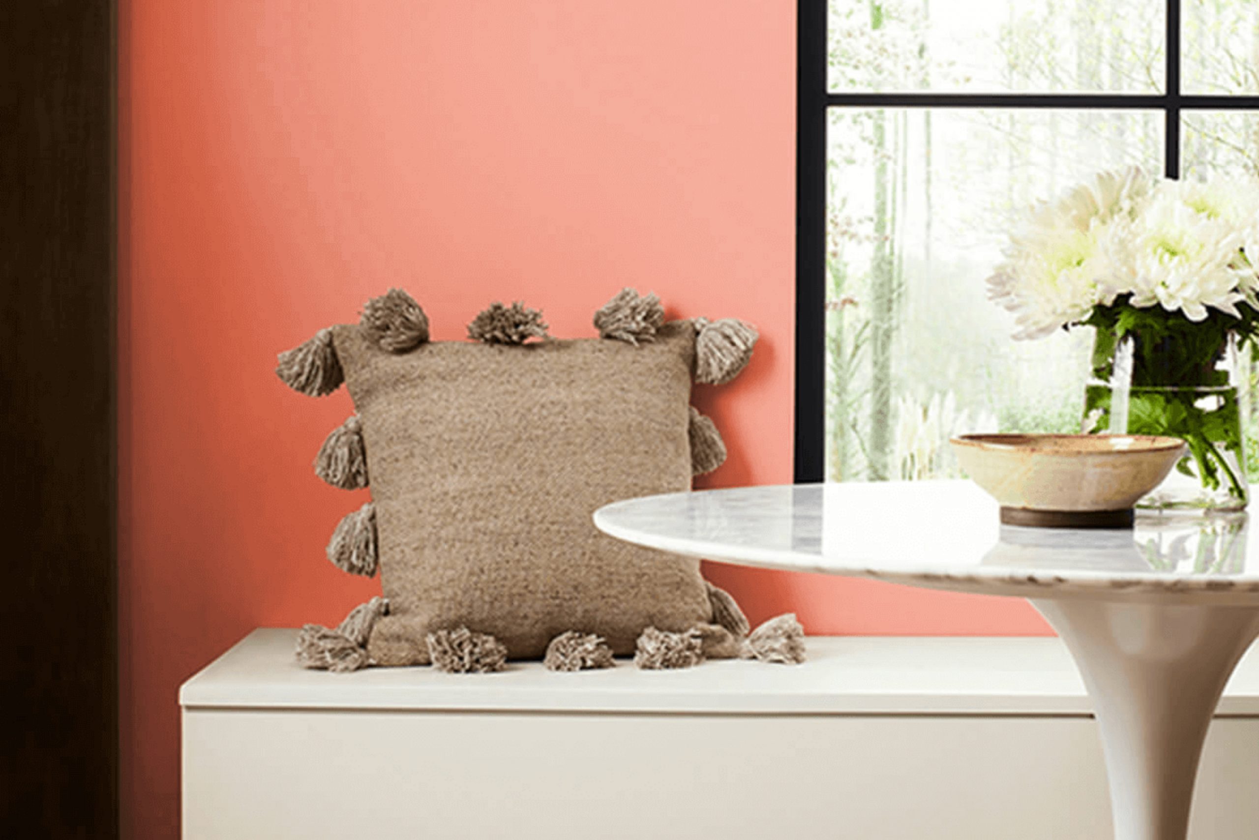
What Color Is Stone Fruit SW 9699 by Sherwin Williams?
Stone Fruit SW 9699 by Sherwin Williams is a warm, inviting color that carries earthy undertones, providing a homely and cozy atmosphere. This paint color has a slight hint of peach and beige, offering a balanced blend of warmth and neutrality. Its soft shade makes it flexible for various interior styles.
In a rustic or country-style home, Stone Fruit can enhance the warm, welcoming feel. It works well in a modern farmhouse setting, adding a gentle, natural hue to complement wooden beams and vintage furnishings. In a contemporary style, it can be used to add a touch of warmth to clean lines and sleek designs.
Stone Fruit pairs beautifully with materials like warm woods, such as oak and walnut. These materials highlight its natural appeal. It also complements textures like soft linens, cotton, and woven textiles, bringing a cozy feel to living rooms or bedrooms. Pairing it with gold or brass metal accents can add a touch of elegance to the room.
For contrast, you can use darker colors like charcoal or navy blue in furniture or decorative elements. This color can also blend smoothly with neutral shades like cream or light gray for a calm and balanced look.
Is Stone Fruit SW 9699 by Sherwin Williams Warm or Cool color?
Stone Fruit SW 9699 by Sherwin Williams is a warm, earthy color that adds a cozy and inviting feel to any home. This shade is a rich blend of brown and red, which mimics the natural tones found in stone fruit. Its warmth makes it a great choice for living rooms and dining areas, creating an inviting atmosphere where people feel comfortable gathering.
In kitchens, Stone Fruit can complement wooden cabinets and natural stone countertops, enhancing their natural beauty. It’s also flexible enough to pair with both modern and traditional decor styles. In bedrooms, the warmth of this color promotes a restful environment, making it easier to relax and unwind.
When used in home offices or creative areas , Stone Fruit can help inspire focus and productivity. Its neutral yet rich tone allows it to coordinate well with a variety of other colors, making it a flexible choice for accent walls or larger areas.
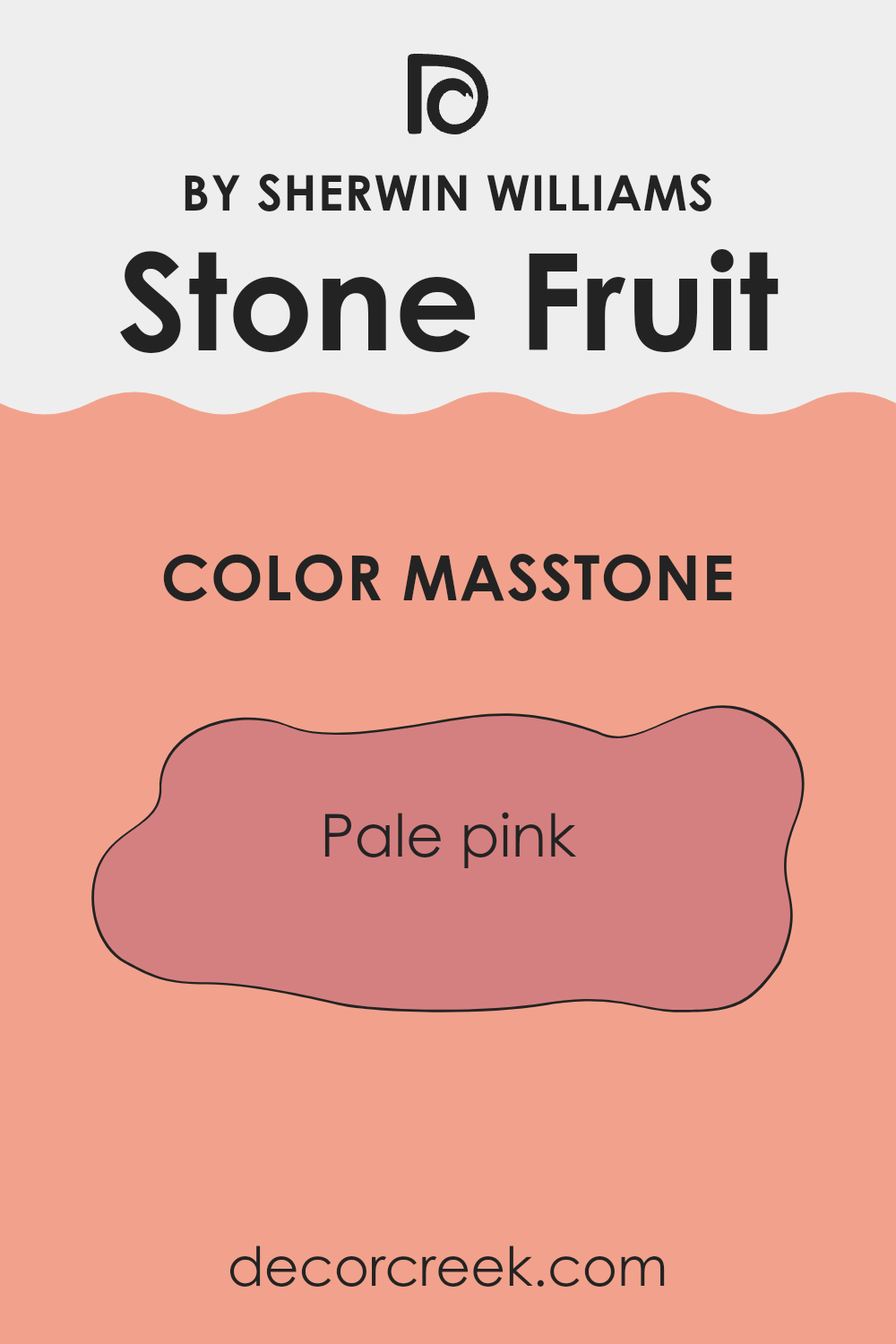
Undertones of Stone Fruit SW 9699 by Sherwin Williams
Stone Fruit by Sherwin Williams is a complex color that has a rich mix of undertones. These undertones, such as pale yellow, light purple, and light gray, make this hue quite refined and interesting. The yellow and orange undertones give the color a warm and inviting feel, which can make a room feel cozy and cheerful. The pale yellow and light gray add a subtle softness, providing a calm base.
Additionally, the subtle hints of light purple, pink, and lilac can add depth and intrigue to the color, making it appear different depending on the light and other colors in the room. These cooler shades help balance out the warmth, ensuring the color does not become overpowering. Light blue and mint undertones freshen the hue, creating a lively atmosphere when used on walls.
The addition of olive, brown, and red undertones gives the color an earthy quality, grounding it and making it flexible enough to complement a variety of styles and furnishings. Overall, the undertones in Stone Fruit affect not just its appearance, but also the mood it creates, making it a dynamic choice for interior rooms. This variety of undertones ensures that the color can adjust well to different lighting conditions and settings.
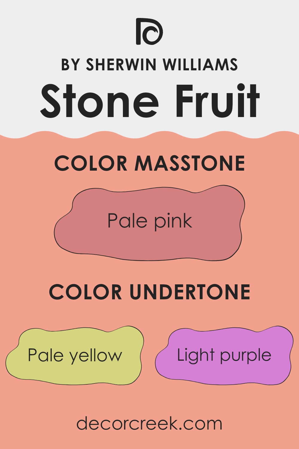
What is the Masstone of the Stone Fruit SW 9699 by Sherwin Williams?
Stone Fruit SW 9699 by Sherwin Williams, which has a masstone of pale pink (#D58080), can gently enhance the atmosphere of a home. This shade of pink is soft and subtle, creating a warm, inviting feel. Its gentle tone can make rooms feel cozy and comfortable without feeling too strong.
In a living room or bedroom, it creates a soothing backdrop that encourages relaxation and comfort. The pale pink hue is flexible and pairs well with neutral tones like whites, grays, and beiges, adding a hint of color while maintaining a calm aesthetic.
In children’s rooms, it can add a playful yet refined touch. Stone Fruit is also a great choice for accent walls or small pieces of furniture, bringing a refreshing pop of color without taking over the room. Overall, this gentle shade is a lovely way to introduce warmth and a soft, welcoming vibe to any home.
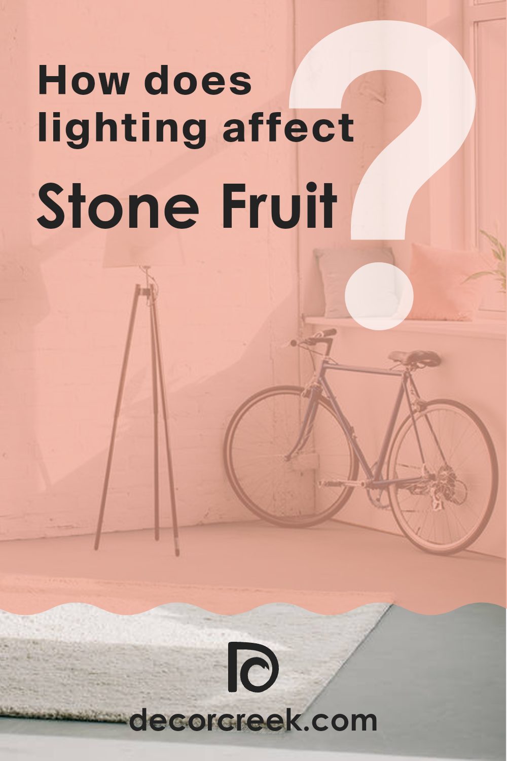
How Does Lighting Affect Stone Fruit SW 9699 by Sherwin Williams?
Lighting plays a crucial role in how we perceive colors. The type of light can dramatically change the appearance of paint colors, including Stone Fruit SW 9699 by Sherwin Williams. This color is a warm, earthy tone, and its look can change depending on lighting conditions and the orientation of a room.
In natural light, Stone Fruit shows its true warm characteristics. In a north-facing room, which gets cooler, indirect light, the color might appear slightly muted, giving it a more subdued vibe. This is because north-facing rooms often have consistent, soft light without as much warmth, causing colors to appear a bit cooler and darker.
In contrast, south-facing rooms benefit from bright, warm, and intense sunlight for most of the day. Here, Stone Fruit will look lively and warm, enhancing its earthy undertones and making the room feel cozy and inviting. The strong natural light in these rooms can bring out the depth and richness of the color.
East-facing rooms receive warm, yellow-toned light in the morning and cooler, bluish light in the afternoon. Stone Fruit will glow warmly in the morning sunlight, but might take on a more neutral tone as the day progresses. This shift can give the color some dynamic changes throughout the day.
West-facing rooms experience the opposite effect, with cooler light in the morning and warm, golden light in the late afternoon and evening. Stone Fruit will start the day looking a bit more subdued and will become richer and warmer as the sunlight intensifies later in the day.
Under artificial light, the color can vary based on the type of bulbs used. Warm white lights can enhance the cozy aspects of the color, while cooler, LED lights might make it appear slightly more muted or subdued. Different lighting setups can provide unique looks for this flexible color, so considering your light sources is important when using Stone Fruit in your home.
What is the LRV of Stone Fruit SW 9699 by Sherwin Williams?
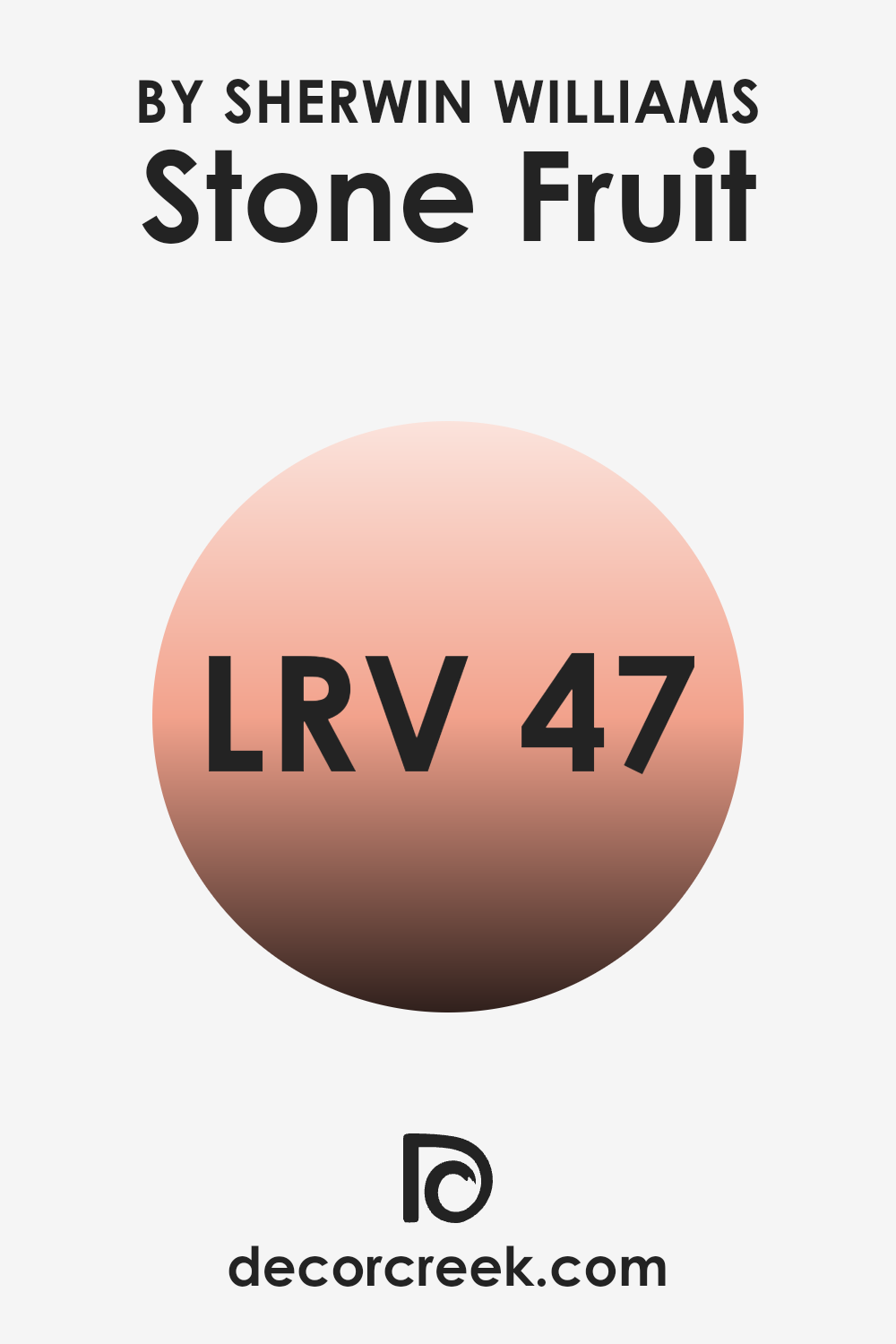
LRV, or Light Reflectance Value, is a measure that indicates how much light a color reflects or absorbs. It is a scale ranging from 0 to 100, where 0 represents absolute black, absorbing all light, and 100 represents pure white, reflecting all light. This means that LRV helps us understand how bright or dark a color might appear when painted on a wall.
Colors with higher LRV reflect more light and can make areas feel more open and airy. On the other hand, colors with a lower LRV absorb more light, which can make a room feel cozier and more intimate.
The LRV of 46.574 for the color Stone Fruit signifies that it is a mid-tone shade, balancing between light and dark. It will reflect a fair amount of light, but not too much, making it a steady choice for various room settings. This color can gently brighten up areas without feeling too intense. Stone Fruit provides a comfortable warmth, suitable for living areas and bedrooms, without making a room feel too small or too large.
Its moderate LRV means it works well in both naturally lit rooms and those with softer light
What are the Trim colors of Stone Fruit SW 9699 by Sherwin Williams?
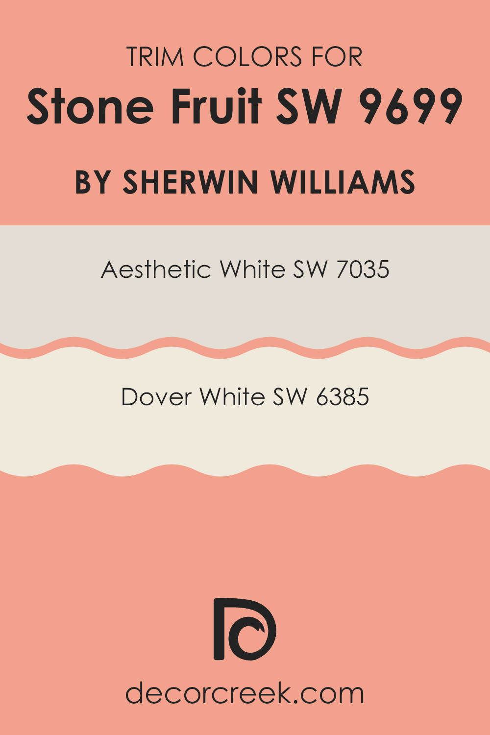
Trim colors play a vital role in enhancing the overall look of a room painted with Stone Fruit, a warm, earthy shade by Sherwin Williams. These colors serve as a frame, highlighting the main color while adding contrast and definition to the walls.
By choosing the right trim color, you can accentuate architectural details and create a more inviting atmosphere. For Stone Fruit, using lighter trim colors like Aesthetic White or Dover White can provide a subtle contrast that enriches the warmth of the main color without making it feel too strong.
These lighter shades help to define and separate the different elements of a room, making the room feel more finished and cohesive.Aesthetic White (SW 7035) is a soft, off-white hue with gentle undertones that can balance the richness of Stone Fruit. It brings a touch of warmth without taking attention away from the primary color.
On the other hand, Dover White (SW 6385) is a creamy white with a sunny, welcoming quality that brightens up the room. This color can add a gentle lightness to the edges, making them feel crisp and clean. Both of these trim colors complement Stone Fruit beautifully, providing a polished look that enhances the overall aesthetic of a room.
You can see recommended paint colors below:
Colors Similar to Stone Fruit SW 9699 by Sherwin Williams
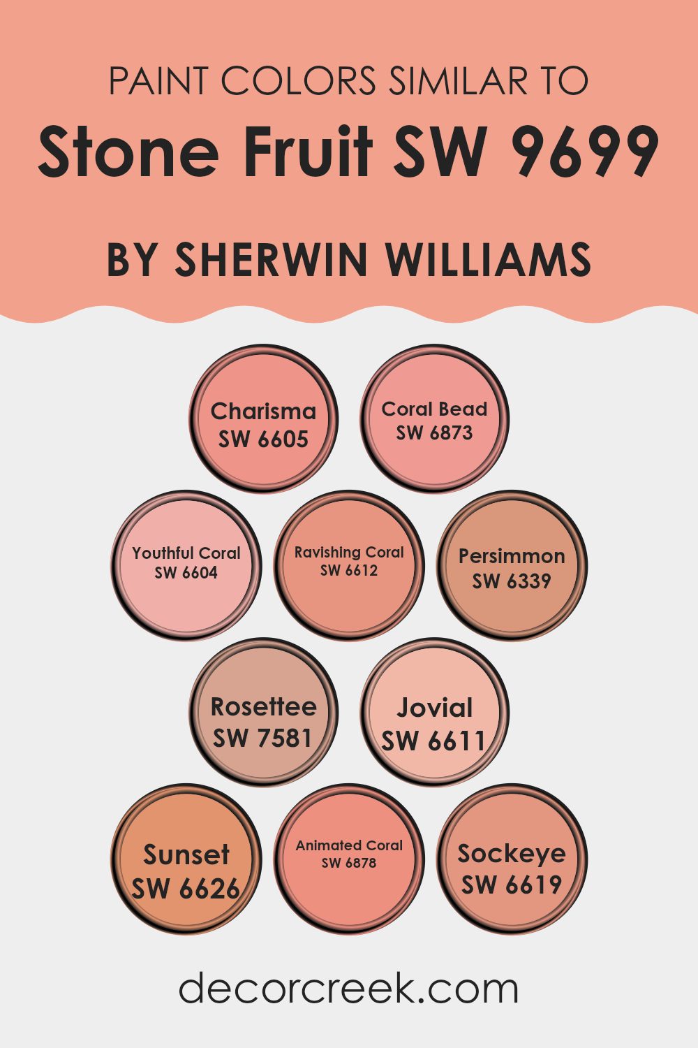
Similar colors are important because they help create a harmonious and cohesive look in any room. When colors are similar, they share certain undertones, making them pleasing to the eye when used together. For example, the colors related to Stone Fruit from Sherwin Williams create a warm and inviting palette. SW 6605 Charisma is a lively shade that feels fresh and uplifting, infusing rooms with a cheerful vibe. SW 6873 Coral Bead offers a bold touch with its vibrant energy, perfect for adding a burst of personality to an area.
In contrast, SW 6604 Youthful Coral feels soft and inviting, while SW 6612 Ravishing Coral provides a more intense, alluring depth. SW 6339 Persimmon adds a warm, rich note reminiscent of its namesake fruit. SW 7581 Rosettee brings in a romantic flair, adding softness and elegance.
SW 6611 Jovial is a bright, happy color that brings lightness and fun into any room. SW 6626 Sunset suggests warmth and coziness, like the last light of the day. SW 6878 Animated Coral is lively and energetic, perfect for drawing attention. Lastly, SW 6619 Sockeye adds a brighter, spirited touch, ideal for those who love bold, lively rooms. These similar colors work together beautifully, enhancing the vibe of any room with their warm, cohesive tones.
You can see recommended paint colors below:
- SW 6605 Charisma (CHECK A SAMPLE)
- SW 6873 Coral Bead
- SW 6604 Youthful Coral (CHECK A SAMPLE)
- SW 6612 Ravishing Coral (CHECK A SAMPLE)
- SW 6339 Persimmon (CHECK A SAMPLE)
- SW 7581 Rosettee
- SW 6611 Jovial (CHECK A SAMPLE)
- SW 6626 Sunset (CHECK A SAMPLE)
- SW 6878 Animated Coral
- SW 6619 Sockeye (CHECK A SAMPLE)
How to Use Stone Fruit SW 9699 by Sherwin Williams In Your Home?
Stone Fruit SW 9699 by Sherwin Williams is a warm, earthy paint color with a hint of terracotta. It’s a great choice for adding a cozy feel to your home. This color can work well in various rooms, such as the living room or bedroom, where you want to create a comfortable and inviting atmosphere.
You might consider using it on an accent wall to add a pop of color, or even paint a piece of furniture like a dresser or bookshelf for a touch of character. Pairing it with neutral tones like beige or soft white can help balance the color and keep the room from feeling too dark.
You can also complement it with natural materials, like wooden furniture or woven fabrics, to enhance its warmth. Overall, this shade adds a touch of comfort and character to any room in your home.
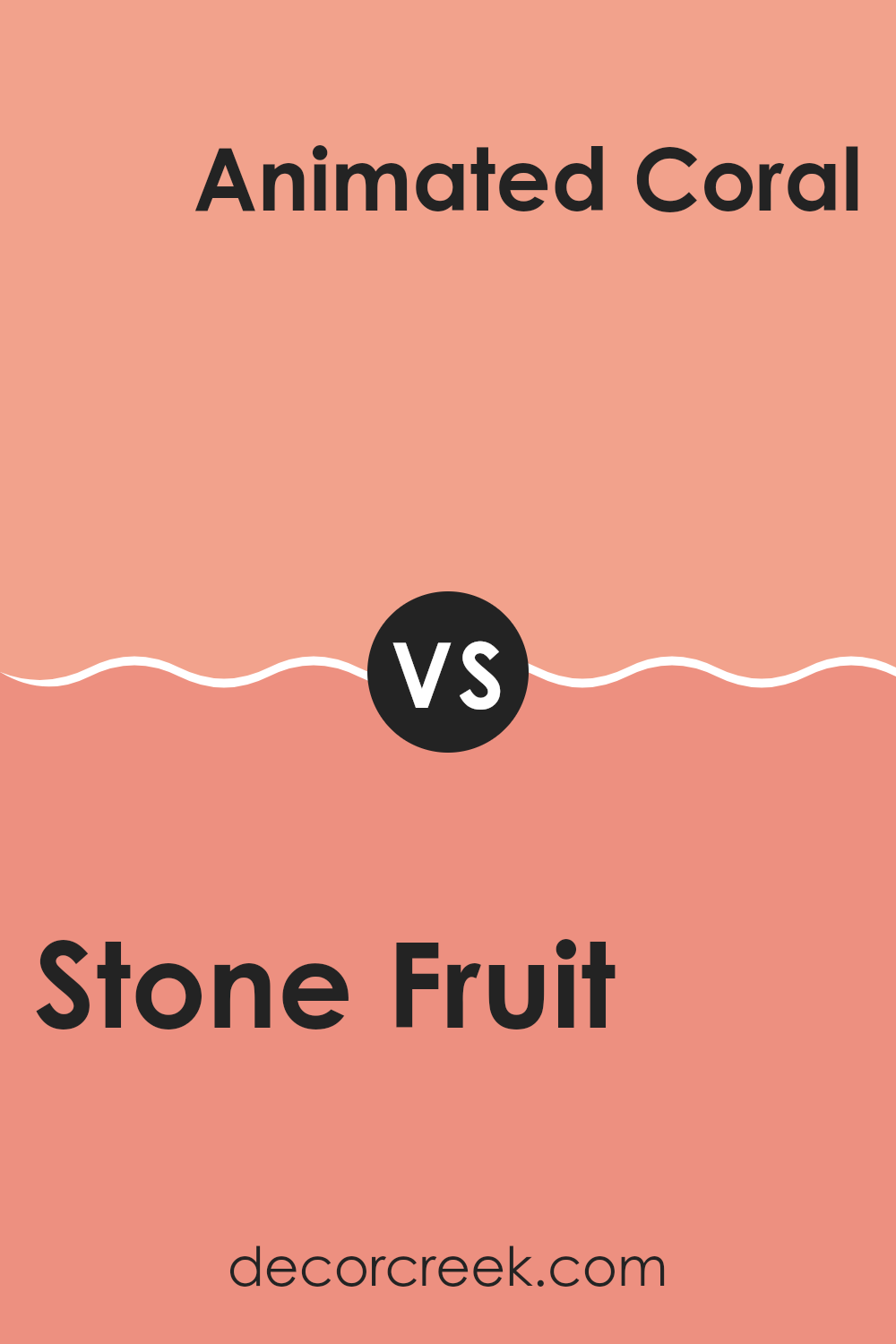
Stone Fruit SW 9699 by Sherwin Williams vs Animated Coral SW 6878 by Sherwin Williams
Stone Fruit SW 9699 by Sherwin Williams is a soft, muted color that brings to mind the gentle tones of a ripe peach. It’s warm and comforting, with a subtle blend of pink and beige that adds a gentle touch to any room. On the other hand, Animated Coral SW 6878 is bold and lively.
This vibrant hue has stronger pink and orange undertones, creating an energetic and cheerful atmosphere. While Stone Fruit feels calm and inviting, Animated Coral is more about making a statement with its vivid presence.
These two colors are quite different; Stone Fruit works well as a neutral background, while Animated Coral acts as a vibrant accent. Together, they can provide a balanced contrast: Stone Fruit softens the room, and Animated Coral adds a pop of energy. Each color has its own place, depending on whether you prefer a soothing environment or an energetic vibe.
You can see recommended paint color below:
- SW 6878 Animated Coral
Stone Fruit SW 9699 by Sherwin Williams vs Coral Bead SW 6873 by Sherwin Williams
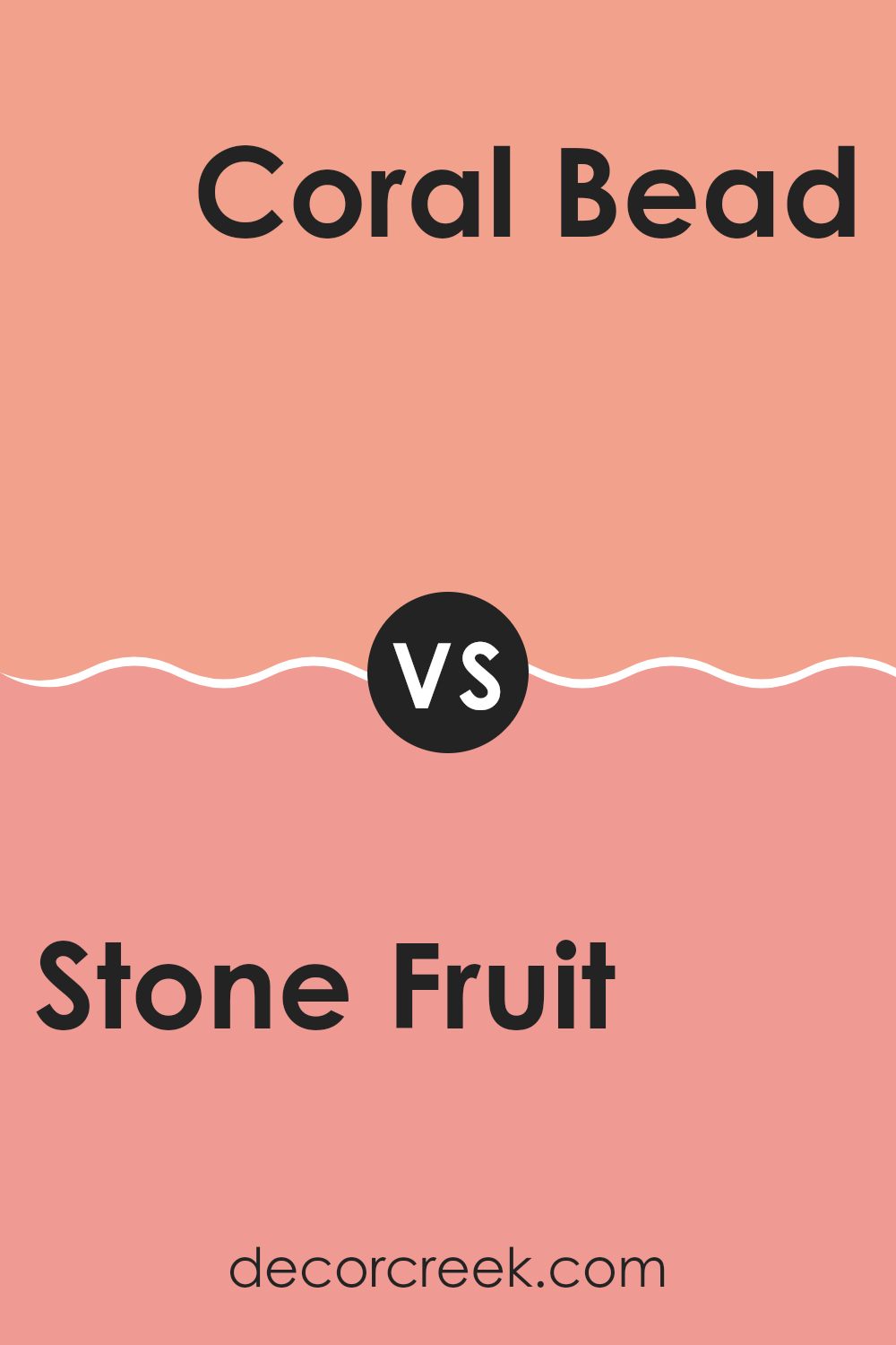
Stone Fruit SW 9699 and Coral Bead SW 6873 by Sherwin Williams are two distinct colors that can create varied moods in a room. Stone Fruit is a calming neutral with warm undertones, offering a cozy and inviting feel. It works well in living rooms or bedrooms where a relaxed atmosphere is desired. This color pairs nicely with earthy tones and natural materials for a harmonious look.
On the other hand, Coral Bead is a vibrant and energetic shade, filled with lively pink and orange undertones. It’s perfect for adding a pop of color and bringing a cheerful vibe to a room. This color shines in rooms like kitchens or playrooms, where energy and excitement are welcomed.
Together, Stone Fruit and Coral Bead can balance each other, with one providing calm and the other bringing energy. They can be used in combination to define different areas or moods within the same home.
You can see recommended paint color below:
- SW 6873 Coral Bead
Stone Fruit SW 9699 by Sherwin Williams vs Rosettee SW 7581 by Sherwin Williams
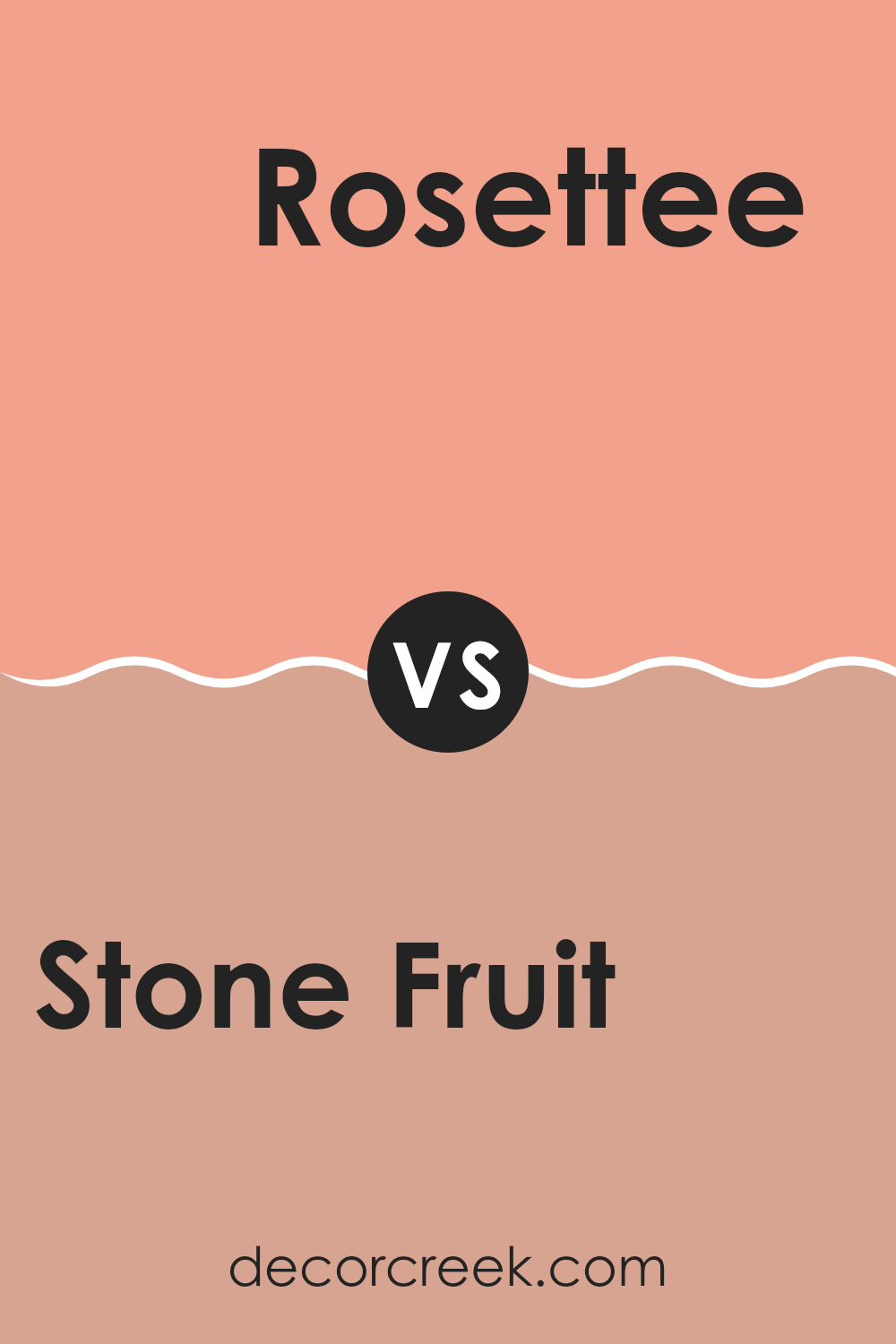
Stone Fruit SW 9699 by Sherwin Williams is a warm, muted color reminiscent of ripe peaches or apricots. It’s a gentle, earthy hue that offers a soft, cozy feel. Ideal for creating a comforting atmosphere, it pairs well with other natural tones.
On the other hand, Rosettee SW 7581 by Sherwin Williams is a much bolder shade. It has a rich, rosy pink color that brings energy and brightness to a room. While Stone Fruit leans more towards understated, Rosettee makes a statement with its vibrant presence.
Together, these colors can be quite complementary. Stone Fruit serves as a calming backdrop, while Rosettee adds a touch of lively contrast. This combination can create a balanced room where the gentle warmth of Stone Fruit is enhanced by the lively splash of Rosettee, perfect for both subtle and vibrant rooms.
You can see recommended paint color below:
- SW 7581 Rosettee
Stone Fruit SW 9699 by Sherwin Williams vs Youthful Coral SW 6604 by Sherwin Williams
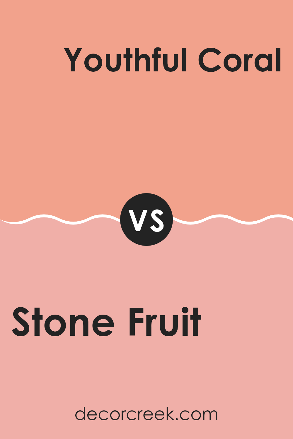
Stone Fruit SW 9699 by Sherwin Williams is a warm, earthy color that resembles the gentle hue of ripe apricots or peaches. It brings a sense of warmth and comfort to a room, creating an inviting and cozy atmosphere. This color works well in living rooms or bedrooms where a soothing and relaxed environment is preferred.
On the other hand, Youthful Coral SW 6604 is a vibrant, energetic hue with pink and orange undertones. It’s lively and bright, making it a great choice for areas where you want to add some fun and playfulness, such as a child’s room or an accent wall in a creative studio. It adds a touch of excitement and can lift the mood of a room.
While Stone Fruit is more muted and neutral, Youthful Coral offers a bold pop of color. Both colors can complement various styles, but they evoke different feelings and energy levels in a room.
You can see recommended paint color below:
- SW 6604 Youthful Coral (CHECK A SAMPLE)
Stone Fruit SW 9699 by Sherwin Williams vs Charisma SW 6605 by Sherwin Williams
Stone Fruit SW 9699 by Sherwin Williams is a gentle, earthy shade with warm undertones, resembling the soft color of ripe peaches or muted clay. It’s a flexible hue that works well in rooms where you want to create a neutral yet inviting atmosphere. Stone Fruit feels grounded and natural, making it suitable for living rooms, bedrooms, or any area where comfort is a priority.
In contrast, Charisma SW 6605 is a lively and energetic color. This bright coral hue radiates warmth and enthusiasm, making it a great choice for accent walls, dining areas, or rooms needing a pop of color. Its vivid nature can invigorate a room and inspire joy and creativity.
When comparing the two, Stone Fruit is soft and subtle, enhancing a calming environment. Meanwhile, Charisma stands out, adding vibrancy and excitement to a room. Together, they can be harmoniously combined, with Stone Fruit as a neutral backdrop and Charisma as a standout feature.
You can see recommended paint color below:
- SW 6605 Charisma (CHECK A SAMPLE)
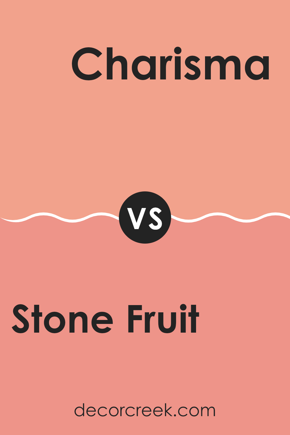
Stone Fruit SW 9699 by Sherwin Williams vs Ravishing Coral SW 6612 by Sherwin Williams
Stone Fruit (SW 9699) and Ravishing Coral (SW 6612) by Sherwin Williams offer distinct vibes for your room. Stone Fruit is a warm, earthy tone that evokes the feel of natural materials. It’s subtle and can easily blend with other natural shades, creating a calming and grounded atmosphere in an area.
Ravishing Coral, on the other hand, is vibrant and lively. It’s a bright, energetic shade of coral that can instantly add a splash of warmth and fun to any room. This color is great for adding a cheerful touch and works well as an accent or feature wall to catch the eye.
While Stone Fruit is understated and perfect for a subtle, cozy environment, Ravishing Coral is all about boldness and making a statement. Together, they can balance each other out, with Stone Fruit providing a soothing foundation and Ravishing Coral adding pops of vibrant color.
You can see recommended paint color below:
- SW 6612 Ravishing Coral (CHECK A SAMPLE)
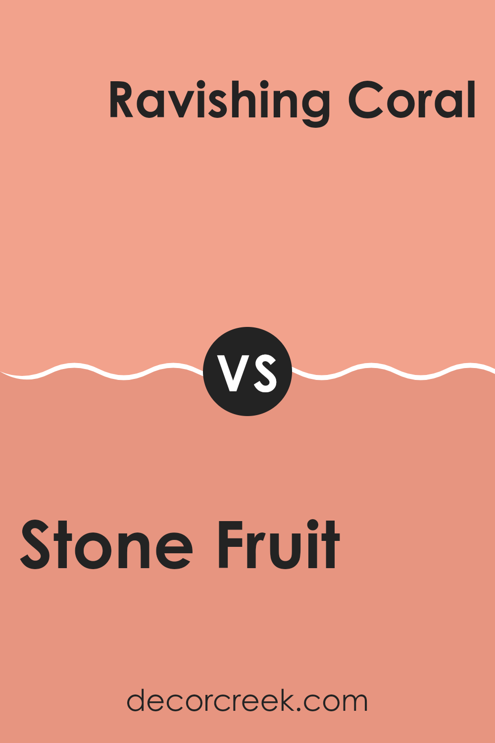
Stone Fruit SW 9699 by Sherwin Williams vs Sunset SW 6626 by Sherwin Williams
Stone Fruit SW 9699 is a warm, earthy hue that draws inspiration from natural tones, offering a cozy and grounded feel. It’s a muted blend of brown and soft orange, ideal for creating inviting areas that feel comfortable and natural. This color is flexible and can work well in any room that aims to feel warm and welcoming.
Sunset SW 6626, on the other hand, is a bold and vibrant shade of red-orange. Much like the brilliance of a sunset, this color is energetic and lively, perfect for adding a burst of life to any room. It’s excellent for creating an accent wall or adding color to a lively dining room or living area.
When comparing the two, Stone Fruit is more subdued and earthy, making it suitable for calm and relaxed environments, while Sunset is more intense and energizing, ideal for rooms where you want to make a bold statement.
You can see recommended paint color below:
- SW 6626 Sunset (CHECK A SAMPLE)
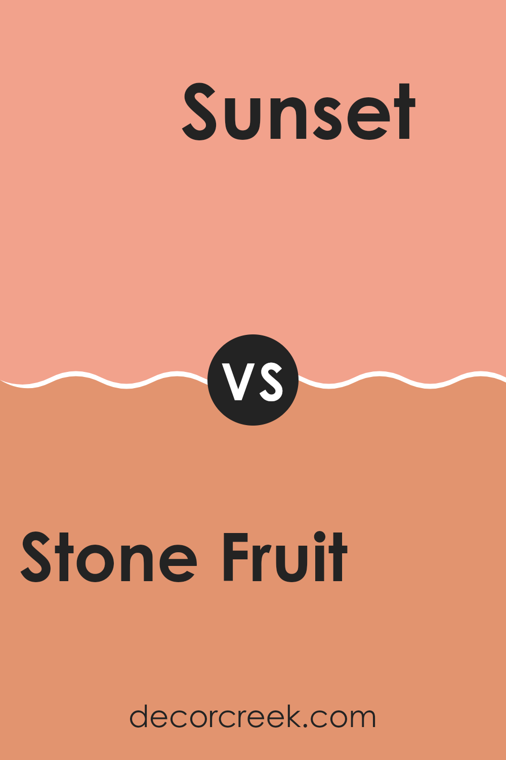
Stone Fruit SW 9699 by Sherwin Williams vs Jovial SW 6611 by Sherwin Williams
Stone Fruit SW 9699 by Sherwin Williams is a subtle, earthy color that feels warm and natural. It has a soft, muted tone, resembling a mix of light brown and peach. This color can create a cozy and comforting atmosphere in a room, making it a good choice for living rooms or bedrooms where a relaxed vibe is preferred.
On the other hand, Jovial SW 6611 is a bright, cheerful color. It’s a lively shade of warm reddish-pink that can add energy and fun to a room. Jovial is good for rooms where you want a burst of color and cheeriness, like a kitchen or an accent wall in a child’s room.
While Stone Fruit is more subdued and calming, Jovial brings a vibrant and playful feel. Together, they can create a balance of warmth and brightness in any room, with Stone Fruit offering a steady base and Jovial adding lively touches.
You can see recommended paint color below:
- SW 6611 Jovial (CHECK A SAMPLE)
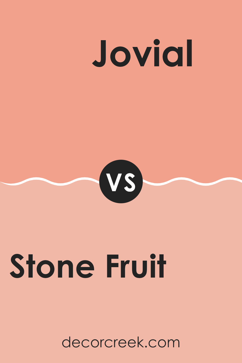
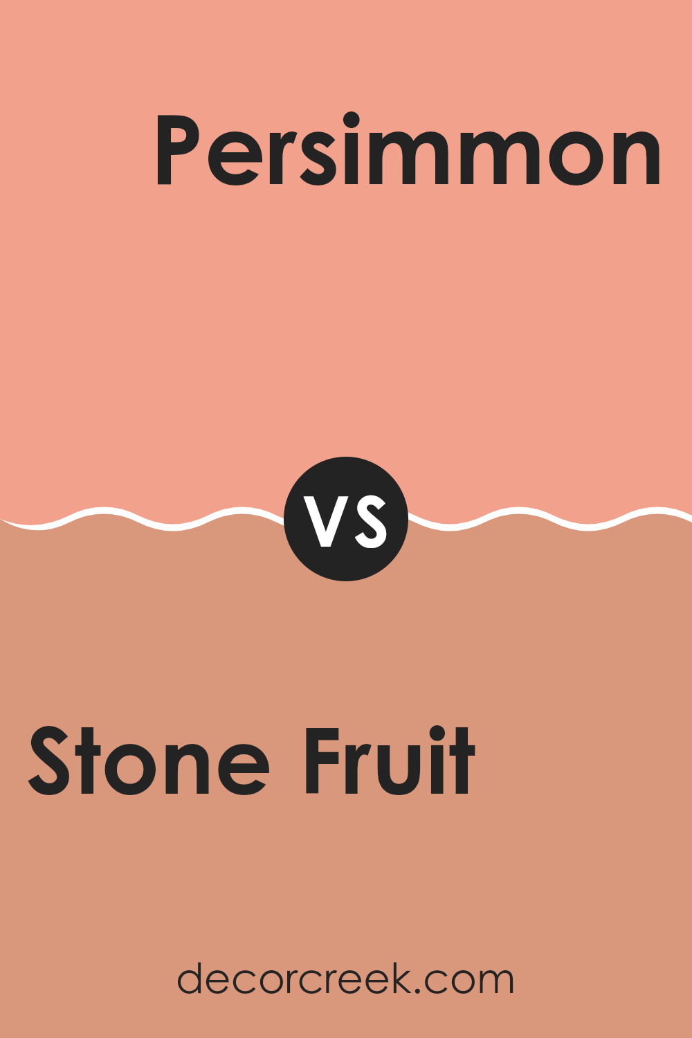
Stone Fruit SW 9699 by Sherwin Williams vs Persimmon SW 6339 by Sherwin Williams
Stone Fruit SW 9699 by Sherwin Williams is a warm, muted shade that brings to mind the softness of ripe peaches. It has a subtle earthy tone, making it flexible for various areas. The color is understated yet rich enough to create a cozy atmosphere.
On the other hand, Persimmon SW 6339 is bold and energetic. It’s a bright, vivid color that resembles the fruit it’s named after. This orange-red hue brings a lively and cheerful vibe to a room.
When comparing the two, Stone Fruit is more subdued, perfect for creating a relaxed environment without being too dark. It’s well-suited for bedrooms or living areas requiring a calm backdrop. Persimmon, however, is ideal for adding a punch of color and can act as an accent in a neutral room. It works well in playful settings such as kitchens or children’s playrooms. Both colors offer distinct moods, with Stone Fruit being subtle and Persimmon being more daring.
You can see recommended paint color below:
- SW 6339 Persimmon (CHECK A SAMPLE)
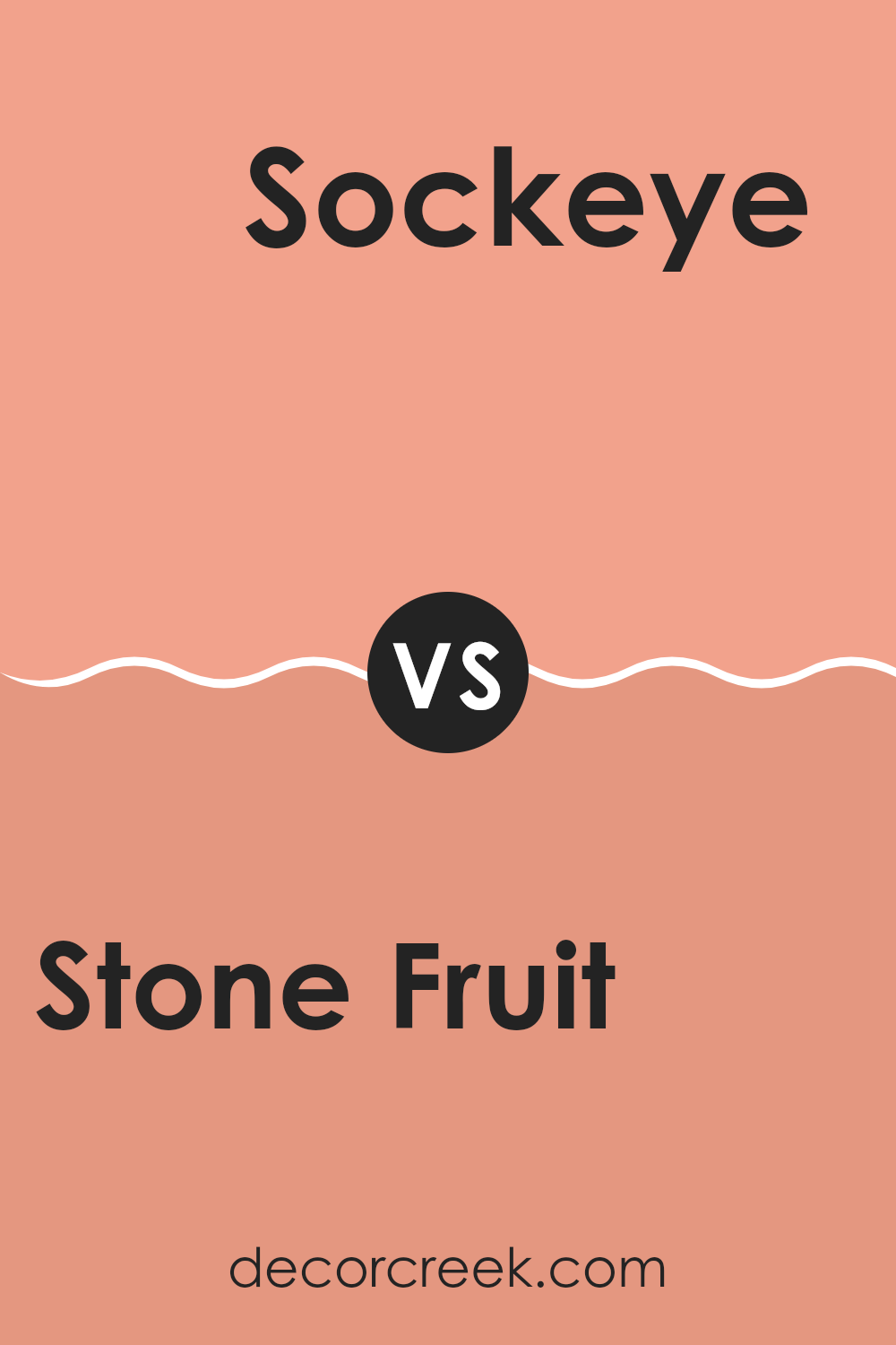
Stone Fruit SW 9699 by Sherwin Williams vs Sockeye SW 6619 by Sherwin Williams
Stone Fruit SW 9699 and Sockeye SW 6619 by Sherwin Williams are two distinct colors that bring different vibes to a room. Stone Fruit is a soft, warm neutral with a hint of earthy undertones. It creates a cozy and inviting atmosphere, making it suitable for living rooms or bedrooms where you want a calm and restful setting.
In contrast, Sockeye is a vibrant, bold red-orange shade that grabs attention. It’s lively and energetic, adding a touch of excitement to any room. This color is ideal for accent walls or rooms where you want to make a statement, like dining areas or a front door.
While Stone Fruit provides a subtle, soothing backdrop, Sockeye offers a pop of color that can energize a room. Together, they can be used effectively in a design scheme, with Stone Fruit as the primary background and Sockeye as an eye-catching accent.
You can see recommended paint color below:
- SW 6619 Sockeye (CHECK A SAMPLE)
In writing about SW 9699 Stone Fruit by Sherwin Williams, I’ve found a color that feels like a warm hug from a sunny afternoon. It’s like the soft, fuzzy skin of a peach or the blush on a ripe apricot. When I see it, I think of cozy rooms that make you feel safe. It’s a color that can be friendly and welcoming, whether it’s in a living room or a bedroom.
Imagine a place that’s bright and gentle at the same time; Stone Fruit makes that happen. It works well with other colors too, like whites and browns, making it feel like you’re right in nature. This color is like the bridge between the gentle morning and the time when the sun gently sets.
I’ve also noticed how it works in different rooms. In kitchens, it can make breakfast feel like an event, and in smaller rooms, it makes everything feel a little bigger and kinder. Families and friends might talk just a bit longer because the color makes them feel happy.
SW 9699 Stone Fruit is more than just paint; it’s a way to make us feel good every day, turning houses into homes and ordinary times into special moments. It shows us how simple color can make a big difference in how we feel.
Ever wished paint sampling was as easy as sticking a sticker? Guess what? Now it is! Discover Samplize's unique Peel & Stick samples.
Get paint samples


