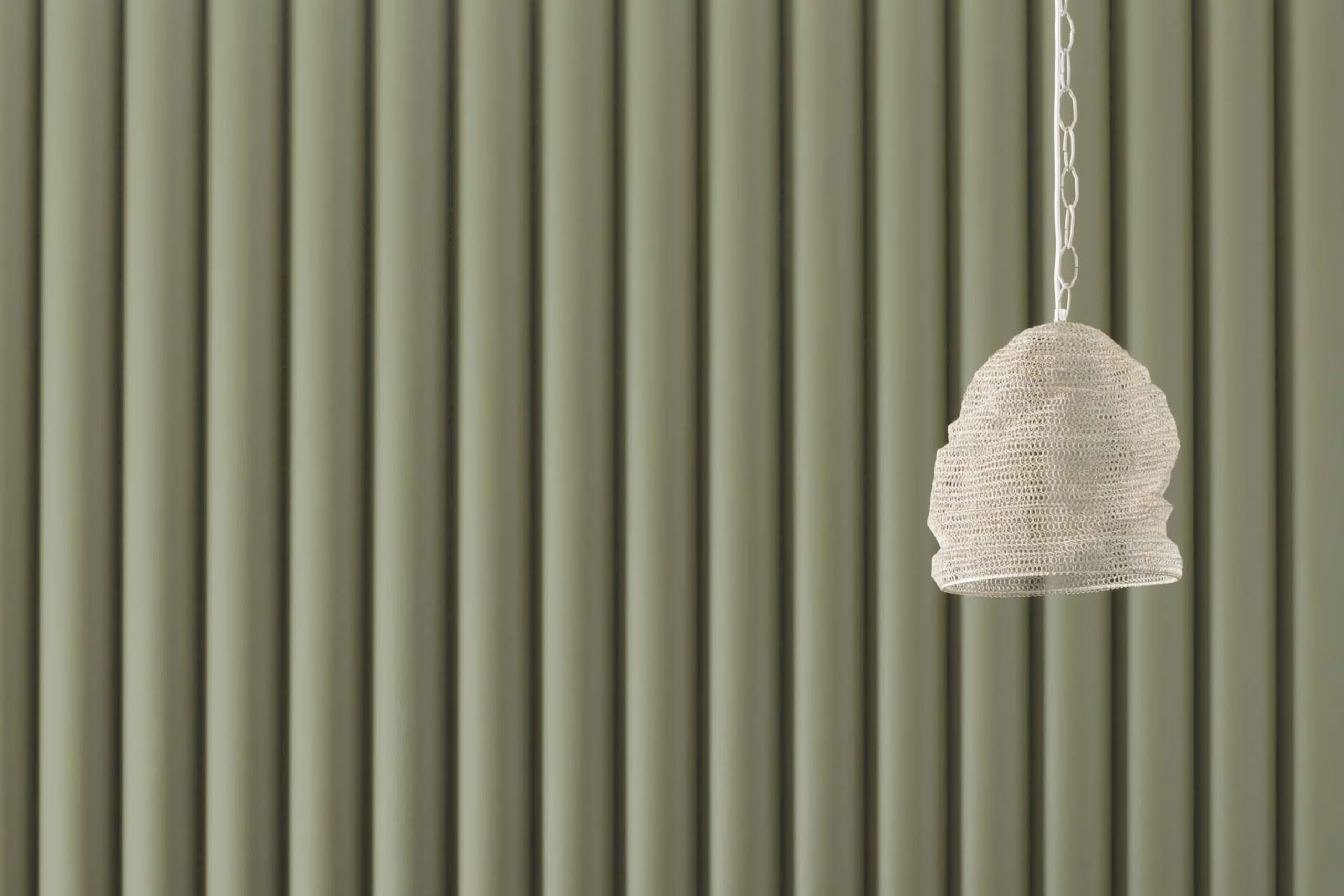
I recently started using a color called HC-112 Tate Olive by Benjamin Moore for a painting project in my dining room, and I’m excited to share my thoughts on it. If you’re looking for a unique shade that adds warmth and refinement to any area without being too bold or overpowering, Tate Olive might be the perfect choice for you.
This color has a subtle, earthy tone that blends beautifully with natural materials like wood and stone. It’s an adaptable shade that can help create a cozy atmosphere in a room, making it ideal for areas where you spend a lot of time with family or entertaining guests.
Whether you’re painting walls, furniture, or accent pieces, Tate Olive provides a harmonious backdrop that complements various decor styles. In my experience, it pairs especially well with soft, neutral colors, enhancing the overall aesthetic of the room.
Give HC-112 Tate Olive a try, and you might find it as wonderfully practical and pleasant as I do.
What Color Is Tate Olive HC-112 by Benjamin Moore?
The color Tate Olive HC-112 by Benjamin Moore is a rich, warm green with earthy undertones, reminiscent of lush olive groves. This adaptable shade can create a cozy and welcoming atmosphere in any room. The depth of this green is particularly effective in areas that aim for a natural, grounding feel. It works beautifully in rustic kitchens, cozy living rooms, and even bedrooms where a touch of calmness is desired.
Tate Olive pairs excellently with natural materials like wood, enhancing its warm tones and bringing out the rich textures of timber. Leather also complements this color well, adding a hint of luxury without overpowering the room. Woven textures such as wicker or rattan can introduce a lighter, airy feel that balances the depth of Tate Olive.
In terms of interior styles, Tate Olive fits perfectly within farmhouse, traditional, and cottage aesthetics. These styles often incorporate natural elements and soft, muted tones that harmonize with Tate Olive.
The color also has a place in more eclectic interiors, where it can serve as a grounding element to balance brighter, bolder patterns and textures. Overall, Tate Olive is an adaptable choice that brings warmth and depth to interiors, creating calming areas that feel both polished and inviting.
Is Tate Olive HC-112 by Benjamin Moore Warm or Cool color?
Tate Olive HC-112 by Benjamin Moore is a warm and rich olive green paint that brings a cozy and welcoming atmosphere to any room. This hue is perfect for those looking to add a touch of nature-inspired calmness to their living areas without overpowering them with too much brightness. It works beautifully in rooms that receive plenty of natural light, as the sunlight enhances its earthy tones, making the area feel more vibrant and inviting.
When used in smaller areas, such as a bathroom or study, Tate Olive HC-112 provides a sense of warmth and depth, making the room feel more intimate and comfortable. In larger areas like living rooms, it pairs perfectly with natural materials such as wood and leather, amplifying its rustic appeal.
This color is also adaptable when it comes to styling. It blends seamlessly with both neutral shades and bold accents, allowing for a range of decorating themes from modern to traditional. Overall, Tate Olive HC-112 is an excellent choice for anyone aiming to create a cozy, grounded feel in their home.
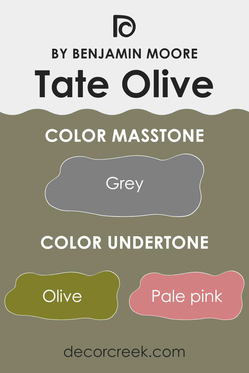
Undertones of Tate Olive HC-112 by Benjamin Moore
Tate Olive HC-112 by Benjamin Moore is an adaptable paint color that has a complex blend of undertones. These undertones include a wide range of hues such as olive, pale pink, mint, and many others. Each undertone plays a role in how the main color is perceived, contributing different vibes and visual effects depending on the lighting and surrounding colors.
Undertones are subtle colors that lie beneath the surface of the main color. They can enhance or alter the way we see the primary color, especially under different lighting conditions. For instance, in natural light, the olive and light green undertones of Tate Olive might make the walls appear more lively and fresh. Meanwhile, in artificial lighting, the brown or dark green undertones could give the room a cozier and more grounded feel.
When used on interior walls, the complexity of Tate Olive’s undertones allows it to adjust beautifully to various decor styles and color schemes. For example, the mint and pale pink undertones can soften the overall look, making it suitable for a relaxed and cozy bedroom. The darker undertones like navy and dark green can provide a striking contrast in an area that uses lighter colored furnishings or decorations, adding depth and interest to the room.
In summary, the undertones of Tate Olive HC-112 bring a dynamic and adaptable quality to this paint, making it a great choice for different rooms and settings. The right balance of these undertones can enhance the atmosphere of any area, influencing how colors and furniture come together for cohesive interior design.
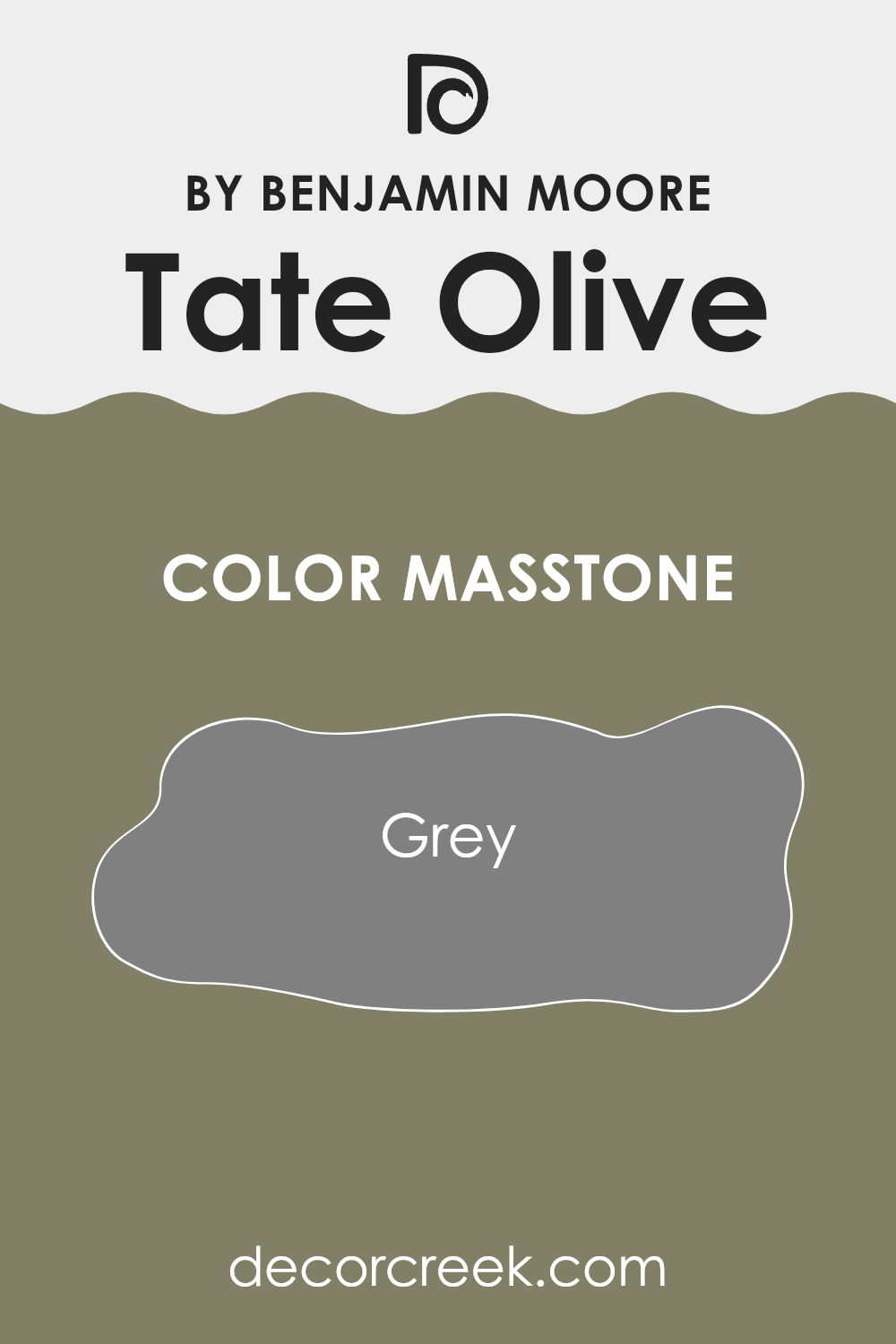
What is the Masstone of the Tate Olive HC-112 by Benjamin Moore?
Tate Olive HC-112 by Benjamin Moore has a masstone of Grey (#808080), which is a balanced and neutral hue. This particular shade of grey provides a stable and calm atmosphere in any room, making it highly adaptable for home decor.
Grey, being a neutral color, works well with nearly all other colors, allowing homeowners to mix and match furniture and accessories without clashing. In areas where relaxation is key, such as bedrooms and living areas, the grey tone of Tate Olive offers a restful backdrop.
Moreover, in a practical sense, grey hides wear and tear better than lighter colors, making it a wise choice for high-traffic areas like hallways and living rooms. With its enduring appeal, this color can fit into various design styles, from modern minimalist to cozy traditional, helping to create a cohesive look throughout a home. Neutral grey, like that found in Tate Olive HC-112, is excellent for creating a base that supports all types of aesthetic expressions.
How Does Lighting Affect Tate Olive HC-112 by Benjamin Moore?
Lighting plays a crucial role in how colors appear in different environments. The color perception of any painted surface can change dramatically depending on whether it is exposed to natural sunlight or artificial lights, such as LED or fluorescent bulbs.
Taking the color Tate Olive (HC-112) by Benjamin Moore as an example, this warm, muted green shade can look significantly different under various lighting conditions. In natural light, Tate Olive shows its true color, which is a soft and earthy green. Natural light highlights the warmth of this hue, making it appear lively and inviting.
Under artificial light, the appearance of Tate Olive can change based on the type of bulb used. LED lights, which often have a cooler tone, can make this color look more subdued and slightly bluish, losing some of its warmth. Fluorescent lighting, on the other hand, might enhance the greenness of the paint, but it can also cast a slightly harsher glow, making the color appear a bit more intense than it does in natural lighting.
The orientation of an area can also affect how Tate Olive looks on the walls. In north-facing areas, which get less direct sunlight and tend to have cooler light, Tate Olive might look darker and more muted. This could make the area feel smaller or more enclosed.
In south-facing areas, this color will be bathed in ample sunlight throughout the day, enabling the paint to show its true, warm hue. The additional light can make areas appear larger and more open.
In east-facing areas, morning light brings out the brightness in Tate Olive, making it look vibrant in the morning while turning more shadowed and deeper as the day progresses.
West-facing areas receive intense evening light, which can cast a warm glow on the walls and intensify the color in the later parts of the day, bringing a cozy atmosphere to the area during sunset hours.
In summary, lighting conditions significantly impact how colors like Tate Olive look and feel in an area. It’s always wise to test paint colors in different parts of the area at different times of the day to see how lighting affects their appearance.
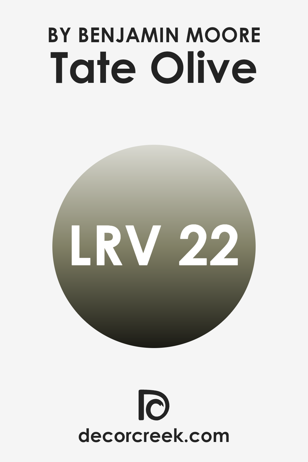
What is the LRV of Tate Olive HC-112 by Benjamin Moore?
Light Reflectance Value (LRV) measures the amount of light a paint color reflects back into the room as opposed to absorbing it. It is expressed as a percentage from zero, which is perfectly black and absorbs all light, to a much higher value near the top end of the scale, which would be perfectly white, reflecting all light that hits it back into the environment.
The LRV is important because it can significantly impact how a color looks when applied to your walls and how much light it can add or subtract from an area. A higher reflectance value means the color will appear lighter and can make an area feel more open and brighter. Conversely, a lower value means the color is darker and can make the area feel smaller and more enclosed.
The LRV of 21.63 for this specific shade means that it is on the darker side, reflecting only around 21.63 percent of the light. This characteristic makes it a bolder choice for your walls, likely creating a dramatic and cozy feeling in the area. When used in small rooms or areas without much natural light, this color could make the area feel more compact.
However, in well-lit, larger areas, it adds a dash of richness, enhancing the aesthetic without overpowering the ambiance with darkness. Choosing the right lighting and room accessories can help balance the light absorption, ensuring the color complements the area’s overall feel.
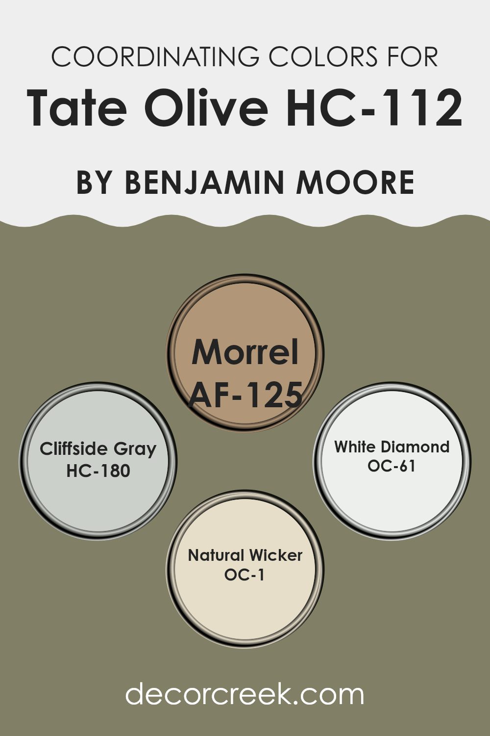
Coordinating Colors of Tate Olive HC-112 by Benjamin Moore
Coordinating colors are those that complement each other well when used together in a design scheme. These hues are carefully selected to harmonize with each other, enhancing the aesthetic appeal of a room without overpowering it. By pairing colors that coordinate, you can create a cohesive look that flows smoothly from one element to the next.
For example, when working with a deeper shade like Tate Olive by Benjamin Moore, which is a rich, earthy green, it’s balanced beautifully by the likes of Morrel, a warm, sandy brown. This combination pulls together natural elements, creating a grounded and cozy atmosphere.
Cliffside Gray, another coordinating shade, is a soft, muted gray that acts as a neutral backdrop, providing a calm counterpoint to more intense colors. White Diamond offers a crisp, clean white, perfect for trim or ceiling to keep the area feeling fresh and bright. Lastly, Natural Wicker is a subtle beige with warm undertones, excellent for soft furnishings or walls, where it enhances natural light and adds warmth to the setting. Each of these colors supports and enriches the primary color, allowing for design that’s both harmonious and appealing.
You can see recommended paint colors below:
- AF-125 Morrel
- HC-180 Cliffside Gray
- OC-61 White Diamond
- OC-1 Natural Wicker
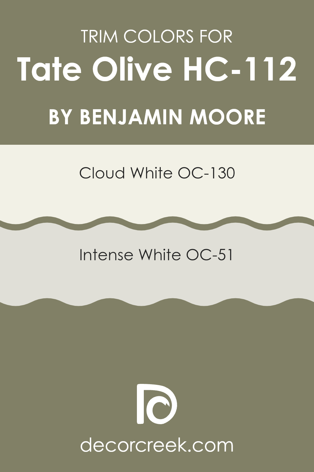
What are the Trim colors of Tate Olive HC-112 by Benjamin Moore?
Trim colors are specific shades used to highlight or accentuate architectural elements such as door frames, windows, and baseboards, setting them apart from the main wall color. In the case of Tate Olive HC-112 by Benjamin Moore, picking the right trim color can enhance the distinctive green shade, ensuring the walls are visually appealing but not overpowering.
Opting for lighter trim colors like OC-130 Cloud White or OC-51 Intense White can create a subtle yet striking contrast, drawing the eye to the craftsmanship of the trim while complementing the deeper hue of the walls. OC-130 Cloud White is a crisp, clean white with a hint of warmth that prevents it from appearing too stark against richer colors such as Tate Olive.
It’s an adaptable choice that works well in various lighting conditions, providing a fresh and airy feel to any room. On the other hand, OC-51 Intense White is a soft, light grayish white with an almost invisible undertone that helps in softening the overall look without stealing the spotlight from the wall color. This shade is ideal for those who prefer a more subtle contrast that still provides definition and depth to the area.
You can see recommended paint colors below:
- OC-130 Cloud White
- OC-51 Intense White
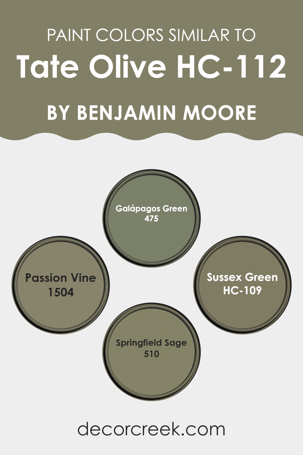
Colors Similar to Tate Olive HC-112 by Benjamin Moore
Using similar colors in a design can create a sense of harmony and unity. When decorating, choosing paints like those similar to Tate Olive by Benjamin Moore can help achieve a coherent atmosphere without abrupt visual interruptions.
Colors like Galápagos Green and Passion Vine blend well with each other, aiding in a gentle transition from area to area. Such an approach is pleasing to the eye and ensures that the elements within a room feel connected and balanced.
Galápagos Green is a deep, lush green that brings a feeling of nature indoors, creating a cozy and inviting ambiance. Passion Vine, slightly brighter, adds a touch of vibrancy without overpowering the senses, complementing Galápagos nicely.
On the other hand, Sussex Green has an earthy tone that grounds the environment, offering a calm and steady feel. Springfield Sage, softer and more muted, works well to soften the edges and corners of an area, pulling together the varied tones of the other colors into a unified palette. Each of these colors supports the others, allowing for a fluid visual experience that is both pleasant and soothing.
You can see recommended paint colors below:
- 475 Galápagos Green
- 1504 Passion Vine
- HC-109 Sussex Green
- 510 Springfield Sage
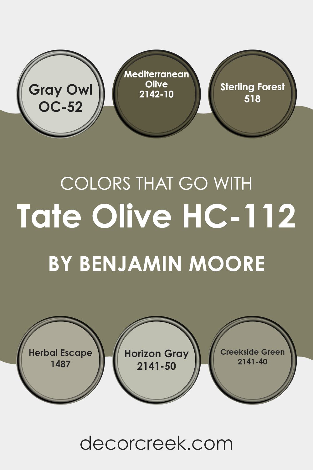
Colors that Go With Tate Olive HC-112 by Benjamin Moore
Choosing complementary colors for Tate Olive HC-112 by Benjamin Moore is crucial for creating a harmonious look in any area. Colors like OC-52 Gray Owl, 2142-10 Mediterranean Olive, 518 Sterling Forest, 1487 Herbal Escape, 2141-50 Horizon Gray, and 2141-40 Creekside Green are perfect examples of hues that match well with Tate Olive, effectively balancing its deep, rustic charm.
Gray Owl OC-52 is a gentle and adaptable gray with a hint of blue, making it a great backdrop that allows Tate Olive to stand out without overpowering. Mediterranean Olive 2142-10, on the other hand, is a richer, deeper tone of olive, providing a bold contrast that still feels cohesive with the earthy character of Tate Olive.
Sterling Forest 518 introduces a unique blend of blue and green that reflects natural elements, perfect for creating a unified outdoor feeling indoors. Herbal Escape 1487 is a lighter, fresher green that adds a dash of brightness, rejuvenating any area when paired with the more subdued Tate Olive.
For a subtle yet effective contrast, Horizon Gray 2141-50 offers a light gray with a warm undertone, ensuring a smooth transition between colors in a room. Lastly, Creekside Green 2141-40 blends beautifully, sharing the green base of Tate Olive while lightening the atmosphere with its clearer, fresher tone. Together, these colors create a welcoming and balanced environment, enhancing the beauty of your area effortlessly.
You can see recommended paint colors below:
- OC-52 Gray Owl
- 2142-10 Mediterranean Olive
- 518 Sterling Forest
- 1487 Herbal Escape
- 2141-50 Horizon Gray
- 2141-40 Creekside Green
How to Use Tate Olive HC-112 by Benjamin Moore In Your Home?
Tate Olive HC-112 by Benjamin Moore is a warm, earthy green paint that adds a cozy and welcoming feel to any room. This adaptable shade can work beautifully in a variety of areas in your home.
For example, you might choose to paint your living room walls with Tate Olive to create a calm, inviting atmosphere where family and friends can relax. In a kitchen, this shade can complement wooden cabinets and natural stone countertops, enhancing the room’s organic character.
Moreover, Tate Olive works well in a bedroom, where its soothing tone can help set a relaxing mood, making it easier to unwind at the end of the day. You could also use it in a bathroom paired with soft lighting and white fixtures for a fresh, clean look.
For those looking to add a touch of nature-inspired color without overpowering an area, Tate Olive is a great choice for an accent wall or for painting cabinetry and furniture. This color can easily harmonize with a wide range of decor styles and preferences.
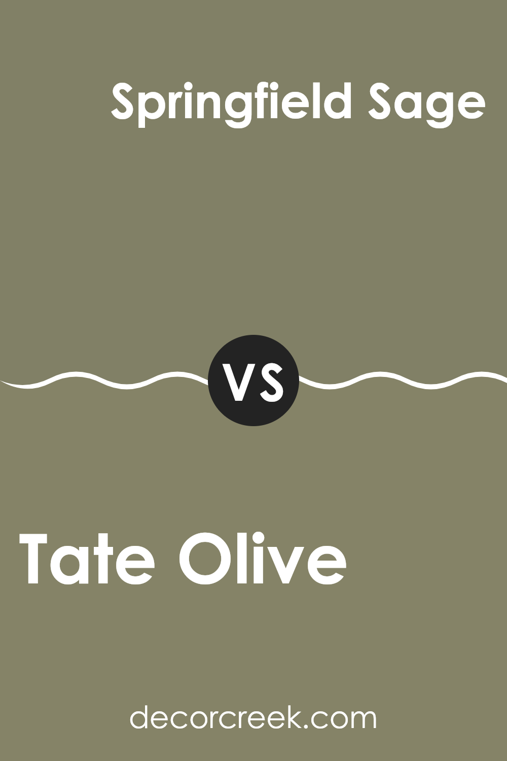
Tate Olive HC-112 by Benjamin Moore vs Springfield Sage 510 by Benjamin Moore
The main color, Tate Olive, and the second color, Springfield Sage, both by Benjamin Moore, share certain similarities yet maintain distinct differences. Tate Olive has a deeper, richer green hue that conveys warmth and coziness to an area. It’s a shade that can make a room feel more inviting and snug, ideal for places where you want to unwind.
Springfield Sage, on the other hand, is a lighter green with subtle hints of gray, making it more subdued and adaptable for various settings. This color is excellent for creating a calm, understated atmosphere without making the area feel too heavy or dark.
It works beautifully in rooms with ample natural light, as it enhances the sense of openness and brightness. Both colors appeal to those looking to incorporate green into their decor, offering varying levels of depth and mood depending on the desired effect in the design.
You can see recommended paint color below:
- 510 Springfield Sage
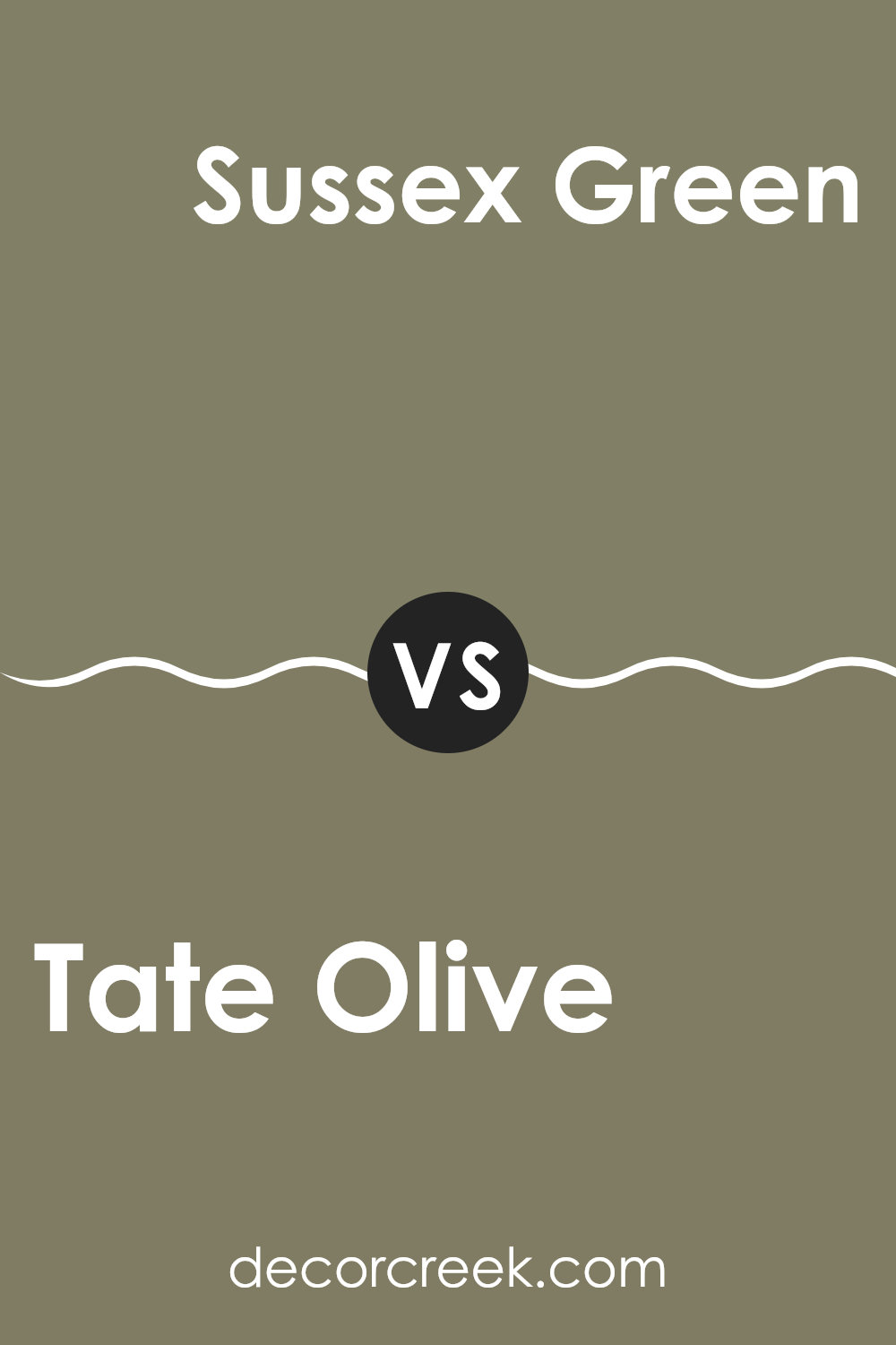
Tate Olive HC-112 by Benjamin Moore vs Sussex Green HC-109 by Benjamin Moore
Tate Olive and Sussex Green are both colors from Benjamin Moore’s Historical Collection, designed to bring a traditional yet enduring feel to any area. Tate Olive is a deeper, olive green that offers a rich and earthy character. It works beautifully in areas aiming for a grounded, nature-inspired look and is an excellent choice for accent walls or to add depth to a room.
Sussex Green, on the other hand, is slightly lighter than Tate Olive and leans more toward a sage tone. This color carries a fresh quality, making it ideal for brightening up areas like kitchens or bathrooms. It can also serve as a soothing backdrop in a bedroom or living area, creating a calm and inviting ambiance.
Both colors are adaptable and suit a variety of décor styles, whether you want to achieve a rustic, classic, or contemporary look. Pairing them with natural materials such as wood or stone enhances their beauty, helping any area feel welcoming and warm.
You can see recommended paint color below:
- HC-109 Sussex Green
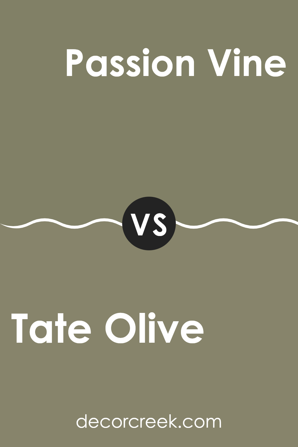
Tate Olive HC-112 by Benjamin Moore vs Passion Vine 1504 by Benjamin Moore
Tate Olive and Passion Vine, both from Benjamin Moore, present unique tones. Tate Olive is a deep, warm green that conveys an earthy and cozy character. It’s ideal for areas where you want a touch of nature with a grounded, comforting presence.
Passion Vine, on the other hand, is a vibrant green with a brighter, more energetic appearance. This shade brings a fresh and lively feel to any area, making it perfect for spaces where you’d like to add cheerfulness and vitality.
While Tate Olive may be better suited for a study or living room because of its darker tone, Passion Vine works beautifully in a kitchen or playroom where brightness is desired. Both colors offer a refreshing approach to green, yet each creates its own distinct mood and atmosphere.
You can see recommended paint color below:
- 1504 Passion Vine
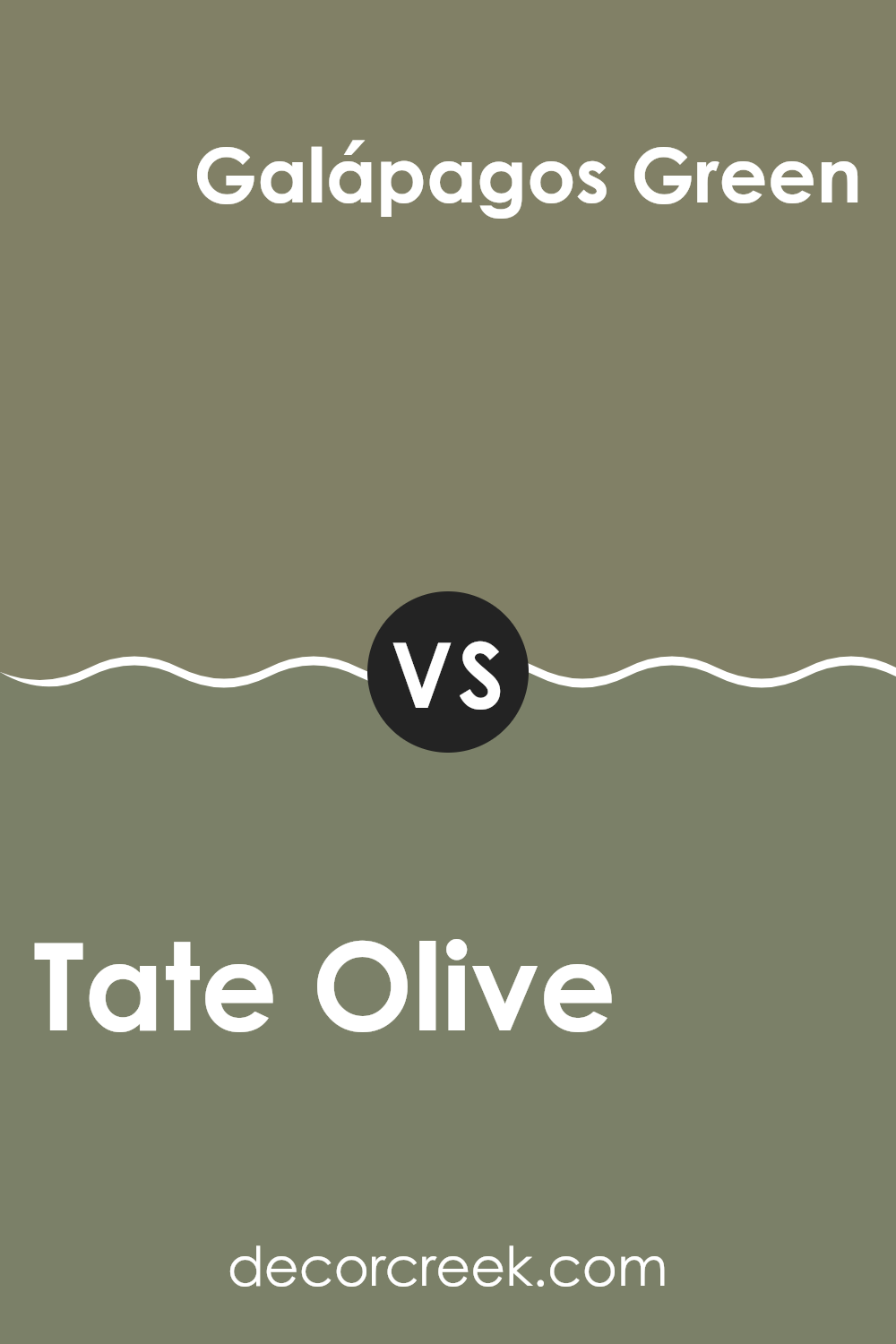
Tate Olive HC-112 by Benjamin Moore vs Galápagos Green 475 by Benjamin Moore
The Tate Olive shade from Benjamin Moore is a deep and earthy green that brings warmth and a sense of calm to any area. It has a hint of brown, which makes it a great option for creating a cozy, inviting atmosphere in rooms like living rooms or studies.
On the other hand, Galápagos Green is a richer, more vibrant shade of green. It leans slightly towards a tropical feel, reminiscent of lush forests and natural scenery. This color is perfect for adding a lively touch of nature to a room and works well in areas that benefit from a pop of color, such as a bathroom or as an accent wall in a kitchen.
Both colors are unique, yet they offer different vibes: Tate Olive is more subdued and grounding, while Galápagos Green is more vivid and energizing. Depending on the mood you want to set in your area, either color could be a great choice.
You can see recommended paint color below:
- 475 Galápagos Green
As I wrap up my thoughts on HC-112 Tate Olive by Benjamin Moore, I’m really happy with what I’ve learned about this color. It’s more than just a simple green. This shade has a unique warmth that makes any area feel more welcoming. It’s like when you walk into a room that makes you want to stay because it feels so cozy and friendly.
What stands out about Tate Olive is how well it works with different styles and furniture. Whether you have a modern living area or a classic kitchen, this color can fit right in. It acts sort of like a friend who gets along with everyone at the party.
Using this color in a home is like adding a secret ingredient that quietly makes everything look better. It doesn’t scream for attention but definitely adds something special to the walls it covers.
After talking about HC-112 Tate Olive, I think it could be a great choice for anyone looking to paint their home. It’s easy to like, easy to use, and it goes with lots of other colors. So if you or someone you know is thinking about a new paint color, Tate Olive is definitely worth considering!
Ever wished paint sampling was as easy as sticking a sticker? Guess what? Now it is! Discover Samplize's unique Peel & Stick samples.
Get paint samples

