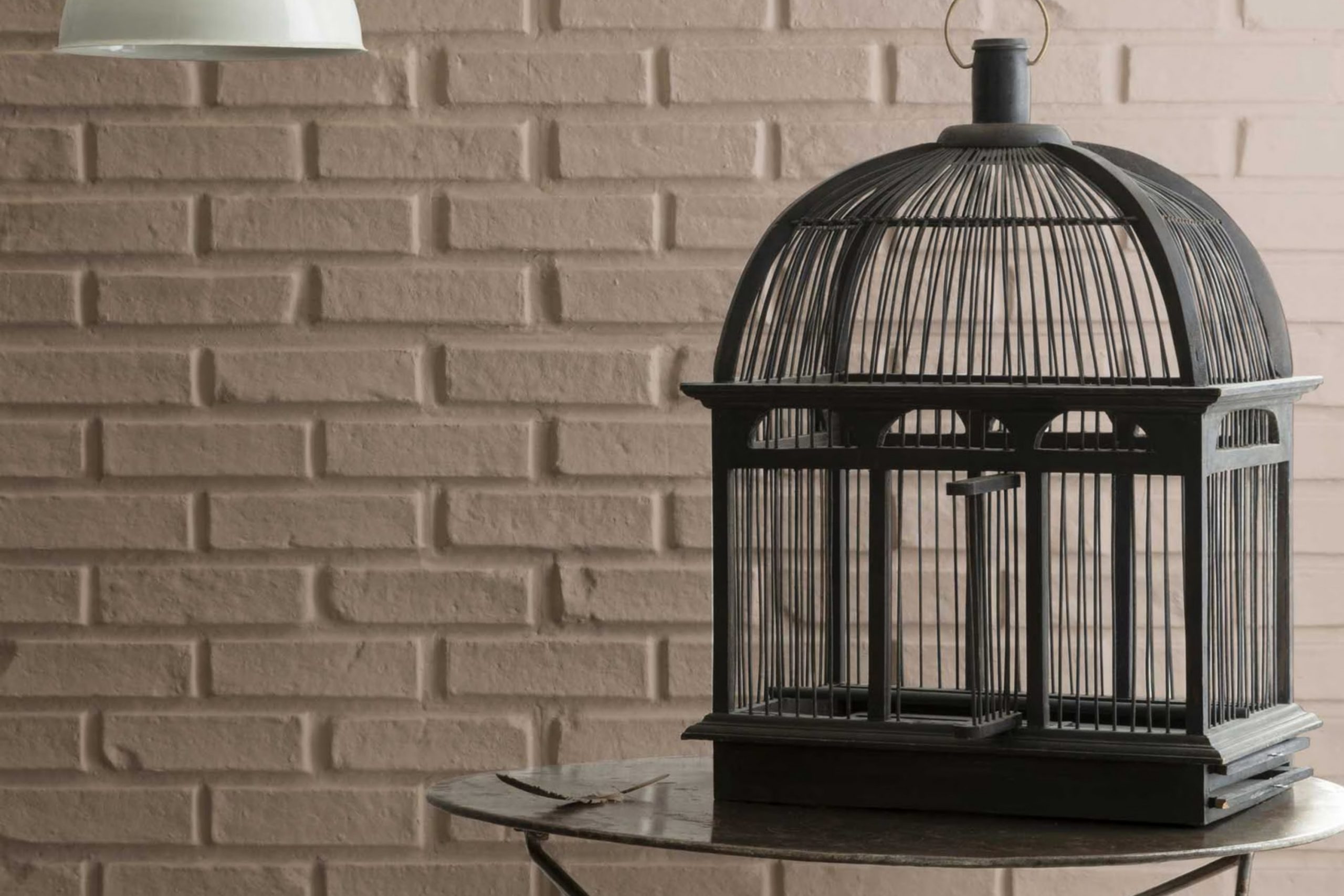
I recently had the pleasure of working with 992 Ticonderoga Taupe by Benjamin Moore, a color that might easily become a favorite for those looking to lend a refined yet subtle touch to their areas. What strikes me first about Ticonderoga Taupe is its incredible flexibility.
This shade beautifully bridges the gap between a neutral backdrop and a statement piece depending on how you use it in your room. Its understated elegance makes it perfect for living areas where comfort merges with style, giving the room a grounded and inviting feel.
When considering renovations or updates, you might find that Ticonderoga Taupe is one of those rare colors that truly reflects natural light in a way that enhances the mood and ambiance of a room, regardless of the light source.
Whether in a sun-flooded living room or a dimly lit study, this color consistently presents a warm, homely vibe without overpowering the senses. Moreover, pairing it with both contemporary and classic décor effortlessly highlights its adaptive nature. Deciding on this color could be a great choice for anyone looking to create a peaceful yet elegant room in their home.
What Color Is Ticonderoga Taupe 992 by Benjamin Moore?
Ticonderoga Taupe by Benjamin Moore is a flexible and warm neutral color that offers a balanced blend of brown and gray. This shade is subtle enough to work in various settings while providing enough depth to make a room feel cozy and inviting. It is an excellent choice for anyone looking to create a welcoming atmosphere without overpowering the senses.
Ticonderoga Taupe is particularly effective in interior styles that lean towards rustic, modern farmhouse, and traditional designs. It pairs beautifully with natural materials like wood, enhancing the texture and richness of wooden furniture and flooring. The color also complements stone accents, such as a stone fireplace or backsplash, creating a harmonious look that ties together natural elements.
In terms of textures, Ticonderoga Taupe works well with soft textiles like wool, linen, and cotton. These materials in lighter shades can contrast nicely with the depth of the taupe, making the room feel layered and well-thought-out. Additionally, pairing it with metallic finishes like bronze or copper can add a touch of warmth, making the room feel inviting and homely.
Overall, Ticonderoga Taupe is an adaptable color that helps enhance the aesthetic of a room through its natural, earthy tone, making it a reliable choice for various decorating projects.
Is Ticonderoga Taupe 992 by Benjamin Moore Warm or Cool color?
The Ticonderoga Taupe 992 by Benjamin Moore is a flexible, warm gray color with a touch of beige, making it a fantastic choice for many homes. Its neutral tone provides a calm and inviting atmosphere, suitable for any room whether it be a living room, bedroom, or kitchen. This color pairs well with a wide range of other colors, from bright and bold to soft and subtle, allowing for various decorating styles.
Ticonderoga Taupe 992 is especially useful for areas that need a touch of warmth without overpowering the senses. It can make small rooms feel larger and more open, due to its light-reflecting properties, while also providing enough depth to offer coziness to larger areas.
This paint color doesn’t stigmatize or dictate a particular style, but rather, seamlessly integrates into existing décor, enhancing natural light and complementing wood finishes and different textures. It’s an excellent choice for homeowners looking for a flexible and practical color option that easily adapts to different living rooms and styles.
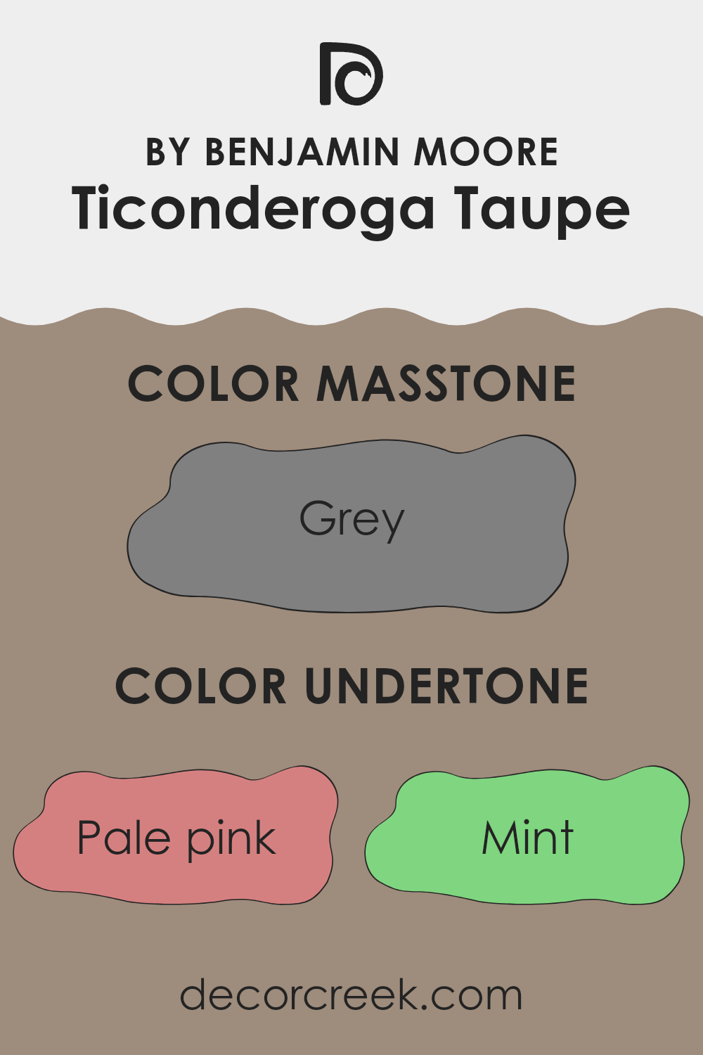
Undertones of Ticonderoga Taupe 992 by Benjamin Moore
Ticonderoga Taupe by Benjamin Moore is a flexible paint color that contains a complex spectrum of undertones. These undertones are subtle hues that influence how the primary color is perceived and can affect the overall ambiance of a room.
The undertones in Ticonderoga Taupe range across a broad spectrum, including pale pink, mint, olive, and pale yellow, which add a warm and inviting quality. Similarly, hints of lilac, orange, and purple bring depth and richness, ensuring that the color doesn’t appear flat or monotonous on large surfaces. The presence of light purple and pink enhances its adaptability, making it a suitable choice for various decorating styles.
When used on interior walls, Ticonderoga Taupe adapts to different lighting conditions, reflecting various highlighted undertones at different times of the day. For instance, in natural light, you might notice the lighter undertones such as mint or pale yellow, creating a fresh and airy feel. In contrast, in artificial lighting, darker undertones like olive or brown might become more prominent, providing a grounded, cozy atmosphere.
The complexity of Ticonderoga Taupe and its undertones makes it an excellent choice for those looking to add depth and interest to their living rooms without overpowering them with color. Its ability to harmonize with a wide range of décor elements and furniture makes it a practical choice for many homes.
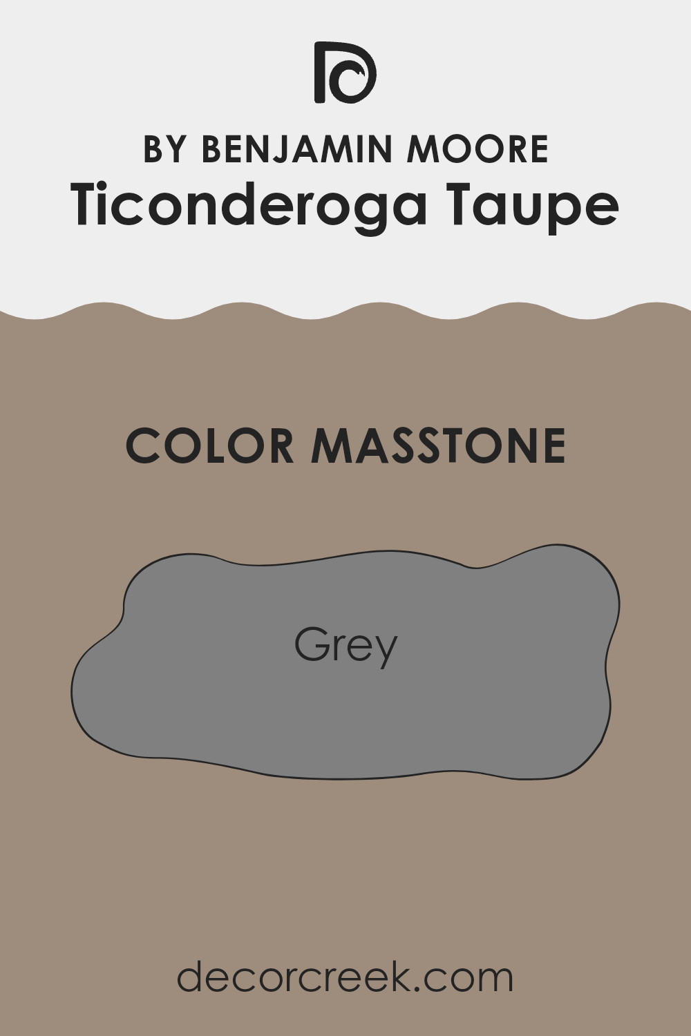
What is the Masstone of the Ticonderoga Taupe 992 by Benjamin Moore?
Ticonderoga Taupe (992) by Benjamin Moore has a masstone of grey (#808080), which affects its application in homes in flexible and practical ways. As a neutral grey, this color easily pairs with a wide range of other hues, making it an ideal choice for walls in living areas and bedrooms.
Its balanced tone helps it blend seamlessly with both bright accents and softer, muted furnishings, enhancing the overall appeal without overpowering the room. This grey, being neither too dark nor too light, is perfect for creating a calming backdrop in a room.
It can also make smaller areas appear larger and more open, thanks to its ability to reflect light rather than absorb it. Additionally, this shade of grey hides minor wall imperfections well and maintains a clean look even in high-traffic areas.
Overall, Ticonderoga Taupe provides a practical and flexible option for those looking to refresh their home interiors without committing to bold colors that could quickly go out of style.
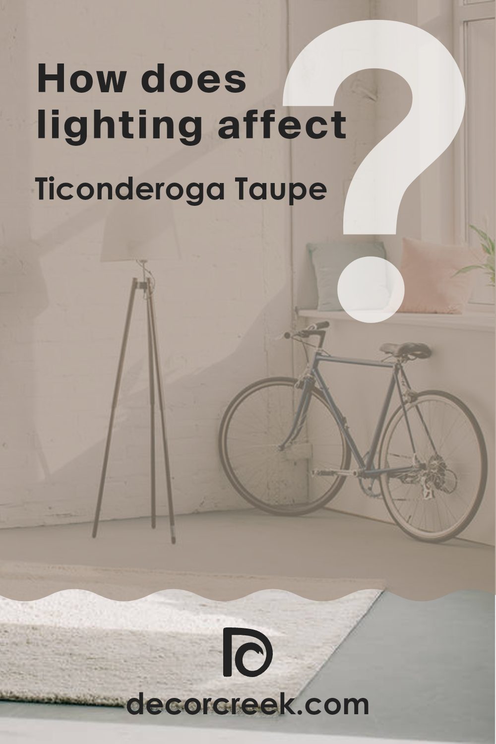
How Does Lighting Affect Ticonderoga Taupe 992 by Benjamin Moore?
Lighting plays a crucial role in how colors appear in our homes. Depending on the type of light—be it natural daylight or artificial light from lamps and fixtures—the same color can look different under various lighting conditions.
Taking Ticonderoga Taupe by Benjamin Moore as an example, this color’s appearance can vary significantly. In natural light, Ticonderoga Taupe tends to look more true to its swatch color, which is a warm, muted shade. Natural light, especially full sunlight, can help bring out the subtle undertones in the paint, making the color appear more vibrant and lively.
Under artificial lighting, Ticonderoga Taupe can take on different tones depending on the type of bulbs used. For instance, with incandescent lighting, which casts a warm glow, this color may look more golden or creamier. Fluorescent lighting, on the other hand, could bring out cooler tones in the taupe, making it appear slightly more gray.
The direction a room faces also impacts how Ticonderoga Taupe looks. In north-facing rooms, which often get less direct sunlight and have cooler, bluish light, this taupe may appear slightly darker and more muted. On the other hand, in a south-facing room, where warm, bright light pours in for most of the day, Ticonderoga Taupe will likely look lighter and warmer, enhancing its cozy and welcoming feel.
In east-facing rooms, the morning sunlight can make Ticonderoga Taupe appear soft and warm, perfect for rooms used primarily in the morning. West-facing rooms, which get evening light, can make the color appear richer and a bit more intense, which could be perfect for living areas used later in the day.
By understanding the interaction between light and color, you can better predict how a shade like Ticonderoga Taupe will behave in different settings, allowing for more informed choices in your decorating projects.
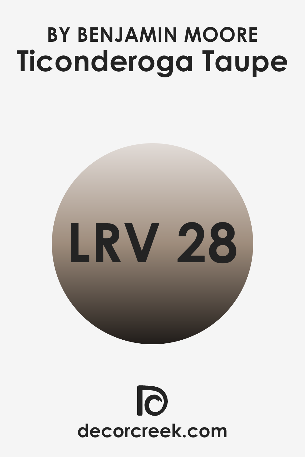
What is the LRV of Ticonderoga Taupe 992 by Benjamin Moore?
LRV stands for Light Reflectance Value, a measure used to indicate how much light a color reflects back into a room. Each paint color is given an LRV number, where lower values mean the color appears darker because it absorbs more light, and higher values mean the color appears lighter and reflects more light.
This measurement helps people decide which paint colors will work best in their specific rooms based on available lighting and desired mood. The LRV for Ticonderoga Taupe by Benjamin Moore is 27.51, suggesting that it is on the darker side of the scale. This means it won’t reflect a lot of light, making it a better choice for areas that may want to feel more grounded or intimate.
When used on walls, this color could make a room feel cozier and smaller, so it’s ideal for large rooms or areas with plenty of natural lighting to offset the darkness. Contrastingly, in a smaller or poorly lit room, it might make the room feel a bit more cramped or gloomy.
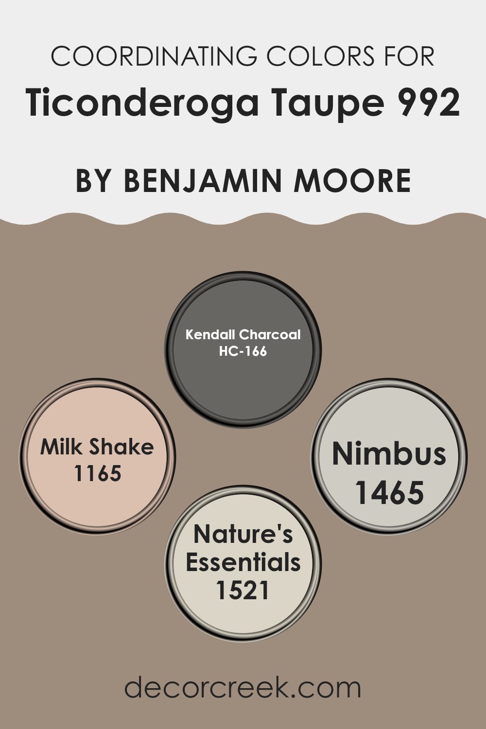
Coordinating Colors of Ticonderoga Taupe 992 by Benjamin Moore
Coordinating colors are selected to complement each other and create a harmonious palette throughout a room. These specific hues are chosen to enhance the main color, in this case, Ticonderoga Taupe, and can adjust the mood, perceived room size, and lighting effects in a room. Coordinating colors like the ones by Benjamin Moore work by balancing undertones or contrasting them to bring out the unique characteristics of the main shade, resulting in a visually appealing and cohesive look.
HC-166 – Kendall Charcoal is a deep, rich gray that provides a strong contrast to the lighter taupe, making it ideal for accent walls or furniture to anchor a room with depth. Milk Shake 1165 is a creamy, almost white color that offers a soft contrast, perfect for trim or ceilings to give a fresh and clean appearance.
Nimbus 1465 carries a hint of gray, marrying well with both the taupe and darker or lighter shades, ideal for adjacent rooms or furnishings to maintain flow. Nature’s Essentials 1521 is a muted earth tone that complements the natural depth of Ticonderoga Taupe, suited for areas where a touch of warmth is desired, like fabrics or rugs. Each of these colors supports and enhances the main shade to create a balanced and appealing palette.
You can see recommended paint colors below:
- HC-166 Kendall Charcoal
- 1165 Milk Shake
- 1465 Nimbus
- 1521 Nature’s Essentials
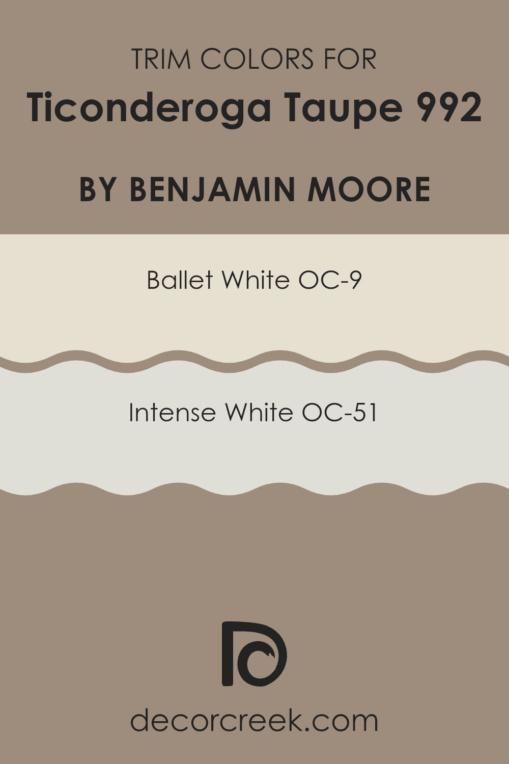
What are the Trim colors of Ticonderoga Taupe 992 by Benjamin Moore?
Trim colors are shades used to finish the edges or frame specific architectural features such as doorways, windows, and baseboards, enhancing the overall aesthetic of a room. When paired with a neutral shade like Benjamin Moore’s Ticonderoga Taupe, choosing the right trim color can accentuate the wall color and create a clean, finished look.
The colors OC-9 Ballet White and OC-51 Intense White by Benjamin Moore are excellent choices for trim with Ticonderoga Taupe, as they offer a subtle contrast that highlights the walls without overpowering the room’s tone. OC-9 Ballet White is a soft, creamy white that provides a gentle contrast to Ticonderoga Taupe, lending a light and airy feel to the room.
OC-51 Intense White, on the other hand, is a sharper white with a more pronounced brightness, making it ideal for creating a crisp border that defines the areas between walls and trim. Both colors support a visually appealing environment by bringing out the best features of Ticonderoga Taupe, allowing for a seamless integration of wall and trim colors.
You can see recommended paint colors below:
- OC-9 Ballet White
- OC-51 Intense White
Colors Similar to Ticonderoga Taupe 992 by Benjamin Moore
Similar colors play a crucial role in creating harmonious and aesthetically pleasing visual experiences, especially in interior design. When colors are closely related in tone and hue, they can create a seamless and cohesive look that enhances the overall ambiance of a room.
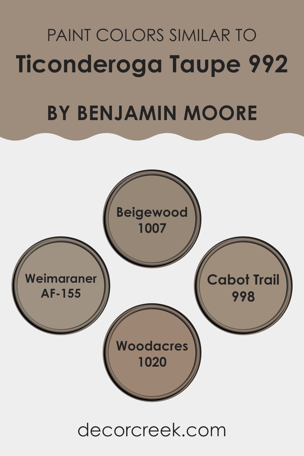
This concept is evident when you consider variations of a color like Ticonderoga Taupe from Benjamin Moore, such as Beigewood, Weimaraner, Cabot Trail, and Woodacres. These colors work well together because they share a common foundation yet provide subtle differences that add depth and interest without overpowering the senses.
Beigewood is a warm, muted beige that offers a soft backdrop, perfect for areas where you want a touch of warmth without overpowering brightness. Weimaraner is a deeper, grayish tone that exudes a calm, grounding effect, ideal for creating a focal point in a room without being too stark. Cabot Trail, a richer, earthier hue, adds a robust element that can make a room feel more inviting and cozy, suitable for more intimate settings or furniture pieces.
Lastly, Woodacres brings in a more subtle, earth-toned cream that works beautifully to lighten rooms subtly with its understated elegance. Together, these shades complement Ticonderoga Taupe, allowing for a flexible range of combinations that can cater to various design preferences while maintaining visual coherence.
You can see recommended paint colors below:
- 1007 Beigewood
- AF-155 Weimaraner
- 998 Cabot Trail
- 1020 Woodacres
Colors that Go With Ticonderoga Taupe 992 by Benjamin Moore
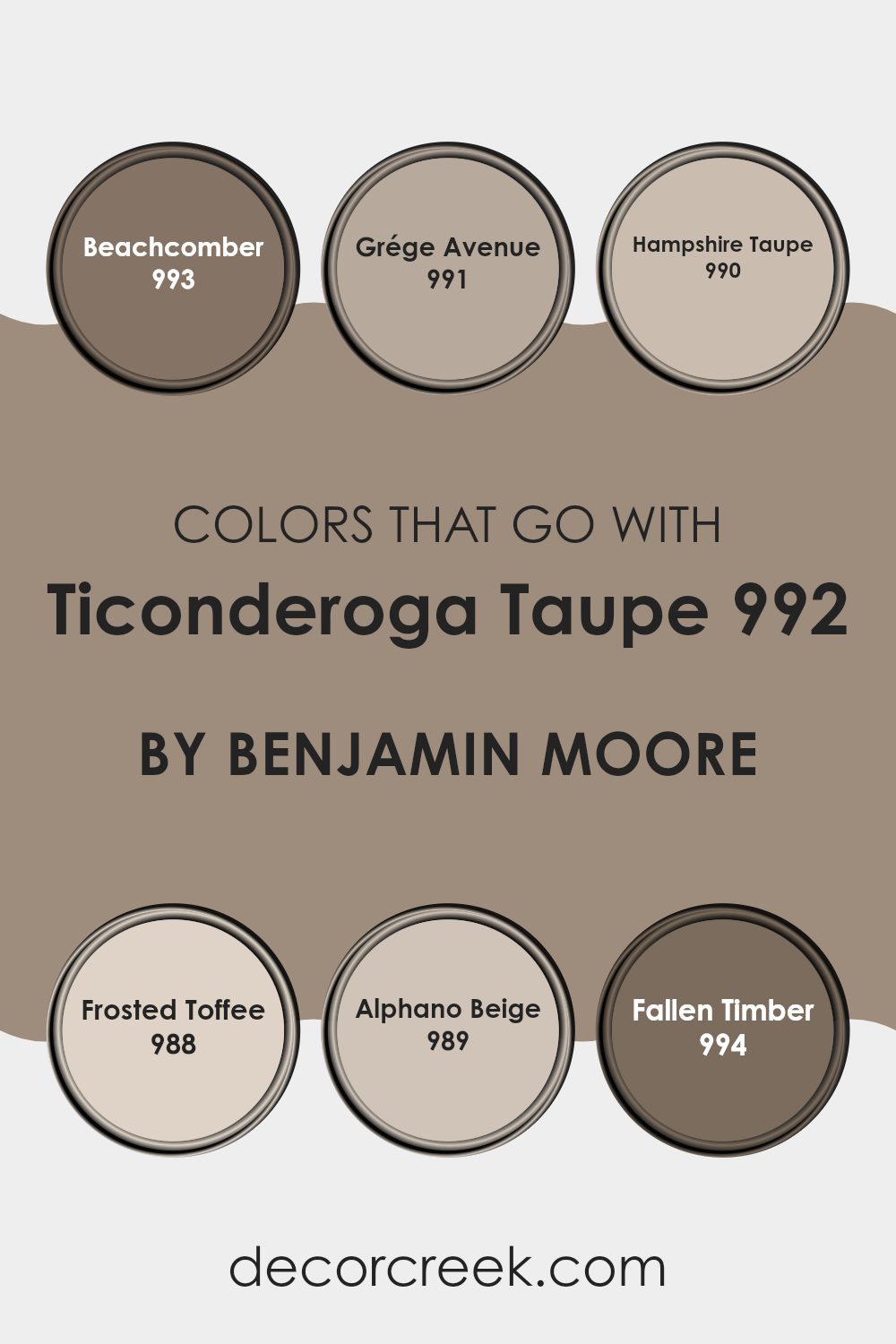
Choosing the right colors to complement Ticonderoga Taupe 992 by Benjamin Moore can greatly enhance the ambiance of any room, creating a harmonious and warm atmosphere. Ticonderoga Taupe is a flexible color that serves as an excellent neutral base, making it crucial to select coordinating colors that enrich its earthy tones without overpowering it.
When considering 993 – Beachcomber, it brings a hint of sandy warmth that pairs effortlessly with Ticonderoga Taupe, adding a subtle beach-inspired feel to a room. This color is gentle and inviting, perfect for areas meant to feel cozy and welcoming.
Next, 991 – Grége Avenue offers a sleek, urban twist, being a mix of beige and gray hues that can help create a modern yet warm room that complements the soft nature of Ticonderoga Taupe. Moving to 990 – Hampshire Taupe, this color is deeper, providing a robust contrast that can accentuate the lighter undertones of Ticonderoga Taupe, ideal for creating a striking visual dynamic.
988 – Frosted Toffee adds a sweet, caramel-like richness, enhancing the warmth of Ticonderoga Taupe, making the room seem more inviting and comfy. 989 – Alphano Beige has a soft, creamy presence that blends smoothly with Ticonderoga Taupe, perfect for achieving a seamless color transition in open areas.
Finally, 994 – Fallen Timber introduces a touch of rustic charm with its deeper, wood-inspired hue that can anchor the lighter Ticonderoga Taupe in settings that aim for a natural feel. Together, these colors complement Ticonderoga Taupe by creating a cohesive palette that enhances the aesthetics of any room while maintaining a warm, inviting environment.
You can see recommended paint colors below:
- 993 Beachcomber
- 991 Grége Avenue
- 990 Hampshire Taupe
- 988 Frosted Toffee
- 989 Alphano Beige
- 994 Fallen Timber
How to Use Ticonderoga Taupe 992 by Benjamin Moore In Your Home?
Ticonderoga Taupe 992 by Benjamin Moore is a flexible paint color that offers a warm and inviting feel. This shade is perfect for creating a cozy atmosphere in any room of your home. Its rich taupe hue makes it ideal for use on living room or bedroom walls, offering a backdrop that pairs well with a variety of decor styles and colors.
You can also use Ticonderoga Taupe in your kitchen or bathroom for a subtle, earthy look that isn’t overpowering. This color works beautifully with natural materials like wood, stone, and linen, enhancing their textures.
For a harmonious look, try pairing it with creamy whites, deep browns, or soft blues. Whether you are painting an entire room or just an accent wall, Ticonderoga Taupe adds warmth to your room, making it feel more welcoming. The color is also great for furniture pieces, adding depth and interest to older items you might want to refresh.
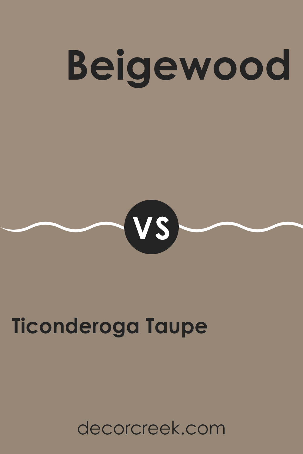
Ticonderoga Taupe 992 by Benjamin Moore vs Beigewood 1007 by Benjamin Moore
Ticonderoga Taupe and Beigewood are both neutral colors by Benjamin Moore that can easily warm up any room, but they have subtle differences in tone. Ticonderoga Taupe has a richer, gray-infused brown tone, creating a cozy and grounding atmosphere in rooms.
It pairs well with soft whites or vibrant colors for a balanced look. On the other hand, Beigewood is lighter and more subdued, leaning slightly towards a sandy beige. This color is great for areas where you want a lighter, airier feel, as it reflects more light and can make small rooms appear bigger.
Both colors work well in various decor styles and can be combined with other hues to create a tailored aesthetic. Whether you’re painting a busy family room or a quiet study, these colors can easily fit into your vision.
You can see recommended paint color below:
- 1007 Beigewood
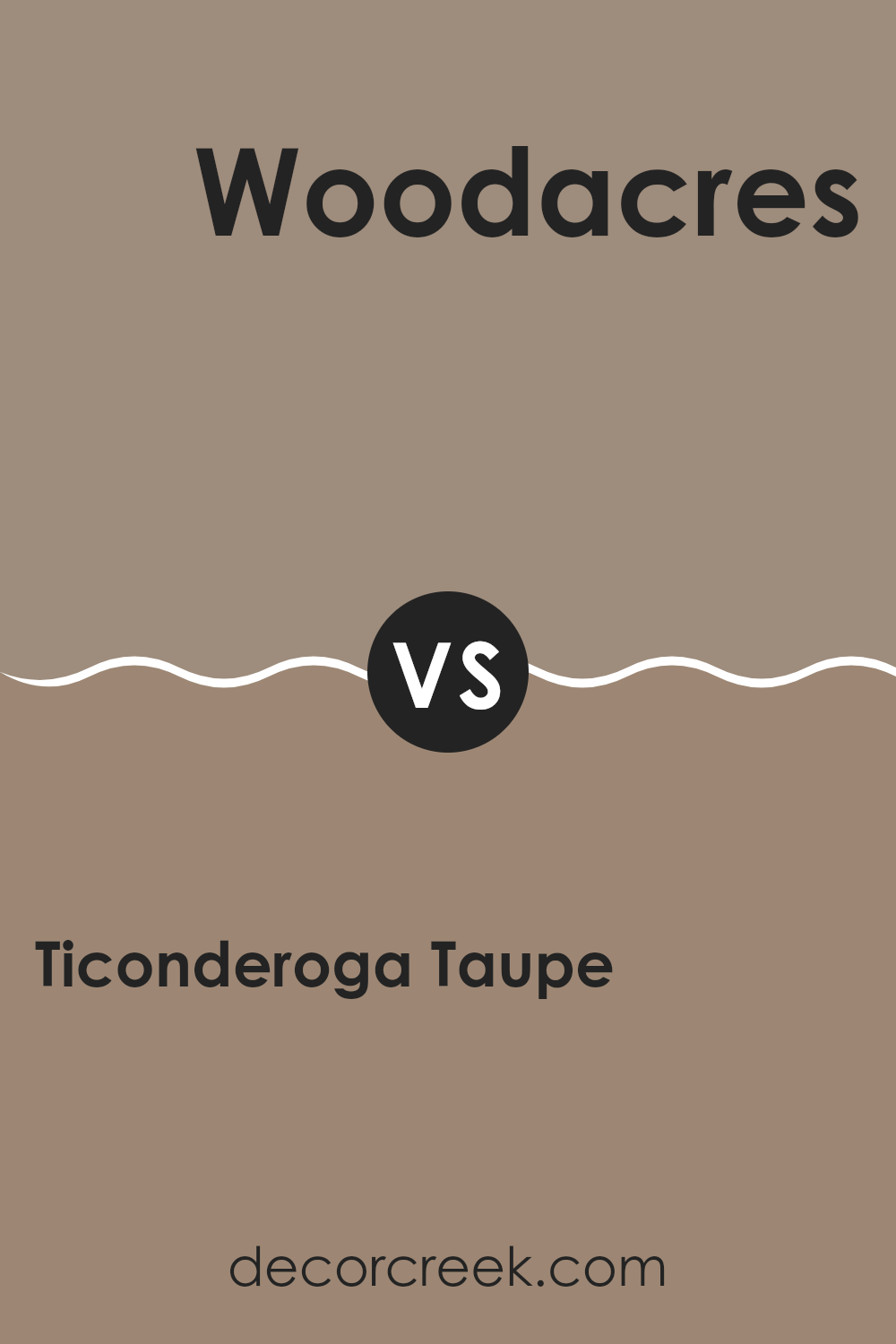
Ticonderoga Taupe 992 by Benjamin Moore vs Woodacres 1020 by Benjamin Moore
Ticonderoga Taupe and Woodacres, both by Benjamin Moore, are unique in their ways of setting the tone in any room. Ticonderoga Taupe is a neutral shade that leans towards a grayish tan. It’s quite flexible, fitting well in many rooms without overpowering them. It can make a small room feel larger or give a cozy feel to a spacious area.
On the other hand, Woodacres takes on a darker, richer tone compared to Ticonderoga Taupe. It’s closer to a true brown, providing a warm and welcoming feel. It’s perfect for areas where you want to create a snug, inviting atmosphere. This color might be preferred in rooms where a sense of warmth is essential, like in a living room or a bedroom.
Both colors offer subtle, earthy vibes, but Ticonderoga Taupe is lighter and more adaptable, while Woodacres gives a stronger presence with its deeper hue.
You can see recommended paint color below:
- 1020 Woodacres
Ticonderoga Taupe 992 by Benjamin Moore vs Cabot Trail 998 by Benjamin Moore
Ticonderoga Taupe and Cabot Trail, both by Benjamin Moore, have distinct tones that set a unique mood in any room. Ticonderoga Taupe is a soft, warm beige with a comforting and welcoming feel. It’s light enough to make small rooms appear larger while still adding a touch of warmth.
On the other hand, Cabot Trail is a deeper, richer color with brown undertones, giving it a more grounded and cozy feel. It is perfect for creating a focal point in a room or adding depth.
While Ticonderoga Taupe reflects more light, making it ideal for a casual, airy room, Cabot Trail’s darker shade works well in a setting where you want to create a sense of warmth and enclosure. Each color has its charm, whether you’re looking to brighten up a room or create a snug, inviting area.
You can see recommended paint color below:
- 998 Cabot Trail
Ticonderoga Taupe 992 by Benjamin Moore vs Weimaraner AF-155 by Benjamin Moore
Ticonderoga Taupe and Weimaraner, both by Benjamin Moore, are unique yet complementary shades. Ticonderoga Taupe presents as a subtle, warm beige. This color is flexible, making it easy to use in any living room, as it pairs well with a range of decor styles from classic to modern. It tends to brighten rooms, creating a cozy and welcoming atmosphere.
On the other hand, Weimaraner is a richer, deeper color with a robust gray-brown tone. This color is perfect for adding a touch of drama and warmth to areas, ideal for accent walls or cozy nooks. Although it’s darker, it still maintains an inviting quality without overpowering a room.
Together, these colors can create a balanced look in a home. Ticonderoga Taupe could be used for larger areas or rooms needing more light, while Weimaraner works well for highlighting features or for furniture pieces, blending seamlessly for an integrated aesthetic.
You can see recommended paint color below:
- AF-155 Weimaraner
After reading about 992 Ticonderoga Taupe by Benjamin Moore, I feel like I’ve learned so much about this color. It’s a really special kind of brown that feels cozy and warm, kind of like a teddy bear or hot chocolate on a cold day. It seems perfect for making a room feel safe and snug, whether it’s a quiet spot for reading books or a place where the family gathers to talk and play games.
This shade isn’t too dark or too light, which is great because it means it can fit in with lots of different room styles and decorations without causing any trouble. Plus, it can cover walls really well, hiding those annoying little marks or uneven spots.
I think it’s a handy color to know about if someone wants to freshen up their home without making things look too different or fancy. Benjamin Moore did a nice job with Ticonderoga Taupe, making a paint that’s easy to use and looks good almost anywhere.
So if someone asked me which color they should use for their next room makeover, I’d definitely suggest giving this taupe a try! It might just be the cozy touch they’re looking for.
Ever wished paint sampling was as easy as sticking a sticker? Guess what? Now it is! Discover Samplize's unique Peel & Stick samples.
Get paint samples

