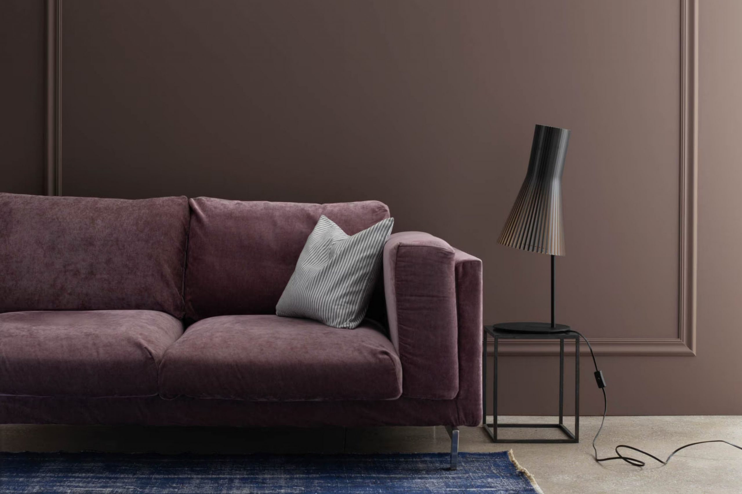
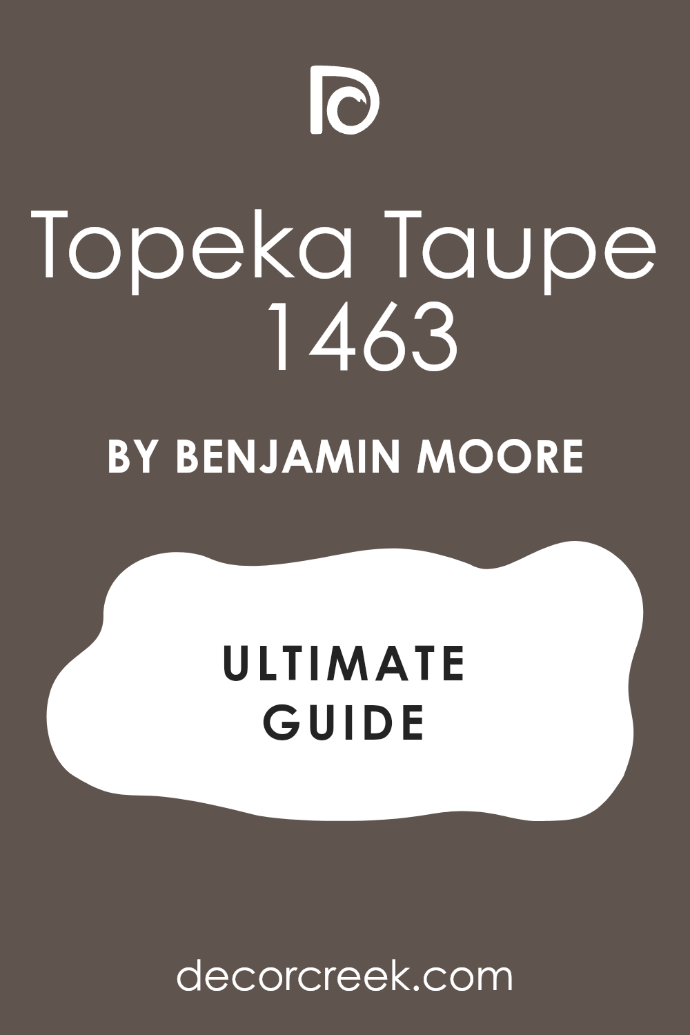
When you look at a room painted with Benjamin Moore’s 1463 Topeka Taupe, you might feel an immediate sense of warmth and comfort. This color is not just a shade; it’s an experience that brings a soothing and grounded atmosphere to any room. Topeka Taupe is a beautiful mix of brown and gray, creating a neutral tone that feels both rich and understated.
Using this color in your home can make a room feel more inviting. It has the unique ability to blend with various decor styles, from modern to traditional. If you think about how colors affect mood, Topeka Taupe offers a calming presence. It doesn’t shout for attention but speaks softly, allowing furniture and other elements to shine while still holding its own.
You might notice how light interacts with this hue throughout the day. In the morning, it might seem brighter and more lively, while in the evening, it offers a cozy and intimate setting. This adaptability makes it a perfect choice for living areas or bedrooms, areas where you spend a lot of time relaxing or hosting friends and family.
Topeka Taupe seems to carry the charm of earthiness while maintaining a refined edge. It’s no surprise that people who choose this color often mention how it makes their home feel more harmonious and well-balanced, creating a room where they feel truly at home.
What Color Is Topeka Taupe 1463 by Benjamin Moore?
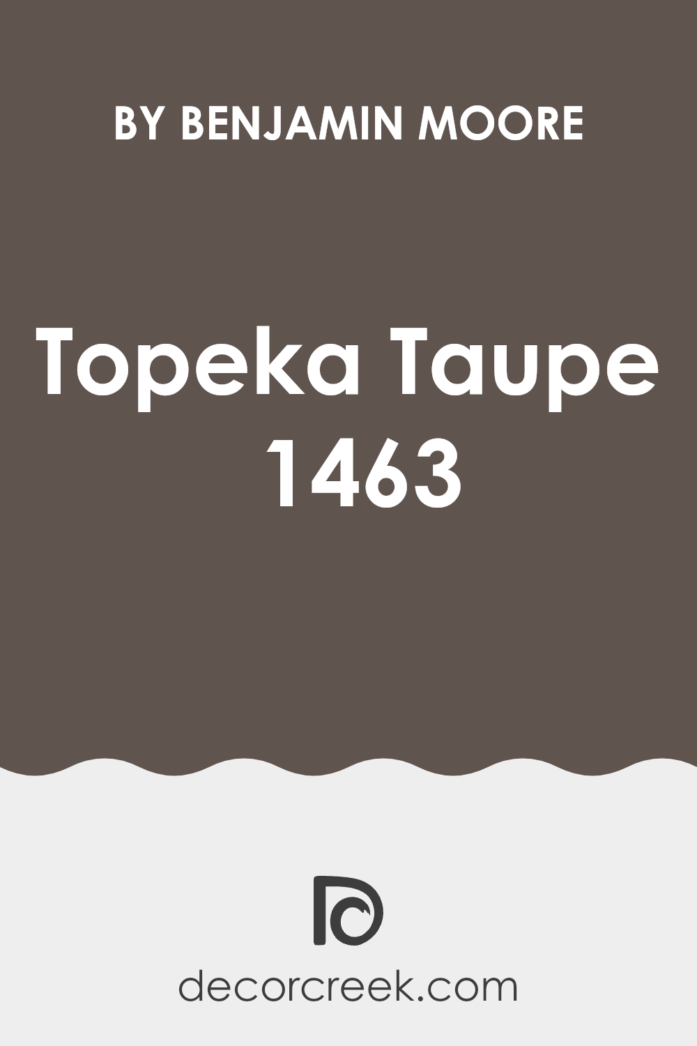
Topeka Taupe by Benjamin Moore is a warm, earthy shade of taupe. It strikes a nice balance between beige and gray, offering a neutral hue that’s both cozy and adaptable. This color adds a touch of warmth without being too dark or overpowering, making it an excellent choice for a variety of interior styles.
Topeka Taupe works particularly well in traditional and transitional rooms, where its classic appeal complements rich wood tones and enduring decor. It also feels at home in rustic and farmhouse-style interiors, adding warmth and depth to natural materials.
When it comes to pairing materials and textures, Topeka Taupe looks great alongside natural wood, both light and dark finishes. It harmonizes beautifully with soft textiles like wool and cotton, as well as leather and suede, creating a comfortable and inviting atmosphere. In terms of metal accents, brass and copper can bring out its warm undertones, while brushed nickel and stainless steel provide a modern contrast.
For accents, try pairing Topeka Taupe with soft whites, muted greens, or deep blues for a pop of color that enhances the room without clashing. This color is adaptable enough to serve as a main wall color or an accent, offering flexibility in various rooms and settings.
Is Topeka Taupe 1463 by Benjamin Moore Warm or Cool color?
Topeka Taupe by Benjamin Moore is a warm, neutral color that fits seamlessly into many home environments. It is an adaptable shade that combines shades of brown and gray, making it a popular choice for those looking to create a cozy and inviting atmosphere. This color can work well in living areas, bedrooms, or even kitchens, providing a neutral backdrop that complements various styles.
Topeka Taupe provides a grounding effect, making rooms feel comfortable and relaxed. It easily pairs with both bold and subtle accents, allowing homeowners to personalize their decor while maintaining a cohesive look.
This shade is particularly effective in rooms with natural light, as it can add depth and warmth without overpowering the area. Its adaptability makes it ideal for entire rooms or just as an accent wall. Overall, Topeka Taupe by Benjamin Moore is a classic choice for those seeking a neutral tone that enhances the warmth and style of a home.
Undertones of Topeka Taupe 1463 by Benjamin Moore
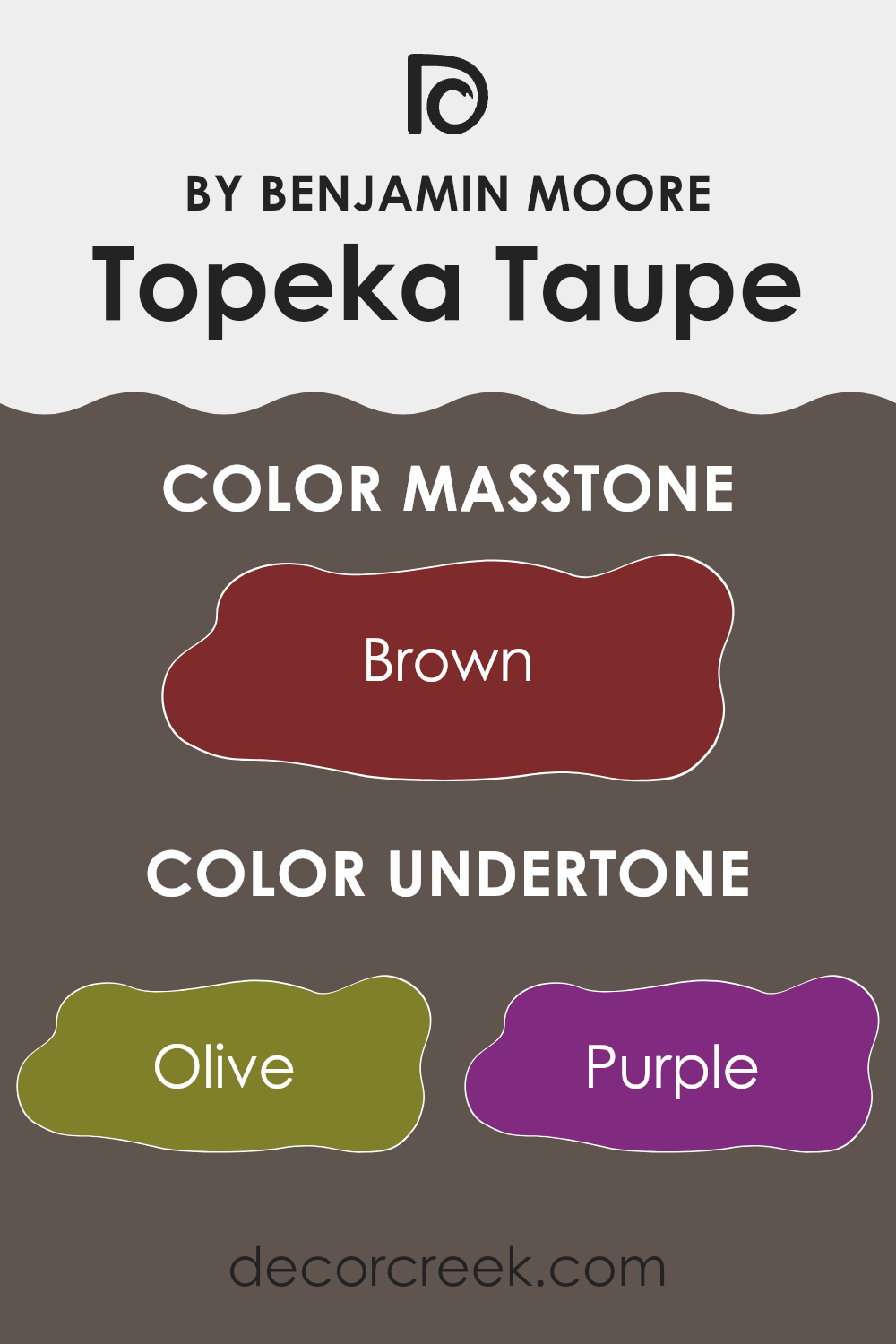
Topeka Taupe by Benjamin Moore is an adaptable, neutral paint color with several subtle undertones. These undertones influence how we perceive the color in different lighting and settings. The olive and dark green undertones add a warmth that makes the taupe appear more earthy, grounding a room with a natural feel. The hints of purple and pink in the undertones can introduce a slight warmth, adding a cozy and inviting feel to the color.
The grey and dark grey undertones bring a sense of neutrality, making the taupe more balanced and adaptable to various color schemes. The navy and dark turquoise undertones add depth, giving the color more character and making it less flat. Similarly, the red and orange undertones add subtle warmth, brightening the atmosphere slightly without being overpowering.
On interior walls, these combined undertones mean that Topeka Taupe can look different depending on the time of day and the light source. In bright, natural light, it may appear warmer due to the green and olive tones. In dimmer conditions, the grey and navy undertones might become more prominent, giving the walls a cooler, more soothing appearance.
Overall, this makes Topeka Taupe a dynamic choice that can adapt to different moods and styles within a home.
What is the Masstone of the Topeka Taupe 1463 by Benjamin Moore?
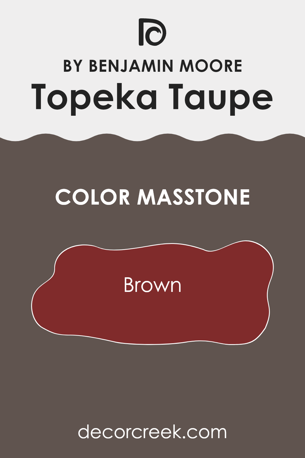
Topeka Taupe by Benjamin Moore has a rich, warm brown masstone, which influences how it works in homes. This color can create a cozy atmosphere, making it an excellent choice for living rooms or bedrooms where you want to relax. Its brown undertone adds warmth, which can make an area feel more inviting and comforting.
When used on walls, Topeka Taupe can serve as a neutral base that complements both traditional and modern decor styles. It pairs well with other earth tones and can be highlighted with accents in lighter shades, like creams and whites.
This color’s warmth can also make larger areas feel more intimate and smaller areas feel snug and welcoming. For homes with a lot of natural light, Topeka Taupe can balance brightness and avoid feeling too stark. Overall, its brown masstone makes it an adaptable and flexible choice for many areas in the home.
How Does Lighting Affect Topeka Taupe 1463 by Benjamin Moore?
Lighting plays a significant role in how we perceive colors. Natural and artificial lighting can change the appearance of a color, making it look different than it does on a paint swatch. Topeka Taupe by Benjamin Moore, a warm taupe color, can appear differently depending on the light source.
In natural light, the color will shift based on the room’s orientation. For north-facing rooms, natural light tends to be cooler and less intense. As a result, Topeka Taupe can appear a bit grayer or more muted. This might make the color seem a bit darker and less warm, though still providing an elegant look.
In south-facing rooms, the light is generally warm and bright throughout the day. Topeka Taupe will show its warmer tones and appear lighter and more vibrant. The warmth of the sunlight enhances the brown and beige tones within the color, creating a cozy atmosphere.
East-facing rooms receive direct sunlight in the morning, which can make the color appear brighter and more inviting early in the day. As the sun moves westward, the color may take on a softer, slightly cooler tone in the afternoon and evening.
Conversely, in west-facing rooms, Topeka Taupe will be subdued in the morning when natural light is indirect but will warm up as the afternoon approaches and the sun shines directly in, enhancing the warm hues of the color.
Under artificial lighting, the type of bulb used will affect the color’s appearance. Incandescent lighting, which has a warm cast, will enhance the warm tones in Topeka Taupe. Meanwhile, LED or fluorescent lighting, which can be cooler, might make the color appear slightly more muted or gray than under warm lighting.
Thus, Topeka Taupe’s appearance is adaptable, changing with light conditions, creating different moods in each setting.
What is the LRV of Topeka Taupe 1463 by Benjamin Moore?
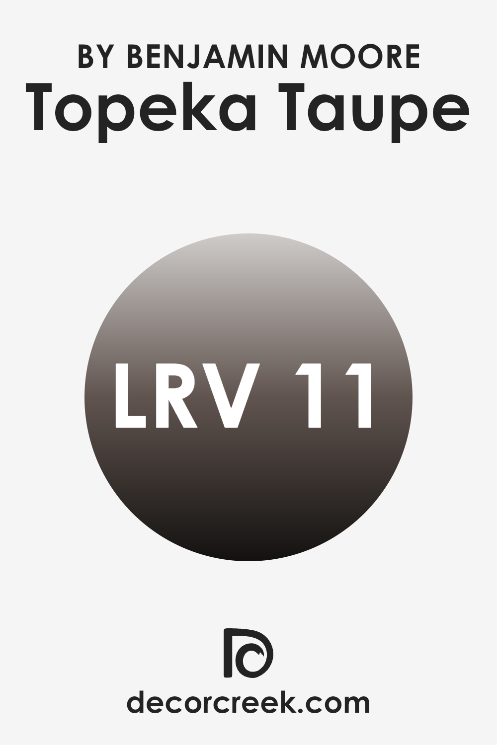
Light Reflectance Value, or LRV, is a measurement that tells you how much light a paint color reflects. It is a scale that runs from 0, which would be a completely black surface reflecting no light, to 100, a pure white surface reflecting all the light.
Colors with a lower LRV absorb more light and may make an area feel cozier or smaller, whereas colors with a higher LRV reflect more light, making a room appear larger and more open. Understanding LRV is helpful when choosing paint colors because it can give insight into how a color will behave in a particular area with specific lighting conditions.
In the case of Topeka Taupe by Benjamin Moore with an LRV of 11.01, the color will absorb a significant amount of light rather than reflecting it. This means that it will contribute to a warmer, more intimate feel in a room.
Given its lower LRV, Topeka Taupe would be a good choice for areas where you want to create a rich, cozy atmosphere. However, in rooms with limited natural light or smaller rooms, it might make the area feel more enclosed unless balanced with lighter accents or sufficient artificial lighting.
Coordinating Colors of Topeka Taupe 1463 by Benjamin Moore
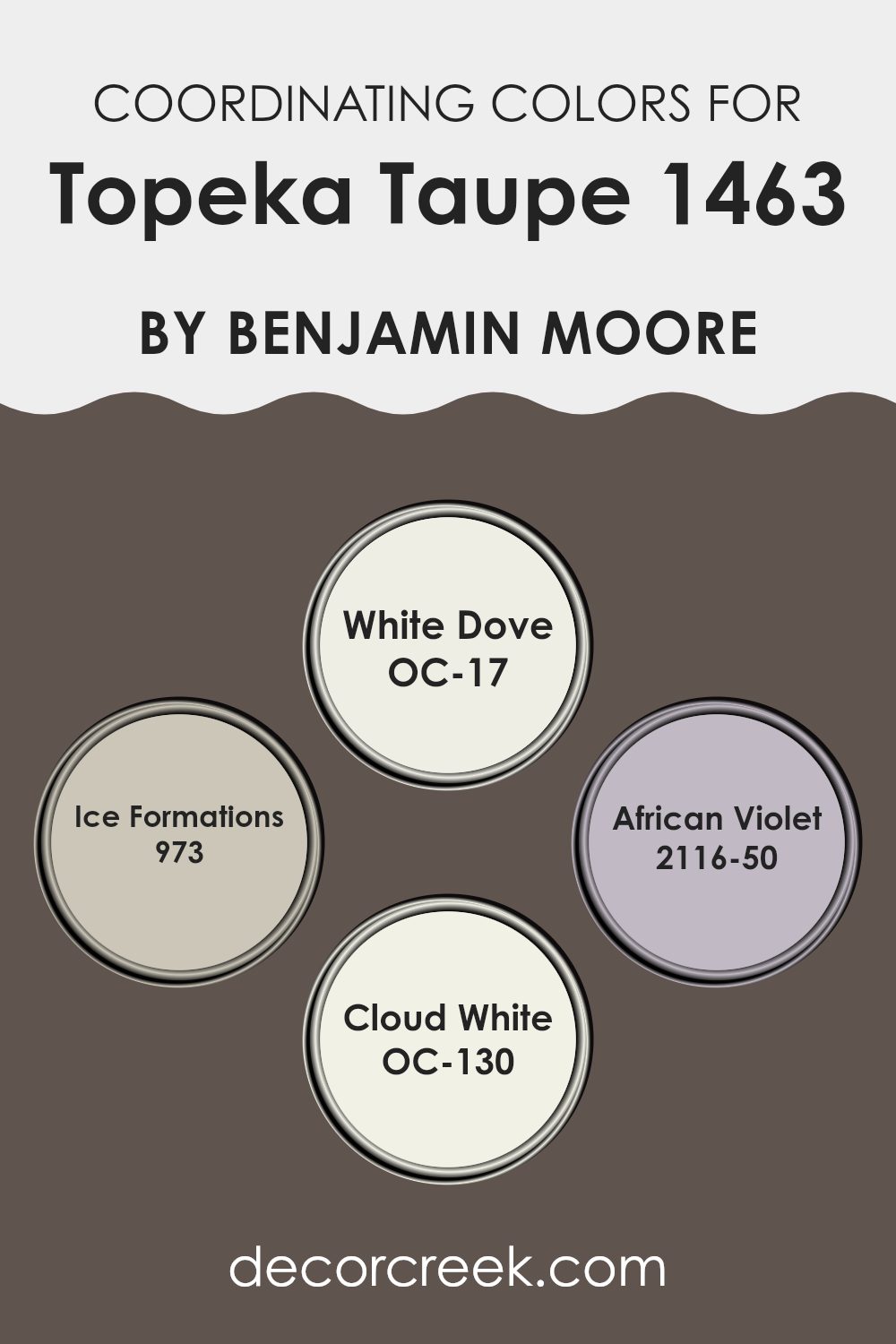
Coordinating colors are hues that are carefully chosen to complement each other, creating a balanced and harmonious look in any area. Topeka Taupe is an adaptable color that serves as a warm backdrop, and when paired with a selection of coordinating colors, it can create a cohesive design palette.
White Dove (OC-17) is a soft and warm white, providing a clean and crisp contrast that can brighten a room without feeling stark. Ice Formations (973) offers a light, cool blue tone, adding a refreshing touch that pairs well with the warmth of taupe.
African Violet (2116-50) introduces a muted purple hue, adding depth and a hint of refinement without overpowering a room. Finally, Cloud White (OC-130) is another soft white, slightly warmer in tone, ensuring a smooth transition between colors.
Each of these hues can work together beautifully, enhancing the warmth and versatility of Topeka Taupe while allowing for different design elements and accessories to seamlessly fit into the overall look. The combination of these colors can make any room feel inviting, offering a balance between warmth and subtle vibrancy, making them a popular choice for a well-coordinated interior.
You can see recommended paint colors below:
- OC-17 White Dove (CHECK A SAMPLE)
- 973 Ice Formations (CHECK A SAMPLE)
- 2116-50 African Violet (CHECK A SAMPLE)
- OC-130 Cloud White
What are the Trim colors of Topeka Taupe 1463 by Benjamin Moore?
Trim colors are the shades used to accentuate the lines and edges of painted surfaces, such as door frames, window frames, and baseboards. They play a crucial role in interior design by highlighting architectural features and providing a clean, finished look. In the case of Topeka Taupe by Benjamin Moore, these colors are important as they create delightful contrasts or harmonious blends with the main wall color. Topeka Taupe is an adaptable hue that can feel both warm and neutral, and using the right trim colors will enhance its visual appeal and make rooms feel more inviting and cohesive.
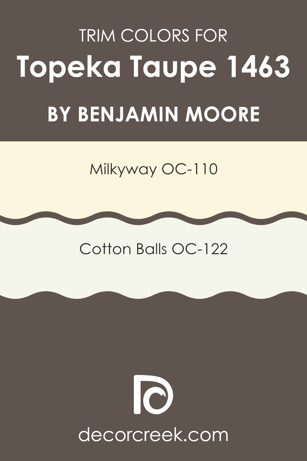
OC-110 Milkyway and OC-122 Cotton Balls are ideal trim colors to pair with Topeka Taupe. Milkyway is a gentle, soft off-white with a warm undertone that complements the taupe beautifully without stealing the spotlight.
It offers a subtle contrast that highlights the features of the area while maintaining a cozy atmosphere. On the other hand, Cotton Balls, a crisp and clean white, provides a more distinct contrast, giving a fresh, airy feel to the room. It works well to brighten areas and create clear, modern lines alongside Topeka Taupe. Both colors enhance the overall aesthetic by either creating a warm balance with Milkyway or achieving a brighter, sharper look with Cotton Balls.
You can see recommended paint colors below:
- OC-110 Milkyway
- OC-122 Cotton Balls
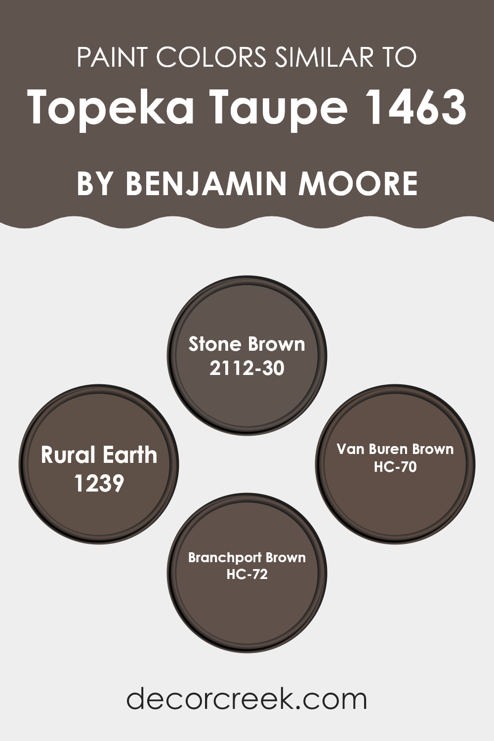
Colors Similar to Topeka Taupe 1463 by Benjamin Moore
Similar colors play an important role in creating harmony and balance in design. When you choose colors that are close to each other on the color spectrum, like those similar to Benjamin Moore’s Topeka Taupe, you create a soothing and cohesive look.
These colors naturally blend well together, enhancing the overall aesthetic of a room. Stone Brown 2112-30, for example, has a warm, earthy quality that can ground a room and add depth. Its muted tones pair nicely with other browns, making it adaptable for various design themes.
Rural Earth 1239 offers a rich, natural appeal with its warm undertones, giving areas a cozy and inviting feel. Van Buren Brown HC-70 has a classic, enduring quality, making it ideal for traditional settings, enhancing a room’s cozy charm. Lastly, Branchport Brown HC-72 is a darker, more intense shade, perfect for adding dramatic contrast or highlighting specific areas in a room.
By using these similar colors in a palette, you allow each shade to complement the others, creating a visually pleasing environment. Together, these hues enhance the depth and warmth of a room, resulting in a layered and cohesive design that is easy on the eyes.
You can see recommended paint colors below:
- 2112-30 Stone Brown (CHECK A SAMPLE)
- 1239 Rural Earth (CHECK A SAMPLE)
- HC-70 Van Buren Brown (CHECK A SAMPLE)
- HC-72 Branchport Brown (CHECK A SAMPLE)
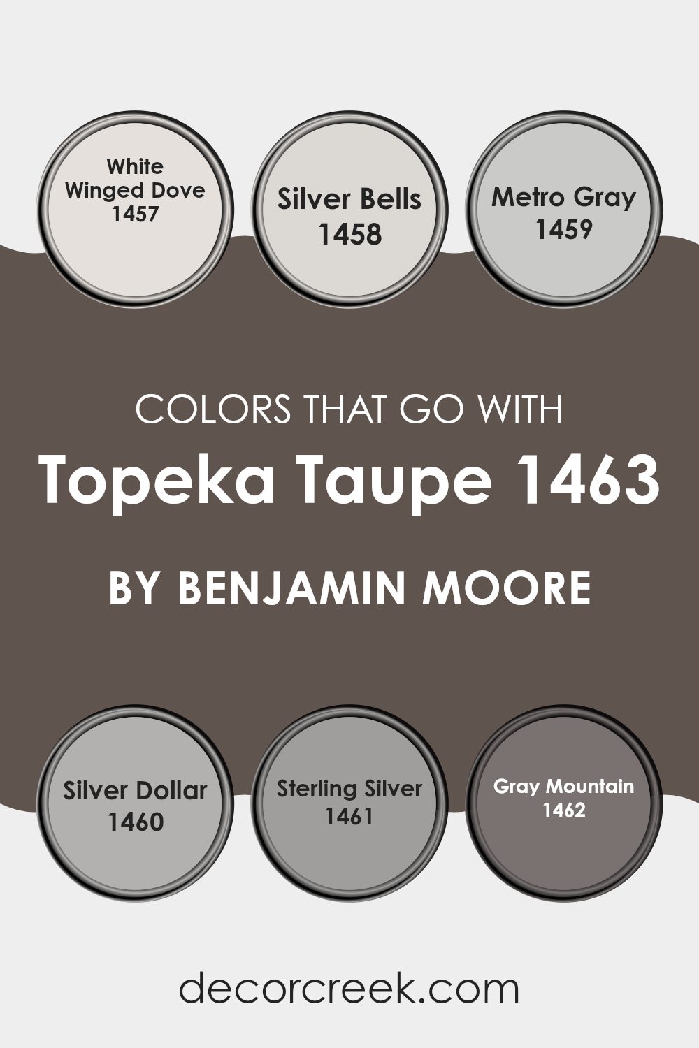
Colors that Go With Topeka Taupe 1463 by Benjamin Moore
Choosing colors that pair well with Topeka Taupe by Benjamin Moore is important because they can enhance the overall feel and aesthetic of an area. Topeka Taupe is a warm, neutral color that can act as a foundation for your room, creating a cozy and inviting environment.
Pairing it with White Winged Dove, a soft and creamy white, can help bring a sense of light and openness, making your room feel more spacious. Silver Bells is a cool, light gray that works as a subtle contrast to Topeka Taupe; it can add a modern touch while maintaining a sense of calmness.
Metro Gray is a deeper, charcoal gray that can add depth and drama to your area when used alongside Topeka Taupe. This combination can create an elegant atmosphere. Silver Dollar, a shade lighter than Silver Bells, offers a gentle touch that blends well, allowing the taupe to stand out without overpowering the area.
Sterling Silver, a bright, silvery hue, introduces a hint of shine and sophistication, balancing the warmth of the taupe. Lastly, Gray Mountain is a classic, medium gray that complements Topeka Taupe by offering a grounded, neutral backdrop. These colors, when combined, create a harmonious and visually appealing setting.
You can see recommended paint colors below:
- 1457 White Winged Dove (CHECK A SAMPLE)
- 1458 Silver Bells (CHECK A SAMPLE)
- 1459 Metro Gray (CHECK A SAMPLE)
- 1460 Silver Dollar (CHECK A SAMPLE)
- 1461 Sterling Silver (CHECK A SAMPLE)
- 1462 Gray Mountain (CHECK A SAMPLE)
How to Use Topeka Taupe 1463 by Benjamin Moore In Your Home?
Topeka Taupe by Benjamin Moore is a soft, neutral paint color that brings warmth and comfort to any area. It’s adaptable and can be a great choice for different rooms in your home. In living areas, Topeka Taupe creates a cozy and inviting atmosphere, making it a perfect backdrop for a variety of furniture styles and color accents.
It’s also an excellent option for bedrooms, where its calming nature can help create a restful environment. This warm taupe can be paired with whites and creams for a classic look or with bolder colors for a more modern twist.
In kitchens and dining areas, Topeka Taupe complements wood tones and stainless steel, providing a balanced look. Its neutral quality allows it to work well with various textures and materials, making it a flexible choice for home decorating. Overall, Topeka Taupe is a reliable color that adds subtle elegance to any room.
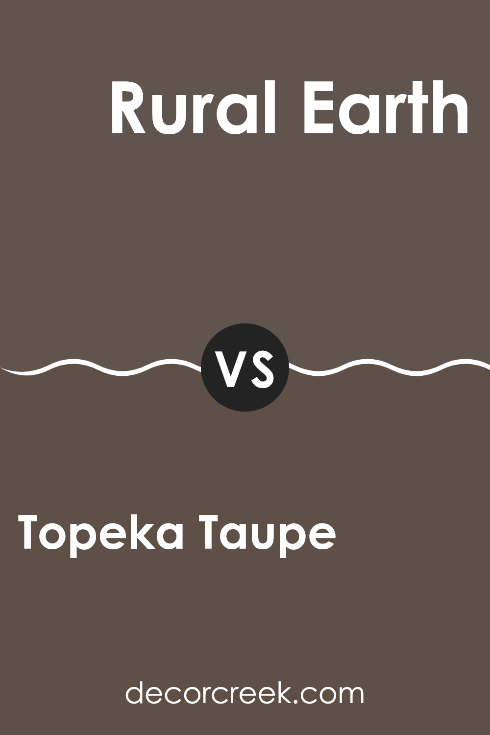
Topeka Taupe 1463 by Benjamin Moore vs Rural Earth 1239 by Benjamin Moore
Topeka Taupe 1463 by Benjamin Moore is a warm, earthy color with neutral undertones. It combines gray and brown in a soft, cozy way, making it adaptable for many rooms. This color creates a welcoming and comfortable atmosphere, perfect for living areas or bedrooms.
On the other hand, Rural Earth 1239 by Benjamin Moore is a deeper, richer shade that leans more towards a brownish hue. It has a natural, grounded feel, lending a sense of warmth and security to a room. Because of its intensity, it can be a great accent color or used in a room where you want a more intimate and cozy setting.
When comparing the two, Topeka Taupe is lighter and more adaptable, while Rural Earth has a stronger presence, adding depth to an area. Both can create inviting environments, but the choice depends on whether you prefer a softer vibe or a more dramatic touch.
You can see recommended paint color below:
- 1239 Rural Earth (CHECK A SAMPLE)
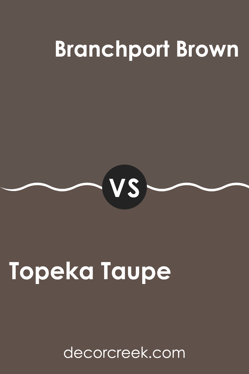
Topeka Taupe 1463 by Benjamin Moore vs Branchport Brown HC-72 by Benjamin Moore
Topeka Taupe 1463 by Benjamin Moore is a soft, warm neutral color that leans towards beige with a hint of gray. It has a calm and soothing feel, making it a great choice for areas where you want a subtle backdrop. It’s adaptable and can pair well with a variety of other colors, giving you flexibility in decorating.
On the other hand, Branchport Brown HC-72 by Benjamin Moore is a rich, deep brown. This color is more intense and makes a stronger statement compared to the soft subtlety of Topeka Taupe. It can add warmth and coziness to a room, especially in areas like a study or a living room where you want a more intimate or grounded feel.
When comparing the two, Topeka Taupe is more understated and adaptable, while Branchport Brown brings depth and character to an area. Both colors can complement each other nicely if used together in a thoughtful way.
You can see recommended paint color below:
- HC-72 Branchport Brown (CHECK A SAMPLE)
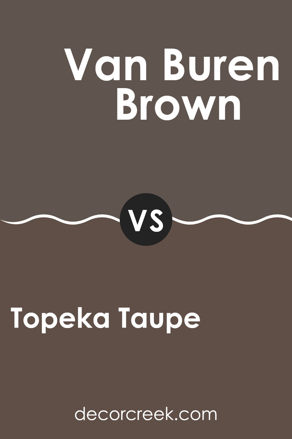
Topeka Taupe 1463 by Benjamin Moore vs Van Buren Brown HC-70 by Benjamin Moore
Topeka Taupe 1463 by Benjamin Moore is a soft, warm neutral with a hint of gray. It gives areas a cozy and inviting feel without overpowering them. On the other hand, Van Buren Brown HC-70 by Benjamin Moore is a deeper, richer brown with red undertones. It brings warmth and a strong sense of grounding to a room.
When compared, Topeka Taupe is more subtle and adaptable, which makes it suitable for a variety of settings. It’s excellent for creating a calm background that complements other colors and furnishings. In contrast, Van Buren Brown can serve as a bold statement color, ideal for accent walls or rooms where you want to add depth and character.
In summary, Topeka Taupe is light and adaptable, perfect for those looking for softness, while Van Buren Brown is strong and rich, suited for those wanting to make an impactful choice.
You can see recommended paint color below:
- HC-70 Van Buren Brown (CHECK A SAMPLE)
Topeka Taupe 1463 by Benjamin Moore vs Stone Brown 2112-30 by Benjamin Moore
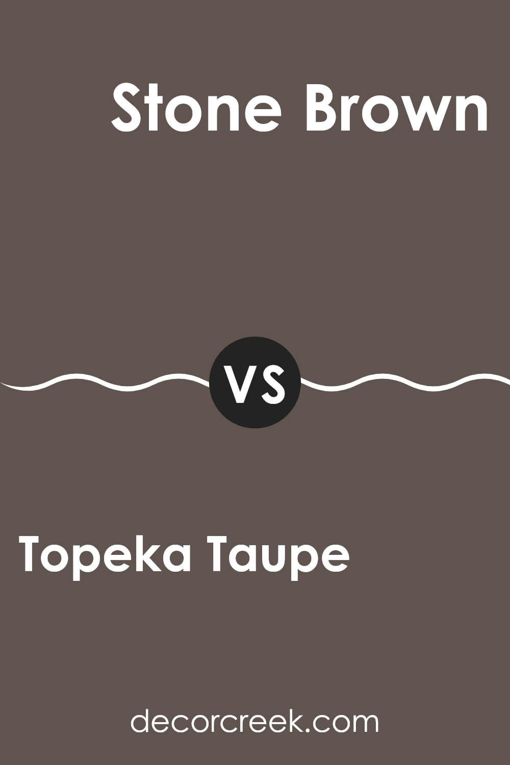
Topeka Taupe and Stone Brown are both shades offered by Benjamin Moore, and they each bring a unique vibe to a room. Topeka Taupe is a softer, lighter color with a taupe tone that leans towards beige, making it suitable for various areas. It provides a warm and neutral backdrop that doesn’t overshadow other colors, making it ideal for creating a cozy and inviting environment.
On the other hand, Stone Brown is a deeper, richer color that has more of a brown undertone. It adds a strong, earthy feel to a room and can make a bold impact, especially in well-lit areas. This color works well as an accent or in larger rooms, where it can create a sense of intimacy and warmth.
When choosing between these colors, consider the overall mood you want to establish. Topeka Taupe is perfect for a light and airy setting, while Stone Brown can add depth and a grounded feel.
You can see recommended paint color below:
- 2112-30 Stone Brown (CHECK A SAMPLE)
Wrapping up my thoughts on 1463 Topeka Taupe by Benjamin Moore, I can say it’s a pretty cool color. Imagine a shade that mixes warm brown with a touch of gray. That’s Topeka Taupe! It’s like the color you see on a tree trunk or some rocks. This color feels calming and not too loud. It’s like a hug for your room, making it feel cozy and nice.
If you put Topeka Taupe on your walls, it makes everything else look great. Think about your favorite chair or a picture on the wall – they all look even better with this color behind them! Topeka Taupe is handy because it works with so many other colors. Whether you have blue, green, or even red things in your room, they will likely look good with this shade.
Using Topeka Taupe is almost like having a friend around all the time. It comforts you and makes your home feel nice and warm. While there are many colors out there, I think Topeka Taupe stands out because it can match different moods and styles without being boring
. If you’re thinking about painting a room, this might be a fantastic color to choose.
Ever wished paint sampling was as easy as sticking a sticker? Guess what? Now it is! Discover Samplize's unique Peel & Stick samples.
Get paint samples


