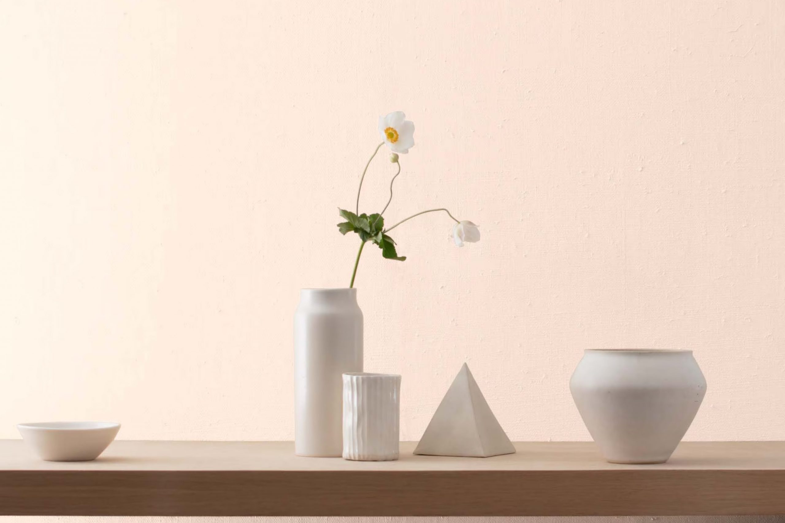
I recently had the pleasure of using Benjamin Moore’s 892 Warm Blush, and I have to share my experience with you. This particular paint color has a subtle charm that adds a cozy warmth to any room without being overpowering. It’s a soft pink that leans toward a peachy cream, making it a great choice if you’re looking for something that brings light and a gentle positivity to your living room.
When painting my home office, I chose Warm Blush to create a soothing yet energizing backdrop. The color turned out to be incredibly adaptable, pairing well with both dark and light furniture, which allowed me to play around with different decor styles.
Whether you’re new to decorating or just looking for a fresh update, Warm Blush offers a beautiful and straightforward solution. It’s easy on the eyes and fits seamlessly into a variety of interior designs, making it a go-to for anyone looking to refresh their home with ease and style.
What Color Is Warm Blush 892 by Benjamin Moore?
Warm Blush 892 by Benjamin Moore is a delicate and cozy color that brings a sense of gentleness and warmth to any room. This hue features a soft pink tone with a slight peach undertone, making it perfect for creating a welcoming and comforting atmosphere in a room. It is subtle enough to act as a neutral, yet has enough warmth to add a refreshing pop of color.
Warm Blush 892 works exceptionally well in interior styles that favor a soft, romantic, or even whimsical look. It is particularly fitting for shabby chic, modern farmhouse, and Scandinavian styles where the goal is to create a light and airy environment. The color’s adaptability allows it to blend seamlessly with cleaner, more minimalist designs as well.
When considering materials and textures to pair with this color, think of natural elements that enhance its warmth. Light woods, such as oak and birch, maintain the airy feel, while adding white or beige fabrics creates a gentle contrast that highlights the softness of the color. Additionally, incorporating elements like woven wicker or rattan can introduce an organic texture that complements the earthiness of Warm Blush 892. Metals such as gold or brass can also be paired to introduce a touch of elegance without feeling overpowering against the subtle charm of the color.
Is Warm Blush 892 by Benjamin Moore Warm or Cool color?
The paint color Warm Blush 892 from Benjamin Moore is a popular choice for homeowners looking to add a soft and inviting feel to their room. This color is a subtle pink with a hint of warmth, making it a cozy option for rooms where you want to create a relaxed and welcoming atmosphere. It works especially well in living rooms and bedrooms where a gentle touch of color can make the room feel more comfortable.
What’s great about Warm Blush 892 is its adaptability. It pairs well with both light and dark furniture, allowing for a variety of decorating styles. Whether you’re aiming for a modern look with sleek furniture or a more traditional ambiance with classic wood pieces, this color supports a broad range of tastes and preferences.
Additionally, its lightness helps to brighten up a room, making it appear larger and more open. This characteristic makes it an excellent choice for smaller rooms or areas with limited natural light. Overall, Warm Blush 892 is a practical choice that adds a warm, calming splash of color without feeling overpowering.
Undertones of Warm Blush 892 by Benjamin Moore
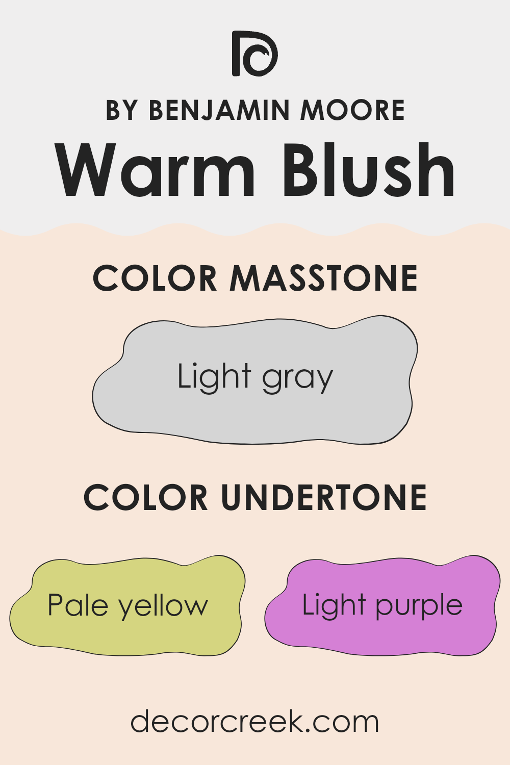
The color Warm Blush 892 by Benjamin Moore has a complex and subtle mix of undertones which include pale yellow, light purple, light blue, pale pink, mint, lilac, and grey. These undertones play a significant role in how the color appears under different lighting conditions and can influence the ambience of a room.
Undertones are essentially hints of other colors that are mixed into the main hue. They are not always immediately noticeable, but they affect the warmth or coolness of the color. For instance, pale yellow and mint add a touch of warmth, making the color feel more welcoming, while lilac and light blue introduce a cooler, more subdued vibe.
When applied to interior walls, the variety of undertones in Warm Blush 892 allows it to adapt beautifully to different settings and decor styles. The pale yellow undertone can make a room feel more inviting, while the light purple and lilac offer a gentle, subtle contrast, adding depth and interest to the walls. The pale pink and grey help soften the overall appearance, ensuring the color doesn’t feel overpowering in the room.
Additionally, the mix of warm and cool undertones means that Warm Blush 892 can interact dynamically with both natural and artificial lighting. During the day, natural light might highlight the warmer tones, making the room feel cozy. At night, artificial lighting could accentuate the cooler undertones, giving the room a fresh appearance. This adaptability makes Warm Blush 892 an adaptable choice for many homes, fitting various room themes and lighting conditions.
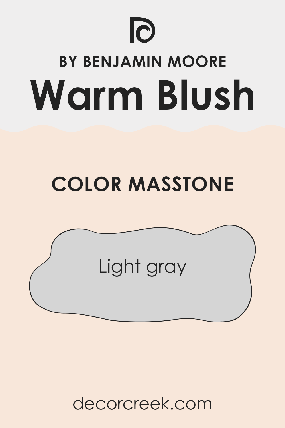
What is the Masstone of the Warm Blush 892 by Benjamin Moore?
Warm Blush 892 by Benjamin Moore, with its masstone of light gray characterized as #D5D5D5, offers a neutral and subtle palette that fits well into various home settings. This color works effectively by providing a subtle backdrop that doesn’t overshadow other elements in a room.
Its light gray tone is flexible, making it easy to pair with a wide range of colors and decor styles. The neutrality of Warm Blush 892 helps in creating a calm atmosphere, allowing colorful furnishings or artwork to stand out. It’s an ideal choice for those looking to add a gentle color to their walls without making the room feel too busy or overpowering.
Additionally, light gray tends to reflect light, helping to make a room look brighter and more open, which is a significant advantage in smaller or darker rooms. Warm Blush 892’s adaptability and gentle presence ensure it can be used in living rooms, bedrooms, and even in bathrooms, maintaining a clean and inviting look.
How Does Lighting Affect Warm Blush 892 by Benjamin Moore?
Lighting plays a crucial role in how we perceive colors. It can change how a color looks depending on whether it’s under natural or artificial light. Consider the color Warm Blush 892 by Benjamin Moore. In artificial light, this shade might appear slightly deeper and richer. Artificial lights, particularly warmer bulbs, can enhance the cozy, inviting quality of this color, making it feel more intimate.
In contrast, under natural light, Warm Blush 892 can look softer and more vibrant. This is because natural light, especially from the sun, is fuller spectrum, meaning it brings out every nuance of the color. On a sunny day, the color will really stand out, showing off its peachy, rosy undertones.
The orientation of the room also impacts how Warm Blush 892 looks throughout the day. In north-facing rooms, which receive less direct sunlight and often have cooler, softer light, this color might seem more muted and subtle. It retains a gentle warmth but doesn’t become overpowering, which is perfect for calm, peaceful settings.
South-facing rooms, however, get a lot of bright, warm light throughout the day. Here, Warm Blush 892 will appear much more vibrant and lively. Its warm undertones are enhanced, making the room feel welcoming and cheerful —great for rooms that are used frequently like living rooms or kitchens.
East-facing rooms see the most change in color perception throughout the day. In the morning, when the light is warmer, Warm Blush 892 will look bright and cheerful. As the day progresses and the natural light becomes cooler, the color dims a little, creating a softer atmosphere by the afternoon.
Finally, in west-facing rooms, the color experiences the opposite effect. It starts softer in the morning and then grows increasingly warmer and vibrant toward the evening as the sunlight becomes golden. This makes evening rooms beautiful and glowing, perfect for dining rooms or areas used mostly in the evening.
Understanding how light affects color can help in decorating your room in a way that uses natural and artificial light to your advantage, creating the perfect mood for each room.
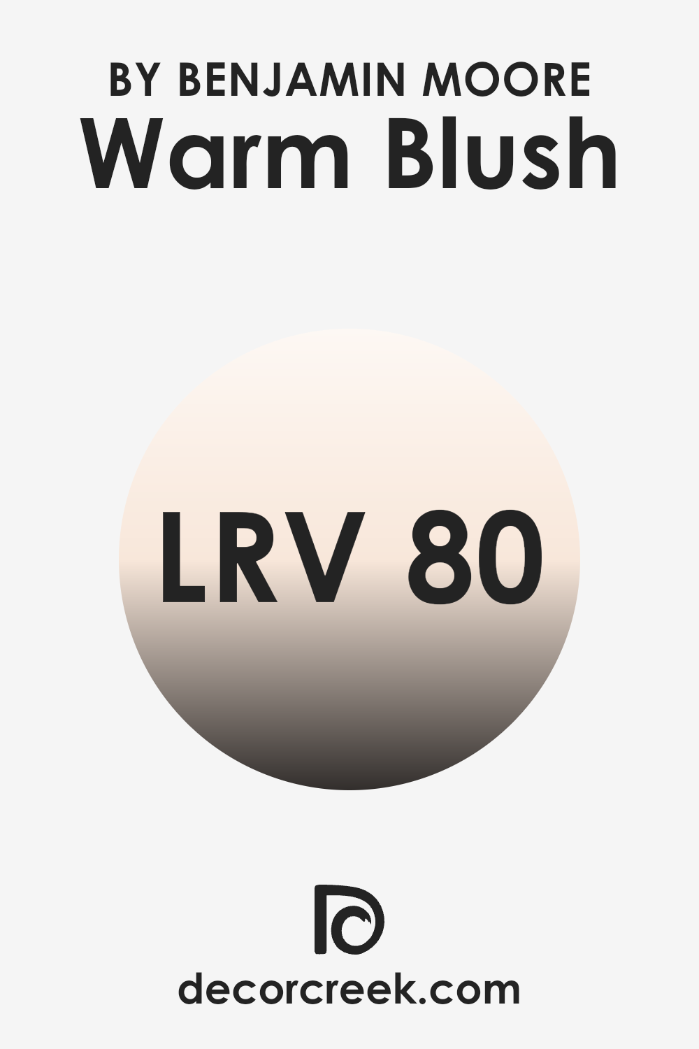
What is the LRV of Warm Blush 892 by Benjamin Moore?
LRV stands for Light Reflectance Value, which measures the percentage of light a paint color reflects back into the room compared to the amount it absorbs. If a color has a high LRV, it means it reflects more light, making a room appear brighter, and vice versa, a low LRV means the color absorbs more light, which can make a room look smaller and darker.
This measurement is crucial when choosing paint colors because it helps you understand how the color will behave under different lighting conditions and can influence the overall feel of a room. For instance, the LRV of Warm Blush is 80.14, meaning it is a light color that reflects a considerable amount of light. In practical terms, when used on walls, this paint will make the room feel airy and open by brightening it up.
The high LRV aids in illuminating rooms that might not receive a great deal of natural sunlight, effectively using the available light to create a warm and welcoming atmosphere. This characteristic makes it an excellent choice for smaller rooms or areas with fewer windows, as it helps counteract the potential for the room to feel cramped or gloomy.
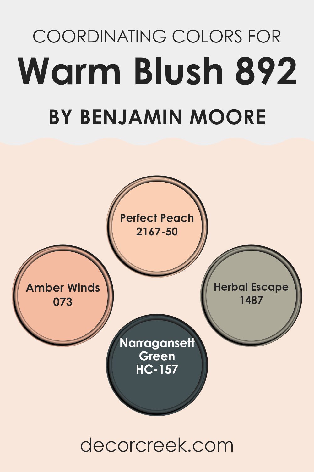
Coordinating Colors of Warm Blush 892 by Benjamin Moore
Coordinating colors work by complementing or enhancing the characteristics of a base color to create a visually harmonious palette. In interior design, these coordinating colors can be chosen to either contrast with or accentuate the main color, depending on the desired effect. Warm Blush 892 by Benjamin Moore, for instance, is a soft and subtle shade, and selecting the right coordinating colors can make it stand out or blend beautifully within a room.
Perfect Peach 2167-50 offers a light and airy feel that pairs well with Warm Blush, providing a delicate harmony perfect for creating a welcoming atmosphere. It has an uplifting quality that can make a room feel more inviting. Amber Winds 073 adds a richer, warmer tone that can give depth to a room while maintaining a gentle connection to Warm Blush.
These slightly orange tones can warm up a room without feeling overpowering. Herbal Escape 1487 has a hint of green, which provides a natural, earthy counterbalance to the Warm Blush. This color helps add a refreshing touch, gently enriching the overall palette without feeling overpowering.
Lastly, Narragansett Green HC-157 lends a bold contrast, its deep green tones offering a striking visual that still complements the subtle pink hues. This deeper shade can be used to highlight important features or areas within the room, making it both functional and aesthetically appealing. Together, these colors can create a cohesive look that enhances the comforting vibe of Warm Blush.
You can see recommended paint colors below:
- 2167-50 Perfect Peach
- 073 Amber Winds
- 1487 Herbal Escape
- HC-157 Narragansett Green
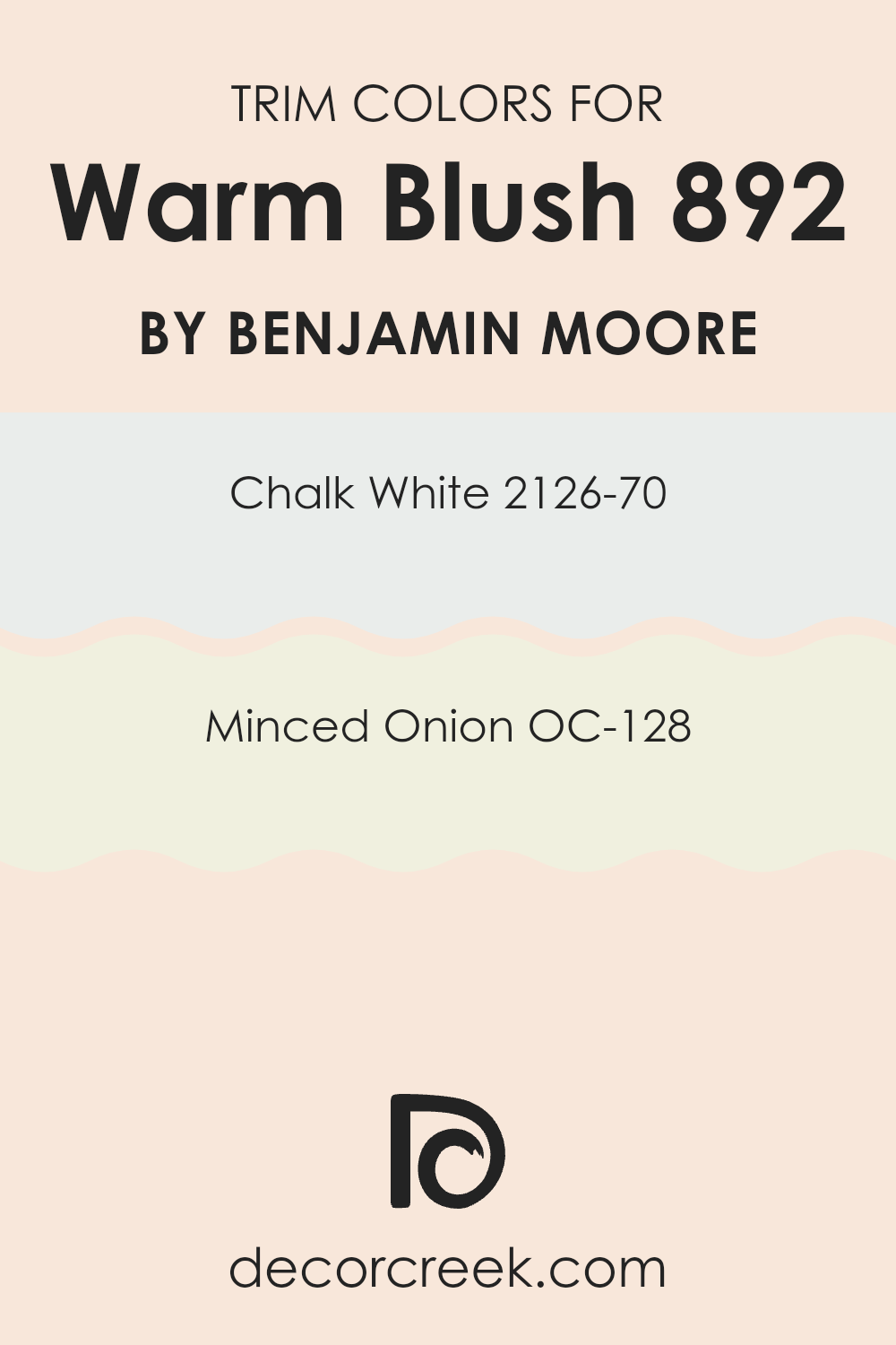
What are the Trim colors of Warm Blush 892 by Benjamin Moore?
Trim colors are the hues used to paint the architectural details of a room or exterior, such as door frames, window frames, and skirtings. They are important in interior design because they can highlight these features, adding definition and contrast to the walls. When using a gentle tone like Warm Blush by Benjamin Moore, selecting the right trim colors can enhance the overall look, ensuring that these design elements stand out without feeling overpowering in the room.
One excellent choice for trim color is Chalk White (2126-70), a clean and almost translucent shade of white that can help to subtly highlight the delicate pink of Warm Blush. It brings a fresh and airy feel to the room, making small rooms appear larger and more open.
Another good option is Minced Onion (OC-128), a soft, light gray with a hint of warmth. This color complements Warm Blush without contrasting too sharply, providing a smooth transition between the wall and trim, creating a gentle and inviting room.
You can see recommended paint colors below:
- 2126-70 Chalk White
- OC-128 Minced Onion
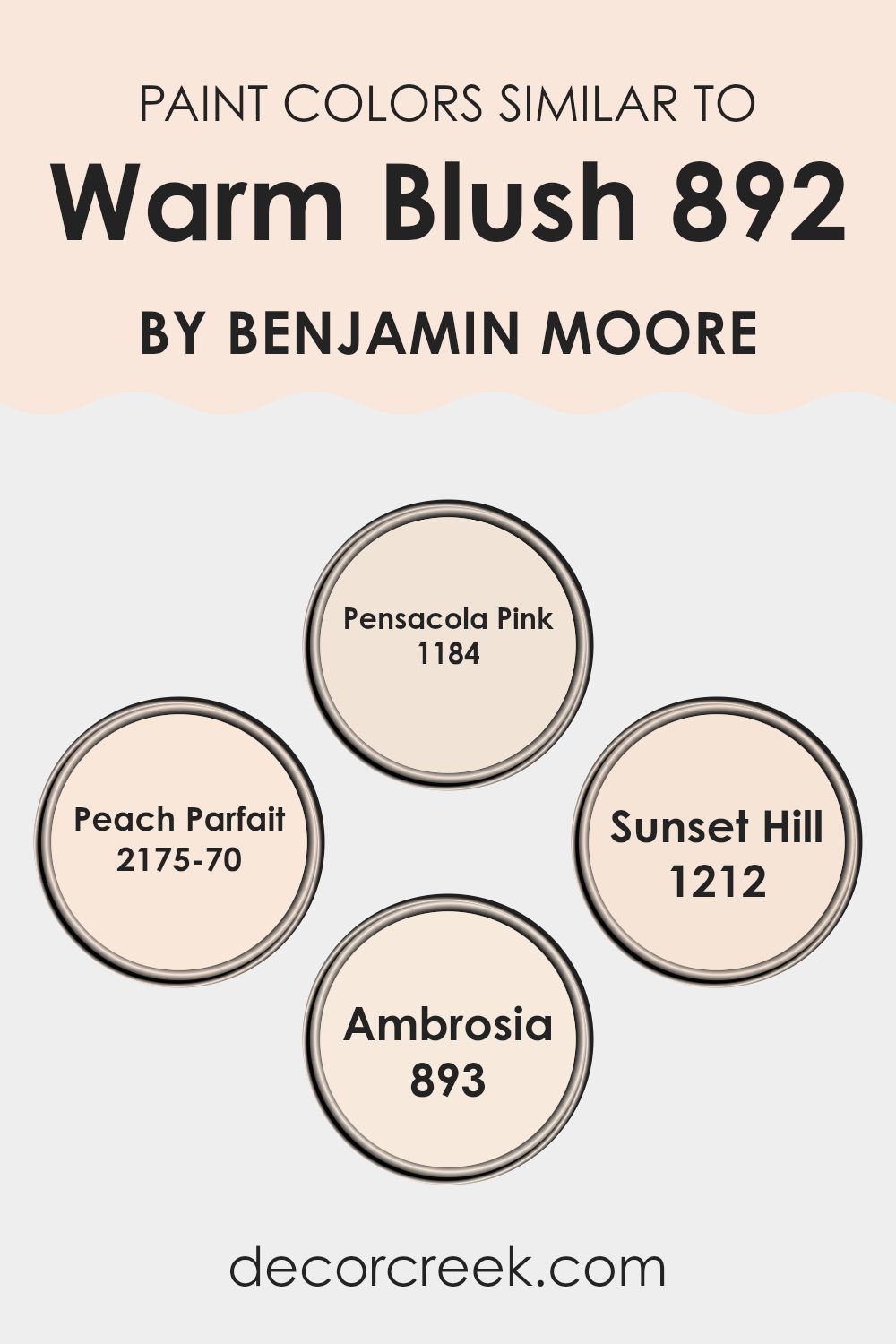
Colors Similar to Warm Blush 892 by Benjamin Moore
Using similar colors in design can create a harmonious and visually appealing room. Similar colors share common hues and are usually located next to each other on the color wheel. They provide a subtle contrast and blend smoothly together, enhancing the overall look without overshadowing elements.
For instance, colors like the warm tones of Pensacola Pink, Peach Parfait, Sunset Hill, and Ambrosia are excellent similar shades that complement Warm Blush, offering a cohesive look that’s calming and pleasing to the eye. This continuity can make interiors appear larger and more connected, as the eye moves seamlessly from one area to another.
Pensacola Pink has a soft, inviting charm that gives a gentle warmth, perfect for creating a cozy and intimate environment. Peach Parfait is slightly lighter, giving off a delicate, airy vibe that can brighten up a small room or enhance the light in a room. Sunset Hill brings a deeper, rich dimension reminiscent of a fleeting evening sky, adding a hint of drama while retaining its warmth.
Ambrosia is a lighter, more ethereal shade, providing a subtle contrast that complements the deeper pinks without feeling overpowering. Together, these colors work cohesively to create a balanced and inviting atmosphere where each shade enhances the qualities of the others.
You can see recommended paint colors below:
- 1184 Pensacola Pink
- 2175-70 Peach Parfait
- 1212 Sunset Hill
- 893 Ambrosia
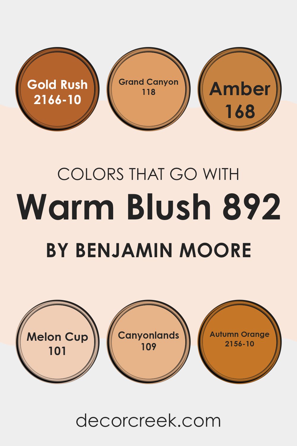
Colors that Go With Warm Blush 892 by Benjamin Moore
Selecting complementing colors for Warm Blush 892 by Benjamin Moore is crucial because it helps create a harmonious and inviting room. The chosen colors like Gold Rush, Grand Canyon, Amber, Melon Cup, Canyonlands, and Autumn Orange all work effectively with Warm Blush to offer a warm and cozy ambiance. When these colors are used together, they can make a room feel more cohesive and balanced, enhancing the overall look.
Gold Rush is a deep, rich yellow that shines brightly like sunlight and brings a lively spark to any room. Grand Canyon, in contrast, is a robust, earthy orange that mimics the natural beauty and vastness of its namesake, adding a sense of grounded majesty to environments. Amber is a warm, golden hue that suggests the soft glow of twilight, perfect for adding a gentle warmth throughout.
Melon Cup is lighter, presenting a subtle peachy orange that infuses rooms with a soft, gentle cheer. Canyonlands offers a dusty rose that echoes the reddish hues found in desert landscapes, providing a unique warmth.
Finally, Autumn Orange is a bold, dynamic orange that recalls the vibrant tones of fall leaves, ideal for making strong visual statements. These colors, when paired with Warm Blush, create rooms that are warm, welcoming, and visually appealing, perfectly suited for anyone looking to add a touch of warmth to their interiors.
You can see recommended paint colors below:
- 2166-10 Gold Rush
- 118 Grand Canyon
- 168 Amber
- 101 Melon Cup
- 109 Canyonlands
- 2156-10 Autumn Orange
How to Use Warm Blush 892 by Benjamin Moore In Your Home?
Warm Blush 892 by Benjamin Moore is a beautiful, flexible paint color that brings a soft, cozy feeling to any room. This subtle shade can work wonderfully in rooms that need a touch of warmth without feeling overpowering. Whether you’re looking to freshen up your living room, bedroom, or even a bathroom, Warm Blush 892 adds just the right amount of color to make the area feel inviting.
For those wanting to update their kitchen, applying Warm Blush 892 on the walls can offer a gentle contrast against white cabinets or can complement wooden tones. In a bedroom, this color pairs well with creams and light browns, creating a soothing backdrop that’s perfect for relaxing after a long day. If you have a small room, like a hallway or entryway, painting it with Warm Blush 892 can make it appear brighter and more welcoming.
To sum it up, Warm Blush 892 is a great choice for anyone looking to add a hint of warmth to their home with a paint color that is easy to work with and matches many decorating styles.
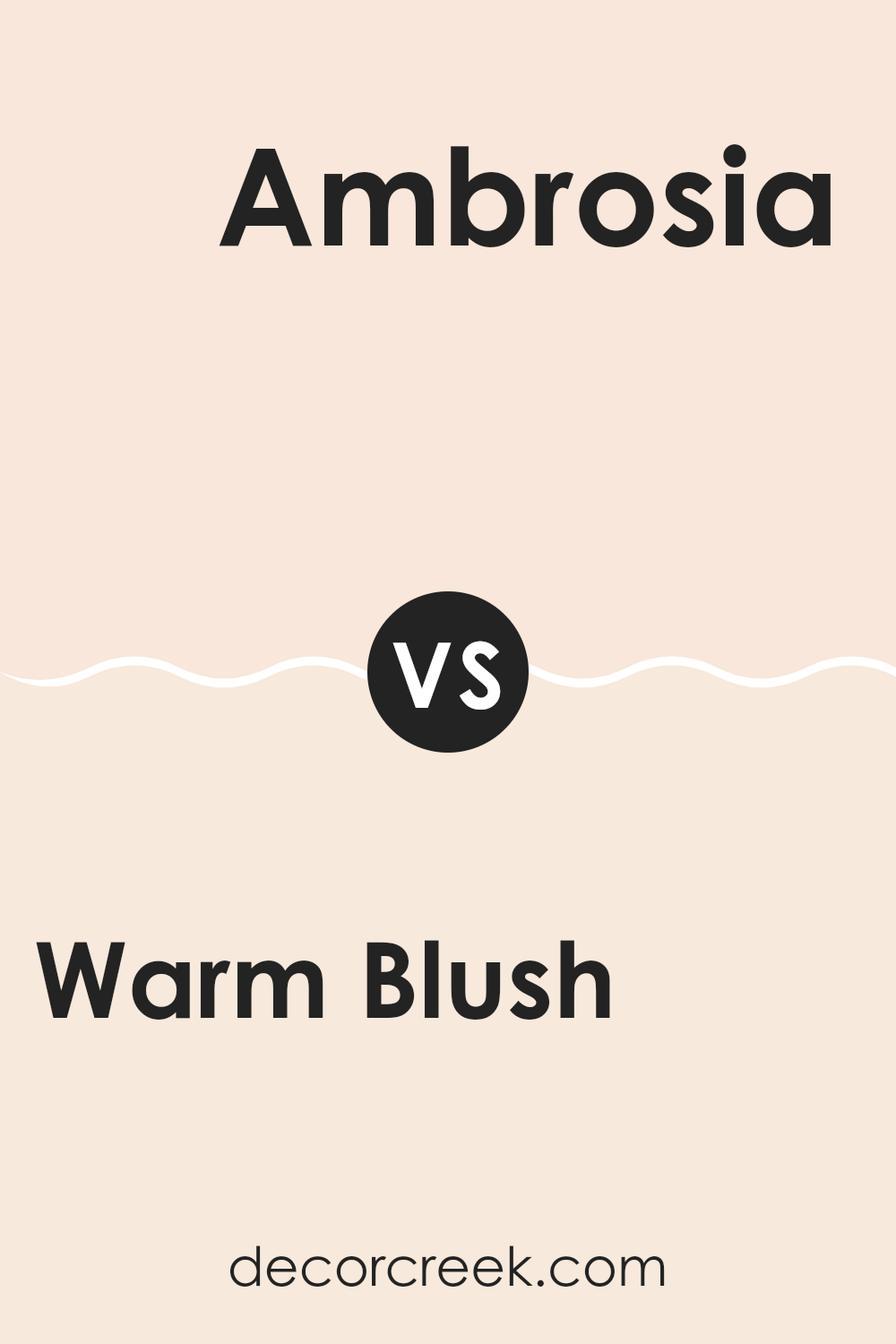
Warm Blush 892 by Benjamin Moore vs Ambrosia 893 by Benjamin Moore
Warm Blush 892 and Ambrosia 893 from Benjamin Moore are both soft, inviting hues that work well to create a cozy atmosphere in any room. Warm Blush 892 has a delicate pinkish tone that adds a gentle, comforting touch to rooms, making it perfect for rooms where you want a subtle hint of warmth and color.
On the other hand, Ambrosia 893 offers a slightly greener undertone, giving a hint of freshness without becoming overpowering. This color is ideal if you’re looking for a color that’s still soft and easy on the eyes but provides a touch of natural vibe.
While both colors are light and airy, Warm Blush leans more toward a warm, rosy feel, whereas Ambrosia brings in a breath of fresh air with its almost mint-like undertone. These colors are great choices for someone looking to freshen up their room in a gentle, appealing way.
You can see recommended paint color below:
- 893 Ambrosia
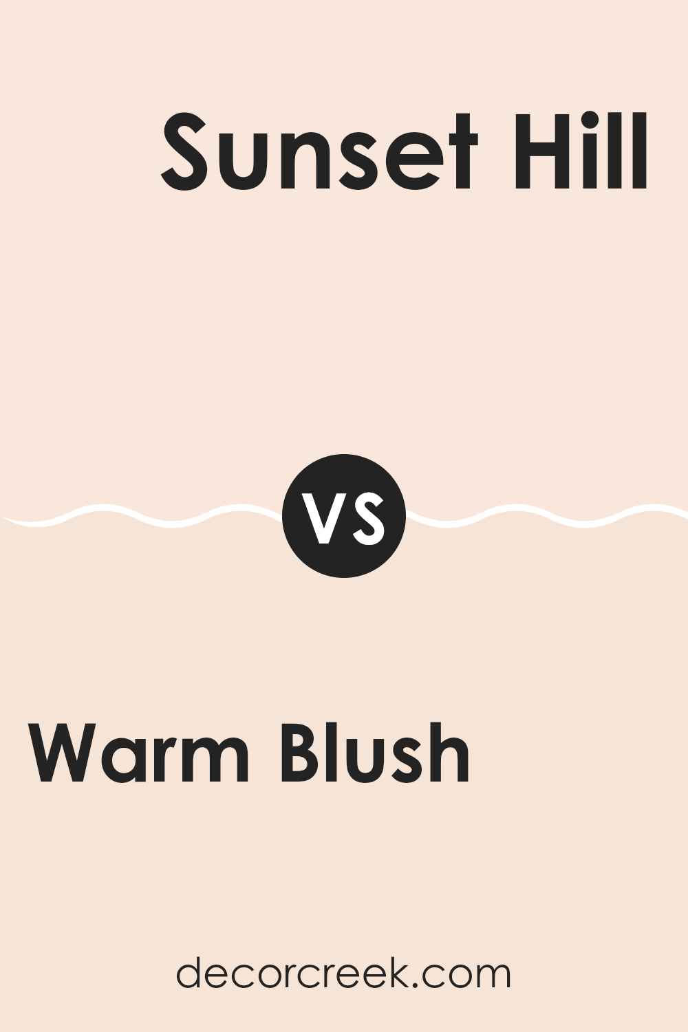
Warm Blush 892 by Benjamin Moore vs Sunset Hill 1212 by Benjamin Moore
The main color Warm Blush is a soft, muted pink with a cozy and welcoming feel. It has a subtle warmth that makes it very adaptable for various rooms, radiating a gentle, embracing vibe without being too bold or overpowering. On the other hand, Sunset Hill is a richer, deeper beige with hints of pink. This color is more grounded and earthy compared to Warm Blush. It gives a room a solid, comforting presence due to its deeper tone.
While Warm Blush is lighter and can help a small room feel slightly larger and more open, Sunset Hill, with its more substantial tone, works well in a room that can handle a richer color without feeling cramped.
Both colors offer warmth, but Sunset Hill provides a more robust backdrop, possibly better suited for large rooms or one with ample natural light. In contrast, Warm Blush works well in any light, enhancing the room with its light-reflective quality.
You can see recommended paint color below:
- 1212 Sunset Hill
Warm Blush 892 by Benjamin Moore vs Pensacola Pink 1184 by Benjamin Moore
Warm Blush and Pensacola Pink are two paint colors that create distinct moods in any room. Warm Blush offers a gentle and cozy feel, reminiscent of a subtle sunset. This tone is quite adaptable, making it easy to pair with lighter or darker hues for a balanced look. It’s great for a room that’s meant to be calming and inviting.
Pensacola Pink, on the other hand, has a brighter and more energetic vibe. It brings a fresh and playful feeling to rooms, perfect for areas that benefit from a cheerful and lively atmosphere, like a child’s bedroom or a creative room. This shade can really liven up a room and works well when used as an accent wall or when paired with complementary colors.
Overall, while both paint colors lie in the pink spectrum, Warm Blush provides a more understated warmth, whereas Pensacola Pink stands out more vibrantly. Depending on your room’s purpose and existing decor, each has its own perfect fit.
You can see recommended paint color below:
- 1184 Pensacola Pink
Warm Blush 892 by Benjamin Moore vs Peach Parfait 2175-70 by Benjamin Moore
Warm Blush 892 is a subtle and cozy shade that leans toward a light beige with pink undertones, giving it a soft and welcoming feel. It is an ideal choice if you’re looking to create a gentle and soothing ambiance in a room. This color pairs well with darker furniture or decor accents, providing a balanced backdrop that enhances the warmth in any room.
On the other hand, Peach Parfait 2175-70 is a much lighter and airier color, with a clear influence of peach that adds a fresh, cheerful vibe. It’s brighter than Warm Blush 892 and can make small rooms appear more open and vibrant. Peach Parfait works beautifully in areas with a lot of natural light, complementing other light tones and materials like soft linens or gentle woods.
Both colors have their unique appeal, with Warm Blush offering depth and warmth, while Peach Parfait brings in an energetic and fresh look, making each suitable for different types of rooms based on your aesthetic goals and the atmosphere you wish to create.
You can see recommended paint color below:
- 2175-70 Peach Parfait
In conclusion, after trying out Benjamin Moore’s 892 Warm Blush, I’m really happy with how it looks in my room. It’s a soft and gentle pink that makes everything feel cozy and welcoming. It’s not too bright or too dull; it’s just right for making my room feel special.
This color would be great for anyone wanting to add a little warmth to their walls without making things too bold. It has a calm feeling that is nice to look at, and it goes well with other colors.
Whether you want to paint a whole room or just an accent wall, I think 892 Warm Blush can make any room look nicer. It’s a paint color that’s easy to love and makes your room look pretty without too much fuss. I would definitely recommend it if you’re looking for something new for your room.
Ever wished paint sampling was as easy as sticking a sticker? Guess what? Now it is! Discover Samplize's unique Peel & Stick samples.
Get paint samples

