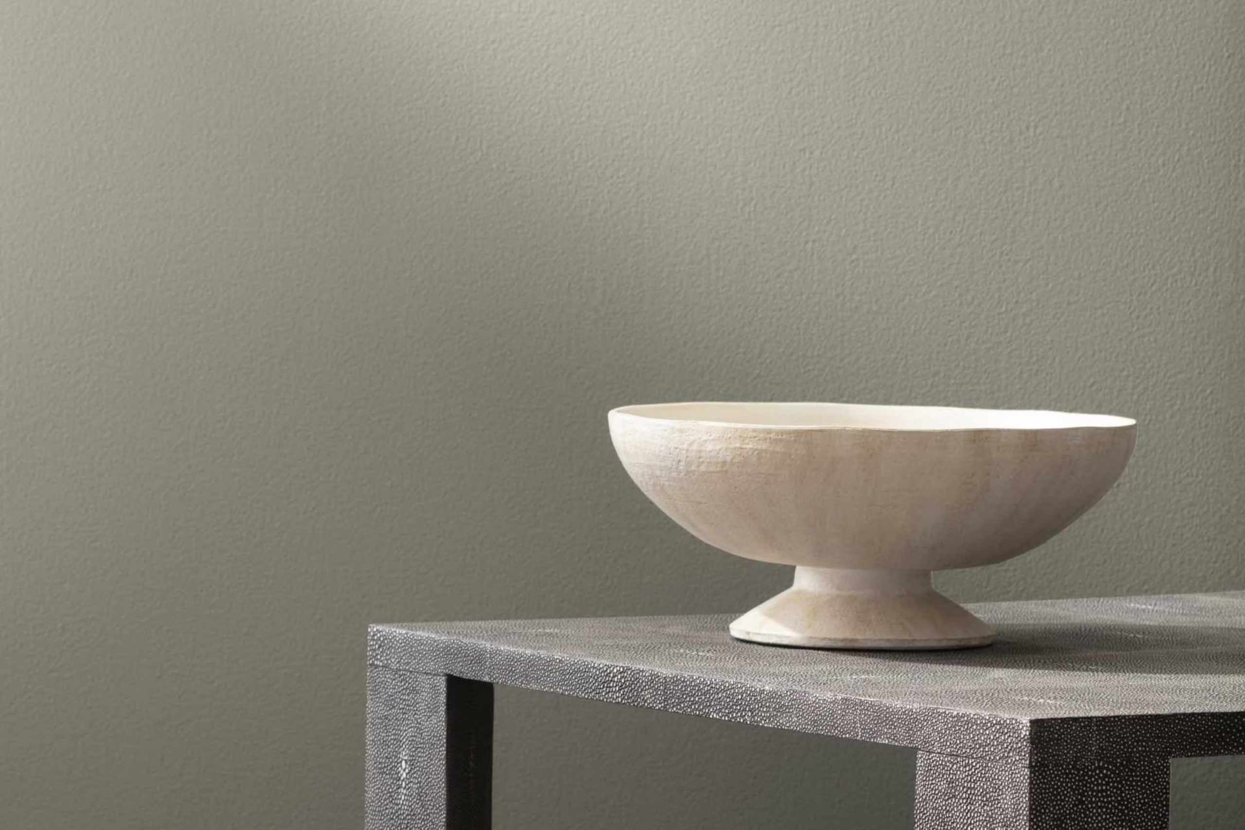
Imagine you’re looking to give your area a renewed, inviting look. You come across a color that truly stands out: 1487 Herbal Escape by Benjamin Moore. This soothing green hue instantly brings a sense of calm and freshness into any room. It’s like having a touch of nature’s charm indoors, offering a gentle backdrop that feels both comforting and elegant.
By choosing 1487 Herbal Escape, you’re not just selecting a color; you’re setting a mood that captures the essence of an early spring day. This shade is adaptable too, working beautifully in living rooms, bedrooms, or even bathrooms. It pairs wonderfully with natural materials such as wood, wicker, or linen, creating a balanced atmosphere that feels both graceful and approachable.
So, if you’re ready to refresh your home with a color that brings the peaceful feeling of a lush garden indoors, 1487 Herbal Escape may be the perfect choice.
It’s a way to gently enhance your living area without overpowering it, making it ideal for anyone looking to create a calm and inviting home.
What Color Is Herbal Escape 1487 by Benjamin Moore?
Herbal Escape by Benjamin Moore is a rejuvenating shade of green, reminiscent of flourishing foliage after a gentle rain. This color carries a lively yet calming presence, making it ideal for cultivating a relaxed atmosphere in any area. With its natural essence, this paint color beautifully contributes to creating a cozy, welcoming vibe in homes.
When it comes to interior styles, Herbal Escape is adaptable enough to enhance both modern and traditional designs. It particularly stands out in rooms seeking a rustic or cottage aesthetic. In more contemporary rooms , it serves as a vibrant backdrop that can be softened with neutral furnishings or accentuated with bold, complementary hues.
This shade pairs wonderfully with natural materials such as wood and stone, reinforcing its organic appeal. Textures like linen, wool, and other soft fabrics also enhance the gentle quality of the color, adding a layer of warmth to the overall design. Picture wooden flooring, stone surfaces, and linen drapes working together to highlight the beauty of Herbal Escape.
Whether you’re updating a bedroom, living room, or kitchen, this color brings a breath of renewal indoors, making areas feel bright yet comfortable. It’s an excellent option for anyone looking to infuse their home with a touch of nature’s calm charm.
Is Herbal Escape 1487 by Benjamin Moore Warm or Cool color?
Herbal Escape 1487 by Benjamin Moore is a fresh and lively green paint that brings a sense of nature into any home. This color resembles the vibrant green of fresh herbs, making it a great choice for kitchens or sunrooms where you want to add a bit of life and energy.
In a bedroom or living room, it offers a calming backdrop that isn’t too bold but still adds color and personality to the area. It pairs well with natural elements like wood and stone, enhancing their organic feel. Herbal Escape also works nicely with both light and dark furnishings, offering adaptability in decorating styles.
Whether you want to create a cozy, inviting nook or refresh an entire room, this paint color makes it easy to add a hint of nature to your indoor areas without overpowering them. In rooms with lots of natural light, it feels airy and vibrant, truly bringing the outdoor charm inside.
Undertones of Herbal Escape 1487 by Benjamin Moore
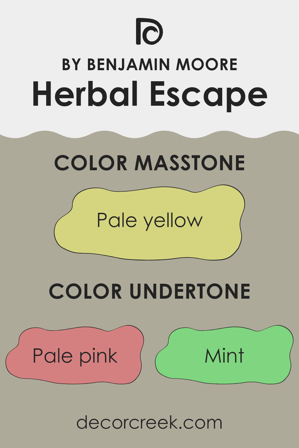
Herbal Escape 1487 by Benjamin Moore is a unique paint color that incorporates a complex mix of undertones which subtly influence how the color appears in different settings. Undertones are the colors beneath the surface of the paint that can either cool down or warm up the main color. With undertones ranging from pale pink and mint to light blue and orange, Herbal Escape offers an adaptable backdrop for various interior styles.
When painted on interior walls, the undertones in Herbal Escape interact with both natural and artificial light, altering the color’s perception throughout the day. For example, in sunlight, the lighter undertones like mint and light blue might make the walls appear fresher and more vibrant. In contrast, in dimmer light, deeper undertones such as grey or olive could give the room a more grounded feel.
Understanding these undertones can help in choosing decor and furnishings. The pale pink and lilac undertones can complement soft textures and romantic elements, while the grey and light gray provide a neutral background suitable for bold colors or metallic finishes. Moreover, the subtle hints of orange and yellow can introduce a warm glow, perfect for creating a cozy atmosphere.
Overall, the wide range of undertones in Herbal Escape allows for adaptability in interior design, enabling the color to adjust and reflect personal style and the room’s function. Whether for a calm study area or a lively living zone, these undertones help enhance the surroundings by subtly shifting in different lights.
What is the Masstone of the Herbal Escape 1487 by Benjamin Moore?
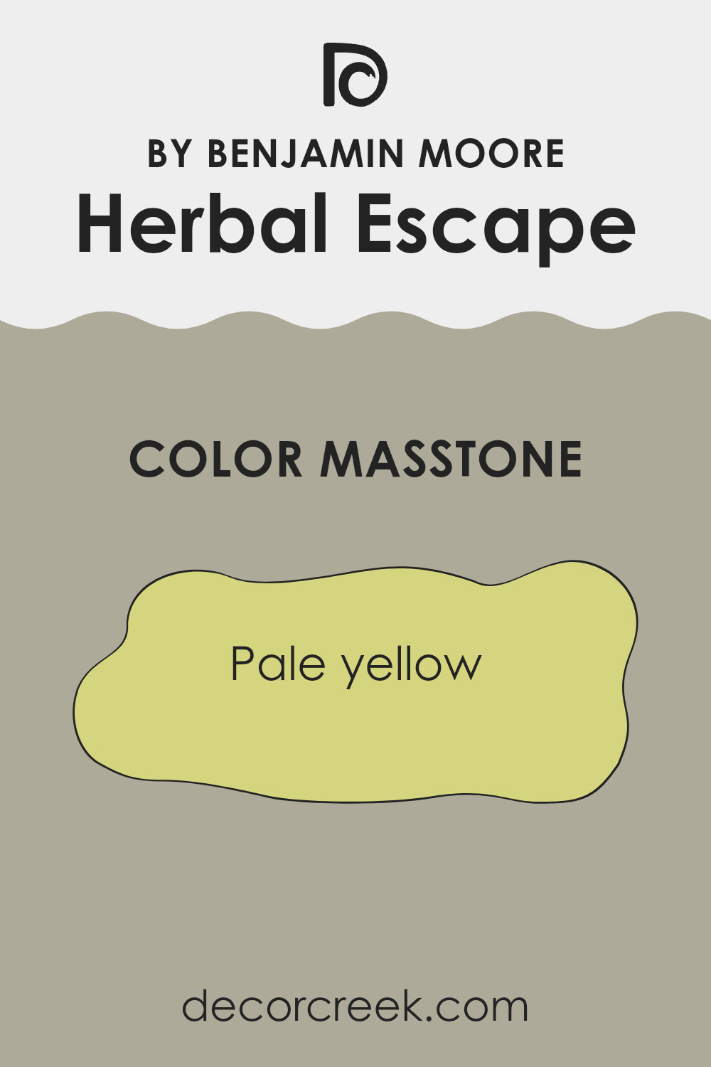
The color Herbal Escape 1487 by Benjamin Moore has a masstone of pale yellow, coded as #D5D580. This gentle yellow hue brings a light and airy feel to any room, making areas appear larger and more open. Its subtlety is perfect for creating a welcoming atmosphere in living zones or kitchens where families gather.
This shade is adaptable and pairs well with both bright colors for a playful vibe and neutral tones for a calmer setting. Additionally, this particular shade of yellow has the benefit of not overpowering rooms with brightness, making it easier to decorate around.
Being a forgiving color that hides minor marks and smudges better than deeper tones, it’s practical for high-traffic areas in a home. Its flexibility and pleasant aesthetic make it a popular choice for homeowners looking to add a touch of lightness without dominating the existing décor.
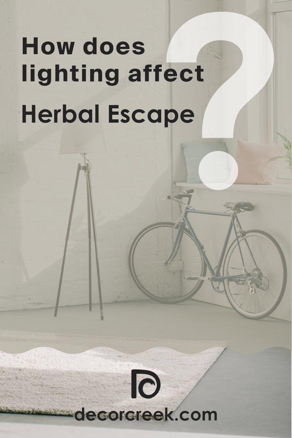
How Does Lighting Affect Herbal Escape 1487 by Benjamin Moore?
Lighting plays a crucial role in how colors appear in any given area. Different light sources can significantly influence the perception of color in a room. The color “Herbal Escape” (1487) by Benjamin Moore demonstrates this beautifully.
In artificial light, “Herbal Escape” may look warmer or take on a slightly yellowish tint, depending on the type of bulbs used. For instance, incandescent bulbs, which emit a warmer, golden light, can make this color appear cozier and softer. LED or fluorescent lights, which tend to be cooler, can highlight more of the green undertones in the paint.
In natural light, “Herbal Escape” shows a truer version of its soft, gentle green tone. Natural light offers the clearest representation of color, though its appearance still shifts depending on the time of day and weather conditions.
In north-facing rooms, which generally receive less direct sunlight, “Herbal Escape” may appear more subdued and slightly deeper. The limited light enhances the color’s depth, giving it a cooler and more reserved character.
Rooms facing south, with abundant sunlight throughout the day, make “Herbal Escape” appear lighter and more lively. The natural brightness can make the room feel open and refreshing—ideal for living areas or kitchens.
In east-facing rooms, the morning light lends “Herbal Escape” a soft and inviting quality early in the day, gradually mellowing as the light fades. By afternoon, the color may appear more neutral and less vivid.
West-facing rooms show the opposite effect. “Herbal Escape” tends to look muted in the morning but gains warmth and richness in the afternoon and evening as the sunlight deepens. This transition creates a pleasant effect in bedrooms or dining rooms where the light naturally shifts in tone.
Overall, “Herbal Escape” adjusts beautifully to different lighting conditions, making it an adaptable option for various room orientations and environments.
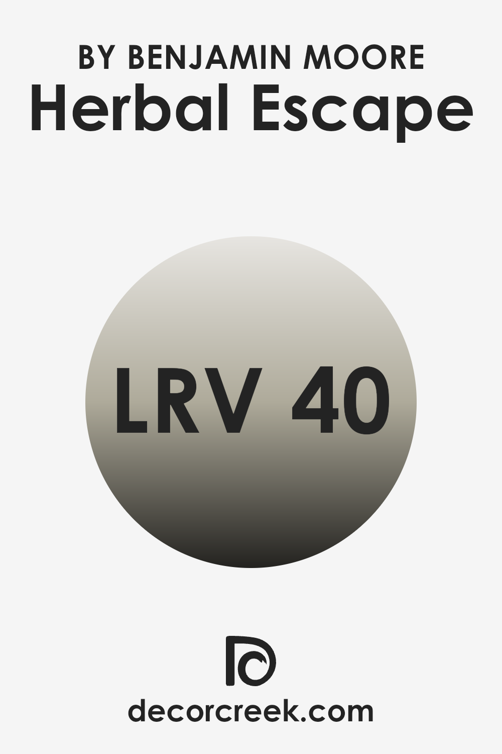
What is the LRV of Herbal Escape 1487 by Benjamin Moore?
LRV stands for Light Reflectance Value, which is a measure of how much light a paint color reflects back into a room. It’s expressed as a percentage, with lower values indicating darker colors that absorb more light and higher values for lighter shades that reflect more light.
This value is crucial when deciding on a paint shade because it helps determine how bright or dark a room will feel once painted. Dark colors with low LRV can make a room feel cozy but smaller, while light colors can make an area feel airier and larger.
The LRV for Herbal Escape is around 39.97, which is a mid-range value. This means it neither reflects light as much as very light colors nor absorbs light like darker shades. In practical terms, it’s an adaptable choice that brings a balanced intensity of color to the walls, providing a moderate enhancement to the perceived size of the area.
It possesses enough depth to add character and warmth, while still keeping the room reasonably bright, making it a suitable option for different lighting situations and room sizes.
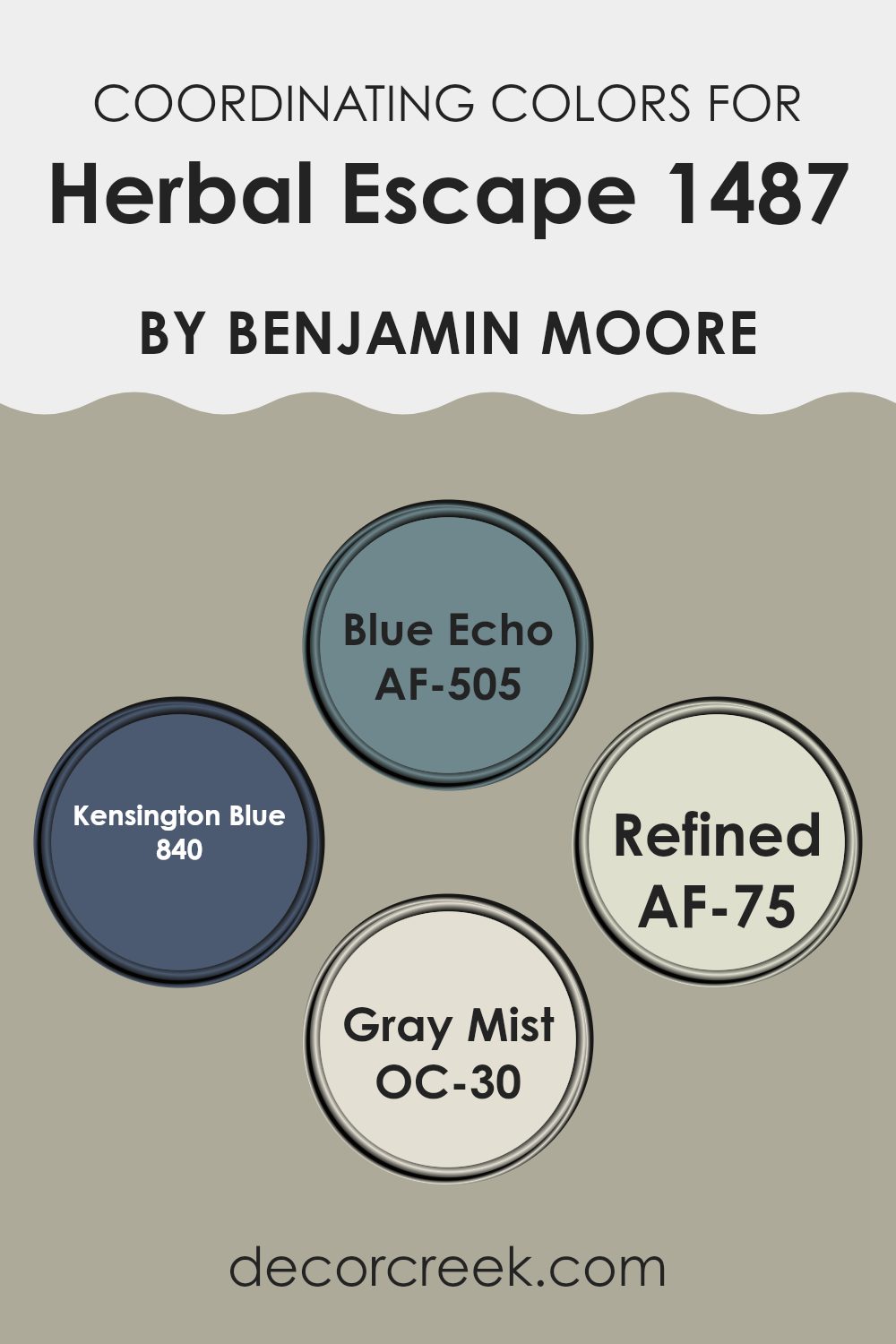
Coordinating Colors of Herbal Escape 1487 by Benjamin Moore
Coordinating colors are shades that complement each other and harmonize within an area to create a balanced and visually appealing atmosphere. When working with a primary paint color, such as Benjamin Moore’s Herbal Escape, the selection of coordinating colors is crucial to enhance the ambiance of a room. Coordinating colors can contrast, complement, or subtly blend with the main color, enriching the overall decor and setting a specific mood.
For instance, AF-505 – Blue Echo is a deep, vibrant tone that pairs well with Herbal Escape by adding a striking contrast that can make features stand out in an area. It works well in accents or for creating a focal point in a room.
On the lighter side, OC-30 – Gray Mist offers a soft, gentle gray that complements the subdued green of Herbal Escape, perfect for creating a calming and cohesive look throughout a home. AF-75 – Refined is a clean and clear color, suitable for areas that aim for a crisp and fresh appearance, while 840 – Kensington Blue, a rich naval shade, adds a dash of boldness and depth, perfect for bringing an air of drama and classic elegance to a room alongside a lighter, earthy hue like Herbal Escape. Each of these colors helps to craft a distinct feel and look, ensuring the area feels well-balanced and inviting.
You can see recommended paint colors below:
- AF-505 Blue Echo
- 840 Kensington Blue
- AF-75 Refined
- OC-30 Gray Mist
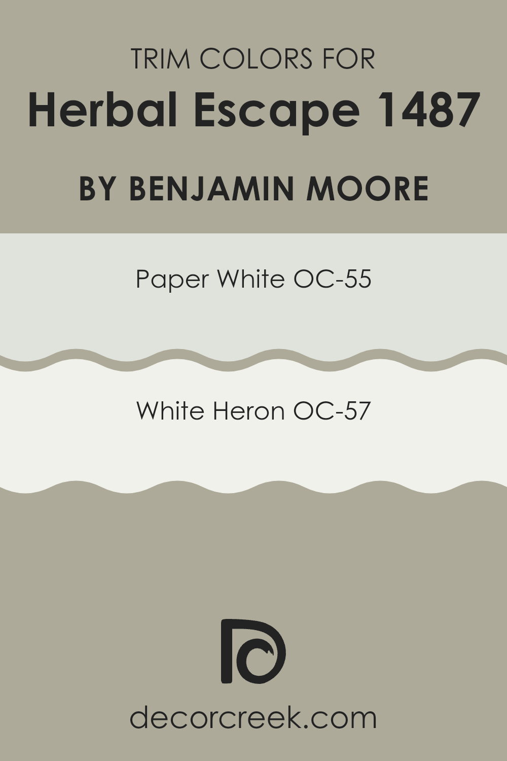
What are the Trim colors of Herbal Escape 1487 by Benjamin Moore?
Trim colors are the accents applied to the edges, moldings, window frames, and doors of a room, adding definition and style to the area. When using a color like Herbal Escape 1487 by Benjamin Moore, picking the right trim colors is crucial because they outline and enhance the main wall color, ensuring that the boundaries of the area are clearly and attractively defined.
OC-55 – Paper White and OC-57 – White Heron work well as trim colors with Herbal Escape 1487, as they provide a subtle yet clean contrast, highlighting the colors without overpowering the main hue. OC-55 – Paper White is a soft, gentle white that carries a hint of a warm undertone, making it ideal for creating a friendly and welcoming atmosphere.
It pairs beautifully with deeper or more vibrant tones as it does not compete for attention but instead supports and brightens the main color. OC-57 – White Heron is a crisp, clean white with a slight cool undertone, acting as a fresh and bright frame to more subdued wall colors, such as Herbal Escape 1487, making the shade appear more lively and defined.
You can see recommended paint colors below:
- OC-55 Paper White
- OC-57 White Heron
Colors Similar to Herbal Escape 1487 by Benjamin Moore
Choosing similar colors in decorating can significantly enhance the aesthetic of a room by creating a sense of harmony and flow. Colors like Herbal Escape 1487 by Benjamin Moore and its related shades work well together because they share a common intensity and undertone, resulting in a cohesive look.
When similar colors are used in an area, they help connect different elements and features seamlessly, making the setting feel unified and thoughtfully designed. This approach to color selection allows decorators to achieve a balanced and inviting atmosphere without overpowering the senses.
For example, Cheyenne Green 1502 is a deep, soothing green that reflects the richness of a dense forest, providing a grounding effect in any area. Rockport Gray HC-105 offers a stony, neutral foundation that works well as a refined backdrop for bolder shades or as a stand-alone tone for a calm, subtle mood.
Jockey Hollow Gray HC-108, with its deeper gray hue, adds richness and depth, making it ideal for creating dimension when paired with lighter tones. Lastly, Fieldstone 1558 captures the cool character of stone, giving areas a sense of stability and permanence with its muted, adaptable shade. Together, these colors create a palette suited for interiors that highlight natural beauty and seamless flow between areas.
You can see recommended paint colors below:
- 1502 Cheyenne Green
- HC-105 Rockport Gray
- HC-108 Jockey Hollow Gray
- 1558 Fieldstone

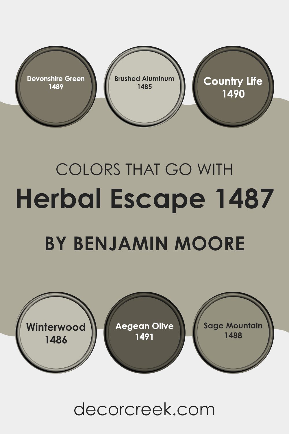
Colors that Go With Herbal Escape 1487 by Benjamin Moore
Choosing the right colors to accompany Herbal Escape 1487 by Benjamin Moore is essential because it helps create a cohesive look and feel in an area. The colors that pair well with Herbal Escape, such as Devonshire Green, Brushed Aluminum, Country Life, Winterwood, Aegean Olive, and Sage Mountain, each bring their unique qualities while maintaining harmony.
Devonshire Green adds a rich, muted green reminiscent of a dense forest, providing a grounding effect. Brushed Aluminum offers a light, silvery touch that can brighten the room’s mood and contrast beautifully with deeper tones. Country Life is a soft, earthy shade that reflects the gentle hues of natural surroundings, perfect for a soothing environment.
Winterwood introduces a subtle, grayish-green that mirrors the quiet calm of a frosty forest, ideal for areas aiming for a neutral and balanced palette. Aegean Olive brings a deeper green reminiscent of lush foliage, adding depth and vitality to the setting.
Lastly, Sage Mountain blends gray and green, evoking the essence of a misty mountain landscape and grounding the palette with its steady presence. Together, these colors provide a range of impressions—from refreshing and lively to calm and understated—allowing for personalization of your area while maintaining a harmonious flow.
You can see recommended paint colors below:
- 1489 Devonshire Green
- 1485 Brushed Aluminum
- 1490 Country Life
- 1486 Winterwood
- 1491 Aegean Olive
- 1488 Sage Mountain
How to Use Herbal Escape 1487 by Benjamin Moore In Your Home?
Herbal Escape 1487 by Benjamin Moore is a vibrant green paint that can add a fresh and lively look to any room in your home. This shade is perfect for those who want to bring a touch of nature indoors. You can use it in various ways to energize your living areas.
For example, painting an accent wall in your living room with Herbal Escape can create a focal point and bring a breath of freshness into the area. It also works well in kitchens and bathrooms, where the green can complement natural materials like wood and stone.
Additionally, using this color in a bedroom can give the area a calm and refreshing feel, helping you relax and sleep better. Pair it with soft whites or earthy tones for a balanced look. Overall, Herbal Escape 1487 is an adaptable color that can make your home feel more lively and connected to the outdoors.
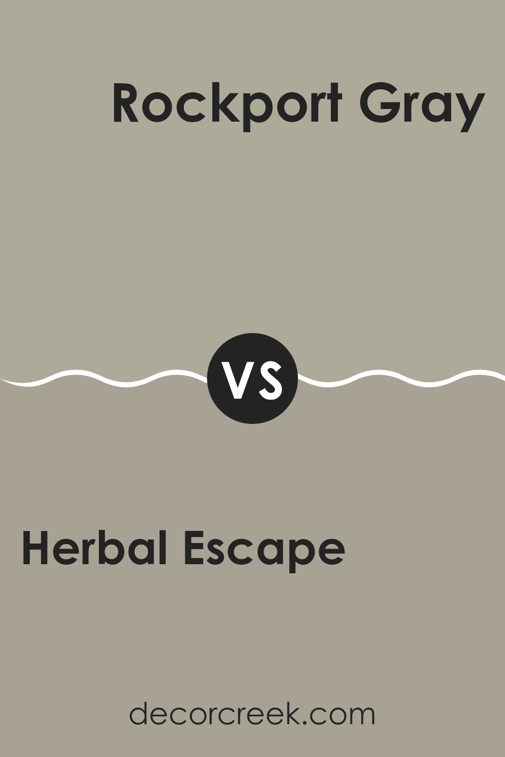
Herbal Escape 1487 by Benjamin Moore vs Rockport Gray HC-105 by Benjamin Moore
Herbal Escape by Benjamin Moore is a soothing, restful green shade that evokes a lush garden or a leafy forest. It carries a fresh, natural character that works beautifully in areas where you want a calming atmosphere, such as bedrooms or living rooms.
In contrast, Rockport Gray by Benjamin Moore is a soft, warm gray with earthy undertones that adds a comforting touch to any setting. It’s subtle yet engaging, making it an adaptable choice for different decorating styles.
Together, these colors create a harmonious balance. Herbal Escape introduces a refreshing burst of green, while Rockport Gray provides a grounding, inviting foundation or accent. This pairing helps establish a well-balanced and pleasant environment, blending the vitality of nature with the ease of neutral tones for seamless harmony.
You can see recommended paint color below:
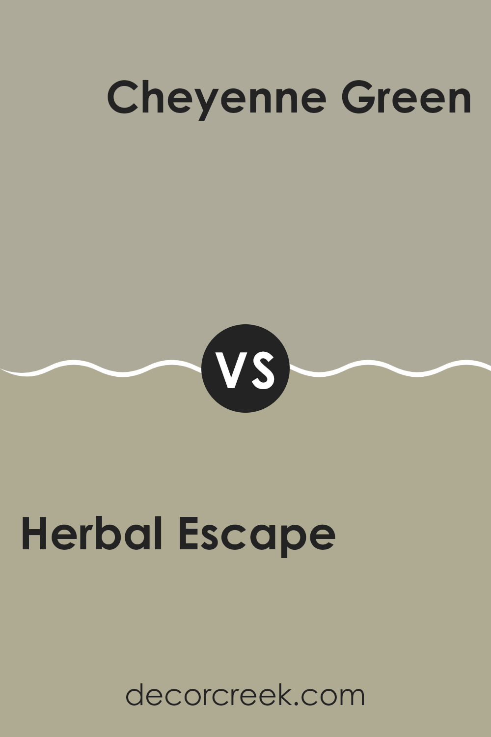
Herbal Escape 1487 by Benjamin Moore vs Cheyenne Green 1502 by Benjamin Moore
The main color, Herbal Escape, and the secondary color, Cheyenne Green, are both from Benjamin Moore and share a natural connection while maintaining distinct differences. Herbal Escape features a gentle, light green tone that feels fresh and effortlessly brightens a room. This shade is perfect for creating a calm, soothing atmosphere, making it ideal for areas meant for relaxation, such as bedrooms or bathrooms.
Cheyenne Green, in contrast, carries a deeper, more muted green hue with subtle gray undertones, giving it a grounded and cozy character. This color works beautifully in areas designed for a more composed yet welcoming ambiance, like living rooms or studies.
Both shades draw inspiration from the natural world, but Herbal Escape leans toward a lighter, airier mood, while Cheyenne Green embodies a more earthy and enveloping presence. The decision between the two ultimately depends on the desired feeling and aesthetic for the area.
You can see recommended paint color below:
- 1502 Cheyenne Green
Herbal Escape 1487 by Benjamin Moore vs Fieldstone 1558 by Benjamin Moore
Herbal Escape and Fieldstone, both by Benjamin Moore, are subtle and calming hues, yet they bring distinct moods to an area. Herbal Escape is a gentle green with a soft vibrancy that evokes freshness and nature, ideal for creating a light and open feeling in a room. It’s the kind of shade that quietly enlivens an area without overpowering it, making it perfect for a cozy corner or a bedroom that needs a touch of calm.
Fieldstone, on the other hand, is a neutral gray that leans slightly toward taupe. This color is highly adaptable and fits effortlessly into various settings, offering an understated backdrop that complements multiple décor styles. It’s an excellent option for those seeking a shade that supports a range of palettes without drawing too much attention.
Overall, while both colors encourage a peaceful atmosphere, Herbal Escape brings a whisper of freshness, whereas Fieldstone provides a steady, quiet foundation.
You can see recommended paint color below:
- 1558 Fieldstone

Herbal Escape 1487 by Benjamin Moore vs Jockey Hollow Gray HC-108 by Benjamin Moore
Herbal Escape and Jockey Hollow Gray are two distinct colors by Benjamin Moore, each bringing its own character to an area. Herbal Escape is a fresh, soft green that introduces a sense of calm and natural beauty to any room. It feels light and open, perfect for creating a relaxed and refreshing atmosphere.
Jockey Hollow Gray, in contrast, is a deeper, muted gray with subtle green undertones. This shade provides a grounded, cozy quality, ideal for areas where you want warmth and comfort without heaviness.
Both colors are adaptable and work beautifully in various settings, from bedrooms to living areas. While Herbal Escape adds a breezy, uplifting touch, Jockey Hollow Gray offers a comforting, enveloping effect. They can be paired with complementary hues or used individually to set a distinct mood. Whether you prefer something bright and rejuvenating or calm and understated, these shades present elegant and balanced options.
You can see recommended paint color below:
- HC-108 Jockey Hollow Gray

After reading about the 1487 Herbal Escape paint by Benjamin Moore, I feel it could be a wonderful choice for anyone wanting to give their room a fresh, natural look. This shade of green is soft and evokes the feeling of being surrounded by nature, which is calming.
Whether you’re painting a bedroom, a living area, or even a small corner of your home, this color can bring a cheerful and peaceful atmosphere to your walls. Herbal Escape isn’t just an attractive color—it also complements many decorating styles and furniture tones.
This makes it easy to incorporate without needing to change other elements in your room. It’s balanced—not too bright or too dark—helping the area feel light and open. If you’re considering introducing a new shade into your home, or you’d like a room to capture the feeling of a tranquil green garden, this could be an excellent choice.
Overall, adding 1487 Herbal Escape may make your room feel more inviting and enjoyable to spend time in.
Ever wished paint sampling was as easy as sticking a sticker? Guess what? Now it is! Discover Samplize's unique Peel & Stick samples.
Get paint samples

