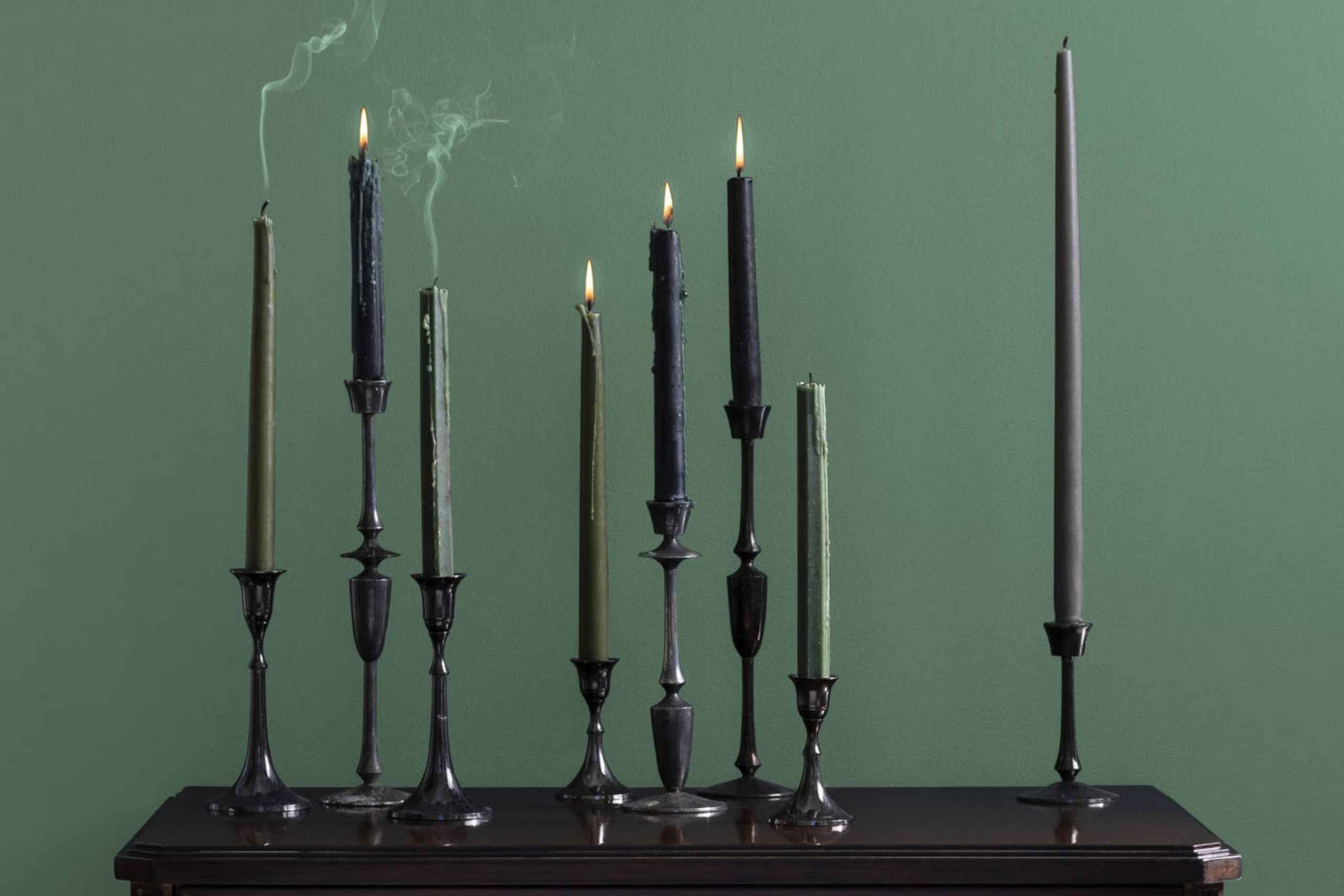
As a lover of peaceful and soothing rooms, finding the perfect green paint that isn’t intense or overly muted can be quite the challenge. During my search, I came across HC-130 Webster Green by Benjamin Moore. It’s a shade that walks the line beautifully between invigorating and calming, making it an excellent choice for anyone looking to refresh their home with a nature-inspired vibe.
This adaptable color is deep enough to make a statement on its own, yet it remains incredibly flexible when paired with other hues. It works well in a variety of settings, from the living room to the bedroom, subtly shifting its tone depending on the lighting. The balance it strikes is unique, giving enough color to enrich the room without overpowering it.
Whether you’re painting an accent wall or considering it for the entire exterior of your home, Webster Green maintains a sense of balance that’s hard to find in more vibrant greens.
Choosing this color has allowed me to create a room that feels both refreshing and refined. If you’re looking for a green that’s both dynamic and down-to-earth, HC-130 Webster Green might be the hue for you.
What Color Is Webster Green HC-130 by Benjamin Moore?
Webster Green HC-130 by Benjamin Moore is a flexible shade of green that blends a classic feel with a modern touch. This color is a deep, rich green that can add a lush, organic vibe to any room. It stands out for its ability to act as both a bold statement and a subtle backdrop, depending on the lighting and surrounding decor.
Webster Green works well in a variety of interior styles, particularly in traditional, rustic, and contemporary settings. In a traditional room, it pairs beautifully with rich woods and antique furnishings, enhancing the enduring look of the area.
In rustic interiors, it complements natural materials like stone and unfinished wood, echoing the colors found in nature. For contemporary rooms, this green can be matched with sleek metals and glass accents, providing a pop of color that’s neither intense nor dull.
The color goes well with a range of materials and textures. It looks stunning against natural wood, enhancing its warm tones. Textiles like velvet or silk in lighter or contrasting hues can also stand out against Webster Green, providing a luxurious touch to the decor.
Metals, whether brushed or polished, add a striking contrast, making the green appear even richer. For a cohesive look, pairing it with creamy whites or soft beige tones can soften the overall effect, making the room feel inviting and comfortable.

Is Webster Green HC-130 by Benjamin Moore Warm or Cool color?
Benjamin Moore’s Webster Green HC-130 is a unique and adaptable paint color for home interiors and exteriors. Its rich green hue brings a touch of nature indoors, creating a cozy and welcoming atmosphere.
This color works well in various rooms, including living rooms, bedrooms, and even kitchens, offering a calming backdrop that complements both modern and traditional decor. Webster Green HC-130 pairs beautifully with natural materials like wood and stone, enhancing their organic qualities.
It’s also a great choice for exterior use, blending seamlessly with outdoor environments. Whether applied as a main wall color or as an accent, this shade is effective in adding a fresh and lively touch to any area without overpowering the room. Additionally, it coordinates well with light and dark neutrals, adding depth and interest to the home’s overall aesthetic.
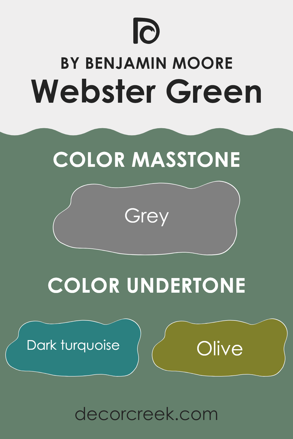
Undertones of Webster Green HC-130 by Benjamin Moore
Webster Green HC-130 by Benjamin Moore is a complex color with a varied palette of undertones that greatly affect how it appears in different settings. The color has undertones that range from dark turquoise to fuchsia, giving it a unique flexibility that can blend well in various interior designs.
Undertones are subtle colors that lie beneath the surface of the primary color, influencing its overall hue and how it reacts to light. For example, in low light, Webster Green might appear darker, emphasizing shades like dark green or navy. In brighter light, lighter undertones such as mint or pale yellow might become more prominent, giving the color a fresher look.
When applied to interior walls, the undertones of Webster Green can shift the mood of the room. Darker undertones like brown or dark grey can make an area feel cozy and grounded, while livelier undertones like mint or turquoise can add a refreshing splash of color that brightens a room. Similarly, the presence of red or orange undertones can add warmth to an area, making it feel more welcoming.
Therefore, when choosing Webster Green for your walls, consider the room’s lighting and the desired atmosphere. The varied undertones can subtly alter the perception of the room, either enhancing brightness and airiness or providing depth and warmth, depending on what you wish to achieve. Understanding and using these undertones can help you create the desired effect in your decorating project.
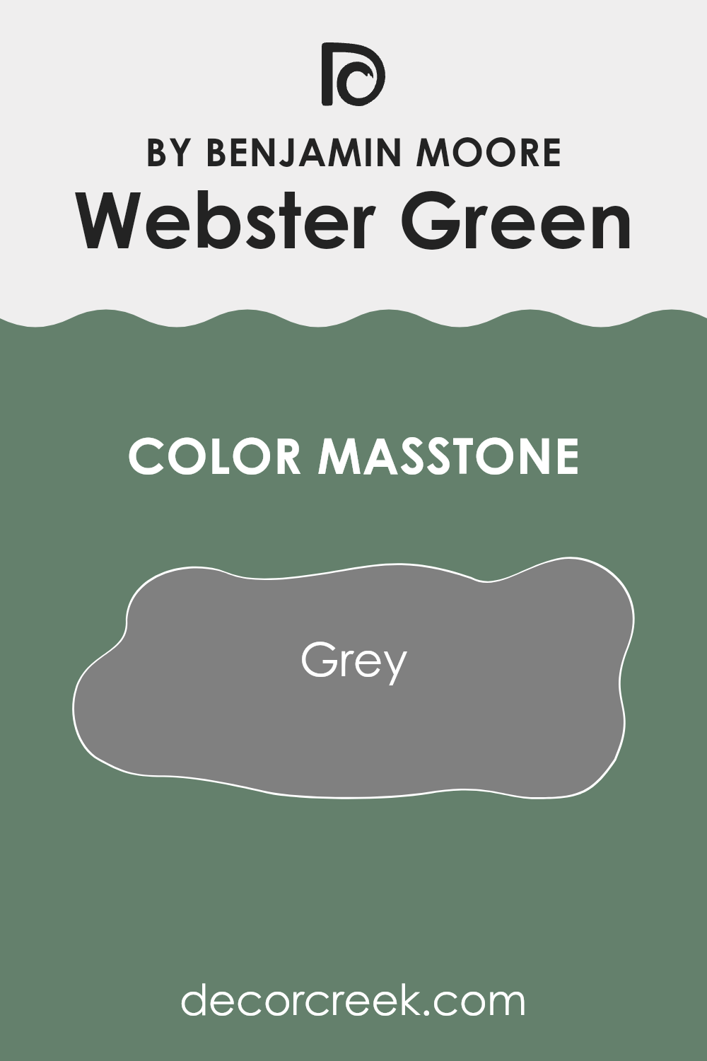
What is the Masstone of the Webster Green HC-130 by Benjamin Moore?
Webster Green HC-130 by Benjamin Moore is a unique shade of grey that carries a neutral yet impactful presence. The masstone of this color, which is exactly grey (#808080), makes it adaptable and easy to use in various home settings. This shade can complement both modern and traditional decors with its balanced tone.
In a living room or a bedroom, Webster Green adds a subtle depth to the walls without overpowering the room. Its neutrality means it pairs well with both bright accents and subdued hues, allowing homeowners to mix and match their furniture and decor easily. For example, against this grey backdrop, both a bright red sofa or a soft beige rug would look fitting.
Moreover, its neutrality helps in creating a calm and inviting atmosphere, which is perfect for rooms where relaxation is key. In a kitchen or a bathroom, this color can contribute to a clean and uncluttered look, reinforcing a sense of cleanliness and order. Overall, Webster Green is a practical choice for anyone looking to achieve a stylish yet understated home environment.
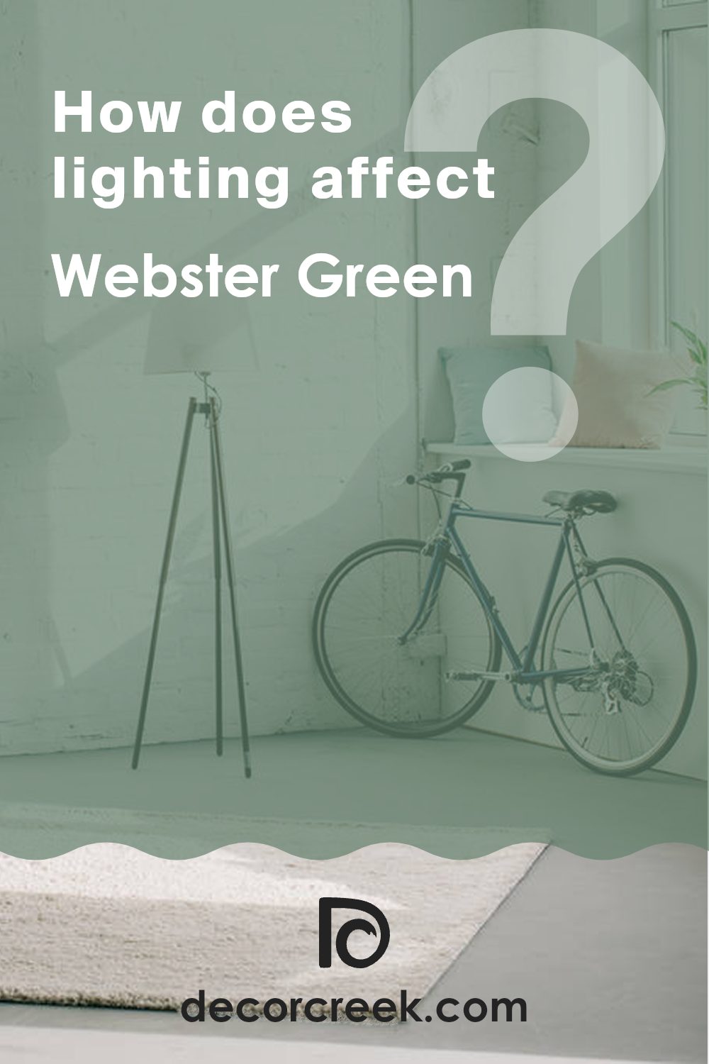
How Does Lighting Affect Webster Green HC-130 by Benjamin Moore?
Lighting plays a huge role in how we perceive colors around us. The way a color appears can change dramatically depending on the type of light it’s under. This can mean the difference between a color looking vibrant and dull, warm or cool.
Take the color HC-130 (Webster Green) by Benjamin Moore, for example. This shade can look different when placed in natural versus artificial lighting. Under artificial light, such as LED or fluorescent lights, HC-130 tends to appear a bit darker and can have hints of gray. This kind of light tends to flatten the depth of the color, making it less lively.
In contrast, when HC-130 is exposed to natural light, its true character shines through. The color looks fresher and more dynamic. Natural daylight often enhances green, making it appear vibrant and lively. This greener, more vivid appearance is due to the broader spectrum of light from the sun, compared to the limited spectrum from artificial lighting.
The orientation of a room also impacts how HC-130 looks. In north-facing rooms, which usually get cooler, softer light, this color might look more muted and slightly bluish. This can make the area feel calm and cozy. In south-facing rooms, where light is warmer and more intense, HC-130 will look brighter and more lively, bringing a fresh atmosphere to the room.
In east-facing rooms, HC-130 will be illuminated with warm, gentle light in the morning, making the color look soft and welcoming, while turning into a cooler tone in the afternoon and evening as the sunlight fades. West-facing rooms, however, get the afternoon and evening light, which is warmer. Hence, the color in these rooms will feel richer and more intense towards the end of the day.
Overall, the perception of HC-130 can vary significantly based on the lighting and the room orientation, impacting the overall mood and feel of an area.
What is the LRV of Webster Green HC-130 by Benjamin Moore?
LRV stands for Light Reflectance Value, which measures the amount of visible and usable light that a paint color reflects, on a scale from 0 (absolute black, absorbing all light) to 100 (perfect white, reflecting all light).
This value helps in determining how light or dark a color will look once applied to the walls. A higher LRV means the color will look lighter and can make a room feel more open and bright, as it reflects more light back into the room. Conversely, colors with a lower LRV absorb more light and tend to make a room appear smaller and cozier.
The LRV of the color Webster Green, being 20.2, indicates that it is a darker shade. When used on walls, this particular green will not reflect much light. This means it can make an area appear more enclosed and intimate, which could be perfect for creating a cozy and snug atmosphere in rooms like bedrooms or living rooms.
However, the low LRV also suggests that one might need to use additional lighting in the room to prevent it from feeling too dark or cramped, especially in areas where natural light is limited. This color, with its dark tones, can especially benefit from pairing with lighter colored decor or furniture to balance the overall feel of the room.

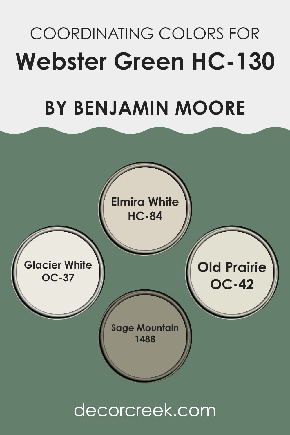
Coordinating Colors of Webster Green HC-130 by Benjamin Moore
Coordinating colors are hues that complement each other harmoniously within color schemes to create a visually appealing look. These carefully selected shades work together to enhance the ambiance of a room, ensuring that the colors do not clash but instead enhance the overall theme and mood of the environment. Coordinating colors are often used to achieve a balanced and cohesive interior decor style, making rooms feel more unified and thoughtfully designed.
For Webster Green HC-130 by Benjamin Moore, a set of coordinating colors includes Elmira White HC-84, Glacier White OC-37, Old Prairie OC-42, and Sage Mountain 1488. Elmira White is a soft, warm white that provides a gentle contrast to deeper tones, making it ideal for trim or ceilings to add a light, airy quality to the room.
Glacier White is a crisp, clean white that offers a fresh, bright look that can help to open up an area and provide a sharp contrast to darker colors. Old Prairie is a muted, earthy beige that brings warmth and a natural feel to any room, perfect for creating a cozy and inviting atmosphere. Lastly, Sage Mountain is a rich gray-green that complements the lush tones of Webster Green, adding depth and interest to the room with its earthy, calming hue. Together, these coordinating colors work to create a cohesive and appealing environment.
You can see recommended paint colors below:
- HC-84 Elmira White
- OC-37 Glacier White
- OC-42 Old Prairie
- 1488 Sage Mountain
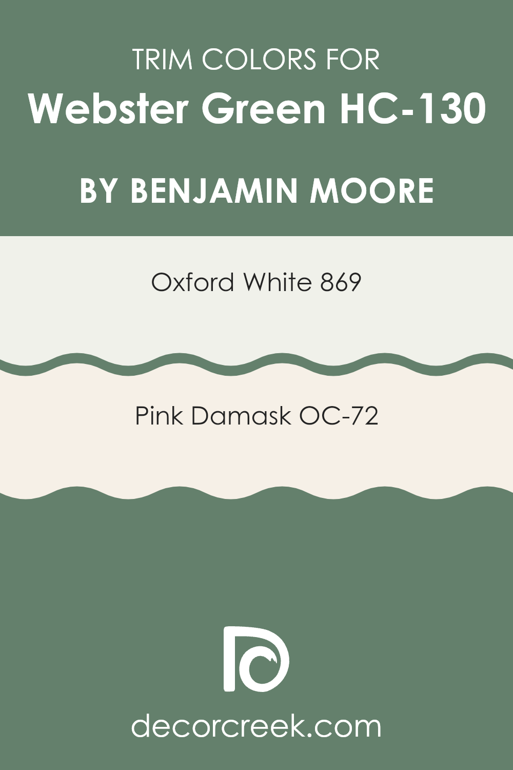
What are the Trim colors of Webster Green HC-130 by Benjamin Moore?
Trim colors are specific shades used to highlight or complement the main color applied on walls, ceilings, doors, and other surfaces. They play a vital role in enhancing architectural details such as moldings, door frames, and window sills, creating a more polished and finished look.
For Webster Green by Benjamin Moore, using colors like Oxford White and Pink Damask as trim can add a subtle contrast that helps define the areas beautifully without overpowering the primary hue. These trim colors help in balancing the overall aesthetic of a room, ensuring that the green does not dominate but rather feels grounded and pleasing to the eye.
Oxford White 869 is a crisp white color that offers a clean and fresh look, making it ideal for trim that needs to stand out against deeper tones like Webster Green. It reflects light beautifully, thus can make a room feel brighter and more open. On the other hand, OC-72 Pink Damask is a gentle pink that adds a hint of warmth and softness to the surroundings. When used as a trim color, it provides a subtle contrast, enriching the environment with a touch of soft color that is easy on the eyes and creates a welcoming atmosphere.
You can see recommended paint colors below:
- 869 Oxford White
- OC-72 Pink Damask
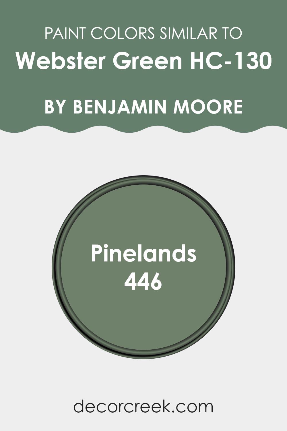
Colors Similar to Webster Green HC-130 by Benjamin Moore
Selecting colors that are similar can significantly impact the aesthetic and feel of a room. When colors like Webster Green HC-130 and its similar shade, 446 – Pinelands, are used together, they create a harmonious and cohesive look that is pleasing to the eye.
This similarity in hue allows for a subtle variation that can add depth and texture to the décor without causing a stark contrast, making the environment feel unified and consistent. Such color schemes are often used to enhance the size of a room, making small areas appear larger and more open, as the colors flow seamlessly from one area to another.
Webster Green HC-130 is a gentle, muted green that evokes a sense of calm and comfort. It’s perfect for creating a restful environment because it’s soft enough to blend well with natural elements and other neutral tones. On the other hand, 446 – Pinelands is a slightly deeper shade that carries a touch more warmth.
While closely related to Webster Green, Pinelands offers a subtle shift that can be used for accent walls or for coordinating furniture pieces, providing just enough distinction to design a layered, yet cohesive interior. Both colors support a natural aesthetic and work beautifully in rooms intended for relaxation and ease.
You can see recommended paint color below:
- 446 Pinelands
How to Use Webster Green HC-130 by Benjamin Moore In Your Home?
Webster Green HC-130 by Benjamin Moore is an adaptable paint color that works beautifully in many areas of the home. Its rich, deep green tone adds a natural and calm feeling to any room. You can use it in the living room to create a cozy and inviting area for your family and friends. It also looks great in bedrooms, providing a relaxing backdrop that promotes rest and comfort.
For those looking to update their kitchen or dining area, Webster Green pairs well with wood furniture and accents, highlighting the warmth of natural materials. Additionally, this color makes bathroom areas feel fresh and clean when combined with white fixtures and linens.
Lastly, if you want to add a touch of personality to your entrance or hallway, painting these areas with Webster Green can make a strong, welcoming statement right at your front door. Overall, Webster Green HC-130 is an excellent choice for anyone looking to introduce a stable and comforting green into their home’s color scheme.
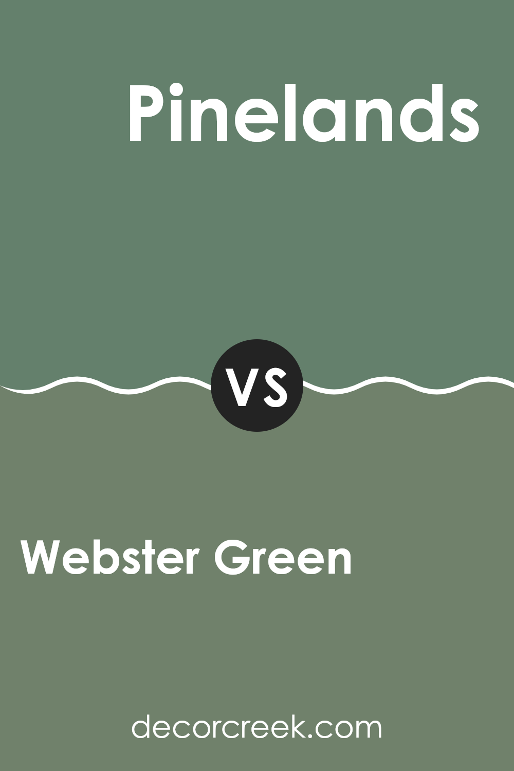
Webster Green HC-130 by Benjamin Moore vs Pinelands 446 by Benjamin Moore
Webster Green and Pinelands by Benjamin Moore are two distinct shades that can set different moods in a room. Webster Green is a soothing, deep green that creates a cozy, welcoming feeling in an area. It’s a robust color that pairs well with natural materials like wood and stone, making it ideal for rooms where you want to relax and feel at ease.
On the other hand, Pinelands is lighter and has more of a calm, muted tone compared to the depth of Webster Green. It’s an adaptable color that works well in many areas of a home, providing a gentle touch of nature that’s both fresh and calming. This color can help brighten a room subtly without making it feel too intense.
Both colors celebrate the beauty of nature but offer different depths and moods. Choosing between them would depend on the type of atmosphere you’re hoping to create, whether it’s the strong, grounding presence of Webster Green or the light, airy feel of Pinelands.
You can see recommended paint color below:
- 446 Pinelands
After reading about HC-130 Webster Green by Benjamin Moore, I have learned quite a bit about this unique paint color. It’s a green shade, but it’s not just any green. It has a fresh and calm feel that reminds me of a quiet day in the garden. It seems like a great choice if someone wants their room to feel like a peaceful, comfy place to read or relax.
This paint color appears to work well in many different rooms, whether it’s a bedroom, a living room, or even a bathroom. It can make large rooms feel cozy but not too small, and it can give small areas a lively touch without making them feel tight.
Using Webster Green could be a smart move for someone who wants to refresh their home without making it look too bright or flashy. It’s kind of like picking a great background that lets all your favorite furniture and decorations stand out without clashing.
So, if anyone is thinking about giving their room a new look, Webster Green might just do the trick. It’s peaceful, pretty, and simple enough to fit in almost anywhere. Plus, Benjamin Moore is known for making quality paint, so it’s likely a choice you won’t regret.

Ever wished paint sampling was as easy as sticking a sticker? Guess what? Now it is! Discover Samplize's unique Peel & Stick samples.
Get paint samples

