Imagine you’re looking to refresh a room in your home with a new color that feels calm and serene. You might want to consider 1488 Sage Mountain by Benjamin Moore. This particular paint color offers a subtle, muted green that reminds you of quiet, mist-covered hills early in the morning.
It’s a versatile shade that works well in many spaces, whether you’re painting a bustling kitchen or a peaceful bedroom.
As someone who enjoys updating their living space, you’ll find that 1488 Sage Mountain provides a comforting backdrop that complements various decor styles, from modern minimalist to rustic farmhouse. This color’s mild, soothing quality can help you create a more relaxed environment, ideal for unwinding after a long day.
Using 1488 Sage Mountain could be your next step in giving a room that fresh, new feel you’ve been wanting. It’s not just a change of color; it’s about enhancing your overall living experience, making your home a more delightful place to spend time in.
Whether you like entertaining friends or just need a cozy sanctuary for yourself, this color might just be what you’re looking for.
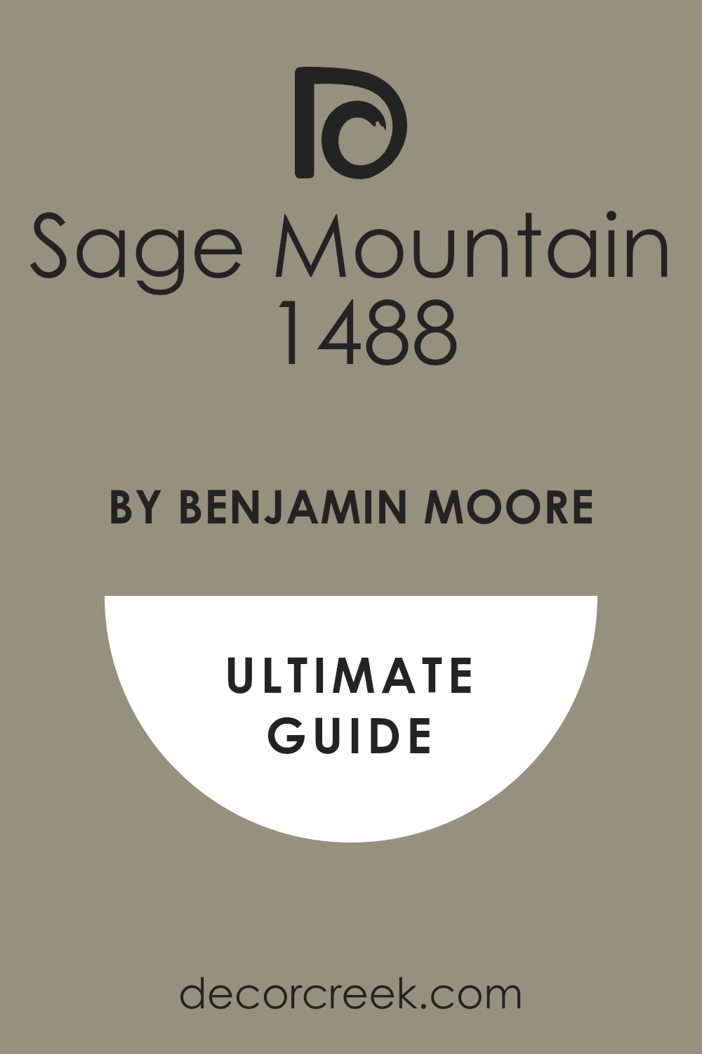
What Color Is Sage Mountain 1488 by Benjamin Moore?
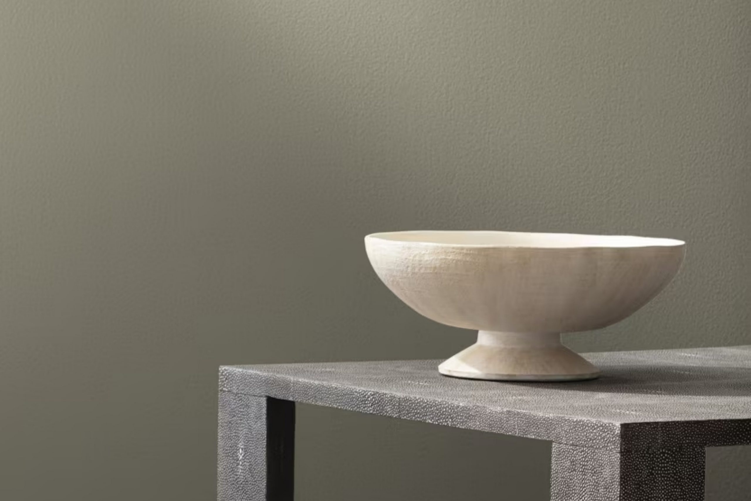
Sage Mountain by Benjamin Moore is a subtle and warm gray-green color that brings a sense of calm and understated elegance to any room. This versatile hue is perfect for those looking to add a touch of nature-inspired softness to their living spaces without overwhelming the senses. Sage Mountain works exceptionally well in interior styles that favor a natural, grounded aesthetic, such as rustic, Scandinavian, and modern farmhouse designs.
The color pairs beautifully with natural materials like wood, which complements its earthy undertones, enhancing the cozy and welcoming feel of a room. Whether it’s light oak furniture, dark walnut pieces, or even reclaimed wood accents, the combination creates a harmonious balance.
Adding textures like linen or wool in neutral shades can also enhance the warmth of Sage Mountain, giving a tactile and visually pleasing experience. For a bit of contrast, incorporating elements like stone, such as a marble coffee table or slate tiles, can introduce a refreshing break in texture while still aligning with the overall subdued palette.
Overall, Sage Mountain is a fantastic choice for creating a gentle backdrop that supports a variety of textures and materials, suitable for many home spaces wanting a touch of soft, natural color.
Is Sage Mountain 1488 by Benjamin Moore Warm or Cool color?
Sage Mountain by Benjamin Moore is a beautiful green hue that brings a down-to-earth, welcoming feel to any home. This color is versatile and works wonderfully in many areas of the house. For example, in the living room, it can create a cozy and inviting atmosphere. In the kitchen, it adds a fresh vibe that is both warm and modern.
When paired with natural elements like wooden furniture or indoor plants, Sage Mountain enhances the overall appearance of the space, making it feel more connected to nature. This color also pairs well with light colors such as white or beige, which can make a room feel bigger and brighter.
Moreover, Sage Mountain is excellent for bedrooms as it provides a gentle and calming backdrop, promoting a relaxed environment that is crucial for restful sleep. Whether you’re painting a wall or incorporating accents, this color has a flexible charm that can easily adapt to different styles and preferences in your home.
Undertones of Sage Mountain 1488 by Benjamin Moore
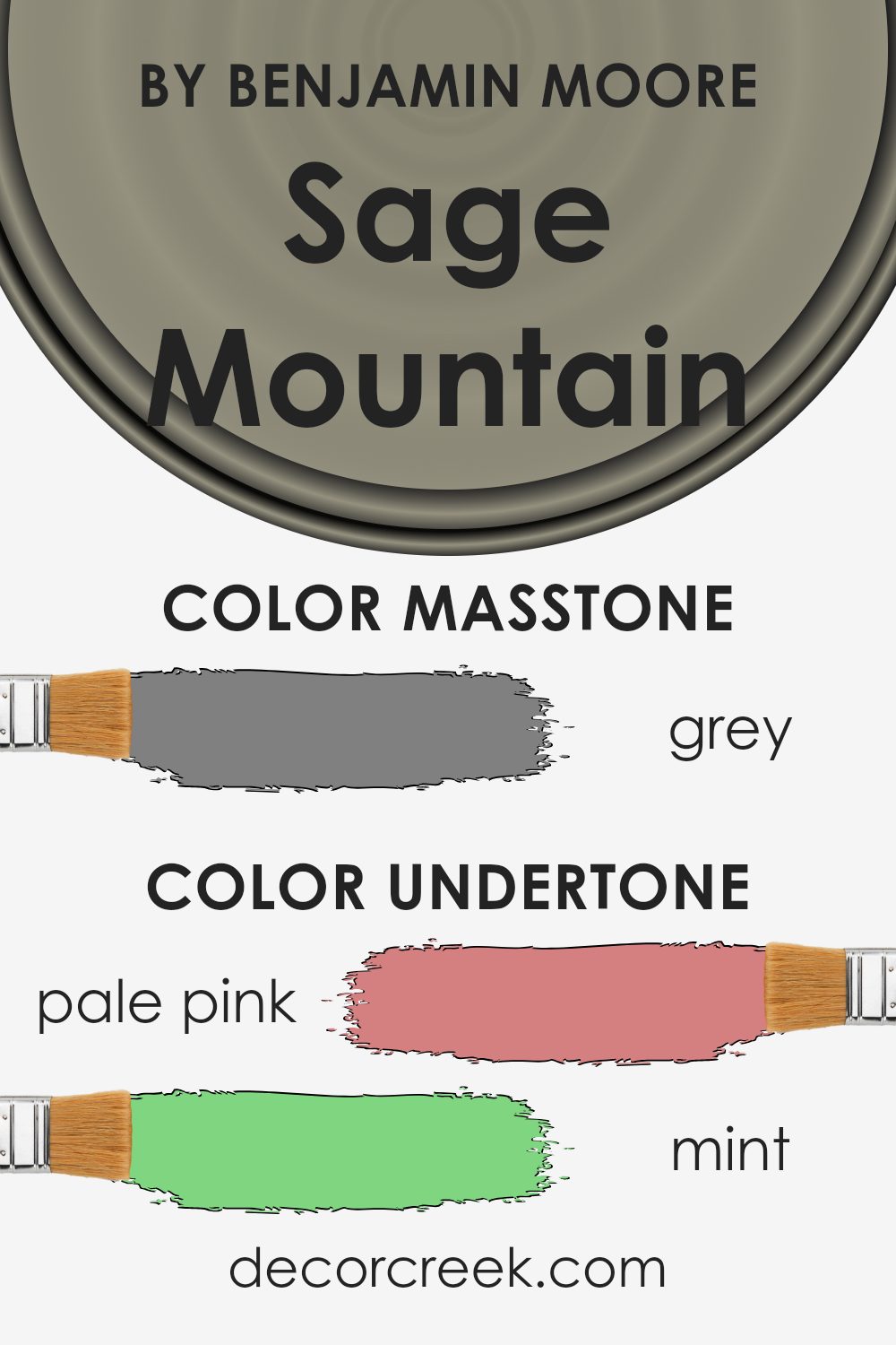
Sage Mountain 1488 by Benjamin Moore is a rich and versatile paint color that can significantly influence the ambiance of any room due to its various undertones. In general, undertones in a paint color are subtle hues that can be noticed under certain lighting conditions, impacting the overall perception of the color on your walls.
For Sage Mountain, these undertones include shades like pale pink, mint, and olive, which add a certain warmth and earthiness to the color, making it adaptable for many spaces.
Pale yellow and light turquoise undertones bring a gentle brightness, softening the appearance of the room, while darker undertones like navy and dark green add depth and complexity. This mix makes Sage Mountain a great choice for rooms that need a balance of warmth and soothing earth tones.
When applied to interior walls, Sage Mountain with its undertones provides a backdrop that can either recede or come forward depending on the lighting and accompanying decor. In natural light, lighter undertones like light blue and light turquoise may become more apparent, giving a fresher look to the space.
In artificial lighting, darker tones like brown and olive might stand out, creating a cozier and more grounded feel.
Thus, the undertones of Sage Mountain can affect your room by interacting with different types of light and furniture colors, offering a dynamic look throughout the day. It’s a color that works well in many settings due to its rich layer of undertones, making it adaptable and appealing for various interior styles.
What is the Masstone of the Sage Mountain 1488 by Benjamin Moore?
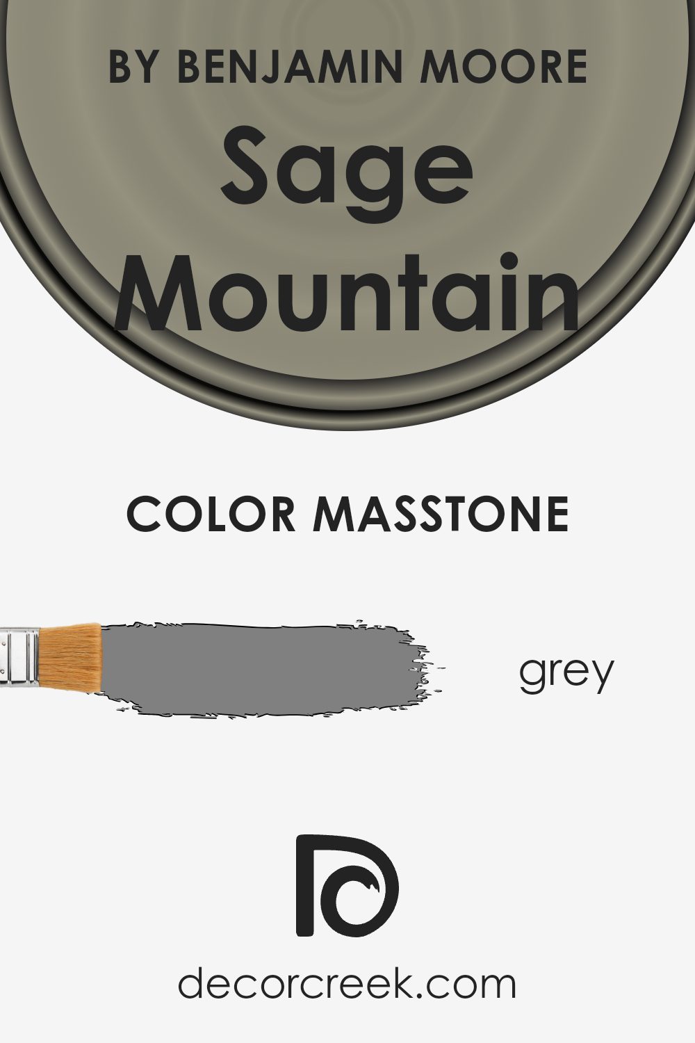
Sage Mountain by Benjamin Moore is a shade of grey that strikes a perfect balance between soft and bold. Its masstone, Grey (#808080), has an even mix of black and white, making it incredibly versatile for home decor. This balanced gray can work well in various lighting conditions, looking slightly different but equally pleasant under both natural and artificial light.
The neutrality of Sage Mountain Grey allows it to blend seamlessly with other colors. Whether your home has a modern feel or a more classic look, this color can fit right in without overpowering other design elements. It’s especially useful in spaces where you want to create a calm, welcoming atmosphere without using colors that are too dark or too light.
In homes, Guru Sage Mountain can be used in living rooms, kitchens, or even bedrooms. It acts as a great background color that can pair well with brighter colors or serve as a standalone hue for a clean, minimalistic look. The balanced nature of this gray makes it a practical choice for many homeowners.
How Does Lighting Affect Sage Mountain 1488 by Benjamin Moore?
Lighting plays a crucial role in how we perceive colors in a room. The way light interacts with paint can change how a color looks, depending on the quality and type of light.
Take, for example, the color Sage Mountain by Benjamin Moore. This is a subtle and earthy green hue that can look quite different under various lighting conditions. In natural light, its true color is most accurately represented, especially in a room that receives a lot of sunlight. The natural brightness makes Sage Mountain appear fresh and lively, bringing out its verdant undertones.
Under artificial light, the perception of Sage Mountain can change dramatically depending on the type of bulbs used. Warm lighting can enhance the green, giving it a more cozy and inviting feel, while cool lighting might make it appear more muted and subdued.
The orientation of a room also affects how Sage Mountain looks. North-facing rooms typically receive less direct sunlight, which can make this color appear more shadowed and grey, losing some of its vibrancy. South-facing rooms, with more abundant light, will display Sage Mountain in its most vibrant, true-to-color form, emphasizing its lush qualities.
East-facing rooms get bright morning light, which can make Sage Mountain look soft and subtle. As the day progresses, the intensity of the color may decrease but will still maintain a gentle presence. West-facing rooms, on the other hand, experience the strongest sunlight in the late afternoon, which can bring out the depth and richness of the Sage Mountain, making it appear more dynamic and striking as the day ends.
In summary, the color Sage Mountain by Benjamin Moore shows versatility but varies significantly depending on the light and room orientation, highlighting its complex nature as a paint choice for interiors.
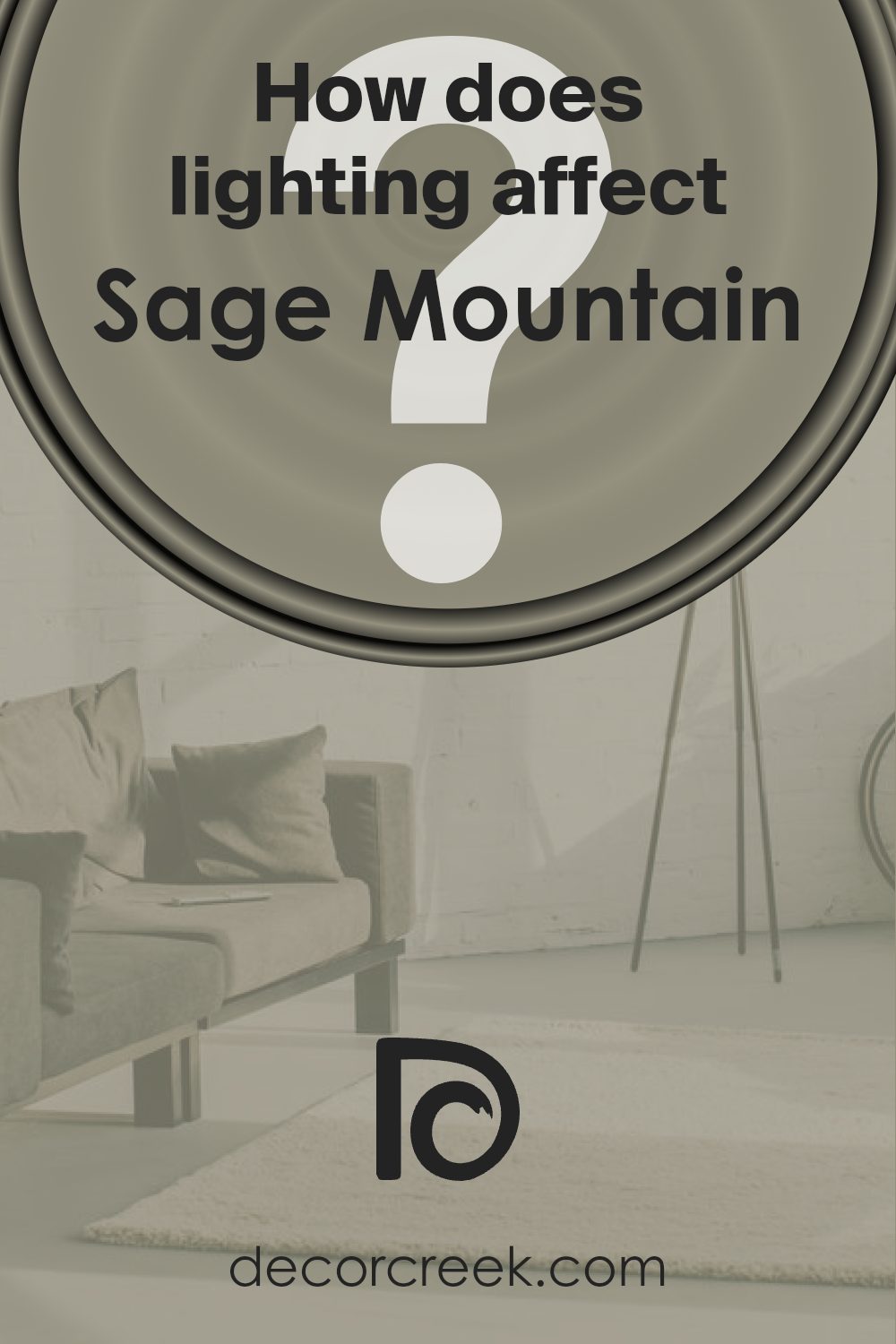
What is the LRV of Sage Mountain 1488 by Benjamin Moore?
LRV stands for Light Reflectance Value, which measures the percentage of light a paint color reflects back into a room. It ranges from 1 to 100, with lower numbers meaning the color absorbs more light and appears darker, while higher numbers mean it reflects more light and looks lighter.
This value is crucial when choosing paint colors because it helps you understand how light or dark a color will look once it’s on your walls. A color with a low LRV can make a room feel cozier and smaller, while a high LRV can make a space feel more open and airy.
The LRV of 28.5 for the color Sage Mountain means it’s on the darker side of the scale, absorbing more light than it reflects. This can influence the atmosphere in a room, making it feel more enclosed and intimate, which might be perfect for creating a cozy living space or bedroom. However, in a small or poorly-lit room, using a color with a low LRV might make the space feel even smaller and darker. It’s important to consider the amount of natural and artificial light a room gets when deciding if this shade is right for your space.
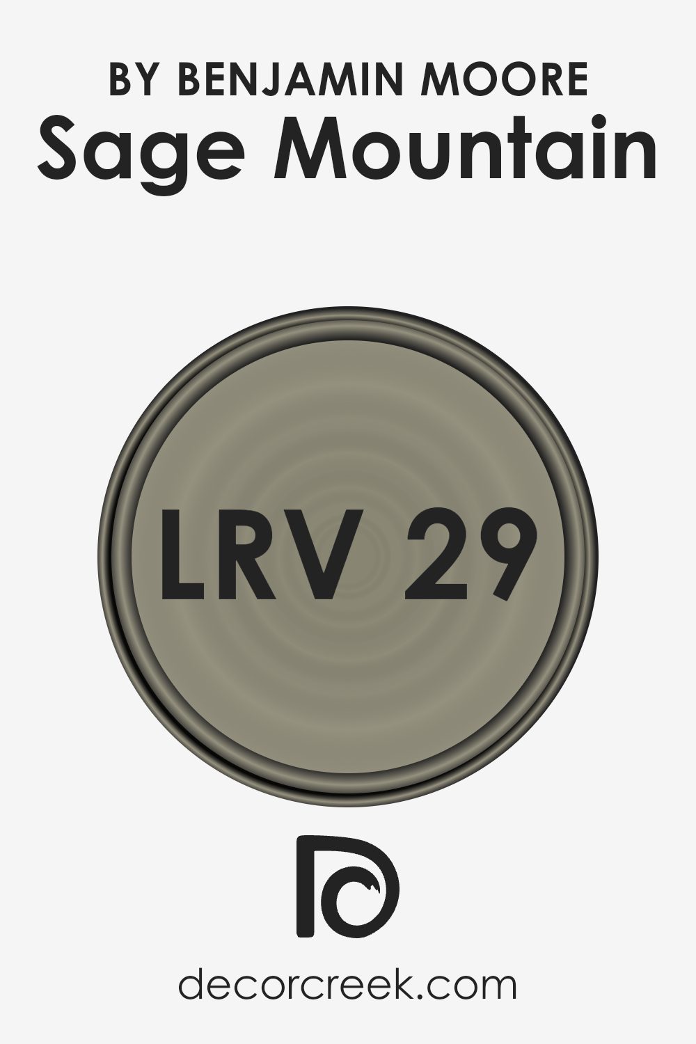
Coordinating Colors of Sage Mountain 1488 by Benjamin Moore
Coordinating colors are complementary shades that harmonize with a main color to create a pleasing aesthetic. For instance, when working with a specific paint like Sage Mountain by Benjamin Moore, selecting the right coordinating colors can enhance the look and feel of your space. These coordinating shades are designed to balance the main color without overshadowing it and can help in achieving a cohesive look throughout different rooms or areas.
Among the coordinating colors for Sage Mountain, Stone House (1039) is a warm and inviting beige that pairs beautifully with the cooler tones of sage, providing a balanced visual warmth. It works well in living areas and bedrooms where a soft, welcoming atmosphere is desired.
Narragansett Green (HC-157), another coordinating shade, offers a deep, rich hue that contrasts effectively with lighter sage, ideal for creating focal points or accent walls. China White (OC-141) is a fresh, clean white that acts as a neutral backdrop, amplifying the depth of Sage Mountain. This shade is perfect for trim, ceilings, and woodwork, giving spaces a crisp, finished look.
Lastly, Feather Down (OC-6) is a soft, creamy off-white that blends smoothly with Sage Mountain, suitable for creating a subtle, cohesive look in rooms without stark contrasts. These coordinating colors each offer a unique way to enhance the ambiance of a room while maintaining harmony with the primary color.You can see recommended paint colors below:
- 1039 Stone House (CHECK A SAMPLE)
- HC-157 Narragansett Green (CHECK A SAMPLE)
- OC-141 China White (CHECK A SAMPLE)
- OC-6 Feather Down
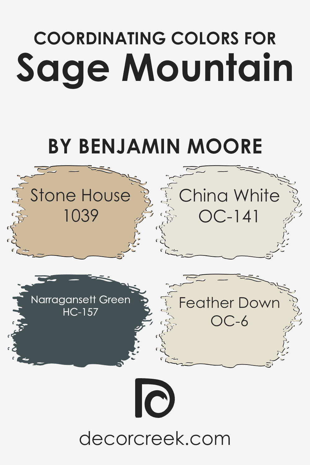
What are the Trim colors of Sage Mountain 1488 by Benjamin Moore?
Trim colors play a crucial role in defining the aesthetics of a room by highlighting architectural details, creating defined lines, and bringing about a polished finish to a space. When paired with a wall color like Sage Mountain by Benjamin Moore, trim colors need to complement the primary hue while adding their own subtle touch to the overall ambiance of the room. Specifically, colors like OC-72 Pink Damask and OC-145 Atrium White are excellent choices for trim, each bringing a unique flare while maintaining harmony with the main color.
Pink Damask OC-72 is a soft, muted pink that provides a gentle contrast against deeper, richer wall colors such as Sage Mountain. Its warm undertones can help in softening the overall look of the room, making the space feel welcoming and cozy.
On the other hand, Atrium White OC-145 is a clean and crisp white that offers a fresh, clear boundary around Sage Mountain’s more subdued tones. Using Atrium White as a trim color ensures that the edges and corners of the room are neatly defined, enhancing the room’s sense of space and light.
Both these colors support and accentuate the beauty of the main wall color, completing the look of the room attractively and effectively.
You can see recommended paint colors below:
- OC-72 Pink Damask
- OC-145 Atrium White (CHECK A SAMPLE)
Colors Similar to Sage Mountain 1488 by Benjamin Moore
Similar colors work well together because they create a harmonious blend, allowing the eyes to move smoothly from one shade to the next without any jarring transitions. This is quite handy in interior design where the goal is often to create a cohesive and subtle aesthetic.
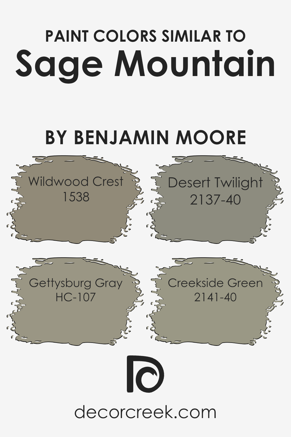
Using shades like Wildwood Crest, Gettysburg Gray, Desert Twilight, and Creekside Green alongside Sage Mountain not only enhances consistency but also adds depth to the decor. These colors have a natural fluidity that complements each other, ensuring that no single color overshadows another. Instead, they support and enrich the visual experience.
Sage Mountain acts as a gentle and muted green that can serve as a calming backdrop in any space. Wildwood Crest is similar but lighter, offering a fresh and airy feel perfect for creating a relaxed environment.
Gettysburg Gray introduces a sturdier touch with its earthy, gray tones, grounding the lighter greens without overpowering them.
Desert Twilight steps in as a deeper, olive-influenced hue that adds an element of warmth, while Creekside Green closes the loop with its slightly brighter and more vibrant character that pulls the collection together, making the space feel inviting and cohesive.
These colors collectively provide a balanced palette that can beautifully enhance living spaces without overwhelming the senses.
You can see recommended paint colors below:
- 1538 Wildwood Crest (CHECK A SAMPLE)
- HC-107 Gettysburg Gray (CHECK A SAMPLE)
- 2137-40 Desert Twilight (CHECK A SAMPLE)
- 2141-40 Creekside Green (CHECK A SAMPLE)
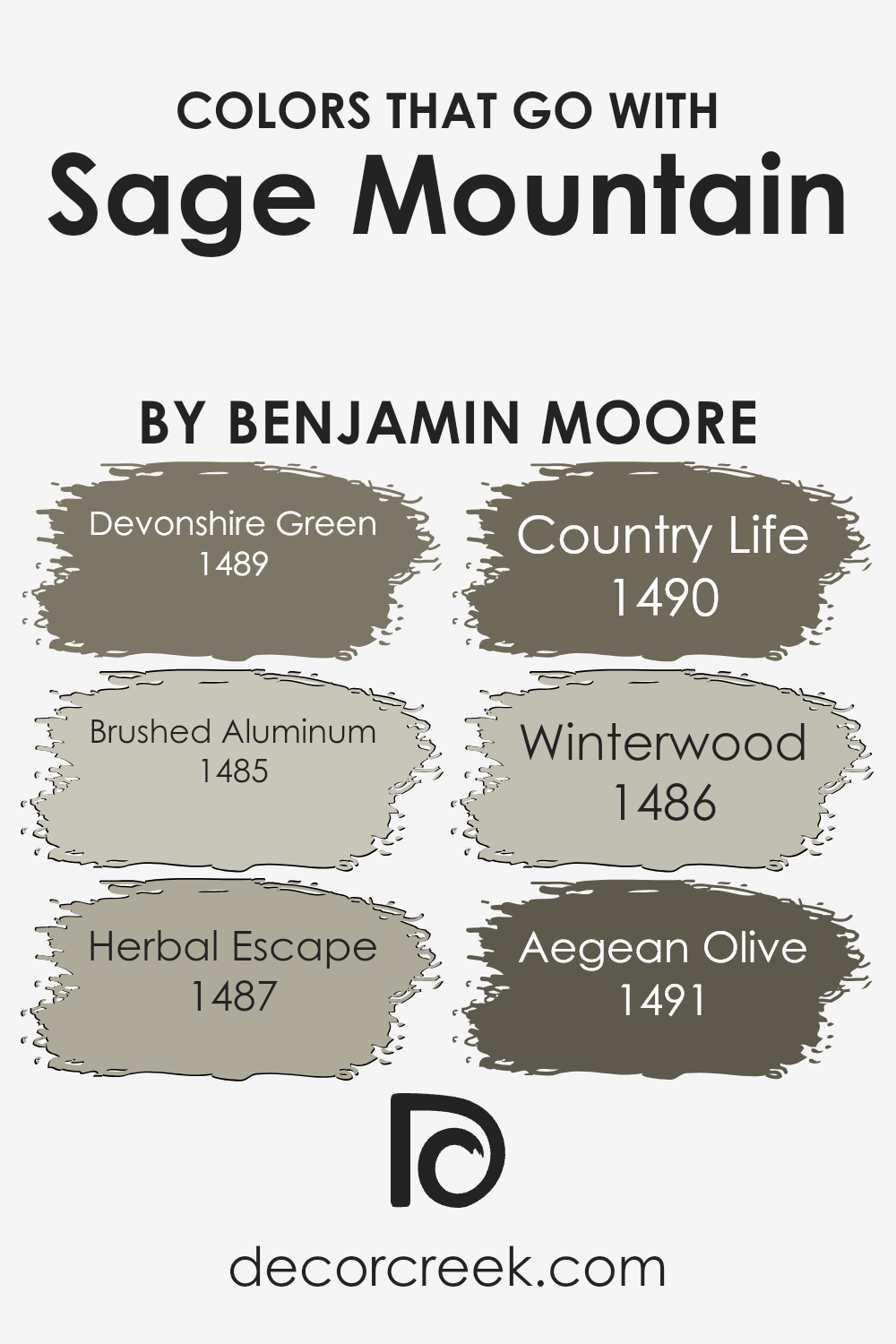
Colors that Go With Sage Mountain 1488 by Benjamin Moore
Choosing the right colors to complement Sage Mountain 1488 by Benjamin Moore is crucial for creating a harmonious and appealing space. When paired thoughtfully, compatible colors can enhance the beauty and essence of a main color.
For instance, Devonshire Green 1489 provides a subtle contrast to Sage Mountain, with its slightly deeper green tone that echoes an earthy and natural vibe.
This complements the underlying tones in Sage Mountain, providing a grounded and cohesive look. Brushed Aluminum 1485, on the other hand, offers a light, almost silvery gray that can brighten spaces and add a fresh, clean look when used alongside the deeper green.
Herbal Escape 1487 adds a slightly more vibrant and lively green, injecting a bit of energy into the palette without overwhelming the soothing nature of Sage Mountain. It’s a perfect choice to create visual interest in a room that needs a touch of vitality.
Country Life 1490, meanwhile, is a creamier, subdued hue that works beautifully to soften the overall appearance, making the environment feel welcoming and cozy. Winterwood 1486 offers a muted, grayish-green tone that complements the cooler aspects of Sage Mountain, ideal for those looking for a subtle yet layered aesthetic.
Lastly, Aegean Olive 1491 brings a deep, rich olive green to the table, adding depth and intensity to the color scheme and making the space feel more grounded and cohesive.
You can see recommended paint colors below:
- 1489 Devonshire Green (CHECK A SAMPLE)
- 1485 Brushed Aluminum (CHECK A SAMPLE)
- 1487 Herbal Escape (CHECK A SAMPLE)
- 1490 Country Life (CHECK A SAMPLE)
- 1486 Winterwood (CHECK A SAMPLE)
- 1491 Aegean Olive (CHECK A SAMPLE)
Sage Mountain 1488 by Benjamin Moore Color Palette
Sage Mountain offers soft, earthy green warmth that feels calm, grounded, and naturally inviting. This palette expands that soothing quality with gentle whites, warm neutrals, and deep accents that bring shape and depth.
White Dove, Cloud White, and Simply White brighten the palette with clean, soft light, enhancing Sage Mountain’s natural warmth.
Kingsport Gray adds a warm taupe note that blends beautifully with the earthy green base, while Revere Pewter adds gentle grounding that helps the palette feel complete and balanced.
Coastal Fog deepens the palette with warm gray-beige tones that add texture and richness.
Hale Navy introduces a cool, strong anchor that enhances contrast while blending smoothly with the green undertone.
Together, these shades create a warm, grounded palette perfect for relaxed living spaces, cozy bedrooms, and natural-inspired interiors. The palette feels steady, welcoming, and full of subtle depth.

How to Use Sage Mountain 1488 by Benjamin Moore In Your Home?
Sage Mountain 1488 by Benjamin Moore is a lovely, muted green shade that can add a subtle touch of nature to any space in your home. It’s perfect for creating a cozy and inviting atmosphere in living rooms or bedrooms where you want a gentle splash of color that isn’t too overpowering. The subdued green hue works well with natural materials like wood or stone, enhancing the earthy feel of a room.
You can also use Sage Mountain 1488 in your kitchen or bathroom for a refreshing change from the usual neutrals. It pairs beautifully with white cabinets or fixtures, offering a soft contrast that is pleasing to the eye. For those looking to add some color without going too bold, this shade can also work nicely on an accent wall.
It provides a subtle backdrop that blends well with different decor styles, whether you want a modern look or something more rustic. This versatile paint color from Benjamin Moore can help you create a relaxed and welcoming space in your home.
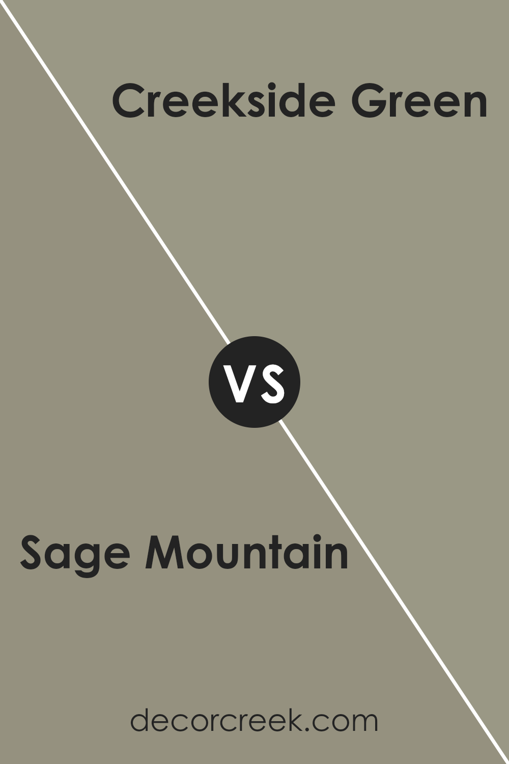
Sage Mountain 1488 by Benjamin Moore vs Creekside Green 2141-40 by Benjamin Moore
Sage Mountain and Creekside Green are both green hues by Benjamin Moore, but they present different vibes. Sage Mountain is a softer, more muted green, giving a gentle and calming feel to any space. It’s very versatile, working well in areas like living rooms and bedrooms where you want a peaceful atmosphere.
On the other hand, Creekside Green is more vivid and has a fresher appeal. Its brightness leans towards a natural outdoor feel, making it great for spaces like kitchens or sunrooms where you want to bring in a touch of nature.
Although both colors bring green to the forefront, Sage Mountain is subtler, while Creekside Green stands out more boldly. So, depending on the energy and mood you want to create in your room, you could prefer one over the other.
You can see recommended paint color below:
- 2141-40 Creekside Green (CHECK A SAMPLE)
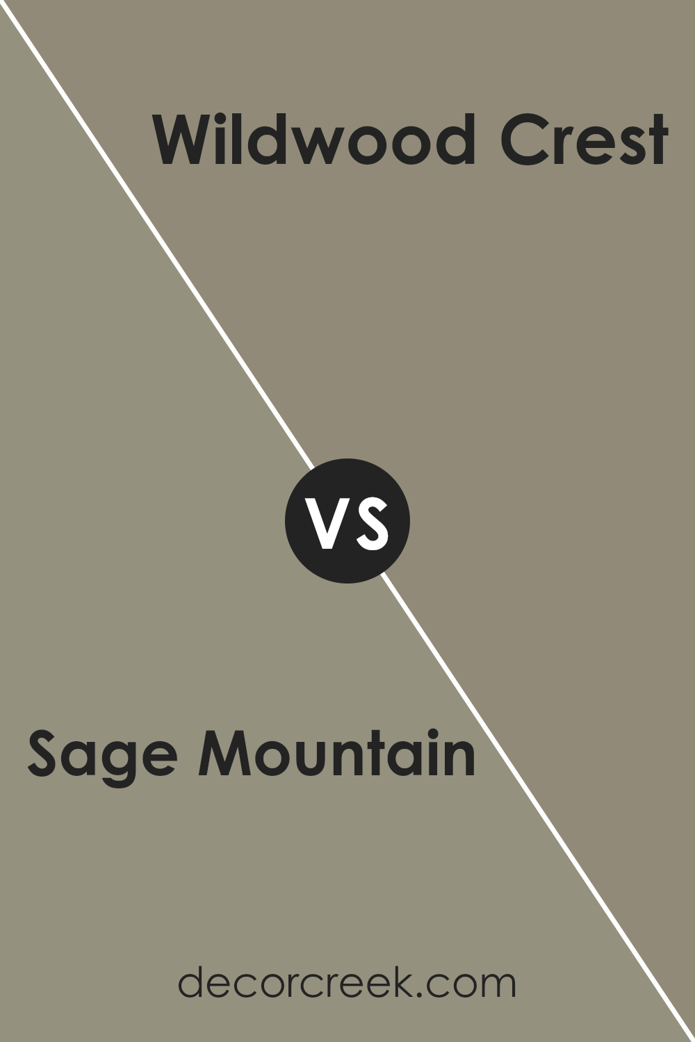
Sage Mountain 1488 by Benjamin Moore vs Wildwood Crest 1538 by Benjamin Moore
Sage Mountain and Wildwood Crest, both by Benjamin Moore, offer subtle and natural tones that are great for creating a cozy atmosphere. Sage Mountain is a muted green with gray undertones, giving it an earthy and calming feel. It’s perfect for spaces where you want a touch of nature without overwhelming the room with a bright color.
On the other hand, Wildwood Crest leans more towards a pale, sandy beige, offering a soft and warm look. This color can help make rooms feel more spacious and airy, and it pairs wonderfully with a wide range of décor styles.
Both colors are fairly neutral, so they work well in many settings and complement various furniture colors and materials. Whether you’re looking to create a nature-inspired vibe or a gentle, welcoming space, either of these colors could be a perfect fit.
You can see recommended paint color below:
- 1538 Wildwood Crest (CHECK A SAMPLE)
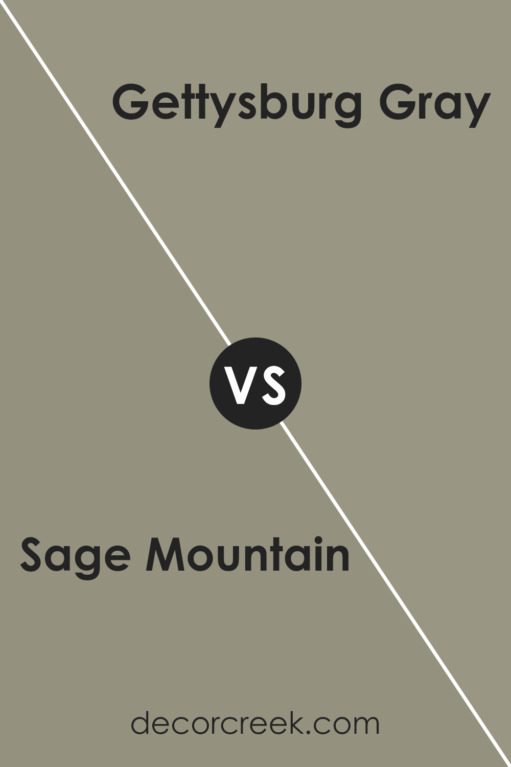
Sage Mountain 1488 by Benjamin Moore vs Gettysburg Gray HC-107 by Benjamin Moore
Sage Mountain is a subtle, soft green that brings a hint of nature into any space, making it feel fresh and inviting. It’s light enough to keep rooms looking airy but with just enough depth to add character. In contrast, Gettysburg Gray is a deeper, muted gray with green undertones.
It offers a strong sense of groundedness, providing a solid, soothing backdrop that can complement various decor styles. When comparing the two, Sage Mountain feels more delicate and light, potentially better for creating a relaxed, breezy atmosphere.
On the other hand, Gettysburg Gray, with its richer tone, might be preferred in settings where a more defined, cozy, and enveloping ambiance is desired. Both colors work well in many types of rooms, but the choice between them really depends on the mood you want to set: lighter and airier with Sage Mountain, or more anchored and subtle with Gettysburg Gray.
You can see recommended paint color below:
- HC-107 Gettysburg Gray (CHECK A SAMPLE)
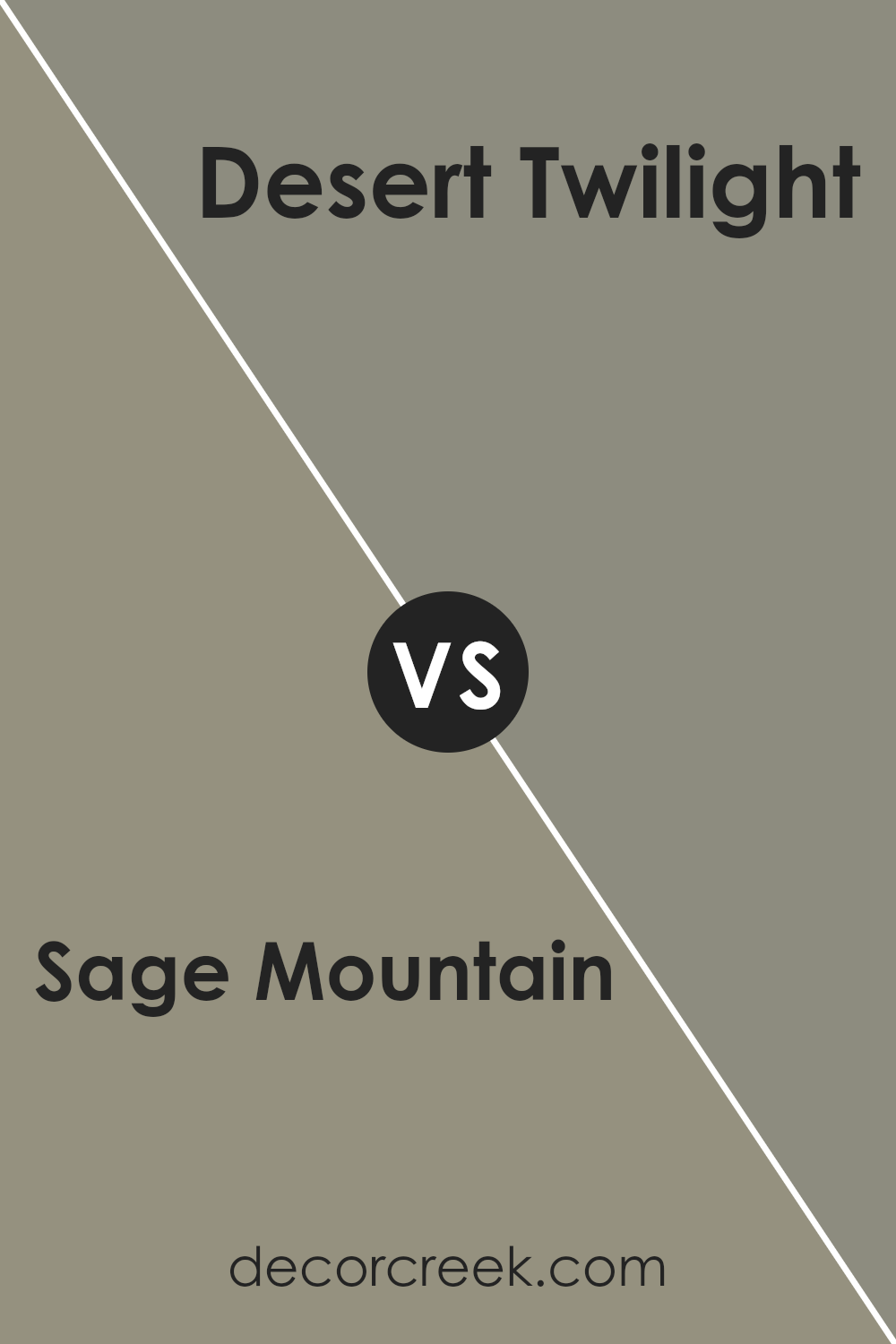
Sage Mountain 1488 by Benjamin Moore vs Desert Twilight 2137-40 by Benjamin Moore
Sage Mountain is a soft, muted green with gray undertones, giving it a calm and gentle feel that makes it great for spaces where you want to relax, such as bedrooms or living rooms. On the other hand, Desert Twilight is a darker, sandier color that leans towards gray, offering a more neutral and versatile backdrop. This color is ideal for creating a cozy atmosphere in any room.
When comparing the two, Sage Mountain brings a hint of nature indoors, reflecting a fresh, earthy vibe. In contrast, Desert Twilight provides a sturdier, grounding effect, which can help in making a space feel more secure and enclosed.
Depending on the lighting, Sage Mountain tends to feel brighter and more refreshing, while Desert Twilight can make a room feel more intimate and protected. Choosing between these two would depend on the mood and function you want for your room.
You can see recommended paint color below:
- 2137-40 Desert Twilight (CHECK A SAMPLE)
Conclusion
In wrapping up my thoughts about 1488 Sage Mountain by Benjamin Moore, I must say I’m really impressed with this color. It’s a sort of green that feels calming and cozy, almost like being in a quiet, leafy forest. This color makes rooms feel more peaceful and is a great choice if you want to give your space a touch of nature.
What’s really great about Sage Mountain is that it goes well with a lot of different colors. You can pair it with soft creams, deep blues, or even wood tones, and it always looks nice. It’s a versatile color that can work in a bedroom, living room, or even a kitchen. Plus, it’s not too bright or too dark, so it sets just the right mood.
Using this paint can really change how a room feels, making it a cozy spot in your home where you can relax. So, if you’re thinking about giving your room a new look, 1488 Sage Mountain could be a perfect choice. It’s soft, natural, and creates a warm, inviting space. Remember, a little change like a new wall color can make a big difference in how your home feels!
Ever wished paint sampling was as easy as sticking a sticker? Guess what? Now it is! Discover Samplize's unique Peel & Stick samples.
Get paint samples


