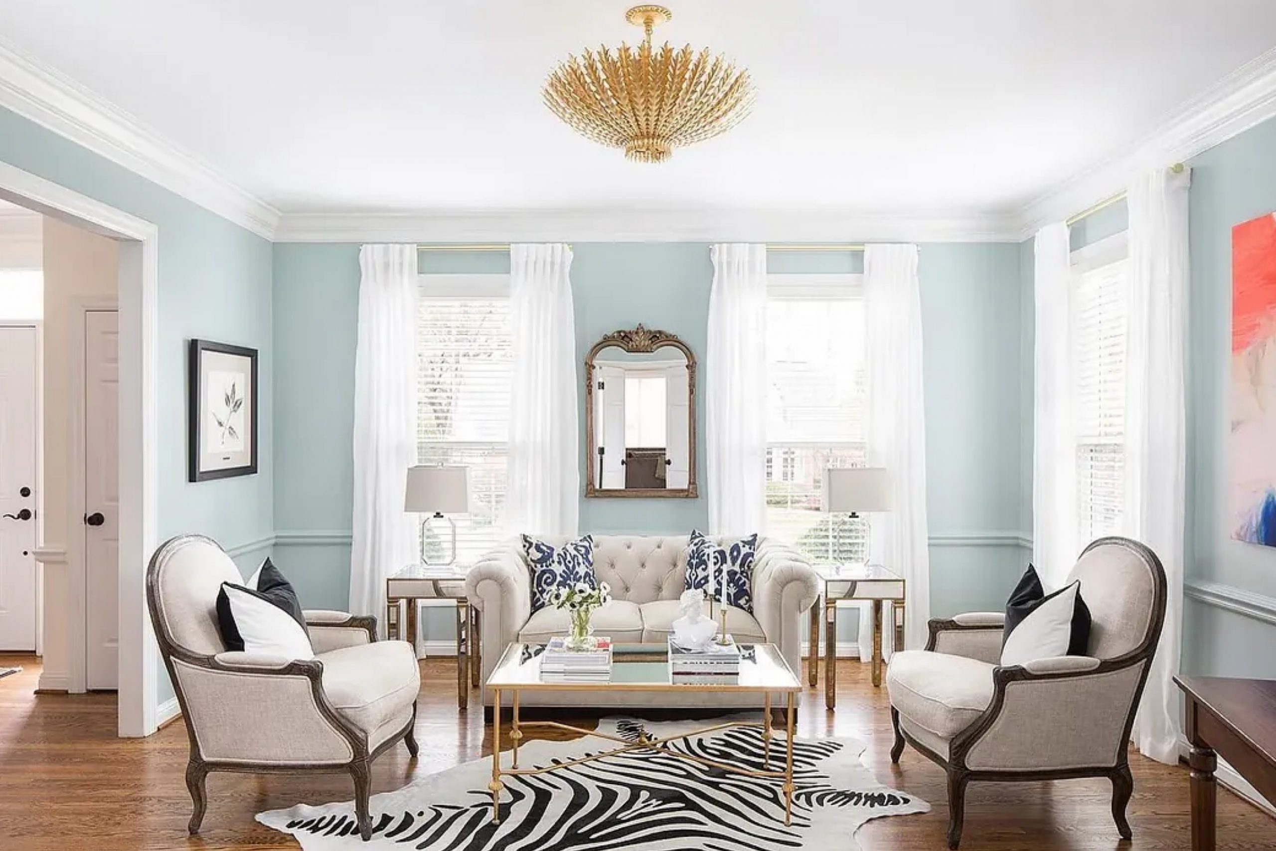
When I first laid eyes on Wedgewood Gray HC-146 by Benjamin Moore, I was struck by its soothing presence. It’s a color that immediately brings to mind the gentle calm of a quiet afternoon, with just the right touch of warmth. Whether you’re considering a fresh coat for a cozy living room or want to rejuvenate your bedroom, this shade offers a versatile backdrop.
It’s not overpowering, yet it provides enough character to stand on its own.
Wedgewood Gray has a unique ability to adapt based on the lighting and surroundings. In natural light, it can appear serene and airy, while under soft indoor lighting, it turns into a cozy hue that’s both inviting and sophisticated.
This color is versatile enough to pair with various decor styles, from traditional to modern, making it an easy choice for those who love experimenting with home aesthetics.
If you’re someone who values creating a calming environment, this shade might just be what you’re looking for. It’s a color that feels like home, offering peace and balance. Whether you’re painting an entire room or just an accent wall, Wedgewood Gray can seamlessly fit into your space, evoking a sense of harmony that you’ll appreciate every day.
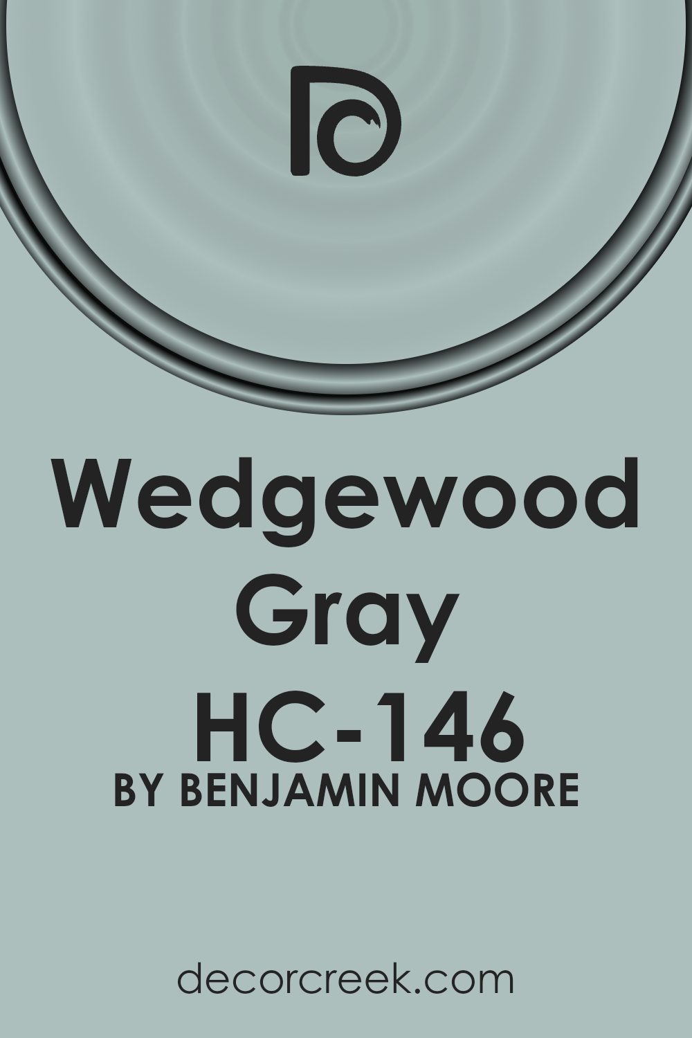
What Color Is Wedgewood Gray HC-146 by Benjamin Moore?
Wedgewood Gray (HC-146) by Benjamin Moore is a soft, muted blue-gray color that brings a gentle, calming atmosphere to any room. The hue has a subtle blend of blue and gray tones that can vary slightly depending on the lighting, providing a versatile backdrop that fits many design styles.
This color works wonderfully in coastal or nautical-themed interiors, where it echoes the colors of the sea and sky. It also fits well in traditional settings, offering a classic, timeless look.
In modern or contemporary spaces, Wedgewood Gray provides a neutral yet interesting backdrop that complements sleek lines and simple decor.
Materials that pair well with Wedgewood Gray include natural woods and white accents. The neutral tone of the paint highlights the richness of wooden floors, furniture, or beams, while crisp white trims or moldings create a fresh, clean contrast.
Textiles such as linen, cotton, and soft wool in muted shades can add warmth and coziness. Metal accents, like brushed nickel or chrome, work well in fixtures or decor, providing a subtle sheen that complements the understated elegance of the color.
Overall, Wedgewood Gray is a versatile choice that can adapt to a range of styles and materials, creating a space that feels inviting and pleasant.
Is Wedgewood Gray HC-146 by Benjamin Moore Warm or Cool color?
Wedgewood Gray HC-146 by Benjamin Moore is a lovely shade that brings a soft and calming feel to any room. It is a mix of blue and gray, making it a versatile choice for home interiors. This color can create a peaceful atmosphere, perfect for living rooms, bedrooms, or even bathrooms.
Its muted tone allows it to work well as a neutral backdrop, complementing many different styles of decor.
In spaces with a lot of natural light, Wedgewood Gray appears more blue, providing a fresh and airy vibe. In dimmer settings, the gray undertones come through, offering a cozy and inviting feel. This adaptability makes it a great choice for different rooms in the house.
Whether paired with white trim for a classic look or with darker accents for contrast, Wedgewood Gray adds warmth and softness without overpowering other elements in the room.
Undertones of Wedgewood Gray HC-146 by Benjamin Moore
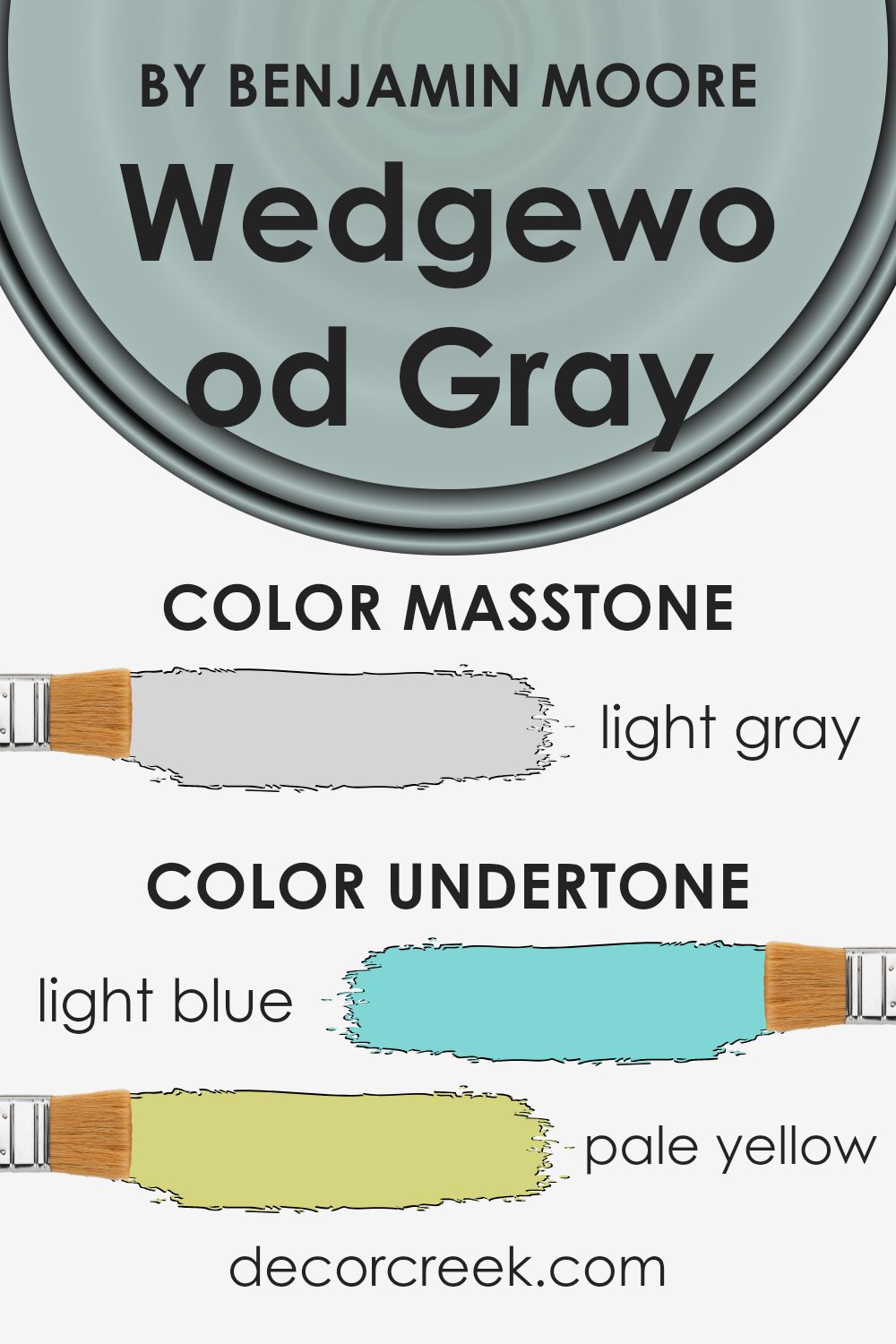
Wedgewood Gray HC-146 by Benjamin Moore is a unique color that carries a range of subtle undertones. When you look at it, you might first notice its primary gray tone, but there’s more going on. It has hints of light blue, pale yellow, light purple, mint, lilac, pale pink, and classic gray. These undertones can make the color look different depending on the lighting and the surrounding colors in a room.
The blue undertone gives it a calming effect, making it suitable for spaces where relaxation is important. The pale yellow adds a touch of warmth, giving the gray a cozy feel.
Light purple and lilac undertones can add a slightly elegant touch, making the color feel a bit more sophisticated. Mint gives it a refreshing vibe, while pale pink lends a soft, welcoming note.
When used on interior walls, these undertones can influence the overall atmosphere of a room. In bright, sunlit rooms, the blue and green undertones may be more pronounced, giving the space a cool, airy vibe. In dimmer light, the warmer undertones like yellow and pink may come through, making the room feel cozier.
The changing light throughout the day can make the color shift, which adds a dynamic element to your home.
What is the Masstone of the Wedgewood Gray HC-146 by Benjamin Moore?
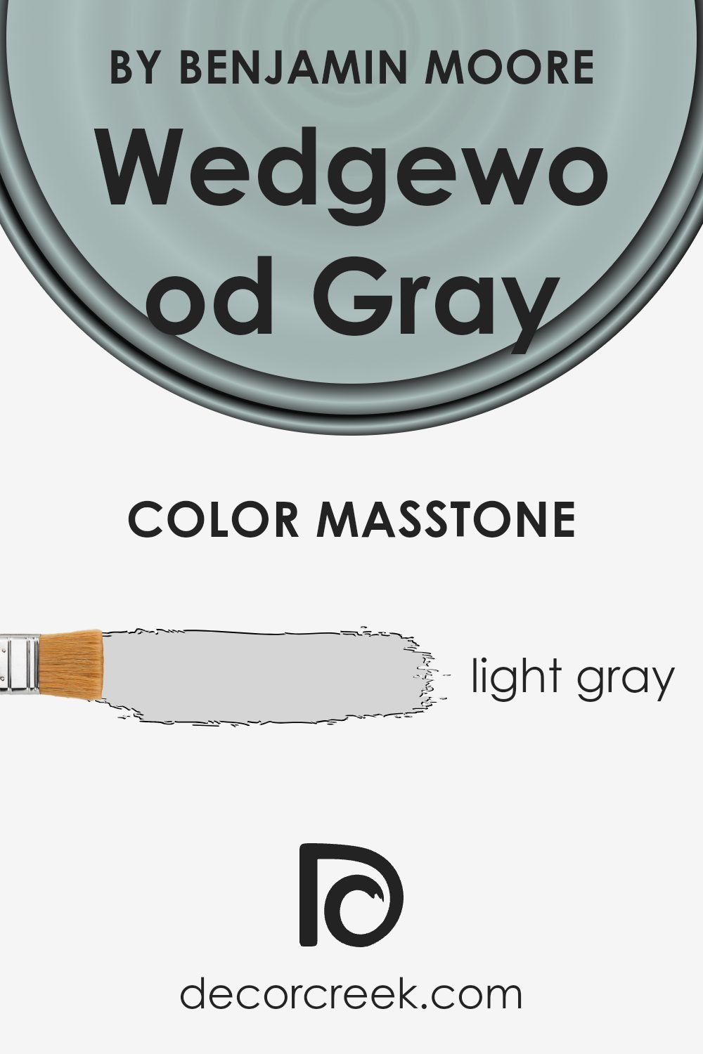
Wedgewood Gray HC-146 by Benjamin Moore is a paint color that offers a light gray masstone, which significantly influences how it works within homes. The light gray tone (#D5D5D5) is subtle and versatile, making it easy to pair with various decor styles and color schemes. This soft gray acts as a neutral backdrop, allowing other colors in the room to stand out without being overpowering.
In spaces like living rooms and bedrooms, Wedgewood Gray creates a calming and airy feel. It’s perfect for walls because it reflects natural and artificial light well, making rooms appear brighter and more spacious.
This quality is particularly beneficial in smaller rooms or areas with limited natural light, as it can help them feel more open and inviting.
Wedgewood Gray also complements a wide range of furniture and accessories, from classic wood finishes to modern metallic accents, making it a practical choice for any home design.
How Does Lighting Affect Wedgewood Gray HC-146 by Benjamin Moore?
Lighting significantly affects how we perceive colors. This is because light changes throughout the day and differs depending on its source. Natural light varies based on the sun’s position, time of day, and room orientation, while artificial light depends on the type and color temperature of bulbs used.
Wedgewood Gray (HC-146) by Benjamin Moore is a versatile color that appears as a medium-toned gray with blue undertones. Its appearance can shift based on the lighting conditions in a room.
In natural light, the orientation of the room affects how this color appears. In north-facing rooms, which receive cooler, indirect light, Wedgewood Gray will tend to show more of its blue undertones and may appear slightly darker and cooler. This can give the room a calm feel but may also feel a bit cold in spaces that do not get much direct sunlight.
In south-facing rooms, which get warm, direct sunlight for most of the day, Wedgewood Gray tends to look lighter and warmer. The sunlight can soften the gray and bring out a subtle warmth, making the space feel inviting and balanced.
In east-facing rooms, the color will appear brighter and slightly warmer in the mornings when the sun is shining in directly. In the afternoon and evening, when less direct light is present, the color might revert to its cooler tones with more noticeable gray and blue.
In west-facing rooms, the light is indirect and cooler in the morning, which might enhance the color’s gray aspect.
However, in the late afternoon and evening, the room is bathed in warmer, golden light, making Wedgewood Gray appear warmer and highlighting any subtle undertones present.
Under artificial lighting, such as incandescent bulbs, Wedgewood Gray might exhibit warmer tones. In contrast, fluorescent or LED lighting with cool tones can emphasize the grays and blues, making the color feel cooler once again. Therefore, personal preference and lighting choice should guide you when using this color in your home.
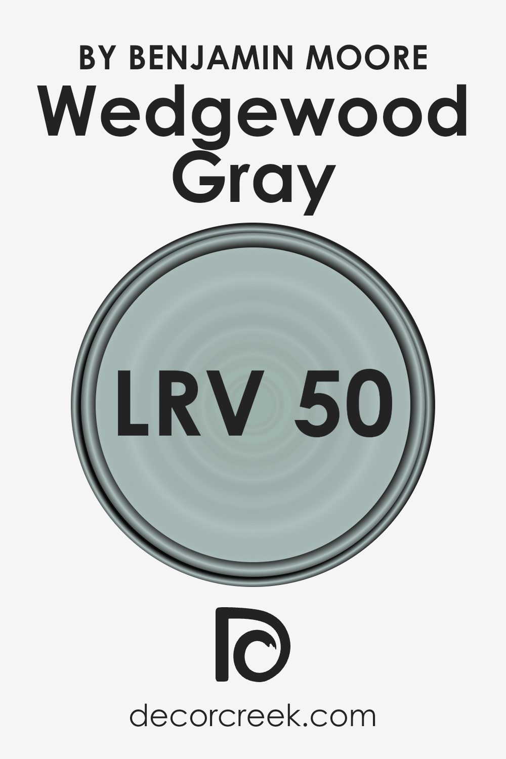
What is the LRV of Wedgewood Gray HC-146 by Benjamin Moore?
The term “LRV” stands for Light Reflectance Value. It is a measurement that indicates the percentage of light a color reflects and is used to understand how light or dark a color will appear when it is applied to walls. LRV is measured on a scale from 0 to 100, where 0 is absolute black (absorbing all light) and 100 is pure white (reflecting all light).
A higher LRV means that the color will reflect more light, making the room feel brighter, while lower values absorb more light, making the room feel cozier or more intimate.
Understanding LRV can help when choosing paint colors, as it suggests how a color might behave under different lighting conditions, which can really change the look of a room.
For Wedgewood Gray with an LRV of 49.59, this means it falls into the middle range of the scale.
This value indicates that the color will reflect about half of the light that hits it. It won’t make the room overwhelmingly bright nor particularly dark.
This balanced LRV makes Wedgewood Gray a versatile choice, as it offers a soft, muted tone that can work well in different lighting conditions. In a well-lit room, it might appear lighter and more airy, while in a dimmer space, it could look deeper and cozier. Its moderate reflectance value makes it adaptable to different moods and settings, providing a comforting backdrop without overpowering other elements in your decor.
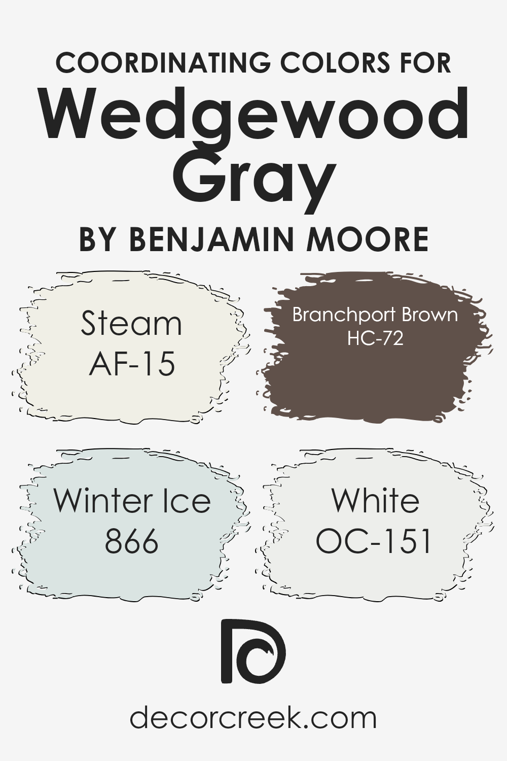
Coordinating Colors of Wedgewood Gray HC-146 by Benjamin Moore
Coordinating colors are shades that complement each other, creating a harmonious and visually appealing look when used together in a space. These colors work in tandem to enhance a room’s aesthetic by either complementing the primary color or contrasting with it just enough to add interest without clashing.
Wedgewood Gray is a soft, muted gray-blue that acts as a versatile backdrop, setting the tone for a room’s ambiance. When paired with the right coordinating colors, it can create a cohesive and well-balanced design.
AF-15 Steam is a simple and soft white that introduces warmth and brightness, making spaces feel open and airy. Winter Ice, numbered 866, is a cool, light gray with a hint of blue, which pairs well with Wedgewood Gray by adding a slight contrast without overpowering it.
On the other hand, HC-72 Branchport Brown brings depth to the palette with its rich, earthy brown tones, offering a natural grounding element.
Lastly, OC-151 White adds crispness and clarity to the space, accentuating architectural details and creating a fresh look. Together, these colors work seamlessly with Wedgewood Gray, resulting in a versatile and inviting atmosphere for any home.
You can see recommended paint colors below:
- AF-15 Steam
- 866 Winter Ice
- HC-72 Branchport Brown
- OC-151 White
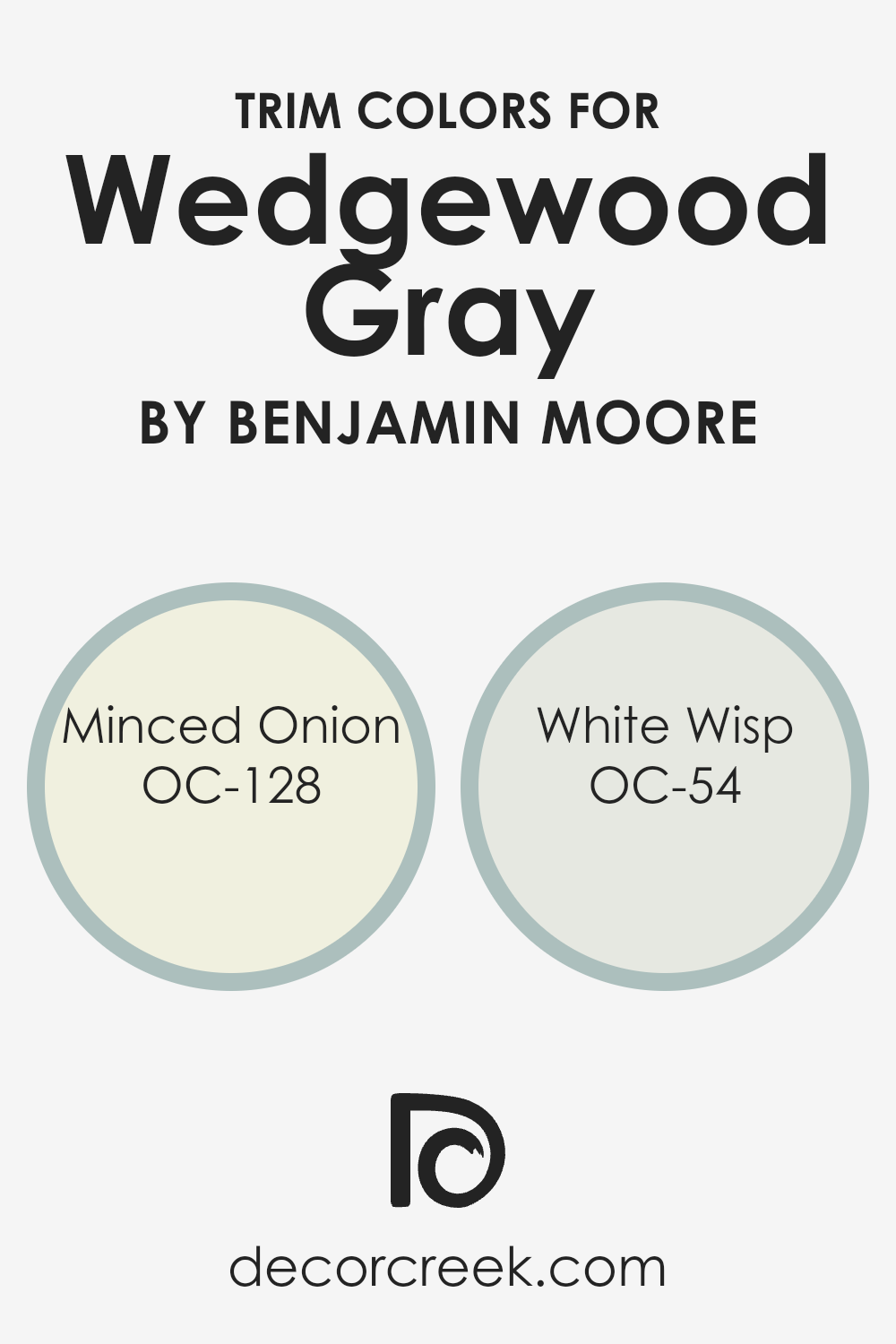
What are the Trim colors of Wedgewood Gray HC-146 by Benjamin Moore?
Trim colors are the shades used on the edges of walls, like baseboards, door frames, and window casings. They help define the architecture of a room and give it a finished look. Using the right trim color with Wedgewood Gray can really make this soft blue-gray shade stand out.
Wedgewood Gray is a timeless classic from Benjamin Moore that combines gray and blue for a calm and balanced look. Picking the perfect trim color can bring out the best in Wedgewood Gray, adding to the overall feel of the room.
When choosing trim colors like OC-128 Minced Onion and OC-54 White Wisp, you enhance the color scheme and give the space a clean and organized appearance.
Minced Onion is a warm off-white with a hint of creaminess that pairs beautifully with Wedgewood Gray.
It adds a touch of warmth and subtle contrast without overshadowing the main color. On the other hand, White Wisp offers a cooler tone with a slight hint of gray, providing a crisp and fresh feel when used as a trim color.
Its understated elegance ensures that the walls remain the focal point while the trim provides a clean outline and polished finish. By selecting either Minced Onion or White Wisp, you create a pleasing and harmonious look that highlights Wedgewood Gray’s charm and brings a balanced atmosphere to any room.
You can see recommended paint colors below:
- OC-128 Minced Onion
- OC-54 White Wisp
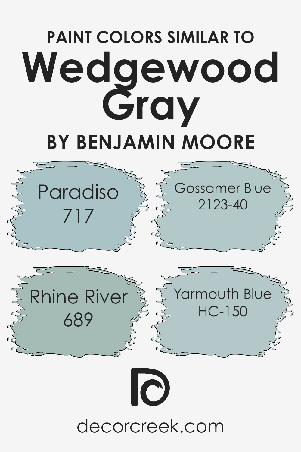
Colors Similar to Wedgewood Gray HC-146 by Benjamin Moore
Choosing similar colors to Wedgewood Gray is important because they help create a harmonious and cohesive look in a room. These colors can naturally blend and complement each other, offering a unified aesthetic that is pleasing to the eye. Paradiso (717) brings to mind a vibrant energy with its bold teal undertones, adding depth and interest without overwhelming the space.
Rhine River (689) evokes a calm and relaxed atmosphere with its cooler shades, a perfect backdrop for peaceful living areas or restful bedrooms. Gossamer Blue (2123-40) offers a light and airy feel with its soft, delicate hue, making a room seem more open and inviting.
Yarmouth Blue (HC-150) has a warm, muted quality that adds a touch of sophistication and comfort, perfect for both traditional and modern spaces.
These colors work well together because they share a common base, allowing them to blend seamlessly within the same environment.
When used together, they create a balanced look without clashing or competing with each other. Each color brings its own personality and mood, but they all work together to enhance the overall design.
The subtle variations in shades allow for flexibility, enabling you to play with different accents while maintaining a cohesive look. Using similar colors effectively can make any space feel more curated and thoughtfully designed.
You can see recommended paint colors below:
- 717 Paradiso
- 689 Rhine River
- 2123-40 Gossamer Blue
- HC-150 Yarmouth Blue
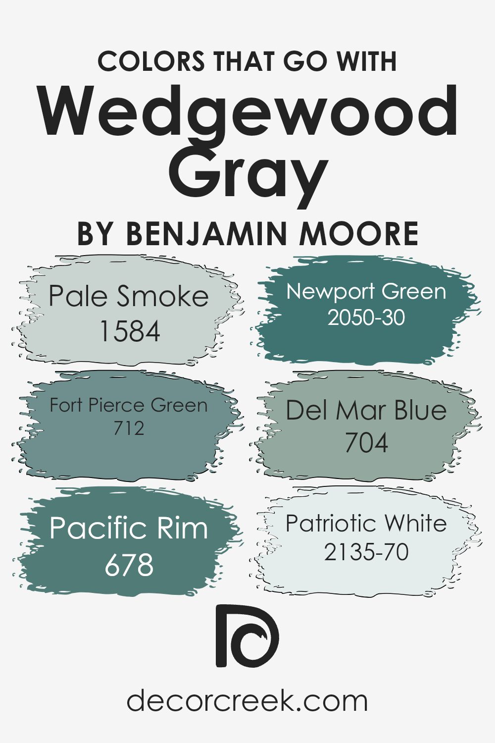
Colors that Go With Wedgewood Gray HC-146 by Benjamin Moore
Wedgewood Gray HC-146 by Benjamin Moore is a versatile color that serves as a perfect backdrop for many rooms. It is known for its soft, muted tones, which pair beautifully with a range of colors. For instance, 1584 – Pale Smoke offers a gentle, misty blue tone that complements Wedgewood Gray.
This soft hue brings about a subtle contrast while keeping the atmosphere light and open. Similarly, 712 – Fort Pierce Green introduces a slightly more vibrant touch with its deep green shades.
This color can create a refreshing and natural feel when combined with Wedgewood Gray, adding depth without being overpowering.
On the other hand, 678 – Pacific Rim brings warmth to the palette. This earthy, terracotta shade can encourage a cozy feeling when paired with the cooler tones of Wedgewood Gray.
For those who lean toward a cooler color scheme, 2050-30 – Newport Green offers a rich, marine-inspired vibe that complements the gray’s muted undertones. If one wishes to add an oceanic feel, 704 – Del Mar Blue, with its gentle aquatic hue, pairs effortlessly.
Lastly, 2135-70 – Patriotic White is a classic, clean choice that balances out these vibrant colors. Its simplicity allows Wedgewood Gray to shine, ensuring a harmonious and inviting look for any space.
You can see recommended paint colors below:
- 1584 Pale Smoke
- 712 Fort Pierce Green
- 678 Pacific Rim
- 2050-30 Newport Green
- 704 Del Mar Blue
- 2135-70 Patriotic White
How to Use Wedgewood Gray HC-146 by Benjamin Moore In Your Home?
Wedgewood Gray HC-146 by Benjamin Moore is a versatile and calming paint color that can be a great choice for various spaces in your home. This gentle blue-gray hue works well in areas where you want to create a soothing atmosphere, such as bedrooms or living rooms.
It pairs nicely with both light and dark furnishings, allowing for flexibility in decorating. In a bedroom, Wedgewood Gray can promote relaxation and restfulness. In living areas, it can add a touch of elegance without being overwhelming.
This color also complements natural materials like wood and stone, making it suitable for spaces with a rustic or modern style. In a kitchen, it can be used to add a fresh look when combined with white cabinets or countertops. Its soft tone is perfect for creating a welcoming environment, making family and guests feel comfortable and relaxed in any room of the house.
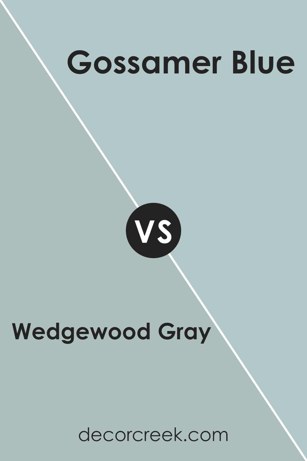
Wedgewood Gray HC-146 by Benjamin Moore vs Gossamer Blue 2123-40 by Benjamin Moore
Wedgewood Gray HC-146 and Gossamer Blue 2123-40 are two popular colors by Benjamin Moore, both offering unique styles. Wedgewood Gray is a soft, muted blue-gray. It has a calming presence and works well in a variety of settings. It can look gray under certain lights and blue under others, making it versatile for many spaces.
On the other hand, Gossamer Blue is a lighter, more airy blue. It has a brighter feel compared to Wedgewood Gray and can bring a fresh, clean look to any room. Gossamer Blue is more distinctly blue, giving spaces a cheerful and uplifting atmosphere.
The primary difference is in their tones: Wedgewood Gray is more subdued with a gray undertone, while Gossamer Blue is light and distinctly blue. Depending on your desired mood, choose Wedgewood Gray for a calm backdrop or Gossamer Blue for a lively, fresh vibe.
You can see recommended paint color below:
- 2123-40 Gossamer Blue
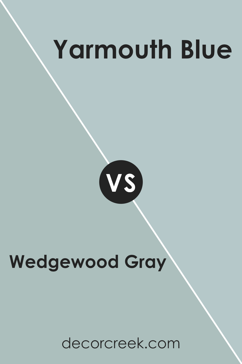
Wedgewood Gray HC-146 by Benjamin Moore vs Yarmouth Blue HC-150 by Benjamin Moore
Wedgewood Gray and Yarmouth Blue are two different paint colors from Benjamin Moore, offering distinct looks for your space. Wedgewood Gray is a soft, muted blue-gray that brings a calm and subtle elegance to any room. It has a neutral undertone, making it versatile and easy to pair with various other colors and decor styles.
Meanwhile, Yarmouth Blue is a slightly brighter and more vibrant blue with a hint of gray. It feels a bit more lively and fresh compared to Wedgewood Gray, which lends itself well to spaces where you want more of a lively feel, while still maintaining a relaxed vibe.
Both colors can be used to create a soothing atmosphere, but Wedgewood Gray tends more toward a calming backdrop, whereas Yarmouth Blue can provide a soft pop of color. Depending on the lighting and surrounding decor, each color can present a different feel.
You can see recommended paint color below:
- HC-150 Yarmouth Blue
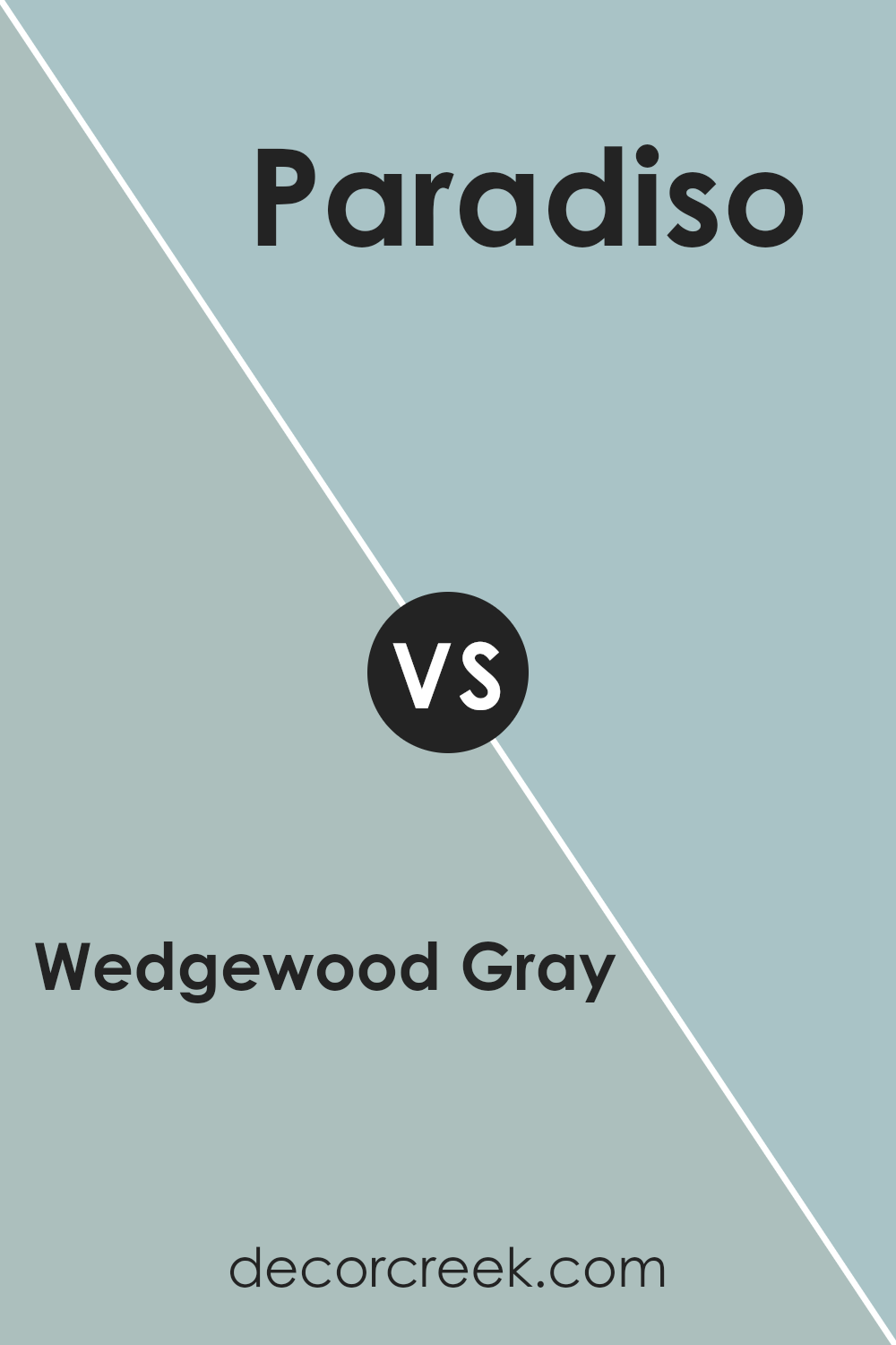
Wedgewood Gray HC-146 by Benjamin Moore vs Paradiso 717 by Benjamin Moore
Wedgewood Gray HC-146 and Paradiso 717 are distinct colors from Benjamin Moore’s collection. Wedgewood Gray is a soft, muted blue-gray that gives rooms a calm, neutral feel, making it versatile for various spaces and easily matching with other colors and materials. It’s a trusted choice for creating a soothing atmosphere in a home.
On the other hand, Paradiso 717 is a rich teal with a mix of blue and green, offering a more vibrant and bold look. It’s ideal for adding an energetic touch to a space, providing a pop of color that stands out.
Paradiso can be used as an accent color in a room to draw attention or to set a mood that feels lively and fresh.
When deciding between these colors, consider the mood you want to create. Wedgewood Gray is perfect for a subdued, relaxed environment, while Paradiso can bring excitement and liveliness to your decor.
You can see recommended paint color below:
- 717 Paradiso
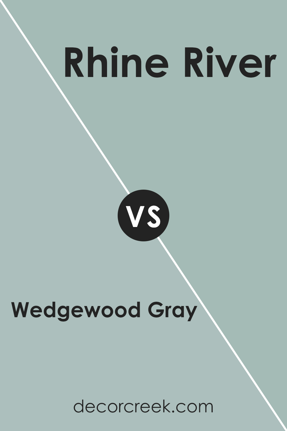
Wedgewood Gray HC-146 by Benjamin Moore vs Rhine River 689 by Benjamin Moore
Wedgewood Gray HC-146 and Rhine River 689 are two elegant paint colors by Benjamin Moore, each offering a distinctive feel. Wedgewood Gray, despite its name, leans more toward a blue-green shade rather than a traditional gray. It provides a calm and soothing atmosphere, making it suitable for living rooms or bedrooms.
The color changes subtly with different light, sometimes appearing more gray and other times more blue-green, bringing versatility to any room.
Rhine River 689, on the other hand, is a fresh, blue-green tone with a bit more depth and richness. It’s a bit bolder than Wedgewood Gray, making it perfect for adding a pop of color without overwhelming the space.
This color works well in kitchens or bathrooms where a touch of vibrancy is desired. Both colors can easily complement neutral furniture, but while Wedgewood Gray is more subdued, Rhine River adds a brighter yet harmonious touch.
You can see recommended paint color below:
- 689 Rhine River
After learning about HC-146 Wedgewood Gray by Benjamin Moore, I must say I’m truly impressed by how this paint color can make rooms look so inviting and calming. It’s a sort of dusty blue-gray that feels really gentle and soothing.
This color would be great in almost any room, from bedrooms to living rooms. It’s a color that makes you think of a soft, peaceful day with a clear sky and maybe some gentle waves, but inside your home.
One thing I like is how this color can make a room feel bigger and more open. When you have a color that’s not too bright but not too dark, it can help a room feel like it has more air and light in it. I also noticed that it looks fantastic with both light and dark furniture, which makes it really flexible for decorating.
You could have bright white shelves or deep brown chairs, and it would still look very nice.
At the end of thinking about HC-146 Wedgewood Gray, I feel like it’s a great choice if you want to paint your walls a color that is calm and easy on the eyes. It’s a friendly, gentle color that would make anyone feel welcome and relaxed at home. I can see why it’s such a popular choice!
Ever wished paint sampling was as easy as sticking a sticker? Guess what? Now it is! Discover Samplize's unique Peel & Stick samples.
Get paint samples

