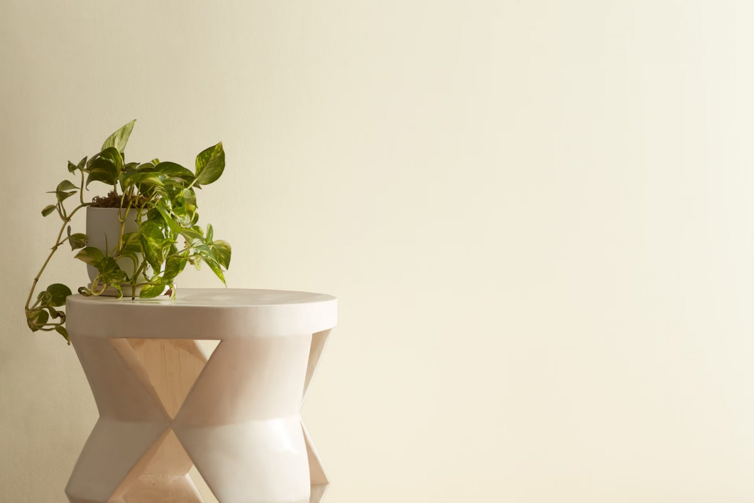
If you’re on the lookout for a fresh coat of paint that perfectly balances a calm feel with just the right dash of brightness, you may want to consider 927 White Swan by Benjamin Moore.When I stumbled upon this shade in my work as a designer, I was seeking something that could brighten up a room without being too stark or clinical.
White Swan hit that mark beautifully, providing a soft, creamy white that works wonders in different lighting conditions.
I’ve found that it has a warm undertone, which is great for creating a cozy ambiance in rooms like the living room or bedroom. This adaptability also extends to various styles, whether you have a modern minimalist home or a more traditional setting.
Additionally, it pairs seamlessly with a range of colors and textures, making it a reliable choice for those looking to refresh their home with a classic, yet fresh look. Whether you want to revamp a single room or plan a bigger home update, White Swan offers a lovely starting point.
Let’s discuss how this color performs and why it might be the ideal pick for your next painting project.
What Color Is White Swan 927 by Benjamin Moore?
The color White Swan by Benjamin Moore is a warm, inviting shade of white that brings a subtle brightness to any room. This color creates a cozy, welcoming atmosphere, making rooms feel more open and airy while retaining a sense of comfort. White Swan works best in interior styles that lean towards modern, minimalist, or Scandinavian designs due to its clean and unimposing nature. This shade can successfully bridge the gap between traditional warmth and contemporary clarity.
In terms of pairing materials, White Swan is highly adaptable. It complements natural wood beautifully, whether it’s light oak, rich walnut, or even reclaimed pieces, highlighting their natural grain and adding to the organic feel of a room.
It also pairs well with textiles like linen or cotton, which enhance its soft, gentle essence. For those preferring a bit more texture, pairing it with exposed brick or a subtle stone accent can introduce an interesting depth and contrast while retaining the color’s inherent coziness.
Adding details in metals like brushed nickel or matte black can provide a modern twist to the simplicity of White Swan, creating a more dynamic yet harmonious room. This color ensures that every element, from furniture to decorations, stands out without overpowering the senses, allowing each piece its moment to shine.
Is White Swan 927 by Benjamin Moore Warm or Cool color?
White Swan 927 by Benjamin Moore is a popular paint color for home interiors. It’s a clean and soft white that brings a bright and airy feel to a room. Because it’s not a stark white, it creates a warm and welcoming atmosphere without feeling too cold or clinical.
This color works well in almost any room because it serves as a neutral backdrop that can be paired with a variety of decor styles and colors. In rooms with limited natural light, White Swan can help to brighten and open up the area, making it appear larger.
It is also very effective for highlighting architectural features like trim and moldings, because it provides just enough contrast with bolder colors. For homeowners looking for a fresh and adaptable shade of white, White Swan 927 is a solid choice that enhances the overall feel of a home.
Undertones of White Swan 927 by Benjamin Moore
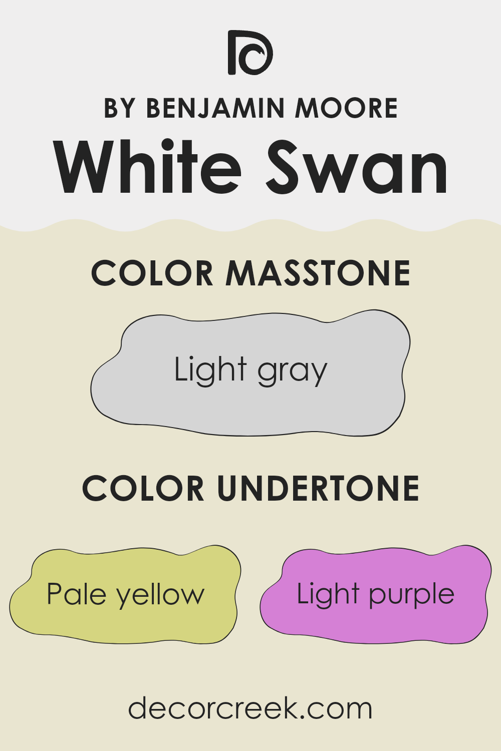
White Swan 927 by Benjamin Moore is an adaptable off-white paint known for its complex undertones. Not just a simple white, its subtle mix of undertones adds depth and dimension. These undertones include pale yellow, light purple, light blue, pale pink, mint, lilac, and grey. Each undertone brings its unique influence, subtly shifting the overall perception of the color depending on lighting and surrounding colors.
In general, undertones are critical because they can distinctly alter the appearance of colors under different lights. For instance, a color might look slightly blueish in natural light but show hints of yellow under warm indoor lighting. This characteristic is crucial in choosing paint, as it will affect the room’s atmosphere at various times of the day.
Specifically for White Swan 927, these undertones can make a room feel more welcoming and lively without overpowering the senses. On interior walls, the pale yellow can make a room feel warm and cozy, the light blue can evoke a fresh and airy feeling, and the pale pink can add a subtle touch of warmth. Grey and lilac can give a neutral balance, ensuring the color does not lean too far towards any warmer or cooler hue. The result is a balanced, nuanced white that adjusts subtly to different decor styles and lighting conditions, making it a great choice for many rooms.
What is the Masstone of the White Swan 927 by Benjamin Moore?
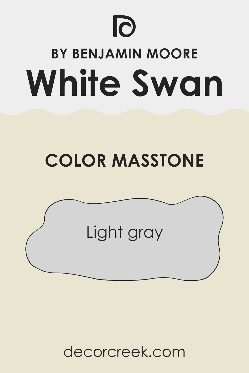
White Swan 927 by Benjamin Moore has a masstone of light gray, characterized by its RGB values close to #D5D5D5. This light gray shade has a subtle and clean appearance, making it an excellent choice for home interiors.
It provides a neutral backdrop that works well in various rooms, from modern living rooms to cozy bedrooms. Its lightness helps in making rooms look brighter and more open, which can be particularly useful in smaller areas that might otherwise feel cramped.
The color is adaptable, easily pairing with other colors whether bright or muted. This makes it a practical choice for those who like to change accent colors frequently without repainting the entire room. The neutrality of White Swan 927 ensures that it doesn’t overpower a room but instead offers a soothing, fresh look. This color is ideal for anyone looking to create a home environment that feels airy and well-maintained.
How Does Lighting Affect White Swan 927 by Benjamin Moore?
Lighting plays a crucial role in how we perceive colors. The same color can look different depending on the type of light it’s under. For example, the color White Swan by Benjamin Moore might appear differently under various lighting conditions.
In artificial light, such as LED or fluorescent bulbs, the characteristics of the light can affect how White Swan looks. Typically, artificial light can make colors seem slightly cooler. So, White Swan might have a crisp and clean appearance in rooms lit by common household bulbs.
In natural light, the time of day and the weather can change how White Swan looks. On a sunny day, natural light tends to make colors look vivid and lively. White Swan would likely appear very pure and bright. On a cloudy day, it might look more muted but still maintain its clarity.
The direction a room faces also impacts how White Swan looks:
– North-facing rooms: These rooms get less direct sunlight, making them cooler in tone. White Swan could look slightly more shadowy or grayish in these rooms.
– South-facing rooms: These rooms enjoy abundant sunlight, making them warmer. Here, White Swan would look brighter and truer to its original shade.
– East-facing rooms: Morning light is warm and yellow, making White Swan look softer and warmer in the mornings. As the day progresses, this warmth may decrease.
– West-facing rooms: These rooms get the evening light, which can be quite warm and golden. Here, White Swan can take on a warmer tone during the evening.
Understanding these effects can help in deciding where to use White Swan effectively, ensuring that the color complements each room at any time of the day under different lighting conditions.
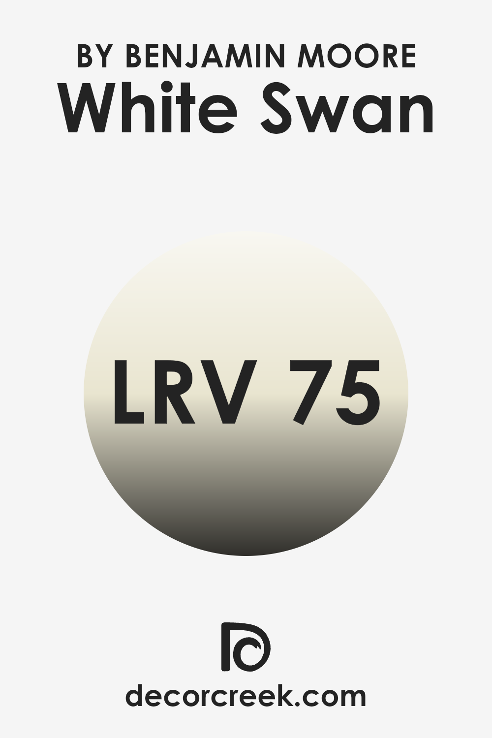
What is the LRV of White Swan 927 by Benjamin Moore?
LRV stands for Light Reflectance Value, which is a measure of the amount of visible and usable light that a paint color reflects within a room. LRV is scaled from zero to one hundred, with higher numbers indicating that the color reflects more light.
When choosing paint colors for a room, understanding LRV can be quite helpful, as it affects how light or dark a color appears once applied to the walls. A color with a high LRV, for example, will make a room look more illuminated and open, because it reflects more light back into the room.
Speaking of the LRV for the color White Swan (75.33), it falls into the higher end of the scale, meaning it has a high ability to reflect light. This makes it a great choice for rooms that you want to appear brighter and more spacious. Because of its high light reflection, it can help in making smaller or darker rooms feel more open and larger.
The use of this color on walls can be particularly effective in boosting the natural light in a room, making the environment feel welcoming and lively. Given its high LRV, the color can significantly influence the atmosphere within a room by enhancing the light conditions.
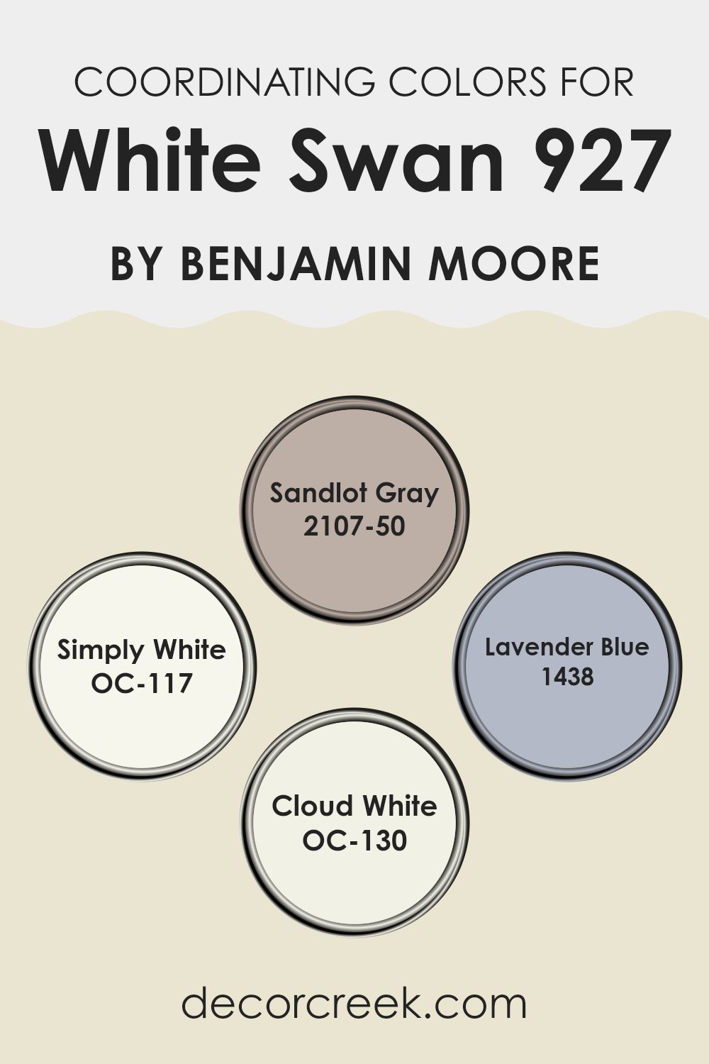
Coordinating Colors of White Swan 927 by Benjamin Moore
Coordinating colors are sets of colors that complement each other when used together in decor, providing a harmonious and balanced look. These colors usually share the same undertones or are strategically chosen to enhance the primary color they accompany. For instance, White Swan 927 by Benjamin Moore is an adaptable hue that pairs well with a variety of coordinating colors to create an appealing and cohesive aesthetic in any room.
2107-50 Sandlot Gray offers a muted, neutral backdrop that pairs subtly with White Swan’s softness, making it ideal for creating a relaxed atmosphere. OC-117 Simply White is a clean and bright shade, providing a crisp contrast that highlights the softer tones of White Swan while keeping the room light and airy.
1438 Lavender Blue introduces a gentle splash of color, adding a soft, subtle pop that enlivens rooms without overpowering them. Lastly, OC-130 Cloud White works closely with Simply White to maintain a bright and airy feel, while offering a slightly creamier tone that softens the contrast, ensuring that the room feels welcoming and warm.
Together, these coordinating colors support a variety of design preferences, providing options to either keep things subtle or add gentle color enrichment.
You can see recommended paint colors below:
- 2107-50 Sandlot Gray
- OC-117 Simply White
- 1438 Lavender Blue
- OC-130 Cloud White
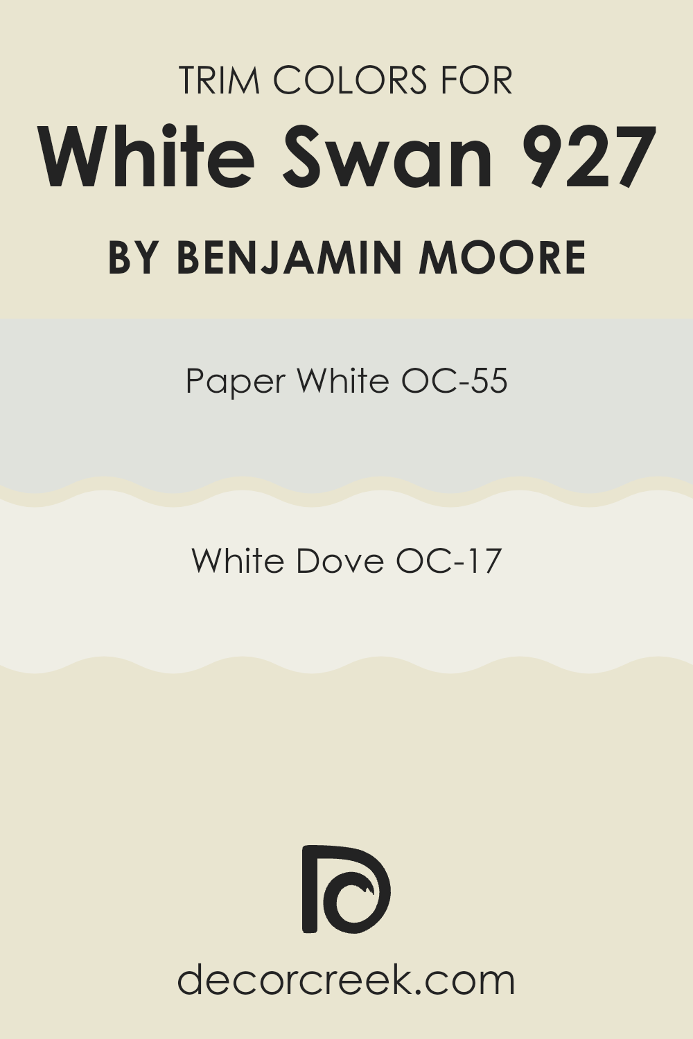
What are the Trim colors of White Swan 927 by Benjamin Moore?
Trim colors are specific shades used to accentuate the architectural details of a room like door frames, moldings, and baseboards. Choosing the right trim color can significantly impact the overall aesthetics of a room, helping to define and accent the main color palette. For instance, using specific trim colors with White Swan 927 by Benjamin Moore can enhance the subtle nuances of this primary shade and bring a coherent and polished look to any room.
OC-55 Paper White is a gentle off-white with a soft, neutral base that avoids stark contrasts, making it ideal for complementing the understated elegance of White Swan 927. It provides a clean and fresh look without overpowering the senses.
On the other hand, OC-17 White Dove offers a warmer undertone, which adds a subtle hint of coziness to the surroundings. This color works well to soften the visual transitions between the walls painted in White Swan 927 and other elements of the room, making it an adaptable choice for many different rooms and styles.
You can see recommended paint colors below:
- OC-55 Paper White
- OC-17 White Dove
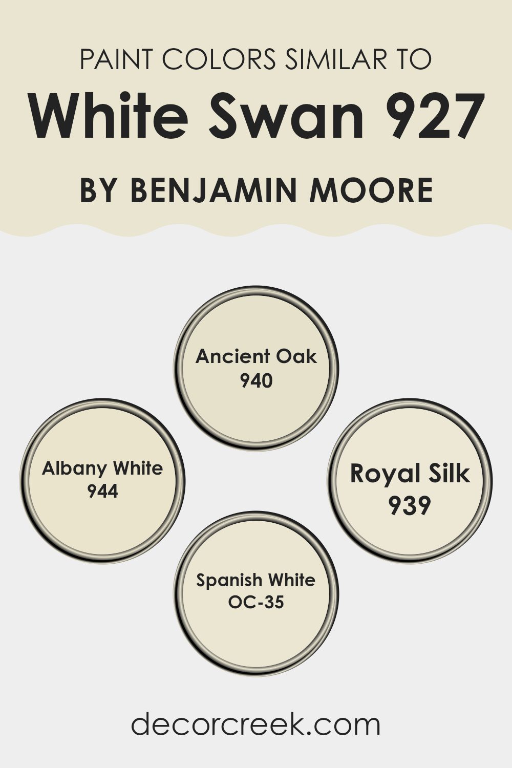
Colors Similar to White Swan 927 by Benjamin Moore
Choosing similar colors can significantly enhance the aesthetic flow of a room, creating a harmonious and visually comforting environment. Colors close to White Swan 927, like 940 – Ancient Oak, 944 – Albany White, 939 – Royal Silk, and OC-35 – Spanish White, work well together because their subtle differences can add depth while maintaining a cohesive look.
These shades are close enough to each other that they create a gentle transition from one area of a room to another, which can be very appealing in open floor plans or rooms with connected layouts. For instance, 940 – Ancient Oak is a warm, muted beige that offers a solid earthy base, perfect as a backdrop that complements a variety of decor styles.
944 – Albany White stands out as a soft, creamy white that brightens rooms gently without overpowering them, making it ideal for trim and ceilings. 939 – Royal Silk adds a hint of subdued lavender to the mix, introducing a subtle touch of color that is both refreshing and calm. Lastly, OC-35 – Spanish White offers a slightly warmer tone, bridging the gap between crisp whites and full beiges, making it an adaptable choice for main walls or accents. Using these similar hues, one can create a soothing ambiance that flows naturally throughout the room.
You can see recommended paint colors below:
- 940 Ancient Oak
- 944 Albany White
- 939 Royal Silk
- OC-35 Spanish White
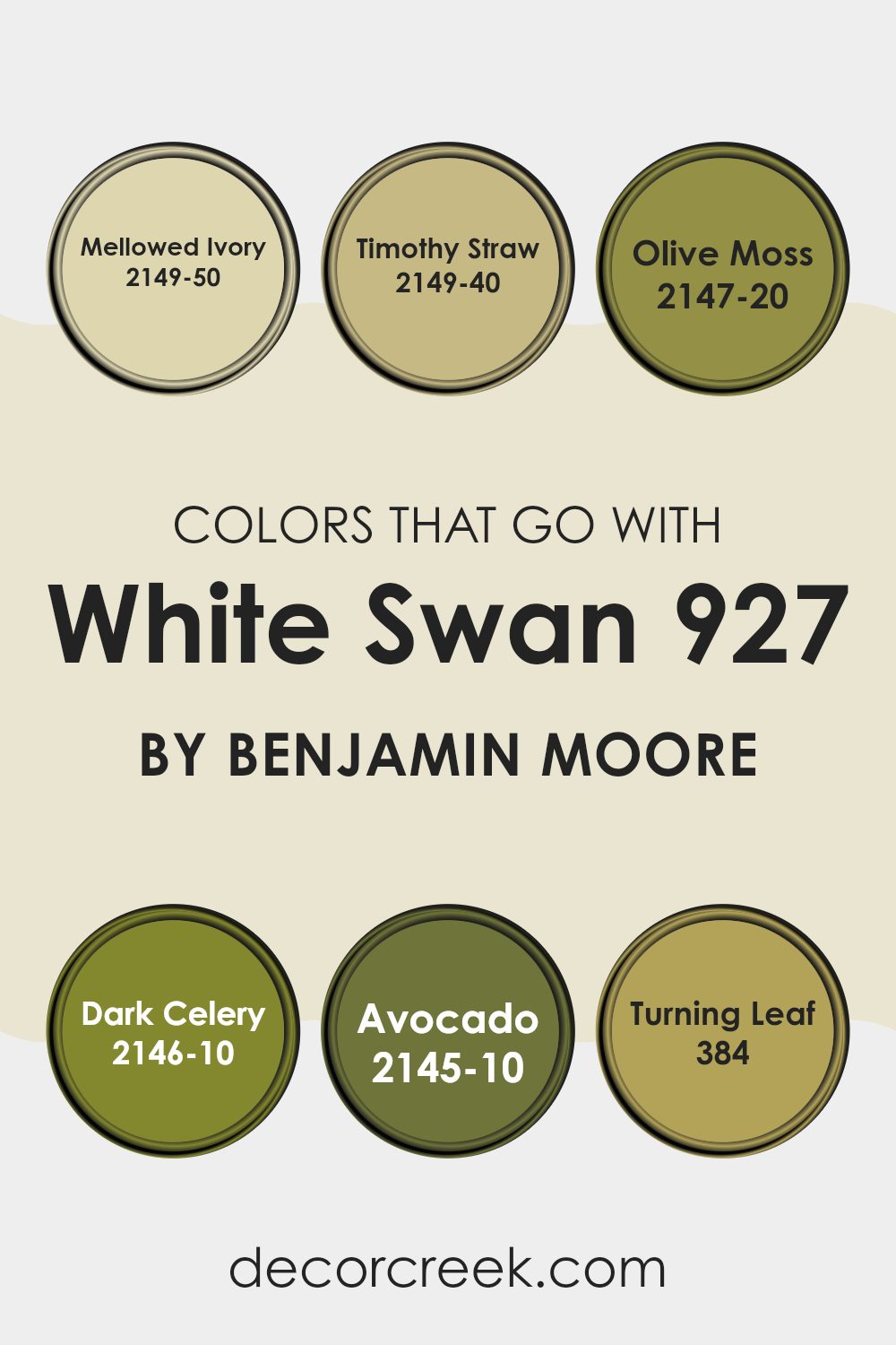
Colors that Go With White Swan 927 by Benjamin Moore
Choosing the right colors to complement White Swan 927 by Benjamin Moore is crucial because it helps create a harmonious and visually appealing room. White Swan itself is an adaptable shade of white that provides a clean and fresh backdrop, allowing other colors to truly shine. When paired with the right accents, it can make a room feel more welcoming and put together.
Mellowed Ivory 2149-50 is a soft, creamy color that brings a warm and gentle touch to White Swan 927, making the room feel cozy yet airy. Timothy Straw 2149-40, on the other hand, introduces a subtler, greenish-yellow hue that works well to add a bit of sunlight and cheerfulness to rooms.
For a bolder contrast, Olive Moss 2147-20 offers a deep, earthy green that pairs beautifully with White Swan for a nature-inspired look. Likewise, Dark Celery 2146-10 presents a richer, more intense green, which can make a statement while grounding the airiness of White Swan. Avocado 2145-10 is a robust dark green that creates a stark, yet harmonious contrast, perfect for adding depth and interest.
Finally, Turning Leaf 384 adds a splash of autumn with its muted reddish-orange, evoking the feeling of fall and warmth, ideal for creating a cozy, inviting environment. Together, these colors enhance the simplicity of White Swan, allowing for a range of delightful interior themes.
You can see recommended paint colors below:
- 2149-50 Mellowed Ivory
- 2149-40 Timothy Straw
- 2147-20 Olive Moss
- 2146-10 Dark Celery
- 2145-10 Avocado
- 384 Turning Leaf
How to Use White Swan 927 by Benjamin Moore In Your Home?
White Swan 927 by Benjamin Moore is a gentle off-white paint color that’s adaptable enough for any room in your home. It’s a popular choice for creating a clean and fresh look. You can use it to paint your living room walls for a neat and tidy appearance that makes the room feel bigger and more inviting.
This color also works well in bedrooms, providing a calm backdrop that lets your bedding or artwork stand out. In the kitchen, White Swan can brighten up cabinets or walls, complementing stainless steel appliances and wood surfaces nicely.
It’s also a great option for bathrooms where you might want a light, airy feel. If you have a smaller room, like a hallway or entryway, using White Swan can help make these areas appear more open. Overall, it’s a great choice if you’re looking to freshen up your home with a clean and simple off-white shade.
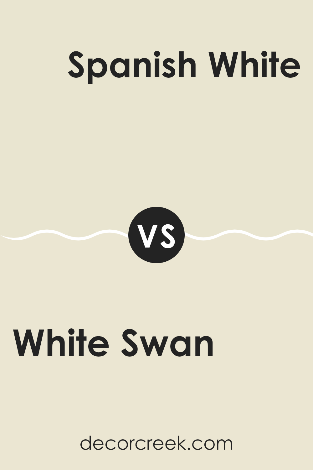
White Swan 927 by Benjamin Moore vs Spanish White OC-35 by Benjamin Moore
When comparing White Swan by Benjamin Moore to Spanish White OC-35, also by Benjamin Moore, you’ll notice subtle but distinct differences. White Swan is a pure, neutral white with a slight warmth that makes any room feel open and airy.
In contrast, Spanish White has a bit more depth, leaning towards a creamy white with beige undertones, providing a comforting and cozy vibe. This makes Spanish White a better choice for rooms where you want a touch of warmth without going too far into the beige or cream spectrum.
White Swan, with its cleaner look, is ideal for a modern setting where the aim is to create a fresh, uncluttered environment. Both shades are adaptable, but the choice between them largely depends on the mood and style you want to achieve in your room.
You can see recommended paint color below:
- OC-35 Spanish White
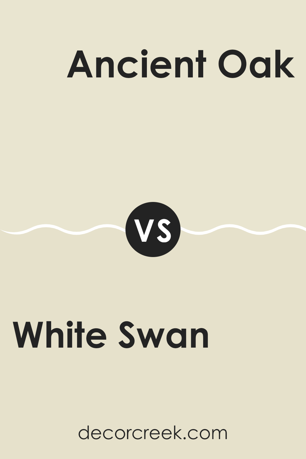
White Swan 927 by Benjamin Moore vs Ancient Oak 940 by Benjamin Moore
Benjamin Moore’s “White Swan” is a soft, neutral shade of white that provides a clean and simple backdrop. It’s an adaptable color that works well in different lighting situations and can make small rooms appear larger.
“Ancient Oak,” on the other hand, is a deeper, warmer color that leans towards a chocolate brown. This color is great for creating cozy and inviting rooms. When comparing the two, “White Swan” is more suitable for achieving bright and airy environments, whereas “Ancient Oak” is ideal for adding depth and warmth to a room.
Both colors complement each other well when used in the same room, with “White Swan” possibly used on the majority of walls and “Ancient Oak” as an accent or feature wall, helping to anchor the room’s décor.
You can see recommended paint color below:
White Swan 927 by Benjamin Moore vs Royal Silk 939 by Benjamin Moore
The Benjamin Moore color White Swan is a soft, gentle off-white with a hint of warmth. This color can make rooms feel larger and more open, and it works beautifully as a primary color, providing a clean, neutral background that’s easy on the eyes.
On the other hand, Royal Silk is also on the lighter side but carries a subtle lilac undertone, giving it a distinctly different feel from White Swan. Despite both being light hues, Royal Silk offers an understated hint of color that adds variety without overpowering the senses.
In a direct comparison, White Swan is the more adaptable of the two, easily fitting into a wide range of decor styles and settings. Meanwhile, Royal Silk suits rooms where a slight touch of color is desired. Its gentle purple tint makes it unique, ideal for creating a quiet point of interest in a mostly neutral room.
You can see recommended paint color below:
- 939 Royal Silk
White Swan 927 by Benjamin Moore vs Albany White 944 by Benjamin Moore
White Swan and Albany White, both by Benjamin Moore, are similar hues with subtle differences that affect their use in decorating. White Swan has a soft, warm tone that feels inviting and comfortable in most rooms.
It’s an ideal choice for creating a cozy atmosphere, particularly in living rooms or bedrooms. Albany White, on the other hand, leans a bit cooler with slight gray undertones, giving it a fresher look. This color works well in kitchens and bathrooms where a clean, crisp appearance is desired.
Both colors are adaptable and pair well with various decor styles, from traditional to modern. However, choosing between them depends on the mood you want to set and the natural light in your rooms, as White Swan tends to enhance warmth, while Albany White reflects light more neutrally.
You can see recommended paint color below:
- 944 Albany White
After reading all about 927 White Swan by Benjamin Moore, I’ve learned so much about what makes this paint color special. 927 White Swan isn’t just any white paint; it has a gentle touch that can make any room feel welcoming and warm. This color is really good at making small rooms look bigger and brighter and bringing a peaceful feeling without being too bright or sharp.
Using 927 White Swan can be a good choice for many places in your home like your living room, kitchen, or even your bedroom. It’s a soft white that can go well with other colors, from bright blues to deep greens, making it easy to use no matter what your favorite colors are.
In short, after looking at all the benefits and the beautiful, calm vibe 927 White Swan offers, it’s clear why so many people love it. It’s like a cozy blanket for your walls, giving you a comforting feeling every time you walk into the room. Whether you’re fixing up a small room or just want to give your whole house a fresh, new look, 927 White Swan is a great choice to make any area of your home feel more inviting.
Ever wished paint sampling was as easy as sticking a sticker? Guess what? Now it is! Discover Samplize's unique Peel & Stick samples.
Get paint samples

