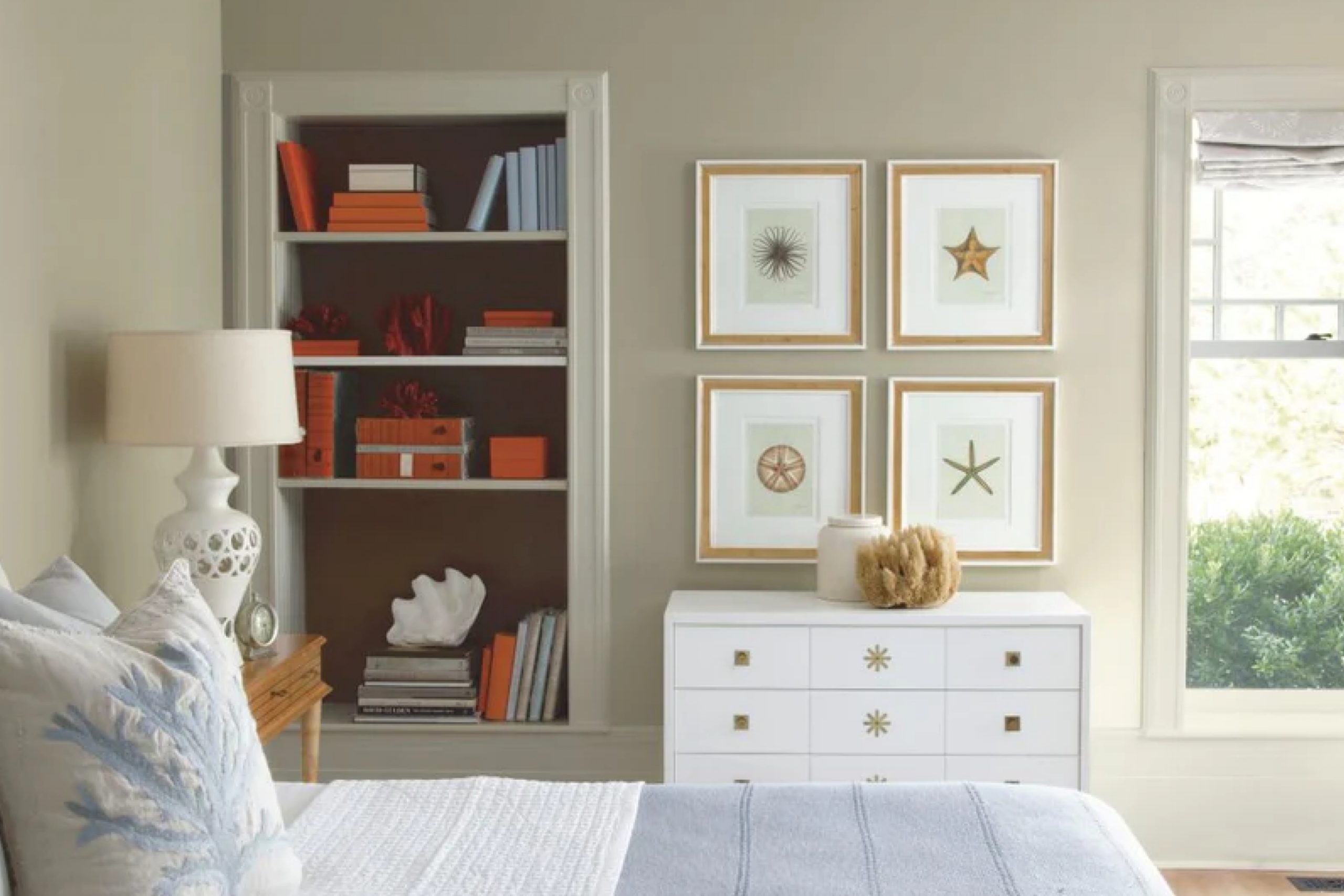
The first time I saw OC-24 Wind’s Breath by Benjamin Moore, it felt like discovering a hidden gem. Its soft, understated tones created a quiet sense of calm, as if inviting me into a serene space. I could instantly imagine this soothing color bringing warmth and clarity to any room.
It reminded me of cool breezes on a warm day, carrying hints of serenity.
I found that this shade has a magical balance; it is neither too bold nor too dull. Instead, it offers a quiet elegance that enhances any room. Its versatility amazed me as it matched with different styles, whether modern, classic, or something uniquely mine.
The type of calm it brought into my environment was surprising.
In choosing this color, I felt confident, knowing it would create an atmosphere of comfort. With its grace and charm, OC-24 Wind’s Breath turned out to be more than just a color; it became a part of my home, reflecting a piece of my personality.
I found it incredible how a color could influence the mood and make everything feel just right.
What Color Is Wind’s Breath OC-24 by Benjamin Moore?
Wind’s Breath (OC-24) by Benjamin Moore is a soft, warm neutral that blends beige and gray undertones. This color creates a gentle and inviting atmosphere, without feeling too stark or cold. Wind’s Breath is versatile and can work well in a variety of interior styles, lending a cozy and calming touch to each.
In a modern or minimalist setting, Wind’s Breath provides a perfect balance as a wall color, allowing for clean lines and uncluttered spaces to shine. It pairs beautifully with natural materials like light-colored woods, such as birch or maple, offering a warm contrast.
For a farmhouse or rustic interior, it complements exposed brick, weathered wood, and cozy textiles like wool or cotton. Wind’s Breath acts as a neutral base that enhances the character of more textured and tactile elements in the room.
In coastal or beach-inspired homes, this hue harmonizes with soft blues, sandy tones, and crisp whites, creating a breezy and relaxed ambiance. It works particularly well with woven baskets, linen fabrics, and light, airy drapes.
Overall, Wind’s Breath is a flexible, neutral shade that fits many design schemes, working seamlessly with both sleek surfaces and textural elements.
Is Wind’s Breath OC-24 by Benjamin Moore Warm or Cool color?
Wind’s Breath by Benjamin Moore is a soft, warm neutral color that can add a cozy atmosphere to homes. It is a light taupe shade with subtle hints of gray and beige, making it versatile for different spaces. This color works well in living rooms, bedrooms, and kitchens, offering a gentle backdrop that doesn’t overpower the room.
It pairs nicely with both bold and muted colors, allowing for flexible decoration choices.
One of the great things about Wind’s Breath is its ability to reflect light, which can make rooms feel brighter and more inviting. It doesn’t create harsh contrasts but blends smoothly with other elements in the space. This shade complements both modern and traditional styles, making it a popular choice for homeowners looking to create a welcoming and balanced atmosphere.
Overall, Wind’s Breath is a reliable option for those seeking a warm, inviting color that provides a flexible foundation for designing their home.
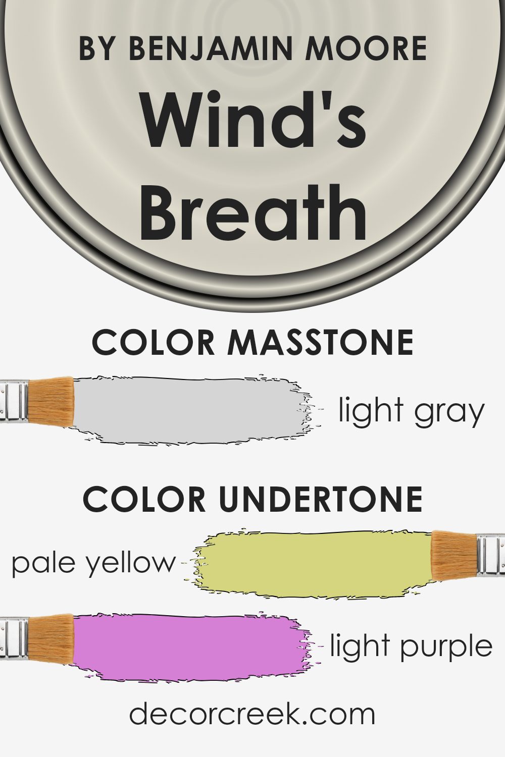
Undertones of Wind’s Breath OC-24 by Benjamin Moore
Wind’s Breath by Benjamin Moore is a versatile and subtle paint color with several underlying tones that affect how it appears in different spaces. The color displays undertones of pale yellow, light purple, light blue, pale pink, mint, lilac, and grey. These undertones can influence the perception of the color in various lighting conditions and surroundings.
Pale yellow undertones in Wind’s Breath add warmth, making it feel inviting and cozy. This warmth can make a room glow gently, especially in areas with ample natural light. The light purple and lilac undertones introduce a hint of sophistication and can create a soft, calming atmosphere.
These hues are delicate and help the paint adapt to different moods and settings, like bedrooms or living rooms.
Meanwhile, the light blue and mint undertones contribute a cool freshness, which can counterbalance the warmth from other undertones. These cooler hints can be noticed under artificial lighting or in spaces with limited natural light, helping a room feel open and airy.
The underlying grey tone gives Wind’s Breath its neutral, versatile base. This grey provides an excellent backdrop that allows the other undertones to subtly shine, making it an ideal choice for interior walls where you want a balanced and adaptable look.
Overall, the blend of these undertones allows Wind’s Breath to change subtly with light and complements a wide range of furnishings and decor styles.
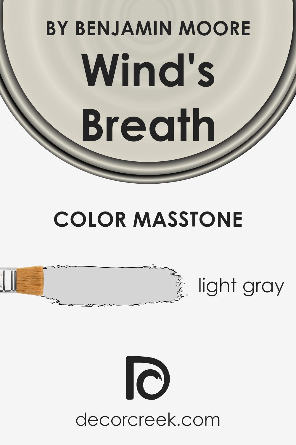
What is the Masstone of the Wind’s Breath OC-24 by Benjamin Moore?
Wind’s Breath (OC-24) by Benjamin Moore is a light gray color that provides a gentle, neutral backdrop in homes. With its subtle hue of #D5D5D5, it allows for versatility in various spaces. The light gray tone helps to create a spacious and airy feel, making rooms appear larger and brighter.
It’s an excellent choice for those who want a clean, simple look that works well with different styles and furnishings.
This color pairs nicely with a range of other colors, from soft pastels to bold accents, providing flexibility in decorating. Whether used in living rooms, bedrooms, or kitchens, Wind’s Breath offers a calming, unobtrusive presence that enhances the overall ambiance. Its neutrality makes it a great choice for those who may frequently change their décor, as it can harmonize with numerous palettes.
Overall, Wind’s Breath is a practical and pleasing choice for creating a light, easygoing atmosphere in any room.
How Does Lighting Affect Wind’s Breath OC-24 by Benjamin Moore?
Lighting plays a significant role in how we perceive colors. Different light sources can change the appearance of a color, making it look warmer, cooler, brighter, or even duller. Natural light changes throughout the day, affecting how we see colors in a space. Artificial light, on the other hand, can vary depending on the type of bulb used (like LED, fluorescent, or incandescent), further altering color perception.
Take the color “Wind’s Breath OC-24” by Benjamin Moore, for instance. This is a neutral, light greige (gray-beige) color that can adapt to different lighting conditions. In natural light, especially in rooms that face different directions, it can appear quite differently.
In north-facing rooms, the light tends to be cooler and sometimes even a bit gray. Here, Wind’s Breath can appear more muted and lean towards a cooler gray tone. This makes the space feel calm and subdued.
In south-facing rooms, there’s an abundance of warm, direct sunlight throughout the day. This light can bring out the warmer, beige undertones in Wind’s Breath, making it feel more inviting and brighter.
East-facing rooms get bright, warm light in the morning, but it turns cooler as the day progresses. In the early hours, Wind’s Breath may look warmer and more vibrant, but later in the day, it may appear cooler and more relaxed.
West-facing rooms receive warm light in the afternoon and evening. Wind’s Breath might look somewhat washed out during midday, but it will gain warmth and depth as the sun sets.
Artificial lighting also impacts this color. Warm white bulbs (more yellow) will enhance the beige tones, while cool white bulbs (more blue) will emphasize the gray. Therefore, choosing the right type of lighting for your room can affect how Wind’s Breath, or any color, actually appears on your walls.

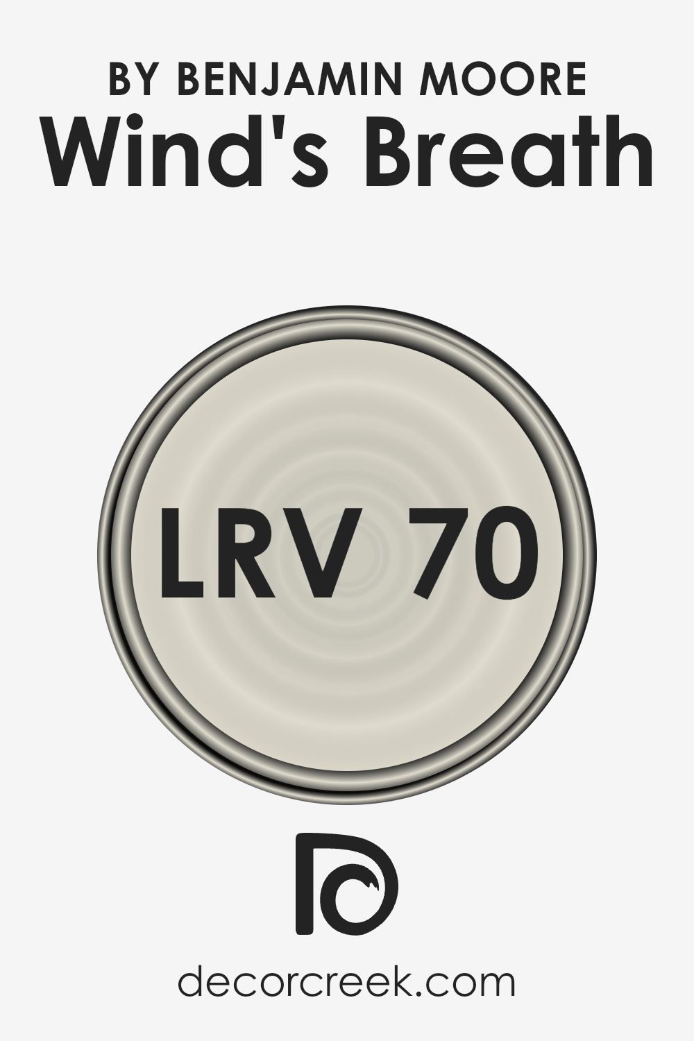
What is the LRV of Wind’s Breath OC-24 by Benjamin Moore?
LRV, or Light Reflectance Value, is a measurement that tells you how much light a color reflects and absorbs. It is measured on a scale from 0 to 100, with 0 being absolute black, which absorbs all light, and 100 being pure white, which reflects all light.
A higher LRV means the color reflects more light and makes a room feel brighter and more spacious. In contrast, colors with lower LRV values absorb more light, making spaces feel cozier and sometimes smaller.
So, when choosing paint colors for your walls, considering the LRV is important to achieve the desired effect in your room, whether you’re aiming for warmth, brightness, or contrast.
Wind’s Breath by Benjamin Moore has an LRV of 69.59, which means it reflects a good amount of light, making it a relatively bright color.
This particular LRV value suggests that Wind’s Breath will help make a room feel lighter and more open, as it reflects a significant portion of the light that hits it.
The color is a soft, neutral shade that balances well in different lighting situations, adding a gentle warmth without overwhelming other elements in the room. This makes it a versatile choice for various spaces in a home, especially if you want to maintain a bright yet calm environment.
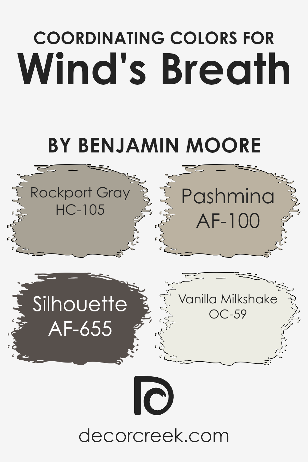
Coordinating Colors of Wind’s Breath OC-24 by Benjamin Moore
Coordinating colors are shades that work well together to create a balanced and pleasing look in a space. These colors, when paired with Wind’s Breath OC-24 by Benjamin Moore, add depth and style to any room. Wind’s Breath is a soft, neutral tone that acts as a perfect backdrop.
When you bring in Rockport Gray HC-105, with its warm, earthy grey hue, it adds a sense of stability and goes well with the gentle lightness of Wind’s Breath.
Silhouette AF-655, a deep and rich color, introduces a touch of drama and contrast, making elements in the room stand out without being overwhelming. Pashmina AF-100, with its warm beige tint, blends seamlessly, creating a cozy and inviting atmosphere that complements the lighter tones.
Lastly, Vanilla Milkshake OC-59, a creamy off-white, offers a light, airy touch that can brighten any space.
Together, these colors create a harmonious palette that can bring a room together in a way that feels both well-thought-out and effortless. By using these colors as a group, you can make any room feel vibrant yet balanced, each shade enhancing the others in its own way.
You can see recommended paint colors below:
- HC-105 Rockport Gray
- AF-655 Silhouette
- AF-100 Pashmina
- OC-59 Vanilla Milkshake
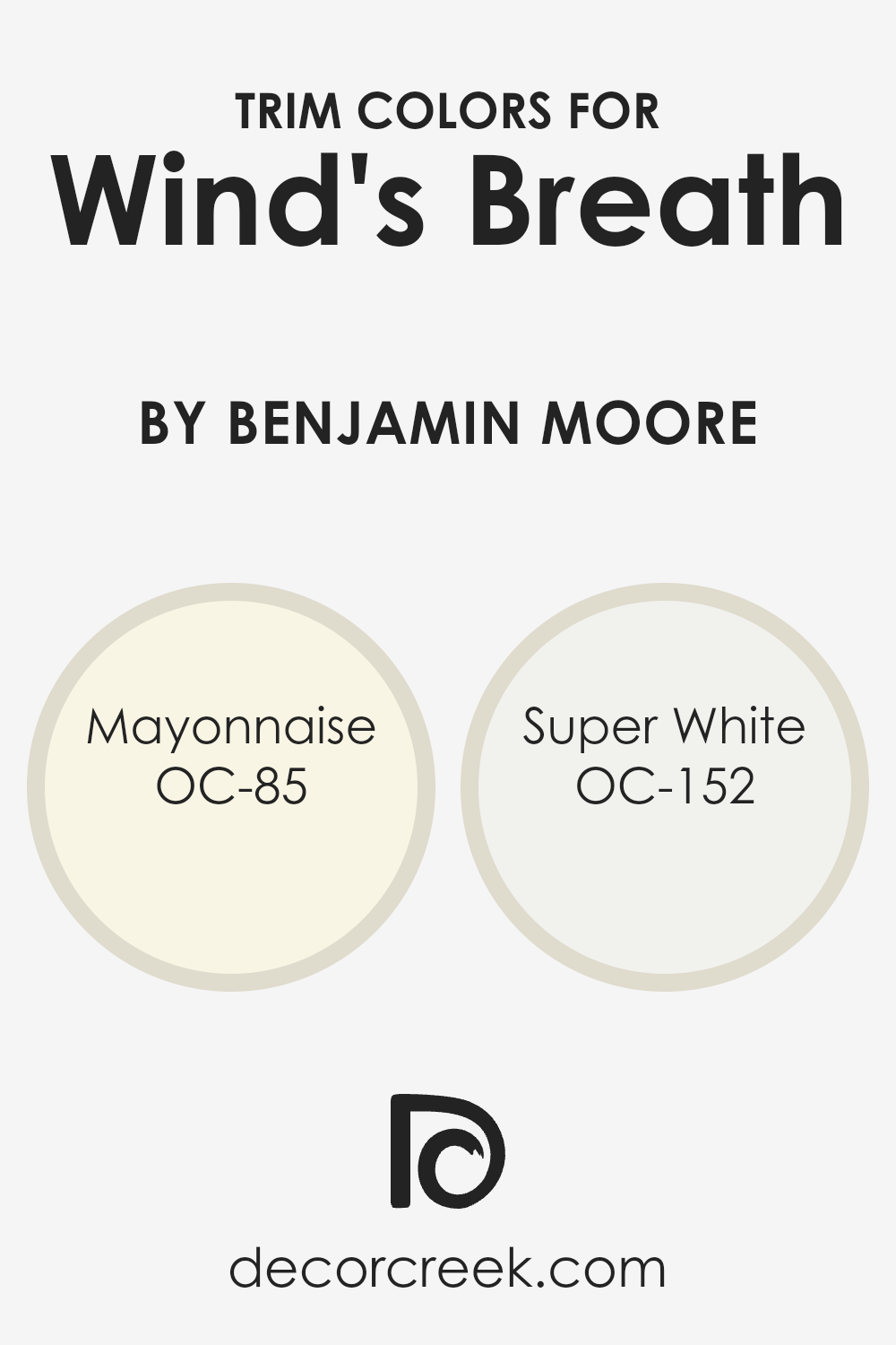
What are the Trim colors of Wind’s Breath OC-24 by Benjamin Moore?
Trim colors are the shades typically used to outline and frame windows, doors, and baseboards in a room. They create a contrast or complement to the main wall color, highlighting architectural features and adding depth to a space.
Using trim colors effectively can make a room feel more polished and complete. In the case of Wind’s Breath by Benjamin Moore, trim colors play a crucial role. Wind’s Breath is a soft, neutral hue that lends a sense of calm and simplicity to a room, yet without well-chosen trim colors, it might lack definition and contrast.
For Wind’s Breath, using Mayonnaise OC-85 and Super White OC-152 as trim colors can significantly amplify its impact. Mayonnaise is a warm white with subtle yellow undertones, offering a cozy touch against the cooler tones of Wind’s Breath. It brings a gentle warmth to the room, enhancing the inviting atmosphere.
On the other hand, Super White offers a brighter, crisper contrast. It’s a pure white that sharpens the edges around windows and doors, giving a clean and modern touch.
Choosing between these two trim colors or using them in combination can define the mood of the space—whether opting for a softer, more blended look with Mayonnaise or a sleek, contemporary feel with Super White.
You can see recommended paint colors below:
- OC-85 Mayonnaise
- OC-152 Super White
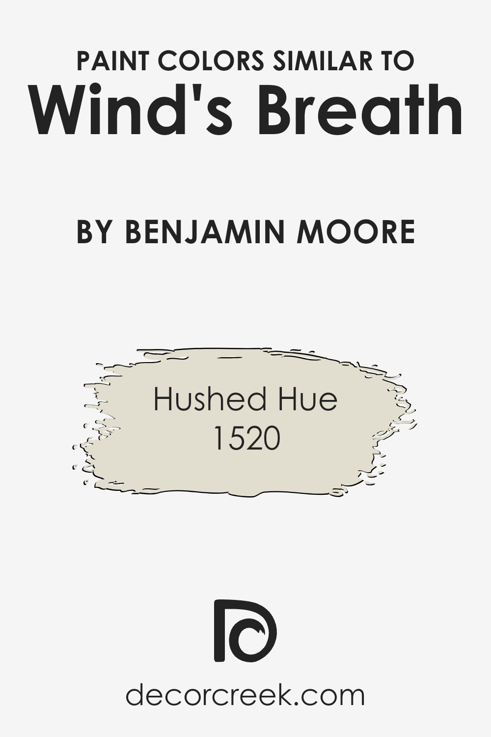
Colors Similar to Wind’s Breath OC-24 by Benjamin Moore
Similar colors are important in design because they create a harmonious and calming effect. For Wind’s Breath OC-24 by Benjamin Moore, similar tones like 1520 – Hushed Hue can complement its soft and inviting nature. Using similar colors allows designers to build cohesive spaces that are pleasant to the eye and comfortable to inhabit.
These hues often share undertones, helping them blend seamlessly. When you walk into a room painted with such colors, everything feels like it naturally belongs together.
Hushed Hue 1520 is a gentle, light yellow that adds a touch of warmth without being overpowering. It feels like sunlight streaming through a window, offering a cozy and welcoming vibe that’s perfect for living spaces or bedrooms. Wind’s Breath OC-24, on the other hand, is a lighter, neutral color with an airy feel, making it versatile for any room.
Together, these shades enhance each other, creating a space that feels both fresh and inviting. Utilizing similar colors such as these in a design scheme not only enhances the overall look but also provides a subtle backdrop that allows other decorative elements to shine.
You can see recommended paint color below:
- 1520 Hushed Hue
How to Use Wind’s Breath OC-24 by Benjamin Moore In Your Home?
Wind’s Breath OC-24 by Benjamin Moore is a soft, inviting paint color. It’s a light greige with subtle hints of warmth, making it a versatile choice for various rooms in a home. Use it in living rooms or bedrooms to create a cozy and comfortable atmosphere. Its neutral tone pairs well with both warm and cool color palettes, allowing it to complement a wide range of décor styles, from modern to traditional.
In the kitchen or bathroom, Wind’s Breath can provide a clean, fresh look. It works beautifully with natural materials like wood and stone, highlighting their textures without overpowering them.
For those aiming for a minimalist look, this color can serve as an ideal backdrop, allowing artwork or furniture to stand out.
Wind’s Breath OC-24 can also be used to brighten small spaces, such as hallways or entries, making them feel more open and welcoming.
It’s a practical and stylish choice for anyone looking to update their interior with a subtle yet effective change.
Wind’s Breath OC-24 by Benjamin Moore vs Hushed Hue 1520 by Benjamin Moore
Wind’s Breath OC-24 by Benjamin Moore is a light, soft color with a gentle warmth. It’s like a light beige or off-white with a hint of gray, making it versatile and easy to pair with other colors in a room. This color gives spaces an airy and open feel, making it ideal for smaller rooms or areas where you want to create a sense of spaciousness.
On the other hand, Hushed Hue 1520 by Benjamin Moore is a warmer, more muted shade with a touch of yellow or earthy undertones. It feels cozier and more grounded than Wind’s Breath. Hushed Hue works well in rooms where you want a sense of warmth and comfort, making it great for living rooms or bedrooms.
Both colors are neutral, but Wind’s Breath leans more toward a cool neutrality, while Hushed Hue has a warmer vibe. Together, they can create a balanced look in a home.
You can see recommended paint color below:
- 1520 Hushed Hue
Conclusion
When I think of this color, I imagine bright and cozy spaces that feel warm and welcoming.
Wind’s Breath is not too bright and not too dark, which makes it perfect for any room, whether it’s the living room, bedroom, or even the kitchen. It’s friendly and can make any piece of furniture look great next to it.
The color also reminds me of how I feel at the beach when the wind feels soft on my face and the sky looks big and endless. It brings calmness and warmth but keeps things lively at the same time.
What I like most is that this color can fit anywhere. People who painted their rooms with it have said it makes them feel happy and relaxed. They enjoy spending time in their spaces more than ever before.
So, in the end, Wind’s Breath is like the perfect friend for your home. It’s always there, making sure you feel good and everything looks nice. It’s a wonderfully friendly color that can make any room feel just right.
Ever wished paint sampling was as easy as sticking a sticker? Guess what? Now it is! Discover Samplize's unique Peel & Stick samples.
Get paint samples

