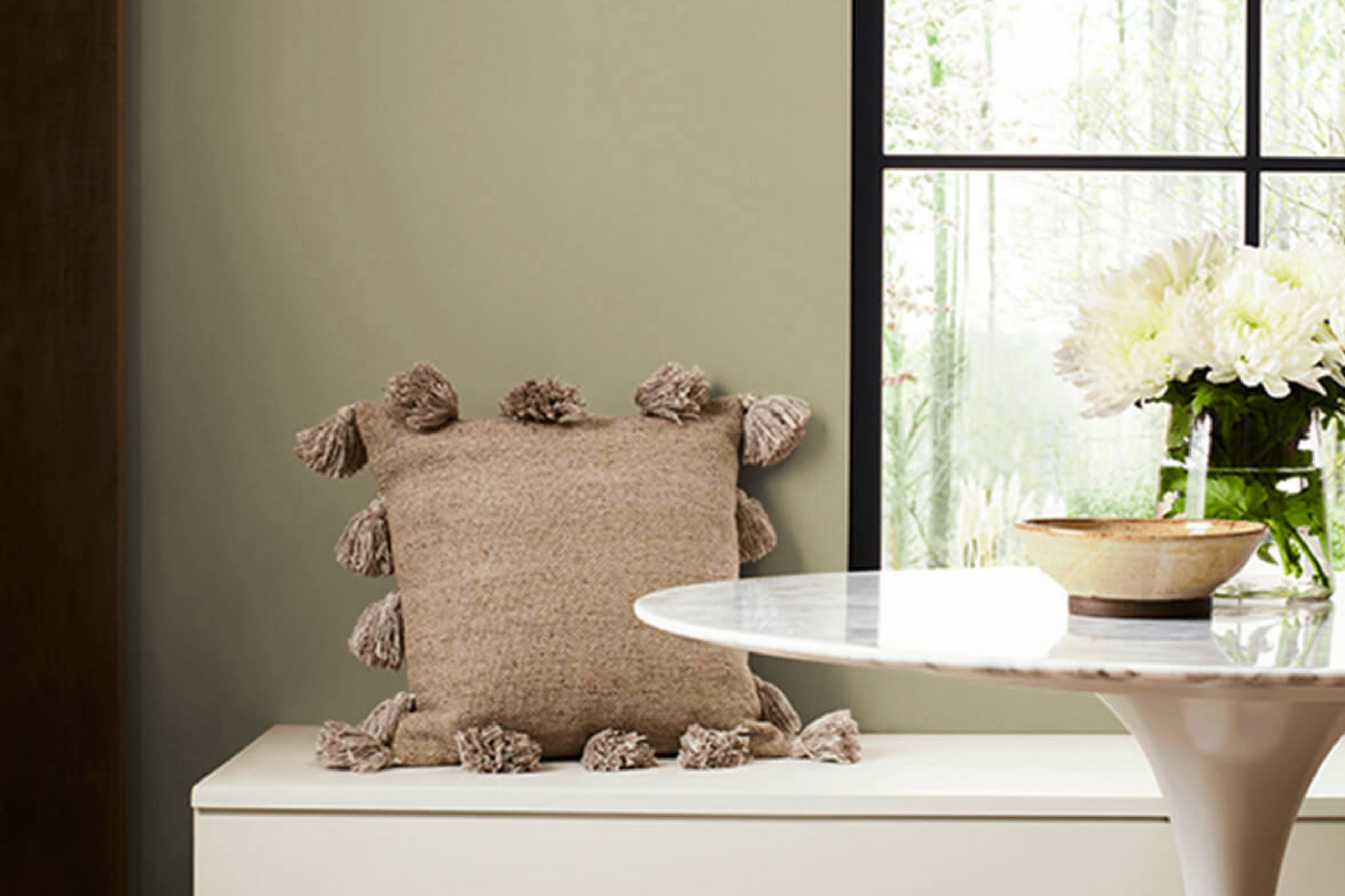
When you’re looking for a paint color that offers a subtle and sophisticated feel for your space, SW 9527 Worn Khaki by Sherwin Williams might just be the perfect choice. I find that this particular shade brings a warm, neutral backdrop that can easily blend with various decor styles and preferences.
Worn Khaki is a part of Sherwin Williams’ color collection, and it stands out because of its versatile nature.
Whether you want to create a cozy, inviting atmosphere in your living room or a serene, calm environment in your bedroom, this color adapts beautifully to different lighting and settings.
Many of my friends and clients have used Worn Khaki in their homes. They often tell me how much they appreciate the color for its ability to complement other colors, from bright accents to softer hues.
It’s also quite practical for hiding everyday wear and tear on walls, making it a great choice for busy households.
If you’re considering a new look for your home or just a simple refresh, Worn Khaki is worth considering. It’s a color that doesn’t overpower but rather enhances the beauty of your spaces.
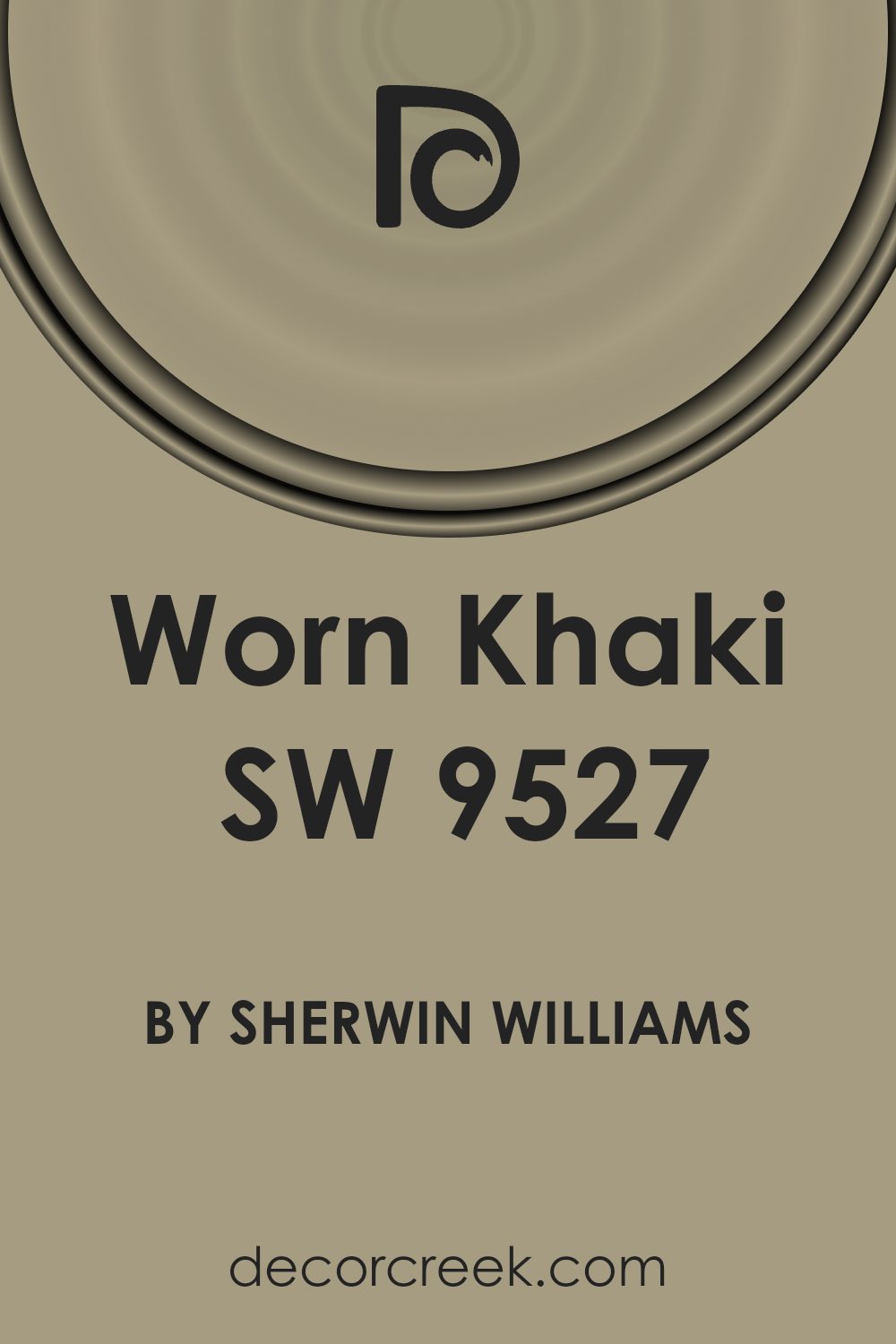
What Color Is Worn Khaki SW 9527 by Sherwin Williams?
The color Worn Khaki by Sherwin Williams is a soft, neutral hue that strikes a beautiful balance between green and beige. This versatile color has an understated earthiness, making it comfortable and inviting without being overpowering. It is perfect for creating a cozy, muted backdrop in any room, enhancing the sense of space and comfort.
Worn Khaki works exceptionally well in interior styles that lean towards the natural and rustic, such as farmhouse, cottage, and Scandinavian designs. Its subtle, organic vibe also makes it a great choice for modern and minimalist spaces where simplicity and relaxed aesthetics are key.
When it comes to pairing with materials and textures, Worn Khaki harmonizes beautifully with natural wood, enhancing its grain and warmth. It also pairs well with stone elements like marble or slate, which can add a touch of understated elegance to the casualness of the color. In terms of textiles, linens and soft cottons in white or light pastel tones create a soft contrast that brings out the earthy qualities of Worn Khaki.
Additionally, incorporating brushed metals like brass or copper can introduce a gentle sparkle that subtly enlivens the color scheme. Overall, Worn Khaki is a functional and adaptable color that works well across a wide range of design approaches, making any room feel grounded and welcoming.
Is Worn Khaki SW 9527 by Sherwin Williams Warm or Cool color?
Worn Khaki by Sherwin Williams is a warm, inviting color that can make a house feel more like a home. Its subtle green and brown tones blend nicely, creating a cozy atmosphere that’s perfect for relaxing. This color works well in almost any room, whether it’s a living room where families gather or a bedroom where calm is key.
It pairs nicely with natural materials like wood and stone, enhancing these textures without overpowering them. Because it’s a neutral shade, it also matches well with various furniture styles and other colors, making it flexible for many decorating schemes.
Its versatility makes it a great choice for those who like to change their decor often, as it can serve as a background to both bold and muted accents. Overall, Worn Khaki sets a warm, earthy tone that’s easy to live with and enjoy.
Undertones of Worn Khaki SW 9527 by Sherwin Williams
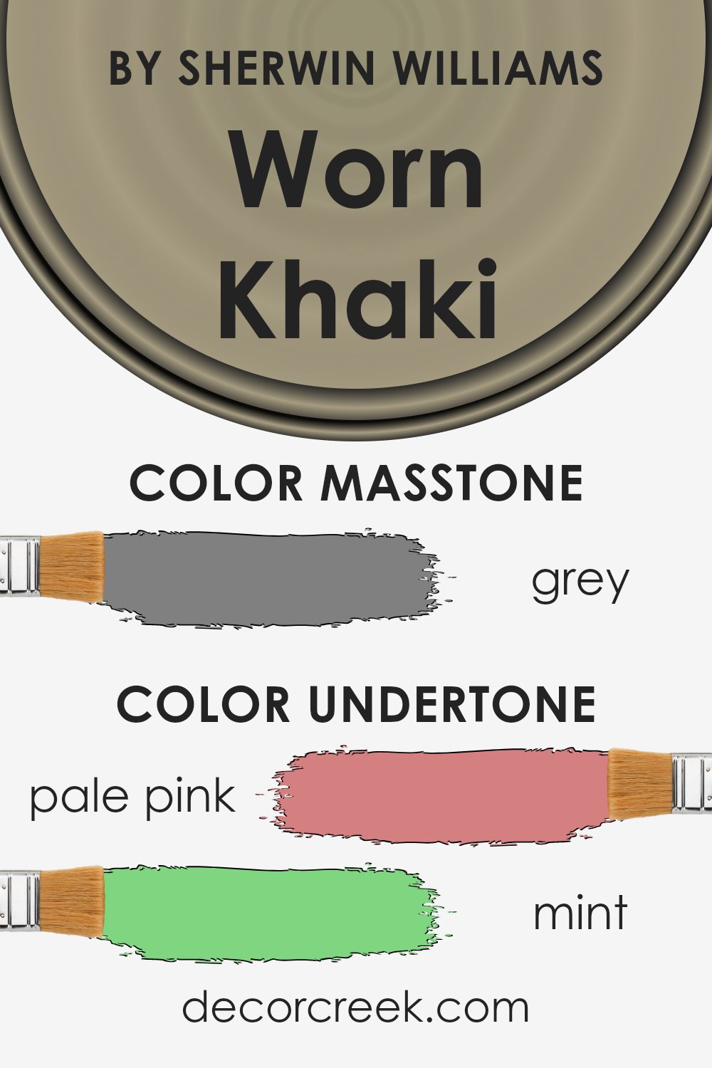
Worn Khaki by Sherwin Williams is a versatile paint color that can shift its appearance based on its undertones. Undertones are subtle colors that lie beneath the surface of the main color. They can significantly impact how a color looks in different lighting conditions and when paired with various interior elements.
The undertones of Worn Khaki include a spectrum from pale pink to dark grey, which means that the color can appear differently based on the time of the day and the colors surrounding it. For example, in a room with lots of natural light, the pale yellow or light gray undertones might make the walls seem brighter and more airy.
On the other hand, in a room with less light or during the evening, darker undertones like brown or dark green may become more noticeable, giving the walls a cozier feel.
When using Worn Khaki on interior walls, these undertones offer a lot of flexibility in terms of decor and style. The presence of both warm undertones like orange and cool undertones like light blue allows this color to harmonize with a wide range of furnishings and accent colors.
This makes it ideal for living rooms, bedrooms, and even kitchens, adapting well to different themes and personal tastes.
Understanding these undertones is crucial when choosing what other colors to combine within a space, as it helps in achieving the desired atmosphere. Whether you’re aiming for a refreshing, calm area or a warmer, inviting space, the undertones of Worn Khaki can help guide your decor choices effectively.
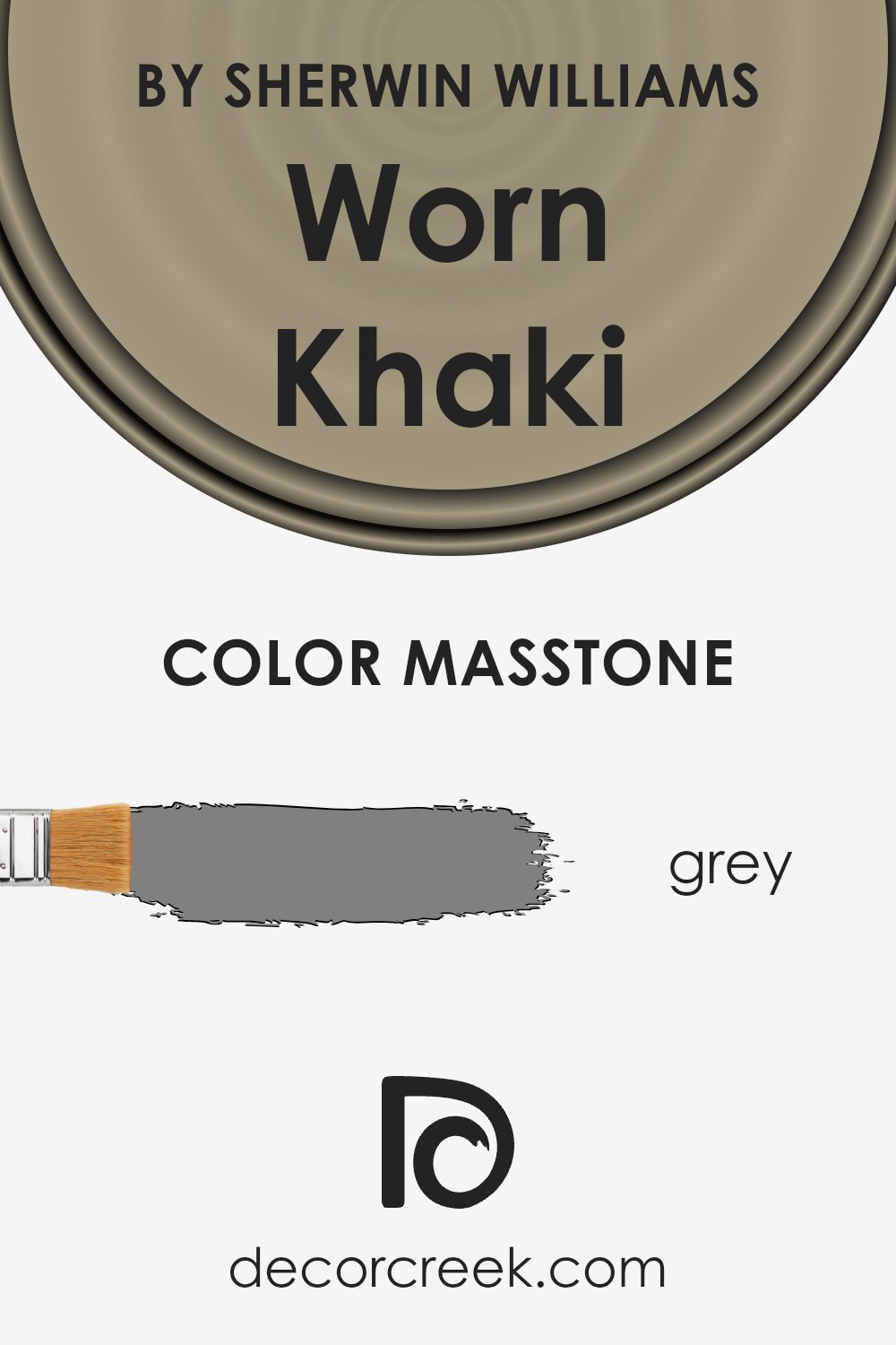
What is the Masstone of the Worn Khaki SW 9527 by Sherwin Williams?
Worn Khaki by Sherwin Williams, with a masstone of Grey (#808080), lends itself well to creating a calm atmosphere in homes. This color can be seen as a versatile middle ground, not too dark or too light, making it easy to incorporate into various styles and spaces.
In living areas, it can help to set a peaceful tone, ideal for relaxation after a busy day. In bedrooms, Worn Khaki’s soft grey hue acts almost like a neutral, pairing well with both bright and muted furnishings, allowing for flexibility in design choices.
This color can also help to make small rooms appear larger by reflecting light, rather than absorbing it, which often happens with darker colors. Using this shade in a home effectively meets the need for a practical color that adapts seamlessly to different decorating schemes and lighting conditions.
How Does Lighting Affect Worn Khaki SW 9527 by Sherwin Williams?
Lighting plays a crucial role in how we perceive colors in our daily environments, significantly impacting the mood and visual impact of a space. Color can look different under various light sources: natural sunlight, fluorescent lights, or incandescent bulbs all affect how we see color.
In the case of the color Worn Khaki, a soft and muted hue, its appearance can significantly alter depending on the type of light it is exposed to. Under artificial light, such as incandescent lighting, Worn Khaki tends to appear warmer and cozier, bringing a rich depth to the room. This makes it a great choice for living spaces and bedrooms where softer, comforting tones are desired.
In natural light, however, Worn Khaki can look quite different. The true color is often more evident, revealing all the subtle undertones. It appears lighter and can pull more of its beige or gray aspects depending on the sun’s position and intensity.
The orientation of the room also affects how Worn Khaki is perceived:
– North-facing rooms: These rooms receive less direct sunlight, which can make colors appear cooler. Worn Khaki might look more muted and subdued here, pulling out its cooler, grayish tones.
– South-facing rooms: With ample sunlight, south-facing rooms highlight the warmth in Worn Khaki. Here, the color can look brighter and more inviting, taking on a cheerful vibe during the day.
– East-facing rooms: These rooms enjoy bright light in the morning, which can make Worn Khaki look warmly lit and vibrant in the mornings but cooler in the afternoon.
– West-facing rooms: As the sun sets, west-facing rooms get a soft, warm glow. Worn Khaki can benefit from this evening light, looking warmer and more welcoming in the late afternoons and evenings.
Choosing colors like Worn Khaki requires consideration of both the natural and artificial lighting of the space to ensure it consistently provides the desired atmosphere.

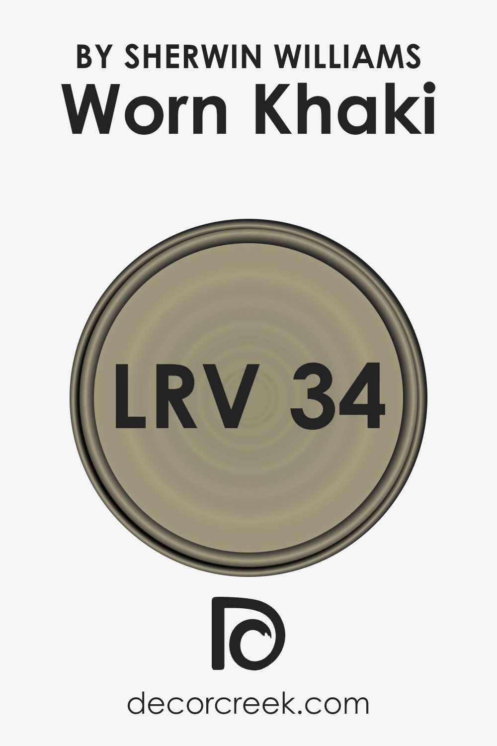
What is the LRV of Worn Khaki SW 9527 by Sherwin Williams?
Light Reflectance Value (LRV) measures the percentage of light a paint color reflects from or absorbs into a surface. It’s a useful concept when choosing paint colors because it helps predict how light or dark a color will look once applied to a room’s walls .
Colors with higher LRVs are lighter, reflecting more light, making a room feel brighter. Conversely, colors with lower LRVs absorb more light, which can make a space seem cozier but darker.
With an LRV of 33.536, the color mentioned falls into the lower to mid range of the LRV scale. This means it doesn’t reflect a lot of light, but it’s not among the darkest. As a result, it can make a room feel warmer and more enclosed, without making it feel too small or cramped.
This kind of color is ideal for spaces where a moderate, grounded feel is desirable and can especially complement areas with ample natural or artificial lighting to prevent the space from feeling too dark.
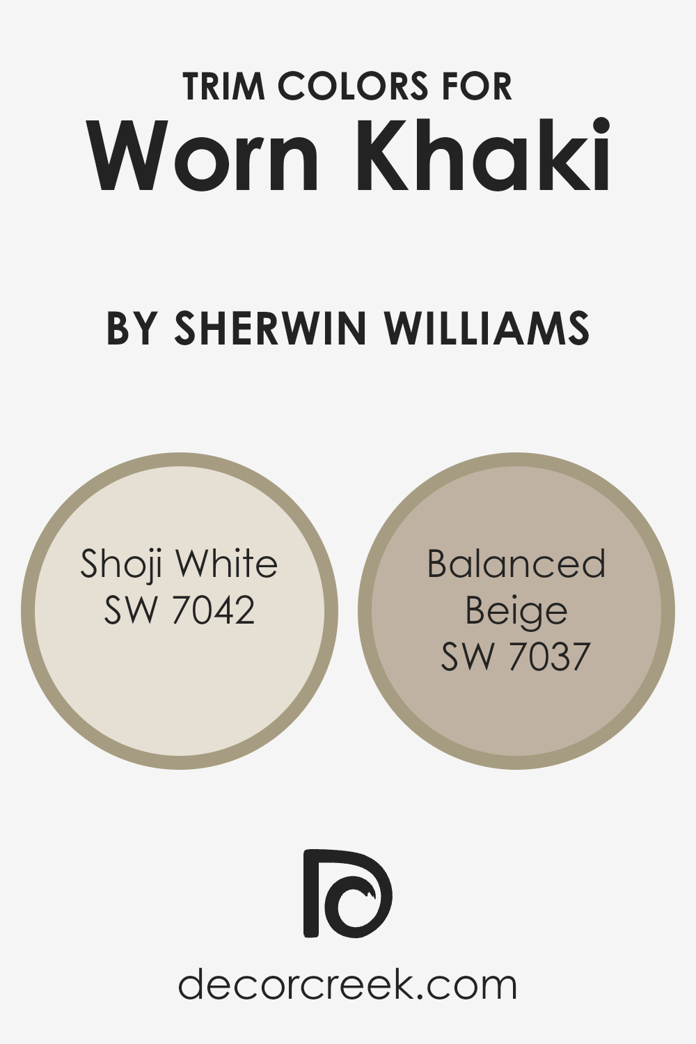
What are the Trim colors of Worn Khaki SW 9527 by Sherwin Williams?
Trim colors are essential in painting because they highlight the distinguishing features of rooms, such as door frames, window sills, and baseboards, providing a finishing touch that defines and enhances the overall look.
When coordinating with a color like Worn Khaki by Sherwin Williams, choosing the right trim colors can create a harmonious and polished appearance. Shoji White and Balanced Beige are ideal trim colors for use with Worn Khaki due to their complementary tones.
Shoji White is a gentle and light color that brings a fresh and airy feel to trim work, making it a great choice to subtly contrast the richer and earthier tones of Worn Khaki. It has the ability to make transitions between walls and trims smooth and visually appealing.
On the other hand, Balanced Beige is a warm neutral that enriches the depth of nearby colors without causing a harsh separation. This color works wonderfully with Worn Khaki to offer a cohesive yet distinct boundary that enhances both the trim and the wall color.
Using these trim colors ensures a refined and cohesive look that ties the spaces together beautifully.
You can see recommended paint colors below:
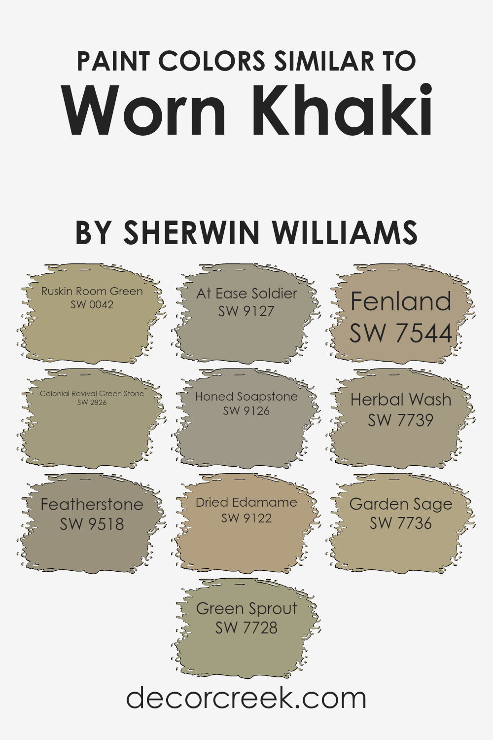
Colors Similar to Worn Khaki SW 9527 by Sherwin Williams
Similar colors, like shades of green ranging from olive to khaki, provide a harmonious palette that allows for aesthetic continuity while adding subtle variety. When used in interior design, these colors create a cohesive look that’s pleasing to the eye and seamlessly blends different design elements.
These colors can make a space feel more put-together and comfortable, offering a natural, earthy atmosphere that’s both welcoming and calming.
For example, Ruskin Room Green has a muted, earthy tone that can ground a room’s aesthetic with its soft, natural feel. Similarly, Colonial Revival Green Stone adds a slightly more intense hint of green while still maintaining a laid-back vibe.
Featherstone has a gentle beige-green tint, giving a room a light and airy feel. Green Sprout offers a touch of freshness with its vibrant, young green hue, brightening up any space subtly. At Ease Soldier is more muted, leaning towards a military green, which adds depth and warmth.
Honed Soapstone, with its darker, more subdued tone, can anchor spaces with its rich, deep green. Dried Edamame provides a dusky green that integrates well with natural materials. Fenland showcases a richer, earthier tone that works well in spaces that aim to be cozy and inviting.
Herbal Wash has a vibrant green that can bring vitality to any space, while Garden Sage offers a dusty green that works beautifully in understated, calm environments. All these colors work collectively to craft spaces that feel unified and effortlessly stylish.
You can see recommended paint colors below:
- SW 0042 Ruskin Room Green
- SW 2826 Colonial Revival Green Stone
- SW 9518 Featherstone
- SW 7728 Green Sprout
- SW 9127 At Ease Soldier
- SW 9126 Honed Soapstone
- SW 9122 Dried Edamame
- SW 7544 Fenland
- SW 7739 Herbal Wash
- SW 7736 Garden Sage
How to Use Worn Khaki SW 9527 by Sherwin Williams In Your Home?
Worn Khaki by Sherwin Williams is a warm neutral paint color that brings a cozy and inviting atmosphere to any space in your home. This soft beige has a hint of green, making it versatile and easy to pair with various decor styles and colors.
You can use it in a living room to create a calm, welcoming environment where everyone feels at home. It’s also great for bedrooms, providing a peaceful backdrop that’s perfect for relaxing at the end of the day.
In the kitchen, Worn Khaki works beautifully on cabinets for a fresh look that isn’t too bold or overpowering. It pairs nicely with wood finishes, white, or even pastel colors, allowing you to personalize your space easily. Apply it in smaller, less bright areas like hallways to make them appear brighter and more spacious. Overall, Worn Khaki is a great choice if you’re looking for paint that offers warmth and flexibility throughout your home.
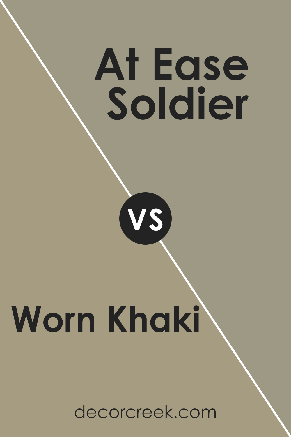
Worn Khaki SW 9527 by Sherwin Williams vs At Ease Soldier SW 9127 by Sherwin Williams
Main color, Worn Khaki, is a light, muted green with a noticeable beige undercurrent. It brings a subdued, natural vibe to spaces, making it ideal for creating a cozy and inviting atmosphere. This color works well in living areas and bedrooms where a calm, subtle backdrop is desired.
On the other hand, the second color, At Ease Soldier, is darker and leans more towards a green-gray. This shade is slightly bolder and provides a strong, grounding effect in a room. It suits spaces that benefit from a more defined, robust appearance, like home offices or studies.
Both colors are from Sherwin Williams and have their unique ways of setting the tone in a space. Worn Khaki is lighter and softer, making it versatile for many areas, while At Ease Soldier, with its deeper tone, creates a more defined and moody atmosphere.
Whether one is better than the other depends on the mood you’re aiming to achieve and the natural light in your space.
You can see recommended paint color below:
- SW 9127 At Ease Soldier
Worn Khaki SW 9527 by Sherwin Williams vs Ruskin Room Green SW 0042 by Sherwin Williams
Worn Khaki and Ruskin Room Green are two distinct shades from Sherwin Williams. Worn Khaki is a soft, muted beige that gives off a calm and neutral vibe. It’s a versatile color that works well in any room, offering a subtle backdrop that complements various decor styles.
On the other hand, Ruskin Room Green is a deeper, rich green with a hint of gray, creating a more grounded and earthy feel. This color is great for adding a touch of nature-inspired sophistication to spaces, making it ideal for areas where you want a more cozy and inviting atmosphere.
Both colors are suitable for creating a warm and welcoming environment, but while Worn Khaki keeps things light and airy, Ruskin Room Green adds depth and drama with its more pronounced hue.
You can see recommended paint color below:
- SW 0042 Ruskin Room Green

Worn Khaki SW 9527 by Sherwin Williams vs Herbal Wash SW 7739 by Sherwin Williams
Worn Khaki and Herbal Wash are two distinct paint colors from Sherwin Williams. Worn Khaki stands out with its soft, muted beige tone, offering a subtle and calming effect ideal for creating a cozy atmosphere in any room. It pairs well with a range of other shades, making it a versatile choice for decorating.
On the other hand, Herbal Wash is a vibrant green with a fresh and lively vibe. This color brings a touch of nature indoors and can revitalize a space, making it feel more lively and refreshing. While Worn Khaki leans towards a neutral palette that can serve as a quiet backdrop, Herbal Wash takes a bolder stance, infusing energy and brightness.
Together, these colors could complement each other well, with Herbal Wash adding a dash of color to the subdued elegance of Worn Khaki.
You can see recommended paint color below:
- SW 7739 Herbal Wash
Worn Khaki SW 9527 by Sherwin Williams vs Green Sprout SW 7728 by Sherwin Williams
Worn Khaki and Green Sprout, both from Sherwin-Williams, offer distinct vibes for any space. Worn Khaki is a muted, earthy beige with subtle green undertones, making it a versatile choice for those seeking a neutral backdrop that’s warm and inviting. This color pairs well with bold accents or can also stand elegantly on its own.
On the other hand, Green Sprout is a vibrant, light green shade that bursts with freshness and energy, reminiscent of spring foliage. It’s ideal for brightening up a room or introducing a lively pop of color without overwhelming the senses. This shade can stimulate a cheerful, refreshing atmosphere in any area of a home or office.
Together, these colors could provide a harmonious balance between understated warmth and cheerful vibrancy, suitable for various design schemes.
You can see recommended paint color below:
- SW 7728 Green Sprout
Worn Khaki SW 9527 by Sherwin Williams vs Fenland SW 7544 by Sherwin Williams
Worn Khaki and Fenland are two interesting colors from Sherwin Williams. Worn Khaki has a light, beige-like tone that feels calm and simple. It’s a versatile shade that can easily fit into any space, providing a neutral backdrop that’s easy on the eyes.
On the other hand, Fenland is a darker, richer color resembling a blend of green and gray. It offers a more defined and cozy feel to spaces, perfect for creating a homey and inviting atmosphere.
When comparing the two, Fenland stands out as the darker, more intense color, which can make small rooms feel a bit tighter. In contrast, Worn Khaki opens up spaces with its lighter and airier presence.
Both colors work well in homes, but the choice between them depends on what mood or style you want to achieve—Worn Khaki is great for brightness and simplicity, while Fenland is ideal for depth and warmth.
You can see recommended paint color below:
- SW 7544 Fenland

Worn Khaki SW 9527 by Sherwin Williams vs Garden Sage SW 7736 by Sherwin Williams
Worn Khaki and Garden Sage are two distinct shades from Sherwin Williams. Worn Khaki has a warm, earthy tone that mimics the color of well-used khaki fabric. It’s a versatile, inviting color that works well in spaces meant to feel comfortable and relaxed.
In contrast, Garden Sage has a cooler, more subdued green hue, reminiscent of sage leaves. This color brings a subtle freshness to a room, creating a calm and soothing atmosphere without being too bright.
While Worn Khaki tends to give a cozier, more enveloping feel, ideal for living rooms or bedrooms, Garden Sage offers a breath of fresh air, suitable for spaces that aim for a naturalistic or minimalist style, like bathrooms or kitchens.
Depending on the lighting and accompanying décor, Worn Khaki can appear more neutral, while Garden Sage might lean towards a more nature-inspired vibe, enhancing modern and traditional designs alike.
Both colors provide unique aesthetics and can significantly influence the mood and style of a space.
You can see recommended paint color below:
- SW 7736 Garden Sage
Worn Khaki SW 9527 by Sherwin Williams vs Dried Edamame SW 9122 by Sherwin Williams
“Worn Khaki” and “Dried Edamame” by Sherwin Williams are two neutral shades that offer subtle differences in mood and style. “Worn Khaki” is a lighter, softer beige that has a clean and calming effect, making it ideal for creating a cozy and inviting atmosphere in spaces like living rooms or bedrooms.
It pairs well with a wide range of colors and decor styles, making it very versatile for interior design. In contrast, “Dried Edamame” is a deeper, greyish-green tone that provides a more grounded feeling. This color would work well in areas that you want to give a touch of nature-inspired robustness, such as studies or dining rooms.
It’s especially good for places where you might want a stronger, more defined color presence but still maintain an overall neutral palette. Both colors share a natural vibe, but each brings its unique flair to interiors, with “Worn Khaki” being slightly more neutral and lighter, while “Dried Edamame” offers a hint of depth and sophistication.
You can see recommended paint color below:
- SW 9122 Dried Edamame
Worn Khaki SW 9527 by Sherwin Williams vs Featherstone SW 9518 by Sherwin Williams
Worn Khaki and Featherstone, both from Sherwin Williams, offer distinct tones for different tastes. Worn Khaki is a deeper, richer tone that gives a warm feel to any space, making it cozy and welcoming. Its earthy hue can make a room feel grounded and comfortable, perfect for living areas or studies.
Featherstone, on the other hand, is a lighter, more gentle color. It provides a fresh and airy feel, brightening up a space effortlessly. This color works well in smaller rooms or spaces that you want to appear more open and light-filled, such as bathrooms and kitchens.
In summary, Worn Khaki brings a sense of warmth and depth, ideal for creating a snug, homey environment. Featherstone offers a clean and bright look, enhancing spaces with its subtlety. Depending on what atmosphere you want to achieve, either color could be the perfect choice.
You can see recommended paint color below:
Worn Khaki SW 9527 by Sherwin Williams vs Honed Soapstone SW 9126 by Sherwin Williams
Worn Khaki and Honed Soapstone are both neutral colors, but they create distinctly different moods. Worn Khaki is a soft, muted green with a warm tone that can make a space feel cozy and inviting. It pairs well with both bright colors and other neutrals, providing a versatile backdrop for various decor styles. It’s quite subtle, so it doesn’t overpower a room but instead, adds a gentle layer of warmth.
On the other hand, Honed Soapstone is a darker gray that leans towards slate, providing a stronger presence in a room. This color is cooler in tone compared to Worn Khaki, making it ideal for those who prefer a more modern look. It can make white trim or furniture pop, giving a room a clean, bold contrast.
Although it’s darker, Honed Soapstone still maintains a sense of calm and can work well in spaces that aim for a more grounded, understated feel.
Both colors are highly flexible for interior design, adapting beautifully to a variety of settings and styles.
You can see recommended paint color below:
- SW 9126 Honed Soapstone
Worn Khaki SW 9527 by Sherwin Williams vs Colonial Revival Green Stone SW 2826 by Sherwin Williams
Worn Khaki and Colonial Revival Green Stone are two distinct colors from Sherwin Williams that bring different vibes to space. Worn Khaki is a subtle, soft beige that has a natural, earthy feel to it, making rooms feel warm and inviting. It’s a versatile color that works well in almost any room, providing a neutral backdrop that complements various decor styles.
On the other hand, Colonial Revival Green Stone is a gentle green with a touch of gray. This color is more specific in its tone and brings a mild, refreshing feel to spaces. It’s excellent for creating a calm atmosphere in areas like bathrooms or bedrooms, where a touch of color can add depth without overwhelming the senses.
Both colors offer unique opportunities to enhance your home’s aesthetic. Worn Khaki is ideal for those seeking a classic, understated look, while Colonial Revival Green Stone is perfect for adding a subtle hint of color to a peaceful, restful setting.
You can see recommended paint color below:
- SW 2826 Colonial Revival Green Stone
Conclusion
In conclusion, after talking about SW 9527 Worn Khaki by Sherwin Williams, I really see how special this paint color is. This shade of khaki isn’t just your typical light brown; it has a unique charm that can make any room feel cozy and welcoming.
Whether you’re looking to paint your bedroom, living room, or even your kitchen, Worn Khaki brings a warm and calming feel to the walls.
One of the best things about Worn Khaki is how well it goes with many other colors. You can pair it with bright colors like blue or red for a fun look, or match it with soft whites or greys to keep things calm and pretty. It works great in modern homes as well as older houses that have a lot of history. It doesn’t matter what style your room is; this color can fit right in.
Also, picking this paint means you don’t have to worry about it going out of style. It’s a color that stays nice over time, which is great if you don’t want to repaint often. Plus, it covers the walls well, so you get a great finish after painting.
Overall, SW 9527 Worn Khaki by Sherwin Williams is a wonderful choice if you’re looking to make your home feel warm and inviting, while also keeping things simple and stylish.
Ever wished paint sampling was as easy as sticking a sticker? Guess what? Now it is! Discover Samplize's unique Peel & Stick samples.
Get paint samples

