If you’re looking for a fresh coat of paint to breathe new life into your home, you might want to consider SW 9518 Featherstone by Sherwin Williams. This color is quickly becoming a favorite for many because of its unique blend of warmth and elegance.
Featherstone is a subtle yet striking color that brings a sense of calmness and sophistication to any space. Whether you’re updating your living room, bedroom, or kitchen, this hue has the versatility to elevate your home’s style effortlessly.
Sherwin Williams has always been known for its quality paints and vibrant colors, and Featherstone is no exception. It’s perfect for those who want to add a touch of modernity without overwhelming a room’s natural charm.
This color works beautifully with different lighting and complements various decor styles, making it a great choice for anyone looking to refresh their space.
Plus, with the durability and coverage you expect from Sherwin Williams paints, you can enjoy your chosen hue for years to come.
In this article, we’ll delve into why SW 9518 Featherstone might just be the color update you’ve been searching for. From its aesthetic appeal to practical application, we’ve got you covered.
So, if you’re considering a new paint color, keep reading to find out why Featherstone could be the perfect pick.
What Color Is Featherstone SW 9518 by Sherwin Williams?
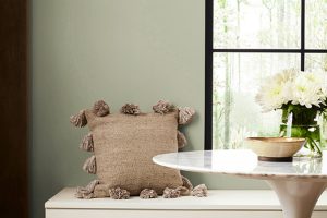
Featherstone is a unique color by Sherwin Williams that brings a soft, earthy feel to any space it adorns. This color is like a warm hug, with its gentle beige tones that offer a comforting and inviting atmosphere.
It’s light enough to make small rooms feel bigger and cozy enough to give large spaces a more intimate vibe. What makes Featherstone stand out is its versatility.
It fits beautifully with a range of interior styles, from modern minimalist to rustic farmhouse and everything in between.
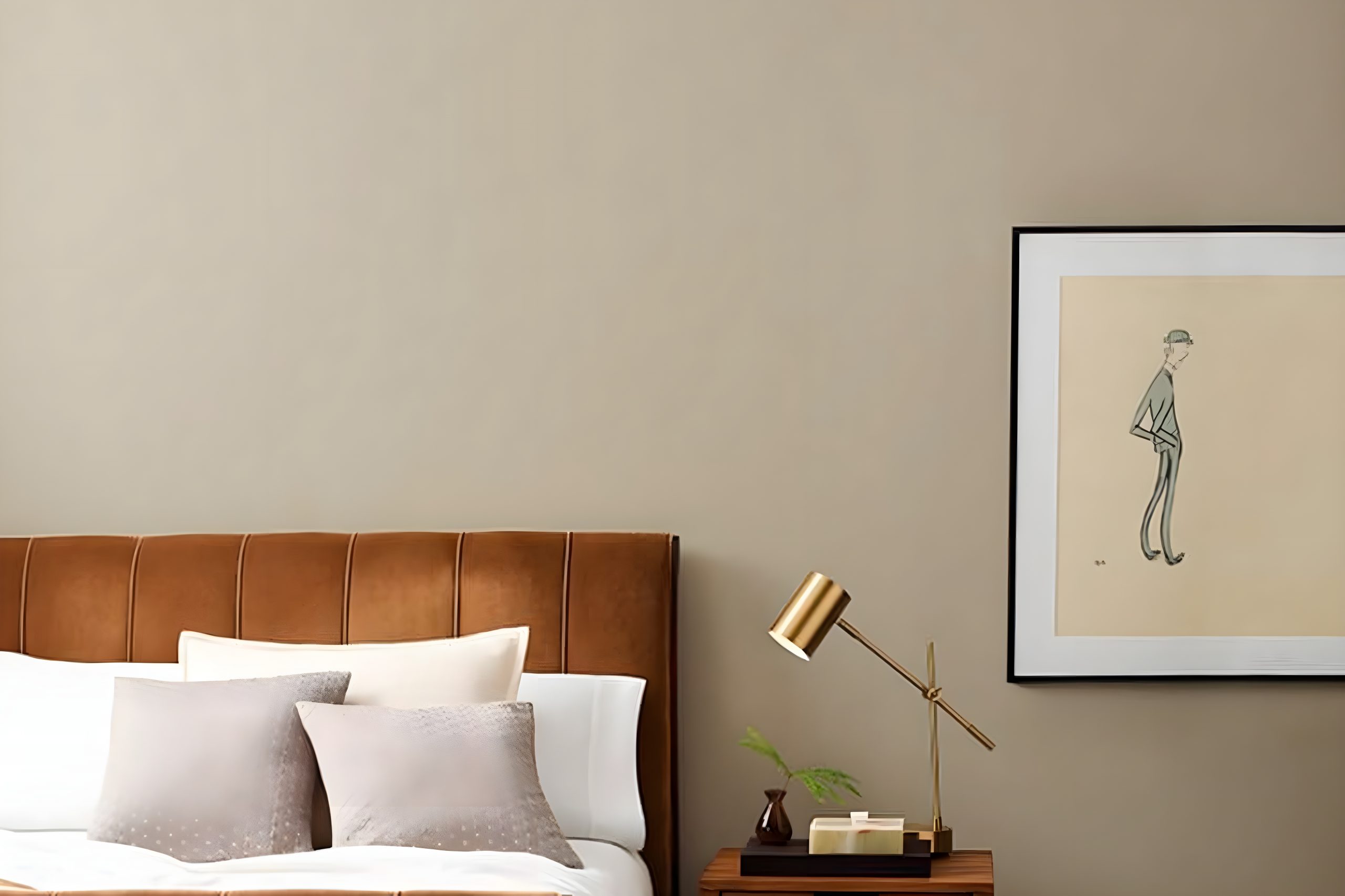
In terms of matching materials and textures, Featherstone pairs wonderfully with natural wood, adding a touch of warmth and organic character.
Think wooden floors, furniture, or even exposed wooden beams for a touch of rustic charm. It also looks great with stone textures, like granite countertops or a stone fireplace, giving a grounded, earthy feel to the environment.
Soft fabrics in muted colors work well too, adding layers and depth to the cozy atmosphere that Featherstone creates.
This color shines in living rooms, bedrooms, and kitchens, providing a neutral backdrop that allows other elements of your decor to stand out.
It’s particularly effective in rooms with plenty of natural light, where its underlying warm tones can be fully appreciated. Featherstone is a testament to the power of neutral colors in creating inviting, comfortable, and stylish spaces.
Ever wished paint sampling was as easy as sticking a sticker? Guess what? Now it is! Discover Samplize's unique Peel & Stick samples.
Get paint samples

Is Featherstone SW 9518 by Sherwin Williams Warm or Cool color?
Featherstone SW 9518 by Sherwin Williams is a soft, warm color that brings a cozy feel to any space. This hue is perfect for creating a welcoming atmosphere in homes, as it has the power to make rooms look bright and airy yet inviting at the same time.
The unique quality of Featherstone lies in its versatility. It can serve as a neutral backdrop that allows furniture and decor to stand out, or it can be the focal point when paired with bolder colors for a stunning contrast.
This color works well in living rooms, bedrooms, and even kitchens, offering a subtle elegance that enhances the sense of comfort.
In spaces with natural light, Featherstone takes on a lively, vibrant tone, while in rooms with less light, it provides a warm, snug feel. Its adaptability makes it a great choice for those looking to add a touch of sophistication without overwhelming a space.
Whether you’re updating a single room or redecorating your entire home, Featherstone offers a timeless appeal that is both stylish and easy to live with.
Undertones of Featherstone SW 9518 by Sherwin Williams
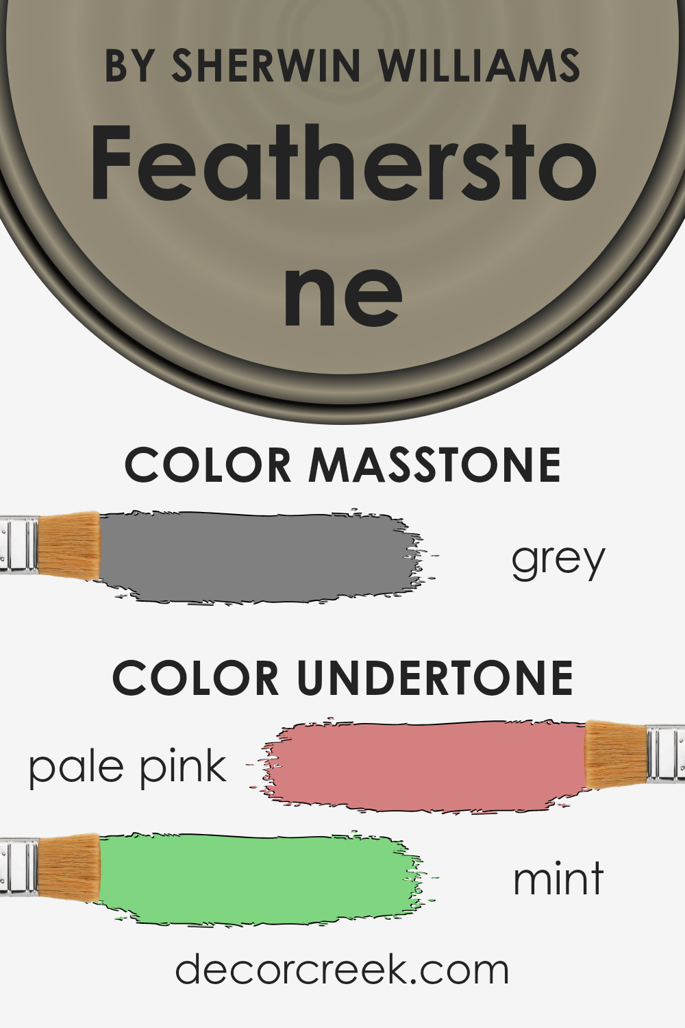
Featherstone, a paint color by Sherwin Williams, has subtle undertones that can significantly influence the way it appears on interior walls.
Understanding these undertones, such as pale pink and mint, is crucial because they can change how we perceive the main color under different lighting conditions and when combined with various decor elements.
Pale pink undertones add a soft warmth to the color, making spaces feel more inviting and cozy. In natural light, this warmth becomes more apparent, giving rooms a gentle, soothing vibe.
In contrast, artificial lighting can accentuate the pink, adding a subtle vibrancy and depth that might not be as noticeable under the sun’s rays.
Mint undertones introduce a fresh, crisp element to the mix. This cooler aspect can make Featherstone feel more airy and spacious, especially in well-lit areas.
The mint can also counterbalance the warmth of the pale pink, ensuring the color maintains a balanced, neutral feel that’s versatile enough for various decorative styles and preferences.
When applied to interior walls, the interplay of these undertones with the main color and the room’s lighting can significantly affect the ambiance of a space.
The pale pink can make the room feel cozy and welcoming, while the mint can offer a refreshing contrast, creating a balanced and harmonious look overall. This complexity allows Featherstone to adapt to different settings and moods, making it a versatile choice for your home.
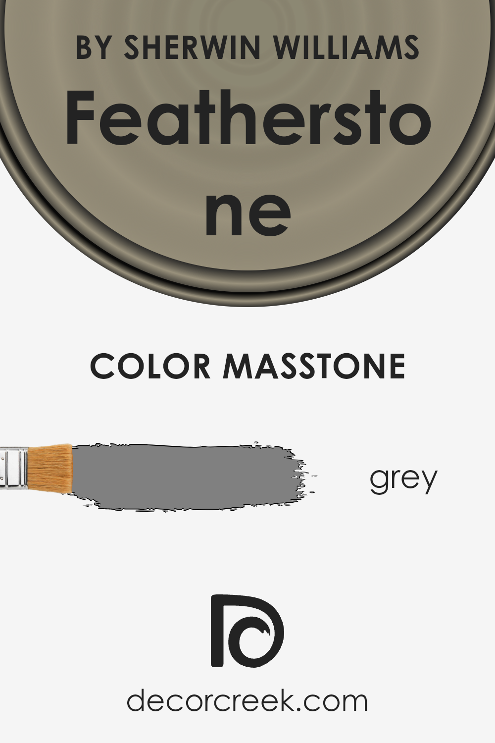
What is the Masstone of the Featherstone SW 9518 by Sherwin Williams?
Featherstone, identified by its specific code, is a color that Sherwin Williams offers, which has a distinctive grey tone. This grey is the core shade of the paint, known as the “masstone.”
Since its masstone is grey, which is a neutral and versatile color, it has a particular way of adding an elegant and calm feel to any room in homes.
Grey, being in the middle of black and white, brings balance and sophistication. It’s perfect for those looking to create a modern, yet timeless, space.
The masstone of this color means it can easily match with other colors, whether they are bright for a vivid contrast or softer tones for a more subdued palette. In homes, this makes it incredibly practical.
It works well in living rooms, bedrooms, or even kitchens, providing a backdrop that supports all kinds of decor – from minimalist to eclectic – without overwhelming the space.
This grey encourages a feeling of comfort and stability, making any home feel more inviting and put-together.
How Does Lighting Affect Featherstone SW 9518 by Sherwin Williams?
The way lighting interacts with colors is quite fascinating and can significantly change how a color appears in a room. Lighting can alter the perceived color, intensity, and mood.
This is why considering the type of light a room receives is crucial when selecting a paint color.
Let’s explore how artificial light and natural light affect the appearance of a specific color, for example, a soothing grayish hue. In artificial light, this hue can look warmer or cooler depending on the type of bulb used.
Warm lighting tends to pull out the warmer undertones in the paint, making the room feel cozier. On the other hand, cool lighting can highlight blue or green undertones, giving the room a more refreshing vibe.
Natural light brings its own set of variables. The direction your room faces plays a significant role in how this particular color will look throughout the day.
In north-facing rooms, light tends to be cooler and more consistent throughout the day. This could make the gray appear more muted and slightly cooler, emphasizing any subtle undertones.
The light in south-facing rooms is warmer and brighter, potentially making the same color appear lighter and warmer, enhancing the coziness of the space.
East-facing rooms get the morning light, which is warm and bright but shifts throughout the day to cooler, softer light. In this setting, the color can appear lively and warm in the morning but become more subdued as the day progresses.
West-facing rooms experience the opposite effect. The color may start off cooler in the morning, then as the sun sets, it fills the room with a warm glow, making the color appear richer and warmer.
Understanding how different lights impact color can help you anticipate how this gorgeous hue will transform throughout the day and in various artificial lights, ensuring your room always feels just right.

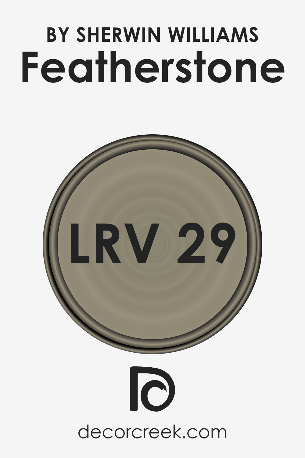
What is the LRV of Featherstone SW 9518 by Sherwin Williams?
LRV stands for Light Reflectance Value, which is a measure used to determine how light or dark a color will appear once it’s applied to your walls.
This number is measured on a scale from 0 to 100, where 0 is completely black, absorbing all light, and 100 is pure white, reflecting all light.
The higher the LRV, the more light the color will reflect back into the room, making the space appear brighter and larger. Conversely, colors with lower LRVs absorb more light, which can make a room feel cozier but also smaller and darker.
With an LRV of 28.516, the color in question is on the darker end of the spectrum, meaning it doesn’t reflect a lot of light back into the room.
This characteristic will make it visually stand out as a statement color in your space. When applied to walls, this color will absorb more light than it reflects, which can significantly influence the atmosphere of the room.
It can add depth and sophistication to a space but might also make a small room feel even smaller and more enclosed.
To counterbalance this effect, it’s advisable to use this color in rooms with plenty of natural or artificial light and to combine it with lighter colors on other walls, ceilings, or furnishing.
LRV – what does it mean? Read This Before Finding Your Perfect Paint Color
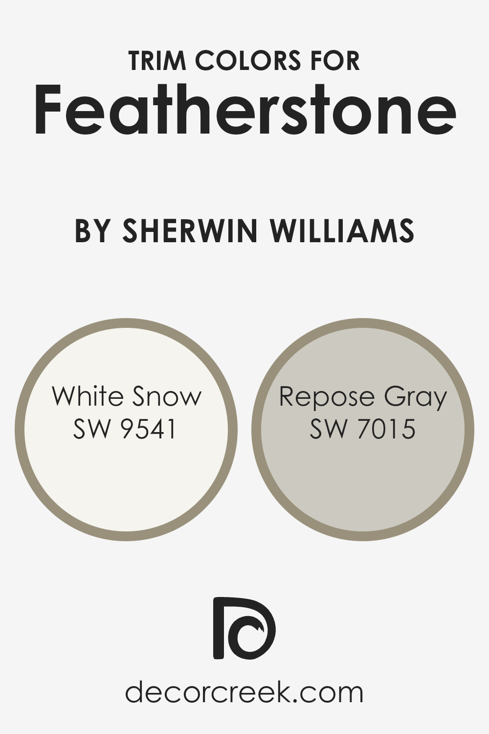
What are the Trim colors of Featherstone SW 9518 by Sherwin Williams?
Trim colors play a critical role in interior and exterior design, serving as the defining lines that accentuate the main colors of walls or the exterior of buildings.
In the context of using a specific color such as Featherstone by Sherwin Williams, choosing the right trim colors is crucial to enhance the aesthetic appeal and create a harmonious look.
The trim colors act like a frame, outlining the architectural details and features, making spaces appear more structured and cohesive.
They can significantly impact the perception of the main color, either by providing a bold contrast that draws the eye or by subtly blending in to soften the overall effect.
When considering Featherstone by Sherwin Williams, two trim colors that pair beautifully with it are White Snow SW 9541 and Repose Gray SW 7015.
White Snow is a crisp, clean white that provides a sharp contrast, brightening the space and making the Featherstone color pop with more clarity and brightness.
It’s perfect for creating a fresh and inviting atmosphere. On the other hand, Repose Gray offers a softer contrast, with its warm undertones complementing the Featherstone’s depth.
This combination is ideal for those seeking a more muted, sophisticated harmony between the wall and trim colors, ensuring the space feels both elegant and welcoming.
You can see recommended paint colors below:
- SW 9541 White Snow
- SW 7015 Repose Gray
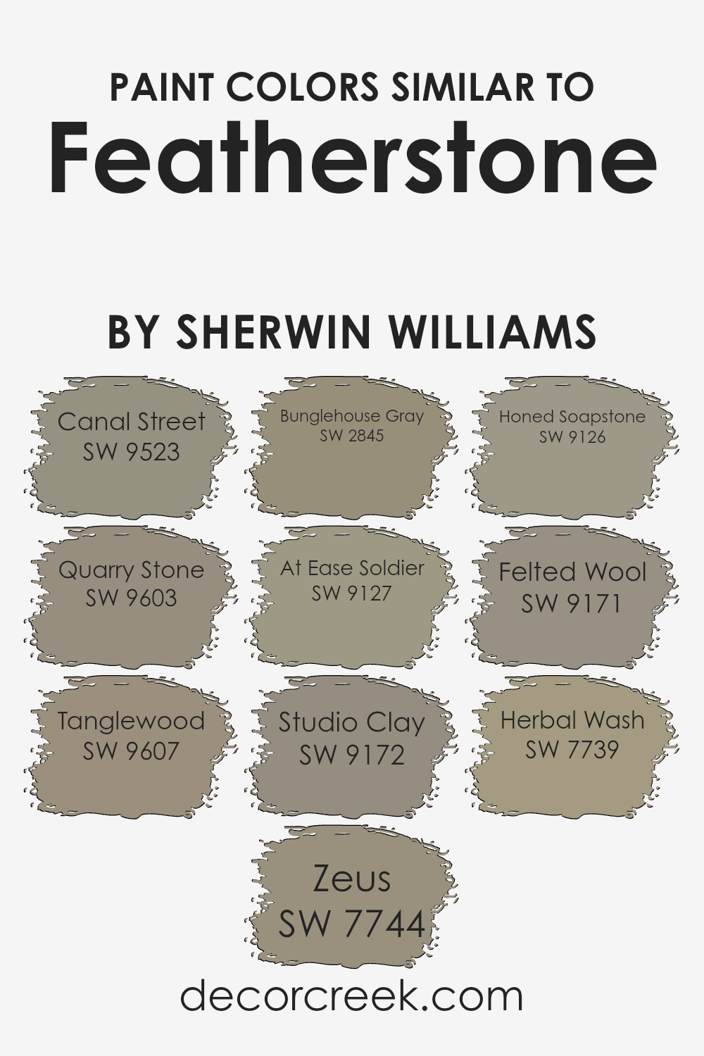
Colors Similar to Featherstone SW 9518 by Sherwin Williams
Similar colors play a vital role in creating a harmonious and balanced visual experience, especially in interior design and painting. They can enhance the aesthetic of a space by adding depth and continuity, making it feel more cohesive.
For instance, when colors like Canal Street, a soft, muted green with an earthy tone, and Quarry Stone, a subtle, warm gray with hints of green, are used together, they create a soothing natural palette inspired by the outdoors.
Tanglewood follows this natural theme but leans into a warmer, beige hue that reminds one of sun-kissed wood, providing a comforting warmth.
In the realm of darker tones, Zeus offers a strong, slate gray that can serve as an anchoring foundation, giving depth to spaces when paired with lighter hues like the others.
Bunglehouse Gray is another intriguing option; it’s a deep, complex blue that adds a touch of sophistication.
Moving to the softer side, At Ease Soldier presents a muted green, offering a calm and grounding effect, while Studio Clay brings in a subtle, earthy clay color, perfect for adding a touch of warmth.
Honed Soapstone has a unique, soft gray delicacy, suggesting a refined elegance when combined with similar shades.
Felted Wool, with its gentle gray warmth, exudes a cozy, inviting atmosphere. Finally, Herbal Wash adds a splash of freshness with its light, sage green, capturing the essence of a serene, leafy retreat.
Together, these colors work seamlessly to create varied but unified spaces, allowing for creativity in design while maintaining a sense of continuity and flow.
You can see recommended paint colors below:
- SW 9523 Canal Street
- SW 9603 Quarry Stone
- SW 9607 Tanglewood
- SW 7744 Zeus
- SW 2845 Bunglehouse Gray
- SW 9127 At Ease Soldier
- SW 9172 Studio Clay
- SW 9126 Honed Soapstone
- SW 9171 Felted Wool
- SW 7739 Herbal Wash
How to Use Featherstone SW 9518 by Sherwin Williams In Your Home?
Featherstone SW 9518 by Sherwin Williams is a soothing and versatile paint color that can add a touch of warmth and elegance to any room in your home.
This color is a soft, neutral hue that works well in living areas, bedrooms, and even in the kitchen or bathroom. Its calming nature makes it perfect for creating a relaxing sanctuary in your bedroom, helping you unwind after a busy day.
In the living room, Featherstone can make your space feel more inviting and cozy, ideal for family gatherings or just chilling out.
For those looking to refresh their kitchen or bathroom, this color offers a subtle backdrop that can be easily matched with cabinets, countertops, and accessories, without overwhelming the space.
Its neutral tone works well with both natural light and artificial lighting, ensuring your home feels bright and airy.
Whether you’re aiming for a modern, minimalist look or a more traditional vibe, Featherstone can help you achieve the desired ambiance with its understated elegance and versatility.
Featherstone SW 9518 by Sherwin Williams vs Tanglewood SW 9607 by Sherwin Williams
Featherstone and Tanglewood, both by Sherwin Williams, offer unique touches to any space. Featherstone is like a light, airy breath of freshness, with its subtle, soothing qualities.
It brings a sense of calm and relaxation, perfect for creating serene environments. On the other hand, Tanglewood steps in with a bit more warmth, channeling the cozy feel of woodlands.
It’s like wrapping yourself in a comfortable blanket on a chilly morning. While Featherstone provides a backdrop for simplicity and light, Tanglewood adds depth and warmth, making spaces feel more grounded and inviting.
Both colors complement each other well, with Featherstone bringing in lightness and Tanglewood offering a comforting embrace. Choosing between them depends on the atmosphere you want to create.
Featherstone is great for a crisp, clean look, while Tanglewood is ideal for adding a touch of warmth and homeliness.
You can see recommended paint color below:
Featherstone SW 9518 by Sherwin Williams vs Herbal Wash SW 7739 by Sherwin Williams
Featherstone and Herbal Wash are two interesting colors by Sherwin Williams. Featherstone is a soft, gentle type of pink with a warm, almost earthy feel to it.
This color feels cozy and would work well in a space where you want to add a touch of warmth without overwhelming it with a strong color. It’s perfect for creating a calm and welcoming atmosphere.
On the other hand, Herbal Wash has a different vibe. It’s a green color that hints at freshness and nature, reminding you of being in a garden or a lush outdoor area.
This color is a bit more vivid and lively compared to Featherstone. It’s great for spaces where you want to bring in some life or a feel of the outdoors, making rooms feel brighter and more energetic.
In short, while Featherstone offers a subtle warmth and coziness with its soft pink tone, Herbal Wash brings a sense of freshness and vitality with its green hue.
Both colors have their unique appeals, depending on the mood you want to create in your space.
You can see recommended paint color below:
- SW 7739 Herbal Wash
Featherstone SW 9518 by Sherwin Williams vs Bunglehouse Gray SW 2845 by Sherwin Williams
Featherstone and Bunglehouse Gray are two distinctive paint colors from Sherwin Williams, showcasing unique vibes for any space.
Featherstone, a gentle, light hue, brings a soft, airy feel to rooms, perfect for creating a serene and inviting atmosphere.
Its subtle warmth adds a hint of coziness without overpowering the space, making it ideal for living rooms or bedrooms seeking a touch of calm.
On the other hand, Bunglehouse Gray steps in with a stronger character. This color is a deeper, more pronounced gray that adds a bit of sophistication and depth.
It’s a versatile choice, fitting well in areas that aim for a bit more gravity or a modern touch, such as offices or dining rooms.
While still neutral, it commands more presence compared to the softer Featherstone, making it a go-to for those wanting to make a bolder statement.
Both colors offer their unique take on neutral hues, providing different moods and atmospheres depending on what you’re aiming for in your space.
You can see recommended paint color below:
- SW 2845 Bunglehouse Gray
Featherstone SW 9518 by Sherwin Williams vs Canal Street SW 9523 by Sherwin Williams
Comparing Featherstone and Canal Street by Sherwin Williams is like looking at two serene moments in nature. Featherstone offers a light, airy vibe, reminiscent of a gentle sunrise with its soft, warm undertones.
It has a soothing presence, perfect for creating a cozy, inviting space. On the other hand, Canal Street brings a deeper, cooler tone to the table, akin to a tranquil evening sky.
It’s the kind of color that adds a touch of elegance and depth to any room, making it feel more grounded and serene.
While Featherstone can light up a room with its subtle warmth, making small spaces appear larger and more welcoming, Canal Street offers a more sophisticated, calming effect, ideal for adding a sense of tranquility to a space.
Whether you prefer the soft embrace of morning light that Featherstone provides or the cool tranquility of an evening breeze that Canal Street suggests, each color has its unique charm, adding a distinct mood and character to interiors.
You can see recommended paint color below:
Featherstone SW 9518 by Sherwin Williams vs Studio Clay SW 9172 by Sherwin Williams
Featherstone and Studio Clay by Sherwin Williams are two distinct shades that offer unique vibes to any space. Featherstone is a kind of light, airy color, giving off a feel of openness and brightness.
It’s the kind of color that can make a small room seem more spacious and welcoming. On the other hand, Studio Clay has a much earthier tone. It’s a deeper, more grounded color, reminiscent of natural clay.
This makes it perfect for creating cozy and warm environments. Whereas Featherstone adds a breath of fresh air to a room, Studio Clay brings in a sense of warmth and comfort.
If you’re looking to brighten up a space, Featherstone is a go-to. But if you prefer a more soothing, grounded atmosphere, Studio Clay is the better choice.
Both colors have their charms, depending on the mood you want to set in your space.
You can see recommended paint color below:
- SW 9172 Studio Clay
Featherstone SW 9518 by Sherwin Williams vs Honed Soapstone SW 9126 by Sherwin Williams
Featherstone and Honed Soapstone, both by Sherwin Williams, are unique in their ways, offering different vibes for spaces. Featherstone is a soft, warm hue that injects a cozy, welcoming aura into rooms.
It’s kind of like the gentle embrace of a sunny day, making it perfect for living rooms or bedrooms where you want a peaceful, calming effect.
On the flip side, Honed Soapstone presents a cooler, more refined tone. This color brings a sleek, modern feel to any space, reminiscent of the subtle elegance of natural stone.
It’s ideal for areas like kitchens or bathrooms where you want to combine sophistication with a touch of contemporary flair.
While Featherstone bathes spaces in a light, airy feel, Honed Soapstone offers a grounded, tranquil atmosphere.
Both colors have their charm, whether you’re leaning towards a warmer, inviting space with Featherstone or a chic, serene setting with Honed Soapstone.
You can see recommended paint color below:
- SW 9126 Honed Soapstone
Featherstone SW 9518 by Sherwin Williams vs At Ease Soldier SW 9127 by Sherwin Williams
Featherstone and At Ease Soldier, both from Sherwin-Williams, offer distinct vibes for any space.
Featherstone is a light, airy hue, somewhat close to a soft pink with a touch of warmth, making it perfect for creating a cozy yet slightly sophisticated atmosphere. It brightens up rooms effortlessly, giving them a fresh and welcoming feel.
On the other hand, At Ease Soldier is a grounded, soothing gray-green. This color leans more towards nature, evoking a sense of calm and tranquility.
It’s excellent for spaces where relaxation is key, as it pairs well with natural elements and materials, bringing an outdoor vibe indoors.
While Featherstone adds a gentle warmth and can make spaces feel more open and light, At Ease Soldier offers depth and a feeling of serenity, making it ideal for a peaceful retreat.
They could complement each other in different rooms or as part of a color scheme within the same space, depending on the desired mood and style.
You can see recommended paint color below:
- SW 9127 At Ease Soldier
Featherstone SW 9518 by Sherwin Williams vs Quarry Stone SW 9603 by Sherwin Williams
Featherstone and Quarry Stone, both from Sherwin Williams, offer distinct vibes for spaces. Featherstone is like a soft hug from a warm, beige blanket, giving rooms a cozy, inviting atmosphere.
Its understated elegance makes it versatile, effortlessly fitting with various decor styles. On the other hand, Quarry Stone steps in with a deeper, cooler tone, reminiscent of natural stone.
This color brings a grounding, calm feeling, making it perfect for spaces aimed to be serene retreats. While Featherstone lights up a room with its gentle warmth, Quarry Stone anchors it with a sense of calm strength.
Depending on what mood you’re aiming for, Featherstone brightens and warms, whereas Quarry Stone cools and soothes.
Both colors work beautifully in their ways, either enhancing the light and airy feel with Featherstone or giving a room steady, tranquil vibes with Quarry Stone.
You can see recommended paint color below:
Featherstone SW 9518 by Sherwin Williams vs Zeus SW 7744 by Sherwin Williams
Featherstone and Zeus, both by Sherwin Williams, offer unique tones for different moods and settings. Featherstone is a soft, warm hue with earthy undertones, perfect for creating a cozy and inviting space.
It’s light enough to make small rooms feel bigger but has enough depth to add character to any area. On the other hand, Zeus is a darker, richer color. It’s a powerful shade that brings a strong and bold statement to a room.
With its deeper tones, Zeus can anchor a space and pair well with brighter or lighter colors to create dynamic contrasts.
While Featherstone brightens and warms, Zeus adds sophistication and depth, making them ideal for different purposes.
Whether you’re looking for a gentle background color or a dramatic accent, these colors offer great versatility for home décor.
You can see recommended paint color below:
- SW 7744 Zeus
Featherstone SW 9518 by Sherwin Williams vs Felted Wool SW 9171 by Sherwin Williams
Featherstone and Felted Wool by Sherwin Williams are two distinctive colors with unique qualities. Featherstone is a lighter, more airy shade that brings a sense of freshness and calm to any space.
It has a gentle touch, reminiscent of the soft, subtle hues found in nature. This color works well in spaces aimed to be soothing and serene, perfect for bedrooms or quiet sitting areas.
On the other hand, Felted Wool is a deeper, richer color that suggests warmth and comfort. It’s like the cozy feel of a well-worn sweater on a chilly day.
This color adds depth and character to spaces, making it ideal for creating inviting living rooms or intimate dining areas. Felted Wool’s warmth contrasts nicely with Featherstone’s lighter tone, offering a solid foundation for decor that aims to be both welcoming and stylish.
Together, these two colors can create a beautiful balance within a home, from the light and uplifting vibe of Featherstone to the cozy, enveloping atmosphere that Felted Wool provides.
Whether used alone or in combination, they offer versatile options for transforming spaces.
You can see recommended paint color below:
- SW 9171 Felted Wool
Conclusion
Featherstone, identified by its unique code SW 9518, is an appealing color option from Sherwin Williams that has become a popular choice for those looking to add a warm and inviting touch to their spaces.
This color offers a beautiful balance between a soft, welcoming ambiance and the right amount of depth that can enhance various areas of a home or office without overwhelming the senses.
It’s a versatile choice that works well in a range of settings, from modern to traditional, making it a go-to for many design projects.
Choosing Featherstone for a design project means opting for a color that can easily complement a wide array of decor elements and color palettes.
Its understated elegance allows it to act as either a striking focal point or a subtle background, depending on what the design calls for.
This flexibility, coupled with the quality that Sherwin Williams is known for, ensures that any space can achieve a look of sophistication and warmth, making it a great selection for those wanting to refresh their environment with something that feels both new and timelessly stylish.

Ever wished paint sampling was as easy as sticking a sticker? Guess what? Now it is! Discover Samplize's unique Peel & Stick samples.
Get paint samples